
MOCA Museum App Mary Degnan UX Designer wannabe July 2022


The product: The MOCA app is designed to allow a user the ability to book tickets and guided tours online, thereby avoiding long lines and frustration during busy times. Project overview Project duration: June – July 2022


The problem: The Museum of Contemporary Art (MOCA) has been hosting some very popular exhibitions. Lines to get in are long, and visitors often leave when they realize they won’t be able to view the exhibition in a timely fashion, as only a limited number of visitors are allowed in at one time.
Project overview
The goal: Our product will let users purchase tickets and schedule group tours online, which will positively affect their abilities to avoid waiting in line by creating time-saving efficiencies. We will measure this by analyzing the number of users who purchase tickets and book their tours online.
My role: UX designer in training, via Google’s Coursera curriculum Project overview Responsibilities: User research, storyboarding, low fidelity prototyping, wireframes, user testing, high fidelity wireframing
Understandingtheuser ● User research ● Personas ● Problem statements ● User journey maps
User research: summary The research for the MOCA app was conducted in the form of two moderated usability studies to determine answers to the following questions: • Can the user complete the process of booking tickets? • What improvements should be made? • What are the pain points? • Where does a user drop off? • Is the app accessible? (I found this app easy to navigate: agree/disagree) Several changes were made to the designs based on user feedback, including: • Tweaking the color palette to more closely adhere to accessibility standard • Adding text below icon buttons for screen readers • Adding more realistic (but not final) to avoid user confusion • Changing confusing icons to text buttons
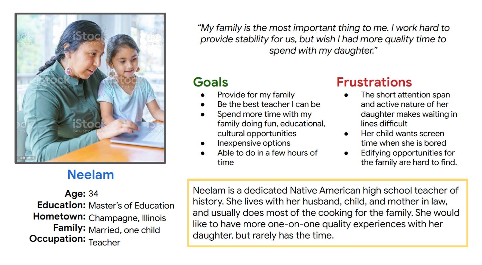
Persona: Neelam Problem statement: Neelam is a busy mother and teacher who needs a fun and time-efficient way to enjoy cultural and opportunitieseducational because the demands of her work and family life limit spending quality time with her family.
User research: pain points Pain point Users wanted timesaving opportunities that would help them make the most of educational or cultural opportunities. Pain point Users wanted to engage their children and themselves in non-digital edifying activities. Pain point Users wanted to engage in cost-efficientactivities.cultural 1 2 3
Initial user journey map

● Paper wireframes ● Digital wireframes ● Low-fidelity prototype ● Usability studies theStartingdesign
Paper wireframes This was a helpful activity to consider all the necessary elements to include in the app. The design continued to evolve beyond the paper wireframe part of the process.


Digital wireframes Rather than pursue my initial idea of including type in the images, I have indicated that the type should be beneath the images in order to accommodate screen readers. Navigation Bar andinformationVisitortickets
Digital wireframes Once the user selects “Tickets” on the previous screen, they should be able to select a date and time to visit the museum. User can select a date to visit. Users can select desired time ticketed entry. Add to cart
Low-fidelity prototype: MOCA Gallery App

1
It was observed that 3 out of 5 participants were confused by a blank calendar grid. This means that a more realistic calendar should be incorporated.
1 It was observed that 3 out of 5 participants were stymied by the inability to enter a credit card number. This means that a personal info/credit card page needs to be completed.
3
Feedback from 5 participants attempting to book online tickets for a museum/gallery via a wireframe prototype for a mobile app. 1 findings
It was observed that 3 out of 5 participants indicated that a more realistic calendar was needed.
Round
One participant noted that the plus button was not instructive enough, and was replaced with an add-tocart button.
2 It was observed that 3 out of 5 participants commented that there was no way of obtaining email confirmation. This also means that a personal info/credit card follow up needs to be completed.
MOCA Gallery App Usability study: findings
2 Round 2 findings
● Mockups ● High-fidelity prototype ● AccessibilitytheRefiningdesign
Mockups It was observed that 3 out of 5 participants were confused by a blank calendar grid. A more realistic calendar should be incorporated. Before usability study After usability study


Mockups Before usability study After usability study It was observed that 3 out of 5 participants were stymied by the inability to enter a credit card Similarly,number. it was observed that 3 out of 5 participants commented that there was no way of obtaining email confirmation. Adding a personal info/credit card page before the credit card information achieved both insight goals.


Mockups (before iterations)


Mockups (after iterations)

High-fidelity prototype https://www.figma.com/file/v94GyGDQPLTC8L2bRTkeoi/GALLERY%2FMUSEUM-MOBILE-APP-mockup?node-id=0%3A1

Accessibility considerations The color palette has been adjusted from initial designs in order to come into compliance with WebAIM contrast standards.checker Standalone icons were changed to include text below them, to help users avoid confusion and accessible for those with screen readers. Some icons were changed completely to text buttons. 1 2 3
● Takeaways ● Next stepsGoing forward
Takeaways Impact: Feedback has indicated that an app such as the MOCA app would be useful to avoid crowds and long lines. What I learned: I have so much more to learn about Figma. Accessibility features can be expanded, such as possibly including a section where a visitor can indicate if they have accessibility considerations.
Next steps Flesh out additional sub pages. Include interactive date and time picker. Learn more about Figma! 1 2 3
Let’s connect! I am a graphic designer looking to improve my skill set! My portfolio can be viewed here. I can be reached at mary@chico-designs.com. Thank you for checking out my case study!
