Fair list
Artist / author
Apollinaire, Guillaume
Arp, Hans
Asse, Geneviève
Baldessari, John
Bellmer, Hans
Berthon, Paul
Beuys, Joseph
Boltanski, Christian
Brancusi, Constantin
Bravo, Manuel Alvarez
Broodthaers, Marcel
Chirico, Giorgio de
Crosby, Caresse & Harry
Doesburg, Théo van
Dominguez, Oscar
Dubuffet, Jean
Duchamp, Marcel
Ernst, Max
Feldmann, Hans-Peter
Francis, Sam
Geffroy, Gustave
Giacometti, Alberto
Gibran, Gibran Khalil
Gilbert & George
Goncharova, Natalia
Guro, Elena
Héré de Corny E. L.
Hugnet, Georges
Iliazd (Ilia Zdanevich)
Joyce, James
Kandinsky, Wassily
Klein, Yves
Kokoschka, Oskar
Kuknetzov, K. V.
Laboureur, J-E
Lam, Wifredo
Laurens, Henri
Larionov, Mikhail
Léger, Fernand
Liubavina, N. I.
Man Ray
Manet, Edouard
Manzoni, Piero Marcoussis,
Masson, André
Matta Echaurren, Robert
Matta-Clark, Gordon
Mesens, E. L. T
Miro, Joan
Moriyama, Daido
Penrose, Roland
Pissarro, Camille
Porter, Louis
Rot(h), Di(e)ter
Ruscha, Ed
Shotaro, Shimomura
Schwitters, Kurt
Talbot, William H. Fox
Other:
Bauhaus
Black Sun Portfolio
Brucke (Kirchner et al).
– Katalog zur Ausstellung
are marked with an asterisk
3
Louis No. 12 13, 15 83*, 89 75, 82 55* 07 60, 65 68, 84–6, 88 25 78 67, 73, 76 24 42 18 34, 39 47, 49 35*, 69 28–9*, 36, 45 81 87* 06 57 30 70–72 16 10 03* 34–5 44, 46, 80* 25 31 58 08 27 23 63 40 16 50 12 69 05 56 09*
Eragny Press Polyglot prayers Epistolae et
Evangelia Surrealism Bindings
Tristan Warhol, Andy Winogrand, Garry 21, 22 61 74 41 48, 51–2, 66, 80* 77 38* 11* 90 54, 64 59, 62 33 17–20 04 43 13, 15 53 79 37 42 08bis 11* 01* 02* 32
Tanguy, Yves Tzara,
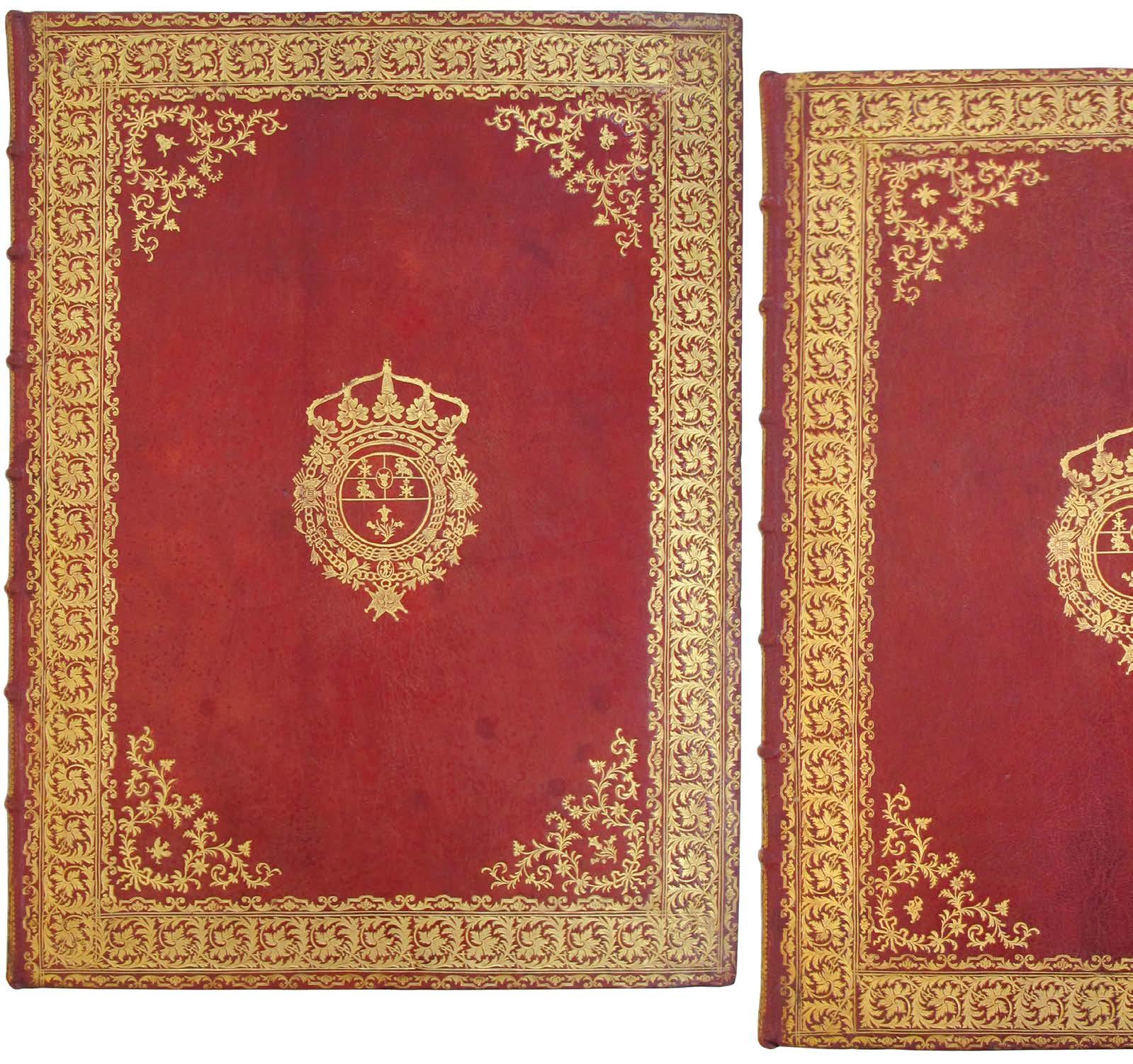
Large 8vo. (220 x 148 mm). [68 leaves including blanks]. Elaborate architectural pictorial title in pencil, sepia ink and wash peopled with the apostles, saints and other figures, title in sepia ink within central cartouche, dated above and with central triangle enclosing the tetragrammaton, the whole ruled in red, verso with elaborate pencil drawing of Jesus as 'Salvator Mundi' with orb and halo (the title misbound - see below) and all following leaves with manuscript text in sepia ink in a variety of languages recto and verso and with 17 further drawings in pencil, ink and wash, all leaves ruled in red and with pencil guides for text where applicable (see below for details of the manuscript text, languages and illustration); sheet size: 216 x 138 mm. Full contemporary crushed morocco by the Queens' Binder A (William Nott?), boards with double roll tool border within double fillet to surround a beautiful geometric interlacing décor with additional decorative floral, guilloche and volute tools, banded spine with gilt cruciform composition in six compartments, board edges and turn-ins with roll tool décor, comb marbled endpapers, a.e.g.
Elementa Religionis Polyglotta Una cum Hymnis qui ex S[ancto] Scriptura derumpti in Ecclesia Cantantur. (London). 1666.
This extraordinary volume comprises Christian prayers and texts (the Confession of Faith, Ten Commandments, the Eucharist, Benedictus, Magnificat and Nunc Dimitis and others) in a variety of Middle-Eastern and European languages including Greek, Latin, Hebrew, Arabic, Chaldean, Syriac, Farsi, Ge'ez, French, Italian, Spanish and German. The volume is composed in the Arabic and Hebrew manner, i.e. reading from right to left, and is illustrated with a series of striking contemporary compositions including the architectural title, portraits of Jesus as the Salvator Mundi, the Virgin Mary, the Apostles and others such as Moses and Simeon.
Composed shortly after the Restoration, the title is dated 1666, and in the same year as the Great Fire, the source for the texts is likely the London or Walton's Polyglot published a short time earlier in the 1650s. Each of the prayers is polyglot, with the order of language and their presence varying throughout the volume. The title, now bound at the western and orthodox beginning of the book, appears at some point to have become detached and has been inserted in the wrong part of the manuscript; it seems much more likely that it should appear before the opening 'Formula Orandi' with the portrait of Jesus as Salvator Mundi facing the opening lines of the formula. Thereafter, the manuscript follows the Arabic / Hebrew, right to left, format, a format evidently suited to the inclusion of languages that read both right to left and left to right.
The manuscript poses a large number of interesting questions in terms of its origin, its production, its authorship (the manuscripts may demonstrate a number of hands), its artistic composition, its usage (devotional or pedagogical or both), its relation to music and its binding. Although the binding is unquestionably an English production, English as a language is conspicuous in its absence throughout. The dating of the manuscript, it is dated 'Anno 1666' on the title, seems certain, but the concurrence of the year of creation with that of the Great Fire prompts further questions, particularly in terms of the binding.
The prayers and texts included are the following and in the following order: 'Formula Orandi' (the Lord's Prayer); 'Fidei Confessio' (the Nicene Creed); 'Decalogus' (the Ten Commandments); 'Institutio Baptismi' (the Baptismal Rite); 'Institutio Eucharistiae' (the Eucharist); 'Canticum Zachariae' (the Song or Canticle of Zechariah or Zachary, i.e. the Benedictus); 'Canticum Beatae Virginis [Theotokos in Greek]' (the Canticle or Song of Mary, i.e. the Magnificat); 'Canticum Simeonis' (the Song or Canticle of Simeon, i.e. the Nunc Dimitis).
Please contact us for full details of the manuscript.
PSD
4
A beautiful seventeenth-century manuscript collection of illustrated polyglot prayers in an exquisite contemporary English binding of red morocco.
01.
A splendid French edition of the Epistolae et Evangelia in a contemporary binding of red morocco à la dentelle likely by Padeloup.

EPISTOLAE ET EVANGELIA. Epistolae et Evangelia Ad Usum Congregationis Sancti Mauri Ordinis Sancti Benedicti, Necnon Eorum Omnium Qui Missali Romano Utuntur. Paris. Typ. Lud. Annae Sevestre ... Cum Privilegio Regis. 1708.

Folio. (380 x 250 mm). pp. (iv), 328, lxii, (v). Engraved frontispiece of the Crucifixion, printed title in red and black with engraved publisher's vignette and the text of 'Epistolae et Evangelia', printed text in Latin in different fonts throughout within double ruled border, large engraved head-piece of the Sermon on the Mount by Giffart to opening of the text, elaborate five-lined decorative initial to same, large engraving to pg. 215 verso and repeated engraved head-piece by Giffart for 'Proprium Sanctorum' and 'Commune Sanctorum', three leaves with printed text and music in red and black (i.e. pp. lvi - lx), two leaves with monthly index, final leaf with
This magnificent French edition of the ‘Epistolae et Evangelia’, readings from the Epistles and Gospels designated for specific Sundays and holy days throughout the liturgical year, was printed for the use of the Congregation of Saint Maur. This copy in a beautiful bindinglikely by Antoine-Michel Padeloup le Jeune (see below) - was bound for Henry Arundell, 8th Baron Arundell of Wardour (1740 - 1808). Arundell, an avid collector in all fields and a leading English Catholic peer, commissioned a number of bindings in Paris for service books for use in his All Saints’ Chapel at New Wardour Castle in Wiltshire. The castle was designed by James Paine and includes additions by the Imperial Russian architect Giacomo Quarenghi; All Saints’ Chapel was reworked and enlarged by Sir John Soane in the 1780s.
The binding with its religious tools (the Saints Peter and Paul, the crucifix tool used to surround the vignette saint at the centre of each board, the pelican of piety, the cloud-emerging hand with gospel, the lyre) is attributable to Padeloup on the basis of these tools and their use on a binding recorded by Robert Hoe (see plate 115 in ‘Catalogue of Books Printed in Foreign Languages, 1895) and their common use on a further binding (see ‘Les Plus Belles Reliures’ plate 34). Another binding, matching in décor, of the same title was offered in Breslauer’s Catalogue 110 (see no. 138) and also attributed to Padeloup. Michel Wittock’s collection (see lot 63 in Part I of his sale in 2004)
5
02.
'Privilège' dated 'le vingt-septième Séptembre mil sept cent six' recto, decorative woodcut initials and headand tail-pieces throughout; with terminal blank q4.. Full contemporary red morocco à la dentelle surrounding central vignette of St. Peter (front board) or St. Paul (rear), borders with lyre and other evangelical tools, Saints Peter and Paul at alternating corners, banded spine with green morocco label with gilt title and elaborate decorative tooling in gilt in seven compartments, turn-ins with floral roll tool borders, board edges ruled in gilt, green and cream silk placemarkers, marbled endpapers, a.e.g., later burgundy calf-backed marbled board box with gilt titles to spine.
featured a pair of bindings à la dentelle that also incorporated Arundell’s crowned ‘A’ vignette to the boards and while the tooling is similar to the present binding it is not identical. That pair of bindings was not attributed to a particular atelier although the catalogue note states: ‘This pair of dentelle bindings is of the very highest artistic quality, from an unidentified atelier that is in every way the equal of Derome’s’. It is very likely that these tools were commissioned specifically by Arundell for use in the creation of his bindings.

€12,500
3 vols. Elephant folio. (656 x 490 mm). 83 engraved plates: composed of 3 engraved titles within rich ornamental borders by Lattré, 2 allegorical frontispieces (vols. I and III only)
by Jean Charles François after P. Girardet, 2 engraved dedications to the French King (vols. I and III only) and
HERE DE CORNY, Emmanuel Léopold. Recueil des Plans, Elevations et Coupes ... des Châteaux, Jardins et Dependances Que le Roy de Pologne Occupe en Lorraine [Together with:] Suite des Plans, Elevations et Coupes [And:] Plans et elevations de la Place Royale de Nancy et des Autres Edifices qui l'Environnent. Paris. Se Vend à Paris Chez François. (c.1750) - 1753.
The volumes were composed, designed and engraved by Emmanuel Héré de Corny (1705 - 1763), a French architect, and Jean Charles François (1717 - 1769), a French engraver from Nancy. Héré was the chief architect to the twice-deposed Polish King, Stanislas Leczinski, who received the Duchys of Bar and Lorraine in the Treaty of Vienna. Héré devoted his entire professional career (1736 - 1763) to Stanislas and was almost single-handed in the design of the plans and direction of the works.
The first two volumes, published in 1750 (or 1751), illustrate designs for the chateaux, parks, and garden pavilions Héré executed
6
The rare first edition of one of the greatest and most beautiful 18th century books on gardens and architecture - this copy in contemporary red morocco with the arms of Stanislas Leczinski for whom the book was produced.
03.
76 engraved plates, plans, sections and elevations and the two leaves of engraved text in vol. I ('Description du Rocher ... au bas de la Terrasse du Château de Lunevile' with engraved head- and tail-piece, printed recto and verso of a single leaf) and vol. III ('Reflexion sur les Divers Batimens et sur Tous les Ornemens qui les Accompagnent' printed recto only and dated 1751); this copy also with the additional 'Mausoleum' plate added to vol. II. Sheet size: 644 x 462 mm. Full contemporary French crushed red morocco, front and rear boards to each volume with large central vignettes: the arms of Stanislas Leczinski with his bull's head, eagle and cavalier devices with the 'Croix de l'Ordre du Saint-Esprit' and the thistle of Nancy, large decorative corner tools with the repeated devices of Stanislas and the Nancy thistle at centre, all within three elaborate decorative borders with gilt-ruled divisions, turn-ins and board edges with gilt foliate roll tool decor, banded spines with elaborate decorative tooling, titles, volume numbers and the devices in eight compartments with fleurs-de-lys at head and foot, sky blue watered silk doublures and guardleaves, a.e.g.
for Stanislas: Lunéville, Chanteheux, Malgrange, Commercy and Eineville. Also included are designs for churches (Saint-Remy and Bonsecours), the Hôpital Saint-Julien at Nancy, the altar of the chapel at Lunéville, that at Saint-Remy and so on. According to Millard: 'A first edition of 125 copies was produced ... ' and that the information concerning the publication ' ... is contained in the 1761 expense accounts for Stanislaw'.
Stanislas’ gardens at Lunéville included ‘Le Rocher’, an extraordinary project of water-powered automatism designed by Héré and achieved with the skill of engineer and clock-maker François Richard. ‘Le Rocher’ included musicians, shepherds, a miller, a drunkard and so on, all performing actions suited to their rôles. Stanislas’ guests, either strolling or boating, became active participants in the mise en scène of the tableau vivant. Stanislas’ marvellous automata and their movements were described by Héré himself ‘dont les mouvements sont si bien omits qu’ils ne paraissent point d’être l’effet de l’art.’
The third volume, published three years later, is devoted entirely to illustrate the plans for the Place Royale de Nancy. In addition to plans and views of the three interconnected spaces in Nancy, the volume contains the designs of the structures adorning the processional route, including the Hotel de Ville, the Hotel Consulate, the Bourse de Commerce, and the Palace of the Military Government, as well as the triumphal arches, statues, fountains, and wrought iron grilles that ornamented the spaces. The ensemble is one of the major works of urban design of the eighteenth century.
'Stanislaw's gardens and parks were a major influence on French picturesque design, for they were visited by many French and European guests. Voltaire and the Comte de Girardin (the creator of Ermenonville), among others ... and both Marc Antoine Laugier and Sir William Chambers described Stanislaw's gardens ... '. (see Millard pg. 205).
Copies of all three volumes in contemporary bindings are scarce but are known in original boards, calf (with or without arms) and, as here, in red morocco. As per the catalogue 'De Vitruve à Ledoux', which traces four known copies in red morocco, all feature small variations in tooling or variants in the combination of arms. Of these, one features the arms of the Dauphin (the son of Louis XV and father of Louis XVI, Louis XVIII and Charles X who pre-deceased his father and never ascended to the throne), two feature the arms of Stanislas and one further example, the present copy, features the arms of Stanislas combined with those of Nancy.
With a limitation (according to Millard and the accounts of Stanislas) of 125 copies for the first parts, the work is necessarily rare; equally given the fragmented nature of the publication many copies lack the third part. Copies in contemporary French red morocco are of the utmost rarity.
Please contact us for the list of bibliographic references and further images (see overleaf.
€185,000
7
No. 03

4to. (229 x 182 mm). [Single bifolium: pp. (4)]. Leaf with drop-head title and note above opening text, printed text recto and verso on following leaves, folded as issued. Loose as issued, later morocco-backed portfolio.
Although Talbot had announced his researches and progress in the field of what was to become photography in his 1839 lecture to the Royal Society ('Some Account of the Art of Photogenic Drawing ... &c.'), that lecture, although ground-breaking, dealt largely with the achievement of an image on treated paper and only alluded briefly to the possibility of a more versatile development. It was not until his 1841 lecture to the same body (the title as per the present publication is 'The Process of Calotype Photogenic Drawing ... &c.') that the details of his refinements, and most particularly his successes with the negative / positive process, were delineated. Those successes and Talbot's development of the resultant negative / positive process for photographic reproduction and duplication remained the predominant methodology in the field for more than 150 years; all subsequent refinements, whether in the chemicals used, differing methods for image capture, printing and so on, were merely variations on Talbot's original scheme. Talbot had patented his method in secret (he was awarded 'Her Majesty's Royal Letters Patent No. 8842') in February 1841, prior to his lecture to the Royal Society, concerned by Arago's announcement of Daguerre's discoveries, the efforts of Hippolyte Bayard and the priority of his own work.
'In 1841 William Henry Fox Talbot announced an improvement of his photogenic drawing process, which he named 'calotype' (from the

10
The rare first edition of the first announcement of Fox Talbot's calotype method — the most important innovation in the history of photography.
TALBOT, William Henry Fox. The Process of Calotype Photogenic Drawing, Communicated to the Royal Society, June 10th, 1841. London. Printed by J. L. Cox and Sons. 1841.
04.
03
No.
Greek, meaning 'beautiful picture'). Previously he had allowed his sensitized paper to remain exposed to light until an image became visible. He now made a remarkable discovery: a much shorter exposure so changed the characteristics of the silver salts that they could be reduced to silver by chemical after-treatment. This principle of the 'development of the latent image' is basic to most subsequent photographic processes ... To make a calotype negative, Talbot bathed a sheet of paper in two solutions, one of silver nitrate, the other of potassium iodide ... After exposure the paper was bathed again in this solution [a mixture of gallic acid and silver nitrate] which acted as a physical developer and gradually brought out the image ... He printed them [the resultant negative] with his original silver chloride paper.’ (Beaumont Newhall).
‘Privately printed for the author for distribution to friends and editors.’ (Gernsheim).
‘Between 1835 and 1839, Talbot and Henneman continued their experiments, motivated by a desire ... for reproducing images from nature. Following Arago’s announcement to the Académie des Sciences 7 January 1839 of the existence of Daguerre’s photographic process, Talbot became concerned over the priority of his work; he frantically sought to improve his process prior to the disclosure of Daguerre’s ... In 1840 Talbot would develop a latent image on paper, and he called this new process the calotype. He patented and then disclosed the process in a paper presented to the Royal Society in June of 1841 ... ‘. (DSB).

Talbot’s document is scarce: COPAC locates no copies in the UK and the catalogue for the British Library reports no example; OCLC lists two copies in Germany (at Marburg and Stuttgart’s Staatsgalerie) and four in the US (at Syracuse, Columbia, Harvard and Princeton).
[Gernsheim 655; see Beaumont Newhall’s ‘The Calotype: The Pencil of Nature’ in ‘The History of Photography’, New York, 1997, pg. 43]. €30,000
11
The
05.
4to. (276 x 240 mm). [8 leaves; pp. 15]. Contents: leaf with half-title recto, justification with manuscript number and the signatures of Manet and Cros verso; printed title with etched vignette; six leaves with Cros’ poem ‘Le Fleuve’ and seven etchings by Manet, each within the text and printed rectos only, final leaf with two etchings and imprimatur verso. Illustration: title with etched vignette and 7 original etchings by Manet. Full contemporary café crème calf by Pagnant with his signature, boards ruled in blind, banded spine with black morocco labels and gilt title in six compartments, turnins with elaborate tooling in gilt, marbled endpapers, original publisher’s printed wrappers with text in red and black preserved.

From the edition limited to 100 copies, signed by Cros and Manet on the colophon and containing 8 etchings and etchings with drypoint by Manet.
The etchings, here in very good to fine impressions, were printed by August Delatre and A. Cochet.
‘Probably the first 19th century book to have a truly modern appearance with etchings simplified almost to abstraction, a square format and wide margins. Much of the atmospheric quality due to careful printing by Auguste Delatre, noted etcher and teacher, who sometimes rubbed his plates slightly after wiping, to spread the ink and soften the tone’. (The Artist and the Book).
The original publisher’s printed wrappers, present here and smaller than the sheets for the book, are often lacking.
[The Artist and the Book 177; Guerin 63; Carteret IV, 128; Harris 228-229].
€30,000
06.
8 vols. 8vo. (180 x 118 mm). pp. xvi, 375; 396; xx, 395;
Geffroy’s evocative presentations, evidence of his profound friendship and respect for Ajalbert, vary (save for the final three) although
12
first truly modern illustrated book, with the rare original wrappers.
MANET, Edouard. Cros, Charles. Le Fleuve. Eaux-Fortes d’Edouard Manet. Paris Librairie de l’Eau-Forte. 1874
Jean Ajalbert's set presented to him by the author Gustave Geffroy.
GEFFROY, Gustave. La Vie Artistique. Préface d'Edmond de Goncourt. Paris. Dentu (after 1897, Floury) 1892–1903.
xviii, 334; 408; 462; 368; 483. Original etched frontispiece to each volume by Carrière, Rodin, Renoir, Raffaelli, Fantin-Latour (lithograph on chine), Pissarro, Vierge, and Willette. Contemporary green cloth-backed marbled boards (vols. 1 - 7), leather labels with gilt titles and volume nos. to spines, original publisher's printed wrappers with titles to front covers in red and black, publisher's advertisements to rear, uncut, vol. 8 in original publisher's printed wrappers as issued.
the displayed sentiments are similar, the most effusive appear in the first two volumes:
I - ‘A mon cher Jean Ajalbert / poète de mon esprit et ami de / mon coeur / Gustave Geffroy’;
II - ‘A mon cher p’tit, le doux (?) poète / et violent avocat: Jean Ajalbert / de tout mon coeur d’ami / Gustave Geffroy.’
The first volume also includes a letter from Geffroy, a bifolium of smooth paper (138 x 108 mm) with Geffroy’s manuscript recto and verso to the first leaf, addressed to Ajalbert and his son. Among details such as a desire that Ajalbert visit him when he comes to Paris is news of Geffroy’s health (‘Ma santé continue à se lézarder. J’entends distinctement les craquements.’) and of the death of Eugène Carrière in agony (‘ ... une des plus tristes choses, la plus triste même, la plus sinistre, de ma vie ... ‘). As for the presentations in the volumes, Geffroy ends familiarly and affectionately ‘affectueusement à toi et `ton gosse’, addressing Ajalbert in his ‘Auvergne de neige’.
Jean Ajalbert was a poet, author and journalist publishing in the ‘Revue Independante’, ‘La Pleiade’, ‘L’Humanité’ and a major contributor to the Dreyfusard press. The front pastedowns of the volumes feature Ajalbert’s circular woodcut bookplate with his initials flanking an image of Mount Fuji and initialled ‘MB’.
‘La Vie Artistique’ was one of the most influential of the late-nineteenth century art periodicals. Geffroy was a friend and one of the earliest supporters of the Impressionists. He was a founding member of the Academie Goncourt and was, in Edmond de Goncourt’s words, ‘dispensateur d’une culture nouvelle.’ He writes about the artists he liked and admired: Manet, Carrière, Rodin, Pissarro, Raffaelli, Whistler, Moreau, Puvis de Chavannes, Sisley, Forain, Cassatt, etc. The testaments he published on Impressionism constitute one of the major sources of the history of art of the period.
‘De fait ses comtes rendus d’expositions et ses études d’artistes mettent en valeur avec une étonnante pénetration des talents aussi divers que ceux de Gustave Moreau, de Puvis de Chavannes, de Maurice Denis, de Rude...’ (D. B. F.).

13
€6,000

No. 05

No. 06
Folio. (560 x 382 mm). [6 leaves]. Wrapper with titles &c. and six original lithographs each in a single colour on large sheets of Japon Imperiale with large margins, each numbered beneath and with the stamp of Maison Gerschel. Loose as issued in original publisher's grey wove printed paper wrapper, pictorial titles with decoration, list of plates &c. by Berthon to front cover in red, loose in later blue card portfolio with cloth ties.
BERTHON, Paul. Six Estampes Originales de Paul Berthon. (Les Six Vierges). Paris. Offert par la Maison E. Gerschel - Produite pour la Lithographie / Atelier Paul Berthon. 1902.

From the edition limited to 200 copies, with this one of 100 'souscrits par la Maison Gerschel & portant sa marque'.
The complete set of the 6 lithographic portraits by Paul Berthon printed in different colours.
This set has an extra state of the first of the prints, 'La Vierge au Houx', without remarque and signed in pencil.
The prints are titled as follows: I. La Fille aux Houx; II. La Femme aux Aiglents; III. La Vierge aux Lys; IV. La Florentine; V. Sainte Philomène; VI. Dame aux Hortensias.
€6,500
16
An excellent, complete and unsophisticated copy of Paul Berthon's rare portfolio.
07.

17
Oskar Kokoschka's original typescript for Der Gefesselte Columbus with his extensive corrections.
08.
4to. (220 x 290 mm). [17 leaves including blanks]. Two leaves with pasted-in catalogue details, leaf with pasted-in letter, leaf with presentation in pencil and seven leaves of wove paper with Kokoschka's typescript manuscript text recto only, the leaves numbered '1' to '7' at upper right with extensive annotation, excision and alteration in blue ink by hand, the text divided and ruled into sections in red crayon and numbered 'I' to 'XII' (see below for additional details); sheet size: 283 x 214 mm. Later burgundy morocco-backed green cloth, matching morocco label with gilt titles to front cover.
KOKOSCHKA,
Kokoschka's text, recto only on seven leaves of wove paper and dated 1907, is titled at the head of the first leaf 'Fortsetzung der 'Träumenden Knaben' before the addition above of the manuscript title 'Das Bewusstein der Gesichte', itself crossed through and replaced beneath with the further and final title 'Der Gefesselte Columbus'.
Although written by Kokoschka as a continuation of his 'Die Träumenden Knaben' (published in 1908), 'Der Gefesselte Columbus' was not published as a text until 1921. At that date it was issued, reproduced as a lithograph orthographic text, to accompany a series of pictorial lithographs Kokoschka had executed after the inspiration of his love for Alma Mahler. Although the text pre-dates Kokoschka's meeting with Alma, the lithographs their passionate three year relationship inspired - also published separately in 1916 by Gurlitt after Kokoschka composed them in 1914 - fitted the text and an edition of 120 copies uniting the illustration and text was published, again by Gurlitt, in 1921 together with a more extensive small format edition.
Pasted in at the front of the volume is the front cover of the catalogue for the auction where the manuscript was purchased ('Dr. Ernst Hauswedell' in Hamburg, November 23rd, 1968) while the following leaf has the description of the manuscript itself (lot 1893: 'Schreibmaschinenemanuskript m. eigenh. Korrekturen u. Zusätzen'). A further leaf features a typed letter from Dr. Ernst Hauswedell himself (dated '14. November 1968') affirming that the manuscript is certainly from 1907 ('das Manuskript von Kokoschka ist sicherlich aus der Zeit um 1907'). After the purchase at Hauswedell, the owner showed the mansucript to Kokoschka who then inscribed it for him: 'für den lieben Dichter (?) Wolfgang / der mein Manuscript gefinden / hat, eine Ehre für mich / dein OKokoschka / 14.III.69'.
€17,500

18
Oskar. Der Gefesselte Columbus Fortsetzung der 'Träumenden Knaben'. (Vienna). 1907.

The very rare first exhibition catalogue for the Künstlergruppe Brücke
illustrated with original woodcuts by Kirchner, Heckel, Pechstein and Schmidt-Rottluff.
08bis. BRUCKE (Kirchner, Pechstein, Heckel & Schmidt-Rottluff). Katalog zur Ausstellung der K. G. 'Brücke' in Galerie Arnold. Dresden. Gärtnerische Buchdruckerei H. Niescher. 1910.
(234 x 185 mm). [19 unnumbered leaves of smooth cream wove paper]. Leaf with title, leaf with vignette woodcut by Kirchner with statement by the Brücke recto and verso and text of the catalogue listing work by Cuno Amiet, Erich Heckel, Ernst Ludwig Kirchner, Max Pechstein, Karl Schmidt-Rottluff and Otto Müller illustrated with 13 full-page original woodcuts by and after members of the group (see below), leaf with vignette title recto, verso and following two leaves with wooodcut text and illustration by Kirchner ('Mitglieder der Künstlergruppe Brücke'), final verso blank; 20 original woodcuts by Heckel (four including that for the wrapper by Heckel), Kirchner (eleven including the vignette title and four text pages for 'Mitglieder der Künstlergruppe Brücke), Pechstein (three) and Schmidt-Rottluff (two). Original publisher's ochre printed card wrappers pasted over stapled leaves as issued, front cover with woodcut illustration and title in black by Heckel, printer's credit to rear.
Although founded in 1905, the Künstlergruppe Brücke produced only three exhibition catalogues. The present catalogue, issued in 1910, was the first and like the two following catalogues, both from 1912 and for exhibitions in Berlin and Hamburg, featured original woodcuts. Die Brücke, the Dresden-based association of Expressionist artists formed by Fritz Bleyl (who left as early as 1907), Erich Heckel, Ernst Ludwig Kirchner and Karl Schmidt-Rottluff - later joined by Max Pechstein, Otto Mueller and Emil Nolde - created a profoundly Modernist and highly influential aesthetic by rejecting prevalent academic styles and forging the new from the both the modern avant garde and the past of Dürer, Cranach, Grünewald et al.
The original woodcuts for the present catalogue (see below) are not only superb examples of Expressionism but also noteworthy for their interplay, with each artist interpreting the work of another: Schmidt-Rottluff after Heckel, Kirchner after Heckel, Heckel after Kirchner, Kirchner after Pechstein, Pechstein after Kirchner, Heckel after Pechstein, Heckel after Schmidt-Rottluff and so on. Although other schools and movements have demonstrated affinities of technique, medium and outlook, in no other is the interplay demonstrated by Die Brücke so marked or profound.
'Die Ausstellung der Brücke in der Galerie Arnold war in mehrfacher Hinsicht bemerkenswert. Es erschien ein in Gestaltung und Aufmachung einzigartiger, zum ersten Mal von Künstlern selbst konzipierter Katalog, der das gesteigerte Selbstbewußtsein der Gruppe verdeutlichte ... An dem Katalog fallen folgende Besonderheiten auf: er enthält Original-Holzschnitte ... Originell und für die enge Verbundenheit der Künstler untereinander bezeichnend ist, daß die Holzschnitte nach den Gemälden meist von einem anderen Künstler stammen und damit von einem anderen künstlerischen Temperament ausgeführt wurden als die ausgestellten Werke selbst. Die Holzschnitte sind nicht nur Hinweis auf ein kongeniales Verständnis unter den Malerfreunden, sondern sie zeigen auch, wie eng hier der künstlerische Ausdruck von Grafik und Malerei beieinander liegen ... '. ('Stationen der Moderne: die bedeutenden Kunstausstellungen des 20. Jahrhunderts in Deutschland', Berlin, 1988).
The original woodcuts are as follows:
- HECKEL: KG Brücke (cover image) [Dube 177 I]; Fränzi after Kirchner [Dube 179 I]; Müßige Weiber after Pechstein [Dube 180 I]; Schlafender [Dube 178 I];
20
- KIRCHNER: Rudernde Samoanerin (vignette head-piece for first leaf of text) [Dube 725 I]; Mann und Frau after Heckel [Dube 723]; Badende [Dube 726]; Sitzender Akt after Pechstein [Dube 722]; Sandgräber am Tiber after Heckel [Dube 721]; Tanz after Pechstein [Dube 724]; - title vignette ('Mitglieder der Künstlergruppe Brücke') [Dube 700]; P[assiv]-M[itglieder] I - IV [Dube 701; 702 III; 703 II; 704];
- PECHSTEIN: Sitzender Mann nach Heckel [Krüger 92]; Artistin nach Kirchner [Krüger 93]; Badende nach Kirchner [Krüger 94];

- SCHMIDT-ROTTLUFF: Haus im Park [Schapire 49]; Schnitter [Schapire 50].
This catalogue is rare and COPAC details no examples in the UK; OCLC returns three copies in Germany (at the Sachsige Landesbibliothek, the Thüringer Landesbibliothek and the Kunstbibliothek Staatliche Museen zu Berlin), a copy in Switzerland (at the Biblioteca Cantonale) and three copies in the US (at the Getty, Yale and the Art Institute of Chicago).
With its card covers and Yapp edges, the catalogue is fragile. The present example, with only some very slight wear to the spine and edges, a small (3 mm) tear to the lower edge of the front wrapper and a tiny area of loss at the foot of the spine, remains in very fresh condition. The contents, on smooth wove paper, remain immaculate. €35,000
21

This page and right: No. 08bis

Louis Marcoussis's copy with his original signed Cubist gouache covering the wrappers.
MARCOUSSIS. Claudel, Paul. L'Otage. Drame. Paris. éditions de la Nouvelle Revue Française. 1911.
8vo. (192 x 140 mm). pp. 205. Contemporary green morocco-backed marbled boards, title gilt to spine, marbled endpapers, original wrappers and backstrip with Marcoussis' signed gouache painting preserved, t.e.g.
Marcoussis' original gouache covers the entirety of the original wrappers: the front cover, spine and rear wrapper, and is signed by him ('L. Marcoussis') on the front wrapper at lower left. The composition, in typically Marcoussian Cubist-style, is executed in terracotta, pale pink, cream, white and ochre gouache over pencil and incorporates the original printed text of the wrapper; the book also features Marcoussis' ownership signature in blue ink to the initial blank.

The catalogue 'de Parallèlement à Chanson Complète' (2005) features a similar work by Marcoussis, the painted box for a copy of Marcoussis' 'Eaux-Fortes pour Alcools de Guillaume Apollinaire' (Paris, 1934). That work consisted of a gouache painting by Marcoussis for the front cover only of the protective box for the book, also in a typically Marcoussian Cubist style, and was presented by Marcoussis to André Breton ('L'emboîtage fut peint en 1934 - 1935 par Marcoussis pour André Breton ... '). Breton's copy with the painted box was sold at Christie's Paris in 2006.
Paul Claudel's 'L'Otage', written in 1908 - 1910, was the first book to be published by the publisher NRF ('éditions de la Nouvelle Revue Française'). The first play of his dramatic historic trilogy, 'La Trilogie des Coûfontaine' (the remaining two parts are 'Le Pain Dur' of 1913 - 1914 and 'Le Père Humilié' of 1915 - 1916), 'L'Otage' was first performed at London's Scala Theatre and had its Parisian debut in 1914 at the Théâtre du Vieux-Colombier; 'L'Otage' is the most performed of Claudel's trilogy.
€15,000
24
09.
8vo. (195 x 130 mm). [37 leaves including inserted leaves of glossy and thick blue / grey paper; pp. 57 (+ 6)]. With 5 plates (two portraits by Guro reproduced in black and white, and 3 colour reproductions of her paintings tipped-in on various paper stock); one leaf with music by Matyushin printed to rear. Original publisher's wrappers with Yapp edges, titles in blue and illustrations by Matyushin in yellow to covers and spine.
GURO, Elena. Matyushin. Osennyi son'. P'esa v chetyrekh kartinakh. (Autumnal Dream: A Play in Four Acts). St Petersburg. N. I. Butkovskaia. 1912.

From the edition limited to 500 copies.
Elena Guro and Mikhail Matyushin (m. 1906), were key members of the Russian Futurist group The Union of Youth. Guro, sixteen years younger, significantly changed Matyushin's view of art and society and together they were influential in the burgeoning Cubo-Futurist movement. Matyushin was also a professional musician, and the inclusion of a leaf of his music, written for one of the texts in the book, is particularly touching. In 1912 Guro was suffering from leukemia and writing on the subject of her dead and 'unforgettable son', who is the subject of the present work, and to whom the book is dedicated. The couple did not have children and Guro's fantastical subject matter continues to intrigue those familiar with her work. It has been suggested that xxxxx (see the dedication, below) is a pseudonym for the artist-poet herself.
The present book is atypical in the context of Russian avant-garde publications, its typesetting, word-image combinations and subtle illustrated wrappers by Matyushin revealing a sensitivity more in keeping with Russian symbolism, which dominated the beginning of Guro's artistic career. This could, in part, be in keeping with the sad and otherwordly subject matter of the author's (imagined) dead son. In 1910, Guro and Matyushin were both involved in the publication 'A Trap for Judges,' printed on wallpaper and typeset in a way much more common to Russian Futurist publications.

25
[Rowell and Wye 8]. €4,000
An excellent copy, unsophisticated in the original wrappers, of one of the rarest books by Elena Guro,
10.
11.
8vo. (217 x 158 mm). [74 leaves: 4 blank leaves, 66 leaves with text and illustration, 4 blank leaves; pp. 105, (iii)]. Half-title with justification verso, printed title with pictorial colour woodcut decoration, 12 hors-texte original colour woodcut plates by Camille Pissarro each initialed 'CP' in the plates, 9 colour woodcut head- and tail-pieces and ten-line initials by Lucien Pissarro after Camille Pissarro, monochrome woodcut head-piece to 'Table des Matières', colophon leaf with woodcut Eragny Press device to verso; woodcut text ornaments throughout. Text and plates printed by Lucien and Esther Pissarro at the Eragny Press. Full emerald Jansenist crushed morocco by Georges Cretté with his signature gilt, limp pinkish calf doublures with elaborate decorative scheme of gilt rules surrounding a field of matching gilt apple tools from the original publisher's binding retained as doublures, original apple green calf wrappers with gilt title and vignette preserved, green moiré silk endleaves, banded spine with gilt title in five compartments, a.e.g., matching morocco-edged marbled board slipcase.
From the edition limited to 116 copies, this copy printed for 'M. Ad. Messimy'; the separate suite of the 43 plates and and head- and tail-pieces, bound-in at the rear of the book, is on Chine and each is initialled and numbered by Lucien Pissarro in pencil.


'L'illustration hors texte de ce livre a été spécialement dessinée par Camille Pissarro pour être gravée par son fils Lucien Pissarro lequel, chargé d'orner le texte et désireux d'y maintenir l'unité de décoration, y a, dans ce but, adapté le plus souvent possible des croquis de son père. Toutes les gravures sur bois ont été exécutées par Lucien et Esther Pissarro ... '. (From the achevé d'imprimer).
'My father Camille Pissarro was always greatly interested in my books. He planned with me a book to deal with country work. For this purpose he designed 12 compositions to be engraved on wood in chiaroscuro. Unfortunately he died before all the blocks were engraved, but he had seen two of them and this gave me the clue to the rest ... '. (Lucien Pissarro).
'Lucien regretted that his father had not lived to see the completion of their project, but he felt that he had been able to complete it as Camille Pissarro would have wished ... '. (Fern pg. 68).
[Genz EP31; Tomkinson Eragny 31; Ashmolean 47; The Artist and the Book 247].
€17,500
26
One of the finest Eragny productions - Pissarro's second commission and, all in all, his finest bookwith the additional discrete suite limited to 13 copies.
(ERAGNY PRESS). PISSARRO, Camille. Moselly, Emile. La Charrue d'Erable. Paris. Le Livre Contemporain / Eragny Press. 1912.
8vo. (221 x 150 mm). [22 unnumbered leaves]. Leaf with mounted wrapper label, leaf with title ruled in scarlet and justification verso with Apollinaire’s initials and copy number in scarlet ink, leaf with small vignette recto and verso and gelatine printed text of Apollinaire’s verse throughout in blue with additional vignettes, numerous alterations and precisions in Apollinaire’s hand in black ink, tipped-in postcard collage with additional manuscript in black and scarlet inks as usual, final leaf with justification recto, all on smooth ‘papier quadrillé’ as issued. Contemporary dark chocolate morocco-backed marbled paper boards, gilt title ‘G. APOLLINAIRE - CASE D’ARMONS’ to spine, marbled endpapers, later scarlet suede-lined dark chocolate morocco box with gilt titles to spine in six compartments and date ‘1915’.
APOLLINAIRE, Guillaume. Case d’Armons. (à la Batterie de Tir devant l’Ennemi 38e[me] Rég[imen] d’Art, 45e[me] Batterie). Aux Armées de la République. 1915.
From the edition limited to 25 copies numbered in scarlet ink and initialled ‘G. A.’ by Apollinaire.
Apollinaire’s calligrammatic poems appear here, in the very scarce ‘Case d’Armons’ for the first time. Apollinaire’s 1918 collection ‘Calligrammes, Poèmes de la Paix et de la Guerre’ reprinted all 21 of the poems with the exception of ‘Carte Postale’. Also included, inserted loose, are (1) the subscription bulletin (for an edition of 60 copies – see below) on a torn leaf of papier quadrillé as for the book (110 x c.178 mm) and with the text reproduced by the same method, i.e. hectography, recto only. And (2) an example of a ‘carte postale militaire’ (88 x 136 mm) with printed text in blue and and the flags of the allies in colour recto only; this card is very similar to that used by Apollinaire for the collage in the book.

Initially Apollinaire had planned an edition of 112 copies which he refined shortly afterward to 60 copies (he imagined that ‘ce sera une vraie rareté’). An edition de tête of 5 large paper copies and subscription bulletins for 55 copies for 20 Francs and 5 (large paper) for 50 Francs were issued in July 1915. Orders were to be addressed to ‘Brigadier Guillaume de Kostrowitzky’ (Apollinaire’s real name) but at this point, Apollinaire learnt that commerce of any kind was forbidden ‘aux Armées’ and the subscriptions were retracted (Apollinaire discussed it in a letter dated July 18th, 1915 to Jean Mollet: ‘Tache de retirer de la circulation les bulletins realties à Case d’Armons, tout commerce set defend, je n’en savais rien … ‘). Despite the ban, Apollinaire decided to continue with the publication with a much stricter limitation of 25 copies, all of which were issued to close friends and military colleagues. Each copy was numbered by Apollinaire in scarlet ink and initialled - as for this example - and most surviving copies also include a personal presentation from the poet.
A census of surviving copies is available on request. PSD
27
Apollinaire’s extraordinary calligrammatic tour de force, printed at the front in the First World War in very limited numbers.
12.

Above and right: No. 12

First edition of this superb Dada collaboration and Tzara's second collection.
ARP, Hans. Tzara, Tristan. Vingt-Cinq Poèmes. Dix gravures sur bois de Hans Arp. Zurich. Collection Dada. 1918.
8vo. (205 x 146 mm). [26 unnumbered leaves]. Leaf with title and woodcut vignette by Arp recto, leaf with presentation recto and Tzara's verse verso, 15 leaves with Tzara's 25 verses recto and verso and eight original woodcuts by Arp, each recto only, final leaf with justification / colophon and woodcut vignette by Arp verso; printed text in French lowercase throughout. Original card wrappers with pasted-down title label with titles in black and original woodcut by Arp, later morocco-backed chemise and slipcase.
A fine copy, completely unsophisticated, and with a presentation in ink: 'hommage / Tristan Tzara / Zurich / Hôtel Seehof Schifflande'.
The work is Tzara's second published collection of poetic experiments. Vingt-cinq Poèmes is unquestionably one of the book highlights of the heroic period of the Dada movement, as founded in Zurich (1916).
'An important document of the Dada movement by two of its founders. The non-objective woodcuts are similar to Arp's wooden reliefs and collages at this time and their free form is expressive of the automatic quality valued by the Dadaists.' (The Artist and the Book)
€12,500.

30
13.
An enchanting children's book by the Segodnia group, with hand-coloured linoleum cut illustrations.
LIUBAVINA, Nadezhda Ivanova. Dubnova, Sofiya. Mat'. (The Mother). Petrograd. Segodnia. 1918.
8vo. (200 x 150 mm). [2 bifolia: 4 unnumbered leaves; inner wrappers and initial and final leaves printed with letterpress text recto and verso, linocut illustrations with additional watercolour]. Full-page linoleum cut cover illustration with additional colouring by hand and 6 linoleum cut vignettes also coloured by hand by Liubavina. Original publisher's stapled paper wrappers, woodcut titles in black with hand coloured illustration by Liubavina,
by Vera Ermolaeva to rear wrapper..
PROVENANCE: Russian collector Alexey Viktorovich Ulitin (1910–1970).
From the edition limited to 1,000 copies, with this one of 125 hand-coloured copies, numbered in green ink to the inside cover.
The publisher of the present work, Segodnia ('Today'), was the first avant-garde publisher of children's books. The illustrator of 'Mat'', Nadezhda Liubavina, latterly became a member of the group after involvement with the Union of Youth.

The previous owner's stamp is printed to the inner front wrapper verso and the final leaf of text. Bookseller's stamp and price to rear cover.
This copy is in very good condition.
[Not in Rowell and Wye]. €2,500
31
publisher's logo
14.
Original edition of this rare and celebrated number of Dada magazine, the last Issue of Dada to be published in Zurich.
15.
4to. pp. 32. Illustrated with tipped-in reproductions and original woodcuts, printed on various coloured paper stock. Illustrations by Arp, Hausmann, Janco & Richter, including 2 lithographs by Eggeling. Texts by Arp, Breton, Picabia, Richter, Serner, Tzara. Original publisher's printed wrappers with woodcuts by Arp (front) and Janco (rear wrapper).
DADA. Dada 4 - 5. Anthologie Dada. Zurich. 15 mai 1919. Zurich. 1919, 15 mai.
PROVENANCE: With the stamp of Professor Haeusler, Archiv, Wien.
Directed by Tzara and produced as a bilingual issue (French and German) the issue reunited Paris, Zurich and Berlin Dada, with contributions by Huelsenbeck, Richter, Hausmann, Arp, Picabia, Aragon, Breton, Radiguet, Cocteau, Soupault, Albert-Birot, Hardekopf, Serner, Ribemont-Dessaigne, etc.
€6,000
The scarce publication reproducing Goncharova and Larionov's works for the avant-garde stage, an exceptional copy that includes the two additional colour pochoir plates by Larionov.
16.
Folio. (498 x 362 mm). [6 bifolia: 12 leaves + 14 leaves of plates; pp. 18]. Leaf with justification, leaf with title with circular pochoir publisher's colour vignette (by Larionov), copyright verso, 6 leaves with Valentin Parnack's analysis with 8 tipped-in
GONCHAROVA / LARIONOV. (GONTCHAROVA / LARIONOW).
L'Art Décoratif Théatral Moderne. Paris. Edition 'La Cible'. 1919.

From the edition limited to 515 copies, with this one of 100 large paper subscriber copies signed by Goncharova and Larionov and numbered in ink and including the very scarce two additional prints.
The two additional prints, each a vibrant reproduction of a work by Larionov in pochoir, are on a thick and fibrous, tan / yellow handmade paper of larger size than the wrappers for the book (512 x 330 mmm / 510 x 340 mm); these two pochoirs are very uncommon and it is rare to find them included with the portfolio.
32
illustrations on glossy paper (6 in colour), leaf with list of plates, leaf with list of text illustrations and 14 hors-texte plates: 6 pochoir colour plates (2 by Goncharova and 4 by Larionov) and 8 colour plates (listed as 'Gravures'), 3 tipped-in; sheet size: 500 x 360 mm or the reverse. Loose as issued in original publisher's printed paper portfolio with flaps, front cover with title and large vignette in black by Larionov, one cloth tie.
Goncharova and Larionov are credited with bringing cubism to the theatre, Goncharova with the 'Coq d'Or' of 1914 and Larionov with 'Les Contes Russes' in 1915. This impressive portfolio was published for Larionov and Goncharova's large exhibition of their theatrical work, held at the Galerie Barbazanges to celebrate their arrival in Paris. It comprises a series of pochoirs and prints of several of the designs on display. Valentin Parnack's essay discusses Larionov's theories about dance and theatre, and singles out the artist as the initiator of new types of choreography, including dances based on free movements, types of gait, animal movements, mechanical dance, and social dance related to work.

'Entre les nouvelles formes que le vingtième siècle a données aux arts, l'expression nouvelle de l'art décoratif fut trouvée par la génie de deux peintres - Larionow et Gontcharova.' (From the text by Valentin Parnak).
[see lot 190 in the sale 'Une Bibliothèque de Connaisseur', Guy Loudmer, Paris, December 1989].
€37,500
An excellent example of one of Schwitters' finest productions, Die Kathedrale.

SCHWITTERS, Kurt. Die Silbergäule MERZ - Die Kathedrale. Hanover. Paul Steegemann Verlag. 1920.
Folio. (498 x 362 mm). [6 bifolia: 12 leaves + 14 leaves of plates; pp. 18]. Leaf with justification, leaf with title with circular pochoir publisher's colour vignette (by Larionov), copyright verso, 6 leaves with Valentin Parnack's analysis with 8 tipped-in
'The booklet 'Die Kathedrale' with 8 lithographs by Schwitters was published by Paul Steegemann's Silbergaule series in 1920. The prints differ greatly from one another. Some are drawn in free rhythms on a light ground and present once more the motif of pseudo-functional machinery or show Dadaistically combined elements familiar from the drawings (windmill, coffee mill, house, stroller, handwriting, numbers). Others are compact and flat-looking 'abstract' forms - rectangular or oval. Here too Schwitters made use of 'foreign matter' such as pieces of shoe leather and patterned
33
17.
illustrations on glossy paper (6 in colour), leaf with list of plates, leaf with list of text illustrations and 14 hors-texte plates: 6 pochoir colour plates (2 by Goncharova and 4 by Larionov) and 8 colour plates (listed as 'Gravures'), 3 tipped-in; sheet size: 500 x 360 mm or the reverse. Loose as issued in original publisher's printed paper portfolio with flaps, front cover with title and large vignette in black by Larionov, one cloth tie.
material (presumably confectioners' paper such as he often used in his early collages, but pasted on the process block). The Kathedrale graphics are doubtless the finest, most original works produced by Schwitters at this time, and they deserve a place of honour in the history of modern graphics.' (Schmalenbach).
'When he published an album of lithographs in 1920, 'Die Kathedrale', he put a sticker on the front reading 'Vorsicht: ANTi-dada', and one of the lithographs inside places 'Merz' and 'Der Sturm' together inside a box with 'Dada' on the outside.' (Ades).

[Ades 6.7 & 6.33, see pg. 123].
€12,500
An excellent example, never folded, of the first issue of the iconic kleine dada soirée poster.
18.
Lithograph in red with additional printing in black recto only on thin newsprint paper, the full sheet, never folded; sheet size: 300 x 300 mm.
DOESBURG, Théo van & Kurt Schwitters. kleine dada soirée. (The Hague). (1922 / 1923).
This programme / poster by Théo van Doesburg and Kurt Schwitters details the events for the travelling show they had devised towards the end of 1922. Their proposed tour of Holland was to start in The Hague in December 1922 but had to be postponed due to problems with Schwitters' passport. On January 10th, 1923, Schwitters and
34
van Doesburg appeared at the Haagsche Kunstkring (the details are at the upper right of the poster together with the address 'Binnenhof 8') and the performance featured van Doesburg's 'dadasofie', 'ragtime-dada' by Erik Satie and Schwitters' sound poetry. The chaotic typography of the poster, in typical dada style, features random capitalisations, variations in typography, the text at variable and peculiar angles, manicules, small vignettes, a quotation from Tristan Tzara etc., all against a background with 'dada' printed in red. It is thought that Piet Zwart, a member of the Kunstkring attended that first performance, and over the following three months a further 13 performances were held in different cities. The basic form for each event included van Doesburg reading from his booklet 'Wat ist Dada?', Schwitters making animal noises (barking like a dog or cooing like a dove) from the audience before reading his own works, van Doesburg's wife Nelly - she appeared under the stage name 'Pétro' - would play musical selections and the fourth collaborator, Vilmos Huszár, projected on a screen the moving figure of a mechanical dancer.
'We opened in den Haag in Konstruktixistik manner. Doesburg read a very good dadaistic programme, in which he said the dadaist would do something unexpected. At that moment I rose from the middle of the publik and barked loud. Some people fainted, and were carried out, and the Papers reported that Dada means barking.' (Schwitters quoted in Dada and Surrealism Reviewed).
'The poster / program 'Small Dada Evening' is a carefully orchestrated visual cacophony. Information is difficult to discern in this nonhierarchical [sic] composition of red and black lettering distributed pell-mell across the white page. The work was printed in two passes through the press ... ‘Small Dada Evening’ is a tricky piece of graphic design, a playful tease falling somewhere between communication and Dadaist self-subversion. The sheet doubles as a poster advertising the Dada Soirées that toured Holland in 1923 and as a program for the Soirées’ proceedings, but even while it claims these dual functions, it undermines them ... ‘Small Dada Evening’ is not a poster in the traditional sense. It may be better understood as a visual emblem of the Dutch Dada tour, a graphic encapsulation of the soirées and of Van Doesburg’s and Schwitters’ particular brands of Dada.’ (Christian Larsen).
[see ‘Dada in the Collection of the Museum of Modern Art’, New York, 2008, pp. 102 - 105; Ades pp. 125 - 126 which describes the series of ‘kleine dada soirée’ performances (without naming them) in Schwitters’ words].
€30,000
35

No. 17

No. 18
Hannah Höch's copy of her dada colleague
Kurt Schwitters' collection of typographic sound poems.
19.
8vo. (230 x 156 mm). [16 leaves; pp. (iii), 32. Leaf with title, copyright verso, leaf with quotations, leaf with Schwitter's 'Einleitung / Tran Nr 26 / An alle Kritiker' and Schwitters' verse each poem separated by double black rules, final leaf with 'Gesetztes Bildgedicht' recto and list of publications by Schwitters verso. Original publisher's green printed paper wrappers with titles and illustration to front cover in black.wrappers.
(HOCH, Hannah). Schwitters, Kurt. elementar. Die Blume Anna / Die Neue Anna Blume / eine Gedichtsammlung / aus den Jahren 1918-1922. Einbecker Politurausgabe von Kurt Merz Schwitters. Berlin. Verlag Der Sturm. 1922.

The front inner wrapper features Hoch's circular estate stamp with the text 'HANNAH HOCH / ROSSNER-HOCH / NACHLASS / SAMMLUNG'.
The extraordinary success of 'Anna Blume' (1919) caused two further collections of poetry and prose by Schwitters to imitate it in their title, the present work and 'Memorien Anna Blumes in Bleie' (also 1922).
'Die Blume Anna' contains some of the earliest manifestations of Schwitters's Dada sound-poems. The poem that forms the conclusion, a typographical picture-poem entitled 'Gesetzes Bildgedicht', is addressed more to the eye than to the ear - shaped optically as well as phonetically.
'The copious adventures of Anna Blume ... made their first appearance in 1919 ... and soon became a succes de scandale ... 'My Anna Blume went from triumph to triumph', Schwitters later gloated, 'People condemned me and kept out of my way.'' (Ex-Libris 15).
A few small stains to the spine, two small areas of rubbing to the rear wrapper and some very slight toning to the text leaves and edges of the front wrapper but an excellent fresh copy in the unfaded pale green wrappers. €2,000
38
Kurt Schwitters' MERZ 4: BANALITATEN.
SCHWITTERS, Kurt. MERZ 4: BANALITÄTEN. Hannover. Redaktion des Merzverlages. 1923, Juli.

8vo. (230 x 146 mm). [8 leaves; pp. 33 - 48]. Printed
text illustrated with monochrome illustrations of paintings, photographs, sculpture, furniture and architectural projects as well as typographic text ornaments and dada typography; printed text and illustration on rose paper as issued. Original publisher's grey printed wrappers with typographic dada designs to covers, stapled as issued.
MERZ 4 features literary contributions from Schwitters, Soupault, Ribemont-Dessaignes, Tzara ('DADA est une promenade'), Haussman ('CHAOPLASMA'), Malespine ('SENTIMENT (demi tarif)'), Arp ('Die Hasenkaserne') and El Lissitzky ('Topographie der Typographie'). As one might expect, the printed text in German or French, follows dada practise and caprice throughout.
Artistic contributors included Picasso (credited as Sacipos for 'Le Lonvoi' ('Violin'), Schwitters, van Doesburg, Arp, Segal and MoholyNagy.
'MERZ est le journal le plus sot du monde. Aus dem Inhalt: Malespine. Rellisverse. saci Pos. [Picasso]. Rietveld. Chaoplasma. Typographie usw.' (From the cover).
'Cet été les éléphants porteront des moustaches, ET VOUS?' (Philippe Soupault in the text).
[see Ades pp. 123 - 126 & 129 (for a detailed list of the content); see Le Fonds Paul Destribats 204]. €5,000
39
20.
Albert Skira's copy of Michel Leiris' first book of poems illustrated by his friend Masson.
MASSON, André. Leiris, Michel. Simulacre. Poèmes et Lithographies. Paris. Editions de la Galerie Simon (Kahnweiler). 1925.

Small 4to. (252 x 198 mm). [18 unnumbered leaves]. Half-title with quote from Raymond Lulle verso, printed title in red and black with the woodcut vignette designed by Derain, 13 leaves with 7 poems by Leiris illustrated with 6 original monochrome lithographs by André Masson, final leaf with justification and achevé d'imprimer. Original publisher's printed wrappers with Masson's pictorial lithograph title to front cover, later black cloth chemise and box.
From the edition limited to 112 numbered copies signed by the author and artist, with this one of 90 on 'papier vergé des Manufactures d'Arches' and with presentations in blue ink from artist and author: 'Vis à vis, du vieux Pont-Neuf / j'ai retrouvé mon ami Albert / Skira, qui je porte comme le / susdit Pont. / Bien amicalement à toi / André Masson' and 'Ta mine du minotaure, / l'habit du labyrinthe / et l'Albert à Skira. / Avec l'amitié de / Michel Leiris'.
'Michel Leiris rencontra Masson en 1922. De cinq ans son cadet, il allait devenir l'un de ses amis les plus proches ... Toujours modeste, Leiris collabora plus d'une fois avec Masson sur le plan littéraire et fut un ardent défenseur de l'oeuvre de son ami ... Simulacre a été le premier livre de poésie de Leiris, publié par le marchand de Masson Kahnweiler.' (Cramer). [Cramer
A very fine presentation copy of this scarce collaboration between Masson and Jouhandeau.
MASSON, André. Jouhandeau, Marcel. Ximenès Malinjoude. Paris. Editions de la Galérie Simon (Kahnweiler). 1927.
40
2]. €6,500
21. 22.
8vo. (174 x 132 mm). [40 unnumbered leaves]. Etched frontispiece, title printed in red and black with Kahnweiler's woodcut vignette device and Jouhandeau's text illustrated with five etched plates by André Masson, each printed recto only. Original publisher's cream printed wrappers with titles to front cover in black.
From the edition limited to 112 copies, with this one of 10 'exemplaires de Chapelle' on 'Vergé d'Arches' numbered in Roman numerals and signed by Masson and Jouhandeau in mauve ink on the colophon and with a signed presentation in blue ink on the front free endpaper recto: 'Cher, cher / Gabriel Bonoure, / tu sauras, toi, / déchifrer / l'enigme / de ce livre sanglant / Jouhandeau'.
Also included, loosely inserted, are two sheets of manuscript concerning Jouhandeau and Masson and their collaboration, likely in the hand of Bounoure, the poetry critic of the Nouvelle Revue Française and presentee of the volume, who contributed greatly to the public recognition of Jouhandeau's work.

'Aux yeux de Jouhandeau, ces illustrations étaient un curieux mais brillant compromis entre la figuration, qui suit l'intrigue du roman, et les compositions automatiques, qui reflètent largement l'oeuvre massonien de 1927 dans les peintures au sable. Mais puisque les eaux-fortes en question datent de la même année, il se pourrait tout aussi bien qu'elles aient influencé son style de 1927 plutôt que l'inverse.' (Cramer).
A fine copy of Laboureur's privately published essay on original engraving with a presentation to Camille Bloch.
23.
Oblong 4to. (225 x 285 mm). [15 leaves including inserted
LABOUREUR, Jean-Emile. Considérations sur la Gravure Originale. Brussels. La Société de la Gravure Originale Belge. 1928.
From the edition limited to 115 numbered copies on Arches, with this one of 15 lettered copies for the author and collaborators on
41
[Cramer 4]. €3,500
leaf with frontispiece; pp. (i), (i), (i), 5 - 19, (1)]. Original engraved frontispiece by Laboureur, signed in pencil at lower right, inserted loose, half-title with presentation, title, engraved plate and engraved tail-piece by Emile-H. Tielemans, opening three-line initial printed in red to Laboureur's text and final leaf with justification. Original publisher's printed paper wrappers with titles in black to front cover.
the publication and with a presentation in pencil on the half-title: 'à Camille-Bloch, cordial / hommage de l'auteur / J. E. Laboureur'.

'Bien des vues erronées, bien des idées fausses se perpétuent touchant le caractère de la gravure d'interprétation, ou de reproduction, comme on voudra. Nous allons essayer de faire le tour de ces idées, vraies ou fausses, d'ésquisser en quelque sorte de ce que plus de science et de loisir m'aurait peut-être permis d'appeler: 'Défense et Illustration de la Gravure Originale'.' (From Laboureur's text).
Camille Bloch was a French publisher who issued a number of works with illustration by Laboureur. €950
Giorgio de Chirico's rare first suite of lithographs, nearly impossible to find complete.
Folio. (572 x 462 mm). [6 unnumbered leaves]. Six original colour lithographs by Giorgio de Chirico, each signed and numbered in pencil at lower right (sheet size: 565 x 450 mm or the reverse). Loose in original publisher's cloth-backed portfolio, boards with textured faux crumpled paper pattern, printed title label to front board.
From the edition limited to 112 copies with each lithograph signed and numbered by de Chirico in pencil.
Ciranna cites an additional ten copies issued in monochrome only as suites for the first ten numbered copies.
De Chirico's lithographs are titled as follows:

1. 'Il Ritorno del Figliuol Prodigo I'.
2. 'Gladiatore'.
3. 'Hebdomeros'.
4. 'Villa sul Mare'.
5. 'Scuola di Gladiatori II'.
6. 'Gli Archeologi IV'.
42
CHIRICO, Giorgio de. Metamorphosis. Paris. Editions des Quatre Chemins. 1929.
24.
'La première suite de lithographies en couleurs de Chirico quasiment inconnue complète ... Précieuse suite de ces 6 lithographies en couleurs de Chirico, publiée sans titre ni justification, qui constitue la première rencontre significative du peintre avec la technique lithographique ... Cette suite complète est de la plus grande rareté.' (Bibliothèque Daniel Filipacchi Deuxième Partie).
Of mythical rarity, de Chirico's 'Metamorphosis' is almost impossible to find in complete form: we can locate only a single example sold at auction, that of Daniel Filipacchi in 2005; in addition we can locate only the copy in the Cabinet des Estampes at the Bibliothèque Nationale de France described by Ciranna in 1969 as the sole recorded example.

€17,500
Harry Marks' nominatif copy on Japon
signed by Joyce.
4to. (212 x 168 mm). [44 leaves; pp. (viii), xv, (i), 55, (i)]. Half-title, title printed in red and black, contents leaf, leaf with monochrome etched abstract portrait frontispiece by Constanin Brancusi
BRANCUSI, Constantin. Joyce, James. Tales Told of Shem and Shaun. Three Fragments from Work in Progress. Paris. The Black Sun Press. 1929.
From the edition limited to 650 copies, with this one of 50 hors commerce on Japanese Vellum signed by Joyce in black ink to the half-title; this nominatif copy was printed for Harry F. Marks: 'This copy is for / Harry F. Marks' (see the justification).
'The entire edition is for sale at the / Bookshop of Harry F. Marks / 31 West 47 Street New York'. (From the justification).

43
[Ciranna 11 - 16; see Bibliothèque Daniel Filipacchi Deuxième Partie lot 75, Christie's Paris, Vendredi 21 Octobre 2005].
25.
signed in the plate, preface by C. K. Ogden, (pp. xv), The Mookse and the Gripes (pp. 1 - 16), The Muddest Thick that was Ever Heard Dump (with mathematical diagram on pg. 32), (pp. 17 - 43), The Ondt and the Gracehoper (pp. 45 - 55), justification leaf with achevé d'imprimer (June, 1929). Printed 21 lines per page in hand-set Caslon, headlines and initials printed in red throughout. Original publisher's cream wrappers with printing in red and black to upper cover and spine, monochrome 'black sun' vignette to rear wrapper, original glassine wrapper.
Printed in Paris by Harry and Caresse Crosby's Black Sun Press and with an introduction by C. K. Ogden, 'Tales Told of Shem and Shaun' was offered for sale in New York at the 'Bookshop of Harry F. Marks, 31 West 47 Street New York'. This was the second separately published fragment of Joyce's fabled 'Work in Progress' (after 'Anna Livia Plurabelle' in 1928), although sections had been printed in periodicals as early as 1924, a work which would eventually coalesce - on May 4th, 1939 after 17 years of work - into Finnegans Wake.
Picasso had been the first choice to provide a frontispiece but refused on the grounds that he did not produce portraits 'sur commande' and Joyce suggested Constantin Brancusi as an alternative. Brancusi's final 'portrait', the abstract 'Symbol of James Joyce' prompted Joyce's father to remark on seeing it: 'the boy seems to have changed a good deal'.
[The Artist and the Book 32; Slocum & Cahoon A36; see Joyce by Richard Ellmann, pg. 614]

Large 8vo. (260 x 184 mm). [16 leaves; pp. 31, (i)]. Leaf with title recto and credits verso, leaf with introductory text recto and verso and 14 leaves with text and numerous monochrome illustrations (see below), one in red and black, occasional lines of text in red, final leaf verso with contents. Original publisher's cream stapled wrappers as issued, titles to front cover in black and photomontage illustration by Sergei Senkin in brown and black over front and rear covers.
VARIOUS ARTISTS. Kronman, Evgeny. Rabskiy Trud. (Slave Labour). Moscow. Ogiz-Izogiz. 1931.
From the edition limited to 5,000 copies.
The striking photomontage cover by Sergei Senkin depicts toiling exploited labourers of every kind, while the illustration throughout - accompanied by analytical anti-capitalist commentary - is drawn from the work of George Grosz, Théophile-Alexandre Steinlen, Otto Dix, Käthe Kollwitz, Frans Masereel, John Heartfield and others. While the illustration is largely satirical in tone, pace Grosz, some, such as that by Kollwitz, is pathetic and some of the images, such as the group of African-American workers depicted on page 26, is reportage.
€2,500
44
An excellent copy of this very scarce analysis of capitalist exploitation with extensive satirical illustration.
26.
€7,500
An excellent copy of this scarce Constructivist children’s book.

27.
Small 8vo. (172 x 124 mm). [16 leaves; pp. 32]. Leaf with title recto and publication details verso and Abramov's text illustrated with 24 monochrome illustrations and diagrams by Kuznetsov, two full-page. Original publisher's printed wrappers stapled as issued by Kuznetsov, Constructivist typographic illustration to front cover in grey black and purple, publisher's vignette in purple to rear cover with illustration of a ruler.
KUZNETSOV, Konstantin Vasilievich. Abramov, Al. Schepkhi Rezniki Zhest. (Wooden Chips, Rubber Bands and Tin-Plate). Moscow. Molodaiia Gvardiia. 1931.
A beautifully illustrated instruction manual for children demonstrating how to create various toys (cars, trucks, tanks, a proto-skateboard cum go-cart and so on) from found wood, rubber bands and tin.
€1,250
An excellent copy of the édition de tête of Mr. Knife, Miss Fork with Max Ernst’s frottage photograms.
28.
8vo. (184 x 126 mm). [45 leaves: 26 leaves of Hollande + 19 leaves of illustration on photographic paper each with guardleaf; pp. 38, (i), (i)]. Leaf with monochrome photogram frontispiece signed by black ink by Max Ernst, half-title, printed title in red and black with knife and fork vignette and Kay Boyle's English trasnlation of Crevel's French text illustrated with 18 hors texte original monochrome full-page

ERNST, Max. Boyle, Kay & René Crevel, (Trans.). Mr. Knife, Miss Fork. Paris. The Black Sun Press. 1931.
From the edition limited to 255 stamp-numbered copies, with this one of 50 large paper édition de tête copies on Hollande signed by Crevel on the half-title in blue ink and by Ernst on the frontispiece photogram in black and with the binding hand coloured by Ernst.
The English translation of of the first chapter of René Crevel's 'Babylone', 'Monsieur Couteau, Mademoiselle Fourchette', first published by Editions Simon Kra in 1927.
'Although it is usually said that Ernst collaborated with Man Ray to make 'photograms' of his frottages, it is more accurate to call them 'cliché-verres' ... Ernst's rubbings (from the embossed patterns on greetings cards, postcards, bookcovers, etc.) were done on very thin, translucent pieces of paper, which were then used as photographic negatives to make the prints. The white-on-black images do a fine
45
photograms by Max Ernst (in collaboration with Man Ray), each with tissue guard-leaf with printed title in red, leaf with justification, blank leaf and final leaf with list of Black Sun publications; printed text in English with lagination, photogram titles and initials in red throughout. Original blind and gilt-stamped cloth with hand-colouring after a design by Ernst, knife and fork design on spine, black endpapers, t.e.g., black calf-backed felt-lined moiré cloth board chemise with gilt titles to spine and matching slipcase.

job of representing the dark visions of death and desire that come to the girl in Crevel's story ... '. (The Book of 101 Books).
'Buch mit 19 eingehefteten Photogrammen von Frottagen, in Zusammenarbeit mit Man Ray ... Die Photogrammen sind Negativkopien von Frottagen ... '. (Spies).
[Spies 13, I - XIX; Roth, 'The Book of 101 Books' pp. 66 - 67].
€25,000
André Breton's copy of the rare édition de tête on Japon Nacré with a long presentation from Tzara and Max Ernst's frontispiece etching in three states.
29.
12mo. (194 x 148 mm). [94 leaves ; pp. 173, (i)]. Half-title with Tzara's presentation (see below) and 'Du Même Auteur' verso, three leaves with the frontispiece etching by Ernst in three states verso (see also below), printed title with copyright verso, two inserted leaves with manuscript by Tzara and Tzara's verse: 'Pièges en Herbe', 'La Fonte des Ans', 'Où Boivent les Loups' and 'Le Puisatier des Regards', three leaves with 'Table' and final leaf with justification. Full black crushed morocco
ERNST, Max. Tzara, Tristan. Où Boivent les Loups. Paris. Editions des Cahiers Libres. 1932.

From the edition limited to 1,010 numbered copies, with this one of 10 from the édition de tête on Japon Nacré, signed by Tzara in blue ink and with Max Ernst's original etching as frontispiece; Ernst's etching, here in three states, was issued only with the édition de tête and the three nominatif copies for the author, artist and publisher.
Tzara's long, affectionate and evocative presentation is in black and blue inks to the half-title: 'à André Breton [in black ink, the remainder in blue] / tout au long d'une vie et d'une mort corrigées / sans égards pour les écuries des sommeils / dans la solitude dans l'instable souffle des insectes / dans la raréfaction des contrastes / en signe de complicité linéaire / et d'amitié / Tristan Tzara / [with a drawing of a flower] / Oct. '34'.
The etching, printed by Roger Lacourière, is present in the final published version (Spies E) on Chine appliqué, without letters on Chine appliqué (Spies D) and with the plate cancelled on Chine (not listed by Spies). The etching is itself of considerable rarity in any state with
46
by Pierre-Lucien Martin with his signature gilt and dated '1955', front and rear boards and spine with elaborate gilt rules in gilt and blind to form an elaborate parallelogrammatic motif, boards with additional heightening onlays of scarlet and beige calf, title gilt to spine, turnins ruled in gilt, japon nacré doublures and endpapers, original printed wrappers with titles in black to front cover and spine and publisher's vignette to rear cover preserved, black calf-backed red paper board chemise and matching slipcase.
Spies recording only 16 copies in total, no mention of pulls of the barred plate and with the 'D' state known in only a single pull.
Also included, bound in after the title, is Tzara's original manuscript for 'et du jour au lendemain', recto only in blue ink, the eighth poem in four stanzas of 'La Fonte des Ans'; all of Tzara's text is printed in lowercase throughout.
'Ouvrage avec une rarissime gravure de Max Ernst tirée sur Chine appliqué. Cette gravure s;inscrit dans le cycle de 'Loplop', personnage mi-homme mi-oiseau que l'artiste s'est choisi comme double figural vers 1930. Tout en courbes ornementales, ce drôle d;oiseau semble ici avoir pondu ses oeufs dans un encadrement tiré au cordeau.' (Biblithèque d'un Grand Amateur Européen).
The édition de tête of 'Où Boivent les Loups' with Max Ernst's frontispiece is truly scarce and we can locate only the present copy with the presentation to Breton, Tzara's copy (number 9) sold in 2006 and in a private collection in Germany, Jacques Matarasso's copy sold in 1993, and the editor, René Laporte's copy, sold in Paris in 2016.

[Spies / Leppien 14; see 'Biblithèque d'un Grand Amateur Européen', lot 126; see Bibliothèque Matarasso, Loudmer, 1993, lot 660].

47
€55,000
A very good copy of the first critical anthology and study of Khalil Gibran printed in Arabic in Sao Paolo in 1932.
GIBRAN, Gibran Khalil. Mas’ud, Habib. Jibran Hayyan wa Mayittan (Gibran Alive and Dead) : majmu’a tastamilu ‘ala mukhtarat mimma kataba wa-rasama Jibran Khalil Jibran wa-mimma qila fih. San Pawlu, Brazil. (Sao Paulo, Brazil). Maṭbaʻat ‘Abu ‘al-Hawl. 1932.
4to. (240 x 168 mm). pp. (ii). (i), (ii), 567. Leaf with title, quotation by Gibran verso, leaf with photographic frontispiece portrait of Gibran, printed text in Arabic throughout with three monochrome illustrations and 33 hors texte plates (one in colour of Lebanon with pink tissue guard) of work by Gibran, index at conclusion and final leaf verso with credit. Original publisher’s tan printed wrappers with Yapp edges, portrait of Jibran to front cover with title in white.
PROVENANCE: Ownership signature ‘Barbour / Jerusalem / 1936’ to front wrapper verso.
This first anthology of the work (literary and artistic) of Gibran Khalil Gibran, the Lebanese-American poet, novelist and artist known best in the West for his visionary work 'The Prophet', was published in Brazil in 1932 (the year after Gibran's death at the age of 48) by the diaspora Lebanese newspaper 'Abu al-Hawl'. Born to a Maronite family in Ottoman-ruled Lebanon in 1883, Gibran's talents were first noticed in Boston after his family's emigration in the 1890s. After studies in Lebanon, the US and Paris, Gibran settled in New York where he exhibited his paintings and drawings and published his first English-language book 'The Madman' in 1918. 'The Prophet', published by Khnopf in 1923, followed and despite a cool initial reception, sold well and has become subsequently one of the biggest selling English-language titles of all time (it remains in print today), as well as being translated into more than 100 other languages.
Due to 'The Prophet' Gibran's commercial success was assured but it was this anthology that began the efforts to establish his critical reputation. Mas'ud provides excerpts from Gibran's prose, letters and poems, and includes a biographical sketch as well as contemporary criticism. The manuscript of Gibran's 'Al-Mawakib' (The Procession) is presented in facsimile as are the suite of metaphysical drawings he made for it. The hors-texte plates and text illustrations reproduce drawings by Gibran: Abu Nuwas, Ibn Sina, Majnun, the Prophet and others. The sole colour plate shows Bsharri, Gibran's Mount Lebanon birthplace, and a number of cedars. As noted by one critic, Gibran's artistic work bears more relation to Leonardo than to any interceding artist or school. Gibran's longterm patron, Mary Haskell, bequeathed the whole of her collection of drawings and paintings to Savannah, Georgia's Telfair Museum.
This study is scarce: OCLC reports a single copy, that at Harvard; COPAC reports a second copy at Cambridge. A second edition was published in Beirut in 1966.

48
30.
€3,000
The édition de tête of the first edition of René Char's Le Marteau sans Maître with Kandinsky's original dry point engraving signed in pencil, in the original wrappers with the scarce original bandeau.


KANDINSKY, Wassily. Char, René. Le Marteau sans Maître. Paris. Editions Surréalistes. 1934.
8vo. pp. 142, (i). Leaf with half-title recto and 'Du Même Auteur' verso, leaf with Kandinsky's dry point engraving as frontispiece verso, printed title in red and black with copyright verso, Char's verse, two leaves with 'Table' and final leaf with justification and achevé d'imprimer recto. Original publisher's printed wrappers with titles to front cover in black and red and original bandeau with printed text in black.
From the édition de tête limited to 20 numbered copies on papier de Hollande van Gelder with Kandinsky's original dry point engraving as frontispiece; only copies from the édition de tête were issued with the original engraving, which in this copy is - exceptionally - signed at lower right by Kandinsky in pencil.
This copy is complete with the very scarce original bandeau for the work with the printed quotation from Heraclitus of Ephesus: 'Il faut aussi se souvenir de celui qui oublie où mène le chemin.' (One must remember also the man who forgets which way the road leads).
Also included are the scarce subscription announcement printed on yellow paper and with a quotation from the Comte de Lautréamont and the 'vient de paraître' with a laudatory text by Tristan Tzara on white paper.
Kandinsky's untitled etching, issued in only 20 impressions, was followed by only two further etchings, those for 'La Main Passe' (1934) and 'Fraternity' (1939), before Kandinsky's death in 1944. Pablo Picasso was a profound admirer of Char and of the work, which collected all of Char's poems published after 1927, and submitted an etching for the second edition - printed in a very similar format to this edition - published again by José Corti's Editions Surréalistes, in 1945. A third illustrated edition was also published, illustrated by Joan Miró, in 1976. This first edition and in this issue of 20 copies with Kandinsky's etching is the rarest of the editions; Picasso's etching for the édition de tête was issued in 25 copies while the version with Miró's etchings was an edition of 215 copies, 50 with an additional suite.
[Roethel 199; see 'De Parallèlement à Chanson Complète' pp. 357 - 364].
€30,000
49
31.
Small folio. 4 issues in 1. (294 x 212 mm). pp. 8; 10, (2); 9; 18, (2). Printed text and illustration in monochrome (green headline for number 2), parallel texts in Czech, Spanish, English with French throughout. Later blue cloth-backed marbled boards by Gauché with his stamp to front free endpaper verso, red morocco label to spine with gilt title: BULLETIN INTERNATIONALE DU SURREALISME, original publisher's printed wrappers for each issue preserved.
BULLETIN INTERNATIONAL DU SURRÉALISME / Mezinárodni
Buletin Surrealismu / Boletín Internacional del Surrealismo / Bulletin International du Surréalisme / International Surrealist Bulletin. Nos. 1 - 4. (All Published) . Paris, Prague, Santa Cruz de Tenerife, Brussels & London. 1935 - 1936.

PROVENANCE: No. 1 with the note 'appartenant à Henri Tartoureau to final leaf verso; from the collection of Robert Valançay, bound by him; private collection, Paris.
Remarking on this ‘inaccessible et mythique numéro’, the catalogue for the Breton sale of 2003 reported that ‘d’après Benjamin Péret, la quasi totalité de son tirage contenu dans une valise se trouverait quelque part au fond de l’océan. De la plus insigne rareté’.
‘In May, 1935, another invitation was extended to the Paris Surrealists, this time from friends of Oscar Dominguez in Tenerife who for four years had been publishing a review of modern art, ‘Gaceta de Arte.’ Breton and Péret went to the Canaries, and met Eduardo Westerdahl, the director of the review, and the poets Domingo Pérez Minik, Domingo Lopez Torres, Pedro Garcia Cabrera and Agustin Espinoza. ‘Gaceta de Arte’ organised an exhibition at the Ateneo Gallery of paintings, watercolours, drawings, collages, engravings, and photographs ... Conferences were held, and Buñuel and Dalí’s film ‘L’Age d’Or’ was shown. A second bilingual edition of the ‘International Surrealist Bulletin,’ this time in Spanish and French, appeared in October 1935 at Santa Cruz de Tenerife, dealing with the same issues - the relationship between art and revolution - as the Czech number. It contained reproductions of ‘The Hunter’ by Dominguez, and ‘The Death of Marat,’ an engraving by Picasso for a collection of poems by Benjamin Péret ... ‘. (Marcel Jean on no. 2).
€9,000
50
A complete set, including the sensationally rare second issue published in Santa Cruz de Tenerife, October 1935.
32.
Shimomura Shotaro's beautiful presentation series of 1930s Modernist travel photographs.

SHIMOMURA Shotaro. The World Through Lenses. (Tokyo). (Privately published). 1935.
Small 4to. (212 x 284 mm). 36 original silver gelatine prints on various paper stock, each with tissue guard with printed titles in Japanese and in English; sheet size:155 x 206 mm or the reverse. Loose as issued in original carved wooden box, the lid with elaborate decoration and stylised carved initials 'S S', title label to interior.
Shimomura Shotaro (1883 - 1944), chairman of the Daimaru chain of department stores, builder of a Tudor villa in Kyoto, philanthropist, traveller and remarkable photographer produced these 36 photographs during a world tour in the early 1930s. Spanning India (4 photographs), the USA (11 photographs), Egypt (1), Italy (3), Switzerland (3), Austria (1), Denmark (1), Holland (1), Italy (3), France (2), Britain (8), and one aboard ship (the SS Katori Maru), Shimomura's photographs each capture an iconic aspect and display it with an exceptional style. Although this series, very much a vanity production, was produced by Shimomura as a gift for presentation, with the photographs issued loose in a carved wooden box bearing his initials, each with a tissue guard with title in English and Japanese, the whole is a testament to Shimomura's taste and his remarkable and talented eye. Subtitled 'Souvenir Photo Sketches of Shotaro Shimomura's Tour Round the World, 1934 - 35' this series of extraordinary photographs deserve to be more widely known.
Full details of the photographs and their titles are available on request.
We can trace no other complete example of Shimomura Shotaro's series.
51
Japon des Avant Gardes 1910
1970]. €17,500
[not in
-
33.
Georges Hugnet's verse with Oscar Dominguez' exquisite frontispiece.

4to. (255 x 196 mm). [12 unnumbered leaves]. Leaf with publication details verso, leaf with title recto, leaf with etching by Oscar Dominguez as frontispiece verso (signed in the plate and dated '35'), three leaves with Hugnet's verse recto and verso, two blank leaves, leaf with justification recto. Loose as issued in original publisher's orange printed wrappers with titles to front cover in black.
From the edition limited to 70 numbered copies on 'normandy vellum teinté' signed by the editor.
Published as number 12 in GLM's series 'Repères', Dominguez's etching with drypoint 'Femme à la Bicyclette' was one of his first efforts in the medium.
'Another surrealist who did not terminate his activity during the occupation years was the Spaniard Oscar Dominguez. Dominguez began making prints in the 1930s, first producing two gemlike erotic etchings for the anonymously authored, pocket-size book 'Le Feu au cul' [not published until 1943] and then the truly exquisite drypoint 'Femme à la Bicyclette', which accompanied Hugnet's La Hampe de l'Imaginaire, published a year later.' (Surrealist Prints pg. 95).
The édition de tête of La Septième Face du Dé with Marcel Duchamp's couverturecigarettes and an original collage poèmedécoupage by Georges Hugnet.
DUCHAMP, Marcel. Hugnet, Georges. La Septième Face du Dé. Poëmes - Découpages. Paris. Editions Jeanne Bucher. 1936.

Small folio. (292 x 214 mm). [46 leaves]. Leaf with half-title with die vignette (the 'dé'
From the edition limited to 270 numbered copies signed by Hugnet and Duchamp, with this one of the first 20 examples from the édition de tête on japon blanc with Marcel Duchamp's 'couver-
52
DOMINGUEZ, Oscar. Hugnet, Georges. La Hampe de l'Imaginaire. Paris. Editions G[uy]. L[évis]. M[ano]. 1936.
[Surrealist Prints 40]. €2,250
34.
35.
of the title as an image) recto and 'Du Mème Auteur' verso in green, leaf with original collage poème-découpage dated 'Mai 36' and initialled 'GH' by Hugnet in red verso as frontispiece, printed typographic title, leaf with quotations recto (by Isidore Ducasse, Xavier Forneret and Saint-Just) and first poem verso, 19 further poems by Hugnet, numbered '2' to '20' recto with verse verso and each poem with facing reproduction collage poème-découpage (13 with colour elements), final leaf with justification and achevé d'imprimer recto with the signatures of Duchamp and Hugnet to a sheet of torn pink paper pasted to the leaf as usual; Hugnet's text with typographic ornaments and small vignettes printed in green throughout.
ture-cigarettes' and with Hugnet's unpublished original collage poème-découpage as frontispiece; 24 additional hors commerce lettered copies were also issued.
'For the 'Couvertures cigarettes' front and back covers of the deluxe edition of 20, he began with a print of an oversize, hand-coloured photograph of three cigarettes 'stripped bare' of their wrapppers. He created the front cover by cutting down the images, slicing off one lone cigarette and overlapping it with the other two so that only two cigarettes are immediately visible. Then he repeated the process for the back cover. The photographs are glued on the inner side only, and the outer side remains free.' (Schwarz, pp. 733 / 734).

'Hugnet's 'La Septième face du dé: Poèmes-découpages', published in 1936, was Surrealism's first attempt to combine graphics with poetry. In collages of cutout images and printed letters and words, he succeeded in creating - brusquely, violently, with mystery - a world bearing the traces of a dark romanticism. He demonstrated chance as involved in the procedure of cutting with scissors. His works are mirrors, reflecting the unconscious.' (Jacques Baron).

[Schwarz 444 (with errors); Roth 92 / 93 (hors commerce copy on blue paper); see lot 430, 'Paul Destribats, Bibliothèque des Avants-Gardes - 1ère Partie', 2019; see lot 187, 'Mille Nuits de Rêve - Collection Geneviève & Jean-Paul Kahn', 2019; see 'Surrealism: Two Private Eyes', Solomon R. Guggenheim Museum, 1999 (vol. 2, no. 585); see lot 137, 'Bibliothèque Daniel Filipacchi: Deuxième Partie', Christie's Paris, 2005 (the copy listed in the Guggenheim catalogue)].
€110,000
53
Maurice Heine's presentation copy of the collaboration featuring Max Ernst's colour frottages with Benjamin Péret's verse.
ERNST, Max. Péret, Benjamin. Je Sublime. Paris. Editions Surréalistes. 1936. 30th June, 1936.
8vo. (Wrapper size: 148 x 107 mm. Sheet size (max.): 206 x 220 mm.). [28 unnumbered leaves including 4 inserted leaves with Ernst's frottages: frottage by Ernst; half-title with list of Péret's publications verso; title, 13 poems by Péret and three additional frottages by Ernst; justification with achevé d'imprimer verso; final blank leaf].
Illustrated with four original colour frottages on cream paper by Max Ernst; sheet size: 143 x 102 mm. Original publisher's green printed wrappers with duotone title to upper cover.

From the edition limited to 241 numbered copies, with this one of 25 hors commerce examples from the total edition of 41 copies with the four original frottages by Max Ernst and with large protruding and untrimmed sheets.
Benjamin Péret's presentation is in black ink to the half-title: 'A Maurice Heine / qui répand le sang et / le goût du sang comme un / boisson de jasmin / Son ami / Benjamin Péret'.

Maurice Heine (1884 - 1940) was a writer and editor, he was a cousin of Heinrich Heine and was close to the Surrealists, known most particularly for his extensive work related to the Marquis de Sade. Heine wrote fifteen studies on de Sade's work and was the editor and transcriber of the scroll - with de Sade's minuscule manuscript - of 'Les 120 Journées de Sodome, ou l'Ecole du Libertinage' published between 1931 and 1935.
This extremely rare Surrealist collaboration features four original colour frottages, each achieved by hand by Max Ernst to accompany Péret's thirteen poems.
'Buch mit vier eingehefteten farbigen Frottagen in der Vorzusausgabe. Die Anzahl der Farben variiert innerhalb der Auflage.' (Spies).
[Spies / Leppien 16B; Russell (Books) 14; Gershman pg. 33; De Parallèlement à Chanson Complète pp. 383 - 385].
€35,000
54
36.
First edition of MoMA's important Bauhaus monograph, with a delightful inscription by László Moholy-Nagy.

BAUHAUS. Bayer, Herbert & Gropius, Walter & Gropius, Ise. (editors). Bauhaus 1919-1928. The Museum of Modern Art. New York. Museum of Modern Art. 1938 .
4to. (255 x 195 mm).
pp. 244. Illustrated throughout in monochrome. Original publisher’s yellow cloth, titles printed in red and black.
Moholy Nagy’s signature, written in black ink to the initial blank, reads: ‘... yes, they are right! / L. Moholy Nagy / Xmas 1939.’ It is followed by another inscription which reads ‘To my good friend and room mate at the School of Design, Chicago / Bud Bigelow.’ Presumably this copy was given by Moholy Nagy to Bud Bigelow who later passed it on.

László Moholy-Nagy opened his own school, The School of Design in Chicago, in February 1939. Its first campus was at 247 East Ontario Street. Many of the faculty and students of the New Bauhaus joined the school, which offered day and evening classes, and Saturday morning classes for children. In 1944 the school was reorganised as the Institute of Design in Chicago.
The book design’s and typography is by Herbert Bayer. It includes work by all members of the Bauhaus.
Some signs of wear and minor soiling to the yellow cloth covers. Internally in good condition.
55
€1,750
37.
38.
Small 4to. (222 x 176 mm). [30 unnumbered leaves]. Leaf with Penrose's presentation recto, leaf with additional inserted collage recto (held with photograph corner mounts) and original signed collage verso (this as called for - see below), half-title with pasted monochrome photographic frontispiece verso, title with justification verso, leaf with dedication 'For LEE' and Penrose's verse illustrated
PENROSE, Roland. The Road is Wider Than Long. London. London Gallery Editions. 1939.

From the edition limited to 510 numbered copies, with this one of 10 copies from the édition de tête on Millbourn Hand-made paper numbered in red ink, illuminated and with an original drawing by Penrose (as called for); this copy also with an additional original collage and a presentation by Penrose.
Penrose's presentation is in orange ink to the initial blank: 'This is for Roy, / with no sense of time but / with lasting affection / Roland. / 25 Oct. 1972'.
‘The Road is Wider than Long’ is Penrose’s Surrealist hymn of love to Miller - later in Egypt he gave her the original manuscript of his verse, ‘laboriously calligraphed’, illustrated with his own photographs and ‘a small collage’ and bound in ‘thick shoe leather’ together with a pair of gold handcuffs by Cartier - and a paean to places and times yet untouched but soon to vanish or alter completely. In the édition de tête, the reproduction photographs are replaced with originals, their tone more pronounced, and ten of the leaves are illuminated by Penrose in watercolour and a variety of colour inks, highlighting and outlining passages, colouring initials or adding decorative vignettes. The endpapers too are original photographs, cropped versions of Penrose’s photograph ‘Sand Prints’ and it is tempting to imagine that the footprints photographed are those of Miller herself. Each of the ten copies from the édition de tête also include an original collage facing the half-title: that for the present copy depicts a surreal landscape, the direct painted background in blue and black overlaid with excised sections from a monochrome photograph of water, creating an effect of Stonehenge-like dolmen or a passage tomb beneath a yellow and orange sky with an outline black sun; the collage is signed at lower right ‘R. Penrose’ in black ink.
The present copy also includes a further collage (118 x 170 mm) tipped-in to an initial blank with photograph corner mounts: entirely in monochrome, the collage consists of a background image of a featureless sea and horizon with a small belaboured boat at lower left over which is pasted a Victorian clifftop scene of a picnic. A seated group of women at right is flanked at left by a man in nautical dress indicating something on the horizon that a woman with telescope is viewing; a child clutches at her skirts while a further figure, prone for safety, looks over the clidff edge. The collage is completed by an additional figure pasted over both scenes, at left, the marble legs and torso of a classical nude with an added erect phallus of matching colour; it is clearly this phallus indicated by the nautical male and at which the woman with the telescope gazes.
56
An excellent copy of the scarce édition de tête with two original collages, colour illumination by hand and a presentation from Penrose.
[see ‘Scrap Book 1900 - 1981’ by Roland Penrose, New York, 1981; see ‘Roland Penrose: The Life of a Surrealist’ by James King, Edinburgh, 2016; see ‘Roland Penrose: The Friendly Surrealist, A Memoir’ by Antony Penrose, Edinburgh, 2001, pp. 90 - 93].

€22,500

57

58 No. 38
4to. (254 x 193 mm). [11 bifolia + 8 leaves of vieux Japon + 9 leaves of Chine]. Half-title, printed title, frontispiece etching by Dominguez printed in green and Ganzo’s verse illustrated with seven further original etchings (several with additional aquatint) by Oscar Dominguez, five full page, final leaf with justification and achevé d'imprimer together with the additional suite with hand-colouring and the additional suite in black on Chine. Loose as issued in original publisher's patterned paper wrappers with titles to front cover in blue and black, original publisher's wooden board slipcase with manuscript titles in ink.
DOMINGUEZ, Oscar. Ganzo, Robert. Domaine. Illustré de Huit Eaux-Fortes de Oscar Dominguez. Paris. (Par l'Auteur et l'Artiste). 1942.

From the edition limited to 74 numbered copies, each signed by Ganzo and Dominguez, with this one of three copies on vieux Japon with an additional suite of all of Dominguez' engravings with additional colouring by hand; this copy also includes a further suite in black on chine - not called for in the justification - together with an additional proof.
'Another surrealist who did not terminate his activity during the occupation years was the Spaniard Oscar Dominguez. Dominguez began making prints in the 1930s, first producing two gemlike erotic etchings for the anonymously authored pocket-size book 'Le Feu au cul' and then the truly exquisite drypoint 'Femme à la bicyclette'... Dominguez was not a prolific printmaker, so his next effort of any importance was the series of etchings illustrating Robert Ganzo's 'Domaine' in 1942.' (Surrealists Prints).

59
[Surrealist Prints 41]. €9,500
Venezuelan poet Robert Ganzo's Domaine illustrated by Oscar Dominguez, published during the Nazi occupation of Paris, one of four copies to include the additional suite with hand-colouring.
39.
An exceptional copy of Eluard's La Derniere Nuit with illustrations by Laurens.
40.
Large 12mo. [12 unnumbered leaves]. Frontispiece engraving, designed and engraved by Henri Laurens and signed 'HL' in the plate, printed in 5 different colours. Original publisher's printed wrappers.
LAURENS, Henri. Eluard, Paul. La Dernière Nuit. Paris. 1942.
From the edition limited to 65 numbered copies signed by the artist and poet, with this one of 53 on vélin d'Arches.
An excellent copy with the suite by Laurens printed in 4 different colours: Blue, brown, grey / black and ochre.
A clandestinely printed edition, intended for the trusted friends of the artist, Henri Laurens, and the poet, Paul Eluard. La Dernière Nuit consists of seven 'poèmes de résistance' denouncing oppression allied with Laurens' powerful frontispiece. €4,250

Benjamin Péret's copy with a warm presentation from Mesens and an additional manuscript with two of Mesens' poems from Alphabet Sourd Aveugle.
41.
8vo. (210 x 148 mm). [24 leaves; pp. 47, (i)]. Half-title (with Mesens' presentation), 'by the same author' verso, printed title with biography verso, leaf with 'Table' recto and 'Contents' verso, section titles 'Troisième Front / Third Front' and 'Pièces
MESENS, E[douard]. L[éon]. T[héodore]. Troisième Front. Poèmes de Guerre Suivi de Pièces Détachées Illustré par l'Auteur / Third Front & Detached Pieces Translated by Roland Penrose & the Author. London. London Gallery Editions. 1944.
From the edition limited to 500 numbered copies on unwatermarked Arnold & Foster paper signed by Mesens, this inscribed 'H. C.' in red ink and with Mesens presentation in blue and black ink to the half-title: 'A mon très cher Ami / Benjamin Péret, / [ce livre qui lui fût déjà / envoyé au Mexique / pendant la guerre], avec / le cachet de garantie / de mon admiration de / toujours. E. L. T. M.'
Also included, loosely inserted, is a folded sheet of cream paper with the watermark 'EXTRA STRONG' (274 x 214 mm) from the 'Hôtel
60
Détachées / Detached
Pieces' and Mesens' verse in English and French on facing pages illustrated with 5 monochrome illustrations by Mesens (the first double-page and negativised for the translation, i.e. the French image is a negative of the English positive), the final illustration is an artistic interpretation of a musical score titled 'La Partition Complete / The Complete Score'; printed text in the original French and English translation throughout. Original publisher's turquoise printed wrappers with titles to front cover and spine in black, yellow printed dust-jacket with matching titles to front cover and spine, advertisements to rear cover and flaps.
Canterbury' in Brussells, the verso with Mesens' two manuscript 7-line poems 'I' and 'L' in black ink (each line of each poem begins with the title letter - a transcription is available on request) with the note '(1930 - "Alphabet sourd aveugle").' beneath. A further note beneath a ruled line reads: 'La letter I a été réimprimée dans 'Petite Anthologie poétique du Surréalisme' (page 107 - Editions Jeanne Bucher, Paris 1934) et dans 'Antologia del Surrealismo' (page 246 - Editioni [sic] di Uomo - Milano 1944). Sur ces deux réimpressions / le mot 'IMMENSE', qui termine le poème fait défaut.'

The first volume in the 'London Gallery Editions' series 'Collections of Recent French Poetry', edited by Mesens, translated by Roland Penrose and Mesens. Illustrated throughout with diagrams, drawings and a musical score. €2,500

6 issues. Folio. Profusely illustrated in colour and monochrome throughout. Each issue loose in original publisher's portfolio (differing sizes and colour paper portfolios for each issue) with printed title.
CROSBY, Caresse & Harry. BLACK SUN PORTFOLIO. An Intercontinental Quarterly. Nos. 1 - 6. (All Published). Washington D. C., Paris, Rome, Athens. The Black Sun Press. 1945 - 1947.
Published in different cities (Washington D. C., Paris, Rome and Athens) with contributions from eminent figures from various modern movements (see below). Although copies are often in poor condition, the copy offered here is in very good, even exceptional, condition with only some very minor creasing to some of the card portfolios.
'Portfolio has been created and designed to present to an imaginative public, lively and varied examples of work by modern artists. Prose, poetry, prints and plans are gathered here into an ample folder of loose leaf design ... Following World War I the Black Sun Press was born in Paris of just such timely need as now exists - the need of effecting an exchange of thought between America and Europe. In Paris in 1927 Harry Crosby, one of the original editors of 'Transition', published his own poems under the Black Sun imprint, and from
61
A very good complete set of the international Black Sun Portfolio.
42.
then on appeared books of verse and prose by many others ... Today, Phoenix-like, the world emerges once more from the ashes of a war, and again there is being born a new expression of man's aspirations. Never before has so much depended on the courageous vision of the artist, and more than ever before we realize that enormity is not greatness and that the bellowing of the war lords is a repetitive echo of sterility whereas the song of the poet bespeaks endless renewal ... To carry forward into the more complex world of peace that spirit, to build a bridge of enduring fabric between the ivory tower and the arena, to provide a forum in time not yet released from darkness for those who come clad in the Full Armour of Light, is the purpose of PORTFOLIO.' (Caresse Crosby).
Please contact us for the full list of contents in each issue.
André Breton's copy with a beautiful presentation from Benjamin Péret and Tanguy's original etching.
43.
4to. (248 x 192 mm). [60 leaves + inserted leaf with Tanguy's etching; pp. 101, (ii), (i), (i)]. Half-title (with Péret's presentation), title with copyright verso and Péret's verse illustrated with 4 hors-texte phototypie plates reproducing gouaches by Tanguy, 'Table', justification and final leaf with achevé d'imprimer; inserted loose (as issued)

TANGUY, Yves. Péret, Benjamin. Feu Central de Benjamin Péret. Paris. Collection le Quadrangle. K éditeur. 1947.
From the edition limited to 1,030 numbered copies, with this copy one of 'quelques exemplaires hors-commerce' and inscribed 'H. C.' and conforming to the édition de tête of 30 copies on pur fil Johannot numbered in Roman numerals; Péret's presentation is in blue ink to the half-title: 'A André Breton / que les vents n'atteignent pas ; le seul homme / fidèle à lui-même que j'aie jamais connu / Son ami / Benjamin Péret / 18 mai 1949'.
This copy, that of André Breton, was not included in the sale of Breton's library by Calmels Cohen, Paris, in 2003. Breton's widow, his third wife Elisa Claro, née Bindorff, to whom he was married from 1945 until his death, retained a handful of his most cherished books,
62
€4,000
is Tanguy's original etching (238 x 188 mm). Original publisher's printed wrappers as issued: a grey jacket with illustration after Tanguy in white with excised section to front cover and beneath a yellow patterned wrapper with printed text in red.

among which was this copy of his friend Péret's 'Feu Central' with its beautiful, personal and evocative presentation.
'Feu Central' collects Péret's verse collections 'Immortelle Maladie' (1924), 'Dormir, Dormir dans les Pierres' (1927), 'Je Sublime' (1935), 'Un Point C'est Tout' (1946) and 'A Tatons'; all, save 'A Tatons', which appears here for the first time, had been published previously.
The original wrappers for the book were designed especially for the first 230 'exemplaires de luxe' of the book, were executed after the maquette by Pierre Faucheux after Tanguy's original drawing.
[Trésors de la bibliothéque d'André Breton 42]. €9,500

The first edition of Iliazd's poem Pis'mo (The Letter) inspired by the poet's meeting with fellow emigré Princess Olga Djordjadze in Cannes in 1946.
44.
12mo. (186 x 136 mm). [6 folded sheets: 24 leaves including initial and terminal blanks]. Leaf with title, leaf with dedication ('Olga'), leaf with text recto, 11 leaves with text recto and verso, leaf with conclusion of text recto (text pages numbered 6 - 28 at lower right, final page dated '1946') final leaf
ILIAZD (Ilia Zdanevich). Pis'mo. (The Letter). (Paris). Sorok Pervyĭ Gradus (41º / Le Degré Quarante et Un / Forty-One Degrees). (1948).
From the edition limited to 60 copies each signed and numbered by Iliazd in pencil, with this one of 30 on vélin pur fil du Marais; Iliazd has dated the justification '9449' in pencil in his characteristic format.
The poem 'Pis'mo', one of very few written in France that were published, was inspired by Iliazd's meeting of Olga Djordjadze in 1946 and composed at the end of the same year . Djordjadze had accused Iliazd of undertaking 'shameful' work (he was engaged in writing a doctoral thesis in Russian for another). Iliazd's response to Djordjadze was: 'For whom, then, do you want me to write in Russian?' to which she responded: 'I would wish that it be only for me'. The result
63
with achevé d'imprimer and justification; printed text with Iliazd's verse in four-line stanzas in Russian in Cyrillic throughout on uncut sheets, printed at L'Imprimerie Union. Loose as issued in original thick wove jacket with printed title to front cover in black .
was a poem filled with romantic love, nostalgia and the impossibility of fulfilment.
The printed poem - first published in 1948 in characteristic Iliazd format with clear and exact typography and meticulous printing by Dmitri Snegarov and Volf Chalit at l'Imprimerie Union in limited numbers on special paper and enclosed in sheets of different blank wrappers - marks the beginning of Iliazd's major period of book production and led to one of Iliazd's most important collaborations with Picasso. The second collaboration with Picasso (the first was 'Afat' of 1940) 'Pis'mo: Escrito por Iliazd. Grabado por Picasso', also published in 1948 takes the text of the poem 'Pis'mo' but features two title pages, one in Russian (for Djordjadze) and one in Spanish (for Picasso) and is illustrated with 6 of Picasso's engravings.

This version of 'Pis'mo', limited to 60 copies, is scarce and we can trace copies at the Bibliothèque Nationale in France, the Bayerische Staatsbibliothek in Germany and at the NYPL and Yale in the US only.
[see Johanna Drucker's 'Iliazd - A Meta-Biography of a Modernist', 2020; not in Cramer but see 48; not in Isselbacher].
€9,500
64
Original signed collage by Max Ernst for La Brebis Galante.

ERNST, Max. Original collage for La Brebis Galante. (Paris). 1949.
(282 x 214 mm). Original collage of excised sections of paper, some with additional with frottage, pasted to larger sheet over black ink drawing by Max Enrst, signed in black ink lower right.
This collage was not included in the book by Benjamin Péret published by Les Editions Premières. The book included colour etchings as well as reproductions of collages by Ernst and was published in an edition of 321 copies.
The verso of the present sheet also includes work in black ink crossed through in pencil beneath what appears to be left-handed or mirror writing.
[see Spies / Lepien 28 for the book]. €30,000
65
45.

No. 46
46.
Small 8vo. (175 x 138 mm). [29 leaves each folded in 4].
Letterpress text by various poets throughout, several leaves with additional overprinting in colour, each illustrated by various artists with linocut, woodcut, lithograph, etching, burin engraving or drypoint, several in colour; sheet size: c.320 x 245 mm. Uncut sheets with deckle edges as issued loose in 5 chemises. Poems and illustration printed recto only with attributions and numbering of leaves (2 - 24) verso, terminal blank and final two sheets with printed title: 'AVIS MUET AU
RELIEUR' otherwise blank stitched as issued. Loose as issued in original publisher's printed paper wrappers with contributors to each volume in black to front wrapper, two thick paper jackets, original parchment wrapper with the winged harp vignette by Ribemont-Dessaignes and 'NE COUPEZ PAS MES
PAGES' in black to front cover and title stamped in blind to spine and original pleated parchment envelope with title stamped in blind to spine.
ILIAZD. Poésie de Mots Inconnus. Paris. Le Degré 41. 1949.
From the edition limited to 158 copies, with this one of 41 'Compagnon' examples numbered in 'XXIX' in Roman numerals and printed for Wols ('Compagnon XXIX Wols' printed in purple) and signed and dated ('26250') in black crayon by Iliazd to the justification (i.e. leaf '3' with Dominguez' engraving).
Wols' contribution to 'Poésie de Mots Inconnus' is a dry-point engraving to leaf 16 as an illustration to Iliazd's own 'Morceaux de Théatre', three excerpts from his works 'L' Ane à Louer' (1919), 'Ile de Pâques' (1919) and 'Janko Rois des Albanais' (1918). Wols was the pseudonym of Alfred Otto Wolfgang Schulze (1913 - 1951), a German artist and a leading light of the Tachist school, who, although noted during his lifetime, was recognised as a pioneering abstract expressionist post mortem. Tachism (or Tachisme) as a term was first used in 1951, the year of Wols' death.

This anthology of 'forgotten phonetic poetry' by Georgian-born poet-publisher Iliazd was published as his response to an intellectual argument against the Lettrists and Isidore Isou. Iliazd had assembled examples of visual and sound poetry (dada, Futurism, zaum, calligrammatic and so on) to demonstrate a historical context denied by the provocative Isidore Isou and a younger generation of iconoclastic Lettrists. A battle of letters had developed over the previous couple of years and 'Poésie de Mots Inconnus' was to be Iliazd's published riposte after the chaotic mélée that concluded his 1947 lecture 'Après Nous le Lettrisme'. Iliazd's response to the Lettrists was a remarkable interplay of typographic innovation and illustration, a demonstration of the novelties of the pioneers of visual poetry combined with the illustrative printing techniques of the visual avant garde (see below for a complete list of the poets and artists involved). As per Johanna Drucker: 'He [Iliazd] was not so much working at a mimetic redundancy of verbal and graphic qualities as he was demonstrating the theatrical potential of the page.'
The texts were written between 1910 and 1948, starting with Velimir Khlebnikov and ending with Antonin Artaud, and consist of Russian Futurist texts and Dadaist writings from Paris, Zurich, and Berlin. The book has two formats, folded - as here - and unfolded in sheets and as for all of the books Iliazd published, he did not want the book to be cut or bound. For each author, he varies the composition of the page and the book is full of invention typical of this master of mise-enpage. In folded form, the book is solid, compact and almost sculptural, tactile and a beautiful object with a vellum jacket and overjacket with a pleated vellum spine: it is a book that must be handled to be appreciated. The importance of the work to Iliazd is clear, even if it brought him much anxiety. After the publication of 'Poésie de Mots
Wols' exemplaire de compagnon of Iliazd's typographic masterpiece of visual, phonetic and sound poetry, a beautiful anthological work of the poetic avant-garde.
Small 4to. (208 x 210 mm). [46 unnumbered leaves].
Lithograph text and illustration printed recto and verso throughout: 15 full-page illustrations, 44 leaves with text and illustration, 32 leaves with text only, final leaf with justification recto and achevé d'imprimer verso; text after Dubuffet's manuscript. Original olive linen-covered boards, gilt title to front cover.
Inconnus', Iliazd's oeuvre ceased to be retrospective; the work was the realisation of his highly respected role as editor / publisher / artist and the template for his meticulous future productions. The book was dedicated: 'in recognition of our companions' and the pages were printed by letterpress by Alexander Zasypkine and the Imprimerie Union.
'The simple issue at stake for Iliazd was that the innovative work of the early avant-garde, in which he had personally participated, was being erased. His sense of historical accuracy and his sense of personal pride were both affronted ... One very droll note from Iliazd to the editors of 'Libération' described his presence at a conference where Isou denounced his existence, and then, having denied that he existed, proceeded to describe in detail the various things Iliazd did not do ... Iliazd and the futurists and dadaists, Isou insisted, had copied Lettrism in the past, stealing their ideas from Isou and the future movement.' (Johanna Drucker).
[Isselbacher 30 - 32; Chapon 293 / 294; see Cramer Picasso 54 & Miro 19; see Johanna Drucker's 'Iliazd - A Meta-Biography of a Modernist', 2020, pp. 160174].
€32,500
DUBUFFET, Jean. La Métromanie, ou les dessous de la capitale. Texte de Jean Paulhan. Paris. Presses lithographiques de Edmond et Jacques Desjobert. 1950
From the edition limited to 150 copies, with this hors commerce copy unnumbered on papier d'emballage, as called for, and with a presentation in blue ink on the verso of the first leaf: 'avec l'amical salut de / Jean Dubuffet / à Enid Bissett'.

Enid Bissett was, together with Ida and William Rosenthal, the developer of the Maidenform bra; Enid and her husband Joseph were close personal friends of Dubuffet and his wife Lili. Generous patrons of the arts, the Bissetts owned paintings and other works by a number of major European artists including Picasso, Modigliani and Giacometti, as well, of course, as Dubuffet.
'Calligraphié et orné d'images par Jean Dubuffet en décembre 1949, texte et illustrations ont été tracés au roseau taillé avec de l'encre lithographique sur papier report et reportés ensuite sur pierres, imprimé chez Desjobert, Paris, décembre 1949, chez les auteurs, Paris 1950.' (Webel, pg. 64).
[Webel 175 - 264]. €10,000
68
An hors commerce copy of La Métromanie with a presentation from Dubuffet.
47.
One of Miró's greatest illustrated books.

48.
Folio. (395 x 305 mm). pp. 128. Illustrated with 72 original lithographs by Joan Miró. Loose as issued in original publisher's wrappers with a collage after Miró to front wrapper, original decorated chemise and original slipcase with designs after Miró.

MIRO, Joan. Tzara, Tristan. Parler Seul. Paris. Maeght Editeur. 1950.
From the edition limited to 253 copies, with this one of 200 on Malacca pure rag paper, signed by the author and the artist.
'This book represents a particularly effective collaboration between artist and author. Miró's brilliantly spontaneous and amorphous images, drawn directly on the stone with very few preparatory sketches, have the inventive verve of Tzara's random verses.' (The Artist & the Book).
[Cramer 17; The Artist & the Book 206]. SOLD
69
Les Murs with verse by Eugène Guillevic and Dubuffet's magnificent lithographs.
DUBUFFET. Guillevic, E[ugène]. Les Murs. Paris. Les Editions du Livre. (1950).

Folio. (400 x 304 mm). [17 unnumbered bifolia including blanks: 34 leaves]. Half-title, justification verso, original monochrome lithograph frontispiece, printed title and Guillevic's verse (presented as bifolia numbered 1 - 12 on first recto with verse verso, Dubuffet’s lithograph on following recto with blank verso) with 13 original monochrome lithographs (the final lithograph hors texte), final leaf with achevé d’imprimer recto; the front cover is also an original monochrome lithograph. (Sheet size: 380 x 285 mm). Loose as issued in original publisher’s paper wrappers with Dubuffet’s lithograph cover, blue paper board chemise with printed title label to spine and matching slipcase.
From the edition limited to 172 numbered copies, with this one of 160 on Montval.
In 'Les Murs', one sees a distillation of many of Dubuffet's fundamental ideas. The artist was fascinated by natural materials, and constructed his lithographs by building upon the various imprints he made during his experiments with stones, leaves, dirt, etc. In this series of fifteen lithographs, he repeatedly explores the motif of the stone wall, examining its rich patterns,textural possibilities and the human and animal interventions upon it (graffiti and defacement) that all combine to create a new canvas. By presenting these apparently crude images the artist set out to shock the world with a ‘new refreshed eye’. In 1945, he stated: ‘I feed on the banal. The more banal a thing may be, the better it suits me ... It is where the picturesque is absent that I am in a state of constant amazement.’
The figures in ‘Les Murs’ do not have any definable relationship to each other or to their surroundings, they merge with their environments, absorbed into the various wall surfaces. By focusing on the mundane materiality of walls, the elemental aspect of nature, Dubuffet creates a new expressive vocabulary that challenges the process of idealisation inherent in mainstream artistic endeavours.
The lithographs were executed by Dubuffet in 1945 and printed at Mourlot Frères; the book was printed by Joseph Zichieri, Paris for Les Editions du Livre.
[Webel 52 - 67]. €17,500
70
49.
The
rarest of Fernand Léger's illustrated books.
Small folio. (270 x 222 mm). [31 doubled leaves]. Half-title with justification verso, printed title with large lithograph vignette, leaf with dedication 'A Christiane' and Frénaud's verse illustrated with four original colour lithographs by Fernand Léger printed on vélin d'Annan, each initialled by Leger in the stone, leaf with 'Table' and final leaf with achevé d'imprimer. Original publisher's red printed wrappers, stitched as issued with black thread in the Japanese style, black cloth-backed red board chemise with title to spine in red and matching
LEGER, Fernand. Frénaud, André. Source Entière. Paris Seghers. 1952.

From the edition limited to 25 numbered copies on Chine (as well as three additional lettered copies) signed in blue ink by Léger and Frénaud, with the colour lithographs printed on vélin d'Annan.
Although five colour lithographs are announced on the title ('avec cinq lithographies originales en couleurs'), as Saphire makes clear, only four colour lithographs are included in the text; the fifth lithograph is the vignette on the title printed in black.
[Saphire 121 - 125].
A very good copy of Péret's Anthologie de l'Amour Sublime with Miro's signed colour lithograph.

8vo. (202 x 135 mm).
Half-title with 'Du Mème Auteur' verso, leaf with Miro's original colour lithograph as frontispiece verso, title with justification verso and Péret's text illustrated with reproductions on glossy pa -
€10,000
MIRO, Joan. Péret, Benjamin. Anthologie de l'Amour Sublime. Paris. Editions Albin Michel. 1956.
From the édition de tête limited to 37 numbered copies on vélin du Marais with the original colour lithograph signed and numbered by Miro as frontispiece, with this one of seven hors commerce copies numbered in Roman numerals; an ordinary edition without the frontispiece was also issued.
Miro's original colour lithograph, printed by Mourlot, Paris, is numbered from the edition of 40.
71
50.
51.
per throughout, two leaves with 'tables' and final leaf with achevé d'imprimer. Original publisher's printed wrappers with titles in red to front cover and spine, front cover with repeated reproduction in relief in pink of a drawing by Ambroise Paré.

Also included, inserted loose, is a card for 'Editions Jean-Jacques Pauvert' to be filled out and sent in order to receive the 'Catalogue Illustré'.

[Cramer 35; Miro Lithographe 175]. €9,500
René Char's De Moment en Moment
published by PAB and illustrated by Miró.
52.
12mo. (124 x 128 mm). [6 bifolia: 12 unnumbered leaves]. Two blank leaves, leaf with title recto, leaf with Miró's signed engraving as frontispiece recto, four leaves with Char's verse recto and verso (final verso blank), leaf with Miró's second engraving recto, leaf with justification recto, two blank leaves. Loose as issued in original cream printed wrappers with titles in black to front cover.
MIRO, Joan. Char, René. De Moment en Moment. (Alès). P[ierre]. A[ndré]. B[enoit]. 1957, Mars.

From the edition limited to 42 numbered copies on Auvergne à la main with this one of 36 numbered in Arabic numerals and signed by PAB in pencil; the first of Miró's engravings (the frontispiece) is signed by the artist in pencil.
Miró's original prints for the book are burin engravings on celluloid. Char's prose poems were written in 1948 and 1949 respectively.
[Montpellier 287; Cramer 42] €5,000
72
Small folio. (370 x 282 mm). [20 unnumbered lesaves: 14 leaves of gold paper (including half-leaf for title + 6 leaves of cream laid paper]. Half-leaf with title recto and justification verso and 19 leaves with 13 offset lithograph plates printed in black on gold paper and six printed in black on cream paper, each with additional colouring by the artist by hand. Original publisher’s gold paper-covered boards, front cover with collage decoupé lithograph of a hand clasping a flower in black on gold paper.
WARHOL, Andy. A Gold Book (New York). (By the artist). (1957).
From the edition limited to 100 copies, signed by Andy Warhol in ink on the half-leaf justification and with the text: 'Dedicated to / Boys / Filles / friuts [sic] / And / flowers / Shoes and t[ed] c[arey] and e[d]. W[allowitch]. / Book designed by / Miss Georgie Duffee'.
The cover for this copy features Warhol's line drawing of a hand clasping a flower (see F & S IV.115), the whole image cut out and pasted to the gold paper-covered front board. Printed in black on gold paper, this example represents a unique variant, not described in Feldman & Schellman’s catalogue raisonné of Warhol’s prints, which gives details of the version printed on white paper only.

At the end of 1957 Warhol had his third, and final, exhibition at the Bodley Gallery in New York- A Show of Golden Pictures by Andy Warhol - which ran from December 2nd - 24th, 1957. The same year, he produced this book, A Gold Book. Many of the drawings in the book were based on photographs by Edward Wallowitch.
Sketches of Anna Mae Wallowitch, Edward’s sister, were included in ‘A Gold Book’ and she also worked, at some point, as Warhol’s agent. Wallowitch was to go on to photograph many of the ‘Campbell Soup Cans’ for Warhol in the 60s.
‘A Gold Book ... is the most elaborate of Warhol’s editions. He also printed thirteen of the plates on gold paper - inspired, according to Charles Lisanby, by the gold-leaf furniture lacquered with black designs they had seen on their trip to Bangkok.’ (F & S pg. 321).
73
A unique example of the most beautiful of Warhol's pre-Pop books with a variant cover.
[F & S IV.106 - 124]. €30,000
53.
54.
Square folio. (424 x 428 mm). [26 leaves]. Initial green leaf with manuscript colophon / justification and dedication (see below), 24 leaves of alternating green and red each with 90 degree handcut slots, final blank red leaf; sheet size: 404 x 408 mm. Loose as issued in original publisher's black wrappers, original grey cloth box.
ROT[H], Di[e]ter. Book B. (Providence, Rhode Island?). (By the artist). (1958 - 1964).
From the proposed edition of 25 copies (although far fewer were issued, see The Dieter Roth Times quoted below) inscribed on the initial orange leaf in pencil: 'NR. 8 / 25 / DITER ROT / BOOK B / IDEA
1958 SC. 1964' and with the artist's thumbprint in black ink. Inscribed in blue ink 'fûr Kees Broos, Souvenir aus Basel / Marz 1987 / Dieter Roth.'
'As of 1958, Roth created works that rest between print-making and books, the so-called 'slot books'. Using black, white or colored square sheets of paper, he cut out precise shapes in various sizes, most of them being rectangular, others more complex, resulting in loose stacked sheets with window-like images peering through layer after layer of pages. Rotating and reordering the sheets, the viewer can change the visual sequence and interact with the work ... Roth worked on the idea of rearranging pages for some time. He would change the width of the slots, select different anglles for them, and alter the number of sheets and their colors ... these early hand cut [sic] Roth books are considered important and rare 'incunabula' in the development of the artist's book.' (The Dieter Roth Times).

'Roth identifies only 8 copies completed in his Collected Works volume 20.' (The Dieter Roth Times).
According to the above quote, this would make the present copy the last of the edition.
€15,000
74
A very rare hand-cut slot book by Di[e]ter Rot[h] with red and green sheets.
8vo. (152 x 104 mm). [26 leaves including bifolium with Bellmer's etching; pp. 43, (i)]. Half-title, title, original burin engraving as frontispiece by Bellmer, signed in pencil, leaf with 'Note de l'Editeur', text of Sade's letter 'Mon Arrestation' (dated 'Mi-Septembre 1778'), text of 'Etrennes Philosophiques' (dated 1782), final leaf with justification recto. Sheet size: 149 x 96 mm. Full black polished calf by Leroux with his signature in red and dated 1990, front and rear boards with a tooled design heightened in silver and red surrounding the outer edges of boards and flowing over the spine, title to spine in silver, black polished calf doublures, red suede endpapers, original wrappers and backstrip preserved, calf-backed red suede-lined chemise with title gilt to spine and matching slipcase.
BELLMER. Sade, Marquis de. Mon Arrestation du 26 Août. Lettre Inédite Suivie des Etrennes Philosophiques. Paris. Jean Hugues. 1959.
From the edition limited to 184 numbered copies on vergé de pur chiffon, with this one of 52 édition de tête copies with Bellmer's signed frontispiece engraving; a further 16 hors commerce copies 'de présent' were also issued with the etching.
De Sade's text, a letter written to his wife from the 'donjon de Vincennes' after his arrest on September 7th 1778, was present in the collection of Maurice Heine and was hitherto unpublished. Lely chose to accompany that letter with another, the 'Etrennes Philosophiques', written by de Sade under the pseudonym 'des Aulnets' and addressed to Mlle. Marie-Dorothée de Rousset. Lely describes the importance of the latter: ' ... elles [les etrennes] représentent le premier crayon des idées philosophiques dont les ouvrages ultérieurs de Sade nous offrent un si luxueux développement.' (see the 'Note de l'Editeur').
Issued by Jean Hugues as Volume III of the series 'Le Cri de la Fée', the other two volumes were illustrated by Alberto Giacometti (Volume I: 'La Folie Tristan') and Max Ernst (Volume II: 'Le Poème de la Femme 100 Têtes' with text by Ernst), and the series was edited by Gilbert Lely. All of the volumes were published in 1959. €5,000

75
Marquis de Sade illustrated by Bellmer and bound by Leroux.
55.
An excellent copy of Piero Manzoni's very rare 12 Linee catalogue for his exhibition at Azimut in Milan in 1959.
Small 4to. (240 x 170 mm).
Printed text by Vicenzon
Agnetti 'Piero Manzoni: Les Lignes' in French to front cover verso, leaf with English version of the same text
'Piero Manzoni: The Lines' to following recto, verso and following leaf with Agnetti's text in Italian 'Piero Manzoni: Le Linee' as a spread printed in red with drawing after Manzoni above, verso and following leaf with Manzoni's biography in Italian (with illustration of Manzoni's face above one of his lines in black), French and English. Original publisher's printed pictorial wrappers stapled as issued, front cover in red with 'MANZONI' in white over an image of his 'Linee' containers, matching image to rear cover with exhibition details and measurements in black.

'12 Linee' was held at Azimut in Milan's via Clerici from December 4th to December 24th, 1959. Manzoni had begun to execute his 'Linee' earlier in the same year, using a roller, brush or other method to make a continuous line on a scroll of paper. The scroll, its details noted, would then be rolled up and placed in a cylinder which was then sealed before labelling with the length of the line, the date of creation and the artist's signature (some also featured an external representation, a sample, of the content). The cylinders were not to be opened but were to be displayed and purchased as found.
'For Manzoni, a painting has to be, first and foremost an act of giving, a wonderful charge, and that's all. All boiled down to pure art ... his pictorial sense has completely disappeared [sic] - as a matter of fact, they are endlessly long, interminable lines ... Traced on strips of paper and then rolled up, these lines are inserted into tubes, suitably coloured and sealed, and the length of each is marked on the container, but it refers to the title rather than the actual lenght [sic] ... In front of these works, all useless chatter concerning painting, transitions and beloved returns fades ... In each of these lines, predominant is the immediate and irresistible embrace of Kierkegaard's Eros ... a catharsis that geometrically repeats itself beyond the present and beyond useless expression.' (From Vincenzo Agnetti's 'Piero Manzoni: The Lines' in the catalogue).
This catalogue is very scarce and we can locate only those copies at Bologna's Biblioteca delle Arti and Revereto's MART in Italy, at the Rijksmuseum, Stedelijk and the Institute for Art History in the Netherlands, the Bibliothèque Kandinsky in Paris and a copy at London's Tate; we can locate no copies in the US.
[see Das Archiv Sohm pg. 64 for illustration of 'Linee']. €4,000
76
MANZONI, Piero. Agnetti, Vicenzo. 12 Linee. Milan. Azimut. 1959.
56.
57.
8vo. (206 x 144 mm). Halftitle, leaf with Giacometti's signed original etching as frontispiece verso, printed title with justification and copyright verso, section title and du Bouchet's verse in seven sections, leaf with 'Table' and final leaf with achevé d'imprimer and printer's credit verso. Original publisher's printed wrappers with titles and publisher's vignette to front cover and titles to spine in black.
GIACOMETTI, Alberto. Bouchet, André du. Dans la Chaleur Vacante. (Paris). Mercure de France. 1961
From the edition limited to 520 numbered copies with this one of the first 70 on vergé d'Auvergne à la main du moulin Richard-de-Bas with Giacometti's signed original etching as frontispiece.
Giacometti's original etching, signed in pencil at lower right, is a portrait of the poet André du Bouchet.
Giacometti had provided an etching for du Bouchet's earlier 'Le Moteur Blanc' (GLM, 1956) appearing to show the poet's desk or the floor of a studio covered in canvases. 'Le Moteur Blanc' is also included in this collection together with other verse, some not previously published. 'Dans la Chaleur Vacante' also includes 'Sol de la Montagne', 'Au Deuxième Etage', 'Face de la Chaleur', 'Sur le Pas' and 'Cession'. The collection received the 'Prix de la Critique' in 1961, the year of publication.

Klein's Monochrome und Feuer.
58.
8vo. (210 x 100 mm). [Bifolium of card + sheet of card + leaf of thin pink paper]. Title to front cover, verso and following leaf of folded bifolium with monochrome
KLEIN, Yves. Monochrome und Feuer. Krefeld. Museum Haus Lange. 1961.
Yves Klein's Krefeld exhibition 'Monochrome und Feuer' (Monochrome and Fire), held from January 14th to February 26th, 1961, at the Mies van der Rohe-designed Haus Lange. The retrospective, the only one held during Klein's short life, included a wide range of work including his monochromes, sponge reliefs, sponge sculptures, anthropometries and cosmogonies. It also included a small
77
[Lust 107]. €6,500
An excellent copy of André du Bouchet's verse collection with Giacometti's signed portrait of the poet as frontispiece.
An excellent copy of the scarce announcement card with IKB monochromes for Yves
IKB pigment to form a central spread, final verso of bifolium with exhibition times and details, additional inserted sheet of card with monochrome IKB pigment recto and details of the opening of Klein's exhibition and of the performance of his 'Monotone Sinfonie - Stille', further leaf of thin pink paper with printed details of the change of exhibition dates (see below). Loose as issued in printed card wrappers.
void room and his drawings of his water and fire wall and fountain designs. Perhaps the most spectacular of all the exhibited work was the installation of his Fire Sculpture and Wall of Fire on the museum's lawn. The Fire Sculpture consisted of two large columns of flame that shot up from the ground into the air measuring about three metres. With the Wall of Fire, fifty Bunsen burners in a grid-like pattern were set upon their side so that their rosette-like flames created a vertical wall of fire.
The accompanying exhibition catalogue, now an iconic document, is a folder that includes as part of its contents, three original chromatic sheets, each a monochrome by Klein, one in International Klein Blue (IKB), one in lucid pink, and the other in gold (with or without additions). This announcement, even scarcer than the catalogue itself, includes a monochrome in International Klein Blue as a spread to the interior of the folded card and a second monochrome as a loose sheet within, the verso featuring the printed details of the opening of the exhibition. A further sheet, one of pink tissue (the tone the same as the monochrome of the catalogue described above), was added with printed details of the change of date of the opening from January 8th to January 14th due to Belgium's 'Grève du Siècle' of 1960–1961.

As stated above, this invitation is rarer than the scarce catalogue for the exhibition and we can trace only three examples worldwide: at the Archives Yves Klein in Paris, at Dresden's Archiv der Avantgarden in the Staatliche Kunstsammlungen and at Cologne's KMBKunstaarchiv. €4,750
8vo. (180 x 141 mm).
From the first edition limited to 700 copies; a second edition was issued in 1970.
78
RUSCHA, Ed. Some Los Angeles Apartments. (Los Angeles). 1965.
The first edition of Ed Ruscha's Some Los Angeles Apartments.
[24 leaves]. Leaf with title and
59.
copyright verso and 34 captioned black and white photographic illustrations. Original publisher's white wrapers, title in green to front cover and original glassine, the glassine worn, some consequent toning to lower edge of front wrapper.
'His (Ruscha's) third book, Some Los Angeles Apartments returned to the more varied page layouts of Twentysix Gasoline Stations, but like the two previous books, the most common page spread contained a single photograph on the upper right-hand portion of the page. That said, the mix of layouts is richer than in the first book'. (Clive Philpot).

€2,750
A highly important letter from Beuys to Monsignor Otto Mauer of Galerie Nächst Saint Stephan concerning the early multiple ... mit Braunkreuz.
60.
BEUYS, Joseph. ... Mit Braunkreuz. ( ... With Browncross).
Original Letter by Beuys to 'Monsignore Mauer' Concerning the Seminal Multiple. Düsseldorf. 1966, 16 November.
4to. (297 x 210 mm). Single leaf of cream A4 paper with triple circular watermark 'MK / PAPER' with Beuys' manuscript in black ink recto and verso, dated 'Düsseldorf, den 16 November 1966' and addressed to Sehr geehrter, lieber Monsignore Mauer!', recto with small drawing of the multiple with explanatory annotations, additional marginalia to verso, signed 'Herzliche Grüsse / von Joseph Beuys' at foot of verso; text in German throughout. Two punched holes (for filing) at right of sheet edge restored.
The multiple ' … mit Braunkreuz' is of particular significance for Beuys' oeuvre as it incorporates so many of the themes and currents, here still in development, that came to dominate his work. It seems clear from the letter that Beuys seeks to convey that significance to Mauer, a man whose intellect would allow him to grasp it and whose influence would allow its dissemination. Stemmler (see below) notes that an entire book could be written about the interplay of theme, content and interpretation and the interrelated signifcances thereof.
Beuys opens his letter effusively, greeting Mauer as 'Sehr geehrter, lieber Monsignor Mauer!' before thanking him for his thoughts (referring to an earlier letter to Beuys) and beginning his explanation of his multiple ' ... mit Braunkreuz' published by Edition René Block earlier in the same year. In addition to Beuys' explanation, which takes up much of the letter, the artist has sketched an explanatory drawing, towards the foot of the first page showing each element: at left, 'Kassette' with two texts, 'Text I' and 'Text II', at centre the felt piece 'halb. Filzkreuz' and at right the 'Zeichnung mit 2 braunen Kreuze in Ölfarbe'.
79
[Engberg & Phillpot B3].
Beuys continues 'Es ist einfach, aber für mich eine wichtige Arbeit ein ziemliches Mysterium' (It is simple, but for me an important work, a relative mystery).
Overleaf, Beuys explains the content of the multiple, consisting as per his drawing, of two framed typed texts, 'GIOCONDA III' (i.e. 'Text I' of the drawing) and ''BÜHNESTÜCK I', (i.e. 'Text II'), elucidating his allusive prose and following the typography of each of them - both refer to actions and performances by Beuys - as published. The two texts, each important in terms of reference and interleaved with Beuys' artistic philosophy, experiential mysticism and thought processes (referring to Greek mythology, Leonardo, the Swedish chemist, Berzelius, the theatre and cooking) are the source of much speculation and exegesis (see below) and it seems clear that he was concerned to convey the detail in toto to Mauer. The other parts of the multiple, illustrated in the drawing, are the half felt cross and the original drawing with the cross painting, a symbol that became - at least from this multiple onward - very significant for Beuys.

Beuys soon returns to less complicated matters: the sale of drawings to the Albertina and the sale of ' ... mit Braunkreuz' by Block. Beuys suggests that half of the edition of 26 copies has already been sold and that Block is preparing to raise the price for the remaining copies. Beuys signs off with his typical 'Herzliche Grüsse' before adding a postscript suggesting that Mauer may want two or three copies of ' … mit Braunkreuz'.
Monsignor Otto Mauer, was a Catholic priest and collector who founded the Galerie Saint Stephan (later the Galerie nächst Saint Stephan) in Vienna's Grünangergasse next to the Stephansdom. Cited as the 'driving force behind the revitalisation of Austrian art after the Second World War', Mauer was a keen proponent of abstraction and conjoined with his intellectual leanings, founded the gallery as a place for the exchange of ideas and a platform for the avant garde. Mauer remained director of the gallery until his death and was an early champion of performance and installation - Beuys' work included - as well as contemporary art in all its forms and varieties.
A full transcription of the letter is available on request.

[see Schellman 3 for the multiple; see Schellman pp. 509 - 510; see 'Joseph Beuys: Werbung für die Kunst', 2012, pg. 95 for this letter]. €15,000
From the edition limited to 20 copies on Rives with each plate signed and numbered by Matta in pencil, with this - copy number 1 - one of
80
Copy number one with all of the lithographs with additional colouring by hand of Roberto Matta's Minded Mind portfolio.
MATTA ECHAURREN, Roberto. Minded Mind. Minneapolis. Minneapolis School of Art. 1966.
Large folio. (760 x 560 mm). [7 leaves]. 6 original litho -
61.
graphs by Roberto Matta each signed and numbered in pencil and each with additional colouring by hand by Matta and signed again in colour crayon, additional leaf with justification and colophon. Loose as issued in original publisher's black cloth portfolio with flaps, reproduction of Matta's signature in various colours to upper cover, titles in colour to spine.
two examples with all of the lithographs with additional colouring by hand by the artist and each with an additional signature in colour crayon.
'This portfolio of six lithographs entitled MINDED MIND was executed by Roberto Matta Echaurren between December 3rd and 13th 1966 at The Minneapolis School of Art. The entire edition was donated by Matta, the proceeds of the sales to be used for the benefit of the school. MATTA came to The Minneapolis School of Art from Paris for an eleven day period of demonstrations, critiques, and discussions ... This edition, signed and numbered 1 to 20 is printed on Rives ... Numbers 1 and 2 are hand colored ... '. (From the leaf with justification).

This set has the prints hand coloured by Matta and the prints are also signed twice, once in pencil and secondly in coloured crayonpresumably as he was colouring them. The lithographs were printed by the Tamarind trained Kinji Akagawa.
8vo. (181 x 144 mm). pp. 52, comprised of a single narrow accordian-folded sheet (nine conjoined sheets with the additional small folded flap at the end of the book at 9176 and 9171 Sunset Boulevard) in leporello format; total size: 181 x 7455 mm. Original publisher's printed wrappers, title in silver to front cover and spine, original reflective silver slipcase.

RUSCHA, Ed. Every Building On The Sunset Strip. (Los Angeles). Edward Ruscha. 1966.
From the edition limited to 1000 copies, complete with the small folded flap at the end of the book (at 9176 and 9171 Sunset Boulevard); this copy signed on the title page by Ruscha.
'The Sunset Strip satisfied one of Ruscha's early ambitions: 'In Oklahoma City, I delivered newspapers riding along on my bicycle with my dog ... I dreamed about making a model of all the houses on that route, a tiny but detailed model that I could study like an architect standing over a table and plotting a city". As a result of his subsequent fascination with the Sunset Strip, this unrealized youthful ides resurfaced in a different form. The accordion-fold structure of the book was an appropriate format for Ruscha's intended depiction of the famous Hollywood thoroughfare as a series of two-dimensional storefront facades, like those of a Western town'. (Clive Phillpot).
[Engberg & Phillpot B4; Roth pp. 182 - 185].
€5,500
81
62.
Dominique Fourcade's Lessive du Loup with Wifredo Lam's original signed etching.

LAM, Wifredo. Fourcade, Dominique. Lessive du Loup. Paris. G[uy]. L[évis]. M[ano]. (1966).
8vo. (194 x 146 mm). [30 leaves; pp. 48, (v)]. Half-title with publisher's copyright verso, leaf with original signed etching by Wifredo Lam as frontispiece verso, printed title, leaf with dedication to René Char and Fourcade's verse, 'Table' and final leaf with achevé d'imprimer and justification. Original publisher's printed wrappers with titles to front cover and spine in black.
Dieter
From the edition limited to 523 copies, with this unopened copy from the édition de tête of 55 copies on vélin d'Arches with the original etching by Lam signed in pencil as frontispiece; the remaining 460 copies (apart from 8 hors commerce) were issued without the signed frontispiece.
Lam's etching was printed in Paris by Georges Leblanc. €950
ROTH, Dieter. Stempel Theke / Stempelkasten / Stamp Thek / Theque d'Estampes. (Rubber Stamp Box). Dusseldorf / Stuttgart. Tam Thek / edition hansjörg mayer. 1968 / 1972.

82
63.
Roth's Stempel Theke / Stempelkasten with an original signed stampdrawing.
64.
No.
62
Square 4to. (28 x 28 x 7cm). Box with fitted sections for the following: 12 rubber stamps, 2 ink pads, 2 flasks with black and red ink and three leaves of instructions by Karl Gerstner and Dieter Roth recto only; sheet of white paper pasted to the interior with printed publication details, overwritten by Roth to alter the title and his name to 'Dieter' with the insertion of an 'e' and with an elaborate stamp drawing, label with justification pasted to spine interior also overwritten by Roth. Original drop-back black cloth box, white paper label to spine with publication details and manuscript alteration by Roth, With handwritten label across box opening, signed 'OK' by both Roth and Gerstner. Slight staining to lower edge of box affecting the colophon panel insidecontents fine.
From the edition limited to 111 copies, each signed and numbered and with an original 'stampdrawing' by the artist.
The multiple and its contents were created in the workshop of the Galerie der Spiegel in Cologne and the box was published by Edition TAM THEK under the aegis of Karl Gerstner and Daniel Spoerri (the box was edited jointly by Gerstner and by Spoerri) in 1968, however, part of the edition - presumably those boxes that were unsold initially - were issued by Hansjörg Mayer's 'edition hansjörg mayer' in 1972 with additions, excisions and alterations by Roth. The major addition is a large 'stampdrawing' to the box interior created using the multiple's stamps, but Roth's intervention does not end there: extensive use of a black marker by Roth has altered the spine label extensively, changing his name from 'Diter Rot' to 'Dieter Roth' with the addition of an 'e' and 'h', the publisher has been changed to 'edition hansjörg mayer' and the title of the work has been altered to 'Stempelkasten'. These alterations continue with the box interior: the justification has been modified extensively with the same black marker to reflect the same alterations in publishing details, the title and artist's name have been altered as per the spine label and Roth has signed the 'stampdrawing' and dated it '73 / September' in pencil.

4to. (296 x 211 mm). 70 leaves with printed and mimeograph text, inserted leaves from newspapers and illustration throughout with additional original material inserted as issued. Original publisher's printed wrappers.
INTERFUNKTIONEN. Heubach, Friedrich Wolfram (Ed.). Interfunktionen. No. 1. (Deluxe edition). Cologne. 1968.
This deluxe edition of Interfunktionen No. 1 was likely issued only for the contributing artists in an edition of 8 copies; the entire edition of Interfunktionen No. 1 was 120 copies.
Interfunktionen, linked inextricably with the Joseph Beuys-era Kunstakademie Düsseldorf and the LIDL Akademie, published theory, criticism and artists’ projects, and facilitated a brand of European-American relations in art that had not previously been ex-
83
[Dobke E2]. €14,000
The very scarce deluxe edition of the first issue of Interfunktionen with signed original material from many of the contributors.
65.
plored. The magazine boasted contributions and support from Jörg Immendorff, Sigmar Polke and Wolf Vostell.
The first issue of Interfunktionen was issued in an edition of 120 copies, while later issues averaged a circulation of about 1,000. Presented as a collection of some seventy leaves, the issue includes assorted papers printed, typed, or handwritten, loose enclosures, foldouts, inserted sheets of newsprint and collages of news clippings with scrawled citations. In his introduction, Heubach warns that the restrictive policies of art institutions like Documenta impede the free, experimental production of art. Detailed records describing the cancelled multimedia event, the ongoing controversies, the banned works and a general collection of news coverage follow.

This first issue of Interfunktionen is scarce and this deluxe version even scarcer and it is probable that only eight copies of this first issue were ever produced, intended originally for the contributing artists themselves. This copy is complete with several original signed works (see below) by the magazine's original contributors.
Please contact us for details of the original signed works included in this deluxe issue.
[see Continental Schrift: The Story of Interfunktionen' by Christine Mehring, Artforum 42, No. 9, 2004; Eye on Europe pp. 101 / 275].
€15,000
An excellent copy of René Char's collection written in the spring of 1968 with Miro's signed lithograph frontispiece.


8vo. (224 x 164 mm). [16 leaves; pp. 25, (i), (i), (i)]. Half-title with publisher's credit verso, leaf with original colour lithograph frontispiece, signed by Miró in pencil verso, printed title and Char's verse, final leaf with achevé d'imprimer and justification. Original publisher's cream printed wrappers with titles to front cover and spine in black.
From the edition limited to 885 copies, with this one of 95 examples on vélin d'Arches with an original colour lithograph frontispiece by Joan Miro, signed in pencil by the artist.
[Cramer 126].
€3,500
84
MIRO, Joan. Char, René. Le Chien de Coeur. Paris. GLM. 1969.
66.
An excellent, crisp presentation copy of Marcel Broodthaers' important appropriation of Stéphane Mallarmé.
BROODTHAERS, Marcel. Un Coup de Dés Jamais N’Abolira le Hasard - Image. Antwerp / Cologne. Wide White Space Gallery / Galerie Michael Werner. 1969.
Folio. (326 x 250 mm). [16 unnumbered leaves, blanks included]. Leaf with Broodthaers' title, leaf with 'Préface' signed by Stéphane Mallarmé (a transcription in toto of Mallarmé's original verse replacing Mallarmé's original prefatory text), blank leaf, leaf with title cancelled with black line and 10 leaves with Mallarmé's verse with each line cancelled in black, final verso with 'Imprimé en Belgique' and final leaf with justification and copyright recto. Original publisher's white printed wrappers with titles in red and black to front cover within rules of black and red, printed 'exemplaire catalogue' to rear cover, original glassine dust-jacket as issued.
From the edition limited to 400 copies, with this one of 300 marked 'exemplaire catalogue' on white wove paper without watermark, inscribed by Broodthaers in blue ink, signed with his initials 'M. B.' (as usual) and dated ''déc. 69.'; the copies marked 'exemplaire catalogue' were not issued with a signature or number.
Broodthaers' inscription replaces his own name (he has crossed through it with a large 'X') in 'Copyright 1969 by Marcel Broodthaers Bruxelles' with an arrow from the 'by' to the new names 'Olga et Sandro', while beneath he has dated and signed it: 'déc. 69.' / M.B.'.
Olga Morano (1935 - 1999) was a Paris-based conceptual artist, painter and sculptor. A close friend of Broodthaers and other Belgian artists such as Marcel Mariën, she owned a number of artist books by Broodthaers that included presentations. The present book, Broodthaers' appropriation of Mallarmé, with its presentation to 'Olga et Sandro' becomes Broodthaers' gift of his appropriation of Mallarmé: i.e. the appropriation of Mallarmé by 'Olga et Sandro', a further irony in the conceptual labyrinth of mirror images the book presents and represents.
'It seemed to me that I was looking at the form and pattern of a thought, placed for the first time in finite space. Here space itself truly spoke, dreamed, and gave birth to temporal forms.' (Paul Valéry on Mallarmé's 'Un Coup de Dés Jamais N'Abolira le Hasard: Poème').
In 1914, Stéphane Mallarmé’s ambitious typographical construction, the extraordinary poem, 'Un Coup de Dés Jamais N’Abolira le Hasard: Poème', was finally published - in the form that Mallarmé had himself envisaged - by Gallimard's 'Editions de la Nouvelle Revue Française'. A version had appeared during Mallarmé's lifetime, in 1897, in 'La Revue Cosmopolis' but the title aside, Mallarmé's vision for the poem - refused by printers at the time as unfeasible and absurd - was ignored. The original edition of 1914, seen through the press by Mallarmé’s son-in-law, was printed as a limited edition in Belgium in 1,000 copies, 100 large paper examples and 900 ordinary copies (the ordinary copies unmentioned on the justification). The poem itself is a typographical caprice and a visual object of linguistic power that preceded Apollinaire’s calligrammes by more than a decade. In Mallarmé’s own words, taken from his introductory ‘Préface’: ‘les «blancs» en effet, assument l’importance, frappent d’abord ; la versification ... occupe, au milieu, le tiers environ du feuillet … ‘

85
67.
The
In 1969, Marcel Broodthaers took Mallarmé’s assertion at face value, and presented his own version of the poem. The covers in Broodthaers’ artist book replicate almost exactly those of the 1914 edition albeit with three specific modifications: the replacement of Mallarmé’s name with that of Broodthaers, Mallarmé’s ‘Poème’ has become Broodthaers’ ‘Image’, and the location and name of the original publisher has been replaced with those of the later edition, Brussels and Cologne in place of Paris, and Wide White Space and Galerie Michael Werner in place of Gallimard’s ‘N R F’ (Nouvelle Revue Française).
Further, Broodthaers replaced the title (it reflects the changes to the cover), the ‘Préface’ in Broodthaers’ version is the whole text of Mallarmé’s original poem (Mallarmé’s own ‘Préface’ has been removed), the justification mirrors that of the 1914 edition (including the omission of the details of the ‘édition courant’ of 900 copies as is usual with a French publication) and, of most importance, Broodthaers has redacted Mallarmé’s poem throughout with a series of black effacements that exactly match the typographical arrangement of the original. Broodthaers’ process transforms Mallarmé’s ‘Poème’ into ‘Image’, from poetry to graphic, into a pure abstraction, a book without text.
[Ceuleers 33; Jamar 32; Werner 8; Artists Who Make Books pp. 50 - 51].

€12,500
68.
Oblong 8vo. (c.176 x 266 mm). [9 unnumbered irregularly cut leaves]. Cover leaf with full-page monochrome
BOLTANSKI, Christian. (Recherche et Présentation de Tout Ce Qui Reste de Mon Enfance). (Paris). (201, boulevard Saint-Germain). (1969).
From the edition limited to (approximately) 150 copies, this copy dated and initialled by Boltanski in pencil to the verso of the final leaf 'mai / 1.969 / C. B'; c.100 copies were mailed to selected people at the time of publication.
86
very scarce first edition of Christian Boltanski’s fragile and ephemeral first artist book.
image of a class photo including Boltanski, leaf with explanatory typed letter with typed signature and dated 'Paris, mai 1969' and seven leaves with reproduction images and explanatory text (15 illustrations in total); all leaves of thick white wove stock photocopied as issued and printed recto only in monochrome; final leaf verso signed and dated 'mai / 1.969 / C. B' by Boltanski in pencil. Loose as issued, the leaves held by a transparent plastic spine.

Christian Boltanski (1944 - 1921) based much of his work, his artist books in particular, on the efforts to reconstruct his own past. In the present work, his first artist book published in the form of reproductions of family photographs, scraps of a sweater, some hair, a sample of his hand-writing in 1950 and other relics of his childhood, Boltanski offers details of a mythical youth (see below for the full contents). In reality, and as Boltanski himself admits, several of these personal relics belonged to his brother or his nephews.
This first edition, as opposed to the stapled reissue in differing format and with different content included in 'Reconstitution' (1991), includes Boltanski's important text - it reads as a manifesto - in the form of a letter. In it Boltanski suggests he must set a precedent, an example and presents the artistic aim of his oeuvre: ' ... j'ai décidé de m'atteler au projet qui me tient à coeur depuis longtemps : se conserver tout entier, garder une trace de tous les instants de notre vie, de tout les objets qui nous ont cotoyés, de tout ce que nous avons dit et de ce qui a été dit autour de nous, voilà mon but.'
'I'm interested in shared memories; so I felt no remorse about putting 'Christian Boltanski's bed' when it was my nephew's bed. The relic aspect doesn't interest me, because it's too closely linked to one person.' (Christian Boltanski).
'Recherche et Présentation de Tout Ce Qui Reste de Mon Enfance', given its ephemeral form, is scarce on the market and in institutions and we locate only a handful of copies: at the BNF, Bibliothèque Kandinsky and Bibliothèque Littéraire Jacques Doucet in France, a copy at the Kunstbiblio Staatliche Museen zu Berlin in Germany, a copy in Poland at Kraków's Biblioteka Główna Akademii Sztuk Pięknych, a copy at the Chelsea College of Arts in London and copies at Yale and Princeton in the US. The cataloguing for many of these examples is confusing: Princeton and Yale indicate their copies lack the title (there is no title), the Chelsea College lists the publisher of their copy as Edition Givaudon (?) and many of the other listed copies are described as consisting of eight pages; whether these copies are complete or not, the book is very rare with only a single copy (at Artcurial in 2009) reported in book auction records.
[Calle (1), pp. 12 - 13; see 'Inventaires de Christian Boltanski', Israel Museum, Jerusalem, 1973; see also 'Reconstitution', 1991, for the reissue].
€8,500
87
Copy number 1 of this collaboration between Man Ray and Marcel Duchamp from The Large Glass: Combat de Boxe.
69.
Folio. (370 x 520 mm). pp. (5) including wrapper. Leaf with title recto and explanatory text verso ('COMBAT de BOXE / Pied du jongleur de gravité / Vêtement de la mariée') with colour (blue, green and red) keyed to the engraving by Man Ray, the engraving with additional colour, numbered '1 / 100' at lower left and signed at lower right 'M R' in pencil. Original publisher's printed wrappers with titles in black to front cover, additional original glassine jacket.
DUCHAMP, Marcel and Man Ray. Combat de Boxe. Paris. Editions de Larcos. 1970.

From the edition limited to 100 numbered copies, this copy numbered '1 / 100' and signed by Man Ray with his initials in pencil.
'Combat de Boxe' is the joint project - a posthumous one in the case of Duchamp who had died in 1968 - of Man Ray and Marcel Duchamp (the drawing by Man Ray is based upon an original idea of Duchamp) and relating to 'The Large Glass'. The print is presented in a folio with a page of text by Duchamp explaining the codes used for the making of the drawing.

[Schwarz 337 for the photograph of the original drawing 'Combat de Boxe'; see Schawarz pp. 172 - 175] €3,500
70.
Square 4to. (216 x 223 mm). [8 leaves]. Original mono -
GILBERT & GEORGE. To be with Art is all we Ask. (London). (Art for All). 1970, Autumn.
From the edition limited to nine numbered copies, signed by the artists in red ink to the front cover and numbered to the rear.
88
The very rare portfolio edition with an original photograph and limited to only nine copies of Gilbert & George's second booklet.
chrome photograph with white border, the caption 'Frozen into a Gazing for you, Art' beneath and with the red 'GG' stamp at lower right (with tissue guardleaf), six leaves of white card with letterpress printed text above printed rule and 'art for all', final numbered leaf also with the 'GG' stamp, the leaves stamp-numbered 1 - 6 at lower right, three-line decorative initial to opening of text and final leaf with explanatory text in italics; sheet size: 204 x 210 mm. Loose as issued in original thick white paper portfolio with white card backing, titles in black and artists' signatures in red ink to front cover, printed justification in black with manuscript number in red ink to overlapping flap on rear cover.
This portfolio edition of 'To be with Art is all we Ask', the second booklet of Gilbert & George, appears to precede the smaller format stapled version issued in an edition of 300 numbered copies. Not only does the portfolio include an original monochrome photograph (this is a reproduction in the booklet version and reversed, reduced in size, cropped and in low resolution) but each page of text for the booklet version, including the explanatory text (see below), is here recto only with large margins on a single sheet. For the smaller format version the artists are described on the cover as 'GILBERT and GEORGE / the human sculptors' and at the head is the Gilbert and George banner with arms, the portfolio edition features neither detail. The portfolio is dated 'AUTUMN 1970' while the exhibition itself, held at Nigel Greenwood Gallery in Glebe Place, was 16th - 21st November.

'To be with Art is all we Ask' details the words of Gilbert & George as addressed to the persona of art. The extraordinary text is questioning, adoring, subservient, and thankful, a mixture of the banal and the ecstatic, pathetic and bathetic: 'We would honestly like to say to you, Art, how happy we are to be your sculptors. We think about you all the time and feel very sentimental about you. We do realise that you are what we really crave for, and many times we meet you in our dreams. We have glimpsed you through the abstract world and have tasted of your reality.' (From the text).
Also included with this portfolio edition are a copy of the booklet version limited to 300 numbered copies and stamped 'GG' in red to the final page of text as well as the invitation to the Nigel Greenwood Gallery exhibition 'To be with Art is all we Ask (a four-piece descriptive set) from Gilbert & George the Sculptors' held in November 1971.
Although both the booklet and the invitation 'To be with Art is all we Ask' are scare, this portfolio version is truly rare: MoMA appears to hold a copy but their description suggests it lacks the leaf of explanatory text and perhaps the original portfolio with the artists' signatures and the justification. We trace no other examples.
[see 'Gilbert & George's Art Titles 1969 - 2010 in Chronological Order' pg. 3, b (booklet), E (Exhibition), LE (Limited Edition); see 'The Words of Gilbert & George' pp. 28 - 30 & 305].
€15,000
89
The rare portfolio edition published the year after the appearance of their first magazine sculpture.
GILBERT & GEORGE. The Words of the Sculptors Gilbert and George. London. Art for All. (1970).
Folio. (291 x 203 mm). [4 leaves]. Each leaf with letterpress text and central monochrome portrait vignette of either Gilbert (sheets 'one' and 'three') or George (sheets 'two' and 'four'), the sheets numbered at upper right and with G. and G. crest at head and imprint at foot and with legend beneath each vignette, all recto only; sheet size: 255 x 165 mm. Loose as issued in original card folder with interior tissue flaps, printed titles and vignette in black and artists' signatures to front cover, justification to rear.
From the edition limited to 35 numbered copies, signed by the artists to the front cover in sepia ink and numbered to the rear.
'The Words of the Sculptors Gilbert & George' was presented as their first 'magazine sculpture' (four were to follow) on four pages (pp. 43 - 47) of the Autumn 1969 issue of 'Jam Magazine'. Each page was numbered at upper right and presented a vignette portrait of either Gilbert or George above an apparently sincere and straight forward statement; the 'Art for All' imprint was at the foot of each sheet and the G. & G. with arms banner at the head.

Please contact us for a list of the sheets with their texts (and vignette photographs).
'The Words of the Sculptors Gilbert and George' is rare and we can trace only two copies in the US, at MoMA (possibly lacking the original wrapper) and the Getty, and a further copy at the Groninger Museum, Groningen.
[see 'Gilbert & George's Art Titles 1969 - 2010 in Chronological Order' pg. 2, LE (Limited Edition), see also pg. 1, MS (Magazine Sculpture); see 'The Words of Gilbert & George' pp. 12 & 305].

90
€10,000
71.
Early portfolio detailing Gilbert & George's view of their own artistic persona(e).
72.
Square 8vo. (204 x 202 mm). [Ten leaves]. Ten leaves numbered 'One' to 'Ten' each with central printed monochrome vignette portraits of Gilbert and George (each 40 x 30 mm) with alternating placement for each succeeding leaf above three line printed text, each leaf stamped with the red 'GG' stamp at lower right corner all recto only; sheet size: 190 x 190 mm. Loose as issued in original card wrapper with titles in black and signatures of Gilbert and George in red to front cover, justification '9 / 10' to rear cover in sepia ink.
GILBERT & GEORGE. The Ten Speeches of Gilbert and George the sculptors. London. Art for All. 1971, Spring.
From the edition limited to 10 numbered copies, signed by the artists in red ink to the front cover and inscribed '9 / 10' to rear cover.
Each leaf in 'The Ten Speeches of Gilbert and George ... ' features a similar text:, for example for the first leaf ('One'): 'They weren't Good Artists / The weren't Bad Artists / But, My God, the were Artists', with the word 'Artists' on subsequent leaves replaced with 'Sculptors' ('Two'), 'People' ('Three'), 'Thinkers' ('Four'), 'Drawers' ('Five'), 'Writers' ('Six'), 'Painters' ('Seven'), 'Dreamers' ('Eight'), 'Searchers' ('Nine') and 'Men' ('Ten'). The vignettes for each sheet had been used previously in the earlier portfolio 'The Words of the Sculptors Gilbert and George' from 1970.

'The Ten Speeches of Gilbert and George ... ' was also an exhibition / performance held over the course of a week later in the year. The opening was on November 29th.
With a limitation of only ten copies, 'The Ten Speeches ... ' is necessarily rare. We can trace a single copy sold at auction in 2002 and one institutional copy at MoMA only.

[see 'Gilbert & George's Art Titles 1969 - 2010 in Chronological Order' pg. 5, E (Exhibition) & LE (Limited Edition); see 'The Words of Gilbert & George' pp. 36 & 305].
€15,000
91
A wonderful example of a unique Broodthaers magic slate, with a presentation from the artist.
BROODTHAERS, Marcel. L’ Ardoise Magique ou la Signature de l'Artiste. (Brussels). 1972.
Small 8vo. (152 x 108 mm). Magic slate of pale green card with metal reinforcement to edges, window cut to front with celluloid panel showing the magic slate, ink inscription verso. Loose as issued in original (?) envelope, later card protective box.
The pale green card backing of the slate is inscribed by Marcel Broodthaers in a darker green ink: '"L' Ardoise Magique, / ou / "La Signature de L'Artiste, / 30 Octobre 72 / A. Françoise Lambert, / MB.'


The artist's widow, Maria Gilissen, has stated that Broodthaers' created some 18 different 'magic slates' in various sizes, combinations and formats, however very few examples were inscribed and presented by him. This example features Broodthaers' signature, his initials, multiple times to the re-usable surface as well as to the verso of the card enclosure where the work is titled, dated and presented. Françoise Lambert, to whom the work was presented, was the owner of the eponymous Galleria Françoise Lambert in Milan, where Broodthaers (and others of the so-called 'neo-avant-garde' such as Buren) held a number of exhibitions.
Sigmund Freud thought the magic slate or writing slate (in French 'ardoise magique' or 'Wunderblock' in German) analogous to the human system of perception and its links to the unconscious - his 1924 essay 'Notiz über den 'Wunderblock'' outlines his theory - and it seems likely that Broodthaers, like Freud, was intrigued by the magic slate's capacity to retain detail even if that detail has been erased by the action of the slate's 'magic' and is no longer visible.
‘L'ardoise magique repose sur le principe suivant : toute inscription est effacée simplement en tirant sur la plaquette médiane. Elle reste cependant gravée, invisible, sur une pellicule à l'intérieur de l'appareil. / Die Schreibtafel beruht auf dem folgenden Prinzip : jede Beschriftung wird durch einfachen Herauszichen der Tafel ausgelöscht. Sie bleibe über unsichtbar auf einen Film in Innern der Vorrichtung graviert. / The writing slate is based on the following principle : each inscription can be wiped off just by pulling out the plate. Yet it remains invisibly engraved on a film inside the device.’ (From Marcel Broodthaers' 'Magie').
‘ ... this is precisely the way in which, according to the hypothesis I mentioned just now, our mental apparatus performs its perceptual function. The layer which receives the stimuli - the Pcpt.-Cs.
[Perception-Consciousness] - forms no permanent traces; the foundations of memory come about in other, adjoining, systems ... I do not think it is too far-fetched to compare the celluloid and waxed paper cover with the system ‘Pcpt.-Cs.’ and its protective shield, the wax slab with the unconscious behind them, and the appearance and disappearance of the writing with the flickering-up and passing-away of consciousness in the process of perception.’ (Sigmund Freud translated by James Strachey).
€17,500
92
73.
An excellent copy of Gordon MattaClark's scarce artist book.
74.
4to. (252 x 204 mm). pp. 144. Pages split horizontally into two sections. Original publisher's printed wrappers.
'Walls paper' is Gordon Matta-Clark’s most renowned photobook. It consists of a suite of colour photographs depicting the exposed interior walls of Bronx tenement buildings that were being demolished. Clearly, Matta-Clark had not been able to get to these buildings before the wreckers, but instead of halving the building, he halved the book. Each page has been cut horizontally, so that the viewer can experience Matta-Clark's creative process, and 'split' the building while turning the pages.

75.
Oblong folio. (248 x 328 mm). [14 unnumbered leaves]. Leaf with titles and small colour vignette, 12 leaves each with colour offset illustration and final leaf with colophon, all recto only on glossy stock with rounded corners. Original publisher's blue card envelope.
BALDESSARI, John. Throwing Three Balls in the Air to get a Straight Line (Best of Thirty-Six Attempts). Milan. Giampaolo Prearo Editore S.r.L. / Galleria Toselli. 1973.
From the edition limited to 2,000 copies.
As early as 1972 / 1973, Baldessari had set himself the impossible task of balancing order and chaos with ‘Throwing Four Balls in the Air to Get a Straight Line (Best of 36 Tries)’ and ‘Throwing Three Balls in the Air to Get an Equilateral Triangle (Best of 36 Tries),’ continuing in 1974 with ‘Throwing Four Balls in the Air to Get a Square (Best of 36 Tries).’
93
MATTA-CLARK, Gordon. Walls Paper. New York. Buffallo Press. 1973.
[Parr & Badger, The Photobook II, pp. 148-149]. €4,000
John Baldessari's beautiful photographic serial multiple.
€6,500
A superb copy of the édition de tête of the édition originale of Broodthaers’ anonymous artist book inspired by Baudelaire’s sonnet La Beauté: the first of 3 lettered copies and one of only 13 signed by the artist
76.
Small folio. (320 x 250 mm). [8 unnumbered leaves]. Leaf with half-title ('Fig. 1 / Fig. 2 / Fig. 0 / Fig. 1 2 / Fig. A'), leaf with Baudelaire's sonnet 'La Beauté' printed in black with a single line printed in red (the title of the present work) and headline '(Fig. 1)', verso and following 4 leaves each with a single word from the same line at foot of page in black and typographical variations of the half-title, leaf with with Baudelaire's sonnet 'La Beauté' repeated in black with 'les étoiles' printed in red and headline '(Fig. 2)' recto, justification verso with headline '(Fig. 0)', leaf with quotation by Broodthaers' recto with headline '(Fig. 12)'. Original publisher's white printed wrappers with titles in red and black to front cover and (Fig. A) in black to rear.
From the edition limited to 338 copies, with this one of 3 lettered copies, inscribed 'A' and initialled 'M B', on papier Roemerturm Alt Xanten à la cuve conforming to the édition de tête signed and numbered by Broodthaers in ink; the remaining copies, on different paper, were neither signed nor numbered.
Broodthaers, in signature playful style, designated the édition de tête of thirteen copies (i.e. the three lettered and ten numbered examples he signed) as forming the true original edition ('formant authentiquement l'édition originale') of his work. The other 300 copies of the book, those he neither signed nor numbered, were designated by Broodthaers as the first edition ('première édition'); a further 25 copies were marked 'S. P' and were 'reservés à la presse'. Broodthaers hierarchy is subtle but important and characteristic of the way he presented his books.
For Broodthaers, the French poet and critic Charles Baudelaire, the historical period he occupied, and the literary figures such as Dumas and Mallarmé who preceded and followed him, was of central interest. In the winter of 1969 / 1970 Broodthaers had participated in a seminar on Baudelaire conducted by the literary sociologist Lucien Goldmann, a symposium that had a profound impact on the artist. In the five years that followed, Baudelaire would provide the inspiration for several of Broodthaers’s works: in 1970, he made a seven-minute film called 'A Film by Charles Baudelaire (Political Map of the World)', in 1972, as part of an exhibition in Paris, he produced a series of prints that included one titled 'Charles Baudelaire Paints', 1973 saw the present work, 'Je Hais le Mouvement Qui Déplace les Lignes', and the following year, 1974, Broodthaers published 'Charles Baudelaire / Pauvre Belgique', with the entirety of Baudelaire's condemnatory text - Baudelaire had detested his time in Belgium - omitted.
In 'Je Hais le Mouvement Qui Déplace les Lignes', Broodthaers takes Baudelaire's sonnet 'La Beauté' from the 'Spleen et Idéal' section of 'Les Fleurs du Mal' (1857), prints it in full on the second leaf but with line seven of the second stanza in red, that line becoming the title of the book. This page is designated at the head '(Fig. 1)' and the following eight pages each feature, at the foot, a word in sequence from that line, together with a changing typographical mise en page of 'Fig. 1', 'Fig. 2' and so on. These variations concluded, Baudelaire's sonnet is reprinted, but with the original red line now in black and 'les étoiles' in the penultimate line of the ultimate stanza in red. This page is designated '(Fig. 2)' while the following page, with the justification,

94
BROODTHAERS, Marcel. Charles Baudelaire. Je Hais le Mouvement Qui Déplace les Lignes . Hamburg. Edition Hossmann. 1973.
is designated '(Fig. 0)' and the final page with Broodthaers' own quotation is assigned '(Fig. 12)'; the final flourish is the rear cover - the front cover makes no mention of Broodthaers but only Baudelaire - which is marked '(Fig. A)'. All of the brackets for the 'figure' designations are Broodthaers' own.
With these 'figures' established, the typographic variation in the mise en page with the words from the original red line takes on significance and establishes an ongoing interplay between the poem and words of Baudelaire, the line 'Je hais le mouvement qui déplace les lignes' and the words 'les étoiles' in particular, the thoughts of Broodthaers concerning Baudelaire, as well as the artist book as a work - that red line becoming the title of the work - and as an object. It is worth noting that Broodthaers as the author of this work is uncredited (the book is more of an imaginary or ersatz book by Baudelaire), the cover making no reference to him, and his name features only on the page '(Fig. 12)' with his own quotation. In that quotation (see below) Broodthaers stresses that he took part in Goldman's seminar as 'artiste', that word printed in italics.

In 1971, in a similar fashion to the subsequent 'Je Hais le Mouvement Qui Déplace les Lignes', Broodthaers produced a Mönchengladbach Kassettenkataloge consisting of a series of matryoshka-like boxes designated 'Fig. 1', 'Fig. 2', 'Fig. 0' and 'Fig 12'. A text by Johannes Cladders to the underside of each of the boxes is designated 'Fig. A' and serves as a key or rubric to the catalogue multiple. The figures in the present artist book work in a similar way, ‘(Fig. A)' in particular, and it is worth quoting a detail from the Mönchengladbach text, a quotation in German by Broodthaers that in a sense unlocks the works: 'Fig. A bezeichnet meine Mitarbeit am Text, bevor ich ihn gelesen habe.'
'Ce livre trouve son origine dans un séminaire de Lucien / Goldmann sur Baudelaire, tenu à Bruxelles l'hiver / 1969 - 1970, auquel j'avais été invité à participer comme 'artiste'.' / MARCEL BROODTHAERS'. (Broodthaers' text on the final leaf).
[Ceuleers 39; Jamar 38; Werner 15]. €17,500
95

No. 76
 No. 77 (overleaf)
The very scarce first edition of Moriyama's hand-made artist's book, this copy signed by Moriyama.

77.
Small folio. (318 x 214 mm). [22 unnumbered leaves].
Printed title in Japanese and English (signed 'Daido' in black felt pen) with Japanese text verso, 20 leaves with Moriyama's photocopied images recto and verso, final leaf with 'The End' recto and colophon verso. Original stapled silkscreen wrappers with American flag design, Moriyama's repeated self-portrait motif and title in white.
MORIYAMA DAIDO. Mo Hitotsu No Kuni / Another Country in New York. (Tokyo). (Self-published by the artist). 1974.
From the edition limited to approximately 100 copies.
Moriyama spent two months in New York in 1971, accompanying his friend the designer Tadanori Yokoo during his show at MoMA. It was Moriyama’s first trip out of Japan, and he produced a masterpiece of improvised book-making from the images he shot there with his half-frame camera. In 1974, Moriyama rented a Tokyo shop and a photocopy machine for 14 days, and produced the copies of this rarest of Japanese photobooks, while each customer waited. At most 100 copies were sold.
Moriyama produced three covers for the book (see below), this copy features the silkscreen cover based on the colours of the American flag with Moriyama's repeated self-portrait motif and English title in white. The variant cover aside, each copy of the book is unique, the pages displaying different variations in framing and tone. The finest examples display an extraordinary tonal quality, a texture that is almost that of a silkscreen in the fine gradations of black.
'We borrowed the copy machine from Canon. When we did this, the quality still wasn't very good; the tone was inconsistent, and parts of the image would get lost. But that degradation was the interesting thing about it. Also, it seemed like the most appropriate treatment for material related to New York. It was the right timing. It was partially intentional and partially play. Rather than doing a photobook, I wanted to do something self-made. At that time, I was also interested in silkscreens. So I printed the cover with silkscreen. All along the walls, we hung up the silk-screened covers to dry. There were three cover versions. One included the American flag, which I think of as a self-portrait in a way, and then the title fit in between the red and blue. This was in part the influence of Andy Warhol in 1967 and '68. With the interior pages the feel I wanted was closer to that of a copy machine. While the silkscreens were drying, I had the customer have a coffee and wait. I asked them to choose which cover they liked, and then I would staple the bundle together and hand it over. That was interesting. It was 1974.' (From Photography in Print, An Interview with Daido Moriyama, in Kaneko & Vartanian - Japanese Photobooks of the 1960s and '70s, pg. 29).
Although later facsimile editions can be found, this original edition is truly scarce and as per Moriyama's own comments, few copies were assembled and sold at the time. OCLC reports copies at the SF MoMA and the Tate in London only; we locate one other copy at Princeton's Marquand Library.
98
[Parr & Badger I, 301; Kaneko & Vartanian pp. 28 - 29]. €37,500
78.
Folio. (530 x 395 mm). [18 unnumbered leaves]. Leaf with justification with silkscreen text in multiple colours, leaf with Winogrand's introduction with silkscreen text in multiple colours and 15 original signed photographs by Garry Winogrand on G. A. F. - V. C. paper each mounted to a sheet of Fabriano Classico, final leaf with list of photographs and copyright with silkscreen text in multiple colours; sheet size: 502 x 376 mm; photograph size: 220 x 322 mm. Loose as issued in original publisher's grey linen clamshell box with photographer's name in darker grey to front cover.
BRAVO, Manuel Alvarez. (Friedlander, Lee, Ed.). Fifteen Photographs. New York. Double Elephant Press. 1974.
From the edition limited to 75 numbered copies (plus 15 artist's proofs) with each photograph signed and numbered by Bravo in pencil to the support sheet.
André Breton's introduction was written originally for the exhibition 'Mexique' in 1939.
'Tout le pathétique mexicain est mis par lui à notre portée: où Alvarez Bravo s'est arrêté, où s'il est attardé à fixer une lumière, un signe, un silence, c'est non seulement où bat le coeur du Mexique mais où encore l'artiste a pu pressentir, avec un discernement unique, la valeur pleinement objective de son émotion. Servi dans les grands mouvements de son inspiration par le sens le plus rare de la qualité en même temps que par une technique infaillible, Manuel Alvarez Bravo, avec son 'Ouvrier tué dans une bagarre', s'est élevé à ce que Baudelaire a appelé le style éternel.' (André Breton).
Please contact us for the titles of each photograph. €40,000
The Double Elephant Press portfolio of signed photographs by Garry Winogrand.
79.
Folio. (530 x 395 mm). [18 unnumbered leaves]. Leaf with justification with silkscreen text in multiple colours, leaf with Winogrand's introduction with silkscreen text in multiple colours and 15 original signed photographs by Garry Winogrand on G. A. F. - V. C. paper each mounted to a sheet of Fabriano Classico, final leaf with list of photographs and copyright with silkscreen text in multiple colours; photograph size: 220 x 322 mm.

WINOGRAND, Garry. (Friedlander, Lee, Ed.). Fifteen Photographs. New York. Double Elephant Press. 1974.
From the edition limited to 75 numbered copies (plus 15 artist's proofs) with each photograph signed and numbered by Winogrand in pencil to the support sheet.
Please contact us for the full list of locations. Loose as issued in original publisher’s grey linen clamshell box.
€40,000
99
The Double Elephant Press portfolio of signed photographs by Manuel Alvarez Bravo.

No. 78

No. 79
Iliazd's typographic masterpiece Le Courtisan Grotesque with illustration by Miró.
80.
Folio. (462 x 340 mm). [32 bifolia]. Title and text illustrated with 15 colour etchings by Miró, all printed on single folded sheets, final leaf with justification and achevé d'imprimer. Loose as issued in original vellum wrappers with a colour etching by Miró to front cover, additional jacket of ‘papier de boucher’, publisher’s grey cloth chemise with title and monogram to spine in black and matching slipcase.
MIRO, Joan. Monluc, Adrien de. (Comte de Cramail). Le Courtisan Grotesque. Paris. Iliazd / Le Degré Quarante et Un. 1974.
From the edition limited to 110 copies signed by the artist and publisher in pencil, with this one of 60 copies on Auvergne Richard de Bas.
'Le Courtisan Grotesque' was Iliazd's final printed and published book but he had first written to Miró concerning the project in 1951. Further discussions occurred in the mid-1960s but it was not until 1971 that production began in earnest and it was only in 1974, in time for Iliazd’s 80th birthday on April 21st, that the book was completed.

‘I find the book more and more beautiful, and I am very proud to have done it with you.’ (Miro writing to Iliazd in December 1974).

‘Nowhere is Iliazd’s typographic skill more apparent than in the artfully deft handling of typography to indicate puns within the seventeenth-century text of Adrien de Monluc that appears in Le Courtisan Grotesque (1974). In that work, Iliazd called attention to the wordplay by setting the phrases containing double entendres sideways within the line. A difficult technical task, one for which Iliazd’s early apprenticeship with the elaborate pages of Ledentu (1923) had prepared him more than fifty years earlier. The aesthetic judgement with which Iliazd subsumed his youthful exuberant spirit of radical experiment into the almost classical-seeming beauty of the works of his later decades bears tribute to his capacity to preserve the best of his early discoveries within the context of a more artistic vision.’ (Johanna Drucker, Iliazd and the Art of the Book).
[Cramer 182; Isselbacher 17; see ‘Iliazd and the Art of the Book’ by Johanna Drucker in ‘Splendid Pages, The Molly and Walter Bareiss Collection of Modern Illustrated Books’, 2003].
€22,500
102
The complete series of Feldmann's very scarce Pornofotos.
81.
Folio. (297 x 210 mm). Leaf of cream wove writing paper with vertical and horizontal folds, Feldmann's name printed at upper left and address and date at upper right, mimeograph typsescript text in German, Italian, English and French recto and verso and 12 original colour photographs (each 88 x 130 mm or the reverse) showing Feldmann engaged in explicit acts with two women. Loose as issued.
FELDMANN, Hans-Peter. Pornofotos. (Pornographic Photographs). Hilden, Germany. (By the artist). 1975.
From the edition limited to 50 copies (see 'Das Museum im Kopf'); other sources suggest as few as 15 examples.
These 12 original photographs, the red / orange colour palette dating them immediately to the 1970s, depict Feldmann with two women in explicit sexual scenarios. The majority of images depict the protagonists intent and distracted, however two feature some or all of them engaging the camera directly and in one all sport broad grins. The action is staged deliberately, the intention for distribution clear, and Feldmann mailed a number of examples to friends and colleagues in the art world. As a series, the photographs make reference to Feldmann's 'Bilder' books but also the 'lettre ouverte' formula used by Feldmann himself (he sent fictitious letters to fictitious people) and Marcel Broodthaers.

Feldmann's intention is outlined in the text - written in the form of a letter from Feldmann - in German, Italian, English and French that accompanies the photographs: 'On the enclosed photos I can be seen as a porno-model. The / following considerations led me to those activities and their / publication: I am ashamed to display my sexual practices in / public, and even with ovveraccentuation for more clarity. Never- / theless I don't feel ashamed over the same sexual practices / within the usual private, not public surroundings. In this / sense I participate with the majority of all fellow beings. / Notwithstanding, there are other things done in public, / where the majority do not feel ashamed, things which are highly / esteemed or at least approved, although these things are really / sickening and there true disgust, should be brought to the fore- front.'
[see Das Museum im Kopf, Katalog / Projekte, pg. 155]. €9,500
A very fine copy of John Baldessari's artist book Brutus Killed Ceasar.
82.
Slim oblong 8vo. (274 x 95 mm). [35 unnumbered leaves]. Leaf with title, blank leaf and 33 leaves, each with a triptych in matching format throughout composed of two facing profile monochrome photographic
BALDESSARI, John. Brutus Killed Caesar. Akron, Ohio. The Emily H. Davis Art Gallery of the University of Akron ... &c. 1976.
Baldessari is well known for using disparate elements of everyday life in his photographically generated works of art. In this, one of his earliest printed artists' books he juxtaposes three images in a linear format using two photographic portraits of a younger and older man facing each other with a photograph of a common household object between them. Each leaf repeats the same portraits but illustrates a different 'murder weapon' or more mundane item that might be (or has been at some point) used to commit a murder: a kitchen knife, a
103
portraits of the same men at left and right and between a monochrome photograph of a weapon; all leaves printed recto only, publication details to rear inner wrapper. Original publisher's spiral bound printed wrappers with titles to front cover in black.
wooden board, a magnifying glass, a book of matches, pushpins, a banana skin, an arrow, an apple etc.
Baldessari's book was published thanks to 'The Emily H. Davis Art Gallery of the University of Akronwith the cooperation of the Sonnabend Gallery New York and The Ohio State University Columbus'. (see rear inner wrapper).

There is one very small bump to one corner (the upper right corner at spine of the front cover)otherwise the fragile book is in excellent condition.
8vo. (230 x 158 mm). [20 unnumbered leaves incl. suite + inserted leaf with original work]. Leaf with title, eight leaves with Supervielle's verse and four original dry-point engravings by Geneviève Asse (two conceived as a spread), leaf with justification verso and final leaf with achevé d'imprimer recto, leaves mounted on tabs throughout; also included is the additional suite of drypoint engravings on Japon Hosho each signed and numbered by Asse in pencil, an additional pull of the third dry-point also on Japon Hosho 'rehaussée à l'huile' by Asse and signed in pencil
ASSE, Geneviève. Supervielle, Silvia Baron. Les Fenêtres. (Paris). (By the Artist). (1976).
From the edition limited to 100 numbered copies on grand vélin d'Arches signed by the artist and author, with this one of the first 20 copies from the édition de tête with the additional suite of dry-point engravings on Japon Hosho signed and numbered from the edition of 20 by Asse in pencil; ten hors commerce copies numbered in Roman numerals were also issued.
In addition, this copy also includes a pull of the 3rd engraving 'rehaussée à l'huile' in delicate tones of blue and and signed by Asse in pencil at lower right together with a further original work in pencil and paint. Although the additional pull of the third engraving 'rehaussé à l'huile' is not called for, the copy at the Bibliothèque Nationale (numbered 'VI' in Roman numerals) also includes a pull of the same engraving with similar additional colour.
The additional inserted work in pencil and blue paint on a sheet of cream unwatermarked paper (146 x 102mm) appears to be a study for the fourth engraving albeit with additional painting. Asse's painting is a strip along the entire right-hand margin to the sheet edge and is graded with subtlety forming a gradually disappearing stripe towards the centre of the leaf.
104
A beautiful example of the édition de tête of Les Fenêtres in a beautful binding by Monique Mathieu.
[John Baldessari.,The Museum of Contemporary Art, Los Angeles, 1990, pg. 247; Moeglin-Delcroix, Esthétique du livre d'artiste, pg. 275]. €1,250 83.
with an additional unsigned work - an unsigned study in pencil and paint - inserted loose. Sheet size: 224 x 142 mm. Full blue / grey pale polished calf by Monique Mathieu with her signature in blind and dated 1979, three vertical excisions through front board with angled shallow excision to create an asymmetric decorative scheme, single excision to head of rear board (matching the top excision to front), blue title direct to spine, pale blue polished calf doublures, matching brushed suede endleaves, original blue aquatint wrapper and backstrip preserved, blue suede-lined calf-backed pale pink canvas chemise with blue title direct to spine, matching calfedged wool-lined slipcase.

Although Asse's book 'Haeres' (1977) is the first to feature blue in its illustration, it is clear both from the cover of 'Les Fenêtres' (a beautiful graded blue aquatint), the engraving in the suite heightened with two tones of blue and perhaps most importantly the additional inserted work (a drawing with heightening in blue), that blue in terms of book illustration was at the forefront of Asse's creative thought. Prior to the introduction of colour, Asse's illustrations were marked by a remarkable purity, a simplicity of almost ascetic clarity to match those poets whose work she chose to illustrate. In 1980, with 'Les Conjurés', a translation of Borges by Silvia Baron Supervielle, Asse made a book incorporating a further colour: red.
€17,500
84.
Small 4to. (245 x 207 mm). pp. (123). Colour and black and white illustrations throughout. Publisher's cloth with dust-jacket and black card box.
BOLTANSKI, Christian. Reconstitution. Karlsruhe & Paris. Badischer Kunstverein & Edition Chêne. 1978.
From the deluxe edition limited to 20 copies, signed and numbered by Boltanski on the final page and accompanied by two original works executed exclusively for this publication.
The two original works are as follows:
- original colour photograph of a still-life or 'composition photographique';
- triptych of monochrome self-portrait passport photographs (two of these are reproduced on the book's dust-jacket); beneath the three portraits Boltanski has written their dates in pencil, 'le 5 septembre 1965 - le 27 novembre 1970 - le 28 janvier 1978'.

Each of the photographic works are mounted on a single folding sheet of squared card, which is numbered and signed in pencil by Boltanski on the verso.
[Flay 53, pp. 146 - 147].
€3,750
105
The deluxe edition of Boltanski's Reconstitution accompanied by two original works.
Boltanki's unique appropriated book object / multiple / sculpture featuring a sucre taillé ... dans un cage en grillage.
85.
8vo. (190 x 136 mm). Leaf with printed publication collection details, half-title with 'Du Même Auteur' verso, title with justification verso, the 2 leaves with 'préfarce', the following 2 leaves with 'prologue' and all remaining text leaves with rectangular excision, metallic grill mounted within excision after leaf with 'première série des ouvertures' to show a worked sugar lump mounted to rear inner wrapper and imprisoned within. Original publisher's black printed wrappers with abstract decorative patterning by Boltanski, printed title in red and black to front wrapper, title in white to spine.
BOLTANSKI, Christian. Touratier, Jean-Marie. Farce. Paris. Editions Galilée. 1979.

From the edition limited to 50 numbered copies, signed in pencil by Boltanski.
Boltanski's book object multiple - produced in collaboration with Touratier - features a copy of Touratier's 'Farce' with a fictitious justification referring to Boltanski and all pages after the 'Préfarce' with a small excised section forming a box within the pages of the book. In this box, Boltanski has affixed a shaped section of sugar in the form of a trefoil or vertibra. This segment of sugar is itself imprisoned behind a grille that has been affixed to the first leaf of text proper ('première série des ouvertures'). The justification describes it as follows: ' ... comprenant un sucre taillé ... dans un cage en grillage ... '.
'Special edition of 50 numbered copies including a sugar lump, covered in mesh, set in a cube-shaped hollow cut in the pages of the book, turning it into a 'livre-objet'.' (Bon Calle).
[see Calle: 'Contributions to books', pg.126; for other 'Sucres Taillés' see Bob Calle's 'Archives Christian Boltanski 01', Paris, Editions 591, 2000, pp. 95 - 104].
€7,500
86.
Small folio. (296 x 209 mm). [32 unnumbered leaves +
BOLTANSKI, Christian. Classe Terminale du Lycée Chases en 1931. Castelgasse - Vienne. Düsseldorf. Kunstverein für die Rheinlande und Westfalen. 1987.
From the édition de tête limited to 18 numbered copies issued in a different wrapper, loose in a zinc box and with an additional original
106
The édition de tête with an original signed photograph and housed in a zinc box.
photograph within bifolium + justification]. Half-titles, printed title in red and black with monochrome photographic vignette, introductory essay by Jiri Svestka, colour photograph of a work by Boltanski, section title in red, 18 photo-portraits each printed on tracing paper recto only, leaf with a monochrome photograph of the portraits' exhibition in Vienna 1987, leaf with Boltanki's biography, leaf with publication details and colophon and final leaf with colophon; loose in a bifolium of green laid paper is Boltanski's original monochrome photograph signed verso in black ink, also loose, printed recto only, on matching green laid paper is the justification. Printed text in German throughout. Original publisher's thick grey wrappers and other contents loose in original zinc box with white paper label with printed titles to upper cover.
monochrome photographic portrait signed by the artist verso in black ink; the total edition was 1000 copies
Boltanski utilises portraits of students from a Jewish High School in Vienna. He enlarges their faces and then distorts and blurs them to give the impression of dead faces, as if to wonder what might have happened to them. This deluxe edition is issued in a variant wrapper of different stock and without the printed titles of the ordinary edition, the original photograph is loose in a bifolium of green laid paper and the justification is printed recto only on the same paper stock.

'For this book, C. B. used the same snapshots as for the SaintEtienne publication [see Calle pg. 51] but printed on tracing paper. So when you turn the pages, faces which conjure up death appaear even more pronounced through the transparent paper. For us, this book introduces much more than the exhibition did, the device that offers ephemeral, invisible phenomena being absent from the latter.' (Bob Calle).
[see Calle pp. 52 -54]. €4,000
The deluxe edition of Yea published by Sam Francis' own press and with his original painting to the binding.
87.
8vo. (210 x 132 mm). [20 leaves; pp. (i), (i), 25, (i)]. Title with imprint, half-title and Corman's verse, final leaf with justification and colophon recto. Original stiff plain white boards with a painting by Sam Francis to covers and over spine.
FRANCIS, Sam. Corman, Cid. Yea. San Francisco. The Lapis Press. 1989.
From the edition limited to 250 copies, with this one of 25 copies signed by Francis and bound in white paper-covered boards with an original colour painting by Sam Francis on the covers and over the spine covers.
'YEA was designed and printed by Lee Ferriss at The Lapis Press Studio in Emeryville, California. The type is Baskerville, and the paper is Mohawk Superfine ... '. (From the colophon).
€12,500
107
The deluxe edition of Boltanki's Noticies del dia.
88.
Square metal box. pp. 90. The book contains a list of calls made to the Barcelona police from 7 to 13 April 1994; also included is a card bifolium with inserted monochrome photograph, a card box with two audio tapes and a canvas-backed map of Barcelona with extensive annotation in ink. Loose as issued in metallic box with paper label to upper cover and justification pasted to lid interior.
BOLTANSKI, Christian. Notícies del dia. Barcelona. Fundació Espai Poblenou. 1994.
From the deluxe edition limited to 25 signed and numbered copies. Published on the occasion of the show 'Faits Divers' held between May 12 - September 30, 1994, this special edition has the book bound in full cloth, and placed in a typical Boltanski metal biscuit tin. In addition the box also contains two audiotapes, one black and white photograph (signed and numbered on the verso), and a folded map of Barcelona backed onto fabric. Boltanski has marked this plan of the city by hand with crosses showing where specific police incidents have occurred. He has also written the date, time and the type of incident beside each of the crosses.

A presentation copy of Pierre Lecuire's beautiful book object Delphiques illustrated by Geneviève Asse.
89.
Oblong folio. (65 x 485 mm). [3 conjoined sheets + leaf with presentation + bifolium with prospectus]. Leporello of 3 conjoined sheets of Chine folded into 18 sections: Leaf with engraved title, printed title with the pencil signatures of Asse and Lecuire and 7 poems
ASSE, Geneviève. Lecuire, Pierre. Delphiques. Paris. Editions des Livres de Pierre Lecuire. 2000.
From the edition limited to 30 numbered copies on Chine, signed by Lecuire and Asse in pencil; this copy with a long presentation from Lecuire to a single leaf of laid paper similar in size to the book / leporello.
Lecuire's poetic presentation reads as follows: 'à mon ami Henry Bouillier qui s'est souvent déraltéré à 'LA FONTAINE DE CASTALIE.' / N'élève pas de monument à la goutte qui jette son éclat de pluie sur le rocher et emporte un filet liquide plus limpide qu'un pli. Ne dresse pas à sa rencontre un monument / de mains désertes. Un pied sur ce
108
[Calle pp. 88 - 89]. €3,500
by Lecuire illustrated with 7 drypoint engravings by Geneviève Asse, the verse and engravings alternating between blanks, leaf with list of fragments, final leaf with colophon and achevé d'imprimer; sheet size, unfolded: 2318 x 484 mm. Loose as issued in original printed wrappers in original hinged plexiglass box.
roseau ne franchira jamais les eaux sans âge des fleurves éternels. [A short passage in Greek follows]. xii.2000. P. L.'.
The engraved title in Greek is also by Geneviève Asse. The book was conceived and designed by Pierre Lecuire and the engravings were printed at atelier Georges Leblanc in Paris.
Henry Bouillier (1924 - 2014) was a school friend of Lecuire, a bibliophile, literary critic and editor at the NRF. As the presentation in 'Delphiques' indicates, Bouillier and Lecuire remained close throughout their lives.
'Le 7 poèmes en prose de Pierre Lecuire ... renvoient aux réalités fortes et poétiques du site et du phenomène delphiques. Selon un rhythme sobre, ilsalternent avec les 7 'flèches gravées' de Geneviève Asse. Dans le texte sont insérés en grec des fragments de 7 poètes grecs anciens ... Ces 'citations' donnent une dimension intemporelle à l'hommage rendu au génie de la Grèce antique.' (From the prospectus for the book).
Lecuire's poems are as follows: I. Chemin de Delphes; II. L'Aurige; III. Fontaine de Castalie; IV. Pythie; V. Torche; VI. Roches Phédriade; VII. Poète.
The fragments used are by Alcman, Sappho, Hesiod, Orpheus, Lycophron, Empedocles and an anonymous poet.
Also included with this copy is the original prospectus for the book, a bifolium in the same format as the book with title to the first recto and publication details to the second recto and following verso.
[Livres de Pierre Lecuire 68]. €3,000
Search Engine by Louis Porter.
90.
(400 x 125 x 70 mm). Title, Introduction, seven cards detailing subject matters (listed A–Z), a further 390 cards with reproduction photographs; card with colophon at rear. Each card digitally printed in white ink. Loose as issued in original publisher's handmade black drawer.

PORTER, Louis. Search Engine. (London). (Louis Porter). 2022.
From the edition limited to 8 copies (plus 2 APs).
‘Search Engine’ is a series of index cards featuring photographs sourced from the Science & Miscellaneous section of the London Library — one of the world's largest independent lending libraries. These images are ordered as they were encountered, alphabetically by subject, on shelves that make neighbours of Sleep and Smuggling and that bring together Pleasure, Poaching and Poisons.
The result could be seen as an archaeology of the photographic systems of knowledge that we often taken for granted.
Please contact us for the full range of subjects included. €2,000
109
info@simsreed.com
+44 (0) 20 7930 5566
43a Duke Street St. James’s London SW1Y 6DD
books.simsreed.com
@simsreed_books

No. 90
Sims Reed Rare Books
43a Duke Street St. James’s London SW1Y 6DD

