
002 Typeface Suisse Int'l Paper Moldmade 100gr Moldmade 300gr
Isotypically. See How to Say It.
I
Bachelor degree in Design e comunicazione visiva September 2022

Thesis project by Valentina De Vito Lucrezia Bonaudo
Supervisors Marta Benenti Luca Cattaneo
Volume
The present thesis essay investigates the Isotype System and its pictograms as mass communication tools beginning with the first studies carried out by Otto Neurath. The research, consisting in two volumes, analyzes on the one hand the evolution of the visual language and on the other aims to provide useful tools for a graphic designer.
The first volume explores the relationship between man, society and the Isotype, focusing on communication issues related to languages heterogeneity and on social power that comes from mastering the language.
The historical research explores time, places and people who gave birth to this visual language.
The second volume provides a technical analysis of the Isotype’s charts and some rules to design them effectively. In order to provide relevant design references, some case studies are collected and analyzed. In addition, a small communication design project called “Isotypically” will supplement the research putting into practice the gained knowledge while making it affordable to everyone.
006 Isotypically. See How To Say It.
007History of Isotype Introduction History of Isotype Society and Isotype Limits and controversies How to create Isotype Case studies Isotypically. See how to say it. Conclusions Bibliography Sitography Acknowledgements 01 02 03 04 05 06 07 08 09
Introduction
010
INTRODUCTION
This essay is about the graphic aids that surround us and allows us to intuitively under stand our world. Those graphic aids and design (in its broader meaning) share an objective that is to simplify reality to make an easier living out of it. Nevertheless the analysis of this theme is strictly related to the design framework, it intends to be read and understood by everyone, and not only those related to the design field.In order to do this, the essay gives the reader relevant elements of historical context and some essential design basis. Still the research wants to be useful over theoretical teachings, in an applicative part. For example, in data visualization design and everyday people interaction, in order to make them more effective.
This thesis is divided in two volumes that will be independent of one another, so that a reader can still decide to read the theoretical part, the practical part or both, adapting to her needs. Since design is “for everyone” the Isotype is one of the systems that performs better in this aspect, because it creates equality and brings knowledge to a level that is not defined by economical and intellectual gaps. Moreover, designers often design icon systems or use them in other bigger communication systems, so it’s vital to remind or educate them about rules and heuristics that regulate their use and understanding.
Starting from an in-depth historical re search, the dissertation focuses on the social aspects that gave life to the Isotype System and on the technical aspects that allow its creation. The aim of this pictorial communication system is to bring masses’ education on the same level and to extinguish the low participation of people in social and economic life, to make information universally accessible and usable.However, the positive aspects of Isotype are not the only ones which made it, even today, a universal and stud ied language. In fact, this research also includes some of the controversies that, over the time, have questioned the effectiveness of this system.
The last approached topic is the creation of the Isotype’s charts from a technical point of view. The volume provides basic notions on rules, such as colors, shapes and composition, also including international case studies to be used as references while designing.
The goal of this thesis is to provide readers with the necessary tools to develop a critical eye and to acquire notions in order to understand and correctly interpret the visual language that surrounds her. For the readers who are familiar with de sign, such as designers and experts of the sector, the aim is to provide a valid design method not only for graphic systems but an applicable aid in each field. The first volume, of historical and theoretical nature, analyzes the evolution of the Isotype’s visual language while the second, of applicative and prac tical kind, provides graphic designers (and not only) with useful tools for designing.
The theoretical book analyzes the historical background of Isotype with a focus on the “Isotype Team” roles, evolution and outcomes since 1920. This analysis includes the influence of the enlarged context, considering time, places and people. The Isotype system is deeply connected to the social purpose of public opinion education, and on an historical level, the project was embedded in the socialist struggle for a new society. The designing process was born to ease the human living condi tions, an example of social and socialist - oriented design is the Russian Constructivism art move ment, considering its low alphabetization context at the time. The main goal for the Isotype is to make available data for the uneducated masses, indeed its simplicity suits well the special needs of those affected by cognitive impairments. Finally the essay deals with the pain points of Isotype, both in the existing documentation (lack of information for the transforming process) and in the Isotype system it self, referring to its durability and affordance.
The second book is a want-to-be manual for the designing process and specifically for the cre ation of data visualizations. It provides an overview on pictograms and charts and their practical as pects. What are the pictograms, how are they made,
how to use them correctly and at last how to ef fectively create Isotype charts. In order to provide relevant design references, some relevant case studies are collected and analyzed in their way to deal with language lack of usability and mass ed ucation matters.
“Isotypically, See How to Say It” is an educa tional project developed to support the research essay and that starts from the Isotype method to explain visual communication. The goal is to spread this picture language and make it simple and accessible to everyone. Its core consists in a social media strategy developed on Instagram and its aim is to educate people, disclosing the Isotype’s secrets. It also relies on collaborations and another objective is to allow you to test yourself. The contents, created keeping an eye on inclusivity, would especially deepen the technical-practical aspects of the Viennese Method and curiosities about other visual languages.
013
014 Isotypically. See How To Say It.
History of Isotype01
015History of Isotype
016
1 Eva Mayr and Günther Schred er, “Isotype Visualizations. A Chance for Participation & Civic Education,” JeDEM - EJournal of EDemocracy and Open Gov ernment, vol. 6, no.2 (Decem ber 2014): 137-139, https://doi. org/10.29379/jedem.v6i2.301.
2 Christopher Burke, “Introduc tion,” in Isotype: Design and contexts, 1925-1971, ed. Christo pher Burke, Eric Kindel and Sue Walker (London: Hyphen Press, 2013), 9.
1 Isotype logo.


HISTORY OF ISOTYPE
The Isotype method is a culture free approach designed to teach social and economic matters through typographic pictures instead of using morecomplex ways such as numbers and words. The Isotype was meant to be a uni versally readable language, meant to serve the purpose of debabelization and able to educate people and to make them consciously decide on their future, by communicating scientific datas in the simplest possible way to the broadest public. Once named Wiener Methode der Bildstatistik (Vienna Method of Pictorial Statistics), Isotype stands for International System of Typographic Picture Education and derives from the ancient greek words ísos (equal) and týpos (type) together hinting to its main feature, the consistent use of the same symbol to depict the same item. 1 This method was developed in Wien, but also traveled across central Europe and beyond, by a group with leftist tendencies and during a period of municipal socialism of the First Austrian Republic (1919 - 1938).
The main figures of the group (the Isotype team) escaped fascism and nazism moving to the Hague, in the Netherlands, and some years later in England where the Isotype Institute was founded. 2 In this chapter we will discuss the his torical background of Isotype with a focus on the “Isotype Team” roles, evolution and outcomes since 1920. This analysis includes the influence of the enlarged context, considering time, places and people.
017
1
ISOTYPE ACROSS THE WORLD
↘
TIME AND PLACES Austria
After the First World War, Austria was in dire straits, inflation was increasing dramatically and there were shortages of food and housing which threatened public health. This was the back ground in which Otto Neurath (1882-1945), key figure of the Isotype movement, developed his idea of education: he wanted to bring awareness on the social and economic issues of the time in Wien to the man in the street.
According to him when a Viennese citizen enters the museum “[...] he finds reflected his problems, his past, his future-himself” and “[...] the aim is not to show what a particular building project looks like, but to help the citizen see the different types of homes that are included in the plan for the city's development, realize for what groups of the population these different types are intended, how they are going to modify the lives of people, to what extent they are going to help in improving health, reducing mortality es pecially that of infants - and so on.” 3 In order to do this Neurath thought that drawing attention to practical comparisons (such as present/past Wien and Wien/other countries) was essential, and so he did in 1924 when he became director of the Gesellschafts- und Wirtschaftsmuseum (Museum for Social and Economic Affairs), born
3 Micheal Twyman, Graphic Communication Through Isotype: Exhibition Catalogue, (Reading: University of Reading, Depart ment of Typography & Graphic Communication: 1 May 1975), 8.
Isotypically. See How To Say It.
020
4 Stefano Oliverio, Pedagogia e Visual Education. La Vienna di Otto Neurath (Milano, Edizioni Unicopli: 2006), 104
5 Mayr and Schreder, "Isotype visualization," 137.
6 Robin Kinross, “The graphic formation of Isotype, 1925-40,” in Isotype: Design and con texts, 1925-1971, ed. Christo pher Burke, Eric Kindel and Sue Walker (London: Hyphen Press, 2013), 158.
from the interaction between Neurath's educa tional ambitions and 1920s Social-Democratic Vienna, particularly concerned with the matter of working class’ education. 4 From this moment on, with the help of the museum team, Neurath started to work on his biggest educational pro ject, the Viennese method (Wiener Methode der Bildstatistik), a data-visualization system con ceived as “an education in clear thought” that would become the museum’s main feature and the starting point for the Isotype movement. 5
Russia
For a brief period (1931-1934), while settled in Austria, the Isotype group worked for the USSR which was led by Joseph Stalin at that time.
The team was asked to establish a Soviet institute and to instruct the Russians in the ap plication of the Viennese Method, since the government strongly believed in the application of this method. Indeed the Council of People's even passed a decree in September 1931 that stated “all public and cooperative organizations, unions and schools are obliged to apply pictorial statis tics according to the method of Dr.Neurath”.6
In november 1931 the All-Union Institute of Pictorial Statistics of Soviet Construction and Economy (also known as izostat) was established
021History of Isotype
with Otto Neurath at its head. It was agreed that at least five members of the Vienna Museum staff would always be present in Moscow, and that Otto Neurath himself would be onsite at least sixty days per year.
Their work depicted the Soviet “progress” since the 1917 October revolution in a way peo ple (poor and uneducated) could understand and believe. In this period they took distances from their own rules, starting to depict not only false datas 7 supplied by the government but even predictions about the future success of Stalin’s five year plan. 8
The arrangement ended in 1934, then the Izostat institute was reorganized and kept on producing charts without the team's involve ment until 1940.
Netherlands and USA
Upon the outbreak of the Austrian civil war (1934) a small group composed of Otto Neurath (who was jewish), Marie Reidemeister, Gerd Arntz, Erwin Bernath, and Josef Scheer moved to the Netherlands, to escape the Austrian fascists in Vienna. In the Hague they made the International Foundation for Visual Education their new headquarters. It is during this exile that Marie Reidemeister came up with a new name for the Vienna Method, the
7 Kinross "The graphic forma tion of Isotype", 159.
8 Emma Minnis, “Picturing so viet progress: Izostat, 1931-4,” in Isotype: Design and con texts, 1925-1971, ed. Christo pher Burke, Eric Kindel and Sue Walker (London: Hyphen Press, 2013), 259.
Isotypically. See How To Say It.
022
9 Rudolf Modley was an ex member of the Museum for Social and Economic Affairs in Vienna and he wanted to bring his own version of the picture language in the USA, compet ing with Neurath and slowing down his process of exporting Isotype. See below, paragraph “OTHER PEOPLE - Rudolf Mod ley (1906-1976)”.
Christopher Burke, Eric Kindel and Sue Walker, ed., Isotype: Design and contexts, 1925-1971 (London: Hyphen Press, 2013), 299.
10 Basic English (British Ameri can Scientific International and Commercial English) is a sim plified form of English devel oped between 1926 and 1930 by the British writer and linguist Charles Kay Ogden.
(“Basic English, artificial lan guage,” Britannica, accessed March 4, 2022, https://www. britannica.com/science/Ba sic-English-artificial-language.)
11 Burke, Kindel and Walker, Isotype: Design and contexts, 283.
ISOTYPE (International System of Typographic Picture Education). While in the Netherlands, the team made a lot of efforts to try to make the Isotype more and more international, bringing it overseas, in the States. There, Otto Neurath could count on many supporters, but the economic sit uation of the Great Depression, the controversial figure of Rudolf Modley 9 and the spread of (cheaper) imitations of the Vienna Method impeded, at least partially, the achieving of his ob jective. It was only in 1935, four years later, that Neurath obtained work of great importance from the National Tuberculosis Association (NTA) of America, developing a successful traveling exhi bition to educate Americans about tuberculosis.
The team kept working on the Isotype growth focusing on education, it was hard for them to find publishers and investors in that context but they managed to publish International Picture Language (1936) and Basic by Isotype (1937) and to broaden their internationality writ ing in Basic English. 10 They also worked for an American publisher (Knopf) writing Modern Man in the Making, published in 1939 both in the USA and in the UK. 11
England
The Netherlands turned into a more and more unhospital place when in May 1940 the nazis
Isotype
023History of
invasion began. It was then that Marie and Otto as many other jewish fled to England. However they were both interned as “enemy aliens” on the Isle of Man, where the government intended to take in refugees from Europe, which were mostly jew ish. They were released ten months later, in 1941, after famous figures such as Albert Einstein and Julian Huxley petitioned for their freedom. Soon after they married and moved to Oxford where they began to work in the visual education field. Indeed the British government employed their knowledge for propaganda, to explain visually the social policy and the British war effort. 12
Since the beginning of this journey, Otto Neurath emphasized the international nature of the picture language. In his opinion, through the use of pictures rather than words it is possible to connect people internationally, “pictures make connection, words make division” he used to say.
Even if this idea has been demonstrated in fields such as travel and roads’ wayfinding, the original concept was way more utopian, as the team didn’t want to create only a method to illustrate information, but to create a universal lan guage in a way that others already did. (see, for instance, Esperanto language or Blissymbolics). 13
In International picture language (1936), Otto Neurath already claimed the internationality of the Isotype even if it had not yet spread beyond the modernized West. Time, nevertheless, proved him right when Marie Neurath brought Isotype in British colonial West Africa in the 1950s achieving its spread in Ghana, West Region of Nigeria and Sierra Leone.
If it wasn’t ever a fully universal language it was for sure one of the most international languages ever since it spreaded, apart from where it was born, in Europe, in the United Kingdom, in Africa, in the States and in the Soviet Union. 14
12 “Marie Neurath design er,” Ben Uri Research Unit, ac cessed March 4, 2022, https:// www.buru.org.uk/record. php?id=631
13 Burke, "Introduction," 9-10. Blissymbols or Blissymbolics is a semantic graphical language developed in 1949 by Charles K. Bliss as a “universal” language that could cut across national boundaries and facilitate inter national communication and peace, today it found use in the education of people with com munication difficulties. (Michael Everson, Proposal for ISO/IEC 10646-2: 1999 (E), in “Universal Multiple-Octet Coded Char acter Set” http://std.dkuug.dk/ JTC1/SC2/WG2/docs/n1866. pdf).
Esperanto is an artificial lan guage created by Polish oph thalmologist L. L. Zamenhof in 1887 and it was intended to be a universal second language for international communication. (“Esperanto, language,” Britan nica, accessed March 4, 2022, https://www.britannica.com/ topic/Esperanto.)
14 Eric Kindel, “Isotype in Africa, 1952-8,” in Isotype: Design and contexts, 1925-1971, ed. Christo pher Burke, Eric Kindel and Sue Walker (London: Hyphen Press, 2013), 449.
Isotypically. See How To Say It.
024
a “La storia e le caratteristiche del costruttivismo russo”, Elle Decor, accessed March 4, 2022, https://www.elledecor. com/it/architettura/a38289018/ costruttivismo-russo-sto ria-caratteristiche.
b Vchutemas (Higher artis tic-technical workshops), was an art school active in Moscow (1920-26) which, represented an attempt to connect artis tic creation to the world of pro duction. (...) (“Vchutemas”, Trec cani, accessed March 4, 2022, https://www.treccani.it/enciclo pedia/vchutemas/.)
c El Lissitzky (1890 - 1941) was an artist, a graphic designer and one of the main charac ters of the Russian avant-gar de who also designed propa ganda posters. (“Lissitzky, El,” Treccani, accessed March 24, 2022, https://www.treccani.it/ enciclopedia/el-lissitzky/.)
d Aleksandr Rodčenko (18911956) was one of the founders of the constructivism art move ment who explored the pho tography field. (“Le nuove visuali di Alexandr Rodchenko – Maes tri della fotografia,” Fotografia artistica, accessed March 24, 2022, https://fotografiaartistica. it/le-nuove-visuali-di-alexan dr-rodchenko-maestri-della-fo tografia/.)
e The term "propaganda" did not carry a negative connota tion, it indicated the dissemina tion of ideas. (“Il Costruttivismo russo”, Storia del Disegno Graf ico, accessed March 4, 2022, https://www.storiadeldisegno grafico.com/?p=2054.)
f Storia del Disegno Grafico, “Il Costruttivismo russo.”
Isotype and Russian Constructivism
In the postwar period, just like the iso type in Austria, an artistic movement called Constructivism was born in Russia. It developed immediately before the Russian Revolution of 1917, which ended the Russian Empire and gave birth to the Soviet Union in 1922. Russian Constructivism is considered the evolution of the futurist movement and is deeply linked with a context of so cial and artistic change. Just like Neurath’s language, constructivism’s main features stem from the idea that art is not only for the élites, but must also be addressed to the lower social classes.a Following that strong innovative intent that spreaded after the October Revolution, the russian School of Art and Design (Vchutemasb) was founded. Born in 1919 from the idea of re newing existing academies. Since Vchutemas’ teachers were mainly constructivist artists, such as Lissitzkyc and Rodčenkod, the movement started to spread even faster thanks to the young stu dent’s receptive minds. Constructivists’ messages were spread through posters, advertisements, slogans and photographs. The graphics took on a fundamental role in this movement since it was able to bring revolutionary messages even to the illiterate population.
The issue of low alphabetization was ad dressed through Agitprop, the Department of Agitation and Propagandae of the Communist Party of the Soviet Union. The aims of Agitprop were to promote the ideas of Marxism-Leninism and to provide explanations of the party policy, in addition to spreading the useful knowledge of the different contexts. The literacy campaign was carried out in order to improve the effectiveness of propaganda. Lenin, in fact, understood that to increase the number of accessions he would have to decrease the illiteracy rate of the Russian people.f Russian constructivism was supported in its early years by the government until the Stalinist regime in 1932 decided to dissolve all artistic movements in order to give more space to the art of the communist regime’s celebration.
History of Isotype
025

026 Isotypically. See How To Say It. 2
2 In Neurath's Mudaneum of fice, The Hague, 1939 (left to right: Marie Reide meister, Otto Neurath, Josef Scheer, Gerd Arntz)
PEOPLE AND WORKFLOW
Since its birth, the Isotype system has been characterized by a complex internal organization. Indeed, beneath the creation of each graphic chart and of each pictogram there was a team of professionals, each one taking care of projects’ specific aspects with the help of their own team.
The common goal was to make clearly un derstandable the information they had to depict, catching the observer’s eye and keeping it focused on the datas. The Isotype Institute’s offices were occupied by researchers who collected statistics and other information, by designers of symbols who developed the vocabulary of this language, and by transformers, who converted information into graphs. In its heyday, the Isotype team con sisted of about twenty-five people, a large number if we compare it to modern design teams’, with an average number of ten people per project. The creator of the Isotype system, Otto Neurath, was often directly involved in the conception and composition, as well as in the design of picto grams. He was the inspirer, the publicist and the key thinker of the project.
The remaining members can be sorted into four main working groups:
↘ Economists, historians and statisticians: they had to collect all the data and to identify which were the most interesting topics to discuss.
027History of Isotype
↘ Transformers: they organized and trans formed information into visuals, so that it could be easily understood.
↘ Graphic artists: they drew charts’ symbols respecting a series of stylistic rules to make them self-explanatory, recognizable, and unitary.
↘ Technical assistants: they literally made the charts, their role was to paste symbols, to spray flat areas of color, to print , to take photographs and to create models if necessary. 15
In addition to the scientific and design skills that were required for the creation of the graphics, an ability to stimulate the observer through the accurate aesthetics of pictures was needed. The development of this competence is attribut ed to the German artist Gerd Arntz, member of the Isotype team since 1929. Another personali ty, essential in the development of this language system was Marie Reidemeister, not only in the role she had for the team but also in what she did after Otto Neurath’s death in 1945.
The team worked through a defined design process: the idea was proposed by Neurath, who then met the experts to start finding the materi al needed to develop the project. These discussions were also attended by the transformer who, in this way, began to familiarize with the topic and to think about the best way to visually present it. The sketch of the idea was then drawn up by
Isotypically. See How To Say It.
028
15 Twyman, Graphic Communi cation Through Isotype, 11-12.
Burke, "Introduction,"
The team members assembling a chart, 1930.

Neurath himself, with the help of some experts, until a draft was obtained. The draft was then copied and combined with colors; the artist had to improve its aesthetic by constantly discussing the choices with Neurath and the transformer. 16
The transformer plays a central role inside the team and its presence has been one of the most relevant innovations, which have made this communication system unique. The transformer, indeed, occupied a position in both the designing process and the data collecting, and even in the pictograms’ graphic creation. His main task was to organize the information in such a way that it was as clear as possible and consistent with the graphic conventions of the Isotype. The name itself derives from the ability of this professional figure to transform statistical material into pictorial sketches. Neurath himself defined it as "the trustee of the public", as one who had some kind of social awareness that could be clearly expressed.
Isotype
029History of
16
14. 3 3
The role of the transformer, although fun damental in the design of the charts, wasn’t the only one that could determine the projects’ final aspect, indeed after the data synthesis and the choice of pictograms’ shapes and colors the art ist comes into play.
The icons’ style of the Isotype system comes from the desire to make information understandable in a simple and immediate way, stimulating emotions that can lead the observer to think deeply. The pictograms are modular, schematic and use recognizable shapes and colors; this style can still be seen in pictures and icons that we find in signs and road signs, in public buildings and increasingly in digital interfaces.
Otto Neurath’s work influenced today’s or ganizational approach to design for two reasons. Firstly, the structure of his team clarified the de sign process’ phases and introduced the division into specific areas of work that, in this way, can be evaluated and, if necessary, modified at a precise point. Secondly, the creation of graphical rules and conventions that could be taught and that allowed his team to work continuously and con sistently even when substitutions were applied. Through its organization, the Isotype movement created what today's large-scale design teams still look for. 17
17 Twyman, Graphic Communi cation Through Isotype, 12.
4 Gerd Arntz drawing the picto gram for ‘unemployed’, 1930.
5 The hand of Marie Neurath transforming statistics, 1930.
6 Gerd Arntz with collaborators of the Isostat institute, Moscow, 1933.
7 A technician cuts out the print ed pictogram, 1930.
Isotypically. See How To Say It.
030


031History of Isotype 5 6 7 4
032 Isotypically. See How To Say It. 8
18 Moritz Schlick (1882-1936) was a German physicist and philosopher, founder of logi cal positivism (or neo-positiv ism) and of the Vienna Circle. ("Moritz Schlick, German phi losopher," Britannica, accessed March 24, 2022, https://www. britannica.com/biography/ Moritz-Schlick).
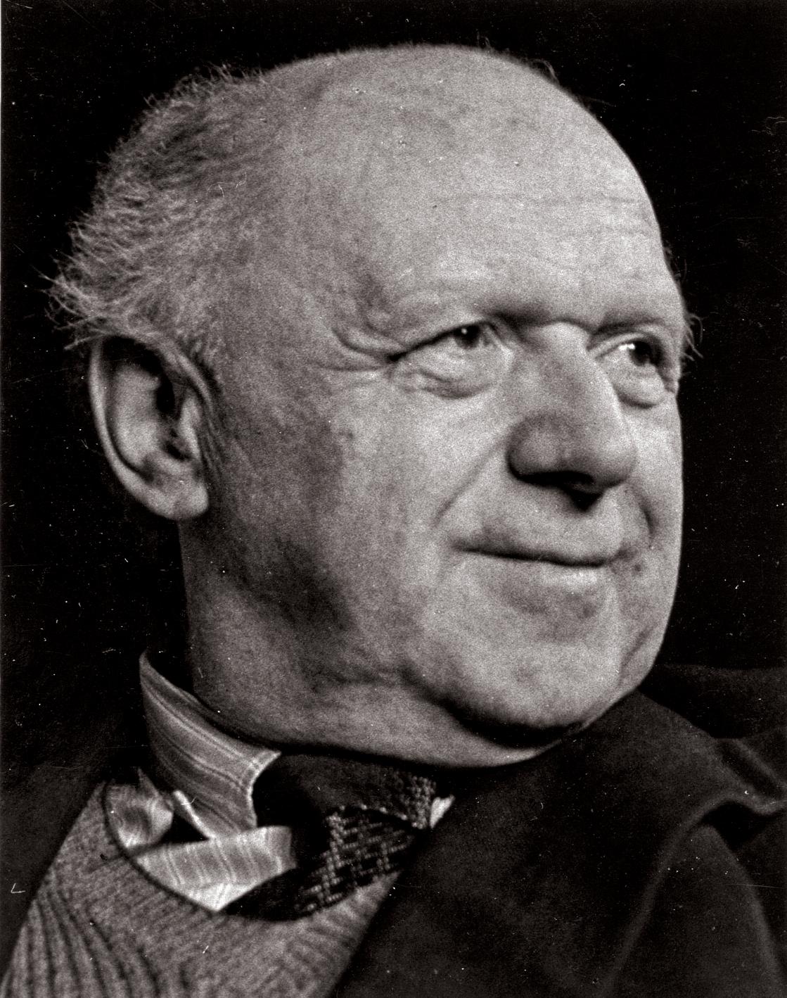
ISOTYPE TEAM - Otto Neurath (1882-1945)
Biography
Otto Neurath started out as philosopher, economist and sociologist with studies in math ematics, physics and history. He taught political economy at the new Academy of Commerce in Vienna, and later earned his professorship at the University of Heidelberg.
Philosophical thought
8 Otto Neurath, 1939.
He is considered one of the greatest per sonalities of Neopositivism since, during his teaching years, he came into contact with some scholars who later formed the first nucleus of the Vienna Circle. Neurath’s philosophical reflection on the language starts from a question: how can we avoid the traditional ambiguities of the lan guage of philosophy in order to understand it?
He argued that "theories are complex linguistic buildings that are not divisible into isolat ed assertions to be related to facts". His position was opposite that of Moritz Schlick. 18
According to him, the meaning of a prop osition consists in the method used to verify it, while in Neurath’s opinion the comparison be tween statements that speak of reality cannot
033History of Isotype
take place outside the linguistic statement itself. Schlick’s position was realistic, the comparison with the fact itself led to the truthfulness of the statement; for Neurath, however, the linguistic dimension is intradescent. His position was an ti-realistic, close to that of Wittgenstein 19 in the Tractatus. The answer to the starting question lies in the use of scientific language, considered by Neurath to be objective and social, able to be used to break down the ambiguities of philosoph ical language. Scientific theories are linguistic constructions that start from existing statements, they are not created from scratch. Neurath compares scientists to sailors who have to rebuild their ship offshore. It is necessary that all the existing ship is used as a support, so thanks to the old beams the ship can be rebuilt gradually.
Neurath's aim was to create a universal language that could give children and workers the same information he gave to his colleagues. He wanted to give them new information about what they didn't know.
His purpose was similar to that of unified science, which intended to reduce the different scientific languages to one. Scientists become examples and assume a decisive role in optimizing the economic and political conditions of that time. Indeed Neurath believed that the living conditions of the population could be measured objectively and communicated with simplicity
19 Ludwig Wittgenstein (18891951), in full Ludwig Josef Jo hann Wittgenstein, (born April 26, 1889, Vienna — died April 29, 1951, Cambridge), Austri an-born British philosopher, re garded by many as the greatest philosopher of the 20th century. Wittgenstein’s two major works, Logisch-philosophische Ab handlung (1921; Tractatus Log ico-Philosophicus, 1922) and Philosophische Untersuchun gen (published posthumously in 1953; Philosophical Investiga tions), have inspired a vast sec ondary literature and have done much to shape subsequent de velopments in philosophy, es pecially within the analytic tra dition. ("Ludwig Wittgenstein, British philosopher," Britanni ca, accessed August 23, 2022, https://www.britannica.com/bi ography/Ludwig-Wittgenstein).
Isotypically. See How To Say
034
It.
20 Thomas E. Uebel, Rediscov ering the Forgotten Vienna Cir cle (London: Kluwer Academic Publisher, 1991), 27-30.
21 Stefano Oliverio, Pedagogia e Visual Education. La Vienna di Otto Neurath (Milano, Edizioni Unicopli: 2006), 148.
and clarity. 20 The Vienna Method comes from this insight since it captures reality in its quantitative aspects through symbols.
Visual education
Neurath’s interest in visual education stems from the belief that his contemporaries were definitely conditioned by the cinema and the abundance of images in which they lived. He thought that the getting of knowledge for the masses took place mostly through sight and during leisure hours. Advertising model, except for its kind of content, was the model to look at to educate masses effectively. Indeed the use of pictures had to be opposite to that used by ad vertising, while advertising praises a single image, visual statistics offer multiple images so that their variety can encourage thinking and information learning.
“A good Bildstatistik has the task of making a specific fact clear and universally understandable [...] Statistical images can be placed side by side without disturbing each other. An advertising image, on the other hand, requires absolute domination”. 21
Visual statistics (Bildstatistik) had to make facts clear and understandable through pic tograms. Statistics and its new visualization
035History of Isotype
diagrams and numbers, but overturning its pur pose that isn’t product promotion anymore, but understanding and education.
The interest in education can be found in all the fifty-years-work of the Isotype movement, in deed Otto Neurath and Marie Redeimeister were pioneers of visual education in a period of skepticism around this kind of learning, to which the academic old method (the one founded on the absolute power of written words) was preferred. 22 Neurath believed that there are things that cannot be said through pictures, but he also believed that in some cases pictures can speak very effectively and with more chances to be remembered than words.
Isotype was a helping language only to be used along with other languages, not a proper language, but for sure it created “connections”. Indeed it is intelligible for a wide group of peo ple, taking age and abilities as variables, so that a well made pictorial chart could be understood both by a child and an educated adult. 23
Neurath’s starting point was the foundation of the Museum for Social and Economic Affairs in 1924, where visual statistics were invented. Its task was to make information clear and accessible through the use of pictograms and its main themes were housing, health and social admin istration. After the birth of the Museum for Social and Economic Affairs in Vienna, cultural centers
22 “Otto e Marie Neurath: Le parole dividono, le immag ini uniscono”, Disegnango lo, accessed March 24, 2022, https://www.disegnangolo.it/ disegnangolo/otto-marie-neur ath-le-parole-dividono-le-im magini-uniscono/.
23 Twyman, Graphic Communi cation Through Isotype, 9.
Isotypically. See How To Say It.
036
24 Ed Annik and Max Bruins ma, Lovely language: Words di vide, images unite (Rotterdam: Veenman Publishers, 2008), 81, https://issuu.com/ontwerpwerk/ docs/lovely_language/212
where artists were trained in the method of visual statistics were also born in Düsseldorf, Dresden and Moscow. With the first diffusion of this new language, thanks to museum exhibitions and the use of symbols, the average citizen could acquire information on topics in the same way as infor mation could be obtained from maps and atlases.
Neurath’s thought
According to Neurath, picture language could not completely replace written words. Its role was intended to be a support language and a replacement only in those few cases when im ages are more effective. Pictures carefully made can be more effective than complex texts, espe cially when the goal is to reach a wide audience and to give a clear view of circumstances, rela tionships and developments (i.e. they can be useful to increase political interest).
It is from this idea that the concept of visual education was born, pictures are more understandable and unambiguous, while words can be understood in different ways, leading to a greater disparity. 24 "Words divide, images unite" is what Neurath said, indeed, words and numbers provide detailed and accurate information, but what is their point when the goal is to provide an insight? This led Neurath and his collaborators to conceive their own visual language, made up
037History of Isotype
of standardized symbols that made the learning process easier.
Basic English
Along with his work on visual statistics, Neurath also worked with the linguist Charles Kay Ogden, who had developed Basic English, a 850-word language for improving international communication, where BASIC stands for "British American Scientific International Commercial". In 1936 Neurath published a brochure on visual sta tistics, where he mixed Ogden’s language with his pictograms in order to strongly improve the data understanding.
In Neurath’s opinion, visual education was primarily linked to political awareness and could become a tool for responsible social action. He devoted himself to communication beyond the boundaries of language and culture until his death in 1945, due to this we refer to him as the first among internationalists. 25
25 Carena, "Introduzione", 9.
9 Otto Neurath with Alvar Aalto and László Moholy-Nagy, 1937.
Isotypically. See How To Say It.
038

039History of Isotype 9

040 Isotypically. See How To Say It. 10
26 Marie Reidemeister stud ied mathematics and physics from 1917 to 1924 at the Uni versity of Göttingen, Germany, while also taking courses at the "Kunstschule" (art school) in 1919.
(“Meet Marie Neurath, the Woman Who Transformed Isotype Into an Internation al Endeavor,” Eye on de sign, accessed March 24, 2022, https://eyeondesign. aiga.org/meet-marie-neur ath-the-woman-who-trans formed-isoytpe-into-an-inter national-endeavor/)
10 Marie Neurath, 1945.
ISOTYPE TEAM - Marie Reidemeister (1898-1986)
Marie and the Isotype
One of the most important figures in the Isotype team was Marie Reidemeister (Marie Neurath, after she married Otto), a scientist, a writer, and a designer who managed to leave her mark in a world where the role of women was often underestimated. Marie and Otto first met in 1924 at the Museum for Social and Economic Affairs (founded by Neurath the year before), dur ing a trip to Vienna while she was still in her studying years. 26
Marie was very impressed by the work that Otto was doing and, on the same day, when she let him know he asked her to join the team, since her enthusiasm was what Otto looked for. Given Marie’s lack of experience and the brevity of the meeting it was almost a gamble to include her in the project, but as we know she paid off both sides. Marie joined the museum’s staff, which had their own creative laboratory to produce the exhibitions’ material. Marie’s official title was "transformer", coined by Otto to describe the ho listic and collaborative role of the creator of the infographics. Always working together, the two built a strong professional relationship that also turned into a sentimental one.
041History of Isotype
Isotype's name
After the outbreak of the war in Austria, the team had to move to the Netherlands. The change of headquarters made the name "Vienna method" inadequate, it was then that Marie summarized the whole method’s concept in the Isotype word, an acronym for International System of Typographic Picture Education. 27 Marie Reidemeister became a key figure for the team due to her internal work, but especially due to her role in the project development, which be came a movement with an international influence.
Publishing and education
While working in The Hague, the team continued to develop Isotype focusing mainly on pub lications and education. Stability, however, was short-lived. In 1940, the bombing of Rotterdam forced them to move to England, where Otto and Marie were separated and imprisoned in intern ment camps. Once released they married and moved to Oxford where they established the Isotype Institute.
Although most of the staff was no longer with them, the Neuraths began working for the state, designing post-war campaigns and prop aganda films for the Ministry of Information. At the same time, the success of one of their first
27 “Meet Marie Neurath, the Woman Who Transformed Isotype Into an Internation al Endeavor,” Eye on de sign, accessed March 24, 2022, https://eyeondesign. aiga.org/meet-marie-neur ath-the-woman-who-trans formed-isoytpe-into-an-inter national-endeavor/.
Isotypically. See How To Say It.
042
publications, "Knopf", led them to consider pub lishing as a profitable option for Isotype. It was then that the London book packaging company Adprint partnered with the couple to produce a series of educational children’s books.
The first sketches would have been included in "Just Boxes" and "Tips for Tots", published after Otto’s death in 1945. After that Marie decided to pursue the Isotype project, but to focus mainly on the educational aspects. In the following years she worked on "Just Boxes”, developing Otto’s idea to look at objects from the inside to really understand how they are made. The educa tional book was published in 1948 as "If you could see inside", its main feature being a special kind of illustrations, which are objects’ cross-sections that reveal what’s inside them. The goal was to show how these objects worked without telling it, but through the use of pictures.
This work method was applied in all of her children’s books that were published for the next two decades.
Since young readers were more interested in images than words, Marie found in children’s books the best way to put in practice the Isotype method. This approach had consequences on the translation and the publication abroad of these books, finally achieving the original objective of Isotype: to become an international language.
043History of Isotype
Dozens of illustrated books were made in the fol lowing years, they stood out from the others for the colorful graphic covers, for the meaning that color assumed and for the use of double pages.
Marie’s legacy
In 1971 she retired from her profession al duties and donated the work archive to the University of Reading, where it is still preserved in the Department of Typography & Graphic Communication. Until 1986, when she died, Marie devoted herself to the collection of biographical materials of her husband and to the reorganiza tion, the edition, the translation of his writings and to the documentation of the entire history of Isotype. 28
28 “Meet Marie Neurath, the Woman Who Transformed Isotype Into an Internation al Endeavor,” Eye on de sign, accessed March 24, 2022, https://eyeondesign. aiga.org/meet-marie-neur ath-the-woman-who-trans formed-isoytpe-into-an-inter national-endeavor/.
11 Marie Neurath visiting the Gold Coast, 1955.
Isotypically. See How To Say It.
044

045History of Isotype 11

046 Isotypically. See How To Say It. 12
12 Gerd Arntz, 1986.
ISOTYPE TEAM - Gerd Arntz (1900-1988)
Biography
Gerd Arntz was born in Germany in a family of iron manufacturers, but since he was young he had different interests such as visual arts. At the age of nineteen he joined the group of progres sive artists of Cologne and, driven by his socialist ideology, described workers’ living conditions and the class struggle through his abstract xylographies. Published in small avant-garde mag azines, his work was noticed by Otto Neurath who was looking for a designer who could create ele mentary signs, pictograms and who could summarize the concepts in a clever way.
Their lives collided during an exhibition in Düsseldorf, Germany, where Arntz and Neurath’s Museum for Social and Economic Affairs partic ipated with their latest works. Otto immediately glimpsed the potential of this artist and arranged a meeting in his studio, soon after Gerd joined the Isotype team to further develop his representa tion method. Later, in 1929, Arntz was made a permanent member of the Gesellschafts- und Wirtschaftsmuseum and moved to Vienna.
During his career he designed about 4,000 pictograms (signaturen), and abstract illustra tions (leitbilder) for the Isotype project.
047History of Isotype
At the same time he worked on exhibitions’ design and publications for the Vienna Museum, with the help of Neurath and his collaborators. 29
Innovations
One of Arntz’s significant contributions was the introduction of linocut, a direct printing technique using a matrix previously made by hand-engraving linoleum, since it is a large print run method it was possible to make hundreds of copies of the pictograms. Side texts were no longer hand-drawn, but printed following the New Typography principles, a layout technique introduced in the 1920s by Jan Tschichold. This included the use of an asymmetric, dynamic layout and the use of sans serif fonts instead of goths or serif. 30
The work in the Isotype team
During his years in Vienna, Arntz greatly im proved the museum’s output quality and soon after he started designing the first visual statistics in the shape of graphs, which would be exhibited at the museum and published in books and mag azines. In the early 1930s, the museum’s staff counted 25 members, from 3 to 6 among these were employed in the graphics department with Arntz.
29 Ed Annik and Max Bruins ma, Gerd Arntz: Grapic Design er (Rotterdam: 010 Publishers, 2010 ), 27-29, https://issuu.com/ ontwerpwerk-laura/docs/gerdarntz_graphic-designer.
30 Christopher Burke, “The Ge sellschafts- und Wirtschafts museum in Wien (Social and economic museum of Vien na), 1925-34,” in Isotype: De sign and contexts, 1925-1971, ed. Christopher Burke, Eric Kindel and Sue Walker (London: Hy phen Press, 2013), 67-68.
Isotypically. See How To Say It.
048
The museum’s printing laboratory was equipped with the most advanced machinery including two hand printing presses and three typographic printers. In addition, there was a carpentry, where exhibitions’ tools were manufac tured, and a photography section with a skilled photographer trained in the use of technical cameras. Arntz’s role as director was crucial in making sure that the whole group was working at its best.
The war years
In 1934, the fall of the socialist government in Vienna forced Neurath, Arntz and their families to leave the country and to move to the Hague, in the Netherlands where Neurath had established the Mundaneum Foundation, a kind of branch of the Vienna museum. Here the Dutch Foundation for Statistics is established to allow the Isotype team to keep on working on visual statistics.
Five years later Otto and Marie Neurath decided to flee to England, since The Hague was no longer a safe place for the jews. Arntz de cided to stay and to keep working for the Dutch Foundation for Statistics, which put him in charge of the graphics department for the publication of visual statistics on "Prosperity and industry in the Netherlands".
049History of Isotype
Arntz’s legacy
Twelve years of working alongside Otto Neurath and twenty-five more with the Dutch Foundation for Statistics, led Arntz to create a huge variety of symbols and illustrations. In 1976 much of his work was collected and entrusted to the Municipal Museum of the Hague, where his first solo exhibition "Gerd Arntz - critical graphics and visual statistics" was organized, followed in 1980 by "Symbols for Education and Statistics", a book by Kees Broos displaying all of his work even more extensively.
In 1988 Gerd Arntz died in the Hague, he was a proud member of the Dutch Federation of Applied Artists, and throughout his career pur sued the goal of enlightening people, helping them to develop their education as citizens, and teaching them to critically evaluate visual information. Arntz and Neurath’s work has become an inspiration for contemporary artists and designers engaged with social issues and today a good part of this artistic legacy is still available in online archives. 31
31 Annik and Bruinsma, Lovely language, 87-88.
13 Gerd Arntz with Flip Bool at Mart. Inspecting the ring-bound publication of Symbols for edu cation and statistics, 1979.
Isotypically. See How To Say It.
050
Isotype

051History of
13

052 Isotypically. See How To Say It. 14
14 Rudolf Modley, 1970.
OTHER PEOPLE - Rudolf Modley (1906-1976)
While in 1925 the Isotype made its way across Europe, and enjoyed great success, it failed to land in the United States. Despite this, the presence of graphs similar to those devel oped by Neurath and his team are recurrent in 1930s and 1940s US government’s document. The growth and popularity of visual statistics in America is due to Rudolf Modley, a little known person in the design field.
Biography
Rudolf Modley was born in Vienna and during his studies at the law university, he worked for the administrative department of the Gesellschafts und Wirtschaftsmuseum. In the summer of 1930 Modley left Vienna for Chicago to find a postdoctoral job at the Academy of World Trade. Neurath didn’t miss the opportunity to ensure a collaboration between the Vienna Museum and the Museum of Science and Industry through Modley.
In 1933, Neurath went to the States to es tablish the "Organizing Committee for the Institute of Visual Education", whose main purpose was to promote Neurath’s method in the United States. Modley managed to take part in this institution as secretary thanks to his two years of work at the
053History of Isotype
Chicago Museum, however in 1934 he founded a for-profit company called "Pictorial Statistics Inc." in New York City starting to work independently on the topic.
In America, Modley is still considered someone who helped the international standardization of Isotype pictorial symbols in the postwar period, but little attention is paid to his strong critics to Neurath’s method.
The Isotype breakup
Modley took distances from Neurath and his philosophy after he moved to America and for mainly three reasons:
Firstly, with Neurath in the Netherlands it was difficult to keep alive those connections that the Gesellschafts und Wirtschaftsmuseum had established abroad.
Second, the newborn New Deal in America was a great opportunity to spread the Vienna method since one of its objectives was to explain data to people. That data happened to be those representing the entire social and economic condition produced by the recent crisis.
Finally, the four years of experience in the States led Modley to different opinions than Neurath’s, on topics such as the method’s visual rules and mostly those related to data analysis.
Isotypically. See How To Say It.
054
In 1936, Modley’s "How to Use Pictorial Statistics" was published, he developed the first comprehensive study of pictorial statistics in the United States also including lots of criticism on Neurath’s methods. He writes: "None of the or ganizations which work in the United States at the present have adopted Dr. Neurath’s system to its full extent.
Most of them feel that his approach is too rigid to permit general adoption of the method". Modley became the central figure of a phenomenon called "Americanization of the Neurath method" since he was able to influence all the organizations that in those years were working on pictograms.
Modley’s criticism
In Modley opinion symbols must be designed according to cultural differences, the stiffness of Neurath method, which aimed at a unique and international language, was a utopian path to follow. Modley argues that the best way to make pictograms easy to understand is to grad ually make society accept them as a communication tool. Symbols must first become part of the language for a small audience, for this reason they must be designed for a specific community of people. Modley identifies in Neurath’s stand ardization process another pain point: he argues that it must be undertaken through cooperation
055History of Isotype
between partner companies. He first praises the Isotype’s attempt to establish international relationships, then again criticizes the excessive strictness of Neurath’s method and blames him for the failure of these collaborations.
Symbol Sheet
Around 1936 Modley did something that Neurath never managed to do, publishing and selling the "Symbol Sheets". These were printed sheets that contained 95 symbols themselves classified into 25 groups, in order to meet the needs of anyone who wanted to create visual sta tistics individually.
In 1940, Pictorial Statistics Inc. changed its name to "Pictograph Corporation" with Modley at its head. In the following years the company published "Pictorial Symbols", a book collecting a thousand symbols, its purpose was to help all those who wanted to master the rules of picto graph and those who wanted to experiment the use of symbols. Providing a tool to get closer to a kind of communication that would overcome linguistic and educational differences.
The distribution of ready-made symbols is the beginning of a bottom-up and step-by-step process that made possible the spreading of the picture language.
Isotypically. See How To Say It.
056
32 Hisayasu Ihara, “Rigor and Relevance in the Internation al Picture Language Rudolf Modley’s Criticism against Otto Neurath and his Activi ty in the Context of the Rise of the “Americanization of Neurath method”,” (2009).
Neurath’s work was aimed at internationality, Modley instead regarded pictorial statistics as a new method that could be applied by anyone. Until his death in 1976 Modley maintained his interest in standardizing symbols both in America and inter nationally, even collaborating with Marie Neurath and Henry Dreyfuss in a project to create a dictionary of graphic symbols for Western countries. 32
Isotype
057History of
058 Isotypically. See How To Say It.
Society and Isotype02
059History of Isotype
060
33 Ellen Lupton, “Reading Iso type,” Design Issues, vol. 3, no. 2 (Autumn, 1986): 47.
34 Frank Hartmann, “Visualiz ing Social Facts: Otto Neurath’s Isotype Project,” in European Modernism and the Informa tion Society: Informing the Pres ent, Understanding the Past, ed. Warden Boyd Rayward (Lon don: Routledge, 2016), 280.
35 Otto Neurath, “Invento ry of the Standard of Living,” Zeitschrift für Sozialforschung vol. 6, no. 1 (1937): 140-151.
36 Mayr and Schreder, "Isotype visualization," 137.
37 Quote by Otto Neurath. (Mayr and Schreder, "Isotype visuali zation," 137)
SOCIETY AND ISOTYPE
The picture language developed by Otto Neurath and his team aimed to provide a glob al model for education, to unite different people through a universally readable visual language 33 and also to politically and socially empower peo ple: “Neurath’s project was deeply embedded in the socialist struggle for a new society. He vigor ously expressed his ideas on questions of how to represent scientific results and how to transfer knowledge into society”. 34
In Neurath’s opinion, political and economic conditions could be improved through the picture language since “general living conditions (Lebenslagenkataster), such as lodging, nutrition, clothing and working hours, could be improved if they could be measured objectively, using meas ures based on a strictly scientific foundation of empirical observation and logical analysis”. 35 Neurath’s work as head of the Gesellschaftsund Wirtschaftsmuseum can be seen as a result of his socialist political affiliations. 36 Indeed, he imagined statistics as a tool for social and edu cational purposes: “Statistics is a tool of proletarian battle, statistics is a necessary element of the socialist system, statistics is a delight for the international proletariat struggling with the ruling classes”. 37
061
In a context where active political par ticipation and civic education were an exclusive privilege of those who had been educated, Isotype’s visual statistics aimed to break down these social differences, to meet the needs of a wide audience.
By providing information accessible to everyone, this method intended to encourage citizens to rethink the learned concepts and then apply them. Informing was one of the main ob jectives, but motivating people to act was even more so. 38
Isotype: what kind of design?
Although the invention of the Isotype sys tem dates back to the 1930s, its impact on the modern world of visual information has been cru cial. It has contributed to the invention of a design method that is still used today and has made information more accessible to the masses, irreversibly changing the way information is learned. The Isotype’s purposes have been reached through a design method (picture language) that we still find today in two types of design: social-oriented design and information design.
Social-oriented design is the application of design methods aimed at addressing complex human problems, separating the design process from the artifacts it produces and applying it to
38 Mayr and Schreder, "Isotype visualization," 136.
Isotypically. See How To Say It.
062
39 “Social Design,” Cono De sign Studio Milano, accessed March 4, 2022, https://www. conostudio.com/social-impact.
40 Rune Pettersson, Informa tion Design: An introduction (Amsterdam, John Benjamin Publishing Company: 2002), 18, Google Books.
41 “L’Isotype”, Alchimie Gra fiche, accessed March 4, 2022, https://www.alchimiegrafiche. com/isotype/.
42 Red Vienna was a name for Austria's capital between 1918 and 1934, when the Social Democratic Workers' Party had political control over Vienna. (Anson Rabinbach, The Austri an socialist experiment: social democracy and austro-marx ism (Boulder: Westview Press, 1985), 4).
complex social challenges. It’s a design that goes beyond the creation of a product or service, the goal is to think out a complex, resolutive design system that takes into account all the aspects that can affect society, environment, culture and economy. 39
Information design is a way of presenting information so that it can be understood effec tively. This design method mainly refers to the visualization of information, beyond the aesthetic and artistic aspect.40 In the Isotype team, there was a figure who took care of this process of making the information understandable and effective: the transformer. The spread of Isotype principles throughout Europe laid the groundwork for the development of information design in the 20th century.41
Subject of this chapter is the relationship between society and Isotype seen through the lens of the Isotype’s twofold purpose: the social and the educational one.
SOCIAL PURPOSE
The historical situation that the Red Vienna42 was experiencing after the First World War was a fertile ground for the development of the Gesellschafts- und Wirtschaftsmuseum, since there was a lot going on to inform people about.
Isotype
063Society and
On 2nd November 1918, Austria became a republic for the first time. After the Habsburg dynasty’s collapse, adult men and women gained the right to vote and, at the same time, new difficulties arose. Refugees from the actual Ukraine flooded the capital Vienna. The middle class plunged into poverty after buying worthless war bonds. Spanish flu and syphilis devastated the country, while food supplies were rationed.
Intellectuals and politicians of the time, de spite the social and educational conditions, believed that Austria could become an example of democracy. One of these intellectuals was Otto Neurath, who through his museum showed to the Viennese citizens what was happening to their country and how the government was acting to improve their lives. Neurath approached graphic design as a means to an end, the aim was to educate people around the world on social and economic issues, making comparisons between present and past, between Vienna and other cities, to pave the way for social change. 43
Humanization of knowledge
Since democratization of knowledge is one of the main themes of Neurath’s studies we must introduce the concepts of popularization and hu manization. They are both means to an education process of knowledge’s democratization but they promote a different approach from each other.
43 Micheal Twyman, Graph ic Communication Through Isotype: Exhibition Catalogue, (Reading: University of Reading, Department of Typography & Graphic Communication: 1 May 1975), 7.
Isotypically. See How To Say It.
064
Popularization wants to teach simplified complex contents, the ones that the established education system expects to be passed on and understood by everyone.
Humanization builds knowledge based on everyday life’s language. It involves the use of a vocabulary familiar to most of the population, while the more complex expressions would be introduced gradually.
The main risk of the first process is, howev er, to foster, among uneducated people, a sense of inferiority that communicators may rather want to avoid. Neurath thought on this topic was that there was a profound need to find “a mean that could strengthen the self consciousness of those who are learning while preserving them from the insecurity that often accompanies the half-knowledge (halbwissen) acquired through populari zation”. For this reason Neurath argues that the teaching process must be done in accordance with the previous knowledge of the man in the street, basically the adding knowledge must be built on the basis of what surrounds these people (home, garden, streets).
This is what humanization does, since it builds knowledge progressively with a bottom-up process that goes from the simple to the complex.
065Society and Isotype
According to Neurath between these two methods only humanization has an authentically pedagogic aim. Its pedagogical relevance lies in the way it builds a scientific attitude in people, making them capable of being critical and ready to discuss an argument, making democracy truly possible. 44
For the reason above this approach was largely applied by Neurath in his museum, in contrast to the more widespread pedagogical ap proaches at that time. (see below, “educational purpose”, p. 069)
Social objectives reaching
The idea of turning the Gesellschafts- und Wirtschaftsmuseum into a place for learning stems from Neurath’s idea of addressing ordi nary people. The modern museum had to be brought to people through visual and practical experiences, and not the other way around. It was not a treasure chest of rare objects, but an ed ucational museum showing what characterizes people’s lives.
The museum’s work focused mainly on the political and economic context of Red Vienna. Inside the museum it was explained to people how municipal taxes were spent, there were graphs and diagrams on the new housing pro gram and an attempt was made to promote the fight against tuberculosis, venereal diseases and alcoholism. Health education in every aspect was proposed in the shape of images. In this way, even a foreigner who wanted to know about Vienna and Austria could get an overview. 45
44 Oliverio, Pedagogia e Visual Education, 172.
45 Burke, Kindel and Walker, Isotype: Design and contexts, 524.
Isotypically. See How To Say It.
066
46 (Otto Neurath’s Atlas “Socie ty and Economy”: Design, Con tents, and Context, https://www. isotyperevisited.org/Ihara_Soci ety_and_Economy.pdf)
47 Banu İnanç Uyan Dur, “Otto Neurath, Isotype picture lan guage and its reflections on recent design”, The Online Journal of Communication and Media, vol.1, no.3 (July 2015): 2.
15 "Entwicklung der Kartoffel produktion seit 1860" , Isotype chart for the Gesellschafts- und Wirtschaftsmuseum exposition.

One of the most significant projects carried out at the Gesellschafts- und Wirtschaftsmuseum was the Atlas of society and economy, a collec tion of one hundred statistical graphs and thirty textual tables. It was published in 1930 for the 100th anniversary of Bibliographisches Institut Leipzig, a publishing house of the time and commissioned by the Leipziger Bibliographisches Institut. 46 The main feature of this atlas is the use of a standardized language: "By analyzing sketch es, notes, and other sources, it is clear that the makers of the Society and Economy' attempted to standardize not only the atlas's symbols, but its entire design, including its colors, maps, format, and typography". 47
The single cards of this collection were partly intended for the schools. Indeed it was during these years that the socialist reform of ed ucation was taking place and the Isotype material was used experimentally. It was a success, the method proved itself functional for discussing high-level content in the school environment.
Neurath’s pictorial language spread rap idly and newspapers around the world took their
067Society and Isotype
15
cue from his method of creating infographics to share all kinds of information. For this reason, he began to write and publish books on Isotype to make it (and its rules) international.
The Isotype is one of the best-known ex amples of innovation in graphic design, a result of its attempt to meet social needs. Many impor tant developments in graphic design stem from changes in society, in association with the efforts to unify political or religious communities. 48
The method also spreaded in Western Nigeria, Africa, when in the 1950s Marie Neurath was commissioned to design infographics for civic education and the new electoral procedure. Here the method proved itself effective, even if adjustments had to be made to adapt it to the new context, culturally different from Europe. 49

48 Twyman, Graphic Commu nication Through Isotype, 7. 49 Christopher Burke, “Isotype representing social facts picto rially,” Information Design Jour nal, vol. 17, no. 3 (January 2009): 211-223.
16 "Leprosy can be stamped out", poster leaflet, 1955. Iso type Collection, University of Reading.
Isotypically. See How To Say It.
068
16
50 Otto Glöckel (1874-1935)was a social-democratic pedagogist, politician and school-reformer during the First Austrian Repub lic (1919-1933).
(“Otto Glöckel”, Das Rote Wien, accessed March 4, 2022, https://web.archive.org/ web/20160328003859/http:// www.dasrotewien.at/gloeck el-otto.html).
51 Oliverio, Pedagogia e Visual Education, 141-142.
52 We refer to “Austrian social ists” as an enlarged group (and not only those strictly related to the education field) which was concerned about mass educa tion, since their aim was to po litically empower the working class through instruction.
53 Oliverio, Pedagogia e Visual Education, 144.
54 Ibidem, 145.
EDUCATIONAL PURPOSE Intro - Vienna’s pedagogical context
Vienna has a tradition of widespread popular education, here the scholastic reform pro moted by Otto Glöckel 50 took place, breaking the Bildungsprivileg (cultural and educational privilege) and affirming the Einheitschule (basic unitary school).
Education could rely on a network of institutions and initiatives that were open to everyone, especially to those who had not been able to take advantage of school training such as adult work ers. 51 However, it has been remarked that the Austrian socialists 52 lacked attention to the real needs of the uneducated, since their educational efforts relied on a top-down culture, unsuitable to real and historically determined conditions. 53 Even if it was a common opinion that the ex tension of the right to vote (promoted by the Red Vienna) had to be supported by a significant in crease of the education attainment, the solutions by the popular educational institutions were the same as ever. Indeed for the education of adults were provided overviews on traditional disciplines (history, natural sciences), with the addition, starting from the second half of the 19th century, of an interest in mechanics that led to the creation of technical museums to act as training institutes. 54
069Society and Isotype
Adult education projects had a strong liter ary imprint, and based itself on an absolute belief in the power of the written word, so that editorial media (books and newspapers) were privileged. This bibliocentric approach believed in the effec tiveness of the “high culture” and it was also rig orous in the choice of which written word could be passed on. Just as the Volksbildungsverein, an older Viennese educational association, already did in the past, choosing books on the ba sis of very strict pedagogical principles and without any concession to lighter texts. 55
Moreover, the common workers, were expected to use the little free time they had to close the cultural gap between them and the wealthy classes, attending conferences and reading books they could not understand (since they spoke mostly dialect) thereby amplifying their feeling of distance from the world of Bildung (education) in a moment in which they should be raised to it. 56
At that time, Eduard Reyer 57, who has been considered Neurath’s ideological precursor by Oliverio 58, took distances from the stiffness of this education’s method: “We must warn against too broad and tendentious censorship because too much rigidity does not convert the majority of readers but rejects them. These people escape our influence and read the worst material else where, entirely according to their own taste.”59
55 Oliverio, Pedagogia e Visual Education, 144.
56 Oliverio, Pedagogia e Visual Education, 145.
57 Eduard Reyer (1849-1914) was a geology teacher for the Vienna University and a former referent for library activities for the Volksbildungsverein, who in 1897 founded his own institu tion, the Zentralbibliotek, where the books’ purchasing wasn’t motivated by “high” principles only. (Oliverio, Pedagogia e Visual Education, 142)
58 Oliverio, Pedagogia e Visual Education, 142.
59 Ibidem.
Isotypically. See How To Say It.
070
60 Ibidem.
61 Referring to cultural and edu cational privilege.
Yet, it must be noticed that Reyer was quite aware of the limits of popular education: “Society’s recovery cannot be expected from popular libraries. Offer healthy living conditions and no man will ever read those pathological books that flood the book market”. 60
Intro - Otto Neurath’s Position
On this background, Neurath’s work can be seen as a battle for the scientific conception of the world through visual data that, on the one hand, allows for the democratic diffusion of knowledge and, on the other hand, counters the bildungsprivileg 61 and the status quo maintenance. Indeed Neurath took distances from the Austro-Marxist educational policy and revised some points of that Viennese “democratization of knowledge” process, orienting it towards more practical economic facts.
According to Neurath, popular education must be equipped with a place in which the trans mission of conceptual tools and notions for the understanding of social phenomena is possible in a pedagogically aware and effective way: the social museum.
This institution (the Gesellschafts- und Wirtschaftsmuseum - Museum for Social and Economic Affairs) was established in 1924 by the municipality of Vienna, by Neurath’s will and
071Society and Isotype
under his guidance, with the financial support of the Wiener Arbeiter- und Angestelltenkammer (Viennese chamber of workers and employees). Presenting his pictorial statistics to the English public for the first time, in 1931, Neurath wrote: “Everyone understands images; every one likes to look at pictures. In the age of the eye, schools and popular education must show in images and animated films everything they have to necessarily say. The Museum for Social and Economic Affairs in Vienna tries to do this on an international basis. It brings its images above all to illiterate people all over the world, whom we too often forget in our daily work. But imag es have yet another quality: they are the same for men of all languages and are not overloaded with emotional tones like our words”. 62
The old pedagogical method, based on written word, is now opposed to the Bildpädagogik (visual pedagogy, of which Neurath traces back the predecessor in Comenius’ Orbis Pictus 63), that has to be preferred to the first one whenever possible. As stated by Neurath:
“What can be shown with an image must not be said with words”. 64
This new method brings with it a new awareness: visual statistics represents a prole tarian weapon in the struggle for social power. “It
62 Oliverio, Pedagogia e Visual Education, 160.
63 Comenius (1592-1670) is a philosopher frequently men tioned as a model by Neurath in the Bildpädagogik texts. (Ol iverio, Pedagogia e Visual Edu cation, 147).
64 Oliverio, Pedagogia e Visual Education, 141.
Isotypically. See How To Say It.
072
65 Ibidem, 147.
Ibidem, 150.
means encouraging socialist thinking if statistics and its method are investigated. The educational privilege in this field must be broken quickly. No workers' school, no workers' newspaper, no workers' cinema without statistics or statistical visual izations understandable to all”. 65
Bildstatistik effectiveness
The Isotype system theorizes “amount pic tures” and “number-fact pictures” that respectively give statistics or relation between amounts of different things.
Pedagogical intentions define their main characteristics: graphics must leave out as many details as possible and still be understandable; whoever observes them must be able to easily grasp the represented social phenomena and to establish comparisons. Relevantly, since what is sought is not artistic elegance, but the ability of the image to be immediately understandable and readable without (too many) written captions, the result is a non-naturalistic graphic.
“It is pedagogical intentions that decide what is welcomed in a graphic presentation and what is not. In general, in a statistical presentation everything will tend to have a meaning, pos sibly even the width of the columns within which something is represented.”
073Society and Isotype
66
66
Graphic symbolizations (curves and tables) of statistical explanations are similar to bildstatistik since they both depict data, but there is a substantial difference. Diagrams that present curves, although being more immediately under standable than the numbers, generate a sense of unfamiliarity in those observers without particular mathematical skills.
Depicting social phenomena using simpli fied images, instead, doesn’t reject the observer, but rather allows her to immediately grasp the core of the question submitted to her.
“To most men the reading of long lines of numbers is a great trouble-they put down a book when they see it has in it numbers or curves. But pictures are an attraction. [...] We may even say that almost no knowledge at all is necessary of the words of the picture language -the signs or of the rules for talking this language-the system”.
For sure diagrams are way more accurate in depicting data than bildstatistik but it can be neglected if we consider that it’s not that useful for the educational aim. Indeed in Neurath’s opinion it is better to keep simplified quantitative images in mind rather than forget the exact num bers. 67 Since this method doesn’t give a full ac count of all the facts, but it’s rather a selection of them, a number of experts in science didn’t sup port this system pointing it out as a danger to the rules of the science. But the needs of education are different from those of science.
Isotypically. See How To Say It.
074
67 Ibidem, 151.
68 Otto Neurath, International picture language, (London: Ke gan Paul, Trench, Trubner & co. Ltd., 1936), 24.
69 Oliverio, Pedagogia e Visual Education, 156.
70 Neurath, International Pic ture Language, 24-26.
i.e. This visual statistic about births and deaths in Germany (fig. 1) doesn’t rely on rigorous information but offers a quantitative idea of the represented phenomen. Exact numbers are less important than relationships, data can be compared ictu oculi between themselves and through years, so that the observer can gain a truly lasting knowledge that relies on visual mem ory. It becomes obvious that if teaching-pictures are used, information has a better chance to be kept in mind by observers.
As Neurath says in a way that is still actual, schools are poorly rooted in the past and “the general teaching tendency is the outcome of the old opinion that pictures are only for men with out knowledge of reading and writing, and not for men of good education”. 68
Nevertheless many risks are linked to the use of words, in particular to the education by words: it’s possible for a student to create “senseless connections, the elimination of which is often difficult” 69 or to “take note only of details and to see nothing of the general view”. 70
Teaching Bildstatistik
The Bildpädagogik is, according to Neurath, of great value if we consider that it allows us to heighten the general education level, making the pupils' education free from its dependence on the teacher's ability.
075Society and Isotype
“The first need for teaching by pictures is to give the teacher good teaching material. Teaching by the eye is much more dependent on good teaching material, and much less dependent on the powers of the teacher than other forms of teaching. The better the teaching material is, the less teaching experience is necessary, which makes possible a higher general level of educa tion” . 71
In short, it’s essential to be a good teacher to develop effective teaching pictures, but it’s not necessary to be a good teacher to show these charts.
“The teaching system which has the greatest value is not the one which in the hands of good teachers gets the learners furthest, but that which makes it possible for the least able teach ers to do good work”. 72
While, as Neurath said, it is sometimes difficult to say in words what can be clear by pictures it must be clarified that even through picture language it’s hard to make a picture of some sim ple statements. 73 A well-working education system and, consequently, its teachers have to see which of the two languages works best for which purpose, eventually mixing them. A good teach er keeps out all the unnecessary details, since is conscious that only a little of knowledge will be kept in mind. That’s why teaching pictures can
71 Neurath, International Picture Language, 26. 72 Ibidem. 73 Ibidem.
Isotypically. See How To Say It.
076
74 Ibidem.
75 Ibidem.
76 See chapter 1 “Visual educa tion” p. 035
77 Neurath, International Picture Language, 28-29.
only be produced with the help of a good teacher, who is aware of the real needs of education. 74
Neurath stated that a good teaching-picture gives all the information in three looks: at the first look all the important facts are given, at the second the less important points can be seen and at the third details can be seen. If at the fourth look other features can be seen, the teaching picture is bad. 75 Comparing teaching-pic tures with advertisement pictures once again 76 , it can be said that while every advertisement is in competition with each other, teaching-pictures have to be similar as far as they give the same de tails. This substantial difference in the approach relies on different objectives: the advertising pic ture aims to put every other advertising picture out of the memory of the onlooker, while teaching pictures are a part of a unit that works better if it acts as such. 77
077Society and Isotype
078 Isotypically. See How To Say It.
Limits and controversies 03
079History of Isotype
080
78 Günther Schreder, "Redis covering Isotype from a Cog nitive Perspective" in Diagram matic Representation and Inference. Diagrams 2018, ed. Alan F. Blackwell, Kim Marri ott, Atsushi Shimojima, (Cam bridge: Springer Cham, 2018), 1.
79 Pinker, Steven and Paul Bloom. "Natural language and natural selection." Behavioral and Brain Sciences, vol. 13, no. 4 (1990): 708-709.
80 Burke, Kindel and Walker, Isotype: Design and contexts, 283.
LIMITS AND CONTROVERSIES
The Isotype is one of the most effective systems ever invented to communicate statis tical information. After almost a century from its birth it is still used in designing information and wayfinding78, but despite all these merits, it has many limits.
These limits may depend on the method itself, which can’t express some concepts and which is much less dynamic than the society for which it is designed, since, differently from verbal language, it can’t evolve without someone who puts active effort in this activity. 79 Some other limits depend on the early choices made by the Isotype team. As a matter of fact, their research has many limits in terms of method’s disclosure (specifically about the transforming process) that, willingness to educate the masses, has never been complete. Furthermore the Isotype is una voidably a child of its times when it comes to respecting diversities and gender equality. Indeed it is important to underline that the method was developed during the 30s by a group which was mainly made up by male europeans. 80
Through this chapter it will be possible to appreciate different points of view from those of the members of the Isotype team, thereby
081
questioning the efficacy and the correctness of the method.
LIMITS
Obsolescence
The Isotype is a communication system that relies on visual language to communicate concepts and data. It has always focused on concrete and countable aspects of history and society such as demographics, manufacturing, trade and transport which were the primary fields of interest of the Gesellschafts- und Wirtschaftsmuseum. 81
While extremely effective in representing such items, it lacked adequate representations for the expression of abstract constructs including “trust in institutions, values, expectations, life satisfaction”. Thus, being unable to represent many contemporary survey or panel items is to be considered one main reason for Isotype's decline. 82 It must be said that this kind of limit is in trinsic to the visual method that was chosen in the first place for being the only existing inter national language that could work for Neurath’s project. Otto Neurath himself foresaw and made clear another limit linked to method’s obsoles cence, which is signs’ aging. "We are not able to take over the old signs as they are. Adjustments
81 Mayr and Schreder, "Isotype visualization," 143.
82 Ibidem 83 Mayr and Schreder, "Isotype visualization," 139.
84 I.e. The Isotype’s pictograms are strictly connected to “the graphical symbols for use on public information signs” which is the name for a standard (ISO 7001) that defines the use of a specific set of signs for public information. (Mayr and Schred er, "Isotype visualization," 139)
85 “Functional aesthetics ad vocate a clear and simplistic design in which parsimonious use of ink is one of the guiding principles, whereas decorative illustrations are said to inhibit a clear look at the data” (Mayr and Schreder, "Isotype visualization," 142)
86 Mayr and Schreder, "Isotype visualization," 142.
082 Isotypically. See How To Say It.
87 Edward R. Tufte is Professor Emeritus of Political Science, Statistics, and Computer Sci ence. His research concerns statistical evidence and scien tific visualization. He is a Fellow of the American Statistical As sociation, the American Acad emy of Arts and Sciences, and the Society for Technical Com munication. (“Edward Tufte,” Yale University, accessed Au gust 17, 2022, https://politi calscience.yale.edu/people/ed ward-tufte).
88 Such as 3D effects, back ground images, shadow ef fects, unnecessary borders and unnecessary grid lines ("The Manifesto of the Data-Ink Ratio," Speedwell, accessed August 17, 2022, https://speedwell.com. au/insights/2019/the-manifes to-of-the-data-ink-ratio)
89 "The Manifesto of the Da ta-Ink Ratio," Speedwell, ac cessed August 17, 2022, https://speedwell.com.au/in sights/2019/the-manifesto-ofthe-data-ink-ratio
90 Mayr and Schreder, "Isotype visualization," 142.
91 Ibidem.
17 "Data Ink Ratio", Edward Tufte, 1983.

have to be made in relation to the forms of today and tomorrow”. 83 And even if Otl Aicher’s work inspired today’s information design field84, picto grams designed almost a century ago look unavoidably outdated. The contemporary aesthet ic paradigms, as a matter of fact, are based on functional aesthetics 85 which are clearly incoherent with Aicher’s design choices. 86
One of the functional aesthetics parame ters is the data:ink ratio, theorized in 1983 by the American statistician Edward Tufte 87 to evaluate the amount of distracting elements 88 in data visualization. 89 The proportion puts in relation the amount of ink used to actually represent data with the total amount of ink of any chart. Nearer to one is the resulting factor, the more effective the chart is. 90 Isotype visualizations have a low data:Ink ratio since they use not only Data-Ink, but also Non-Data-Ink (ink that could be erased without losing information) including unuseful details in charts. 91
083Limits and Controversies
17
In the 30’s the Isotype was one of the most effective and innovative methods of visual communication, but today, we suggest that it needs the intervention of contemporary minds to keep up with the times.
Objectivity
The Isotype team believed that the Isotype could present data in a neutral way, leaving the observer free to judge by herself. As to this feature of the language, Otto Neurath argued that “on controversial problems both sides could get their arguments from the same chart”. 92
However, this is not entirely correct if we consider that objective data can also be used to communicate subjective ideas. Picking which data to display and deciding how to display is already a subjective choice and is crucial for the message that visual statistics communicate. 93 The Isotype Team itself, while working in the Izostat for the Russian government, used this method’s blind spot for Soviet propaganda. (See “Russia”, chapter 1).
Emotional associations
Another point is that emotional associa tions have a remarkable role in decoding infor mation and must be kept in mind while talking about statistics objectivity.
92 Schreder, "Rediscovering Isotype from a Cognitive Per spective", 3.
93 Annik and Bruinsma, Lovely language, 147.
18 Isotype chart "Production of tractors in the USSR".
19 "ИЗОСТАТИСТИКА" Isotype in Russia.
Isotypically. See How To Say It.
084


085Limits and Controversies 18 19

086 Isotypically. See How To Say It. 20
94 Annik, Ed and Max Bruins ma. Lovely language: words di vide, images unite. (Rotterdam: Veenman Publishers, 2008), 132-133, https://issuu.com/ ontwerpwerk/docs/lovely_lan guage/212.
95 Ibidem
20 "31 days in Iraq", Adriana Lins De Albuquerque, 2007.
Max Bruinsma, a design critic, demon strated how the visual language theorized by the Isotype team is not as neutral as Neurath thought. A practical example is given by the visual language used by Adriana Lins de Albuquerque's in representing the number of deaths resulting from Iraq’s war (fig. 20).
The chart, indeed, is far from being neutral or objective since it is meant to induce an emotional reading. 94
Bruinsma analyzed it: “The exact numbers in the statistics are, although readable, not the first information we digest; what we see is a vast graveyard. In other words, the fact that we cannot read the exact amount of deaths at first glance is probably the most important information this graph commu nicates: too many dead people. And the choice in this graph for a woman holding a baby to sym bolize 'civilians' is of course a strong example of visual rhetorics.” 95
As Bruinsma exemplifies, visual statistics can carry invisible meanings that, if unnoticed, can be dangerous especially for uneducated readers.
For this reason, the viewer must always take a critical look at Isotype visualization and statistics in general to understand what could be the implicit meanings and how they could influ ence her perspective on the topic.
087Limits and Controversies
CONTROVERSIES
Effectiveness
Isotype visualization concept was to sup port the understanding and memorizing of com plex data, although the effectiveness of this method is not without controversy. Some studies 96 showed how depictions are not always as effective as words can be when it comes to gen eralizing ideas and enhancing comprehensibility. Glyphs and depictions have different peculiar ities. Glyphs are better for expressing abstract thought while depictions are recommended for concrete and instant communication. 97
Glyphs are perfect to communicate the invisible since they are not iconic and, therefore, they do not distract portraying the visible. Yet, they still have the advantage of rapid access to meaning just like visual communication.
Depictions, on their side, have the benefit of distinctiveness and greater memorability than glyphs other than accessing meaning faster. 98
Barbara Tversky 99, professor of Psychology at Stanford University and Columbia Teachers College who studied the Isotype method and its likenesses aspects (pictogram’s similarities with the identified objects), argued that the Isotype System is not successful for deeply understand ing data. 100
96 I.e Cognitive psychology studies (Jansen, 2009) proved how only some of the isotype guidelines actually help un derstanding data (encoding of colors, partial pattern recogni tion).
97 Barbara Tversky, "Visualizing Thought," Topics in Cognitive Science, vol. 3, no. 3 (2011): 517.
98 Tversky, "Visualizing Thought," 516.
99 (“Barbara Tversky,” Goog le Scholar, accessed August 17, 2020, https://scholar.goog le.com/citations?user=ykz KVEYAAAAJ&hl=en)
100 Tversky, "Visualizing Thought," 516.
Isotypically. See How To Say It.
088
101 Ibidem
102 Mayr and Schreder, "Iso type visualization," 143.
103 Ibidem
104 The process that makes it possible to translate data into Isotype charts. (Visible lan guage, Pia Pedersen, 1468)
“Just as likenesses can facilitate compre hension and memory, they can also interfere. Because depictions are specific and concrete, including them when they are not essential to the meaning of a diagram can inhibit generalization to sets of cases not depicted”. 101
This means that Isotype visualization may, due to likenesses, deter the user from deeply understanding a topic by hindering her from ap plying the same reasoning to similar cases which are not depicted.
Between élites and masses
Thanks to highly pictorial icons and their intuitive arrangement, the Isotype is a highly intuitive system, but it still has to be learned to be understood. 102 A knowledge of visual grammar, for instance, is crucial for Isotype charts’ under standing. Otto Neurath in fact “invested efforts into implementing Isotype in the school system” in order to make “the man in the street” acquire visual literacy. 103
However, it is way more difficult for people, such as contemporary designers, to learn how to produce Isotype depictions and charts due to lacking documents that provide clear and scien tific instructions for the transforming process. 104
089Limits and Controversies
“While the documentary notes produced by O. and M. Neurath do provide insight into the Isotype method, they do not offer very clear de scriptions of the central process of transforming, i.e. of analyzing, selecting, ordering, and then making visual some information, data, ideas, im plications. This would instead appear to be a very intuitive process, more akin to tacit knowledge held on their part”. 105
Since it doesn’t allow the contemporaries to fully apply the method and to perpetuate it, this deficiency counters the primary aim of the Isotype system, which is, once again, instructing masses and making knowledge available to anyone regardless of the people’s social status.
Another controversial and little studied aspect is how the team conducted their empirical studies. Among the others, a study that the Isotype team conducted was related to field observations in primary schools and at the Gesellschafts- und Wirtschaftsmuseum which “helped to gain a more comprehensive under standing of the Isotype technique”. 106
However, to date, there is only limited em pirical evidence available on Isotype studies and theories. Indeed Neurath’s claims on Isotype vis ualizations have scarcely been inspected and the very effectiveness of the method has never been demonstrated, neither by historical documents nor by newer research. 107
105 Mayr and Schreder, "Iso type visualization," 143.
106 Schreder, "Rediscovering Isotype from a Cognitive Per spective", 3.
107 Ibidem 108 Related to “Eurocentrism”. Eurocentrism has been var iously defined as an attitude, conceptual apparatus, or set of empirical beliefs that frame Eu rope as the primary engine and architect of world history, the bearer of universal values and reason, and the pinnacle and therefore model of progress and development.
Sundberg, Juanita. “Eurocen trism” in International Encyclo pedia of Human Geography. (USA: Elsevier Science, 2009), 638-643.
Isotypically. See How To Say It.
090
109 "The Dark Side of Picto grams. How sports—in particu lar the Olympics—perpetuate multiple systems of oppres sion," Futuress, accessed July 28, 2022, https://futuress.org/ stories/the-dark-side-of-picto grams/
110 “Depicting Race in Ico nography,” The Noun Project Blog, accessed July 28, 2022, https://blog.thenounproject. com/depicting-race-in-iconog raphy/
111 Ibidem
112 Ibidem
113 Nikolow, Sybilla. "Words Di vide, Pictures Unite. Otto Neur ath’s Pictorial Statistics in His torical Context." In Volume 2 Volume 2, ed. Richard Heinrich, Elisabeth Nemeth, Wolfram Pichler and David Wagner, (Ber lin, Boston: De Gruyter, 2013), 92.
EUROCENTRISM AND STEREOTYPES
The Isotype has a marked Eurocentristic 108 approach in designing pictograms: Asja Keeman, a designer and researcher, highlighted how “pic tograms manifested the colonial standards of the time, with the various races and ethnicities being portrayed through orientalist tropes and stereo typical references”. 109 While trying to accomplish recognizability through synthesis and standardi zation, race depictions could result in a dangerous system perpetuating prejudice. 110
Pictograms are deeply embedded in our life, they have high visibility in public spaces and people are used to it, for this reason they are also trusted as authoritarian and unbiased. 111 Thus, It is crucial for pictograms to be appropriate and re spectful every time and especially when depicting race. 112 What is depicted in figure 21 is an orig inal chart from the “Gesellschaft und Wirtschaft” exhibition of 1930. The Isotype team had to deal with the representation of the world’s population, so in order to take into account diversities they proceeded by grouping people and differentiating them through skin color and hats. 113
“The upper row shows the Europeans and their emigrated descendents in white. The sec ond depicts the American Indians in red, Africans in black, and Oriental and Indian people in brown.
091Limits and Controversies
The lower row, finally, represents the Chinese, Mongols, Japanese and Asians in yellow.” 114
Even if the chart is effective, both the color and the hats choice could be disrespectful to all the non-white population. For instance refer ring to someone native americans or asians with red 115 and yellow 116 is, today, considered offen sive. Moreover the use of the turban or of the asian conical hat for representing brown and yellow men is misleading since it is a stereotype that doesn’t fit the contemporary reality of these populations.
Figure 22 represents a black and white version of the same pictograms which also depict different clothing for each group. It must be said that even if this Isotype chart doesn’t fit our new cultural norms, Otto Neurath opposed any form of racism throughout his whole life and its team’s intention was to be as inclusive as possible while creating icons representing humankind. 117 In fact, representing not only white people was a radical choice for the time, since the actual existence of these people was neglected. 118 Through the Isotype charts Neurath and his team challenged the notion of cultural supremacy by revealing to the white western world that, differently to what they thought, they were a minority. 119
Otto Neurath was aware that, for semiotic reasons, creating “cultural independent” symbols could lead to perpetuating stereotypes,
114 Nikolow, "Words Divide, Pic tures Unite. Otto Neurath’s Pic torial Statistics in Historical Context," 92.
115 Red men. Adjective. Archa ic, offensive: a Native American (https://www.collinsdictionary. com/it/dizionario/inglese/redmen)
116 Yellow. Adjective (PEOPLE), offensive: belonging to a race that has pale yellowish-brown skin.(https://dictionary.cam bridge.org/it/dizionario/inglese/ yellow)
117
"Exploring Isotype Charts: Only An Ocean Between," Me dium, accessed August 14, 2022. https://medium.com/ nightingale/exploring-isotypecharts-only-an-ocean-be tween-part-1-399f227e1c6
118 Ibidem
119 Ibidem
120 Nikolow, "Words Divide, Pictures Unite. Otto Neurath’s Pictorial Statistics in Historical Context," 95.
21 “People of the World” from Gesellschaft und Wirtschaft, Plate 96, 1930.
22 “Signs for the 5 groups of men” from the book Internation al Picture Language, 1936.
Isotypically. See How To Say It.
092
indeed the result above representing humankind was never, according to him, a final solution.
In his opinion “We could not photograph so cial objects even if we tried. They can be demon strated only through symbols. It is because this is not an easy task that it has so long remained unfulfilled”. 120It is crucial for pictograms to carefully highlight different physical traits. Pictograms depicting different population groups should not


093Limits and Controversies
21 22
be homogeneous or they could fail in their goal to celebrate differences. Keeping in mind that
“As an audience, we must not mistake physical representation to be synonymous with racism in an ironically internalized form of racism against the self”. 121
Gender
Another weakness of the pictogram design of the Isotype charts is related to the use of a male figure both for indicating a male person and non-gendered person, as it can be seen above for “People of the world” (fig. 21). This has result ed, today, in modern wayfinding systems still using the male pictogram as neutral, indirectly and subtly discriminating against women similarly to what non neutral-gender languages, do. 122
“[...] pictorial stereotypes in the media that we don't notice could be the most harmful because we aren't even aware of the negative false ideas they perpetrate.” 123
As a matter of fact, today’s signage makes a massive use of the “male-neutral” icon even if most of the time it is not perceived as such. This kind of non-choices end up promoting and nor malizing gender roles:
“Systems of pictograms can appear to be neutral, upon close inspection, gender stereo types can be seen based on outdated ideas of
121 The Noun Project Blog, “De picting Race in Iconography.”
122 “The traditional grammat ical convention in most gram matical gender languages is that for groups combining both sexes, the masculine gender is used as the 'inclusive' or 'ge neric' form, whereas the femi nine is 'exclusive', i.e. referring to women only. This generic or neutralising use of the mas culine gender has often been perceived as discriminating against women”
European Parliament. Gen der neutrality in the language used in the European Parlia ment. (July 2018), 7. (https:// www.europarl.europa.eu/cms data/151780/GNL_Guidelines_ EN.pdf)
123 Wolicki, Maggie. Put a Skirt on It. Gender Stereotypes in Pic togram Design. (Atlanta: Savan nah College of Art and Design, 2015), 2.
Isotypically. See How To Say It.
094
124 Wolicki, Put a Skirt on It. Gender Stereotypes in Picto gram Design, 11.
125 Burke, Kindel and Walker, Isotype: Design and contexts, 516.
23 Female roadwork sign. 24 Diaper room sign.
25 “Gender Neutral Icon” by Dan Brunsdon, 2013.
26 “Gender Neutral Icon” by Maggie Wolicki, 2015.
27 “Gender-Neutral Bathroom Icons” by Siegel+Gale, 2016.
which gender has the capabilities to perform certain careers. Women are shown performing “female jobs.” Passive, supplementary jobs where the woman is shown waiting on a man, or assisting but not leading”. 124
To stop the perpetuation of the “Man-AsDefault” concept some solutions were found in “gender mainstreaming”, a form of hacking of the existing signage (fig. 23 and fig. 24) and in the creation of new gender neutral pictograms (fig. 25, fig. 26, fig. 27). In Vienna, the city administration modified its public information signs in troducing female pictograms into “traditionally” male-neutral signs, such as that for roadworks. (fig. 23). 125
Overall, it has been proven that although the Isotype system was an innovative invention for its time, it has many weaknesses that must be taken into account by contemporary studies. Lack of research, lack of objectivity, visual obsolescence, gender and race stereotypes could be considered as open points to work on to implement and upgrade the Isotype system, adjusting it to today’s needs.
095Limits and Controversies


096 Isotypically. See How To Say It. 23

097Limits and Controversies 24


098 Isotypically. See How To Say It. 25


099Limits and Controversies 26

100 Isotypically. See How To Say It. 27
Limits and Controversies 101
Valentina De Vito
Lucrezia Bonaudo
Typeface Suisse Int'l Paper Moldmade 100gr Moldmade 300gr
Isotypically. See How to Say It.
II

Bachelor degree in Design e comunicazione visiva September 2022
Thesis project by Valentina De Vito Lucrezia Bonaudo
Supervisors Marta Benenti Luca Cattaneo
Volume
004 Isotypically. See How To Say It.
005How to create Isotype Introduction History of Isotype Society and Isotype Limits and controversies How to create Isotype Case studies Isotypically. See how to say it. Conclusions Bibliography Sitography Acknowledgements 01 02 03 04 05 06 07 08 09
006 Isotypically. See How To Say It.
How to create Isotype 04
007How to create Isotype
HOW TO CREATE ISOTYPE
While creating Isotype, Otto Neurath built a prototype of an interdisciplinary graphic design agency, gathering specialists from different fields. Behind the team’s work there was thorough research and willingness to properly and accurately explain data, turning them into memorable visual elaborations for the audience.
One of the mottos of the Vienna Method was that to remember simplified images is bet ter than forgetting images that are too accurate. According to Neurath, in fact, the Isotype system had to be both informative and attractive, in order to compete with the visual entertainment of the time. The material that was produced was not meant for specialists and professionals, but for ordinary people, so the priorities of the Isotype team differed from those of statisticians. It was necessary to round the numbers and to make tough decisions while interpreting them graphi cally in order to shape them into accessible information for the public.
The Isotype system, while having rules that characterize it, was an open project and it could be adapted to the needs of the population that changed over the years.
009
Otto Neurath himself explained that “the 'Vienna Method' is, unlike the usual graphic methods, not a machine into which one throws sequences of figures in order to get quantitative pictures. The 'Vienna Method' requires creative, educational work.” 1
Designing the Isotype
The main feature of the infographics pro duced using the Isotype system is to depict statistics or relationships explaining different themes. Most people find it difficult to read long lines of numbers, while they are attracted by im ages and this gives the Isotype system a greater educational value. To understand its images it is not necessary for the user to know all the rules of the Isotype language, because, without being aware of it, it undergoes the intrinsic effect of the images. The same thing happens when reading a theatrical script or a piece of writing, they do not require a knowledge of the art used in producing them. On the other hand, in order to “write” in this language it isn’t enough to read a book about the Isotype system itself. The information translation must be carried out by experienced people who work together: economists, historians, statisticians, transformers and people with knowledge in drawing, coloring, printing, collage, etc. 2
The purpose of instructional images is to remain etched in the beholders’ mind. The
1 Burke, "Isotype representing social facts pictorially," 3 . 2 Neurath, International Picture Language, 30-32.
Isotypically. See How To Say It.
010
3 Neurath, International Picture Language, 62-64.
4 "Semiotics, also called semi ology, the study of signs and sign-using behavior. It was de fined by one of its founders, the Swiss linguist Ferdinand de Saussure, as the study of “the life of signs within society.” ("Semiotics," Britannica, ac cessed August 21, 2022, https:// www.britannica.com/science/ semiotics.)
5 Annik and Bruinsma, Lovely language, 128.
6 Ibidem, 136-137.
to create Isotype
image distribution and the use of color must be designed in such a way that the attention is guided, at first, towards a specific point (that must be seen first), and then to follow a certain path. It works just like a book or a speech: the objective is trying to emphasize some sections to keep the public interest high. If a word is printed in spaced characters or entirely in uppercase, it means that its importance is greater than the others, as it happens when during a speech a word is pro nounced in a louder tone.
Rhythm also plays an important role in memorizing data because it helps to better distribute the information, balancing them inside the charts. Generally, these rules of rhythm are not part of education, which is limited to words and the correct logical connection between them. Instead, the Isotype, as an aid language for teaching purposes, must focus on the rhythm from the beginning of the design process. 3
In this sense, the design and the arrange ment of pictorial signs within didactic images has a fundamental role because visual and verbal se miotics 4 work differently, in fact, images are read by association and not by logical argument. 5 Associations can be guided by combining images and words, words keep the focus on images and images open an associative field around words. When words are missing it’s nec essary to organize the visual rhetoric of an image to ensure readability and unambiguousness.6
011How
When using the Viennese Method a sim ple image, yet rich in information and details, is presented to the viewer to describe an entire topic. Which details to include and which to exclude is a tough problem to solve and cannot be solved permanently to reach the education al goal of the Isotype, indeed each case has to be evaluated. 7
Modernity of the Isotype
The Isotype visual language aims at uni versal recognition and does so through the use of signs that recall reality. Giving a pictogram a fixed shape for several years is a difficult and responsible job as signs must work like letters. It’s necessary to consider not only the present but the entire historical past and future path of a concept to make it last in time. 8
When looking at the Isotype graphs to day one is struck by their modern appearance. Why are they so modern despite being de signed at the beginning of the last century? The answer lies in the fact that the Movement has never been really interested in the style for its own sake, but has been mainly concerned with providing information in the simplest and most direct way possible.9
Some depiction’s visual features derive from the clarity of thought that underlies all
7 Neurath, International Picture Language, 29.
8 Christopher Burke, “Picto gram design: Vienna and be yond,” in Isotype: Design and contexts, 1925-1971, ed. Christo pher Burke, Eric Kindel and Sue Walker (London: Hyphen Press, 2013), 505-506.
9 Michael Twyman, “The signif icance of Isotype,” in Graphic Communication Through Iso type: Exhibition Catalogue, ed. Michael Twyman (London: Uni versity of Reading, Department of Typography & Graphic Com munication, 1975), 12-13.
Isotypically. See How To Say It.
012
10 Burke, "Pictogram design: Vi enna and beyond," 499.
11 Twyman, "The significance of Isotype," 13.
12 Burke, "Isotype representing social facts pictorially," 3.
the Isotype work. The innovations that this lan guage has brought to designing processes have become common use only after considering and trying a vast number of possibilities. For example, the icons designed by Gerd Arntz in the late 1920s show elements of standardization, modu larity and schematization that we can now identify in the sets of pictograms developed for public information. 10
Many of the team members had little train ing in traditional methods of graphic communication, which is why they found themselves in a good spot for rethinking things from scratch.11
The graphic style of the first graphs is quite raw, pictograms were cut from the paper with scissors, but it was gradually improved thanks to Gerd Arntz, who Neurath wanted at his side to col laborate on the Isotype project. Otto recognized his work as suitable to the needs of the Vienna Method and worked with him on pictograms’ creation. The legacy of these well-designed symbols is present in modern day public signage, but at the time it wasn’t the main focus of Isotype’s work. Arntz and Neurath, in fact, aimed to make the pictograms universally understandable and as timeless as possible. Otto realized that it would be very difficult to apply, in some cases, symbols’ timelessness and therefore some of them would have to be periodically updated to keep using them in the Isotype system.12
to create Isotype
013How
Isotype as a universal language
Since Isotype’s goal was to make its teach ing language universal, the educational aim always came first. The individual shapes had to be clear and understandable, the layout and the choice of colors had to attract the attention of the audience. To achieve this goal, very specific ba sic rules were born to allow the development of a unified and recognizable style. 13
On the basis of this universal recognition to which the founders of the Isotype aspired, pic tograms were born from conceptualizing reality in its simplest form. 14 It was necessary for picto grams to be suitable for repetition in sequence along a line, in order to indicate statistical quan tities. This feature differentiates the Isotype method from other communication systems. Neurath compares Isotype symbols to alphabetic characters:
“There must initially exist a simple wish to create international, statistical letters, with which one can typeset picture tables.” 15
Pictograms are the words of a visual lan guage. They can be used wherever there are people with too little time or attention for reading long texts, or where different languages meet, and this is precisely the most important legacy that the Isotype has left to the world of visual commu nication today.16
13 Burke, "Pictogram design: Vi enna and beyond," 502.
14 Annik and Bruinsma, Lovely language, 139.
15 Burke, "Pictogram design: Vi enna and beyond," 501-502.
16 Annik and Bruinsma, Lovely language, 175.
Isotypically. See How To Say It.
014
17 Twyman, "The significance of Isotype," 10.
18 Ibidem, 14.
19 Neurath, International Picture Language, 32-33.
ISOTYPE'S RULES
Otto Neurath’s contribution in the field of visual language was to establish a series of conventions to make communication easier and more effective. These rules were developed over a number of years and were only resolved after being tested through the use and feedback of people. 17
The visual quality of the Isotype work can be fully understood only by those who have tried to produce something similar. This can be seen in the way the elements are arranged within a graph, so that the user is helped to read the information. This can also be seen in symbols’ design, which highlight the importance of selecting essential features and eliminating unnecessary ones. 18
In the construction of a picture language it is necessary to establish a general list with a limited number of signs for international use, pro vided with all the necessary rules about shapes and colors. The signs, moreover, must be clear themselves, without the aid of words. This is called "speaking signs". Signs must be different from each other to ensure that there is no doubt about their meaning even if used individually and without context. 19
A fundamental concept of the entire icons’ system designed by the Isotype is that of stylistic
to create Isotype
015How
coherence. Consistency refers to the aesthetic uniformity of a set of signs and to the standardized use of these, allowing them to become con ventional in a particular context.
However, the Viennese Method is incon sistent in certain respects, having been devel oped over a period of twenty-five years and in an environment of political and economic chaos. Neurath had at his side a large staff that reached a peak of 25 people around the 20s and the ear ly 30s. Political pressure in wartime also forced Neurath and his collaborators to relocate several times, resulting in a constant personnel change and loss of documents.
The Isotype, therefore, is not a coherent language since it basically ended up being a huge experiment in visual communication. Nonetheless it has opened the way to the stylistic coherence that we see today in communication systems. 20
The stylistic uniformity we know today is able to unify a group of scattered signs in an environment. Establishing a consistent way of grouping symbols allows users to learn how to read them and deduce from context what would not be immediately understood. 21 In addition, it is important to mention one more aspect about uniformity, namely the coherence: it’s crucial to always use the same signs for the same con cepts. 22
20 Lupton, "Reading Isotype," 55-56.
21 Ibidem, 56.
22 Hartmann, "Visualizing So cial Facts," 286.
Isotypically. See How To Say It.
016
23 Mayr and Schreder, "Isotype visualization," 137.
24 Burke, "Pictogram design: Vienna and beyond," 502.
25 Ibidem, 504.
to create Isotype
Another fundamental point that charac terizes pictograms is the similarity to the object they represent. They must abstract reality in such a way as to simplify it but still remain recognizable. 23 Details therefore play a very important role in pictograms’ design.
In 1928, Marie Neurath summarized the guidelines for Isotype’s pictograms. She stated that the images must not be too naturalistic, because a too precise similarity to reality would distract the user from the true content of the graph, which lies in the quantitative relationships it wants to communicate. 24 The guidelines of the Vienna Socio-economic Museum said:
“The pictogram may not denote more than is necessary to the statement of facts for which it is chosen.”
Additionally, Otto Neurath suggested that “...characters must be designed, the simpler the better”, as standardization was inevitable to achieve their objective. 25
An image produced following the rules established by the Isotype system allowed the public to learn its contents by having no more than three glances: at the first glance the most important concepts would be captured, at the second, only the least important concepts would
017How
be captured and finally at the third, the details would appear. Indeed, despite the simplicity of the Isotype graphs, it was therefore necessary to make an effort to understand them thoroughly. 26
The value of teaching through images lies in the ability to make a selection and exclude unnecessary details. The facts are told to the public in a simple way to be easily imprinted in memory. This is why experience and skills are needed to transform scientific and statistical information into educational images. 27
Shapes
To define the style of the individual signs designed by the Isotype team, the reduction rule was used, that is, to find the simplest expression to represent an object. It’s necessary to point out that its use does not strengthen the relationship between image and object it represents, indeed it can even weaken it, making the signs less understandable.
The main function of reduction is to suggest the natural and scientific relationship that the pictogram has with the identified object, thinking it as a not culturally learned sign. The most widely used technique in the practice of reduction is the use of the silhouette, an image that emulates the shadow of the object. It is indexed, made without
26 Hartmann, "Visualizing So cial Facts," 286.
27 Neurath, International Pic ture Language, 27-29.
Isotypically. See How To Say
018
It.
2 1
28 Isometric drawing, also called isometric projection, method of graphic representa tion of three-dimensional objects, used by engineers, technical illustrators, and, oc casionally, architects. The technique is intended to com bine the illusion of depth, as in a perspective rendering, with the undistorted presentation of the object’s principal dimen sions—that is, those parallel to a chosen set of three mutually perpendicular coordinate axes. ("Isometric drawing," Britanni ca, accessed August 21, 2022, https://www.britannica.com/ topic/isometric-drawing.)
29 Lupton, "Reading Isotype," 53-55.
human intervention, a natural consequence rath er than a cultural interpretation. The flatness of the silhouette suggests the honesty of facts, op posed to the illusionism that can be found in the perspective drawings.
Viennese Method’s signs are schemes of language and for this very reason they project the shape of an object on a plane. When it is neces sary to indicate the depth in the Isotype, graphic isometry is used. 28 The isometric design de scribes what we know to be true, since it’s based on observation. Neurath took childrens’ draw ings as a role model: kids don’t use perspective, they are able to draw an object from all sides simultaneously.
1 Flower icon by Isotype.
2 House icon by Isotype.
Eliminating perspective and internal de tails increases the alphabetical quality of Isotype signs: the size, scale or position of one pictogram relative to another is not interpreted spatially, their similarity is arbitrary and does not describe real physical relationships. Signs are unified in relation to other signs, such as letters of a typeface. By eliminating the details, however, the reduction gives the image a generic status: a pictogram symbolizes no particular object but a class of objects. In this way signs become temporary and reusable substitutes for real objects. 29
Dimensions and countability
Another main rule of the Isotype is that the figures’ increases are not shown by enlarging the
to create Isotype
019How
image that represents it, but by repeating the same symbol. 30 Each icon represents a certain amount of objects and this is clarified within the educational image through the use of a legend. In this way it is easier to count pictograms and thus understand what the graph wants to tell. 31
Finding the right numerical unit for the signs was a very important step and Otto Neurath stressed that it “had to be as great as possible but not greater than it could show a development or diversity in the numbers.”
In the example in fig. 3, following this rule, a unit large enough was assigned to make the
30 Burke, "Isotype representing social facts pictorially," 2. 31 Hartmann, "Visualizing Social Facts," 286-287.

3 "Unemployment by Industries, 1932", 1945.
Isotypically. See How To Say It.
020
3
32 Pia Pedersen, "Behind Iso type Charts: The Design of Number-Fact Pictures," Visible Language - the journal of visual communication research no 51.1, (April 2017): 12-37.
33 Mayr and Schreder, "Isotype visualization," 138.
numerical difference between employed and unemployed for each type of industry clearly recognizable, but above all, to ensure that the comparison of the different working areas was eye-catching.
For this reason, graphs produced with the Viennese Method often have larger units and fewer pictograms than other images that use the same principle.32
Colors
Rules for shapes appear to be more rigid than those for colors in the Isotype system. The colors’ use is intended to emphasize the differences between similar symbols and these seem to be assigned quite arbitrarily. 33
In the didactic images the colors are a great help for the eye to recognize the different divisions of symbols of a common group.
To represent the different types of industries an unregulated color code is used and not always the same. An example of categorization could be:
Metal, steel and machine industries: red ↘ Textile and clothing industry: blue ↘ Wood and agricultural industry: green
In fig. 4 are represented the manufacturing and agricultural industries previously cited, while
to create Isotype
021How
↘
the industry of the transport and the commerce have been represented using the black color and several icons in order to differentiate the two cat egories. The distribution of these marks on the map makes it easy to read thanks to the color categorization.
Given that An image, potentially, can contain countless shades, it is up to the creator of the graphs to use as few of them as possible. Indeed, colors must be very different from each other to avoid doubts in the mind of the user.

See How
022 Isotypically.
To Say It.
4
34 Neurath, International Pic ture Language, 41-44.
4 “Occupations” Chart 17 from Only an Ocean Between, 1943.
5 Colors used by Isotype.
The seven main colors used in the Isotype are the following: white, blue, green, yellow, brown, red and black. Colors such as blue, green and red all have the same weight and are frequently used with black, gray and brown. Some of them are fur ther divided into light and dark colors, or others mixed together, such as black and white or yellow and red orange.
This small amount of colors were used on a basis defined by printing necessities. If the used paper was white, for example, white figures turned into black outlined figures. Moreover if pictures had to be printed, the number of colors would be smaller, up to two colors.34
Composition
Signs are put together as bodies in a space. Written or spoken language is defined as with a single expansion 35 because sounds come one after the other in time and the words one after the other on paper. There are also languages with two expansions, such as chemistry, where information is linked crosswise to each other, and not only through words-signs that follow each other. One and two expansion languages are not that different after all: they can be placed in parallel so that the points of each expansion are connected to the points of a limited line. A visual language with a single expansion is composed of
create Isotype
023How to
5
long lines consisting of signs connected to each other; the Isotype system, instead, uses the connection of parts in two directions, creating an im age-language. 36
After seeing the basic rules for making the Isotype system pictograms, it is also necessary to clarify how to set the graphs that contain them. 37
↘ In an Isotype view, icons are lined up as letters, repeated following the reading direction from left to right. (Fig. 6) This rule can be modified according to different teaching needs. (Fig. 8)
↘ To compare the signs between years or countries a vertical axis is used. (Fig. 9)
↘ Pictograms can also be combined with other graphics if necessary, such as maps. (Fig. 7)
An important aspect within Isotype charts is the use of Basic English for titles and short captions or descriptions within them. Texts were writ ten using Futura, a sans serif typeface designed by Paul Renner 38 and arranged according to the principles of the New Typography 39 introduced by Jan Tschichold. 40
FROM REALITY TO ISOTYPE CHARTS
The transformer’s role was to convert real ity into Isotype graphs. Now, the process and the fundamental principles of this crucial role will be analyzed.
The principles of Transformation
The transformation is divided into several steps (Fig. 10): On the contrary to what one might
35 “Espansione” in linguistics: "Any element or group of ele ments that broadens the mean ing of a basic statement and that can be eliminated without changing the relationship be tween the remaining terms."
(“Espansione,” Treccani, ac cessed August 21, 2022, https:// www.treccani.it/enciclopedia/ espansione/.)
36 Neurath, International Pic ture Language, 60-62.
37 Ibidem, 73-82.
38 "Paul Renner was an emi nent twentieth century German graphic designer, type designer and typographer. He was also a remarkable painter and teacher. He is best known for designing Futura typeface which became the milestone creation of twen tieth century and influenced the modern typeface designs." (“Paul Renner,” Famous Graph ic Designer, accessed August 21, 2022, https://www.famous graphicdesigners.org/paul-ren ner)
39 "In the 1920s and 1930s, the so-called New Typogra phy movement brought graph ics and information design
Isotypically. See How To Say It.
024
to the forefront of the artistic avant-garde in Central Europe. Rejecting traditional arrange ment of type in symmetrical columns, modernist designers organized the printed page or poster as a blank field in which blocks of type and illustration (frequently photomontage) could be arranged in harmo nious, strikingly asymmetrical compositions." (“The New Ty pography,” MoMa, accessed August 21,2022, https://www. moma.org/calendar/exhibi tions/1013)
40 "Jan Tschichold was a prominent twentieth century German typographer and book designer. He was a remarkable teacher and an author as well. He is best known for writing Die neue Typographie and Typo graphische Gestaltung which became standard textbooks for the next generation of ty pographers." (“Jan Tschichold,” Famous Graphic Designer, ac cessed August 21, 2022, https:// www.famousgraphicdesigners. org/jan-tschichold)
6 "Kraftwagenbestand der Erde", Atlas of Society and Economy, 1930.

7 "New York", Atlas of Society and Economy, 1930.

8 "How long do animals live?", 1939.
9 "Motor Cars, Telephones, Ra dio Sets, 1937", 1937.
How to create Isotype
025
6 7

026 Isotypically. See How To Say It. 8

027How to create Isotype 9
think, it's not a rigid process, rather than an ap proach that adapts to the material that needs to be analyzed.
The cultural and historical period in which the Isotype developed influenced Otto Neurath’s social goals. His vision (a) of giving people ac cess to knowledge greatly influenced the choice of topics that were chosen for transformation (b). In addition, the principles of this language (c) provided a working method for the transformer. At the end of this process, an Isotype diagram (d) was obtained and after that it underwent public evaluation (e). Responses led to the improvement of the entire transformation process (f)41.
10 Transformation process. 11 Simplification process.
ISOTYPE
principles rules
c d eb
• TRANSFORMATION •Culture Historical period
IMPROVEMENT
Isotypically. See How To Say It.
028
10
a
f
System
Reasoning
developed revised
EXPERT
CHART Public education Visual argument
41 Pedersen, P. (2012). Visualiz ing Transformation. Paper pre sented at The Design Research Society 2012 International Con ference , Bangkok, Thailand.
Transformation is above all a simplifica tion process, consisting of two levels of decision-making (Fig. 11):
↘ Starting material’s choice
↘ Image construction
Starting from the data, provided in the form of words and figures, it is necessary to find a way to extract the essential facts and translate them into images. This is one of the transformers’ re sponsibilities: understanding the data, getting the necessary information from the experts, se lecting what to convey to the audience, figuring out how to make it understandable and how to connect it with what had already been said in other charts. In this sense, the transformer is the trustee of the public. He must remember the basic rules of the system and avoid unnecessary details that would distract the user.
Selection is a key step in the transforma tion process because a simplified picture is easier for the audience to understand and remember.
GENERAL
MATERIAL EXTRACTION
DETAIL
PICTURE FORM
How to create Isotype
SIMPLIFICATION
029
11
RAW
Info obtainment Research Understanding Decision Selection Making understandable Creating connection / comparison Choosing scale Round figures out Arrangement / title / color / type
Furthermore, an unsuccessful simplification can distort reality and falsify data.
Transformation process
The material and raw data collected in the first phase of the design of an Isotype chart determine the topic that will be treated in the trans formation process.
During this phase Marie Neurath wrote data and calculations directly on the cards as she carried out the transformation and on other occasions she added more data and removed others.
In the final drafts that are delivered to the artist, who has the task of translating them into Isotype graphs, the selection process performed to get to that result won’t be noticed.
The sketches made during the transforma tion phase do not take into account style questions. Priority is given to project definition and narrative details, while simplification and aesthetic change are improved during the chart’s finishing phase.
The layout within the graphs is changed and revised during the transformation process, as it becomes more and more detailed. Marie started by inserting all the data into the board and then rotating and moving it to find the best configuration. Her work involved these steps:
Isotypically. See How To Say It.
030
42 Pedersen, P. (2012). Visualiz ing Transformation. Paper pre sented at The Design Research Society 2012 International Con ference , Bangkok, Thailand.
Counting and selection of units
First configuration of the graph
Reparation or grouping of symbols
Rotation and displacement of elements
Detailing
Final idea and image simplification
In addition to the layout of symbols, the written content of the graphs included title, al ternative title, captions, alternative captions, and font size. As the image is formed, the configura tion of the texts also changes to become more and more understandable. 42
Pictograms are the element that undergoes most changes until the end of the transfor mation process and also in that of realization by the artist, who is in charge of further simplifying the graph to get the best result. The colors established during the transfor mation process are rarely changed by the artist. The choice of color, in fact, is made by the trans former in order to emphasize the content of the graph in the most correct way.
This is the transformation process adopted by Marie Neurath, which is complex but consist ent in its essential principles. None of the numer ous sketches she produced contained the same
How to create Isotype
031
↘
↘
↘
↘
↘
↘
combination of symbols, indicating that this is not an automatic process, but that each project is specifically studied. 43
43 Pedersen, P. (2012). Visualiz ing Transformation. Paper pre sented at The Design Research Society 2012 International Con ference , Bangkok, Thailand.
Isotypically. See How To Say It.
032
create
033How to
Isotype
034 Isotypically. See How To Say It.
Case studies
035How to create Isotype
05
CHIT CHART CELL THEORY SPATIAL DIAGRAMS THE DEEPEST LAKES THE DYNAMIC OF PROTESTS VISUALIZING THE BIOMASS OF LIFE CHI SIAM% MYTHOS ÖKONOMIE: KAMPAGNE
EXPERIENCE JAPAN HISTOGRAPHY GAPMINDER BLISSYMBOLICS
036
001 002 003 004 005 006 007 008 009 010 011 012
INFO
TOOL TOOL TOOL
CASE STUDIES
Through this chapter some case studies, in particular some infographics at first and then a few tools, will be presented and analyzed. All the chosen case studies are examples of data visualization that were selected on the basis of their educational role and their diversity in depicting information. Considering that each case study will be unavoidably different from the others, the chosen method includes analyzing each case study differently according to its peculiarities. In a second step each case study will be evaluated on the basis of Isotype rules, also keeping into account the controversies that have been discussed in this essay.
Moreover, for every project, a visual resume of the carried out analysis is proposed through the following indicators: education, intuitiveness and Isotype pertinence.
037
INFO INFO INFO INFO INFO INFO INFO TOOL
CHIT CHART
See How To
038 Isotypically.
Say It.
001 002 003 004 005 006 007 008 009 010 011 012

039Case studies Year/ 2017 Designers/ Till Noon Typology/ Infographic Education Intuitiveness Pertinence ● ● ● ● ○ ● ● ● ● ○ ● ○ ○ ○ ○
Description
Chit chart is a project meant to gather data and share them through simple charts. Its full name clarifies the project’s field of interest, which is “facts”. Charts on different top ics, such as “society”, “environment”, “history”, and many more are made available to users. The project’s main touchpoint is a website through which people can easily learn about complex (but also simple) data.
General Visual Method
From simple to more complex depiction the method includes using a meaningful image as basis, and numbers or grids to specify data.

Tone of voice
Chart’s animations and the choice to include play on words creates an enjoyable envi ronment in which learning is something funny.
Isotypically. See How To Say It.

040
Moreover the visual language is in the middle between illustration and photomontage, which differently from the use of simple pictograms is better at catching people's attention, because of its animations and unusual visuals.
Isotype pertinence

The countability rule isn’t totally respect ed, indeed the project uses larger elements to depict bigger numbers. However the graph’s readability is enhanced by the use of figures and percentages.
The depictions used are anything but es sential, and each of them is full of colors and Non-Data-Ink that could potentially obstruct the learning process. Detailing data depiction is one of the controversial issues that was discussed in this essay. As seen from Tufte's point of view, including details which didn’t carry any crucial information (Non-Data-Ink) was a mistake that could distract viewers from the main question.
041Case studies

042 Isotypically. See How To Say It.

043Case studies
CELL THEORY
Isotypically. See How To Say It.
044
001 002 003 004 005 006 007 008 009 010 011 012


045Case studies Year/ 2019 Designer/ M. Bublik Typology/ Infographic Education Intuitiveness Pertinence ● ● ● ○ ○ ● ○ ○ ○ ○ ● ● ○ ○ ○
Description
The project is a collection of experimental data visualization prints, dedicated to the problem of human’s invasion of nature. The name, Cell Theory, is a metaphor for the kinship between all the living systems. The drawings of the graphs are inspired by the shapes of some microbiologi cal structures and the prints are made by mixing drawing and vector typography.
The first section contains some data visualization about air pollution, while the second is about sea pollution. The third block treats global problems such as endangered species and the exploitation of agricultural land.

Drawings
The drawings used in these infographics are the element that attracts most the users’ at tention. In fact, the depiction has an artistic connotation that pushes the observer to be attracted
Isotypically. See How To Say It.
046

047Case studies
in the first place by the images, as it happens for prints, and then to read datas. The information can be find in both numbers and graphic proportions, and it is combined with the rest of the graph without disturbing the harmony of the illustrations.
Isotype pertinence
As with the educational images of the Isotype system, the visual support of depiction makes data more comprehensible. In this case, the countability rule of Isotype charts is not respected, because for the most part larger or smaller dimensions are used to indicate higher or lower quantities instead of its repetition. Colors are used to highlight relevant data compared to others, yellow has the role of capturing attention compared to the rest of the image where black is used.
Isotypically. See How To Say It.
048


049Case studies
SPATIAL DIAGRAMS
050 Isotypically. See How To Say It.
001 002 003 004 005 006 007 008 009 010 011 012

051Case studies Year/ 2017 Designer/ Roni Levit Typology/ Infographic Education Intuitiveness Pertinence ● ● ● ● ● ● ● ● ● ○ ● ● ● ○ ○
Description

The industrial area of Ramat-Gan has un dergone a change to transform it into the commercial hub of Tel Aviv. The process is still on going as the roads are difficult to walk at night, uninviting and very polluted.
To raise some questions that emerged af ter this urban process, Roni Levit created visual interventions in very frequented public places. She used some urban elements of the city, such as walls, steps and tiles, to create diagrams that tell the inhabitants about the reality in which they live, through the use of quantitative data.
Isotypically. See How To Say
052
It.
Location
The use of public spaces as a media to show the public this type of information has great power, that is to submit the issue to the inhab itants of the country, willingly or not. Unlike the Isotype educational images that were displayed in the socio-economic museum in Vienna and only occasionally in magazines and newspapers, these graphs are available to everyone and not only to those interested in reading them.
Educational role
The awareness raising takes place almost in a compulsory way and if on the one hand it may seem forced to provide information in this way, on the other there is certainly a positive feedback in terms of understanding of the reality of the facts. In this way, the inhabitants are educated along the way to the changes that their city is going through.
Isotype pertinence
These diagrams are characterized by the use of shapes and colors that attract attention, while icons are not present. The observer is cap tured by the vividness of the tones and the size of the images, as well as by the place where they are placed. Unlike the Isotype, where the information was displayed in detail, in this case the educational function takes place even without the use of pictograms and the concepts are understandable thanks to the percentages and short texts that accompany the diagrams.
The typical composition of the Isotype di dactic images, which were designed on a flat surface, is not applied since the information design depends on the surface on which data are reported. Surfaces, among other things, are inten tionally chosen for being as effective as possible on the basis of the addressed theme.
053Case studies

054 Isotypically. See How To Say It.

055Case studies
THE DEEPEST LAKES
056 Isotypically. See How To Say It.
001 002 003 004 005 006 007 008 009 010 011 012

057Case studies Year/ 2022 Designer/ F. Fregapane Typology/ Infographic Education Intuitiveness Pertinence ● ● ● ○ ○ ● ● ● ● ○ ● ● ○ ○ ○
Description
The infographic shows some of the deepest lakes of the world. Lakes are analyzed in terms of surface, geographic region and, where applicable, presence of isles. Each one of these properties is linked to a graphical representation. First of all the shape to indicate lakes is the same for every lake, and it changes its dimensions on the basis of its surface, growing in a directly proportional way with it. Lake’s geographic region is obtained by rotating the main shape, and adding to one of its edges a letter (E for Europe, A for Africs, As for Asia and so on).
Lake’s depth is represented with a number of colored (from blue to red) concentric lines, while the presence of a red dot at its center indicates the existence of islands. A circle below the shape com pletes the graphs showing the lakes’ precise extension (in figures to the hundredth of kilometer) and their name.
Visual language associations
The depiction method recalls the topographic map’s language and creates a visual association in terms of vertical movement (positive or negative height). This is useful to quickly communicate what the charts are talking about without the need for a
Isotypically. See How To Say

058
It.
user to read texts to understand if she is interest ed or not in the topic.
Isotype pertinence
The project, while attempting to simpli fy the representation, loses in understandability due to the use of the same shape for different lakes, which in a counter-intuitive way are different in shape each time. Moreover the choice to use orientation and letters to indicate different geographical regions requires a high level of at tention to be decoded since the user must read a legend to understand it. The project doesn't fol low the countability rule, since instead of establishing a unit and repeating it for higher surfaces it increases the main shape’s dimension.

059Case studies
THE DYNAMIC OF PROTESTS
060 Isotypically. See How To Say It.
001 002 003 004 005 006 007 008 009 010 011 012

061Case studies Year/ 2016 Designer/ L. Ingenito Typology/ Infographic Education Intuitiveness Pertinence ● ● ● ○ ○ ● ● ● ● ○ ● ● ● ● ○
Description
The Dynamics of Protests is a project in spired by the Isotype. It depicts a series of infographics about the spread of different kinds of protests around the world.
Each infographic treats a different theme. The first chunk of infographic tells us who is pro testing and it compares different categories of population through the use of percentages. The second block shows differences between men and women on topics such as civil disobedience, occupations, online and offline petitions and voting.
Isotypically. See How To Say It.

062
The third and fourth set of infographic show the percentage of population protesting against each one of the problems that afflict our society, such as corruption, discrimination and inequality. In the fifth and sixth category, instead, an over view on the type of protests that are being carried out in some countries is given. The last infographic is about the future protests and issues that will be most supported among young and old people.
Percentages
The use of percentages within these infographics is very consistent. Unlike the Isotype system, which preferred to compare the data by repeating the same symbol with a precise value, in this case, the repeated pictogram has a purely aesthetic value, as it is not given a number and the percentages are in any case explained under each representation.
Digital icons
The icons of these infographics are visi bly inspired by the Isotype system’s pictograms. Given the theme and the desire to place it in the historical period in which we live, the designer had to invent and draw some "modern" icons, in particular those that concern the world of digi tal, social media and technology. The difference between existing and the newly invented picto grams is visible in several aspects. For example, the uniformity of style is no longer so clear-cut and the latter have much more detail than those of the Isotype system.
Isotype pertinence
From a technical point of view, the com position rules are respected and even improved, data are accompanied by maps and the com parisons take place on a vertical axis as for the Isotype system.
063Case studies
The choice of colors is arbitrary, just like those chosen for the Neurath charts, but still useful since it helps to distinguish the informa tion within the infographics. Descriptions have a supporting function, although in this case they are slightly longer in some infographics and this may distract from the general view.
As it happened in the Viennese method’s statistics male icons have a certain predominance, but the only infographic in which the choice could make sense is just one out of many. This depiction consists in a comparison between males and females, however also in this case gender equality and inclusivity for non-binary people is lacking.
Isotypically. See How To Say It.

064

065Case studies
VISUALIZING THE BIOMASS OF LIFE
066 Isotypically. See How To Say It.
001 002 003 004 005 006 007 008 009 010 011 012

067Case studies Year/ 2022 Designer/ M. Belan Typology/ Infographic Education Intuitiveness Pertinence ● ● ● ● ○ ● ● ● ● ○ ● ● ● ● ○
Description
In this infographic the whole Earth’s Biomass is represented. Our planet supports approximately 8.7 million species, of which over a quarter live in water. These numbers are so large that it is difficult to visualize them mentally and to realize the enormous biodiversity that char acterizes the Earth. Carbon is an essential part of our biology, it is used in complex molecules and compounds. That’s why biomass is typically measured in terms of carbon makeup. In this vis ualization, a single cube represents one million metric tons of carbon.
Three-dimensionality
The three-dimensionality within this graph is crucial given the complexity and amount of represented data. Using two-dimensional imag es it would not have been easy to give an idea of proportions between the different categories. Instead, using the cube as a unit of measurement, it is possible to imagine the data, without having to show them singularly.
Details
The graphic details included in this info graphic help the observer to distinguish the dif ferent categories analyzed and to identify the liv ing beings that are part of it. In a two-dimensional graph such an enrichment could have diverted the attention of the audience from the basic concepts, while in this case, the chosen visualization facilitates data understanding.
Isotypically. See How To Say It.
068
Isotype pertinence
As already said, one of the main differenc es between this infographic and the Isotype’s educational images is the three-dimensionality of the graphic elements, but it is not the only one. The use of colors plays an important role in categories’ differentiation and the accompanying texts are short and concise, likewise it happened in the Isotype’s charts. Also objects repetition rule is respected, as we find a cube as a unit of measurement that repeats itself to indicate larg er quantities.

069Case studies
CHI SIAM%
See How To
070 Isotypically.
Say It.
001 002 003 004 005 006 007 008 009 010 011 012

071Case studies Year/ 2018 Designer/ A. Bianchi Typology/ Infographic Education Intuitiveness Pertinence ● ● ● ● ○ ● ● ● ● ○ ● ● ● ● ○
Description
Chi siam% is an editorial project based on an annual report (censis 2017) on themes of public interest such as poverty, work, city growth and other measurable factors of a nation, which, in this case, is Italy. The aim was to translate difficult and complex statistics into understandable im ages for everyone. The photographic-infographic’s method is something noteworthy about the project, indeed it represents an entire category of infographic that uses a slightly different visual language.

Visual stimulation
The project wants to demonstrate how, through a different approach, it is possible to effectively communicate “boring” data to people. The strength of photography and graphics together makes data more appealing and, thus, penetrating. It is indeed easier in this way to stim ulate comprehension and memory.
See How
072 Isotypically.
To Say It.
Photography
Designing photos through the use of simple existing objects is something that requires an attentive eye, in fact it’s very easy to communicate the wrong messages through objects. Each object brings meanings that go further than the simple denotation, for example connotations. Connotation is, “in linguistics and literary theory, a 'secondary' (often emotional) meaning (or a range of associations) evoked by a word beyond its explicit denotation or dictionary meaning.”
Isotype pertinence
The project’s charts comply with the Isotype’s countability rule, indeed a unit is de fined and the single object is repeated to reach a certain number. Moreover, the chosen objects are significant, for instance coins are used to indicate economic welfare and toy-miniature houses to represent city growth. Every figure has a corresponding photographic visual which is designed in detail, mixing real objects and colors (visually appealing).

073Case studies


074 Isotypically. See How To Say It.


075Case studies
MYTHOS ÖKONOMIE: KAMPAGNE
076 Isotypically. See How To Say It.
001 002 003 004 005 006 007 008 009 010 011 012

077Case studies Year/ 2016 Designer/ B. Martini Typology/ Infographic Education Intuitiveness Pertinence ● ● ● ● ○ ● ● ● ● ● ● ● ● ○ ○
Description
The project was created to provide data on the existing economic system and the social impact it has on the public, through the use of infographics. The aim is to create a democrat ic space for dialogue and to help people inform themselves and to express their opinion. The pro ject was carried out at the Café Klug in Wurzburg (Germany). Posters were posted inside the place and customers were given coasters and napkins printed with different infographics and informa tion on the subject. In this way the discussion is literally put on the table to encourage people to face it.

Supports
While the placement of posters inside the space is useful only to those who consume at the counter or in an indoor table, the use of common objects as supports leads every customer to con sult the information. In this way, data awareness is passed on to all customers even while they are sitting at the table for lunch.
Isotypically. See How To Say
078
It.
Isotype pertinence

The icons used for these infographics are only two, unlike most of the Isotype’s education al images, where the used number of symbols was higher. Moreover, the pictogram indicating humans has an exclusively masculine and not neutral connotation, as it also happened in the Isotype graphs.
The compositional style is very similar to that used by the Vienna Method, in particular if we consider the countability rule, according to which each icon represents a certain amount of an ob ject. Colors play a secondary role within these infographics, as they do not affect or clarify the data further than the used shapes.
079Case studies

080 Isotypically. See How To Say It.

081Case studies
EXPERIENCE JAPAN
082 Isotypically. See How To Say It.
001 002 003 004 005 006 007 008 009 010 011 012

083Case studies Year/ 2021 Designer/ M. Yamaguchi Typology/ Tool Education Intuitiveness Pertinence ● ● ● ● ○ ● ● ● ● ○ ● ● ● ○ ○
Description
Experience Japan Pictograms is a toolbox that was born to support Japanese sightseeing experiences. The project consists of a simple and, above all, free to use set of pictograms de signed to become part of the basic infrastructures for tourism in Japan.

Its pictograms are designed to communicate basic information and Japanese differ ent cultural elements, such as food, nature and landmarks.
Usability
Thought to be used on paper, for physical signage and on digital media. Each pictogram is editable in scale and color combinations to meet the needs of any specific medium.
How
084 Isotypically. See
To Say It.
Animated pictograms

Small pictograms’ animations are also available on the project’s website. The use of animations makes signs more contemporary, since it gives them a digital look making the project more interesting for people. In addition, anima tion makes complex signs unlikely to be misunderstood, giving them a more precise meaning.
Educational role
Starting with the project’s concept, pic tograms themselves should encourage exploring territory and traditions. Moreover, almost every pictogram design is linked to a short story that tells more about what’s depicted and its meaning in Japanese culture.
Isotype pertinence
On a technical level, stylistical coherence between signs is evident, indeed line thickness and figures follow consistency rules. Nevertheless, the number of icons is critical since they end up being similar to each other (i.e. mobility signs). For non experienced users, this could result in signs’ misunderstanding and misuse.
085Case studies


086 Isotypically. See How To Say It.


087Case studies
HISTOGRAPHY
088 Isotypically. See How To Say It.
001 002 003 004 005 006 007 008 009 010 011 012

089Case studies Year/ 2015 Designer/ M. Stauber Typology/ Tool Education Intuitiveness Pertinence ● ● ● ● ● ● ● ● ○ ○ ● ● ● ○ ○
Description
“Histography” is a graphical visualization of the whole human history, based on an interactive timeline that distributes historical events in chronological order, from the Big Bang to 2015, representing them as points that, if clicked, show information, images and videos. The web site draws historical events from Wikipedia and self-updates daily with new recorded events. Users can choose the “display heater”, to choose the years range (from decades to millions of years), so they can identify the events of interest, or use the preset interval subdivisions to jump from the Stone Age to the industrial era.

Timeline
The use of a timeline to move from one event to another helps the user to identify the his torical period in which it is located. It makes visualization easier and allows users to choose the desired time frame. Filters can also be selected to identify only certain events, such as wars, in ventions, discoveries and disasters.
Isotypically. See How To Say
090
It.
Interactivity
The ability to select events and navigate through Wikipedia pages to read more information makes this site unique. It collects information on a single page and allows the user to choose how to do it according to his needs.
Isotype pertinence
On the graphic level, “Histography” and Isotype have little in common, starting from the fact that the data are presented very differently. The Isotype in its didactic images provided in formation, mostly statistics, comparing them among them and leaving the observer the task of reworking them. Histography, on the other hand, is a collector of historical events that are present ed only in relation to the date on which they occurred, without any explicit connection between them. The educational function, therefore, takes place in both cases but in different modes and for different purposes.

091Case studies
GAPMINDER
092 Isotypically. See How To Say It.
001 002 003 004 005 006 007 008 009 010 011 012

093Case studies Year/ 2005 Designers/ Rosling team Typology/ Tool Education Intuitiveness Pertinence ● ● ● ● ● ● ● ● ● ○ ● ● ● ○ ○
Description
Gapminder is an educational tool that pro vides teaching material about themes related to global development. Its main objective is to ex pose common misconceptions about UN goals and countries through visual statistics.
Accessing the website it’s possible to take quizzes about these topics and to discover how many people are wrong about them. Beyond the quiz section, which is called the “worldview upgrader”, the website offers at least two other interesting tools sections: “animating data” and “dollar street”. The first one is a visualization tool that shows world data trends such as life expectancy, world population and income levels in dif ferent and customizable graphs.
“Dollar street” is a selection of images and short videos that show how income levels across the world have different results on people’s lives.
Social empowerment
Exposing stereotypes and misconceptions about the world around us builds awareness in people that consequently can make more con scious decisions. The quiz format allows everyone, regardless of their level of education, to understand complex topics and to self-evaluate their knowledge. Moreover people can track their progress while learning and decide to deepen a specific topic.
Isotypically. See How To Say
094
It.


095Case studies

096 Isotypically. See How To Say It.
Media section
Choosing to communicate numbers by images that depict real humans in real locations, instead of pictograms and abstract shapes, helps people to figure out what those numbers mean in a more practical way. The dollar street section, indeed, gives feedback on people’s living con ditions starting from numbers related to their monthly income.
Isotype pertinence
Thanks to its digital platform, the project can relocate in a single chart the data related to different aspects of the same topic while show ing, in a more dynamic way, data trends through the years. This is something that the Isotype al ways aimed at, in order to give people the widest view angle possible.
However the data visualization system used by the project is not in line with Isotype's rules. The charts depicting data use abstract, thus uncommunicative, shapes to identify cat egories that result understandable only through descriptions.
The countability rule is not respected: shapes become bigger to indicate higher num bers, which are instead numerically clarified in a specific section.
097Case studies
BLISSYMBOLICS
098 Isotypically. See How To Say It.
001 002 003 004 005 006 007 008 009 010 011 012


099Case studies Year/ 1949 - 1971 Designer/ C. Bliss Typology/ Tool Education Intuitiveness Pertinence ● ● ● ● ○ ● ● ● ● ● ● ● ● ○ ○
Description
Blissymbolics (1971) is a communication system originally based on and derived from Charles K. Bliss’ work Semantography (1949). Blissymbolics Communication International (BCI) is the international authority responsible for maintaining and extending the Blissymbolics language for the purposes of augmentative and alternative communication.
This language is currently composed of 5000 graphic symbols. Each Bliss-word is com posed of one or more characters which can be combined in endless ways to create new symbols. Bliss-words can form many types of sentences of different grammatical difficulty and abstract and concrete concepts.
Isotypically. See How To Say It.

100
Customs
The Blissymbolics system is one of the most used means of communication by nonspeakers, those with limited language skills, and those who want to communicate with anyone de spite cultural differences.
Blissymbols are quick and easy to learn, they can be used to express both basic words and more complex ideas, such as feelings. Its wide vocabulary allows people to express present, past and future concepts, to ask questions and statements. For these reasons it can be used both by children and adults and it’s appropri ate for persons with a wide range of intellectual abilities.
Characteristics of symbols
Each symbol has a specific meaning and they are all recognizable thanks to the similarity with the object or idea of the concept it repre sents. Simple shapes are used to keep the symbols easy and fast to draw.
Blissymbolics is a generative system and its versatility is due to the many existing use-strat egies that allow the user to create new symbols to indicate anything.
However, the words that make up this lan guage are too many to be able to communicate in a simple way just knowing the meaning of a few of them.
Isotype pertinence
The Isotype and Blissymbolics systems are apparently very similar but there are some differ ences that make them substantially different.
101Case studies
The Isotype was born as a support lan guage, while Blissymbolics aims to be a substitute to the verbal one, as it is also able to express abstract concepts, thoughts, ideas, questions and answers, which the language invented by Otto Neurath is not able to do because of its ob jectivity. Both languages aim to break down language, cultural and social barriers but they do it in a different way. Indeed, being the Isotype a support language, it has an educational purpose that makes it usable to explain statistics and complex concepts to ensure that a large audience can un derstand the meaning of its educational images.
Blissymbolics, on the other hand, caus es the linguistic impediments to be overcome directly by the audience, not only by looking at them, but by learning to use this language in the first place, just like an alphabet.
The two languages have a uniformity of style that makes them recognizable and easily understandable, both of them use simple symbols and no details, but for different reasons.
The Isotype pictograms imitate the silhouette of the object they represent in order not to distract the audience from the message that wants to convey the educational image. Blissymbolics imitates the object or the concept using simple lines, an outline that refers in all respects to reality, or, in the case of concepts, to the idea people have of them. In this way, this language becomes easily reproducible and read able by children, adults, people with learning difficulties or cognitive disabilities.
Another substantial difference between the two systems of communication is the use of colors. Isotype, being a language that helps understanding, was born to be observed and there fore color plays a fundamental role for learning information correctly. Blissymbols, on the other hand, are monochromatic, another feature that makes them look more like an alphabet than a visual language.
Isotypically. See How To Say It.
102

103Case studies
104 Isotypically. See How To Say It.
how to
105 Isotypically. See
say it. 06
Isotypically. See How To Say It.
106
107
PERSONAS


THE HIPSTER
AMELIA NOVELLI, 15
classical high school student
"Uta meris, ama"
Hopes: not freaking out before her diploma, traveling across the world
Fears: not reaching 1.60m in height, not fitting in
Interests: activism, politics, photoshopping pictures, RV trips, hair dying
Sociality: close friends, chill night (movie and her favorite blankie)
THE BUSY SCHEDULE
ALICE ROLANDO, 32
first grade school teacher
Hopes: becoming a master toy maker, overcome difficulties always with a smile
Fears: running out of baccy in the middle of a night out, not being helpful to others
Interests: education, trips, board games, concerts, feminism
Sociality: parties, backpacker
Isotypically. See How To Say
108
It.
“Un’anarchia artistica, in cui ciascuno è un ribelle”
THE ALTERNATIVE
THE ART DEALER
MICHELE DE GIORGI, 28
humanistic computer science student
“Coscienza e rivolta”
Hopes: making a short film on his town, finding an inspiring job
Fears: forgetting to lock his car, turning away from his loved ones
Interests: photography, music creation, video games, philosophy
Sociality: playing Risiko with his friends, chatting with strangers
THE NIGHT OWL

VERONICA VAIR, 19
languages and cultures for tourism student
“Cercando qualcosa di indefinito”
Hopes: finding her charming prince, being independent Fears: spiders, doing things she don’t like
Interests: cinema, festivals, music, reading, activism Sociality: dynamic, loves to do new things
DENIS DACIC, 23
communication design student
“I never sleep, cause sleep is the cousin of death”
Hopes: getting rich, being a Javascript master


Fears: frying his PC, loosing time
Interests: exploring nature, music, traveling, athletics
Sociality: creature of habit, night out with the boys
109
HOW MIGHT WE
The How Might We Method is a design thinking activity which consists in rephrasing challenges as a question beginning with “How Might We...?”
Users’ interaction
↘ How might we engage our users?
How might we create an affectionate audience?
How might we adapt the project to user’s necessities?
Education and communication
↘ How might we tell the story of the Isotype?
How might we make the Isotype system more widespread?
How might we educate people about Isotype?
Engagement
↘ How might we make the Isotype method more inclusive?
How might we make the Isotype more current by maintaining its identity?
110
↘
↘
↘
↘
↘
↘ How might we get creative people to participate in the project?
Designing Storytelling
How might we make the project useful for users?
How might we make the Isotype more funny?
How might we keep involve users?
How might we make the technical info less technical?
111
↘
↘
↘
↘
GUIDELINES
Being a link to approach design and the Isotype
Being inclusive*
Being collaborative
Respecting the Isotype’s identity
Having an educational and informative purpose
Being useful to the design process
Telling the Isotype in a simple and accessible way
CONCEPT
Isotypically, See How to Say It is an educa tional project that starts from the Isotype method to explain visual communication. The goal is to spread this picture language and make it simple and accessible to all, indeed, it is a link to discov er communication.
It relies on collaborations and their objec tive is to allow you to test yourself.
Starting from theoretical research, the pro ject output is an Instagram page with educational and informative purpose, that tells the story and the method of Isotype.
The contents, created keeping an eye on inclusivity, would especially deepen the techni cal-practical aspects of the Viennese Method and curiosities about other visual languages.
Isotypically. See How To Say It.
112
↘
↘
↘
↘
↘
↘
↘
CASE STUDIES
Some relevant case studies are collected and analyzed in their Tone of Voice, inclusivity and engagement. The indicators used help to evaluate and rank the social media strategies of the following accounts.
INDICATORS
Educational role
Accessibility
Practical advice
Insights
Engagement
Engaging post/stories that create interactions
Average activity
Inclusivity
Double language descriptions
Use of gender neutral representation and language
113
↘
↘
↘
PUBBLICITÀ GENIALI
ALICE RAWSHTORN STORIE DI GRAFICA ITALIANA MY SECRET CASE BOTTEGA FAGNOLA TRECCANIGRAM REDONA
114
001 002 003 004 005 006 007
115
PUBBLICITÀ GENIALI
Isotypically. See How To Say It.
116
001 002 003 004 005 006 007

117Case studies Education Engagement Inclusivity ● ● ● ● ○ ● ● ● ○ ○ ● ● ● ○ ○
Description
Pubblicità Geniali is a popular Instagram page that aims to explain the “secrets” behind the success of different brands, especially focus ing on marketing strategies.


The “carousel” method allows everyone to learn complex information step by step. The project has some limits if we consider aspects of involvement and interaction, which are limited to few questions asked to users at the end of carousel.. Moreover the visual language is in the middle between illustration and photomontage, which differently from the use of simple pictograms is better at catching people's attention, because of its animations and unusual visuals.
Isotypically. See How To Say It.
118
Elements of interest to user
Michele/ the format perfectly suits him, who as a curious person tries to discover the rea sons behind any choice.
Denis/ as a designer he always tries to follow pages that allows him to design better and consciously.

119Case studies
ALICE RAWSHTORN
Isotypically. See How To Say
120
It.
001 002 003 004 005 006 007

121Case studies Education Engagement Inclusivity ● ● ● ● ○ ● ● ● ○ ○ ● ○ ○ ○ ○
Description


Alice Rawshtorne is a British design critic who often uses her personal Instagram profile to share educational posts. Weekly he chooses some themes and then posts every day about them, among the topics treated we find the Isotype and other themes related to the world of design. The descriptions that accompany the images are very thorough, but they lack a meth od that makes them tougher to “digest” by her audience.
Isotypically. See How To Say It.
122
Elements of interest to user

Denis/ Alice Rawshtorne is an influential critic in the design world and Denis never misses a chance to keep up to date.
Veronica/ Alice Rawshtorne’s posts often bear witness to very important (and often un known) women in the design world.
123Case studies
STORIE DI GRAFICA ITALIANA
See How To Say
124 Isotypically.
It.
001 002 003 004 005 006 007

125Case studies Education Engagement Inclusivity ● ● ● ● ○ ● ○ ○ ○ ○ ● ○ ○ ○ ○
Description

Storie di Grafica Italiana is a popular page on graphic design in Italy. The posts are summaries of what is the real content of the page, ie vid eo lessons. The topics are treated from time to time by an expert in a complete, but concise way. The page is static because apart from the video lessons it only presents image-posts, which are not engaging. It also turns out to be a niche page and that hardly involves a not experienced user.
Isotypically. See How To Say

126
It.
Elements of interest to user
Alice/ being an educator by, she follows the page to learn new things and at the same time experiment with new teaching methods.
Denis/ When he can’t fully understand a topic, Denis always checks if there is a video les son by Storie di grafica Italiana that could help.

127Case studies
MY SECRET CASE
Isotypically. See How To Say It.
128
001 002 003 004 005 006 007

129Case studies Education Engagement Inclusivity ● ● ● ● ● ● ● ● ● ● ● ● ● ● ●
Description
My secret case is a brand of sex toys that use its instagram page for educational and promotional purposes. Among the types of posts there are some insights into the sexual sphere, both from a scientific and human point of view, and the posts addressed to inclusivity. The tone of voice is one of the greatest strengths of the page as it manages to communicate directly with users. This makes it possible to retain users and educate them in a light, taboo-free manner.

See

130 Isotypically.
How To Say It.
Elements of interest to user
Amelia/ The Instagram page allows teen agers to normalize and live their sexuality with greater serenity.
Michele/ as a sensitive and curious per son, Michele finds that the page is useful to get to know each other and get to know others better.

131Case studies
BOTTEGA FAGNOLA
See How
132 Isotypically.
To Say It.
001 002 003 004 005 006 007

133Case studies Education Engagement Inclusivity ● ● ● ○ ○ ● ● ● ● ○ ● ○ ○ ○ ○
Description
Bottega Fagnola is a bookbinding work shop born in Turin. Through its Instagram page, it shows to customers (and not only) the work usually done in the lab. There are several week ly columns that keep the public’s interest high: quizzes, #intemabottegafagnola posts and reels where tricks are shown to keep books at their best. Inclusivity is an uncluttered aspect probably because the page was not born with a purely educational purpose.
Isotypically. See How To Say

134
It.
Elements of interest to user
Amelia/ follows the page as a lover of books, to find out how to keep her oldest volumes and receive some advice on reading.
Alice/ she is attracted to every manual activity and as a good teacher she never wants to stop learning.

135Case studies
TRECCANIGRAM
Isotypically. See How To Say It.
136
001 002 003 004 005 006 007

137Case studies Education Engagement Inclusivity ● ● ● ● ● ● ● ● ● ● ● ○ ○ ○ ○
Description
Treccanigram is the Instagram account of the Italian Encyclopedia Institute. Inside it you can get a real culture on many unknown words or on the meanings of some of them within trending songs. The interaction with the public is high thanks to the different sections that are proposed in the stories. The language used is simple and ironic, however it is not entire ly inclusive.

Isotypically. See How To Say It.

138
Elements of interest to user
Denis/ The page has a rich editorial plan which is always up to date. Denis takes his cue from them when he finds himself planning one.
Amelia/ The educational function of the page fascinates Amelia, who in this way can use new words within her essays.

139Case studies
REDONA DIDA
Isotypically. See How To Say It.
140
001 002 003 004 005 006 007

141Case studies Education Engagement Inclusivity ● ● ● ● ● ● ● ○ ○ ○ ● ● ○ ○ ○
Description
Redona defines herself as an “Organic Growth Specialist”, within her Instagram profile she publishes tips on how to improve business by using design and visual communication. The language used in the posts is simple and easily understandable.

The contents are published without a precise frequency and there is no real involvement of the public, neither through posts, nor through stories.
Isotypically. See How To Say It.

142
Elements of interest to user
Denis/ He is interested in this profile because it provides useful advice on how to im prove his work.
Veronica/ she manages a lot of Instagram pages and for this reason she is looking for sim ple but effective ways to increase the visibility of her posts.

143Case studies
COMMUNICATION STRATEGY
Guidelines
the history of Isotype
Isotype’s
involving the
the
gender
a funny and ironic
Strategy
COMMUNICATION TOOLS
144 Isotypically. See How To Say It.
@isotypically
↘ Telling
↘ Explaining
rules ↘ Actively
users ↘ Wielding
original pictograms ↘ Using a
neutral language ↘ Being concise and clear ↘ Using
Tone Of Voice
↘ Isotype’s pills ↘User engagement (IG tools and posters) ↘ Recognizable visual identity ↘ Online poster sale Posts and stories ↘ Presentation ↘ Weekly downlodable pictograms ↘ Isotype’s history ↘ Isotype’s rules ↘ Case studies ↘ “Create your own poster” contest ↘ Quizzes ↘ IG filter
POSTERS
Posters will be designed both by Isotypically’s designer and users. Once at month a different poster will be available for purchase, in March, June, September and December the poster of the month will be one picked from those sent by our users.


Rules
The users will have to use the given month colors, pictograms and font. While the user is free to choose the poster’ topic and how to compose it.
145
PROJECT BOOK
Objectives
Isotypically’s book aims to be a promotion al and an explanatory support. For this reason, its content are specially designed for telling as much is possible about the project, but always in an appealing way.
Contents
What the Isotype is, learning games/case studies, qr code that redirects to the IG page, customizable pages, poster and cards.

Isotypically. See How To Say It.

146
First step Second step
Third step Fourth step
147
WEEKLY/ ANNUAL EDITORIAL PLAN
Stories Posts
MON TUE WED THU FRI SAT SUN
148 Isotypically. See How To Say It.
09.00 13.00 19.00 22.00
Quizzes Quizzes solutions Case studies Isotype’s history Isotype’s rules Pictogram
Contest time Winners announcement

149 2023
150 Isotypically. See How To Say It.
Conclusions
151Conclusions
07
Isotypically. See How To Say It.
152
CONCLUSIONS
This essay has investigated the Isotype system as one of the first effective visual languages, beginning with Neurath’s writings and deepening the research with the studies held by different communication experts.
The research analyzes, in the first place, the history of the Isotype throughout time, places and people and then the relationship between society and the Isotype in terms of social and educational purpose.
The essay inspects the limits and controversies of the method, such as inclusivity and du rability, looking at it from a different point of view questioning the efficacy and the correctness of the method.
The thesis also has a more practical section which elaborates on and explains the rules behind the Isotype and the transformation process that leads to charts. Some relevant case studies are then analyzed and evaluated according to the Isotype’s theories, also keeping into ac count the above mentioned controversies.
In addition, a communication design pro ject concludes the research, trying to make the Isotype more affordable and explaining its history in a plain and simple way.
The Isotype Team’s work is a milestone in communication design history, both for having introduced an interdisciplinary team composition (which is still applied today) and for the innovative
153
theories they developed. This research wants to be an acknowledgement for their work and a starting point for further improvements.
One of the project’s achievements was to create, for the first time, an organic essay that could collect information on both the historical and the designing process.
As the research proceeded, our ongoing objective was to provide a different point of view, which is ours as visual designers. Thus, keeping in mind this intention and the relationship be tween the Isotype and design, a communication project was developed.
Another goal was to spread this method that, despite its importance, is still very little known among designers. Indeed, to give a head start for designing information, it is crucial to be aware of older effective visual methods already invented.
Through this project the willingness of the scientists and designers to break the linguistic barriers has emerged. In order to do this much remains to be done.
Isotypically leaves open some research and project paths, such as deepening research on Isotype’s educational and inclusivity aspects.
Special Educational Needs is one of the major themes that demands an in-depth analy sis, since it provides a parameter for assessing the Isotype’s effectiveness. Further investigation is needed for the Isotype’s visual outputs, such as pictograms, Isotype’s charts and exhibitions’ layout, as they are one of the most interesting topics for design studies.
Moreover, historically speaking, it must be said that only little research exists for such an important method for data visualization.
Isotypically. See How To Say It.
154
Even if many researchers agree that Isotype still influences contemporary communication design, its principles remain for the most part untested. For this reason new studies on how Isotype visualizations are comprehended shall be carried out.
This thesis essay is a springboard for researchers, designers and for anyone who wants to learn about the Isotype. The project provides a strong foundation to deepen knowledge about the above topics: the reader will have learned, through the first volume, the historical and con textual bases of the Isotype, and, through the second, how to follow (and to break) its rules.
155Conclusions
156 Isotypically. See How To Say It.
157How to create Isotype Bibliography08
Isotypically. See How To Say It.
158
PAPERS
Burke, Christopher. “Isotype representing social facts pictorially.” Information Design Journal, vol. 17, no. 3 (January 2009): 211-223.
Ihara, Hisayasu. “Rigor and Relevance in the International Picture Language Rudolf Modley’s Criticism against Otto Neurath and his Activity in the Context of the Rise of the “Americanization of Neurath method”.” (2009).
Lupton, Ellen. “Reading Isotype.” Design Issues, vol. 3, no. 2 (Au tumn, 1986): 47-58.
Mayr, Eva, and Günther Schreder. “Isotype Visualizations. A Chance for Participation & Civic Education.”JeDEM - EJournal of EDemocracy and Open Government, vol. 6, no. 2 (December 2014): 136-50. https://doi.org/10.29379/jedem.v6i2.301.
Neurath, Otto. “Inventory of the Standard of Living.” Zeitschrift für Sozialforschung, vol. 6, no. 1 (1937): 140-151. https://doi. org/10.5840/zfs193761138.
Pedersen, Pia. "Behind Isotype Charts: The Design of Num ber-Fact Pictures." Visible Language - the journal of visual com munication research, no. 51.1, (April 2017): 12-37.
Pinker, Steven and Paul Bloom. "Natural language and natural selection." Behavioral and Brain Sciences, vol. 13, no. 4, (1990): 707-784. https://doi.org/10.1017/S0140525X00081061
Quindós, Tania and Elena González-Miranda. "AN ANATOMI CAL QUESTION: Pictogram design associated to female gen der. Translated articles." Eme, vol. 3 (2015): 145-149. http://dx.doi. org/10.4995/eme.2015.3383
Tversky, Barbara. "Visualizing Thought". Topics in Cognitive Science, vol. 3, no. 3 (2011): 499-535. https://doi.org/10.1111 /j.1756-8765.2010.01113.
Uyan Dur, Banu İnanç. “Otto Neurath, Isotype picture language and its reflections on recent design.” The Online Journal of Com munication and Media, vol.1, no.3 (July 2015): 1-6.
159Bibliography
VOLUME'S CHAPTERS
Burke, Christopher. "Introduction." In Isotype: Design and con texts, 1925-1971, edited by Christopher Burke, Eric Kindel and Sue Walker, 9-20. London: Hyphen Press, 2013.
Burke, Christopher. "Pictogram design: Vienna and beyond." In Isotype: Design and contexts, 1925-1971, edited by Christopher Burke, Eric Kindel and Sue Walker, 498-521. London: Hyphen Press, 2013.
Burke, Christopher. "The Gesellschafts- und Wirtschaftsmuse um in Wien (Social adn economic museum of Vienna), 1925-34." In Isotype: Design and contexts, 1925-1971, edited by Christo pher Burke, Eric Kindel and Sue Walker, 21-106. London: Hyphen Press, 2013.
Carena, Tiziana. "Introduzione." In Linguaggio internazionale per immagini - Le prime regole dell'Isotype con immagini Isotype, edited by Otto Neurath, 7-34. Milano - Udine: Mimesis, 2018.
Hartmann, Frank. “Visualizing Social Facts: Otto Neurath’s Iso type Project.” In European Modernism and the Information So ciety: Informing the Present, Understanding the Past, edited by Warden Boyd Rayward, 279-293. London: Routledge, 2016.
Kindel, Eric. "Isotype in Africa, 1952-8." In Isotype: Design and contexts, 1925-1971, edited by Christopher Burke, Eric Kindel and Sue Walker, 448-497. London: Hyphen Press, 2013.
Kinross, Robin. "The graphic formation of Isotype, 1925-40" In Isotype: Design and contexts, 1925-1971, edited by Christopher Burke, Eric Kindel and Sue Walker, 107-185. London: Hyphen Press, 2013.
Minnis, Emma. "Picturing soviet progress: Izostat, 1931-4." In Isotype: Design and contexts, 1925-1971, edited by Christopher Burke, Eric Kindel and Sue Walker, 257-281. London: Hyphen Press, 2013.
Nikolow, Sybilla. "Words Divide, Pictures Unite. Otto Neurath’s Pictorial Statistics in Historical Context." In Volume 2 Volume 2, edited by Richard Heinrich, Elisabeth Nemeth, Wolfram Pichler and David Wagner, 85-98. Berlin, Boston: De Gruyter, 2013. https://doi.org/10.1515/9783110330496.85.
Twyman, Michael. "The significance of Isotype." In Graphic Com munication Through Isotype: Exhibition Catalogue, edited by Mi chael Twyman, 7-17. London: University of Reading, Department of Typography & Graphic Communication, 1975.
Isotypically. See How To Say It.
160
BOOKS
European Parliament. Gender neutrality in the language used in the European Parliament. July 2018.
Neurath, Otto. International picture language. London: Kegan Paul, Trench, Trubner & co. Ltd, 1936.
Oliverio, Stefano. Pedagogia e Visual Education. La Vienna di Otto Neurath. Milano: Edizioni Unicopli, 2006.
Twyman, Micheal. Graphic Communication Through Isotype: Ex hibition Catalogue. London: University of Reading, Department of Typography & Graphic Communication, 1975.
Uebel, Thomas E. Rediscovering the Forgotten Vienna Circle. London: Kluwer Academic Publisher, 1991
Wolicki, Maggie. Put a Skirt on It. Gender Stereotypes in Picto gram Design. Atlanta: Savannah College of Art and Design, 2015.
EBOOK
Annik, Ed and Max Bruinsma. Gerd Arntz. Graphic Designer. Rotterdam: 010 Publishers, 2010. https://issuu.com/ontwerpw erk-laura/docs/gerd-arntz_graphic-designer
Annik, Ed and Max Bruinsma. Lovely language: words divide, im ages unite. Rotterdam: Veenman Publishers, 2008. https://issuu. com/ontwerpwerk/docs/lovely_language/212
Pettersson, Rune. Information Design: An introduction. Am sterdam: John Benjamin Publishing Company, 2002. https:// books.google.it/books?id=GdCxQMYwGA4C&printsec=front cover&hl=it&source=gbs_ge_summary_r&cad=0#v=onep age&q&f=false
161Bibliography
162 Isotypically. See How To Say It.
163How to create Isotype Sitography09
Isotypically. See How To Say It.
164
WEBSITES
Alchimie Grafiche. “L’Isotype.” Accessed March 4, 2022. https:// www.alchimiegrafiche.com/isotype/
Ben Uri Research Unit. "Marie Neurath designer." Accessed March 4, 2022. https://www.buru.org.uk/record.php?id=631
Britannica. "Basic English, artificial language." Accessed March 4, 2022. https://www.britannica.com/science/Basic-English-ar tificial-language.
Britannica. "Esperanto, language." Accessed March 4, 2022. https://www.britannica.com/topic/Esperanto.
Cono Design Studio Milano. “Social Design.” Accessed March 4, 2022. https://www.conostudio.com/social-impact.
Das Rote Wien. “Otto Glöckel.” Accessed March 4, 2022. https:// web.archive.org/web/20160328003859/http://www.dasrotew ien.at/gloeckel-otto.html.
Elle Decor. “La storia e le caratteristiche del costruttivismo rus so.” Accessed March 4, 2022, https://www.elledecor.com/it/ architettura/a38289018/costruttivismo-russo-storia-caratteris tiche.
Storia del Disegno Grafico. “Il Costruttivismo russo.” Ac cessed March 4, 2022. https://www.storiadeldisegnografico. com/?p=2054.
Treccani. “Vchutemas.” Accessed March 4, 2022. https://www. treccani.it/enciclopedia/vchutemas/.
Treccani. “Lissitzky, El.” Accessed March 24, 2022. https://www. treccani.it/enciclopedia/el-lissitzky/.
Fotografia artistica. “Le nuove visuali di Alexandr Rodchenko –Maestri della fotografia.” Accessed March 24, 2022. https://foto grafiaartistica.it/le-nuove-visuali-di-alexandr-rodchenko-maes tri-della-fotografia/.
Britannica. "Moritz Schlick, German philosopher." Accessed March 24, 2022. https://www.britannica.com/biography/MoritzSchlick
Disegnangolo. "Otto e Marie Neurath: Le parole dividono, le immagini uniscono." Accessed March 24, 2022. https://www. disegnangolo.it/disegnangolo/otto-marie-neurath-le-parole-di vidono-le-immagini-uniscono/
Eye on design. "Meet Marie Neurath, the Woman Who Trans formed Isotype Into an International Endeavor." Accessed March 24, 2022. https://eyeondesign.aiga.org/meet-marie-neur ath-the-woman-who-transformed-isoytpe-into-an-internation al-endeavor/
Futuress. Where feminism, design and politics meet. "The Dark Side of Pictograms. How sports—in particular the Olympics—per
165Sitography
petuate multiple systems of oppression." Accessed July 28, 2022. https://futuress.org/stories/the-dark-side-of-pictograms/
The Noun Project Blog. "Depicting Race in Iconography.” Ac cessed July 28, 2022. https://blog.thenounproject.com/depict ing-race-in-iconography/.
Medium. "Exploring Isotype Charts: Only An Ocean Between." Accessed August 14, 2022. https://medium.com/nightingale/ exploring-isotype-charts-only-an-ocean-between-part-1399f227e1c69.
Speedwell. "The Manifesto of the Data-Ink Ratio." Accessed Au gust 17, 2022. https://speedwell.com.au/insights/2019/the-man ifesto-of-the-data-ink-ratio.
Britannica. "Semiotics." Accessed August 21, 2022. https://www. britannica.com/science/semiotics.
Britannica. "Isometric drawing." Accessed August 21, 2022. https://www.britannica.com/topic/isometric-drawing.
Treccani. “Espansione.” Accessed August 21, 2022. https://www. treccani.it/enciclopedia/espansione/.
Famous Graphic Designer. "Paul Renner." Accessed August 21, 2022. https://www.famousgraphicdesigners.org/paul-renner.
Famous Graphic Designer. "Jan Tschichold." Accessed August 21, 2022. https://www.famousgraphicdesigners.org/jan-tsch ichold.
MoMa. "The New Typography." Accessed August 21, 2022. https://www.moma.org/calendar/exhibitions/1013.
Isotypically. See How To Say It.
166
167Sitography
168 Isotypically. See How To Say It.
169How to create IsotypeAcknowledgements
170
Un sincero ringraziamento alla nostra pa ziente relatrice Marta Benenti per essere stata presente in ogni momento di questo percor so, condividendo con noi i traguardi raggiunti, ma soprattutto supportandoci nei momenti di maggiore difficoltà. Grazie per i buoni consigli e per averci dato fiducia accompagnandoci nelle nostre scelte.
Ringraziamo anche il nostro correlatore Luca Cattaneo, per averci permesso di sviluppare la parte progettuale a cui tenevamo tanto e che ad oggi riteniamo sia stata indispensabile per arricchire la nostra tesi e il nostro percorso univer sitario. Grazie per creduto in questo progetto.
Lucrezia e Valentina171
Non esiste davvero un momento adatto per fare dei ringraziamenti, ma forse questo è uno dei più adatti. Questi anni lontani da casa sono stati per me soprattutto una scoperta, ho perso la mia vecchia me e l’ho ritrovata sulla strada fino a ri compormi come un anagramma.
Ci sono stati dei momenti in cui sentivo il peso di un’intera montagna sulle mie spalle e momenti in cui, facendo uno zoom out sulla mia piccola vita tra le tante, mi sentivo solo un filo d’erba. Alla fine di questi tre anni mi sento tutt’al tro che arrivata, ma credo di potermi almeno sentire un'eroina solo per un giorno.
Vorrei ringraziare soprattutto mamma e papà della fiducia che hanno riposto in me, e che nonostante i dubbi su cosa fosse il “desain” mi hanno permesso di inseguire le mie passioni. Grazie a voi e ai miei fratelli perché senza di voi non sarei qui e non sarei la persona che sono.
Un grande grazie va al mio amante/consulente/amico/intrattenitore/sostenitore Fede che in questo percorso ha saputo sempre cosa dire e cosa fare per farmi sentire bene, spero di fare sempre lo stesso per te.
Un grazie a mia Sorella acquisita, ci sia mo viste crescere, abbiamo condiviso qualsiasi cosa e soprattutto abbiamo sempre trovato l’una nell’altra la comprensione che cercavamo.
172
Grazie a Biagio, il ragazzo dal cuore d’oro che mi sorprende sempre e che ha sempre un abbraccio da darmi quando mi dimentico di aver ne bisogno.
Grazie ai ragazzi del parchetto, siete sem pre in grado di offrire un punto di vista differente. Ogni volta che torno a casa dopo le nostre serate scopro di aver imparato qualcosa di nuovo. Grazie a Lucrezia, che ha partorito insieme a me questa tesi e che ha saputo accompagnar mi umanamente in questo periodo disumano.
Infine grazie a me, per l’impegno che metto in ogni cosa, questo è stato un lungo percorso, ma davanti ho molto di più da percorrere.
173
Valentina
Anche per me è arrivato questo traguardo, ancora non mi sembra vero di aver raggiunto la conclusione del mio percorso universitario, sof ferto in alcuni momenti, ma soprattutto gratificante per quello che mi è stato insegnato e che ho imparato con piacere e molta dedizione. Ma come in ogni percorso, non si è mai da soli ad affrontarlo, ci sono persone che lo hanno iniziato con me senza concluderlo, altre che ho incontrato durante la strada e infine chi c'è sem pre stato.
Il ringraziamento più grande va alla mia famiglia, che mi ha sempre sostenuta in ogni scel ta, a partire proprio da quella di intraprendere questo percorso di studi. Grazie perché, anche se a volte la vita presenta delle sfide, avete sempre e comunque messo me al primo posto, non lasciandomi mai indietro e mai senza il vostro prezioso supporto.
Grazie Mamma perché, con molta pazienza, hai saputo starmi vicina nei momenti di scon forto dandomi sempre buoni consigli.
Grazie Papà perché sei la persona che crede in me più di chiunque altro e sei sempre pronto a darmi una mano quando ne ho bisogno, anche senza chiedertelo.
Grazie Adri, sei il mio fratellone speciale e questa tesi, questo traguardo, lo dedico anche a te, perché se tu non fossi stato presente nella mia vita non sarei la ragazza che sono oggi.
174
Grazie alle mie migliori amiche, le Birille, perché insieme a voi ho condiviso i momenti più significativi della mia vita, ma questo rimarrà uno dei più importanti, un ricordo che so di non poter dimenticare e in cui voi siete state vicine a me, nei giorni di sole e soprattutto in quelli di pioggia. Grazie Valentina, non potevo desiderare una persona più preziosa di te durante il mio percorso e soprattutto nella sua conclusione. Sei stata il motivo per cui non mi sono tirata indietro nel momento in cui abbiamo incontrato delle difficoltà, la compagna di università che tutti vorreb bero avere e l'amica che mancava nella mia vita. Ora che abbiamo affrontato questo grande passo insieme, so che sarà impossibile per me lasciarti andare, perché sei un punto di riferimento su cui potrò sempre contare.
E infine, grazie a me stessa, per non essermi lasciata sopraffare dagli eventi della vita, per aver voluto mettere questo percorso sempre al primo posto, perché ci tenevo e so di aver segui to le mie sensazioni ma soprattutto il mio cuore.
Lucrezia175