Design Destination: Reykjavik
vol 17 issue 08
AUGUST 2018
Specialist: Arjun Rathi
total pages 126
Design Quest: Vriksh of Life
RS 100 HOME-REVIEW.COM
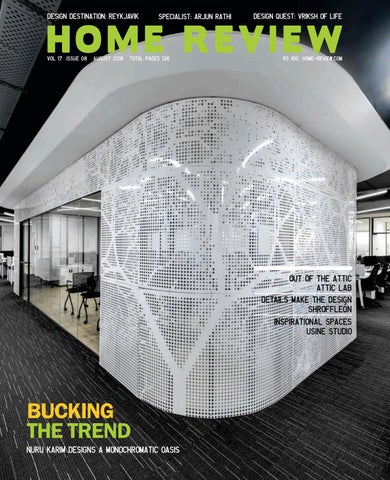
OUT OF THE ATTIC ATTIC LAB DETAILS MAKE THE DESIGN SHROFFLEรณN INSPIRATIONAL SPACES USINE STUDIO
BUCKING THE TREND
NURU KARIM DESIGNS A MONOCHROMATIC OASIS
Photo: Cyrus Dalal
N
uru Karim’s firm NUDES’ design sensibility is a pleasant departure from the ‘sameness’ that surrounds a lot of interior work today. Creating an expression supported by gleaming glass and CNC manipulated metal surfaces, Nuru and his team provide a slick and modern response to space-optimisation in the workplace. Holding centre-stage in this city office is a hybrid ‘pod’ conceived in a skin of manipulated metal and refracting glass. Assuming a variety of performative functions that range from a conferencing facility to a recreation space, this structure anchors the design scheme and sets forth a language that is all about crisp detailing set against a monochromatic colour canvas. While a few home owners are adventurous and experimental in their outlook to decor and living, most others want a remodel that is timeless (yet keeping with the times), done in a fairly tight budget, completed quickly and extremely durable. This equation is one that Maria and Kayzad of Shroffleón have got balanced perfectly. Understanding owner expectations and responding to it in a clever and sustainable way, the design duo reset a large apartment in South Mumbai with a contemporary flair. Staying true to the fundamentals, they focus on smart details that are balanced using muted colours and a careful selection of textures, lighting and furniture. Nothing is over the top here. It is clear thinking at play that results in a home that is inviting and classy and will remain that way for a long time to come. Anish Bajaj, Editor anish@marvelinfomedia.com
Highlights Of The Venice Biennale Case Design elaborates on ideas of collaboration for a school in Pune. Their showcase is currently on display at the Venice Biennale. Watch the episode on the Design Owl Youtube channel. Presented by Hafele.
6 Home Review August 2018
emails + feedback Out-of-the-box
Inspirational
The Attic Lab is just beautiful and so distinctive in its design that I couldn’t help but re-read the article. It is such a wonderful design and so different from the normal designing work I usually see.
Arjun Rathi is so inspiring for a budding industrial designer like me. His new collection of lights is just stunning. Please publish more of his work.
By Email Ambreen Naik
Let us know what you love and hate about this issue. Mail us at letters@marvelinfomedia.com
8 Home Review August 2018
By Email Jignesh Hirpara
Style Meets Comfort
Not just Northern lights
Despite the congested areas of Mumbai, Nuru Karim of NUDES has designed a splendid monochromatic themed space with a gorgeous view of the skyline. Talent has no limitations.
Now I know there is so much more to Iceland than just the Northern lights. An architect myself, I will visit all the places mentioned that spectacular Iceland has to offer. Thank you for the information.
By Email Arjavi Marwah
By Email Amit Shah
30 art
36
22
form
Scott Slagerman showcases his esoteric series called Wood & Glass which depics the symbiotic relationship between the two Usine Studio implements a minimalistic approach long with a fusion theme for a firm in Vadodara
43
Cover Story NUDES creates a monochromatic universe with a new age multi-functioning pod in a modern office in Mumbai
By Ritika Chhabra& Shashi Bakshi
46 SHROFFLEoN re-configures a five bedroom residence to an three bedroom luxurious oasis in Mumbai
52
AUGUST
The portfolio of rat[LAB] is a kaleidoscope of patterns, forms, and materials used in unconventional ways
58 Archiplan International curates a technologically advanced branstorming session to zero in on their own office design
71 64 This 15th century monastery is the idyllic melding of Renaissance Tuscany and 21st century luxe
10 Home Review August 2018
product
designer
His global presence in product design reinforces Richard Hutten’s status as a genius of creativity and novelty
The Inside Track Now on Apple and Android
DOWNLOAD YOUR FREE COPY* OF The Inside Track and stay connected All you need to do is download the free Magzter app. Apple users can download Magzter from the App Store. Android users can download Magzter from Android Market. Try it out today.
* Limited Period Offer
84 76
90
An innovative and technologically enhanced home-studio designed by the architect-couple of Attic Lab in Kerela
Ayaam Architects design a farmhouse in Gujarat using green measures for environment conservation
96
REYKJAVIK A DESIGN DESTINATION
106
101 GREEN PROJECT The Garden House is where nature takes centre stage, and everything else takes inspiration from it
AUGUST
Landscapes
110 The Cactus Park Taiwan introduces the named plant as a thrill to enjoy and beauty to admire with a new pair of eyes
116 RR DĂŠcor tells tales of the intertwining of the old with the new in a world of fabrics
120
Eclectic styles, varied themes, upcoming trends come together in our newly launched segment!
12 Home Review August 2018
THE MARKETPLACE Get your hands on the latest products to hit the market
123
Editor & Publisher Anish Bajaj Creative Director Natalie Pedder-Bajaj Features Editor Mala Bajaj
Priyanka Menon Writer Priyanka Menon is a copywriter, lecturer in advertising and English literature, poet, and author for HarperCollins and Juggernaut. When she isn’t busy with any of these roles, she can be seen at Starbucks, sipping on white-chocolate mocha, scribbling in her diary. She lives in Pune.
Assistant Editor Shweta Salvi Sr. Sub-Editor Neerja Kapadia Contributing Writers Devyani Jayakar Dhanishta Shah Priyanka Menon Kanupriya Pachisia Ramya Srinivasan Shruti Nambiar Virupa Kantamneni Himali Kothari Avani Patwardhan Vandana Krishnan Designers Asif Shayannawar Darshan Palav Snigdha Hodarkar
Ramya Srinivasan Freelance Writer Hailing from Bangalore, Ramya Srinivasan is an IIM-B graduate, who worked in the corporate world for twelve years before switching to writing full-time. She has written features, travelogues, book reviews and personal essays for multiple online and print magazines.
14 Home Review August 2018
Subscribe to The Inside Track and stay connected
India’s leading trade publication that connects manufacturers, dealers and designers across the country No. of Issues
You Pay
You Save
36 + 8 Free
Rs. 900
20%
24 + 4 Free
Rs. 600
16%
12
Rs. 300
Please fill up this coupon and send it along with your cheque/DD to: Marvel Infomedia Pvt. Ltd., B 62, 1st Floor, Cotton Exchange Bldg, Cotton Green, Mumbai 400 033. Tel (022) 23736133/1, 32958501 Fax (022) 23743069 Email response@marvelinfomedia.com www.theinsidetrack.in
I am enclosing a cheque/DD No _________________ Dated __________________ drawn on ( name of bank ) ________________________________ favouring “Marvel Infomedia Pvt. Ltd.” for Rs.__________________________________( Add Rs 40/- for non Mumbai cheque/DD ) YOUR DETAILS Mr/Mrs/Miss/Ms_________First Name __________________________________________Surname ____________________________________________ Address_________________________________________________________________________________________________________________________ City____________________________________________State____________________________________________________Pin Code________________ Phone__________________________Email____________________________________________________Occupation_____________________________ the inside track reserves the right to extend, cancel or discontinue the offer without giving any reason or prior notice
Editorial & Marketing Mumbai Ms. Sheetal Waghmare B-62, Cotton Exchange bldg., Cotton Green, Mumbai 400 033 T 022 23736133 / 23736131 / 23743069 M 9833301852 E marketing@marvelinfomedia.com Chennai Mr. S. Venkataraaman Flat No. 2, 3rd Flr, E-Block, Hansa Garden, 30 Madampakkam Main Rd, Rajakilpakkam, Chennai 600 073 Tel 044 22281180 / 09444021128 Email: svenkat@marvelinfomedia.com Publishing Director Mr. R.I.Bajaj Distributed in India by India Book House Pvt. Ltd. 412, Tulsiani Chambers, Nariman Point, Mumbai 400 021. This issue has a total of 126 pages comprising of a 6 page cover and 120 inside pages. We welcome unsolicited material but do not take responsibility for the same. Letters are welcome but subject to editing. All rights reserved. Nothing may beprinted in whole or part without written permission of the publisher. The editors do their best to verify the information published but do not take responsibility for the absolute accuracy of the information. All objections, disputes, differences, claims and proceedings are subject to Mumbai Jurisdiction.
Nuru Karim Bucking The Trend, Page 22. Nuru Karim is a member of the thriving avant-garde architectural community in India. Nuru, who did his Masters in Architecture and Urbanism at the Architectural Association, AADRL, London, had a brief stint with Zaha Hadid Architects before returning to Mumbai. His firm LIVE - Laboratory For Interactive Visionary Environments has won several competitions and accolades. Nuru also loves to play cricket in his spare time.
Shroffleon Details Make The Design, Page 46. SHROFFLEoN is a young award winning design studio headed by partners Kayzad Shroff and Maria Leon. Concentrated primarily in the residential sector, their build works have received numerous awards such as Emerging Architect of the Year, Young Architect of the Year, Young Designer of the Year(Runner Up) by NDTV, ArchiDesign and IIID, in addition to being listed as part of the AD100
Editor Mr. Anish Bajaj. Published and Printed by Mr. Anish Bajaj on behalf of the owner Marvel Infomedia Pvt. Ltd, B-62, Cotton Exchange bldg, Cotton Green, Mumbai 400 033.
Attic Lab Out Of The Attic, Page 76. Ar.Shinoop PM & Ar.Revathy Raju Shinoop are an architect duo practicing architecture in Parappanangadi, Malappuram, Kerala. They have started their practice since 2012 and are flourishing ever since. Both of them have always loved to experiment with new ideas. When it came to designing their own office, they developed something out of the box at the same time responsive to its site and climate.
16 Home Review August 2018
Home Review August 2018
29
PAST & FUTURE
E V E N T S 25 MAY 25 NOV
100% Design South Africa is geared towards doing business, writing orders and setting up new business networks and relationships. The quality of the exhibition was recognized when it was named the Aaxo Roar Awards Winner of Best Trade & Consumer Exhibition (under 6000 sqm) in both 2017 and 2016.
TO
Venice Biennale, Venice, Italy
www.100percentdesign.co.za
This conference provides opportunities for the delegates to exchange new ideas and application experiences face to face, to establish business or research relations and to find global partners for future collaboration. It will be held from 8th - 10th August at the Sunway Hotel in Phnom Penh in Cambodia this year and will have prolific personalities in its attendance list.
TO 09Acetech 10 AUGDesign Wall , Mumbai, India
www.10times.com/bdmawm The Venice Biennale is back for its 16th edition showcasing two of our Indian architects, Rahul Mehrotra and Gurjeet Singh Mathroo in addition to many world famous entities. With the theme of Freespace, the Biennale will present for public scrutiny examples, proposals, elements - built or unbuilt - of work that exemplify essential qualities of architecture which include the modulation, richness and materiality of surface; the orchestration and sequencing of movement, revealing the embodied power and beauty of architecture. While previews of the main event will be held on 24th and 25th May, the exhibition will open to the public from 26th May - 25th November, 2018.
08100%TO 12Design, AUG
Johannesburg, South Africa
Design Wall has garnered industry attention and served as an indispensable launch pad for new, promising brands. The likes of Niranjan Hiranandani, Ar. Hafeez Contractor, Boman Irani, Ashish Raheja, Ar.Kanhai Gandhi, Ali Lokhandwala, Ashish Puravankara, Ar. Gayathri Shetty, Jimmy Mistry, Ar. Nina Puri, etc,. to name a few have lent their unconditional support to this endeavor.
Architects, Designers, Installations, Products, Art dealers, Curators, Sculptors, Students and all other design fanatics will coagulate under one fair, uniting to benefit each other from networking to building. It will be a one stop shop to associate with some of the who’s who of the design world globally. www.labiennale.org
TO 08International 10 AUG Conference On
Building Design, Phnom Penh, Cambodia The idea International Conference on Building Design, Materials, Architecture and Waste Management is for the researchers, scientists, scholars, engineers and practitioners from all around the world to present and share ongoing research activities.
18 Home Review August 2018
Design Wall is an initiative undertaken by Acetech to promote and foster latest innovations & technologies in the architecture, building materials and design industry. It provides an unrivalled platform for product manufacturers to unveil their products and services before an esteemed jury panel.
100% Design South Africa is the largest curated exhibition platform for sourcing high-end contemporary design in Africa taking place from the 8th - 12th August 2018, in Hall 1, Gallagher Convention Centre, Jo’burg. Launched in August 2014, this award-winning high-end curated exhibition showcases some of the most inspirational designs and designers. 100% Design South Africa takes place alongside the popular and well-attended Decorex Jo’burg and is the perfect platform to source South African and international furniture and product design as well as lighting, interior design, surface and materials for the residential, commercial, hospitality and office sectors.
Each year Acetech is deluged with an overwhelming number of entries. Acetech, along with its official tabulators Ernst and Young, then shortlist the top brands that are given a platform to present their services, products and technologies before the esteemed jury panel. They are also given 1X1 meter space to display their innovation. Each shortlisted brand is allocated three minutes on the dais to explain and exhibit the features of their path-breaking product or technology and to address any queries from the jury that may arise. Following a very stringent judging process, the winning products are then selected. The winning products are also displayed through the entire duration of the show. www.etacetech.com/dw.html
PAST & FUTURE
E V E N T S 11International 13 AUG Conference On TO
Design, Materials And Manufacturing Okinawa, Japan
The DW! Design Weekend is the largest Latin American design festival, a major urban design festival composed of hundreds of independent, simultaneous events, integrated by an “Official Program”. It was created to promote Design and its connections with Art, Architecture, Urbanism, Decoration, Social Inclusion, Aggregation of Value, Business and Innovation. It was born from a great inspiration from Lauro Andrade, CEO of Summit Promo who immersed himself in the subject since 2006 after being inspired by ‘Milan Design Week’ and ‘The London Festival’ subsequently. The first edition was incepted in 2012 and since then the festival has reached international levels of quality. There are several independent events, simultaneous and integrated by an official program.
Successfully held in Kuala Lumpur, Malaysia and Beijing, China in the past two years, ICDMM is an annual conference which explores the development and implications in the related fields of Design, Materials and Manufacturing with an objective to present the novel and fundamental advancements. It also serves to foster communication among researchers and practitioners working in a wide variety of scientific areas with a common interest in improving Design, Materials and manufacturing related techniques. The 3rd International Conference on Design, Materials and Manufacturing (ICDMM 2018) will be held in University of the Ryukyus, Okinawa, Japan during August 11th – 13th, 2018. It is co-sponsored by the University of the Ryukyus, Kyushu Branch of the Society of Materials Science, Japan and International Association of Computer Science and Information Technology.
The DW! includes lectures in educational institutions, guided tours in galleries and workshops, exhibitions, installations, artistic and urban interventions, thematic circuits, competitions, parties and product launches in shops and showrooms. This year it is to be held from 29th August – 2nd September 2018.
TO 14Death 23 ofSEPArchitecture, David
Hall Art Cafe CGH Earth, Kochi
31Chart AUG TO 02 SEP
Copenhagen, Denmark
29 AUG TO 02 SEP
Since its inception, CHART has established itself as the international platform for contemporary art in the region. It consists of three segments - Art Fair, Design and Social. Chart Art fair is the leading Nordic contemporary program building on the Nordic tradition of collaboration and presenting the invited galleries in unison within the historic halls of Kunsthal Charlottenborg in Copenhagen. The selection and curation is realized by the five founding galleries based in Copenhagen: Galleri Susanne Ottesen, Galleri Bo Bjerggaard, V1 Gallery, Andersen’s and David Risley Gallery.
20 Home Review August 2018
www.chartartfair.com
www.designweekend.com.br
www.10times.com/icdmm-yu
DW! Design Weekend São Paulo, Brazil
Chart Design will present a selection of the top design galleries from the Nordic region exhibiting rare, unique and collectible designs in the beautiful settings of Denfrie Centre of Contemporary Art in Copenhagen. Char Social is a series of cultural events exploring the crossover between art, design, architecture, music, performance and gastronomy. This un-omissible event will be held from 31st August 2nd September 2018.
The Death of Architecture; circa 2000 is a traveling exhibition assembled by 13 of India’s thinking and concerned design practices. Through evocative art works, poetry and prose, the exhibition decodes and amplifies actions some which are orchestrated, others inconsiderate. Actions that slowly tear and restructure the fabric of our cities and the architecture within and along with that impact our sense of being. The exhibition presents evidence that will allow discussions about our present, and yet at the same time is embedded with clues and signs that can help effect meaningful dialogues about the future. In a sense, it consolidates the many critical discussions that form the dough which leads to design such as those about the demise of our cities as we know them or the meaning of inspirations from the past, or ideas of beauty, or duplicitous ways of achieving identity, or ways of understanding spatiality. The exhibition is a strong mirror that will allow cities and design communities to structure conversations that are pertinent to their immediate realm and concerns. www.deathofarchitecture.com
When Luxury Merges Into Décor U-Line Introduces Its Premium Collection, ‘Tuscan’ to ornate your homes in a bespoke fashion. Centering on the theme of ‘everything natural’, the Tuscan collection is perfect addition to the grandeur of decorative homes. Using abstract design, stripes and style direction that draw from rich cultural heritage, it smartly celebrates the earthy tone. Tuscan collection is made using premium quality high-end materials. Its variations of color palette exude a neutral feel, which ensures it gets along perfectly with practically any kind of furniture. Emitting a dash of calm and relaxing feel, it further ensures to enhance the living space with contrasting light and dark details. Plenty of custom choices available assure one mix-match and experiment luxuriously to suit distinct needs adequately. Able to fit in all your needs, the collection vouches to deliver a grand feel that’s beyond expectations. The Tuscany collection is available in all the leading furnishing stores all over India. U-Like Fabrics comes into the picture in the year 1980 under the esteem guidance of Mr. Parmod Goyal, with the vision of universally accepted belief in change in the furnishing industry. Their process is deeply conducted to produce international standard quality and provide services of experienced and competent consultants from various fields like Interiors, Architecture and Acoustics. Home Review August 2018
21
BUCKING THE TREND 22 Home Review August 2018
The AOT Group office in Mumbai is a monochromatic oasis of natural light, stylish interiors and some breath-taking views of the city’s legendary skyline.
Text By Shruti Nambiar Photographs Courtesy the Architect
Home Review August 2018
23
This has been said many a time before - workspaces can be drab. They can easily slip into high-function mode and sacrifice all aesthetics and most of their comfort in the bargain. Offices that buck this trend are the ones that let the personality of the work and workers occupying its spaces dominate its design. The AOT Group office in Mumbai does just that, especially because the Nuru Karim-led design firm NUDES brought in a plan that prioritised space-optimisation and a distinctive colour-scheme.
At the centre of this monochromatic universe is a pod - slick, transparent and capable of performing multiple functions. Like an alien entity that landed and has now occupied the heart of the expanse, it is eye-catchingly mysterious and builds instant curiosity.
24 Home Review August 2018
CNC’d aluminium solid sheets are wrapped around this hybrid space. As more regulation work-stations bustle outside, the pod can be the spot of training sessions, talks, workshops, etc. with its movable furniture allowing for a smooth slide into ‘break-out’ or recreational sessions of a more informal tenor. The outer cover of the pod is a pastiche of shiny glass and patterned white CNC skin, the latter inspired by AOT’s philosophy of networking and growth.
Ground floor plan of BAD Cafe.
Floor plan
Home Review August 2018
25
Depending on how you interpret it, it showcases either a large branch network of a mighty tree or a complex interconnected web of wires. Irrespective of that inference, it is a striking visual that literally and figuratively centres the look of the space. The skin and the gleaming glass split the inside lights, creating just the right amount of drama for the interiors. It brings good balance to days undoubtedly dominated by serious business talk.
The interconnected web-like skin first comes up at the reception desk, in fact. This area is all white walls, polished and gleaming surfaces, and fluorescent lighting, with a neon display announcing the establishment’s name. This may be an office, or it could be a futuristic laboratory. One will only find out after stepping further in.
26 Home Review August 2018
What may seem slightly unusual is the meeting room standing right near the reception desk. Inside, the work-stations follow a grid system designed keeping space-maximisation in mind. The long tables have simple divisions and clean filing cabinets below. Overlooking the space is an industrialstyle ceiling, the exposed beams painted in dark shades and the suspended tube lighting reinforcing that old feeling created at the entrance - of being in a place of high-tech experiments.
This is a simple ensconce
with its
monochromatic set-up,
a mostly transparent shell with frosted patches, and simple wooden flooring. Home Review August 2018
27
Less obvious inside may be the carpet, but it helps solidify the slightly broody demeanour of this office. The black floor covering is in keeping with the monochrome pledge of the design, and the white stripe patterns on the carpet form that minor detour in expression. The simplicity of the work stations stands well against this light ripple of change in design. There is plenty of natural light streaming in, and the reflective surfaces create pools of light and shade all around. The cafeteria continues the monochromatic scheme, keeping the layout exciting by mixing and matching chairs of the two hues at every flattopped table. The views from here are fantastic, the city skyline in full view through the wide glass windows. The light, naturally, is plentiful, and the patterned backs of the chairs throw out lovely shadows on the floor with its help.
Reflected Ceiling Plan
28 Home Review August 2018
Section
The floor spread in this office measures 11,700 sq ft and the seating for the staff of 180 has been planned in a way that all are accommodated in a naturally-lit stretch. The AOT Group is in the business of accommodation and travel-related services, so the staff needs workspaces that are reflective of that open, free-spirited core of what they enable. Thankfully, they have this office in Mumbai, where style meets comfort, and all the city bustle is kept far off! office@nurukarim.com www.nudeoffices.com
Home Review August 2018
29
At play here are the bark of a walnut tree and brilliant amethyst hued glass.
30 Home Review August 2018
art form
A GLASS ACT The world abounds with talented artists who turn glass into one-ofa-kind collectibles. LA-based artist, Scott Slagerman not only uses glass but also wood along with it, to create a staggering and esoteric series called Wood & Glass. It’s no secret that Scott Slagerman has always been fascinated by glass. In fact, this is one of the first things he says about himself. The versatility of glass and its ability ‘to change from a fragile state to molten fluidity only to return to the original state’ has always been something the LA-based artist has wanted to explore. In his latest collaboration, Slagerman, along with Jim Fishman, has created a beautiful series that depicts the symbiotic relationship between two entirely different kinds of materials - Wood & Glass.
Some of the tools that are an integral part of the art.
Text By Priyanka Menon Photographs Courtesy Scott Slagerman Home Review August 2018
31
A specialist in glass fabrication, Slagerman completed the Glass Program at UCLA School of the Arts, where he studied with the likes of Thurman Statom and Richard Marquis, before going on to study glasswork at L’Ecole des Beaux Arts de Aix in Provence. Fascinated by the use of glass in architecture and commonplace objects that are around us, Slagerman began to explore the temperament of glass and how the material is visually and physically malleable enough to fit in with other materials. While studying in Europe, he explored different aspects of the craft – “From lighting and vases to wine glasses and objects d’art, I visited and worked in studios and different glassworks,” he adds. Speaking about the collection, he says, “It is composed of a variety of high quality woods which were carefully selected and sourced.” Being environment-conscious, the duo only used wood from already fallen trees. The first part of the process involves drawing the primary designs directly onto the surface of the wood. The shapes are then cut out using traditional wood-working techniques. The next step involves the blowing of molten glass directly into these shapes and into the piece of wood too. For the uninitiated, glassblowing is a glass forming method that inflates molten glass into a bubble by using a blowpipe. “This creates a perfect fit and the two elements look like as if they were naturally formed together,” Slagerman adds.
The letter ‘W’ unlike ‘V’ has a certain robust quality to it. Perhaps it is the multiple glass fittings into the wood that renders it so.
32 Home Review August 2018
By blowing the glass directly into the already cut-out sections of the wood, there is room for the glass to fit perfectly and make the two materials like they were naturally suited to each other. The final piece also draws inspiration from the traditional Japanese joinery. In this way, the mundane functionality of wood is replaced by breathing new life into the material, making it art!
The blow-pipes are pre-heated before being used for blocking.
Home Review August 2018
33
Slagerman’s deliberate showcase of the wood in its natural and raw form, by maintaining significant details like the bark, annual rings, etc, goes a long way in paying respect to the materials at play as well as ‘highlighting the beauty of this often neglected material essential to the art of glass-making.’ Each piece from the Wood & Glass Collection is a tangible result of the symbiotic relationship that has always existed between wood and glass. However, even with the two rather disparate materials working together in unison, the entire series has required extensive and in-depth research into the worlds of woodworking and glassblowing. “Wood is, and has been for centuries, integral to the art and craft of glass, with its primary role being limited to the production process, and in the shaping and molding of the glass,” Slagerman remarks as he expounds further about how his series has both wood and glass presented in a united front. What really stands out more than anything else in the Wood & Glass Collection are the distinct colours, varied shapes, and patterns that Slagerman and Fishman have painstakingly perfected. A collection like this that is invested into exploring more than just one aspect of art and focuses on bringing two materials together in a space that is designed to create eclectic and esoteric pieces works on a subliminal level too. It therefore stays with you long after you have caught sight of it for the first time.
This piece is made of clear glass and the bark of the Mesquite Tree, found mainly in parts of southwestern U.S. and Mexico.
The creators of this collection were merely exploring a relationship between two fascinatingly singular materials when they chanced upon a story that they wove into their art, to create stunning pieces that appear like iridescent vases that are versatile enough to be a part of any décor. www.scottslagerman.com/wood-glass
34 Home Review August 2018
Enjoy the amazing shopping experience on the newly launched Lighting Lounge by The WhiteTeak Company.
GLITTER AND GOLD
The WhiteTeak Company, a perfect online destination for luxurious homes décor accessories is now also available in its retail store in New Delhi as ‘TheWhiteTeak Company Lighting Lounge’ to provide their consumers both offline and online experiences.
The recently launched luxurious lighting lounge which is spread over 3000 square feet & 2 levels & is laid out between an arresting geometric grid-like design detail that offers a wide range of premium lighting products, luxury décor accessories and much more which would surely be statement centerpieces of your home. This store houses it all and the entire range of products are easy to view in the chosen shades of beige, white & wood! Pops of color break the seamless flow and make you take attention; yellow is used in strategic display tables & in the seating! Each piece of this lounge from large chandeliers to small décor accents has an exceptional edge to it that flaunts a glamorous and eccentric attitude. According to Anu Mehta, co-founder of The WhiteTeak Company, “Our recently launched WhiteTeak Lighting Lounge would surely be a great shopping experience for our consumers. Not only this, to provide our consumers both online and offline experiences, we are also planning to launch more stores in Mumbai, Chennai and other cities to connect with today’s consumers by giving the experience that is personal and relevant.” According to Mamta Mehta, co-founder of The WhiteTeak Company, “In our Delhi store people have been seen relaxing in the serene atmosphere and sipping coffee whilst taking in space! The White Teak way is to make you a part of the family & whether you are shopping or not, the coffee is always on us! Delhi Store Address The White Teak Company, Ist Floor, A-225, New Managlapuri, Opp Metro Pillar no- 45, M. G. Road, Sultanpur, New Delhi www.whiteteak.com
Rakesh Handa Director M: 98102-49118
Home Review August 2018
35
On one side is an exposed concrete grey wall on which are sketches of the basic standards related to PMC and construction works.
36 Home Review August 2018
INSPIRATIONAL SPACES
Yatin Kavaiya, Jiten Tosar and Jitendra Singh Matharoo of Usine Studio rearchitected and designed the office space for the Project Management Consultancy (PMC) firm, MPT. A 1650 sq ft duplex apartment in Vadodara was thus transformed into a charming and personalised work studio.
Text By Ramya Srinivasan Photographs Courtesy PHX India Home Review August 2018
37
Peppered throughout the MPT office are awe-inspiring graphics that aim to impress, inform and educate the visitor; this white-on-black graphic of men-at-work, signifies the different construction processes.
38 Home Review August 2018
Designing an office space for a client who is in the thick of the construction business can be a rewarding experience as there is an evolved understanding and visualisation of what to achieve and how to execute. The client, Mayur Thakkar, with his keen eye for detail was involved in every stage of the design of the MPT office. He also had an amazing clarity that the theme of the project should be to demonstrate various construction aspects as show pieces. Yatin Kavaiya, principal architect of Usine Studio,elaborates, “In each of the different windows in the office, we implemented different techniques such as single and double glazing and materials such as wood or aluminium. We used soft close channels in some cases while manual in some. For lighting, we used a combination of natural daylight and yellow spotlights.” This way, when clients visit the office, they can get a first-hand feel of the various construction elements helping them arrive at decisions faster. The theme also extends to the use of materials such as exposed concrete and brick cladding that represent the core of the client’s business. The design team and the client decided on a minimalistic approach such that “the basics are laid bare.” Kavaiya says, “We wanted to implement a fusion theme with a clean look and use textured materials.” However, to get started with this objective, they had to first make crucial civil changes to the thirty-year-old structure - altering the staircase location, strengthening the brick-cladded walls with metal holdings, shifting the entry door from the backside to the front and removing a few walls in consultation with the structural engineering team are examples of such changes. As a result of these fundamental modifications, the layout of the office space flows smoothly. In the ground floor, the reception area, staff workstations and lounge, an admin desk and informal huddle space, and a pantry are laid out together; the first floor is more of a private space with a conference room and a cabin shared by the client and his wife, Amee Thakkar, who works as a travel consultant.
Inside the MPT office are various examples of window frames, fixtures, lights and fittings that allow the space itself to become a demonstrative piece of construction and engineering design.
Home Review August 2018
39
}
One is welcomed at the entrance with a façade that has an etching of a skyline on a dark grey metal panel. This leads into the reception area, where the highlight wall in light grey with an exposed concrete finish and adorned with a pixel-like collage of the client’s works creates the perfect first impression on any visitor. Adjacent to this monochromatic wall sits an aged blue bench adding just the right pop of zest with its boutique finish. It is fascinating to observe the ingenious use of graphics that lend a creative expression to the character of this business. For example, the passage wall leading from the reception area has a white-on-black graphic of men-at-work, signifying the different construction processes. Kavaiya says, “The idea of these graphics was to be informative. Whether it’s the project displays or the men-at-work wall, we wanted these to tell more about the work.” Another brilliant example of this is the outdoor staff lounge. Covered with a mild steel pergola from which light fixtures are suspended, the area has a playful vibe about it. On one side is an exposed concrete grey wall on which are sketches of the basic standards related to PMC and construction works. Complementing this is a neutral light grey table in the centre, around which tiny pastel hued stools work their understated magic. Kavaiya describes this area as “raw and simple with no superficial treatment”, and marks this as his favourite space in the office. He explains, “This area with the louvres at the top and the enveloping greens changes in appearance with the lighting. The play of light varies with morning, evening and night, lending a charm to this space.” He calls out the lighting element in the double-height ceiling as the most challenging aspect of the project. “We did a lot of experiments with the fixture and eventually arrived at this linear metal lamp that was heavy to mount. We also attached a wooden frame with a narrow beam for focused lighting. While this element appears to be simple, it was a tough one to derive,” he shares.
40 Home Review August 2018
On the double-height ceiling is mounted a linear metal lamp that cleverly balances lighting on the upper floor passage with focused beams on the desks and soft throws on the wall below.
Home Review August 2018
41
The outdoor lounge with its concrete grey wall and table contrasted with tiny pastel hued stools is a perfect setting for informal staff discussions over a cup of tea.
Every nook of the MPT office has a story to tell, of what the business is about, of the underlying processes, of the hardworking men behindthe-scenes, of the spectacular achievements and of the inherent ethos, making it an inspirational space to work from.
info@usinestudio.in
42 Home Review August 2018
OBJET D’ART
By Ritika Chhabra & Shashi Bakshi
DESIGNQUEST
Vriksh of Life is a brand that strives to provide products that excel in quality and have value for money. For instance, their home furnishing segment uses only top quality wood Sheesham, Mango, Acacia and teak.
Text By Vandana Krishnan Home Review August 2018
43
Brass coffee table
Marble Inlay Console
Their biggest USP is that they bring in the best suited interior designing partner as per the client’s home styling needs and provide them high quality products at great value for money.
When asked about the inception of the brand, Ritika Chhabra, owner, replied “The idea behind the brand was threefold. First, to provide end to end service - interior design, furniture, home décor and art. Second, we wanted to ensure quality with value for money. And third, we wanted a fusion of ethnic and modern. Our logo mirrors our values; the Vriksh of Life caters to old (roots) and the new (wings)”.
Barrel Bar
Everything at Vriksh of Life is either designed in-house such as coffee tables, end tables and seating, or is hand-picked from their high-end furniture and décor manufacturing partners based out of different parts of India to ensure upscale standards of quality and aesthetic appeal.
Being Indian at heart and ethos is quite visible in their product range. They draw inspiration from designs that blend ethnic and contemporary sensibilities effortlessly.
44 Home Review August 2018
Geometrical Hand Painted B&W Metal Bathroom Accessories Grande
20 Drawer Brass Cabinet
When asked on how they plan on dealing with competition, Shashi Bakshi, coowner, replies, “We are not competing with imported furniture, which is most of the market; hence we do not even consider them as competition. As for the rest of like-minded brands, we collaborate with them. Given our positioning in the market, connoisseurs of good things will come to us one day or another. We plan to serve & sell well.� www.vrikshoflife.com
Ceramic End Table - Teak Wood
Their ceramic tiles, brass inlay, hand painted furniture and home accessories have been their consistent best sellers. The ceramic collection allows for high level of customization and personalization options. The beauty of their hand painted and brass inlay furniture ranges are that they are hand crafted and worked upon by talented artisans the brand is associated with those, who are highly skilled at these techniques.
Home Review August 2018
45
In the living room, the flooring, walls, curtains and upholstery on the sofas follow the light palette in shades of white, colour coming from the chaise and the abstract patterned rug on the floor.
46 Home Review August 2018
DETAILS MAKE THE DESIGN Re-mapping the layout of an apartment in Mumbai, SHROFFLEoN have used a largely white palette to open up spaces and invite natural light into the interiors, while wielding a contemporary, minimal aesthetic. Originally shared by ten members of an extended family, this five-bedroom apartment at Mumbai’s Napeansea Road was now to be re-configured to create three larger bedrooms with more luxurious baths. Maria Leon and Kayzad Shroff of SHROFFLEoN decided to carve larger spaces out of the existing footprint and increase the size of the windows, to maximise the ingress of natural light. “Since four of the family members had moved into the adjacent building, the family was now smaller, consisting of a couple, two daughters aged 10 and 14, as well as the grandparents,” says Maria. Meant to be shared by three generations, the brief of the family included a simple home with clean lines. In addition to budgetary concerns, all three generations in the family concurred that they wanted a ‘white’ home. “We introduced a grey veneer after a good deal of negotiation. They also wanted the spaces to look large, so we increased the size of the old 3ft x 4 ft windows to the fullest extent that the structure would allow. Circulation spaces were to be minimised. This changed the whole feel of the house,” says Kayzad.
Text By Devyani Jayakar Photos courtesy Fabien Charuau Home Review August 2018
47
The material palette consists of white marble on floor, textured paint of three types, bird’s eye light grey veneer, coloured glass, fluorescent glass and muted wall papers which are not graphic in nature. Concrete finish paint, leather panelling and black powder coated metal strips round up the details.
48 Home Review August 2018
“We also got a Phad painter from Nasik to paint directly on one wall,” says Kayzad. (Phad is a religious folk painting on scrolls using traditional vegetable colours on a long piece of cloth or canvas, known as phad. The narratives of the folk deities of Rajasthan, are depicted on the phads. The Bhopas or priest-singers traditionally carry the painted phads along with them and use these as the mobile temples of the folk deities.) In the living room, the flooring, walls, curtains and upholstery on the sofas follow the light palette in shades of white, colour coming from the chaise and the abstract patterned rug on the floor. Smaller contrasts are offered by the cushions, while the dining chairs in blue create more solid punches. A dome shaped lamp in glossy black hovers over the space with a row of spot lights at the far end casting small golden pools on the wall.
}
In the master bedroom, a beige upholstered headboard extends to the ceiling in a geometric pattern, while the bedroom for the daughters has accents in blue. In the grandparents’ room sunny yellow chairs add warmth to the space. “Most of the furniture was custom made by a friend of the clients who is in the trade,” says Kayzad.
}
Tweaking the layout naturally led to a larger living room, bedrooms and baths, as five bedrooms were reduced to three and the original locations were repositioned. “We don’t follow any fixed style, but the spaces we design are contemporary in nature,” says Kayzad. “We take the construction seriously. Materials come in certain sizes…our design emerges from these limitations. Conversations with the contractors lead us to make small changes which improve the longevity of the finishes.” Grooves are used in large surfaces, so that cracks don’t develop over time at the line where two materials or sheets meet. Clever solutions include walls with horizontal grooves to section the surfaces into smaller areas, on which undulations are easier to handle.
Home Review August 2018
49
The bedroom for the daughters has accents in shades of blue.
50 Home Review August 2018
This also lends scale to the space, along with the effect of panelling...without the expense.“The detailing becomes the design. In the master bedroom, there are grooves on the wall behind the headboard, where the textures and plain paint meet. This improves the workmanship and is based on how the materials behave after a few years,” says Maria. Ceilings are always ‘floated,’ the gap disguising any cracks which may develop. In Maria and Kayzad’s scheme of things, lighting receives special attention too. Planning for options which can light up either the periphery of the room, the centre or combinations, it comes in the form of strips, spots, spots within strips, double coves as well as decorative lighting - and included Delta Lights from Classic Luminaires with Grok and Fabbian from Angle Ventures. The various combinations enable the family to decide whether they want to flood a room with light or have thoughtfully positioned pools which leave the rest of the room relatively dimmer. Juggling spaces while conforming to a largely white palette, Maria and Kayzad have introduced interest through textures and a judicious use of colour, to create a light filled, inviting home. Shades of white further the appeal of the muted colour as it sweeps over large expanses, acting as a backdrop for carefully selected accents. “The home has been transformed completely from its earlier look,” says Kayzad.
k.shroff@shroffleon.com www.shroffleon.com
In the grandparents’ room, a padded headboard offers comfort, while a yellow bedside lamp picks up the sunny shade of the chairs across the room.
Home Review August 2018
51
rat[LAB]Studio is based in New Delhi but its works span UK, Europe, USA and Asia. The team is distinguished by its mathematical approach to design and reliance on computational design and Parametric Methods. The portfolio of rat[LAB] is a kaleidoscope of patterns, forms, and materials used in unconventional ways. The team’s design preoccupations run much deeper than the simple outside and interior layout model. Here, every project is an attempt to understand the ideas of space, materiality, responses to form, and connection to the environmental elements themselves.Much of the work mentioned below is fundamentally dependant on algorithms, computational development and parameters often inspired from complex natural forms. Founded by Sushant Verma and Pradeep Devadass, with the interior design section - rat[LAB]INTERIORS founded by Anchal Chaudhary, the firm’s model includes regular collaborations with researchers and other design experts.
52 Home Review August 2018
Team rat[LAB] is a consummate hand when it comes to designing skins and façades, where the reliance on algorithm-based design and appetite for unconventional form expression can help feed or enhance any building’s artistic ambition.
The Cellular Morphology Facade skin system prototype, for example, features a brilliant hexagonal-grid, with the whole array of a wave-like being that can be retrofitted on to façades. The skin offers weather-control features that can be specifically accommodated during the design stage. The firm’s adaptive[skins] research range is another effort in developing adaptive architectural features that have environmental regulation in mind. Developed using complex genetic algorithmic considerations with heat and light conditions as main parameters, the skins’ responsiveness has been tested against Delhi and Barcelona’s climatic realities. These skins work in dual form bringing striking, seemingly-moving dynamism to the façade, and improved comfort inside with temperature and illumination control. With D2F (Design to Fabrication), rat[LAB] goes back to questioning as to what elements can control a room’s spatial impression. “D2F is a small scale lightweight installation designed to demonstrate the computational aspect of installations and pavilions in architecture, where generative design is used to design and control the fabrication of an object,” states the team. Another meditation on spatial interaction is the Sky Maze Pavilion, a temporary installation at the Museum Gardens in London. Metallic bright on the outside, the structure has been conceived as a conduit for light and reflection from all directions, making it a “treasure chest” of illuminated gems that hit the viewer when moving and changing the line of vision. A somewhat similar effort is ‘Patterned Porosity’ at Amora Banquets, New Delhi, where the multi-panelled skin is like a punctured curtain covering a part of the façade, making the outside instantly distinct, and sparing the insides the assault of direct natural glare.
Text By Shruti Nambiar Photographs Courtesy rat[LAB] / rat[LAB]INTERIORS / rat[LAB]EDUCATION Home Review August 2018
53
“Spatial tectonics” are at play at the multi-functional Experience Center in Noida where rat[LAB]INTERIORS has created a Faceted Shell. The interiors have been spared the regularity of storage spaces and instead have been clad in large triangular facets of marble. Each of these facets feature fractals, making the entire zone look like a futuristic space ship. Mathematically designed and realised with CNC technology, the sharp angular surfaces come together incorporating a brilliant contrast to the light and reflectivesurfaces. There is incredible whimsy here, almost thunderous movement, even when you know how carefully calculated every cut and angle has been. Standing in dreamy contrast is the Fluid Wall at the Fluid Experience Perfumery, in New Delhi and Mumbai. Designed to support Ashish N Soni's three creations inspired by 85 notes of Chivas 18 and created with British perfumeries, Floris, Bloom and Pell Wall, the space sets up a wholesome experience of smell using the design team’s distinct parametric, sectional style, including art displays, custom furniture and that inescapable feeling of material movement. An amalgamation of heritage Indian and rat[LAB]’s signature mathematically-strong forms happens at the Farzi Café in Jaipur.
54 Home Review August 2018
The café’s elegantly subdued interior hue is elevated by the furniture and lighting elements that unapologetically exist in a geometric universe. The cluster of small metallic triangular hangings at the bar, the vaulted ceiling design, the crescentshaped sectional detailing at the entry point – all of the them effortlessly bring together two different schools of design on a confident template.
Rat[LAB]INTERIORS has delved into smaller scale articulations of their designs through Furniture, Products and Art Installations that collectively form a spectrum of products developed by the firm. There is this thing about rat[LAB] products - on the spectrum of convention, they all stand beyond the far end. And this is true about their form, make, and sometimes, even expected use. In the team’s eyes, these are furniture pieces as well as “spatial enhancers”, created with fluidity in mind and powered by algorithmic calculations. The collection featured in the firm’s Parametric Art Collection 2017 is a masterclass in not thinking straight. ‘Laxus’ (part of the ‘Amorphous Surfaces’ feature installation) rejects the notion that seating surfaces have to be flat to be comfortable, and is confident in its sleek, undulating surface composed of curvilinear parts. Brought together by a CNC process and topped with large red lips-shaped custom upholstery, the design is unforgettable in its marble stone avatar. ‘Ichorous’ helps bring parametric whimsy to spatial voids, especially around structural columns, while ‘Circumitus’ is a minimalist table with legs that seem to be mid-dance and a surface that seems to be moving to a rhythm of its own.‘ Aranea’ is ostensibly inspired by the arachnid form, but the table’s base could just as easily be a video game glitch metaphor, a winking rebel in the midst of rules-following commoners. ‘Illuster’, parametrically-designed to throw down warm light in patterns, and featuring an array of fins, is part supernatural flower, part sea creature hanging from above. The same sense of shape-shifting, segmented curvilinearity defines many other pieces, like ‘Timeless Repose’, ‘Concavitas’, and ‘Helix’. These are self-sufficient pieces, capable of standing on their own to make indelible impressions, while also being talented enough to come into a room and completely change its aura. Home Review August 2018
55
rat[LAB] is dedicated to provide design education solutions for design professionals and students through its various parallel ventures run under the vertical rat[LAB]EDUCATION, which is an initiative to spread the idea of computation in design profession & education in India. After more than 40 design workshops carried out in India and globally across many cities, the education cell recently launched Smart Labs - an independent 6-month hybrid programme on Computational Design for students from all over India to participate. They successfully held a public exhibition for Smart Labs 1.0 in Chennai as they move toward Smart Labs 2.0 with the second batch. info@rat-lab.org interiors@rat-lab.org www.rat-lab.org www.rat-lab.org/interiors
56 Home Review August 2018
Home Review Now on Apple and Android Devices
All you need to do is download the free ‘Magzter app. Apple users can download Magzter from the App Store.’ Android users can download Magzter from Android Market.
Try it out today.
One would imagine that when an architectural firm designs its own office, everything would be a cakewalk. Not necessarily so. The technologically advanced office of Arkiplan International in Delhi had more brainstorming inputs than projects several times its size. Taking their time, the architects have designed a space which anticipates future trends and needs, within its grounded aesthetic.
“Our office has a footprint of just 2,800 sq ft. The average size of projects which we handle is 2,00,000 sq ft. The concept of a branded hotel would take us about two or three weeks. Our own office, a fraction of the size, took us six weeks,” muses Prasoon Shrivastava of Arkiplan International. “There were too many minds at work, too many thought processes and differences… even ideas by interns were not shot down. It was important to make the space an efficient one.” After the initial teething, the team got down to work. It was agreed on that the transparency of their work culture and philosophy called for an open office, without any indications of hierarchy in the design or materials used in different spaces. There are no partitions or glazed glass between work stations, with an ambience which encourages communication, comfort and fosters engagement. The spaces range from private and formal to communal and casual. “We needed the space to be a purposeful one, which would motivate the team to spend time in it and get inspired,” says Prasoon. “With the open floor plan comes the responsibility of creating breakout areas where people can get a few moments of quiet to concentrate. This need has been efficiently catered to. Stepped seating in leather finish granite provides opportunities for spontaneous conversations and a creative setting for casual recreation and refreshment. The amalgamation of form and fluidity, formal and informal and open and closed creates a symbiotic balance between work and recreation.”
Text By Devyani Jayakar Photographs Courtesy Sebastian Zachariah
58 Home Review August 2018
Future Proofed
Stepped seating in leather finish granite provides opportunities for spontaneous conversations and a creative setting for casual recreation.
Home Review August 2018
59
60 Home Review August 2018
The material palette is a simple one. Vitrified tile flows consistently through the spaces, with most of the ceilings having exposed ducting, retaining as much volume as possible. Only the air conditioning unit installed by the builder has been concealed by conventional gypsum. There is an intentional lack of transitions in the spaces and nothing indicates the designations of the people occupying them. “We are conscious not only of current trends, but also try to anticipate the next big shift. In 2005, everything favoured ecofriendly and green. We believe that the next move is going to be towards technology and we are working towards that,” says Prasoon. “Artificial Intelligence is going to kick in…in a big way.” To that end, this office is based on applications of the Internet of Things. The IoT is a giant network of connected "things" (which also includes people). The relationship can be between people-people, people-things, and things-things. This is the concept of basically connecting any device with an on and off switch to the Internet (and/or to each other). The new rule for the future is going to be, “Anything that can be connected, will be connected.”
The table in the co-founder's cabin has soft curves and was designed in-house.
“Lights that work on occupancy schedules keeping in mind daylight savings, blinds that sway with the sun and cameras that stream real-time footage - all of it is based on the proprietary technology of the company. The facility is voice-controlled and compatible with Google Home and Amazon Alexa and is connected to a network with intelligent and adaptable software. At a fundamental level, such intelligence would not only result in an enhanced experience but also pave the way for energy savings,” says Prasoon.
{
But lest you think that this office is only about technology, there are different elements that come together to enliven the working space. The office opens to a reception with a parametric table which has a backdrop of a green wall.
The formal meeting room, on the other hand, is home to a corten steel word cloud that spells the verticals that the company functions in.
Home Review August 2018
61
The transparency of the work culture and philosophy called for an open office, without any indications of hierarchy in the design or materials used in different spaces. The ambience encourages communication, comfort and fosters engagement. The spaces range from private and formal to communal and casual.
“The table was designed through software and has 183 laser cut pieces which were assembled. Conventional manufacturers were not capable of executing this design, so we contacted an artist who handles some of our hospitality projects. A small-scale model in FRP was made, followed by a full-scale clay model to test its height, proportions and stability. The final product was coated with metallic paint used on automobiles,� says Prasoon.
62 Home Review August 2018
The height of another table can be adjusted by pressing a button, so that meetings can be held by the staff either standing or sitting around it. The reception faces a semi-formal meeting room in tones of warm yellow. Rather than confronting the open reception with the closed meeting room, a complementary, coherent whole has been created with a sleek divider. “The formal meeting room, on the other hand, is home to a corten steel word cloud that spells the verticals that the company functions in. The weathered steel word cloud and the sleek glass space come together to break the norms of the conventional and present a dynamic chemistry,” says Prasoon. And don’t forget the art. A wall of humansized sculptures is based on the theme of 'Resurgam', which translates to ‘I shall rise again.’ It inspires people to look beyond their current struggles in the hopes of a blissful tomorrow and future. “This artwork tells our story…it celebrates our struggle. We are who we are because of our struggles. Everyone can relate to it, from the junior to the senior most employees,” says Prasoon of this meaningful installation which transcends mere decoration. “We have our own app and hardware for the technology,” says Prasoon. “There is also a smart mirror, which tells the time, weather and is synced with google calendar, a playlist and YouTube. It accepts voice commands…you can call Uber.” Er…does it reflect a digitally enhanced image of the person standing in front of it? Prasoon doesn’t miss a beat. “Not yet,” he says. “We had to ask a vendor not to over commit to potential buyers.” Arkiplan's 'self-learning office' is a legitimate example of what an intelligent use of modern-day technology looks and feels like. Within its walls, art, technology and plain common sense comes together to create a coherent whole. What can we say? Perfection comes with a price.
The reception faces a semi-formal meeting room in tones of warm yellow.
info@arkiplaninternational.com www.arkiplaninternational.com
Home Review August 2018
63
The beautiful entrance to the Belmond Villa San Michele with its old Michelangelo faรงade and perfumed terrace gardens overlooking Florence.
64 Home Review August 2018
UNDER THE TUSCAN SUN
Belmond Villa San Michele in Fiesole, just 15 minutes from central Florence, is situated resplendently on historically hallowed ground. One of the most exclusive properties in Italy, this 15th century monastery is the idyllic melding of Renaissance Tuscany and 21st century luxe. Perched over the undulating hills of Chianti, the Arno Valley and the iconic cupola of Florence’s cathedral, Belmond Villa San Michele is a living museum, with ancient frescoes, historic carvings, alluring Italian style gardens and even a façade attributed to the great Michelangelo! The story of Villa San Michele started when Niccolò Davanzati gifted a little plot surrounded by woodland to some Franciscan monks (also filling the monastery with significant paintings, sculptures and frescoes). In 1900, the monastery was bought by Henry White Cannon, an American who then landscaped the gardens and reinstated the deteriorating structures (the wrought-iron gates and the rust-coloured wall patina can still be seen today).
Text By Natalie Pedder-Bajaj Photographs Courtesy Belmond Villa San Michele
Home Review August 2018
65
The villa was badly damaged during the Second World War and in 1950, its new owner Lucien Tessier set about remodelling 20 rooms on the first floor, financed by enterprisingly opening a portion of the villa as a hotel.
66 Home Review August 2018
Belmond acquired the property in 1982 and began a systematic restoration of the buildings in collaboration with the Florence Fine Arts Authority. The damage on the Michelangelo façade was staved, while time was spent in additionally re-building the villa’s ancient Limonaia (a storehouse formerly for potted lemons) into two beautiful suites and creating another charming suite out of an old chapel on the grounds - all while staying true to the materials and building methods used in the 17th century. In the refectory, centuries of smoke, steam and even human breath had discoloured Nicodemo Ferrucci’s fresco of The Last Supper. This highly skilled restoration was carried out by the Opificio delle Pietre Dure, a global leader in the field of art restoration, while the antiquated geometric wooden ceiling in the main hall, displaying the crest of the Davanzati family was also painstakingly restored.
}
Crossing the old wrought-iron gates of the Belmond Villa San Michele, arriving guests feel as if they’ve stepped into a church nave, complete with an altar and two raised box pews. This ‘reception’ area is a riot for the senses, as ancient architecture is juxtaposed with modern art, creating an eye popping,jaw dropping wonder! Because of its patronage to the arts, throughout the hotel, modern pieces have been peppered against its historical background, reiterating the uniqueness of this magnificent property through a design language of its own.
If you’r not lucky enough to be staying in the private Limonaia Suite (on the far end), guests can still relax and enjoy the views under umbrellas strewn about in the fragrant Italian gardens.
There are 45 rooms and suites placed both in the former monastery building and around the Italian gardens. Rooms in the historical building have been beautifully decorated and embellished with restored period pieces, antique wardrobes, chairs and finely crafted chests. The Michelangelo Suite which is steeped in history as it was originally the monks’ library and later served as Napoleon Bonaparte’s headquarters in Florence, extends across the entire width of the entrance façade. For many, Belmond Villa San Michele’s exquisite gardens that were planned in the eighties by Pietro Porcinai (one of the finest Italian landscape architects of the 20th century) is every bit as unforgettable as its Renaissance frescoes and picturesque views. Garden rooms open out onto fragrant flowers like Chinese hibiscus, Jasmine and the Villa’s 300-year-old purple wisteria wafting through the air.
All rooms have been elegantly decorated with restored pieces, antiques and finely crafted furniture.
Home Review August 2018
67
Contemporary yet understated furniture melds perfectly under old stone arches harmoniously blending the ancient with the modern.
At night, the natural grandeur of the landscape is further accentuated by the lighting specially created by Pietro, who had not only prototyped the eggshaped lanterns strewn around the grounds, but had also conducted a thorough study of all the flora around before drafting his grand plans. But for unrivalled views over Florence, the Limonaia Suite is the most coveted. Built in a former orangery, it has a heated stone plunge pool ensconced in a perfumed garden, a private patio, a stylish marble bathroom with both walk-in shower and bathtub and an elegantly decorated room adorned with old world Italian charm.
In the old refectory, guests can lounge under Nicodemo Ferrucci’s fresco of The Last Supper and also admire modern art pieces that hang proudly beside it.
68 Home Review August 2018
Another gorgeously appointed suite is the endearing little chapel with it’s intricately restored frescoes, also situated in a quieter part of the resort. Being in Italy, food and history are a marriage made in heaven. Serving some of the region’s finest cuisine, made from fresh local produce and seasonal ingredients, The Loggia Restaurant has tables set among the soaring stone arches with ringside seats overlooking Tuscany.
}
Besides enjoying traditional dishes and trendy cocktails in the glamorous Cloister Bar (where tradition meets leather, brass and marble in flashes of modern sophistication), the gardens or the pool terrace, serious foodies can even take a class at the hotel’s renowned cookery school. Other unique experiences offered at the Belmond include clay modelling at Florence’s Galleria Romanelli and a private visit to the Duomo terraces. Since the Villa San Michele is so enthusiastic about promoting local talent, it also offers its guests a one-of-a-kind graffiti class in the studio of the popular street artist Hopnn, whose work one can admire at the hotel’s check-in area. As part of its Street Art Exhibition in 2017, where prominent artists had been commissioned to create installations and artworks around the hotel, two women artists stand out, namely Carla Bru whose muses are hung in the restaurant and the almost child like paintings by Nian, whose feminine deities interpreted as little girls of different ethnicities can be seen in the kids’ library area. But the most noteworthy ‘art’ at the Belmond Villa San Michele has been an unusual experiment conducted by Roberto Ghezzi whose unique pieces are created by the elements. This Italian artist was so captivated by the contradiction of human activity at the hotel for most of the year and the eerie stillness of its winter months, that he placed in-situ 15 canvases of different sizes around the hotel grounds and has left them for mother nature to ‘draw on’. When ready, the canvases will be extracted and exhibited on illuminated cubes for both guests and art lovers alike.
}
Home Review August 2018
69
The undulating pool at the top of the gardens, has picturesque views of the city below.
Established almost 40 years ago, Belmond Ltd. owns and operates 46 amazing and distinctive hotel, rail and river cruise experiences in many of the world’s most sought-after destinations. With guests like Bono, Paul McCartney, Robert De Niro, the late Steve Jobs, HRH The Prince of Wales and Julia Roberts choosing the Belmond Villa San Michele as their home away from home, no wonder ‘la dolce vita’ has never been sweeter here! www.belmond.com
70 Home Review August 2018
RICHAR0 HUTTEN
Beautiful and aesthetic yet functional and fun is what best describes Richard Hutten’s work. Counted as one of the most well-known and successful designers of Netherlands, Richard Hutten is synonymous with avant-garde designs.
Text By Rashmi Gopal Rao Photographs Courtesy The Designer Home Review August 2018
71
“Imagination is more important than knowledge. For knowledge is limited, whereas imagination embraces the entire world, stimulating progress, giving birth to evolution” - Albert Einstein
Table Chair
An exponent of “Droog Design” (Dry design), Rotterdam based Richard Hutten is arguably one of the most famous Dutch designers. Ever since he graduated from the Design Academy in Eindhoven in 1991, Hutten has been creating pieces known for their innovation and playfulness. The latter quality is an integral part of all Hutten’s designs as he believes in the philosophy of the importance of ‘play’ as culture. A legend in the field of furniture design and interior design, many of Hutten’s designs have been displayed in museums across the world making him one of the most collected living designers. A recipient of many illustrious awards, Richard Hutten who is the art director of Gispen since 2008, has a long list of prestigious clients including Lloyd hotel, I+I Milano, Gemeentemuseum in The Hague, Central Museum Utrecht, and HRH Princess Beatrix of the Netherlands. Chairs have been a constant source of inspiration and a fascination for Richard Hutten ever since he started his career. The legendary Table Chair which was a part of the designer’s graduation work consists of two separate tables. One is a smaller stool that you can sit on and the other table is for the back and arm rest sans the top. This iconic creation is part of permanent collections at the Victoria & Albert Museum, London, FNAC Paris and The MoMA in New York.
Dombo Mug
A path breaking piece that has been sold over a million times, Dombo Mug reinforced Richard Hutten’s status as a genius of creativity and novelty. A design that instantly brings a smile on the user’s face, this cup with two handles is synonymous with its superior ergonomics and ease of use. A favourite with children and elders alike, the cup is perfect whether you are sipping coffee or wine!
Thunderball
72 Home Review August 2018
A quirky piece that can be folded away, the Gisben Thunderball pendant lamp is an assortment of steel blades. The key differentiating factor of the piece is the spacing of the blades that creates a wonderful play of light and shadow. A signature creation that can add the much-needed oomph to any space.
Layers Cloud Chair
An utterly unique creation, the Layers Cloud Chair, is a collection of spheres. Inspired by the colours of nature, the chair uses over 800 square meters of Kvadrat’s Divina fabric. The pattern is similar to that found on sedimentary rocks and is complemented by earthy hues. The clusters are made entirely of the material, all of which were made individually and then assembled together. A particularly clever and classy way of camouflaging the unwanted and sometimes the ugly, Leave Magnets by Richard Hutten is yet another trend setting design. A piece of art that is both colourful and highly pragmatic, it is used to cover ceiling fixtures, sprinkler installations, pipes, wires and the likes. With a magnet at its base, the leaves can be used to cover anything made from steel. Available in two versions, one person or two person, Artifort Apps Sofa has a squarish design with rounded edges. Comfortable and roomy, the sofa is amenable to be upholstered in multiple hues and a variety of fabrics. Replete with Artifort traditions, the chair is functional and sturdy.
Leave Magnets
Artifort Apps Sofa
Home Review August 2018
73
A versatile piece that looks as spectacular during the day as in the night, the Dandelion Lamp was designed by Richard Hutten for Moooi. A contemporary creation that is both elegant and timeless, the design has been inspired again by nature. The unusual laser cutting creates an explosion of flower like circles and resembles a large Dandelion and is therefore named such. An ideal fit to any setting be it a bedroom or a boutique, the lamp is sure to add life and energise any space. The Butterfly coat track is a dreamy yet elegant design that is an ideal fit in your foyer or hallway. Inspired by the delicate beauty and freedom of butterflies that flutter from one flower to another, this coat track has a poetic quality to it. A useful item to have at home to hang coats and hats, the coat hanger is sure to make a sophisticated style statement.
Dandelion Lamp
With a clear objective of doing different things each time, Richard Hutten’s creations are focused on being sustainable and within his ethical standards. Apart from this, he is in pursuit of the ultimate chair which he believes is yet to be made, hence Richard Hutten aims to continue making chairs all his life. www.richardhutten.com
Butterfly coat track
74 Home Review August 2018
NEW AND IMPROVED CenturyPly Launches ‘Sainik 710’ to Strengthen Its Economic Segment. CenturyPly, the innovator in the wood panel industry in India, has launched ‘Sainik 710’. This is an addition to its existing economic plywood segment, ‘Sainik’ MR Grade commercial plywood. Sainik 710, a marine grade and boiling waterproof panelboards are designed to withstand all harsh weather conditions, providing a perfect solution for all kinds of furniture needs. Manufactured using selected eco-friendly timbers and bonded with high-quality BWP grade modified PF resin, ‘Sainik 710’ plywood and blockboards come with CenturyPly’s patented Glue Line internal protection and ACC treatment. This revolutionary product from the house of CenturyPly is one-of-its-kind in the plywood industry and will be available at a uniform price range across the country.
Specifications 1. Manufactured in accordance with IS: 710. 2. Boiling Water Proof Grade plywood and blockboard. 3. Borer and Termite proof with 5-year warranty. The superior quality in economic range and increased durability make ‘Sainik 710’, an ideal choice for a wide range of applications. www.centuryply.com
‘Sainik 710’ plywood and blockboards are 100% borer and termite proof, and come with 5-years of warranty with an aim to provide more finesse to homes and peace of mind to the consumers. Offered in large format panels, they are available in thicknesses ranging from 4mm, 6mm, 9mm, 12 mm, 16mm, 19 mm and 25 mm to suit the varied requirements of the consumers. Some salient features: USP 1. Manufactured using selected eco-friendly timber. 2. High resistance to all climatic conditions. 3. Bonded with BWP grade modified PF resin. 4. Glue Line Protection and ACC treatment. 5. One India, One Price.
Home Review August 2018
75
By night time, the studio transforms into a cornucopia of greens, yellows and everything that’s inviting. A cabin in the woods, indeed!
76 Home Review August 2018
OUT OF THE ATTIC
In Kerala’s Malappuram District, nestles an innovative and technologically enhanced homestudio designed by the architectcouple of Attic Lab.
Text By Priyanka Menon Photographs Courtesy Prasanth Mohan
Home Review August 2018
77
78 Home Review August 2018
The home studio designed by Attic Lab, a Kerala-based design and innovation firm, is a 46 sq m cabin. Shinoop and Revathy, the musically and artistically inclined founders of Attic Lab were at the helm of affairs. Home Review takes you on a tour of the Attic Lab Studio that is not just ‘a characteristic regional expression of Kerala architecture’ but a modern innovation as well. “The most distinctive visual form of Kerala architecture is the long, steep sloping roof built to protect the house’ walls and to withstand the heavy monsoon, laid with tiles supported on a roof frame made of hard wood and timber,” says Shinoop. Primarily designed to be a home studio, the space also metamorphoses into a corner for music and relaxation. The main site is spread out over 3 cents, with the archetypal marshy soil that is common to the region.
The entrance to the studio is simple and welcoming. Non-descript elements like the cobble-stones amplify the naturally abounding landscape.
One of the primary concerns for the team was the availability of having space versatile enough to be used as both a workstation as well as a place to enjoy music, relax, and also hold meetings and discussions. “The design needed to be compact, yet modern in its material and construction,” Shinoop goes on. And so, even with a restricted budget, the duo set about to create a space that not only had symbols of Kerala’s unique architectural expression, but could also be lauded as a coming together of modern elements in a wondrous structure. A-frame that wholly defines }isthethestructure. Although not entirely
The most striking feature of the studio common in India, the inspiration behind the design were the attics of traditional Kerala homes. Divided into two levels – the ground floor and the attic – the final product is a seamless combination of work and pleasure! The attic serves as an insulator for the ground floor, keeping the lower space cool and cosy.
Music being the food for the soul, finds a home in the studio with its own niche. Replete with a synthesiser, amplifier and other kinds of set-ups, the room has been designed keeping acoustic precision in mind.
Home Review August 2018
79
The tall trees and dense foliage around effectively block the sun, and as a result, the attic doesn’t get over heated even in the summer months. Owing to the fact that an attic doesn’t necessarily require walls around, the overall construction cost was reduced, and this worked in favour of the designers. “The long, steep and sloping roof was built to protect the house’s walls and to withstand the torrential monsoons,” Shinoop adds. Laid normally with tiles supported on a roof frame that is made of hard woods and timber, the roof also aesthetically augments the simplicity of the modern structure by bringing local elements of design into play.
With a small meeting room and a diwan-like seating, the space is cosy and warm with soft lighting that doesn’t interfere with the natural light filtering through the windows.
“Structurally, the roof frame is supported by the pillars erected on a plinth raised from the ground for further protection against dampness and insects, common in the tropical climate,” he goes on. From the construction point of view, the materials used were simple and not heavy on the pockets. Reclaimed laterite, recycled steel, terracotta, cement board, MDF, plywood and glass are among the few resources Attic Lab put to use. Typically, studios tend to have large floor to ceiling windows that sort of merge the interior and the exterior. However, in the case of the Attic Lab Studio, Gable windows are instated at the two ends to provide the attic and the ground floor with ventilation and allow natural light to filter through. With Shinoop and Revathy being constantly on-site, a lot of minor issues were resolved immediately. This is perhaps why the entire structure was completed in a span of just three months. The time-line would have been reduced even further, had it not been for the heavy rains that blanketed most of Kerala during that period.
80 Home Review August 2018
The attic! The perfect getaway when the going gets tough. Notice the glass-paneled floors that allow natural light to filter through.
Home Review August 2018
81
An aerial view of the studio and its surrounding foliage. The studio’s roof although typical of Kerala architecture, is distinct and unlike the neighbours’ homes.
With workers from Ramanattukara, Feroke, Parappanangadi, Calicut and Angadi, the studio was completed in 2017. It is a wonderful space for creative minds that are constantly on the lookout for ideas, innovations and out-of-the-box solutions. Or in their case, out-ofthe-attic solutions!
www.atticlab.in
82 Home Review August 2018
One-Stop-Shop For Kitchens German modular furniture brand, Nolte cements its India growth story with the opening of its showroom in Worli, Mumbai. Nolte is eyeing the Indian market aggressively with 7 new showroom launches before the end of the year. With 15 showrooms across India already in all the metros and tier I & II cities, their commitment to investing in India has been proven. With more than 10,000 kitchens in tow, they completed 12-years of being in India and emerging as the market leader in the modular furniture segment. The 4000 sq. ft. showroom in Mumbai is situated in the upscale seaside promenade of the city and features the latest international kitchens that were part of the Salone del Mobile Milano this April 2018. On the occasion of the launch, Nolte hosted a gala evening with Celebrity Chef Manu Chandra, talking about new age kitchens and how this particular room is slowly taking centre stage.
I also take this opportunity to introduce our initiative, The Social Kitchen, which is in association with celebrity chef Manu Chandra and architects from across the country. We have visited 4 cities already and will be visiting 5 more to start this movement of getting more architects to talk about changing social behavioural patterns and how that affects the world of design!”
Speaking on the occasion, Alok Duggal, Director of Nolte India said, “We are very happy to finally open this dream project of ours in Worli, as Mumbai has always been a key market for us. We have also tied up with brands such as Bosch, Hafele, Siemens and a few others to cater to consumer demands for appliances such as dishwasher, oven, and fridge to be part of the kitchen.
Chef Manu Chandra said, “I am excited to be part of such an initiative which addresses social changes affecting the design. I use the kitchen professionally and that requires a completely different thought process in drawing up space. Speaking on the occasion, Vikas and Anitha Jain owners of the franchise in Mumbai said, “This is a dream project for them, from designing the space to conceptualizing the look and feel, they have been working with the brand every step of the way. The vision that Nolte comes to the city and the steady approach is exactly the kind of mindset required for a fast-paced city like Mumbai. The futuristic designs, the eye for detail in customization is what makes a brand stand apart and Nolte is definitely up a notch in comparison to the rest of the players in the market. We are very happy about this association and feel this is the beginning of many exciting things to come.” Nolte Mumbai, Praneet CHS, Ground floor, plot no. 234, Jaywant Palkar Marg, Opposite Poddar Hospital, Worli, Mumbai, Maharashtra - 400030 Home Review August 2018
83
Arjun Rathi creates bespoke lighting design solutions that are rooted in client sensibilities and using a variety of materials. Arjun Rathi is the principal of the self-named multidisciplinary design practice operating from Mumbai, India.
Shikhara Hanging Pendant
84 Home Review August 2018
THE NEW NORMAL Text By Neerja Kapadia
Home Review August 2018
85
Table Lamp
Established in 2012, his work has gained national and international recognition for its explorative approach towards design processes.
86 Home Review August 2018
The practice is working across the verticals of architecture, interiors and product design. One of the key verticals in the studio is focusing on designing and building decorative lighting. “At Arjun Rathi Design, we design and build lighting. Whatever the project, the final product is always custommade and produced through our manufacturing partners. Due to the explorative nature of our work, we have great mastery across various materials like brass, bronze, copper, cast glass, blown glass, leathers and embroideries among other mediums. These materials in combination allow us to create a large range of products across the lighting design spectrum. We feel our work archive is not a catalogue but a body of experiences, inspiration and expertise; hence we always have personal meetings with the project designers and clients to establish a brief before creating a design for a project,” said Mr. Rathi.
Geodesic Desk
All projects are designed in-house and are taken care of phase wise - from site visits, exploratory studies, design and technical drawings to the final production and space atmosphere. Depending on the project, they either create a new product from scratch, or repurpose products from their archives. “Our approach is project specific therefore we do not believe in an anonymous, off the shelf selling,” he said. At Arjun Rathi designs, for most of the customised work the designs are rooted within the client sensibilities and material palette of the site. They take inspiration from pop-culture, formal exploration of shapes, proportions of the Golden Ratio and Sacred Geometry.
Hiranandani Sales Gallery Glass Chandelier
The transformative power of lighting is increasingly becoming recognised as a vital component of interior design and architecture, and manipulated in ever more experimental ways. Yet whilst many companies have the capacity to design or produce lighting, rarely do they offer both. The lighting design vertical of the studio was looking to address that need in the Indian context.
The Lodhi Hotel, Delhi - Italian Bloom
Home Review August 2018
87
Cast Glass Bench
When asked about the exclusivity of their designs, Arjun said, “Our designs are tailor made - designed, developed and built in house for project requirements. We do not specify or promote brands that are not ours.” The studio has been exploring a lot of cast glass with recent works which has gained a lot of interest. The process involves melting and reforming raw glass into slabs and shapes which can be used as surfaces and lighting components. The process is very poetic as molten form of glass cools in a controlled environment to form a material reminiscent of frozen ice. This allows for a great lighting potential for the material. Also each cast of the slabs is unique and no two slabs will ever be the same.
Lodha World Towers - Ballroom - Crystal DNA
“India as a market is fairly large, and I think a small segment of the design community and client base was accessible for a while. Being the early bird in the design and build market has helped propel the brand, using this ideology the studio is exploring Tier II and Tier III cities where development is booming. We tend to better ourselves from the experiences of other brands in the same field and always aim to better ourselves on the service front,” says Arjun when questioned about the future of this design form.
ARJUN RATHI DESIGN 109, Churchgate Chambers, Vithaldas Thackersey Marg, New Marine Lines, Mumbai, Maharashtra 400020 Phone: 022 2262 4620 studio@arjunrathi.com www.arjunrathi.com
88 Home Review August 2018
KIDS’ CENTRIC Essentia Environments Showcases its New Collection of Furniture for Kids’ Rooms
India’s premier design and build company, Essentia Environment showcases a new collection of furniture for Kids’ Rooms. With their refined designs and subdued palettes, the collection brings European sensibilities to Indian homes. It is in line with the company’s quest to fuse global sophistication and an indigenous design sense in contemporary Indian homes. The result is a refreshing collection of furniture that is elegant, luxurious, with subtle curved lines and simple straight lines, predominantly in white, beige and pastel shades that evoke calmness and serenity.
Not to miss the exciting range of accessories like pouffs, lights and wooden sculptures and shelves. The Tree of Life storage and display unit in grey and pink can be a signature piece on the wall both as an adornment and as a place to organize all the small items. E-40, South City-1, Sector 40, Gurgaon - 122001, India Contact no +91 - 98189 04466 +91 - 98100 88877 info@essentiaenvironments.com www.essentiaenvironments.com
The Princess beds with richly upholstered, quilted head boards in white can be combined with Princess chairs upholstered in satin fabric with frills to add a bit of playfulness. Some beds have simple upholstered headboards and sides in rich fabrics and present elegantly carved lines. Bedside tables and sofas with classic arched legs are given a contemporary twist by finishing them in white. You also have a choice of luxurious quilted sofas that are comfort personified. Large study tables in white and upholstered chairs also double up as dining sets. Home Review August 2018
89
The farmhouse is an assemblage of low lying cottages with weathered pitched roofs, the wall cladding echoing the earth tones of the tiles above.
90 Home Review August 2018
FOSTERING NATURE A farmhouse in Anand, Gujarat has been designed by Aayam Architects to maximise the landscape it is rooted in; green measures to conserve the environment in the process were also kept well in focus.
In a village, there would usually be low expectations from architecture. But this is not a view that Hiten Kakadiya of Aayam Architects subscribes to. Deceptively simple, this farmhouse designed by him packs a host of modern conveniences‌all with an eye on green concerns. A long informal approach flanked with different varieties of vegetation leads to this home in Mogar, at Anand, Gujarat.
Text By Devyani Jayakar Photographs Courtesy Nikhil Patel Home Review August 2018
91
The double height living room has stone flooring, the varying textures providing interest. Light floods in from the windows, while a wooden staircase hugging the wall leads to the floor above.
92 Home Review August 2018
Built on a four-acre plot, the house has a 4,000 sq ft footprint. “This project was different,” says Hiten. “Usually, it is the architecture which is completed first… the landscaping follows. In this case, the landscaping had already been completed, with an empty space left in the centre for the home.” But this is not the only difference. “Most structures have a front façade and a rear one. In this farmhouse, its almost impossible to tell the front from the back,” says Hiten. This has resulted in a structure which is as attractive, regardless of which side it is viewed from. On arrival, what meets the eye is an assemblage of low lying cottages with weathered pitched roofs, the wall cladding echoing the earth tones of the tiles above. Black stone from random rubble and square sandstone make up the walls, while reclaimed country tiles sit on the wooden roof. Mellow, unobtrusive, the appeal is timeless. A sloping wall at the entrance runs parallel to the pitched roof of the structure behind it, the contemporary geometry nevertheless in consonance with the traditional material palette. The structure doesn’t reveal itself instantly…inviting closer inspection.
An old world aesthetic is recalled in the lines of the furniture and the mellow earth tones.
As part of the brief, the client wanted to rent out the cottages, but didn’t want them to be discrete structures. “This became a guiding factor in the design,” says Hiten. “The design had to work for a single family as well as two or three couples who may not necessarily know each other.” Juggling togetherness with privacy was thus one of the requirements. Consequently, there are no direct connections between the inner spaces. “There is no line of vision between them either,” says Hiten.This has resulted in a complex layout which does not adhere to any identifiable geometrical shape, while providing each room with a different view. A recessed entrance leads to the low height foyer - a triangular transition space with a flat roof. Devoid of seating, its simple walls emphasise the roof, from which the ingress of natural light through three circular skylights casts slowly moving shadows created by the changing angle of the sun. “The entry of light from above is an unusual experience and recalls traditional temples in India, in which inner spaces are darker, assisting in settling one’s thoughts,” says Hiten. “Old homes too had a stained glass on the top, through which a beam of light could enter.”
}
Home Review August 2018
93
The low height of the foyer leaves visitors unprepared for the explosion of space in the double height living room within. The ground floor also houses two bedrooms and a courtyard together with a dining room and kitchen. Multiple verandahs act as buffers between indoor and outdoor spaces. The living room and a bedroom are connected through the calm, dimly lit foyer space. The dining room can be expanded into a semi open space for outdoor dining. The wooden staircase leads to the upper floor which has a study with a collection of books. The space is used for recreation as there is no TV in the livingroom. The bedroom on this floor has a verandah which overlooks the water body in the garden.
A more contemporary take on a four poster bed and shades of blue in the linen enliven this room.
All the beds are variations of four posters, interpreted in a contemporary idiom. The flooring is a mix of Andhra stones, while the verandahs are semi covered, with golden slate underfoot. The variations in textures and colours offer a subtle visual complexity to the surfaces. The home operates on solar power alone. “There is no connection to the grid – a generator which works on diesel functions as a back-up. There’s no problem unless all the air conditioners and geysers are turned on simultaneously,” says Hiten. The wooden louvered windows, open court, wooden roofing and natural stone help to reduce heat gain in summer. The lighting is simple, naked bulbs often sufficing to provide illumination. The filtration plant for the swimming pool ensures that the water only needs to be topped up, reducing the loss to that which is due to evaporation or spillage. Minimal architectural interventions in the landscape include a machan from which the main house is visible. “Several bird species are attracted to this space and are flourishing,” says Hiten.
A courtyard offers a connect with nature and the open sky, while retaining privacy.
What Hiten practises is environmentally sustainable architecture which promotes local management and control, together with empowerment of the local community. “We have a trained contractor with a team which is accustomed to using vernacular styles for inspiration, but executing them with contemporary materials,” says Hiten. “This makes our work easier. Our master artisans carry their ancestral, refined knowledge of construction, in developing the green potential of a traditional technology - while adapting it into a product for the contemporary market. Our practice also offers glimpses of local culture and aesthetics.”
94 Home Review August 2018
Open shelving in the kitchen makes this a functional space.
Approaching ancestral culture, knowledge and tradition as a strong basis for innovation and development, it is evident that Hiten Kakadiya designs with a conscience and a zealous allegiance to green building principles. k.hiten@yahoo.co.in kakadiya.hiten@gmail.com www.aayamarchitects.in Home Review August 2018
95
DESIGN DESTINATION
REYK WHERE ReykjavĂk, the largest city in Iceland, and also its capital, is a popular tourist attraction. Naturally, it is the hub of all commercial and cultural activity. Located on the coastline, the city is much like an ideal dream city. Clean, green and safe, it has spacious dwellings and low density residential hubs.
96 Home Review August 2018
JAVIK WHEN
WHY
The Icelandic coastal weather is not as cold as the name suggests! The weather is mild but constantly changes on a day to day basis. In all, summer time is the high season and the best time to come here. The weather is milder, the days are longer (one more highlight in summer is that it is the season of the midnight sun), which makes it perfect for visitors! Summer begins in late May or early June and lasts through August.
The spectacular natural beauty that pervades this place is something of a delight. For those who have an eye for beauty, Iceland’s architecture is very special. The highpoint here is that the design and architecture have been tailored to accommodate indigenous landscapes and traditions.
Home Review August 2018
97
SCANDINAVIAN CHIC The 18-room Ion City Hotel exemplifies a modern aesthetic inspired by some traditional elements of Icelandic architecture. The area around the hotel is rich in history. In fact, the hotel itself is housed in a renovated building that still retains its original architectural beauty. The outside walls feature a motif inspired by traditional Icelandic weaving. Inside, the boutique hotel is an epitome of Scandinavian chic. There is an element of understated luxury. The clean lines, use of grey and white, wooden floors, woodpanelled walls, luxurious fittings and a mix of Icelandic art, make this an elegant retreat. One can see the use of a lot of finegrained woods which adds to the charm. The regional design pieces and art infuses a local touch.
98 Home Review August 2018
A constant feature throughout are the huge windows. They literally let in a stream of natural light that practically bathes the room. Moreover, the windows offer spectacular panoramic views of Reykjavik. The rooms have been designed so as to accommodate some kind of seating element by the windows, to make the best of the views they offer! From the 20-square-meter Classic room to the 75square-meter Panorama Suite, there are 18 rooms in all. The references to Icelandic themes are subtle but evident. The lobby has a real birch tree behind the reception desk. There is also a custom-designed “bird’s nest” light hanging from the ceiling. These are a nod to the countryside. Staying at the Ion City Hotel is probably an apt way to get a feel of the modern Iceland design aesthetic.
HOMAGE TO ICELAND The Hallgrímskirkja, at the height of 74.5 metres, has the distinction of being the largest church in Iceland, as well as the country’s second tallest building. It is a Lutheran church named after the Icelandic poet and clergyman Hallgrímur Pétursson (1614-1674). One notices a statue facing the church. This depicts Viking explorer Leifur Eiríksson, said to be the first European to land in America. It was back in 1937 that the state Architect Guðjón Samúelsson designed the church. It takes but one look to see where the inspiration for the design comes from. It comes from mountains and glaciers in the landscape. More specifically, the architect was inspired by the shapes created when lava cools into basalt rock. It took 41 years to build and was completed in 1986. The modernist church has a concrete facade. There is an observation area at the top of the church that offers a bird’s eye view of the capital. The interior is also quite impressive. It hosts a 50 feet tall Klais organ, the largest musical instrument in Iceland. Home Review August 2018
99
A NORDIC HOUSE This is one of Reykjavik’s architectural hidden gems that a visitor may miss quite easily. The house was opened in 1968. It has been designed by the Finnish architect Alvar Aalto. The goal of this cultural institution is to foster and support cultural connections between Iceland and other Nordic countries. Inside the house there is a library, a restaurant and a hall for exhibitions, concerts and conferences. The house is .open to the public. It is interesting to note characteristics of Aalto’s design within the house. One of the conspicuous design features is the navy blue mosaic tiled roof of the house, which takes its organic shape from the mountains in the background. The flush of white colour on the exterior and the interior is a nod to the architect’s design aesthetic. He sank a portion of the library’s floor in order to create a sort of hollow to diversify the use of space. Thanks to the crystal shaped skylight, the entire space is awash with light. The furniture inside the building is also designed by Aalto.
PERFORMANCE DESIGN The Harpa Reykjavik Concert Hall and Conference Centre is a Reykjavik landmark. This space is the home of the Icelandic symphony orchestra and Icelandic Opera. The building is a design collaboration between Danish and Icelandic architects and artists. The south façade has been designed by Danish-Icelandic artist Olafur Eliasson. The building has gained several awards for its architecture. The familiar basalt columns that are an integral part of the landscape of the country, find their way here as well. These basalt columns appear as geometrically shaped structures on the exterior. However, they are made of metal and glass of different colours. The spectacle actually begins much before you enter the centre. The exterior of Harpa features dancing lights that can be programmed in different ways. Essentially, its a nod to the famed Aurora Borealis.
Text By Dhanishta Shah
100 Home Review August 2018
GREEN PROJECT
A curious mix of skylights and a pattern of glass tiles adorn the roof to create an interesting play of light, negating the need for artificial light during day time.
WHEN NATURE INSPIRES ARCHITECTURE
Designed by the architecture team of De Earth, The Garden House is where nature takes centre stage, and everything else takes inspiration from it. The house is modelled using sensible green principles and natural materials that respect the climate and topology of its location.
Text By Ramya Srinivasan Photographs Biju Ibrahim Courtesy De Earth Home Review August 2018
101
The double-layered roof with clay tiles over steel truss reduces the quantity of concrete usage and brings down the heat intake by about 10% to 15%.
A ‘green’ project is more than a collection of ideas or principles or a certified rating. It is about making an earnest attempt to connect to the immediate surroundings by choosing sustainable materials and crafting a design that favours the local weather and a lower use of energy. And, that’s exactly what the Garden House does.
With the breakfast counter opening up to the outdoors, separated only by foldable sliding doors, the courtyard becomes an integral part of the daily lives of the residents.
102 Home Review August 2018
Sustainable materials, used in their original form, such as Kota stone for the floors, and bricks and laterite stones for the walls perfectly suit the hot and humid weather; these aid in passive cooling and therefore lowering of energy consumption.
Located in Perumanna near Calicut, the house is owned by a doctor couple, who wanted an open and welcoming space. The plot sits on a sloping, hilly terrain, ensconced by residences on all four sides. At the northern side is a residence at a height of 3m and down south, there are two residences 3m below that level. The peculiar topology of the site presented a challenge for the De Earth team (Vivek PP and Nishan M).
Vivek PP, urban designer of De Earth explains, “The site was a little complicated because it had houses all around, and all of the other houses were looking into this one. So, the natural design choice for us was to make it inward-looking so that the residents could enjoy some privacy. But the client wanted an open house, which was a contradiction to the inward view.” These two opposing elements had to be balanced and the garden, a different take on the usual courtyard, worked its magic in solving this challenge. Built spaces on three sides open into this secured garden neatly tucked inside, camouflaged from the eyes of the neighbours. Vivek acknowledges that since “plants and trees grow easy and well without much maintenance in our tropical climate”, the garden emerged as a practical solution to create a happy, open atmosphere in the house.
In the recognition that the garden is the spotlight, the layout of the house is designed to quickly lead one into it. From the outside gate, you walk amidst the greens to enter the sit-out space stretching onto a hall with living and dining that in turn hurriedly opens to the garden space. A folding sliding door between the indoors and outdoors minimises the barrier between the two spaces, making the garden an integral part of the daily lives of the clients. Of course, the green mass also acts as a natural cooling element in the house. Specifically, the south and west walls, enveloped by the greens, effortlessly reduce the heat intake. Slender built areas with open spaces that promote crossventilation is one of De Earth’s consistent sustainable strategies and here, it is employed in a charming fashion.
Home Review August 2018
103
The Garden House is an oasis away from the urban clutter, a space to foster conversations and togetherness.
The garden courtyard with surrounding walls enveloped by creepers creates an aesthetic corner and also functions as a natural cooling element for the house.
Vivek shares, “Nature friendly concepts and construction techniques of traditional architecture have always been our inspiration.” He further adds, “The client was extremely passionate about using green principles and so it became easy for us to achieve that.” For example, the use of natural textures and materials was a unanimous decision. Kota stone for the floors, bricks for exposed walls and laterite stones for non-exposed areas are perfectly suited to the hot and humid weather. “We wanted to use the materials in their natural appearance, and not merely mock them. They were allowed to be themselves with their purity maintained. For example, we used brick in its original form without creating an outlay on top of it,” explains Vivek.
104 Home Review August 2018
The double-layered roof with clay tiles over steel truss, not only reduces the quantity of concrete used but also brings down the heat inside the house. “The air gap between the two layers reduces the heat intake by about 10% to 15%,” he adds. A curious mix of skylights and a pattern of glass tiles adorn the roof to create an interesting play of light, avoiding the need for artificial light during day time. Other energy saving methods such as a solar water heater and rain water harvesting are also implemented in the project.
The first floor has a small living space and two bedrooms, decorated with simple, informal furniture meant to reflect the clients’ warm personality.
For a busy couple, this house is a haven, designed in a simple and uncluttered manner. The living, dining and kitchen are built in close proximity to each other, allowing the couple to spend a lot of time together. These spaces encourage conversations, togetherness and intimacy. The bedrooms on the first floor have been accessorised with informal furniture, reflecting the clients’ personality. The Garden House scores admirably in its sustainability quotient, by going green literally and figuratively! Enveloping greens all around, hiding a bit of nature’s treasure inside, along with the use of materials that provide comfort using considerably low energy make the garden house a stellar example of sustainability.
www.deearth.com Home Review August 2018
105
SEED PAPER INDIA
Plant-able paper is a biodegradable ecopaper that is made out of recycled paper (no trees are harmed for this paper) and embedded with seeds. After its use, when the paper product is planted in a pot of soil, the seeds inside it germinate and the paper composts away. All that is left behind is flowers, herbs or vegetables and above all no waste at all. There is a common saying, “As you sow, so shall you reap.” Roshan Ray the founder of Seed Paper India had a unique idea once and that was to create a range of commonly used paper products albeit with a twist. He created paper embedded with live seeds; this then clinches the fact that if you use his seed paper products you will only reap wonderful things!
By using Roshan’s innovative seed impregnated paper and other products we have the chance of growing wonderful plants that will help us re-green our environment in the most simplest of ways. Paper is intrinsically woven into our lives and is used by us at practically every moment of the day. Often times our consciences are heavy with thoughts of the trees that went into making the various types of papers we use.
Text Compiled By Mala Bajaj
106 Home Review August 2018
Roshan Ray explains, “A seed is a starting point of every idea, every growth and that is where my inspiration came from. I am an avid reader, a lone traveller, a passionate biker, photography is my hobby and fitness is a habit. I believe my idea of ‘seed paper’ can tweak the system and make the world a better place for our children.”
Roshan Ray and his team which consists of Scott, Sneha and Runa have solved this problem by creating a range of recycled paper products and other products which at the end of their use will help us regreen our environment and thus lower our environmental impact.
Roshan has always leaned towards sustainable living and environmental preservation. It was in the summer of 2014 when the idea of seed paper was planted in his and his team’s heads (no pun intended). And voila! Seed Paper India came into existence soon after. Since then this company has been serving the planet in its own small way by reducing paper wastage and growing more plants. “To truly make a difference, we request you to come on board and use seed paper,” says Roshan. Seed paper is basically bio-degradable recycled paper that has seeds artfully embedded in it.
Home Review August 2018
107
“The use of seed paper is only constrained by one’s imagination! We encourage you to use seed papers to craft price tags, wedding invites, postcards, visiting cards, seasonal cards, etc. etc., instead of normal paper. This could be your way of giving back to the nature in the most basic and effortless way,” says Roshan
Seed Paper India takes orders for creating practically anything out of paper and even prints the text matter on it using only organic dyes. The company has since partnered with the best of businesses for all their paper and design needs and urges you to think up your own creative seed product, and bring it to them. Conjuring it up is literally child’s play for them, from then on.
Seed Paper India also brands the paper products in line with the branding of their several corporate clients. They are therefore quite sought after by event organisers and wedding planners. Because who wouldn’t want to use paper and yet brighten up one’s immediate environment and make their event even more special? There are few who can resist the novelty of Seed Paper India’s products! Invoking consciousness and a sense of responsibility, Seed Paper India, besides creating a comprehensive range of seed paper articles, also makes seed bombs, plant-able seed pens and pencils and even seed embedded clay Ganesha medallions. www.seedpaperindia.com
108 Home Review August 2018
“Located in the Qingwan district of Penghu’s Fongguei Peninsula, the Cactus Park draws its architectural inspiration from prickly succulents.”
110 Home Review August 2018
Landscapes
THE CACTUS PARK The spiny, leafless cactus does not always inspire love. It takes a creative mind to make it look charismatic in a magnetic sort of way. A park in Taiwan introduces the plant as a thrill to enjoy and beauty to admire with a new pair of eyes.
In the architectural fraternity, it won’t be uncommon to hear that a park can be designed to serve as infrastructure. Thinking not in terms of the metaphor alone, a park is also a piece of landscape architecture for numerous designed outcomes. This gives the piece of land a unique personality that transforms it from a singular tool to a multivalent toolkit. In their recent project titled the Cactus Park in Taiwan, CCL Architects and Planners, have most adeptly given the park a contemporary reality which is easy to accept and one that uses design and creative intervention to take visitors back to a green corridor that leads to the nexus where landscape architecture and urban infrastructure collide and thrive.
Text By Kanupriya Pachisia Photo Courtesy CCL Architects and Planners Home Review August 2018
111
Shaped like a cactus, teak wraps the façade of the ‘Big Cactus Greenhouse’ giving it a distinctive appearance.
With legacies as varied as its adventure landscape thriving alongside the cream of Asian sophistication, Taiwan is a continent on one green island.The architects share, “Located in the Qingwan district of Penghu’s Fongguei Peninsula, the Cactus Park draws its architectural inspiration from prickly succulents.” A flat, dry place, Penghu is significantly different from Taiwan proper geologically speaking and is covered mostly with low bushes and grasslands. Being formed out of solidified lava of volcanic eruptions, the stunning rock formations and towering basaltic columns only add to the beauty and vernacular of the Cactus Park.
112 Home Review August 2018
The Qingwan Cactus Park was an abandoned military base during the Japanese Colonial Era and was rebuilt after being expropriated by the county government. After seven years of planning and construction, the abandoned site was re-opened. As you’d expect, cacti were the order of the day. Even the walkways and buildings were carefully constructed with a cactus motif throughout, adorned with jagged lines, wood and green tones. That was interspersed with rock and concrete, designed to preserve the areas basaltic landscape.
As you’d expect, caccti were the order of the day. Even the walkways and buildings were carefully constructed referencing cactii throughout, adorned with jagged lines, wood and green tones.
CCL informs, “The construction was taken up in four phases – preparing the site, constructing three different greenhouses for the cacti, landscaping along the axis and looking into irrigation and planning artists villages, shaded walkways, bike lanes and exhibition rooms.”
A rainwater conservation basin was set up at the lowest point on the site to strengthen water conservation through infiltration to facilitate overall plant growth. The core zone of the project was to control and minimize any damage that construction might inflict on the land.
The project’s landscape treatment worked as a catalyst in enhancing the district’s ecological diversity. The integration of different parts not only improved the environmental quality but also gave birth to a recreational facility. Vegetation improved air quality. “Water conservation also became easy to manage due to the corresponding relation between the low-lying land and highlands,” shared CCL.
The Cactus Park houses three greenhouses. Shaped like a cactus, teak wraps the façade of the ‘Big Cactus Greenhouse’ giving it a distinctive appearance. Large windows facilitate ventilation and basaltic masonry retaining walls fit the local environment as they exhibit a prism grid.
The ‘Echinocactus Grusonii Cactus Greenhouse’ is a curved igloo shaped building made of bended steel covered in white or transparent PC panels in a tessellating triangle pattern that resembles the plant even more directly. These panels bring in light during the day and render a soft glow at night. The ‘Basaltic-Based Greenhouse’ and the exhibition room sport a stonier look, featuring similar masonry retaining walls. The roof of this greenhouse also features a mosaic of panels framed with teak, to let light in.
Home Review August 2018
113
The roof of this greenhouse also features a mosaic of panels framed with teak, to let light in.
“Right by the beach, an old coast guard facility has been repurposed into the artist’s village complete with a workshop, accommodation, bathrooms and outdoor plaza area,” shares the team. The old buildings have been largely preserved with cosmetic touch-ups, including lining the external walls of the workshop with grey-black pebbles, broken up with solid wooden panels and dividing lines. Wooden weatherboards have been built as a bathroom, connected to the existing stone building as a stone shed. The plaza is where curved masonry and seating of different heights connect with the surrounding landscape.
114 Home Review August 2018
Salt interferes with the growth of the protagonist of the park. In order to block the cold north-east monsoon that carries salt, the architects developed a 180-240 cm windbreak, inspired by the method used by local farmers that helped with the growth of the plant near the coastline, more effectively. In addition to appreciating various cacti, families are also allowed to come to the park to plant a cute potted cactus.
Moreover, visitors can also interact with ostriches and other feathered species that make for an interesting experience. Awarded the 2017 American Architecture Prize for Architectural Design of Agricultural Buildings, CCL Architects and Planners have proved once again that when it comes to creating, one just creates - it does not matter what one creates!
www.facebook.com/CCLArchitect/
The ‘EchinocactusGrusonii Cactus Greenhouse’ is a curved igloo shaped building made of bended steel covered in white or transparent PC panels in a tessellating triangle pattern that resembles the plant even more directly.
Home Review August 2018
115
The attention to detail in every aspect of the studio helps reassure a visitor of a commitment to craftsmanship and quality.
116 Home Review August 2018
Retail Therapy
Of Textile Tales Those in handloom industry often say that weaving fabrics is akin to telling stories. RR DĂŠcor, a home textile company tells tales of the intertwining of the old with the new in the world of fabrics.
Text By Dhanishta Shah Photographs Courtesy RR DĂŠcor
Home Review August 2018
117
There are several design features that bring out the aesthetics of the brand, and add to the beauty of the store.
Pioneers in the weaving of handloom silks, RR Décor, owned by Rohit Khemka, is a textile design company that focuses on the originality of designs. The brand markets exclusive furnishing and upholstery fabrics for residential and contract interiors. The creative energies that infuse the brand find their way into the products housed by the store located in New Delhi. The 1300 sq ft space is one large L-shaped area with a 16-foot-high ceiling.
118 Home Review August 2018
The entrance sets the mood for the entire studio and projects an intricately luxurious and beautiful vibe. Here, a story wall has been created with images of artisans printed on wood and the wordings have been cut out in wood; both of these together manifest as one of the main highlights of the studio. To understand the concepts behind the décor of the store, it is important to understand the way the brand functions. RR Décor fabrics begin life in the design department where a team of artists, designers and stylists put their ideas into practice. There is a period of intensive research which also focuses on innovative trends as well as past heritage. Each new fabric thus represents an amalgamation of the past and the present. Most importantly, each design is absolutely original.
This ethos is what pervades the store design as well. There are several design features that bring out the aesthetics of the brand, and add to the beauty of the store. For example, there is an exquisite installation of fabrics, referred to as the Adda wall. “This showcases fabrics from RR Décor’s old and new collections and reiterates the feel of the studio. The addas (embroidery frames) are hung from the ceiling with fish net threads which are practically invisible, giving them a floating feel,” explains Khemka.
The walls are clad in oxidised MS panels which are used to highlight the fabrics on display.
RR Décor, tells tales of the intertwining of the old with the new in the world of fabrics.
Then there is a vertical wooden planter partition decked with real plants that infuses life in the décor. Another colourful installation is one that is made up of colourful wooden clothespins. “This was a smart and unique custom made installation hung on metal wires. We included this as part of our interiors to add an element of colour and softness to the otherwise industrial display unit,” states Khemka.
Of course, the goal of the store here is to showcase the fabrics in the finest possible manner. While these design features add to the allure, the display units also exude a soft charm. The walls of the studio are clad in oxidised MS panels which are used to highlight the fine fabrics on display. The rust on the panels emphasises the indigos of the brand’s latest range. The mild steel along with raw burnt wood becomes the perfect foil for plush velvets. The racks are crafted in a combination of mild steel and burnt pine wood. The flooring is a combination of distressed wood whereas the store interiors are clad with concrete panels, cement tiles, and handmade wooden printing block pillars. An installation of digitally framed pictures of handloom weavers from Bhagalpur is also part of the decor.
As one moves through the store, one experiences a serene beauty. The look however, keeps on changing. “Every time we have a new collection of fabrics in the store, we tend to change the look at the store,” says Khemka. The attention to detail in every aspect of the studio helps reassure a visitor of a commitment to craftsmanship and quality. As a result, when one comes out of the store, it is with a feeling of having experienced something bespoke. www.rrdecor.com
Home Review August 2018
119
Design Cal 27, Kolkata Studio HBA is a division of Hirsch Bedner Associates (HBA), the world’s leading hospitality design firm. It specializes in servicing an international client base with smaller fee budgets and caters to local hoteliers and developers to deliver cutting-edge design solutions. Cal 27, Taj Bengal’s new fine dining restaurant, designed by Studio HBA, is a space that infuses the distinctive cultural elements of Kolkata throughout the restaurant, carefully weaving inspirations from the city in each space. The studio has used local elements and assembled them in artistic ways to pay homage to the setting. A lively blue and yellow color palette represents Kolkata’s signature taxi cabs while black and white prints display iconic native elements. The blue and yellow colors appear as velvet and leather covers for the furnishings. Wooden window shutters inspired by the rolling shutters of Kolkata have been used in the design. Studio HBA left no space untouched, from the ceiling patterns and frames used to depict the wooden rafters and beams reminiscent of the old colonial buildings to the floors laid with timber, stone and terrazzo tiles in intricate patterns that define the space and its local artistry. www.studiohba.com
Text By Avani Patwardhan
120 Home Review August 2018
Intelligent design need not be restricted to mammoth-sized spaces. Sometimes, even a small idea can lead to stunningly brilliant interior themes.
Mixology Design Mixology spotlights innovative design in various domains such as showrooms, bars, clinics, spas and much more.
Gray Office, New Delhi Designed by Amit Bhatia and Aditya Birla, the 1800 sq.ft office located in New Delhi is designed on the concept of contemporary and industrial interiors. The aim of the project was to create a minimal, raw and rejuvenating environment. The spaces are incorporated with open planning, simple and minimal detailing, seeking humble materials and letting the natural light in. The cool shades of gray used in the interiors are merged with splashes of sophisticated blue, yellow and green, and give a raw and rustic look to it. In-terms of layout, the office is divided into three zones, where the entrance lounge acts as the central zone segregating the working areas into two zones. A breakout space is created near the pantry area which works as a small refreshing space or a casual meeting area. The blue carpet in contrast with the gray scheme is a striking element in the space and the backdrop of raw bricks adds character to it. The white and gray color theme portrays a sense of calm and composure and helps exhibit tranquility and harmony in the office space. ar.amitb@gmail.com
Home Review August 2018
121
ITW Consulting, Bangalore With a brief to create a high-energy and unconventional workspace to impress the visitors and clients at the first glance, the design team of Rahul KP and Rachita Murthy have designed an eclectic and quirky workspace for ITW consulting Pvt. Ltd. with only minor alterations in the existing layout. The overall design of the space is a futuristic one with three different zones, ‘Blade Runner 2049’s’ unique dystopian future for the reception area, retro-futuristic sets of movie ‘Her’ for the work zone, and luxurious art-deco elements of ‘Passenger’s’ spaceship bar for a lounge area. The main feature of the reception area is the mural that adds a streak of creative energy to the company’s aura of serious, fast paced business. The mural is created using a variety of techniques & materials. With the sheer size, height, and abundance of sunlight, the main open-plan area of the reception area almost mimics the feeling of a central ‘courtyard’. Inspired by the grand and luxurious art deco-style bar, the lounge area is designed as a warm jewel box that contrasts with the other spaces. Designed to inspire the employees, the office is an eclectic workspace which stimulates minds and helps boost creativity. www.itwconsulting.in
122 Home Review August 2018
THE MARKETPLACE Axor Presents Its New Bathroom Collection Axor Uno
Great White Electricals Present Their New Collection Smart, bright & right for the future, the Greatwhite LEDs are uber-efficient that save 80% energy leaving a positive footprint on the environment. The tools of perfection in mood lighting allow the brightness to add dazzle to the interiors. Stylish & maintenance-free, GreatWhite’s newly launched AIRUS - range of fans are available in four vivid shades with special features like ‘double ball bearing’ and ‘powder coated finish’ for better corrosion resistance and longer life. The dynamically balanced blades are specially designed to give superior air delivery even at low voltage.
Axor develops, constructs and produces taps, showerheads and accessories for luxurious bathrooms and kitchens to perfection. At the highest aesthetic and technological levels , one-of-a-kind pieces and collections are created. With Axor Uno, Axor introduced its new bathroom collection at ISH in Frankfurt. Pipes, the oldest way of channelling water, define the collection’s two style variations - along the washbasin, the shower, and the bathtub. Axor Uno is created in collaboration with the Stuttgart-based Phoenix Design studio. Axor Uno pursues the uncompromising design principles of the original Purist movement with consistent construction: two precisely shaped cylinders joined together at a right angle. The spouts and handles are available in radical or gently rounded versions. The precise contours and the raised proportions in the ‘golden ratio’ of the taps are their defining stylistic features, lending them a special aura and giving them a sleek and elegant look in any setting. Special surface finishes impart added radiance to the collection, which comprises over 70 products for washbasins, showers and bathtubs.
With over 5 decades as leaders in the industry; the pioneers of the ‘piano’ switches in 1963, GreatWhite has continued to innovate & invent. The company proudly presents a range of products under 5 broad categories: Electrical Wiring Devices - Wires & Cables, Circuit Protection Systems, Lights & Luminaries, Fans & Electrical Conduits.
With three times the protection that ordinary cables offer, SecureX comes with Triple Layered Insulation, a core made of the purest grade of copper, a base insulation of 105°C rating and excessive overload with standing capacity. Re-instating trust, the GreatWhite range of MCBs and RCCBs that redefine safe living with thermal overload protection and magnetic short circuit protection. www.great-white.in
Kaff Introduces A New Range Of Built-In Hobs A premium kitchen and home appliances brand, Kaff is committed to providing a world-class kitchen experience. Kaff offers some of the world’s most advanced appliances in the widest range such as ovens, microwaves, dishwashers, wine-coolers, air purifiers, cooktops and outdoor barbeque. A pioneering brand in the ‘built-in kitchen’ category, Kaff provides revolutionary solutions by blending innovation, design, style and versatility. A premium kitchen and home appliances brand, Kaff has launched a new range of stylish, sturdy and innovative builtin hobs, using the latest technology for efficient cooking.
Behind the sleek exterior is a highperformance appliance specially designed for Indian cooking needs. The high-energy multi-frame burners ensure uniform heat distribution and high-precision valves offer total safety with perfect flame control and zero gas leakage. Incredibly intuitive to use than everyday stoves, Kaff’s new range of kitchen hobs have auto-electric ignition, easy-grip knobs, black-tempered glass (8mm thick) and enamelled matt-finish grills, making them high-performance appliances specially designed for Indian cooking needs. Kaff’s built-in hobs make a perfect addition to any stylish kitchen. www.kaff.in
www.axor-design.com Home Review August 2018
123
THE MARKETPLACE Frazer And Haws Presents Exquisite Timepieces In Sterling Silver
Keep a track of time in style as Frazer and Haws presents a range of Timepieces that bring elegance to your tables. Subtly stylized, the sparkling face of the faceted crystal is embellished with different patterns hand pierced in sterling silver. These timepieces offer a refreshing alternative to conventional timepieces. There are various styles available in these decorative timepieces that will compliment any decor. Every piece of Frazer and Haws will add an instant style and luxury to your space. www.frazerandhaws.com
VitrA Frame: A Modern Reflection Of Natural Forms
The innovative and modern design of Frame gives a new look to washbasin collections. Frame countertop washbasins stand out with their geometric form and fine design, and they are available in 5 distinct forms and 4 colors - matte white, white, black and matte black. Authentic and modern design merges with the finest technology and functionality in this collection. Offering black, white-oak and taupe color options addressing any taste, Frame’s uniquely designed products create an unusual bathroom experience for its users.
With different dimensions for maximum ease of use, countertop washbasin units with 60, 80, 100, 120cm and vanity units with 60, 80, 100 cm width options complement graceful lines of the washbasin unit. Frame’s vanity basins are designed with expansive areas for toiletries and deep bowls to ensure your comfort. Washbasins are offered in white and matte taupe color options. www.vitra-india.com
Somany Ceramics Announces The Launch Of India’s Most Affordable Smart Wc Somany Ceramics introduces technologically integrated Evita i-Gen toilet. With this launch Somany Ceramics will offer top of the line smart sanitary ware solution at a reasonable price for the discerning Indian consumers. As the Indian consumers are steadily becoming well-travelled and aware, the demand of smart toilets has been on the rise in the country. With the launch of Evita i-Gen toilet priced at INR 99,999/-, Somany Ceramics aims to reach out to consumers who seek increased functionality with optimal integrated solutions for every corner of their house. www.somanyceramics.com
124 Home Review August 2018