


peración
3 VisUAl And AUDIOvISuaL
muestra
DUAL FOCUS SECONDARY EDUCATION
ArtS ANDALu SIA


1. Experimenting with perception 7 1 Perception and observation • 2 Optical illusions • 3 Perception of colour • 4 Playing with perception • Vocabulary • Art workshop • The final challenge 2. Uncovering artistic potential 15 1 The creative process • 2 Colour and expression • 3 Representing natural forms • 4 Representing the human figure • Vocabulary • Art workshop • The final challenge 3. Creating volume .................................... 23 4. Making audiovisual magic 31 5. Exploring the geometric world 39 6. Designing a better world ................. 47
CONTENTS
Take action!

1 EXPERIMENTING WITH PERCEPTION
PERCEPTION
Gestalt principles
Closure
Continuity


Symmetry


Proximity

Similarity
Common fate


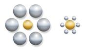
Figure-ground


Colours of light


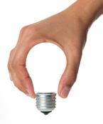
Can you create campaign ad with stencils?

SCAN THE CODE TO FIND OUT THE CHALLENGE
Optical illusions
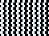
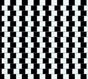
• Café wall
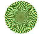
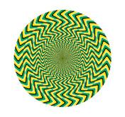
• Apparent movement
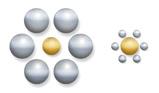
• Ebbinghaus
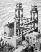
• Impossible objects
• Trompe d’oeil

Shape and perception
Outline

Silhouette

Dintorno Surrounding space


FOCUS O N ENGLISH
Listening
Listen and repeat.
Speaking

What’s the difference between seeing something and observing something?
Discuss the difference with a classmate. Think of some of examples of things you see and things you observe.


White light Green Surface Greenlight
Perception and observation 1

Perception
Visual perception is when we receive and process information through our sense of sight. Our perception of something will be both objective (colour, shape, etc.) and subjective (influenced by culture, experience, mood, etc.).
Observation
Observation comes after perception. It is when we stop and analyse what we are seeing. We pay attention to the visual elements, their meaning and function.
Principles of perception
In the early 20th century, some German psychologists developed the Gestalt principles of perception that explain how we group elements and identify whole figures before seeing their individual parts.
1 Speaking. What is pareidolia? Perform a search and write a definition in your notebook. Choose three photos of the phenomenon and describe them to a classmate.
2 Draw a picture to represent an emotion. Use at least two of the principles of perception.
Closure
We close or complete incomplete shapes.

Proximity
We group elements that are close together.
Continuity
We continue the path of a pattern, even if it is broken.

We group similar elements together. Similarity
Symmetry
Symmetrical shapes make up one shape.
Common fate
We group elements that are pointing in the same direction.
Figure-ground
We cannot perceive the background and the figure at the same time, so the brain must decide which is which.

8
GESTALT PRINCIPLES OF PERCEPTION
Optical illusions 2
Optical illusions are images that confuse the mind. The placement of the lines and shapes can make us see things that are not real.
TYPES OF OPTICAL ILLUSIONS
Café wall illusion
The lines are parallel and the squares the same size, but they don’t look it.
Apparent movement
The lines pointing in different directions make the image look like it is moving.
Ebbinghaus illusion
The circles in the middle are the same size. The big circles around one make it look smaller, and vice versa.
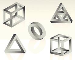
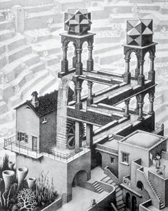
Impossible objects
These objects can only exist in 2D.

The Dutch artist M.C. Escher was famous for his impossible constructions.
Waterfall (1961), M.C. Escher National Gallery (London).
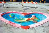
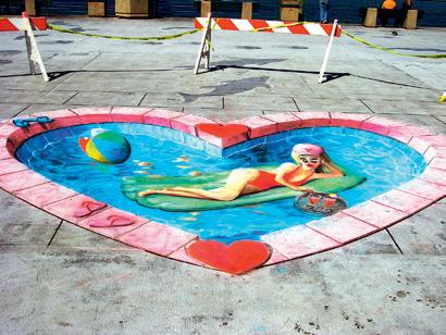
Trompe d’oeil
A very realistic optical illusion. Street artist Julian Beever draws trompe d’oeil 3D illusions on pavements.
Girl in a swimming pool (2007), Julian Beever. Redondo Beach Pier (California).
3 Writing. During World War I, the UK and USA painted ‘motion dazzle’ geometric patterns on their ships to confuse German torpedo boats.
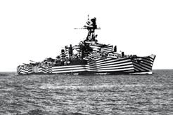
Search ‘motion dazzle’ and answer the questions.
a) What is motion dazzle?
b) Which animals use it?
c) What do they use it for?
4 Observe and analyse these shapes. Why can’t you construct them in 3D? Draw your own impossible object.
5 Speaking. Do some research into ‘Op art’. What are the characteristics of this movement? Discuss different artworks with a classmate. Then, use a ruler and compass to create your own piece of op art within a 10 cm frame.
9 Unit 1
Perception of colour 3
The factors involved in the perception of colour can be physical or psychological.
Physical factors
Our brain perceives the colours of visible light when white light enters our eyes. White light is the part of the electromagnetic spectrum we can perceive.

6 Speaking. Look at the black dot for a time, then look at a white surface. What do you see? Discuss it with a classmate.

7 Do some research into the Munker illusion. Then, use felt-tip pens to show this illusion on A5 paper.
Our eyes contain photosensitive cells called rods and cones. Three types of cones detect the three wavelengths of the colours red, green and blue. When white light hits an object, its surface absorbs some wavelengths and reflects others. We see the colours of the reflected wavelengths. If they are all reflected, we see white. If none are reflected, we see black.
Psychological factors
We can say colour is relative. How we perceive it depends on the colours around it.
Our cones can also become saturated when we look at one colour for a long time. This means that when we move our eyes away, we see the complementary colour. This phenomenon is called successive contrast.
Another optical illusion occurs when the brain fills in a colour. Look at the picture on the right. The circle looks blue when, in fact, only the lines are.
10
Visible light Gamma rays X-rays 0.0001 nm 0.01 nm 0.01 cm 1 cm 1 m 100 m 400 m 500 m 600 m 700 m Radar TV AM FM 10 nm 1000 nm Infrared rays Radio waves Ultraviolet rays
White light Green Surface Greenlight
Playing with perception 4
Advertising
Advertising uses images to persuade people to buy things. The idea is to have a visual impact, so it uses eye-catching images and striking colours and slogans to make the advertisements, or ads, memorable.
Perception is another important aspect in advertising. Images are carefully selected to transmit specific values and feelings. For example, an ad for a perfume may use elegant, sophisticated images to transmit exclusivity.
The Gestalt principles in advertising
The brain perceives simple shapes first. Advertising uses clever, but simple, images to grab the viewer’s attention.
Shape and perception
There are four simple elements we can use to emphasise, highlight, or camouflage shapes.
A well-defined outline makes a shape or figure stand out. Outline
8 Speaking. Work in groups. Create an ad to raise awareness about not wasting water. Use only silhouettes. Present your ad to the class.
9 Paint a picture using outline and dintorno techniques. Think carefully about the colours and textures you want to use, as well as the message you want to convey.
Vocabulary
Perception – Closure – Continuity –Symmetry – Proximity – Similarity –Common fate – Figure-ground –Illusion – Trompe d’oeil – Outline –Dintorno – Silhouette – Surround

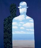
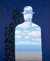
Dintorno
The space inside an outline can be filled with texture, shapes, etc. Surrealist painter Magritte often filled the dintorno with scenes from nature.
Silhouette
A silhouette is a shape of a single colour with no outline. In photography it is often created with backlighting or shadows.
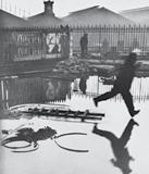
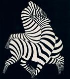
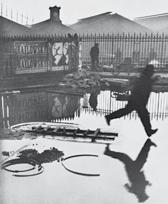
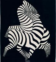
Surrounding space
The space surrounding the figures can be used to highlight or camouflage them. Here, Vasarely uses a plain, dark surround to make the zebras stand out.
11 Unit 1
La Belle Societé (1965-1966, René Magritte. Fundación Telefónica (Madrid).
Behind the Gare Saint-Lazare (1932), Henri Cartier-Bresson. Henri Cartier-Bresson Foundation (Paris).
Behind the Gare Saint-Lazare (1932), Henri Cartier-Bresson. Henri Cartier-Bresson Foundation (Paris).
Art workshop. Printmaking
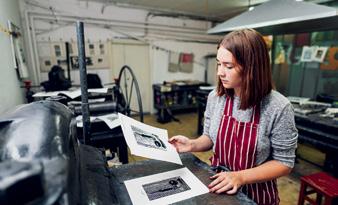
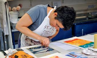
Printmaking consists of cutting a design into a hard surface or printing, then applying ink and printing the design onto paper or another material using relief or intaglio techniques.
There are different types of printmaking:
• Drypoint consists of engraving a design onto a flat metal surface with acid or cutting tools. The ink is applied and the design is printed onto the paper in a press.
• Woodcut consists of carving a design into wood. The ink is applied to the surface and the design is printed onto the paper.
• Lithography consists of drawing a design directly onto a stone or metal plate. Areas of ink are repelled by water and a roller transfers the image to the paper.
• Screen printing uses a mesh screen pulled tight over a frame. A template is used to block certain areas when the ink is passed over the screen to print the design on paper or fabric.
• Aquatint consists of powdered resin spread on a metal plate. When it is submerged in acid, it creates different tones. Ink is added and the design is printed.
• Monotyping is a very basic printmaking technique that consists of a single, unique print.
12
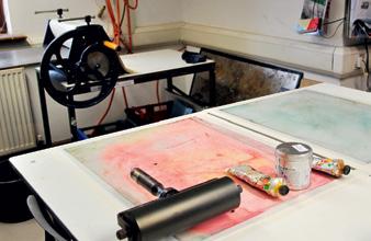
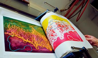
Design process
1. Create your design
Create your design on a glass or acrylic plate (an A4 sheet of acetate will work). Use different types of inks, poster paint or watercolours. Make sure they are very wet to ensure the transfer of the colour. You can add leaves, string and small objects to create texture.
2. Printing
Place the paper over your design and use your hands or rollers to apply pressure and transfer the ink to the paper. You can also use a sharp object to draw on the back of the paper and create a design before you lift the paper.
3. Reproduction
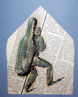
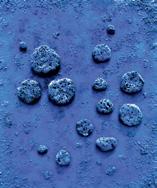
Add more monotype prints until you get the composition you want. In these examples, the printed monotype blots have created pictures. Remember that pareidolia means the brain interprets ink blots as recognisable faces, figures and forms. Your mind tries to make sense of what it is seeing and create something familiar.
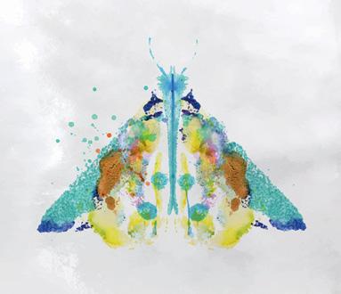

1 Work on your creativity and experiment with pareidolia. Drip well-diluted watercolour paint on acetate onto a similar surface. You can mix different colours as you like. Then place a white sheet of paper onto the acetate to create a monotype inkblot design.
2 When the paint is dry, look carefully for recognisable forms like faces, animals and objects. Trace them with a pencil and then continue the composition to create a picture.
3 Give your creation a title and present it to your class.
13 Unit 1
The final challenge
Take action!
Create a stencil CAMPAIGN ad
Stencilling is a technique that consists of passing paint or ink over a design that has been cut from a robust material.

STEP 1
Gather the materials
• You will need: sheets of acetate to make the stencils, diluted water-based paint, a brush or a sprayer and a support on which to apply the paint.
STEP 3
Create the template
• Transfer the final drawing to an acetate and cut out the parts that need to be painted. Then, place the template on the support and paint over it. Spray the paint or use a fairly stiff brush, covering the holes in the acetate well.
STEP 2
Design the advertising campaign
• Analyse various advertising campaigns, that raise awareness for a cause Choose an approach aimed at your target audience. Remember the importance of composition in a visual message and the use of metaphors. Make a preliminary sketch.
STEP 4
Add the details
• Lastly, finish the design off and add any other details or drawings you want, using other techniques to complete your campaign advertisement. Present your work to your class.
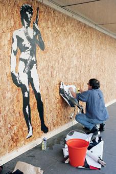
Stencil street art with a social message
• Blek le Rat (1951) is a French artist who is considered to be the ‘father of stencil graffiti art’. The theme of his work is often solitary or marginalised people facing or fighting oppression. He is particularly interested in the problem of homelessness, and uses his art to raise awareness.
Blek le Rat pastes stencilled posters onto a wall in London. David with Kalashnikov (2007).
14
SCAN THIS CODE TO CONSULT THE GLOSSARY FOR THIS UNIT.
Take action!
2 UNCOVERING ARTISTIC POTENTIAL
CREATING ART
Creative Process Steps Basic elements
• Observe
• Gather information
• Choose your technique and materials
• Sketch
• Dot
• Line
• Texture
• Colour
• Plane

Human figure
Proportion Drawing faces


Foreshortening

Can you make a papier mâché mask?

Colour and light
Tonal values


Natural forms
Landscapes Animals
Linear perspective
Overlapping
Aerial perspective
FOCUS O N ENGLISH
Listening
Listen and repeat.
Speaking
Seeing and observing are quite different. We see things all the time, but often don’t observe them. Observe what is happening in your classroom or outside the window. Describe what you discover to a classmate.
CODE TO FIND OUT THE CHALLENGE
SCAN THE
High key Low key Contrast
The creative process 1
Steps of the creative process
Inspiration doesn’t just happen, it takes work. Artists all have different creation processes, but there are some steps that help everyone.
1. Observation
Pay attention to your surroundings, the news, your feelings about events, etc.
2. Information
Gather information and research other artists related to your topic.
3. Technique and materials
Choose the technique you want to use and gather the appropriate materials.
Basic elements of artistic expression
4. Sketch
Create a sketch (an initial test drawing) to help you organise your ideas about shape, colour, texture, position, etc.
THERE ARE FIVE BASIC ELEMENTS USED IN ART
A small round spot or mark. Placed together dots can form shapes. Pointillism used bright dots of colour to create images.
A line can be used to create a shape. Varying the thickness, direction and type of line gives different effects.
Adding a material like sand to paint adds texture. Some artists also add fabric or other materials to their work.
1 Speaking. Think of something (a text, the sunset, etc.) that inspires you and find out how other artists have shown it in their work. Prepare a digital presentation to explain the results of your work to the class.
Colour creates mood or sensations. Dark colours can represent mystery. Bright colours an represent energy or joy.
A two-dimensional flat surface or shape used to create volume, distance, chiaroscuro, etc.p
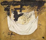
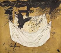
Ochre and black with pasted-on cloth (1972) Antoni Tàpies. Private collection.
2 Use different materials to draw and paint nature themes. You can experiment with pencil, charcoal, poster paint, watercolours, etc. Analyse your results.
Which did you find easier to use? Which did you like best? Explain your answers.
16
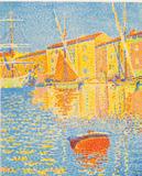
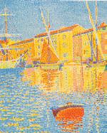
The red buoy. San Tropez (1895) Paul Signac. Musée d’Orsay (Paris).
Dot Texture Line Colour Plane
Colour and expression
Colour
Colours attract our attention every day and affect our mood and feelings. Do you think we love sunsets so much because of the colours?

Harmonious and contrasting colours are a powerful tool for transmitting emotions. Colours can also be symbolic. Red is often associated with passion and energy, while blue transmits serenity.
Light
Light also transmits emotion in art. It can be soft or diffuse to transmit calm, or bright and direct to create be dramatic.
Tonal values
Tonal values determine the degree of light and dark.
TONAL VALUES
High key Contrast
Light tones and high values that soften the composition.
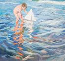
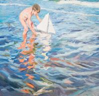
The Little Sailing Boat (1909), Joaquín Sorolla. Museo Sorolla (Madrid).
Low key
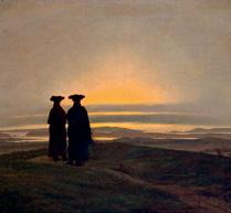
Pronounced areas of light and dark. Often used to focus attention on an object or figure.
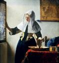
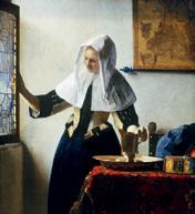
Young woman with a water pitcher (1662), Johannes Vermeer. Metropolitan Museum of Art (New York, USA)
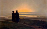
A generally dark scene with little light. In this painting
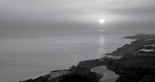
Sunset (1830-1835), Casper D. Friedrich highlighted the sky by painting the in dark colours.
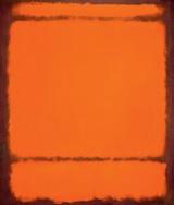
3 Speaking. Look at these two paintings by Mark Rothko and Yves Klein. What do you see? How do they make you feel? Discuss them with a classmate.
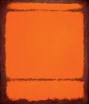
No. 210/No. 211 (Orange) (1950), Mark Rothko. Museum of American Art (USA).
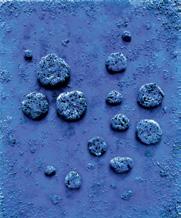
L’accord bleu (RE 10) (1960), Yves Klein. Stedelijk Museum, Amsterdam.
4 Writing. Pantone® created a colour matching system to catalogue colours with a code. They also choose a colour of the year every year to reflect the mood in the world. Do some research and answer these questions:
a) What is this year’s colour of the year?
b) What does it represent?
c) Why did Pantone® start the colour of the year programme?
Choose your favourite colour of the year (1999-2024) and use it to paint a picture that reflects its meaning.
17 Unit 2
2
Representing natural forms 3
Landscapes
Artists use different resources to create realistic natural landscapes:
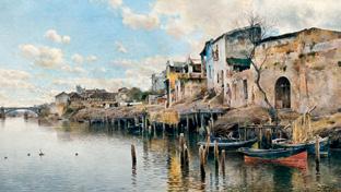
• Linear perspective to show where you are looking from:
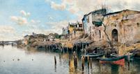
– a high point of view gives a general view
– a low point of view makes objects appear closer, as in this painting by Emilio Sánchez Perrier.
• Overlapping consists of putting some elements in front of others. In natural landscapes, this can be animals, people, etc. in front of objects in the background, such as the sky, mountains, etc.
• Aerial perspective creates space and depth by using gradation of colour. Diminishing scale and texture definition also help create depth.
Animals
Points to take into account when drawing animals:
• break them down into simple geometric shapes
• show the direction of movement and use lines to show the position of legs, fins, heads, etc.
• use 3D shapes (cones, prisms, etc.) for more precision
• use perspective or foreshortening for moving animals
• add outlines and details, including skin texture
• use light and shade to create volume.
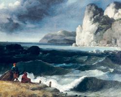
5 Speaking. The genre of landscape painting includes seascapes. Look at this painting by Theodore Gericault. Discuss it with a classmate. What can you see? How does the artist create the movement of the waves?
Look for a picture of the sea. Paint it, using techniques to create movement and depth.
6 Do some research into endangered sea animals. In groups, design a fact file with a fact sheet on each animal. Include a sketch of each animal, as well as important information.
18
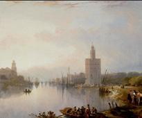
Triana (1888-1990), Emilio Sánchez Perrier. Museo de Bellas Artes, Sevilla.
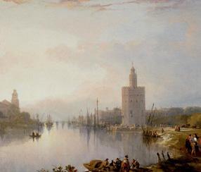
Torre del Oro (1833), David Roberts. Museo del Prado (Madrid).
Marina (1822), Theodore Gericault. Museum of Art and History, Geneva (Switzerland).
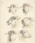
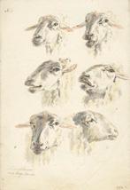
Study sheet with six sheep heads (1880), attributed to Franciscus Andreas Milatz. Private collection.
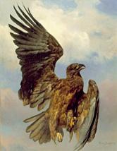
The wounded eagle (1870), Rosa Bonheur. Los Angeles County Museum of Art (USA).
Representing the human figure 4
Proportion
Proportion is the relationship between one part of an object and the whole. For the human figure, we use the head measurement to determine height and the position of different parts of the body. An adult body measures eight heads.
This helps you draw a moving figure. First you draw the direction of the spine, the shoulders, the hips, the legs and the arms. Then, give the figure volume.
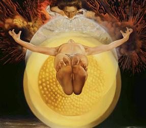
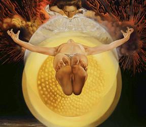
Sometimes artists use foreshortening when they draw a human figure. In this case, you draw some parts of the body larger than others, and do not use proportion. Salvador Dalí uses foreshortening in this painting.
Drawing faces
Proportion is also important when drawing faces. A simple grid will help you put all the features in the correct place. Change the direction of the eyebrows and mouth to alter the expression.


7 Speaking. Polykleitos and Lysippus both developed canons of proportion. Do some research and discuss the questions with a classmate.
a) What is a canon of proportion?
b) Who were Polykleitos and Lysippus?
c) What was the difference between the canons of the two artists?
8 Find pictures of moving people. Using tracing paper, trace a grid showing their movement and create a sketch. Choose one of your sketches and transfer it to paper. Complete the drawing.
9 Writing. Invent a character. Think about their personality (happy, dynamic, calm, etc.) and physical features. Write a description and then draw your character.
10 Arrange your desks into the largest circle possible. Ask volunteers (individuals or pairs) to pose in the centre so the rest of the class can quickly sketch them. Don’t worry about adding details.

Vocabulary
Values – High key – Low key –Contrast – Linear perspective –Overlapping – Aerial perspective
– Foreshortening - Canon - Grid
19 Unit 2
Pieta (1958), Salvador Dalí. Pérez Simón Collection (Mexico).
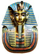
Mask of Tutankhamun. Egyptian Museum in Cairo (Egypt).
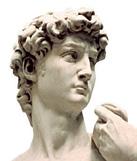
David (1502-1504), Michelangelo. Accademia Gallery Florence.
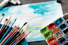
Art workshop. Watercolours
Watercolour is a painting method that uses paints made from pigments dissolved in gum Arabic. The more water you add, the more transparent the paint is.
Watercolour techniques:
• Glazing. Painting another tone on top of a dry layer of colour to create luminosity and transparency. Great for painting water.
• Wash. Using very little paint and a lot of water to paint an area with a translucent colour.
• Wet paper. Using a wet paper support and applying paint with a brush or sponge to make the paint diffuse over the surface.
• Dry-on-dry. Using only a tiny bit of water and a dry canvas to get bright, striking colours.
Watercolour paint dries quickly, so you have to work fast and accurately. Practise the brush strokes and washes on a draft first.
August Macke was a German expressionist who used watercolour a lot. Look carefully at how he used the paint.
Irregular, imperfect lines separate spaces.
Thick black marks highlight features of the human figure.
Thin lines present finer details.
Woman on a divan (1914), August Macke. Museo Nacional ThyssenBornemisza (Madrid).
20
Design process
1. Materials
Gather the materials you need and some extra sheets of paper for sketches and tests.
2. Sketch
Use a pencil to very lightly sketch the main shapes of you composition. These will guide you when you start to paint.
3. Test sheet
Use a separate sheet of paper to test your colours and techniques. Practise washes with wet paper and glazes when the paper is dry to create colour transition.
4. Finish
Add very soft shadows to create volume. Blend colours gently to create the perfect transition between light and dark. Use different tones to evoke emotions and encourage viewers to use their imagination.

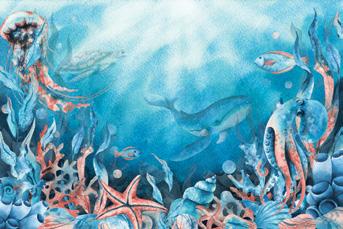
Create an underwater scene
1 Look at this picture. Use watercolour to paint an underwater scene with sea life and objects. Use a range of colours.
2 Create an abstract composition using the glazing technique of overlapping patches of colour. Mix colours to create different sensations.
21 Unit 2
East River, Sunrise (1862), Charles de Wolf Brownell. National Gallery of Washington (USA).
Take action!
The final challenge
MAKING A PAPIER MÂCHÉ MASK
Papier-mâché (crushed paper) is an ancient technique of making objects using paper pulp. This traditional technique has been used by many artists throughout. Work in groups. Design various masks and organise a theatre play.

STEP 1
Design the masks
• Collect images of masks from different cultures to serve as an example. Plan what characters or emotions you want to represent and what the show is going to be about.
STEP 3
Make the papier-mâché
• Cut the paper into small pieces and let them soak for a few hours. Then shred the paper with your hands, strain it with a cloth to extract all the water and mix it with the white glue until you get a pulp. Model it as you wish.
STEP 2
Gather the materials
• You will need recycled paper cut into pieces, a bucket or bowl of water, white glue, brushes, sandpaper and water-based paint.
STEP 4
Add the details to the mask
• Sand down the masks and add the final details with the water-based paint. You can also repeat the process if you need any props. Now you can start your show!
Papier-mâché in art
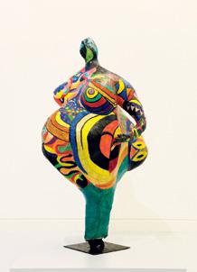
• Niki de Saint Phalle (1930-2002) is a Parisian artist who lived between France and the United States. Some of her sculptures, called ‘nanas’, represent femininity and motherhood. They are voluptuous, cheerful, energetic and depart from the canon. They are made with papier-mâché, wool, and objects that she finds. Later, she began to introduce polyester to them to be able to exhibit them in outdoor spaces.
22
SCAN THIS CODE TO CONSULT THE GLOSSARY FOR THIS UNIT.
1. Experimenting with perception ........................2 2. Uncovering artistic potential .............................. 6 3. Creating volume . ....................................................10 4. Making audiovisual magic ................................. 14 5. Exploring the geometric world ....................... 18 6. Designing a better world.................................... 22 Index SECONDARY EDUCATION 3 VisuA l A nd
IS ual Arts DuAl FOCUs
AUDIOv
EXPERIMENTING WITH PERCEPTION 1

Perception and observation
Perception and observation
Observation Visual perception
The analysis of what we are seeing. Paying attention to visual elements, meaning and function.
Principles of perception
Gestalt principles of perception
Closure
We close or complete incomplete shapes.
Proximity
We group elements that are close together.
Continuity
We continue the path of a pattern, even if it is broken.
Similarity
We group similar elements together.
Common fate
Symmetry
Symmetrical shapes make up one shape.
We group elements that are pointing in the same direction.

Figure-ground
We cannot perceive the background and the figure at the same time, so the brain must decide which is which.
2
Objective Colour, shape, etc. Subjective
by culture, experience, mood, etc.
Influenced
Optical ilussions
Types of optical ilusions
Apparent movement Ebbinghaus
Optical illusions in art
Impossible constructions
The Dutch artist M.C. Escher was famous for his impossible constructions.
objects

Trompe d’oeil
Street artist Julian Beever draws trompe d’oeil 3D illusions on pavements. They have a high degree of realism.
3
Waterfall (1961), M.C. Escher.
Girl in a swimming pool (2007), Julian Beever.
ilusion
Impossible
Cafe wall ilusion
Perception of colour: physical factors
Physical factors
Visible spectrum of light
Our brain perceives the colours in white light, which is the part of the electromagnetic spectrum we can see.
Our eyes contain photosensitive cells called rods and cones. 3 types of cones detect the 3 wavelengths of the colours red, green and blue.
Perception of colour: psychological factors
Psychological factors
Successive contrast
When we look at a colour for a long time and then move our eyes away, we see the complementary colour.
Photosensitive cells Filling in
The brain fills space with a colour. Here, the circle looks blue when, in fact, only the lines are.
4 1
White light Green Surface Greenlight Visible light Gamma rays X-rays 0.0001 nm 0.01 nm 0.01 cm 1 cm 1 m 100 m 400 m 500 m 600 m 700 m Radar TV AM FM 10 nm 1000 nm Infrared rays Radio waves Ultraviolet rays
Advertising and perception
Advertising
Visual impact
Eye-catching images with striking colours and slogans.

Shape and perception
Outline
A well-defined outline makes a shape or figure stand out
Gestalt principles
Simple, clever images.

Four elements for highlighting or camouflaging shapes
Dintorno
The space inside an outline can be filled with texture, shapes, etc. Magritte often filled the dintorno with scenes from nature.
Silhouette
A silhouette is a shape of a single colour with no outline. In photography it is often created with backlighting or shadows.
Surrounding space
The space surrounding figures can be used to highlight or camouflage them. Vasarely used a plain, dark surround to highlight the zebras.
5
La Belle Societé, René Magritte. Zebras, Víctor Vasarely. Behind the Gare Saint-Lazare, Henri Cartier-Bresson.
UNCOVERING ARTISTIC POTENTIAL 2
The creative process
1. Observation
Pay attention to your surroundings, the news, your feelings about events, etc.
Steps in the creative process
2. Information
Gather information and research other artists related to your topic.
3. Technique and materials
Choose a technique to use and gather your materials.

Basic elements of artistic expression
Basic elements
A small round spot or mark. Placed together, dots can form shapes.
Varying the thickness, direction and type of line gives different effects.
Texture
Adding sand to paint or materials to paintings adds texture.
Colour creates mood or sensations. Dark colours for mystery. Bright colours for energy or joy.
4. Sketch
Create a sketch to organise your ideas about shape, colour, texture, position, etc.
A two-dimensional flat surface or shape.
Ochre and black with pasted-on cloth,
6
Dot Line Colour Plane
The red buoy. San Tropez, Paul Signac.
Antoni Tàpies.
Colour and expression
Colour and light
Colour
Harmonious Contrasting Symbolic Light
Can be used in different ways to transmit messages and emotions.
No. 210/No. 211 (Orange), Mark Rothko.
Tonal values
High key
Light tones and high values that soften the composition.
Tonal values
Soft or diffuse light transmits calm. Bright or direct light is dramatic.
Low key Contrast
A generally dark scene with little light.
Pronounced areas of light and dark. Often used to focus attention on an object or figure.
7
The Little Sailing Boat, Joaquín Sorolla.
Sunset, Casper D. Friedrich. Young woman with a water pitcher, Johannes Vermeer.
L’accord bleu (RE 10), Yves Klein.
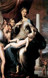
Madonna with the Long Neck, Parmigianino.
Natural forms: landscapes
Landscapes
Linear perspective
High point of view
Low point of view
Aerial perspective Overlapping
Natural forms: animals
Break down into simple geometric shapes.
Add outlines and details.
Animals
Drawing tips
Sketch lines to show direction of movement and position of body parts.
Use light and shade to create volume.
Use 3D shapes for precision.
Use perspective or foreshortening for moving animals.

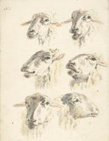
Study sheet with six sheep heads, Franciscus Andreas Milatz. The wounded eagle, Rosa Bonheur.
1 8 2
Triana, Emilio Sánchez Perrier. Torre del Oro, David Roberts.
Human figure: proportion
Canon of proportion: an adult body measures eight heads.


Human figure: drawing faces
Proportion
Foreshortening: some body parts larger than others.
Human face
Use a grid to put the features in the correct place.
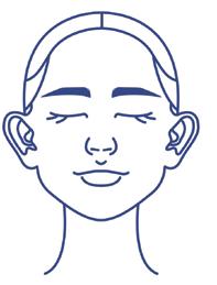
Change the direction of eyebrows and mouth to alter expression.
9
Pieta, Salvador Dalí.
© This edition: GRUPO ANAYA, S.A., 2024 - Valentín Beato, 21 - 28037 Madrid - Printed in Spain. All rights reserved. No part of this publication may be reproduced, stored in a retrieval system, or transmitted, in any form or by any means, electronic, mechanical, photocopying, recording, or otherwise, without the prior permission of the publishers.
