ANTHOLOGY: TOP ONE PERCENT

018 Get ready for the best of the best yearbooks. CHRIST PRESBYTERIAN ACADEMY | LOGAN REID NASHVILLE, TN HIGH SCHOOL 020 HONORABLE MENTION 120 UNIVERSITY ................................. 132 MIDDLE SCHOOL 244 Anthology
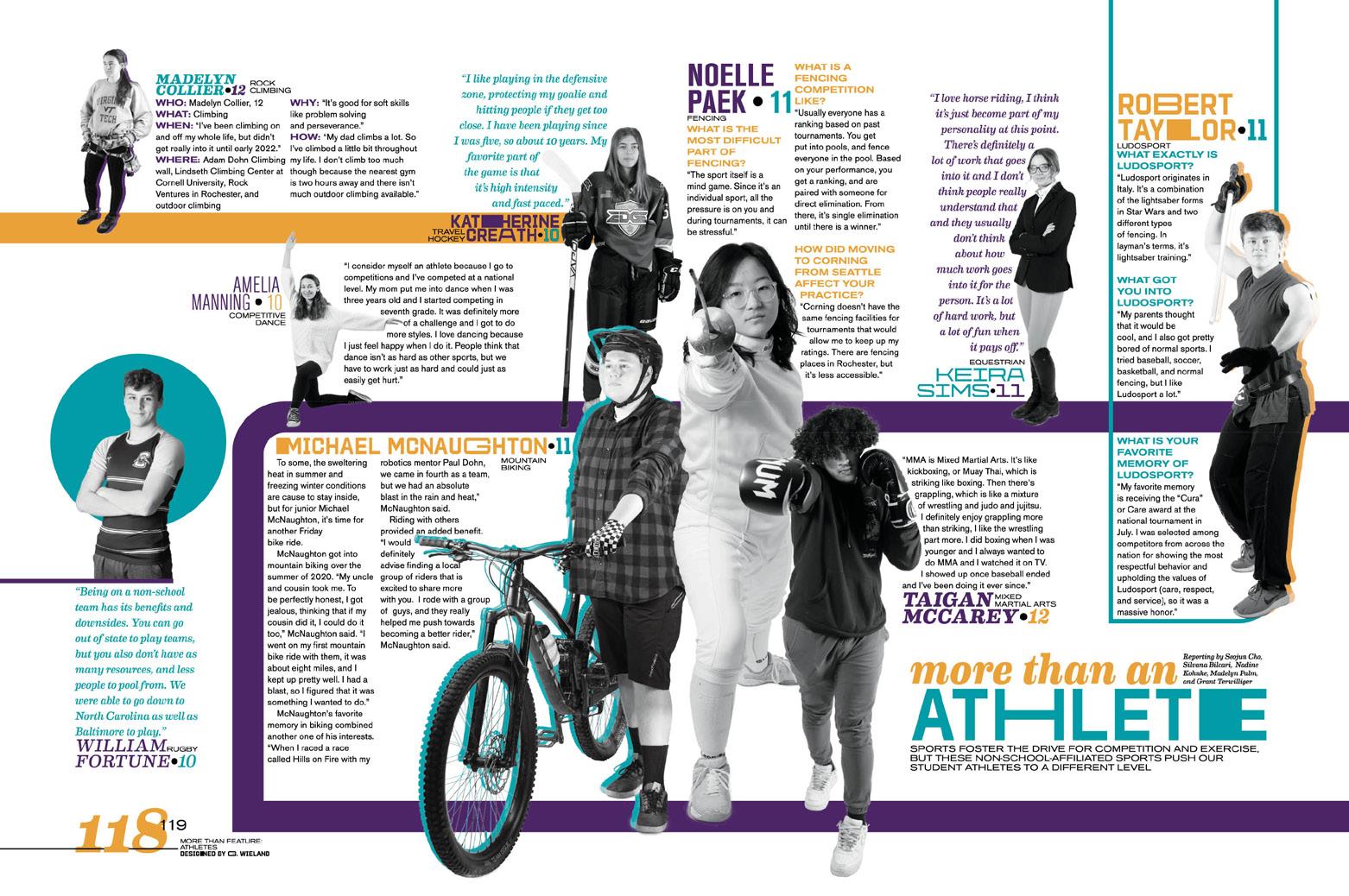
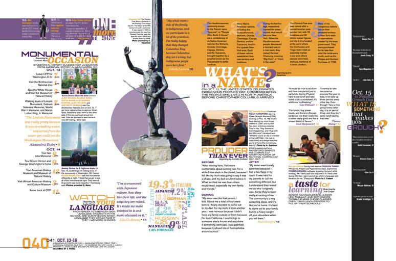
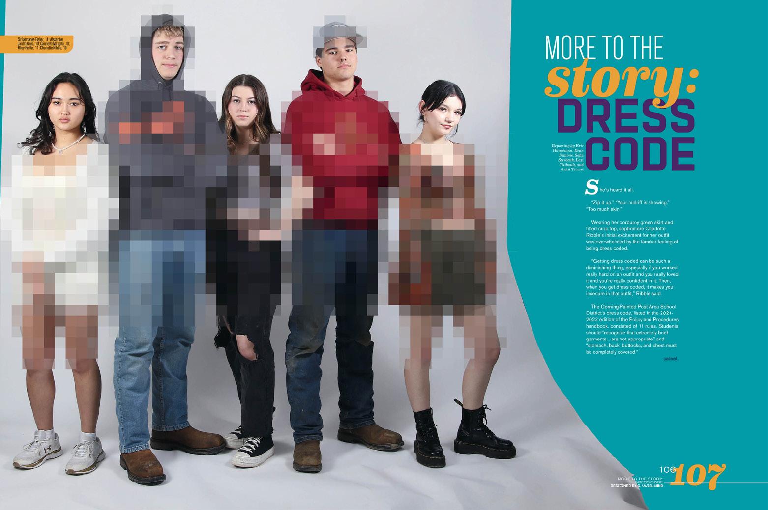
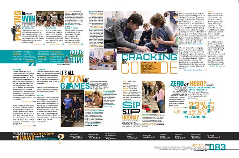
Mention: There’s no such thing as a perfect book, but the entries in this collection are sure striving for greatness. Themes, type, coverage and design are all falling into place — and we see them getting better year after year.
Honorable

THE VARSITY TEAM OF VARSITY YEARBOOK.
These staffs conquered their own checklists and reached elevated goals.
From cover to cover, and on every page in between, these books exemplify what good yearbooks are meant to be.
From classy to cheeky and from serious to lighthearted, the themes (oh so carefully chosen) were expertly expressed in words, graphics, type and color. And more than that — because that’s just the start of it — they covered their school to the utmost and provided the variety of people, events and memories that will make this volume stand the test of time.
PORTFOLIO 29 the best of varsity yearbook 019

Arvada High School
ARVADA, CO
ARVADAN
Adviser: Sergio Luis Yanes
E ditor: Sydney Huyser
Varsity Rep: Genise Cushman


020 COVERAGE PORTRAITS COVERAGE FEATURE ENDSHEET


Stand-out features:
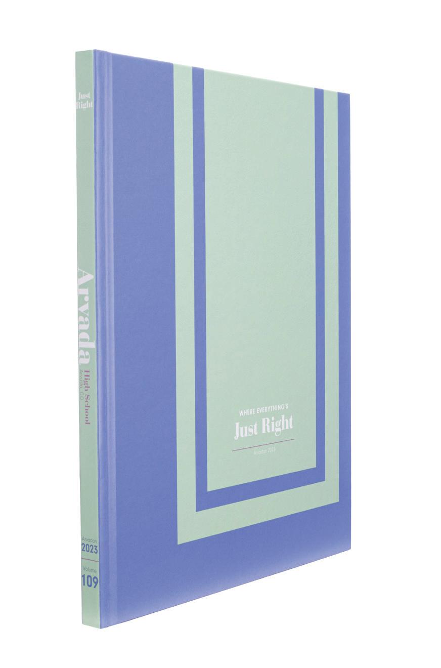
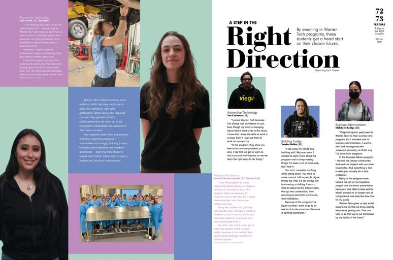
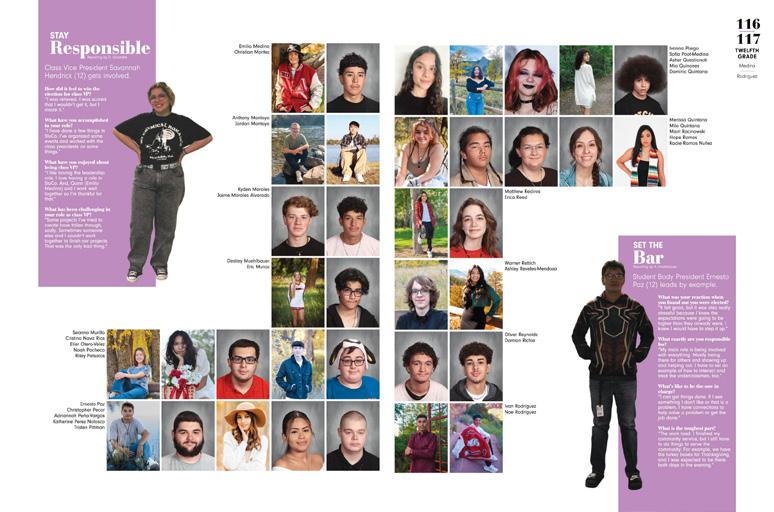
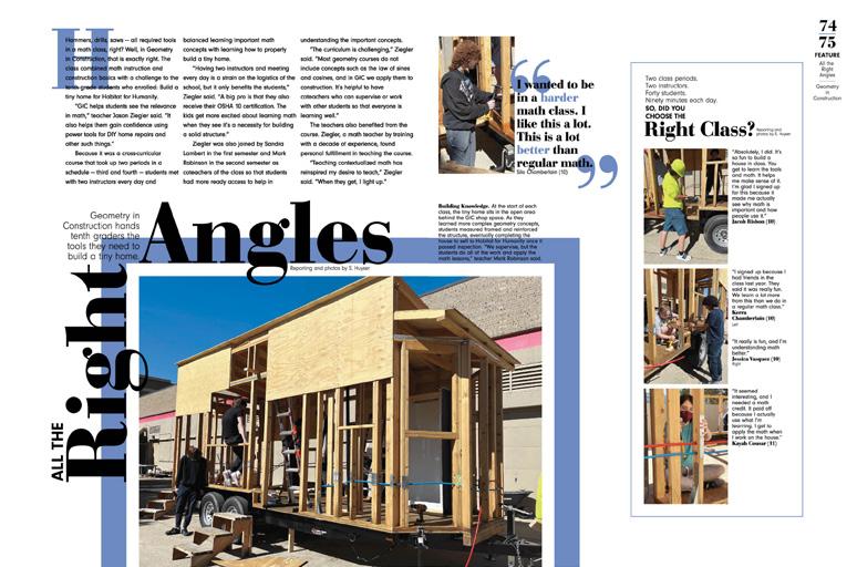
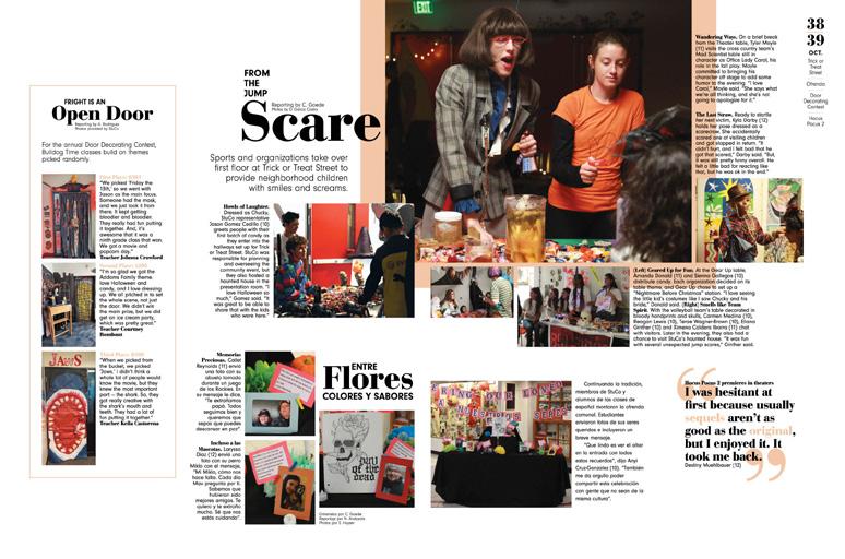
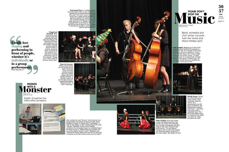
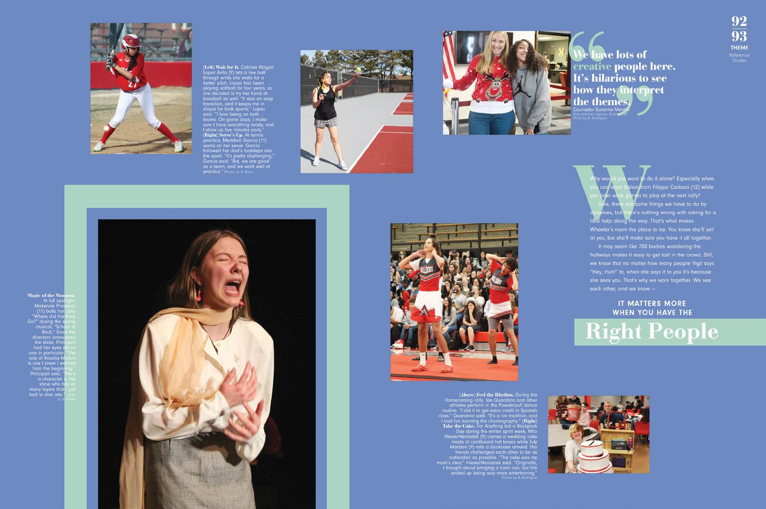
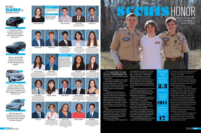
THE RIGHT VIBE: After several years of “bold statement” themes, the Arvadan staff wrote that they wanted to adopt a vibe that was more “understated confidence.” This is reflected in color choices, the more reserved way of opening the book and the ways they wove the theme through the spreads and sections. The Arvadan’s design leans on soothing colors, airy pages and a consistent pair of fonts with distinct roles and use cases.
EMBRACE THE SPACE: For this staff, part of supporting the concept of an understated book included generous use of white space paired with more muted colors. There’s also not a sense of a set-in-stone color palette. Instead, colors were chosen to accent dominant photos and used for thick lines and large quotation marks. Those hues also appear in lighter opacities, with the exception of school-color red, which appears in full strength on reference pages. The dominant headline font, AHJ Bodoni Display Bold — while helping to anchor the stories — provides more of a traditional feel than some other fonts.
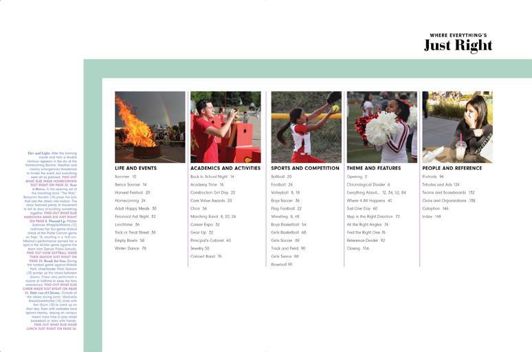
TOP IT OFF: Mixing traditional coverage in chrono-by-month sections with feature spreads and profiles was the right formula for this staff. Coverage is varied and spreads are inviting. Reader services, like informative folios and the topical table of contents on the endsheet, make the book that much more inviting. When we see the index includes color-coded references to four traditional sections, we know it’s all “right there ”
021 ANTHOLOGY | Arvada High School COVERAGE COVERAGE COVERAGE DIVIDER


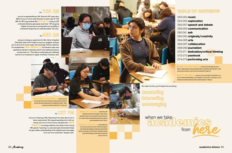
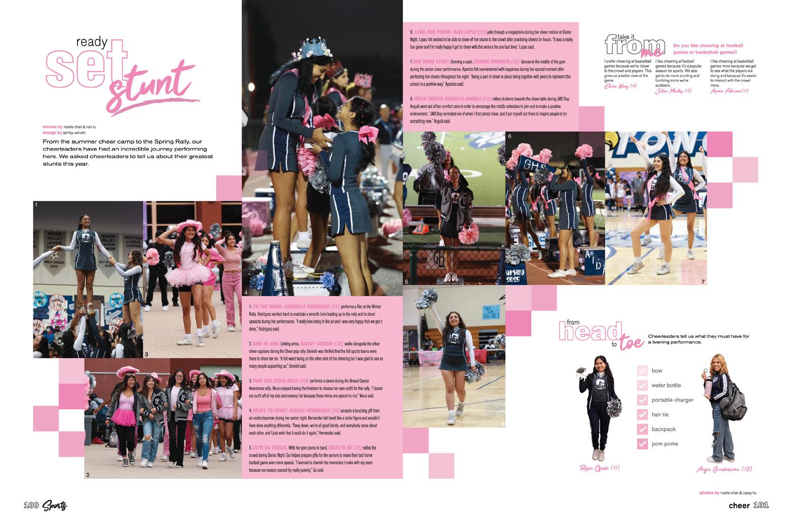
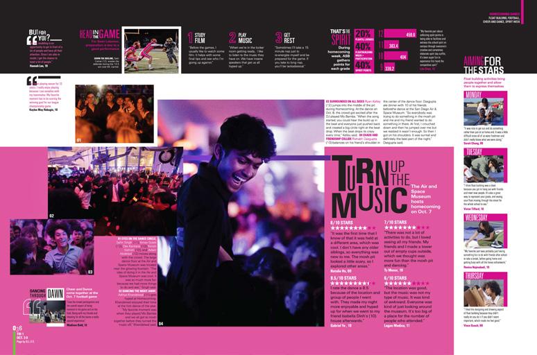
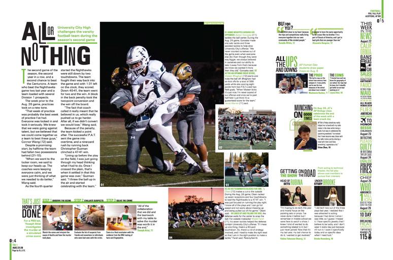
Adviser: Philip Zamora Editors: Neil Lu, Ashley Uenishi and Noelle Chan Varsity Rep: Mimi Orth Gabrielino High School SAN GABRIEL, CA
022 COVERAGE FEATURE ENDSHEET PORTRAITS
ASH-À-WÛT


Stand-out features:
POWER OF THREE:
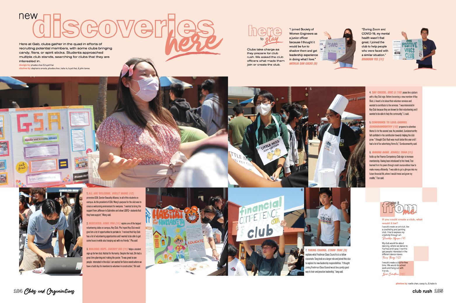
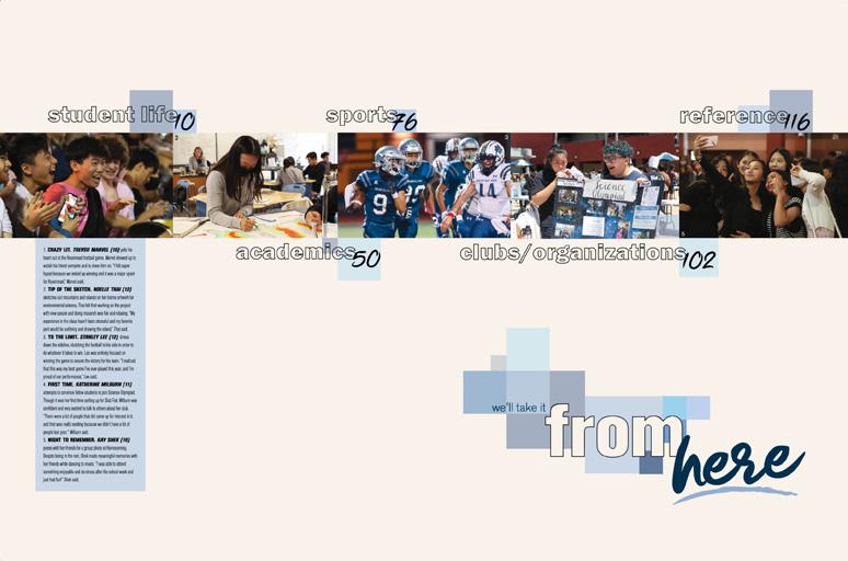
Ash-à-Wût layers contemporary execution onto a rock-solid foundation. The theme look sets the stage with three distinctive fonts (and type treatments) and overlapping pattern of boxes in varying tints and shades of blue. The endsheet follows suit, revealing the traditional sections before another triad is introduced in the opening, where the words discovery, determination and dedication are highlighted.
IT’S ABOUT TIME: Showing ongoing activity on campus, timestamps appear alongside captions on theme pages. While the opening ends, “No matter the time, it all comes back to GAB. This is our story. We’ll take it from here,” each divider offers a twist. Repeating the use of three power words tied to the section, the conclusion on the student life divider reads, “No matter the time, you’ll always find something busy, thrilling, unparalleled when we take student life from here
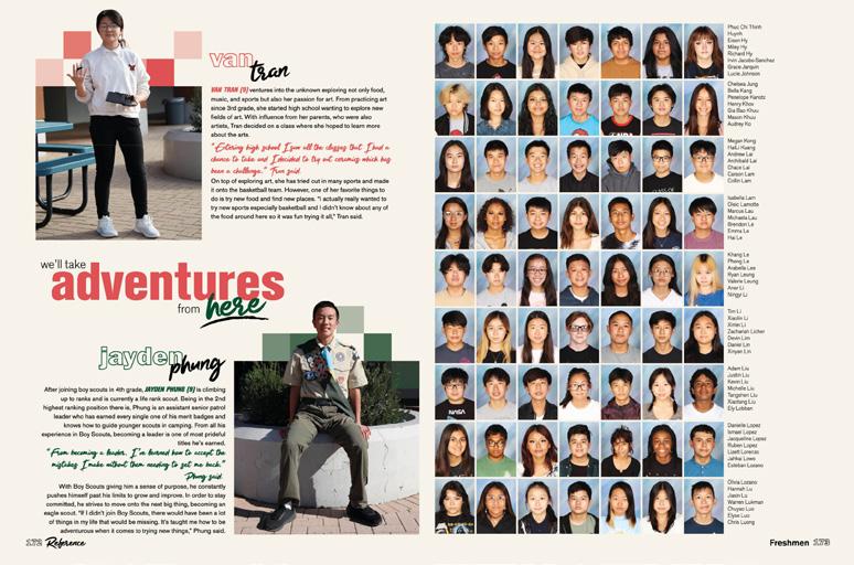
TOOLBOX TACTICS: With visual identifiers firmly established and consistent design and structure, they were ready to go. Coverage spreads feature dominant photo packages and long-form copy, a variety of mods and alternative copy formats, faces and quotes galore. Despite their diverse storytelling and design plans, the volume is unified graphically and typographically. The blocks change colors, echoing the photo content, creating even more visual variety. Many of the mods advance the theme — including the three-quote ACD “Take it from Me,” which appeared both vertically and horizontally.
ANTHOLOGY | Gabrielino High School 023 COVERAGE FEATURE COVERAGE DIVIDER OPENING


024 DIVIDER COVERAGE COVERAGE OPENING Adviser: Greg Anderson Editors: Arianna Evangelista and Leah Grier Varsity Rep: Rebecca McGrath Arapahoe High School CENTENNIAL, CO CALUMET


Stand-out features:
IMPRESSIVE ARRIVAL:
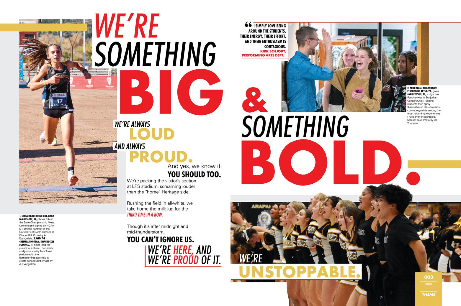
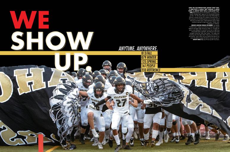
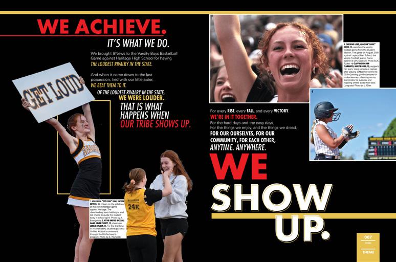
The cover, endsheet, title page and five-spread opening of the Calumet could not be any more unified. There are the obvious theme elements, of course — like type, color and graphics, but between the visual elements of type styling — and the verbal message from the “We Show Up” theme, we feel like we’re caught up in a pep-rally chant. The student photos add to the excitement starting with fans on the cover, then the football team breaking through the mascot flag at the start of a game, and then cheerleaders, more fans and, yes, a few non-sports photos. It’s a great package.
AND THERE’S A REASON:
The fourth and fifth spreads of the opening explain a huge moment in the school’s history: Despite a state law to the contrary, Arapahoe was able to keep its Native American name and mascot. We learn about the history behind the mascot and the continuous and revived relationships between the school and the Arapaho Tribe. The huge, bold headline, “We are Warriors,” cements the feeling of pride expressed on the pages.
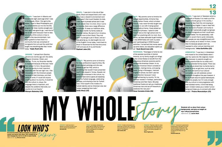
AND IT KEEPS GOING:
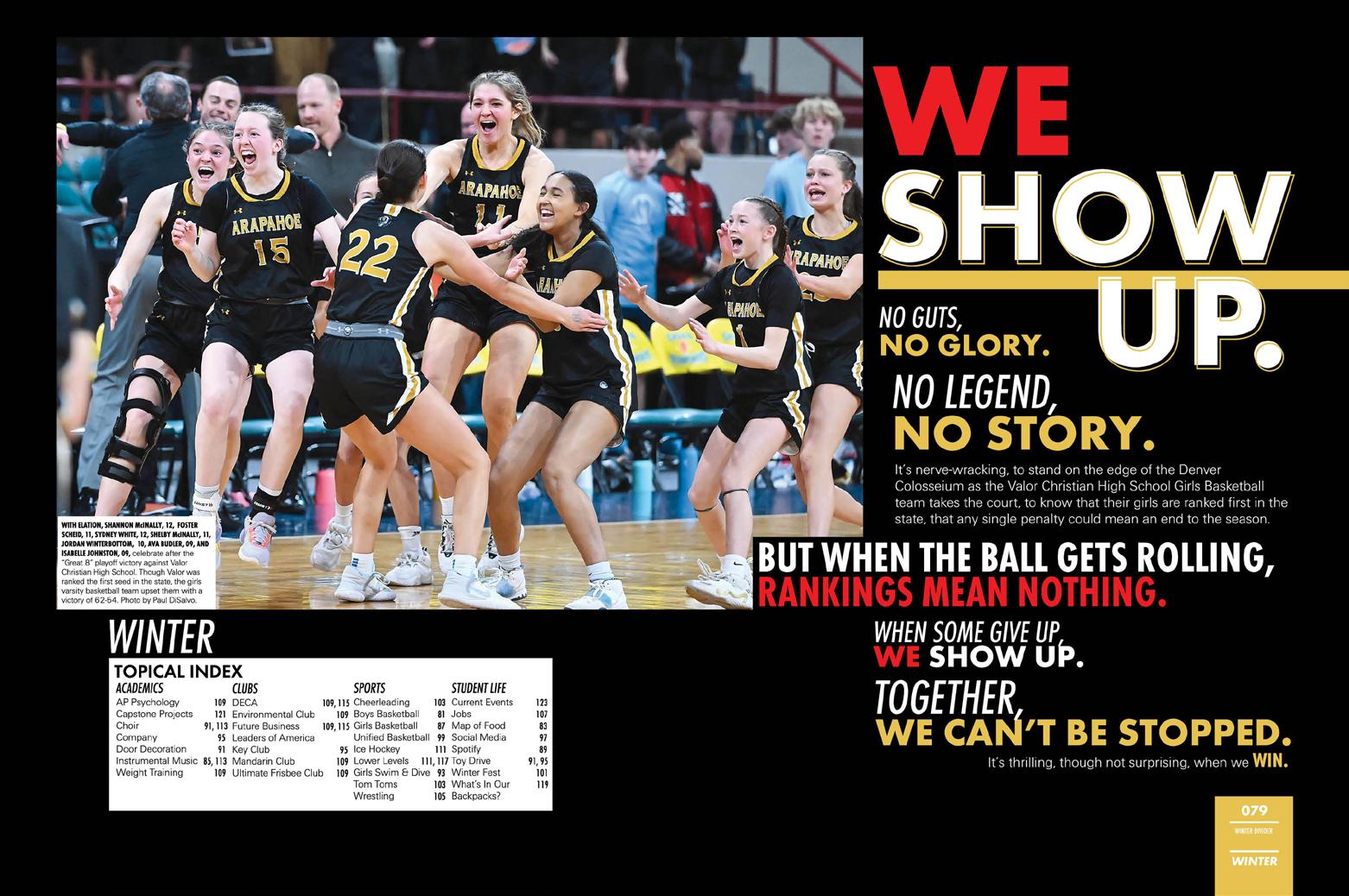
This staff loved their theme so much, they repeated it — on the endsheet, title page, opening, closing and every divider. It’s a chronological book with seasonal sections, so there wasn’t too much explanation needed. Instead, they continued their chantlike theme from front cover to back endsheet.
025 PORTRAITS FEATURE COVERAGE COVERAGE ANTHOLOGY | Arapahoe High School
OPENING ENDSHEET COVERAGE


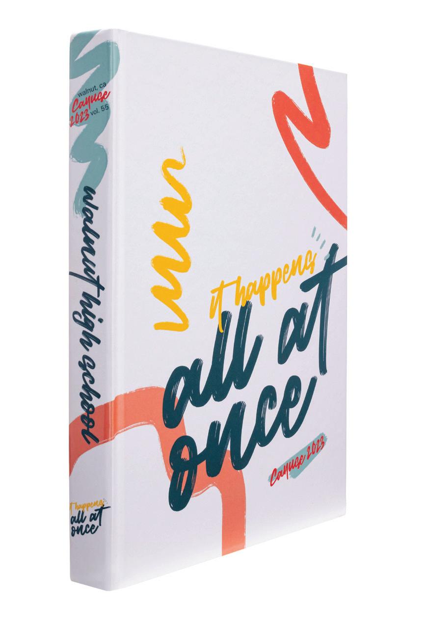
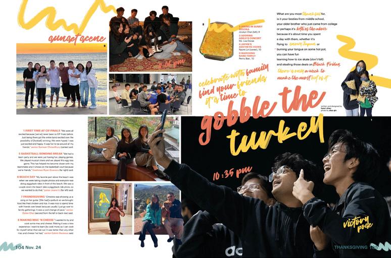
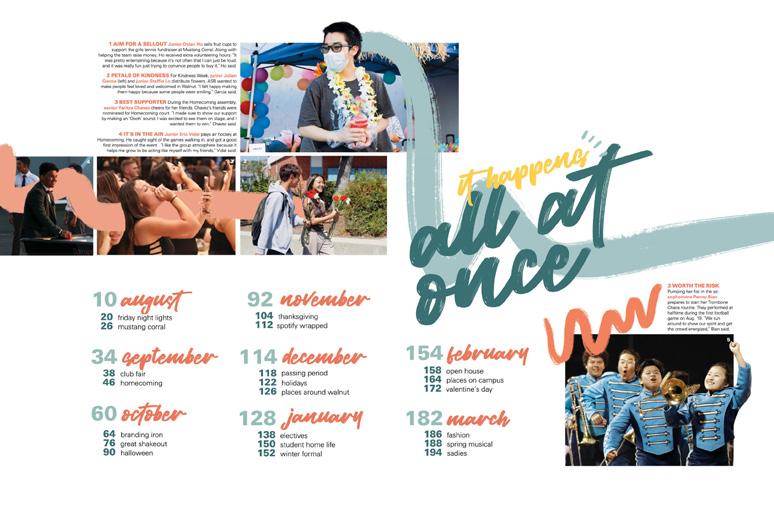
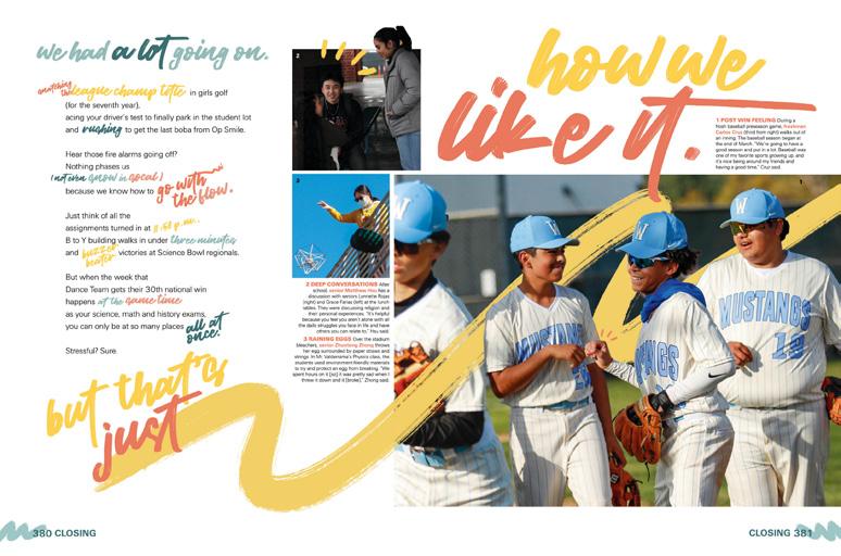
026 COVERAGE COVERAGE FEATURE CLOSING COVERAGE ENDSHEET DIVIDER Adviser: So Hee Tan Editors: Nathan Cheung, Anisha Choksey, Sunny Liu, Shani Su and Amber Zhao Varsity Rep: Mimi Orth Walnut High School WALNUT, CA CAYUSE


Stand-out features:
ALL SO TRUE: Accurately reflecting the high school experience — especially in recent years — there’s a lot going on visually. A four-color palette includes twists on school colors blue and gold, plus a pair of trendy accents used in varying opacities. It sets the stage for busy-ness, alongside a casual handwritten font and loose, curling graphics.
PLANNED VARIETY: Many coverage spreads feature a dominant coverage package supported by two to four mods on other aspects of the coverage week. All incorporate the theme visuals and follow best practices for storytelling, photo composition and type design. And, they were consistent enough that the boo k’s identity was clear. When the staff wanted to break the cadence of the traditional coverage, they used more color and more art to set features apart. By adding graphic touches, silhouetting images and combining smaller bits of copy and photo packaging, they created distinctive spreads with huge appeal.
FOR THE RECORD: Nearly 200 pages of portraits, group shot galleries, ads and more create a strong historical record with lots of details and clear IDs. Even the index contributes with topical listings for easy use, hanging indents to clarify longer entries. A 40-photo current events time capsule wraps up the year.
027
OPENING
CLOSING COVERAGE FEATURE
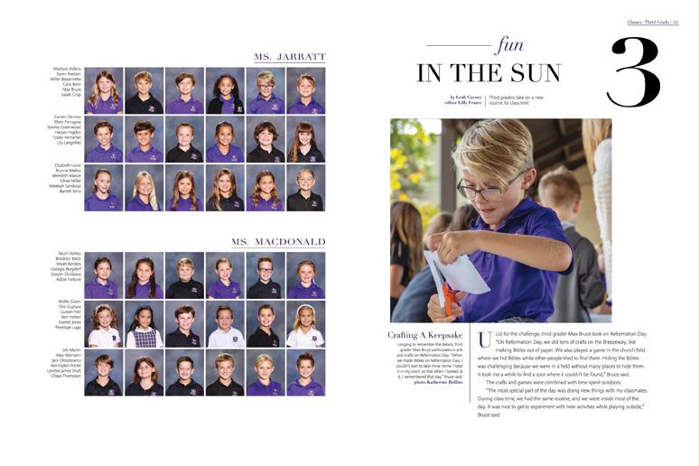
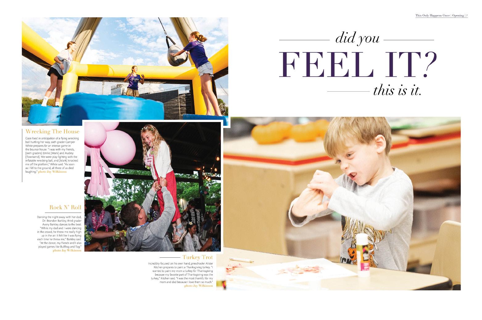
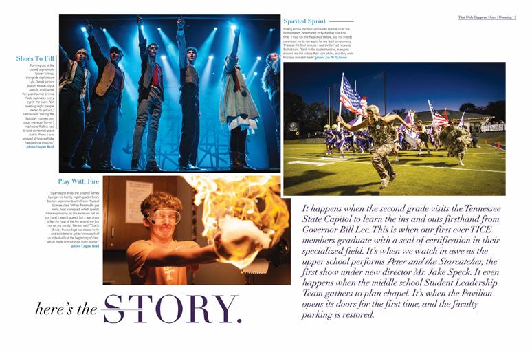
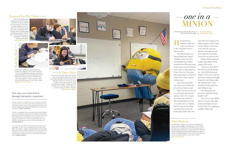
ANTHOLOGY | Walnut High School


028 COVERAGE ENDSHEET COVERAGE PORTRAITS Adviser: Michael Malcom-Bjorklund Editor: Madison White Varsity Reps: Michelle Frakes and Katy Hoffstatter Columbia High School LAKE CITY, FL COLUMBIAN


Stand-out features:
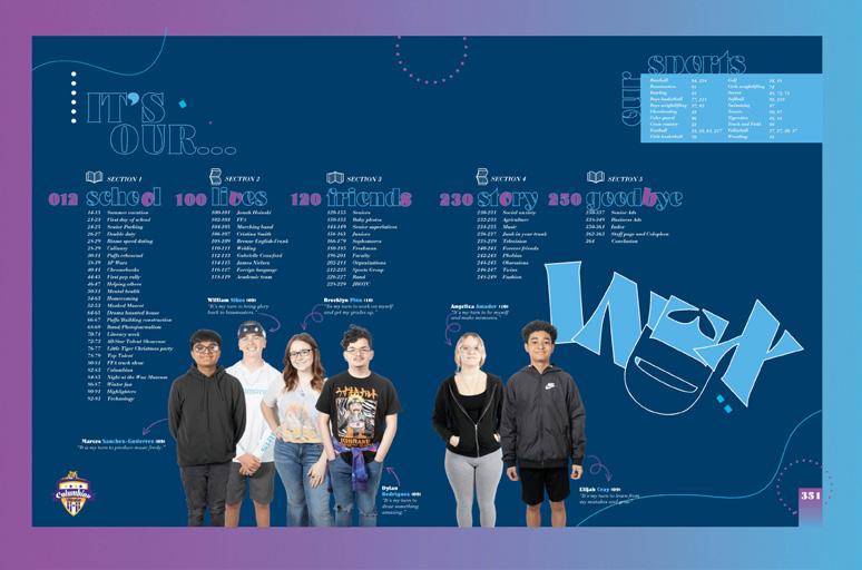
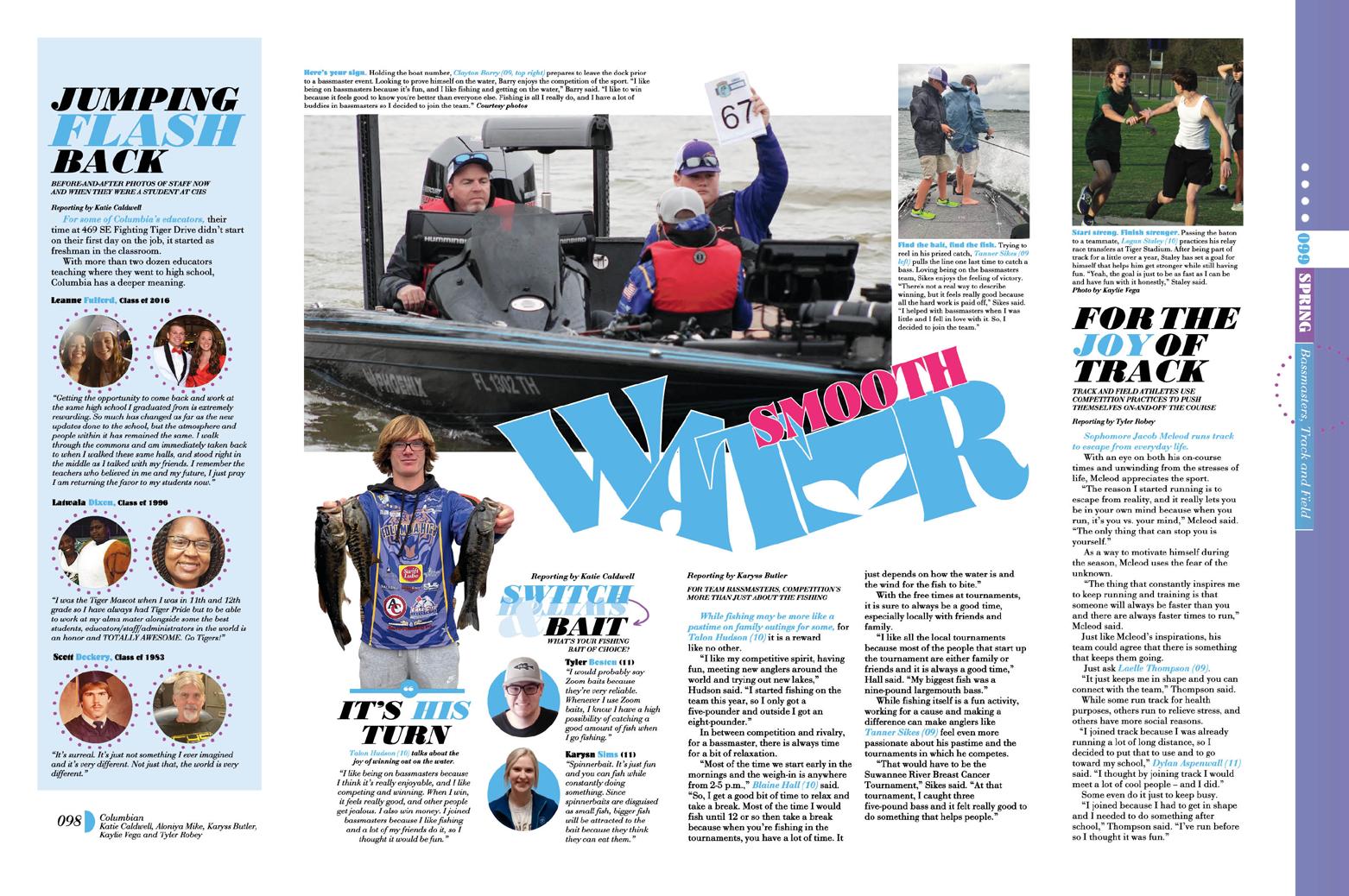
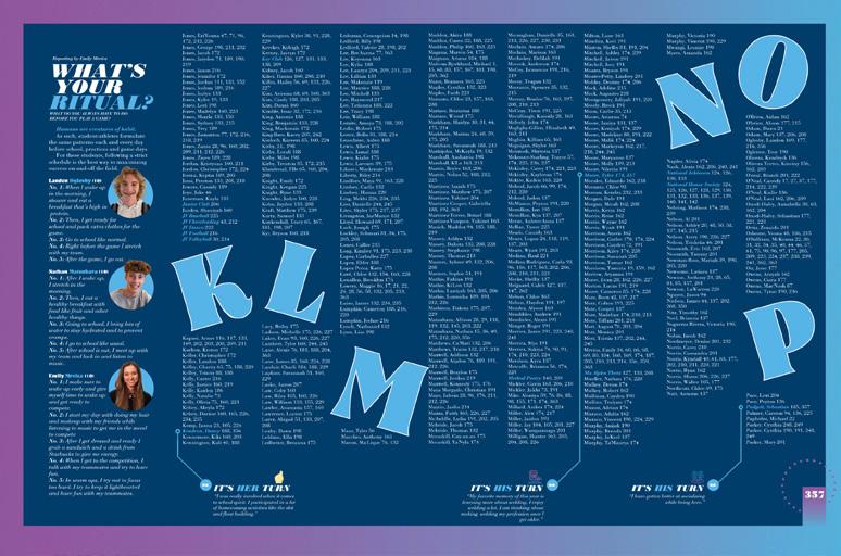
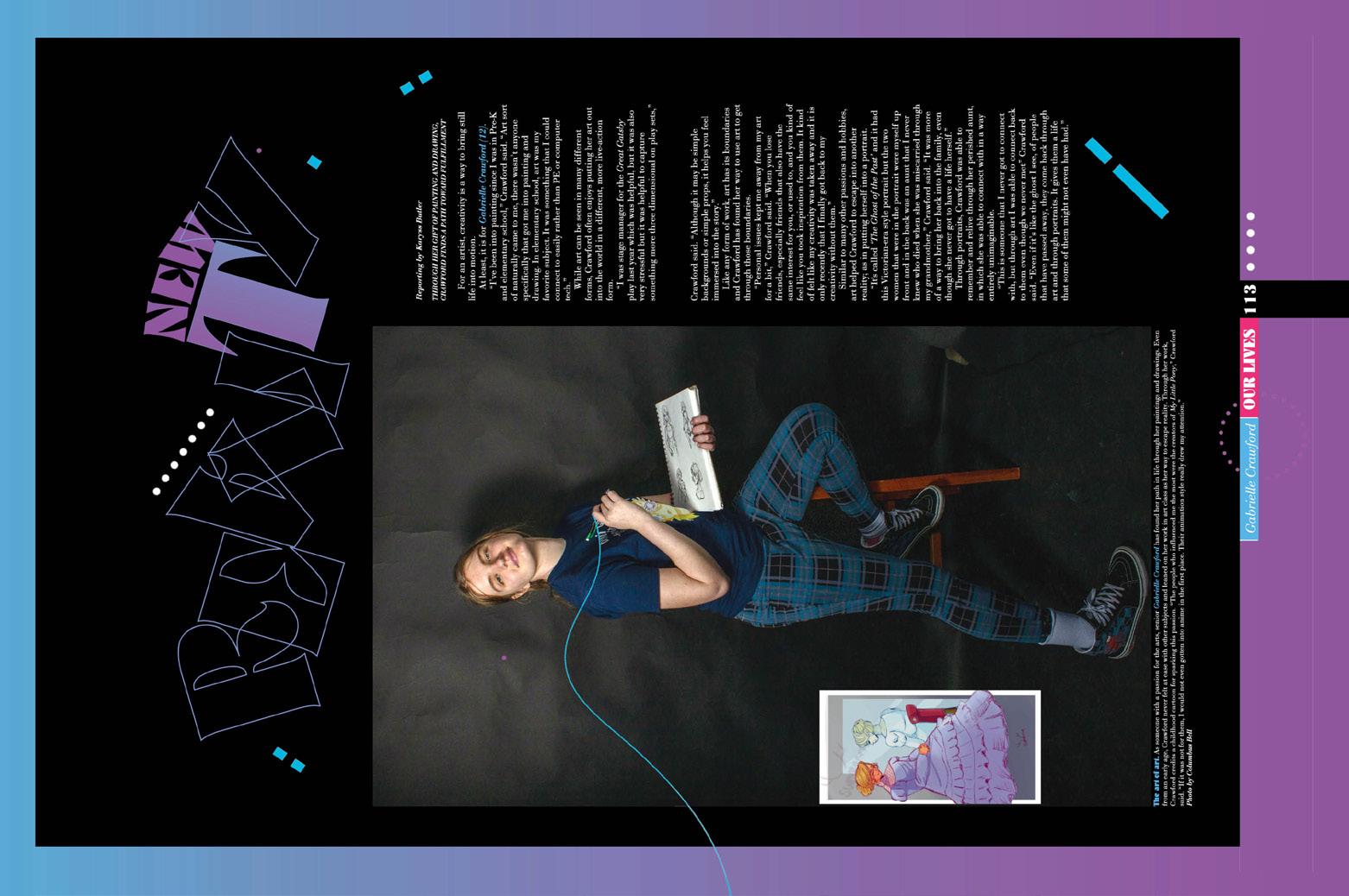
HIGH IMPACT: The striking cover introduces a trio of distinctive display fonts, some repeatable type treatments, part of the color palette and graphic devices galore. Inside, the identifiers provide variety and a strong sense of thematic identity. As on the cover, rotated letters add character to the main headlines and circular graphics appear in the folios to create visual links and anchor silhouetted talking heads within mods.
LITERAL INTERPRETATION:
Columbian is designed to be rotated by readers each time the section changes. That’s right — following the six-spread opening, chronological student life spreads fill the first 100 pages. And then, the content rotates clockwise 90 degrees for a series of impressive vertically oriented profiles and features. Next, a divider requiring another 90-degree rotation introduces the portraits and group shot galleries found in the massive reference section. Yet another turn presents the second section of vertical features and the final spin includes senior ads, index and closing.
PLANNED VARIETY: While many traditional spreads feature layers of coverage on a single topic, others combine seasonal topics organized chronologically. An array of features include single-subject profiles and showstoppers designed with oversized, silhouetted images, large display type and other attention-grabbing components.
029 PROFILE REFERENCE INDEX COVERAGE
ANTHOLOGY | Columbia High School


030 ENDSHEET PORTRAITS DIVIDER REFERENCE COVERAGE Adviser: Daniel Reinish Editors: Kate McDermott and Chloe Wang Varsity Rep: Pam Tripp George C. Marshall High School FALLS CHURCH, VA COLUMBIAN


Stand-out features:
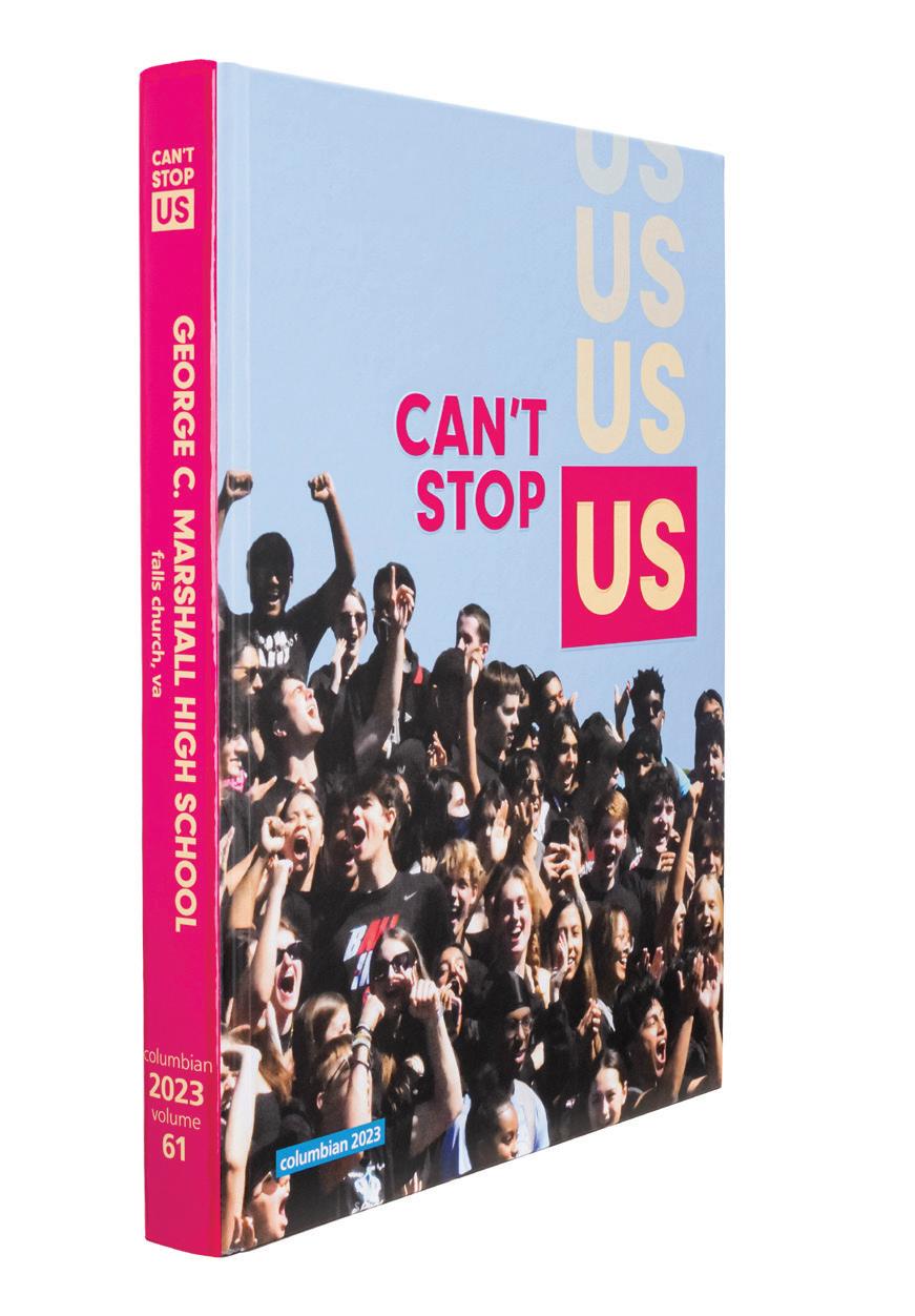
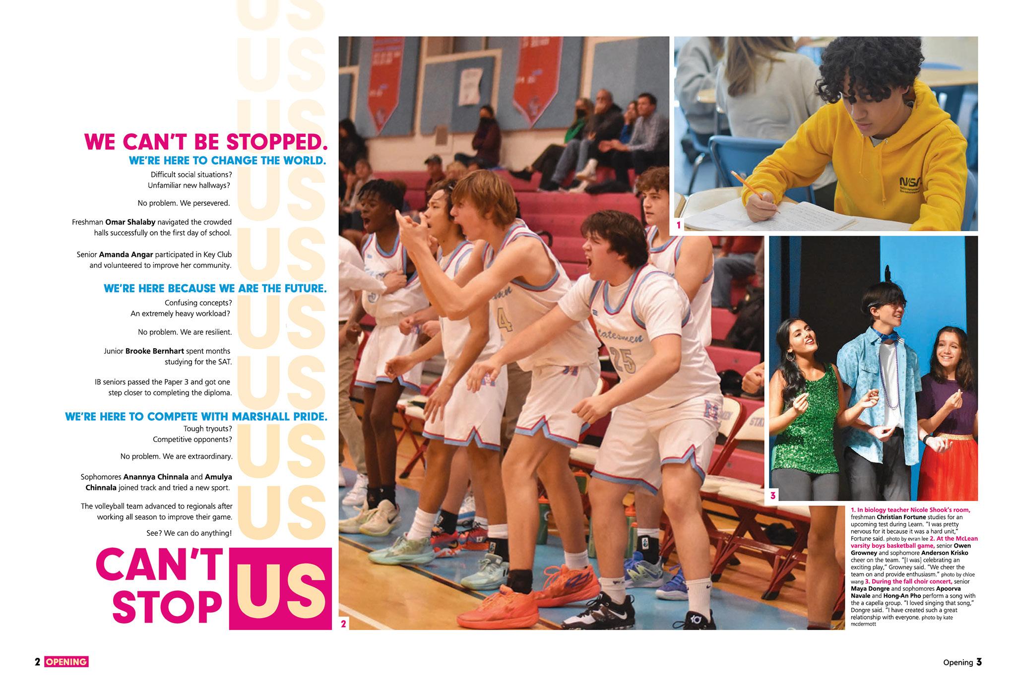
TELL US A STORY: We love it when a book has a clear storyline. The “We celebrate our group identity” storyline comes through strong in this volume of Columbian From the student section photo on the cover to the “Can’t Stop Us” verbal, to the bright colors, there’s no doubt what the tone of the book is going to be.
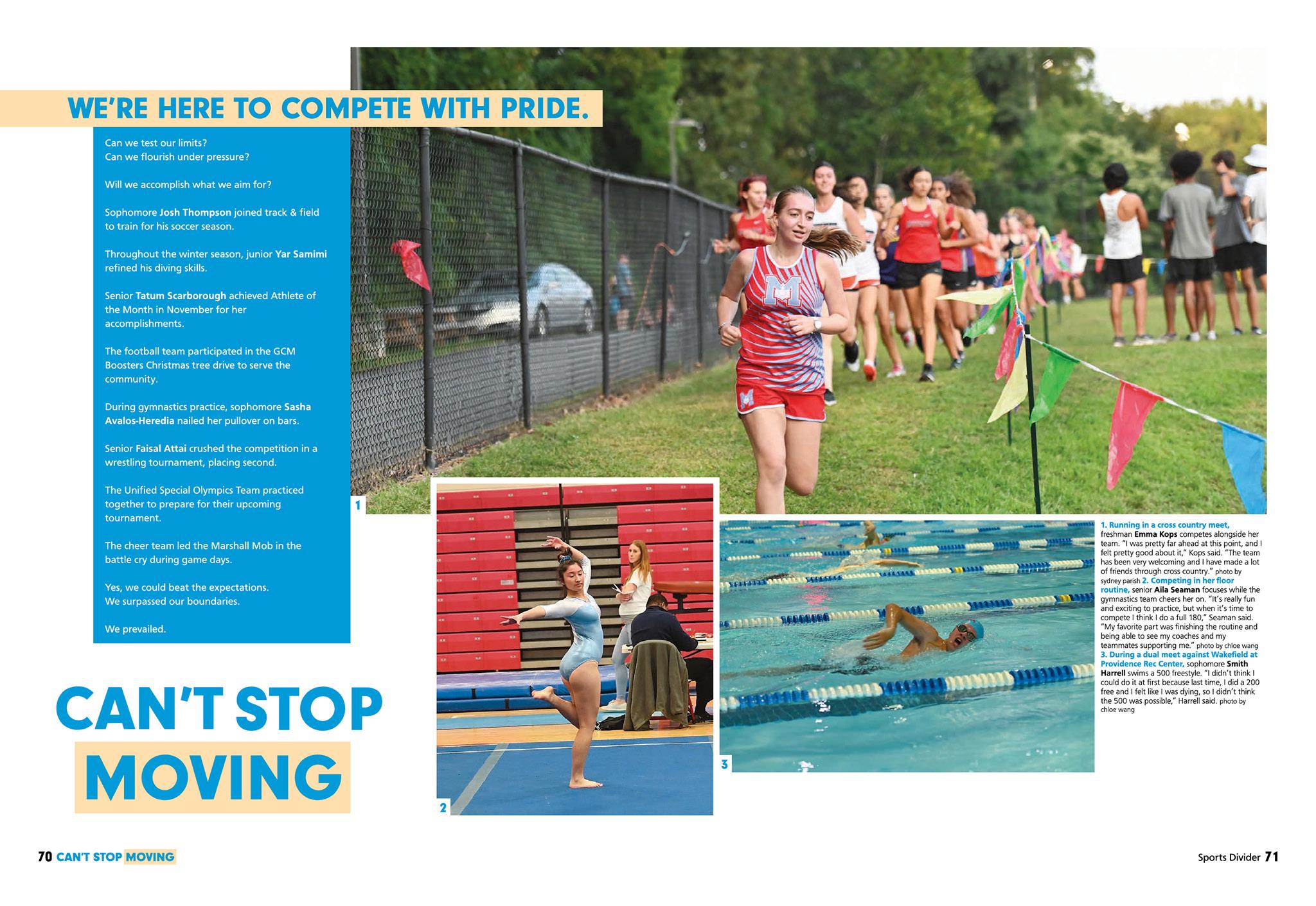
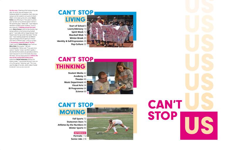
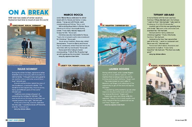
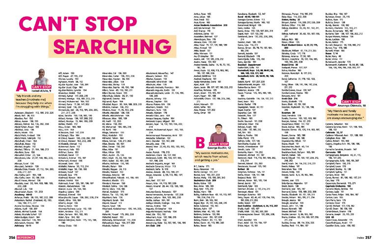
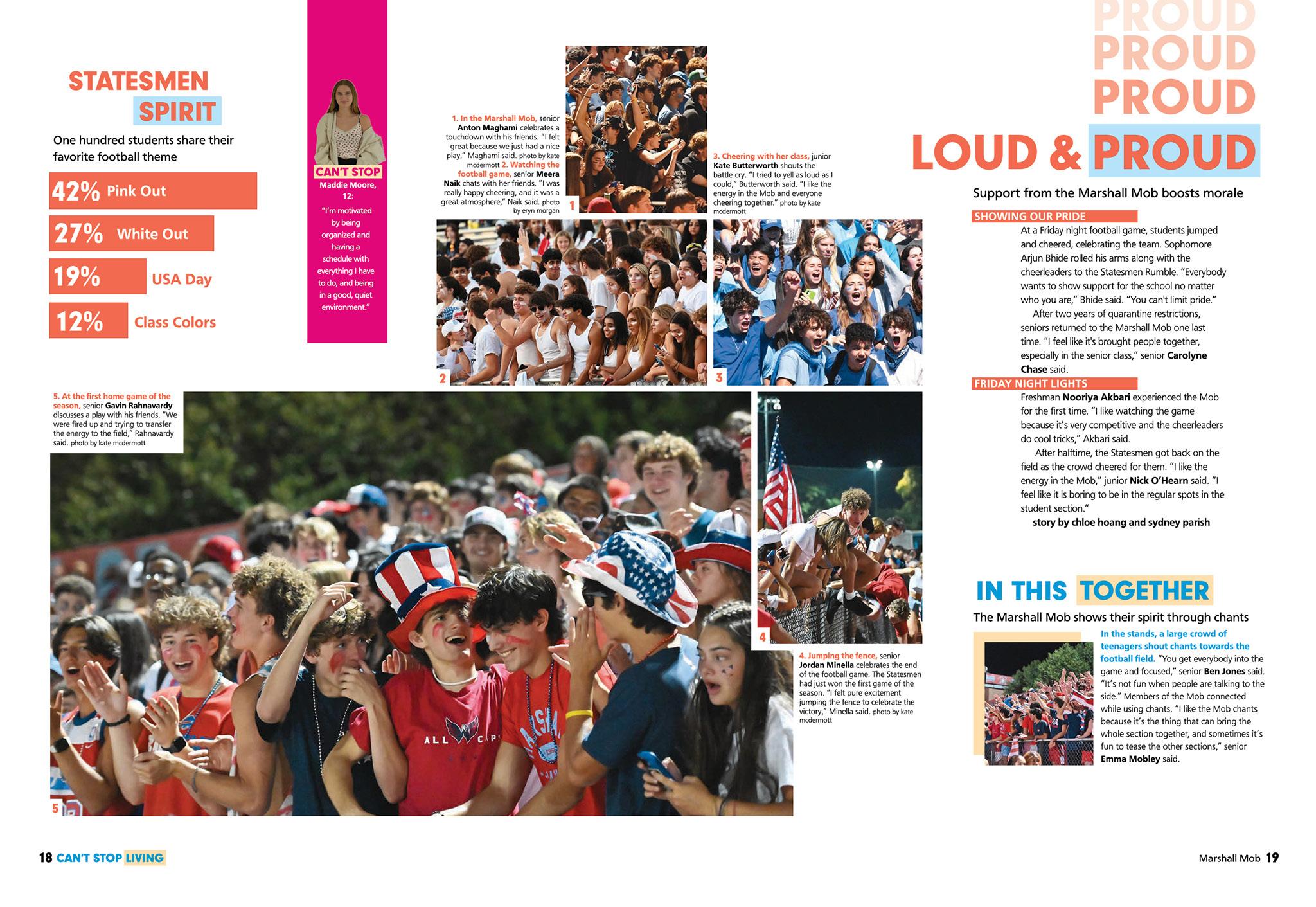
BE BOLD: The staff keeps that initial voice going with bright colors and bold type. They pick up the repeating US from the cover and use repeating words bleeding off the top of the page — but not on every spread. Other theme elements lend the needed consistency, and we re treated to spread after spread begging to be read. (Extra points for rhyming.)
CROWD TOGETHER:
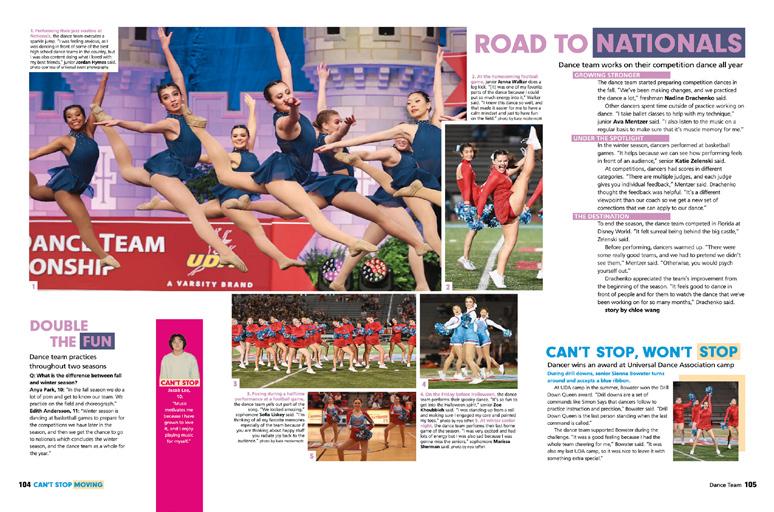
This is next-level: The main dividers and reference/ grade-level dividers all feature at least one photo with a group of students, usually a crowd shot. That’s a theme-advancing strategy that might go unnoticed, but becomes clear as you page through the book. Where we normally try to keep the crowd shots to a minimum, this staff embraced them because that’s what the theme dictated. And, it really works here.
031 COVERAGE INDEX FEATURE OPENING
ANTHOLOGY
| George C. Marshall High School


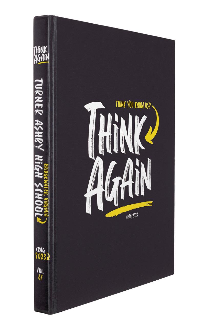
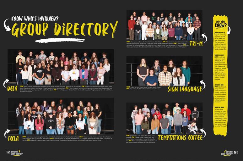
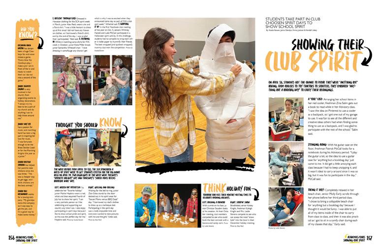
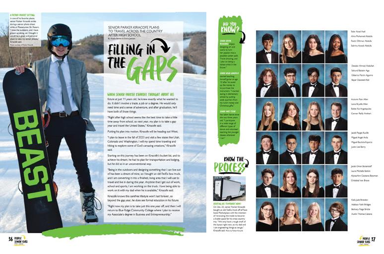
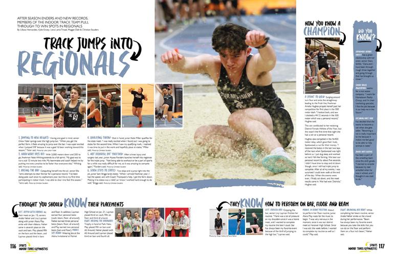
032 PORTRAITS COVERAGE OPENING COVERAGE Adviser: Leslie Stevens Editors: Addison Bridges, Kacey Lam, Delaney Clarke, Kate Jones and Mia Flory Varsity Rep: Kara Peterson Turner Ashby High School BRIDGEWATER, VA CRAG


Stand-out features:
COMBINED COVERAGE:
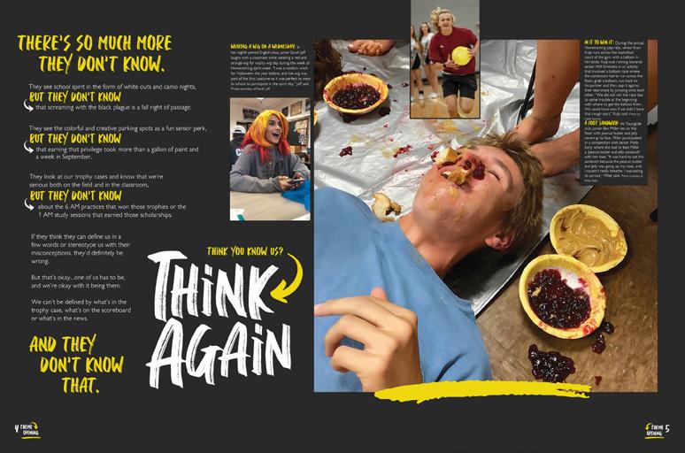
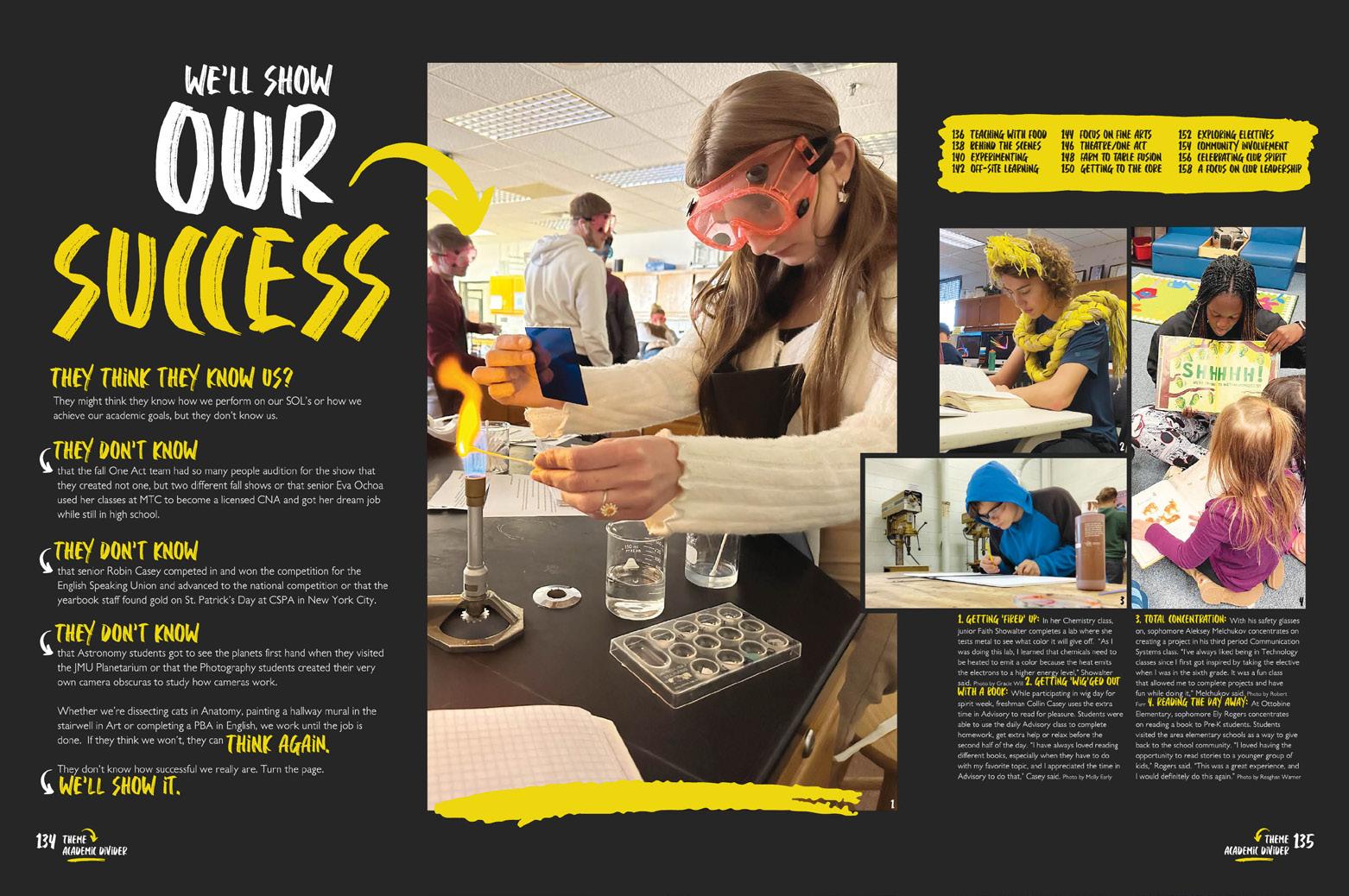
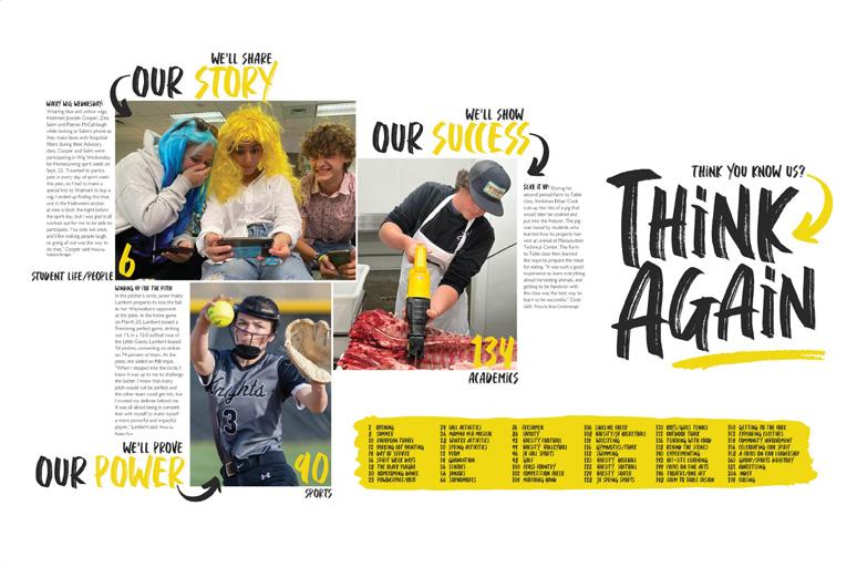
Rather than the five traditional sections of coverage, Crag’s content is combined into three sections that enhance the theme. Answering the theme question, “Think You Know Us?,” they had three responses.
“We’ll Share Our Story” includes both student life and people coverage while sports spreads fill “We’ll Prove Our Power” and clubs and academics spreads are found in “We ll Show Our Success
KEY INGREDIENTS:
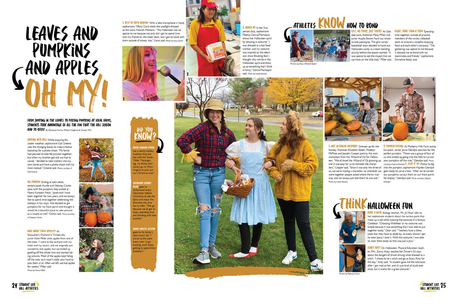
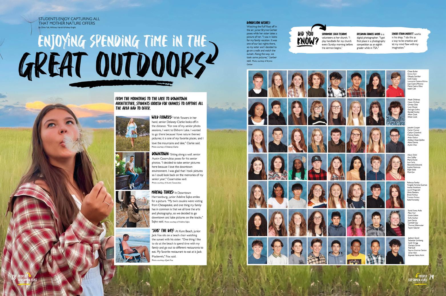
Incredible photos, masterfully used white space and a distinctive display font combine for a volume-unifying look. While most spreads feature longform body copy, some utilize alternative copy formats in the dominant package as well as in the mods. Powerful captions accompany all photos, sharing necessary details and student quotes.
GO BIG:
Check out the impact of great photos run huge! There are plenty of spreads with 10 or more photos; there’s always a dominant that ’s clearly commanding immediate attention, so the other photos are run smaller. But we can’t argue against the drama of stunning photography run large — especially on theme and profile pages.
033 INDEX ENDSHEET COVERAGE COVERAGE PORTRAITS REFERENCE DIVIDER ANTHOLOGY | Turner
Ashby High School


034 COVERAGE OPENING COVERAGE Adviser: Lindsay Safe Editors: Joyce Choi and Larissa Yoon Varsity Rep: Mimi Orth Sunny Hills High School FULLERTON, CA HELIOS


Stand-out features:
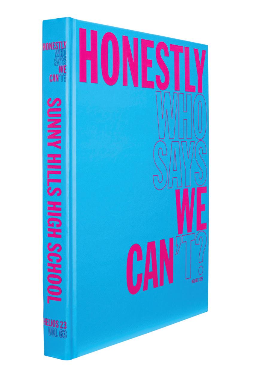
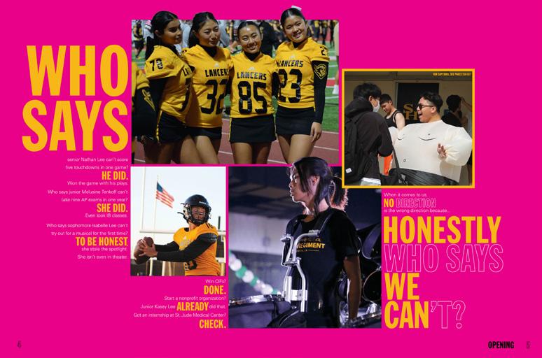
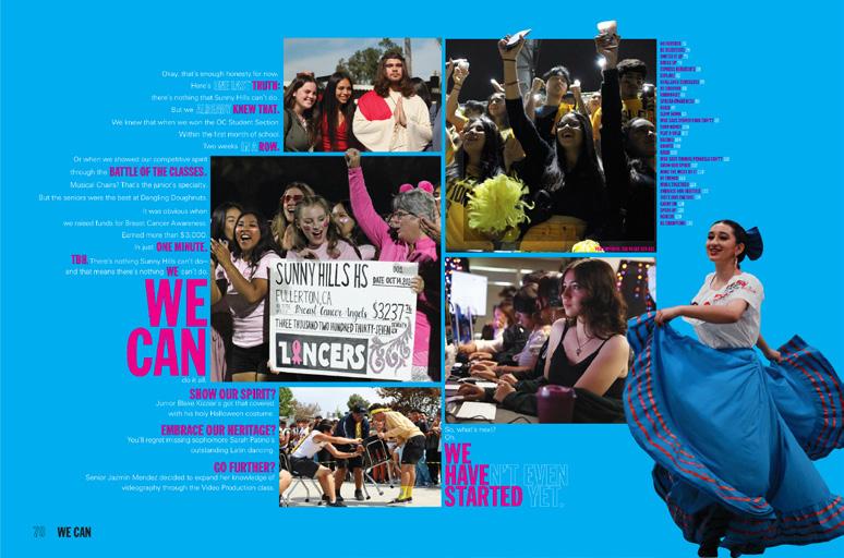
DOUBLE MESSAGE: Two styles of type provide a pair of empowering cover messages. At first glance, the stacked, bright pink theme type seems to read “Honestly We Can ” but when you add the outlined, same-size letters, there’s a twist reading, “Honestly Who Says We Can’t?”
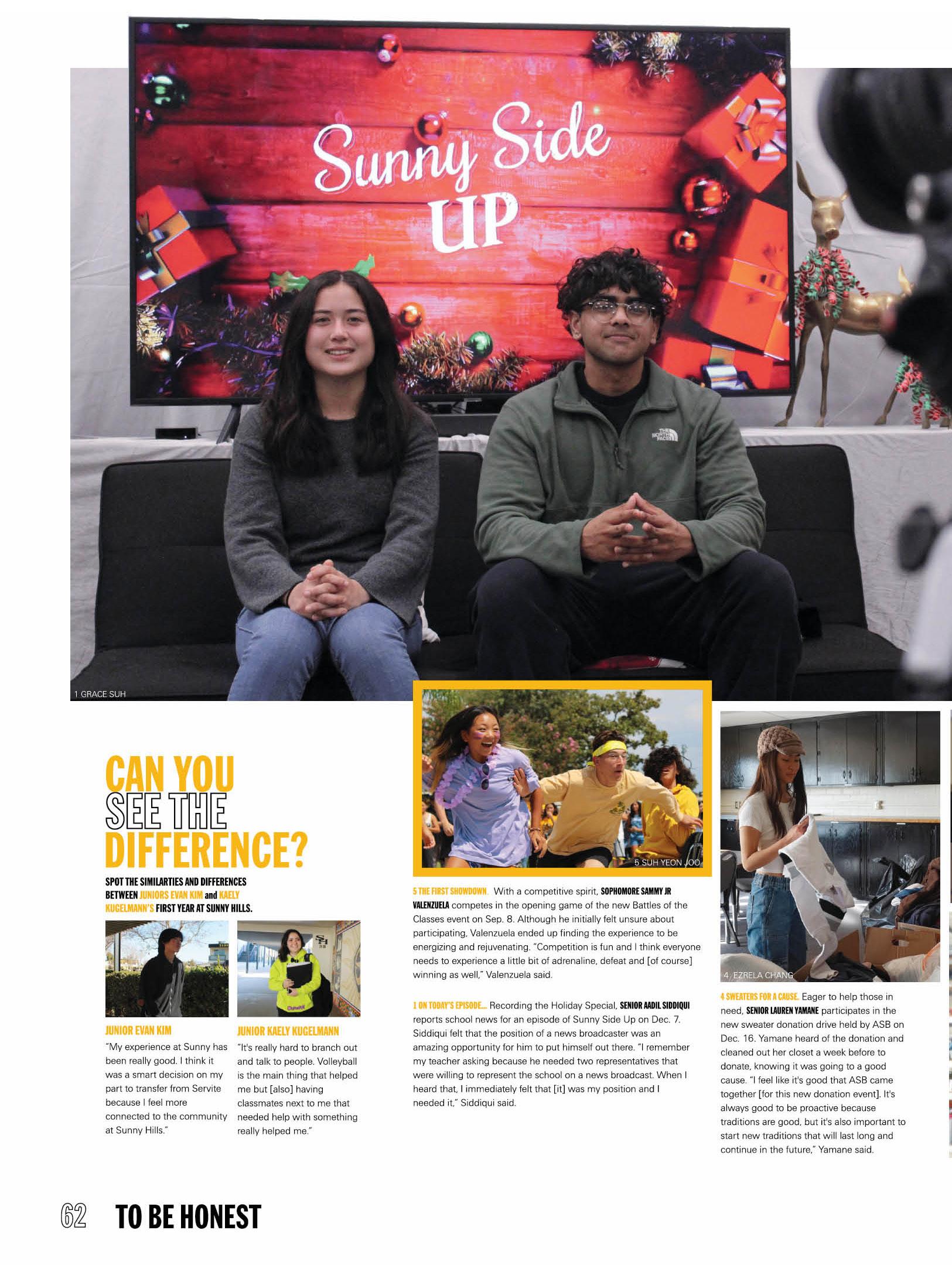
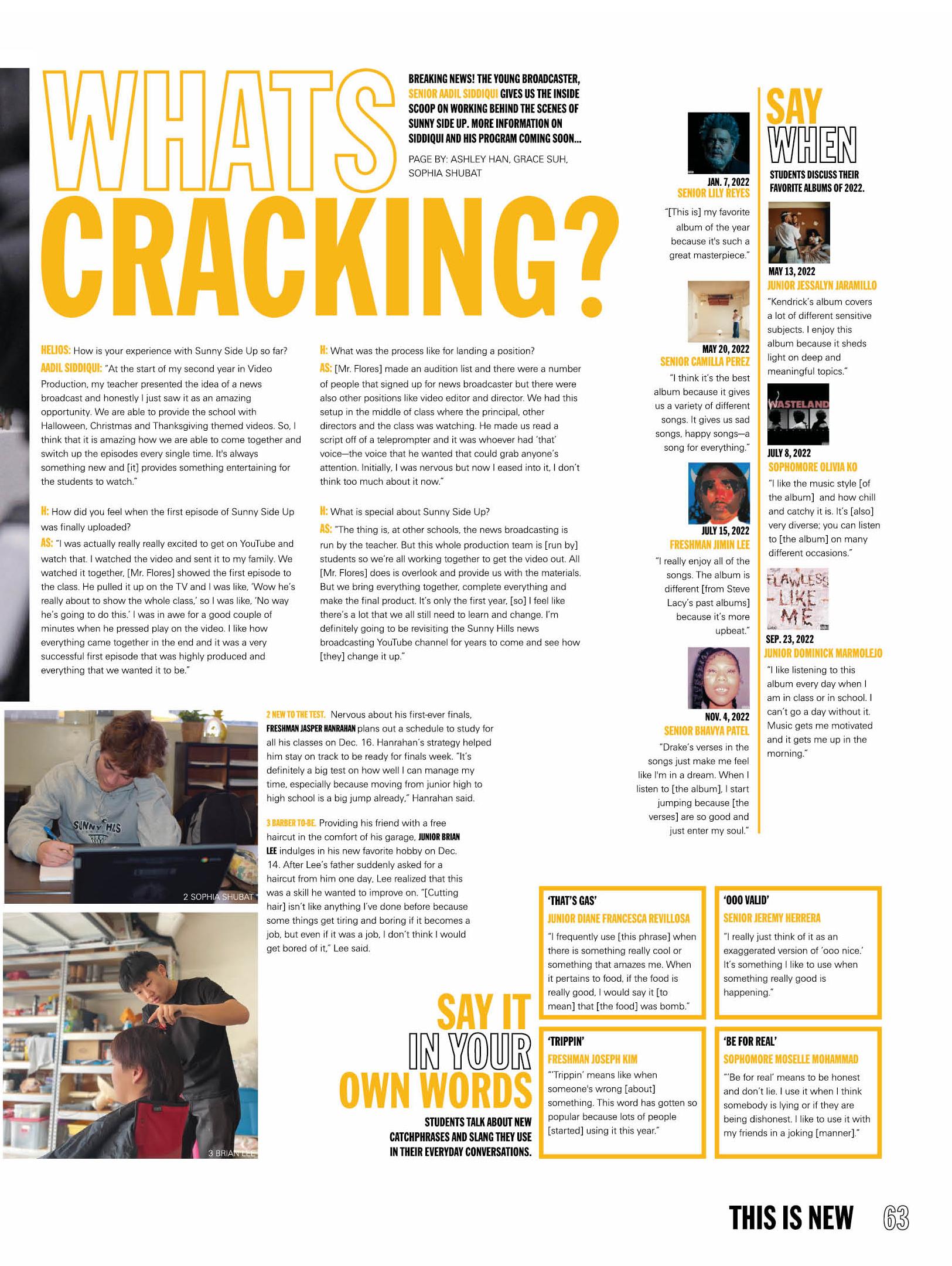
BRIGHT OUTLOOK: Silhouetted students and golden letters announcing the book’s sections pop from the bright blue endsheet. A pair of umbrella-coverage sections — “To Be Honest” and “We Can” — cover student life, academics and organizations before the sports and reference sections round out coverage. Spread-by-spread contents listings appear on the dividers where the umbrella topics read out of the sectional titles. “To Be Honest” spreads include Nobody Expected It, We’re Scared and This is New, which covers new students, first-time school events, slang, freshmen facing finals and a story on a senior anchor of the school’s news broadcast.
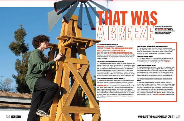
HONEST TIMESTAMP: With contemporary design and layers of supporting coverage, Helios proves everyone has a story, and great planning/ reporting make any topic more interesting. Content spreads cover students (in all grades, in classes and clubs, at home and at school events) through sprawling photo packages, powerful captions. While many main copy blocks are features on students, there’s also a series of profiles titled “Who Says Can’t?” that details activities of an Eagle Scout, a book drive organizer and a chiropractic intern among others. They definitely can — and they did!
035 DIVIDER COVERAGE
ANTHOLOGY | Sunny Hills High School


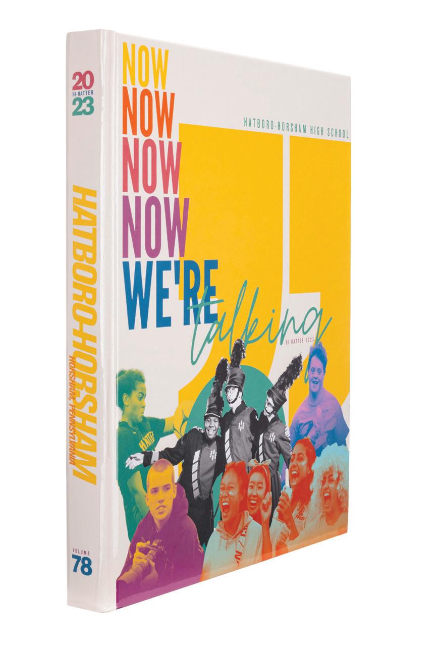
036 CLOSING FEATURE ENDSHEET COVERAGE Adviser: Lauren Nash Editors: Cecily Battaglia, Rowan Hall and McKenzie Kemble Varsity Rep: Tracy Gearhart Hatboro-Horsham High School HORSHAM, PA HI-HATTER


Stand-out features:
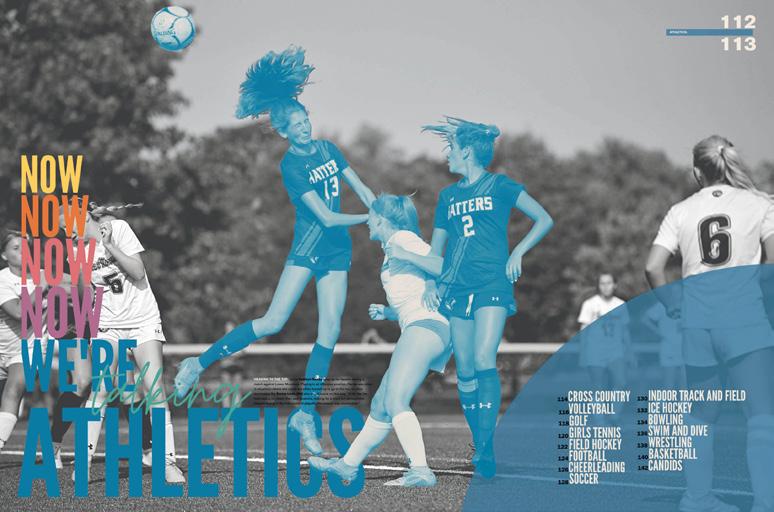
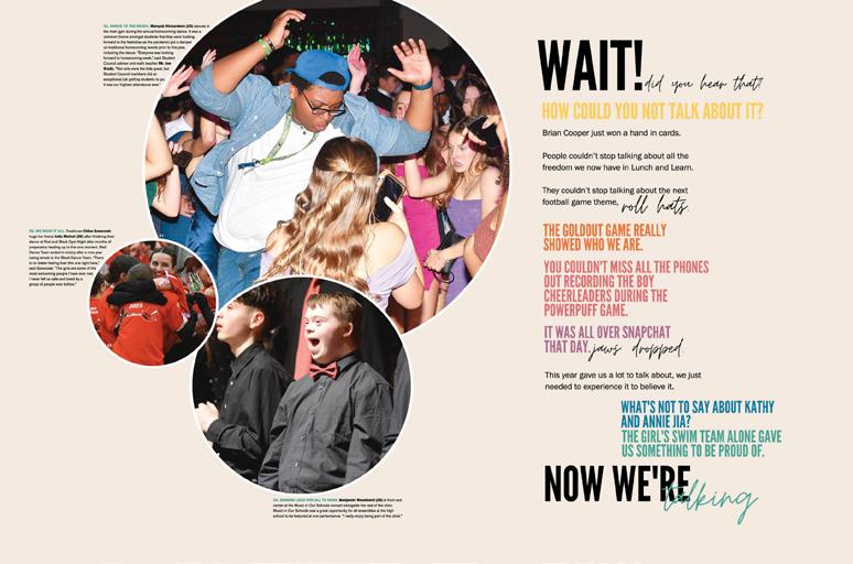
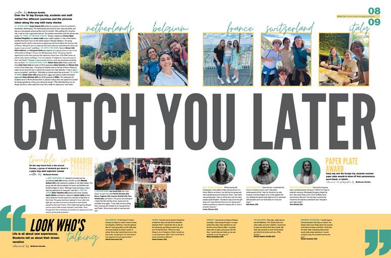
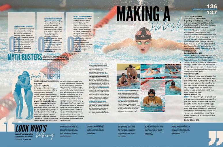
SAY WHAT? Gigantic quote marks layered with contemporary type treatments, cool duotones and partially silhouetted images introduce the visual identifiers. Gloss lamination allows the six brights to pop from the muted background whether the display is complex or simple — like on the back cover where a second set of quote marks commands attention (and matches the endbands).
EVERYTHING YOU NEED TO
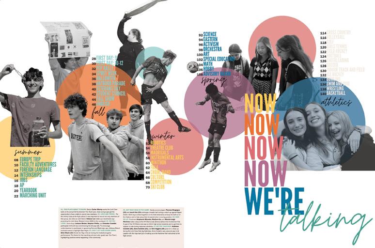
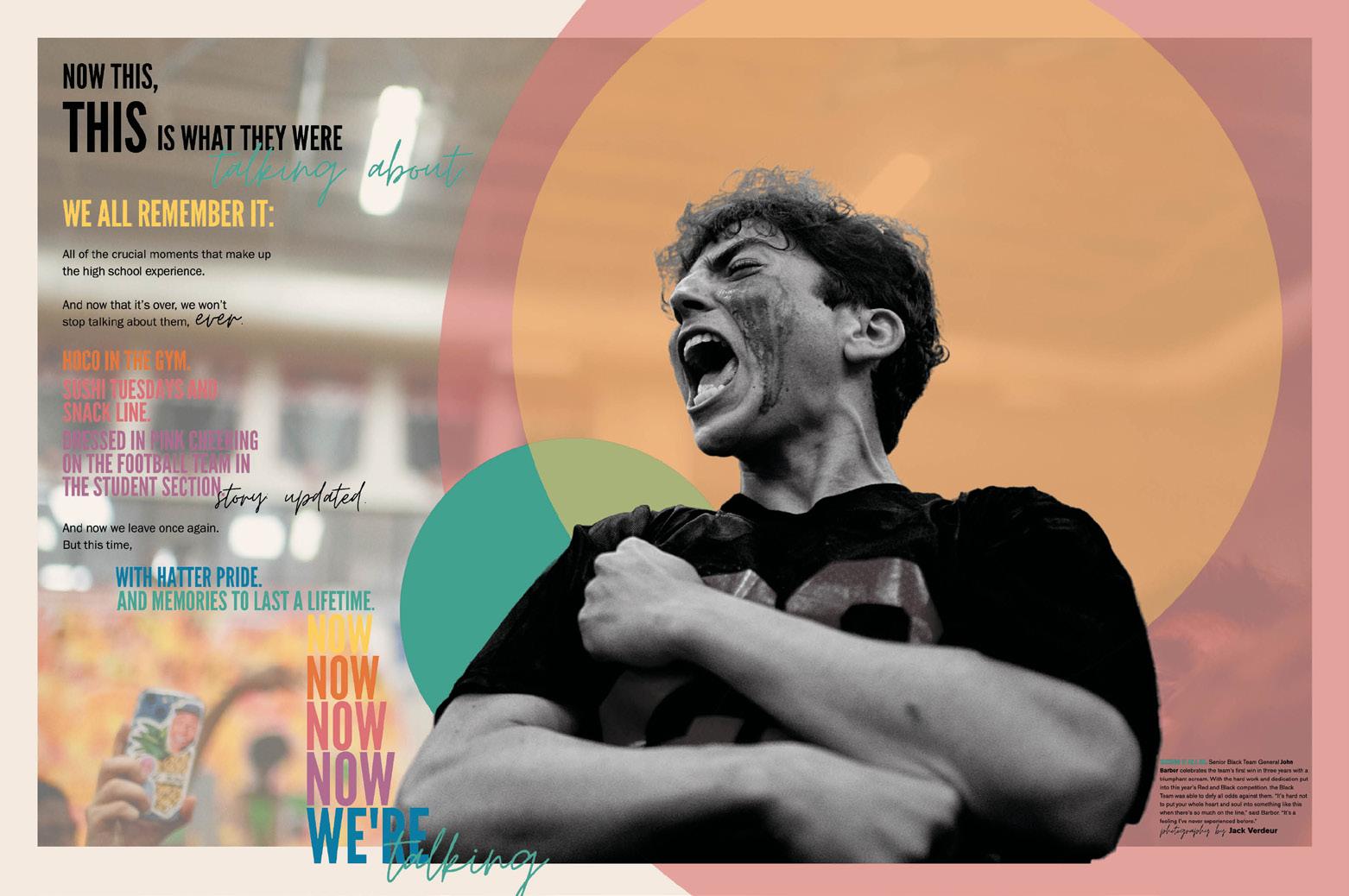
KNOW: Circles receive bigger play on the endsheet where they appear in all theme hues, anchoring silhouetted images and guiding readers from season to season of chronological coverage. Then, the colorful stacked theme logo repeats, directing readers inside. Like the cover, the endsheet and first five pages have the cream background instead of white. The two-spread opening’s colorful and beautifully designed copy sets the verbal tone with specifics, and the accompanying images provide visual connections. Dividers evolve the aesthetic when full-bleed, blackand-white images showcase colorfully duotoned subjects and circles of color layer the image.
SPEAKING VOLUMES:
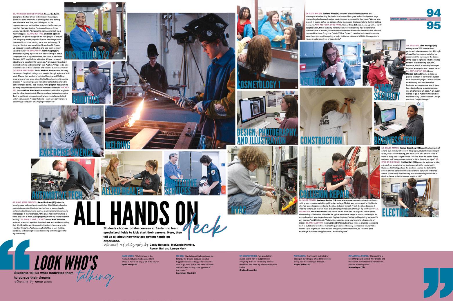
Features and coverage pages are connected by the wholebook inclusionary device, “Look Who’s Talking,” which allows five students per spread to make lengthy personal contributions to the year’s story. In each section, an ACD creates the spread’s foundation and the eye-catching folio at the top right echoes the colors from that section’s divider duotone. Those colors unite the layered coverage of varied mods and sporadic features covering trends and other topics.
037 INDEX FEATURE COVERAGE COVERAGE OPENING FEATURE DIVIDER
ANTHOLOGY | Hatboro-Horsham High School
Barbara Goleman Senior High School MIAMI LAKES, FL
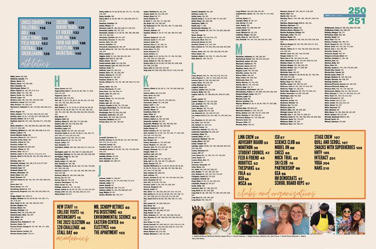
INSPIRATION
Adviser: Isabel Ojeda
Editors: Giana Agostinho, Angie Mesa and Julianna Mooney
Varsity Reps: Vicky Aguirre, Ashley Cuervo and Jose Otero

038


Stand-out features:
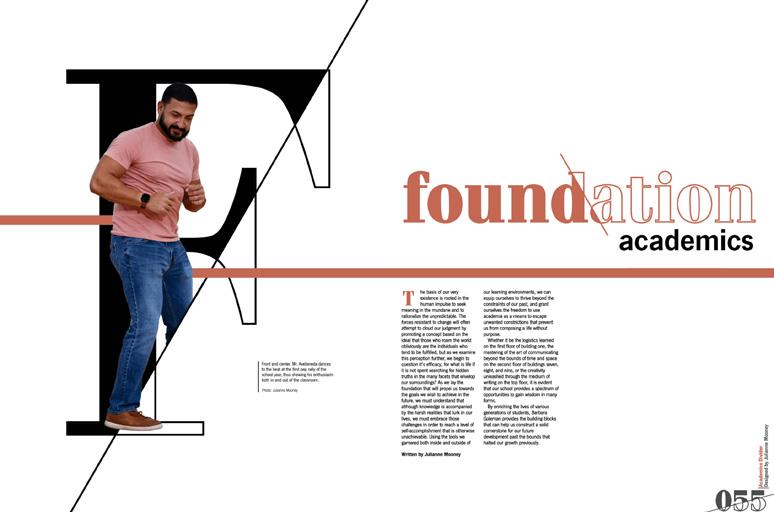
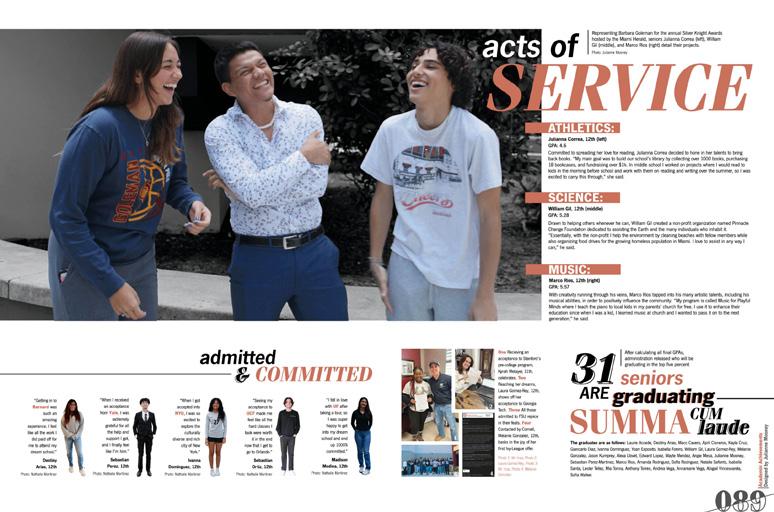
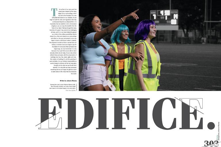
THEME STARS: The choice of the theme “Edifice” adds a layer of complexity and thoughtfulness to this book. Acknowledging the potential ambiguity of the word, the Inspiration staff took on the challenge to ensure it not only applied to the school and the year, but also made sense to the readers. The renamed sections (Figure, Foundation, Façade, Framework, Form and Footing) invite readers to think about the deeper meaning behind the theme. Moving into the opening and dividers, the theme starts to unfold with the opening copy cleverly using the same endsheet words to weave a narrative about writing one’s own story — a story that is the very essence of an edifice. Wow!
A LOVE LETTER: This yearbook serves as a heartfelt ode to Goleman, and the type chosen by the staff adds to the love. It provides opportunities for large type moments, particularly seen in a spread celebrating the school with photos from past yearbooks. The type extends to headline packages, featuring drop shadows and layered outlines or layered normal type. Designers understood the intention behind type and its mood for the book.
QUOTES ON QUOTES: The thoughtful use of pull quotes sets this yearbook apart — going beyond just more coverage. A standout example is found on the faculty spread, where pull quotes from the security guard carry significant weight. The words, “I’m on the students so much because I want them to make something of themselve s, ” resonate with purpose and depth. Love it.
039 COVERAGE CLOSING COVERAGE PORTRAITS DIVIDER FEATURE FEATURE
ANTHOLOGY
| Barbara Goleman Senior High School


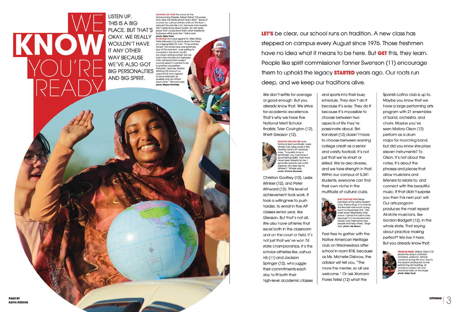
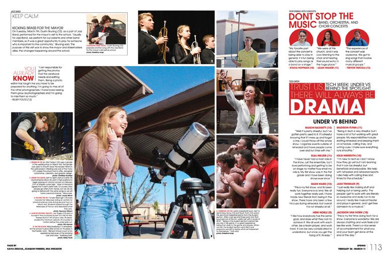
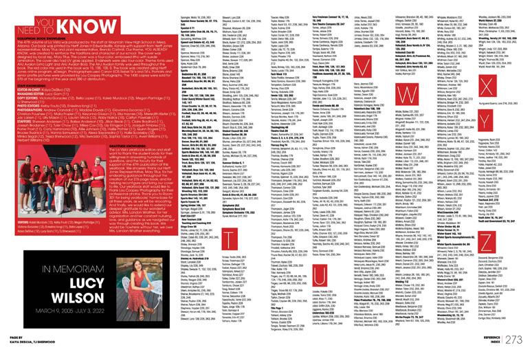
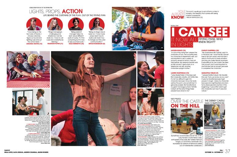
040 COVERAGE INDEX OPENING FEATURE PORTRAITS Adviser: Landon Wrather Editor: Kaiya DeSilva Varsity Rep: Mary Titus Mountain View High School MESA, AZ LA VISTA


Stand-out features:
THEMED COVER(AGE):
La Vista’s cover reveals the font, color, shape and graphic rules. Suede lamination, an embossed theme logo and Gloss UV on the images and spine provide wow factor, but two brief blocks of copy explain the theme’s fit.
“It’s not the nicknames — Campus of Champions, Toro Nation. It s not the titles or honors. It s not the grade on the transcript,” it reads “Being better than the rest doesn’t really matter unless we’re better than who we were the day before. But you already know that ”
READERS ARE IMPORTANT:
Back when the staff first switched from traditional to chronological coverage, athletes and coaches were vocal. They said the best record of a team’s season includes all coverage on the same spread. The staff liked the blended coverage provided by weekly spreads AND they heard their readers. So, each seasonal division begins with weekly spreads blending student life, academic and organizations coverage — followed by full spreads of sports.
LONG STORIES SHORT:
Copy on the opening, closing and dividers is the only longform narrative in the book. It’s packed with names, student voices and specific details. All other words in the book tell the year’s stories in bite-sized chunks. Storytelling captions provide necessary details and student reactions while varying quote displays allow recounts of events and impressions in their own words. Even the 15 senior “profiles” are actually first-person accounts.
041 PORTRAITS REFERENCE COVERAGE COVERAGE ANTHOLOGY | Mountain View High School


042 REFERENCE COVERAGE FEATURE FEATURE Adviser: Emily Everett Editors: Molly DeHaven, Maya Kassir, Talia Firetti, Angelina Lam, Emma Meehan, Sarah Pappalardo, Abby Stephens and Natalie Wike Varsity Rep: Kara Petersen Potomac Falls High School STERLING, VA
LEGACY


Stand-out features:
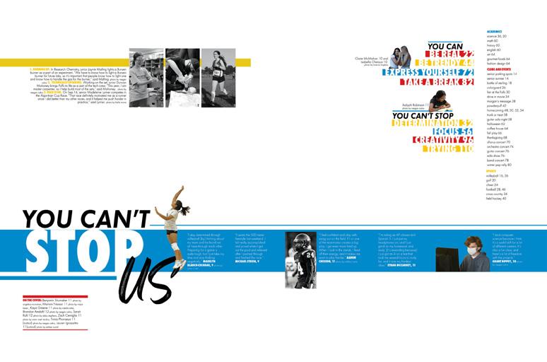
LOTS GOING ON: Three colors. Two fonts. Lines and bars in varying widths and angles. Black-and-white photo boxes and full-color silhouettes. Echoing the students’ busy lives, there are plenty of options and unlimited combos to fortify this theme package. The can/ can’t duality is revealed in the opening, where the read-out headlines flip-flop from “You Can’t Stop Spirit” to “You Can Believe” and back to “You Can’t Stop Us.”
ONE BIG SECTION:
Following monthly summer spreads and one labeled Back to School, weekly spreads include stories from all aspects of school life. Rather than dividers to connect sections to the theme, a series of eight themeadvancing features break the design cadence with showstopping spreads of “can” and “ca n t” coverage including dozens of quotes. Topics like You Can Be Trendy or Express Yourself and Take A Break alternate with You Can’t Stop Focus, Creativity and Trying.
AMAZING READER
SERVICES: Consideration of their readers’ experience led to powerful tools for finding content, learning more and navigating the book. The sports and club reference galleries present easily identified team and group shots accompanied by mods of highlights and additional coverage and the six-quote can/can’t ACD. A top-notch index featuring color-coded topic entries also boasts both additional mods of coverage and the ACD. Most impressive!
ANTHOLOGY | Potomac Falls High School 043 COVERAGE INDEX OPENING ENDSHEET PORTRAITS FEATURE CLOSING

LEGEND


044 OPENING COVERAGE COVERAGE Adviser: Nancy Smith Editor: Kaylee O’Dell Varsity Reps: Dan Mueller, Leah Blase and Danielle Retzer Lafayette High School WILDWOOD, MO


Stand-out features:
ULTIMATE TIME CAPSULE:
Since every year is a combination of major events, everyday occurrences and the little moments that have a huge impact, Legend staffers set out to chronicle all three. The cover’s theme package hints at the heavy, oversized type found within. And the magical moments? Like the book name on the cover, they appear in the accent font to amplify the distinction. The theme’s hard-edged period and varied graphic swooshes and scribbles also appear inside as visual identifiers.
SIMPLE START: The look of black linen, achieved by using the Hopsack grain with Matte lamination on a litho cover, is accented by a nicely designed special-order, Nickel-foiled theme logo and Gloss UVcoated book name. Repeating the foil on the spine showcases all required content.
Continuing the simplicity, the endsheet uses the type combinations from the cover and introduces the book’s four sections in a thematic color palette used consistently throughout the volume.
POWERFUL PACKAGING:
Intentional use of white space makes Lafayette’s content easy to consume. With consistent half-pica spacing between elements, it’s easy to see which components are intended to be consumed together. Wider vertical and horizontal rails of space appear between mods of content, setting them apart. Using wide external margins ensures that each spread’s content is surrounded by a generous white frame.
045
ANTHOLOGY | Lafayette High School DIVIDER PORTRAITS

LEGEND


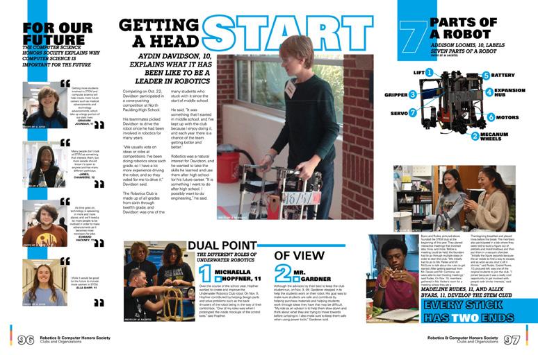
046 FEATURE COVERAGE COVERAGE DIVIDER Adviser: Naomi Schapley Editors: Vanessa Alcala and Kaylee McCallum Varsity Rep: Megan Morris North Paulding High School DALLAS, GA


Stand-out features:
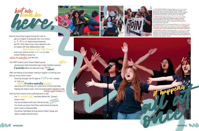
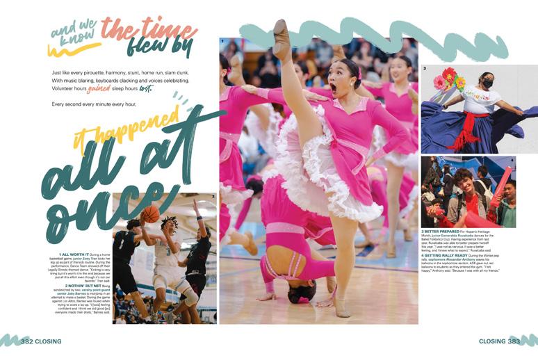
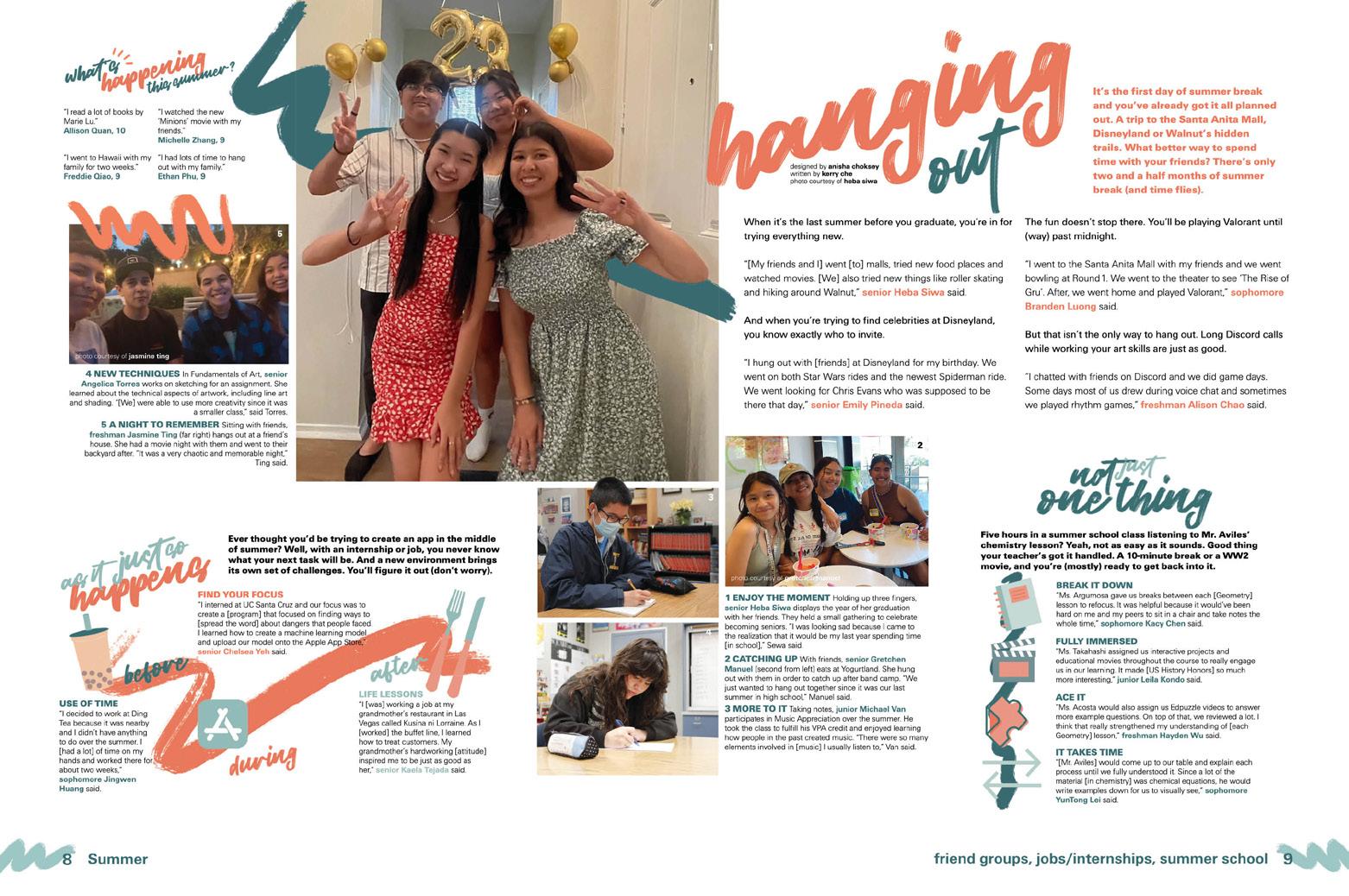
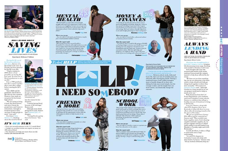
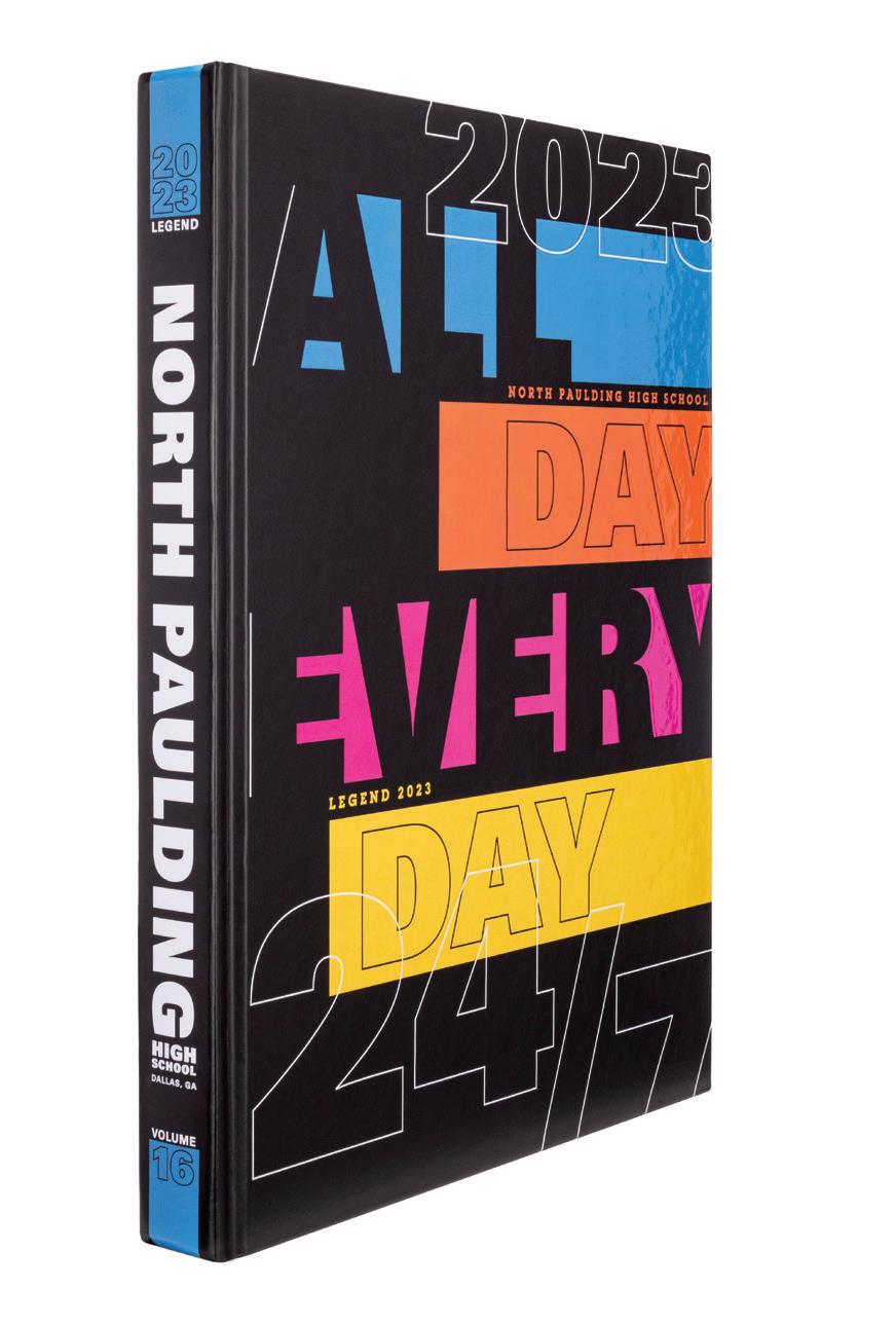
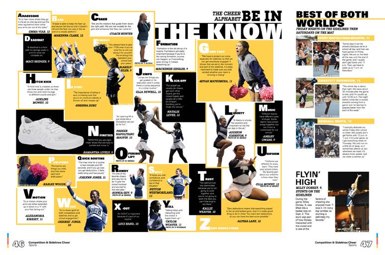
WHAT A KNOCKOUT: This cover design just jumps out at you. The simplicity of the four color bars on the black background with both knocked out and outlined sans serif type is really striking. And, it really carries forward the tone of the “never give up” theme into the book, from endsheet to dividers to coverage pages. The bright hues, big swashes of color and giant letters/numbers really work for this book.
ANOTHER TAKE ON THE ALPHABET: You’ve seen ABC spreads, but here’s an extra cool one. The staff used a set of alphabetical photos and captions to cover the culinary classes. And yes, there are easy answers for x (xanthan gum) and z (zucchini). Some letters feature photos of culinary students doing their thing, but others feature cutouts of important tools of the trade, like a ladle and a whisk. It’s a great way to mix up coverage and make it even more interesting.
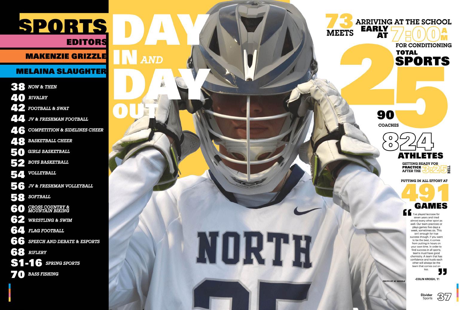
IT COUNTS!: The theme is “All Day Every Day, 24/7” and the numbers in the theme meant the staff had a great reason to include numbers throughout the book. So, you’ll see basic stats presented with big graphic numbers on dividers and plenty of number-oriented mods. Some examples are timelines and mods using the number seven (from 24/7) such as seven pieces of advice, seven significant moments from senior night, and seven ways to be a leader.
047 COVERAGE FEATURE ENDSHEET PORTRAITS FEATURE
ANTHOLOGY | North Paulding High School


048 PROFILE PORTRAITS COVERAGE DIVIDER ENDSHEET Adviser: Heather Nagel Editors: Avery Parker, Corinne Price and Meghan Milligan Varsity Rep: Mary Harris Christ Presbyterian Academy NASHVILLE, TN
LION’S ROAR


Stand-out features:
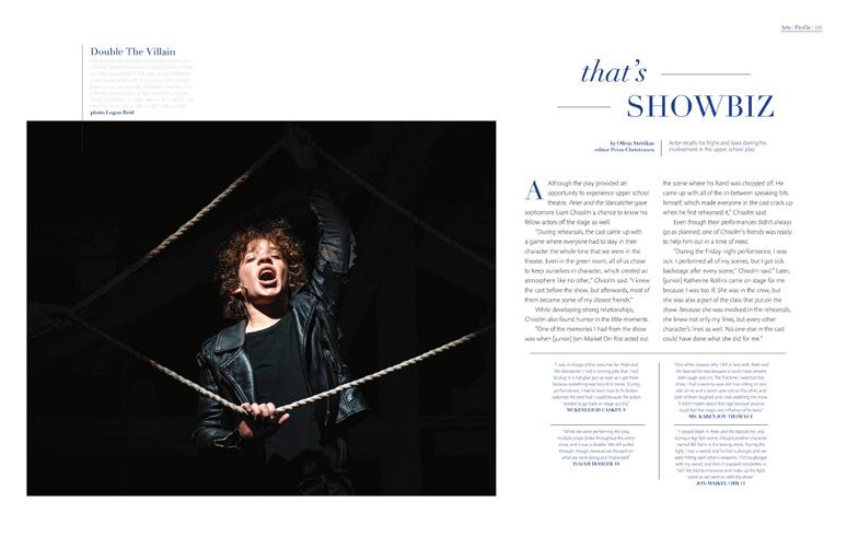
LEAVING A LEGACY: A classic cover (in school-color purple, of course) introduces the staff’s carefully selected visuals and sets the stage for a volume packed with the events and emotions of the closeknit school community. The endsheet features a detailed listing of traditional sections, a trio of images from each school level with reporting captions capture key moments of the year. Stunning photography is front and center throughout. Images capturing peaks of action and emotion are showcased by ample margins and accompanied by storytelling captions packed with yearspecific details and quotes.
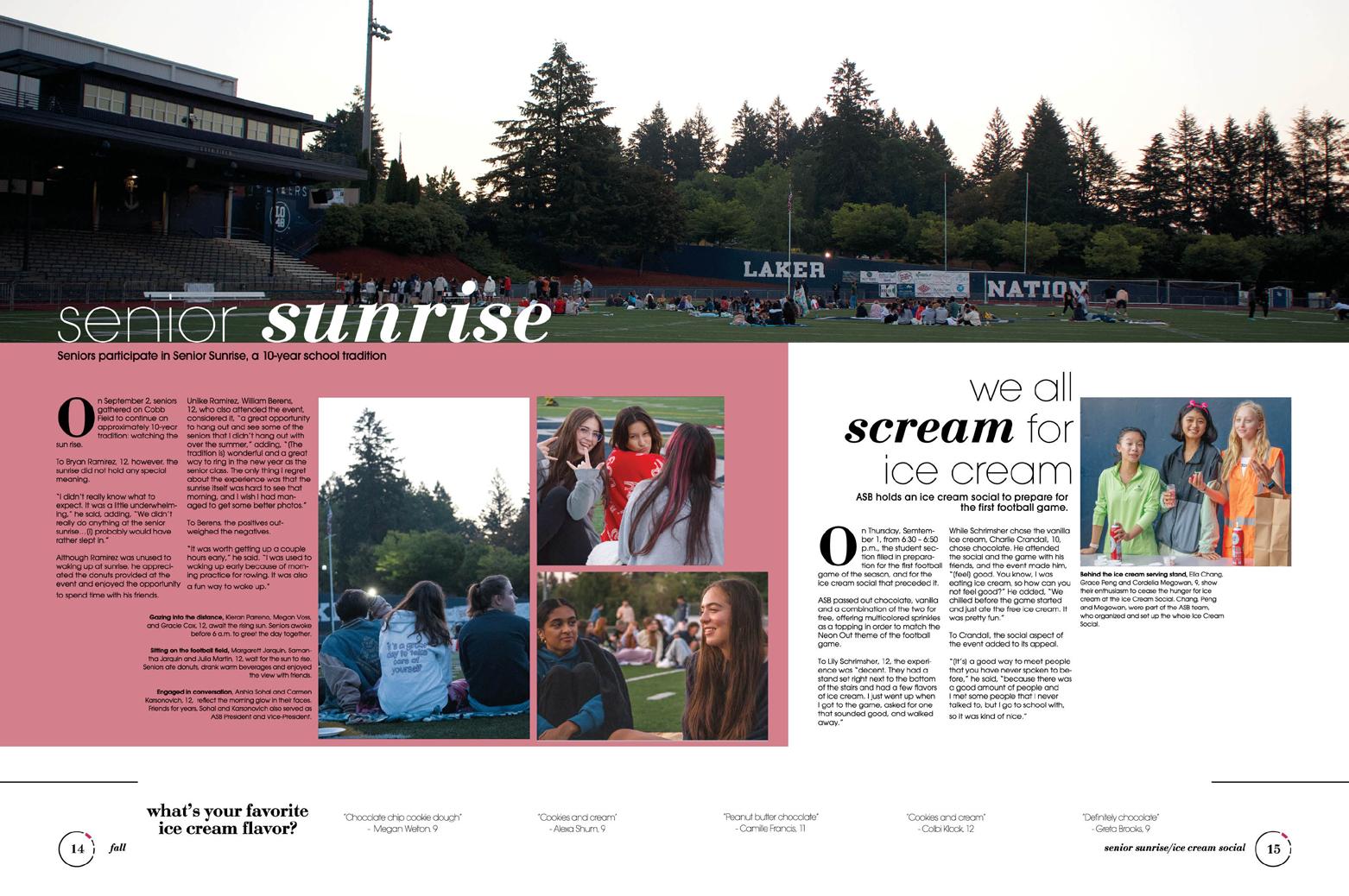
MAKING IT PERSONAL: While many of the events mentioned in the theme copy are experiences students at all levels can relate to, they hold special value to the students whose year included the event in 2023. The younger students may anticipate their own Senior Sunrise, but only the Class of 2023 will recall gathering at Steeplechase in 23 jerseys or recall the goal of having “A Jordan Year.” The seniors alone celebrated together, planning the year they hoped would be the greatest of all time.
EXTRA COVERAGE
OPPORTUNITIES: The staff strategized additional inclusions at every turn. Every caption in the book includes a quote. Two-, three- and four-quote mods capture spread-specific memories. Talking-head mods multiply the impact on many spreads. Most of the 10 full-spread profiles scattered through the book brilliantly feature quotes from four other students with related interests.
049 ADS COVERAGE OPENING OPENING
ANTHOLOGY | Christ Presbyterian Academy


050 PROFILES OPENING OPENING COVERAGE Adviser: Marisol Marquez Editors: Natalia Rocha, Qing (Emma) Hou, Samantha Chow, Michelle Barajas and Natalia Breitenbach Varsity Rep: Mimi Orth South Hills High School WEST COVINA, CA
NEOMEGA


Stand-out features:
DIFFERENT IS GOOD:
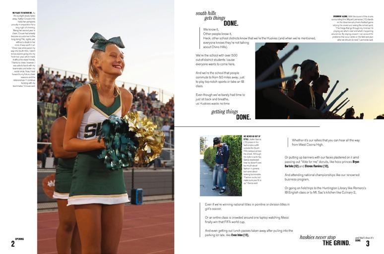
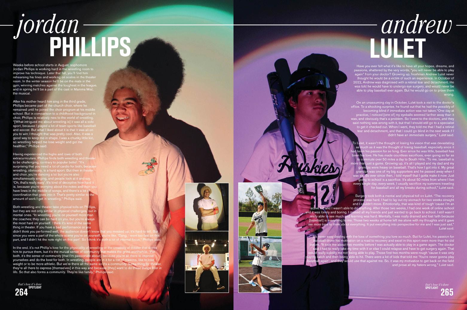
Single-page profiles stand out among the coverage spreads in Neomega. Each features a full-bleed photo of a single student with copy telling their story in-depth. It’s a great way to give the reader more and keep page flippers looking for additional content.
A BALANCING ACT:
This volume provides several great examples of ways to build a spread around a dominant photo package with touching photos. This staff chose to ignore the typical 0.5 or 0.25 pica separation between its main photos, but here’s why it works. They doubled the amount of space around the rest of the elements on the spread. So, it’s a delicate of balance of decreasing white space in one area and increasing it in another area that makes it work — and gives it a modern look.
ON MUTE: The muted color palette of beige, light green and light blue helps to make spreads feel more airy and minimalist. Lines are kept thin and graphics simple so that the type and photos can take center stage. Most spreads don’t include a ton of photos, but the staff does a great job of upsizing photos when they deserve the extra attention.
051 DIVIDER PORTRAITS COVERAGE FEATURE
ANTHOLOGY | South Hills High School


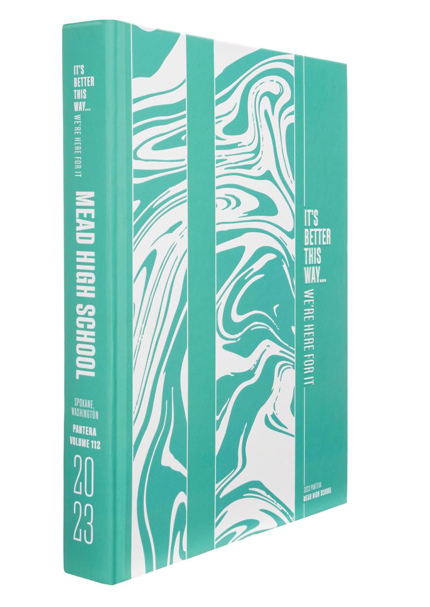
052 COVERAGE COVERAGE DIVIDER OPENING Adviser: Makena Busch Editors: Elizabeth Terrill, Brayden Johnson , Haylie Egan, Bailey Wells, Olivia Ferraro, Sofia Mark and Kanako Walker Varsity Reps: Matt and Jen Johnson Mead High School SPOKANE, WA
PANTERA


Stand-out features:
STUDY IN CONTRASTS:
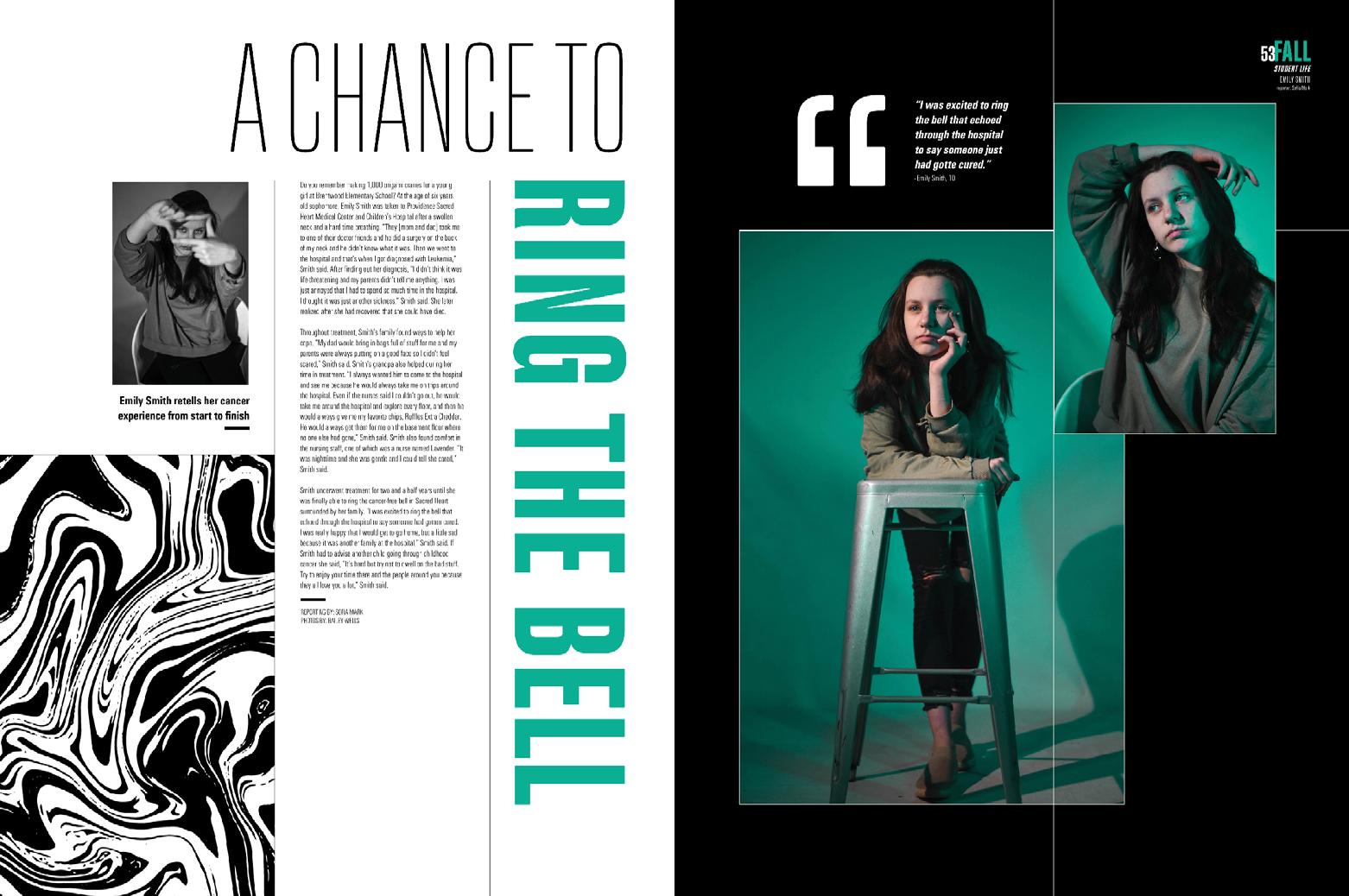
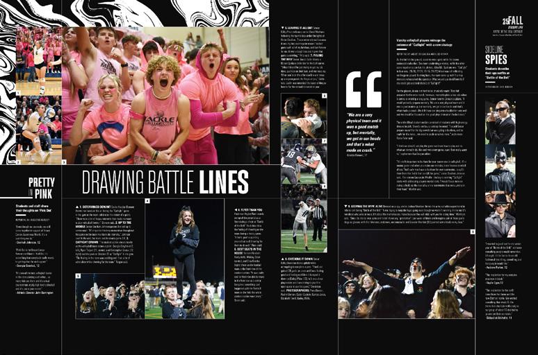
This striking, two-toned cover packed a surprise. The white areas are actually a glow-inthe-dark UV application — the neon green endsheet shows what the cover looks like in the dark. Other contrasts were abundant: Lots of negative space and a complex swirling texture. A pair of sans serif fonts in varying widths and weights. Fine rule lines vs. generous internal spacing. When the design team added compelling photo packages and powerful layers of supporting content, the impact was undeniable.
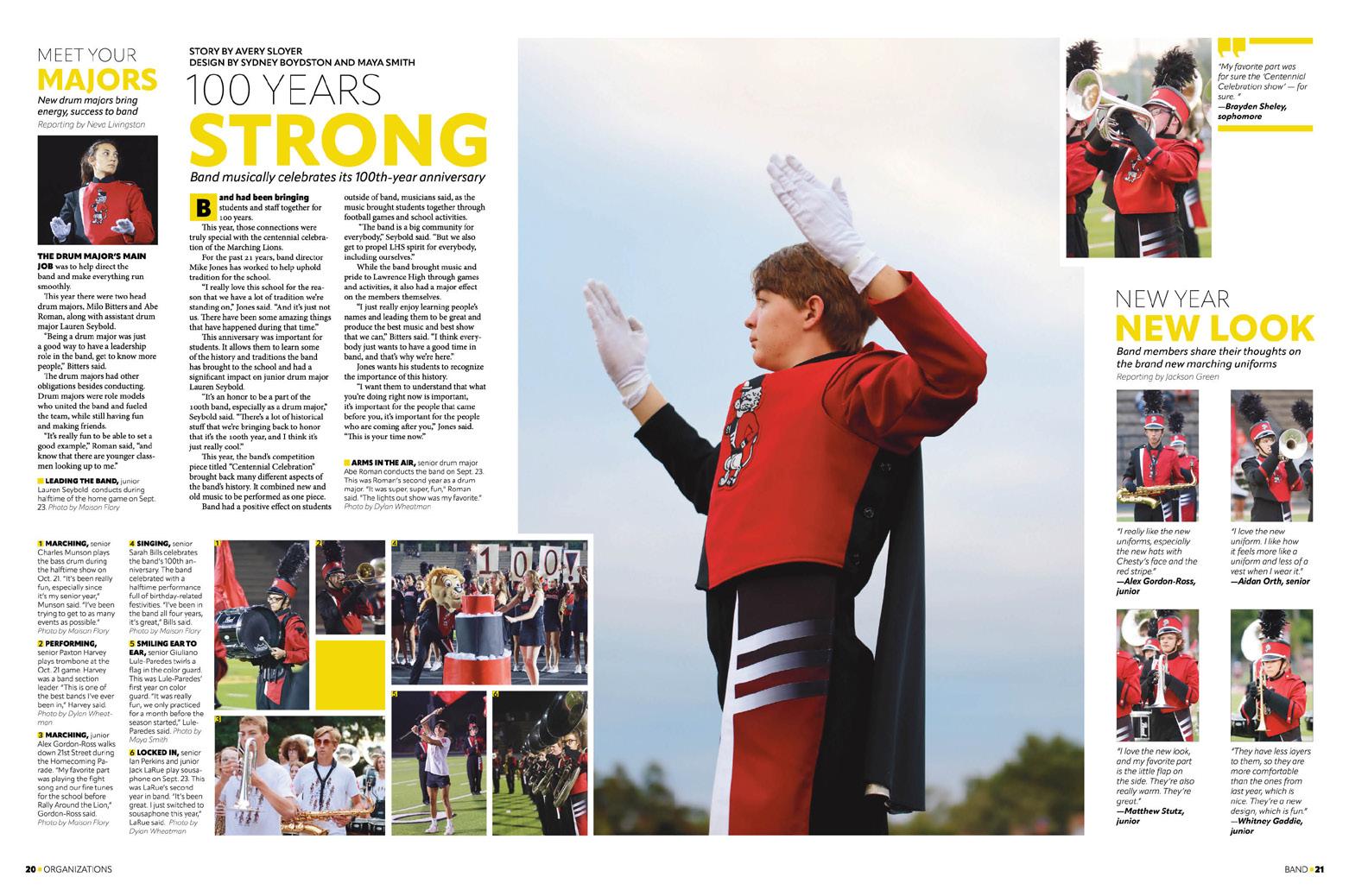
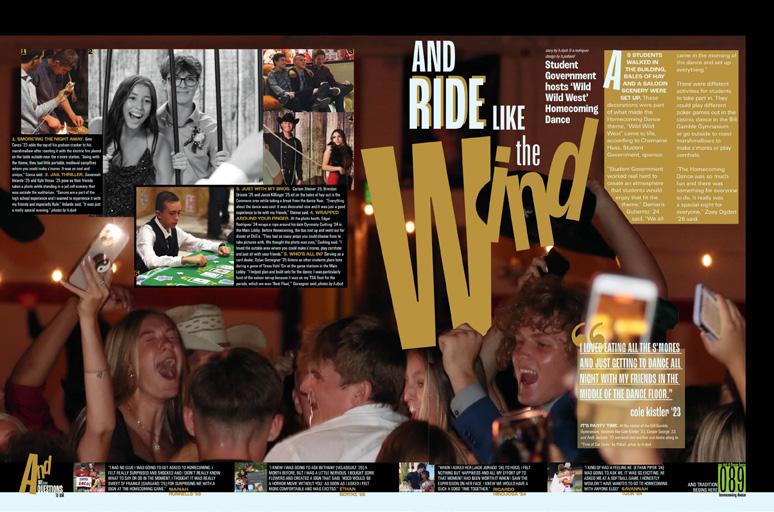
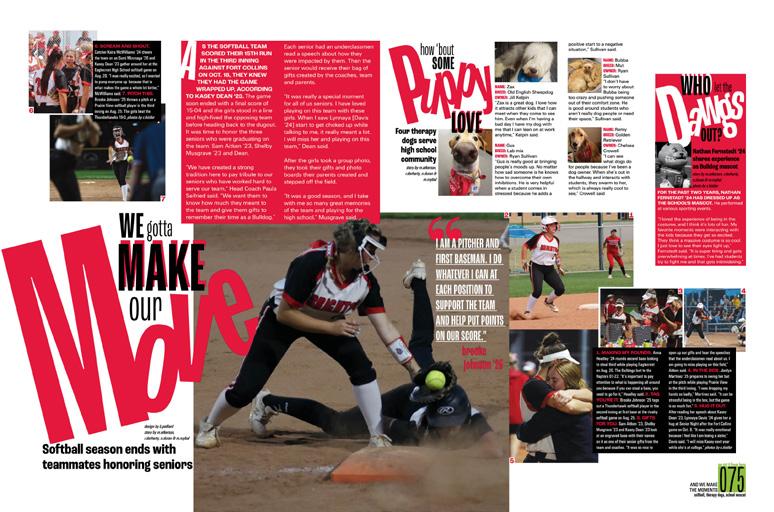
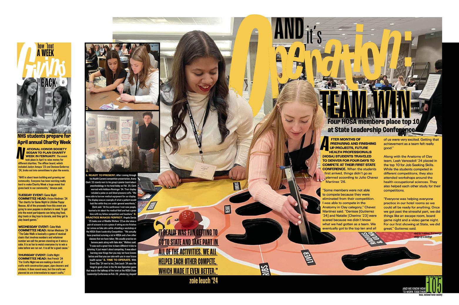
CHRONO PLUS: Mixing organizational strategies works for Mead. Seasonal dividers advance the theme, and single-topic spreads are common, but when several topics fill a spread, the folios clarify details. To balance the six full-spread student profiles, there are spreads with multiple topics. For example, there’s a spread on the new principal with three fun mods beyond the newsier long-form. Sporadic feature spreads range from new students, religion and allergies to Supreme Court cases, the stress of finals and items lost, broken or stolen.
INCREDIBLE COLOPHON:
Proving they were there for it, Pantera staffers told the stories of their theme’s evolution in super-yerdy detail. After sharing production details, the spread also documents type specs, chronicles competitive successes and provides instructions to access the staff’s Instagram. What a great record of those who captured the history of their school!
053 FEATURE COVERAGE PROFILE PORTRAITS CLOSING INDEX ADS
ANTHOLOGY | Mead High School


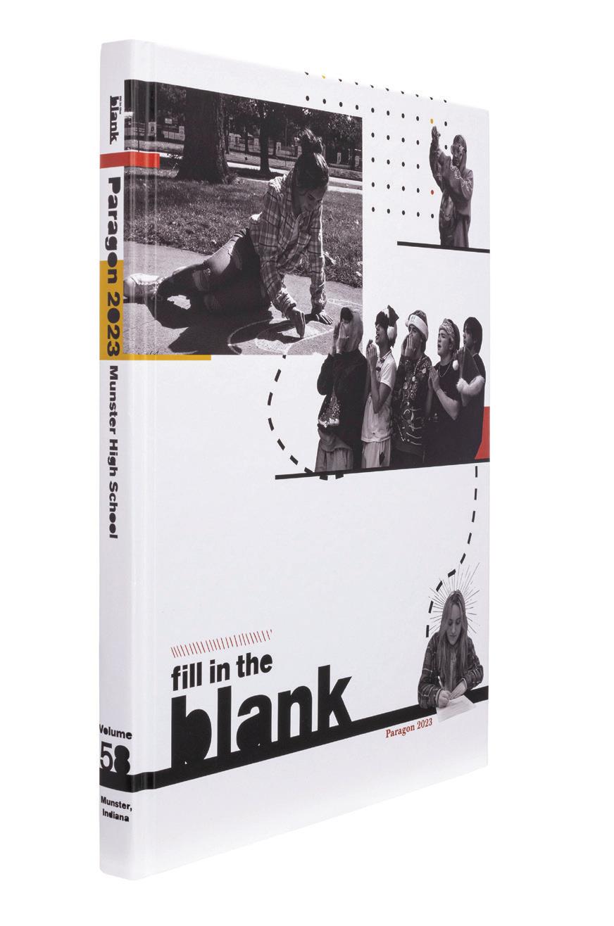
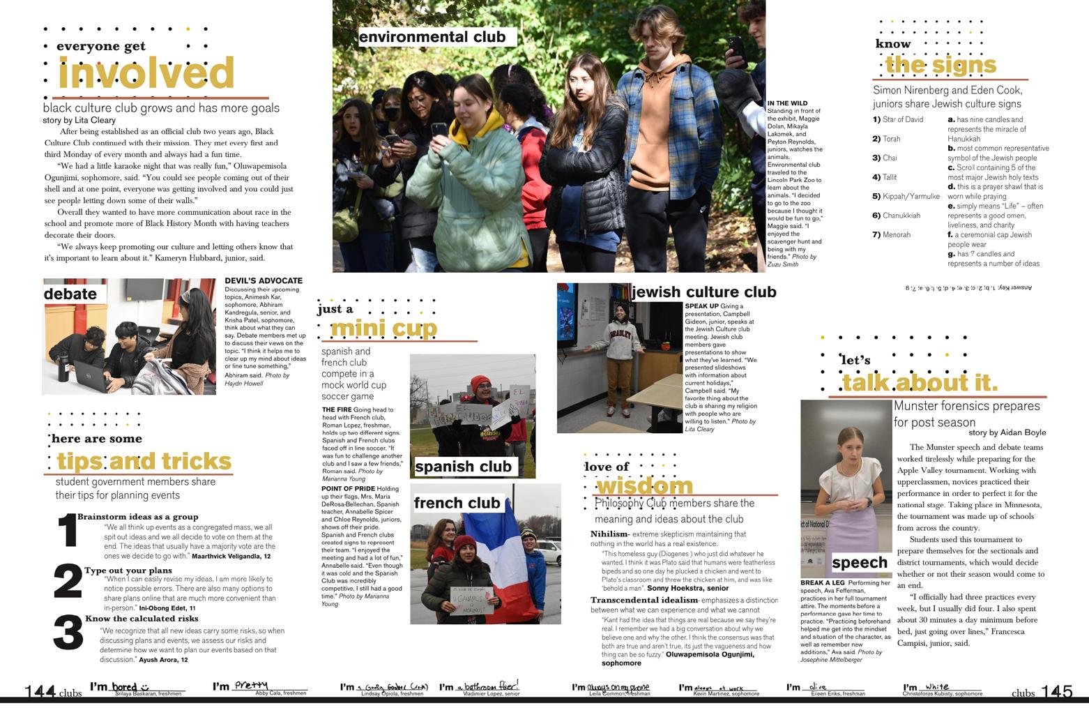
054 FEATURE PORTRAITS COVERAGE ENDSHEET COVERAGE Adviser: Sarah-Anne Lanman Editor: Lita Cleary Varsity Rep: Betty Samples Munster High School MUNSTER, IN PARAGON


Stand-out features:
GRAPHICS GALORE:
Silhouetted images, color bars, several textures and a contrasting pair of fonts on the cover hint to the theme and the vibe immediately. Then, the front endsheet layers on more meaning. In addition to the filled-in counters in the theme statement (yes, a staffer did manually cover the open spaces in the the letters e, b and a to create a clever, but literal, version of the theme), the ACD is introduced and the use of traditional sections is revealed.
SAME AND DIFFERENT:
Red, gold, black and white. The free-form opening features the textures, graphics and filledcounter font, but adds details in the copy and leaves some unfilled blanks to reiterate the theme before concluding “…It’s a big change, but it gives us the opportunity to…” which reads into the dominant theme logo. Plus, a bank of 20 responses to the all-coverage device includes a note that the students filled in the blanks in their own handwriting.
SECTIONAL DESIGN:
Dividers repeat the opening spread aesthetic, centered around a large identifying initial. Each includes visual cues from the cover, but emphasizes a single device that will be used consistently throughout the section. From the heavy black line setting student life spreads apart and the red diagonal slashes identifying academics to sports’ marker swoosh and the texture of dots in clubs, the sections are unified and identifiable.
055 DIVIDER INDEX FEATURE COVERAGE
ANTHOLOGY | Munster High School


056 FEATURE ENDSHEET REFERENCE DIVIDER COVERAGE PROFILE FEATURE Adviser: Julia Walker Editors: Audrey Snider and Andie Rau Varsity Rep: Molly Baker Olathe West High School OLATHE, KS PARLIAMENT


Stand-out features:
TOO HARD TO CHOOSE:
Parliament’s eight-color palette featured a collection of brights that worked well together and created visibly different vibes in various combinations. Four versions of the cover — each using four of the eight hues — were created, celebrating the many opportunities the year presented and acknowledging that personal choices make each student’s experience unique. All eight colors appear on the endsheet, connecting each of the four covers.
PERCEPTION VS. REALITY:
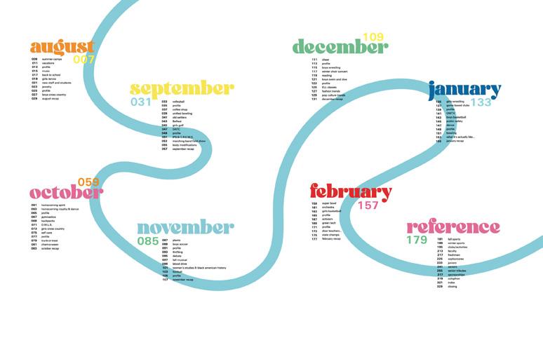
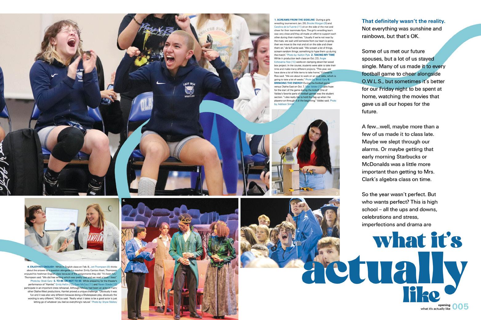
Both the opening and the closing include two spreads. In each case, the first spread presents utopian scenarios represented in YA fiction and movies, and the second spread details both the challenges and the highlights of the year — what it was actually like. The remainder of the book presents the true details of the year.
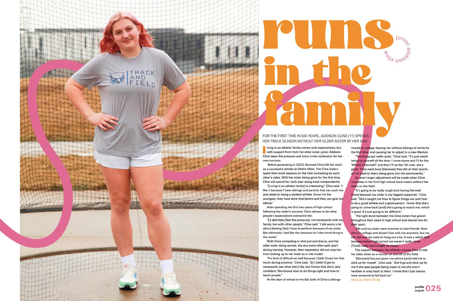
DESIGN DEETS: As the flowing line from the cover weaves its way through the book interacting with type and images, the lowercase modern serif headings create a strong sense of hierarchy to lead readers around each spread. Consistent rails of isolation create clear packages and, at the right margin, traditional, layered coverage spreads feature a theme-advancing ACD asking students to describe themselves in a single word (and then explain).
057 OPENING PROFILE ADS FEATURE
ANTHOLOGY | Olathe West High School


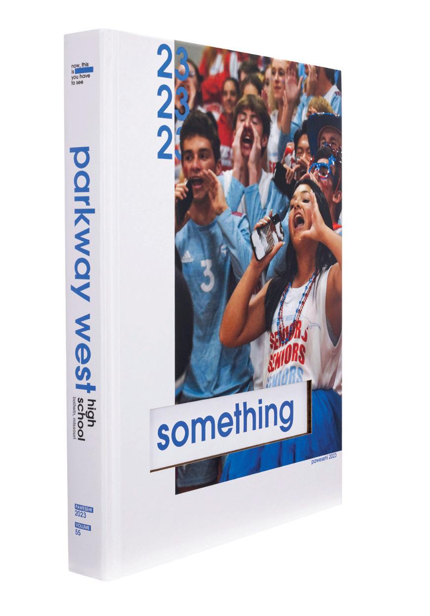
058 COVERAGE OPENING DIVIDER Adviser: Debra Klevens Editor: Tori Neeser Varsity Reps: Dan Mueller, Leah Blase and Danielle Retzer Parkway West High School BALLWIN, MO PAWESEHI


Stand-out features:
READERS’ CHOICE:
While chronological coverage sometimes offers a simpler production process and a way to include interesting and unexpected stories, some school communities are very clear about wanting to see coverage of their sports teams together on a full spread per team. The Pawesehi staff dealt with this preference expertly. First, the student life, academics and organizations coverage flows chronologically. And then, a completely separate sports section, which also follows the chronological pattern, sets readers at ease.
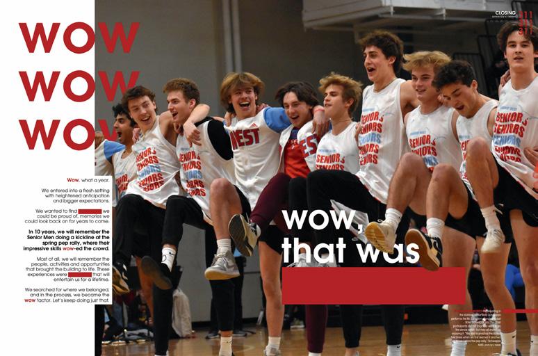
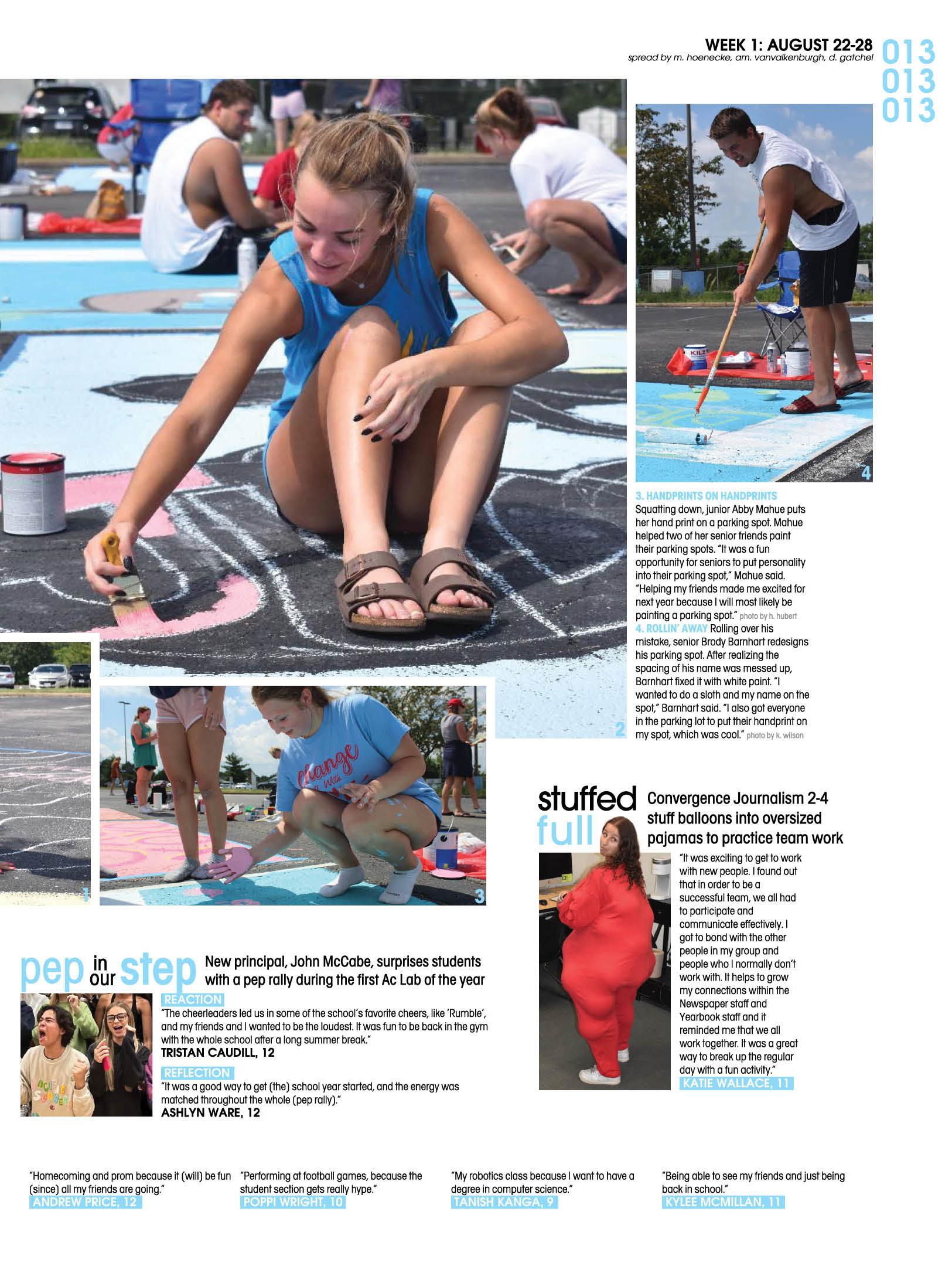
COVERAGE PLUS: Beyond the main photo package, most spreads feature at least four additional layers of content. The multi-mods underscore the idea that there’s so much going on Parkway. And, even more details on the year can be found through the staff’s addition of QR codes leading to videos, all kinds of additional coverage in the sports and clubs reference galleries and quotes introducing each section of the index.
THEME ON EVERY SPREAD:
Pawesehi’s all-coverage device is truly next-level. After the word “something” showed through the laser-cut cover from the endsheet, the staff began using a rectangular color bar to represent the word thematically in the opening and in all theme copy. So, of course, they took the extra step of repeating the device in the seven-quote ACDs spanning the bottom margins of all coverage spreads.
059
CLOSING
PORTRAITS
ANTHOLOGY | Parkway West High School


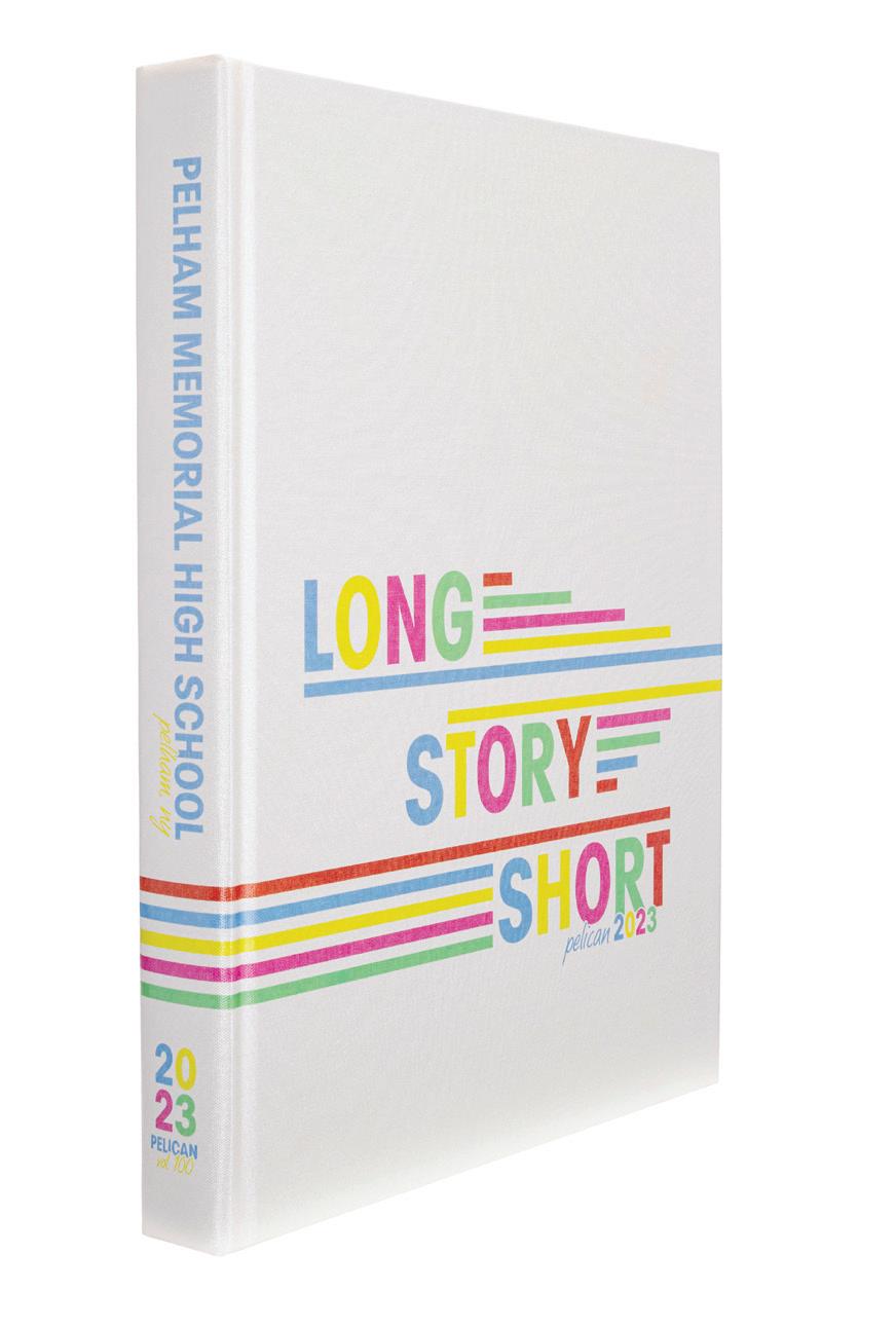
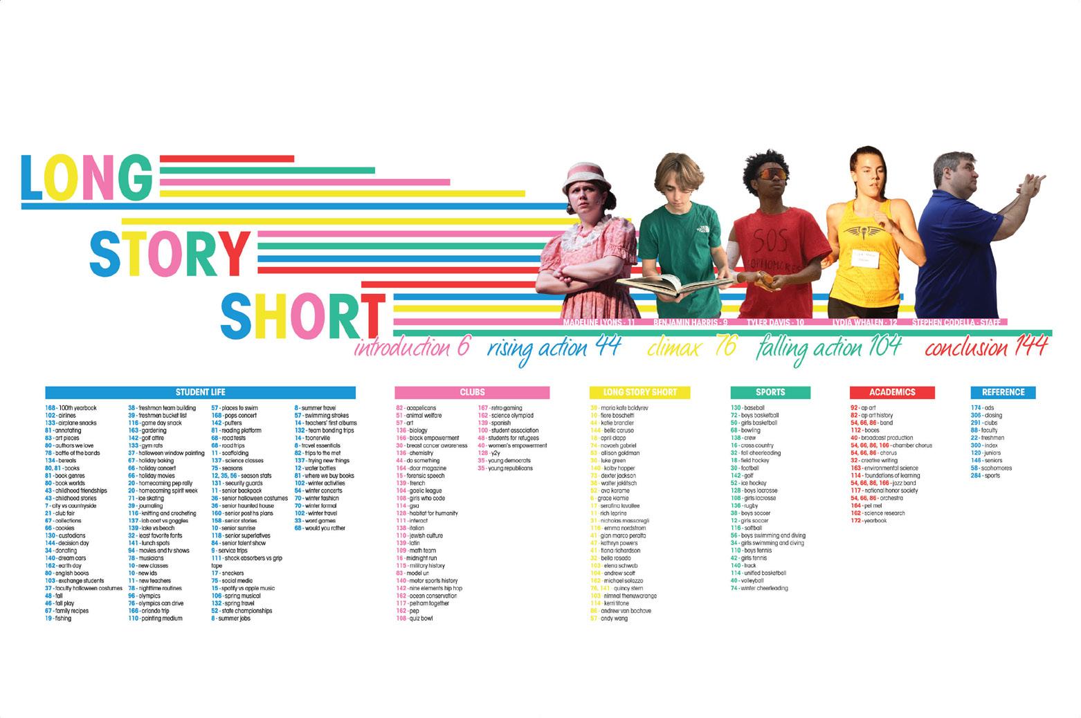
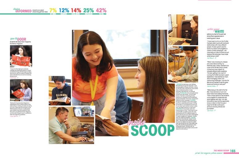
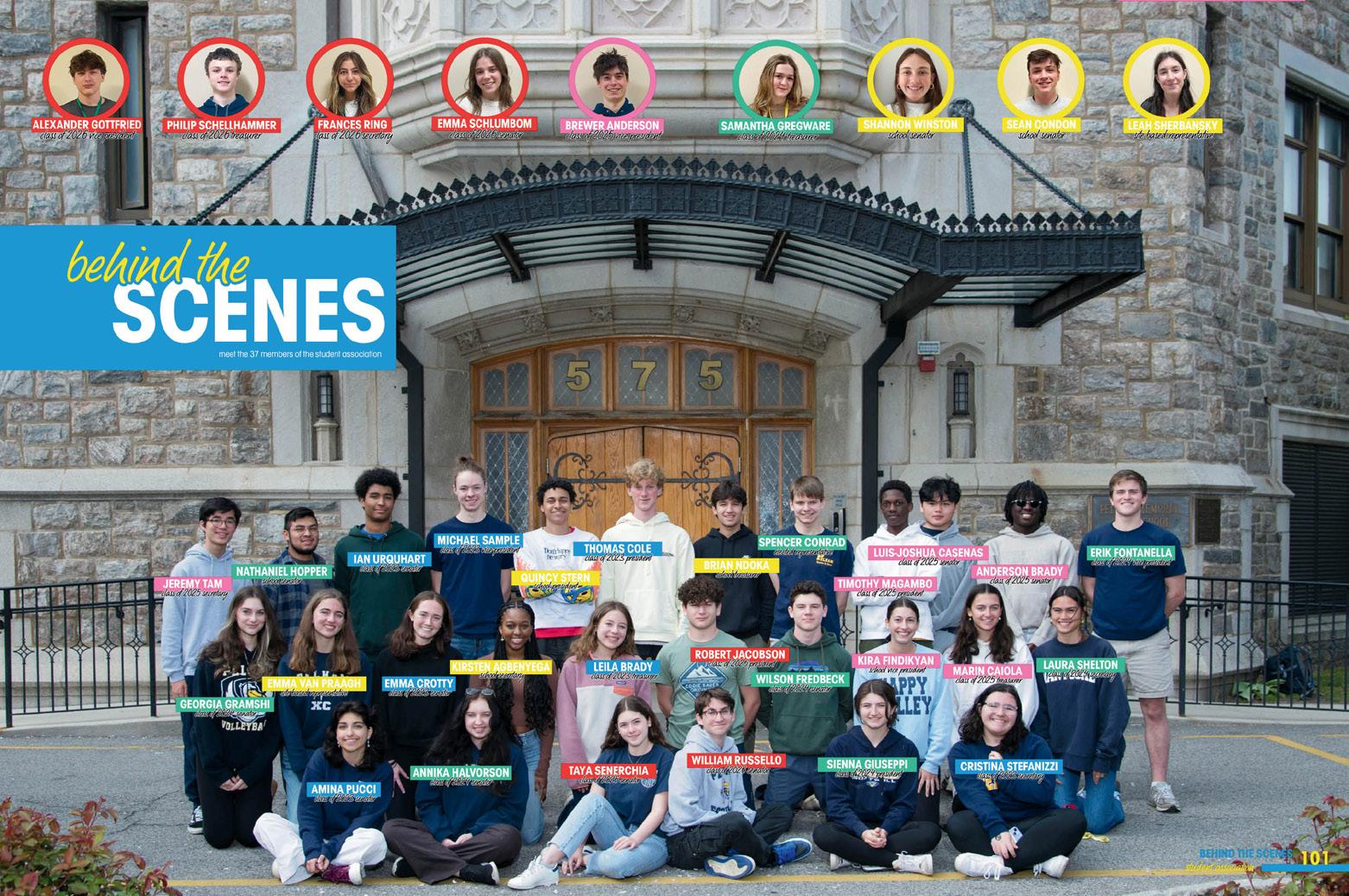
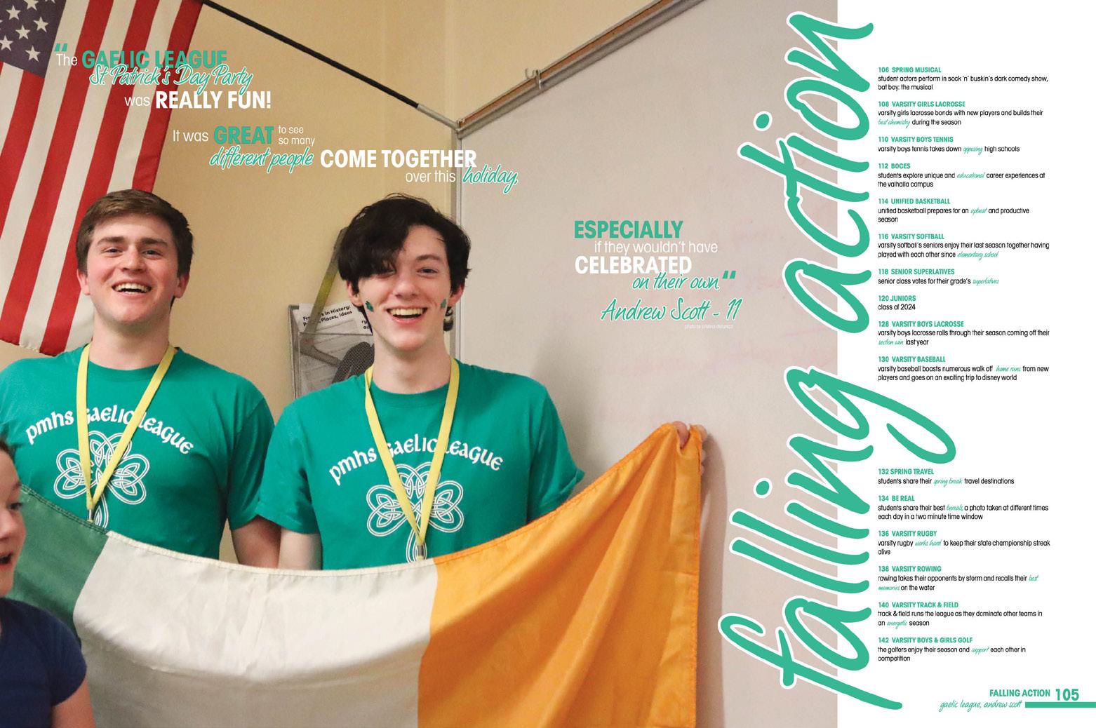
060 COVERAGE FEATURE COVERAGE ENDSHEET Advisers: Jane Wals and Bryan Sans Editors: Cristina Stefanizzi, Grace Dunhill and Kelly Gallivan Varsity Rep: Kristina Gisonde Pelham Memorial High School PELHAM, NY PELICAN


Stand-out features:
TELL US A STORY:
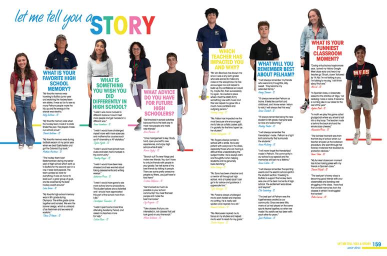
The cover of the Pelican creates a clever connection between the lines on the cover and their varying lengths. But like the good yearbookers these staffers are, the visual/verbal connection extends to the endsheet, where the sections are thoughtfully represented in varying sizes. As you can see by the perfect table of contents, student life will be the longest “story” based off the length of the line hosting the title. You’ll find a gradual decrease in size once you head to the reference section, but that’s not to say there isn’t more to the story there.
NEON FUN: Bringing some fun into their book with color, the Pelican staff showcased a take on primary colors but made them BRIGHT! Kicking off the opening to tell us the “long story short,” each copy block has an assigned color with only parts of the theme highlighted in its alternating text choice. This party-life palette is perfect for what is the Pelican’s 100th volume celebration. It’s definitely an event we want to be invited to!
MAKE THE CONNECTIONS:
Keeping on the fun journey of this centennial volume, we come across perfectly crafted headline packages for the spread. Not only do they tie in the life-as-a-story theme, they’re playful enough to give a chuckle. “Fall-shadowing” is a play on “foreshadowing.”
Keeping the theme going, “Meet the Characters” is found in the folio for the people section. Love it! It’s clear staffers had fun showing us their punny skills.
061 DIVIDER COVERAGE FEATURE COVERAGE
ANTHOLOGY |
School
Pelham Memorial High


Adviser: Annie Gorenstein-Falkenberg Editors: Briona Loughran, Cole Gaddis, Fiona Glynn, Yuno Ide and Emma Stasko Varsity Rep: Genise Cushman


062 DIVIDER FEATURE FEATURE COVERAGE ENDSHEET FEATURE COVERAGE
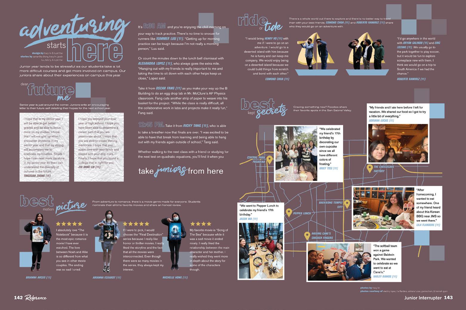
Longmont
LONGMONT,
High School
CO PRIAM


Stand-out features:
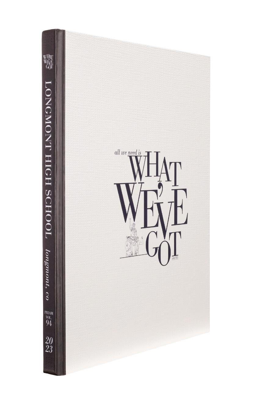
A NICE TOUCH: Readers could feel the difference in this book immediately. With Matte lamination, the Burlap grain presented a tactile introduction to the volume. Adding Raised UV coating on the design elements took the way readers experienced the book — before they even opened it — to another level. Priam’s proud but comfortable vibe is clear from the start.
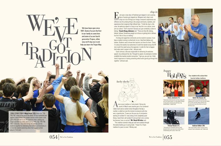
ELEVATED TYPE: The theme logo combines a classic — AHJ Bodoni — with custom design treatments to create the identifiable but versatile look used throughout. Main heads and key words are all caps, so “weaving” the type is less about the interaction of ascenders and descenders and more about sculpted (sometimes bouncing!) baselines that create visual variety within the distinctive look. Another favorite — AHJ Urbano — provides lots of sans serif accent options.
THEY’VE GOT IT ALL:
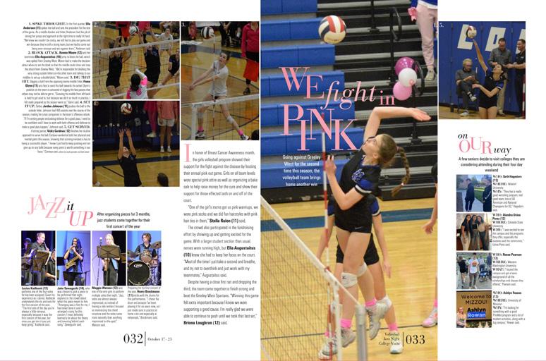
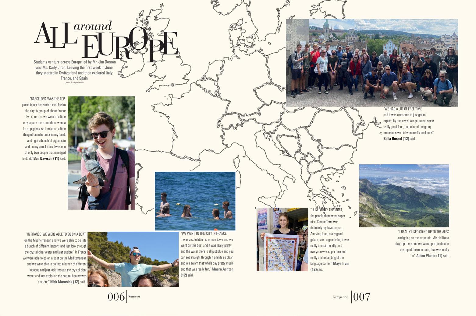
True to the theme, varied design styles come together to create a stunning collection that works. From an airy singleimage opening to flowing photo packages featuring intentional rails of isolation separating additional layers of coverage, the staff’s style palette and underlying structure create a cohesive look. The chrono coverage, features, profiles and the reference section all build on the decisions introduced in theme package.
063
CLOSING
PORTRAITS
FEATURE
COVERAGE
ANTHOLOGY | Longmont High School


064 DIVIDER FEATURE COVERAGE Adviser: Sarah Kirksey Editors: Chloe Gaither, Jessica Sachs, Jordan Hunt and Addie Kerner Varsity Reps: Dan Mueller, Leah Blase and Danielle Retzer Ladue Horton Watkins High School SAINT LOUIS, MO
RAMBLER


Stand-out features:
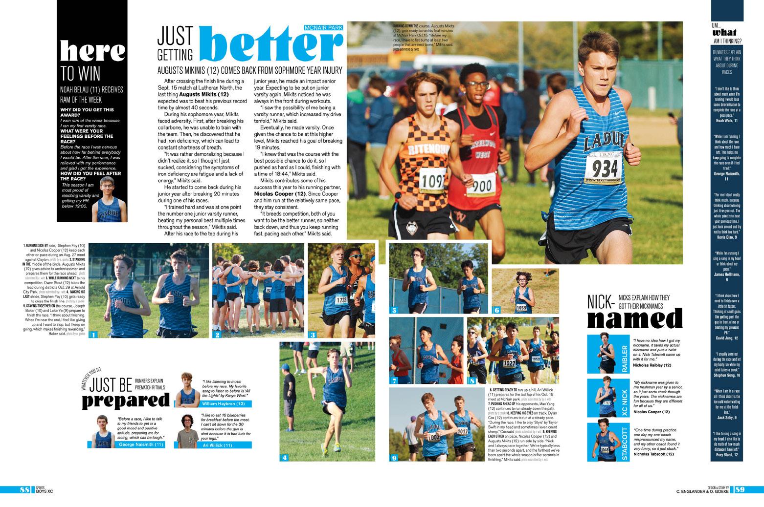
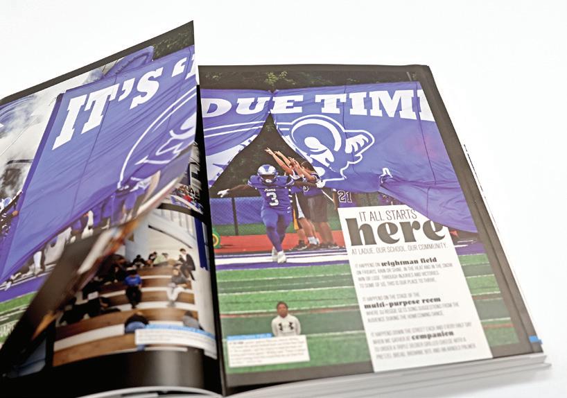
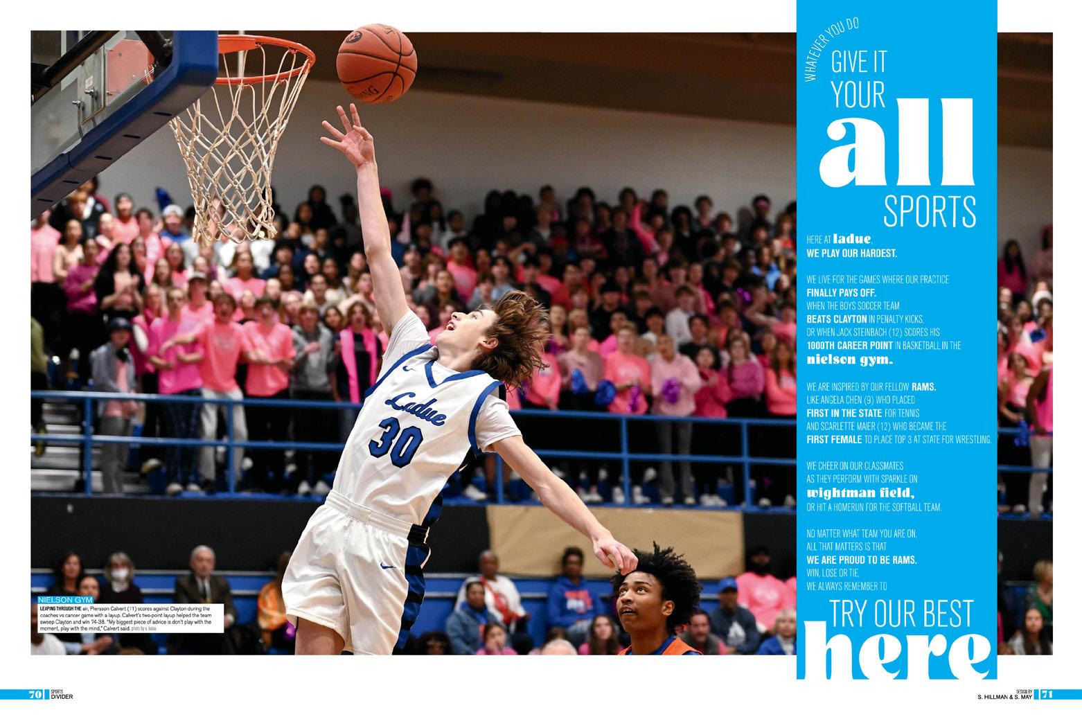
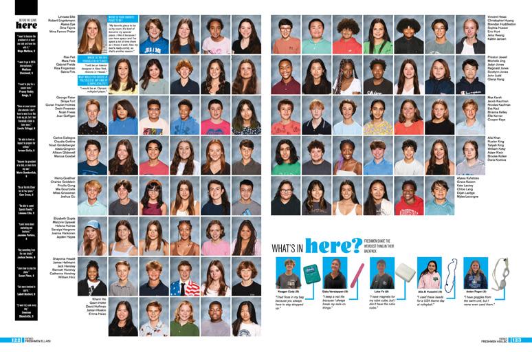
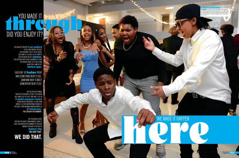
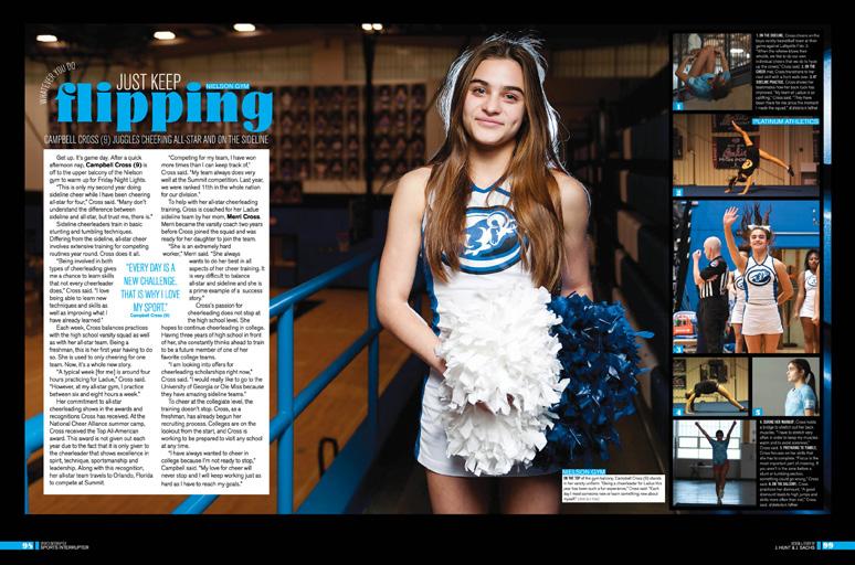
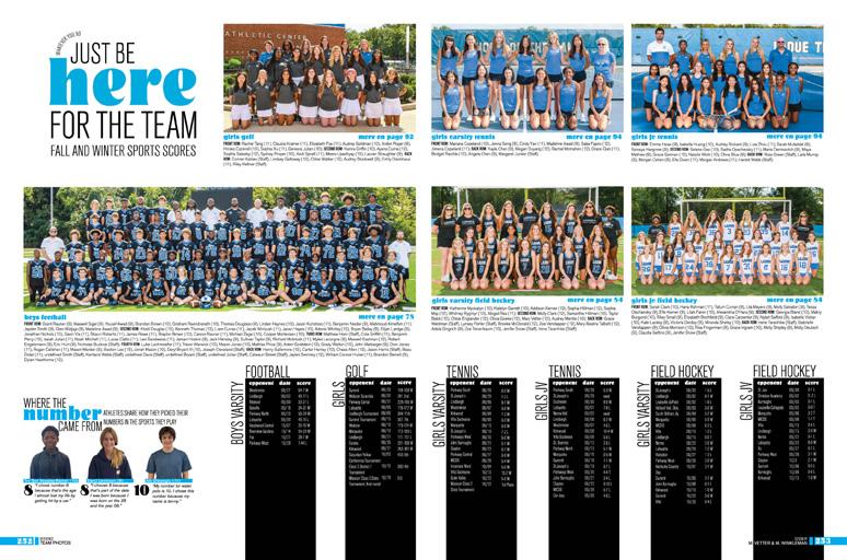
NOT WHAT IT SEEMS: With campus photos spanning the cover, readers might imagine the oversized “here” on the cover represented a locationoriented theme. Actually, it skewed toward advice for a great year. Starting with the opening phrase “Whatever You Do,”dividers added phrases like “Make it Your Own,” Give It Your All” and “Leave Your Mark.” Closing headlines “We Made It Happen Here” and “Whatever You Do, You Will Always Have a Place Here” bring the theme full-circle. Not missing the opportunity, the staff took advantage of the location angle, adding coverage of key campus locations with a doublegatefold tip-in.
GO WITH THE FLOW:
A chronological plan gave readers a road map to student life coverage, but the staff opted not to include sports coverage on those spreads. Instead, a comprehensive sports section with full spreads for each sport showcases flowing photo packages, welldesigned headline packages and journalistic long-form copy accompanied by a handful of related mods.
DETAILS MATTER:
From consistent character styles for both theme fonts — including super specific roles for the many iterations of the robust AHJ Craft Gothic family — to use of negative space both surrounding the content and separating layers of coverage, it’s clear how much planning was done before design work began. The massive collection of mods is yet another nod to the work this staff put in.
065 ANTHOLOGY |
Ladue Horton Watkins High School
PORTRAITS PROFILE REFERENCE CLOSING OPENING INDEX PORTRIATS


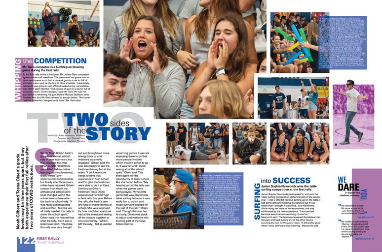
066 COVERAGE COVERAGE ENDSHEET OPENING Adviser: Melissa Cameron Editor: Katy Day Varsity Rep: Annette Johnson Casa Roble High School ORANGEVALE, CA RAMPAGES


Stand-out features:
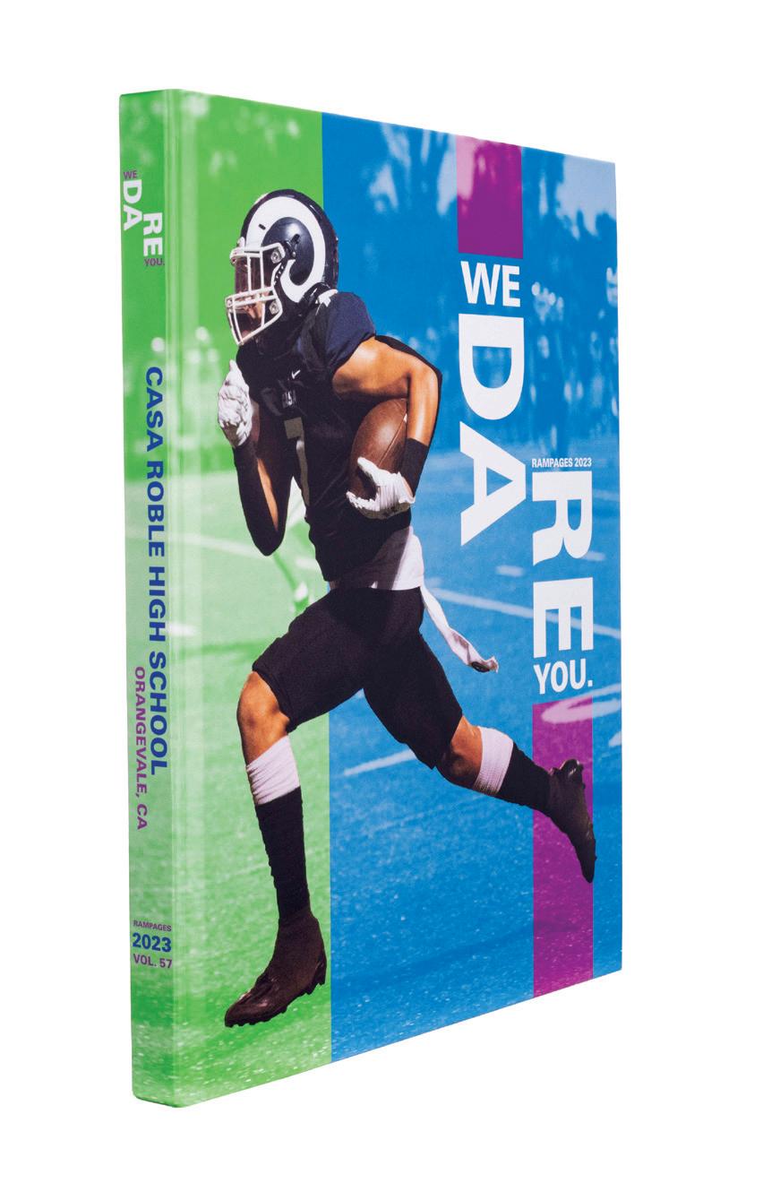
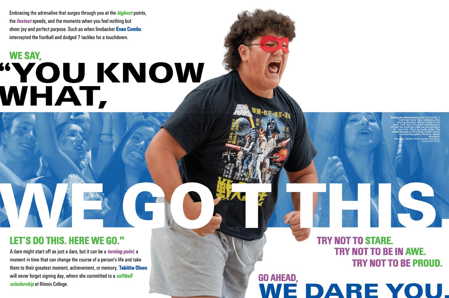
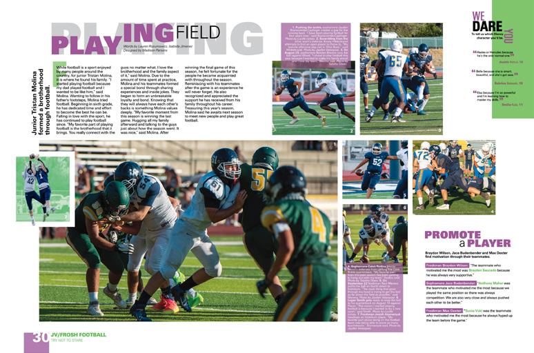
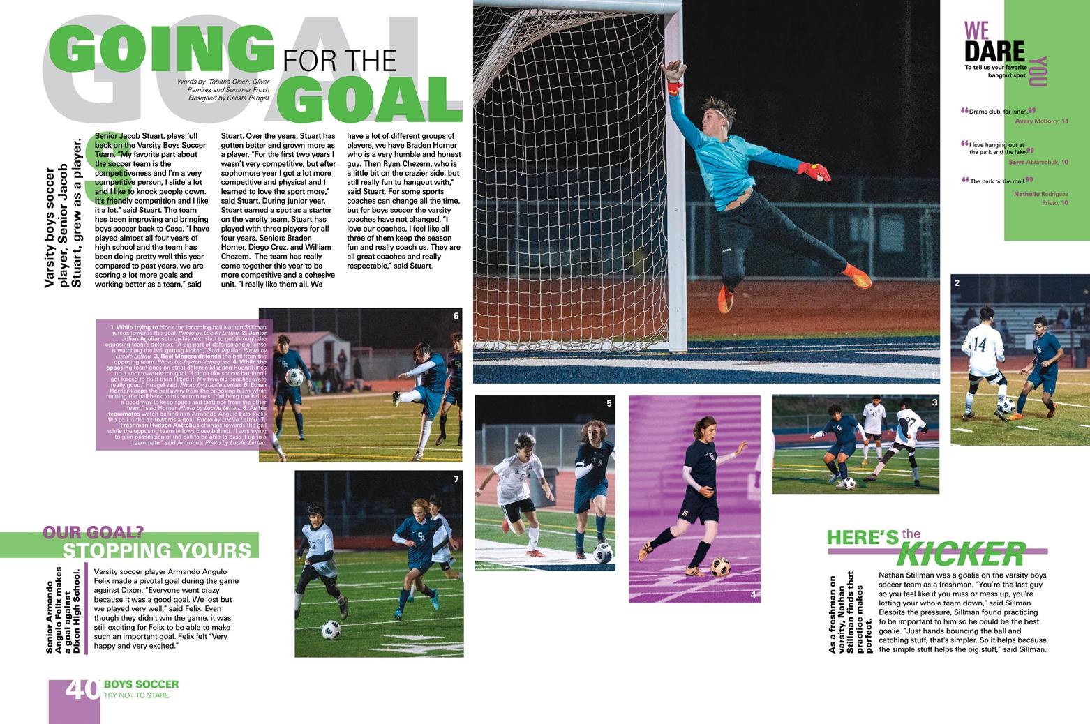
DARING DESIGN: With a bold theme, it makes sense that the design team would also accept the challenge of changing things up. Adding purple and green to their school-color blue, they created a powerful look comprised of color halftones, silhouetted full-color images and oversized headlines. Layer in rotated words, stylized theme copy, lots of overlapping color blocks and masterful use of white space, and you’ve got Rampages
CREATIVE COVERAGE:
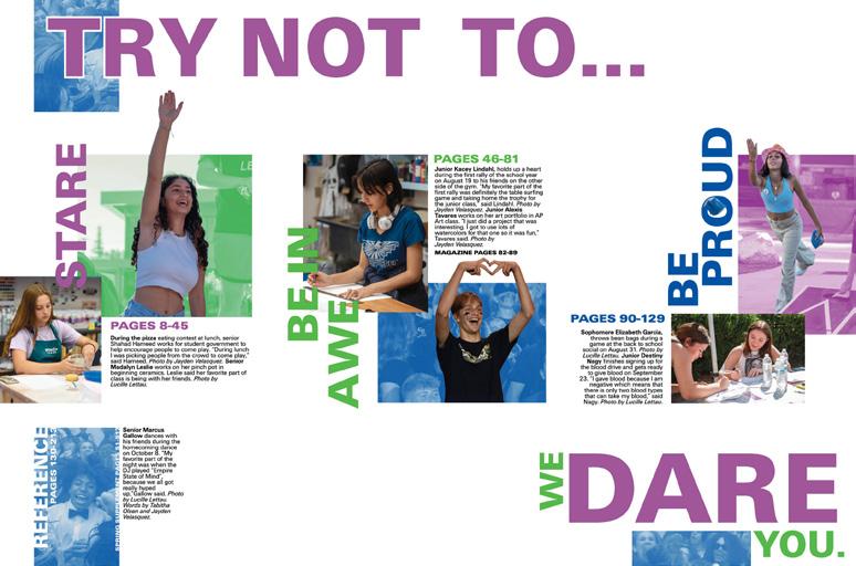
This book has five sections: three hybrid coverage sections, plus reference and a feature magazine. The theme led the staff to craft their coverage around the endsheet label “Try not to...” Each of the sections — Stare, Be in Awe and Be Proud — includes coverage from traditional student life, academics, sports and clubs sections. The full spreads of layered coverage spotlight successes and achievements of the teams, clubs, academic departments and events covered with flowing photo packages and both long-form copy and alternative formats.
SEE THE DIFFERENCE:
Literally encouraging readers to look at the year differently, the four-spread feature magazine requires that the book be turned 90 degrees to read the timely briefs and profiles. Full-bleed black backgrounds with brilliant color blocks and headlines are layered with faces and voices from the Casa community.
067 CLOSING COVERAGE PORTRAITS FEATURE
ANTHOLOGY | Casa
School
Roble High


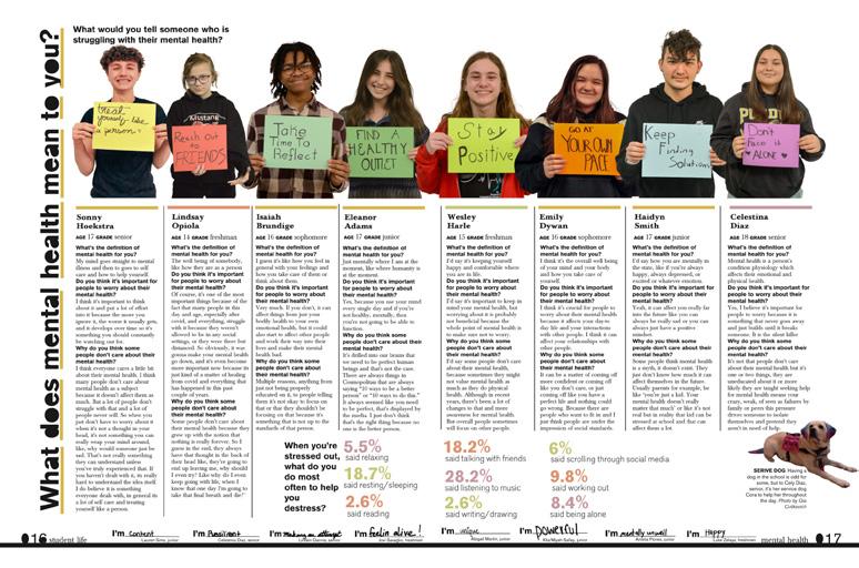
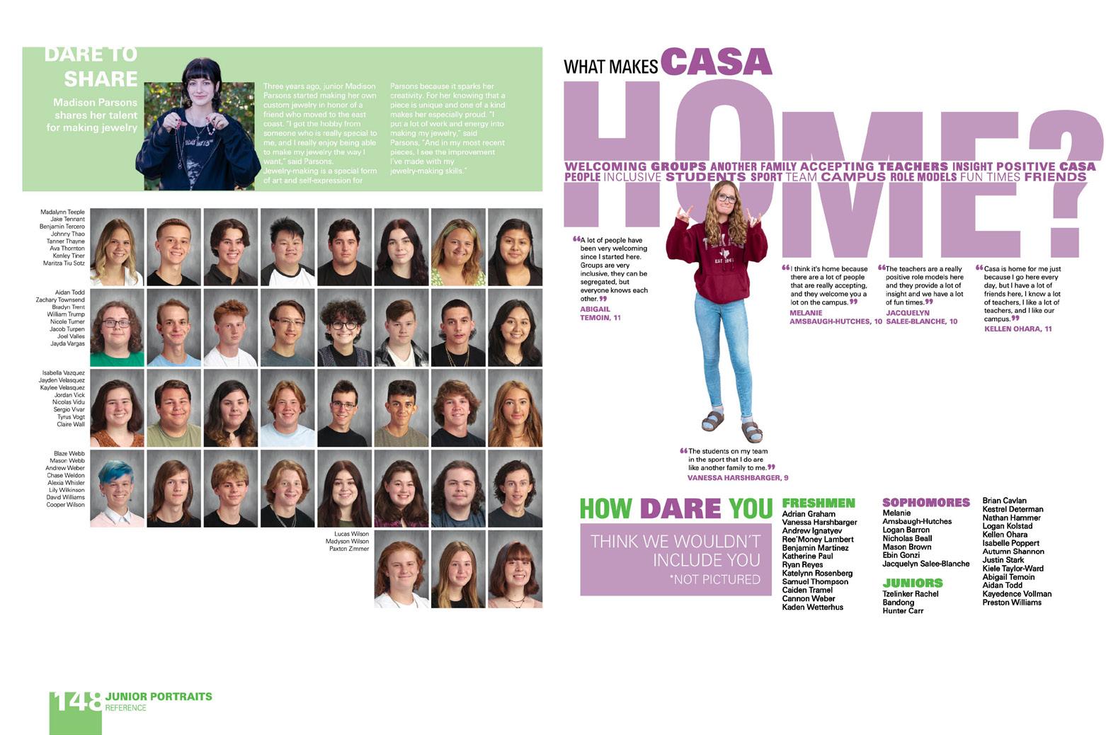
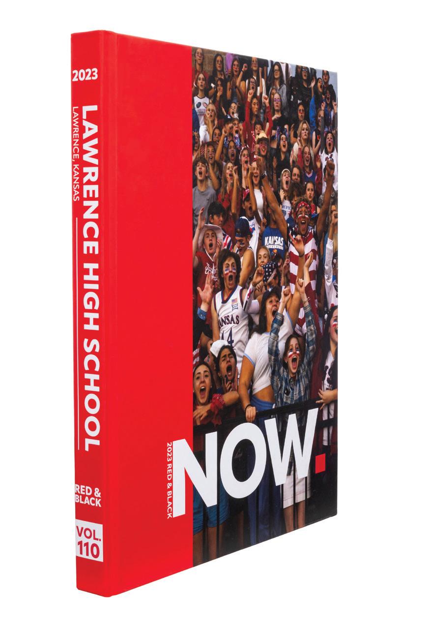
068 OPENING REFERENCE COVERAGE COVERAGE Adviser: Barbara Tholen Editor: Maya Smith Varsity Rep: Barry MacCallum Lawrence High School LAWRENCE, KS
RED & BLACK


Stand-out features:
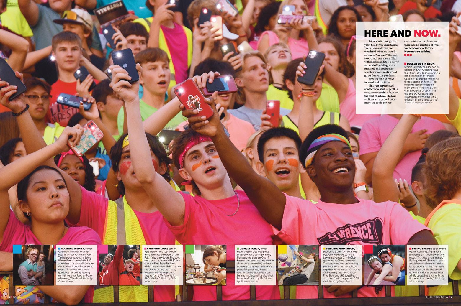
REALLY, NOW: The headings on the endsheet and the opening create the sense of urgency felt by many. After several years of uncertainty, the school year felt more normal. It was time to move forward, start over. “We Start Now.” they began. Then “Here and Now.” On following openings: “See Us Now. Right Now.” and “Turn the Page Now.”
CHRONOLOGICAL FLOW:
The school color dominates the cover, but the endsheet introduces a bright, bold color palette — and the coverage strategy. The colorful contents listing reveals that each traditional section has been assigned a color. The sectional colors appear as accents and folios on each spread of the book’s chronological flow, which follows the opening and records the events of the year in roughly the order they occurred. The book’s only divider introduces the reference section after more than 100 pages of features and full spreads of coverage on traditional topics.
MODS APLENTY:
Content-driven coverage means that lengthy, storytelling captions with quotes appear alongside all action photos, and long-form narratives are present when that makes sense. In other instances, alternative coverage tells the stories. Infographics, lists, talking heads and other quote displays fill the pages with details needed to capture the year. Similar content runs alongside portraits including hundreds more voices, and extra content on reference pages makes the record of the year stronger still.
069 COVERAGE COVERAGE COVERAGE COVERAGE CLOSING ENDSHEET PORTRAITS
ANTHOLOGY | Lawrence High School


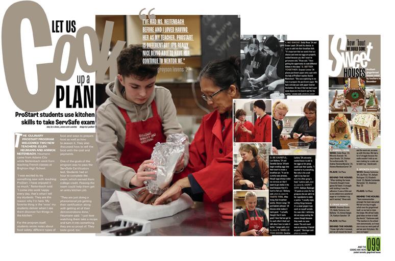
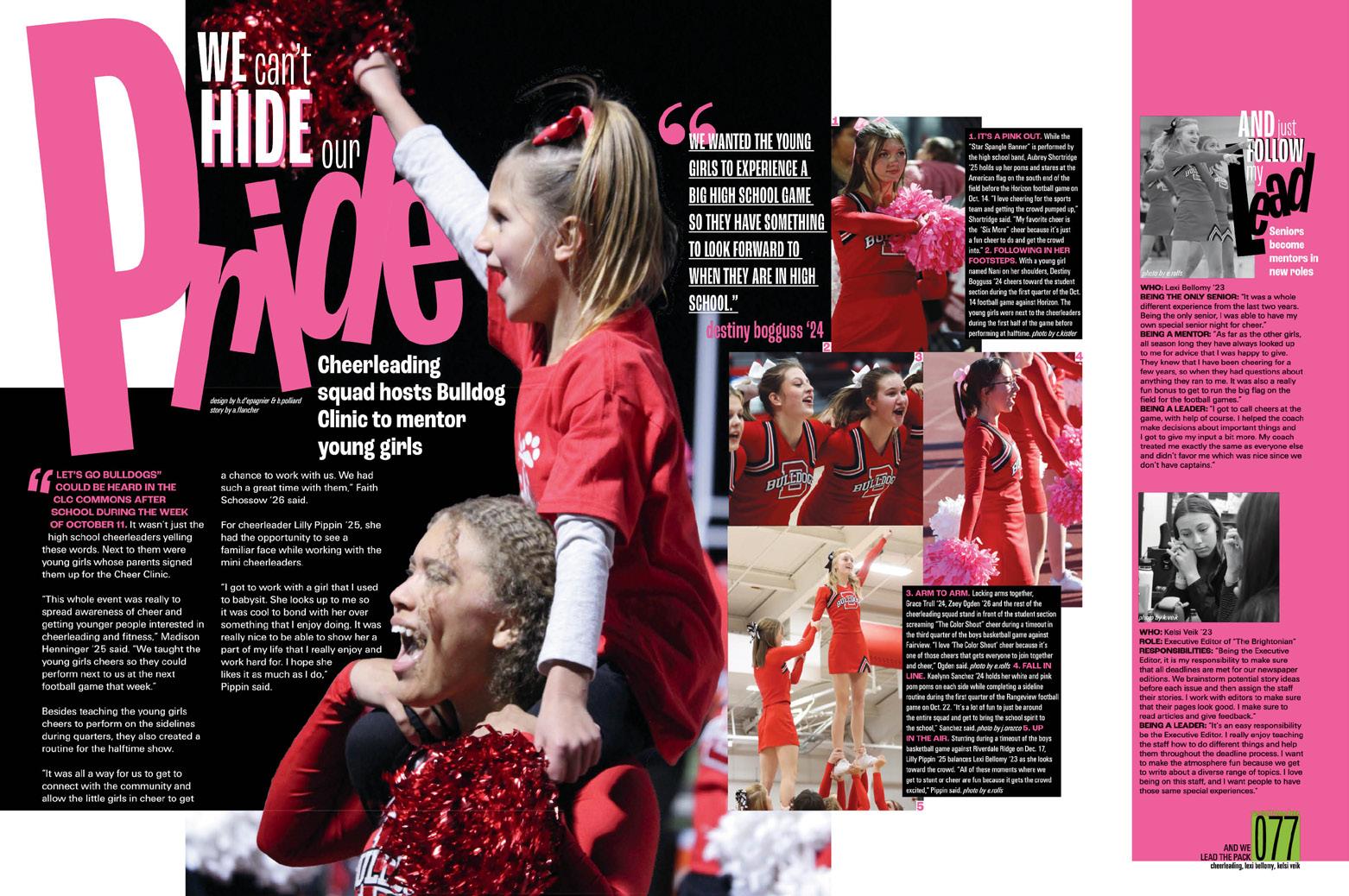
070 PORTRAITS FEATURE COVERAGE COVERAGE FEATURE Adviser: Justin Daigle Editors: Elizabeth Rolfs and Gabriella Polliard Varsity Rep: Ray Slye Brighton High School BRIGHTON, CO REFLECTIONS


Stand-out features:
THE TOTAL PACKAGE:
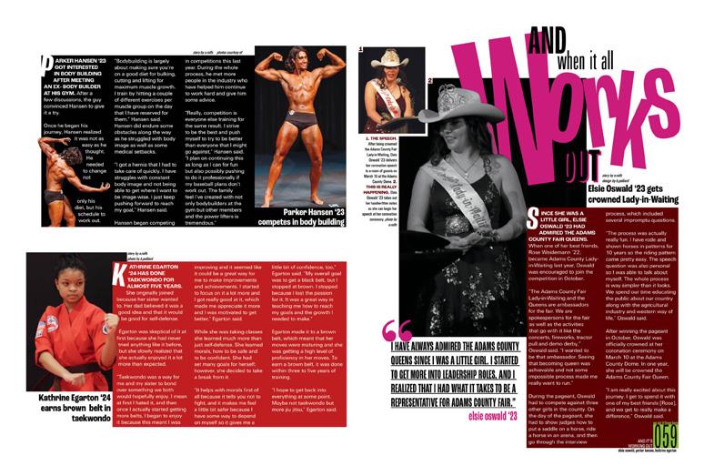
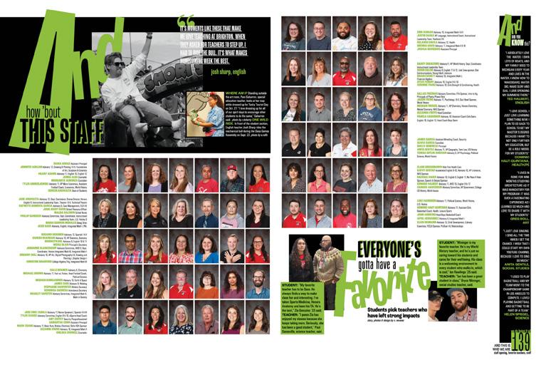
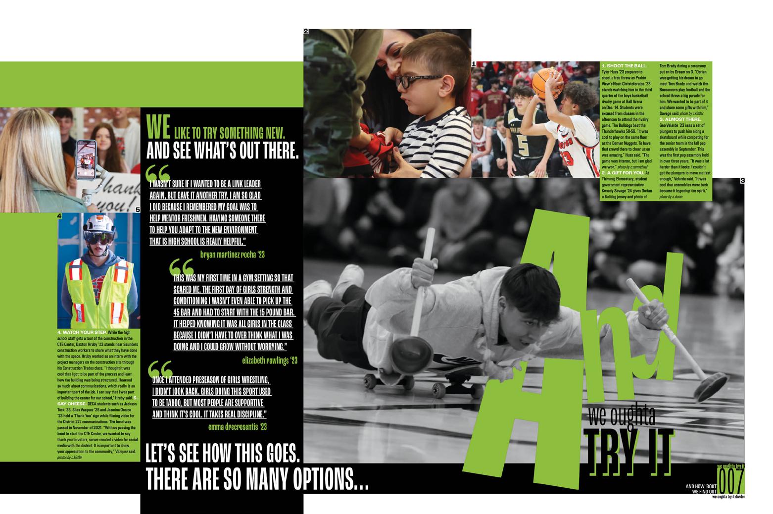
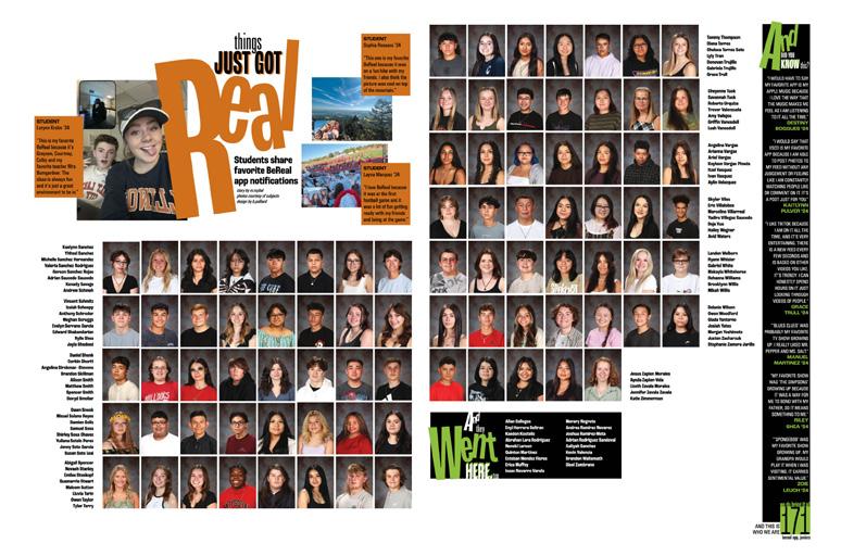
This perennial powerhouse has become known for weaving type and graphics to create a distinctive look. By handling each letter of their main headline separately, The Re f lections staff makes type into art. The secret recipe includes neon green and black for 2023, but no worries, there are plenty of other colors expressed in the big bold type inside. It’s a look that is very Brighton.
UMBRELLA COVERAGE:
The book is divided into three theme-supporting sections: “We Ought to Try It” covered new happenings at the school, including construction and a big schedule change. “We Got It From Here” covered familiar topics and routines. And, “We Bring It All Together” is the reference section, including people, sports, clubs, etc. Finally, profiles are gathered into a section titled, “We’ve Got It Going On.”
BIG, BOLD VOICES:
Giant type pairs with stacked, layered photos and bright colors to ensure each spread packs a punch. Beyond the big and beautiful design, there’s coverage. So much coverage. Student voices are everywhere — in long-form stories, mods, pull quotes, all of the places they should be. Even in the index and woven throughout the people section, the staff hasn’t let their love for design overshadow their coverage goals. It’s a delicate balance, and they are pros.
071 COVERAGE COVERAGE PORTRAITS DIVIDER
ANTHOLOGY | Brighton High School
REFLECTIONS

072
Mauldin
School MAULDIN,
Adviser: Beth Ward Editors: Elizabeth Radecki and Joanna Baldwin Varsity Rep: Devon Swale
High
SC


Stand-out features:
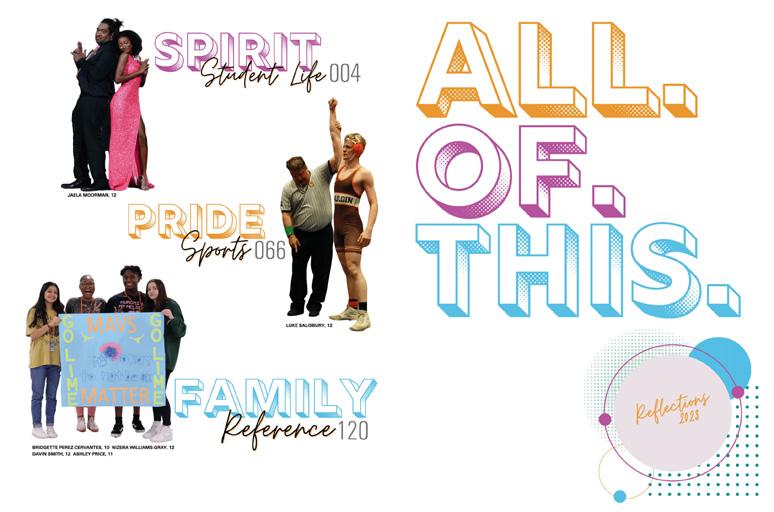
RETRO RECOLLECTIONS:
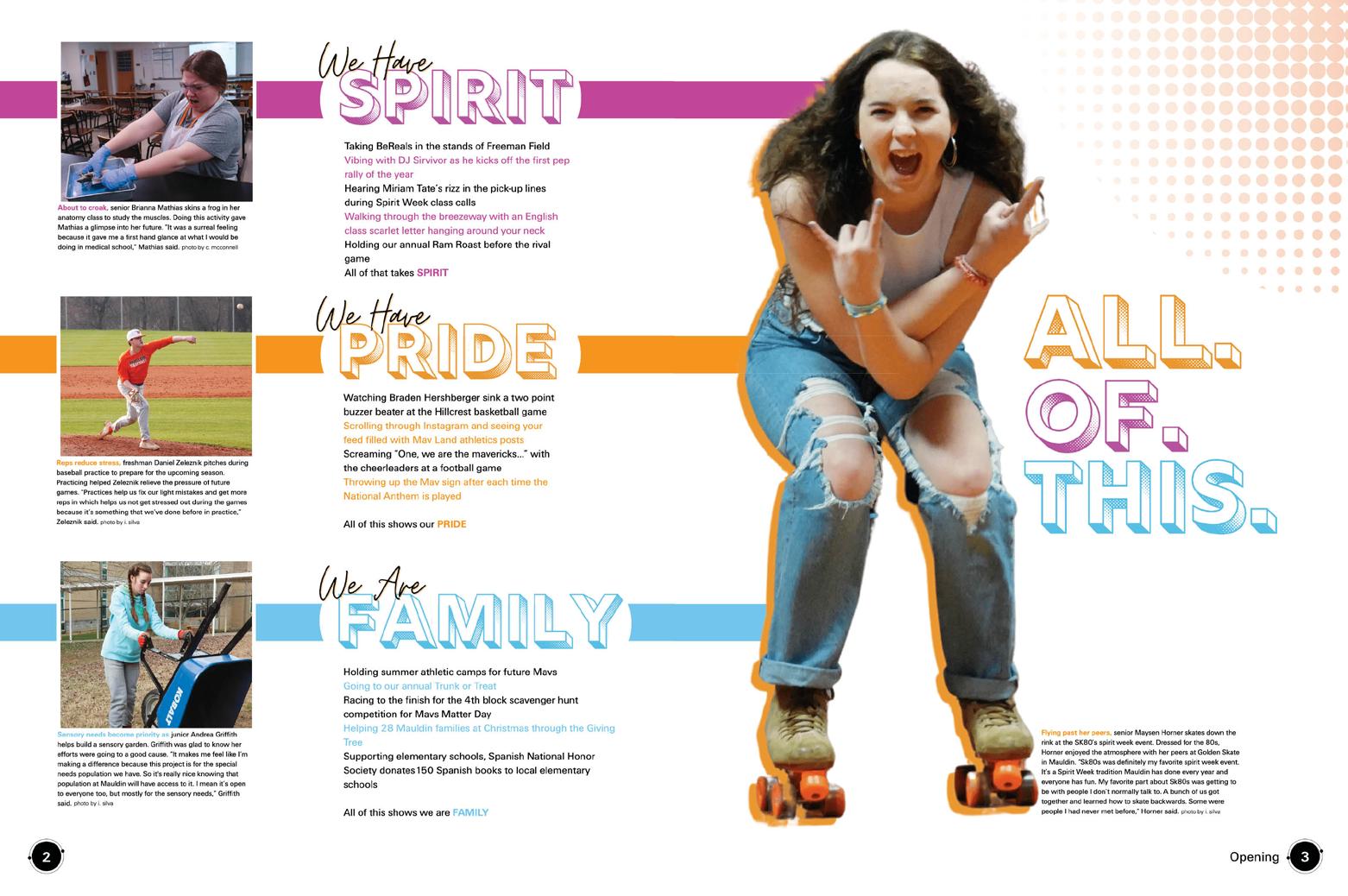
In true everything-old-is-newagain fashion, Reflections’ design showcases one of many popular flashbacks to the ’80s. Check out this totally cool collection of geometrics and textures, colorful posterized photos and the combined use of soft colors, brights and neons. It’s a stunning montage of identifiable campus landmarks and icons blended with multiple versions of the mascot and students.
TRIPLETS EVERYWHERE:
Three words in the theme, with the periods demanding each be delivered separately — and with impact. Three fonts, one that’s outlined, textured and 3D, plus a whimsical accent and a robust, but neutral, sans serif. And, three sections in the book: “Spirit” for student life, academics and organizations, “Pride” for sports and “Family.” for people and reference.
COVERAGE CONSTANTS:
While the look of the volume is bold, bright and different, the journalistic foundations remain intact. That means copy packed with specific details, captions that record essentials and layers of coverage that introduce varied student perspectives. The Square One influence is obvious as consistent internal spacing and rails of separation make it easy for readers to move from mod to mod as they consume each spread’s entire story. Add in the many mod styles (more photos, more quotes), and you have an incredible permanent record of the year for the entire school community.
073 INDEX PORTRAITS OPENING DIVIDER COVERAGE COVERAGE ENDSHEET
ANTHOLOGY | Mauldin High School


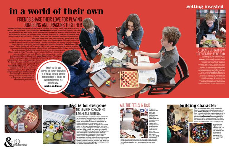
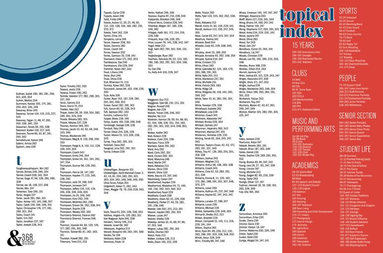
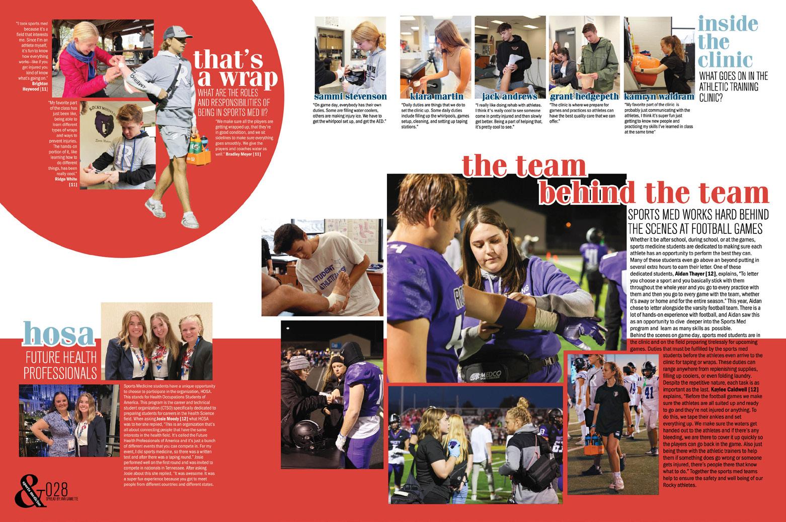
074 INDEX COVERAGE COVERAGE FEATURE PORTRAITS FEATURE DIVIDER Adviser: Marie McCulloch Editors: Bridger Hamm, Emry Gibbs, Addison Floto, Aubrie Toledo, Emma Williams, Macie DeBie, Livia Hurst, Kailey Hancock and Sydney Loscher Varsity Reps: Matt and Jen Johnson Rocky Mountain High School MERIDIAN, ID SILVERTIP


Stand-out features:
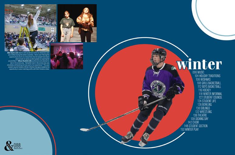
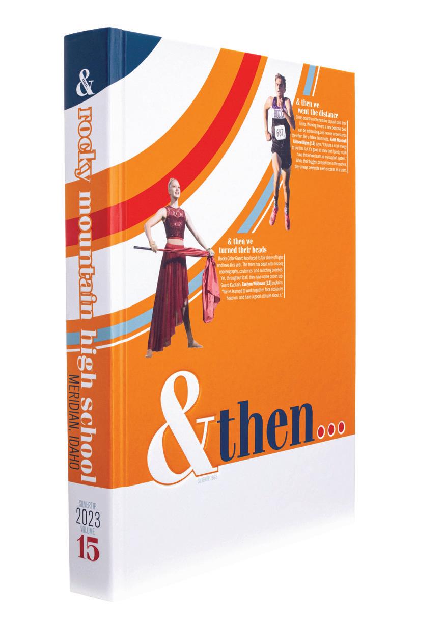
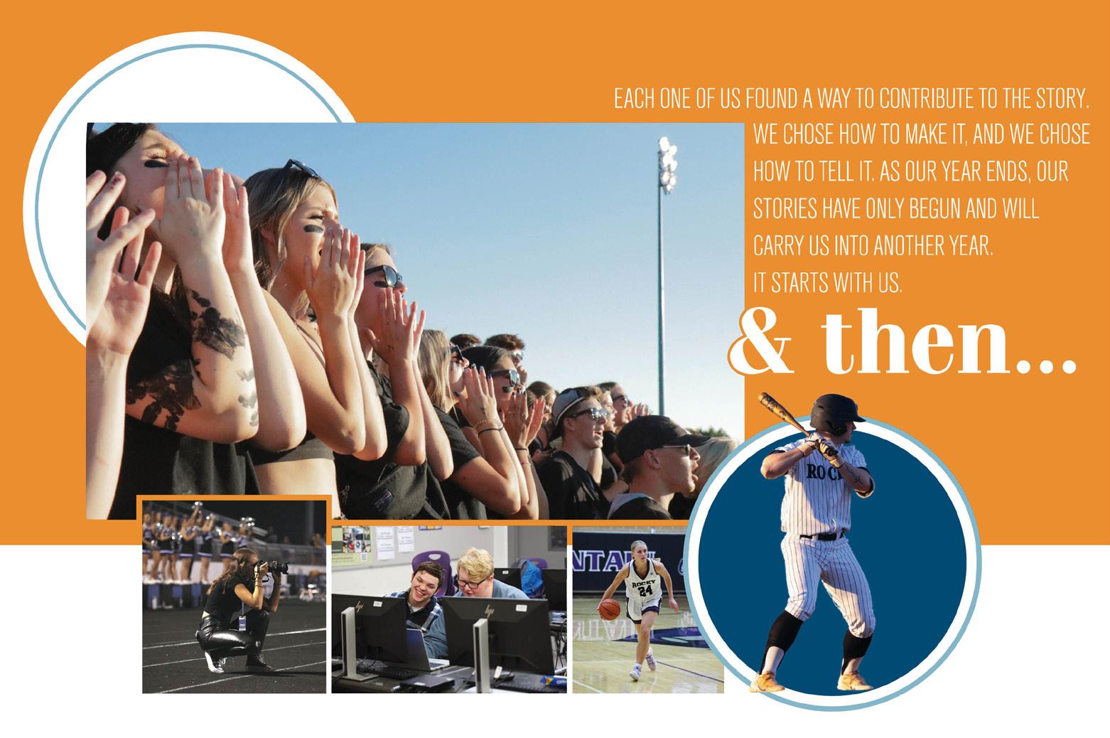
BRING IT AROUND: The delicate balance of the theme is strikingly evident in this Silvertip, where a mix of “&” and “and” seamlessly integrates into headlines without overwhelming the design. Similarly, the circles — a recurring graphic — are used thoughtfully across spreads. They’re placed strategically, providing a visual bleed-off effect that adds aesthetic appeal without overshadowing the content. Designers of this volume knew the perfect balance to bring everything full circle. Literally.
ALL THE COLORS: CMYK blends were carefully selected, and it shows. Whether it’s the mix of navy, light blue and red or red, white and black, each combination is not only aesthetically pleasing but also thoughtfully chosen. While there isn’t a clear organization of the colors on each spread, it’s obvious that each spread was planned to ensure you don’t run into the same palette on the next page.
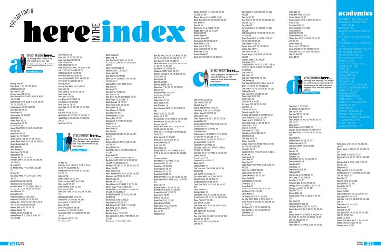
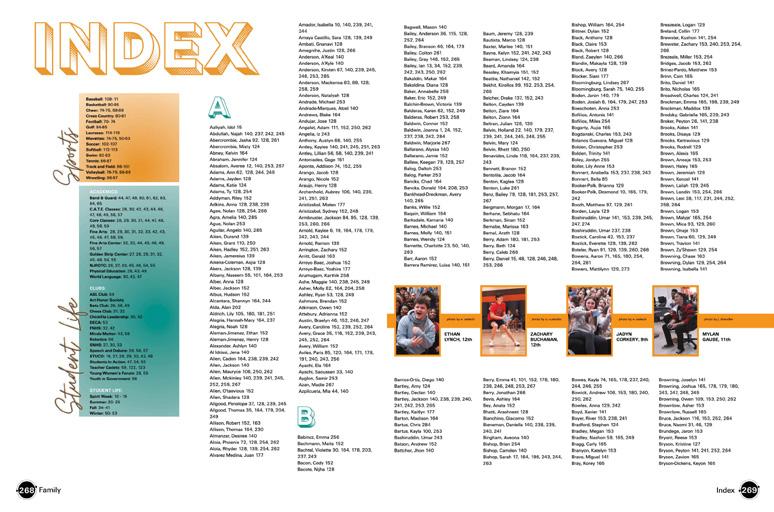
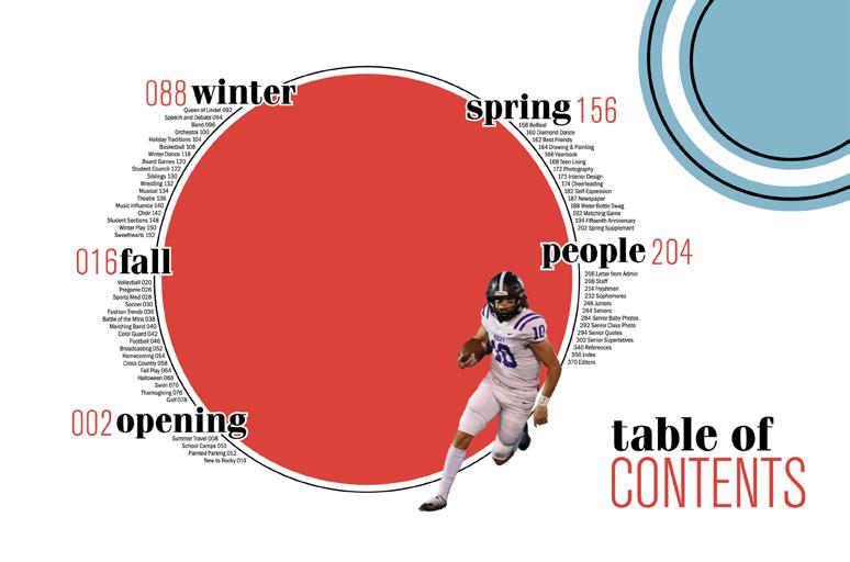
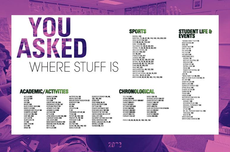
YAY TO THIS INDEX!: Major props to the Silvertip staff. Not only do they provide a traditional index to make our yearbooking hearts sing, but they also take it further with their coverage and the addition of a topical index. The inclusion of interactive index activities, such as a point-based bucket list, adds a fun take on what can be the boring part of a book. This thoughtful approach not only aids in efficient navigation but also transforms the index into an interactive tool that invites readers to explore and connect with each page.
075 CLOSING
ENDSHEET COVERAGE COVERAGE
ANTHOLOGY | Rocky Mountain High School


076 COVERAGE INDEX FEATURE DIVIDER Adviser: Carrie Rapp Editors: Grace Herzog and Bethany Goodson Varsity Rep: Dan Mueller, Leah Blase and Danielle Retzer Lindbergh High School ST. LOUIS, MO SPIRIT


Stand-out features:
GRAB YOUR GLASSES:
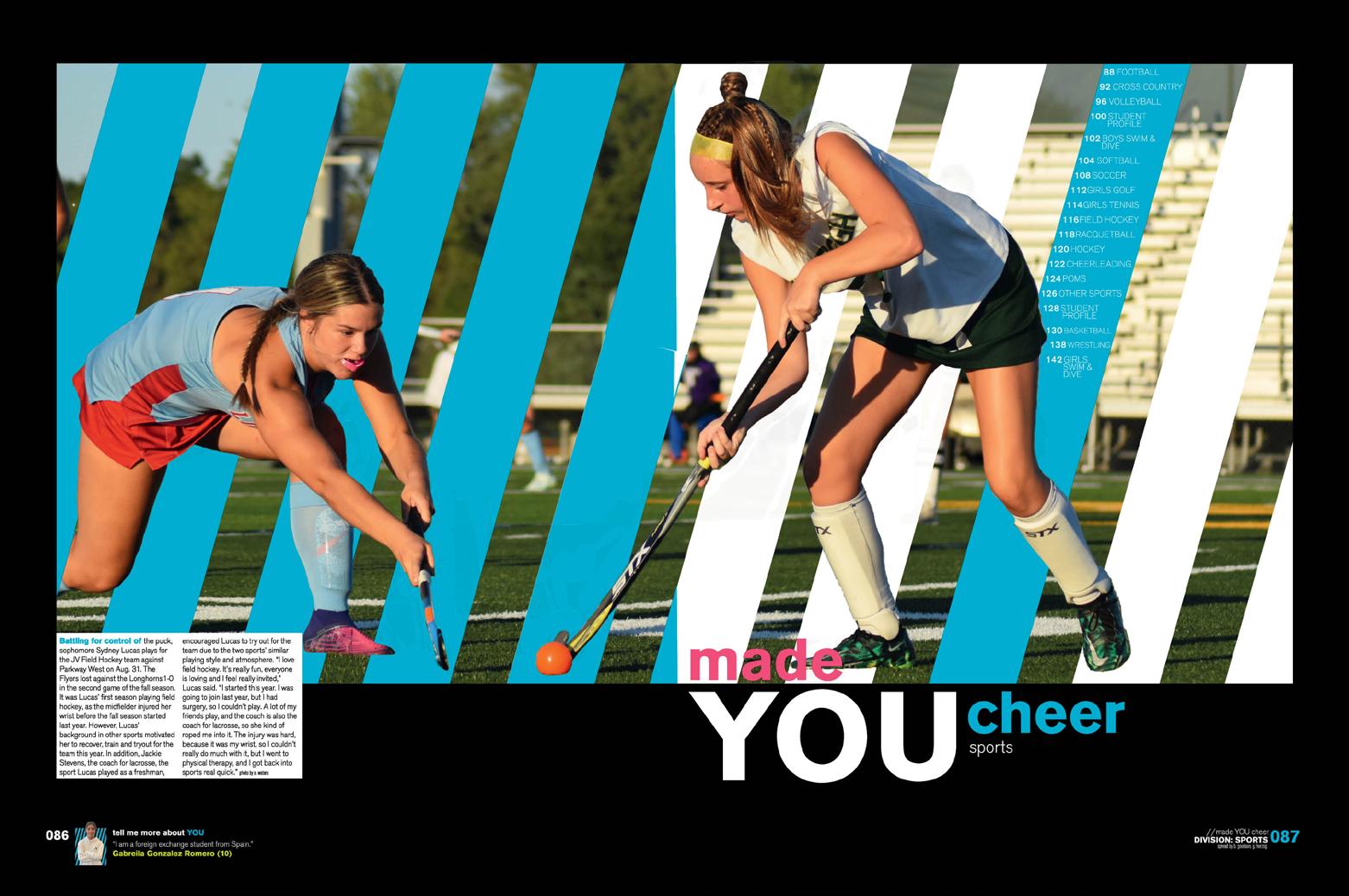
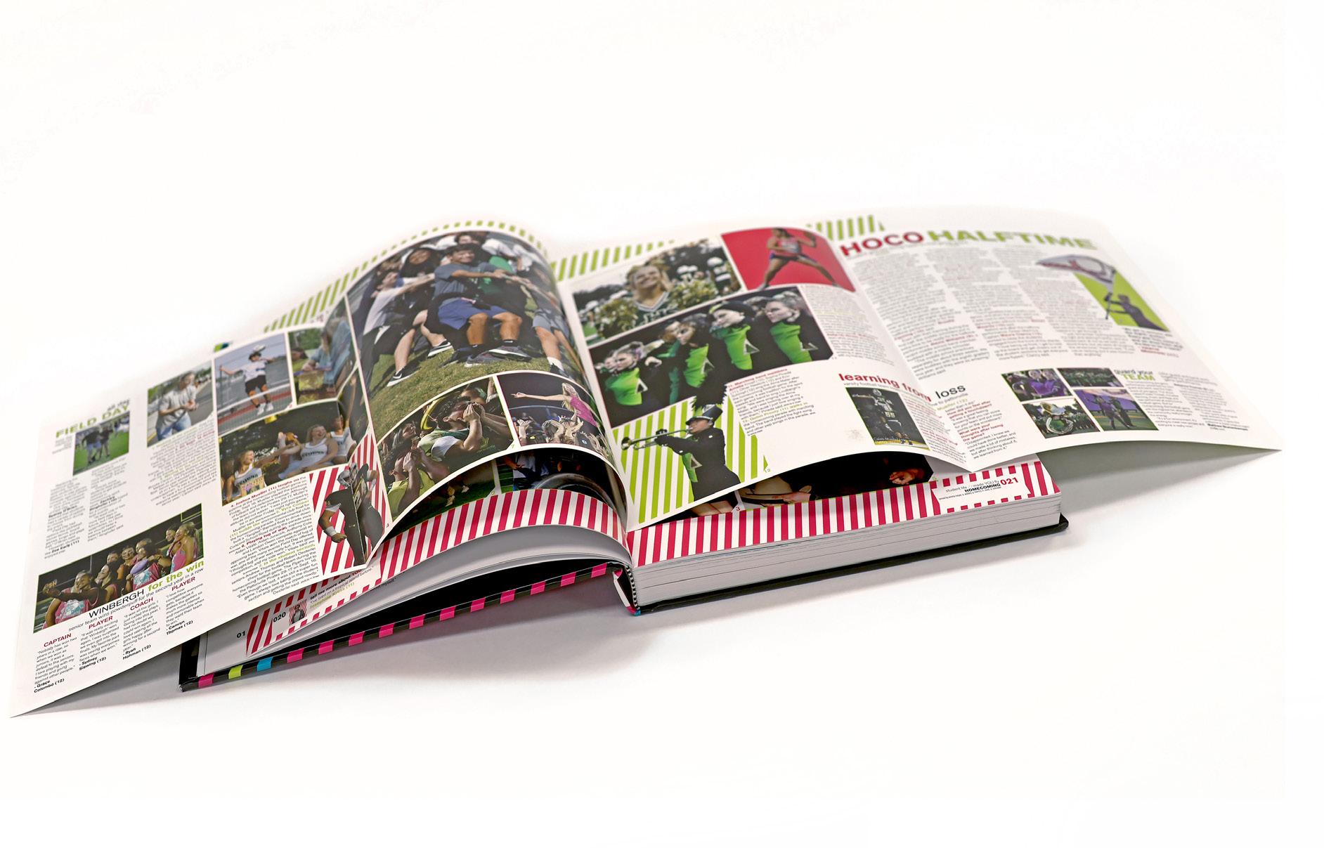
The cover of Spirit kicks off the fun design. Stripes — providing a faux 3D effect — are complemented by both debossing and embossing. The design and applications create a tactile and visually striking cover. Into the book, these stripes serve as a clever anchor for talking heads and appear behind photos. This staff gets props for paying attention to the small details with the stripes extending to the bottom bleed line, providing yet another layer of visual continuity to tie the design elements together.
MADE US STOP:
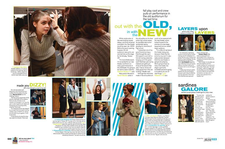
Kicking off the book early on, Homecoming week takes center stage with a visually stunning gatefold. The design kicks off with flair, featuring a “LOOK AT US” headline that demands attention. The spread is thoughtfully designed, capturing the energy and spirit of the event. What made us look (see what we did there?!) was the decision to extend content onto the host spread. Nice job.
THIS ONE IS GOOD:

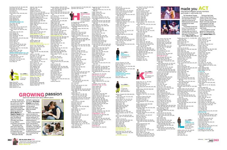
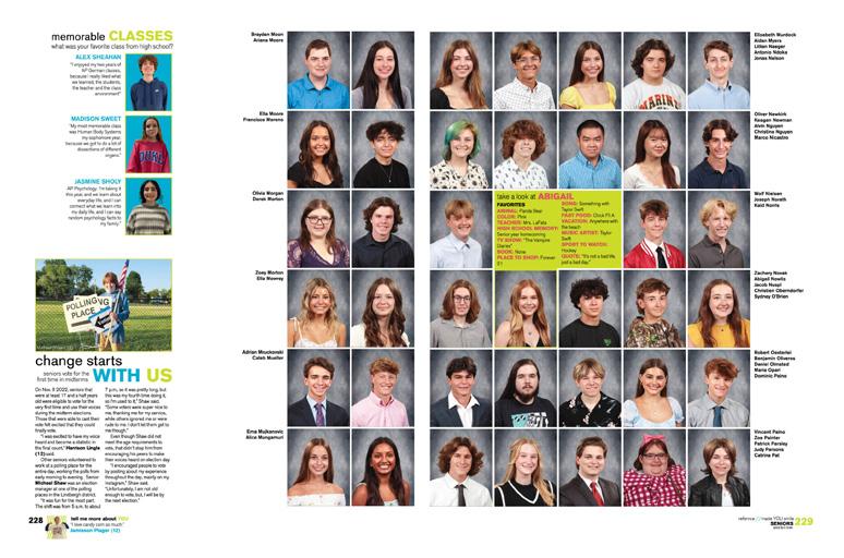
The people section features a profile mod that visually attaches to individual portraits. It first grabs your attention with a color block behind the image serving as a creative backdrop to add some fun to the spread. But you’ll need to take another look. Take, for instance, the mod featuring Abigail, which is right beside her portrait. The design first captures attention and then prompts the reader to “look” and read about her.
077 INNOVATION: DOUBLE-GATEFOLD TIP-IN OPENING COVERAGE PORTRAITS REFERENCE COVERAGE
ANTHOLOGY | Lindbergh High School


078 FEATURE ENDSHEET OPENING COVERAGE Adviser: Carrie Faust Editor: Jaya Castaneda Varsity Rep: Ray Slye Smoky Hill High School AURORA, CO SUMMIT


Stand-out features:
DRAMATIC DUOTONES:
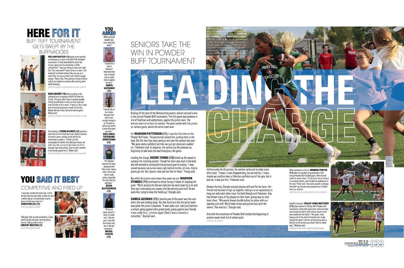
Once they latched on to the power of the varied duotones, the Summit staff accepted the challenge. They took pick-up colors to the next level and paired unlikely colors for maximum impact. Whether the device was used as texture in type, a frame, in color blocks or as the background surrounding the full-color center of interest in the dominant photo, it was an interesting and powerful unifier.
CHRONO PLUS:
A reference section follows the massive chronological section, where two to five spreads of weekly coverage meld stories and images representing academic endeavors, sports/ club events and student life topics into a comprehensive picture of the year at Smoky Hill. Throw in some profiles showcasing even more students and a tipped-in chrono spring supplement, and the story is complete.
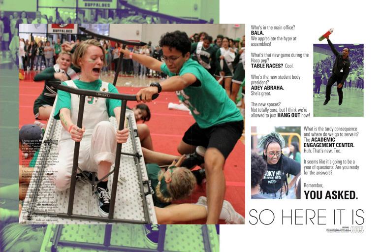
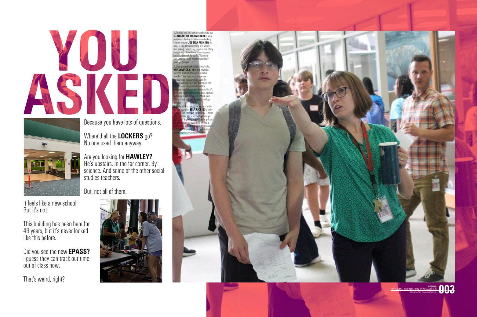
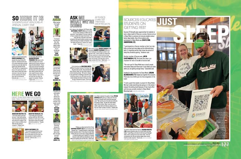
THEMED TO THE MAX: The raised hands on the cover and title page are the epitome of images that “scream the theme.” This book is full of questions — and answers.
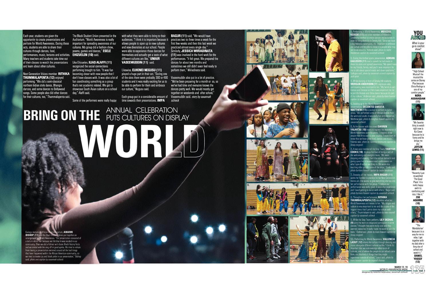
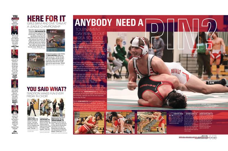
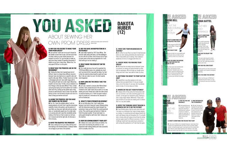
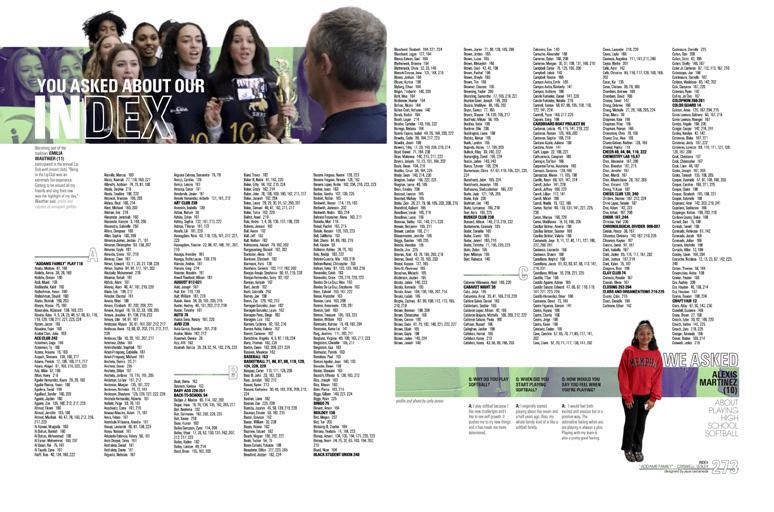
A “You Asked” inclusionary device adds four faces/ voices (and some amazing timestamps) to each coverage spread while theme-advancing mods use the words “you,” “asked,” “so” and “here” throughout. Even the profile-y mods in the portraits sections and index further develop the theme. Way to go!
079 REFERENCE COVERAGE OPENING DIVIDER FEATURE INDEX COVERAGE
ANTHOLOGY | Smoky Hill High School


080 DIVIDER PORTRAITS COVERAGE COVERAGE Adviser: Kathy Nicolson Editor: Olivia Soza Varsity Rep: Mary Titus Corona del Sol High School TEMPE, AZ SUNSET


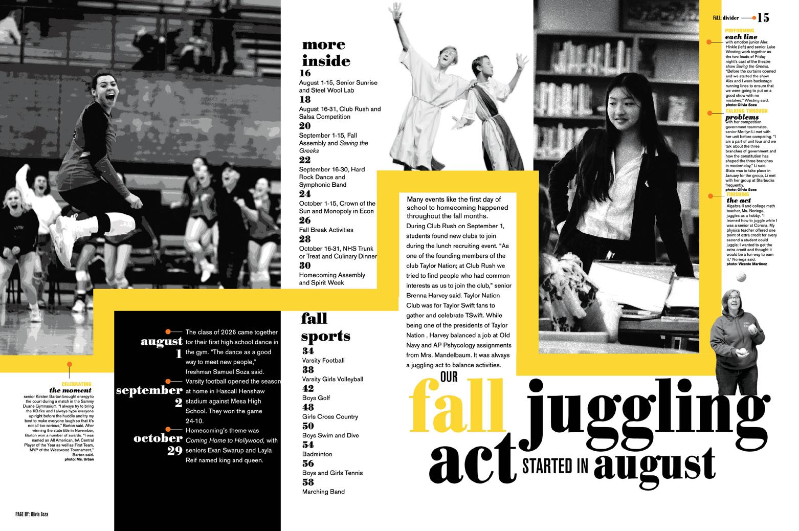
Stand-out features:
WE ALL FEEL IT:
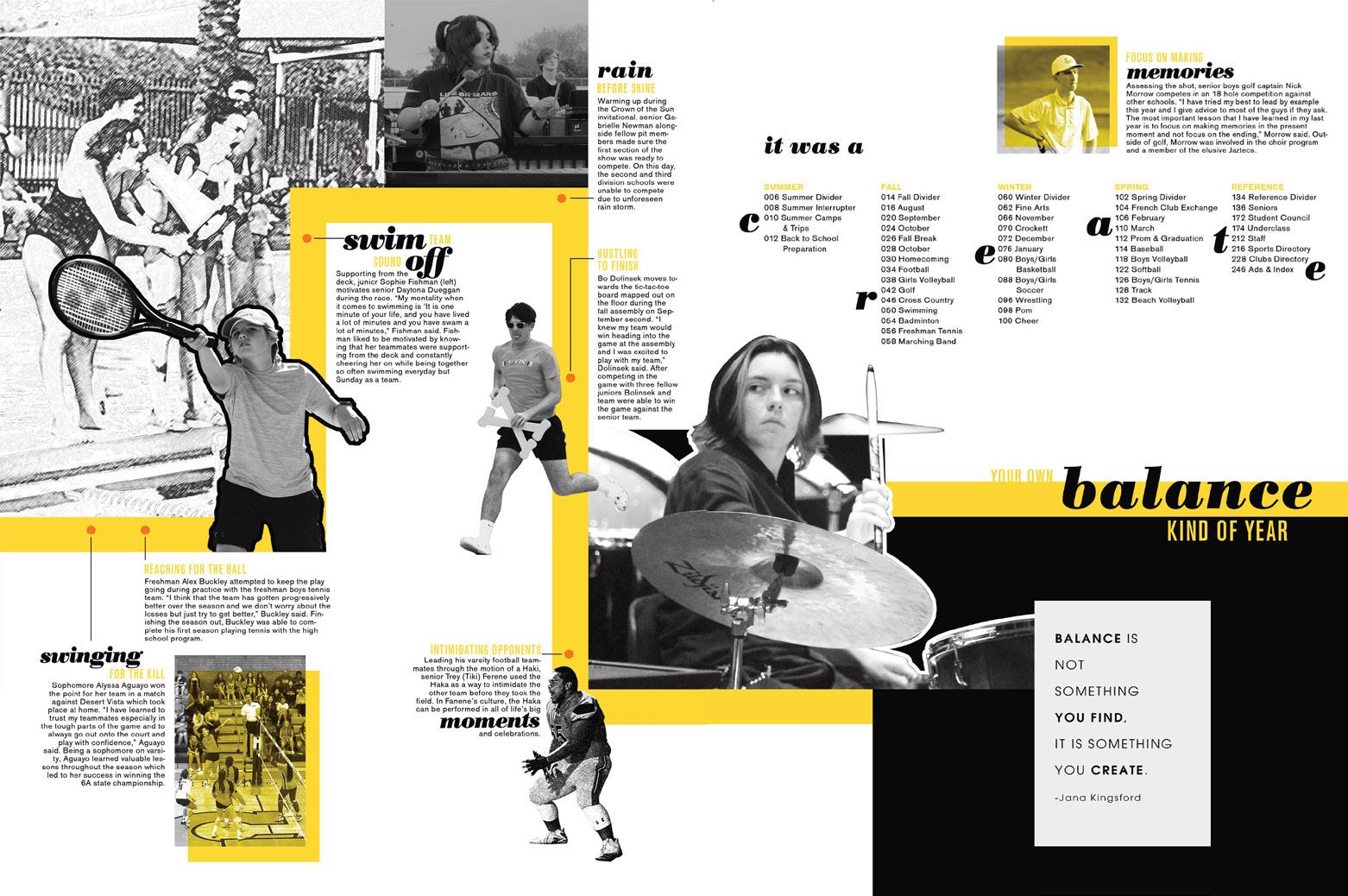
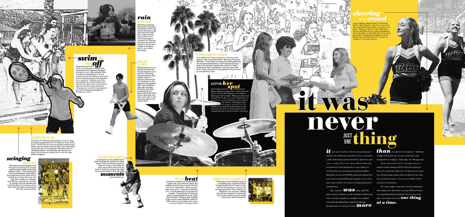
Juggling commitments, crazy schedules and overlapping obligations seemed to be an unavoidable part of high school life as students worked to be scholars and athletes, leaders and friends, performers and employees. Sunset’s cover — with way more type than is traditional — is part photo and part illustration. It’s structured, yet busy. The black-and-white images add to the design’s graphic appeal. And, it immediately proves that the theme fit the school year.
THEMATIC EXTRAS:
Paraphrasing the theme
“It was a Create Your Own Balance Kind of Year,” the contents listing displays the book’s chronological structure before presenting the first full block of opening copy on the fold-out. Two spreads of opening and the summer divider flow logically, with blackand-white images appearing alongside accents in school colors yellow and orange.
MASTERFUL VARIETY:
There’s no question that the staff had guidelines for everything from mod styles and internal spacing to detailed character styles strategies for creating hierarchy. The designers clearly had the freedom to experiment, to create new mods and to break things up — as long as the spreads maintained the visual identity of this book. Love the pops of yellow! What a great collection of coordinated designs.
081 COVERAGE
ANTHOLOGY | Corona del Sol High School
ENDSHEET (OPEN)
ENDSHEET (CLOSED)


082 COVERAGE OPENING DIVIDER COVERAGE COVERAGE Adviser: Jon Hall Editor: Rhett Cunningham Varsity Reps: Dan Mueller, Leah Blase and Danielle Retzer Liberty High School LAKE SAINT LOUIS, MO TALON


Stand-out features:
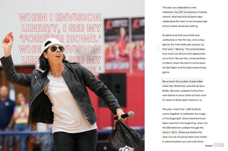
CELEBRATING IN STYLE:
Showcasing the “10” in their theme, the Talon staff added several special 10-year moments to the cover of their anniversary volume. Embossing, Silver foil and both Gloss and Raised UV immediately let the readers know there was something special about the year. Inside, details like glossy UV photos in the opening sig and 10 theme-advancing features with both historical details and current-year trends drive the point home.
THIS IS PERSONAL:
The portraits section adds quote packages and features for nearly 100 individuals with a logical spin on the theme. Introducing the subjects by name fits both the theme structure and visual identifiers before sharing details of their goals, passions and interests. And, tucking them into the paneled portraits is a nice touch.
INSPIRED DESIGN: Intentional consistency and planned visual variety demonstrate the staff’s goals for ease of reader use. By adopting a style palette that provides a uniform look but then creating an array of variations, this staff nailed it. Combining subtle surprises like pops of color and partial cutouts with well-planned Square One layouts featuring consistent rails of separation and an obvious mastery of hierarchy, the content is easy to access without becoming repetitive.
083 OPENING PORTRAITS COVERAGE COVERAGE
ANTHOLOGY | Liberty High School


084 OPENING FEATURE COVERAGE FEATURE Adviser: Stacy Tenace Editors: Kaitlin Chow, Lucas Wong, Kelly Yan and Laura Zhang Varsity Rep: Mimi Orth Diamond Bar High School DIAMOND BAR, CA TAURUS


Stand-out features:
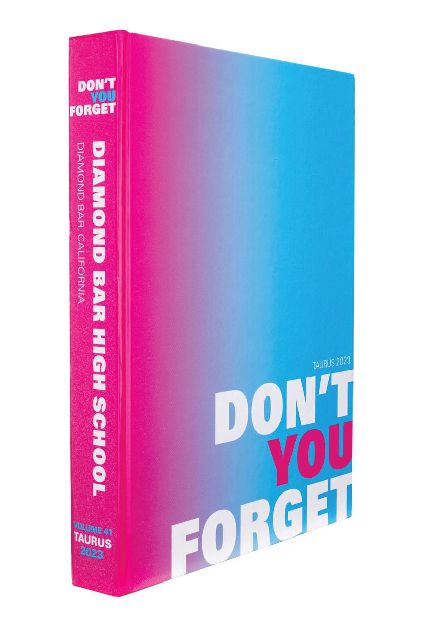
WE WON’T FORGET: We can bet the students at Diamond Bar won’t forget this great cover. The pink-to-blue gradient will make it stand out on any shelf, and the textured, Raised Glitter UV means not only is it a visual delight, but it’s tactile too. The theme is simple and effective, and guess what? It’s not forgotten as you open the book and turn the pages. Well done.
BIG AND BOLD: To go along with the bold color palette, which expanded way beyond pink and blue, here comes one of our go-to font families, AHJ Urbano. This staff made great use of the biggest, boldest versions of this super serif for blocky headline packages. These paired well with their attraction to larger photos. Mix in a healthy dose of interrupter spreads with loads of visual interest and variety, and you have a terrific end product.
FEATURE-FRIENDLY: There are lots of spreads in Taurus that break the mold set by editorial coverage pages. And, whether they are profiles telling interesting stories or features on trending food or Spotify Auras, they jive with the rest of the book. Believe it or not, they applied restraint. Profiles are all the same look with different colors applied. Features are adorned with a variety of graphic treatments — like outlines and handdrawn elements. But, there were rules. These boundaries helped keep coverage pages crisp, clean and uncluttered.
085 PROFILES FEATURE CLOSING FEATURE COVERAGE COVERAGE FEATURE
ANTHOLOGY | Diamond Bar High School


086 ENDSHEET CLOSING OPENING COVERAGE REFERENCE ADS FEATURE Adviser: Erinn Harris Editors: Isabel Chen, Kritika Kumar and Ehlaina McCaskill Varsity Rep: Kara Petersen
Jefferson High School for Science and Technology ALEXANDRIA,
Thomas
VA TECHNIQUES


Stand-out features:
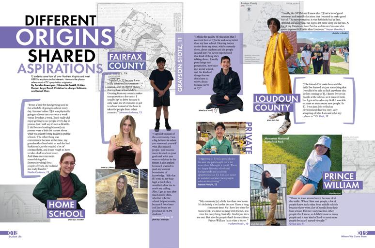
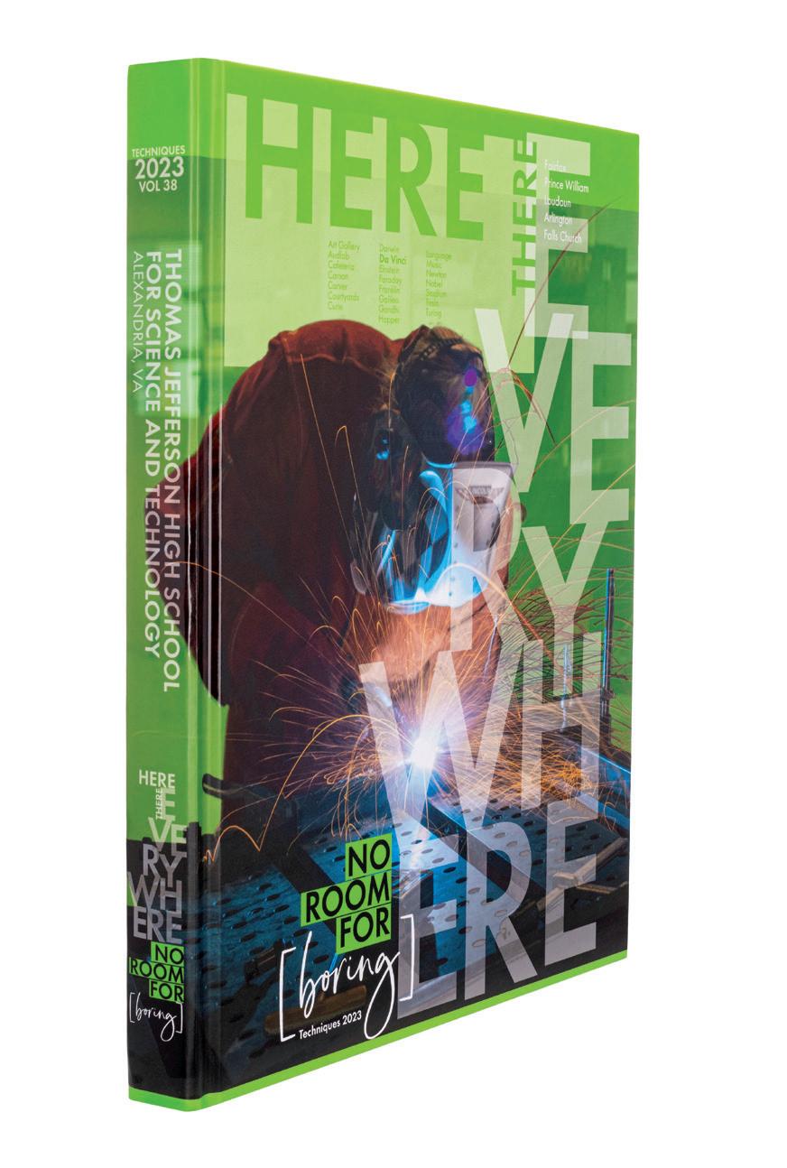
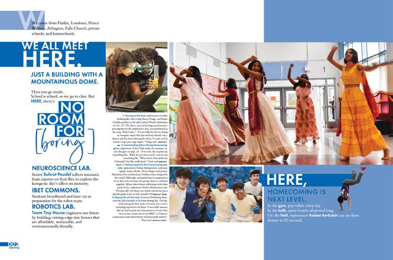
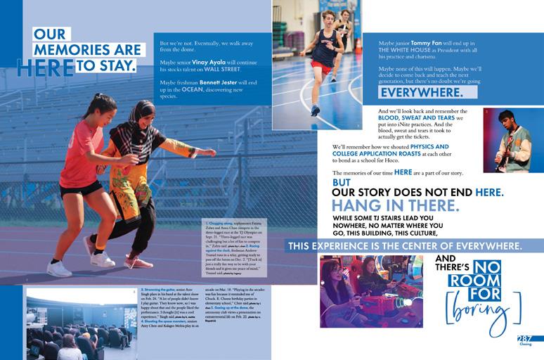
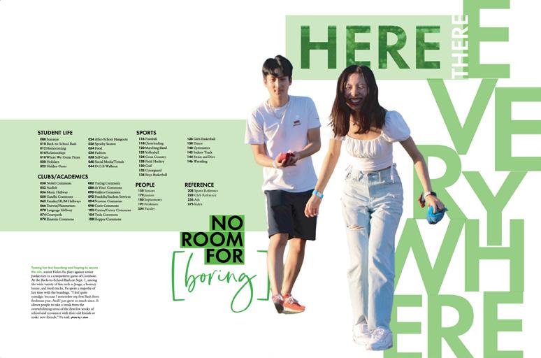
PERFECT FIT: The three location components of the theme inspired a split-cover order, with images representing various aspects of the school experience. Each cover features a full-color subject emerging from a color transparency, plus the oversized theme logo. Captions for all three appear on the D-side of the endsheet leading right into the wellplanned theme package.
ADAPTIVE COVERAGE PLAN: Following the student life section, a theme-based “Here” section focuses on the places students frequent in the school. Coverage is divided by location with folios like Courtyards, Language Hallway and Nobel, Curie and Tesla Commons. Colorful graphic floorplans appear on the spreads covering activities in the 14 common areas named after scientists, inventors and world leaders.
ALWAYS ON TREND:
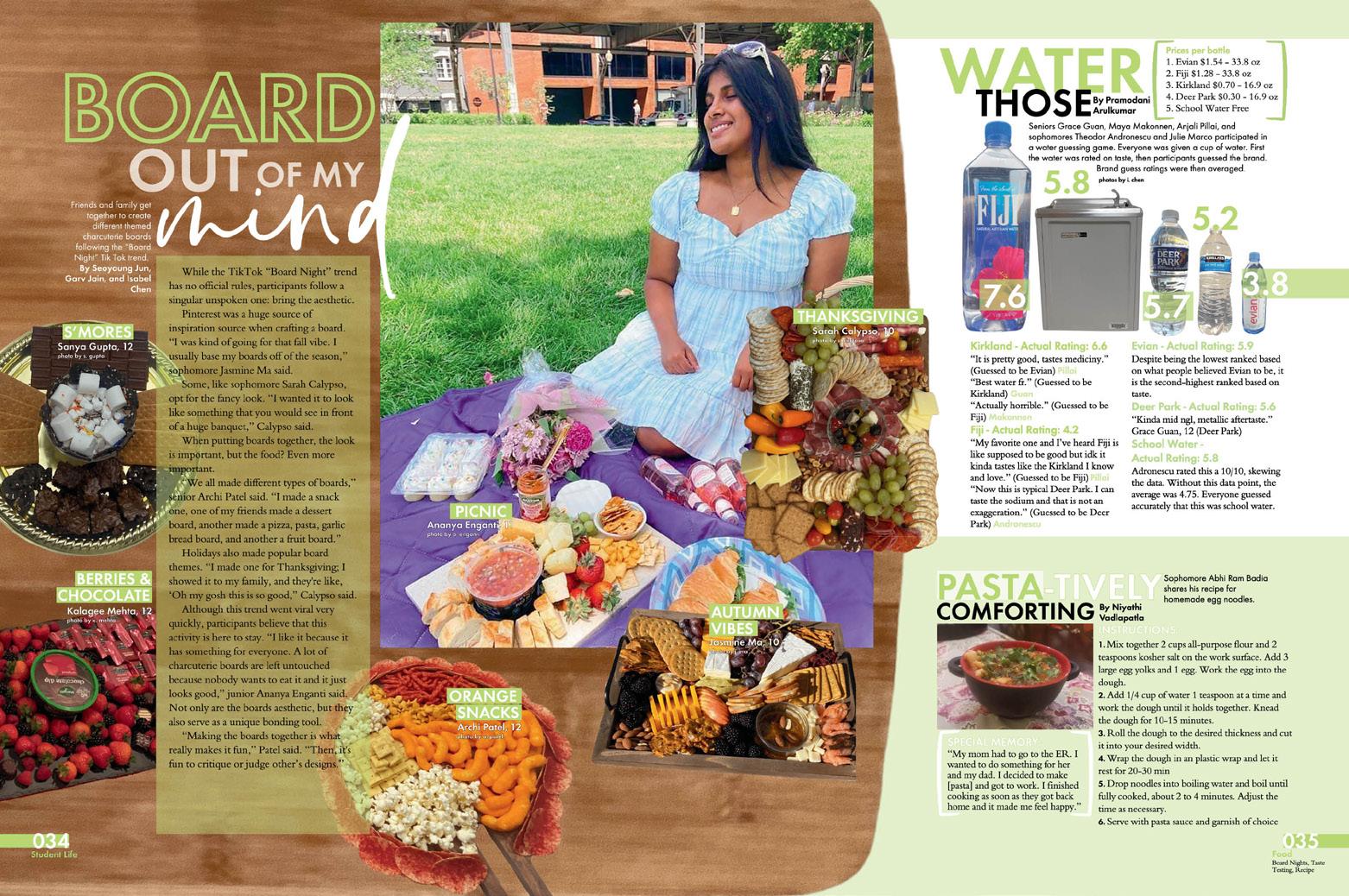
The yearbook world is always looking for creative coverage ideas, and TJ comes through. We love the spread that includes the rocketing popularity of charcuterie boards alongside a taste-test of different water brands and a recipe for homemade egg noodles. All of these topics are approachable, personalized and so very 2023.
087 FEATURE REFERENCE COVERAGE DIVIDER
ANTHOLOGY | Thomas Jefferson High School for Science and Technology


088 COVERAGE CLOSING FEATURE Adviser: Taylor Hudson Editors: Vienna Lopez, Maya Lipski, Kaitlyn Huang, Kyan Hsu, Janice Lee and Sarah He Varsity Rep: Mimi Orth Temple City High School TEMPLE CITY, CA TEMPLAR


Stand-out features:
LITTLE TWEAKS, BIG VISION:
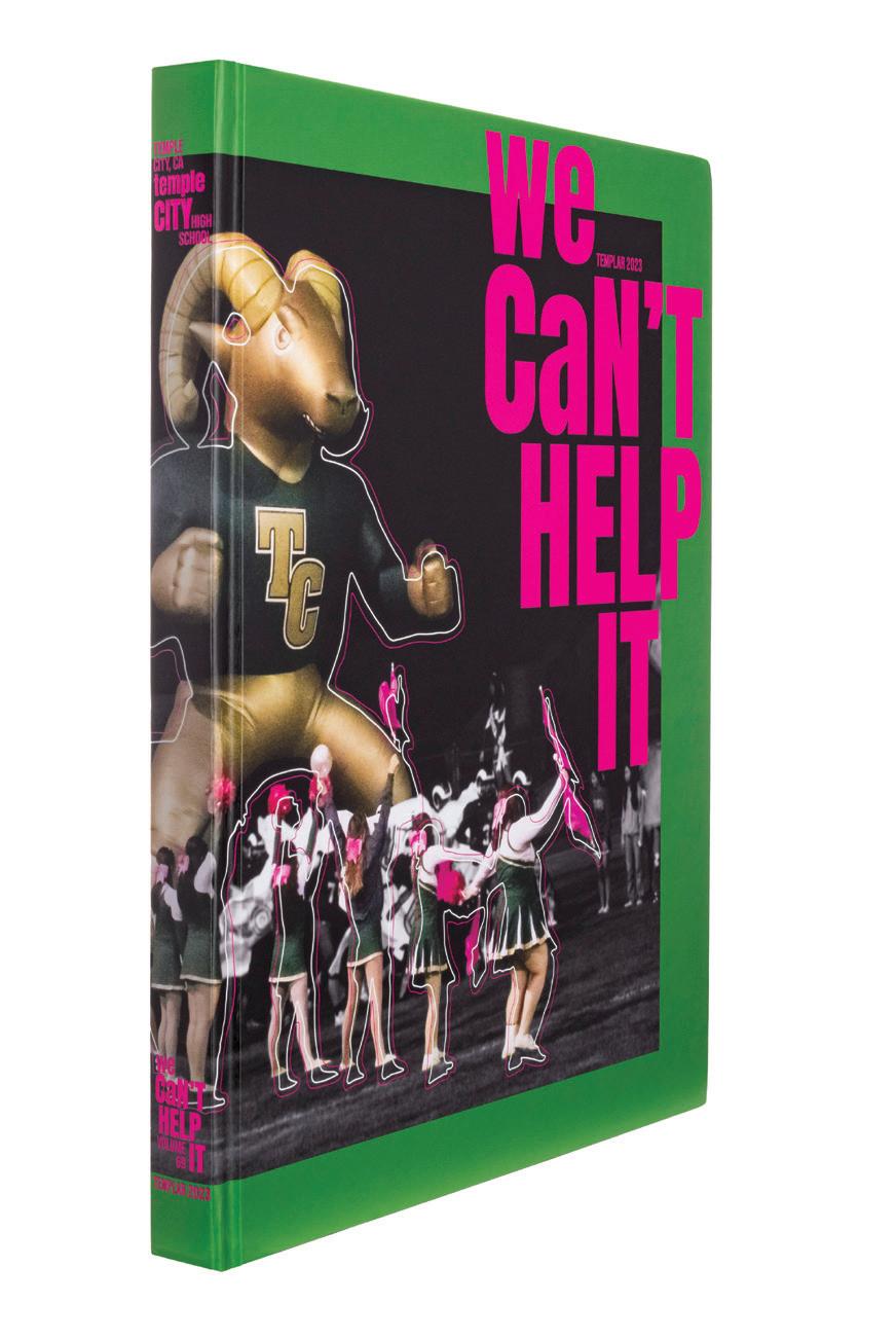
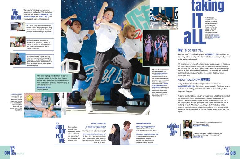
Choosing a great typeface is important, but using that typeface in new and different ways is even better. In this case, a simple tweak had a huge effect on the aesthetic. By choosing a letter or word here and there to make lowercase in an otherwise all-caps headline package, the Templar staff achieved a really different look while using a fairly standard font.
IN YEARBOOK, WE USE PINK: Temple City’s school colors are not pink and green — they’re green, gold and white. And in their designs, they didn’t stick to either a limited palette of theme colors or school colors. It seems as if they paired colors either because they were included in a photo — like on the cover where they picked up the pink accent from the cheer and color guard gear — or they just chose colors that looked good together. The result is a book with LOTS of color combos. And, lots of fun and interest. We vote yes.
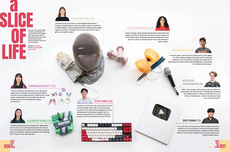
PROFILES GALORE: Another thing that really stands out about this volume is the bounty of profiles. There are modlength photo packages and full-page, long-form profiles, and they are presented in a variety of ways. The net effect is a book that celebrates the individual as part of the whole. We can’t help but like it.
089 FEATURE OPENING
ANTHOLOGY | Temple City High School


090 Advisers: Mike Simons and Katie Paulison-Harris Editors: Adah Gray, Ashti Tiwari and Leah Rizkallah Varsity Rep: Jim Mielty Corning-Painted Post High School CORNING, NY TESSERAE INNOVATION: JUMP COVERAGE FEATURE CLOSING FEATURE


Stand-out features:
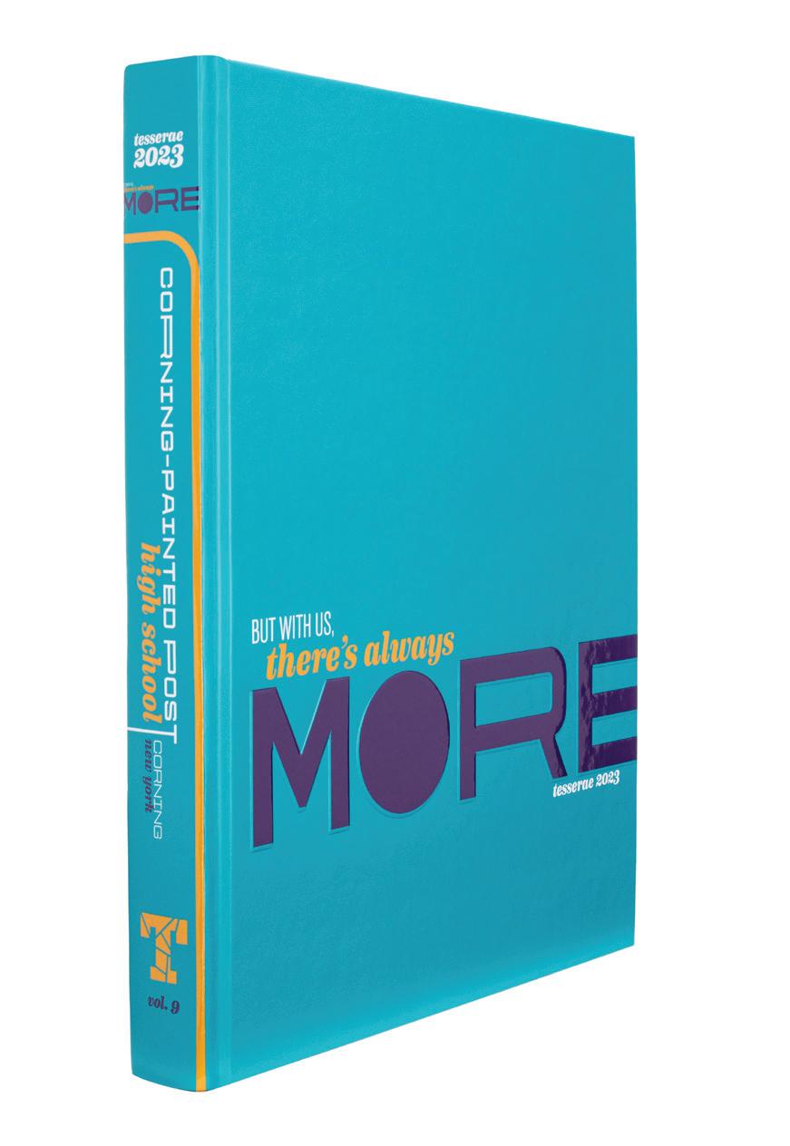
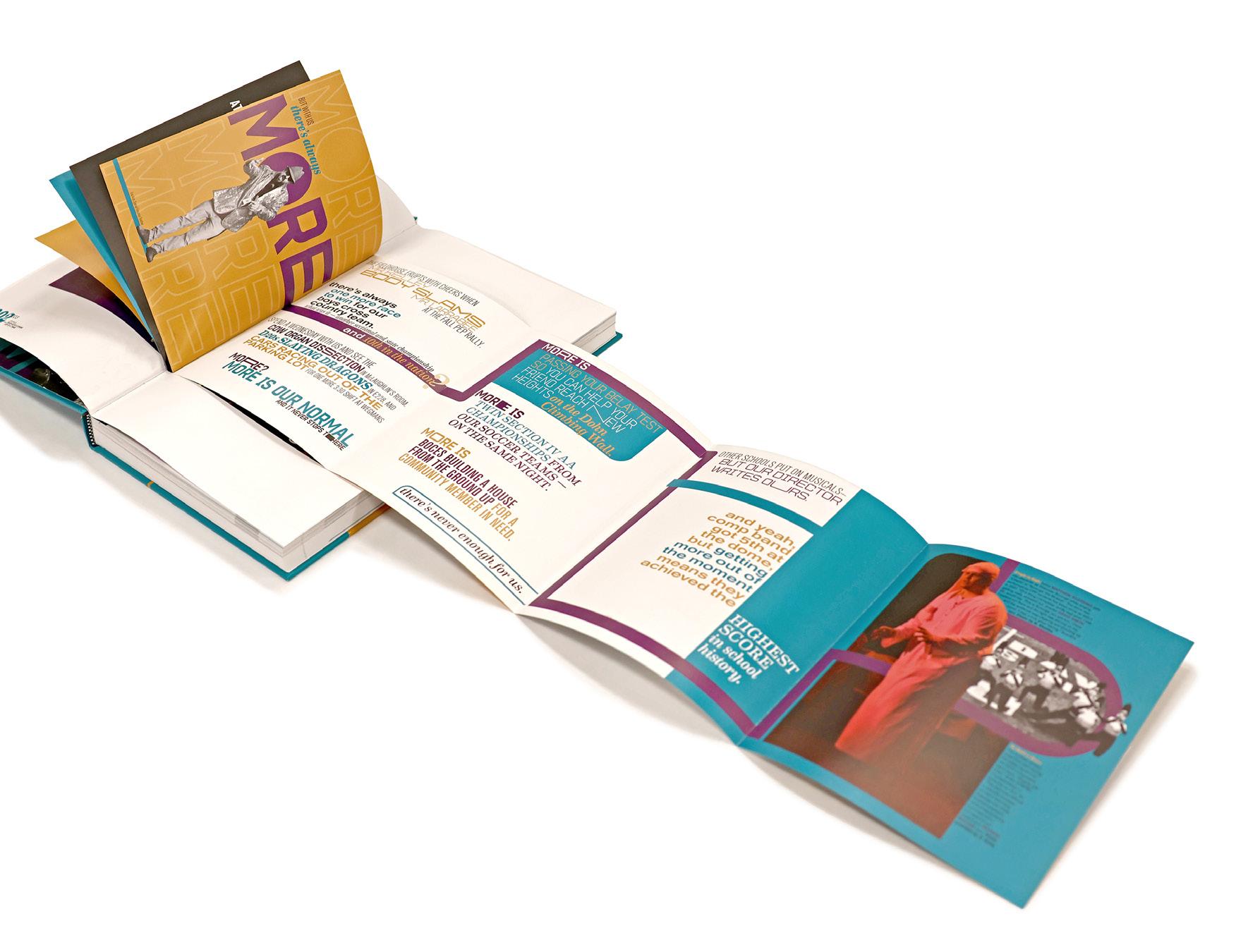
TRUE TO THE THEME: There’s always more to Tesserae, and this volume is no exception. The cover’s three theme colors and three distinctive fonts are accented by Matte lamination, Gloss UV and embossing. The endsheet delivers even more “more,” introducing black-and-white photography, cutout images, extended letters and imagefilled type. And, they’re just getting started.
NICELY IN NINES: “More to the Story” packages use jump coverage to provide two spreads on each of nine topics including banned books, a local marathon, the musical and school safety. In another nod to the ninth volume, each of nine profile spreads features — you guessed it — nine subjects. Plus, the book’s ninequote inclusionary device adds hundreds of additional voices — nine at a time.

DESIGN DELIGHT: Intentional control of the volume’s design cadence delivers a bountiful reader experience. The opening tip-in’s change in format presents the concept literally with a shift from a short-trimmed square booklet to a roll-folded panel the same size. Layered coverage with six or more mods per spread follows. Features and profiles pop in every couple of spreads to change things up before the massive reference section delivers the rest. The last three pages bring the theme full circle visually and verbally. It’s masterful.
091
ANTHOLOGY | Corning-Painted Post High School INDEX INNOVATION: DOUBLE TIP-IN COMBO ENDSHEET REFERENCE COVERAGE


092 FEATURE DIVIDER OPENING ENDSHEET COVERAGE Adviser: Barak Smith Editors: Karina Ho and Kayla McCarthy Varsity Rep: Elizabeth Doebler Classical Academy High School ESCONDIDO, CA THE CHRONICLE


Stand-out features:
GO ON, MAKE IT BOLD: The Chronicle staff committed to their theme from the cover and never let it drop. From the bright and bold color choices to the giant letters and accent words, they created a look all their own. Ample use of white space made their choices all worthwhile without sacrificing coverage — mods and sidebars helped to ensure that many student voices were represented.
ONE AT A TIME: The bold colors — bright teal, lime green, kelly green, red and yellow — often appear alone on a spread. That’s a good choice when the colors dominate the spread’s landscape as part of headline packages (with ultra-giant letters) and when they’re also included as accents and bars. With one color at a time, the photos aren’t overwhelmed.
REPEAT AFTER ME: Repetition is not boring when it’s not on every page, but for a theme to really hold together visually from the cover to the closing and every page in between, you have to choose some great elements to repeat. In this case, it’s the big, bold-color letters. But there are also smaller accents, twocolor headers for the reference section and full-page profiles in the people section. It creates a theme that stands out — and a big success for The Chronicle staff and the year.
093 FEATURE REFERENCE COVERAGE PORTRAITS
ANTHOLOGY | Classical Academy High School


094 OPENING DIVIDER FEATURE COVERAGE Adviser: Jeanna Heck McCann Editors: Tanvi Garneni and Amelia Yum Varsity Rep: Alison Jones Northwood High School IRVINE, CA THE ELEMENT


Stand-out features:
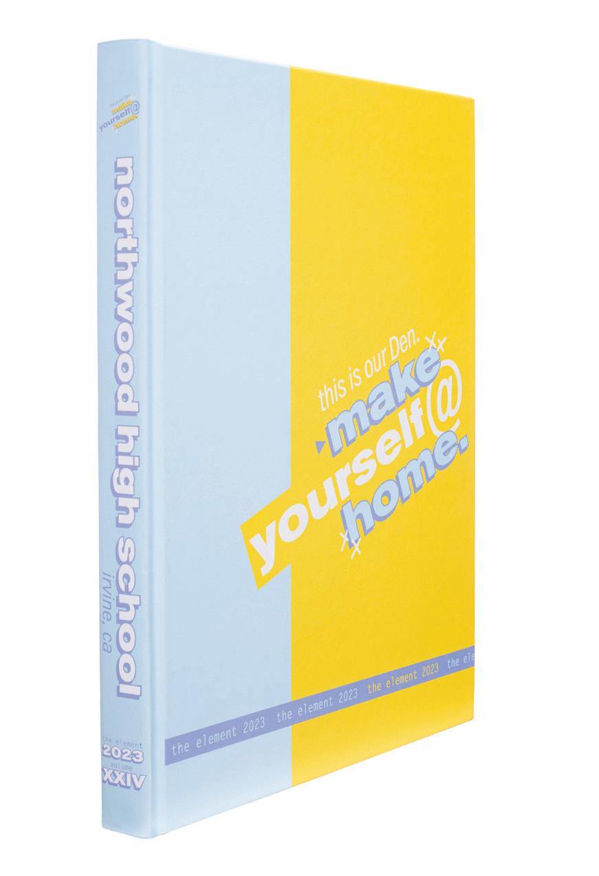
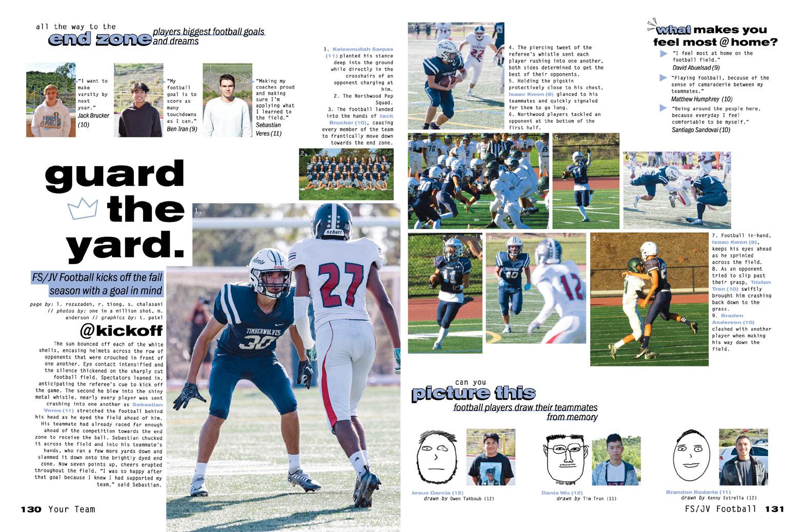
IT’S A MIX: With a six-color palette, three fonts, a mix of hand-drawn and stickerlike graphics, blocky layered headlines and highlighting boxes, there’s no boring in this book. Each spread presents a new combination of elements, in a way only yearbookers can organize, so that readers are treated to plenty of variety.
THE PERFECT PALETTE:
From the cover, you’d think the pastels in the palette would dictate the book’s voice, but even with a light set of colors in use, the shadowed block letters don’t translate as “light.” It’s giving more of a hand-drawn, scribbled vibe, like something you’d see in the margins of your class notes. When these same colors appear on black backgrounds in features and the senior section, they pop and provide another aesthetic still.
MORE THAN DÉCOR:
The way the staff arranged the copy on the feature spreads is worth noting. Sentences are designed lyrically into blocks and separated from each other by space but then connected with hand-drawn arrows and squiggles. This layout not only carries the reader from the beginning to the end of the copy, but it brackets the most important elements of the background photo. It fits the overall vibe of the book really well.
095 COVERAGE INDEX
CLOSING
ENDSHEET
ANTHOLOGY | Northwood High School


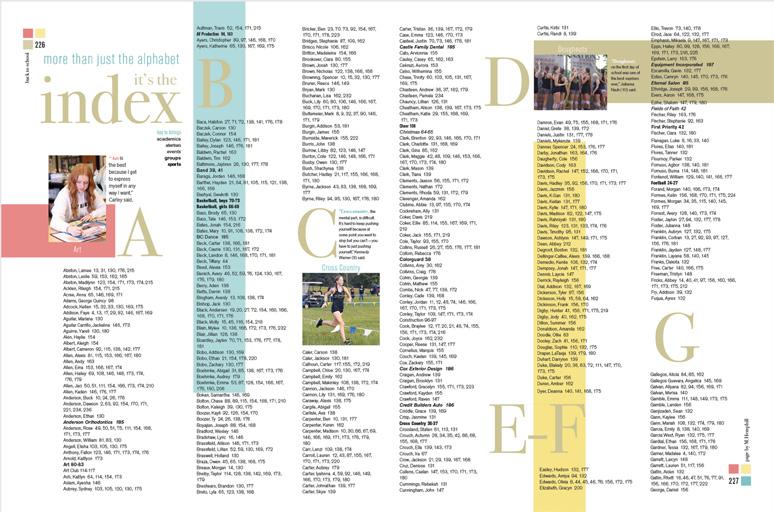
096 COVERAGE COVERAGE PORTRAITS FEATURE Adviser: Angela Zuroeveste Editors: Hallie Jones, Maggie Jones, Anna Flannery, Aubree Gifford, Austyn Knight, Brynlee Sell, Madison Warr, Kelsey Woodruff and Mackenzie Yates Varsity Reps: Matt and Jen Johnson Owyhee High School MERIDIAN, ID THE EYE


Stand-out features:
MORE THAN A FEELING:
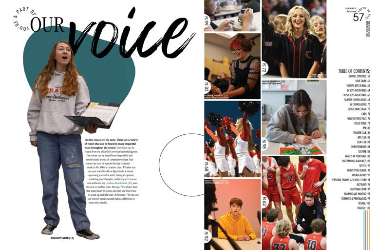
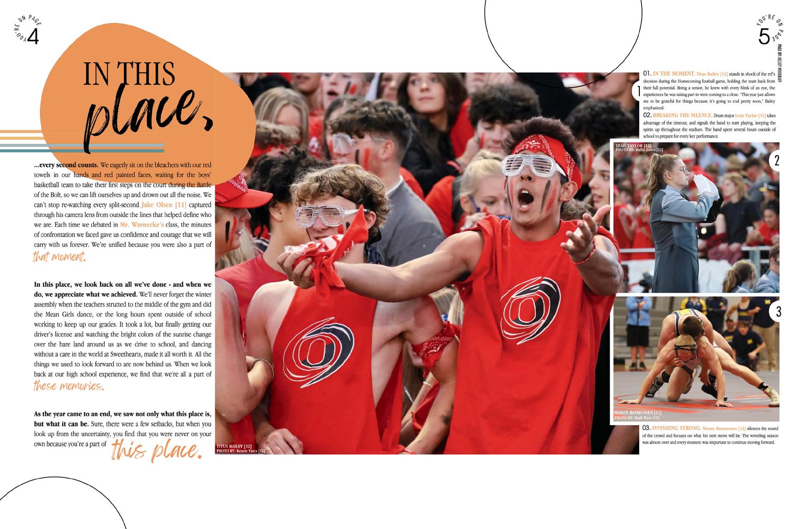
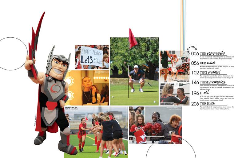
The theme, “You’re a part of this place,” delivers on its promises in several ways. Not only does it work with the sections: This Community, Our Voice, That Moment, These Memories, etc... but it also delivers with the huge amount of coverage, reminding students what they’re a part of. On page after page, we see dozens of photos and stories, all showing how the students are a part of the school’s ecosystem. Sure enough, the index backs it up, and we’re sure their coverage report does as well.
MENTIONABLE INDEX:
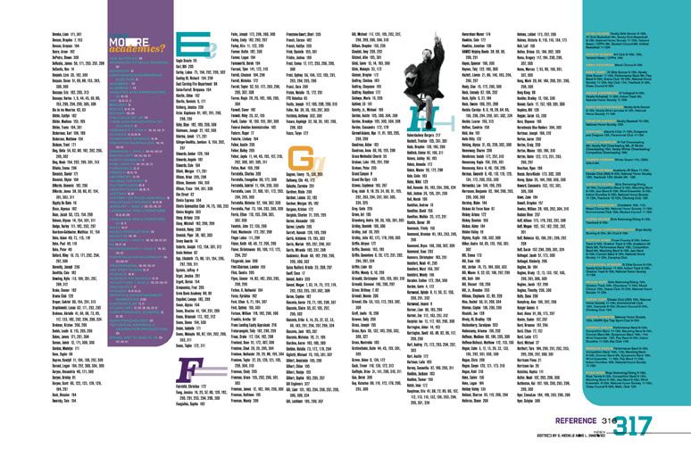
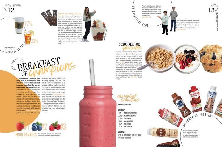
While some indexes don’t elicit a comment, The Eye has an edge in this category. Each letter features a student “sponsor” who has the matching last name and includes a comment on a topic that matches the letter. So, Rebecca Hopper, featured with the letter H, tells us about what makes her happy. (Summer, friends, family and paddleboarding.) Jamal Dildine stands next to the letter D to tell us about a date gone sideways.
SO HELPFUL: We call it reader service, and we love a great folio, but a cheeky one is even better. The staff picked up the circular type pattern from the cover so that, “You’re on page…” could surround every page number. The left folio points out the section while the right includes spread designers and editors.
097 ENDSHEET FEATURE OPENING FEATURE DIVIDER
ANTHOLOGY | Owyhee High School


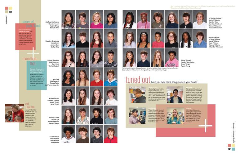
098 DIVIDER COVERAGE ENDSHEET OPENING Adviser: Charla Harris Editors: Elaina Shellogg, Hailey Epps, Camille Harrelson and Mollie Hephill Varsity Rep: Bridget Sherrill Pleasant Grove High School TEXARKANA, TX THE HAWK


Stand-out features:
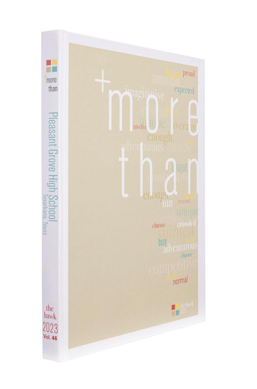
COLOR THEORY:
The muted four-color palette of red, blue, tan and yellow is the opposite of restrictive. Different levels of transparency double or triple not just the number of colors staffers have to work with but also give them a way to change the mood of a headline or design. The darker red stands out for bolder headlines, while the dialedback version is a nice dusty red that can be used as an accent.
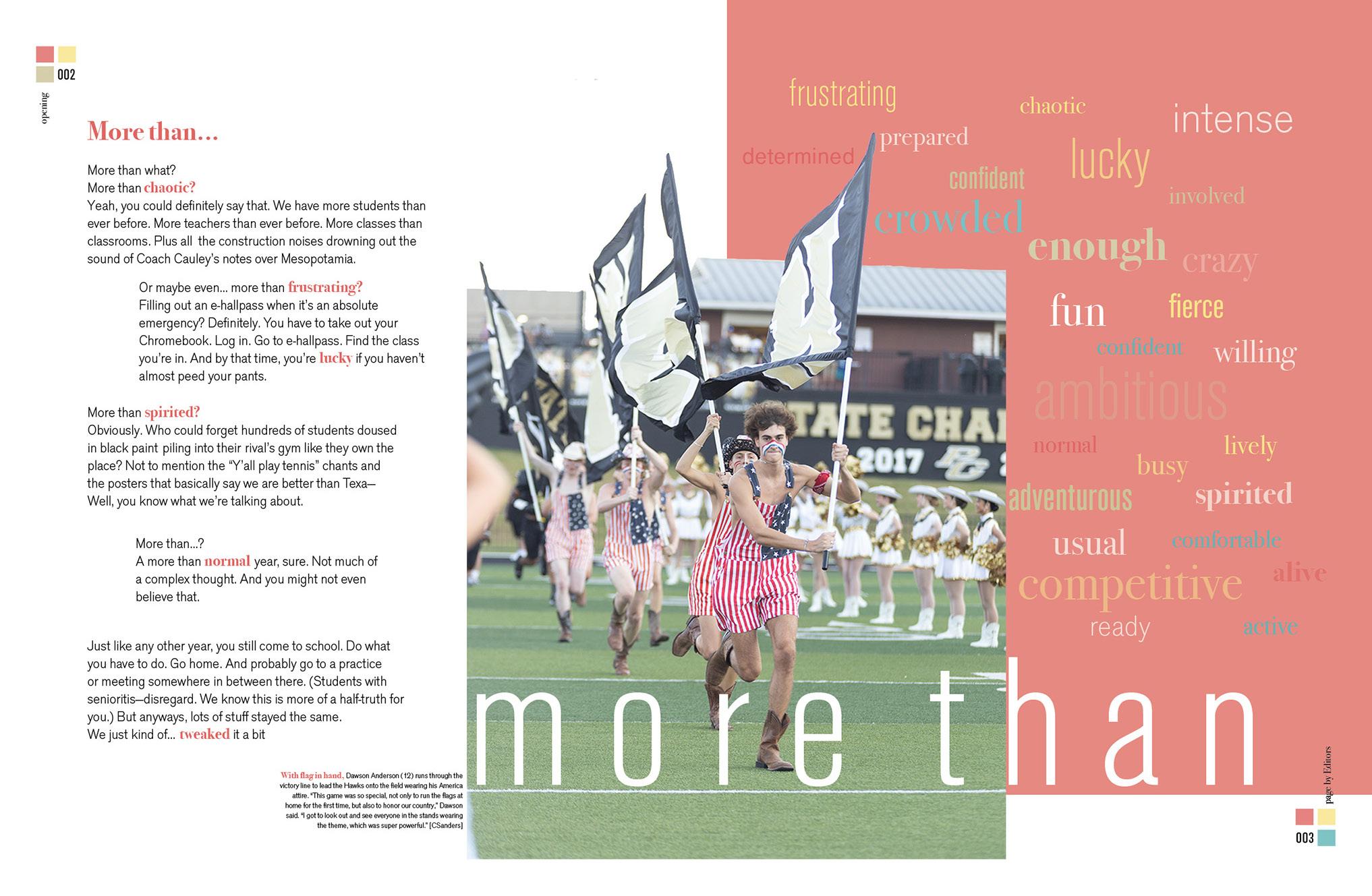
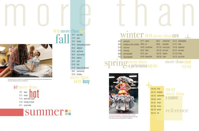
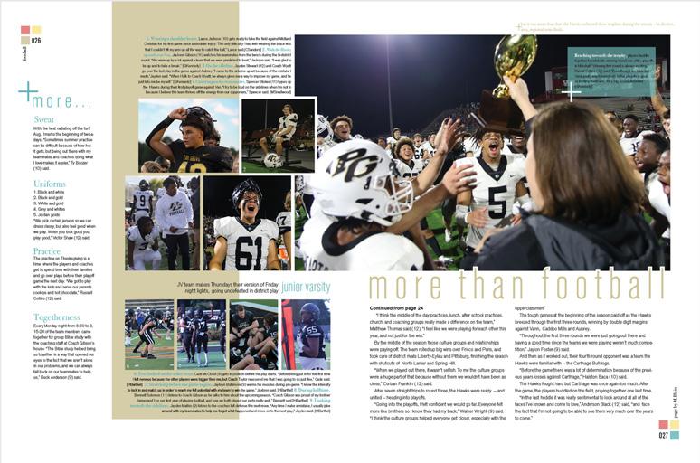
EVEN MORE: It goes without saying that coverage inside The Hawk is amazing. An extra element tops off coverage pages by adding a little-known fact — and adding the thematic “More Than” aspect to those spreads. For example, the “But it was more than that” line on one of the football spreads tells us that one school traveled 507.8 miles to play at Pleasant Grove. The next spread tells us how many trophies the football team took home that year.
LAYER UPON LAYER: If you had this book in your hand, you could play Where’s Waldo to find all of the many elements that subtly support the theme. There are the obvious ones, like the plus sign, the fonts and the color palette. But how about the folio? Three boxes bracket the page number and provide an anchor for type, but they also hide another plus sign in the negative space. We more than like it.
099 INDEX PORTRAITS DIVIDER COVERAGE FEATURE COVERAGE COVERAGE
ANTHOLOGY | Pleasant Grove High School
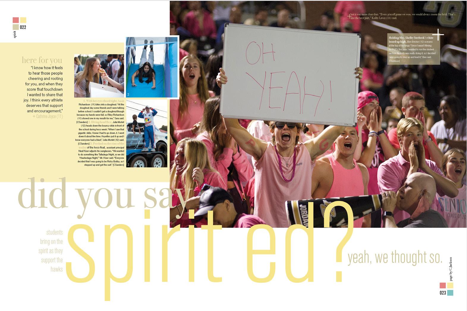
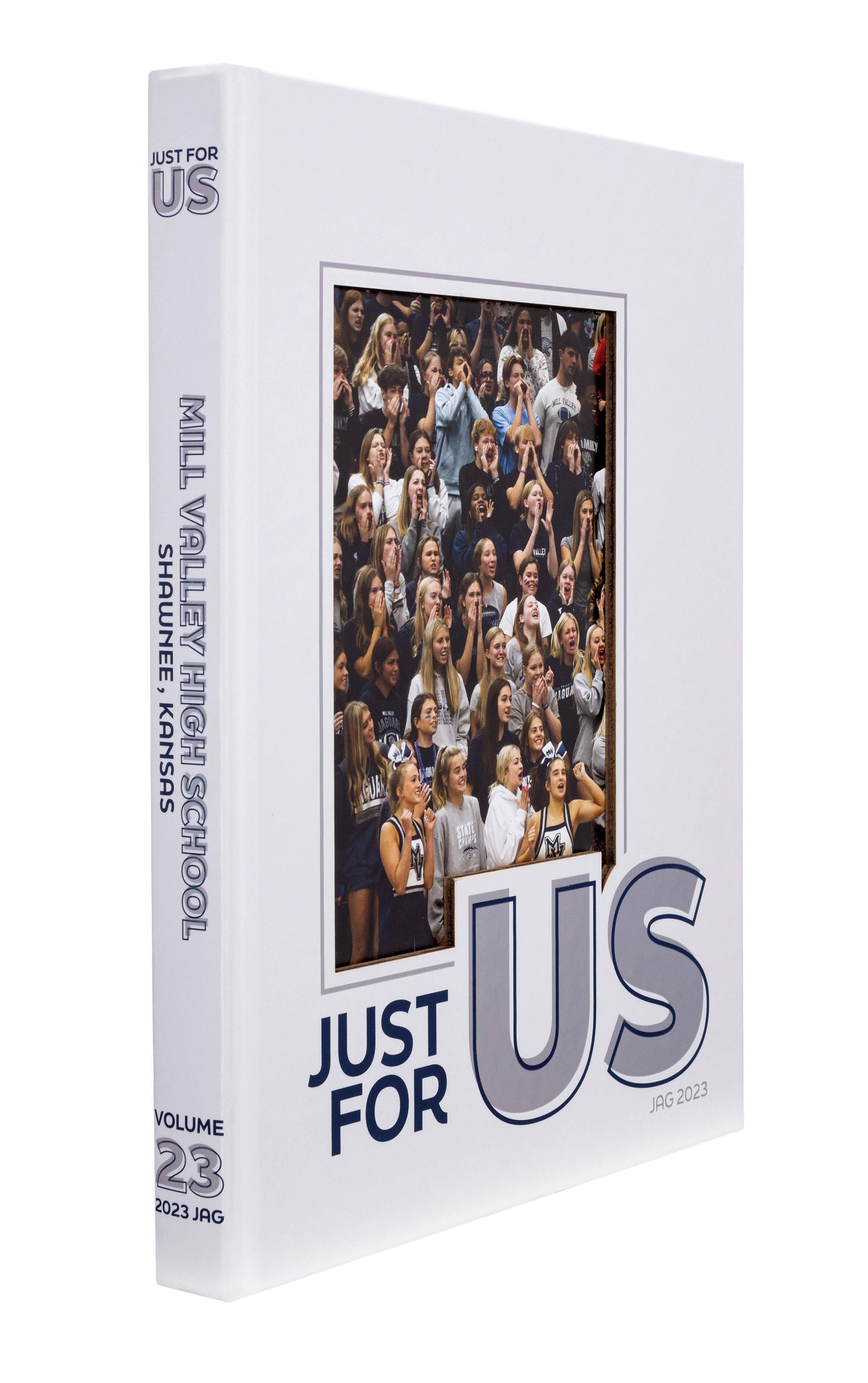
Mill Valley High School SHAWNEE, KS
THE JAG
Adviser: Kathy Habiger
Editors: Ally Nguyen and Casey Cunningham
Varsity Rep: Barry MacCallum

100


Stand-out features:
JUST OUR TYPE:
A simple cover (that’s anything but) introduces the theme — and the type-driven graphics used to unify the volume. Thanks to a laser-cut, a full-color crowd shot on the endsheet shows faces from the student section. With Suede lamination, Chalkboard UV, Metallic Silver ink and a specialorder foil, the cover experience is tactile and visual. We appreciate the subtle intention.
A TEXTBOOK EXAMPLE:
While it’s often said that there’s no one correct answer about how many theme spreads a staff should plan, JAG proves that, sometimes, there is a logical choice. The theme “Just For Us” provided the opportunity to develop the theme over three spreads by emphasizing the words in order and beginning the copy on each spread with a readout from the single-word, oversized headline. Three spreads with three images and three columns — repeating the type treatment from the cover cement the pattern in readers’ minds.
THE PATTERN CONTINUES: On the chronological-by-academicquarter dividers, readers find three-word section titles, three captioned images and a mini contents listing for the section. The subject-framing rule line also seen on opening spreads continues, showcasing the color of the headline’s outline type.
101 COVERAGE ADS COVERAGE FEATURE COVERAGE
ANTHOLOGY | Mill Valley High School


102 OPENING REFERENCE CLOSING FEATURE COVERAGE Adviser: Theresa Poquis Editors: Paula Alvarez, Sania Dhond, Kyra Donlon, Laura Lafreniere, Rohan Puri and Elisabeth Rockefeller Varsity Rep: Kara Petersen Lake Braddock Secondary School BURKE, VA
LAIR
THE


Stand-out features:
LOOK CAREFULLY:
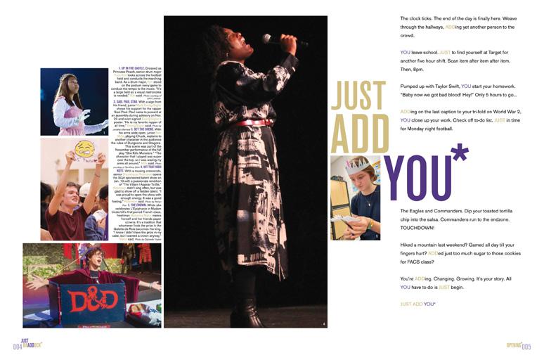
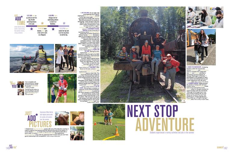
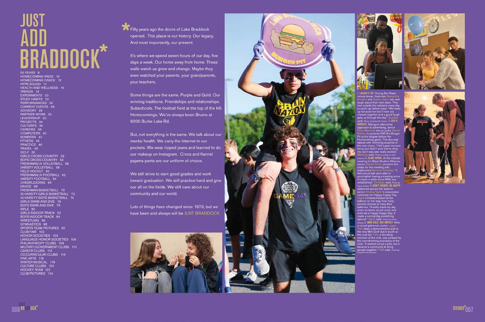
At first glance — thanks to Gold Glitter UV — “Just Add You” is all you see on the cover. But there’s more to the theme than that. In a brilliant play on the school’s name, Gloss UV creates the tone-on-tone effect that sets up both parts of the theme. The white endsheet makes the wordplay more obvious for those who may have missed it. There’s student life content in both the “Braddock” and “You” sections of the book, but all coverage of clubs, sports and academics appears in the Braddock division and the portraits and ads are included in the You section.
SUBTLE CELEBRATION:
The year 2023 was an especially appropriate one for a schoolcolored book — and for the golden glitter. Beyond the spine and the title page where it’s noted that 2023 is Volume 50, just two spreads focus on the past. The “Just Add Braddock” divider acknowledges the anniversary, and the 50 Years of Braddock spread features current students and faculty members as well as some flashbacks.
TIMELESS DESIGN:
With wide margins and ample white space, the look is fresh. Consistent use of the condensed, all-caps sans serif will stand the test of time. Intentional spacing makes the spreads easy to navigate, as do masterful photo packaging and a keen sense of hierarchy. There’s lots of content, and it’s easy on the eyes.
103 DIVIDER COVERAGE ENDSHEET COVERAGE
ANTHOLOGY
| Lake Braddock Secondary School


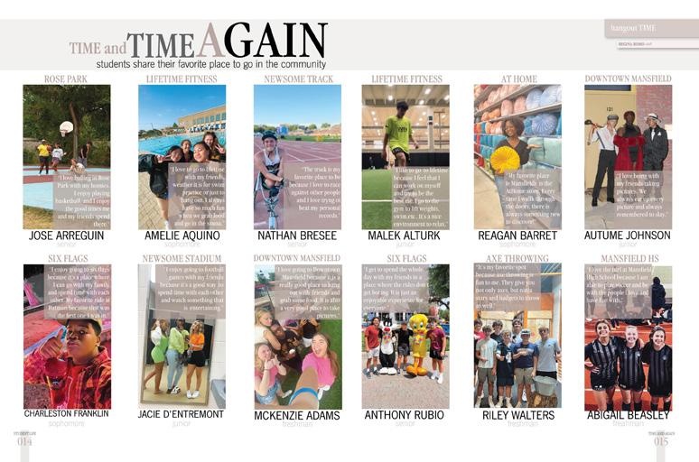
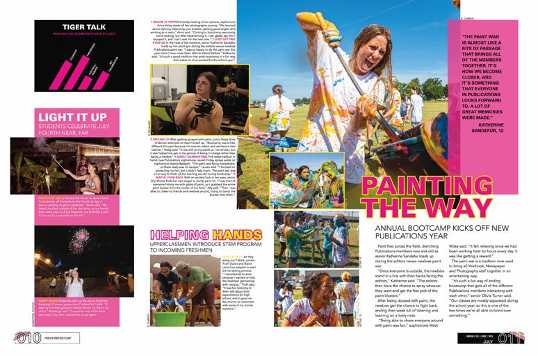
COVERAGE ENDSHEET COVERAGE 104 Adviser: Jillian Rooney Editors: Mia Lam and Bella Foster Varsity Rep: Ronda Cullen The Mansfield High School MANSFIELD, TX THE TIGER


Stand-out features:
TIMELESS MEMORIES:
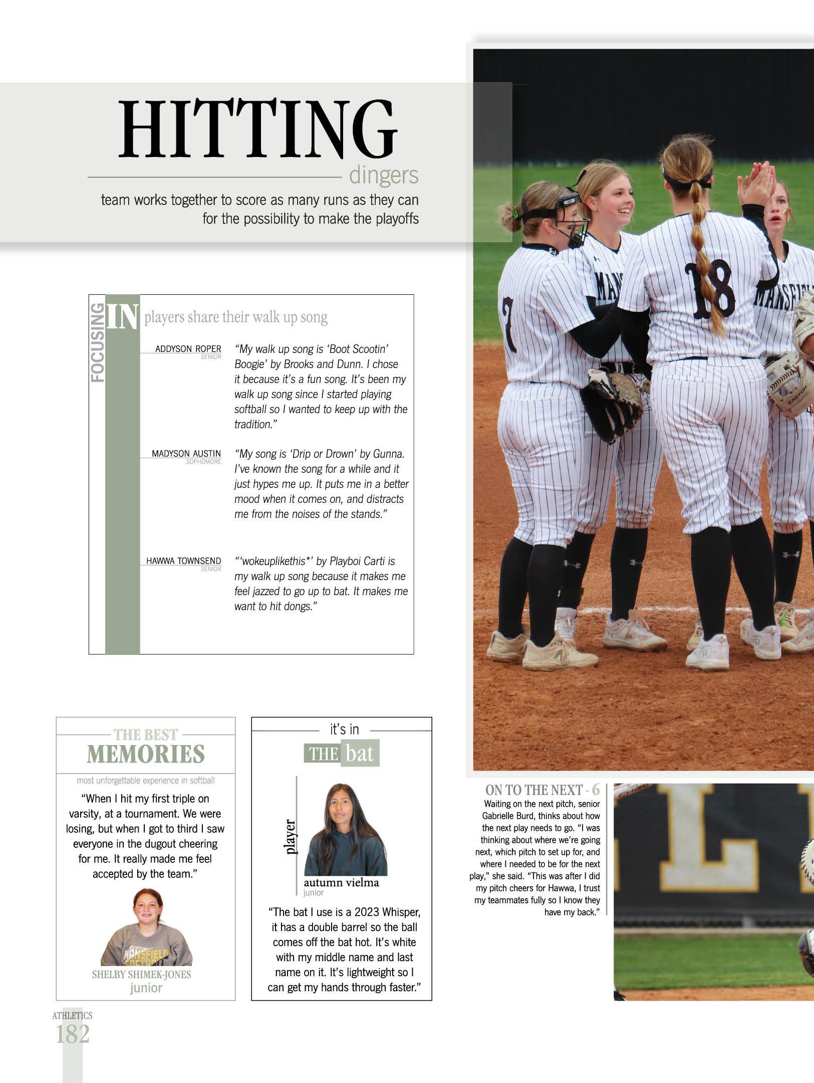
School colors alongside classic design and typography introduce the theme while lots of great photography highlights the events and moments that made the year memorable. Using traditional sections and some great plays on the word “in” from the theme, the endsheet also reveals six sectional colors that will be used to guide the readers through the book.
MEANINGFUL COLOR:
Employing the colors established on the front endsheet to represent each section of the book, folios, content bars and accent type remain constant from divider to divider. Because of the muted/ almost neutral palette selected, the classic vibe continues throughout the volume.
WORTH 1,000 WORDS:
Great images capture faces, expressions, action and moments, appropriately dominating spreads of all types. From flowing photo packages and talking head mods (more than 200 headshots in the first 100 pages!) to selfies, environmental portraits and sports action/performance shots run large), the staff demonstrated mastery of rules of photo composition and hierarchy.
105
FEATURE DIVIDER
ANTHOLOGY | The Mansfield High School


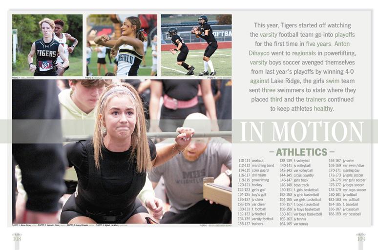
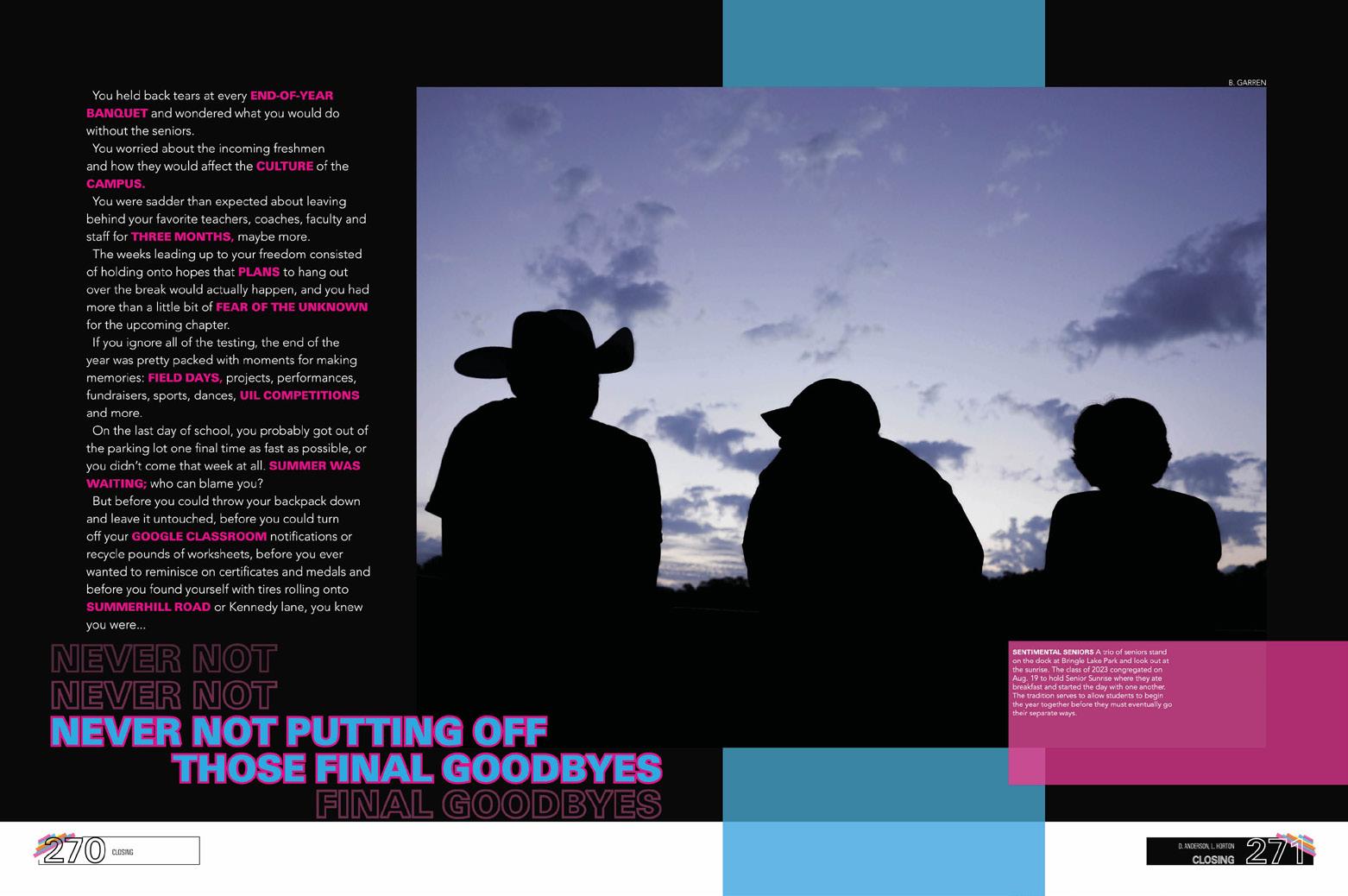
106 Adviser: Sara Vaughn Editors: Desiree Anderson, Lydia Horton, Annie Powell and Regan Raney Varsity Rep: Bridget Sherrill Texas High School TEXARKANA, TX TIGER CLOSING COVERAGE ENDSHEET DIVIDER


Stand-out features:
ATYPICAL PRIDE THEME: At first glance, “Never Not” might not evoke pride and tradition, but the theme’s double-negative structure completely changes the meaning. The cover even bears the words, “No matter what, we’re never not Texas High.” Combining a black-and-white image of the iconic campus star and schoolcolor orange with additional brights, the cover’s fresh approach bursts with energy.
FROM A DIFFERENT ANGLE:
Like the colorful cover and endsheet, the double-spread opening features both strong rectangles and diagonals. Each opener incorporates a single stunning image, two colors from the theme palette as well as yearand school-specific copy that ends with a themed read-out echoing the cover’s stacked, outlined type treatment theme look.
MOD MAGIC AND MORE:
Traditional coverage spreads and features comingle, telling the stories of everyday occurrences, major events, successes, challenges and timely topics. Student quotes are everywhere — in long-form stories and short, part of every storytelling caption, and everywhere else. But since personality profiles can reveal so many more details, in Tiger, they dominate the portraits section supplementing other kinds of mods. Impressive coverage all around.
107
ANTHOLOGY | Texas High School COVERAGE INDEX COVERAGE FEATURE PROFILES


108 CLOSING ENDSHEET PORTRAITS COVERAGE Adviser: Christina Manolis Editors: Belma Mujakic, Hailey Veninga and Layla Halilbasic Varsity Reps: Dan Mueller, Leah Blase and Danielle Retzer Oakville High School ST. LOUIS, MO
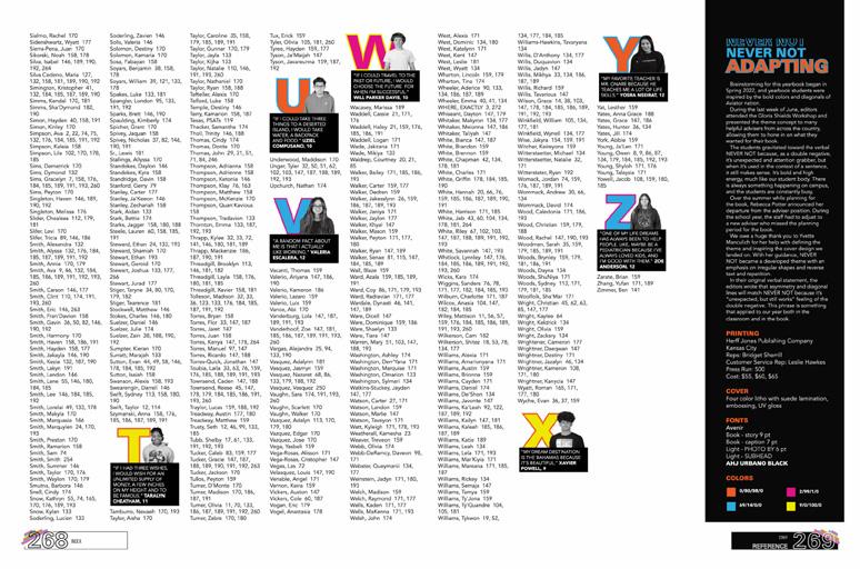
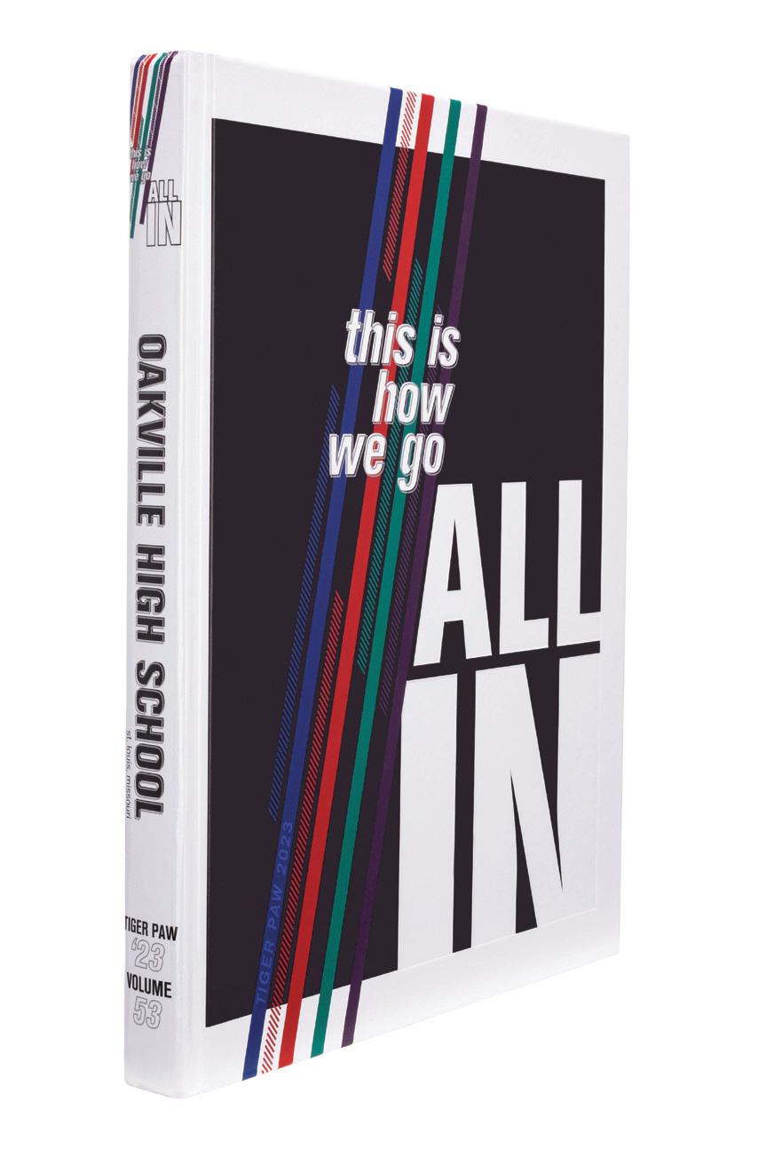
TIGER PAW


Stand-out features:
LOOKS LIKE A PLAN:
It’s all laid out from the start. The diagonal lines following the slope of the letter A, diagonal slashes creating a textured line and italicized type make it easy to imagine how things might unfold. And, that’s exactly what happened. Inside the book, color blocks and photos become parallelograms. Type both forms and fills angles — even on coverage pages where the effects are often more subtle.
COLOR COMMUNICATES:
Outlined type on each section of the endsheet’s contents listing reveals the colors that will unify the traditional sections. The student life divider introduces teal as that section’s color and paprika is the color chosen for School Life. As on the cover, all four colors in the book’s palette are used on theme pages.
WORD-PLAY MODS:
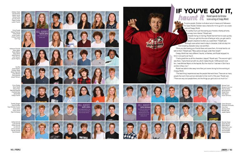
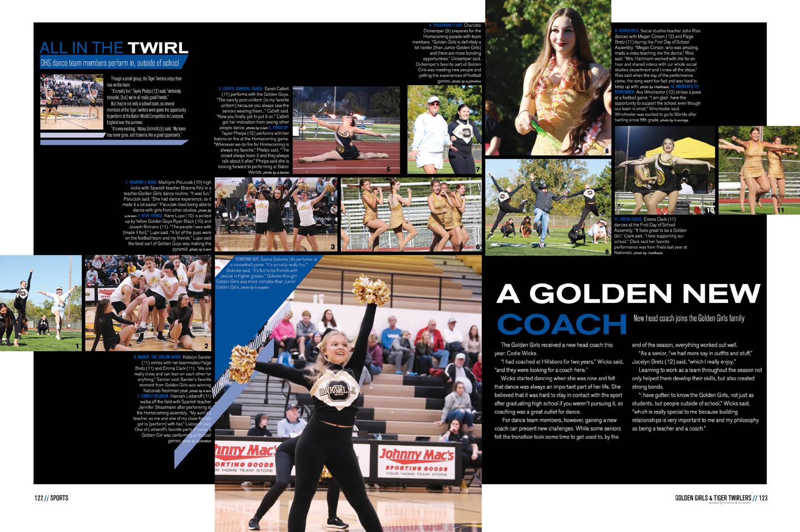
The seven-word theme provided lots of options for brainstorming, and Tiger Paw staffers took advantage of both phrases and single words as they developed coverage opportunities. “This is” was followed by words and phrases, and mod labels beginning All Out, All In and All About appear from cover to cover.
109 COVERAGE PORTRAITS FEATURE COVERAGE
ANTHOLOGY | Oakville High School


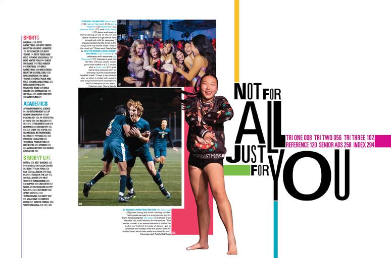
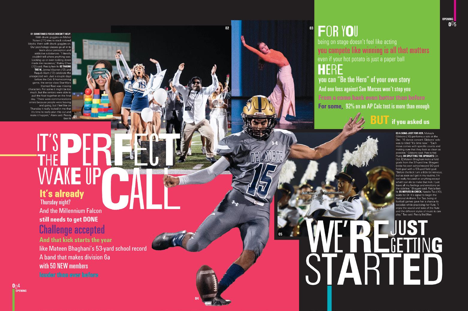
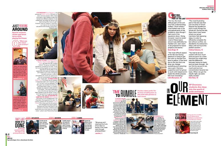
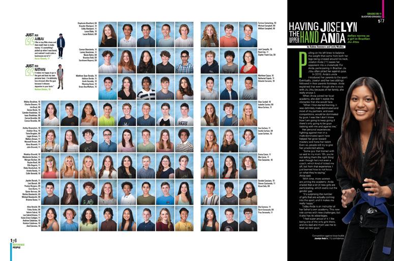
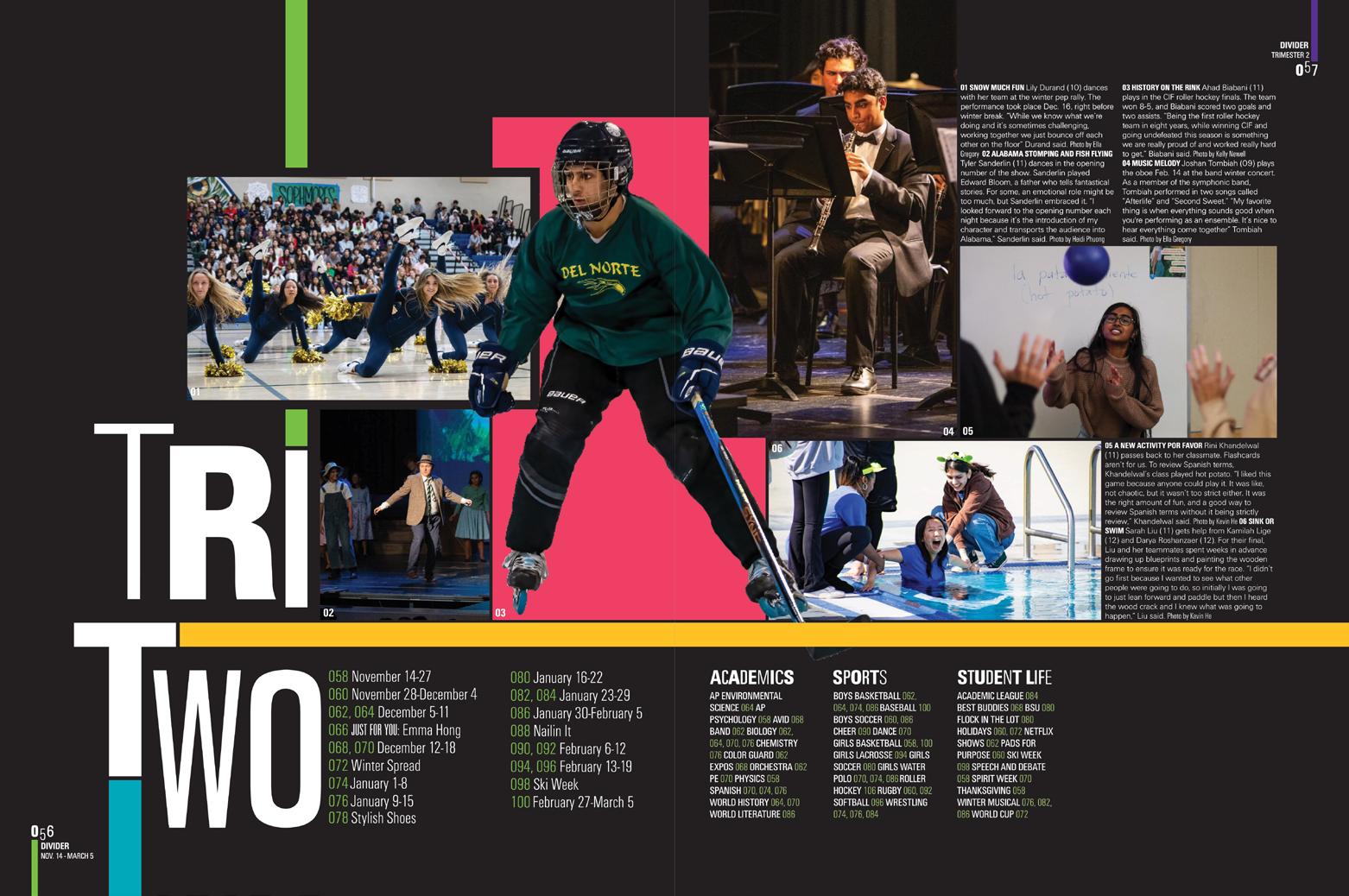
PORTRAITS COVERAGE OPENING INDEX REFERENCE ENDSHEET PROFILES 110 Adviser: Robin Christopher Editors: Bria Gilliam, Lina Aatif, Ishraq Hossain, Faiza Alam, Ella Gregory and Sabine Sommers Varsity Rep: Elizabeth Doebler Del Norte High School SAN DIEGO, CA
TRADITIONS


Stand-out features:
STUDY IN CONTRASTS:
It’s black and white with pops of color. Type that’s both condensed and expanded. All caps and completely lowercase. Strong verticals and horizontals. Matte and Raised Gloss UV. When your theme’s all about your school unifying by celebrating diversity and individuality, it only makes sense that the graphic representation combines distinctly different treatments into a single stunning identifier.
OFF TO A SHINY START:
After more subtle uses of Gloss UV on the cover and both endsheets, the entire first signature features bleeding floods of Gloss UV to highlight not just the three-spread opening and the first chrono divider, but initial coverage spreads as well.
IT’S A HISTORY BOOK:
Beginning on the summer spread and continuing through the spreads preceding the final deadline in March, staffers curated weekly collections of news events in a cool type-asart package, “This Week in the News.” Accenting well-designed type entries and simple graphics with the spreads’ pick-up colors, the mod include local, national and international news to anchor the book in the coverage year.
DIVIDER COVERAGE COVERAGE FEATURE 111
ANTHOLOGY | Del Norte High School


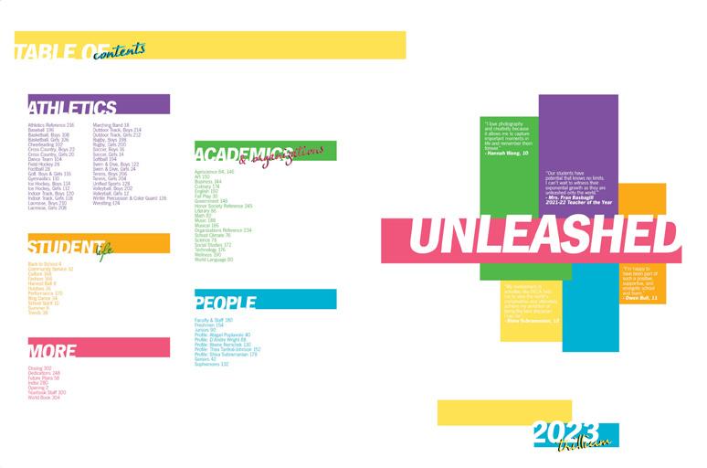
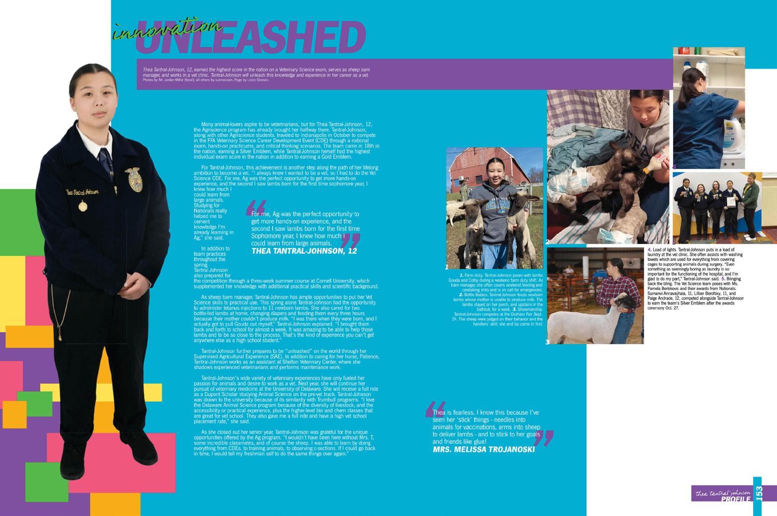
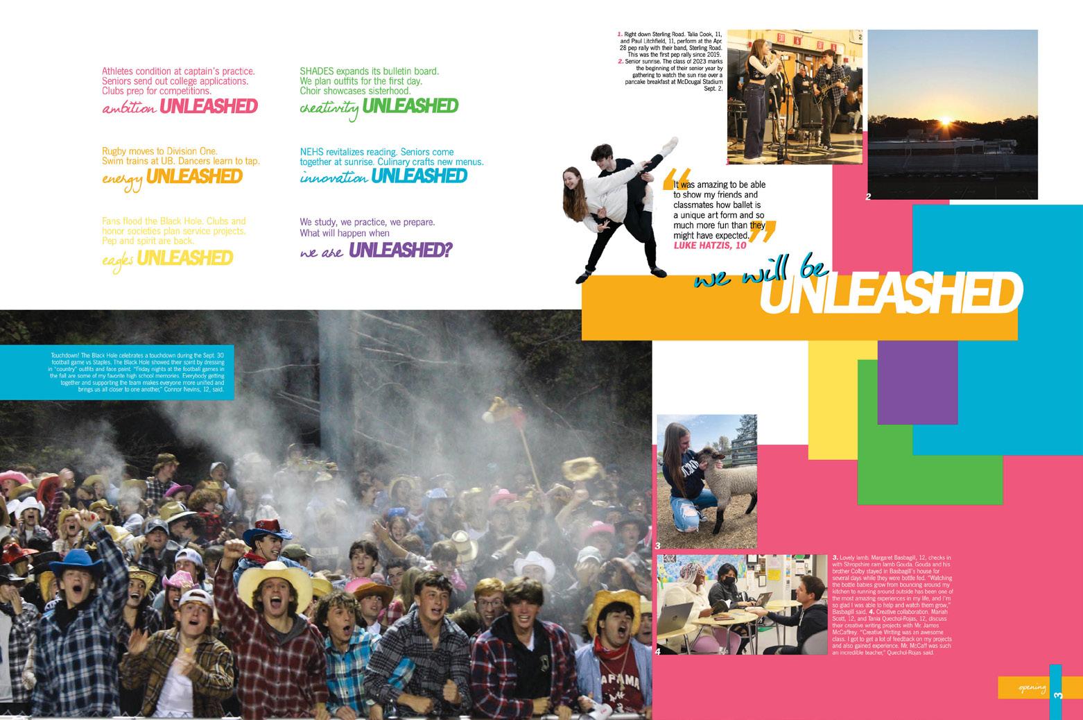
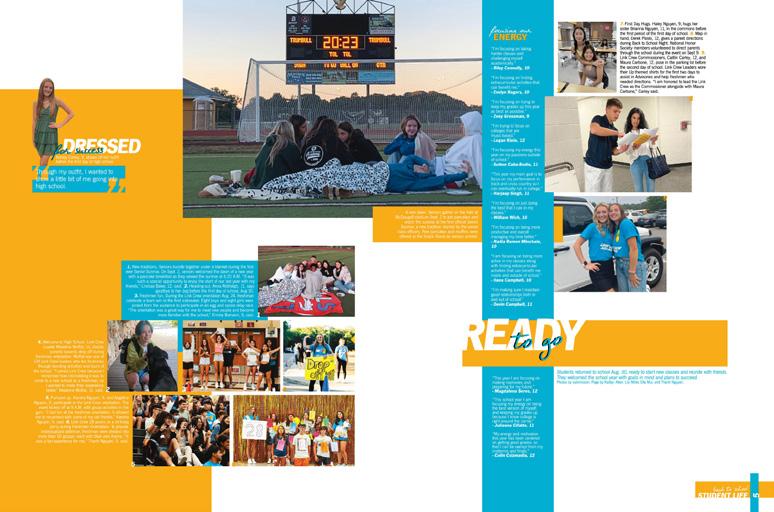
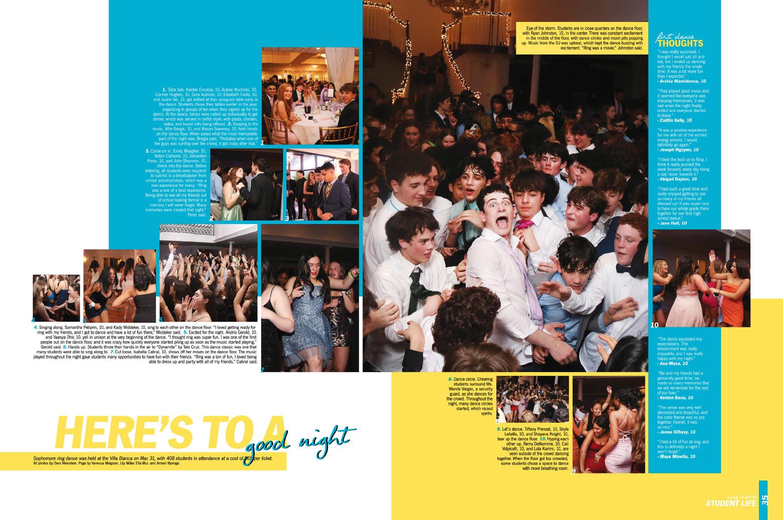
112 Advisers: Jordan Miller and Andrea Lorenz Editors: Lizzie Steeves, Thea Tantral-Johnson, Anisha Kurup and Lakshmi Nair Varsity Rep: Kristina Gisonde Trumbull High School TRUMBULL, CT TRILLIUM COVERAGE PROFILE COVERAGE ENDSHEET


Stand-out features:
QUARTERBOUND TWIST:
While evoking the vibe of a quarterbound book, Trillium’s cover contrasts bright colors with a stark white background where four theme “spokespeople” are featured. The layered rectangles become the theme logo as they present the six-color palette.
THEME MAGIC CONTINUES:
The front endsheet’s theme logo appears in the same space as the cover’s alongside alphabetical listings of traditional sections and a “More” section which includes theme development, the dedication, features and the index. In the logo’s color boxes, quotes explain the connection between the cover “spokespeople,” and the adjacent keywords identify the subjects and add another layer to theme development. The opening copy clarifies the value of the keywords while the colorful rectangles shift and layer with full-color images.
PROMINENT PALETTE:
On theme pages and related features like profiles and senior superlatives, all six colors create impact by appearing together. It’s a lot — as is the unleashing of creativity, innovation, ambition and energy. While the entire volume is colorful, most coverage spreads feature just two of the set for prominent use in color blocks, headlines and folios.
113 ANTHOLOGY | Trumbull High School OPENING COVERAGE COVERAGE PORTRAITS


114 DIVIDER PORTRAITS PROFILE Adviser: Tim Johnson Editor: Ashlyn Schooley Varsity Rep: Denise Miller and Chrissy McDaniel Midlothian High School MIDLOTHIAN, VA
TROJAN


Stand-out features:
MEANING MAGNIFIED: The cover’s theme statement couldn’t have been any more obvious — or any larger. The type-dominant design makes such a strong impression, and with the opening, the pride theme introduces logical spin-off sections, a strategy for theme-advancing profiles and the four key words for their ACD and other mods.
WISE EVOLUTION:
The theme logo decreased in size on the endsheet where the chronological sections and their seasonal sports counterparts are revealed, and the cover’s Gloss UV accent became shiny floods of both the theme logo and the silhouetted image. All three opening spreads feature a single enormous UV-flooded dominant photo alongside copy packed with names and lots of year-specific details. Headlines there echo the font but feature a twist on the cover colors — and the ACD is introduced in a singlepage format.
SO MANY VARIATIONS: This staff cashed in on its versatile theme by incorporating amazing spin-offs. “Impacting More” told of a junior’s summer work in Ethiopia, “Not Just a Climb” shared a freshman’s rock climbing passion, and “Just Make It Happen” chronicled a senior’s soccer journey, which ended with a letter of intent to play at her dream school.
115 ADS COVERAGE ANTHOLOGY | Midlothian High School


INNOVATION: FOLD-OUT ENDSHEET WITH TIP-IN COVERAGE DIVIDER COVERAGE OPENING FEATURE COVERAGE 116 Adviser: Bonnie Gerard Editors: Holly Burkhart, Braden Gerard and Ria Sachdev Varsity Rep: Charles Cook Casady School OKLAHOMA CITY, OK
TWISTER


Stand-out features:
INSPIRATION AT ITS BEST: We see a little bit of Portfolio 27 inspiration at work in the fold-out endsheet with a tip-on section underneath – and we give it two thumbs up because this is a perfect example of what we preach: inspiration, not duplication. This staff did a great job of being inspired and then taking that input and making it their own. Nice work celebrating your 75th anniversary in style.
IT’S A NAME GAME: There’s nothing wrong with using traditional sections, especially if that’s what your school is used to. The Casady staff renamed their six sections to complete the thought of their theme’s intro, “It’s Easy to See Why.” They are clearly laid out on the endsheet, and folios help orient us as we look through the book. In addition, each spread within the section presents a “See Why” answer to go with the theme and umbrella coverage related to the topic.
WE C YOU: It’s always nice to have little moments to highlight the concept of your book. When imagining their theme, the Twister staff realized the C-Y of Cyclones sounds like “see why.” Not only did that simple concept give the theme more meaning, but it helped with the cover design, as well. Nice touch.
FEATURE DIVIDER REFERENCE COVERAGE 117 ANTHOLOGY | Casady School


COVERAGE COVERAGE FEATURE COVERAGE 118 Adviser: Tamra McCarthy Editors: Analyn Do and Savannah Montey Varsity Rep: Joan Selna James Enochs High School MODESTO, CA
WINGSPAN


Stand-out features:
THEIR TRUTH: Equal parts aspirational, comfortable and whimsical, Wingspan depicts the Enochs community as one that includes everyone’s efforts — large and small — which creates different experiences for all. Acknowledging individual contributions and the power of teamwork, the staff chose to share their observations in calming hues, positive language and light-hearted lines that accent many of the headline packages. The Gloss UV flood in the first two sigs created a world that was even shinier. Literally.
FLEXIBLE SYSTEM: The visual identifiers — a single rounded corner, generous white frames, five natural tones, equal-width stripes and a pair of distinctive fonts — provide options for myriad coordinated, but varied, looks. Stunning photography and masterful photo packaging create the foundation for coverage spreads that often feature as many as 20 (or 30!) voices apiece — and incredible visual variety. The ACD, which encouraged students to share “the way they saw it” in just six words, adds more than 1,000 quotes to the book.
HOT SHOTS: Powerful photos of all types fill this book. Peaks of action and emotion run alongside great mood shots, beautiful environmental portraits and the blend of action shots that round out the story. The staff’s photographic prowess extends beyond shooting to image selection, use, priority and packaging.
COVERAGE PORTRAITS COVERAGE
119 ANTHOLOGY
DIVIDER
|
James Enochs High School

El Camino Fundamental High School SACRAMENTO, CA


Adviser: Liz Sansone
Editors: Emery Snyder and Kassandra Martz
Varsity Rep: Annette Johnson
THE POWER OF THE COMBO:
Transporting the colors, type and bold rectangles from the cover to the endsheet, the staff leaves no room to doubt how the book is organized and where students will find themselves.
BUT WAIT, THERE’S MORE:
The cover is eye-catching yet simple, quickly establishing the bold headline font and dominant school-color green. With all of its glossy goodness, the endsheet tells readers what’s up in a big way.
ANOTHER WINNING COMBO:
Using AHJ Bodoni Display Demi Bold for emphasis, the staff chose one or two words of each headline and surrounded it with the sans serif family of AHJ Function.


120 COVERAGE ENDSHEET COVERAGE FEATURE PORTRAITS OPENING COVERAGE
AERIE


Wharton High School TAMPA, FL
Adviser: Victoria Lacomba
Editors: Mia Blauvelt, Hannah Craig and Nicole Dewitt
Varsity Rep: Morgan Miltner
PHOTO-CENTRIC:
Photography is a strong point for this staff. They clearly understood the assignment, covering the bubble lab in science class, the cheer uniform unboxing — and everything in between.
STRIKING SALUTE: The theme, “Here’s to Us,” has two companion pieces: “Here’s to You” and “Here’s to Me.” The nice thing about this approach is that the staff can incorporate mentions of You, Me and Us throughout.
CLEAN AND CLASSIC: The overall feel is very solid. Good design, great coverage, easy to read and navigate — thumbs up.
121 COVERAGE COVERAGE FEATURE COVERAGE OPENING PORTRAITS COVERAGE ANTHOLOGY
| Honorable
Mention
FELIDAE


INVICTUS
WHAT GOOD NEWS?:
Here’s the cool part: It’s a newspaper-themed yearbook. (Get it? Black and white and read all over!) And, the four sections are all news words: circulation, deadline, scoop and byline. Our yerdy little hearts love it.
B&W VIBES: The dividers
feature full-bleed, black-andwhite photos, a caption and a little theme copy. Great photos are the key here, as these pages are minimalistic.
AGAIN (IN A GOOD WAY):
While there are certainly theme graphics that repeat throughout the book, nearly every spread offered something different. We love to see it.


PORTRAITS COVERAGE DIVIDER COVERAGE FEATURE REFERENCE COVERAGE 122 Adviser: Camryn Caggiano Editor: Caroline Woo Varsity Rep: Mark Mandrakos Ward Melville High School EAST SETAUKET, NY


Lake Oswego High School LAKE OSWEGO, OR
LAKER LOG
Adviser: Jami Wray
Editors: Kea Cummings, Cindy Huang, Rami Kim, Mia Christian, Lyra Johnson and Alicia Li
Varsity Rep: Carly Langdon
MORE THAN FACES:
This yearbook stands out for its creative use of nonstudent images, adding a more approachable spread design.
BRING IT FULL CIRCLE:
Notable design choices include the use of circles for images, headshots and even as decorative elements. Even the colophon reveals a deeper intention — they used circles to symbolize a process that ties into the theme’s “more to it.”
THESE DETAILS MATTER:
The fusion of great photography with well-designed layouts ensures that every aspect of the yearbook is a treat. Bravo!
COVERAGE ENDSHEET DIVIDER COVERAGE
ANTHOLOGY | Honorable
Mention
123


Adviser: Sonny Harding Editors: Shelby Stevenson and Jenny Pham Varsity Rep: Megan Morris
TELL US ABOUT YOU:
This Olympian brings the theme’s focus on individual identity to life — allowing readers to connect with the stories of those within their school.
PERFECT PICAS: A standout feature of this yearbook is the effective use of small talking heads that prove the saying “less is more.” Olympian demonstrates that good design can be achieved within a compact 3-by-3 pica space.
LINED UP: The line from the theme package sneaks its way onto each spread — either forming boxes or anchoring floating mods and copy. Genius!


124
Marietta
MARIETTA,
FEATURE PORTRAITS PROFILES COVERAGE
High School
GA OLYMPIAN


Saint Francis High School MOUNTAIN VIEW, CA
POVERELLO
Adviser: Stacy Dawson
Editors: Grace Cargill, Emerson Sawyer, Paige Allen, Jack Sloan and Elizabeth Britt
Varsity Rep: Michele Paolini
JUST THEIR TYPE: The AHJ Bodoni type is an important visual throughout. Negative leading turns section titles into artistic entries into the subjects.
BEST PRACTICES: From detailed folios and story/photo credits everywhere to consistent group photo IDs and a thorough index, this staff clearly invested extra time to make the book easy for readers to use.
FULL-CIRCLE THEMING: The opening copy lists traditions, people, memories and yearspecific details and ends with “Here’s to you. It’s what we’re made of.” In the closing, you’ll find this exact pattern.
PORTRAITS COVERAGE DIVIDER DIVIDER FEATURE ENDSHEET OPENING 125
ANTHOLOGY | Honorable
Mention


THE PREDATOR
LAYERS ON LAYERS:
The cover’s huge letter and rule line introduce the theme, and the colorful endsheet brings it to life with images of all aspects of campus life.
FACES AND VOICES:
The average spread includes 15-20 students. Combine this with the visual variety created by coordinated mods, and you have a compelling book.
BUT, THERE’S MORE:
Talking-head and other quote mods run alongside portraits reveal favorites, memories, challenges and achievements.


126 DIVIDER ENDSHEET COVERAGE OPENING FEATURE PORTRAITS COVERAGE
Zumwalt
O’FALLON,
Adviser: Loran Marquez Editors: Lilly Datillo, Kaia Moreland and Riley Wulfert Varsity Reps: Dan Mueller, Leah Blase and Danielle Retzer Fort
West High School
MO


CUSTOM-SIZE TIP-IN


Franklin High School
Adviser: Allen Maxwell
Editors: Evan Chau, Julie Fang, Olivia DeMelo, Kaiwen Chen, Calista Greatreaks, Malia Wong, Tatiana Lee, Brooklyn Modica, Carl Tatco and Chiara LaVine
Varsity Rep: Sara Cowan
THEY’VE GOT THE LOOK:
The consistent spacing, silhouetted images and rails of isolation contribute to this yearbook’s cohesive feel.
ALL-ENCOMPASSING:
The theme directed the book’s organization in several ways. The chronological sections are titled using major events as start and end dates.
PRIORITIZING PROFILES:
Because theme emphasizes the word “You,” editors chose to open the book with a series of profiles demonstrating student accomplishments.
INNOVATION:
127 DIVIDER PORTRAITS CLOSING COVERAGE REFERENCE
ANTHOLOGY | Honorable Mention COVERAGE
EL GROVE, CA PRIDE

STARGAZER


THEIR SPACE … LITERALLY: Graphics include outlines and line art, and AHJ Function Stencil is used in an outlined form for an architectural feel.
IN THEIR ELEMENT:
Interrupting editorial coverage, full-spread environmental photos and accompanying profiles are great ways to weave the “place” element of the theme into coverage.
NON-TRADITIONAL TRADITIONS: We love the senior portraits where each student is given the option of including props (or pets) that help create a memorable peek into their personality.


DIVIDER COVERAGE PORTRAITS COVERAGE PROFILE ENDSHEET OPENING 128
Adviser: Kristie Martinez Editors: Sivan Gilbert and Claire Thompson Varsity Rep: Mimi Orth California School of the Arts, San Gabriel Valley DUARTE, CALIFORNIA


Clover High School CLOVER, SC
Adviser: Leann Mellon
Editor: Mallory Dover
Varsity Rep: Jessica Daniel
PIXELS ON PICAS:
The black-and-white pixelations on photos are a standout feature throughout this book. The effect finds its way onto mods, feature spreads and dividers.
CAPTION PERFECTION:
Captions in The Eagle are a work of art, designed to captivate both visually and verbally. The strategic use of different lead-in types avoids the monotony of the -ing effect.
OH, THE FUN PORTRAITS:
The people section shines with well-crafted profiles personalized with charming doodles. The use of diverse fonts adds character to each profile but maintains a cohesive design.
SENIOR ADS OPENING COVERAGE COVERAGE ENDSHEET PORTRAITS OPENING
129 ANTHOLOGY | Honorable Mention
THE EAGLE

THE LEGEND


TRUE TO THE THEME:
This book’s visual identity couldn’t be stronger! The cover uses a multi-toned watercolor texture, and the colors are featured in the book’s traditional sections.
SHINE ON: From theme pages with glossy photos to full-flood feature and coverage pages (and some glossy mods), the added emphasis added by UV was a bonus.
HIP TO BE SQUARE (ONE):
The Legend is a great example of how Square One can simplify the design process while making the coverage more robust. Perfect spacing and balance on spreads becomes second nature.

130 DIVIDER COVERAGE COVERAGE FEATURE
Kennedy
Adviser: Dee Clark Editors: Esmeralda Espinoza and Breana Wu Varsity Rep: Jaclyn Holman
High School FREMONT, CA


IT’S STUCK IN YOUR HEAD:
It’s safe to say this is a relevant theme. And years from now, students may not get the same TikTok trigger, but they’ll get the references to skipping forward when you’re listening to music.
THE ARROWS HAVE IT:
Opening and closing copy repeats “Let’s skip to the part where…” in the process of telling the stories of the year. It’s simple yet effective.
KEEPING IT SPECIAL:
In contrast to the repeating arrows, the staff reserved the use of the duotone images, like the one seen on the cover just for special occasions, such as dividers.
ANTHOLOGY | Honorable Mention 131 COVERAGE DIVIDER OPENING COVERAGE REFERENCE PORTRAITS FEATURE
Adviser: Laura Rapini Editor: Erin Hulbert Varsity Reps: Dan Mueller, Leah Blase and Danielle Retzer Orchard Farm High School ST. CHARLES, MO THE TALON


ROYAL PURPLE
FOIL MAKES A COMEBACK:
We’re loving the foil accents included in this volume. While the spine and front lid are likely candidates for this flashy little addition, we see it again on the endsheet for an extra pop.
LEANING INTO LONG-FORM:
This staff’s complete historical record included a variety and wealth of stories. Accompanied by large and stunning photography, the traditional spreads will stand the test of time as these students refer back to their glory days.
SQUIRRELS RUN THE WORLD:
In a world where colleges allow Squirrel Watching Clubs (not kidding), it makes sense to include a first-person account (from the squirrel) of a day-in-the-life. Right?


132 PROFILE COVERAGE COVERAGE FEATURE COVERAGE COVERAGE FEATURE
Adviser: Hallie Everett Editor: Macey Franko Varsity Rep: Barry MacCallum Kansas State University MANHATTAN , KS


Northwest Missouri State University MARYVILLE, MO
TOWER
Adviser: Steven Chappell
Editor: Emily Kunkel
Varsity Rep: Molly Baker
IT’S FOR THE STUDENTS: The Tower staff made a critical strategic move by including an entire section dedicated to Greek life. It expands the potential interested parties, but more importantly, it makes the book a permanent record.
MAJOR MOMENTS: The great thing about university life is that you have exposure to so many new and diverse experiences. The profile of speaker and Giants linebacker Spencer Paysinger is so well done — and is the right amount of emphasis for something that was likely a memorable experience.
KEEP IT CLEAN: Using a trendy block font and layered outlines, the staff ensured their headline packages were contemporary. Clean layouts with clear hierarchy and lots of white space make their book a pleasure to consume.
133 DIVIDER PROFILE COVERAGE COVERAGE
ANTHOLOGY | universities

