ISSUE 120
$12.95
AUSTRALIAN RESIDENTIAL ARCHITECTURE AND DESIGN
THE ART OF CONNECTION Designs for living thoughtfully
Insist on quality for your new kitchen that will last Experience the difference at your nearest Blum showroom
Visit blum.com for locations
SHOWROOM
Available through all Reece Bathroom Life showrooms www.reece.com.au
www.kartellbylaufen.com
CONTENTS
AT A GLANCE
014–016
PRODUCTS
Fresh finds A selection of the latest design products for the home. 018
READING
Bookshelf Tips for looking after plants, bathroom inspiration, small Australian homes and revisiting houses from the 1950s and 60s. 021
STUDIO
Markowitz Design This Melbourne furniture and lighting designer crafts pieces with foresight and meaning.
066–067
OUR HOUSES
Working with an architect The clients for CHROFI’s Lune de Sang Pavilion share their experience of working with an architect.
022–028
030–037
NEW HOUSE
NEW HOUSE
038–045
ALTERATION + ADDITION
Two Halves House by Moloney Architects On a forested, sloping site, this home is split into two pavilions, with a neat sideways step so that both receive views and sunlight.
Two Wall House by Woods Bagot On a site only 3.7 metres wide, this house provides a blueprint for successful urban infill projects.
PerfPad by Northbourne Architecture and Design An existing terrace house has been given a striking new facade and updated into a light-filled home.
046–051
052–057
058–065
GARDEN
NEW HOUSE
NEW HOUSE
Bungalow Garden Rooms by Myers Ellyett with Dan Young Landscape Architect A series of immersive and dynamic “garden rooms” celebrate a life lived outdoors.
Tess and JJ’s House by Po-co Architecture This inner-city family home is a light and airy place of retreat from the city while still enabling a connection with it.
Lune de Sang Pavilion by CHROFI Designed to endure, this dwelling is in a sustainably harvested forest whose trees take up to three hundred years to mature.
068–070 PRODUCTS
Hot & Cold From fridges to cooktops, this is a collection of the latest products for the kitchen. 073
STUDIO
Cecilie Manz Furniture and products that celebrate Danish refinement and style. 090–091
ONE TO WATCH
Adam Kane Architects An up-and-coming practice with a penchant for finely detailed houses. 138
POSTSCRIPT
Matter of Scale An exhibition celebrating the work of architect and designer Ettore Sottsass. 006 HOUSES • ISSUE 120
Featuring pavilions, garden rooms, ‘elegant camping’ and a ‘subterranean’ dwelling, this issue explores different ways of living in the Australian landscape and how our homes can be designed to give back to their sites.
094–101
102–107
108–114
116–121
NEW HOUSE
ALTERATION + ADDITION
ALTERATION + ADDITION
NEW HOUSE
102 The Mill by Carter Williamson Architects A former timber factory has been transformed into a four-storey house with industrial character.
Possum Shoot Shed by Dominic Finlay Jones Architects A “thrillingly simple” pavilion has been formed from the remnants of an existing shed.
Tinbeerwah House by Teeland Architects This new home hovers neatly within its landscape setting, while offering expansive views of the forest beyond.
Kensington Cathedral by Ha Architecture, Product and Environment An unashamedly contemporary renovation enlivens an existing Edwardian home.
122–128
075–083
NEW HOUSE
PEOPLE
FIRST HOUSE
085–089
130–136
Matt Chan of Scale Architecture The practice celebrates the different ways in which people live through a series of highly customized homes.
Eyelid House by Fred Architecture The birth of Fiona Winzar’s practice came with this renovation, alongside the birth of her daughter.
Pitt Point House by Ken Woolley Built on a long, narrow site in 1985, this meticulously crafted island retreat blends seamlessly with its environment.
Panopticon House by Bild Architecture This classic nine-square plan is capped with a roof profile that controls and enhances panoramic views.
REVISITED
HOUSES • ISSUE 120 007
WELCOME
I Write to us at houses@archmedia.com.au Subscribe at architecturemedia.com Find us @housesmagazine
008 HOUSES • ISSUE 120
try to escape the city most weekends – there is nothing better than recharging in nature. But to enjoy these natural environments we need to look after them, and building in them adds another layer of responsibility. This year’s Australian contribution to the Venice Biennale is under the creative direction of Baracco and Wright (profiled in Houses 119) with artist Linda Tegg. Entitled Repair, the exhibition will create a physical dialogue between architecture and endangered plant communities to showcase Australian architecture that engages with rehabilitation of the natural environment. It’s heartening to discover that the clients of many projects in this issue are giving back to the sites on which their houses stand. CHROFI’s Lune de Sang Pavilion (page 58) in northern New South Wales is part of an intergenerational venture that will see the transformation of a former dairy property into a sustainably harvested forest, with trees that take up to three hundred years to mature. The pavilion itself is intended to last millennia and caters to a couple and their extensive extended family, including four children and nine grandchildren. The dwelling is stitched into the site and offers breathtaking views of the landscape. Possum Shoot Shed in Byron Bay’s hinterland by Dominic Finlay Jones Architects (page 116) is also part of a regeneration scheme. This new temporary dwelling, a place for “elegant camping” while the more permanent home is constructed up the hill, is located on an old banana farm that has been taken over by weeds since cultivation ceased. The new owners have since started “considered clearing and rehabilitation, having already planted 3,500 indigenous trees.” The shed itself is on a levelled contour, on the site of the original structure. In Noosa’s bushy hinterland, Tinbeerwah House by Teeland Architects (page 94) is another project that has involved necessary rehabilitation of the land. The owners of this house inherited a site that had undergone a substantial amount of clearing. A denuded building platform had been established, but “much necessary intervention in stabilization, retention and drainage followed.” A vital ingredient in taking a genuinely sustainable approach to architecture is considering how our work contributes to the broader ecology of a site, and my hope is that we will continue to see more of this. Katelin Butler, editor
01
02 01 Australia’s exhibition for the 2018 Venice Biennale, Repair by Baracco and Wright with Linda Tegg, will comprise thousands of Western Plains Grassland plants. The plants are being grown in Sanremo, Italy, and will be installed in Australia’s pavilion. The 2018 Venice Biennale will be held from 26 May to 25 November 2018. Photograph: Louise Wright.
02 Aerial view of the Lune de Sang Pavilion by CHROFI (page 58), which is part of a venture that will see the transformation of a former dairy property into a sustainably harvested forest with trees that take up to three hundred years to mature. Photograph: Brett Boardman.
MY LIFE DESIGN STORIES SenzaямБne Wardrobe, design CR&S Poliform. Tribeca Coffee Table, design Jean-Marie Massaud. Gant Ottoman, Dama Rug, design CR&S Poliform.
POLIFORMAUSTRALIA.COM.AU SYDNEY MELBOURNE
CONTRIBUTORS
CREDITS
Editor Katelin Butler Editorial enquiries Katelin Butler T: +61 3 8699 1000 houses@archmedia.com.au
WRITER
PHOTOGRAPHER
David Clark
Cathy Schusler
David has worked in the interior design industry for more than thirty years. He was editor-in-chief of Vogue Living Australia (2003–2012) and in 2012 he was International Editorial Consultant to Condé Nast for the launch of AD China. In 2016 he was inducted into the Design Institute of Australia’s Hall of Fame.
Cathy is a photographer who regularly collaborates with architects and interior designers. Her experience living in Japan for over a decade and her Australian upbringing and love of nature inform every aspect of her work.
Editorial director Cameron Bruhn Editorial team Cassie Hansen Josh Harris Melinda Knight Mary Mann Production Simone Wall Graphic design Jamie Buswell Managing director Ian Close Publisher Sue Harris Associate publisher Jacinta Reedy Sales manager Eva Dixon Account managers Lana Golubinsky Victoria Hawthorne Brunetta Stocco Bianca Weir
PHOTOGRAPHER
WRITER
Tanja Milbourne, TM Photo
Ricky Ray Ricardo
Tanja is a professional photographer with more than ten years’ experience. Her passion for architecture and the built environment has seen her work widely published and exhibited.
010 HOUSES • ISSUE 120
Ricky is a writer and graduate of landscape architecture who has worked in design publishing for more than six years. He is currently the graphics and submissions coordinator at Taylor Cullity Lethlean. Ricky is a former editor of Landscape Architecture Australia magazine and previously worked for German landscape and urban design magazine Topos.
Advertising enquiries all states advertising@ archmedia.com.au +61 3 8699 1000 WA only OKeeffe Media WA Licia Salomone +61 412 080 600
Print management DAI Print Distribution Australia Gordon & Gotch Australia (bookshops) and International Eight Point Distribution Subscriptions architecturemedia.com/store subscribe@archmedia.com.au or contact the publisher below
Published by Architecture Media Pty Ltd ACN 008 626 686 Level 6, 163 Eastern Road South Melbourne Vic 3205 Australia T: +61 3 8699 1000 F: +61 3 9696 2617 publisher@archmedia.com.au architecturemedia.com New South Wales office Level 1, 3 Manning Street Potts Point NSW 2011 Australia T: +61 2 9380 7000 F: +61 2 9380 7600 Endorsed by The Australian Institute of Architects and the Design Institute of Australia.
Member Circulations Audit Board
ISSN 1440-3382
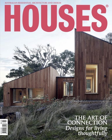
Cover: Two Halves House by Moloney Architects. Photography by Christine Francis. Copyright: HOUSES® is a registered trademark of Architecture Media Pty Ltd. All designs and plans in this publication are copyright and are the property of the architects and designers concerned.
we are the airchitects
Introducing
Audrey by Elica
A rangehood and light in one, guaranteeing air and light quality for the right atmosphere in every space
Designed by Fabrizio Crisá, Audrey is characterised by a soft and rounded silhouette and a high efficiency motor with perimeter aspiration and LED light. Showcasing a striking polished steel finish, Audrey can be suspended from your ceiling over an island or alternatively wall mounted.
* Market average filtering levels is approximately 60%
Featuring Elica's Revolution Filter, Audrey is able to reach filtering levels higher than 82%*— allowing you to cook with confidence. Plus, with a simple cleaning regime, this new filter can regenerate itself and last up to 3 years.
made in italy distributed in australia by residentia group
avail able at selected kitchen stockists, specialists or online shop.elica .com. au
ENTER NOW Entries close 16.03.18 housesawards.com.au
AWA R D C AT E G O R I E S
JURY
Australian House of the Year New House under 200 m2 New House over 200 m2 House Alteration and Addition under 200 m2 House Alteration and Addition over 200 m2 Apartment Garden or Landscape Sustainability House in a Heritage Context Emerging Architecture Practice
Kerry Clare — Clare Design Albert Mo — Architects EAT Jennie Officer — Officer Woods Architects Stuart Vokes — Vokes and Peters Katelin Butler — Houses magazine PRIZES Australian House of the Year $5,000 Category winners $1,000 M O R E I N F O R M AT I O N housesawards.com.au +61 3 8699 1000 housesawards@archmedia.com.au
SUPPORTERS
THE PINNACLE OF RESIDENTIAL DESIGN C E L E B R AT I N G AU S T R A L I A’ S B E S T
PRODUCTS
01 Yuh lamp collection The Yuh collection, designed by Gam Fratesi for Louis Poulsen, includes a wall, floor and table lamp. Inspired by the iconic AJ lamp by Arne Jacobsen, the lamps are flexible, take up very little space and provide direct glare-free downward light. cultdesign.com.au
02 Bump collection The Bump collection by Tom Dixon features minimalist, borosilicate vessels designed for tea making, mixology and floral arrangements. Each piece is delicately handmade with subtle levels of pink and grey tonal translucency. dedece.com
03 First chair Designed and manufactured in Melbourne, the First chair by Apparentt is a modern merger of thin powdercoated tubular steel and ergonomically formed plywood. Its light “line drawing-like” frame is robust and stackable. catapultdesign.net.au
04 Compile shelving system A simple design that allows for a number of possible permutations, Muuto’s Compile shelving system comprises shelves and three heights of dividing tubes. Designed by Cecilie Manz, the system can be used as a room divider or can be placed against a wall. livingedge.com.au
05 Pino stool The Pino stool by Keith Melbourne features a distinctive soft hexagonal loop supporting a gently sculpted sling of seating wires, with legs extending to the top of the chair. Made from zinc-plated steel, Pino is suitable for indoors and out. zenithinteriors.com
06 Concealed cistern Viega’s concealed cistern can help to reduce clutter, improve aesthetics and save space in the bathroom. Viega also offers an extensive range of flush plates, including soft-touch and touchless models. viega.com 014 HOUSES • ISSUE 120
FRESH FINDS
07 Tear drop vase The Tear drop vase is part of the Domo Homewares range, a constantly evolving collection of eclectic items from around the world. Featuring soft furnishings, mirrors, clocks, decorative objects and more, it has recently been expanded to include more affordable options. domo.com.au
08 Affinity flooring collection The Affinity flooring collection by Polyflor features timber-look vinyl flooring planks in a wide array of shade options with realistic knot and grain detailing. A polyurethane surface treatment ensures the range is low maintenance, while impact-resistent characteristics make it quiet underfoot. polyflor.com.au
09 Sampan collection Developed in collaboration with WOHA Being, Apaiser’s Sampan collection is inspired by the iconic sampan boats once moored in great numbers on the Singapore River. Comprising five designs across baths and basins, the collection is hand crafted from “Apaisermarble,” available in four shades. apaiser.com
10 Pacific Chair Vitra’s Pacific Chair, designed by Edward Barber and Jay Osgerby, was developed according to the principle of “full performance, quiet design.” The office chair offers ergonomic seating while demonstrating visual clarity and precision. vitra.com
11 Isi lever handle The Isi lever handle by Mandelli features bold, modern lines crafted from firstgrade Italian brass. Available in ‘Rose Satin Brass’ and ‘Satin Chrome’ (pictured), the lever is infused with skilled workmanship and traditional craftsmanship. parisi.com.au
12 Hollywood collection Designed by Ben McCarthy, the Hollywood collection of chairs and stools pays homage to the utilitarian design of the director’s chair. The collection blends two wood varieties for maximum strength and comfort. go-home.com.au Find more residential products: selector.com and productnews.com.au HOUSES • ISSUE 120 015
13 Artisan Collection The Artisan Collection by Haymes Paint features a range of handcrafted, imperfect, textured finishes designed to be used boldly and creatively to transform the look of a space. The collection is divided into three product ranges: Surface, Metallics and Textures. haymespaint.com.au
14 Atlanta tapware series Boasting a minimalist style and featuring polished chrome with the option of matt black, the Atlanta tapware series by Paco Jaanson celebrates creativity and embraces the option of mixed finishes. It is available in multiple options and sizes and includes an array of mixers, diverters and showers. pacojaanson.com.au
15 Milano Slim outdoor shower Designed by Italian architect and designer Franco Sargiani, the Milano Slim outdoor shower combines robust weather- and saltresistant marine-grade brushed stainless steel with Burma teak, in a design that is sleek and contemporary. rogerseller.com.au
16 Chair 7 Lebello’s Chair 7, pictured with the Plank Table, is a modern outdoor dining chair with a four-legged metal base available in a range of powdercoat colours. It features a comfortable woven shell and accentuated leg tips in solid stainless steel or brass. cafecultureinsitu.com.au
17 Barwon Easy Chair The Barwon Easy Chair by Eco Outdoor is a European-inspired design with crisp lines and elegant materiality. With a teak frame supporting a Rehau outdoor wicker weave, the chair can be left outside. ecooutdoor.com.au
18 Cans 100 ceiling light The Cans 100 ceiling light by ISM Objects is a classically shaped surfacemounted light made from extruded aluminium with a powdercoat finish in a choice of flat black or flat white. ismobjects.com.au Find more residential products: selector.com and productnews.com.au 016 HOUSES • ISSUE 120
READING
BOOKSHELF
Small House Living Australia: Smart design in homes of 90 m2 or less
An Unfinished Experiment in Living: Australian Houses 1950–65
Plant Society: Create an indoor oasis for your urban space
BY Catherine
Geoffrey London, Philip Goad and Conrad Hamann (UWA Publishing, 2017) PP 450 • RRP $65 From James Henry Esmond Dorney’s tiny – now destroyed – Dorney House (1949–1950), to Robin Gibson’s International Style Mocatta House (1966), this ambitious book chronicles 150 of the most significant modernist houses built in Australia. A serious and handsomely presented work, An Unfinished Experiment in Living traces the way architectdesigned houses between 1950 and 1965 responded to the social, economic and climatic conditions of postwar Australia while embracing the aspirations of modernism. Based on new research, it postulates that the most significant houses of the period represent an “unfinished and undervalued experiment in modern living.” In a climate where housing affordability and a lack of diversity in housing types are a major concern, an examination of this experimental period can only be beneficial. Or, as Glenn Murcutt puts it in a preface to the book, “There are lessons here for all of us.”
BY Jason
Foster (Penguin Random House Australia, 2017) PP 240 • RRP $39.99 A sequel of sorts to Catherine Foster’s previous Small House Living effort, looking at projects in New Zealand, this book celebrates the primacy of the small. It presents diverse projects designed across Australia, from witty insertions on tiny infill sites to secondary dwellings in suburban backyards. While an introduction discusses the environmental and social benefits of building small, Foster is not evangelical here; rather, she lets the architecture speak for itself. Alexandria Duplex by David Langston-Jones Architect, for instance, is an accomplished example of what good architecture can achieve on a small, difficult block. David Weir Architects’ Exploding! Shed House also makes the most of an awkward block while ingeniously combining a house with a workshop. Together, the beautifully presented projects in this book show that small size need be “no barrier to architectural magic.”
018 HOUSES • ISSUE 120
BY
Chongue (Hardie Grant Books, 2017) PP 192 • RRP $29.99 Tailor-made for the coffee tables of Fitzroy’s and Newtown’s share houses, this achingly hip, beautifully designed book is a comprehensive guide to indoor gardening. Written by Jason Chongue, a Melbourne-based architect, interior designer and plant cultivator, Plant Society aims to make gardening less intimidating. “I want to show that it doesn’t take much to create your own green spaces at home,” Chongue writes. Along with profiles of indoor plants, organized from the most easyto-maintain species through to more exotic and labour-intensive plants, it offers instruction and tips on basic propagation, repotting, plant styling and more. There are also interviews with “plant people” from around the world, who offer insights and discuss their relationship with plants. Informative and useful, with beautiful photos of indoor plants – from the ubiquitous devil’s ivy (Epipremnum aureum) to the rare and unusual tassel fern (Huperzia) – Plant Society is enough to inspire anyone to start their “personal plant journey.”
Take a Bath: Interior Design for Bathrooms EDITED BY Robert Klanten and Sally Fuls (Gestalten, 2017) PP 255 • RRP $60 The bathroom, the authors of Take a Bath posit, is one of the most complex spaces in the contemporary home. Not only is the bathroom a place for personal ablutions (or, as Rem Koolhaas declared, the space where humans and architecture interact on “the most intimate level”), it is also a place for sanctuary, for intimacy, and a place for preparation. With this complexity in mind, Take a Bath presents a diverse range of projects that transform the bathroom from a functional box into an “experiential realm where all the senses are called into play.” The projects are loosely grouped according to materiality. One bathroom by A+Z Design Studio uses eclectic ornaments sourced from flea markets to transform an abandoned weapons factory in Budapest. Another, by designer Guillermo Santomà, uses vibrant shades of pink throughout. Jesse DeSanti’s bathrooms, on the other hand, boast a clean, uncluttered style, while Hecker Guthrie’s elegant reworking of a Victorian house in Melbourne reveals its heritage character.
If you desire style, build it with Austral Bricks. www.australbricks.com.au
The Mother Of All Rollers
W3
Series Multi Award Winning
‘truly the Mother of All Rollers’ Allows for larger openings Double & triple glazed panels Extra smooth operation Easy to adjust under maximum load Reduces rail extrusion sag
Our Com Commiitmeent nt to bring the best st product p duct
t. 03 03. 97 9703 0 1006 e. sale les@ s@ci ciililoc lock.com
w.ciiililoc loc ockk.co com//pr prod oduc ductt-sh show how owca c se ca e.p .php php
STUDIO
Markowitz Design
01 Adam Markowitz of Markowitz Design.
• FURNITURE + LIGHTING DESIGN •
02 The Assegai pendant features brass details and curved timber.
01
03 The Platform bed, seen in the Cabbage Tree House by Peter Stutchbury Architecture. Photograph: Sam Page. 04 The Flea chair’s jarrah wedged tenons are a nod to its big brother the Fred table, which has a similar construction detail and modernist simplicity.
02
04
03
Part of a “maker movement” away from throwaway objects, Melbourne furniture and lighting designer Adam Markowitz is committed to crafting pieces with foresight and meaning. Words by Mary Mann Photography by Ben Clement
T
here’s an intimate relationship between Adam Markowitz and timber that makes his handcrafted furniture special. That and the hours spent dreaming, drawing, carving and testing each design until it becomes what it is destined to be. Adam’s focus is on making products that tell a story, honour the materials, have meaning for the maker and the user and, ideally, will be handed down through the generations. Markowitz Design is currently in the Meat Market Arts House in North Melbourne, where Adam works alongside other woodworkers. He started the studio in 2014 while working for a small architecture practice. It was at this time that he created the Fred table, which celebrates Australian
timbers and evokes the modernist simplicity he encountered while studying in Denmark. Adam has studied in Melbourne, Tasmania, Denmark, the Netherlands and the USA, and says it is the combination of architecture practice, design education and hands-on training in the art of making that allows him to create the products he does today. A balance of traditional craftsmanship and digital processes is also a vital source of opportunity. Adam’s fine furniture training is evident in the Assegai pendant, which features brass details and curved timber. The prototype was carved by hand. It took some time, but Adam says this is what imbues the pendant with such beauty. The light is now in production, meaning it can be made more affordably, but Adam believes it’s essential that he make the prototypes himself so that the valuable dialogue between designing and making is not lost. “Every chair is unique because every tree has its own grain pattern … The story of the tree’s life is written in the timber and there’s something very visceral about that,” he says. “Wood doesn’t always do what you want it to do … But you can cut a board open
and suddenly there’s the most beautiful grain and you think, ‘I can’t use that on the underside!’ A lot of these opportunities get lost in mass production.” The subtle curves on the Flea chair’s backrest only reveal themselves to an enquiring hand, similar to the handrails Adam created on commission for a house by Peter Stutchbury Architecture. It is when the user becomes connected with the handrail, or the chair, that they fully experience the refined and considered details born of that design-making dialogue and understanding of materiality. When not prototyping, Adam teaches design and architecture at the University of Melbourne. He is also working on a number of residential architecture projects. Across all this, Adam’s attention is on doing things properly and sharing the value of handcrafted Australian products. “It’s not just me, it’s a wider maker movement away from mass-produced throwaway objects, driven by a hunger for authenticity. In Australia you can still approach a maker and say, ‘I want to make this,’ and that’s an important and valuable thing.” markowitzdesign.com HOUSES • ISSUE 120 021
NEW HOUSE
Two Halves House by Moloney Architects • B A L L A R AT, V IC •
Responding eloquently to its lightly forested, sloping site, this earth-toned house has been split into two, with a bathing and sleeping pavilion sitting above an open-plan living space. Words by Marcus Baumgart Photography by Christine Francis
01 A “split-and-slide” architectural manoeuvre ensures that both halves of the house have access to views and sunshine.
01
HOUSES • ISSUE 120 023
7
7
6
7
1 2 3 4 5 6 7 8 9
7
9
8 1
5
Plan 1:400
4
3
2
0
Entry Kitchen Dining Living Garage Study Bedroom Laundry Robe
5m
02
03
02 The neatly designed kitchen is tucked into the eastern corner of the main living space. 03 A low-set bench skirting the open-plan living space encourages milling and conversation. Artwork: Jordana Henry.
“The owner-builder’s attention to detail has been exacting, with the plucky duo finding more than one opportunity to refine the design in the actual building process.”
T
wo Halves House, outside Ballarat in Victoria, is a study of measure and balance against careful siting. But the house might never have existed if it were not for the ability of Moloney Architects to effectively share inspiration and open a dialogue with its clients, allowing them to explore their full range of options. The couple, who own and built the Two Halves House, had initially engaged Mick and Jules Moloney to renovate a house in central Ballarat – a project with a relatively modest budget. But after the architects invited them to visit a project that they were completing, they abandoned the renovation in favour of a totally new design and build exercise, on a site just outside of town.
Moloney Architects set about designing the new home in response to two principal “forces” in the project: the site and the modest brief requirements of the client. With regards to the site, the house is designed to sit on sloping ground. The lightly forested land slopes away to the south, which is also the direction of the view; north is toward the top of the slope. This particular orientation established the factors that the siting of the house – its positioning and massing or bulk on the site – had to deal with. The architect’s response to this was thoughtful and clever. Rather than combine the overall house into a single mass, the architect split the brief into two equal halves and each became a HOUSES • ISSUE 120 025
04
04 An earthy palette evokes the hues of the surrounding bush and eucalyptus trees. Artwork: Architectural print by A. Lethbridge.
05 Uniform oiled birch plywood provides a warm and tactile finish, in a house without a single piece of plasterboard. Artwork: Jordana Henry.
06 Moments of saturated colour rest on a base of neutral tones, such as the black porcelain tiles of the upper pavilion’s bathrooms.
2
(young couple)
4 2 Site: Floor: Design:
Build: Sectional perspective 026 HOUSES • ISSUE 120
2.02 ha 243 m2 1 yr 1 yr
separate pavilion. One half contains the living spaces, including kitchen, dining, lounge and conversation areas, and the garage. This half is positioned toward the southern, lower end of the slope, allowing it to take advantage of the views to the south, out across the valley. The second half contains the study, bedrooms, laundry and bathroom areas of the house. This half is positioned on the upper or northern end of the slope. Dividing the house into two halves was only the first part of the strategy. The real trick was to separate the pavilions and position them at different levels, cascading down the slope on a series of terraces. Separating them in section (vertically) helped to get sunlight and views into both halves, as did the other key move – sliding one half further along the site than the other – separating the halves in plan (horizontally). This split-and-slide manoeuvre allowed Moloney Architects to reconcile the two competing factors in the site: views in one direction and sunlight from another. The result is that both halves of the house have access to both features – sunlight and views. A neat trick. Connecting the two halves is the small entry pavilion, on a third level between them. One arrives at this point via a long, terraced landscape, which gives the arriving visitor a low, oblique view of the connected halves. The architects have thought carefully about how the house is seen in the landscape, and the arrival vista is the first orchestrated view; the second is the view from outside the house at the opposite, eastern end of the site, where by contrast the house looms high and appears much larger and more heroic. In this way the dwelling has been designed to be pleasing from both the inside out and the outside in, from multiple viewpoints. The house doesn’t contain a single piece of plasterboard. The quality of detailing and the finish of the build are commendable; doors slide into walls as planes of abstract flatness and appear again as if out of thin air. The owner-builder’s attention to detail has been exacting, with the plucky duo finding more than one opportunity to refine the design in the actual building process. Their tenacity in researching the finest details of the building went one step beyond what one might expect from the average builder, realizing the Moloney Architects design as it was intended. Finishes and colours throughout are quite simply delicious. The house is highlighted by an earthy palette that evokes the many hues of the bush in general and eucalyptus in particular. Colour is in all cases used sparingly. Flat, neutral tones of timber, concrete and black porcelain tiles form a background and base for the moments of more saturated colour. The result is a harmonious, and very Australian, palette. In an act of “giving back,” the owners of the Two Halves House agreed to open their home to interested strangers after a request from Open House Melbourne, who recently expanded the festival to host the inaugural Open House Ballarat (28–29 October 2017). The pair’s motivation to do this was inspired by that initial site visit with Moloney Architects – from this act of sharing came the impetus to create the Two Halves House. There is nothing quite so compelling as seeing the real thing and it is hoped that this ongoing gesture of personal generosity on behalf of the clients will feed a virtuous circle of future inspiration and commission.
05
06 HOUSES • ISSUE 120 027
07 07 A long, terraced landscape leads to a small entry pavilion, which connects the house’s two halves.
Architect Moloney Architects +61 3 5309 2499 info@moloneyarchitects.com.au moloneyarchitects.com.au Project team Mick Moloney, Jules Moloney, Luke Taylor Builder Owner Consultants Engineer: TGM Carpenters: Larry Hahs, Daniel Forbes Joiner: Woodbeast
028 HOUSES • ISSUE 120
Products Roofing: Standing seam roofing in Colorbond ‘Monument’ External walls: Everist Timber blackbutt shiplap cladding in clear oil Internal walls: Plyco birch plywood in clear oil Windows and doors: Custom blackbutt timber frames by Townsend Joinery Flooring: Exposed aggregate polished concrete Lighting: Brightgreen surface-mounted LED lights; Flos Glo Ball lights from Euroluce; Douglas and Bec lamp; exterior lights from Masson For Light
Kitchen: Paperock benchtop and splashback; Rogerseller tapware; Asko oven Bathroom: Rogerseller tapware; Stonebaths AU bath; custom brass mirror designed by owner, made by Wade Fab; Cerdomus Tile Studio tiles Heating and cooling: Inslab hydronic heating Other: Side tables and chair by Daniel Poole; Jardan stools; vintage Hans Wegner plank chairs
markilux 770/870 tracfix
Are you looking to shade your pergola or conservatory?
Shade up to 400 cm x 400 cm in a stylish manner and enjoy the comfort and the quality of markilux for many years. Both this square awning 770 tracfix, (for installation over any structure) and its round counterpart, the markilux 870 tracfix, are very quiet. Noise-reducing closing guides ensure the awning retracts quietly.
They are exceptionally compact at only 125 mm x 125 mm. The square full cassette of the markilux 770 tracfix fully protects the awning cover. With a diameter of 130 mm, the cassette of the markilux 870 tracfix harmoniously nestles against the conservatory and provides all-round protection to the retracted fabric cover.
markilux.com.au | 1300 654 469
NEW HOUSE
Two Wall House by Woods Bagot • S Y D N E Y, N S W •
Unfolding behind a facade just 3.7 metres wide, this light-filled and spatially expansive house provides a blueprint for successful urban infill projects. Words by David Clark Photography by Trevor Mein
4
(family home)
3
+2 guest/study
2
+2 powder rooms
Site: Floor: Design:
Build:
160 m2 180 m2 6 mths 1 yr, 6 mths
$4,800
030 HOUSES • ISSUE 120
per m2
01
01 The house opens onto an elegantly designed courtyard with a garage and studio beyond. Artwork: Linus Bill and Adrien Horni.
HOUSES • ISSUE 120 031
02 02 Two layers of skylights allow daylight to flood the wall of the living space. Artwork (L-R): Linus Bill and Adrien Horni; Anton Parsons; Dion Horstmans.
I
n the current and urgent discussions about the density of Australian cities, the models for urban infill, highrise nodal points or development corridors are too often developer-driven, cost-cutting, sub-quality misadventures that can leave us anxious about our future urbanscapes and civic communities. Politicians, planners, councillors and developers might learn much from an infill project like Two Wall House in Lilyfield, Sydney. Woods Bagot principal and design director Domenic Alvaro designed the home for himself, his partner Sue and their two daughters. It’s a gem of a house – light-filled and spatially expansive, unfolding TARDIS-like behind a small and discreet facade just 3.7 metres wide. It nestles in beside a grander, older two-storey terrace house. Steelwork details in the balustrading and fencing hint at a connection between the two properties. A zinc-clad roof slopes back from the frontage, disguising its modernity, which, on closer inspection, is given away by the seamless design detailing of the timber, glass, steel and stone and an over-scaled dormer window above. 032 HOUSES • ISSUE 120
03 A zinc-clad roof slopes back from the 3.7metre-wide frontage, momentarily disguising the house’s modernity.
The project was a collaboration between Domenic and a friend. They bought the terrace house, which sat in the corner of a large block of land, with a plan to create two properties – one for each of them. The existing house took up 4.85 metres of the street frontage, leaving a sliver of land running down the side not quite wide enough to build a house that would make financial and architectural sense. The idea that unlocked the entire scheme was to excavate into the existing house by 700 millimetres, keeping the original Victorian facade intact and creating a new party wall that democratically gives each property an equivalent width of 4.2 metres. Immediately behind the narrower facade of the new dwelling, the interior extends across to the new party wall, taking advantage of the extra width. The additional 700 millimetres – about the depth of modern joinery – allows enough habitable space for a comfortable home. The spaces have been masterfully arranged between the two long boundary walls, primarily using joinery to define rooms and living zones. At the front is a compact and elegant sitting room. A frangipani
03
“… the house expands with space and light, and a very ‘Australian’ feel is strikingly evident from the front door.”
05
04
Section 1:400 034 HOUSES • ISSUE 120
04 A long white wall, carrying the clients’ expanding art collection, draws the eye through the house to the courtyard.
0
4m
05 The stairway, designed for efficiency of space, brings a modernist material quality to the house. Artwork: Norman Carlberg.
06 A frangipani tree filters light through the compact and elegant sitting room. Artwork (L-R): Bruno Munari; Paul Ryan.
06 tree filters light through the large glass wall, which can be made private with roller blinds. This doubles as a guestroom, where furniture can be shifted to the edges and a bed pulled down from the dark timber joinery wall. It’s a European-scale solution to hospitality. A pivoting door creates privacy and just beyond it is a powder room tucked beside the stairs. From here, the house expands with space and light, and a very “Australian” feel is strikingly evident from the front door. It’s rare to walk into a narrow row house and see so much light ahead. A long white wall, unadorned except for art that will continue to be collected over time, takes the eye through the house to the courtyard beyond. Two layers of skylights, one at the edge of the upstairs corridor and another in the roof above it, allow daylight to flood down the wall. Sculptures cast shadows and the shifting sun creates its own play of light. At the entry the ceiling height is 2.7 metres. From here the house steps down under a constant ceiling plane so that by the time you’re at the courtyard edge, it’s nudging four metres. It’s a lovely spatial sequence, moving from the compact scale of the front room to the expanse at the back, and the home has all the amenity of a luxurious open-plan apartment but with a grand sense of height and space. Vast sliding doors open onto the courtyard, elegantly designed by Daniel Baffsky of 360 Degrees Landscape Architects. Here, architectural detailing, considered materials and planting
provide a mix of textures and tones. There is a plunge pool and finally a garage with Domenic’s studio above it. Domenic defines this main living space with floor levels, joinery and accomplished detailing. The kitchen and dining table are on one level, and a few steps down is the living area with a large sofa. White joinery walls provide ample storage for day-to-day living and darker oak joinery provides visual contrast and marks out a different amenity – a wet bar with Domenic’s whisky collection, for instance. This works as a family and entertaining space, accommodating kids, guests, meals, drinks with friends, television and lounging. The stairs to the upper level, immediately behind the front room, are formed from eight-millimetre steel (like the stairs in the garage/ studio), another way to save space that might otherwise be taken up by walling and add a modernist material quality. Upstairs, under the dormer window, is one kid’s room. Then a large bathroom beside the stairs, a second child’s room and finally, behind a pivoting door, the main suite with large wardrobe walls for Domenic and Sue, and an ensuite off the bedroom. Domenic likes to experiment with housing models in urban spaces. His previous home was a multi-level project built on a 47-square-metre block in inner Sydney. It won him accolades and a World Architecture Festival award in 2011. This one, a different typology for filling in urban space, is just as accomplished.
HOUSES • ISSUE 120 035
07 07 An over-scaled dormer window provides a place to sit and brings light into a child’s bedroom.
12
13
14
12
First floor 1:400
5 4
2
3 6
9
7
10
8
1
Ground floor 1:400 036 HOUSES • ISSUE 120
11
0
4m
1 2 3 4 5 6 7 8 9 10 11 12 13 14
Entry Formal living/guestroom Kitchen Laundry Storage Dining Living Courtyard Pool Garage Plant Bedroom Main bedroom Study/bedroom (self-contained)
08
Architect Woods Bagot +61 2 9249 2500 contact@woodsbagot.com woodsbagot.com Project team Domenic Alvaro, Simon Lee, Amy Lee Consultants Engineer: Tall Ideas Consulting Engineers Landscaping: 360 Degrees Landscape Architects Joinery: Élan Planning: Planning Lab Heritage: Urbis Certifier: Inner West Council Lighting: Light Practice
Products Roofing: Lysaght Colorbond roofing External and internal walls: Concrete masonry Windows: Vitrosca aluminium windows in ‘Slate Grey’; Aneeta sashless windows in ‘Slate Grey’; Alessi Design Group blinds and awnings in ‘Bronze Grey’ Doors: Custom timber doors, designed by the architect, manufactured by the joiner Flooring: Solid American oak flooring Lighting: XAL lighting from ECC Lighting and Furniture Kitchen: Fiandre Marmi Lab Statuario benchtops from Artedomus; Miele appliances Bathroom: Agape Sen fittings and Fiandre Maximum surfaces from Artedomus Heating and cooling: Ducted reverse-cycle airconditioning External elements: Anston Architectural paving and pool in ‘Vega’ Other: Bassam Fellows wood frame lounge seating, Tractor stools, Circular table, Tray Rack side table, Kant table, Mantis chairs, E15 Habibi side table, Walter Knoll Oki occasional table and La Chance Salute coffee table, all from Living Edge; B&B Italia Mart armchair, TuftyToo sofa and Husk armchair and footstool from Space Furniture
08 High-quality materials and architectural detailing contribute to a sense of expansion in this urban infill project.
HOUSES • ISSUE 120 037
ALTERATION + ADDITION
01 While the house’s scale and form tie in with the street, its new powdercoated aluminium facade glows brightly.
PerfPad by Northbourne Architecture + Design
Through a series of simple but effective alterations the architects have transformed an existing terrace house into a more functional, light-filled home with a luminous street presence. Words by Ella Leoncio Photography by Tatjana Plitt
• MELBOURNE, VIC •
01 HOUSES • ISSUE 120 039
N
orthbourne Architecture and Design’s first completed architectural project sits comfortably nestled in a row of terrace houses down one of South Yarra’s narrow streets. While its white facade glows brightly among more subdued houses, its scale and form ground it comfortably within the existing streetscape. The building volume is very much in keeping with the character of the street, with expressed horizontal lines that tie it in with the datum lines of its neighbours. Although the scale and form are contextual, materially the house departs from the sombre and muted streetscape palette. Clad in bright white powdercoated aluminium sheets perforated with regularly spaced round holes, the facade presents as a crisp, minimal, all-white box. Compared to its neighbours, it’s quite abstracted as a form, with little to reference the human scale. The only aberration to the rational, geometric allwhite design is the existing tree in the front garden. This organic, snaking green form acts as a counter to the rectilinear, pure white facade and is almost as essential to the facade composition as the architecture itself. Both the tree and the architecture seek to highlight the features of the other through contrast, and together they give one another balance. One would be forgiven for assuming that the project is a new build, given its contemporary, minimalist facade, but in fact it’s a renovation of an existing dwelling. The aluminium screens clad a pre-existing house. With the exception of increasing the first-floor building envelope by one metre, the building footprint is more or less as it was. The “before” and “after” plans make it obvious that the degree of intervention was fairly minimal and that much of the original structure remains intact. The ground floor was essentially massaged through the addition of a row of joinery that separates the main living area from the entry, plus a new laundry and powder room. Other than that, little has changed in the plan. The kitchen, which has always been the hub of the house, remains centrally located on the ground floor with open space either side. The first floor, which has been extended with the additional metre toward the front, has had some slightly more extensive internal changes to accommodate an additional bedroom upstairs. However, the two rear bedrooms have changed little. Although the plans reveal fairly limited intervention, the quality and feel of the internal spaces have been completely transformed. This is partly due to the updated joinery and finishes, which change the look of the house and add more functional storage. However, it’s the simple spatial massaging that fundamentally changes the bones of the dwelling and gives it new life. New full-height glazing has been introduced to both ends of the open living area on the ground floor, providing vastly more light than the former heavy timberframed French doors. A timber deck has been added to the front of the house, which has been significantly raised above the natural ground level to finish flush with the internal floor. Given the fence height, this courtyard is protected from the street and makes for a
040 HOUSES • ISSUE 120
02 A row of joinery separates the living space from the entry, a laundry and a powder room. 03 Full-height glazing added to both ends of the open-plan living area brings in light and allows for cross-ventilation.
4
(family home)
3
+1 flexible room
2
+1 powder room
Site: Floor:
164 m2 210 m2
Design: 1 yr, 10 mths
Build:
$2,400
1 yr
per m2
“One would be forgiven for assuming that the project is a new build, given its contemporary, minimalist facade, but in fact it’s a renovation of an existing dwelling.”
02 03
HOUSES • ISSUE 120 041
04
05
3
2
Ground floor 1:400 042 HOUSES • ISSUE 120
7
9 11
7 1
4
5
9
10
6
9
8
First floor 1:400
0
5m
1 2 3 4 5 6 7 8 9 10 11
Entry Lounge Kitchen Dining Laundry Garage Deck Piano room Bedroom Flexible room Balcony
04 A stark, white bathroom reflects the house’s crisp palette and minimalist design language. 05 The main bedroom and ensuite hang in the canopy of a tree, offering privacy and shade. 06 Full-height glazing facing a balcony allows daylight to stream into the main bedroom.
06
highly useable private outdoor space. This new outdoor room extends the perceived length of the living space and offers a much more successful indoor–outdoor experience, transforming the daily use of the living area. The continuous line of kitchen joinery extending to an external barbecue unit also helps drive that visual flow and connection. The new joinery unit opposite this houses the television unit and additional storage. More importantly, it acts as a dividing element to create the separated entry, which is now hidden behind a concealed pivot door in the joinery. This new entry made it possible for the owners to use one of the bedrooms upstairs as a consultancy room. With an enclosed entry, the owner’s patients can now access the consultancy room without any visual connection to the private family living zone.
Upstairs, other than the additional bedroom, it’s the main bedroom that has undergone the most radical transformation. The original bedroom turned its back on the street and suffered from a lack of daylight. In contrast, the new main bedroom reorients the bed toward the windows. Facing onto the only new external wall in the project, full-height glazing opens up to an outdoor terrace, inviting fresh daylight to stream in, filtered and reflected off the perforated screens. The bedroom and ensuite hang in the canopy of the existing tree and this greenery both enriches the outlook and provides privacy screening and shading to the main bedroom. The alterations to this existing terrace are highly efficient. Maximum impact has been achieved through small but clever and strategic interventions. HOUSES • ISSUE 120 043
07 Updated joinery and finishes have transformed the feel of the house while adding more functional storage. Artwork: Maegan Brown. 08 A fireplace and hydronic heating provide warmth in winter, in a house that enjoys minimal temperature fluctuations.
07
Section 1:400 044 HOUSES • ISSUE 120
0
5m
08
Architect Northbourne Architecture and Design +61 3 9999 7970 hello@northbourne.co northbourne.co Project team Sally Holbrook, Lydia Hnatojko Builder S & S Builders Consultants Engineer: Kersulting
Products Roofing: Zincalume deck roofing; Bradford R7 ceiling insulation batts External walls: Dulux AcraTex RenderWall in Dulux ‘White’ Windows: Viridian double-glazed windows; Max Industries frames, powdercoated; Plantation shutters, roller blockout blind, and translucent roller blind in ‘White’ from AP Shutters and Blinds; Centor retractable flyscreen Doors: Custom pivot doors in ‘White’ from Tait Timber and Hardware; Designer Doorware hardware Flooring: Havwoods oak engineered timber flooring; Kirriwirri rug from Designer Rugs
Lighting: LAAL Conehome arch pendant; Masson adjustable LED downlights; Moda Piera Arancini floor and table lamps Kitchen: Abey Gessi kitchen mixer; InSinkErator hot water dispenser; Maximum porcelain tile benchtop; custom birch plywood, white washed and limed; Bosch oven and steam oven; Miele cooktop and dishwasher; Whispair rangehood; Liebherr fridge; Häfele fully concealed pull-out bins Bathroom: Reece tapware; Omvivo basins and vanity (ensuite); Ikea basins and vanity (bathroom); Reece basin (powder room); De Fazio Tiles and Stone wall tiles in ‘White’ and floor tiles in ‘Grey’
Heating and cooling: Hydrotherm hydronic heating wall panels; Jetmaster fireplace External elements: Tait Timber and Hardware tallowwood deck; Perftech custom perforated aluminium sheeting, powdercoated; water-resistant joinery in automative paint; Beefeater barbecue Other: LAAL Samesame stools with steel, terrazzo and marble tops; LAAL tipsy bowl; Grazia and Co Leeroy sofa, Featherston Scape armchair and Featherston e254 Elastic Suspension chair; side table from Cult
HOUSES • ISSUE 120 045
GARDEN
Bungalow Garden Rooms by Myers Ellyett with Dan Young Landscape Architect • BRISBANE, QLD •
A series of diverse, textural and dynamic “garden rooms” are the result of a close collaboration between architect and landscape architect and celebrate a life lived outdoors. Words by Ricky Ray Ricardo Photography by Cathy Schusler
6
(family home)
1
(outdoor shower)
Site: Floor:
820 m2 190 m2
Design:
Build:
3 mths 4 mths
$690
per m2
01
046 HOUSES • ISSUE 120
01 The entry courtyard is a mix of shades of grey and green that highlights various foliage textures, with a ground layer of travertine pavers over sandstone river pebbles.
HOUSES • ISSUE 120 047
5 6
2 4 3
1 2 3 4 5 6
1
Garden plan 1:250
0
Gatehouse Entry courtyard Pool Pool lounge Lawn Existing house
5m
Garden section 1:250
I
n subtropical Brisbane, the average top temperature in the two coldest months of the year – June and July – is a balmy twenty degrees Celsius. So if you’re embarking on a renovation, it makes perfect sense to integrate your interior and exterior spaces as tightly as possible, particularly if you have a large family and space is in demand. This is exactly the thinking that underpins the landscape design at Bungalow Garden Rooms by Myers Ellyett and Dan Young Landscape Architect, in the inner suburb of Paddington. The design deftly negotiates an architecturally significant 1960s cream brick house to provide a series of engaging “garden rooms” that augment the family’s everyday living space. Set atop a rise, the house and garden enjoy magnificent views in almost every direction. “The clients have four boys, and one of the key components was to give them a pool so that at the end of the day they could all jump in there, wear themselves out, have a shower outdoors, then go and get ready for bed,” explains Jade Myers, co-director of Myers Ellyett. While the architects were initially engaged to design a deck around a pool, the project’s scope quickly grew to include an outdoor shower area, two new pergola structures – one above the entry courtyard and the other above the deck and lounge beside the pool – and an incredibly detailed planting response that stitches together the various elements into a coherent whole. 048 HOUSES • ISSUE 120
02 The black aluminium pool fence marks the threshold between two distinctly different spaces – one enclosed and the other open to the sky.
03 The pool area provides the family of six with an extra living area – complete with a pool lounge and outdoor shower.
The property is essentially a walled compound: a masonry wall about two metres high runs the length of the street frontage and the top of a steep slope on the northern boundary. While the wall affords privacy from the street, a lot of the garden area still suffered overlooking issues from a three-storey block of flats across the road. Responding to this concern, the architects designed a simple but effective black timber arbour above the entry courtyard. Deep timber slats, placed about half a metre apart, run perpendicular to the neighbouring building – they let in plenty of light, yet block diagonal views into the courtyard and house. Landscape architect Dan Young explains that the planting in the entry courtyard contrasts shades of grey and green and highlights various foliage textures. In the shadier zones the dark, large leaf forms of Philodendron ‘Congo Rojo’ contrast against the bright, delicate foliage of maidenhair fern (Adiantum aethiopicum), and in the brighter areas, kangaroo vine (Cissus antarctica) creeps between
02 03
04
05
and around the reliable Philodendron ‘Xanadu,’ while the whole space is unified by a luminescent carpet of Dichondra argentea ‘Silver Falls.’ “[Because the garden is an entry space] we wanted to work at the ground plane and at knee [level], but keep the shoulder and eye line open to visually connect the series of garden rooms that are formed by the shape of the dwelling,” says Dan. Travertine pavers – a nod to the modernist vernacular of the house – have been placed over concrete ones and a loose bed of sandstone river pebbles covers the surrounding soil. A giant imperial bromeliad (Alcantarea imperialis) has been made the hero of the space through the careful selection of neighbouring plants that accentuate its striking form and flamboyant hues. I’m not usually a fan of bromeliads, but the composition of this one surprised me. A smart, black aluminium pool fence runs between the entry courtyard and the pool and lounge area, which is more open to the sky. “We wanted to celebrate the barrier of the pool fence as a threshold between two distinctly different spaces,” says Jade. On the southern side of the pool a more contemporary outdoor shower and arbour structure has been built over a new deck, featuring integrated seating. A steel skeleton provides support for
timber rafters that run along the roof and three sides, with voids left in the rear wall where key views to surrounding suburbs are framed. The structure, also painted black, will soon be covered over by lady slipper vine (Thunbergia mysorensis) and adorned with its elegant orange-red flowers. With enough separation in grade between the deck and the play lawn below, a pool fence was avoided. In this third space or garden room, a slightly surreal take on the suburban backyard has been created – think of work by Ian Strange or Howard Arkley – where a flat lawn is bound by a black paling fence and the only features are a clothesline and a square sandpit filled with toys. As we wrap up our visit a refreshing breeze blows through the garden from the north. The three-to-four-metre pink trumpet tree (Tabebuia palmeri) growing through the entry arbour beautifully captures the sound of the breeze with its open canopy of rounded leaves. It’s this attention to detail, where even the aural qualities of foliage are a consideration, that makes this garden a delight. It’s clear that the close collaboration between architect and landscape architect has produced a home and garden that are highly pragmatic and yet dynamic, textural and diverse.
050 HOUSES • ISSUE 120
06
07
04 The black timber arbour above the entry courtyard affords privacy from the three-storey block of flats across the road.
Architect Myers Ellyett +61 7 3876 6040 mail@myersellyett.com.au myersellyett.com.au
05 Lady slipper vine (Thunbergia mysorensis) adorns the brick entry walls and the pool lounge structure.
Project team Jade Myers, William Ellyett, Milton Zietsman
06 Integrated timber seating wraps around the edge of the shaded pool lounge. 07 A new contemporary outdoor shower has been placed at the south-western corner of the pool.
Landscape architect Dan Young Landscape Architect +61 405 571 598 dan@danyounglandscape.com danyounglandscape.om Builder Jerrard Constructions Consultants Engineer: GDS Consulting Engineers Landscaping contractor: Sod Landscape and Design
Products Pool: Summer Daze Pools pool and pebble crete; Linen Tumbled Unfilled travertine pool pavers and coping, and ceramic waterline tiles, all from The Pool Tile Company; custom aluminium pool fencing and gates in black satin powdercoat Pool lounge: Mixed hardwood painted in Dulux ‘Black’; Merbau decking in Sikkens Cetol Deck ‘Natural’ Outdoor shower: Mizu Drift shower mixer and overhead shower, both from Reece Planting (new): Maidenhair fern (Adiantum aethiopicum); dwarf cardamom (Alpinia nutans); kangaroo vine (Cissus antarctica); slender palm lily (Cordyline stricta); jade plant (Crassula ovata); Australian tree fern (Cyathea cooperi); dwarf tree fern (Blechnum gibbum); dichondra silver
falls (Dichondra argentea ‘Silver Falls’); kidney weed (Dichondra repens); gymea lily (Doryanthes excelsa); false sarsparilla (Hardenbergia violacea); creeping boobialla (Myoporum parvifolium); boston fern (Nephrolepis spp.); Philodendron ‘Congo Rojo’ (Philodendron Congo ‘Rojo’); Sage (Salvia officinalis); Syngonium ‘Lemon and Lime’ (Syngonium podophylum ‘Lemon and Lime’); pink trumpet tree (Tabebuia palmeri); Fraser Island creeper (Tecomanthe hillii); lady slipper vine (Thunbergia mysorensis); native violet (Viola hederacea) Planting (existing): Imperial bromeliad (Alcantarea imperialis); meyer Lemon (Citrus sinensis); Philodendron ‘Xanadu’ (Philodendron ‘Xanadu’)
HOUSES • ISSUE 120 051
NEW HOUSE
Tess & JJ’s House by Po-co Architecture • MELBOURNE, VIC •
This clever new home, set on a narrow site in an inner-city suburb, is a light and airy place of retreat from the city while still enabling a connection with it. Words by Katelin Butler Photography by Tatjana Plitt
13
13
12
14
12
First floor 1:400
5 2
6
9
4 3
1
Ground floor 1:400
052 HOUSES • ISSUE 120
7
8
11
10
0
10 m
1 2 3 4 5 6 7 8 9 10 11 12 13 14
Entry Study Robe Main bedroom Scullery/laundry Kitchen Dining Living Deck Pool Off-street parking Void Bedroom Play zone
01
01 The kitchen/dining area is an impressive doubleheight volume, with views directed to treetops and battened screens for privacy and shading.
02
ne of the biggest drawcards of living close to the city is the convenient access to a broad range of amenities. A downside, however, is that privacy and space often need to be compromised on tight, inner-city blocks. But with the assistance of a clever architect, sightlines can be manipulated and every inch of space can be made to count. This is the case at Tess and JJ’s House by Po-co Architecture, located in a cul-de-sac in Melbourne’s South Yarra. The home is a calm retreat removed from city life, but still only a hop, skip and a jump from the action of Chapel Street. The density across South Yarra is varied, with apartment blocks dotted throughout a sea of single dwellings. Tess and JJ’s House sits on an irregularly shaped block with worker’s cottages on either side. The design of the street elevation marks this as a new building, but very much in keeping with the surrounding houses. “In order to keep the rhythm of single-storey houses along the street, we created the illusion of an over-scaled single-storey house from the front and reinterpreted the typical single window and front door arrangement of its neighbours,” says Fiona Poon, director of Po-co Architecture. Taller apartment blocks are located across the laneway at the rear of the site, which made privacy an issue. The angular form of the new home is a response to the angled site. It is pushed and pulled 054 HOUSES • ISSUE 120
02 A paired-back material palette is used throughout the home, including American oak, marble and white joinery.
03 The upstairs zone is like a cubbyhouse for the children, with small angled and battened peepholes.
according to sightlines into the property and carved into to allow the southern neighbours continued access to light. At the time that their new house was being designed, clients Tess and Jonathan Joseph also owned the house to the north, meaning that boundary realignment was possible. The realignment meant that all aspects of the brief could be accommodated, including a small pool and backyard. For Tess and her family the project was a five-year plan. “JJ [Jonathan] and I have two young children: Lachlan, who is six and a half years old, and Evie, who is four and a half. We enjoyed the opportunity to think about how a space would work specifically for our family.” With the requirement for an isolated space for Jonathan to work away from the children, Fiona designed a compact study at the front of the home that faces onto the leafy cul-de-sac and is also connected to the main bedroom suite. The upstairs zone is like a cubbyhouse for the children – the ceiling above the upstairs circulation space follows the roofline, which angles down to avoid
4
(family home)
3 2
+1 powder room
Site: Floor: Design:
Build:
297 m2 117 m2 1 yr 10 mths
03
overshadowing the neighbours. Upstairs is a flexible zone that can be used as two bedrooms or as one bedroom and a rumpus room that opens out onto the circulation via a large sliding door. A small angled and battened peephole at either end of the upper-level circulation space ensures that the children feel connected to what’s happening in the main living areas below and can see who’s coming and going through the front door. Having lived abroad in London and Rome, Tess knew that copious amounts of space weren’t required for the home to function efficiently. A European-style laundry is tucked adjacent to the kitchen and storage is added wherever it will fit. Priority was given to providing the impression of space for the main living areas – the most impressive of these is the main kitchen/dining area, a double-height room with windows from floor to ceiling. This is a wonderful, light-filled space with views directed to treetops and battened screens for privacy and shading. The “wow factor,” as Tess calls it, is amplified through the transition from the dark, compressed hallway that leads from the front door into the naturally lit, airy room. There is a feeling that you are slightly removed from the tightly packed inner-city suburb. With large sliding glass doors opening onto a north-facing deck to expand the floor area and a compact bar at the end of the kitchen, the space is perfect for entertaining. “During this period of your lives with
young children, you don’t go out to socialize as much. So we wanted this home to allow us to entertain,” says Tess. A north-facing lounge area connects to the double-height volume and, in comparison, is a cosier, more contained space. The small garden features established birch trees that allow sun in during winter and provide shade in summer. The eastern wall is solid to provide privacy from the apartment blocks to the rear of the site, other than a single fixed window at floor level, which gives a view of the pool and the movement of reflected light across the water. Fiona was pregnant with her first child during the design process, so Tess managed the project once construction started and along with the builder, Christian McCalman of Build2, carried it through to completion. “It was a winning team, particularly with my commitments at the time,” Fiona recalls. “I wasn’t as heavily involved in the construction process as I normally would be, but Christian respected the design intent and checked in with me along the way.” The success of Tess and JJ’s House doesn’t rely on an impressive coastal view or heroic architectural move. Instead, clever manipulation of space and light has allowed the narrow urban site to feel much larger than it is, and more private than might otherwise have been possible in the dense setting. The dwelling offers a lovely place of retreat from the city while still enabling a connection with it. HOUSES • ISSUE 120 055
04 056 HOUSES • ISSUE 120
Architect Po-co Architecture +61 413 869 825 fiona@po-co.com.au po-co.com.au Project team Fiona Poon Builder Build2 Consultants Engineer: Ranepura Consulting Engineers Joiner: Bulmers Cabinet Makers Landscape: Glasshaus
05
Products Roofing: Lysaght Custom Orb Accent 35; Silvertop ash rainscreen in Quantum stain External walls: Silvertop ash cladding in Quantum Aquaoil stain; cement bricks in Dulux ‘Whisper White’ Internal walls: American oak timber screening in Quantum Aquaoil stain Windows: Morris Windows and Doors hardwood timber windows in Quantum Aquaoil stain; Aneeta sashless sliding windows; Breezway louvre windows Flooring: EC Carpets Residence wool carpets in ‘Twenty six’; Tongue n Groove oak flooring in ‘Oslo’ Lighting: Lucretia Lighting fixtures; Pulse LED bluetooth speaker lights from Machtig Kitchen: Caesarstone benchtop in ‘Frosty Carrina’; American oak benchtop in Osmo Top Oil; Carrara marble plinth, honed; moisture-resistant MDF robes Bathroom: Porcelain tiles from Perini Tiles; tapware and fixtures from Centre Plumbing Plus Heating and cooling: Hydronic heating by Hub Air; Real Flame Elegance gas fireplace External elements: Radial Timbers New Deck decking; pool by Falcon Pools; fencing from Watts Fencing and turf from Performance Grass
06 04 With large sliding glass doors opening onto a deck and a bar at the end of the kitchen, the space is designed for entertaining.
05 The design of the street elevation marks this as a new building, but it is still in keeping with the surrounding houses. Photograph: Fiona Poon. 06 The upper level is a flexible zone, with one of two bedrooms opening out onto the circulation via a large sliding door.
HOUSES • ISSUE 120 057
NEW HOUSE
Lune de Sang Pavilion by CHROFI
In a slow-growth forest in the Byron Bay hinterland, the final dwelling in a collection of powerful, monumental concrete structures has been completed – all designed to endure.
• NORTHERN RIVERS, NSW •
Words by Trisha Croaker Photography by Brett Boardman
058 HOUSES • ISSUE 120
01 A wall of local stone, broken with blackbutt in shaded areas, acts as a spine, stitching together the house and landscape as one.
I
n a world alarmingly besieged by impermanence, the exploration of architectural permanence is an all-too-rare occurrence. Even rarer is the investigation of houses designed as current and future ruins; and of dwellings designed to stand in a potentially postapocalyptic world. Such rigorous questioning lies at the heart of an extraordinary series of future-focused buildings in the Byron Bay hinterland. Conceived as relics in the landscape, the three complementary projects on the site offer themselves as deceptively simple concrete and stone carcasses; like ancient structures that have been rediscovered and made exquisitely habitable, but which may at some stage be reclaimed by the forest. Their creation is the result of a decade-long collaboration between Sydney-based practice CHROFI and clients Andy and Deirdre Plummer, the owners of a former dairy property, which they are transforming into a 115-hectare slowgrowth hardwood forest specializing in hard-to-find cabinet timber species. With some species taking three hundred years to mature, this is an enterprise focused on glorious varieties of the past being grown for the future.
01
The Lune de Sang Pavilion, the most recent building to be completed on the site, joins Stone House (see Houses 100), the Lune de Sang Sheds (see Architecture Australia vol 103 no 1), General Manager’s Residence and guest houses nearby. The single-storey pavilion forms the hub for farm life. In addition to longevity, the owners required a house that would accommodate two very disparate needs. With a big extended family, they needed their home to be robust yet elegant, catering for large and frequent gatherings. It also needed to afford a private space for Andy in particular to retreat to when desired. They wanted prospect and refuge in equal measure and for the dwelling to be “embedded, sutured and stitched” into the landscape. The arrival has been carefully orchestrated down a long, winding driveway. As bordering trees mature, the effect will be a heightened, theatrical one with tree canopies giving way to openness and views in a sequence designed for maximum effect. First impressions are of a deceptively simple structure, a powerful form composed of three dramatic elements. A rectangular in situ concrete and glass-sided box stretches east–west, massive concrete roof beams and columns HOUSES • ISSUE 120 059
02 Arrival has been carefully orchestrated down a long, winding driveway, and as bordering trees mature the effect will be heightened.
02
1 2 3 4 5 6
Driveway Carport Store Lounge Dining Kitchen
03 The public pavilion, designed for gathering, is open visually and physically to a pool, two decks and the view of the valley to the north.
7 8 9 10 11 12
Pantry Pool Change room Sitting Patio Main bedroom
8 5 4 6 9
1 2
7 3 10
11
Plan 1:500 060 HOUSES • ISSUE 120
12
0
5m
03
embedding the house. Along the southern elevation, a seemingly impenetrable wall of local stone, broken only with blackbutt in shaded areas, acts as a spine, stitching the house and landscape as one. Overhead, a strong yet surprisingly delicate oversized steel skillion roof lifts gracefully from the south and swoops to the north, hovering widely and tautly over four roof beams, two cantilevered dramatically to the east and west. The overall result is one of superbly tensioned lightness and strength, flight and permanence. This box is the more public pavilion and gathering space, appearing initially as one large room catering to social activities such as cooking and dining. Open visually and physically to the north, west and east to a pool and two decks (all protected with massive roof overhangs), it reaches out to the valley while framing distant views. Materials have been pared to the minimum, with honed concrete floors below and golden blackbutt panelling above. A wall of vertical blackbutt panelling along the southern elevation (topped with clerestory windows) conceals a series of annexes housing a bathroom, butler’s pantry and mudroom. Rarely is the line between public and private spaces as strongly drawn as in this home, which has a second pavilion for sleeping, bathing and reclining physically separated and hidden from the living space. From the living area, you must go outside to go inside the private spaces. The private pavilion will become increasingly hidden as plantings mature. Aiding this demarcation is one of the precinct’s many sinuous stone walls, applied not just as a respectful nod to the owners’ love of sculptor Andy Goldsworthy’s work and old pioneer walls on site, but in this instance also to rise up and conceal, along with an earth berm, the almost subterranean private world behind it.
Entry to the private pavilion is through a cleverly camouflaged blackbutt door that leads into a world of much greater intimacy and beguiling geometries. Replacing the public rectangle’s soaring ceiling is a flat-roofed exploded tangram – a series of geometries stretched and frictioned past one another to create one fluid space kinked and divided by cabinetry. Replacing the few massive concrete beams and columns of the public pavilion is a continuous sequence of concrete roof ribs and legs, consciously holding spaces securely. The lower ceilings, closer views, more intimate roof overhangs and tangible evidence of the house and roof anchoring to the site all contribute to a pervasive sense of serenity, and of it being unbreachable. A corridor, with a wall of blackbutt cabinetry and a skylight, divides a rectangular sleeping/bathing/dressing space to the east and a triangulated reclining/art space to the west. In the latter, CHROFI has stretched the internal space north-west to a fine tip, and the roof overhang south-west in a similar fashion. With full-height doors leading to a covered outdoor terrace, backed internally by an unbroken stone wall and circled externally by mounded earth and stone, the effect is of an airy and luxurious cave. It is a secure retreat in which to enjoy an extraordinary collection of art, including works by Claudia Borella, Richard Whiteley and the owner, Andy Plummer. This subterranean idea is further explored in the open-plan sleeping/bathing space, wrapped on three sides in glass and circled with earth and stone, with the bedroom carved out of the floor and dropped three steps lower. It’s hard not to think that in lesser hands, any of these strategies could have resulted in an oppressive space. But here they are liberating, speaking of freedom and containment, flight and permanence. Like the rest of this joyous dwelling, these are spaces that simply belong here. In perpetuity. HOUSES • ISSUE 120 061
04 Lower ceilings, closer views and more intimate roof overhangs contribute to a pervasive sense of serenity, and of the private spaces being unbreachable. 05 The open-plan sleeping/ bathing space in the private pavilion is wrapped on three sides in glass and circled with earth and stone.
04
05 062 HOUSES • ISSUE 120
06 The private pavilion is anchored into the ground via a continuous sequence of concrete roof ribs and legs.
07 The sleeping zone is marked out within the open-plan space by being sunken by three steps. Artwork: James Guppy, from The Weather Reports series.
06
2
(family home)
1 1
+1 change room
Site: Floor: Design:
07
Build:
115 ha 400 m2 1 yr, 6 mths 1 yr, 6 mths
HOUSES • ISSUE 120 063
08
09
064 HOUSES • ISSUE 120
10
08 The public pavilion opens to a deck by the pool, framing long views to the mountains. 09 The warm tones of the custom island bench and kitchen wall in the public pavilion contribute to the sense of it being connected to its site. 10 A corridor with a wall of blackbutt cabinetry and a skylight divides the sleeping and bathing zone from a triangulated reclining/art space. Artwork: Coloured vessels by Ben Edols and Kathy Elliott. Vessel on table by Giles Bettison.
Architect CHROFI +61 2 8096 8500 info@chrofi.com chrofi.com Project team John Choi, Jerome Cateaux, Steven Fighera, Tai Ropiha, Clinton Weaver, Eoin Healy, Max Kamlah, Elke Jacobsen, Olivia Savio-Matev, Albert Quizon, Dmitriy Lewicki, Ria Chaney Builder Cedar Creek Construction Consultants Engineer: KPH Consulting Lighting: Lo-Fi Cost planner: QS Plus Products Roofing: Lysaght Spandek; ironbark timber decking; in situ concrete; custom in situ concrete splitters External walls: Bush rock; in situ concrete Internal walls: Blackbutt vertical cladding Windows and doors: Vitrocsa windows and doors Flooring: Honed in situ concrete; ironbark decking Kitchen: Custom island bench and kitchen wall by Boffi Bathroom: Custom cantilevered basalt-clad vanity; custom milled log bench; Rogerseller sanitaryware; Boffi fixtures Heating and cooling: Infloor hydronic heating External elements: Basalt pavers in split finish; Kronos Cava Alborensis pool tiles in ‘Aran’ from Rocks On; Moodie Outdoor Products reinforced concrete grass pavers
HOUSES • ISSUE 120 065
OUR HOUSES
WORKING WITH AN ARCHITECT
On a 300-acre farm in northern New South Wales, CHROFI’s design for a public/private home offers a sense of stillness and embededness. Here, Trisha Croaker talks to the owners, Deirdre and Andy, about their successful collaboration with architect John Choi. Words by Trisha Croaker Photography by Brett Boardman
Trisha Croaker: Why did you engage an architect? Andy: We knew we had something important here. I wanted to find somebody with a veneration for architecture, who understood what has been important over the past two thousand years and who would bring a serious perspective to any endeavour. It’s not just about designing bathrooms and kitchens; it’s finding “the other,” the essence. I don’t know what that is, and I don’t know if anyone can answer that question, but I was looking for somebody who actually thought of it as a serious question. I needed to find that foil of expertise, someone who could take my halfbaked ideas and reinterpret them. Someone we could push ideas back and forth with.
TC: How did you find your architect? Deirdre: We had no idea how to find the right one! We approached several, looked at local architects and asked a long-term 066 HOUSES • ISSUE 120
architect friend for suggestions. Then an agent suggested John Choi, and we are eternally grateful. Andy: I’d gone through four or five architects and it wasn’t working. I was doing business with Colliers in Sydney and asked, “How do you find an architect – someone you can work with?” They suggested John Choi and Tai Ropiha, who’d done the TKTS booth in New York City. I’d seen and admired that, so I called John and sent the brief. Bless his boots, he read it.
TC: How did you prepare for your meeting? Andy: I put together a Powerpoint package. It was a bit of a tossed salad. I knew I couldn’t just take pictures of houses and say, “That’s what I want,” but I could say that there were aspects of the houses that I liked. I talked about suturing, stitching and embeddedness; really big picture stuff.
“Put everything you want on the table and work back from there to what’s achievable.”
TC: What was your brief? Deirdre: We have four children and nine grandchildren. Andy has always liked a bit of distance from the kids. I, on the other hand, revel in the whole mess of family life. Our initial brief was for a family gathering place as well as a place for Andy to retreat to. We wanted a refuge. We talked about journeys, going into another place, Alice in Wonderland and the rabbit hole. Andy: We wanted separate houses for the family, which fed into a central area. That became the guiding beacon. Then we talked about what we were doing with the trees on the farm and the things we liked, including [sculptor and land artist] Andy Goldsworthy’s work. [We wanted a sense of] quietness and stillness and embeddedness, and incorporation of the dwelling into the landscape, like the landscape has accepted the house. That was the notion, rather than the number of bedrooms and taps and car spaces.
TC: Do you feel this was a collaborative process and how did you achieve that? Deirdre: Yes, it was a collaborative process. I think John’s very open, Andy’s very
articulate and I’m fairly articulate. John is a good listener and takes things on. He would argue with Andy if he thought he was wrong, and Andy really respected him for that. There was great collaboration between us and the architect, as there also was with the engineer, builders, stonemasons and craftspeople.
TC: Is the result achieved what you expected? Deirdre: It’s phenomenal, and beyond my imagination. We were particularly lucky to get CHROFI. They are extraordinarily visionary. The thing about John that’s remarkable is the way he incorporates architecture within a precinct, so that the architecture’s always in context with the place; and you suddenly cannot imagine Times Square without the red steps and vice versa. He’s done that with the buildings at the farm.
TC: What advice would you give to someone who is thinking of engaging an architect? Andy: Do as much homework as you can. Try to be as fresh and honest with yourself as you can. Ask yourself: What do I want to do? Is this just about shelter? What’s the common denominator here? How does this relate to the property I have? And then put the questions to the architect, to find some way to manifest that through architecture. If you want something that reflects what you feel on a piece of land, you need someone to interpret that. And it’s not a draftsman. Deirdre: [Retired architect] Espie Dods told me thirty years ago to “ask for what you really want first.” Put everything you want on the table and work back from there to what’s achievable. It’s also important to listen to your architect and give them space to do what they do.
Andy: It’s not what I expected, but I don’t think ahead a dozen steps. I tend to think out a couple of steps and keep my options open all the time. You build something, and it shoots you off in a different direction. All the while there’s a light on the hill, there’s an objective that’s out there. It’s about being flexible. HOUSES • ISSUE 120 067
PRODUCTS
HOT & COLD From convenient under-counter fridges to innovative module cooktops, this collection of products will make life in the kitchen easier, stylish and more fun.
01 KV4 three-hole mixer Originally designed by Arne Jacobsen in the 1960s, Vola’s decidedly contemporary KV4 mixer combines quarter-turn ceramic stop valves, a double-swivel spout and a water-saving aerator. Made in Denmark, the mixer is available in a range of colours. vola.com
02 Under-counter fridges Suitable for indoors or out, Perlick’s undercounter fridges are available in many sizes and styles. With the option of solid or glass doors, the fridges offer the convenience of point-of-use storage for food, beverages and more. perlick.com
03 French door fridges Both attractive and functional, Panasonic’s new range of French door fridges features full-flat glass panels. Available in black, silver and white, the 547-litre fridges are energy efficient and keep food fresh, minimizing wastage. panasonic.com.au
04 Bio rangehood The Bio rangehood by Elicia combines silk white and natural wood surfaces, offering both a sense of tradition and innovation. Featuring high-level technology in terms of suction, noise and filtration efficiency, it is designed to be fully integrated and comes in island and canopy options. residentia.group
05 Duo Fusion cooktop The Asko Duo Fusion is a 90 cm cooktop that combines two energy sources: an induction cooktop and a Fusion Volcano Wok gas burner. These two cooking methods are combined on one piece of 6 mm ceramic glass. asko.com.au
06 XL Levered Dispenser The Billi XL Levered Dispenser, pictured in ‘Gun Metal Grey,’ can be paired with a variety of Billi’s underbench boiling, chilled and sparkling filtered water systems. The dispenser is available in a number of finishes. billi.com.au 068 HOUSES • ISSUE 120
07 Vipp bread box The Vipp bread box is a robust storing option for bread in the kitchen. It features a cleaning-friendly, stainless steel lid, spacious volume and a washable inner liner. It also has a rubber ring at its base that protects surfaces. cultdesign.com.au
08 Granitek Sink Series The Granitek Sink series by Artusi is designed to bring functionality, sleek lines, easy cleaning and high performance together. Granitek is a patented material formed from granite and acrylic resin. artusi.com.au
09 Combi Steam ovens Smeg Combi Steam ovens offer the choice of cooking with steam, convection baking and grilling, used separately or in combination. The range is available in a choice of colours and three designs: Classic stainless steel, the contemporary Linear design and the retro Victoria, pictured. smeg.com.au
10 Module cooktops Module cooktops by Wolf can turn any countertop into a cooking area. Each module is just 38 cm wide, allowing for the combination of a variety of specialty modules, from gas and induction cooktops to a steamer and multifunction module. subzero-wolf.com
11 Albany rangehood Whether used in a pair or as a single rangehood, Qasair’s Albany rangehood is designed to be visually appealing. The rangehood combines functionality with improved noise levels. qasair.com.au
12 Callisto tap collection The Callisto tap collection by Perrin and Rowe is constructed from German low-lead brass and features quarter-turn ceramic disc valves for years of precise use. The collection offers a variety of options, including crosshead or lever handles and round or square spouts. englishtapware.com.au Find more residential products: selector.com and productnews.com.au HOUSES • ISSUE 120 069
PRODUCTS
13 Itopker countertops Itopker porcelain countertops by Inalco provide a wealth of design potential thanks to their extra-wide sheets, measuring 3,200 mm × 1,500 mm. The countertops are available in a range of colours and finishes. g-lux.com.au
14 Culinary Gaston sink mixer The Culinary Gaston spring-pull-down mixer by Methven is stylish and easy to use. Pull-out and pull-down spray options allow for a greater range of movement, making it easy to cover hard-to-reach parts of a sink. cassbrothers.com.au
15 Pearl rangehood Miele’s Pearl rangehood, featuring dimmable atmospheric lighting, is designed to be the focal point of the kitchen. A white, toughened glass canopy is pitched at an angle that allows even the tallest home cook plenty of room to peer into pots and pans. miele.com.au
16 Trail kitchen The Trail kitchen by Carlo Colombo and R&D Varenna is characterized by slimline components, including 6 mm work-tops and 3 mm-thick wall panelling shelves. The kitchen features backlit open cabinets and integrated Trail cabinet handles. poliformaustralia.com.au
17 Fineline cutlery tray Made from warm, textured walnut and characterized by slim, minimalist lines, the Fineline Cutlery tray by Häfele is designed to make kitchen organization easy. It is available from Häfele Home, a new website targeted specifically at home renovators. hafelehome.com.au
18 Pressed-porcelain panels Artetech pressed-porcelain panels by Artedomus offer high resistance to scratching, etching and heat and are easy to maintain. Made in Italy, they are designed to suit a wide range of applications. artedomus.com Find more residential products: selector.com and productnews.com.au 070 HOUSES • ISSUE 120
Elba Natural Stone At Artedomus, we’re passionate about natural stone. For more than 25 years we’ve been searching the world for the most beautiful, unique stones and introducing them to Australia. This is Elba. Originally sourced close to ten years ago, Elba was carefully selected for its elegant, cool grey tones, soft brown markings and low porosity; making it uniquely beautiful, naturally resilient and versatile in application. The genuine Elba stone is available only through Artedomus. Visit one of our showrooms to experience it.
artedomus.com 1300 278 336
Elba splashback and kitchen bench. Also featured Inax Fourelfe Mosaic Project by Lucy Bock. Photography Mark Roper
STUDIO
01
Cecilie Manz • FURNITURE + PRODUCT DESIGN •
01 The Caravaggio series of lamps was designed by Cecilie Manz for Light Years and is available from Cult.
02 The thin, welded frame of the Airy Table series for Muuto, available from Living Edge, is complemented with a light, slim tabletop.
02
03
04 05
03 Furniture and product designer Cecilie Manz. 04 Ladder Hochacht was one of Cecilie Manz’s first product designs and is an object to sit on, rather than something to climb. 05 Moku is a minimalist furniture range designed for Actus and Nisson Mokkou Japan.
The refined and elegant products and furniture by designer Cecilie Manz celebrate the Danish refinement of style. Words by Colin Martin
I
’ve always been fascinated by someone mastering a craft,” says Danish designer Cecilie Manz. As a child she watched her parents working in their ceramic studio and first experienced forming materials while playing with clay. Her grandmother was also influential: “… she had good taste and a very strong sense of creating spaces.” At the Royal Danish Academy of Fine Arts, Jørgen Gammelgaard, Niels Jørgen Haugesen and Peter Hiort-Lorenzen were inspirational teachers. “There was also a very fine craftsperson, who had worked with Arne Jacobsen at Fritz Hansen, who inspired me to work with wood.” The manufacturing rights for her graduate exhibition prototype, Ladder Hochacht (1998–99), were immediately snapped up. Two decades later, Cecilie works with
three assistants and an intern in her central Copenhagen studio and is internationally respected. For the January 2018 edition of Maison & Objet Paris she was honoured with the appointment of Designer of the Year. In Paris she exhibited new “freewheel” projects, following her “own head” rather than working to commission. In 2017, having earlier designed its Moku furniture range, she worked with Japanese manufacturer Actus on a new project, for release in 2019. She designs across a spectrum of materials: metal, glass, clay, textiles and electronics. “You could say I put myself between two or ten chairs working with such diverse fields. But I get to see all these techniques and details,” she says. Vilhelm Hammershøi’s paintings of Danish domestic interiors are influential: “They show what we already have; the subtle dull greys, the important light because it’s so sparse.” For her, light grey is “zero,” not white, as shown in her tonal palette in textiles for Georg Jensen Damask and earthenware for Fritz Hansen. Cecilie’s light touch as a designer
encompasses furniture, such as her aptly named Airy series of tables for Muuto. Her use of slender steel frames and thin laminated plywood tops creates strikingly geometric forms and silhouettes. They seem drawn, not welded. Cecilie co-curated Everyday Life – Signs of Awareness (2017), a Japanese exhibition presenting a broader picture of what’s going on in Denmark. “It was difficult to limit the curation,” she says. “I can be very indecisive until I know what I want.” Based on her designs, when she does decide, manufacturers and purchasers know exactly what they want. “Ladder is still in production, but I’ve entered the stage of my career where products are discontinued,” she says. “I think I’ll never get used to that part.” Undeterred, she remains focused on designing products that enhance everyday life. Her “desert island choice” of something by another designer is telling. She’d take a bottle of wine from Jasper Morrison’s vineyard, “which would be very useful and probably also needed.” ceciliemanz.com HOUSES • ISSUE 120 073
THE BEST FAN YOU’LL NEVER HEAR
www.aeratronae.com.au
PEOPLE
Matt Chan of Scale Architecture Drawing on a fascination for the quirkiness in how people live, Scale Architecture designs efďŹ cient and visually reďŹ ned houses that are customized to the client. Words by Leanne Amodeo Photography by Brett Boardman
hen it comes to designing homes, Matt Chan is most passionate about preserving the idiosyncratic nature of a dwelling. “I find people’s personalities and the quirkiness in the way they live the most fascinating thing about residential design,” says the founding principal of Scale Architecture. This informs his commitment to delivering customized responses that are rigorous yet attractive and his predominantly Sydney-based portfolio is diverse as a result. Matt has been working this way since 2002, when, as a sole practitioner, he undertook his first residential commission, Milis Salem House. As if reimagining a rundown weatherboard cottage in Alexandria didn’t prove challenging enough, Matt wasn’t in the country for this project’s duration. He was studying at Amsterdam’s Berlage Institute at the time and the experience taught him the importance of clear communication along with the value of maintaining relationships with clients.
01
2002
Milis Salem House • S Y D NEY, NSW •
076 HOUSES • ISSUE 120
These principles underline his current practice and define the methodology of his three-person team today. As he explains, “We’re not the type of architects who present a master sketch and that’s all you get. Our design process is a constantly evolving one and it’s very much built around an ongoing conversation with the client.” Milis Salem House introduced him to the possibilities of efficient spatial planning and taught him the importance of understanding site and how to formulate the best design strategy possible. Such approaches (now Scale Architecture signatures) underscore the project’s concept. It is anchored in a simple arrangement that maximizes its tight inner-city setting, comprising separate private and public zones, with the former occupying the upper volume and the latter situated on ground level. A sense of easy circulation permeates the living areas, where a concrete kitchen bench is the only fixed element in an otherwise open plan. It’s an elegant design outcome not reliant on flashy gimmicks and because of
this, it has stood the test of time. Matt’s residential projects may have changed in scale and increased in number, but his ambition and desire to find the right questions for clients remain the same. “The curiosity we have in unravelling the urban condition and how sites work is still there,” he says. In his recently completed North Bondi House, which overlooks the Pacific Ocean on one side and Bondi on the other, he was faced with his most unexpectedly challenging project to date. “Designing something for this site was difficult because it’s really beautiful,” Matt reflects. “We had to formulate a direct response to the topography of the peninsula location and carefully navigate the ground plane.” The home’s entry presents somewhat like a rock platform on a sea cliff, sitting at the top of a set of stairs that follows the natural contour of the land. This entry forms the base of the internal void, which dramatically splits the house in
02
01 Milis Salem House is anchored in a simple arrangement that maximizes its tight inner-city setting. 02 A sense of easy circulation permeates the open-plan living areas of Milis Salem House.
9
10
9
11
Milis Salem House first floor 1:400
Milis Salem House section 1:400
5 1
2
4 3
1 2 3 4 5 6
8 6
7
Milis Salem House ground floor 1:400
0
Living Dining Kitchen Terrace Pool Garden
7 8 9 10 11
Garage Utility Bedroom Robe Studio
5m
HOUSES • ISSUE 120 077
2017
North Bondi House • S Y D NEY, NSW •
03 03 North Bondi House responds directly to the topography of its location on a peninsula.
04 An internal void housing the sculptural central stairway dramatically splits North Bondi House in two.
North Bondi House section 1:400 078 HOUSES • ISSUE 120
04 05 A restrained material palette complements the clever spatial planning of North Bondi House.
0
4m
05
1 1
2 10
12
11
13
12 2
1 2 3 4 5 6 7
Deck Bedroom Study Entry Dining Lounge Utility
8 9 10 11 12 13
Pantry Kitchen Living Void Robe Balcony
North Bondi House first floor 1:400
4
2
5
3
6
1 2
7
8
9
North Bondi House ground floor 1:400
0
4m
HOUSES • ISSUE 120 079
two and contains the central sculptural steel staircase. The planning is ingenious in allowing for two living areas – one upstairs and the other downstairs – that capture views from both sides. Generous floor-to-ceiling windows also help achieve this objective, while the grassed rear yard extending toward the horizon makes the experience of looking out at the Pacific Ocean all the more sublime. Intelligent integration of outdoor space is also characteristic of Matt’s approach, in order to optimize comfort and ease within the home and elicit a higher degree of liveability. His Long Courtyard House, also located in Alexandria, is a fine example of how to assertively orientate an addition to ensure increased levels of
planning efficiency. Having been awarded the Australian Institute of Architects’ New South Wales chapter Emerging Architect Prize two years prior to the project’s completion in 2013, Matt well and truly lived up to the industry hype (and then some) with this project. By reorientating the courtyard to the side of the house facing north, Matt disrupts a typical inner-city terrace configuration to give each ground-level room a garden aspect. The scheme makes full use of the site’s width when the home is opened up, blurring the boundary between inside and outside and extending the interior past the building’s concrete envelope. In a thoughtfully considered detail, the upper level’s cantilevered timber
06 Long Courtyard House boasts a robust material palette characterized by timber, concrete and brick. 07 A cantilevered timber box opening to a roof garden helps Long Courtyard House connect to nature. 08 Each ground-level room of Long Courtyard House has been reorientated to provide a garden aspect.
07 2013
Long Courtyard House • S Y DN EY, N S W •
06 080 HOUSES • ISSUE 120
08
HOUSES • ISSUE 120 081
box opens up to a roof garden, helping Long Courtyard House connect to nature, despite its gritty urban context. However, the project’s most compelling design expression is its robust material palette. “Materiality is really important in every Scale Architecture project,” notes Matt. “And with this one, the choice of materials was based on the design outcome.” Concrete gives the span required for the large courtyard-facing opening, provides thermal mass for the ground-floor living areas and creates the base for the roof garden. It’s undoubtedly high functioning, yet also complements the existing brick boundary wall that’s exposed within the new addition, adding texture and colour to an otherwise neutral scheme.
09
2017
Cricket Pitch House • S Y D NEY, NSW •
082 HOUSES • ISSUE 120
Matt’s latest project, Cricket Pitch House, features a brick exterior punctuated by blackened steel window frames. It’s a new build that takes the north-facing courtyard in Long Courtyard House and reinterprets it as a side yard. Cricket Pitch House is impressive in form, with a diagonal roof ridge and four different facades that each respond to their orientation. Internally, windows and skylights add a sense of angularity to the scheme, which is offset by honey-coloured timber flooring, kitchen joinery and a series of partitions. Like all of Matt’s work, it’s driven by concept rather than aesthetics and so the result is extremely efficient and visually refined. He believes in making good design affordable without compromising on
quality. “This is harder than ever and has become a challenge, but we never set out to make design an exclusive thing for people with money.” Scale Architecture is currently involved in the Nightingale Housing social enterprise as an architectural practice licensed to establish this ecologically, socially and financially sustainable model in New South Wales. His private residential portfolio also continues to expand, with clients drawn to his design-based approach to contemporary urban living. Matt has mastered the art of solutionsfocused architecture and hardworking, intuitive design. scalearchitecture.com
09 Cricket Pitch House features a diagonal roof ridge and four facades that each respond to their orientation. 10 The design of Cricket Pitch House helps maximize solar access to all rooms.
12
12
12
12
1 2 3 4 5 6 7 8 9 10 11 12
12
Cricket Pitch House first floor 1:400
11 The side garden of Cricket Pitch House, featuring honeycoloured joinery and flooring, are efficient and visually refined.
11
3
1
Garage Entry Study Dining Living Kitchen Store Laundry TV room Pool Lawn Bedroom
2 7 9
8
4
5
10
6
Cricket Pitch House ground floor 1:400
0
4m
10
11 HOUSES • ISSUE 120 083
NEWS
PROJECTS
PRACTICE
AWARDS
PEOPLE
PRODUCTS
REVIEWS
Informed, authoritative, quality content. PUBLISHED BY: Architecture Media Pty Ltd Level 6, 163 Eastern Road, South Melbourne VIC 3205 +61 3 8699 1000
NEWSLETTER SIGN UP: architectureau.com/newsletter EDITORIAL SUBMISSIONS: aau@archmedia.com.au
architectureau.com
01 FIRST HOUSE
Eyelid House by Fred Architecture • MELBOURNE, VIC •
Often in life, everything happens all at once – and this was the case for Fiona Winzar of Fred Architecture, who twelve years ago started her own architectural practice while pregnant with her baby, Agnes. Fiona reflects on the first project that began this new chapter of her life, Eyelid House. Words by Fiona Winzar of Fred Architecture Photography by Emma Cross
01 The form of the home has been designed like an eyelid, to create an open outlook to the courtyard while ensuring privacy from overlooking neighbours.
HOUSES • ISSUE 120 085
I
f you really knew what was ahead of you, you’d think twice about starting your own architectural practice. Verging on madness and being a risk-taker are prerequisites. My first clients were my husband’s former neighbours: Jo and Shaun and Jo’s mother, Carol. After several conversations and a fair bit of red wine they took a leap of faith and commissioned me to design their home, with only our own home renovation as a form of project reference. Jo’s, Shaun’s and Carol’s trust was unwavering when they discovered I would have my second child in the middle of the project and that their project would ultimately launch my practice, Fred Architecture (formerly Fiona Winzar Architects). I was employed at the time they engaged me, but was thinking about starting
086 HOUSES • ISSUE 120
my own practice. Having their project and a baby “under my belt” sealed the deal, as completely against the odds as that would seem. As it turned out, babies were a feature of the project. Jo was soon to have identical twins, which, with their first child, Max, would make them a family of five. My baby, Agnes, was born the day after a four-hour meeting with the clients and the builder to sign the construction contracts. No rest for the wicked! That was a few days before Christmas of 2005. When building started in the new year, Agnes came to every site visit in a pouch and the site office became the change and feeding room when required. A baby is a calming device on site, with the odd swearing or heated conversation toned down to whispers and cooing from the tradies.
The challenge for this project – Eyelid House (see Houses 56) – was to create a light-filled, open-plan, three-bedroom, two-bathroom house on a tight and difficult site. The starting point was a typical singlefronted Victorian terrace, poky and dark. Here was a great opportunity to contribute to sustainable and compact inner-city living for a family. The clients’ lack of pretension and relaxed lifestyle meant that a pristine white box with designer furniture was not something that would work for them. With young children, they wanted spaces to be informal, warm and functional. I used a layering of ideas to respond to the brief. The central idea of the design is the roof form of the extension. Its shape has been manipulated like an eyelid, to create an open
02 Raw materials including concrete, steel and timber are blended with more traditional elements such as stained glass and Turkish tiles.
02
3
First floor 1:400
Section 1:400
1 2 3 4 5 6 7
2 1
5 3
3
7
4 6
Ground floor 1:400
0
Verandah Entry Bedroom Lounge Dining Kitchen Courtyard
5m
HOUSES • ISSUE 120 087
03
04
outlook to the rear courtyard while ensuring complete privacy from a dominating apartment block to the south and a threestorey hotel at the rear. The roof overhang shelters and shades the glass facade to the east. The unusual internal spaces that result from the roof form are emphasized with tessellated plywood panelling and translucent materials. “The first-floor bedroom and study space is my favourite part of the house,” says Jo. “The angled ceiling and wall planes are treated as a single form and the tessellated ply panels accentuate the form. While the bedroom is spacious, it gives a feeling of being in a treehouse or cubbyhouse, which is unexpected.” The simple striped pattern of the corrugated folded roof is a reference to local Victorian terraces that feature striped corrugated iron roofs on their front verandahs – a character that is very much Melbourne, Australia. The striped roof establishes a dialogue between contemporary and traditional architecture. This dialogue 088 HOUSES • ISSUE 120
is reflected in the interiors, where raw materials including concrete, steel and timber are blended with more traditional elements such as stained glass and Turkish tiles. The design is contemporary but simultaneously creates an ambiance of warmth and intimacy. Having a baby and making a building at the same time doesn’t give you much time to ponder, so it was a wonderful reward to have super-appreciative clients and to be acknowledged by the profession with an award from the Victorian chapter of the Australian Institute of Architects. The Eyelid House helped me to understand what my work is about. Winning an award gave me confidence to continue to run my own practice and helped me gain exposure to attract new clients. The work is conceptual and sitesensitive, but the architectural language is essentially romantic and expressive. I am particularly interested in creating spaces that vary in scale, have a fluid quality and make subtle suggestions about how to use
the space. The appearance of the space has a looseness about it, but the way people use the space is being quite subtly manipulated. While I haven’t really focused on the origins of my design approach, I can see that similar qualities can be found in Australian architecture from the late 1960s and early 70s. The approach is to create relaxed, sociable and comfortable living environments. Over time, a preoccupation with fluidity of space and with creating environments of social intimacy has become very apparent in my work. This is largely in response to working with dark, poky or very cellular older-style buildings, such as the existing dwelling I worked with on this first project. More than ten years on, Jo, Shaun, Max and the twins, Nina and Imogen, still love living in the Eyelid House, around the corner from Carol. We stay in touch and they always have a million stories to share. As an architect, knowing that your clients love their home and thrive in it is what keeps you going.
05 Architect Fred Architecture +61 3 9999 2148 studio@fredarchitecture.com.au fredarchitecture.com.au Project team Fiona Winzar Builder Third Pig Constructions Consultants Engineer: MacLeod Consulting
03 The unusual internal spaces created by the roof form are emphasized with tessellated plywood panelling and translucent materials. 04 There is a fluidity of space within the narrow footprint of the dwelling, allowing natural light to permeate connected spaces. 05 The expressive and romantic architectural language of the home reflects the personalities of its owners. HOUSES • ISSUE 120 089
ONE TO WATCH
ADAM KANE ARCHITECTS • EMERGING PR AC TICE •
03 01 Adam Kane, who established his own practice in 2015, takes pride in designing specifically for the client. 02 Hardwood House in Victoria’s Daylesford features a consistent dark materiality, both inside and out. 03 Hardwood House can be used as a single house or two independent spaces.
01
Focused primarily on residential work in regional Victoria, Adam Kane Architects is an up-and-coming practice with a penchant for finely detailed houses. Words by Katelin Butler Photography by Adam Kane
090 HOUSES • ISSUE 120
02
he refinement and attention to detail evident in the houses by Adam Kane Architects belies the young age of the practice. Prior to setting out on his own in 2015, director Adam Kane worked for JAM Architects, B.E Architecture and Bates Smart, giving him good experience with projects of different scales, budgets and types. However, Adam’s heart lies with single residential work and this has become the focus of his practice. He finds joy in enhancing the daily lives of his clients by designing homes that respond to their individual requirements. “There is a real emphasis on it being their house, not mine,” he says. “There are some clients who aren’t sure about the pros and cons of using an architect. And then
there are the true believers who value the importance of design, and they are the [clients for whom] we get the most exciting results.” Although each project has its own personality in response to its unique context and client, there is a consistent design language across the body of work by the emerging architect. Of note is Adam’s approach to materials – he chooses a palette that references the context and then carries it through the entire project. Hardwood House in Victoria’s Daylesford is a good example: the dark horizontal timber boards of the exterior are translated into the internal walls and ceiling surfaces. The dark materiality is a response to the brief for high-end overnight accommodation.
04
06 04 Trentham Barn is a simple shed, which epitomizes Adam’s commitment to quality and refined details. 05 The positioning of Blackwood Studio’s two structures creates the impression of a small village of buildings. 06 Located in the Macedon Ranges, Macedon House features internal finishes and detailing inspired by its rural setting.
05
The darkness creates “an emotive, relaxing and comforting space to be in, which is great as a weekender,” says Adam. The planning allows for the dwelling to be used as a single house or two independent spaces with separate entrances. In his residential projects, Adam aims to achieve a sense of timelessness and restraint, “where everything works together.” This approach is carried through into smaller projects, too, such as Trentham Barn, a simple shed for a ride-on mower. “Just because it is a shed, doesn’t mean it shouldn’t be nicely detailed and refined,” says Adam. Blackwood Studio in regional Victoria is another smaller project created with a great level of care. Two separate structures, a garage and a studio, have been
strategically positioned around an existing home to give the impression of a small village of buildings. Although many of Adam’s projects are located in rural Victorian settings, the majority of projects that he is working on are alterations and additions in innersuburban Melbourne, which are currently under construction. Adam enjoys the challenge of responding to a variety of settings and contexts, tailoring each project to the specific needs and desires of its client. Starting a new practice is no mean feat, especially as a sole director. When Adam needs to bounce ideas or seeks advice, in addition to speaking with his team, he often turns to his parents: “My parents are designers and I respect their decisions and
advice, so they have been great mentors to me with starting my practice.” Adam intends to keep the scale of his practice small. He enjoys the personal encounters with clients and takes a hands-on approach to all aspects of the business. With subtlety, clarity and fine detailing, his work isn’t about making grand statements or being fashionable – the homes Adam creates are simply intended to bring joy to those who live in them. adamkane.com.au
HOUSES • ISSUE 120 091
INTERGRAIN SHOWCASE
THE PERFECT GETAWAY The high performance of Intergrain products allowed Austin Maynard Architects to extensively use exposed timber to add warmth and texture to a beach house on the Victorian coast. Photography by Peter Bennetts
hen architect Mark Austin’s clients approached him to renovate their beloved beach house in Lorne, Victoria, they were very clear about the brief. “They were conscious of not following the local pattern of demolishing existing properties to build much larger ones,” says the co-director of Melbourne-based Austin Maynard Architects. “So they wanted us to reconfigure the shack rather than create something new.” Mark’s response was to retain the home’s small footprint and incorporate a first-level addition to accommodate the new kitchen, lounge and dining areas. The Dorman House’s simple yet efficient open-plan layout, punctuated by a spiral staircase and hanging fireplace, is as conducive to quiet retreat as it is to social gathering and entertaining. Full-height windows at the rear of the addition may allow for 092 HOUSES • ISSUE 120
expansive ocean views, but Mark was mindful that aspect not compromise liveability. “It could have been a white plasterboard box full of downlights,” he explains. “Instead, we lined the interior with silvertop ash to give the living areas warmth.” The cohesive detailing exudes character, making the space appear all the more welcoming while effectively turning the clients’ attention inward, without distracting from the view. Ensuring the silvertop ash maintains its appearance was a priority for both the architect and the clients, so Mark selected Intergrain Nature’s Timber Oil as the finish. The product is made from 95 percent sustainable ingredients that, once applied, replicate timber’s natural defences to protect against ageing. For a scheme that relies so heavily on a single material for its design expression, this level of performance is not to be underestimated.
Opposite page: The consistent use of timber on all interior surfaces effectively turns the clients’ attention inward, without distracting from the spectacular view.
This page, left: The silvertop ash on the walls and ceiling of the house are finished in Intergrain Nature’s Timber Oil, which replicates timber’s natural defences to prevent against ageing. This page, above: Exposed timber posts and beams add a sculptural dynamism to the interior and exterior of the new addition.
And what especially appeals to Mark is the durability of the finish, which has a soft, natural lustre that highlights the grain. Exposed timber posts and beams add sculptural dynamism to the interior, not to mention a strong textural element. They’re also a nod to the seaside locale’s jetties and piers and in this respect Mark elegantly instills a sense of place that doesn’t rely on clichéd beach motifs and themes. His bold use of materiality and highquality finishes is what distinguishes this beach house, making it the perfect getaway. INTERGRAIN Dorman House by Austin Maynard Architects was shortlisted in the Residential Interior category of the 2017 Intergrain Timber Vision Awards.
Architect Austin Maynard Architects Builder Spence Construction Engineer R. Bliem and Associates
For more information on Intergrain: intergrain.com.au 1800 630 285
Timber finish Intergrain Nature’s Timber Oil
HOUSES • ISSUE 120 093
NEW HOUSE
Tinbeerwah House by Teeland Architects • NOOSA HIN TER L A ND, QLD •
Resting on a steeply sloping, heavily damaged site, this house works to stabilize and rehabilitate the land while offering expansive views of the forest beyond. Words by Margie Fraser Photography by Jared Fowler
01
01 Sliding timber screens, reminiscent of Japanese tea houses, provide for the control of light, privacy and outlook. HOUSES • ISSUE 120 095
I
n one translation from the Gubbi Gubbi language of the local Aboriginal people, the placename “Tinbeerwah” means “land of grass trees.” In another, it is said to mean “high hill.” Either works for Tinbeerwah House, which sits on a splendidly elevated platform in the bushy hinterland of Noosa, on Queensland’s Sunshine Coast. When the current owners bought the 8,745-squaremetre property in a semirural enclave of tree changers, they inherited from the previous owners the results of a decade of site clearing. A denuded building platform had been established, with a studio/ office pavilion below. Much necessary intervention in stabilization, retention and drainage followed, but the rewards of the location are eminent. 096 HOUSES • ISSUE 120
Teeland Architects was commissioned to design a home for the young family of five that was robust and practical while celebrating the pleasures of the location. The building platform presented a gift amid the somewhat bald narrative of the confronting moonscape, which principal David Teeland refers to as “an open-cut mine” of sorts. The adjacent patch of sloping land to its south is a richly diverse forest of eucalyptus, awash with birdlife and wallabies. A sweeping view east and north takes in a long stretch of coastline and the Pacific Ocean in the distance, with a broad swathe of forest intervening. The elevation disguises the existence of small properties, creeks and hamlets between the house site and the ocean some fifteen kilometres away,
02 The floor sits close to the ground, maintaining a connection with the site and allowing the children to easily step out onto the earth. Artwork (L-R): Narrabri Nakamarra; Minnie Pwerle.
5
(family home)
4 2
+1 powder room 8,745 m2 260 m2
Site: Floor:
Build:
6 mths 9 mths
$3,000
per m2
Design:
5 9
10
9
9
9
8
7
6
Plan 1:400
02
as the eye sweeps over the treetops and their thick, obscuring foliage. The temptation to design a home that juts outward and upward would have lured some wanting to grab maximum views, but David opted for a more discreet and recessive approach. “It was important to keep the home close to the ground, so that the young children can easily step out onto the earth,” he says. The essential grounding of the house in the landscape is also a paean to the majesty of what lies beyond – the bush, the ocean, the stars and sky – and this simple, almost monastic box establishes an elemental shrine for observing these, rather than an overpowering monument. From the street entry point, the house is indeed invisible, tucked in above and behind the curving rampart of the driveway
1 2 3 4 5
Entry Garden terrace Pool Kitchen Scullery
4
3
2
6 7 8 9 10
Dining Living Laundry Bedroom Robe
1
0
5m
and courtyard walls. A narrow chasm-like path and staircase slices through the curves, gradually revealing more of the piece. But it is not until arrival at the front door that the facade is fully legible. The long rectangular pavilion touches the earth at its northern end and hovers a metre or so above it at the south. It is wrapped in a carapace of sliding battened timber screens, rendering degrees of light, privacy and outlook subject to the whims of the inhabitants. Comparisons with a Japanese tea house or temple pavilion spring to mind. Like these buildings, the palette here is organic and the craftsmanship apparent. The outlook from each room along the long skinny space also has its own point of difference, and direct connection to the garden. The spotted gum battens are fast silvering HOUSES • ISSUE 120 097
03
03 The bathroom boasts a dark, sophisticated palette, offset by the warmth of solid American oak joinery. 04 The simple, one-roomdeep rectilinear plan maximizes crossventilation as well as exibility of space. Artwork: Minnie Pwerle. 05 The architects have used the house and landscape interventions to stabilize and rehabilitate the land.
04
“The essential grounding of the house in the landscape is also a paean to the majesty of what lies beyond – the bush, the ocean, the stars and sky …”
05 in deference to sun and wind, another similarity to the Japanese reverence for organic decay. The rectilinear plan is one room deep, maximizing crossventilation. The mobile screens provide protection from the sun in summer, and allow lower winter sun to creep in and warm the concrete floors. Kitchen and living spaces are at the northern end, spilling onto a walled garden to the east and a raised swimming pool to the north. Bedrooms take up the remainder of the length, accessed by a rear corridor/breezeway with double-hung windows punctuating its length. The main bedroom is set into a glazed corner that contemplates the bushland, with a private deck running along its perimeter. Further privacy between the four bedrooms is established with two back-to-back bathrooms dividing the parents’ zone from the children’s bedrooms. The north–south corridor terminates at each end with a view outside to bush and sky through floor-to-ceiling double-hung windows, so that the powerful spatial experience isn’t all given over
to the eastern outlook. The long corridor is a harbour for much built-in storage. A laundry sits opposite the access door to the western exterior service corridor, where the clothesline and pool machinery have a place. The interstitial deck between the sliding timber screens and the operable glass skin of the inner box forms another layer of individual territory claiming outside each bedroom or, in the case of the living areas, a shared community space. This flexibility of space – of mysteriously un-designated use and open claiming rights – renders the efficient 200-plus-square-metre plan more expansive. The owners work from the existing studio below the carport, taking the journey up to the kitchen during the course of the day for coffee breaks and meals. The ritual of exiting their office, observing the bush, then winding up and around the paths to the house has been consciously orchestrated by David as a pleasurable one that delights in the capturing of the calm quietude of these elemental spaces. HOUSES • ISSUE 120 099
06
100 HOUSES • ISSUE 120
Architect Teeland Architects +61 7 5471 0020 director@teeland.com.au teeland.com.au Project team David Teeland, Kim Jong Sook, Jenna Hawting, Monique Watt Builder JW Constructions Consultants Engineer: SCG Consulting Engineers Certifier: Pacific BCQ
07
Products Roofing: Lysaght Trimdek in Colorbond ‘Monument’ External walls: James Hardie Hardieflex sheet in Dulux ‘Monument’ Internal walls: CSR Gyprock plasterboard Windows: Jewel doublehung sashless aluminiumframed windows, powdercoated; custom folded-aluminium window hoods in Colorbond ‘Monument’ Doors: AWS Commercial Series aluminium-framed doors, powdercoated; custom hardwood sliding screens with spotted gum battens and powdercoated aluminium frames
Flooring: Boral concrete burnished with clear penetrating sealer; spotted gum select grade tongue and groove flooring in Bona Traffic clear sealer Lighting: Mark Douglass Cloud glass pendants; interior lighting from Beacon Lighting; exterior lighting by Hunza and Havit Lighting Kitchen: Miele appliances; Franke Kubus sink; Astra Walker tapware in ‘Charcoal Bronze’; stainless steel and black granite benchtops with leather finish; joinery in Formica laminate in ‘Deep Anthracite’ and solid American oak Bathroom: Astra Walker sanitaryware and tapware in ‘Charcoal Bronze’; black granite benchtops with leather finish; Ceramica Senio porcelain floor and wall tiles; joinery in Formica laminate in ‘Deep Anthracite’ and solid American oak External elements: Off-form concrete pool; Eco Outdoor granite coping; rendered block retaining walls in Dulux ‘Monument’; Taylex advanced secondary waste water treatment system; two 25,000-litre rainwater tanks
06 A necessary doubleheight retaining wall has been transformed into a dramatic entry sequence. 07 An off-form concrete pool offers elevated views over the eucalyptus forest to the south. HOUSES • ISSUE 120 101
ALTERATION + ADDITION
Kensington Cathedral by Ha Architecture Product & Environment • MELBOURNE, VIC •
A house with an unlikely history is given an unashamedly contemporary renovation that still references the original Edwardian form. Words by Brett Seakins Photography by Dan Hocking
A
ccording to the 2016 Australian census there are more than 1.7 million private dwellings in Melbourne. That’s a staggering amount for the city’s population of 4.4 million people, especially given that a sizeable chunk is too young to own a house. Imagine if you were to purchase one of these homes and find out that some seventy years earlier your grandmother had rented it, prior to the family relocating to Adelaide. This was the delightful surprise the current owners made while researching the history of their acquisition, just west of Melbourne’s CBD. The suburb attracts quite a contingent of ex-pat South Australians; the owners of Kensington Cathedral put it down to a sense of connection with a suburb of the same name in Adelaide. With this family connection discovered, the client’s already-keen desire to retain the character of the house was made resolute. The brief to Nick Harding of Ha Architecture, Product and Environment was to keep as much of the character as possible while fashioning a third bedroom, new bathroom and a generous entertaining/family zone. The original house is one in a procession of narrow, orderly Edwardians along what is known as The Ridgeway, the street terminating in a tall bluff overlooking the Melbourne ports. Much of the front of the house has been left as it was, other than a lick of 102 HOUSES • ISSUE 120
paint here and there. Two small pop-outs on the eastern boundary challenge the historic notion that a metre-wide access all around the home be maintained. The first of these pop-outs accommodates an efficiently planned ensuite that services the main bedroom, while the second gives the following bedroom an additional metre of space; more importantly, though, each admits generous swathes of northern light, cross-ventilation and views to a compact but verdant fern garden. As with the pop-outs, a new volume also pushes out to the site boundary to funnel northern light into the living spaces, but in many ways, the form of this extension is a fait accompli. The owners had purchased the property with a planning permit already in place for a generous two-storey mass that essentially cleared out the existing lean-tos and extended the gabled roof form south down the block. This basic envelope was all that was included in the planning permit, meaning there were no constraints on any of the internal planning, so rather than tempt fate, the decision was made to explore the opportunities the approved volume could proffer. As we walk through the house, Nick offers that the cathedral ceiling and gabled form are elements he’s used before, though they probably wouldn’t have evolved naturally for this project had
01 The house undergoes a subtle shift, from existing home to New York-style warehouse space.
01
02
03
02 The extant hallway opens to views of the verdant rear garden, beyond the open living space.
03 The mezzanine’s exposed timber beams resonate with those of the main ceiling above.
the constraint not existed. Despite this limitation, Nick felt that in the end it was a boon for the project. With the form being a given, energy was diverted into exploring and refining the finer detail – and it shows. From the macro gestures, such as creating views to the garden at the rear along the Edwardian hallway, to the subtle shift from the existing home into a lofty New Yorkstyle warehouse space, every aspect is considered and resolved. The mezzanine, deliberately held off the western boundary wall to maintain the double-height volume as one steps down into the new space, was apparently a latecomer in the design. However, it has been integrated perfectly – its exposed timber beams resonate with those on the main ceiling to create a warm, intimate scale to the family room below. The kitchen joinery, too, is a warm and precise timber insertion within the “warehouse” space, forming a backdrop to the heroically large stone island bench that anchors the tall volume and is the heart of the home. The biggest decision of the project was determining how far south to take the large glazed gable. Considering the southern 104 HOUSES • ISSUE 120
orientation of the windows, and balancing the desire for a generous entertaining zone with the need for some open garden space, the final decision feels perfect. With the large doors open, a small but useful courtyard seamlessly extends the interior, yet it can stand alone as a functional outdoor space in its own right. Walking the rear laneway to the house, we pass several examples of other architects’ versions of a “second address” to these Edwardians; behind the polite heritage street fronts are the additions stitched to their hosts. While most of the neighbouring additions are busy distancing themselves from their counterpart, the Kensington Cathedral has captured an all-too-fleeting quality of being obviously, but not combatively, contemporary. In the process, Ha Architecture, Product and Environment has perhaps made the already difficult debate around designing contemporary architecture within a heritage context just that little bit harder to navigate.
04
04 A kitchen island extends to become a bench for casual gatherings.
4
(family home)
3 2 Site: Floor:
209.8 m2 144.6 m2
Build:
1 yr 7 mths
$3,600
per m2
Design:
Sections 1:200
0
5m
HOUSES • ISSUE 120 105
05
8
2
7
1
4
3
3
3
6 5
Plan 1:400 106 HOUSES • ISSUE 120
0
5m
1 2 3 4 5 6 7 8
Front yard Entry Bedroom Lounge Internal courtyard Kitchen Dining Rear yard
06
“… Kensington Cathedral has captured an all-too-fleeting quality of being obviously, but not combatively, contemporary.”
05 Double-height glazing at the house’s southern end lets in ample light. The house extends onto a small but useful courtyard.
Architect Ha Architecture, Product and Environment +61 3 9417 2494 info@h-a.com.au h-a.com.au
06 One of a row of orderly Edwardian houses in Kensington, its facade has been left largely untouched.
Project team Nick Harding, Carlo Pasquale, Dan Cadwallader Builder Creative Living Constructions Consultants Engineer: Keith Long and Associates
Products Roofing: Lysaght Custom Orb roofing in Colorbond ‘Monument’ External walls: Weatherboard in Dulux ‘Antique White USA’ Internal walls: Painted in Dulux ‘Antique White USA’ Windows and doors: Racecourse Windows timberframed, double-glazed windows and doors in Dulux ‘Antique White USA’ and Colorbond ‘Monument’ Flooring: Polished concrete Lighting: Artemide Dioscuri pendant and wall sconce Kitchen: Fisher & Paykel fridge; Bosch oven and cooktop; Caroma sink mixer; Timberwood Panels spotted gum and spotted gum veneer; Caesarstone slabs in ‘Pure White’
Bathroom: Duravit Happy D2 washbasin and D-Code Handrinse basin and pedestal; Bastow Victorian tapware; Decina Uno bath; Caroma Urbane Invisi series II wall-faced toilet suite Heating and cooling: Ascot Heating in-slab hydronic heating
HOUSES • ISSUE 120 107
ALTERATION + ADDITION
01
102 The Mill by Carter Williamson Architects • S Y D N E Y, N S W •
108 HOUSES • ISSUE 120
The exposed structure of this former timber factory encourages consideration of not only the house’s final form, but also its individual parts. Words by Rebecca Gross Photography by Brett Boardman
01 Characterized by an interplay between factory materials and sympathetic additions, the kitchen connects the main living spaces.
Section 1:400
0
5m
HOUSES • ISSUE 120 109
02 The main stairwell sits alongside a void that filters light through to the house’s lowest level. 03 Exposed ceilings reveal the original construction of the upper levels’ timber flooring.
02
A
s a writer I’m interested in words: their meanings, usage and origins. When I toured 102 The Mill with Shaun Carter of Carter Williamson Architects, the word “building” was used frequently as both a noun and a verb, “building” referring to a physical structure and the construction of something by putting parts or material together. This is because 102 The Mill is a former timber factory that Carter Williamson has transformed into a fourstorey house. Its original structure and construction techniques are visible, contributing to its new residential form. The project is part of a redevelopment of an industrial site in Balmain, Sydney, in which a sawmill, cottage and factory now accommodate four residences. The long, rectangular factory building 110 HOUSES • ISSUE 120
has been divided into two homes: 102 The Mill, at the front, is a 430-square-metre house with generous and comfortable spaces, multiple outdoor areas and character derived from its existing structure and materials. The house is organized logically: the eastern wall adjoins a factory, the western edge opens to a garden and the northern facade engages with the street. “This was an exercise in organizing the spaces to get light into the building,” Shaun explains. In section, the circulation zone with a staircase and void is arranged along the eastern side of the house, with the living and bedroom spaces configured to the western side, to receive light and ventilation. The open-plan kitchen, living and dining area is on the entry (middle) level, bedrooms are
03
4 upstairs and a guest bedroom, entertainment area and workspace are downstairs. Incorporating an outdoor space at every level was part of the design strategy to increase light and a sense of generosity: a front-yard entrance, a ground-floor garden, a living-area terrace, a main-bedroom balcony and a rooftop terrace with city views. The house has a cavernous entryway lined with steel sheet cladding; its patina and texture contrast with the glossy black exterior tiles. A solid inlaid-timber door opens to the staircase and four-storey void alongside a recycled-brick wall that appears original, but isn’t. “The neighbouring factory was built before this one and they probably thought, let’s save money and not build that wall, so they borrowed from it. It’s such a Balmain thing,” says Shaun.
(family home)
4 3
+1 powder room
Site: Floor: Design:
Build:
289 m2 430 m2 2 yrs 2 yrs, 6 mths
HOUSES • ISSUE 120 111
04
10 4
5
5 6 12
1
2
3
9
8
0
5 7 7 17
Second floor 1:400
112 HOUSES • ISSUE 120
13
15
Ground floor 1:400
16
14
11
7
7
5m
First floor 1:400
1 2 3 4 5 6 7 8 9
Front room Entertainment Piano Light well Lift Laundry Bedroom Car stacker Garden
10 11 12 13 14 15 16 17
Entry Living Kitchen Dining Terrace Driveway Balcony Walk-in robe
05
04 Shutters along the western facade are angled for protection against the harsh summer sun. 05 Glossy black exterior tiles contrast with the patina of a cavernous, steel sheet-lined entryway.
Consequently, the steel columns sat up to 700 millimetres off the adjoining factory wall. While the new wall is closer, there are still variations in the gaps between it and the columns, and the columns and beams differ in size. New steel insertions are painted grey to differentiate them from existing elements and a skylight brings light to the lower levels of the house. Another recycled-brick wall divides this circulation zone from the open-plan living, kitchen and dining area. In a nod to Balmain’s Victorian terrace houses, the lounge is at the front of the house, where large steel-framed windows allow for northern sun and engagement with the street. The kitchen, with a large island bench, has black cabinetry that recedes into the background, and the dining area opens to the rear terrace. Screens along the western facade block the harsh afternoon sun and reduce the heat load, and steel panelling on the walls contributes to the industrial character. Fire tore through the lower levels of the building at some stage in its previous life, so the grey ironbark flooring in the living space is new. The floor above survived, however, and the ceiling exposes its original construction with herringbone bracing, hand-scrawled numbers on the underside of the floorboards and steel trusses – some with and some without haunches. “It’s that old Balmain way again,
where they just found materials and built a factory out of them,” says Shaun. The scars of the former staircase are also evident on the painted brick wall. Upstairs, the corridor leads to three light and bright bedrooms. The main bedroom and ensuite at the front of the house open to an angled balcony that responds to the grand two-storey Victorian terrace across the road and fosters engagement with the street life of Balmain. Fan-shaped tiles in Carrara marble cover the bathroom floor, walls and ceiling, rising up to the skylight to create a more luxurious feel of “bathing rooms,” rather than simply bathrooms. The ground floor is a versatile space that is suitable for a variety of uses, such as guest accommodation and/or a home office. While the open area has a light palette and a subterranean feel, from the base of the void its verticality is amplified by the expansive brick wall, steel columns and lofty skylight. Indeed, standing up close to the exposed structure of 102 The Mill encourages you to consider the house in not only its final form but also its individual parts. As Shaun explains, “You engage more with this home as a building, as a physical structure. You get a sense of how the [parts come] together; you can see it, feel it and understand it.” HOUSES • ISSUE 120 113
06 Fan-shaped marble tiles cover the bathroom’s floor, walls and ceiling, creating a sense of luxury.
06
Architect Carter Williamson Architects +61 2 9799 4472 mail@carterwilliamson.com carterwilliamson.com Project team Shaun Carter, Patrick Fitzgerald, Lisa Merkesteyn Builder Andrew Burton Construction Consultants Engineer: Cardno Landscaping: Melissa Wilson Landscape Architects, Formed Gardens
114 HOUSES • ISSUE 120
Products Roofing: Lysaght Custom Orb External walls: Better Tiles Classic tile in ‘Black Satin’ and ‘Nero Gloss’ Internal walls: Recycled bricks and steel sheet cladding Windows and doors: Sublime Aluminium anodized windows and doors in ‘Black’; Scar Top Joinery western red cedar windows Flooring: Ironbark timber flooring Lighting: Volker Haug Sole Trader and Bent Tom lights; Superlight downlights; surface-mounted downlights from Studio Italia
Kitchen: Miele appliances; Caesarstone granite benchtop in ‘Black’; Afa Exact sink; Sussex Scala tap from Reece; Crafty Kabinets joinery Bathroom: Rogerseller tapware, washbasin, toilet and towel rail in burnished brass; Apaiser bath; Bianco Carrara fan-shaped and square tiles from Classic Ceramics Heating and cooling: Comfort Heat gas-powered hydronic heating and electric floor heating; Variable refrigerant floor airconditioning External elements: Recycled bricks; custom pond with steel edging
$9.95
Don’t miss out. Get single editions or the full set. Order print and digital copies at architecturemedia.com/store
LUXURY & LIVEABILITY
ISSUE 12
Brilliant ideas for Kitchens + Bathrooms
Be inspired by 148 pages of the best contemporary Australian homes
Kitchen by Dan Gayfer Design / Photography by Dean Bradley
Kitchens Bathrooms
Kitchens Bathrooms
Kitchens Bathrooms
Kitchens Bathrooms
Kitchens Bathrooms ISSUE 07 — $9.95
Kitchens Bathrooms ISSUE 06 — $9.95
148 PAGES OF IDEAS TO INSPIRE
FLAIR & FUNCTION 15 unforgettable homes by Australia’s finest designers
LIVING THE GOOD LIFE
$9 95 ISSUE 09
$9 95
CREATING SPACES JUST FOR YOU 148 pages of standout designs, ideas and products
SSUE 10
ISSUE 11
$9.95
147 pages of inspiration, ideas and products to enliven your home
DESIGNED TO IMPRESS 15 of Australia’s best homes 148 pages of inspiration
ISSUE 08 — $9.95
DESIGN VISION 17 homes to love and inspire you 148 pages of great ideas
KINDLE YOUR IMAGINATION All the details you’ll need to create your ultimate space
HOUSES • ISSUE 120 115
NEW HOUSE
Possum Shoot Shed by Dominic Finlay Jones Architects • NORTHERN RIVERS, NSW •
A simple pavilion formed from the remnants of an existing shed, this “thrillingly simple” project makes the most of its majestic site. Words by Sheona Thomson Photography by Christopher Frederick Jones
4
(temporary home/studio)
2 1 Site: Floor:
8.09 ha 90 m2
Design:
3 mths 4 mths
Build:
$3,000
per m2
01 116 HOUSES • ISSUE 120
01 From the forest the house presents as a simple, silvery grey trapezoid, its a rooine in tune with the tumbling slope.
HOUSES • ISSUE 120 117
02
A
little pavilion sits on a hillside, facing due north, with breathtaking views panning west over the rise and fall of ancient mountain structures formed by the crucible of the Tweed Volcano, and east to the vast Pacific Ocean caught in the embrace of Cape Byron. This modest building in northern New South Wales, known as Possum Shoot Shed, is a temporary dwelling: a sometimes “crash pad” for a couple and their grown children and a stage on the journey of creating a more permanent home further up the hill. It’s a place for “elegant camping” made from remnants of an existing shed that, while “not quite liveable,” offered up enough intact material in the form of corrugated sheeting and timber boards to enclose and ingrain the new structure with storied textures. The property used to be a banana farm. Once cultivation ceased, weeds took hold, but the new owner is progressively loosening this grip through considered clearing and rehabilitation, having already planted 3,500 indigenous trees on the eastern slope and, to the south behind the shed, a hillside garden. Access to the shed is from the north-western corner of the site. A narrow, winding roadway runs beneath the property, lined with a thick barricade of forest. As you emerge from this green enclosure 118 HOUSES • ISSUE 120
02 The pavilion is divided into four bays, with the two outer bays devoted to bedrooms and the inner two as living space.
03 A south-facing glass wall aligns with a hillside garden to create what the architect describes as a “living painting.”
and into a cleared patch of hillside, the views to the north-east and out to sea open up. The shed sits on a levelled contour, reoccupying the location of the original structure. Approached obliquely the new shed reads iconically, the end elevation a simple, silvery grey trapezoid marked by sliding panels covering two simple openings and a roofline in tune with the fall of the tumbling slope. Between the gravel drive and the shed, broad, flat stones are set naturalistically into the casually manicured lawn, gently stepping up beneath the half arches of a stately palm to the threshold – a semicircular miniature patio – of the rust-protected door. An alternative path is set a little lower, also as a stone-stepped traverse, past an outdoor shower attached to a refashioned telegraph pole and up onto the elemental platform of a hardwood deck.
03
5
2
1 2 3 4 5
2 3
4
1
Plan 1:400
0
5m
Entry/laundry Bedroom Kitchen Living Deck Section 1:200
0
5m
HOUSES • ISSUE 120 119
04
The shed is structured by a series of five steel portals that create four bays. In a 1:2:1 relationship, a central space for cooking, eating and lounging is bookended by two bedrooms, the one to the east for the early-rising parents and the one to the west for the latesleeping children. While accommodating this diurnal sense of family inhabitation, the cardinal layout of spaces in coalition with the profiling of the cross-section also facilitates cross-ventilation. Four manually operated louvre panels in the south wall flush air into the high volume with no need for mechanical assistance. A “big move” of a full-height south-facing glass wall infuses the central space with the grandeur of nature. The subtle act of canting this wall inward above door height somehow aligns the scale of the sheltered space to the hillside. Architect Dominic Finlay-Jones describes this invitational connection as a “living painting.” The garden planted on the hillside that fills the view is symbiotically protected from prevailing winds by the very pitching roof that makes the southern connection so grand. From within the thrillingly simple interior, washed in the gentle light of the southern sky, full cycles of the days and seasons are read as the garden comes alive with changing colours. This close-up reading of the site through its unique conditions is counterpointed by the sweeping arc of macro landscape spectacles available from the northern side of the dwelling: the sun emerging daily from the 120 HOUSES • ISSUE 120
Pacific horizon and setting behind Mount Warning and the ranges encircling the Tweed Caldera. Not everything about Possum Shoot Shed was designed up front, opening a serendipitous space for improvised and responsive collaboration with the builder and other local makers, which is vital to the processes of Dominic’s practice as it pursues the design of “low-tech and even no-tech things that work.” Believing that there is a spirit in this part of Australia that embraces the connected ingenuity of people, Dominic loves working here for the rewards that come from the “beautiful places and the beautiful ideas” that this landscape enables. As another house will soon be built further up the hillside, closer to the scenic ridge, the making of Possum Shoot Shed was a kind of relationship test for the architect and client. As the clients researched the local profession, Dominic’s practice emerged as one of three prospective choices. An appreciation of the processes and outcome of their previous work, particularly The Farm at Byron Bay, was the “on-ramp” for their connection and subsequently the aesthetic direction of Possum Shoot Shed. And since the client will be active and on site for the construction of the next house, the success of the dwelling goes beyond the outcome of its completion and enjoyable occupation: it was a proving ground for bigger things to come.
05 04 The macro landscape spectacle offered by the northern frontage counterpoints close-up views to the south. 05 The owner is progressively loosening the grip of weeds on the old banana farm site through considered clearing and rehabilitation.
Architect Dominic Finlay Jones Architects +61 2 6687 1425 office@dominicfinlayjones. com.au dominicfinlayjones.com.au Project team Dominic Finlay Jones, Verity Nunan Builder Stehnbuild Consultants Engineer: Westera Partners Landscaping: Alex Petersons
Products Roofing: Lysaght Custom Orb in Zincalume External walls: Recycled Lysaght Custom Orb sheets Internal walls: James Hardie HardieGroove lining; BHP Steel portal frames in Dulux ‘Namadji’ Windows and doors: Alspec aluminium window and door frames; Viridian ComfortPlus glazing Flooring: Burnished concrete from Holcim Australia Kitchen: Recycled hardwood island bench; Sharps Plywood birch ply island cupboards; Caesarstone benchtop in ‘Snow’; MDF kitchen doors in Resene ‘Duck Egg Blue’ External elements: Old Mill Timberyard spotted gum rough-sawn decking
HOUSES • ISSUE 120 121
NEW HOUSE
Panopticon House by Bild Architecture • C A P E O T WAY, V I C •
Arising from the undulating dunes of Cape Otway, this house combines a classic nine-square plan with a floating, independently resolved roof profile that controls and enhances panoramic views. Words by Leon van Schaik Photography by TM Photo
2
(holiday home)
3 2 Site: Floor: Design:
Build:
$4,000
72 ha 300 m2 1 yr 1 yr
per m2
01 122 HOUSES • ISSUE 120
01 The house’s concrete base rises above the dunes, as if it were a raft breasting waves.
HOUSES • ISSUE 120 123
02 The roof profile carefully modulates space within, offsetting the potentially overwhelming effect of a panoramic glass house.
E
mpires thrive by absorbing and including others. This is true in many ways, and very evident in art. Romans strove to exemplify and then outdo their forebears in civilization, the Greeks. The ways in which the American cultural imperium builds on British roots is revealed – at a distance – by a recent house on a coastal headland in the Otways in southern Victoria. In an era in which almost every one of the headlands on our island continent seems doomed to be surmounted by an overblown ranch house, it is significant that one dream house inspires such reflection. The reflection arises because architect Ben Milbourne based his design on the classical model of a square divided three ways into nine equal sub squares: “… mathematical, abstract, four square and without apparent function, and totally memorable …” wrote Colin Rowe in his seminal essay on the persistence of this figure from Andrea Palladio through to Le Corbusier (“The Mathematics of the Ideal Villa,” 1947). Ben, the founding director of Bild Architecture, floated a nine-square plan onto the dunes, elevated its divisions in glass and then dragged the controlling point of a roof extrusion into one corner. The result is an intriguing hybrid between two models. Ben’s design treats the dunes of the headland as waves and the square floor and basement plinth as a raft breasting these waves. This is very much in the steady manner of Rowe. His roof, however, is inspired by Peter Eisenman, when, aiming to outdo the Brits, he designed Fin d’Ou T Hou S and tilted the grid into the ground. Those intent on discovering its maintained symmetries must (conceptually) bury their heads in the sand and look upward. The simple expression of power has become a parlour game for those in the know. Nudge, nudge. In Ben’s mind the nudge lies in the independent resolution of the roof. For him, this refers to the way Hans Scharoun floats the forms of his concert hall in Berlin above a steady ground plane. The simple sandwich of planes used by Mies at the New National Gallery (1968) next door is rejected. Milbourne set his team the challenge of finding the roof extrusion system that best suited the spaces being nurtured below, and the office explored ten options, subjecting each to ten design tests. Three of the seven-by-seven-metre squares along one face transit from the entrance space to a snug wrapped around a fireplace, and then on to a dining/kitchen. Two squares to each side of this contain bathrooms and bedrooms. The central, unroofed square is a courtyard and the final square is a swimming pool. 124 HOUSES • ISSUE 120
02
“From a distance the folded roof takes on the look of one of those hats that falls out of a cracker at Christmas. It makes a crown, the points of which hint at the subdivisions within.”
HOUSES • ISSUE 120 125
03
9 3
10
3
4 5 9 11 8
12
1
7
6
2 4
13
Lower ground floor 1:400
0
5m
Ground floor 1:400
1 2 3 4 5 6 7
126 HOUSES • ISSUE 120
Garage Store Pool Entry Courtyard Living Dining
8 9 10 11 12 13
Kitchen Bedroom Main bedroom Walk-in robe Sauna Terrace
03 Both the cylindrical water tanks and geometric house look as if they could be picked up and moved.
04 The central courtyard is open to the sky, while the roof folds over the pool as an open canopy.
04
The dragging of the roof profile offsets the mullions in what is, as far as practicable, a glass box subdivided by glass partitions. The mullions are set apart by differing amounts; within the ideal form inscribed in my mind, there were subtle rhythms at work. I counted eight surfaces that suggest spatial differentiation from above my head, while the floor plane runs flat and logical below. Without this careful overhead modulation into sub spaces, this could have been one of those intimidating panoramic glazed boxes that are the epitome of the alienation from nature caused by too full an embrace. A lesson taught by glass houses everywhere. Of the nine squares, one three-sided glazed square containing the main bedroom is allowed to rise up to almost double volume, punctuated by a sky-watching roof light. The roof extrusion here conceals an upper-level eyrie, from which neighbouring headlands can be watched. The eyrie is reached by an external stair from the courtyard. The roof profile folds over the pool as an open canopy, providing shade in summer, but also capturing the view of a distant inland ridge of trees.
The blowsy ranch houses on neighbouring headlands set no limits on their encroachment into the landscape. As you drive onto the Otways headland there is a glimpse of Ben’s bounded figure riding the grassy dunes. If it were a flat-roofed box, the house’s elevation would show no hint of the geometrical purity that is at work. From a distance the folded roof takes on the look of one of those hats that falls out of a cracker at Christmas. It makes a crown, the points of which hint at the subdivisions within. Serendipitously, this long prospect to the ambiguously zigzagged figure is framed at close quarters by a cylindrical water tank, also a bounded figure. Both the “tank” and “crown” look as if they could be picked up and moved. Both fulfil their geometrical origin, but both are contained, finite. They make limited claims on the landscape. Leaving the site, we pass an estate agent’s board advertising a seaside mansion, replete with an indoor pool. It could be any headland, anywhere. On the board, alluringly lit spaces beamed their presence into a twilight still glowing from a lurid sunset. This is an image almost too good to be true. HOUSES • ISSUE 120 127
05 05 Enclosed on three sides by glass, the main bedroom rises to almost double height, punctuated by a skylight.
Architect Bild Architecture +61 3 9018 8187 info@bild.com.au bild.com.au Project team Ben Milbourne, Evie Blackman Builder Roberts Builders, GreenCon Consultants Engineer: MacLeod Consulting Environmental engineer: Northco Systems Environmental management: Beacon Ecological
128 HOUSES • ISSUE 120
Products Roofing: Lysaght Custom Orb in Colorbond Coolmax; Webforge fibre-reinforced plastic roof decking in ‘Grey’ External walls: James Hardie Scyon compressed fibre cement sheeting in Dulux paint Internal walls: Gyprock plasterboard in Dulux paint; western red cedar; ceramic tiles from De Lucia Tile Gallery Windows: Custom hot-dip galvanized steel-framed windows from 3D Glass; Viridian Energy Tech insulating glass, clear Doors: Custom hot-dip galvanized steel-framed doors from 3D Glass; B&D Panelift Icon door in ‘Nullarbor Smooth’ Flooring: Burnished concrete Kitchen: Miele ovens and induction cooktop; Schweigen concealed rangehood; custom stainless steel benchtop, sinks and coolroom
Bathroom: Caroma Marc Newson toilets and Titan outdoor showers; Astra Walker mixers and shower sets in ‘Matt Black’; Stormtech shower grates; Sawo sauna heater Heating and cooling: In-slab hydronic heating with air-sourced heat pump; Fujitsu bulkhead airconditioning; Lopi Fireplaces Gyrofocus suspended fireplace External Elements: Exposed aggregate concrete, 80 percent quartz, 20 percent bluestone aggregates; Stormtech linear grates Other: Custom concrete pool; Solar PV and battery system from City to Surf Solar
A modern, stylish solution to replace traditional plasterboard Why stick to traditional plasterboard when you can use Easycraft panelling that will not only make a stylish statement in any space, but deliver a quicker, cleaner installation due to our easyjoin system and pre-primed panels. Total comparable cost—installation in less than half the time Structural integrity—300% more impact resistant than plasterboard Impressive acoustic performance and abrasion resistance Specification made easy with spec guides and AutoCAD / BIM files provided Readily available in convenient sizes, with distributors nationwide Looks great smooth or grooved, with many profile options available
To discover more visit easycraft.com.au
Find what you need for your next project —
Selector.com
Inspiring building and design products Sign up to our weekly e-newsletter. Phone: +61 3 8699 1000 Email: selector@archmedia.com.au
Endorsed by:
HOUSES • ISSUE 120 129
REVISITED
Pitt Point House by Ken Woolley • SCOTL A ND ISL A ND, NSW •
Built on a long, narrow site in 1985, this meticulously crafted island retreat blends seamlessly with its environment, while reading as a small village of interconnected buildings and shapes. Words by Peter Salhani Photographs by Tom Ferguson
01 Taking pride of place in this adult’s retreat, the living room opens to the northerly waterfront terrace through oor-toceiling glass.
01
S
cotland island is a short boat ride from the mainland via Pittwater estuary – an hour’s drive north of Sydney. We make the trip in a fivemetre timber runabout that Greg Roberts built by hand some years ago. From the water, the corrugated roofs of the Pitt Point House protrude like huts among the trees, their grey/green cedar weatherboards blending into the bush. We tie up at a pontoon and walk the sixty-metre jetty to Greg’s boatshed, then up to the sandstone terrace and outdoor room that Greg and wife Louise enjoy year round. Scotland Island is home to just a few hundred permanent and holiday residences. To its north and west is Ku-ring-gai Chase National Park, to its east, the Northern Beaches peninsula. Pitt Point House is unique among these residences, being one of only a handful of true north-facing
waterfronts in the Pittwater, which stretches from Newport up to Barrenjoey Head, where the Hawkesbury River empties into the Pacific. Built on a long, narrow site in 1985, this island retreat was designed by Ken Woolley for his friend and longtime collaborator Brian Pettit. Woolley was a prominent mid-career architect by then, a principal of Ancher Mortlock and Woolley, and working on the Commonwealth Law Courts at Parramatta. Pettit was a keen sailor and gregarious businessman and developer behind the home-building company Pettit and Sevitt, which had closed its doors in 1978. Though the house was intended as their weekender, the Pettits lived in it permanently for ten years – entertaining lavishly and often – before selling to the current owners, Louise and Greg, who are
also boating and design enthusiasts. Notable guests of the Pettits had been the Fijian High Commissioner (at Brian’s sixtieth birthday party) and former prime minister Bob Hawke and his second wife Blanche d’Alpuget, who honeymooned there in 1995. The house is a collection of buildings and shapes in a seemingly ad hoc arrangement, “as if they had developed over time,” according to Walter Barda, who was an associate director of Woolley’s practice at the time and produced designs and drawings for the project. “The idea was a small village of clustered vernacular elements: main house, water tower, [the guest wing] – it’s an island house after all. To that we gave skewed geometries and overscaled pitched roofs chopped in half [living room and main bedroom]. From an aerial perspective, the plan kind of wiggles through the site, some
02
132 HOUSES • ISSUE 120
03 02 Original plans for Pitt Point House by Ken Woolley of Ancher Mortlock and Woolley, 1985. 03 Walls, posts, beams and the cathedral-like ceilings are all clear-ďŹ nished Oregon, sculpted with millimetre precision.
04 Corrugated roofs protrude like huts among the trees, while cedar weatherboards blend into the bush. 05 The main bedroom, under a steeply pitched roof, offers views north up the Pittwater to Barrenjoey Lighthouse. 06 Two connected studies face west and south into a rear bush garden, a common feature of Woolley’s houses.
04
of its elements intersecting or colliding. It’s all very informal but structured.” Being ostensibly an adult retreat, its key spaces are the living area, overlooked by a luxurious main bedroom. These are gathered up under two steeply pitched roof peaks, intersecting above the stairs. Both the living room and bedroom face north with views up the Pittwater to Barrenjoey Lighthouse, winking at night. Behind the bedroom, the plan splits under a shallow skillion roof with a skylit ensuite, terracotta tiled, followed by two interconnected studies, facing west and south into the rear bush garden – a feature of most Woolley houses, along with meticulous craftsmanship. Walls, posts and beams and the cathedral-like ceilings are all clear-finished Oregon, sculpted with millimetre precision by a team of German carpenters. It’s reminiscent of other notable works by 134 HOUSES • ISSUE 120
Woolley, including his own house at Mosman and the stunning St Margaret’s Chapel in Surry Hills – his first independent commission. The living room opens to the northerly waterfront terrace through floor-to-ceiling glass. A low wall of timber joinery housing a fireplace and bookshelves partitions the more enclosed dining room, facing south onto the rear terrace. The nearby all-white kitchen, still in excellent order, also opens to the rear terrace, where the procession of outbuildings and structures includes an arbour, a watchtower, water tanks, a series of cascading ponds and the more introspective guest wing. Facing into the garden, the two bedrooms with ensuites and a screened-in sleep-out are also timber lined under steeply pitched roofs. Certain details, like the living room’s corner bar and the large sunken circular bath upstairs, might suggest Pitt Point
is more of an “offshoot” than a typical Woolley house, reflecting the architect’s unique relationship with Pettit, for whom he built many private homes, and more. Woolley and other great Australian architects – Michael Dysart, Harry Seidler, Russell Jack and Neil Clerehan – had all designed affordable housing for Pettit and Sevitt, which built around 3,500 homes through the northern suburbs of Sydney and Canberra from the early 1960s to 1978. Coincidentally, Greg and Louise’s first home was one of Pettit and Sevitt’s earliest Lowline designs by Ken Woolley, built in 1964 at Elanora Heights. Greg had grown up with design. His father Russell had been a boat designer/builder and a commercial photographer. His aunt was the flamboyant modernist illustrator, designer and milliner, Hera Roberts. They could have never settled for an ordinary house. “We had an architect draw up plans
05
06
06
06 A collection of buildings and shapes in a seemingly ad hoc arrangement, the house was designed to resemble a small village.
when we were first married, but they were out of our budget,” recalls Louise. “So a friend told us to take a look at this new company, that was Pettit+Sevitt. The Lowline design was exactly what we were after, and they let us customize it with recycled sandstock bricks and a deep-red sandstock fireplace.” What had set the now iconic Pettit and Sevitt apart from other projecthome developers was its focus on design, craftsmanship and connection to landscape – which are also the hallmarks of Pitt Point House, a dwelling virtually unchanged by the decades. Over more than twenty years, Greg and Louise have altered very little here, except to renew the kitchen floor, replace a glass shower screen and discreetly add a timber balustrade to the upstairs landing. That the house has endured so well is testament not only to the Roberts’s stewardship, but also to a skilful balancing of opposites in its design – light and shade, prospect (a lens to the view) and refuge 136 HOUSES • ISSUE 120
(a cocooning space from which to view it). A variety of moods and architectural moments are orchestrated within a relatively modest footprint, and its passive environmental design measures are as relevant today as ever: cross-ventilation, roof and wall insulation, and shallow awnings (“eyebrows,” as Greg calls them) that allow winter sun to flood through the big picture windows while blocking it in summer. “It’s a very comfortable house to live in.” Woolley once said there was not much point practising architecture unless it was “approached as an art form.” Pitt Point House captures the island spirit not only artfully, but also playfully. What appears from the water as a prosaic pair of huts unfolds into something infinitely more satisfying, primal and complex. A treehouse and a cave, right on the water’s edge.
Architect Ken Woolley of Ancher, Mortlock and Woolley Practice profile Ken Woolley (1933-2015) was a leader in Australian architecture. After a successful early career in the NSW Government Architect’s Office, his project housing for Pettit and Sevitt during the 1960s and the Wilkinson Award-winning Mosman House contributed to the development of vernacular building and the regional romantic Sydney School movement. Woolley joined Ancher, Mortlock, Murray and Woolley in 1964 (the practice later became Ancher, Mortlock and Woolley), was made a Member of the Order of Australia in 1988 and received the Australian Institute of Architects’ Gold Medal in 1993.
Be inspired by Australia’s best homes
Architect: Moloney Architects / Photography: Christine Francis
ORDER YOUR PRINT AND DIGITAL ISSUES OF HOUSES MAGAZINE AT ARCHITECTUREMEDIA.COM/STORE
AUSTRALIAN RESIDENTIAL ARCHITECTURE AND DESIGN
Subscribe to HOUSES® magazine at architecturemedia.com/store Annual digital subscription (supplied by Zinio): 6 issues Instant delivery anywhere in the world
1 year A$49
Annual print subscription: 6 issues
ISSUE 120
$12.95
Region THE ART OF CONNECTION Designs for living thoughtfully
Australia/New Zealand US/Canada Rest of World Air
3 years
2 years
1 year
A$196
A$136
A$71
US$248
US$173
US$90
A$310
A$213
A$110
Australia, New Zealand and the rest of the world subscriptions: Phone: +61 3 8699 1000 Fax: +61 3 9696 2617 subscribe@archmedia.com.au Publisher Architecture Media Pty Ltd Level 6, 163 Eastern Road South Melbourne Vic 3205 Australia
HOUSES • ISSUE 120 137
POSTSCRIPT
MATTER OF SCALE • E X H I BI T ION •
01 Ettore Sottsass (1917–2007) and Johanna Grawunder of Sottsass Associati, Two houses for a village on the Log Hill Mesa, Colorado, USA, 1989. © Santi Caleca.
01
An exhibition celebrating the work of architect and designer Ettore Sottsass, including stylized photographs of models of his designs taken by Santi Caleca, was held as part of the London Design Festival. Words by Colin Martin ith hundreds of exhibitions and events packed into nine frantic days, visitors to the annual London Design Festival are spoilt for choice. In 2017 it was worthwhile slowing down at the Chelsea showroom of Italian furniture company Lema, where a modest but revelatory exhibition marked the centenary of architect and designer Ettore Sottsass (1917–2007). “When I was born, my father who was an architect, put a pencil in my hand,” Sottsass relates in his memoirs. “He wanted me to become an architect too.” As a young man, Sottsass worked with his father on postwar Italian reconstruction projects. His most successful period in architectural practice was the 1980s, during which time he worked in collaboration with American architect Johanna Grawunder, 138 HOUSES • ISSUE 120
02 Ettore Sottsass (1917–2007) and Johanna Grawunder of Sottsass Associati, Ernest Mourmans House, Lanaken, Belgium, 19982001. © Santi Caleca.
02
who joined his studio, Sottsass Associati, in 1985. Deyan Sudjic, director of the Design Museum, commented in his introduction to the exhibition that Sottsass’s architecture was “a series of intense hugely personal spatial experiments that stood outside the architectural conversation of their time.” Sottsass’s experimentation is demonstrated in photographs taken by veteran Italian photographer Santi Caleca. Caleca met the architect in Milan in 1978 and they collaborated for more than thirty years. Caleca photographed Sottsass’s completed buildings, but, more unusually, he also photographed the architectural models made by studio assistants. Sottsass used these models and Caleca’s photographs of them as tools in evolving the final forms of his designs. The photographs are not simply documentary, they were also instrumental in the architect’s creative process. The photographs presented at the Matter of Scale exhibition date from 1986 to 2001 and relate to projects in Europe, the USA and Asia. They are notable for their intense, saturated colours, which
create a hyperreal, cinematic effect, further enhanced by the stark lighting favoured by the photographer, which flattens the threedimensionality of the architectural models and their faux trees. Projects documented include a house for the Swiss art dealer Bruno Bischofberger (Italy, 1988–1989); Mourmans’ House (Belgium, 1998–2001); two houses for an unnamed client on the Log Hill Mesa (Colorado, 1989); and a house on Jasmine Hill (Singapore, 1996–1999). It’s ironic that Sottsass, whose industrial design projects included ultra-thin keyboards for Olivetti, used models and photographs rather than computers to harness his inherent spatial and chromatic talent. Both processes have a place in contemporary architectural practice. Earlier last year, RIBA Stirling Prize-winning Caruso St John Architects exhibited its scale models, together with photographs showing details, at architectural gallery Betts Project in London. Sottsass certainly would have approved. Matter of Scale was exhibited at the Lema showroom as part of the London Design Festival, 16–24 September 2017. londondesignfestival.com
Meet the experts. From concept to conclusion, we’ll guide the way.
Let us help bring your ideas to life www.rogerseller.com.au/appointment
By Rogerseller Catalano Effegibi Falper Fantini Lema Valcucine
Follow @rogerseller