ISBN: 978-1-955260-43-5
Front Cover: Joan Thorne, Odyssey , 2024, Oil on canvas, 66 x 56”
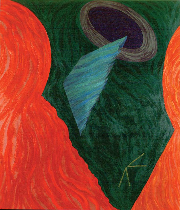
Title Page: Joan Thorne, Chitara , 2024, Oil on canvas, 59 x 49”
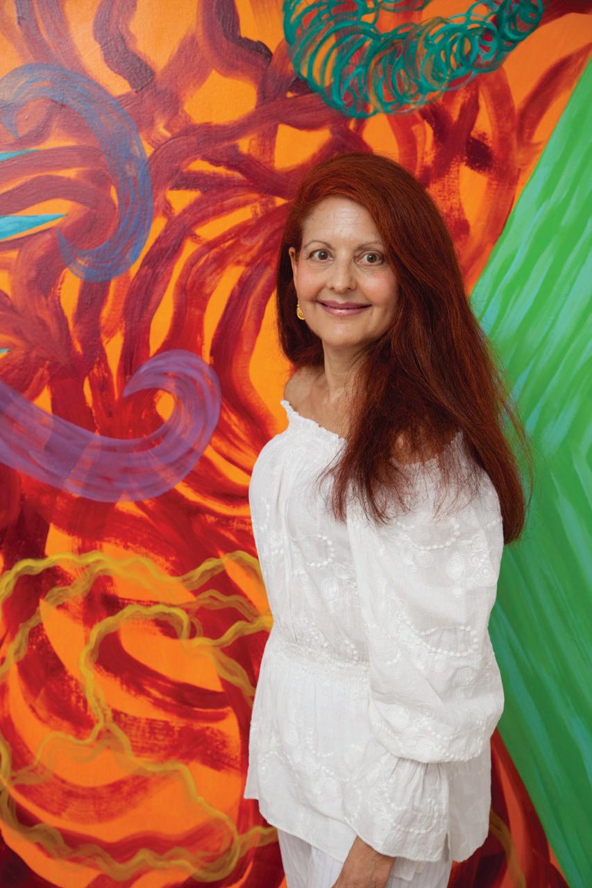
JOAN THORNE
An Odyssey of Color
March 20 - April 18, 2024
Published by:
David Richard Gallery, LLC, 508 West 26th Street, Suite 9E, New York, NY 10001
www.DavidRichardGallery.com
212-882-1705
Gallery Staff:
DavidRichardGalleries1 DavidRichardGallery
David Eichholtz and Richard Barger, Managers
All rights reserved by David Richard Gallery, LLC. No part of this catalogue may be reproduced in whole or part in digital or printed form of any kind whatsoever without the express written permission of David Richard Gallery, LLC.
Catalogue: © 2024 David Richard Gallery, LLC, New York, NY
Artworks: Copyright © Joan Thorne
Catalogue Design: David Eichholtz and Richard Barger, David Richard Gallery, LLC, New York, NY


A
Life of Exuberant Painting:
Mapping Color and Mark Making
David Richard Gallery is pleased to present, An Odyssey of Color, a solo exhibition by New York artist, Joan Thorne, that includes eleven recent paintings from 2022 through 2024. This presentation, her first solo exhibition with the Gallery, focuses on her recent paintings but in the context of the colors, marks, and compositions as they organically evolved throughout her six-decade career. This curation is apropos given the artist’s painting retrospective in 2020 at the Barry Art Museum in Norfolk, Virginia and her inclusion during summer 2023 in, It Happened in SoHo, a three-artist (Joan Thorne, Thornton Willis, and Dean Fleming) presentation of early paintings from the 1970s and 1980s at David Richard Gallery.
About Joan Thorne’s Artworks:
Thorne has not used a grid nor any other all-over organizing structure to define and contain her compositions. Instead, she uses gestures combined with defined shapes or referential forms that emerge out of her long-standing ability to produce rhythmic strokes and marks that seem carefree yet effortlessly contained within imaginary or fixed boundaries. Thorne’s compositions are not templated nor purposely replicated. They are each organically derived from her thinking about the marks and colors combined with conveying space and depth within each composition while also unifying the emerging shapes that must be in dialog with one another.
The title of the exhibition highlights color, which is central to everything in Thorne’s studio practice, but probably no more so than mark making. Looking at Thorne’s compositions throughout her career, at first glance, one generally sees color and geometric shapes. Other than a few paintings in the early 1970s, rarely, if ever, are the geometric shapes filled in with flat, solid colors. Instead, Thorne’s geometric forms are either bounded by a solid or zig-zag line and interiors filled with marks, ranging from circular brush swirls, juicy lush swaths of vivid hues, or writhing, wiggling, and waving parallel marks of colorful pigment. Often and especially earlier in her career, the boundaries of the geometric shapes were loose and not always outlined with a single edge or border, instead they were bounded by the truncation of the individual linear marks at roughly the same length and location such that it looked like fringe. Thus, her mark making has spanned from lines, translucent swaths, and gestural textured strokes to jagged, solid, and soft imaginary borders.
Thorne’s color palettes have ranged from dilute washes of translucent pigment early in the 1970s to fully saturated hues through most of her career that range from primary to secondary, tertiary, and dichroic color combinations. A student of color and understanding theory, she is mostly intuitive as to how the colors and compositions work together—the temperature and push/pull effects create vibrant, kinetic visual activity as well as dimensional space in combination with the geometric planar shapes. The tipping point and profound change in how Thorne experiences and uses color occurred after a trip she made to Mexico in the early 1970s. She said the trip was “mystical” and “forever changed her life and painting”. One can argue that color and mark making are in Thorne’s DNA, they are at the core of every series, the constant and hallmark in every decade, intertwined and being the double helical backbone of her genetic material.
Besides color and mark making, the other elements incorporated in Thorne’s paintings become picturing elements and compositional devices that vary between series and over time. The residue or hint of many of these elements and formal operations from the past still show up in her most recent paintings, which is the curatorial focus of this exhibition. One can readily map in Thorne’s recent artworks her ever evolving compositional trends since the 1970s, including: geometric shapes, as noted above; her compositions in terms of more or less “open space” (more comments on Thorne’s handling this “maximal minimal” concept later); the layering of jagged, open perimeters functioning as framing devices and overlapping patterns to provide spatial depth and define pictorial space; and detailed, complex grounds. As the compositions evolved with every series since the early 1970s, so have her marks and motifs, making each painting and series fresh, dynamic, and forever challenging the viewer’s visual perception.
Looking at the detail of Thorne’s mark making is noteworthy in two ways. First, zeroing in on a small section of her paintings and isolating a particular square or rectangular area reads like an impasto, action painting right out of Abstract Expressionism. As such, Thorne’s gestures and compositions have been noted by Barbara Rose in a studio visit with Thorne in 1979 as she was curating the exhibition, American Paintings: The Eighties. Rose told Thorne that she ”understood Jackson Pollock . . . [and] used what he did to make it [her] own” [1]. Kay Larson, a critic for the Village Voice, also referenced the same Abstract Expressionist icon in 1981 regarding Thorne having “a bright overallness that synthesiz[es] Pollock’s arm with postconceptual brashness and an iconoclast’s attention to her forbears.”[2]
Second, and on the opposite end of the scale (literally) from micro to macro and aesthetically from gesture to optics, Thorne’s frequent use of all-over brush motifs across the canvas as the last addition of marks and color to her paintings (specifically referencing, Oseah, 1981, oil on canvas, 64 x 67 in), also function as activation elements, a method used by Op Artists such as Julian Stanczak. The small, repetitive shape across the canvas activates the viewer’s eye, challenging visual perception. Thus, the viewer is more susceptible to suggestion so that the push and pull of colors combined with color interactions and planes of geometric shapes suggest spatial depth and illusory dimensional volume on a two-dimensional canvas. This is an example of how Thorne knows art history, but more important, how to take that knowledge, expand and deploy it in her own aesthetic way.
Thorne is an expressionistic painter all the way through, exuding passion with each gesture and layering intense emotions with every color choice. She was influenced by late Abstract Expressionism in the late 1960s and 70s during her studies and early career as well as the influences of many other overlapping forms of expressionism from Art Informel, Art Brut, and German Expressionism. It is also interesting to note that shapes in Thorne’s paintings are not grounded, they float and are independent structures. There are no horizon lines or landscape references. Her interest in mysticism is probably more at play than any strong reference to Surrealism or geometry and Modernism. The point in noting the ungrounding of the shapes and forms is that Thorne’s paintings are pure abstractions, emerging out of her interpretation of art historical movements as well as her memories,
dreams, travels, and life experiences including psychological and transcendent experiences inspired by movies, poetry and synesthesia.
Vittorio Colaizzi has written extensively about Thorne’s artwork. In 2016 he noted she had a “career-long engagement with the problems of mark, composition, and pictorial space”. Further, he commented that the artist is comfortable straddling the “divide that pits expression against analysis.”[3] These are keen observations about the history and continued trajectory of Thorne’s work which allowed her to remain focused solely on painting the past six decades and never being at a loss for something new to paint. Her paintings continue to present viewers with such exuberance and a conundrum at the same time. Clearly, Thorne sees no need to decide one over the other and as much as possible serves both up in a single serving. Her paintings are maximal and high impact, highly reflective of Thorne’s personality and presence.
[1] Vittorio Colaizzi, Joan Thorne and the Mirror of Modern Painting, in Barry Art Museum, Light, Layers, Insight, 2019. p12.
[2] Vittorio Colaizzi, Joan Thorne, Analytic Ecstasy, in Woman’s Art Journal, Spring/Summer 2016, p. 40.
[3] Vittorio Colaizzi, Joan Thorne, Analytic Ecstasy, in Woman’s Art Journal, Spring/Summer 2016, p. 38.
By David Eichholtz March 2024, New YorkMapping Joan Thorne’s Iconic Compositional Devices from the Early 1970s to 2024
In the preceding essay, references are made to a number of what the author refers to as compositional devices utilized by Thorne to both (i) organize her compositions and (ii) leverage layers of colors and marks to create dimensional depth and illusory space. Such devices include: Geometric Shapes, Soft Borders, Framing Structures and Elaborate Grounds, Negative Space, and Negative Space Becoming a Shape and Focal Point of the composition. A visual mapping exercise is presented on the following pages. An historical painting is presented on the left as a representative example of the origin of a particular compositional device and on the right, examples of later and recent paintings are presented that demonstrate the continued use of such devices.
Geometric Shapes

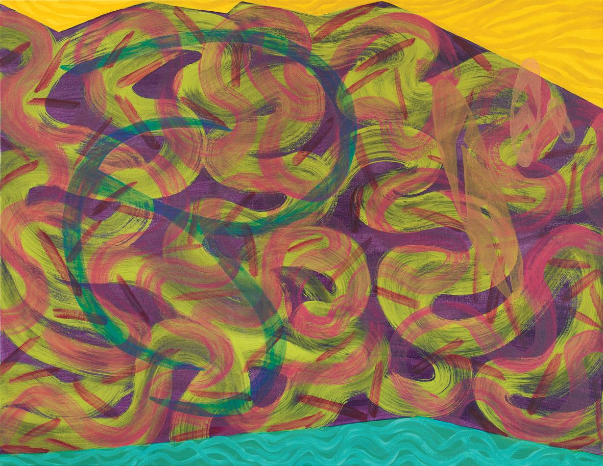
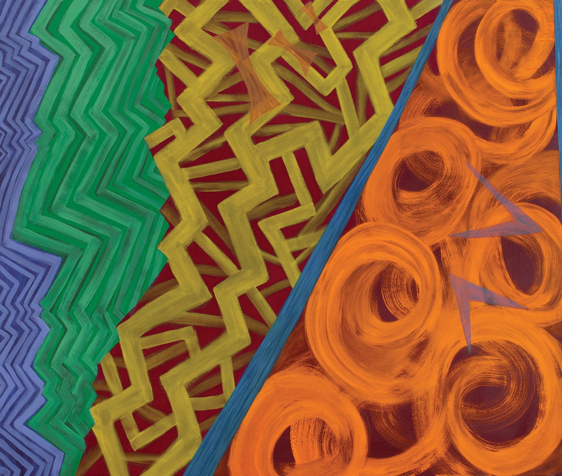
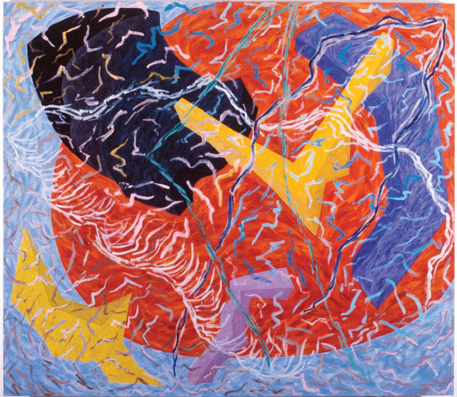
Geometric shapes, both rectilinear and curvaceous forms, are a prevalent feature in most, if not all, of Thorne’s series and paintings. In fact, at first glance, the large geometric shapes are the first thing one notices. The painting above, Amphora, 1973, is a good, representative early example where the geometric shapes were colored with a single hue, entirely visible and wholly contained within the perimeter of the painting. After that, the elaborately filled interiors of the geometric shapes and dense, lush, colorful grounds became more apparent and challenged viewers to focus on and unpack the immense detail in Thorne’s paintings.
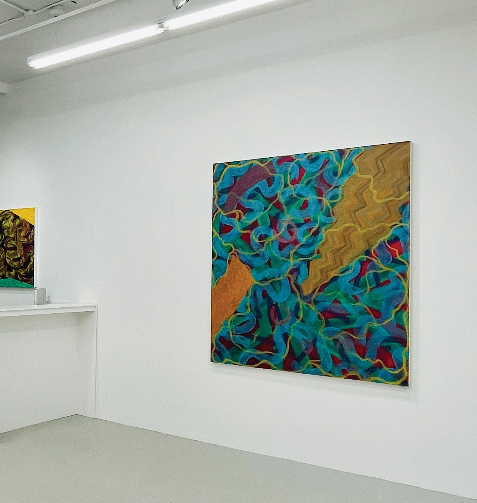
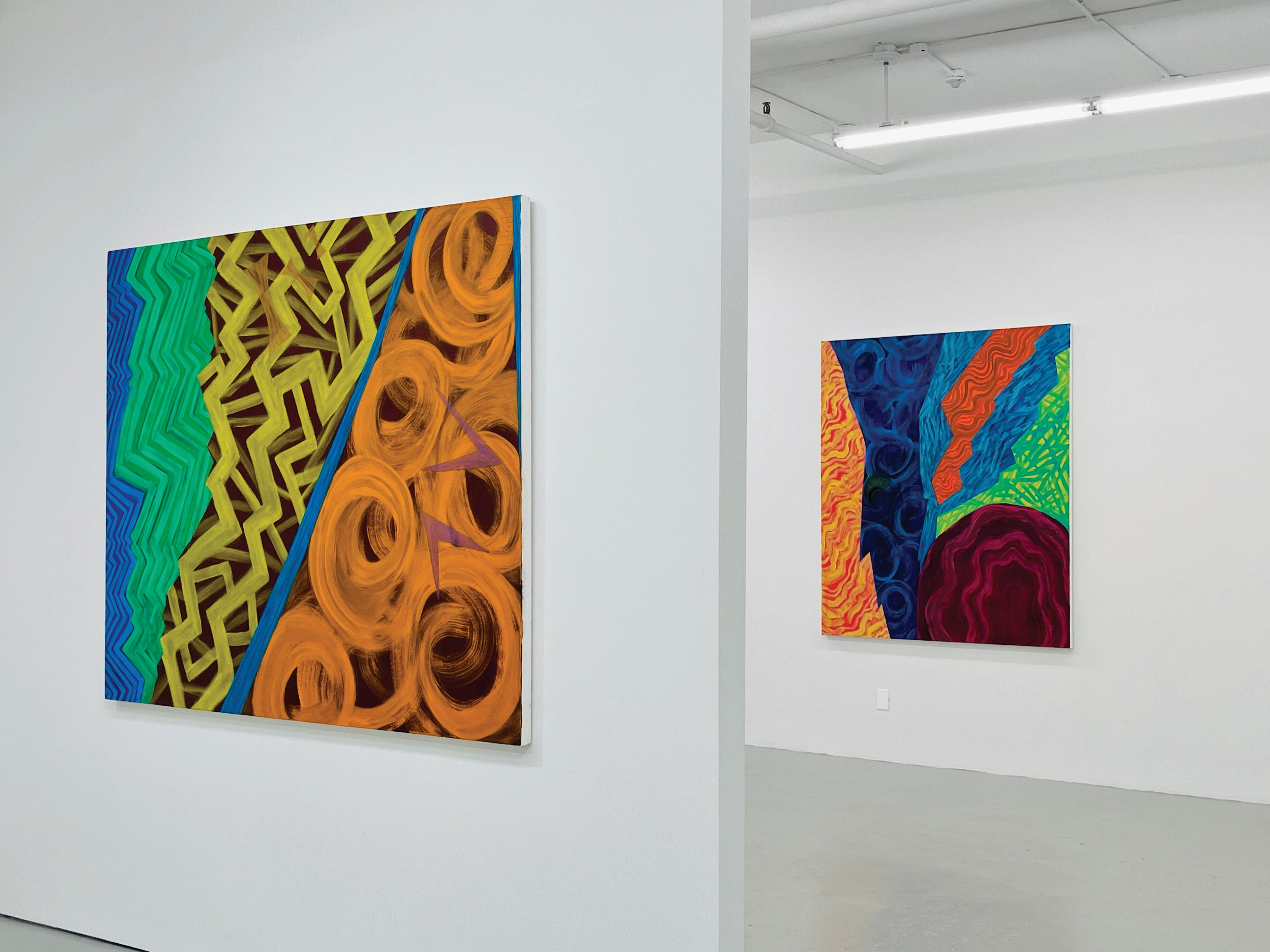
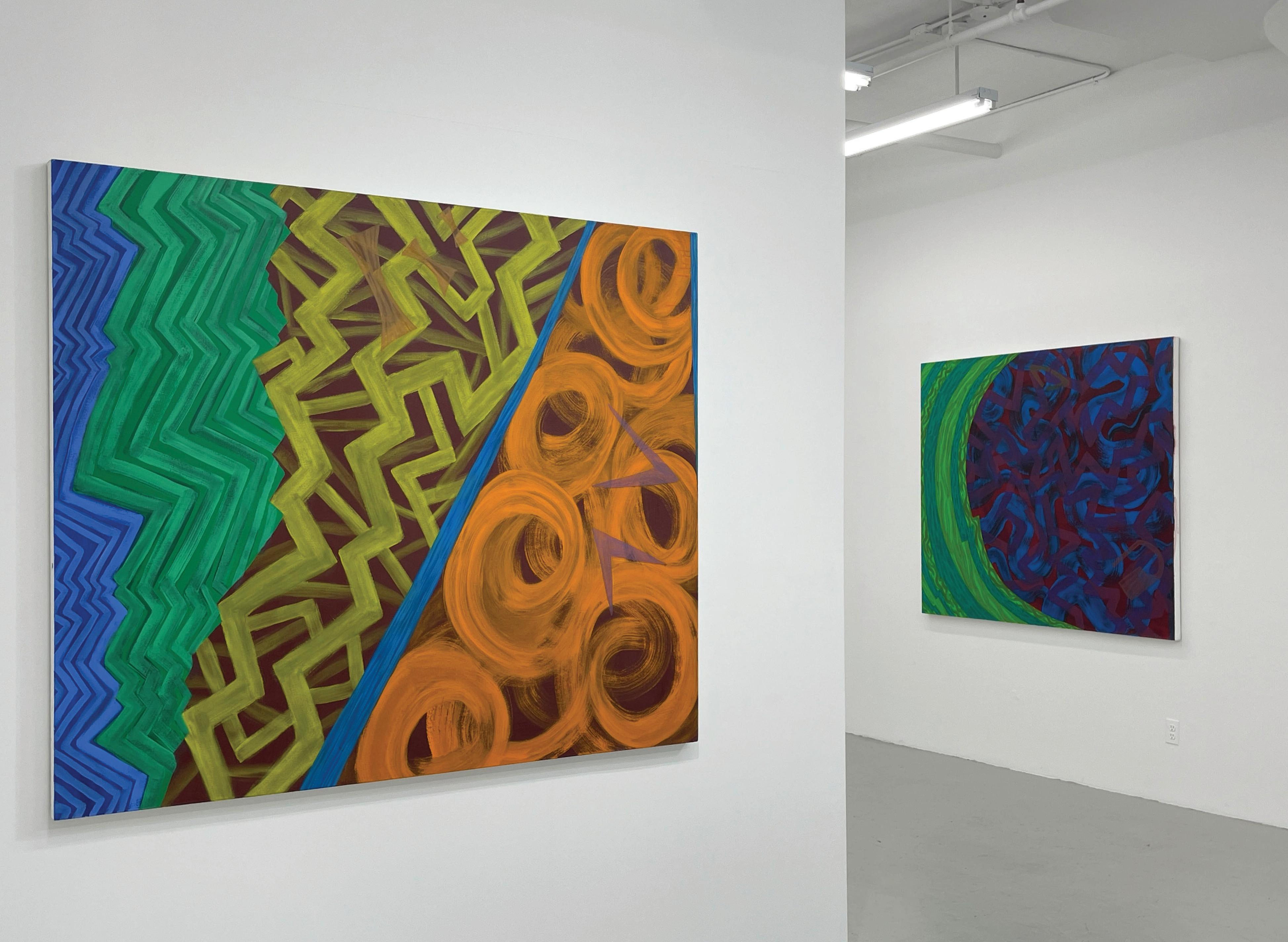
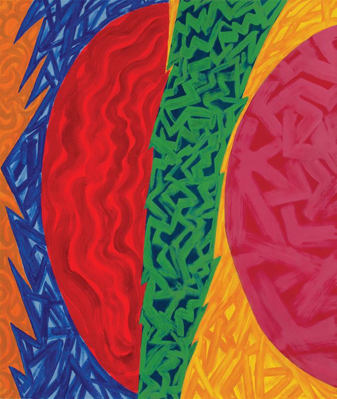
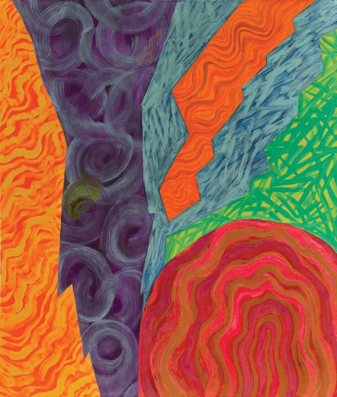
In recent paintings, as seen on the opposite page, large geometric shapes persist, but often, not fully visible. Now, the shapes extend beyond the canvas edge so we only see a detail of the form. Isolated shapes do exist in some paintings, but mostly as open framed structures created by a solid border, see Naga, 2022 on page 23 as an example.
Joan Thorne, Amphra , 1973, Oil on canvas, 102 x 71“

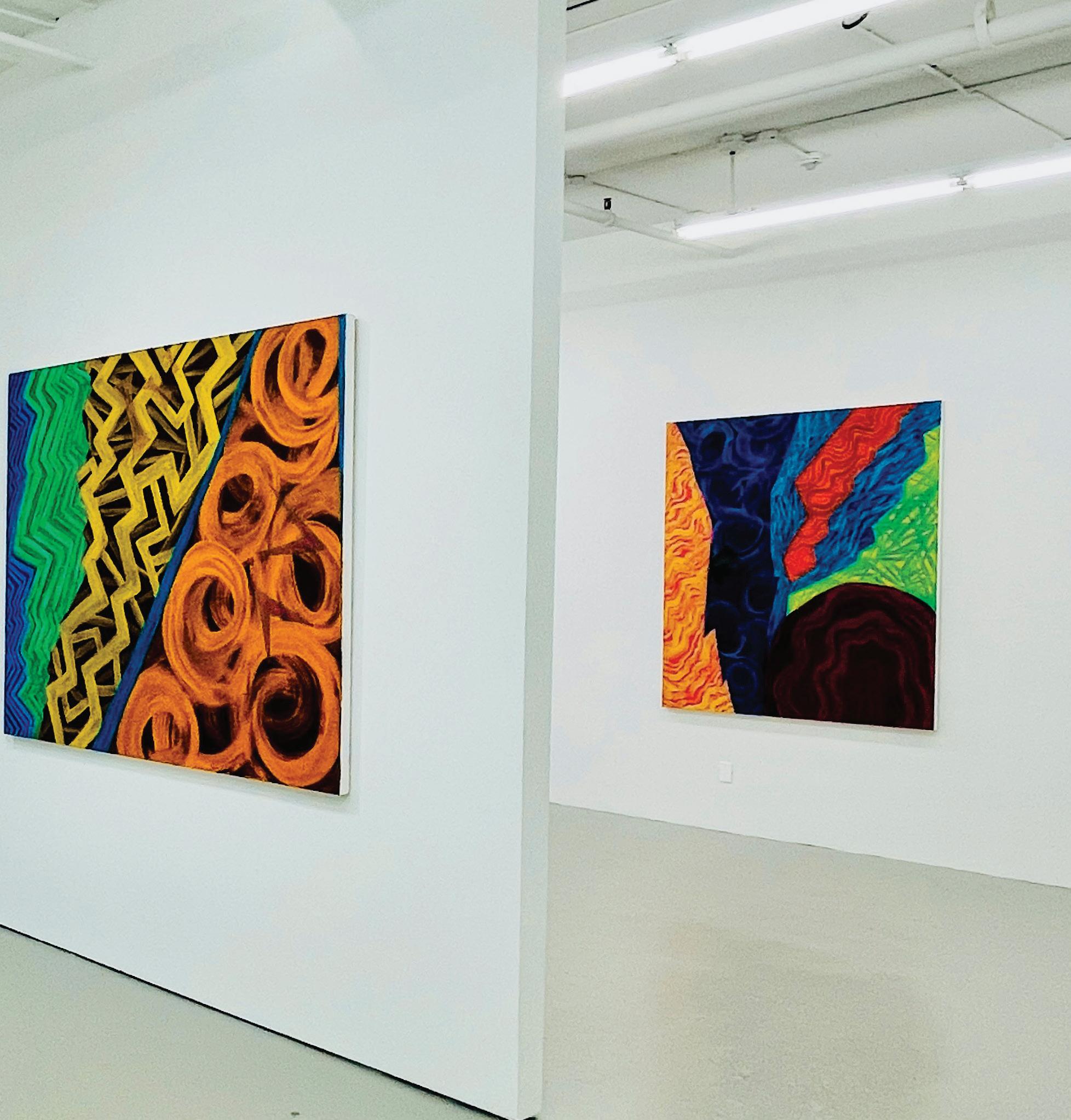
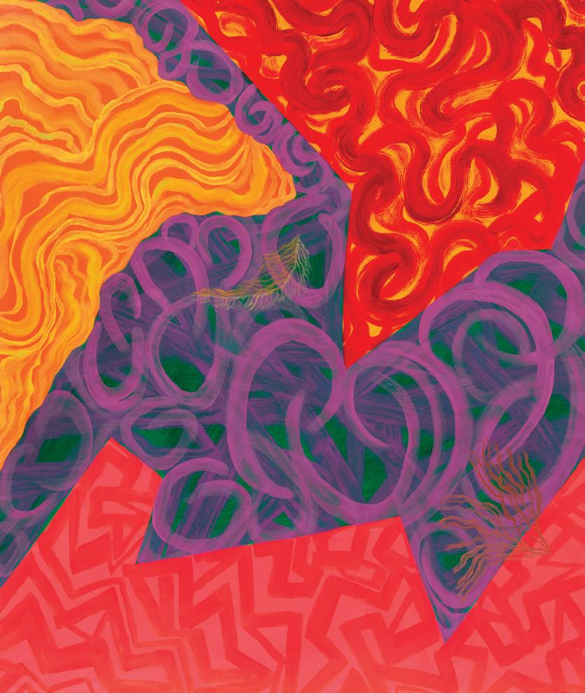
 Joan Thorne, Akivi , 2023, Oil on canvas, 66 x 56”
Joan Thorne, Iconic , 2023, Oil on canvas, 56 x 66”
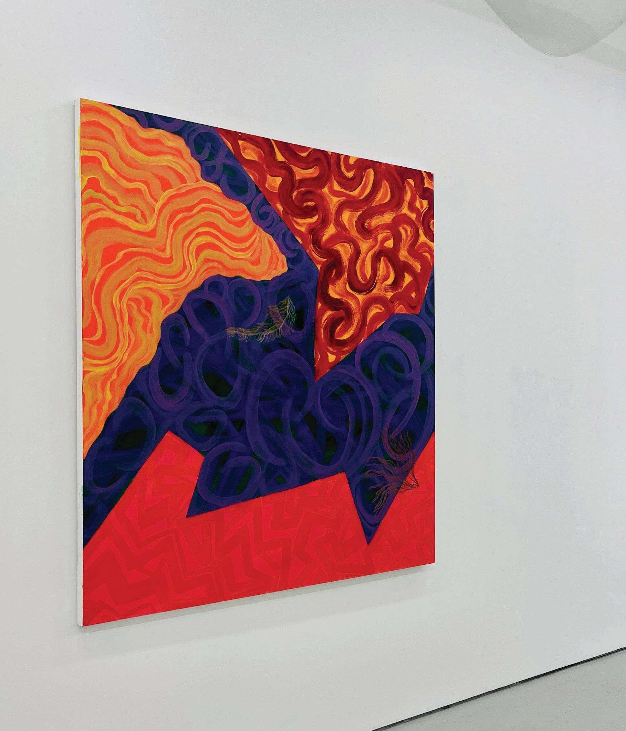
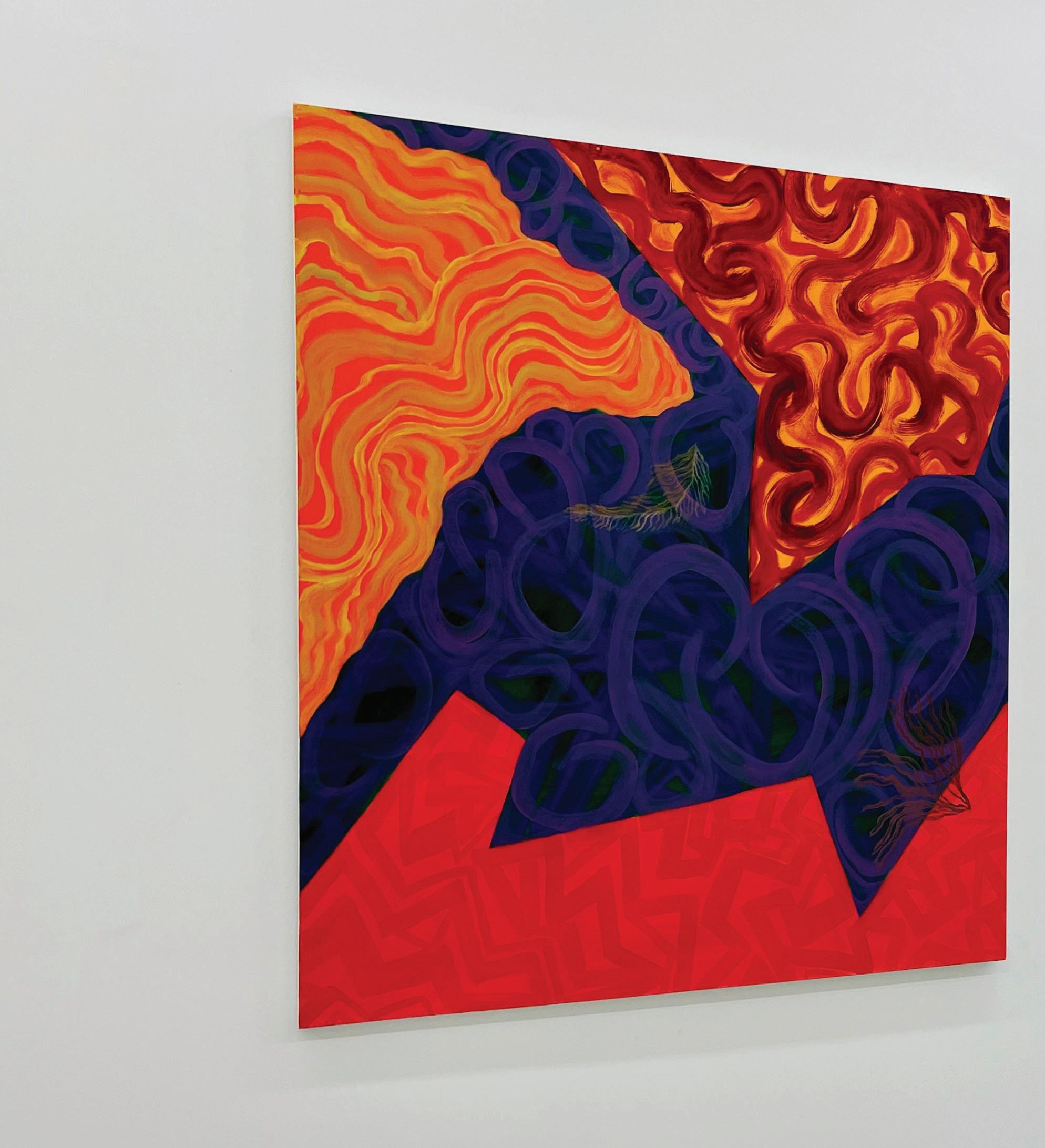
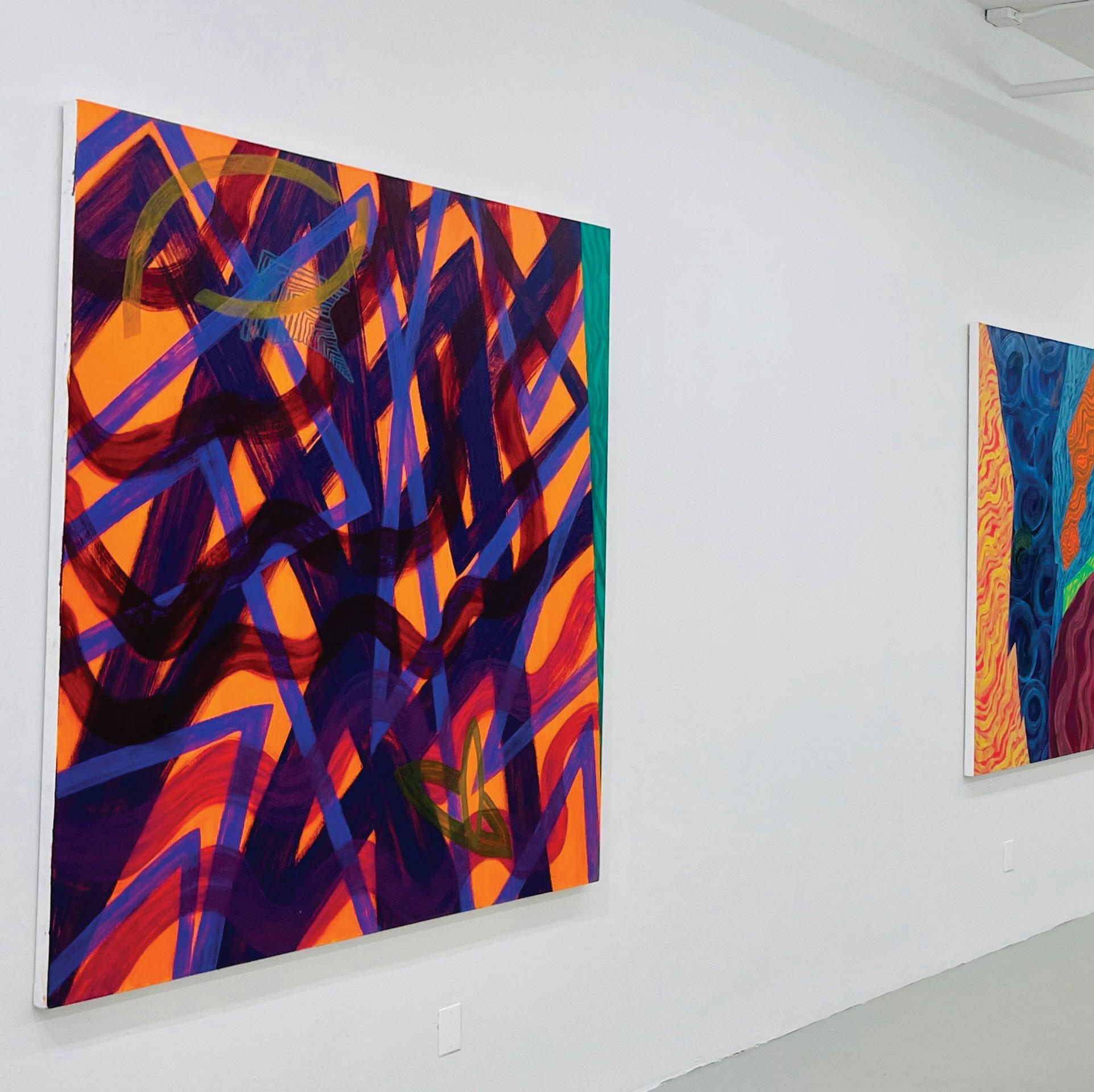
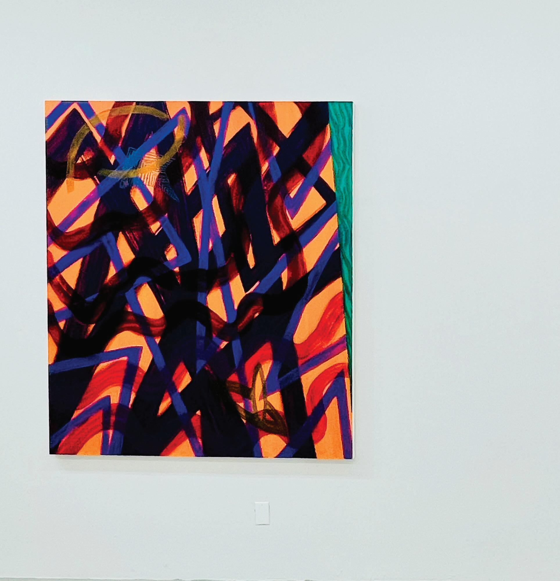
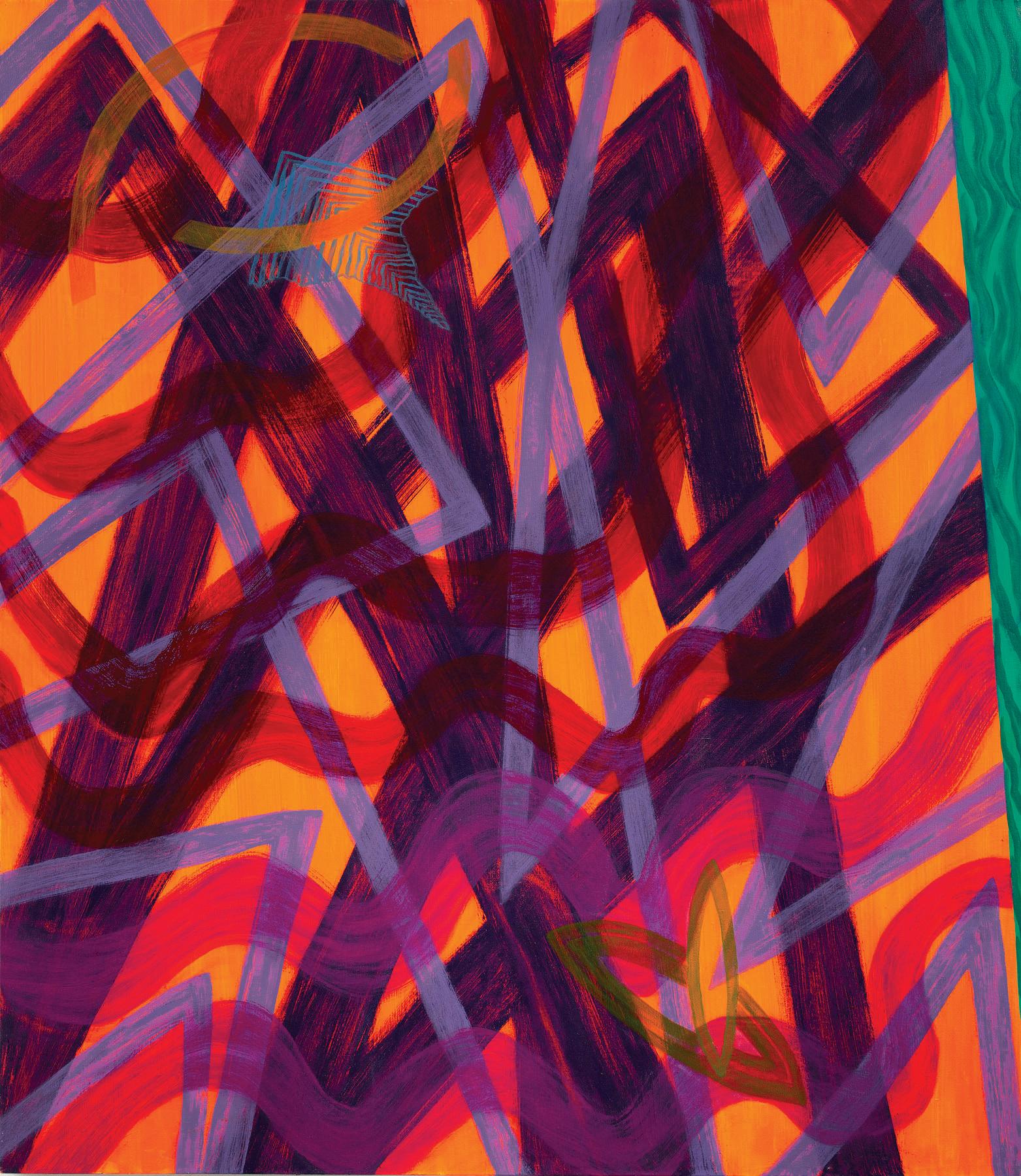
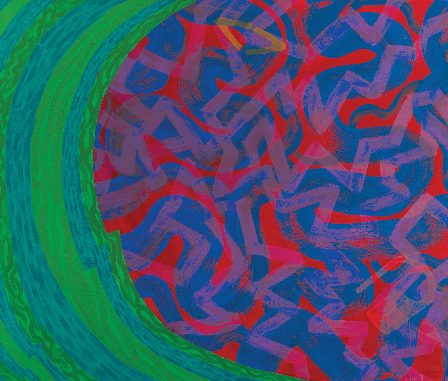
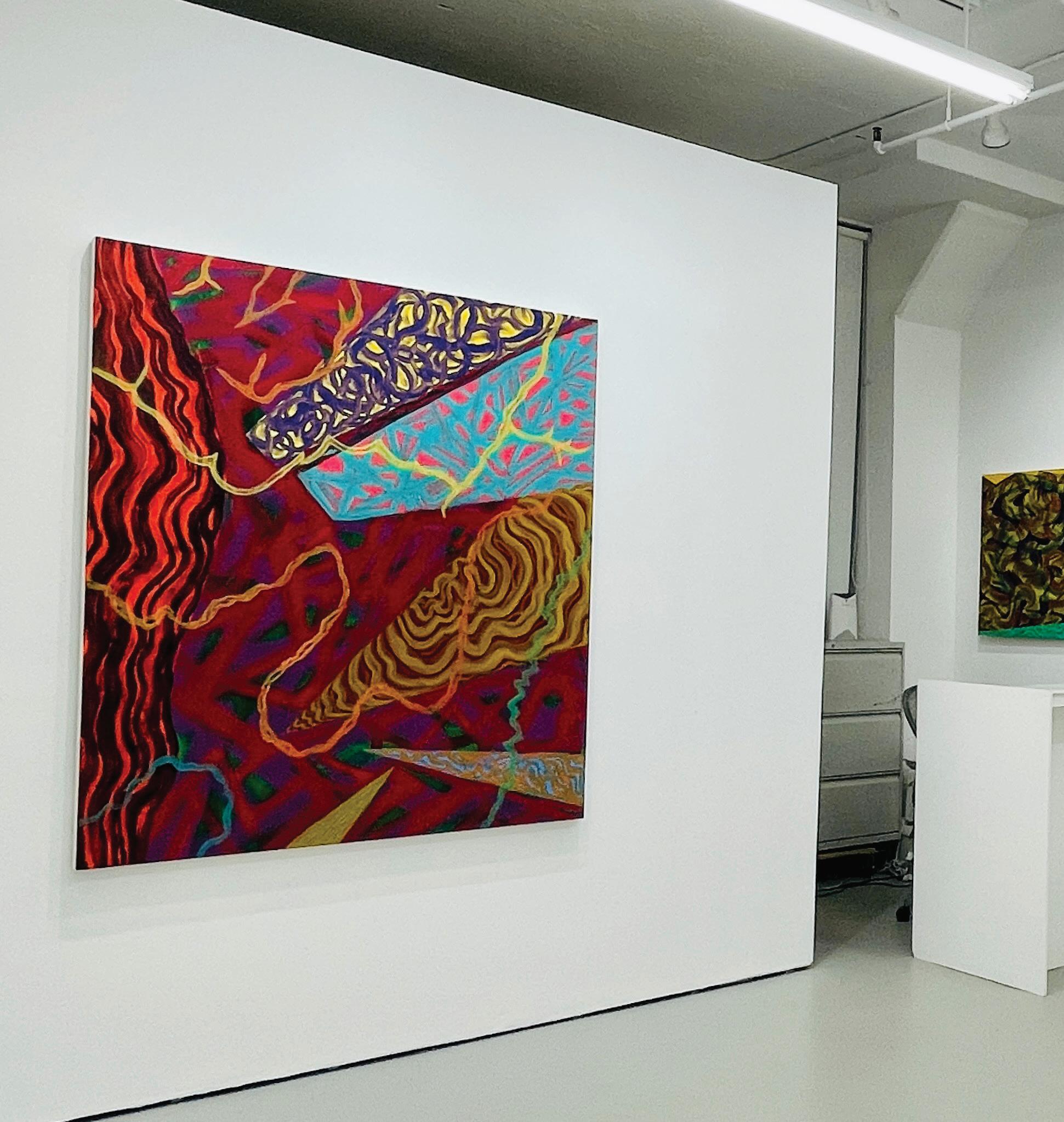
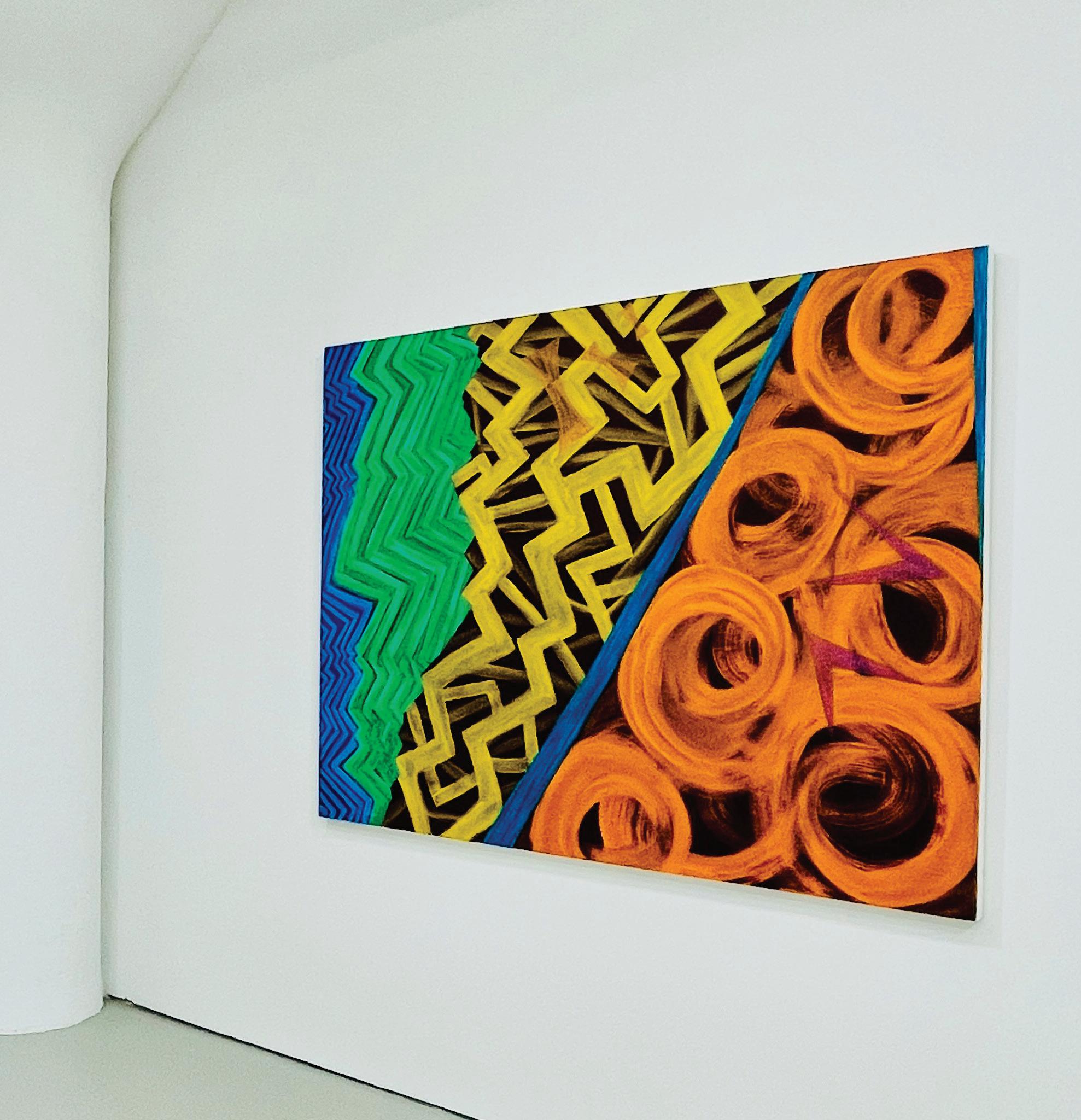
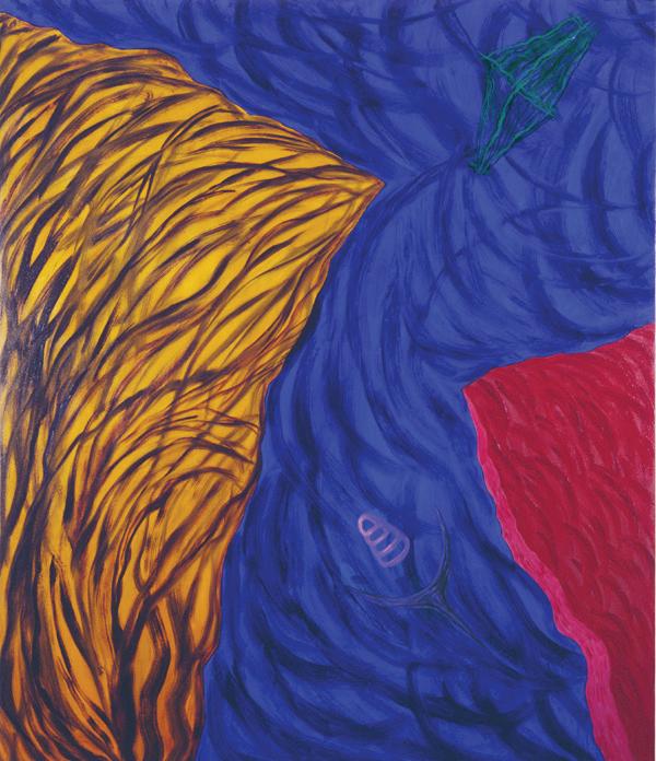
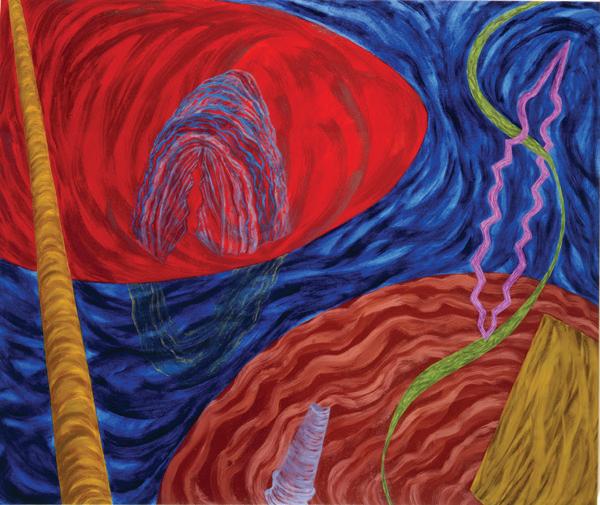
Joan Thorne, Odyssey, 2024, Oil on canvas, 66 x 56”
Joan Thorne, Valparaiso , 2022, Oil on canvas, 56 x 66”
Joan Thorne, Akivi , 2023, Oil on canvas, 66 x 56”
Joan Thorne, Iconic , 2023, Oil on canvas, 56 x 66”
Joan Thorne, Odyssey, 2024, Oil on canvas, 66 x 56”
Joan Thorne, Valparaiso , 2022, Oil on canvas, 56 x 66”
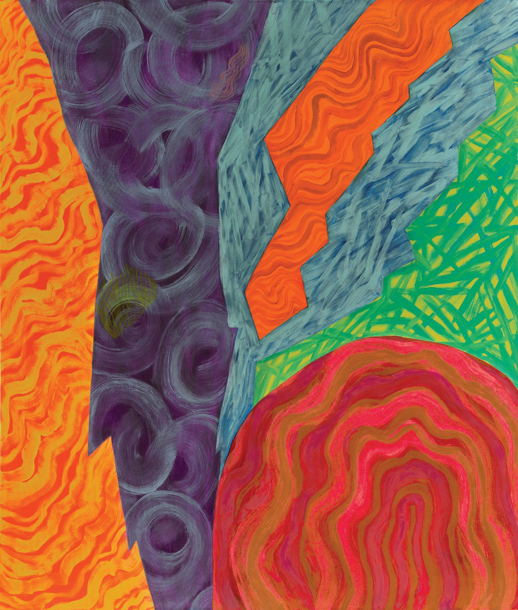
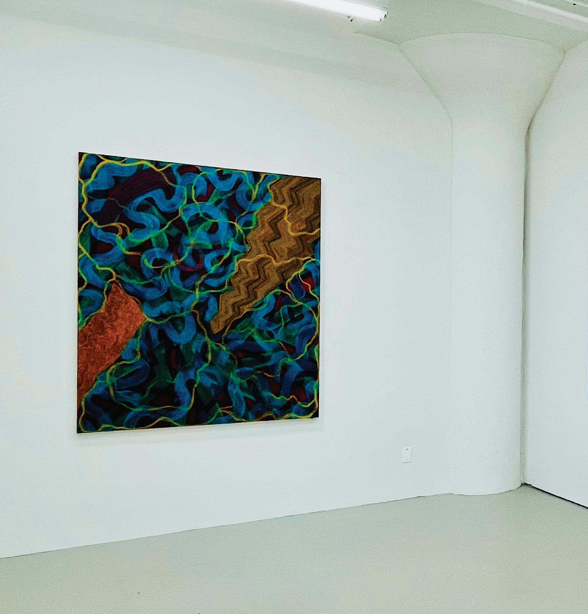
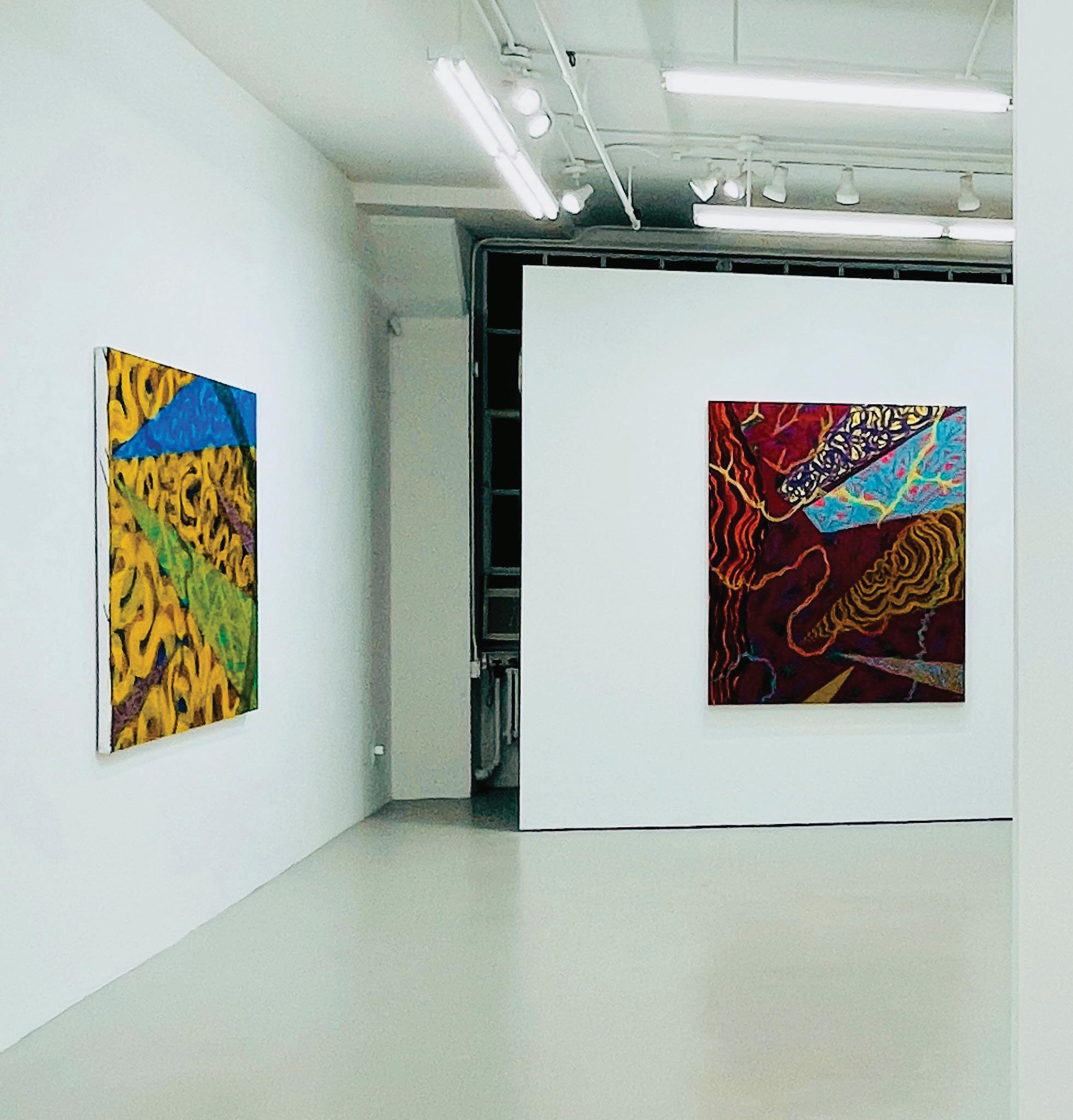
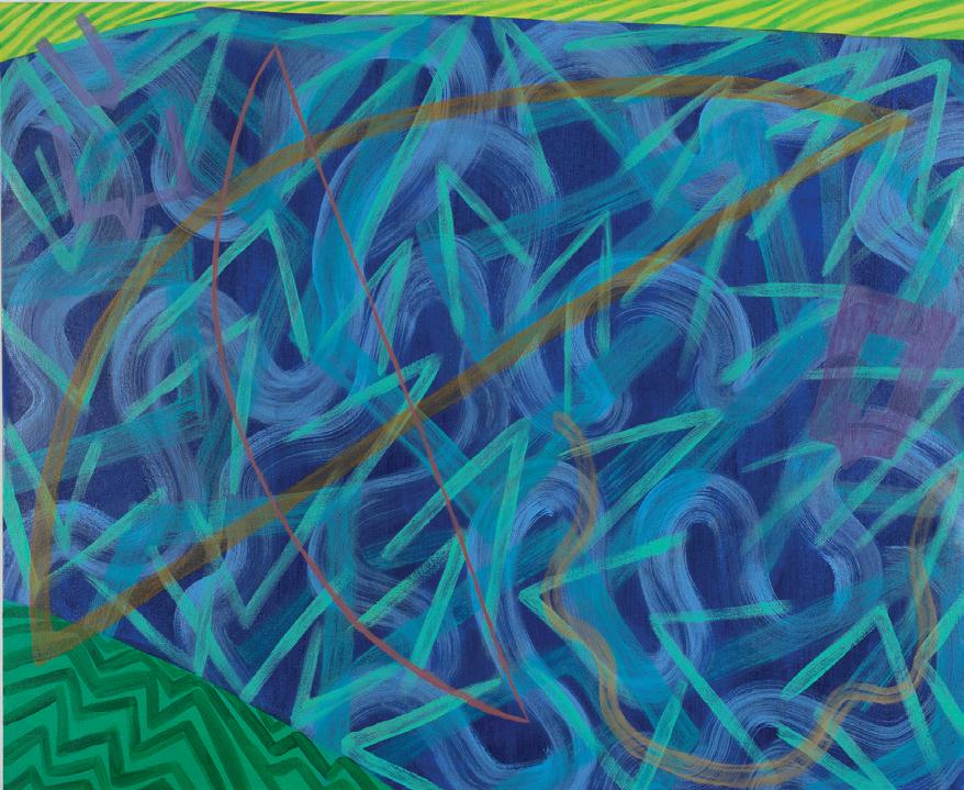
 Joan Thorne, Merengue del Tigre , 1998, Oil on canvas, 66 x 56”
Joan Thorne, Miracle , 2024, Oil on canvas, 59 x 49”
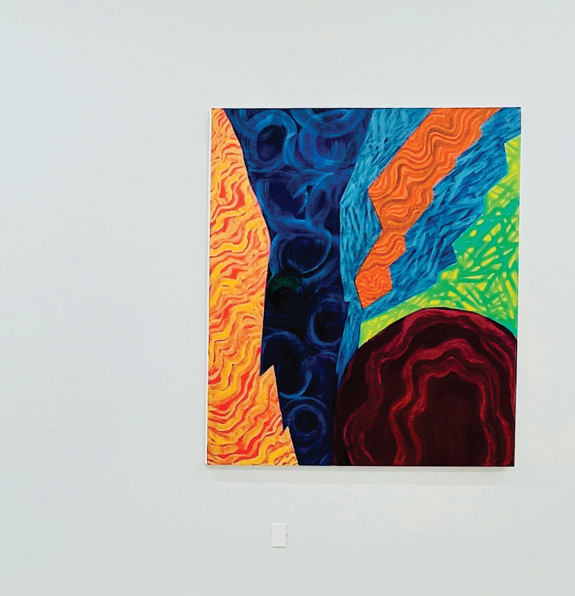
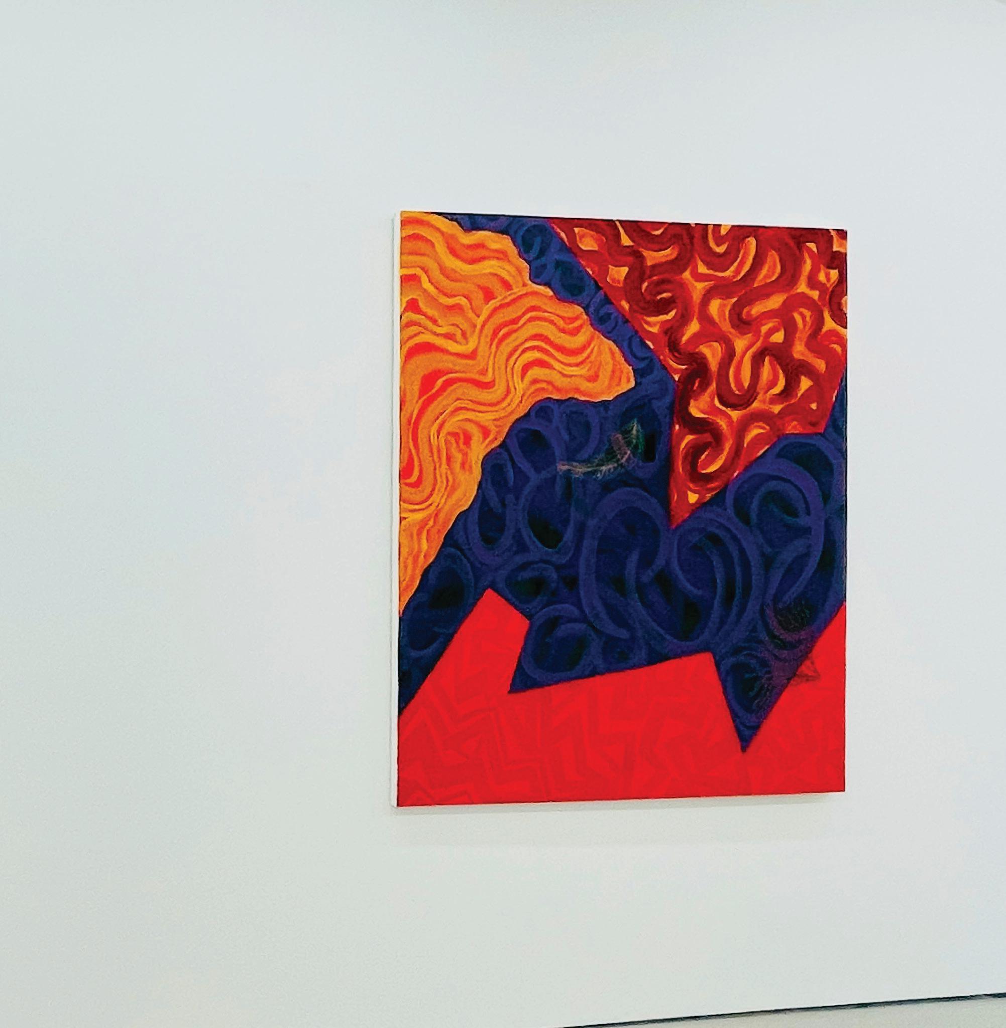
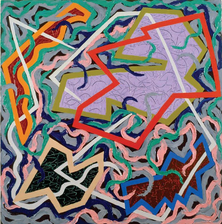
Joan Thorne, Traverse , 2023, Oil on canvas, 65 x 56”
Joan Thorne, Merengue del Tigre , 1998, Oil on canvas, 66 x 56”
Joan Thorne, Miracle , 2024, Oil on canvas, 59 x 49”
Joan Thorne, Traverse , 2023, Oil on canvas, 65 x 56”


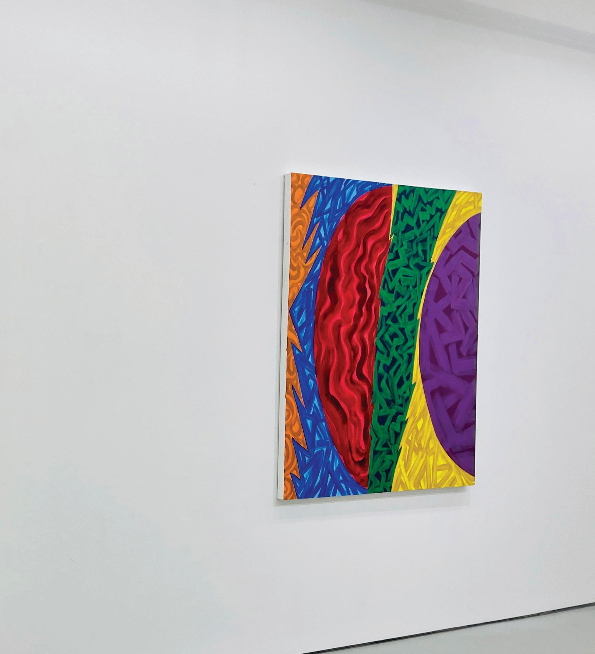
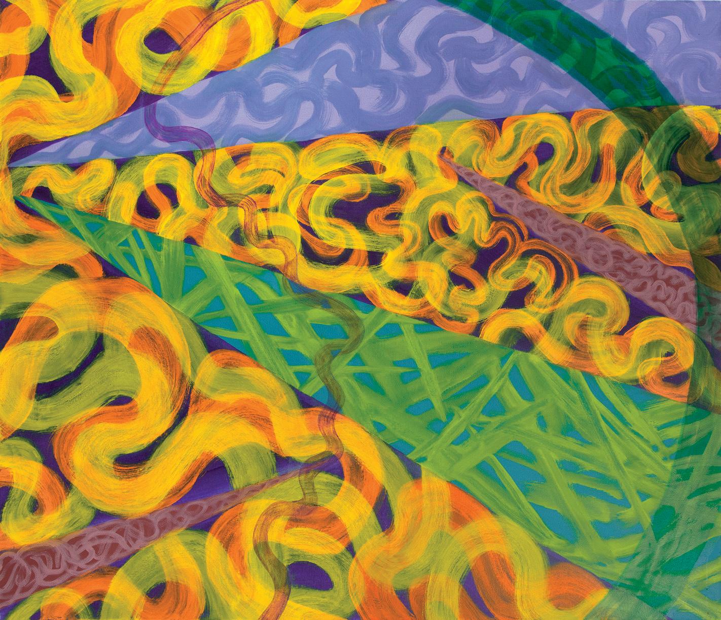
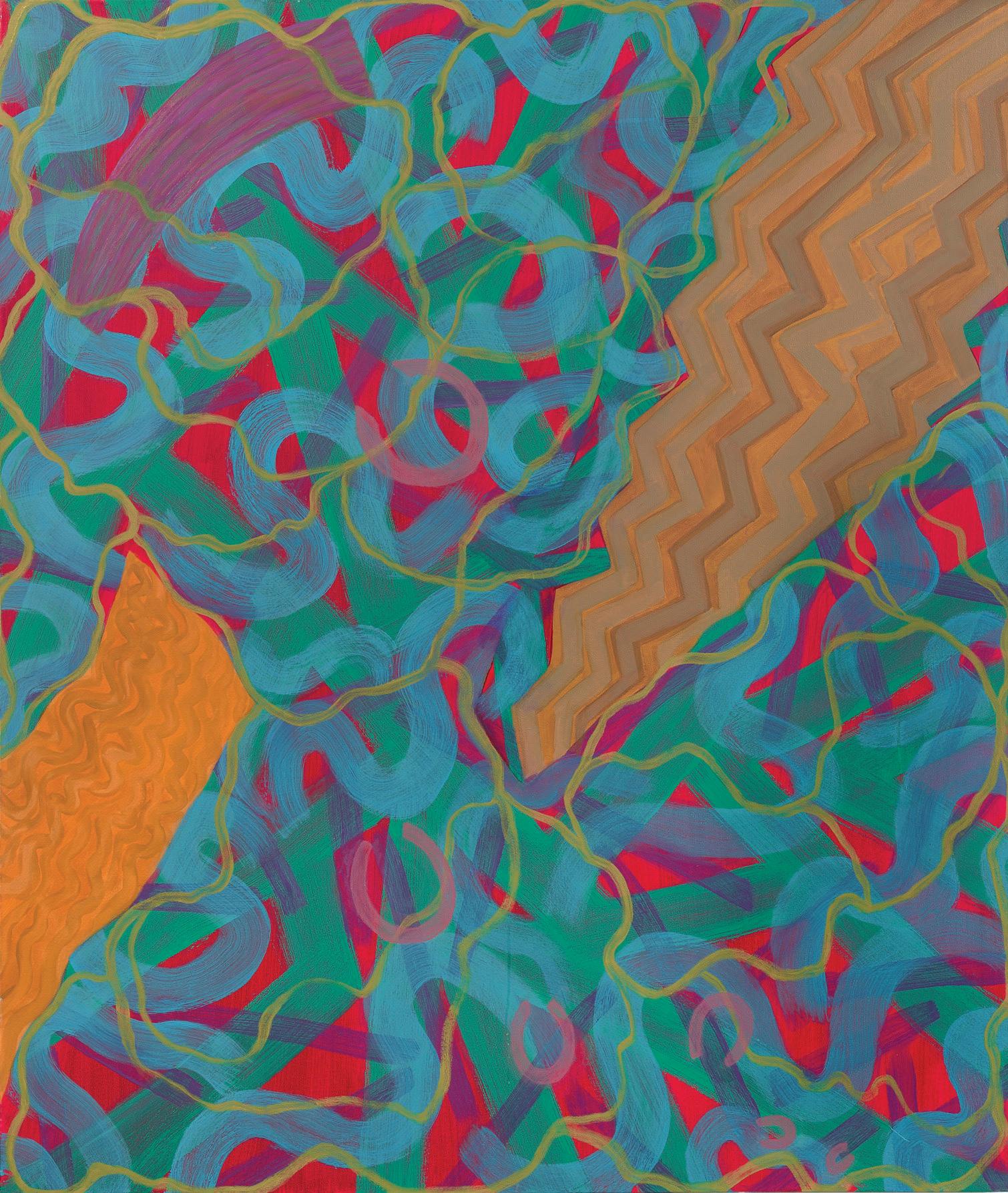
 Joan Thorne, Chitara , 2024, Oil on canvas, 59 x 49”
Joan Thorne, Traverse, 2023, Oil on canvas, 65 x 56”
Joan Thorne, Orango , 2023, Oil on canvas, 56 x 66”
Joan Thorne, Chitara , 2024, Oil on canvas, 59 x 49”
Joan Thorne, Traverse, 2023, Oil on canvas, 65 x 56”
Joan Thorne, Orango , 2023, Oil on canvas, 56 x 66”
 Joan Thorne, Miracle , 2024, Oil on canvas, 59 x 49”