
Fair
spring
NEC 2023

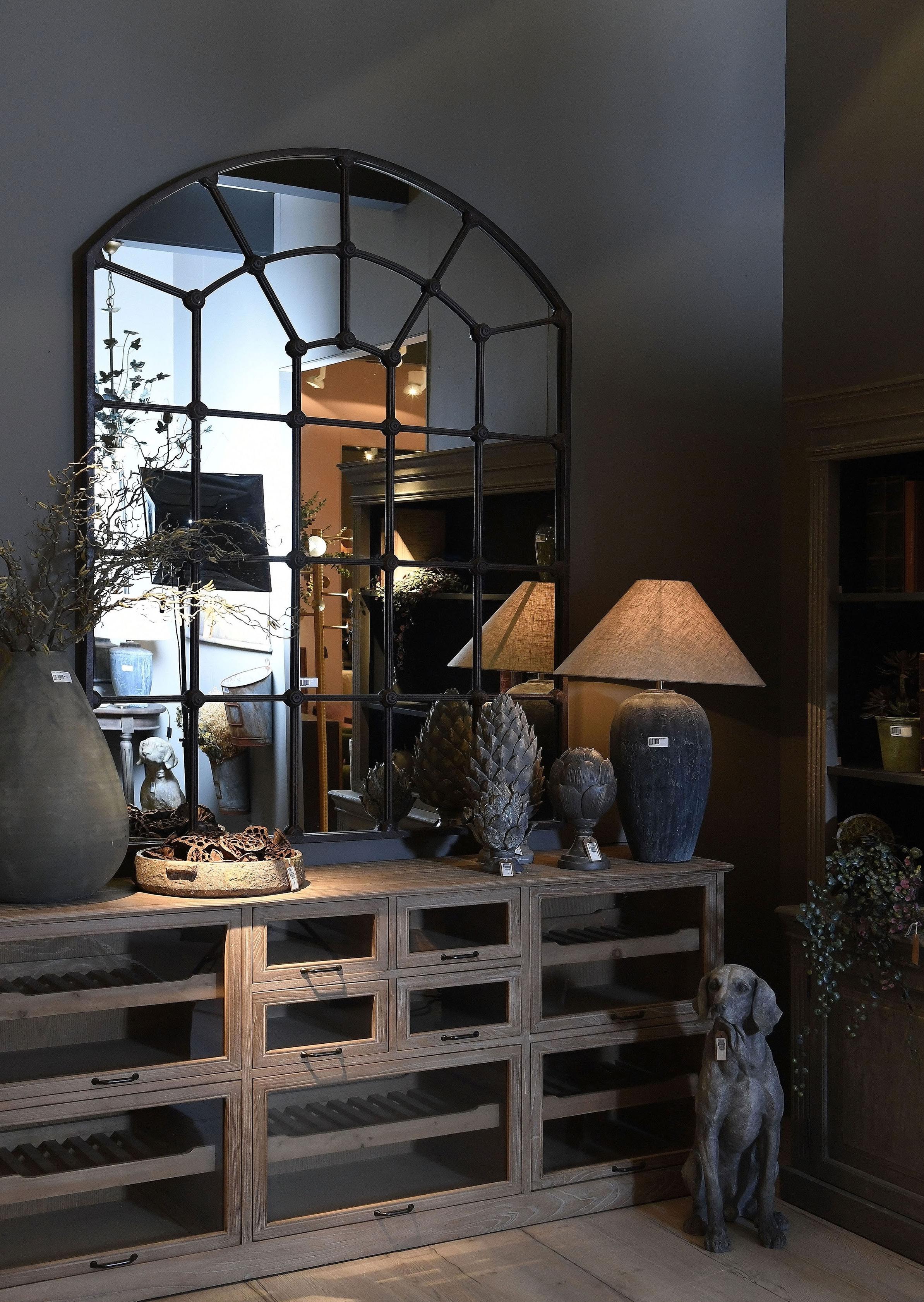
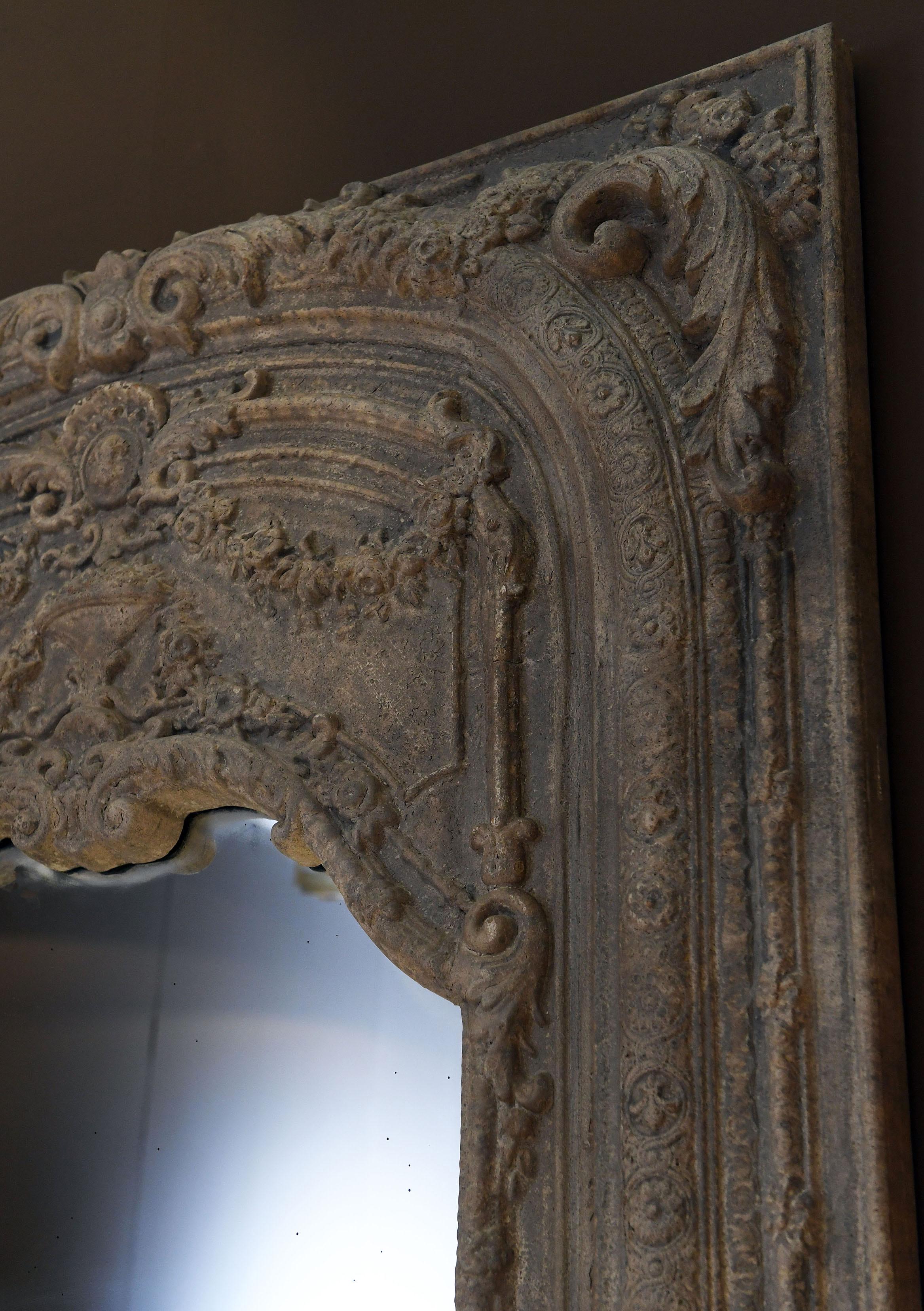
After the success of the Stonehead look at the Autumn Fair, we have evolved this look with the introduction of exquisite metalwork furniture.
Verdigris and bronze lift this look into the realms of the classical and timeless. Not to be missed are the clever retail cabinetry pieces, as well as the brand new double vanity unit and the Cotton Wheel dining table with the wonderful pedestal detail.
Once again, unique pieces are added alongside interesting patchwork upholstery.


As the trend for marble, terrazzo and soft edges continues we have infused pastel hues with a fierce edge to create “Wild.”
Curves and subtle tones of sage green as well as shades of pink, make for a serene yet intriguing aesthetic and the new marble furniture in this look helps lift the look to luxurious heights.
The cabinetry and lighting are inspired by mid-century design and help add an element reminiscent of 1970s Palm Springs.


Terracotta tones and an earthy pantone create a look embedded with deep soul.
The seating is gloriously tactile and warm adding depth to the aesthetic.
Candlelight and mixed metals help create heat and the new marble furniture together with hessian and beaded lighting pieces add layers of interest.
Paint used - Dulux - Georgian 12


Supersized accessories and a soft and deliberately serene grouping of furniture and lighting have helped to create another commercially focused look.
Not to be missed are the new washed wood cabinetry pieces as well as the gateleg inspired dining table.
The signature grouped lighting also helps this look to reach new heights whilst remaining an extremely compatible look.
Paint used - Farrow and Ball - Broccoli Brown 108


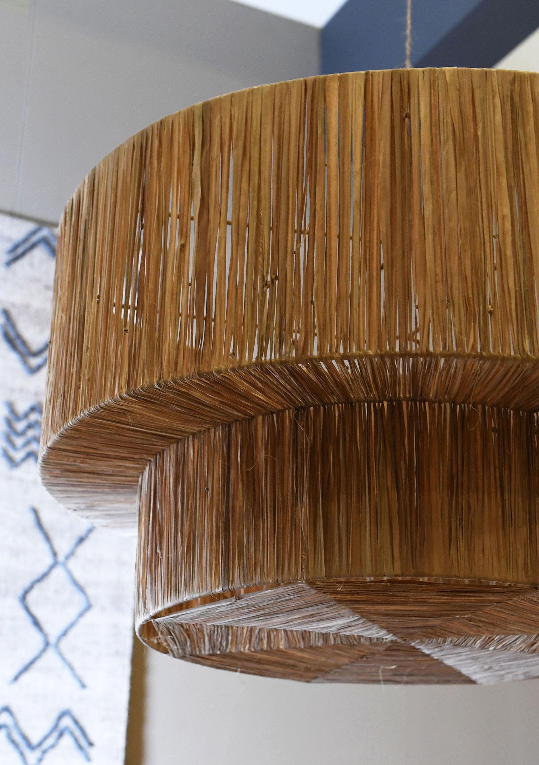
This barefoot beauty is exactly what the name evokes. Laidback chic with elements of intricate design woven through the calm and relaxed aesthetic.
Shots of Indigo tie dye helps energise the neutral palette. We have paired washed woods with layers of texture, oversized accessories, thoughtful pieces of furniture and eclectic pieces including the hand-carved day bed; one of many unique pieces available from our Rarities collection. Finally, doesn’t everyone need a furry chair! Paint


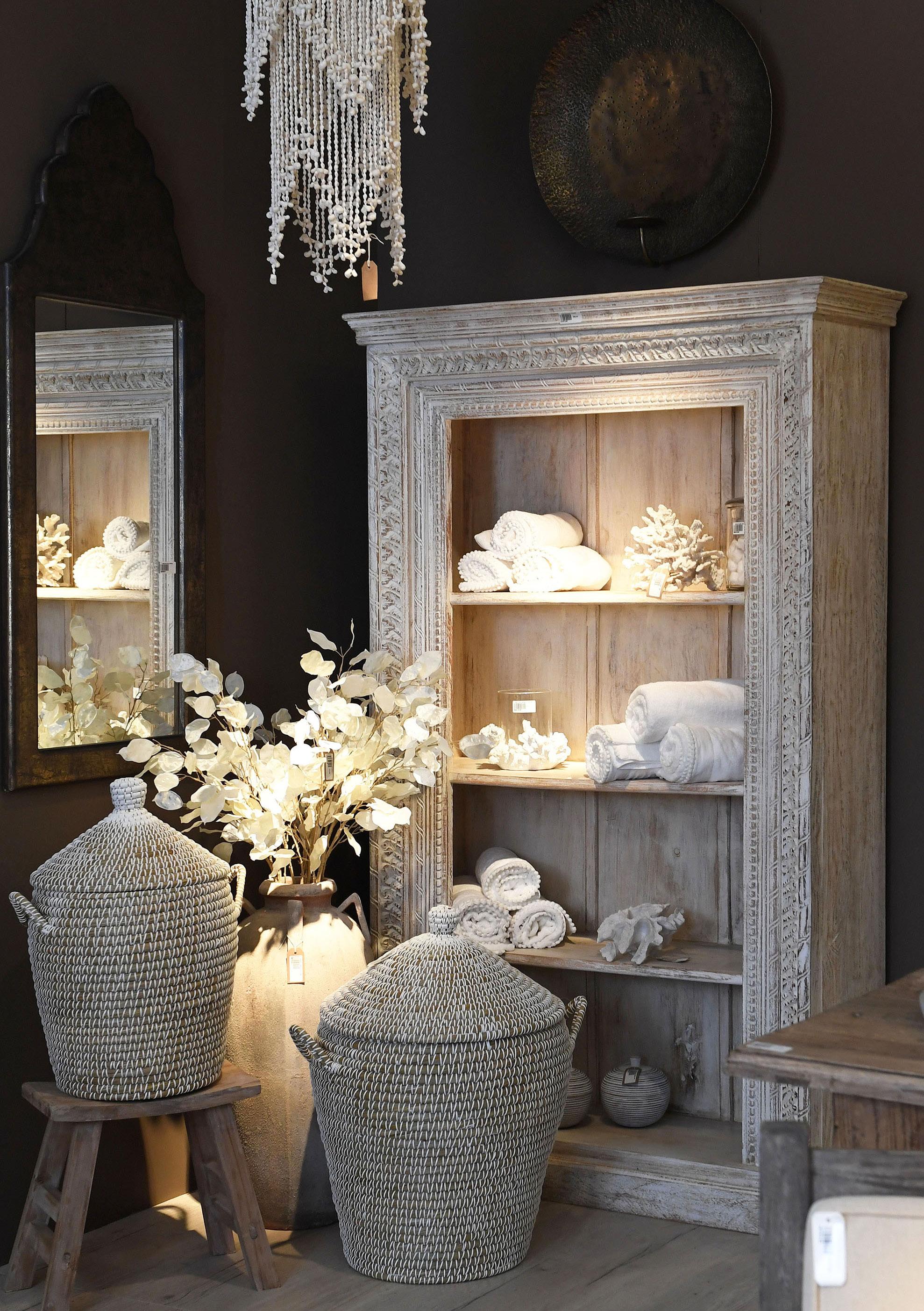
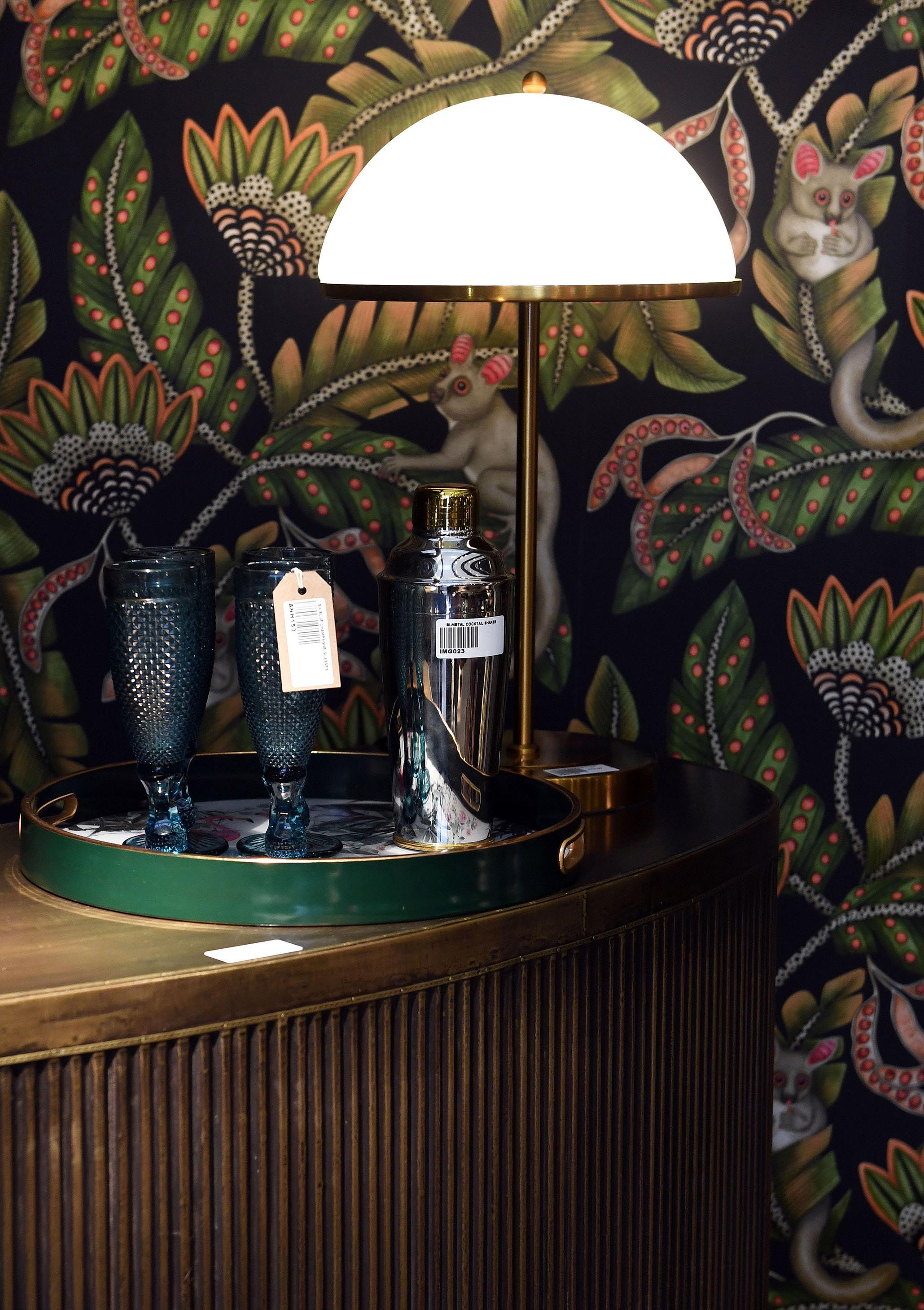
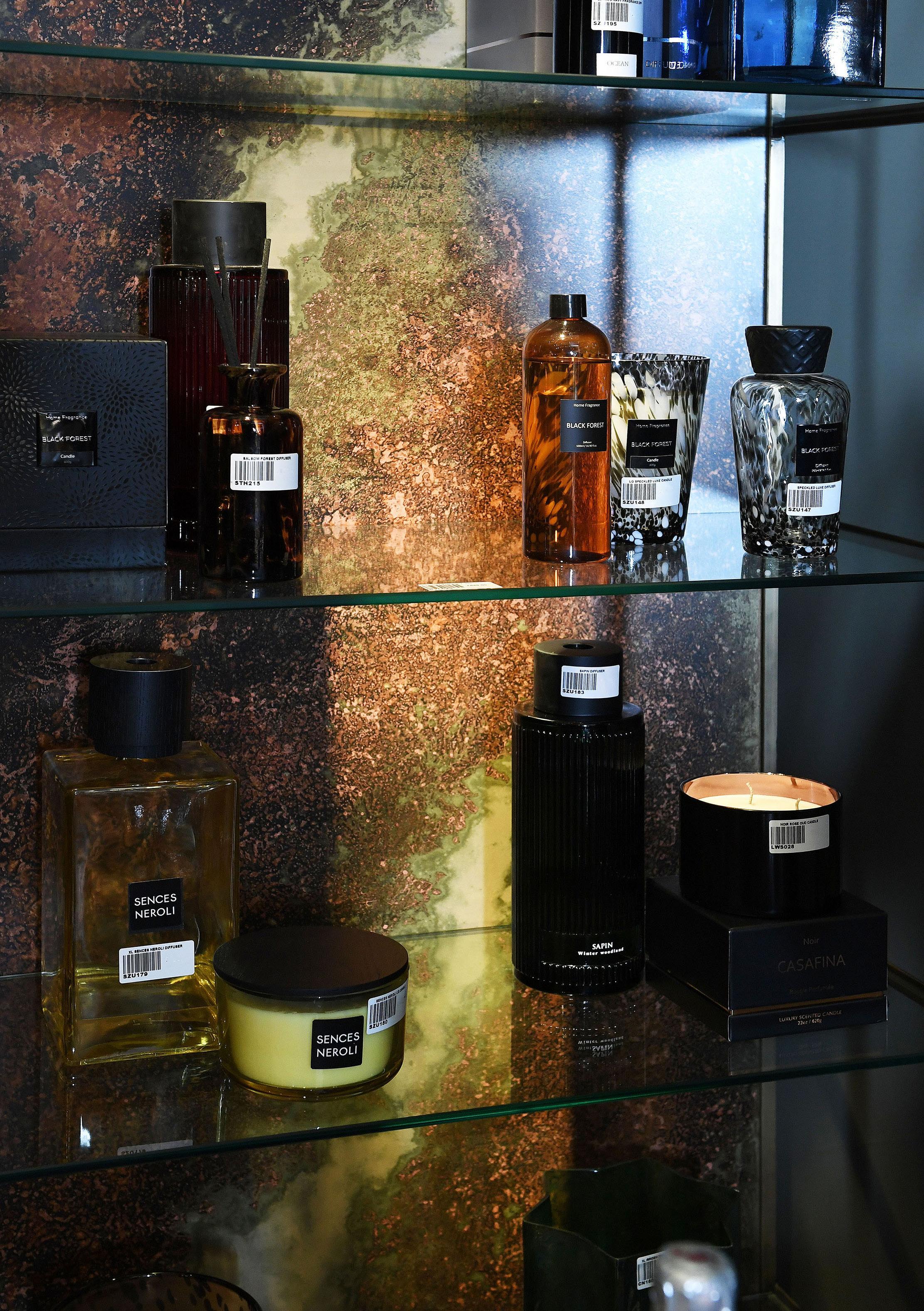
Let us whisk you away to candle-lit sanctuary. Amongst generously proportioned furniture we have added restful elements as well as stylish indoor/outdoor product. Here the observer is invited to reconnect with nature and the self, encouraged to take a breath and consider the sanctuary created.
Of particular interest is the intricately carved Jawai furniture collection. Developed in India to satisfy the gap in the market for repeatable but unique design that is reminiscent of the extremely popular Indian antique collection CH offers. Finally, the oversized reclaimed Elm dining table demands a mention for its proportion and quality - we challenge you to find a better example of a farmhouse table!
Paint used - Fired Earth - Antique Earth 24


Chintz is back! In this art nouveau resurgence we go big on pattern, big on clash!
With Morris being a big influence in textile and pattern at the moment we introduced new pieces of the very adaptable and versatile Kingham collection with Chinoiserie inspired cabinetry and Ikat textiles.
This look is eclectic but remains rooted in tradition.
Paint used - Little Greene - Chocolate Colour 124
Wallpaper used - Morris and Co - Fruits


As a total juxtaposition to the Japandi trend that is ongoing in interiors, this look is a riot of colour and escapism.
We have developed bold, upbeat hues in the fringed upholstery, and the curved bar is as joyous as it is functional. This look reminds us of the evocative and symbolic power of colour. With the pop-esque influence of the 1930s, this is a conscious push forward helping to create exuberance in interiors.
Definitely a room for the maximalist.
Paint used - Little Greene - Invisible Green 56 Wallpaper used - Cole and Son - Bush Baby


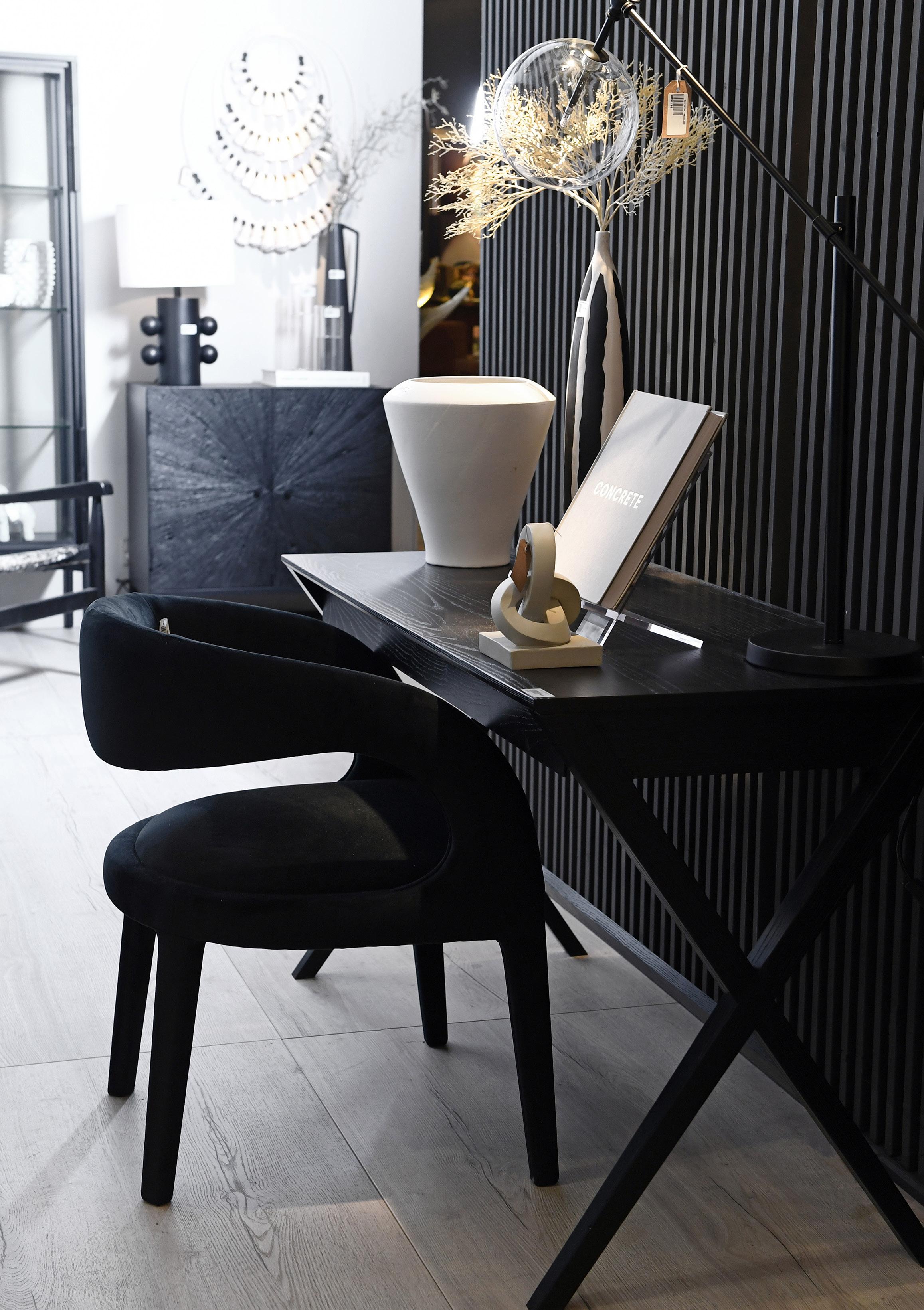
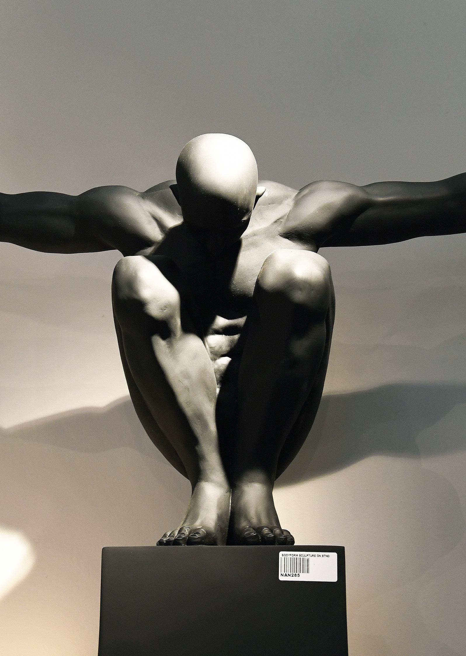
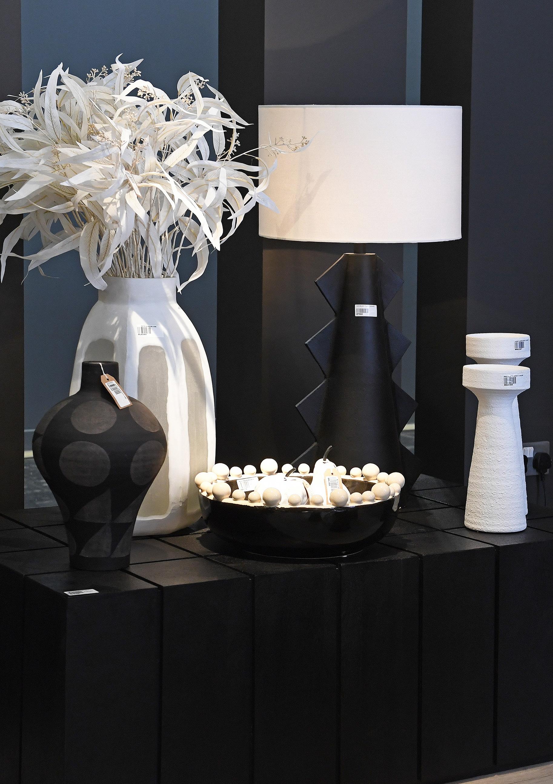
A “third place”- this is a space for togetherness and shared experience. Not home, not away; a place to stop and pause.
The monochrome palette purposefully gives way to structural new furniture pieces with brutalist influences. Sculpture reigns supreme, as the detail in the furniture pieces is allowed to take centre stage. The colour palette remains purposefully restrained.
The introduction of the famous bobble bowl in a new shape is also launched in a variety of colours… within this look, as well as others.
Paint used - Farrow and Ball - Purbeck Stone 275


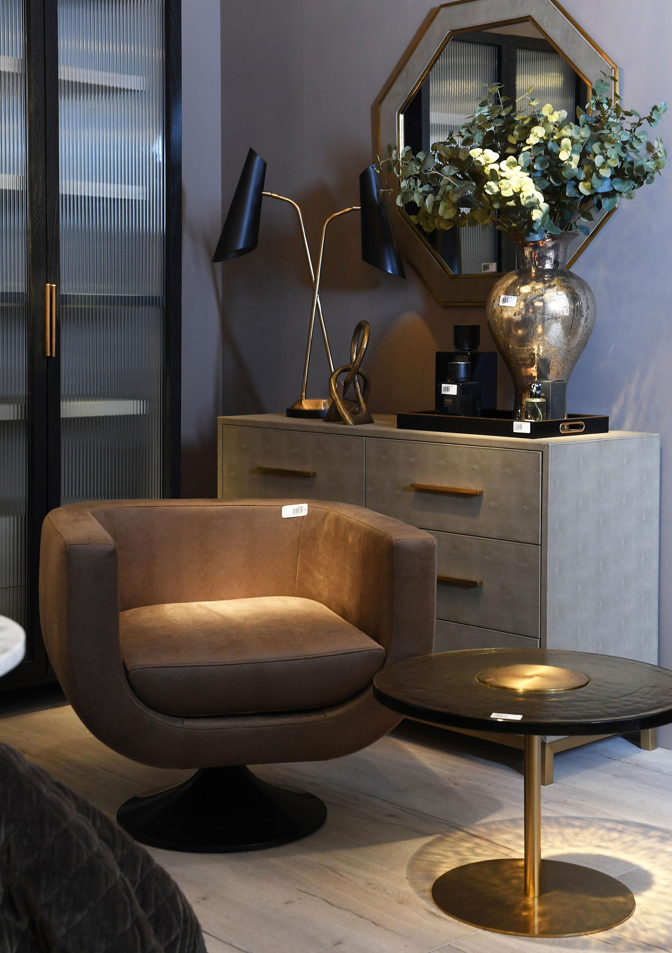
Sleek, refined and carefully considered, this perfectly measured aesthetic also has an equestrian influence.
The new, top-grain leather Cavallo is heavily shaped by tailored Italian style. Added to the mix are the incredibly proportioned Aqua lighting pieces.
This is a step away from the eclecticism seen elsewhere within the new collections towards a purposeful refinement.
Paint used - Dulux - Soft Almond


We can’t decide what we love most about this look. Is it the mega marble, the top-grain leather Rocco collection, or the statement lighting?
It’s up to you to decide. The butter soft mushroom upholstery is cut with glossy black and high impact burnt orange.
Time to sit back and decide if you agree that orange is the new black.
Paint used - Little Greene - Silt 40


The popularity of the gallery space in the centre of the stand continued at this show.
We introduced brand new lighting and artwork as well as sculptural pieces to compliment the different colour blocks that this space inspired.
Paint used - Farrow and Ball - Purbeck Stone 275


