EYE CANDY: THREE STUNNING PROJECTS, P.236
Fashion meets furniture at the salone del mobile FEATURING FENDI CASA, MISSONI HOME & TRUSSARDI CASA
Inspiring Dialogue on Design
AIA Convention 2015: May 14–16, Atlanta
SPRING 2015
Registration opens January 2015. Visit aia.org/convention
INSIDE JAPAN’S GOOD DESIGN AWARD WE HEAD TO TOKYO TO LEARN ABOUT THE COUNTRY’S BIGGEST DESIGN EXHIBITION
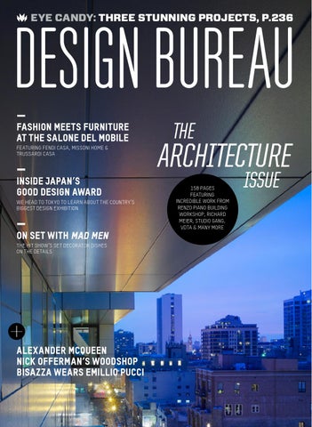
ON SET WITH MAD MEN THE HIT SHOW’S SET DECORATOR DISHES ON THE DETAILS
ALEXANDER MCQUEEN nick offerman’s woodshop BISAZZA WEARS EMILLIO PUCCI
158 PAGES FEATURING INCREDIBLE WORK FROM RENZO PIANO BUILDING WORKSHOP, RICHARD MEIER, STUDIO GANG, VDTA & MANY MORE
Alexandria Avenue Los Angeles, CA Designer & Photo: Emmanuel Cobbet
Be House Proud
...inspired by Spark Modern Fires. Designed and engineered to be extraordinary. See our gallery at www.sparkfires.com or 866.938.3846
modern fires
2
DESIGN BUREAU
Spring 2015
CONTENTS Issue 31 COVER FEATURE
Architecture /p66
PUBLISHER & EDITOR-IN-CHIEF Chris Force chris@alarmpress.com ----MANAGING EDITOR Amanda Koellner akoellner@alarmpress.com
158 pages of stunning architecture projects from around the globe.
ART DIRECTOR Michael Bodor michael@alarmpress.com ----EDITORIAL INTERNS Vincent Caruso DESIGN INTERNS Eleana Daniel Zhenqi Ong ----CONTRIBUTORS Emma Janzen, Kristofer Lenz, Troy Pieper, Margaret Poe, Jessica Barrett Sattell, Risa Seidman, Patrick Sisson, Chloe Stachowiak, John Taylor, J. Michael Welton, Sam Willett ----MARKETING DIRECTOR Jenny Palmer jenny@alarmpress.com CLIENT-SERVICES MANAGER Krystle Blume krystle@alarmpress.com
INFORMER
BUREAU EXPERT:
On set: Mad Men /p36
STATEMENT OF OWNERSHIP, MANAGEMENT AND CIRCULATION
1. Publication Title Design Bureau b. Paid Circulation 2. Publication # 7730 i. Mailed Outside-County Paid 3. Filing Date 10/30/2014 Subscriptions 1,300 / 569 4. Issue Frequency Quarterly ii. Mailed In-County Paid 5. Number of Issues Published Annually 4 Subscriptions 120 / 61 6. Annual Subscription Price $24.00 iii. Paid Distribution 7. Mailing Address of Office Outside the Mail 2,000 / 500 900 N Franklin, Suite 300, Chicago, IL 60610 iv. Paid Distribution by Contact Person Jenny Palmer, 312.878.8848 Other Classes of Mail 0 / 0 8. Mailing Address of Headquarters c. Total Paid Distribution 3,420 / 1,130 900 N Franklin, Suite 300, Chicago, IL 60610 d. Free or Nominal Rate Distribution 9. Publisher ALARM Press, 900 N i. Outside-County 500 / 328 Franklin, Suite 300, Chicago, IL 60610 ii. In-County 150 / 97 Editor Chris Force, 900 N iii. Mailed at Other Classes 0 / 0 Franklin, Suite 300, Chicago, IL 60610 iv. Outside the Mail 0 / 0 Managing Editor Amanda Koellner, e. Total Free or Nominal Rate 900 N Franklin, Suite 300, Chicago, IL 60610 Distribution 650 / 925 10. Owner ALARM Press – Chris Force, f. Total Distribution 4,070 / 1,555 900 N Franklin, Suite 300, Chicago, IL 60610 g. Copies Not Distributed 930 / 1,445 11. Known Bondholders, Mortgages, h. Total 5,000 / 3,000 and Other Security Holdings N/A i. Percent Paid 84% / 73% 12. Tax Status N/A 16. Electronic Copy Circulation 13. Publication Title Design Bureau a. Paid Electronic Copies: 0 / 0 14. Issue Date for Circulation Data b. Total Paid Print Copies + Paid September/October 2014 Electronic Copies: 3,420 / 1,130 15. Extent/Nature of Circulation c. Total Print Distribution + Paid (Average # of copies each issue during Electronic Copies: 4,070 / 1,555 preceding 12 months / # copies of single d. Percent Paid: 0 / 0 issue published nearest to filing date) 17. Publication of Statement Spring 2015 a. Total Number of Copies 5,000 / 3,000 18. Signed by Jenny Palmer 10/30/2014
Top: photo by Michael Biondo Photography. Bottom: Image courtesy of AMC.
your job makes it look easy
our job is to make it easier Serving the trades since 2001 Bellacor Professional makes selection easy and YOUR PROCESS EVEN EASIER Trade pricing & volume discounts Over 300,000 products from over 600 manufacturers Industry leading service Top designer brands Free shipping* Free Membership
www.bellacorpro.com 877-688-7039 Not a Trade Professional? Visit Bellacor.com
4
DESIGN BUREAU
Spring 2015
CONTENTS Issue 31 EYE CANDY
ON THE COVER The Godfrey Hotel in Chicago, photo by Steve Hall, Hedrich Blessing Photographers
Peter Rose & Partners /p236
-----
This seaside residence, which seamlessly brings the outside in, became the talk of the town before it was even completed.
Visit our website at wearedesignbureau.com or send a check or money order to:
A one-year subscription to Design Bureau is US $24 (international $48).
Design Bureau 900 North Franklin Street Suite 300 Chicago, IL 60610 (T) 312.386.7932 (F) 312.276.8085 info@alarmpress.com
Design Bureau (ISSN 2154-4441) is published quarterly by Alarm Press at: 900 North Franklin Street Suite 300 Chicago, IL 60610 Periodicals postage paid at Chicago, IL and additional mailing office(s). POSTMASTER: Send address corrections to Design Bureau at 900 North Franklin Street Suite 300 Chicago, IL 60610
DESIGN THINKING
----Retailers: To carry Design Bureau in your store, please call 201.634.7411. ----Š 2014 Design Bureau. All rights reserved. Reproduction in whole or in part without permission is strictly prohibited. DESIGN BUREAU is a trademark of Design Bureau.
RESTAURANT SPOTLIGHT:
INTERIORS:
Studio Collective /p41
S.A. Baxter, Inc. /p52
NOTES FROM THE BUREAU
PLUS
DB RECOMMENDS. . . . . . . . . . . . . . . . . . . . . . . . . . . . . . . . . . . . . . . . 10 DESIGN THINKING. . . . . . . . . . . . . . . . . . . . . . . . . . . . . . . . . . . . . . . 41 NOTES FROM THE BUREAU . . . . . . . . . . . . . . . . . . . . . 226 EYE CANDY. . . . . . . . . . . . . . . . . . . . . . . . . . . . . . . . . . . . . . . . . . . . . . . . . . 236 REDESIGN:
GUEST COLUMNIST. . . . . . . . . . . . . . . . . . . . . . . . . . . . . . . . . . . 247
Pell Overton /p226
ARCHITECTS & ARTISANS. . . . . . . . . . . . . . . . . . . . . . . 251 FOR HIRE. . . . . . . . . . . . . . . . . . . . . . . . . . . . . . . . . . . . . . . . . . . . . . . . . . . . . . 254
Peter Rose & Partners photo by Matthew Snyder. Studio Collective photo by Ray Kachatorian. S.A. Baxter Inc. photo by Matthew Sumner. Pell Overton photo by Mikiko Kikuyama.
DESIGN BUREAU
Flow >> Matte Nickel with Bamboo Blades
Spring 2015
Cool
by Design
LETTER FROM THE EDITOR
Nearly five years ago, I created Design Bureau with a hazy intention to inspire dialogue on design. This issue is our third dedicated to architecture— a fool’s errand at best. We’ve attempted to put our arms around an enormous community of brilliant, inspired, passionate, and terrifyingly intelligent designers and architects and pull their work onto the pages of our magazine. We chose hotels, tiny homes, enormous mansions, sprawling desert palaces, oceanside retreats, farmland villas, Texas ranches, beach cottages, urban condos, and restaurants large and small, and of course spoke with the designers that created them. If their dialog wasn’t enough to inspire, amaze, and fascinate you, we’ve also presented glimpses into the minds of some of the fashion worlds most influential minds, including Alberto Vignatelli of Fendi Casa, Gia Trussardi, and
Rosita Missoni. That’s not to say that the superstars of design were our only focus. Actor Nick Offerman (Parks & Recreation) takes us on a tour of his LA-based woodshop and the designers behind actress Emma Watson’s #HeForShe campaign explain their vision. And last, but not least, we sent our Managing Editor Amanda Koellner to Tokyo to report back on the Good Design Awards—a nationally recognized mark for excellence in design (why don’t we have on of those in the States?). Phew! It’s been a wild issue, but we hope it presents a spark of inspiration. ----Chris Force Publisher & Editor-in-Chief chris@alarmpress.com Photo by Jim Krantz, jimkrantz.com
Celebrating the modern idiom modernfan.com
6
DESIGN BUREAU
Spring 2015
FOR THE RECORD
FACTUALLY SPEAKING Stats, factoids, and random info from behind the scenes of this issue
Issue 31 “Fashion and design are two worlds that have become closer due to the undeniable advantages that synergies between the two areas can bring.” — GIA TRUSSARDI, CREATIVE DIRECTOR, P. 63 DESIGN BUREAU ON INSTAGRAM
IRON & WINE What actor Nick Offerman likes to listen to in his East LA woodshop (p.17).
40,000 The number of designs that have received The Good Design Award’s “G-Mark” since its inception in 1957 (p.22).
CRAIG’S LIST Where Mad Men set decorator Claudette Didul happens to find the majority of the vintage pieces that appear on the ‘60s-set show (p. 36).
FOUR YEARS Our account manager Hillary with @nigelbarker at @artvanfurniture
DJ Scend spinning at Roche Bobois’ 40th anniversary party
Exclusive tour of Tokyo’s Good Design Exhibition this week! #gooddesign
At the MCA’s press preview for #DavidBowieIs
The anniversary Design Bureau celebrated this year with drinks, a DJ, and dapper attendees (p.252).
See more of our photos on Instagram. follow us @designbureaumag ISSUE 30 AN EXCLUSIVE TOUR OF OUR DB OFFICE, P.66
2014 Gift Guide “I almost ordered the Jonathan Adler lollipop holder for everyone on my Christmas shopping list!” — A.V., VIA E-MAIL
“I love Nigel Barker and was so happy to check out his gift list.” — S.M., VIA E-MAIL
“Can I come work in the DB office, too?” — J.M., VIA TWITTER
TWITTERVERSE: 140-character shout-outs to Design Bureau
@JonathanAdler We’re the latest cover star of @ DesignBureauMag! In good company with @JFisherJewelry, too. @RowNYCHotel TYVM for your wonderful story on #RowNYC’s renovation! @1100Architect We are excited that @QueensLibrary CLDC is in the latest issue of @DesignBureauMag!
With design-centric gift picks from Design Milk’s Jaime Derringer, Warby Parker cofounders Neil Blumenthal and David Gilboa, designer extraordinaire Jonathan Adler, MoMA veteran Chay Costello, and photographer Nigel Barker! p.55
Comments, criticism, questions, suggestions, love letters, hate mail... We read it all. e-mail us your thoughts: letters@wearedesignbureau.com
join the conversation at
twitter.com/DesignBureauMag
Spring 2015
DESIGN BUREAU
DESIGN BUREAU CONTRIBUTORS
Though a recent addition to the Chicago scene, Vincent Caruso has already established himself as a man of many words: “boot,” “funnel,” and “teeth,” to name a few. Additionally, he is a freelance writer and student of the written & recorded arts. Strengths include red wine; weaknesses include emotional transparency. Please tell Debra to call him.
Jessica Barrett Sattell is a writer, editor, and occasional graphic designer based in Chicago who loves to tell stories about the intersections between design, technology, and community. Currently a graduate student in journalism at the School of the Art Institute of Chicago, she likes getting lost in bookstores, info-graphics, and the fact that Chicago now has a permanent design museum. @culturalcatgirl
Chloe Stachowiak is a Michigan native who left her beloved snowy state for DePaul’s Writing, Rhetoric, and Discourse master’s program in Chicago. When she’s not doing homework or interning, she enjoys climbing, writing creative nonfiction, eating doughnuts, and daydreaming about living in the mountains.
Sam Willett is a recent graduate of DePaul University and music journalist whose writing has appeared on Consequence of Sound and Heave Media. His ideal afternoon includes a mug of bottomless coffee, a great book (particularly from the 33 1/3 series), and a pair of over-ear headphones bumping tunes.
astrid chair - designed by g. carollo atlante sideboard - designed by c. ballabio zodiac extension dining table - designed by showroom - two hundred lexington avenue, new york, ny 10016 +1 (212) 696 0211 www.atelier-nyc.com info@atelier-nyc.com
exclusively at
10
DESIGN BUREAU
Spring 2015
Design Bureau Recommends... Our staff is always on the lookout for cool gear. Got a tip? E-mail us at letters@wearedesignbureau.com. 01
02
01 ‘50s Retro Style Mini
Refrigerator from Smeg, $999, smegusa.com
“We have this mini-fridge in our editorial office. Nothing makes me happier on deadline week than rolling over to it to grab a pickle.” — Amanda Koellner, managing editor
02 Areaware Alarm Dock from Need Supply Co., $38, needsupply.com
“Waking up is much easier with this beauty belting out my favorite tunes.” — Krystle Blume, client services director
04
03 Morihata Chikuno Cube House Natural Air Purifier, $68, acgears.com
“My air has never been so pure, which really improves my pitch when I’m singing Morrissey songs.” — Vincent Caruso, editorial intern
04 Outfitter Luggage Wheelie 03
from Herschel Supply Co., $185, herschelsupply.com
“When carrying this bag gets too heavy, I just shout, ‘Roll out!’ and wheel this thing to my destination.” —Michael Bodor, art director
05 Lacquer Backgammon Set
from Jonathan Adler, $395, jonathanadler.com
“My husband and I get pretty competitive with this, but I always win.” — Jenny Palmer, marketing director
05
Images courtesy of the companies featured
DESIGN BUREAU
THE INFORMER Spring 2015
News & musings from the world of design
PIXELS & PRINT Illustrator Matt Chase fills in the blank /p14
IN THE BANANA STAND Matt Chase’s “The Bluths” illustration is a portrait of the dysfunctional family from the cult television show Arrested Development (recently revived on Netflix) that he created for a group show at Gallery1988 in Los Angeles.
SHOP TOUR
PIXELS & PRINT
FASHION & BEAUTY
BUREAU EXPERT
Actor Nick Offerman’s East LA woodshop /p17
The agency behind the UN’s #HeForShe identity /p20
Inside the latest Alexander McQueen exhibit /p24
A conversation with Mad Men’s set decorator /p36 Image courtesy of Matt Chase
13
14
DESIGN BUREAU
The Informer
Spring 2015
PIXELS & PRINT
Fill in the Blank: Matt Chase When sparks failed to fly at an internship with ad agency Crispin Porter+Bogusky in Boulder, Colorado, designer Matt Chase left the gig early to enlist in D.C.’s Design Army. But after three successful years with the awardwinning firm, so much freelance illustration work had amassed for the young designer (who graduated from the University of Kansas in 2010) that he made the official move toward full-time independence. Since then, the talents of this “lone soldier by nature” have led to awards from AIGA, The Society of Publication Design, and The Art Director’s Club, as well as commissioned work for The Wall Street Journal, The New York Times Magazine, and Fast Company, among others. Chase says that his favorite part about what he does is enjoying the time spent doing it, and here we find out a bit more about just what that entails. aZ
MY FAVORITE ALBUM TO LISTEN TO WHILE WORKING IS...
The White Stripes (self-titled).
IF I WASN’T A DESIGNER, I
WOULD BE… shortstop for the New York Yankees. MY SPIRIT ANIMAL IS...
Jeff Goldblum.
MY IDEAL SATURDAY AFTERNOON CONSISTS OF...
go-karts followed by a good live show at a place where I know the bartender. THE LAST TIME I FELT TRULY
INSPIRED WAS ... watching any David Fincher film. I WILL NEVER GET SICK OF
IF I COULD HAVE DINNER WITH ANY DESIGNER DEAD OR ALIVE, I WOULD CHOOSE...
It was actually writing that turned me on to design, so I’m going to cheat and dine with Fitzgerald. We’re meeting Hemingway at the pub after; you’re all welcome to join.
IF I COULD REDESIGN ANY CLASSIC ALBUM COVER, IT TOP: MIT Tech Review, Escapades 1 MIDDLE: Annie Hall, Child Rights Treaty BOTTOM: Fast Company FACING PAGE: Copenhagen
Images courtesy of Matt Chase
WOULD BE...
The Beatles’ Revolver.
LOOKING AT... the world around me. Also Natalie Portman. IN THREE WORDS, MY
WORKSPACE IS... “Where’d
that
go?”
MY BIGGEST INSPIRATION
COMES FROM... the content.
Drawing inspiration from source material is a huge part of my process. Larger answer: humor, irony, and relationships.
Spring 2015
The Informer
DESIGN BUREAU
15
Designed by leading architects, Nusonian offers high performance house packages created for easier maintenance and greater comfort: like your favorite blue jeans. Only better.
nusonianhouse.com
Spring 2015
The Informer
DESIGN BUREAU
SHOP TOUR
WOOD AND RECREATION DB gets a look at actor and comedian Nick Offerman’s East LA woodshop By Amanda Koellner
On NBC’s Parks and Recreation, which wrapped its seventh and final season in February, Nick Offerman plays Ron Swanson: the mustachioed, whiskey-drinking, baconhoarding, government-hating, woodworking director of the fictional city of Pawnee’s parks department. The man behind the treasured character, Nick Offerman, is equally as bewhiskered and similarly skilled with a chisel or chainsaw. So much so, in fact, that he operates his own
shop in East Los Angeles, which his shop manager RH Lee deems “utopia.” “Back in the day, Nick built out this gross bunker building with salvaged siding, old windows, and doors—creating the feeling of a Midwestern barn in the middle of industrial Los Angeles,” she says, noting that the shop operates as a collective filled with woodworkers who take commissions, meaning that “when Nick is in the shop, he’s just one of us wood geeks getting a kick out of making chips fly.” We chatted with Offerman about his dual occupations. What’s appealing about
stepping away from acting for some good oldfashioned woodworking?
Gosh, what’s not appealing? No makeup, no bright lights, no hairspray, no network brass “weighing in” on artistic choices, no Garry Gergich. Just some beautiful, solid wood, a well-sharpened chisel or plane, some Iron & Wine or Wilco on the stereo, and some able hands. Good, honest work that lives or dies on its own merit. How often do you get to work in the shop?
I now delegate commissions to my extremely talented elves, who keep our clientele very happy. I am involved in a lot
of administration and design choices, which then leaves me free to build whatever the hell I please, which is a very lucky circumstance. Last summer I built a three-legged stool and a mahogany ukulele. Who would win in a, for lack of a better term, woodworking-off: Nick Offerman or Ron Swanson?
Ron Swanson would roundly defeat Nick Offerman in nearly any contest of skill or fortitude, but especially woodworking. Ron once built an Irish Harp in one night, after drinking several glasses of whisky, an achievement that would require Nick Offerman two or three weeks, stone sober. a Photo by John Lichtwardt
17
18
DESIGN BUREAU
The Informer
Spring 2015
BOOKS
Read Something By Jessica Barrett Sattell
EDITED BY DAVID JENKINS & ADAM WOODWARD: What I Love About Movies (Opus Books) UK-based magazine Little White Lies has spent nearly a decade delivering brightly illustrated, design-conscious considerations from the film industry, closing each issue by posing the same question to a well-known filmmaker or actor: “What do you love about movies?� Those replies, assembled here, are as personal as the movie-going experience itself. What I Love About Movies pairs fifty unique answers from legends such as Francis Ford Coppola, Wes Anderson, and Spike Jonze with brief profiles and specially-commissioned portraits from an international assemblage of artists, illustrators, and graphic designers to shape a celebration of how the cinema ignites creative passion.
Images courtesy of Opus. Top: End-paper pattern by Little White Lies. Middle: Philip Seymour Hoffman by Raid71. Spike Jonze by Chris DeLorenzo. Quentin Tarantino by I Love Dust.
Spring 2015
Hide and Seek
The Architecture of Cabins and Hide-Outs
The Informer
DESIGN BUREAU
EDITED BY SOFIA BORGES, SVEN EHMANN & ROBERT KLANTEN:
REX MILLER, MABEL CASEY & MARK KONCHAR:
Hide and Seek: The Architecture of Cabins and Hide-Outs
Change Your Space, Change Your Culture: How Engaging Workspaces Lead to Transformation and Growth
(Gestalten) A desire for an idyllic space away from the pressures of city life has long been at the heart of the ideal nature retreat. Hide and Seek: The Architecture of Cabins and Hide-Outs assembles examples of such sanctuaries by contemporary architects and interior designers concerned with how environmental harmony and respect for materials can forge relaxing and elegant living solutions.
EDITED BY ALLAN CHOCHINOV & ERIC LUDLUM: Designing Here/Now: A Global Selection of Objects, Concepts and Spaces for the Future (Thames & Hudson) The internationally juried Core77 Design Awards attest to the immense scope of design across multidisciplinary practices. Designing Here/ Now collects highlights from the contest’s entries and winners across a variety of fields including consumer products, writing, food, business, transportation, and graphics, all showcasing how designers are exploring ways to critically address speculations about what the future may bring.
(Wiley) Workspace design certainly shapes workplace happiness, but Change Your Space, Change Your Culture reveals just how deeply a workforce’s connection to its surroundings can affect productivity, mood, and morale. A look into how buildings can communicate priorities, suggestions for rethinking space, and studies attesting to how good design can inspire good business round out this guide to better understanding the needs of the contemporary office.
BUZZ POOLE & CHRISTOPHER D. SALYERS: Camera Crazy (Prestel) Even with the digitalized world of Instagram and one-touch photo filters, analogue snapshots remain a mainstay of popular photography. Part historical overview, part curiosity cabinet, and part photo-essay, Camera Crazy explores how the market for the affordable, easy-to-use “toy camera” brought photography to the masses and continues to charm fans with boundless platforms for capturing memories.
Images courtesy of the publishers featured
19
20
DESIGN BUREAU
The Informer
Spring 2015
PIXELS & PRINT
Graphics for Gender Equality We catch up with the design studio behind the UN’s #HeForShe campaign By Amanda Koellner
When Emma Watson stood up in front of the UN last fall to cordially invite men to join the fight for gender equality, all eyes were on the British beauty and her emboldening message. Although her voice quivered, the message—“to galvanize as many men and boys as possible to be advocates for change”—was heard loud and clear as public figures such as Russell Crowe, Harry Styles, and Emile Hirsch came forward with unwavering support for the campaign. Months before Watson’s speech went viral, UN Women reached out to New York design studio DIA to complete the #HeForShe identity, and Design Bureau sat down with DIA founder and creative director Mitch Paone and managing partner Meg Donohoe to chat about the experience (spoiler alert: one of the best parts? “Meeting Emma Watson. We’re huge Harry Potter geeks.”).
embodied gender equality alone—a symbol that might live far beyond the actual #HeForShe campaign. Tell me about the type and color choices.
MD: UN Women didn’t want the branding to feel too much like something the UN would put out; they wanted something unique and fashion forward. MP: We took that feedback and really pushed the typography and layouts into less “safe” territory. MD: At first glance, the color choice might seem obvious. The magenta is there to represent the men, not the women. Gender stereotypes need to be abolished, so instead of the typical pink for women, the pink is here to represent the men. How has the feedback been?
This is a global campaign; did you take that into account and strive to design something with international appeal?
MD: It’s been fascinating to see. Emma’s speech really propelled the campaign and put the work in front of so many people.
MD: Absolutely. We believed the campaign needed a strong mark that was iconic enough to stand on its own—something that didn’t hinge on language.
MP: For us, it’s been amazing to watch how the public has been interacting with the mark. People have been drawing it, building it with Legos; a street artist in Sweden has been pasting it on buildings. People rarely interact with graphic design in that sense, and it’s so much fun to see. a
MP: To add even more pressure on ourselves, we set our sights on an even loftier goal to create a mark that Images courtesy of UN Women and DIA
Spring 2015
The Informer
DESIGN BUREAU
OBJECTS & GEAR
Fritz Hansen’s Spring Fever By Vincent Caruso
Spring is in the air, and a home renovation is in order. And while April showers must first test the strength of our patience, the tint of your indoor backdrop can meanwhile be brightened with the timely offerings of furniture design prestige Fritz Hansen. Physical comfort is at its peak ripeness with Jacobson’s Swan Chair, whose curvy shape brings the character of the home office into full bloom. The Little Friend accommodates with its soft tonal modesty. And the PK22 chair in its wicker variation is one to be cozied in once the raincoats are finally hung up on the aptly titled minimalist Coat Tree. a
COAT TREE
LITTLE FRIEND
SWAN CHAIR
PK22 CHAIR
PRICE: $1,163
PRICE: $5,020
PRICE: $4,207
Price upon request
Images courtesy of Fritz Hansen
21
22
DESIGN BUREAU
The Informer
Spring 2015
TRAVEL & CULTURE
INSIDE THE GOOD DESIGN AWARD Our managing editor visits Tokyo to attend the 2014 installment of Japan’s biggest design exhibition By Amanda Koellner
In Japan, 90% of the population recognizes the winning symbol of the country’s Good Design Award—the “G-Mark”—as an indicator of excellence in design, which is particularly amazing when considering most other country’s lack of such a marker, the United States included. Established in 1957, the exhibition and awards have granted that little red symbol to more than 40,000 outstanding designs ranging from industrial products, architecture, intangible designs such as applications, and more. In 2014, 1,258 of the total 3,601 entries received a Good Design Award—100 of which demonstrated “the best chance of future breakthrough,” and nine of which were nominated for the Grand Award. Photo by Amanda Koellner
The theme of this year’s exhibition (which takes place in various venues across Tokyo and brings in an estimated 250,000 visitors) was “a sense of comfort.” “The Japanese call it kokochi,” says Good Design Award chairman Naoto Fukasawa after unveiling the grand prizewinner back in November. “It’s a quality of interaction or something that feels nice. It’s a good comfort.” He and the various members of the jury, which includes product designers, curators, lighting designers, project managers, interior designers, architects, and more, kept this theme in mind as they evaluated the myriad of submissions across different categories or “units.” Here, DB chats with jury vice chairman Taku Satoh, who first became involved with the exhibition and award more than 15 years ago. How have you seen the Good Design Award and exhibition change and progress over time?
Since I joined the jury, there have been remarkable developments in IT and other technologies, and because of this, the nature and quality of communication between people has changed. We now have to not only design articles or goods or physical things but we have a need to design events and activities to develop local communities. Aside from that, about 20 years ago, the designs were dealt with only in a very superficial manner, and recently, we’re evaluating more on a fundamental level and thinking about what the intrinsic measure is—what the design is in its true sense. Where do you think the Good Design Award will go in the future?
The first thing I want to say is that there is nothing in the world that has no connection to design. It’s needed in all scenes of the world: politics, economy, medicine, education— everything needs designs. There are obvious fields where design is everything, such as industrial, product, and
graphic design. Those fields are continuing to pursue how they can do more. But, there are other fields that typically have not used design heavily, and I hope those other fields will start using more designs and partaking in the award. The Good Design Award is trying to become international. What do you think is the biggest challenge for Japan to reach that goal?
It’s important to make sure that people from other countries are interested in sending their entries so that the Good Design awarding system can evaluate them. It’s also important for us to consider the differences in culture and customs from various countries. For example, think about a chair. The function of a chair is common: it’s a thing for people to sit on. However, depending on the region or country, the customs may be different, so the key is how we can understand these differences and share the Good Design Award across borders. a
Spring 2015
The Informer
DESIGN BUREAU
This power-assisted wheelchair took home a Good Design Gold Award for its ability to enable Japan’s rising elderly population to be “enthused with a renewed sense of adventure.”
The Tohoku Edible Journal, a monthly magazine delivered to subscribers with actual produce to form a link between producers in the Tohoku region and consumers in cities, also won a Gold Award.
Denso Wave Incorporated’s industrial robot took home the top honor, designed for the pharmaceutical and food industries to work in sterile environments for increased speed and productivity.
This year marked the first Good Design Japanese Furniture Selection, in which 15 of the year’s award winners were chosen to exhibit their work around the country at various furniture shows and trade fairs.
Top: Images courtesy of the Japan Institute of Design Promotion. Bottom: Photo by Amanda Koellner.
23
24
DESIGN BUREAU
The Informer
Spring 2015
FASHION & BEAUTY
London Calling Alexander McQueen: Savage Beauty Makes its Way to the V&A By Jessica Barrett Sattell British fashion revolutionary Lee Alexander McQueen was known for his blend of gothic chic and romantic showmanship. Drawing influences from history, science, pop culture, and beyond, he crafted otherworldly collections that will forever be etched in catwalk history.
shut in overnight.” The institution also was one of the first to show his garments, in a 1997 50-year retrospective of British fashion.
One year after his 2010 death, the Costume Institute of the Metropolitan Museum of Art in New York organized Alexander McQueen: Savage Beauty— one of the 10 most visited exhibitions in its history. This spring, the Victoria and Albert (V&A) Museum will present a revitalized presentation of the late designer’s legacy as it hosts the show in London from March 14–July 19. The V&A is a natural fit for Europe’s first retrospective of this body of work, and not just because of McQueen’s London heritage. Even from his days as a student at Central Saint Martins, he would frequent the museum’s collections for inspiration, even having once said that it was “the sort of place I’d like to be This page: Left and top images courtesy of firstVIEW. Portrait by Marc Hom. Facing page: Image courtesy of Dyson.
Like the New York show, the V&A edition spans McQueen’s 1992 graduation collection to his unfinished Autumn/Winter 2010 collection, but it will be expanded and adapted to include 30 additional garments, a wider “Cabinet of Curiosities” highlighting collaborative designs, and a new section outlining his relationship with the city of London. The V&A is also collaborating with Gainsbury & Whiting—the same production company that McQueen worked with—to re-create his legendary, highly theatrical runway shows that blended film, music, and performance. Sarah Burton, Creative Director of Alexander McQueen, says that the late designer “believed in creativity and innovation, and his talent was limitless.” That vision will undoubtedly echo in the V&A’s galleries, creating a fitting tribute to a master of maverick couture. a
Spring 2015
The Informer
DESIGN BUREAU
OBJECTS & GEAR
High and Dry Dyson’s latest offering proves that big things can come in small packages By Vincent Caruso
While observably small in size compared to earlier models, the functional quality exhibited by the Dyson Airblade V is colossal. Bolstered by the Dyson digital motor V4, this small but mighty contraption dries the hands of those who come within its vicinity in an extraordinarily rapid 12 seconds. An electrical field generated by capacitive sensors makes this possible, and though the reduced stature of the machine might suggest less room for
experiment, the Airblade V’s remarkable performance is facilitated in part by adding a second column for 420 mph warm air to funnel through. Most impressively, however, is how the Dyson Airblade V has demonstrated environmental efficiency no less equal to its functionality. The Windy City’s historic Soldier Field— home to the NFL’s Chicago Bears—recently ventured to swap their paper towel dispensers out for the Airblade V in a handful of their busier
restrooms. In addition to saving the stadium thousands of dollars in expenses and eliminating paper towels from the staff’s maintenance equation, the Airblade V earned the sta-
dium the very first Leadership in Energy and Environmental Design—Existing Building (LEED-EB) award from the United States Green Building Council (USGBC). a
Lorem Ipsum Omnim qui comnistis molorpore nonectatis esciet iuntorest
25
26
DESIGN BUREAU
The Informer
Spring 2015
FASHION & BEAUTY
Majestic Mosaics Two Italian design heiresses pay homage to their pioneering fathers By Vincent Caruso It’s easy to recognize the worlds of fashion and interior design as logical allied forces. The fruits of the two crafts often rely on a singular artistic vision parlayed through the collaborative ambitions of likeminded eccentrics and tradesmen. Both industries temper to please the functional needs of the consumer—though only once waved past the satisfaction of its conceiver. With Rossella Bisazza and Laudomia Pucci, however, the blood runs yet thicker. The two—ensconced in like social circles by virtue or their fathers’ artistic nobility—bonded early on and have harbored a mutual admiration for the lofty lineage of each other’s family businesses. Now, the daughters have assumed the throne and the cozy kinship recently inspired an epiphanic collaborative effort—the results of which manifested as the Bisazza Wears Emilio Pucci collection debuted at the international Salone del Mobile showcase last year. The collection was an homage to their respective lineages—familial and professional—honoring the conceptual musings of Emilio Pucci achieved by way of the signature stylistic trade of Renato Bisazza, and, more importantly, what the two great minds had in common. “Our signature use of bold colors in sophisticated patterns,” Rosella Bisazza highlights, Images courtesy of Bisazza
is what made the collaboration so immediately intuitive. Moreover, it’s not just the two disciplines that share exploitable similarities, but the consumer bases are also likeminded. “We have always taken inspiration from the world of fashion,” Bisazza expounds, “not only for our collections but also the way we communicate our brand and its values to reach a very style-conscious clientele.” The success of the Bisazza Wears Emilio Pucci showing at Salone del Mobile has roused an intrigued optimism in Rosella in regards to future worldly collisions of this nature. “We often talk of ‘contamination’ between different artistic worlds: design, fashion, art, and some also say food,” she says. “I believe the intersection really works and is surprising, exciting, and cool when lots of talent is poured into the project.” Fashion and Design constantly cross paths creating bonds that, in the future, will be increasingly evident. There have since been even newer additions to the collection which are slated to debut in North America in 2015. a
For more on the intersection of fashion and furniture at the Salone del Mobile, turn to page 59.
DEAR GARDEN ASSOCIATES, INC.
DISTINCTIVE DESIGN, INSTALLATION & MAINTENANCE Bill Dear, Horticulturist
Bucks County, PA 215.766.8110
Princeton, NJ 609.919.0050
www.deargarden.com
28
DESIGN BUREAU
The Informer
Spring 2015
PIXELS & PRINT
BLANCO GOES DIGITAL An update to the brand’s mobile app makes shopping sinks easier than ever
Far from its modest infancy of producing copper galvanized parts for copper cookers and hot water bottles in the 1920s, the family-owned Blanco brand has earned a reliably punctuated presence in the foreground of luxury domestic kitchen planning with more than 50 million sinks produced worldwide
to date. And, as such rapid growth would suggest, the brand has never been coy at utilizing the latest triedand-true technologies to enhance the Blanco customer experience. Most recently, the effects of these ongoing advancements have manifested in the popularity of the Silgranit II Mobile Color App.
The free Blanco app puts the evaluation process of choosing a sink in the palm of your hand, allowing access to galleries of more than 100 Blanco trademarked Silgranit II, stainless steel, and fireclay sinks. Stocked with a variety of colorful countertop surfaces in Dekton and Silestone, as well as natural stone,
By Vincent Caruso
customers can mix-andmatch at their leisure, freely experimenting with combinations as they see fit. Using the camera on Apple and Android devices, users interested in sticking with their current countertop surface can capture a photo of it to be uploaded and stored on the app and used too for sink pairings. For those seeking inspiration, the Silgranit II app provides uncertain users with a photo gallery of sinkto-countertop combination ideas and a favorites folder to store selected reference points. What’s more is that the venture doesn’t have to be a solitary one. To share and compare, the interactive app allows users to email favored combinations with the purpose of exchanging ideas with, and soliciting input from, tasteful peers. Once the perfect fit has been found, the app comes equipped with a Blanco showroom locater to conveniently drive this creative pursuit to completion. Rather than navigating a maze of store aisles, the app simply reassigns the role of salesperson to the stylistic penchants of your own personal needs. An accompaniment to the Blanco website Color Assistant feature, the newly enhanced Silgranit II Color App demonstrates not only a logical advancement of an intuitive mobile function, but a unique investment in the autonomy of the customer by a company whose success has gained in concert with the earned trust of the public. a
Photos courtesy of Blanco
Presenting the art of water… for the most beautiful kitchens in the world.
BLANCO CULINA™— dramatic curves, seamless lines and premium finishes brilliantly capture and refract light. Transforming the simple flow of water into a celebrated work of art. Available in two sizes for the professional and aspiring chef — BLANCO CULINA™ enjoys a shared passion for art as functional as it is beautiful. www.blancoamerica.com
Combine9 Vintage Industrial Design
DESIGN BUREAU
The Informer
Spring 2015
TRAVEL & CULTURE
The Climb Toward Comfort An Amsterdam design duo offers a luxury hotel a heightened holiday from the level planes of the homeland By Vincent Caruso
For all there is to be lauded and admired about the cultural landscape that represents The Netherlands, its geographic landscape is a remarkably flat one. While roughly half of the country’s surface reaches a mere meter above sea level, a solid quarter of the Benelux lowland rests below it. It is reasonable then that the more imaginationacute inhabitants of such altitudinal lows might inevitably harbor otherworldly concepts of, and dreamy fascinations with, the unattainable heights of mountain landforms. Amsterdam-based architects and Delft University alumni Jos Blom and Jasper Eustace might appeal to such a theory, christening their first luxury hotel room co-effort with the name of Edmund Hillary, famous for being among the first ever to reach the summit of Mount Everest. In addition to the 163 “standard” hotel rooms offered by Volkshotel, the Amsterdam lodging offers nine “special rooms”—unconventional, artfully blueprinted luxury chambers sketched out by handpicked beloveds in Dutch design and architecture. Of the “special” lot, the room constructed by Blom and Eustace is quite observably the
Combine9.com
most daring. Instantly commanding, the Edmund’s principal feature is a multifunctional centerpiece shaped as the frosty peak of a mountaintop, with a shower, bed, and closet composing the slopes of the mountain, capped by a bathtub and some modest cacti comprising the summit atop. The mountain is situated in the middle of the room, engulfed in sharply contrasting green tones of a “dazzle pattern” traversing the surrounding walls, assuming the character of abstractionist mountain panorama. Hot pink hendecagonal floor rugs furnish the lodging and complete the room with a dreamlike surrealism. The complexity of the design’s features and the enthused particularity of its theme might suggest welcome to a specific type of traveler—daydream heroics with adventurist appetites and action-rich bar tales—though, to be sure, the Edmund was designed for the enjoyment of all. Its stylistic idiosyncrasies and expressionistic charm are something to behold for anybody with an appreciation for detail. “We wanted to do something that was never done before,” Eustace elaborates, noting an “audible gasp” among guests upon entering the room. “For us, that means mission accomplished.” a
Spring 2015
The Informer
DESIGN BUREAU
Photos by Arend Loerts
31
32
DESIGN BUREAU
The Informer
Spring 2015
TRAVEL & CULTURE
Satellite to Stardom Milan’s Salone del Mobile makes room for ambitious newcomers
Networking is vital when pursuing a career in the fields of design and architecture most anywhere in the world. And the very difficulty of knowing where or how to start is often a stifling bind. Rescuing quality from obscurity, Marva Griffin introduced the SaloneSatellite in 1998 as an offshoot of Milan’s—and, arguably, the world’s—biggest annual furniture event with the aim of arranging firm handshakes and business card swaps between young creatives Photos by Thomas Lohr
By Vincent Caruso
(ages 35 years and younger) and their seasoned industry kin. Griffin filled Design Bureau in on the experience the SaloneSatellite offers to architecture and design fledglings from around the globe.
be evaluated by a selection committee formed by personalities in the design world.
What is the application process like for young designers?
Oh, yes! The SaloneSatellite is a real launching pad for young designers. They are the ones that declare that. Here, it’s very easy to get in direct contact with the manufacturers who exhibit at the Salone del Mobile seeking new ideas for future catalogues.
The SaloneSatellite is exclusively dedicated to young creative designers and architects—for those who design but do not produce, Italians and non-Italians, proposing innovative solutions in the design world through projects, prototypes, and provocative proposals with the hope of finding the right manufacturers to mass-produce their designs. When applying to SaloneSatellite, designers are required to send photographs of designs they have done in the past to
Have you noticed the event directly influence the careers of its participants?
Are there specific designers that have really come up out of the SaloneSatellite and risen to prominence and perhaps even fame as a result of participating?
Among the designers that made their debut at the SaloneSatellite and who are by now
world-famous include Matali Crasset, Patrick Jouin, Paolo Ulian, Satyendra Pakhalé, Tomoko Azumi, Lorenzo Damiani, Ilkka Suppanen, Nendo, Adriano Design, Harri Koskinen, Xavier Lust, Front, Cory Grosser, Daniel Rybakken, and Studio Adriano—to name but a few. As I’ve stated previously, participating here gives you real contacts and international visibility. More than 5,000 journalists visit the SaloneSatellite and write about it! What do you feel is the best part of running the SaloneSatellite?
Helping young participants to make “the big jump” into the production world, taking advantage of the wonderful miscellany of exhibitors, journalists, and visitors that, year after year, make Salone Internazionale del Mobile such a success. a
Spring 2015
The Informer
DESIGN BUREAU
TRAVEL & CULTURE
Highway to Home Design updates to Airstream’s Classic travel trailer make it classier and cozier than ever before By Vincent Caruso
“Let’s not make changes, let’s make only improvements” was the credo of Airstream, Inc. founder Wally Byam, and as exemplified by the 2015
Classic travel trailer, it is an aphorism yet again proven immortal by the company’s advances in bringing a sense of home-sweet-home to
life on the road. In keeping an ear to the ground for the purposes of road travel as they do, Airstream has intercepted the voices of its loyal clientele and has ventured to encapsulate the feedback received by producing a consummately improved version of the prized Classic. Bedecked with cherry-wood cabinetry and high-polish countertops, the kitchen
provides a restful and familiar setting for travel cookery, while increased spaciousness and a power-adjustable master bed tuck you into a level of overnight comfort that a journeyman could once only dream of. “When the world’s most passionate customers come to you with great ideas, you listen,” says Airstream president & CEO Bob Wheeler, awarding this time the consumer the title of Employee of the Year. a
Images courtesy of Airstream
33
34
DESIGN BUREAU
Spring 2015
The Informer
FASHION & BEAUTY
Bit By Bit Architect turned fashion designer Francis Bitonti transforms a mathematical model into a 3D-printed shoe collection By Jessica Barrett Sattell New York-based fashion designer Francis Bitonti draws upon his architecture training to show how digital fabrication is shaping the future of dress. “My work is focused on considering the form of the body in new ways, but it’s also very much rooted in manufacturing,” he says. “We are finding the new forms for things that will be mass produced. It’s not about artistic expression at all.”
Image courtesy of Francis Bitonti
Bitonti, who once designed a 3D printed dress for Dita Von Teese, continues to blend fashion and technology in ways that go beyond smart watches or sensor-embedded T-shirts. For his 3D-printed shoe collection, dubbed Molecule, the designer paired Adobe 3D printing software and a Stratasys 3D printer with a mathematical algorithm for cellular automation to create functional footwear that builds, pixel by pixel, into vivid
color spectrums. The randomized behavior of the algorithm creates different formations for each shoe, which range from platforms to heels. “I use algorithms to make things that are capable of behaving many different ways and doing many different things,” Bitonti says. “It’s about thinking about the object as a system, so the user can co-create. It’s antiinspiration; I like [my designs] to be autonomous until given a context and a narrative by the owner of the thing.” While the luxury fashion industry still places a high
value on artisanship, Bitonti shows how the democratizing potential in advanced manufacturing is shaping the next industrial revolution. “Luxury brands need to be thinking about products more like software,” he explains. “Materials are virtual now.” When asked about how fashion could move beyond wearable tech to embrace tech-crafted wearables, Bitonti points to Apple’s infrastructure of products. “They have created a platform that is very pervasive throughout people’s lives,” he notes. “Fashion brands have a lot they could be learning from them, moving forward.” a
Spring 2015
The Informer
DESIGN BUREAU
DESIGN FOR GOOD
Pencils and Power Tools This California non-profit unites creativity and community to unleash the architect inside America’s youth By Margaret Poe
Emily Pilloton grew up in rural Marin County, California, running around in the woods building elaborate forts with her sisters. So naturally, she’s saddened to see children today spending all day switching between screens. Her solution? Hand that kid a chop saw or a welder and see what they can do. More often than not, they surprise the adults around them—and themselves.
discussing doorknobs). Project H emerged from a desire to get her hands dirty and discover what design can do for people and their communities.
She sees this every day at Camp H, an after-school and summer program for girls ages nine to 12, at which they earn badges on topics ranging from carpentry to masonry to product design. The camp is just one program offered by Project H, the Berkeleybased organization Pilloton founded in 2008 to empower both young people and adults through handson design-build projects.
In just a few years, Studio H, a public school curriculum for middle and high school students, has grown from 10 students to 275—all of them working together to select, design, and build a community project. The inaugural class launched in the poverty-stricken Bertie County, North Carolina, where the students crafted a 2,000-squarefoot farmers market pavilion to showcase produce grown in the rural community. That process, studded with bureaucratic setbacks but ultimately a triumph of grit, sweat, and will, is documented in the 2013 documentary film If You Build It, which has screened across the country. Yet another of the organization’s endeavors is Workshop H—sessions that help adults discover their “creative chutzpah,” taught in part by the Camp H girls.
Pilloton, 32, studied architecture and design, but she quickly grew disenchanted by the corporate world (it all came to a head in one two-hour meeting spent
For Pilloton, there’s nothing like the feeling when she steps back after a project is completed. “It’s magical,” she says. “It’s the most amazing thing ever.” a
“It’s a really important way for kids to start to understand both the world and what they’re capable of,” Pilloton says. “Kids are way smarter than adults give them credit for.”
Top: photo by Jeffery Braverman. Middle: photo by Brad Feinknopf. Bottom: image courtesy of Project H Design
35
36
DESIGN BUREAU
The Informer
Spring 2015
BUREAU EXPERT
On Set: Mad Men We sit down with the decorator that helps bring creator Matthew Weiner’s meticulous vision of the 1960s to life
Don and Megan’s penthouse: “This apartment was a lot of fun to figure out. It was hard because it was so big, and we kept bringing stuff in but it was like sand: it just never looked full.”
By Amanda Koellner
Design Bureau chatted with set decorator Claudette Didul to find out how she scoops such spot-on vintage pieces. I understand your father was in advertising around the same period of time that the show exists. Do you have memories going into an office similar to the ad agency we see on the show?
Definitely. There was a lot of Herman Miller and Knoll furniture. I remember the Pollock Chair, which doesn’t have a very good ergonomic way about it, giving him carpal tunnel. I always laugh because we’ve used that piece so many times on the show. What’s the process like for finding these amazing set decorations from the ‘60s?
M
atthew Weiner’s extreme attention to detail when it comes to the props and sets of his widely acclaimed television series Mad Men is as synonymous with the show as protagonist Don Draper’s womanizing ways. As the lore behind the hit AMC show (which will wrap its seventh and final season this spring) goes, Weiner once demanded a smaller size of prop fruit based on the shrunken sizes of ‘60s produce. Portrait by Amanda Bromberg, Photos courtesy of AMC
I go through a lot of vintage magazines and books, and sometimes find things online. This past year, I found a great interior design magazine from February of 1969 and most of the issue was about offices, which was great. It also proved that we were doing OK with what we’d been choosing for the past few years. Are the props and furniture a mixture of custom pieces based on what you find in your research and vintage scoops or largely one or the other?
It’s mostly vintage, and a lot of it comes from Craigslpist. It’s amazing what you can find there. Sometimes people know what they have, and other times, they have no idea and just want to get rid of it. I have some local vendors out here—Sun Beam Vintage will email me like, “Hey we got this great desk in; we just got these amazing credenzas.” How do you and production designer Dan Bishop work together, and at what point does Matthew jump into the process?
Usually Matthew has a very good idea of how he wants it all to look. He and Dan will have a meeting in the beginning of the season or whenever there’s a new set involved. Dan will come back and do some sketches of what he thinks the room or office would look like, and then we chat about what should fill it and go from there. Did you ever consider going into interior design?
I know a lot of decorators who would or have, but it kind of scares me because it’s so permanent. Sometimes a client might not know when to let go; I just think it would be difficult to do, and I’m not sure if I have the right skin for it. a
Spring 2015
The Informer
DESIGN BUREAU
Peggy’s Office: “That picture is a David Weidman print. I put a few in her house too—a butterfly, some mushrooms. It was of the period and it kind of captures what the time was about, especially the colors.”
Megan’s house in California: “For Megan’s house, my favorite set, I found old Laurel Canyon photos of Frank Zappa’s kitchen with purple kitchen sink cabinets, a photo of Joni Mitchell with lots of plants by her windows, and a great picture of the Rolling Stones on a porch and took all of those into consideration.”
Photos courtesy of AMC
37
38
The Informer
DESIGN BUREAU
Spring 2015
IN THE DETAILS A Chelsea loft’s industrial past opens up to airy-yet-intimate spaces
By Jessica Barrett Sattell
The five-bay window unit at the center of the loft was essential for ample light, so the team worked to structure partitioning throughout an open floor plan to define individual spaces but keep a continuous flow.
Family-run business Palermo Flooring, who have worked with Robertson-Tait on more than 20 high-end projects as specialists in creating and installing custom colors with different materials such as Bona and Monocoat, helped transition the Chelsea Loft into a modern apartment that retained its old-world charm. “My favorite design element was taking the time to work with our client in sampling and creating the custom color they wanted,” says CEO/President Matthew Bruno. “This was a job that we could stand by 100%.”
Heavy dropped ceilings and a bottlenecked floor plan previously made this 2,200-square-foot New York loft feel far more coldly industrial than comfortably livable. The Chelsea condo, one unit in a cast-iron building that was once, according to the building’s super, a factory for adult novelties, Photos by THEY, theybklyn.com
required a lot of re-working to update the space to match the client’s bright taste. Andrea Trimarco, project manager at New York-based luxury construction firm Robertson-Tait, saw potential in the challenge to open up the space’s public areas, such as the kitchen and living room, while
keeping the bedrooms and bathrooms intimate, molding the space into an airy loft with the details of a cozy apartment. Robertson-Tait approached Cemre Durusoy of Architecture Durusoy, a fellow New Yorker and one of the firm’s favorite go-to architects, to collaborate on the project.
They employed a wellrounded process that included schematic design, design development, construction documents, and then the construction itself. It was a priority from the start to foster a working relationship that encouraged a free exchange of ideas, whether from client, architect, or builder. a
Spring 2015
The Informer
DESIGN BUREAU
Out of all of the elements of the project, the reimagined thresholds became the linchpins of the redesign’s success, ensuring improved, simplified circulation and articulation throughout. “In a large open space, such as a loft, the most difficult design dilemma is often how to delineate the spaces so that there is a useable program [in each area],” Trimarco explains. “We successfully designed and built thresholds that created enough variation from one space to another.”
“Avid cookers, the clients also wanted to make the kitchen a central focus of their day to day,” Trimarco says, noting that the residents were big on entertaining. “Ultimately, this required a full gut renovation to accommodate their program and update the finishes to their more warm and modern aesthetic.” Once a maze of cabinetry, the kitchen now acts as a multipurpose prep/dining/entertaining area thanks to a large central island, cheery pops of yellow, and sleek brushed-chrome appliances.
39
Spring 2015
Hotel Spotlight / DN’A A Miami Beach hotel fits right into its fanciful neighborhood, p45
Interiors / Vivre, Inc. A Brooklyn apartment’s rooms feel distinguished yet cohesive, p50
DESIGN BUREAU
Nightclub / YWS This design lights up the Las Vegas strip, p56
Design Thinking DINNER WITH GIADA For her debut restaurant, the celebrity chef wanted a place that felt like home
Photo by Ray Kachatorian
41
42
DESIGN BUREAU
Design Thinking
Spring 2015
BY MARGARET POE
Walk into Giada, the celebrity chef’s eponymous restaurant on the Las Vegas Strip, and your eye immediately goes to the antipasti bar. Beyond a hammered brass face and a gleaming Italian marble countertop, against a backdrop of black and white stone, chefs are hand-rolling pasta and sliding bread into the wood-fired oven. That visual, coupled with the aromas of sweet ricotta pizza and focaccia fresh from the oven, “combine to give guests that welcoming hug that Giada originally wanted,” says Photos by Ray Kachatorian
Adam Goldstein, design director/partner for Studio Collective (speaking with his fellow partners, creative director Leslie Kale and design director Christian Schulz), which designed the restaurant. It’s the first restaurant for Giada De Laurentiis, the Food Network star and cookbook author known for her laid-back California take on classic Italian dishes. Opened in June 2014, the restaurant occupies prime real estate, located in The Cromwell hotel with a prime view of the Bellagio fountains.
Seven over-sized hydraulic windows, operated by remote control, open up to allow guests a clear view of not only the Bellagio, but also Caesars Palace and Bally’s Las Vegas. From the outset, “Giada wanted the space to be extension of her home,” Goldstein notes. Studio Collective creative director Leslie Kale tracked down prints from films by the restaurateur’s grandfather, Italian producer Dino De Laurentiis, to line the walls, ensuring that the space reflects
the chef’s personal aesthetic and history. The bright pops of color from those pieces complement the rich mineral palate, from the white oak wooden floors to the Venetian plaster walls and marble fireplaces. It’s luxurious, befitting its Las Vegas location, yet relaxed enough to almost feel residential. It was all about striking a balance, Goldstein says: “Ultimately, we strived to create a setting that captured both her contemporary California aesthetic as well as her rich Italian heritage.” a
Spring 2015
Design Thinking
DESIGN BUREAU
Everything from the white oak wooden floors to the Venetian plaster walls and marble fireplaces is luxurious in this celebrity chef’s debut restaurant.
Photos by Ray Kachatorian
43
Spring 2015
Design Thinking
DESIGN BUREAU
The architect on this hotel restructured the roof in order to allow the guests to full enjoy unobstructed views of the nearby ocean.
D’NA Design & Architecture
Art Deconstruction A historic ocean-side hotel revitalizes tidily within the neighborhood’s fanciful aesthetic
BY VINCENT CARUSO
The Leslie Hotel is located in a quaint oceanside pocket of Miami Beach wherein an observable Art Deco theme softly threads the community together. It’s a longstanding architectural novelty, and one that the city has a firm interest in maintaining. While this is surely an admirable principle and a sensibly drafted directive, it was also what Julien Bergier, representing half of DN’A Architecture and Design founding team, had initially deemed an obstacle, though upon further traversing the space, it was the Deco-imparted detailings that instructed
the rejuvenation approach among Bergier and his team. The idea for the stylistic leitmotif was hatched where most ideas are— in the bathroom. “We originally approached the design in a contemporary fashion,” but were ultimately won over by the grandiloquent golden frames of the mirrors over the sinks in the facilities. “We decided to extend this language to the rest of the hotel,” Bergier concedes, seeking to redistribute the sentiment of warmth and privacy throughout the boutique hotel. The first subject of this conversion
was the original hotel lobby. “Contextually, the lobby connects directly with the effervescence of Ocean Drive,” Bergier depicts, capturing this experience by fragmenting the lobby into separate “buffer rooms,” exhibiting a more private atmosphere conducive to the misty tranquility of an oceanfront breeze. Referencing vintage photographs of the lobby that found their way into Bergier’s hands, the team labored materials such as “carrara marble, stainless steel, walnut, and reflective resin panels” to honor the lobby’s former life.
Where producing a sense of intimacy was pursued in the lobby, openness when tackling the rooftop. Bergier opting to take advantage of the neighboring ocean view, “restructured the roof to allow the guests to fully enjoy the unobstructed views of the ocean,” adding a secondary structure complete with a “swimming pool, whirlpool, tanning deck and a pergola.” Likewise, the basement of the building was excavated to invite more natural light into the dwellings of what is now a business and gymnasium. a Photos by Sergio Fama
45
46
DESIGN BUREAU
Design Thinking
Spring 2015
Board & Vellum
SMALL HOME, SPACIOUS STYLE A Board & Vellum architect remodels his own century-old home and breathes new life into every square foot
BY CHLOE STACHOWIAK
When Board & Vellum principal Jeffrey Pelletier decided to remodel his family’s home in Seattle, he had two goals in mind: to convert the cramped quarters into more spacious, livable spaces for his husband, sons, and dogs and to maintain its historic 1902 charm— even if it meant creating some of that charm himself. Photos by John G. Wilbanks Photography
Maximizing space was a major challenge in this remodel. How did your design make the most of the square footage in your home?
Working with a smaller footprint, every single square foot was critical to use. For the master suite, there wasn’t room for a walk-in closet, so part of the bedroom was used as a
dressing room with builtin closets concealed behind casework doors. At the entry, there wasn’t room for a coat closet and a powder room unless a space saving wall-hung toilet was used. In the kitchen, the small yard was opened up to the house with a folding door, which helped visually expand the house and the yard. Not a single square foot wasn’t appreciated,
Spring 2015
and that’s the true story of this house. Which design features are you the proudest of?
I really was happy with how we were able to center the new range on the family room, and then subsequently create symmetrical cabinets based off of the range’s location in the kitchen. You don’t know
why everything feels so “in place” in this area but when it is explained to you everyone gets it. Symmetry and alignment are classic tricks that still work well in an open layout. Getting to meld the old with the new here in a way that works so well felt like a “eureka” kind of moment. Were there any surprising moments during this project?
Design Thinking
During construction, we found a time capsule from the previous owners who had lived in this house as a collective. They took pictures of the 1990s kitchen remodel. We had learned to hate that kitchen because it was tight and awkward. Seeing the kitchen that they had originally worked with, however, suddenly made us realize how lucky
DESIGN BUREAU
we had actually been! Without major work they actually had improved the space. It reminded me that all remodels are means to an end. We feel confident that we’ve found our end, but in the end our goal was to keep this house around for another 100 years. If someone laughs at our remodel we can only hope they find our time capsule just as educational! a Photos by John G. Wilbanks Photography
47
DESIGN BUREAU
Design Thinking
Spring 2015
Interlam
A TASTE FOR TEXTURE Decorative wall panels enhance this hotel
SERVING THE CALIFORNIA CENTRAL COAST SINCE 1987 MBS Land Surveys specializes in providing surveying related services for custom homes. We can provide all of the surveying services needed for your project, including the initial topographic survey or as-built floor plan, boundary survey of the parcel, construction staking, and final certifications for the governing agency. We also work in a collaborative effort with local architects, civil engineers, structural engineers, geologists and contractors to make your project as effortless as possible. A quality survey is the first step in creating your dream home!
Michael B Stanton, PLS 5702 3563 Suedo Street, Unit Q San Luis Obispo, Ca 93401
Office: 805.594.1960 Cell: 805.440.4215 Fax: 805.594-1966
BY VINCENT CARUSO
What elevates Interlam beyond competing manufacturers is that its very business model is based on adding an entirely new dimension to the concept of the interior design industry it services. Starting modestly, as most independent companies do, Interlam initially entered the marketplace exclusively as an Italian high-pressure laminate distributor. Since then, however, it has not merely found a niche but practically created one. Ushering high-end wall panels to the foreground of interior design, the accentuated beauty of Interlam’s unique decorative wall panels expands the designers’ conversaImages courtesy of Konzept K and Interlam
tion as well as boosts the object’s artistic potential. Oslo, Norway’s Thon Hotel Opera, seeking to make smooth the ambience of the hotel’s main restaurant, employed two of Interlam’s signature panel stylings in particular. Interlam’s wavy “Art Diffusion” styling was cut to the specifications of the client, imparting a ”3D effect” to the buffet stations by way of contrasting curved panels against straight, sleek countertops. Meanwhile, the “Elements” styling was chosen for the desk fronts just outside the hotel eatery. As a result, texture and character were added to the type of room the usually devoid of such ambience. a
Spring 2015
Design Thinking
DESIGN BUREAU
Images courtesy of Konzept K and Interlam
49
50
DESIGN BUREAU
Design Thinking
Spring 2015
Specific art, rug selections, and furniture pieces allow each room to have a distinguished feel in this Brooklyn apartment.
Vivre, Inc.
Manhattan in View Williamsburg urbanites find a place to rest their heads in the city that never sleeps
BY VINCENT CARUSO
Although uniquely gratifying in other aspects, knowledge of New York’s congested and demanding city life is commonplace, and Williamsburg, Brooklyn is by no means an exception. It is only wise then that many New Yorkers strive to pose their high-rise apartment units as salvation from the cold, claustrophobic rumpus down below. Such was the case with recent clients of Photos by James Slater
Vivre, Inc. designer Elizabeth Bomberger who, while interested in claiming their own share of Manhattan’s skyline grandeur, sought to pursue the configuration of their urban habitat by expanding personal space and establishing stylistic continuity. By arranging the rooms in a logical fashion that positioned the living room closest to the focal
window and the walnuttopped Cone dining table closest to the kitchen, the amount of personal space increased markedly. Furniture and appliances were placed tactfully in a way that mindfully refrained from violating the window’s relationship with the skyline, the magnificence of which is visible from practically anywhere in the apartment. A deep turquoise paint job applied
to the walls throughout the apartment tie the home together, while specific art and furniture pieces and rug selections grant each room its own distinguished personality. A shag rug particularly was situated beneath a large sectional sofa hosting sheepskin throw pillows in the living room, providing precisely the degree of comfort working New Yorkers dream of. a
Bensonwood Crafting Beautiful, Sustainable, High-Performance Homes Since 1973 For more than 40 years, Bensonwood has created beautiful, healthy, energyefficient homes. Our “Montage” building process, legendary craftsmanship and cutting-edge technology deliver timeless design and sustainable living … painlessly.
877.203.3562
Bensonwood.com Photos by Ethan Lacy Architect: Santos Prescott and Associates
52
DESIGN BUREAU
Design Thinking
Spring 2015
S.A Baxter, Inc.
SEAMLESS DETERMINATION A condominium displays comfortable modernization via endlessly sleek design
BY SAM WILLETT
Working from the philosophy that “it can’t be done” doesn’t exist, San Francisco-based contractors S.A. Baxter are the perfect fit for a daunting remodeling project. For one of their recent undertakings, frequent partners Space Architecture and Planning strove the break the mazelike, dark complexion of Photos by Matthew Sumner
the Nob Hill Penthouse Condominium, located in The Francesca in San Francisco, into an airy and comfortable home. Although its 27th floor location brought along a series of challenges during its construction, Baxter’s delivery and patience inspired a modernized product that is approachable and resolute.
In its initial plans, Space strove to innovate the space without violating its original form— originally constructed in 1928. Its patterned ceilings required simple adjustment to “modernize the language without diminishing its impact and provenance,” which was made possible by the 35 Bocce pendant lights
dangling in the living room and sharp-anddistinct David Weeks chandelier featured in the dining room. Similar design is also found on its entry doors, which were also preserved. Both elements informed how the architect implemented new elements and, in the end, brought it all together.
Spring 2015
Design Thinking
DESIGN BUREAU
The distinctive David Weeks chandelier in the dining room of this home adds a unique and sophisticated flair.
The working crew had to obtain a special permit to bring the island countertop into the building from the roof.
S.A. Baxter’s execution of the project compliments this direction with a seamless and sleek appearance. As Sidney A. Baxter II told us: “There is no room for poor workmanship, as any imperfection would be on prominent display,” which is evident in the thorough and exhausting determination delivered
by their team. In order to maintain the form of essential new additions, the working crew experienced many obstacles, from hoisting 600-pound slabs of marble up hundreds of stairs to obtaining a streetclosure permit to transfer its island countertop from the roof. The heavy
casework and cabinets of the living room are wallmounted, which required careful drilling into a 90-degree Unistrut grid to avoid its chimneys. To showcase this organization, all lighting and door installation involved tapein and trimless installation on its newly raised ceilings, simultaneously revitalizing and preserving
the location’s original flair. The owners couldn’t be more satisfied with these efforts. When they laid their eyes on their favorite element, the flame-treated steel paneling over the cabinets, a new dimension to their home was revealed, something incredibly unique and like nothing they had ever seen. a Photos by Matthew Sumner
53
Spring 2015
Design Thinking
DESIGN BUREAU
Prime Five Homes This home is equipped with roof-mounted solar panels and a rainwater harvesting system.
SOMETHING GREEN TO WRITE HOME ABOUT A five-bedroom West Hollywood home extends Mother Nature a permanent invitation
BY VINCENT CARUSO
Maintaining an inconspicuous carbon footprint is no uncommon concern among the elevated rungs of West Hollywood. The means to achieving such gallant ambitions in a way that is as aesthetically pleasing as it is morally satisfying, however, is a fairly broader question that warrants greater consideration. It’s a question Mayer Dahan, Prime Five Homes CEO, specializes in answering, assembling teams of architectural creatives actively invested in keeping a thumb on the pulse of the latest in eco-conscious technologies and an eye keen to exploring ways to incorporate
them into the design of modern luxury homes. Equipped with such green amenities as roof-mounted solar panels and a rainwater harvesting system, the Laurel House boasts “stunning visual layouts that never compromise beauty for functionality.” Pursuing the radical notion of “bringing the outside in,” such beauty is illuminated by the plentiful natural light welcomed through “wall-to-wall accordion windows in the living room, the floor-to-ceiling windows behind the staircase, and the floor-to-ceiling sliding glass doors leading
to the back yard” installed to effectively marry the modern home to the nature that encompasses it. Graced with intoxicating views of the skyline and mountainous panorama, the second floor of the West Hollywood residence includes an “outdoor indoor living space” complete with a patio lounge area and a porcelain-bottomed inground pool, further illusorily eroding the line between Mother Nature and the living space that shelters us from her. Working within the oftinflexible parameters of
green building codes, the success of Dahan’s Laurel Home project is an aweinspiring feat. The home was sold after just three days of being put on the market, an achievement likely responsible for inviting a succession of unfruitful imitators. “During the last years, there have been many attempts to copy our design,” explains Dahan, “yet they have fallen short.” Overcoming a particularly unfriendly year to the housing market, Dahan’s glossy green Laurel Home remains the first and only architectural pursuit of its kind that West Hollywood has seen. a Photos by Kareem Maessa
55
56
DESIGN BUREAU
Design Thinking
Spring 2015
YWS Design & Architecture
LUXURY ON THE LAS VEGAS STRIP International dining group Hakkasan employed YWS Design & Architecture to make its inaugural nightclub the hottest spot in sin city
BY AMANDA KOELLNER
Creating the Las Vegas Strip’s best new entertainment and leisure space is a pretty tall order for a street where each and every venue is vying for the attention of passersby with glitz and glamour. “Hakkasan wanted to mainPhotos by Erik Kabik
tain many signature elements of their brand, and, for their inaugural nightclub, they wanted a design focused o the DJ,” says Tammy Holtfreter, senior interior designer for YWS, who handled the design of the international dining group and created a space
where as many as five DJs can play simultaneously. “In order to do this and bring a different feel to Las Vegas, they wanted to create something earthy, organic, and spectacular. They were very particular about quality and finish type.” Holtfreter and her team set out to design a space that you wouldn’t want
to leave—“an encompassed storification of the distinctive Hakkasan brand.” We chatted with her to find out just what that entailed. How did you seek to make the client’s vision come to life?
Each level has a discrete aesthetic atmosphere that
Spring 2015
Design Thinking
DESIGN BUREAU
Visitors of this Las Vegas nightclub are sent on an experiential journey as the various spaces are tied together via layers to add an air of mystery to the act of moving through the venue.
is intentionally distinct form the next. The spaces were tied together by layering them, offering just a glimpse of the next room or level—sending people on an experiential journey to discover just what Hakkasan might give them around the next corner. What was the space like before you got involved?
We were working with an existing structure in the former Studio 54 space. Turning a 27,000-square-foot, twofloor nightclub into a fivelevel, 80,000-square-foot venue required significant structural modification. What ended up being the client’s favorite design element?
They loved the hand-carved panels that make an appearance on all levels of the restaurant and nightclub. The panels are a signature element of the Hakkasan brand and are used throughout the main dining room, VIP dining rooms, and in the nightclub to create privacy for VIP guests. Which elements are
you most proud of?
Hakkasan restaurant and nightclub is still the hottest entertainment venue on the Las Vegas strip more than a year and half after opening. YWs created an experience that has enough depth proven to remain interesting beyond its myriad competitors. a Photos by Erik Kabik
57
66
THE
F
rank Gehry once said, “Architecture should speak of its time and place, but yearn for timelessness.” This became somewhat of a mantra for the Design Bureau team as we selected the profusion of projects that you will find on the following 158 pages. From homes to nightclubs to museums and more, this architecture feature spans the gamut of the places we live, work, and play—all with contemporary flair and enduring style.
67
RESIDENTIAL REDESIGN PG.68 NATURALLY EMBEDDED ABODES PG.102 HIGH-END HOMES PG.128 RESTAURANTS, HOTELS & SHOPS PG.168 COMMUNITY PG.190
ISSUE
PHOTO BY MIKE SINCL AIR
69
RESIDENTIAL REDESIGN
REVISIONIST HISTORY KEM STUDIO GOES DOWN TO THE ROOTS TO USHER A CLASSIC KANSAS CITY DUPLEX INTO THE MODERN AGE BY PATRICK SISSON
U
pdating without uprooting—it’s a challenge often faced when renovating within historic districts, when a push for modern aesthetics meets the desire to maintain classic features. A
Kansas City couple met that challenge head-on when they decided
to turn an old rental property into a fitting modern home. Their ‘60s duplex, located in a historic neighborhood founded by a turn-of-the-century railroad baron and built in the “shirtwaist”style, a local take on the American foursquare home, oozed local charm. According to Brad Satterwhite, principal archi-
CONTINUED...
FEATURED COMPANY: KEM STUDIO / PROJECT TYPE: RESIDENCE / PROJECT NAME: WHITEHILL RESIDENCE / LOCATION: KANSAS CITY, MISSOURI
70
THE ARCHITECTURE ISSUE | RESIDENTIAL REDESIGN
AGAINST THE GRAIN Part of the attraction of the Whitehill renovation’s exterior comes from materials supplied by a long-time Kem Studio collaborator, Wood Haven—a Kansas City firm founded in 1981. According to sales and marketing manager Rebecca Waugh, the cedar wrapping on the second story and balcony— kiln-dried, sustainable wood supplied by her company— provides an example of the sharp, clean, facade that can be achieved with Wood Haven’s products. Plus, their Rainscreen Clip—a construction method that keeps exterior walls dry— should give this home’s facade additional staying power.
tect of Kem Studio, which over...CONTINUED saw the redesign, the gut rehab went down to the framing in an effort to rebuild and create a communal space clad in modern materials. “We embraced the beautiful, private nature of the street, allowing for the house to ‘open up,’” Satterwhite says. The interior was stripped down, with a two-story concrete tile hearth forming the centerpiece of an open, communal interior furnished with strategic pops of color and an array of midcentury furniture. While that transformation shifted the home’s personality, the new exterior was even more dramatic. From the ground floor of gray bricks to the second story of rich cedar, all capped by dark metal panels on the exterior soffits that amplified the visual effects of the overhangs, the new approach stood out with sharper angles and materials that didn’t look dated. “Natural raw materials both inside and out create a unified aesthetic,” says Satterwhite. “It illustrates that contextual, modern design that is distinct from the historic houses actually honors them in a genuine way.” a
PHOTOS BY MIKE SINCLAIR
PHOTOS BY MIKE SINCLAIR
RESIDENTIAL REDESIGN | THE ARCHITECTURE ISSUE
71
Wood Haven Inc. 401 Bridge St. Perry Kansas 66073
www.rainscreenclip.com therainscreensales@gmail.com 1-800-545-8884 or 785-597-5618
RESIDENTIAL REDESIGN | THE ARCHITECTURE ISSUE
PHOTOS BY MARCOS SANTA ANA, ALLOI INC.
SANTA MONICA MODERN ALLOI ARCHITECTURE + CONSTRUCTION LOOKED TO THE CANYONS OF SOUTHERN CALIFORNIA AS INSPIRATION TO COAX THE OUTDOORS INSIDE BY JESSICA BARRE T T SAT TEL L
A conscious nod to details—such as the humble charm of hardwoods and plenty of natural light—drove Alloi Architecture + Construction’s renovation of a mid-century modern classic into a bright, livable floor plan. Taking the wide vistas of Santa Monica Canyon as inspiration, the result blended structural systems with airy spaces for a new voice in California style.
The owners originally brought us in to be the builders, but once they saw our design expertise from previous home projects, we gladly ended up being their architects and assisting in the construction management. We focused on an open flow configuration of space to accent circulation and movement throughout the common rooms while highlighting the site’s excellent Santa Monica Canyon views through fine wood detail contrasted with glass and wide passages.
Your clients for the Modern Canyon Home were looking to radically transform their existing 2,200-square-foot space as well as add a 1,000-square-foot addition of a master suite and two large bedrooms with private bathrooms to the back of the home. How did you incorporate those needs?
How did those bountiful views inspire other design elements? We knew the design had to create a pleasant, secure, and freeing living experience, so we looked to the site, located in a lush canyon minutes from the Pacific Ocean, to inspire our use of natural elements and lighting, as
well as a neutral color scheme. We employed white oak and Honduran mahogany accents, broad passages, glass doors, expansive windows and skylights, minimal barriers with high ceilings, and crisp, inviting angles. We also developed the concept of disappearing walls by designing Fleetwood pocket doors into three main areas: the living room, entertainment room, and guest bedroom, which helped to blur the distinction between interior and exterior space as well as take advantage of the temperate Southern California climate. What kinds of innovative details made this project a success? Glass walls slide into hidden pockets, and clear, story windows allow natural wind patterns to cool the house. CONTINUED...
FEATURED COMPANY: ALLOI ARCHITECTURE + CONSTRUCTION / PROJECT TYPE:IPSUM RESIDENTIAL / PROJECT NAME:IPSUM MODERN CANYONNAME: HOME /LOREM LOCATION: MONICA,LOREM CALIFORNIA FEATURED COMPANY: LOREM / PROJECT TYPE: LOREM / PROJECT IPSUMSANTA / LOCATION: IPSUM
73
74
THE ARCHITECTURE ISSUE | RESIDENTIAL REDESIGN
PHOTOS BY MARCOS SANTA ANA, ALLOI INC.
CAREFUL CRAFTSMANSHIP To blend the Modern Canyon Home’s high design with fine craft, Alloi Architecture + Construction enlisted Center Line Carpentry, a firm that specializes in quality workmanship in door and window installations. For President J. Jose Briseno—a frequent collaborator with Alloi Principal Marcos Santa Ana—this project’s open floor plan and the set-in look of the windows, as well as a creative use of pocketing corner units, encouraged his invigorating dialogue among the team.
...CONTINUED Skylights are strategically placed throughout the center of the home to provide natural light and cut down on energy costs, while high-efficiency LED lights illuminate the other spaces. It now feels much larger than initially anticipated. The stunning canyon views help to bring the outdoors indoor.
In the end, which design element makes you the most proud? The execution of the front entry façade, which was a combined feat accomplished by a synergy from the design, engineering, and build teams. It includes a full height mahogany horizontal entry door and pocketing Fleetwood door system that conceals supports to protect the home in the event of an earthquake. as
FEATURED COMPANY: LOREM IPSUM / PROJECT TYPE: LOREM IPSUM / PROJECT NAME: LOREM IPSUM / LOCATION: LOREM IPSUM
Leather and Santos Rosewood
Eucalyptus
Eucalyptus Interior Doors
Architect: David Wade
Interior designer: David Michael Miller
Photographer: Bill Timmerman
exceeding expectations for over 35 Years Curved Santos Rosewood
Rift White Oak
3234 east corona ave., Phoenix, aZ 85040 | Ph 602.305.9550 | fax 602.305.9552 | www.woodesign.us
AZ19_WoodDesign_2_7_md.indd 1
2/7/13 5:51 P
“The act of creation” The understanding and interfacing of the nature of man and the nature of materials. Michael Oxman is personally known for his unique ability to combine art and architecture. Our philosophy; To have fun
DISCOVER NEW DESIGNERS
To make enough money to come back tomorrow to have fun and finally To leave something meaningful behind….
STUART-LYNN COMPANY Construction Cost Planning
Architect Michael L. Oxman & Associates, Ltd. 36963 Charlestown Pike Hillsboro, VA 20132 (540) 668-7445 e-mail: hillrose01@aol.com www.architect-oxman.com
SUBSCRIPTIONS AT 50% OFF
wearedesignbureau.com
RESIDENTIAL REDESIGN | THE ARCHITECTURE ISSUE
PHOTOS BY ED WHITMAN, LIGHTSTRUCK STUDIO
FAMILY AFFAIR ARCHITECT MICHAEL L. OXMAN AND ARTIST LANEY KROLL OXMAN SHAPED AN INHERITED APARTMENT INTO A PIED-À-TERRE THAT BLENDS FINE ART AND FUNCTIONAL DESIGN BY JESSICA BARRE T T SAT TEL L
Interaction—between designer and client, guest and host, and art and architecture— drives Virginia-based architect Michael L. Oxman’s practice. Bold color and unabashed creativity defines the work of painter, ceramicist, and glass artist Laney Kroll Oxman. By utilizing a palette of custom furniture, fixtures, and functionality, the couple fused their passions to transform an inherited apartment into a highly personal space to work, entertain, and foster new dialogues through design with a nod to art.
“The Minnie” is a double entendre; it was Michael’s mother’s name and it is also a play on the word to suggest a small space. What were you hoping to achieve in updating this apartment, which was left to Michael as part of his mother’s estate and was her home for over 34 years? We wanted to create a pied-à-terre in a 1970s apartment, upgrading the functionality to be consistent with today’s current lifestyle and creating a more contemporary environment in contrast to our 1892 Victorian primary home. We also wanted to bring
more light into the interior spaces and create a showplace incorporating the interfacing of both architect and artist, not only as an integral part of the design, but for the display of the artist’s work as well. Your design process drew heavily from that collaborative integration of art into the architecture. How did that theme drive this project? The art manifests throughout the integration of the spacing of various influences that create a design. When faced with trying to solve a functional, structural, CONTINUED...
FEATURED COMPANY: ARCHITECT MICHAEL L. OXMAN & ASSOCIATES, LTD. / PROJECT TYPE: RESIDENTIAL / PROJECT NAME: THE MINNIE / LOCATION: CHEVY CHASE, MARYLAND
77
78
THE ARCHITECTURE ISSUE | RESIDENTIAL REDESIGN
The small bathrooms were enlarged to incorporate wider vanities, storage, and upgraded fixtures, as seen below.
PHOTOS BY ED WHITMAN, LIGHTSTRUCK STUDIO
...CONTINUED or environmental problem, the integration between those issues and the decisions behind them are something more than science. That process becomes like art, or painting; trying to frame a certain viewpoint within a certain space and also consider functionality requirements. Understanding those insights and incorporating them into decisions have to solve the needs of a space. Designing a home is highly personal, and the work we do is interactive in that sense.
quite small, were enlarged to incorporate wider vanities, storage, and upgraded fixtures. Colorful and comfortable furniture, in juxtaposition to the clean architectural lines, dramatizes the awareness of the more relaxed character. We also looked to transform the typical dark 1970s apartment into one combining natural and artificial light.
How did you shape that interaction into the final result—your own home-awayfrom-home?
When laying out the space, it was important to incorporate horizontal surfaces for sculptures and wall space for two-dimensional art. Background colors were kept neutral so that they did not conflict with the artwork. As a pied-à-terre, it warms our hearts to be in a comfortable environment surrounded by Laney’s art and the memories of Michael’s mother. We’re sure she would have been proud of what we have been able to accomplish. a
The building had been kept up nicely over the years and has an ideal location. In the public areas—the living room, dining room, and kitchen—the walls were removed in order to create one large space, allowing for more interaction between the owners and their guests. The bathroom areas, which were
How did you maximize the space to turn it into a canvas for showcasing Laney’s art?
PHOTOS BY ED WHITMAN, LIGHTSTRUCK STUDIO
RESIDENTIAL REDESIGN | THE ARCHITECTURE ISSUE
Incorporating ample space for artwork on the walls (which were purposefully kept neutral) was key in this home’s design.
79
Since 1975
PRUTTING & COMPANY CUSTOM BUILDERS
70 Pine Street, New Canaan, CT
Whether it is remodeling or new construction...
Call Us For Your Special Projects
Projects Designed by Joeb Moore + Partners Architects
www.prutting.com
pruttingandcompany.wordpress.com
203.972.1028
RESIDENTIAL REDESIGN | THE ARCHITECTURE ISSUE
PHOTOS BY CHIPPER HATTER
This client, a successful photographer, needed an environment with ample workspace and storage.
WORKSPACE OF CHAMPIONS FOR A TOWERING SPORTS PHOTOGRAPHER, THIS DESIGNER CONVERTED A DINING ROOM INTO AN OFFICE SPACE FIT FOR A KING BY VINCENT CARUSO
As conceded on Corine Maggio’s website, a “typical project” is a phrase that simply doesn’t exist in the lexicon of an honest design firm. In the case of her company, Corine Maggio Natural Designs, the target of each job is initially devised by the apparent functional needs of the project, which she then drapes in the client’s individual aesthetic. To convert the dining room of Maggio’s recent client—a highly successful sports photographer—into a spacious home office, the room had to offer an environment that would accommodate the photojournalist’s collaborative gigs and computer space for editing,
as well as provide a variety of storage needs. Bedecked with mounted adjustable computer monitors and ceiling-high storage cabinetry to match the towering frame of Maggio’s 6’8” client, the most impressive example of office extravagance is the room’s centerpiece—a “mobile island” designed for spacious collaborative work between two people. “Beyond the obvious functional qualities,” says Maggio, “it adds balance to the finishes.” As artful as it is utilitarian, the multipurpose island brings together the “industrial sheet metal seen also in the shelving and hardware with the reclaimed wood of the barn doors and
cabinetry,” reflecting the pragmatism and masculinity of the photographer. Ruminating on the outcome of the project, the client’s personality abundantly shines through the transformed dining room. “We are always proud to design a space that reflects the client’s style with solutions that are tailored to their unique constitution,” Maggio affirms. From the ergonomic desk chair to the enlivening company of Warhol and Jagger gracing the walls, whether tethered to the office or away on holiday, the distinguished essence of the client abounds in this newfound professional realm. a
FEATURED COMPANY: CORINE MAGGIO NATURAL DESIGNS / PROJECT TYPE: RESIDENTIAL / PROJECT NAME: MOONLIGHT BEACH / LOCATION: ENCINITAS, CALIFORNIA
81
82
THE ARCHITECTURE ISSUE | RESIDENTIAL REDESIGN
PHOTOS BY NAT REA PHOTOGRAPHY
RETRO CHARM FROM RETROGRADE FLAVIN ARCHITECTS MAKE THE ‘60S SLEEK AGAIN BY POLISHING A DATED MARYLAND HOME BY CHLOE S TACHOWIAK
Dark-stained beams and overbearing rustic tones might have been in style when the Lincoln house was built, but when Flavin Architects got their hands on the Massachusetts home, bringing back sleekness to an outdated space was the name of the game. Built by local architects in 1967, the once cuttingedge house had accumulated visual clutter over the years—and, from mismatched wood finishes to heavy handed trim and beams, the firm wanted to gut the home’s dated features while respecting its original structure. “Prior to the renovation, the house had a ‘woody’ feel, with many conflicting natural finishes,” says Colin Flavin, principal at the firm. “Along with our client, we eliminated this aesthetic and brought back a sleek midcentury look.” The modernization process included creating a new kitchen—an open yet organized space adorned with dark gray cabinets, Quartzite counter tops, and vintage tiles. The firm also redesigned the living room and study, focusing the rooms around the home’s
massive chimney and fireplace and separating them with a sliding glass door. One of the most important changes made to the residence came from updating its numerous dark and dated wood features. The original plan was to restore the wooden beams by removing their dark stain—a considerably difficult task that would cost a fortune to execute. Instead, the architects decided to alter them completely with cable-mounted accent lighting and a light gray stain. Then, to balance the look, the floors were Cerused a deeper blue-gray hue. “The wood floor installer was shocked to learn we were going to stain his new floor a dark gray,” Flavin says. “Fortunately, we talked him down, and he was amazed by the final product.” It’s a change that, along with tall windows, marble bathroom features, and a cool, subdued color scheme, meet the clients’ ultimate goal: to “bring sexy back” to a 1960sstyled home. a
FEATURED COMPANY: FLAVIN ARCHITECTS / PROJECT TYPE: RESIDENCE / PROJECT NAME: MID-CENTURY MODERN IN LINCOLN / LOCATION: LINCOLN, MASSACHUSETTS
PHOTOS BY NAT REA PHOTOGRAPHY
RESIDENTIAL REDESIGN | THE ARCHITECTURE ISSUE
83
84
THE ARCHITECTURE ISSUE | RESIDENTIAL REDESIGN
Flavin Architects designed the living room and study with a focus on the fireplace and chimney, as seen here.
PHOTOS BY NAT REA PHOTOGRAPHY
Š2015 California Closet Company, Inc. All rights reserved. Franchises independently owned and operated.
californiaclosets.com
|
866.594.0867
86
THE ARCHITECTURE ISSUE | RESIDENTIAL REDESIGN
PHOTO BY SCOTT HARGIS PHOTOGRAPHY
COOKING ON THE COAST
Beautiful bay views led the architect behind this project to admit that it “is really all about the kitchen.”
A SAN FRANCISCO CONDOMINIUM UNDERGOES A TOTAL OVERHAUL AS ITS LONGTIME TENANTS SEEK A FINAL RESTING PLACE BY VINCENT CARUSO
Nestled on a historic San Francisco corner between Downtown and North Beach, this “Jewel Box” luxury condominium boasts a rather interesting pedigree. In addition to the property being owned by Gordon Bell, inventor of the first minicomputer, the space’s original interior was featured in the December 1999 issue of Architectural Digest. Although the modestly unusual background of the condo might adequately supply the casual subject matter of cocktail conversations, Cindy Bayon, Muratore Corporation interior design manager (and her longtime client) favored a more customized approach. In harmony with the client’s wish for this condo to serve as her penultimate home, it was important Bayon rely more on her client’s personal
character than historical superficialities. The client was not satisfied with the “masculine, dark look” that defined the recently purchased space, Bayon recounts, opting instead for a complete overhaul of the condominium. Outplacing the fully revamped interiors of the master bedroom, master bathroom, and living room den, the kitchen was the vital organ of the condominium, breathing a new life through the “large dark mahogany full height barn doors on a stainless track” hallways that connected the rooms. The defining appeal of the kitchen was achieved through first a total demolition, transforming its narrow, windowless structure into the more spacious, inviting room
of the condo, and including a view. “I have to say this project is really all about the kitchen,” Bayon concedes, noting how the arresting new view “overlooks the building’s window curtain to the San Francisco Bay, focusing on iconic structures like Coit Tower and The Transamerica Pyramid.” Despite the heavy emphasis on embedding the client’s individuality into the design of the new condo, historical qualities of the building were indeed still honored. On the hallway outside the main office hangs a photograph of Gordon Bell’s first minicomputer motherboard. An “abstract art of circuits” is how Baylon describes it, allowing Bell’s passions to be admired while the condo’s new occupant works down the hallway practicing hers.
FEATURED COMPANY: MURATORE CORPORATION / PROJECT TYPE: RESIDENTIAL / PROJECT NAME: BELL PROJECT (PURE SPACE) / LOCATION: SAN FRANCISCO, CALIFORNIA
PHOTOS BY SCOTT HARGIS PHOTOGRAPHY
RESIDENTIAL REDESIGN | THE ARCHITECTURE ISSUE
87
88
THE ARCHITECTURE ISSUE | RESIDENTIAL REDESIGN
PHOTOS BY JENNIFER SAYLERS
BEAUTY ON THE BAY
Each of the three units in this condominium boasts natural light and minimalistic details that fit the various owners’ tastes.
A GLASS PENTHOUSE AND EXQUISITE VIEWS MAKE THESE SAN FRANCISCO CONDOMINIUMS A MODERN WATERSIDE OASIS BY CHLOE S TACHOWIAK
Originally built in 1909, San Francisco’s Jackson Place condominiums had barely been touched since a renovation in the late ‘70s. As a result, the three-story building suffered from dated design—that is until Artthaus took on the project and converted it into a pristine fixture on the bay. While there are three separate units at Jackson Place—and three owners with very different tastes—the designers created open layouts with enough natural light and minimalistic details to fit each resident’s unique aesthetic needs.
warm California light and artistic details, opening itself up to guests and residents alike. “We wanted the lobby to be a really grand space,” says Riaz Taplin, principal at Artthaus, Inc. “We completely relocated the main stair in the building to open from the lobby to the third floor, which allowed us to bring natural light into the lobby from above and connect each condominium unit with careful placement of decorative architectural features.”
From your very first step inside the building’s lobby, it’s hard to believe Jackson Place has been around for over a century. The strikingly modern room is flushed with
These decorative features include the numerous art nooks, which add a bold contrast to the minimalistic interior and give future owners a chance to display their
art collections. The building also boasts a glass penthouse and landscaped rooftop garden, a dazzling improvement to what Taplin says originally looked like an “old shed.” The true star of the renovation, however, just might be the surrounding San Francisco Bay—something the designers took full advantage of by tearing off the back of the building and instead adding full-width, floor-to-ceiling windows. “Every unit now has a first class view of the San Francisco Bay and Alcatraz,” Taplin says. “Part of what makes this a stunning architectural space is how the building kind of disappears behind the views of the bay.” a
FEATURED COMPANY: ARTTHAUS, INC. / PROJECT TYPE: CONDOMINIUMS / PROJECT NAME: JACKSON PLACE / LOCATION: SAN FRANCISCO, CA
PHOTOS BY JENNIFER SAYLERS
RESIDENTIAL REDESIGN | THE ARCHITECTURE ISSUE
The stunning views, as seen above, are what really make this building desirable.
89
90
THE ARCHITECTURE ISSUE | RESIDENTIAL REDESIGN
PHOTOS BY THEO MORRISON PHOTOGRAPHY
HAVE HOME, WILL TRAVEL LOS ANGELES WARMTH INFUSES A SUBTLY POLISHED NEW YORK LOFT
A Los Angeles-based client in the music and entertainment industry came to Jack Wettling, principal of Wettling Architects in New York, looking to shape his Chelsea loft into a comfortable pied-à-terre that could function as both a relaxing homeaway-from-home and an engaging space to regularly entertain guests. “His aesthetic direction was to create a warm yet masculine environment,” he explains. “A few musts were ample storage, blackout shades and modern blinds, and a relatively dark palette with pops of color.” In order to meet those needs, Wettling and his team started by designing a wide array of custom storage solutions, such as recessed shelving and unobtrusive cabinetry, which keep clutter minimal and conceal the nonessentials. They then accented
BY JESSICA BARRE T T SAT TEL L
that functionality through small touches with big impacts. “We incorporated industrial materials such as steel and brass and introduced vintage cage lights from old ships,” he says. “When it came to color, we opted for well-edited splashes which functioned as accents but still felt prominent in each space.” The design needs ensured that the team also had multiple opportunities to utilize new materials to meet the client’s aesthetic: “grounded masculinity—refined, yet not too polished,” as Wettling describes. A six-foot-square custom-detailed kitchen island constructed from solid steel acts as both visual anchor and central hub for the loft, adding a soft glow to matte cabinetry and dark hardwood floors. The master bathroom is tiled in bold horizontal tiles of grass green glass that add a bright, un-
expected visual pop. Throughout the space, the plan consciously incorporates room transitions that create an open flow but still allow for ample privacy. Both the design team and client alike were very pleased with the results that transformed the loft into a space melding a practical sensibility with refined warmth, exuding a blend of west-coast casual with big-city living. “We were really happy with the way we were able to redirect the flow of space, effectively enabling the owner to entertain freely and comfortably,” Wettling says. The client’s favorite feature? Simple, integrated window seats that will ensure his guests have perfect views of neighborhood life as well as stunning vistas of the Empire State Building and the city skyline. a
FEATURED COMPANY: WETTLING ARCHITECTS / PROJECT TYPE: RESIDENCE / PROJECT NAME: CHELSEA LOFT / LOCATION: NEW YORK CITY, NEW YORK
PHOTOS BY THEO MORRISON PHOTOGRAPHY
RESIDENTIAL REDESIGN | THE ARCHITECTURE ISSUE
FEATURED COMPANY: LOREM IPSUM / PROJECT TYPE: LOREM IPSUM / PROJECT NAME: LOREM IPSUM / LOCATION: LOREM IPSUM
91
92
THE ARCHITECTURE ISSUE | RESIDENTIAL REDESIGN
PHOTOS BY THEO MORRISON PHOTOGRAPHY
Steel and brass as well as vintage cage lights from old ships helped add a masculine flair to this renovation.
www.AmericanTinCeilings.com sales@americantinceilings.com 866.889.3164
CEILINGS ™
Design: Hutker Architects
T +264 230271 / F +263 230272 43 Schanzen Rd / PO Box 24369 Windhoek / Namibia www.wasserfallmunting.com Design: A4 Architecture
RESIDENTIAL REDESIGN | THE ARCHITECTURE ISSUE
PHOTOS BY MARKUS WEISS
MODELING RUST NEAR-EMPTY NESTERS HAVE THEIR 1950S HOME TRANSFORMED INTO A RESIDENTIAL BEAUTY
With their older children on the run and only occasionally at home, this family took advantage of their newfound flexibility and contacted Wasserfall Munting Architects to transform their “tired 1950s house into a modern home with flexible space for living and relaxation.” The architects did so by demolishing the existing foundation and altering the layout to connect its natural sensitivity with the surrounding “oasis of indigenous acacia trees.” Considering the project’s fruition, it looks like their active young adults will be spending more time at home.
BY SAM WIL L E T T
Which design elements allow the property to bloom amongst its arid environment?
From the outside, which elements encourage this interaction?
The intervention brings a sense of programmatic clarity and simplicity and attempts to create simple, robust spaces to live in. The double-volume living area with its butterfly roof and clerestory windows to the south is the heart of the house. The sliding doors and windows from the kitchen open to a large terraced patio, overlooking the garden and affording panoramic views of the distant mountains.
All stone used are from the site, and many other pieces are donated from other sides. The precast concrete fence panels were reused as stepping-stones across the lawn; the front door is a salvaged prison gate; the clay brick used is from a rehabilitation project where clay is extracted from old mine slime dams. Framed steel mesh panels are used for security and fencing. CONTINUED...
FEATURED COMPANY: WASSERFALL MUNTING ARCHITECTS / PROJECT TYPE: RESIDENCE / PROJECT NAME: OSSMAN STREET REFURBISHMENT / LOCATION: WINDHOEK, NAMIBIA
95
96
THE ARCHITECTURE ISSUE | RESIDENTIAL REDESIGN
PHOTOS BY MARKUS WEISS
...CONTINUED What parts of the overall aesthetic in the finished product make you most proud?
The sense of place and the sensitive manner in which the intervention responds to site and context. Perched on the highest portion of the property, the new house has its main living areas opening up to the north and the beautiful views across the Klein Windhoek valley. It acknowledges and gently embraces not only the existing trees but also the rocky ‘koppie’ that separates the house from the neighboring residence. Passage of time with its rusty red walls and established vegetation will allow the house further to settle within its surrounding landscape. a
Sliding doors from the kitchen open to a large terraced patio, overlooking the garden affording panoramic views of the distant mountains.
98
THE ARCHITECTURE ISSUE | RESIDENTIAL REDESIGN
PHOTOS BY ROBERT CANFIELD PHOTOGRAPHY
A CERTIFIED SUCCESS ENERGY EFFICIENCY MEETS SUBTLE ELEGANCE IN THIS LEED-CERTIFIED CALIFORNIAN REMODEL BY CHLOE S TACHOWIAK
When Studio Schicketanz began work on their Torres project, a home at first suffocated by early-‘70s design, the architects were faced with a challenging set of objectives. They were to fully remodel the dark, deteriorating home, make it as green as possible, and meet the staggering standards of the homeowner—Mary Ann Gabriele Schicketanz, the principal architect and interior designer of the firm itself. “Making everyday architecture fit into a street and/or landscape and look aesthetically pleasing at its highest level is our goal,” Schicketanz says. And, after taking a look around the remodeled home, it appears this
goal was met. The stunning yet simple home shimmers with top-notch aesthetics, from its crisp, clean color palette to the numerous full-length windows that flush each room with natural light. It’s a warm, subtle design that embraces the home’s pre-existing features—like the original structure and fireplace rock—but with a modern touch. The home’s most important features, however, lie beneath its surface. A Silver LEEDcertified project, the Carmel house utilizes green practices at its very core: its features include closed-cell insulation, a rainwater collection system, high-albedo roof material to reflect light, non-toxic materials to
FEATURED COMPANY: STUDIO SCHICKETANZ / PROJECT TYPE: RESIDENCE / PROJECT NAME: TORRES / LOCATION: CARMEL, CALIFORNIA
ensure air quality, low-flow plumbing features, reclaimed teak flooring on its upper level, and Energy Star appliances throughout the rooms. The team was also mindful of what happened to the home’s original materials during the remodel. The demolished wood was saved, re-purposed, and re-used, a new experiment for the firm—and, according to Schicketanz, experiments like this paid off in the end. “Being able to bring the house back to its original intent and improve on that is a great pleasure,” she says. a
RESIDENTIAL REDESIGN | THE ARCHITECTURE ISSUE
PHOTOS BY ROBERT CANFIELD PHOTOGRAPHY
HEAVY METAL Studio Schicketanz turned to frequent collaborator Metal Specialties for all of the metal work that the Torres residence required. “This was the unique project in that we had the opportunity to work with an architect on a more personal level on their own residence,” Metal Specialties owner John Dotto says. “Every project is something new, but often we never get to know the home owner; it was a really positive experience.”
The architecture team reused some of the home’s original materials, such as demolished wood that was repurposed.
99
100
THE ARCHITECTURE ISSUE | RESIDENTIAL REDESIGN
PHOTOS BY RIEN VAN RIJTHOVEN
NEIGHBORHOOD PATRIARCH THIS CALIFORNIAN RESIDENCE STANDS OUT AMONG ITS ARCHITECTURAL PEERS
BY JOHN TAYLOR
Akin to the of head household occupying the end seat of a dinner table, the house at the end of the block in a residential neighborhood should carry a distinguished air. Philip Rossington assisted recent clients in assuming their home’s position as neighborhood patriarch.
What was the client looking for? The owners wanted to update a tired house. They felt their house was special in that it stood at the end of the row, with an open lot on one side, but not otherwise distinguishable from the others. They wanted to make a bold statement from an otherwise bland box. So where did you come in to change that? A large bay, extending to the front and side of the house, was added, creating a terminus to the row of nearly identical houses while also anchoring the house. The bay roof has been angled up, affecting one’s perspective and making the bay seem taller while adding headroom in the master bedroom. And the deck? The deck was shortened but remained as a gesture to the original and an extension of the neighboring house decks, which are rarely used due to the fog and wind in this neighborhood. Overall it’s a gesture toward the city and the empty lot. How is this an example of stunning architecture? The bay added at the front of the house. It’s an emphatic statement to the rather mundane original language that existed. The nearly identical houses you mentioned earlier.
Yes. The exterior rails and windows provide the sharp accent that the box craves. Furthermore, the simplicity of the steel rails exemplifies what the architecture is all about; a box accented by color and clean details. It’s much warmer, more colorful, and more comfortable than many spaces we design. I love the fact that this does not
fall within our more typical aesthetic. The client must be happy. What’s your client’s favorite aspect of the finished project? The fireplace. They picked out each piece of stone and laid them out. a
FEATURED COMPANY: ROSSINGTON ARCHITECTURE / PROJECT TYPE: RESIDENCE / PROJECT NAME: ADDISON STREET / LOCATION: SAN FRANCISCO, CALIFORNIA
RESIDENTIAL REDESIGN | THE ARCHITECTURE ISSUE
PHOTOS BY RIEN VAN RIJTHOVEN
The abutted glazing allows for unobstructed views from the living room to the San Francisco Bay and Oakland Hills beyond.
101
PHOTO BY NIKOL AS KOENIG
103
NATURALLY EMBEDDED ABODES
CASTLE IN THE SAND THIS DUNE-COLORED LONG ISLAND RETREAT FROM 1100 ARCHITECT DEFIES THE EXPECTATIONS OF A BOXY BEACH HOUSE BY PATRICK SISSON
I
t’s hyperbolic to say that a well-designed beach house might get more looks than the cascading ocean spreading out past the back deck. But the Long Island House by 1100 Architect, a low-slung,
cantilevered escape that runs with the metaphor of a structure rising from the sand, is worth the look back over your shoulder. From the limestone exterior to the ramped green roof done in the style of a dune with native plants, it’s so synced to its landscape that you’d think the infinity pool would have its own high tide. According to architect Juergen Riehm, although the street-
CONTINUED...
FEATURED COMPANY: 1100 ARCHITECT / PROJECT TYPE: RESIDENCE / PROJECT NAME: LONG ISLAND HOUSE / LOCATION: LONG ISLAND, NY
104
THE ARCHITECTURE ISSUE | NATURALLY EMBEDDED ABODES
side view recalls a classic, hor...CONTINUED izontal Modernist box, the oceanfront side speaks a very nautical language. “A fully glazed façade facing the beach provides unobstructed views to the ocean, sunsets are viewed from the planted roof garden, and the two main staircases are influenced by marine imagery,” he says. “They are envisioned as found objects turned up by the ocean, such as driftwood. The design of the railings for these stairs is based on a section of coral that was developed into a sculptural pattern.” Other features also reflect and respond to the surroundings. A 30-foot cantilevered roof provides shade, while the interior, set underneath a sloped roof plane, is bathed in light from floor-to-ceiling glass. The green roof, along with a geo-thermal cooling system and hurricane-proof design elements such as a special curtain wall and skylight systems, suggest the home will stay around long enough to shift with the undulating landscape its supposed to reflect. aZ
PHOTOS BY NIKOLAS KOENIG
PHOTOS BY NIKOLAS KOENIG
NATURALLY EMBEDDED ABODES | THE ARCHITECTURE ISSUE
The glazed faรงade of the beach house provides unobstructed views of the ocean.
105
NATURALLY EMBEDDED ABODES | THE ARCHITECTURE ISSUE
PHOTOS BY BILL TIMMERMAN
EVERYTHING’S BIGGER IN ARIZONA A SCOTTSDALE RESIDENCE PROVES THAT SIZE JUST MIGHT MATTER
“Everything about this project was large,” architect David J. Wade begins. “The client purchased three 5-acre parcels to assemble the project site and wanted large rooms, high ceilings, wide halls, and huge windows to bring the beauty of the site right into the house.” Situated on a desert hillside in Scottsdale, Arizona, the residence takes cues from the
The surrounding beauty that engulfs the house is seduced inside through the extraordinarily large windows that face the vastness of the Arizonan acreage.
BY RISA SEIDMAN
vast openness that surrounds it, but Wade utilized a terraced approach to his design to lend the massive structure some grounding. “The terracing is what really reduces the scale of the overall project and integrates the project to the site on all levels,” he explains. Because of the residence’s massiveness, Wade employed a cantilevering technique that makes even the largest walls and cabi-
nets seem to hover in midair. “The cantilevered floor slabs at the great room and dining room provide interest and give the design a lightness to the massing,” Wade says. “Cantilevered cabinetry throughout the house continues the theme to the interior and again reinforces the horizontal aspect of the design.” It’s Wade’s precarious balance between light and heavy that gives the Desert Mountain Reimert Residence a buoyant CONTINUED...
FEATURED COMPANY: DAVID J. WADE INC. / PROJECT TYPE: RESIDENCE / PROJECT NAME: REIMERT RESIDENCE / LOCATION: SCOTTSDALE, ARIZONA
107
108
THE ARCHITECTURE ISSUE | NATURALLY EMBEDDED ABODES
A UNION STRONG AS AN OAK David J. Wade worked with Larry Langhurst, vice president and 35-year co-owner of Woodesign, to get the signature look of the woodwork and cabinets in the Desert Mountain Reimert Residence. Langhurst’s favorite elements of the residence include the 6-by-9-foot barn doors, the wooden staircase, and the cantilevered kitchen cabinets. But most rewarding of all was maintaining a great working relationship. “David’s enthusiasm is infectious,” Langhurst says of Wade. “In the 35 years we have doing this with our 10-man team, we have completed over a thousand projects. This one was in the top two.”
feel, as though it may float off ...CONTINUED the hillside, despite its size. With this project, Wade was simply happy to be able to build something different. “Initially, [the client] was not looking for a contemporary design and would have been happy with the status quo of the North Scottsdale community,” Wade says. “As the design turned into reality, it was a great sense of accomplishment to see a client become so proud of creating something that he was not necessarily looking for in the first place. In the end, it’s a privilege and a joy to provide the kind of service that I had the opportunity to do on this project.” aZ
PHOTOS BY BILL TIMMERMAN
Design • Install • Maintain Green Roof Logistical Experts
ROOF TOP ECOSYSTEM SPECIALISTS Working with architects, landscape architects, contractors, engineers, roofers, developers and individual client’s for more than 10 years - we’ve successfully guided and implemented over 60 commercial and residential green roof projects throughout all phases of the green roof process.
apexgreenroofs.com
NATURALLY EMBEDDED ABODES | THE ARCHITECTURE ISSUE
PHOTOS BY ROSS COFFEY
A BEACH BUM ABODE THE PACIFIC OCEAN SHAPED MANY DESIGN DECISIONS IN THIS BEACHSIDE AUSTRALIAN HOME
BY EMMA JANZEN
At the behest of their clients, design and architecture firm Villa+Villa took notes from cliff-side homes in Cape Town and rustic beach houses in Bahia, Brazil when embarking on the design process for the Northern Beaches residence. The Australian team also drew from their own personal international experiences to craft a “casual, earthy home with lots of textures and usable interconnected living spaces,” director Maria Villa says. Yet many of the final design decisions were influenced simply by the location of the U-shaped, two-story weatherboard home. Positioned within walking distance of the Pacific Ocean in Avalon, Australia, creating ample access to the outdoors quickly became a priority.
at night and having a bath while watching the moon light up the ocean.”
call it the “knot of this home,” thanks to its fresh and simple shape.
Living areas are oriented so they all flow to outdoor spaces, including the ocean-side covered deck and central courtyard flanked by a swimming pool. Views of the ocean are maximized throughout the building as well, thanks to the use of oversized windows. “Sunrises are incredible; the perfect silent alarm clock,” the owners say. “We love the changing skyline, seeing the ships out to sea
Natural light was also a consideration throughout the plans, most prominently spilling into one of the most strikingly architectural elements of the overall design—the central staircase. The magnificent sculptural feature acts as a connector between the ground and top floors, with two circular skylights installed on the roof above to allow for natural light. Villa+Villa
“It’s serene, opulent, and with the grand white presence, directs you towards the sky. It’s definitely a space where everyone stops and observes the movement of the clouds or the most exquisite blue skies,” Villa says. “And it is here where you see, in a very powerful way, the contrast of blue and white. Such an iconic color combo for the quintessential beach house.” aZ
FEATURED COMPANY: VILLA+VILLA / PROJECT TYPE: RESIDENCE / PROJECT NAME: NORTHERN BEACHES RESIDENCE / LOCATION: NEW SOUTH WALES, AUSTRALIA
111
112
THE ARCHITECTURE ISSUE | NATURALLY EMBEDDED ABODES
Views of the ocean are maximized throughout this home thanks to the use of oversized windows.
PHOTOS BY ROSS COFFEY
PHOTOS BY ROSS COFFEY
NATURALLY EMBEDDED ABODES | THE ARCHITECTURE ISSUE
113
114
THE ARCHITECTURE ISSUE | NATURALLY EMBEDDED ABODES
IMAGES COURTESY OF LAUNCH PHOTOGRAPHY
DE PERE DREAMSCAPE A HOME IN SMALL TOWN EXHIBITS SUBURBAN TRANQUILITY ON THE OUTSIDE AND REFINED MODERNITY ON THE INSIDE BY VINCENT CARUSO
The effort to pursue an aesthetic creatively stimulating can often be a fruitless one if your home is one plotted among the vapid rows of modern suburbia. The omnipresent linearity of entrenched replica will dutifully enforce trammeled taste and deflated morale against your stylistic desires. To disrupt the familiarity of tradition that daily consoles your neighbors would be to risk alienation from your own huddled community. To meet the wishes of Robert G. Sinclair’s recent client, seeking “a strong contemporary influence,” against the backdrop of suburban orthodoxy, Sinclair nursed a concept that reflected the home’s pastoral surroundings as interpreted by modern architecture. To effectively produce a home visually inspiring without wandering too divergently from its immediate environment is exhibited partly by the finished project’s illusory physical growth. “We used a simple but concise massing to elongate the plan, making the scale feel larger than the actual foot-
print,” Sinclair reveals, noting, “openings on the road elevation resemble surrounding homes but transform as they turn to the internal view of the rear yard.” And while the two gabled masses pitched quaintly atop the home entranceway above the dining area compliments the home’s bucolic habitat, the living space beneath it hosts a palpably modernized living space roomy and prepared to entertain. Keeping the wishes of the client in the context of the natural habitat of the project itself “was a learning process for the general contractor and subcontractors,” Sinclair reflects, humbled by the popularity of the finished product. Despite the difficulties of ensuring that “the project respected its surroundings while creating a unique aesthetic” in an area that seldom sees this sort of change, Sinclair affirms its success. “It has been very well received by the neighborhood and the public,” he observes, allaying any perceived risk of alienation. aZ
FEATURED COMPANY: ROBERT G. SINCLAIR ARCHITECTURE, INC. / PROJECT TYPE: RESIDENCE / PROJECT NAME: ARD / LOCATION: DE PERE, WISCONSIN
IMAGES COURTESY OF LAUNCH PHOTOGRAPHY
NATURALLY EMBEDDED ABODES | THE ARCHITECTURE ISSUE
TOILING WITH TIMBER With an enthused fondness for the challenges of the architecture industry’s innate unpredictability and over thirty years experience conquering it, Timber Innovations owner, Paul Driessen, emphasizes significance of ARD project’s design in context. “Contemporary European style is not a style that you often see in this northeastern part of the state,” Driessen highlights. And while he and Sinclair have together built Prairie style homes before, ARD was “the most highly influenced contemporary design project” they’ve collaborated on.
115
architecture interiors graphics www.villaandvilla.com.au S O M E W H E R E I N S Y D N E Y, A U S T R A L I A
NATURALLY EMBEDDED ABODES | THE ARCHITECTURE ISSUE
PHOTOS BY GIBEON PHOTOGRAPHY
A MOUNTAIN RETREAT THE GREAT OUTDOORS DRIVES THE VISION BEHIND THIS REDESIGN A simple architectural fix always has the potential to take on a life of its own and become a major renovation. The owners of the Ridge Road Residence originally hired Forum Phi Architecture and Interiors to replace the splitting wooden f loorboards in their 5,000-square-foot Basalt, Colorado home—but from there, the project ballooned. “Then they wanted to remodel the kitchen to be more open for entertaining. This led to ideas for improving circulation and maximizing usable living space,” says Aaron Long, lead architect on the project. “This fever spread quickly to include their desire to remodel all of the bedroom suites, to add an office-slashguest suite and a wine room, and also to
BY RISA SEIDMAN
improve the outdoor living spaces and landscaping.” The overarching goal throughout the vast array of renovations was simple: to make the most of the home’s western Colorado locale, with its sweeping vistas of Mount Sopris and the Roaring Fork Valley. Long and his team accomplished this in a number of ways, including the replacement of the entire fireplace, which had blocked a particularly splendid view of the mountain. The architect also made use of building materials found in the mountains, including stone and wood. “The kitchen cabinets and island counter top deserve mentioning, as they’re made from the
stone petrified in the mud of a riverbed— perfect for the resident f ly fisherman,” he points out. Long, a family friend of the homeowners, wanted to represent their varied interests in the design of the new and improved home. He laid out the two kitchens—indoor and outdoor—knowing that they would often be used for entertaining friends and family. And he also included a stunning, glassenclosed wine room to house the clients’ prized vintage collection. “[But] this project’s aesthetic doesn’t have to do with the style of the house or the materials we used,” Long counters. “Home design in Colorado is all about outdoor living.” aZ
FEATURED COMPANY: FORUM PHI ARCHITECTURE AND INTERIORS / PROJECT TYPE: RESIDENCE / PROJECT NAME: RIDGE ROAD RESIDENCE / LOCATION: BASALT, COLORADO
117
118
THE ARCHITECTURE ISSUE | NATURALLY EMBEDDED ABODES
Aaron Long and his team constructed a glassenclosed wine room to house his the clients’ prized vintage collection.
PHOTOS BY GIBEON PHOTOGRAPHY
PHOTOS BY GIBEON PHOTOGRAPHY
NATURALLY EMBEDDED ABODES | THE ARCHITECTURE ISSUE
119
120
THE ARCHITECTURE ISSUE | NATURALLY EMBEDDED ABODES
PHOTOS BY CASEY DUNN
FIVE-STAR LIVING IN THE LONE STAR STATE A TEXAS RANCHER CLASSICIST FINDS A HOME THAT NODS TO ITS SOUTHWEST SURROUNDINGS BY VINCENT CARUSO
“What would a rancher do?” A self-reflective question that John Wayne likely found himself asking in the face of mounting obstacles as the beleaguered Thomas Dunson in 1948’s Oscar-nominated Red River. It also served as a shepherding mantra for Gary Furman’s architectural team on a recent residential project in the craggy highlands of Texas Hill County. Furman, a native Texan and founding principal of Furman + Keil Architects, was approached by a client seeking a design that accommodated the varying needs of the working ranch’s occupants with hopes of capturing—and emphasizing—the traditional ranch aesthetic that’s characteristic of southwest Americana. “Public areas, kids’ and utility, master, and guest” comprise the separate “realms” that the distinct wings of the ranch are divided into. “Each has its own roof form and is positioned in the landscape to best capture indi-
vidual views,” Furman notes, illustrating the individual personality and singular charm of each realm in regards to its respective purpose. And though the functions of each of these areas remain independent, they are stylistically continuous with extraordinarily large windows and doors girding the property, as well as the juxtaposed treatment of “clean simple volumes of smooth plaster on the interior, contrasted against the textures of stone and sawn wood.” Furman and his team designed a close relationship between the working ranch and its immediate surroundings. “The house and its various wings step up or down respectively with the contours of the land,” he points out. While abundant natural light shines through, the liberally sized windows welcome in the bucolic Texan surroundings, and the spacious outdoor porches allow the modern ranchers to comfortably step out into the great outdoors while never fully having to leave their home on the range. aZ
FEATURED COMPANY: FURMAN + KEIL ARCHITECTS / PROJECT TYPE: RESIDENCE / PROJECT NAME: DOG RUN RANCH / LOCATION: TEXAS HILL COUNTRY, TEXAS
PHOTOS BY CASEY DUNN
NATURALLY EMBEDDED ABODES | THE ARCHITECTURE ISSUE
TIMELESS TIMBERS Although the last buildings to be built using the loggings of the old-growth forests were erected in the early 20th century, New Life Hardwoods specializes in the recovery and preservation of these enduring scarcities and reintroduces them to the sphere of modern architecture. Longleaf pine trees estimated to be up to 400 years old were used most abundantly in the construction of Dog Run Ranch, serving perfectly the natural condition of Texas Hill Country’s environment.
121
YOGURT LAND IN NORTHRIDGE, CA USING 74' LONG RED-W™ OPEN-WEB BARREL TRUSSES WITH A 7' CAMBER.
OPEN When you design with RedBuilt engineered wood structural systems, long, free spans exceeding 100 feet become as economically attractive as they are beautiful. Installation is easier. And even your carbon footprint shrinks. Suddenly, your designs are as open as your imagination. See more at RedBuilt.com. OPEN-WEB TRUSSES • RED-I™ JOISTS • REDLAM™ LVL
DESIGN SPACE MINDS
NATURALLY EMBEDDED ABODES | THE ARCHITECTURE ISSUE
PHOTO BY WARREN JAGGER PHOTOGRAPHY
BE OUR GUEST A PRIVATE BACKYARD OASIS IS ONE OF MANY ENVIABLE QUALITIES OF THIS SEASIDE GUESTHOUSE BY VINCENT CARUSO
Typically, the erecting of a guesthouse adheres to a quite simple concept. It’s treated almost as a home’s structural afterthought— a hastily conceived appendage for purposes sabbatical though minimal and infrequent. While still obviously more so a luxury than an inconvenience, the concerns in plotting such an amenity are often limited merely to the property’s facilities being rudimentarily functional. While matching the quaint seaside charm of the locality surrounding Ronald F. DiMauro’s recent client’s Seascape Guesthouse project, however, heed was most carefully paid to ensuring the guest-
house not “dwarf” the main residence. Docked in a neighborhood predominately comprised of 1,500-square-foot homes, the Seascape Guesthouse quietly overshadows its residential peers at 3,280 square feet. However, by way of tactful massing and an unconventional layout of the rooms, the cottage’s comparative gargantuan is disguised from street view and in turn blends in perfectly among its fellow cul-de-sac companions. This task entailed positioning the two bedrooms perpendicularly to the main living room, resulting in ample space for a
shared courtyard area between the guest cottage and its neighboring possessor. “A private backyard oasis,” as DiMauro puts it, the Seascape Guesthouse’s large patio space is the project’s peak luxury, harboring an outdoor kitchenette, barbeque, hot tub, and fire place. “The clients wanted to create welcoming place for their children to vacation and friends to enjoy,” he says, observing the myriad enviable features this abode possesses in such an unlikely area, asserting that “by working together, we succeeded in creating an ideal guest cottage for this location.” aZ
FEATURED COMPANY: RONALD F. DIMAURO ARCHITECTS, INC. / PROJECT TYPE: RESIDENCE / PROJECT NAME: SEASCAPE GUESTHOUSE / LOCATION: JAMESTOWN, RHODE ISLAND
123
124
THE ARCHITECTURE ISSUE | NATURALLY EMBEDDED ABODES
PHOTO BY WARREN JAGGER PHOTOGRAPHY
So closely captures the beauty of wood, you may be tempted to polish it. Introducing Zuri Premium Decking. Like a beautifully crafted piece of fine furniture, Zuri is designed for people with a discerning eye for exquisite detail. No other engineered product comes close to capturing the authentic colors and natural grain textures of exotic timber. And because Zuri is so easy to maintain, it always attracts attention, but never demands it. So gather ‘round. Because the closer you look, the better it looks. To learn more about Zuri Premium Decking, visit zuri.royalbuildingproducts.com. Or call 800.368.3117.
Exteriors
With five timber varieties, it’s easy to create a deck that sets your home apart.
Beautifully. Done.
126
THE ARCHITECTURE ISSUE | NATURALLY EMBEDDED ABODES
PHOTO BY BRIAN VANDEN BRINK AND MARY PRINCE
BEACHY KEEN A HISTORIC BEACHSIDE COTTAGE GETS A SPLASH OF MODERN LUXURY BY VINCENT CARUSO
The name alone of Provincetown, Massachusetts connotatively harbors a certain pastoral simplicity. It conjures temperate, granular images of a quaint colonial America as serene as the historic New England town’s Cape Cod beaches. In harmony with the standards of the coastal town’s historic commission, Peter McDonald—owner and namesake of Peter McDonald Architects—and his client valued the importance of preserving the town’s lasting regional characteristics when venturing to modernize the client’s largely unchanged cottage. The issues plaguing the House with Blue Shutters cottage were predominately structural. Aside from merely the kitchen and bathrooms demanding basic yet overdue rehabilitating treatments, the rooms comprising the home were too small for comfort and the basement ceilings too low to allow ample sunlight or appealing views of the harbor. While much of the footwork entailed “reworking the floor plans and layout to open up the spaces,” its ultimate purpose was to draw in the pleasing elements characteristic of a quaint coastal town. “The light off the water reflects into the house so the colors and feeling in the house varies,” McDonald reflects of the cottage, which also boasts “extensive multilevel decks to maximize the outdoor living space.” Whether the client chooses relax cozily under the new, coffered ceilings or recumbent on the sun-kissed sand of the proximate beach, binding the home and its neighboring harbor aesthetically is what was most important. Even bearing covetable eccentricities like a hidden shower beneath the stairwell of the deck, McDonald insists there isn’t just one element to point to. Rather, “the house is a collection of details working together to give a beachy, open feeling and just draw you toward the water.” aZ
FEATURED COMPANY: PETER MCDONALD ARCHITECTS / PROJECT TYPE: RESIDENCE / PROJECT NAME: HOUSE WITH BLUE SHUTTERS/ LOCATION: PROVINCETOWN, MASSACHUSETTS
PHOTO BY BRIAN VANDEN BRINK AND MARY PRINCE
NATURALLY EMBEDDED ABODES | THE ARCHITECTURE ISSUE
The nautical blue color scheme adorning the house harmonizes swimmingly with nearby beach turf.
127
PHOTO BY MICHAEL BIONDI
129
HIGH-END HOMES
ORGANIC LUXURY A WESTPORT, CONNECTICUT HOME BLENDS SUSTAINABILITY AND STYLE BY JESSICA BARRET T SAT TELL
A
town in the rolling hills of Italy inspired Westport, Connecticut-based SellarsLathrop Architects to build a home for an energy company executive who needed an energy-efficient abode
that could both accommodate special entertaining and everyday living. The client also sought to divide their home into different sections for a variety of needs, the most unique being plentiful spaces to house their expansive book and art collections. SellarsLathrop blended a sustainably focused construction plan with decorative details that add an organic luxury to the
CONTINUED...
FEATURED COMPANY: SELLARS LATHROP ARCHITECTS / PROJECT TYPE: RESIDENTIAL / PROJECT NAME: MAYER/DIAMOND RESIDENCE / LOCATION: WESTPORT, CONNECTICUT
130
THE ARCHITECTURE ISSUE | HIGH-END HOMES
...CONTINUED space. The residence curves around the lot’s hillside and employs the simple beauty of materials such as natural stone, cherry wood, and stucco. The stunning sunroom, shaped into a pentagon with three sides of solid glass, pivots the structure into wings to house different functions.
“The aesthetic is an assembled organic eclectic vernacular. It adheres to a ‘form follows function’ concept,” says Principal Howard Lathrop. “Avoiding the ‘postmodern,’ each segment has a ration for its appearance.” Ultimately, a holistic view of incorporating
PHOTOS BY MICHAEL BIONDI
the structure into the lot’s natural beauty provided a low impact building process that engendered high functionality — as well as green living. A geothermal system provides efficient heating and cooling to the residence, and the exterior of the home was built as air tight as possible, achieving a HERS rating of 19 thanks to substantial insulation. And, by setting the building actually into the hillside, half of the potential exterior walls are underground, keeping the home cool in summer and warm in winter. Out of all of the elements of the project, the expansive library proved to be the client favor-
ite. Their beloved books became inspirations for the design, and feature prominently in the flexible floor plan; they climb around the central fireplace and provide anchors as lines of sight to lift the eye up and around. Warm natural stone contrasts with a cool industrial Dieter Rams shelving system, crafting a work and activity area both humble and innovative. The most remarkable feature that SellarsLathrop engineered is a specially ventilated “secret room” for enjoying cigars and playing card games that is tucked into a hidden section of the bookshelves, topping off the home as a prime example of multifaceted collaboration between client and architect. aZ
PHOTOS BY MICHAEL BIONDI
HIGH-END HOMES | THE ARCHITECTURE ISSUE
The sunroom, shaped into a pentagon with three sides of solid glass, pivots the structure into wings to house different functions.
131
132
THE ARCHITECTURE ISSUE | HIGH-END HOMES
MODERN MOUNTAIN RETREAT THIS CALIFORNIA HOME WAS DESIGNED TO “DISSOLVE” INTO THE LANDSCAPE BY MARGARE T POE
On a site carved into a hillside, surrounded by soaring pines, the mission was to create a mountain home with a modern sensibility. A home that embraced the soaring vistas as much as its interiors. A home that encouraged a communal sense of living, with indoor and outdoor spaces to accommodate a large, active family. This was architect Blaze Makoid’s assignment—one he embraced with gusto. The home is located within Martis Camp, a luxury community tucked between Truckee, California, and Lake Tahoe, an oasis for those who love to golf or ski. With three outdoor terraces offering different uses for different times of day, the residence revels in its stunning views. And, the living/dining room opens up on both sides thanks to sliding glass panels, allowing for an even greater great room for entertaining. Makoid, owner of Sagaponack, New Yorkbased Blaze Makoid Architecture, says the overhangs on the home “make everything possible. They extend the architecture into the landscape, so that it slowly ‘dissolves.’” Following the steep incline of the land, the stained black exterior and stone accents reflect its surroundings. For all the house’s features, what is its greatest asset, in Makoid’s opinion? “It is the ability to entertain at a variety of scales that is enabled by the flexibility of the design.” It’s a home that empowers its owners to live life to the fullest. aZ
FEATURED COMPANY: BLAZE MAKOID ARCHITECTURE / PROJECT TYPE: RESIDENCE / PROJECT NAME: MARTIS CAMP 506 / LOCATION: TRUCKEE, CALIFORNIA
PHOTOS BY VANCE FOX PHOTOGRAPHY
PHOTOS BY VANCE FOX PHOTOGRAPHY
HIGH-END HOMES | THE ARCHITECTURE ISSUE
OPEN-DOOR POLICY When you’re designing an indoor-outdoor home, everything hinges on having the right windows and doors. So for the Martis Camp 506 project, Blaze Makoid called in the experts—Weiland Sliding Doors and Windows, the company that penned the term “moving glass walls” two decades ago. Weiland designed custom door systems to craft a seamless experience whether the owners are indoors or out. Business services manager Sue Weiland says the architect played to the company’s strengths by using fewer, bigger door panels to embrace the view and create dramatic openings. The larger liftslides and pivot doors “enhance the feeling of being in the woods,” she says. For Weiland, the goal is always to wow the homeowner. The custom doors work perfectly in the “wide open, simple yet elegant design with a contemporary feel in the middle of a forest,” she says. “We really enjoy how their design makes our doors pop.”
133
134
THE ARCHITECTURE ISSUE | HIGH-END HOMES
PHOTO BY NICK GALANTE
EXTENDING THE HONEYMOON A COUPLE ENLISTS THIS ARCHITECT TO BUILD THEM AN EVENT SPACE ON THE SAME ISLAND THEY VACATIONED AFTER THEIR WEDDING BY JOHN TAYLOR
When architect Matthew Schaller first observed the unassuming, pedestrian lot his client had purchased in hopes of one day transforming it into an inviting, elegant fundraising space, Schaller closed his eyes and envisioned the gorgeous tropical estate that it is today. He pictured a space complete with a brand-new porte-cochére entry, accented by a perimeter-spanning Koi pond, 63 stone-clad columns (each providing a dynamic, elemental flourish), and a spacious, exposed interior that all blur the lines between indoors and out.
“First, I had to decide what would work with the new plan,” Schaller says. “The lot came with existing buildings, a two bedroom house, an office, a separate pool and pool house with a restroom and pool equipment room, and a garage.” It was an ambitious undertaking. In repurposing the space, Schaller had been tasked not only with curating an installation worthy of complementing the sandy, postcard-perfect Anahola shores it bordered—there too had
been the client’s personal ties to the location. This was the spot where, decades prior, the client and his wife honeymooned on the island. The project, titled “Hale Ulewehi,” is a resounding success in every sense of the word; paying tribute to the breathtaking scenery Anahola is renowned for in addition to leaving no client need unaccounted for, including “a new wing for the cats and guests.” Schaller speaks proudly of the space: “How perfect!” aZ
FEATURED COMPANY: MATTHEW SCHALLER ARCHITECT, INC. / PROJECT TYPE: EVENTS SPACE / PROJECT NAME: HALE ULEWEHI / LOCATION: ANAHOLA, KAUAI
PHOTO BY NICK GALANTE
HIGH-END HOMES | THE ARCHITECTURE ISSUE
135
HIGH-END HOMES | THE ARCHITECTURE ISSUE
PHOTO BY DDG & TOM ECKERLE
BRICK BY HANDCRAFTED BRICK CAREFULLY SELECTED MATERIALS HELP ROOT THIS RESIDENTIAL BUILDING WITHIN THE CONTEXT OF ITS HISTORIC NYC NEIGHBORHOOD BY EMMA JANZEN
DDG chief creative officer Peter Guthrie says they didn’t have to look far for inspiration when designing 345meatpacking, an 11-story, 37-unit residential building situated on the edge of Manhattan’s historic meatpacking district. Rooted in the former epicenter for meat cutting, prep, and distribution, 345 also sits a mere few blocks away from NYC’s famous High Line—one of the city’s most successful open-space redevelopment projects. “It’s an industrial relic, a ruin brought back to life,” Guthrie says. “When I walk on it, I feel that connection to the past and the present, but
also to the future. It’s a very rooted modern experience, and we endeavored to connect with that experience as much as possible [in regards to 345meatpacking].” In order to craft a building that would be respectful of the context of the neighborhood, yet unique and inspirational architecturally, “ancient and timeless materials” were chosen to build out the sections. For example, sturdy Kolumba brick handcrafted in Denmark (handcrafted in the literal sense—the thumbprints of the workers are embedded on each brick) makes up most of the foundation for the façade. The layered edifice
of 345meatpacking certainly speaks to the foundation of the neighborhood’s historic warehouse aesthetic. DDG also made efforts to ensure the building fits within the modern conversation as the area continues to grow and evolve. The team layered in and entwined base lines from the building’s glass windows to the cantilevered planted marquee on top (another nod to the highline) to form an element of subtle modernity, and bronze was chosen as the secondary material to bring additional contrast to the overall plan. “The beauty of bronze for us is that it con- CONTINUED...
FEATURED COMPANY: DDG / PROJECT TYPE: RESIDENTIAL BUILDING / PROJECT NAME: 345MEATPACKING / LOCATION: NEW YORK CITY, NEW YORK
137
138
THE ARCHITECTURE ISSUE | HIGH-END HOMES
CAREFUL CRAFTSMANSHIP Arrigoni Woods NY, the East Coast outpost of the Coloradobased company, provided all of the heirloom-quality flooring for 345meatpacking. The collaboration was a symbiotic one, as like DDG, the company also places a heavy emphasis on craftsmanship. Although the companies have worked together on three other completed projects, owner Tom Korytkowski says, “in this specific project each design element is carefully considered, created, and meticulously executed. DDG brings each of the elements together into one flawless and balanced design.”.
...CONTINUED trasts, but it’s also going to age and change over time as it oxidizes,” Guthrie says. “It is both referential and very modern, and that is timeless.”
“345meatpacking is a project we are proud of in many regards,” Joe McMillan, DDG’s chairman and chief executive officer says. “We designed and developed a uniquely hand crafted building—the first new residential project in the district—while collaborating with Japanese artist Yayoi Kusama and the Whitney Museum [who is moving to the Meatpacking District in 2015] to wrap the building in a 120-foot-tall work of art during construction—a first in New York City. The finished product is a building that embraces the neighborhood, while having further enhanced its cultural history in the process.” Above any of the nitty-gritty details, DDG wants people to know that the building was designed with “a great amount of passion, care, and love,” Guthrie says. “The brick itself, as well as our corner detail reflect our love of craft, proportion, materiality, and timeless details.” aZ
PHOTOS BY DDG & TOM ECKERLE
PHOTOS BY DDG & TOM ECKERLE
HIGH-END HOMES | THE ARCHITECTURE ISSUE
“Ancient and timeless materials were chosen to build out the sections” of this New York residential complex.
WINDOW OF OPPORTUNITY Instead of opting for standard aluminum windows to keep costs down, like many other developers do in residential projects like 345meatpacking, DDG opted to go above and beyond by sourcing windows from custom manufacturers Tischler Window. William Turso, vice president of sales and marketing for Tischler says working with the firm was a win-win situation for both parties. “They got a better product without having to compromise their design, and we have been exposed to a whole different market segment that was thought to be unavailable to us,” he says. “It was a total team effort. We could not be happier.”
139
速
142
THE ARCHITECTURE ISSUE | HIGH-END HOMES
PHOTOS BY ANICE HOACHLANDER
THE BEAUTIFUL BRANDYWINE THIS PROJECT COMBINES MODERN, SLEEK DESIGN WITH ENERGY-EFFICIENT FEATURES
The Brandywine House is a model of modernist aesthetics and functional mastery tucked modestly into the background of a quiet residential setting. Consistent with homes adjacent, the Brandywine House utilizes traditional materials such as stone, wood, and stucco, imperturbably situating itself among neighbors to a natural effect. From street view, the Brandywine House is separated by copious trees and windows placed stealthily to optimize occupants’ privacy. Assuming the form of an “L” shape, a right angle shelters an outdoor swimming pool and an enormous wooded backyard. Various granites and woods comprise the color palette of the interior, illuminated by natural light ushered by abundant large windows. The Brandywine House exercises a notable commitment to energy efficiency complete with a geothermal HVAC system and computer-programmed shading system. aZ
FEATURED COMPANY: ROBERT M. GURNEY ARCHITECT / PROJECT TYPE: RESIDENCE / PROJECT NAME: BRANDYWINE HOUSE / LOCATION: WASHINGTON, DC
BY VINCENT CARUSO
PHOTOS BY ANICE HOACHLANDER
HIGH-END HOMES | THE ARCHITECTURE ISSUE
143
HIGH-END HOMES | THE ARCHITECTURE ISSUE
PHOTOS BY STM PHOTOGRAPHY
BRINGING THE SEA HOME THE PAST MEETS THE PRESENT IN THIS NAUTICALLY THEMED RESIDENCE
Expressing a homeowner’s love for culture, environment, and community turns any commission into a passion project. With In Surf We Trust, O.B. Laurent Construction (together with Curtis & Windham Architects) followed the homeowners’ lead in building a house that reflects and accentuates the beauty of its setting. With an ideal location like the picturesque Seaside, Florida, finding inspiration in the nautical, beachside spirit of the area was a pleasure in itself. As the last undeveloped plot on a stunning stretch in this oceanfront community, In Surf We Trust represented a moment to honor the historic past while making a statement for the future. The past is expressed
BY KRIS TOFER L ENZ
in the two-story continuous porch facing the street, mandated by city zoning codes. Rather than be limited by this design element, In Surf We Trust differentiates itself by reflecting the ever-changing nature of the sea. The waves crashing just down the street are echoed in curved planes, elliptical open spaces, and conical ceilings that stand in opposition to the boxy homes in the area. The bell-shaped roofs and curved lines created unusual construction obstacles that Warren and Beau Laurent, the brothers behind O.B. Laurent Construction, attacked with aplomb. “We had to alter standard building processes in new, creative ways to achieve the smooth rounded look,” Warren
says. They built a steam box on-site in order to create shingles that matched the home’s rolling nautical theme. And inside, the home is adorned in custom work from top to bottom. The Laurent brothers took great care ornamenting the gently curved interior with hardware and fixtures built by the brothers’ own hand-picked craftsmen. The homeowner was involved in every step of the process—from the rounded bar with chrome accents to the gently curved grand stair. Each element is unique but functional, bearing the utilitarian purpose of a beautiful home featuring progressive architecture and design that is also ready for a family with the nearby beach on their minds. aZ
FEATURED COMPANY: O.B. LAURENT CONSTRUCTION / PROJECT TYPE: RESIDENCE / PROJECT NAME: IN SURF WE TRUST / LOCATION: SEASIDE, FLORIDA
145
146
THE ARCHITECTURE ISSUE | HIGH-END HOMES
The gently curved interior is ornamented with hardware and fixtures built by the architects’ own handpicked craftsmen.
PHOTOS BY STM PHOTOGRAPHY
If ants can create an adaptable workspace with this form and function IMAGINE WHAT YOU CAN DO. Meet Beyond, the future of office design. Beyond movable walls embrace today’s constant state of change without sacrificing aesthetics or practicalities. Beyond fosters openness and collaboration with sound management and privacy. See our entire suite of wall and furniture options because in your workspace, change matters.
allsteeloffice.com/beyond
THE PACE OF CHANGE Nest of a ďŹ re ant (Solenopsis invicta), cast by Walter R. Tschinkel; photo by Charles F. Badland.
148
THE ARCHITECTURE ISSUE | HIGH-END HOMES
PHOTOS BY MICHAEL BIONDO PHOTOGRAPHY
A HOME GREATER THAN ITS PARTS A COUPLE THAT OWNS A HOME CONSTRUCTION BUSINESS USES THEIR EXPERTISE ON THEIR OWN ABODE BY KRIS TOFER L ENZ
From the street, the Prutting Townhouse presents a reserved exterior, only suggesting the exquisite drama executed within and without. We begin with two hexagonal elements nestled comfortably: warmtoned, wood paneling that evokes the hearty cheeriness of home; and a sleek minimal exterior executed in zinc siding. Moving toward the rear of the home, the town house concept manifests as a bifurcated structure that allows the elements to erupt into two distinctive live/work spaces. The result is a paired, his/her theme, distinct but united, suggesting the whole is greater than the sum of its parts.
How to build a home that features worldclass architecture and progressive design and also reflects the luxurious tastes of its owners—without being ostentatious in a tight-knit community? Throw in a long and narrow lot, strict building codes, and the most difficult of all clients to please: a home construction business owner. Oh, and that community is New Canaan, Connecticut: cradle of mid-century American Modernism, meaning the home shares a zip code with projects by Breuer, Johansen, Gores, and Noyes (just to name a few). Such was the seemingly insurmountable task proposed to architecture firm Joeb Moore and Partners when commissioned by David and Deborah Prutting, owners of Prutting & Company Custom Builders. The solution achieved is a delicate game of architectural sleight-of-hand. Show, but don’t tell. Hint, but never reveal.
Working on a small lot offered restrictions that Moore and the Pruttings used as an opportunity to innovate. As David Prutting tells us, “The subtle shape of the building reflects and conforms to the zoning regulations and limitations.” The resultant changes in wall planes, ceiling heights, and sight lines are executed in a daring manner, jutting and withdrawing in harmony with an esoteric mathematic. The bifurcated structure offers substantial access to the gifts of nature. Light and air f low easily throughout and the elements are put to work via solar electricity and radiant heat systems. The Pruttings survey the bounty of their hard work from the unique vantage of their rooftop living space. Equal delights dazzle within. Appointed by David’s wife Deborah, the interior is sleek and modern. The naturally luminous and airy interior co-mixes with stunning finishes and smart design throughout. The result is a space that is equal parts home and work of art, in a community deeply appreciative of that balance. aZ
FEATURED COMPANY: PRUTTING & COMPANY CUSTOM BUILDERS / PROJECT TYPE: RESIDENCE / PROJECT NAME: PRUTTING TOWNHOUSE / LOCATION: NEW CANAAN, CONNECTICUT
PHOTOS BY MICHAEL BIONDO PHOTOGRAPHY
HIGH-END HOMES | THE ARCHITECTURE ISSUE
149
150
THE ARCHITECTURE ISSUE | HIGH-END HOMES
PHOTOS BY IVAN HUNTER
MAKING ROOM FOR THE RUSSETS A WEST VANCOUVER FAMILY GROWS IN ACCORDANCE WITH ITS DESIRE TO HOST AND ENTERTAIN
Child rearing is a daunting task. The ability to pay proper attention to the assorted nurture responsibility is relative in large part to the space in which the child is being nurtured. As a family grows in number, its important that the home sheltering the bunch be laid out accordingly, optimizing the safety and supervision of one’s offspring. Nigel Parish of Splyce Design assisted his clients in maximizing both the maternal capacity for raising a family and the physical capacity to host large gatherings and soirees. What was the client looking for? My clients were in search of a more functional home to accommodate their young and active family. They had outgrown their previous home and wanted to move to a home that would allow for simultaneous moments of kids’ play, as well as space that would allow
for large family gatherings and entertaining. So what did you do in the design process to make this happen for the client? We designed the home not only with unique and individual spaces for each family member but also with spaces where the family can all be together while carrying out their daily activities. The kitchen, dining, and living areas are large and open enough for kid’s play. There is also a dedicated playroom located on the other side of the kitchen. Two cabinet doors in the kitchen open up to reveal a pass through to this room, allowing for supervision and proximity to the kids. What makes this an example of stunning architecture? We feel the design and detailing of the canti
BY JOHN TAYLOR
levered dining room or “glass box” best exemplifies the architecture of the home—one that is connected to the landscape. By eliminating window frames and extending the gazing panels on all three sides of the room past the floor and ceiling planes the space dissolves into the adjacent forest canopy and provides framed views through to the ocean beyond. Of these details, which one best represents the project’s aesthetic? The overall form of the house was shaped by the conditions of the site. The massing of the house pushes and pulls back to accommodate the client’s programmatic requirements and the site conditions (i.e. pushing out to gain a view or reclaim space as in the dining room, or pulling back to meet a certain zoning bylaw requirement, etc.) These volume adjustments give the house the look of a series of stacked boxes. aZ
FEATURED COMPANY: SPLYCE DESIGN / PROJECT TYPE: RESIDENCE / PROJECT NAME: RUSSET RESIDENCE / LOCATION: BRITISH COLUMBIA, CANADA
PHOTOS BY IVAN HUNTER
HIGH-END HOMES | THE ARCHITECTURE ISSUE
MODERN MINAMILISM For more than 35 years, Cantu Bathrooms & Hardware has established itself as a leader in the decorative kitchen and bath industry with the mantra of “you dream it, we’ll find it.” The company has been working with Splyce Design since 2001, and the use of concrete, glass, and open spaces (designed to capture the spectacular views of the ocean and forest) made this particular project unique. “The design aesthetic was one of modern minimalism allowing the views to dominate,” says Mei Tham, decorative plumbing and hardware design consultant for Cantu. “This theme carried throughout all of the rooms and challenged us to find bath and hardware fixtures that complimented and accented the walls and cabinets while remaining unobtrusive.”
The kitchen, dining, and living areas were designed to be open enough for kid’s play.
151
152
THE ARCHITECTURE ISSUE | HIGH-END HOMES
PHOTOS BY IVAN HUNTER
You dream it, we’ll find it. Visit our showroom and experience unlimited possibilities, from the unique and hard-to-find to timeless designs. Create the bathroom you’ve been dreaming of on the budget that lets you sleep soundly.
Bathroom • Kitchen • Hardware 604-688-1252 • Showroom: 8351 Ontario St. Vancouver • CantuBathrooms.com
154
THE ARCHITECTURE ISSUE | HIGH-END HOMES
BEYOND THE BACKYARD BARBECUE THE DESIRE TO CREATE A STRONG SENSE OF PLACE DROVE THE DESIGN DECISIONS BEHIND THESE STUNNING OUTDOOR SPACES BY EMMA JANZEN
Architect Farhad Ashofteh is a firm believer that backyards shouldn’t look or feel boring. Fittingly, when the architect stepped in as designer for the outdoor spaces for not one but three California residences, he was charged with orchestrating schemes that would go above and beyond simple function. “[The clients] wanted to have features that become nice to see from the inside of their homes, but are all functional elements of their outdoor life and can be used anytime throughout the day or night for personal use and entertainment,” Ashofteh says. “So just a pretty BBQ counter or fire pit would not work; it had to be integrated into a coherent concept.” To start, he put several goals at the forefront of the agenda: encouraging whimsy, emphasizing fun, and creating distinct sense of place. Water, fire, and light were all employed as key tools to achieve a contemporary look, and natural materials like seashells, wood, stone, and concrete were integrated to create an organic feel. At the Bel-Air Villa, the focal point of the backyard is a striking concrete and wood “boat” resting at the edge of the raised patio that provides seating around a central fire pit. While the unique centerpiece proved a challenge to install, the end results pleased both Ashofteh and the clients. “Everyone wants to sit in it,” the owner CONTINUED...
FEATURED COMPANY: FARAD ASHOFTEH ARCHITECT / PROJECT TYPE: RESIDENCES / PROJECT NAME: BEL-AIR VILLA, PALISADES VILLA, HOLMBY HILLS VILLA / LOCATION: BEL-AIR, PACIFICA PALISADES, AND HOLMBY HILLS, CALIFORNIA
PHOTO BY FARAD ASHOFTEH
PHOTO BY FARAD ASHOFTEH
HIGH-END HOMES | THE ARCHITECTURE ISSUE
155
156
THE ARCHITECTURE ISSUE | HIGH-END HOMES
...CONTINUED says. “And once seated, they all expect to sail.”
At the Palisades Villa, the fire element is stationed away from the rest of the social spaces, constituting its own small “island” connected to the wood deck via a footbridge, and at the Holmby Hills house, a sleek fire pit is placed directly adjacent to a lap pool waterfall, creating a modern-looking combination that surprises and delights. “The fire and water are combined to work together but in contrast,” Ashofteh says. “Cool water cascades and reflects the warmth of the flame on its surface” and natural seashells placed on a wall that rises from the pool reflects the lights in a rainbow of colors. The blending of natural materials with contrasting elements provides a stunningly beautiful and serene contemporary feel for each project. Ashofteh says that although the aesthetics are important, he feels the most pride when seeing clients react to the final project. “We all know one can do other forms of art to just provoke emotions, good or bad; but architecture, especially in homes, has to provoke and function at the same time,” he says. “For me the satisfaction comes with the enjoyment of the end users.” aZ
PHOTOS BY FARAD ASHOFTEH
HIGH-END HOMES | THE ARCHITECTURE ISSUE
PHOTOS BY FARAD ASHOFTEH
The goals at the forefront of this architect’s agenda? Encouraging whimsy, emphasizing fun, and creating distinct sense of place.
157
158
THE ARCHITECTURE ISSUE | HIGH-END HOMES
PHOTOS BY FARAD ASHOFTEH
PHOTOS BY FARAD ASHOFTEH
HIGH-END HOMES | THE ARCHITECTURE ISSUE
159
160
THE ARCHITECTURE ISSUE | HIGH-END HOMES
IMAGES COURTESY OF TATUM BROWN CUSTOM HOMES
NATURAL TONES, ETHEREAL GLOW A TEXAS PAD ADOPTS ITALIAN TONES
Texas may be known for its in your face, big and bold attitude—but when Tatum Brown Custom Homes began to work on the Preston Hollow Estate, an elegantly modern home in Dallas, the designers had something else in mind. Set in the middle of a lush, densely wooded lot, the house revels in its subtle design—a warm combination of soft, earthy colors, wood details, and glasswork—as well as the bountiful landscape that surrounds it. “Less is more,” says Mark Danuser, president of the building firm. “We kept cohesive colors and textures throughout the home so the architectural details and lot could shine through.” These details include the home’s expansive windows, features that, according to Danuser, “capture the spirit as the house as an extension of the landscape.” The home’s formal powder bath is another treasure: the sophisticated room was a collaboration between the homeowner and the firm’s senior designer, Morgan Farrow, and is brimming with dark marble and woodwork.
BY CHLOE S TACHOWIAK
But the project’s showstopper might be the lighting—a collection of pendants and chandeliers that twinkle throughout the home. One of them, a custom tree-branch-inspired fixture, beams on the kitchen ceiling and beautifully suit the room’s earthy tiles. It’s the Murano glass pieces, however, that really stand out to the homeowners. “Our clients loved Murano chandeliers because of their personal tie to Italy,” he says. “We designed the living and dining room around an antique Murano that had been crated for two years.” Another Murano chandelier was placed in the stairwell, a contemporary piece that, while daunting to install, proved to be a worthwhile task. “It was a perfect fit for the space and our client loved it,” Danuser says. “The install was challenging, as you might imagine with such a delicate glass piece, but seeing the finished product installed was worth it.” aZ
FEATURED COMPANY: TATUM BROWN CUSTOM HOMES / PROJECT TYPE: RESIDENCE / PROJECT NAME: PRESTON HOLLOW ESTATE / LOCATION: DALLAS, TEXAS
IMAGES COURTESY OF TATUM BROWN CUSTOM HOMES
HIGH-END HOMES | THE ARCHITECTURE ISSUE
INTERIOR AND EXTERIOR IN HARMONY After completing 21 projects together, Tatum Brown and Dallas Limestone have established a fruitful relationship marked by open communication. On this particular project, Dallas Limestone project/sales manager Alberto Martinez notes the combination of materials and textures used on both the interior and exterior as unique features. “The colors of the smooth/chopped limestone and the siding complimented each other well while still providing enough contrast,” he says. “The architects did a wonderful job selecting material.”
161
P: (972) 203 9816
HIGH-END HOMES | THE ARCHITECTURE ISSUE
PHOTOS BY MATTHEW MILLMAN
RURAL ROOTS, CONTEMPORARY CLASS A WEST COAST HOME DRAWS ON RUSTIC INFLUENCES AND MODERN LINES
BY MARGARE T POE
In search of inspiration, the architects behind this Californian residence looked to a fixture of the rural landscape: the humble hay barn. Yet the home they designed is no rural relic. The natural heritage and modern aesthetic meld into something else altogether in the sleek residence located just south of the Bay Area in Woodside, California. “The specific detailing of the wood-slatted facade and surrounding glass-walled living spaces best represents our expression in referencing traditional while achieving contemporary,” says Greg Warner, principal of Walker Warner Architects, the San Francisco-based firm that built the residence, which is comprised of several buildings, including a barn. With its expansive terraces and large living spaces, the home is perfect for entertaining—as the homeowners desired—but it’s also comfortable enough to act as an “intimate reprieve” for the family. The light stone and wood are drenched by sunlight dappling through the CONTINUED...
FEATURED COMPANY: WALKER WARNER ARCHITECTS / PROJECT TYPE: RESIDENCE / PROJECT NAME: WOODSIDE RESIDENCE / LOCATION: WOODSIDE, CALIFORNIA
163
164
THE ARCHITECTURE ISSUE | HIGH-END HOMES
KNOCK ON WOOD When a barn inspires a home’s design, the wood used in that home is essential. So when it came time select the hardware for the Woodside Residence, it only made sense to incorporate timber into the door hardware and levers. Walker Warner Architects worked with Sun Valley Bronze, a family-owned architectural hardware company, to outfit the residence. For the first time ever, Sun Valley combined wood and bronze into the hardware—a challenge given the indoor and outdoor fixtures, the impact of the pool and the climate. The team dealt with that challenge by creating the hardware with various species of wood, depending on the application and exposure, says Aimee Commons, director of art and marketing for Sun Valley Bronze. Using wood on these details, Commons says, “carried the overall theme throughout the project.”
...CONTINUED slatted roofs and walls, and abundant windows ensure ample views of the wide-open landscape. It immediately puts visitors at ease, Warner says.
“When experiencing the home for the first time, there is an instant comfort or familiarity with the buildings, given their arrangement, form, and material make-up,” he says. “Yet [there’s] an equally noticeable sophistication to the assembly of the plan, material detailing and overall craft and assembly.” The homeowners sought out a home that was both visually dynamic and unique. As Warner explains: “They wanted to be inspired by the architecture.” With influences both rural and modern, country and contemporary, they surely got their wish. aZ
PHOTOS BY MATTHEW MILLMAN
Clockwise from left: EP-900/GH-900, SQFP-358, CS-979IML/L-200 shown in W2 finish
Fine Solid Bronze Architectural Hardware 866.788.3631
•
www.sunvalleybronze.com
Residential Hospitality Retail Corporate Made in the USA SCS certified for 95% pre-consumer recycled content silicon bronze and 85% pre-consumer recycled content white bronze sand cast architectural hardware
166
THE ARCHITECTURE ISSUE | HIGH-END HOMES
PHOTO BY TRAVIS MARK
PENTHOUSE PARENTING THESE CLIENTS WANTED A HEIGHTENED SENSE OF FAMILY COHESION IN THEIR TIDY BIG APPLE PENTHOUSE DEN BY VINCENT CARUSO
Inevitably, the daunting task of child rearing increases the needs of any family. This can be a confounding obstacle if your living space doesn’t match that size and scope of demands you must meet. In regards to this New York City pad, architect Wayne Turett filled us in on how he met the needs of his recent clients by transcending the conventions of modern aesthetics. What were your clients looking for when they came to you for this project? The owners had a vision for the space—a warm but modern design, a layout with the most panoramic views, and the celebration of a unique collection of Asian art. We recognized that the new home had to be a reflection of the clients’ values and ideas and support their close-knit family’s style of living and entertaining. How did you seek to bring those wants to fruition? Employing a sense of openness and comfort are optimized not only by careful attention to layout, but also through the blending of materials and textures—going beyond aesthetics to take advantage of every square inch and incorporate amenities typically found in much larger homes. Which specific design elements made this space an example of stunning architecture? The demand for clean, unbroken lines called for a heightened attention to finish: camouflaged electrical outlets and concealed sound systems, detailed indirect lighting, self-closing pocket doors. Audio-visual and mechanical systems are subtly concealed; the glass enclosed study provides acoustic separation with no interruption of sightlines; stainless steel wall insets serve as ideal displays for the clients’ South Asian sculpture collection. Of these details, which one do you feel
best represents the project’s aesthetic? The theme of the project is the juxtaposition of the highly polished (mirrored stainless steel; super-high-sheen ceilings; all glass kitchen cabinets and counters; gloss lacquered wall paneling) with the highly textural (rough concrete partitions; unique oversized stone slabs on walls; extensive custom wood cabinetry). The two are balanced and arranged to draw the eye toward the city beyond. What were the challenges? Doing construction on the top floor of an occupied luxury tower is a logistical nightmare. We learned that roof rights in very tall buildings in Manhattan are sometimes owned by broadcast networks, so securing permissions for opening up the roof was an unusual challenge. Which elements or aspects of this project make you most proud? Why? The “unsung hero” of the design is the layout. We packed a huge amount of program and amenity into the space. In New York City, finding room for a few extra walk-in closets is a real accomplishment! What is the client’s favorite part of the finished product? The fundamental usability of the home is one favorite piece; ample storage is another. The arrangement of rooms promoting their active yet family-centric lifestyle is really what they asked for. They’re a very organized, professional couple, so having a place for every item is essential for maintaining their clutter-free style. At a gut level, I think the combination of textural surfaces with clean and ref lective ones answers the clients’ desire for warmth within modernity, an aesthetic attitude which is displayed throughout their collection of paintings as well.
FEATURED COMPANY: TURETT COLLABORATIVE ARCHITECTS / PROJECT TYPE: RESIDENTIAL / PROJECT NAME: UPPER WEST SIDE PENTHOUSE / LOCATION: MIDTOWN, NEW YORK
PHOTO BY TRAVIS MARK
HIGH-END HOMES | THE ARCHITECTURE ISSUE
167
168
PHOTO BY ANTHONY GOMEZ
169
RESTAURANTS, HOTELS & SHOPS
GOURMET FROM THE GROUND UP A RESTAURANT EXTENSION CONNECTS TWO ADJACENT SPACES AND EMBRACES THE RICH AFRICAN CULTURE FOR WHICH THE EATERY IS KNOWN BY VINCENT CARUSO
W
ith more than 1,000 outlets plotted across the globe, intercontinental dining spot Nando’s Peri-Peri has maintained a richly cultural Afro-Portuguese dining aesthetic colorfully
expressive of its South African history. Simultaneously, the restaurant offers a thoughtful, locality-focused environment reflective of
each respective location’s specific community. When forging the construction of Nando’s downtown Baltimore extension in a space consisting of two separate (though adjacent) twostory vacancies, the aim was to apply a like conceptual
CONTINUED...
FEATURED COMPANY: ARIA GROUP ARCHITECTS / PROJECT TYPE: RESTAURANT / PROJECT NAME: NANDO’S PERI-PERI / LOCATION: BALTIMORE, MD
170
THE ARCHITECTURE ISSUE | RESTAURANTS, HOTELS & SHOPS
PHOTO BY ANTHONY GOMEZ
possible, producing an aesthetic inspired by the singularity of the newly inherited residence, as well as a creative approach governed by its limitations. “Since this is in two buildings, the existing materials and structure created a lot of the interesting architecture/ finishes,” Walsh says, revealing that at the exterior, the team kept the building’s existing façade, only adorning the coupled spaces with two different shades of green, while at the interior, retaining all exposed brick and wood. ...CONTINUED balance between the two sides of the property’s demised party wall. “To make the two spaces unique, but also connected,” says Megan Walsh, Aria Group Architects, Inc.’s project architectural designer.
Walsh’s client wanted to preserve as much of the obtained property’s existing materials as
Congruent with the restaurant’s commitment to preserving traditional South African culture, the eatery holds to a deep interest in the incorporation of recovered vintage and antique embellishments that have long been central to Nando’s personality. Appealing to the merits of both resourcefulness and style, Walsh cleverly utilized an impressive array
of features between the walls of the new Baltimore Nando’s, including antique stone sinks for the “Toilet Room,” a decoratively placed restored elevator gate and wheel, and a chandelier comprised of perforated ostrich eggs. Walsh’s stylish-via-resourceful approach was also employed to cohere the two vacancies together. “We used reclaimed materials to clad the new walls and ceilings, which helped connect the two interior spaces,” she says, adding that the upper floors were gutted with the intention of allowing natural light to illuminate the restaurant and create a spacious dining environment. Unique to Nando’s freshly constructed downtown Baltimore dwellings, the two rooms remain united under high ceilings, an eccentric chandelier, and a commitment to a legendary “Peri Peri” recipe. aZ
PHOTO BY ANTHONY GOMEZ
RESTAURANTS, HOTELS & SHOPS | THE ARCHITECTURE ISSUE
171
172
THE ARCHITECTURE ISSUE | RESTAURANTS, HOTELS & SHOPS
IMAGES COURTESY OF RICHARD MEIER & PARTNERS
DOWN BY THE SEASIDE THE HISTORIC 1930 STRUCTURE THAT HOUSES MIAMI’S SURF CLUB GETS A SLEEK UPDATE BY VINCENT CARUSO
Situated on nine acres of ocean-side properties serenely hugging the Atlantic, the legendary Surf Club is set to undergo a branding sea change. With the trusted hand of the Four Seasons company now at the managerial helm, Richard Meier & Partners have revealed designs for the forthcoming expanded and improved Surf Club estates, which will include an 80-room Four Seasons hotel, a historic building designed by Florida native Russell Pancoast, and 150 private homes and penthouses to be shared between abutting 12-story towers. The Meier design offers splashes of pleasure and play, exhibiting an openness accommodating to natural light and recreational retreats harboring private swimming areas and spa & fitness facilities. In concert with the myriad amenities, the fresh Meier design augments the organic beauty of the region with the construction of numerous beach cabanas, parks, and circumambient gardens. The proven excellence of Four Seasons’ service merged with the visual splendor of Richard Meier & Partners’ design will immerse guests in a new wave of luxury. aZ
FEATURED COMPANY: RICHARD MEIER & PARTNERS / PROJECT TYPE: HOTEL/RESIDENCES / PROJECT NAME: SURF CLUB / LOCATION: MIAMI, FLORIDA
RESTAURANTS, HOTELS & SHOPS | THE ARCHITECTURE ISSUE
IMAGES COURTESY OF RICHARD MEIER & PARTNERS
STEEPED IN HISTORY Fernando Wong and Tim Johnson, partners at Fernando Wong Outdoor Living Design (the firm that handled Surf Club’s landscaping), were as big of fans as any of Richard Meier and that remains unchanged now that Surf Club is complete. “The historic nature of the Surf Club made it unique,” Wong says. “It always gave me chills when I thought about walking the same halls that hosted everyone from Winston Churchill to the Duke and Duchess of Windsor and Joan Crawford. Mix that in with Richard’s architecture, and you have a project that only comes along very rarely in one’s career.”
Beach cabanas, parks, and gardens all enhance this Miami hotel and residence complex.
173
ARCHITECTURAL LIGHTING & CUSTOM DESIGN www.lumetta.com • Toll Free 1.877.lumetta • Tel 1.401.691.3994
RESTAURANTS, HOTELS & SHOPS | THE ARCHITECTURE ISSUE
PHOTOS BY JEFF HERRON
PART OF THE CLUB THE PGA NATIONAL RESORT & SPA GETS A STUNNING AND EXOTIC FACELIFT
Since 1980, the PGA National Golf Club green has, as its very name should reveal, hosted among the most familiar names in the sport and the most perfected swings in the country. The club’s eminent PGA Resort & Spa, like its expertly designed courses, are regularly trot upon by the spiked soles of America’s golfing elite. Undertaking the task of modernizing its 367room lodgings and accompanying public areas, the gratifying, bucolic simplicity of the resort’s surrounding environment had to be maintained while offering its visit-
ing talent an upgraded and emboldened golf excursion. Taken by the rich, sedative quality of the resort’s bordering lake and its surveying Florida skies, CBT director of hospitality Jacqueline McGee favored a soft, natural color palette for the guest suites. Meanwhile, the club’s poolside Palm Terrace dining and private events area offers “dramatic sculptural wall textures painted white [that] are reminiscent of the trunk of a palm tree,” adding an exotic dimension to the resort’s new-
BY VINCENT CARUSO
found theme of nature and organicity. The amusements offered by the revamped resort aren’t merely limited to golfers and their enthusiasts, McGee assures. The PGA National Resort & Spa houses revelries indulged regularly by assortments of “honeymooners, spa lovers, business travelers,” and more. McGee and her creative team envisaged “a great place to come and stay that’s memorable, comfortable and unique” for any traveling spirit—professional, putputter, or otherwise. aZ
FEATURED COMPANY: CBT ARCHITECTS / PROJECT TYPE: RESORT/SPA / PROJECT NAME: THE PGA NATIONAL RESORT & SPA / LOCATION: PALM BEACH GARDENS, FLORIDA
175
176
THE ARCHITECTURE ISSUE | RESTAURANTS, HOTELS & SHOPS
PHOTOS BY JEFF HERRON
LIGHT TOUCH When soliciting appropriate luminaires for design projects, CBT offices nationwide utilize Lumetta, which boasts a selection of more than 150 standard lighting fixtures, as well as expert flexibility in custom luminaire modifications to match specific client needs. While demonstrating a keen and readily accommodating understanding of how to work efficiently alongside interior designers, architects, and other industry creatives, unique to Lumetta, the company provides the special moral solace of manufacturing the plenteous range of products here in the United States. The mark of Lumetta’s touch is revealed not by the extravagance of the lighting, Lumetta director of sales & marketing, Marc C. Pfeiffer, explains, but rather by the exercise of restraint exhibited in the interest of balance and taste. “CBT utilized Lumetta surface mounts to provide a decorative element without overpowering the design of the space,” Pfeiffer elaborates, “creating visual interest and providing a softly evenly illuminated space.” The concept of “soft and even illumination” is a theme prevalent in the PGA National Resort & Spa, and was achieved deftly with the “Lumenate”— Lumetta’s “cleanable, robust, UV stable and customizable” proprietary diffuser.
The architects aimed to create “a great place to come and stay that’s memorable, comfortable and unique.”
bramcoCONSTRUCTION 211 North Clinton Street|Suite 2N|Chicago, Illinois 60661 P: 312.324.3947 F: 312.324.3946 W: bramcoconstruction.com
178
THE ARCHITECTURE ISSUE | RESTAURANTS, HOTELS & SHOPS
PHOTOS BY ADAM FIKKEMA
THE REST IS HISTORY A HUGE DOWNTOWN CHICAGO RESTAURANT PAYS HOMAGE TO ITS WELL-KNOWN HOME INSIDE TRIBUNE TOWER BY CHLOE S TACHOWIAK
A surplus of space isn’t a problem many city dwellers face. But when the designers at arch-H set out to create the interior of Howells & Hood, a new restaurant in downtown Chicago, they knew the venue’s cavernous size was the main obstacle they needed to overcome. Located inside the neo-Gothic Tribune Tower—one of the Windy City’s most treasured historical landmarks—the restaurant would need a design grand enough to fit its towering walls as well as the rich history of the building itself.
the largest selection of draft beer in Chicago.
“Everyone usually first comments on how large the space is,” says Nicholas M. Hadley, principal at arch-H.
The magnitude of the project presented challenges, but luckily for the team, the space was as bountiful in character as it was square footage. The designers decided to use the same neoclassical materials and tones that have lined Tribune Tower since its construction in 1923, including dark wooden beams, striking columns, and historical quotes etched into the dining room’s travertine walls. The design even honors the building’s history as a printing press with machine-like touches, ranging from stainless steel beer tap mechanisms to countertops clad in copper.
Instead of working against the project’s staggering size, Hadley used it to the restaurant’s advantage. The team created a flexible, scalable layout that can operate efficiently on fast and slow days, as well as an outdoor patio that utilizes the city views without adding unnecessary work to servers’ plates. Hadley also created a maintainable dispensing system for the bar, which houses
“The aesthetic was about respecting the historic nature of the existing building by paying homage to certain aspects of it, and also by allowing the new program to stand apart in contrast,” Hadley says. “There were a lot of moving parts in this project and being able to manage everything so that there were few compromises in the end was gratifying.” aZ
FEATURED COMPANY: ARCH-H / PROJECT TYPE: RESTAURANT / PROJECT NAME: HOWELLS & HOOD / LOCATION: CHICAGO, ILLINOIS
PHOTOS BY ADAM FIKKEMA
RESTAURANTS, HOTELS & SHOPS | THE ARCHITECTURE ISSUE
179
www.arch-h.com
RESTAURANTS, HOTELS & SHOPS | THE ARCHITECTURE ISSUE
PHOTO BY ROB GILLETT
BRINGING “COW-TECH” CHIC TO AUSTIN A BALANCE STRIKES BETWEEN DIGITAL EXPRESSION AND DEEP TEXAS STYLE
The hotel is by nature a transitional space: a temporary home away from home. Austin, Texas, is in its own transition, as it becomes digital-age metropolis with Texas cow-town roots. We sat down with James Flick, partner at design firm Flick Mars, as he described the unique challenges and opportunities afforded by the rebrand of Renaissance Austin Hotel. What was the client looking for in this project? The client wished for the property to be updated to reflect the lifestyle brand that Renaissance Hotels has adopted, while also staying true to the distinct atmosphere and uniqueness of Austin.
How did you go about bringing that to fruition? Primarily, we listened intently to the client and focused on their input. We meticulously researched the area, coming up with a fundamental road map that guided the project. The key themes we focused on were: “cowtech,” “free spirit,” “eclectic flavor,” “boho chic,” and “artful expression.” What specific architectural elements are most successful? We had an existing hotel property and a limited budget. Therefore, we studied the existing components we could enhance, rather than replace. One incredible feature
BY KRIS TOFER L ENZ
was columns in the lobby that contained expressive movement in the marble. We built wooden cage-like structures around these columns and highlighted them in an innovative way. What other unique elements of the hotel did you utilize? The hotel had oddly-shaped corner suites using “Murphy-style” pull down wall beds. We revitalized this space by transforming the column that divided the room in half into a “wow, look at that” feature by padding the column and adding seating; thereby creating a banquette seating area. It is quite dramatic. Now these suites are some of the most sought-after rooms in the hotel. aZ
FEATURED COMPANY: FLICK MARS / PROJECT TYPE: HOTEL / PROJECT NAME: RENAISSANCE AUSTIN HOTEL / LOCATION: AUSTIN, TEXAS
181
182
THE ARCHITECTURE ISSUE | RESTAURANTS, HOTELS & SHOPS
DESIGN UNDER FOOT The unique floor plan of Renaissance Austin Hotel required a deft, flexible hand when planning carpeting. Enter CM Hospitality, a carpet company that has collaborated with Flick Mars on numerous projects for luxury hotels. From the bold, colorful pattern of the lobby floor, to the subtle geometric shapes in the guest rooms, CM Hospitality’s custom work accentuates Flick Mars’ design aesthetic, without competing. The result is a rare sense of depth and design, combined with the lasting comfort of home.
PHOTO BY ROB GILLETT
184
THE ARCHITECTURE ISSUE | RESTAURANTS, HOTELS & SHOPS
PHOTOS BY MICHAEL GARDNER
EXTENDING THE OLIVE BRANCH A RESTAURANT BRINGS THE FRENCH RIVIERA TO CALIFORNIA WITH EVERY OLIVE TREE AND CHANDELIER BY CHLOE S TACHOWIAK
Take a step inside Newport Beach restaurant Fig & Olive and you find yourself transported to another world, where olive branches provide shade from the Mediterranean sun and the unmistakable scent of rosemary lingers in the air. Born and raised in the south of France, restaurant founder Laurent Halasz wanted to give diners an authentic, olive-oil soaked taste of the country he calls home—a taste that shines through the 12,000-square-foot restaurant’s design just as brilliantly as it does on the menu. Created with help from the Irvine Company, the Mediterranean experience begins when diners make their way to the front doors: the
restaurant is nestled in the middle of 60 olive trees and ample patio space, which generate the feeling of being on a French Riviera estate rather than in a Californian eatery. “The patio with the large white lime wash fireplace creates a feeling of an outside terrace overlooking the inside of the place,” Halasz says, “just like a home terrace looking inside the house.” The restaurant opens up into expansive network of rooms, including three main dining rooms, a garden lounge, and bar—complete with a meat-and-cheese stocked crostini station. Each space is lavishly coated in Medi-
terranean hues: warm wooden floors and beams, leather stools and dining chairs, rosemary planters, a three-pendant iron-work chandelier, and a wall of 400 bottles of olive oil softly lit by lamplight. Every rich detail harkens back to French country living—from the tiles that line the floors to the crackling fireplace that glows inside the terrace. “The elegance of the lines, materials, and design are true to the style of the French Riviera,” Halasz says. “The rosemary, olive trees, and white lime wash inside gives a feeling of outside inside, while the sophisticated furniture and materials outside brings a continuity with the inside.” aZ
FEATURED COMPANY: FIG & OLIVE / PROJECT TYPE: RESTAURANT / PROJECT NAME: FIG & OLIVE NEWPORT BEACH AT FASHION ISLAND / LOCATION: NEWPORT BEACH, CALIFORNIA
FERNANDO WONG OUTDOOR LIVING DESIGN Miami Beach - Palm Beach - The Hamptons 305 604 0003 www.fernandowongold.com
186
THE ARCHITECTURE ISSUE | RESTAURANTS, HOTELS & SHOPS
PHOTOS BY STEVE HALL
IDENTITY IN INDUSTRY A LUXURY BOUTIQUE HOTEL PEEKS ITS HEAD OUT AMONG THE CHICAGO SKYLINE BY VINCENT CARUSO
In the hospitality industry, hotels in particular have a tendency to lock into stylistic uniformity—large rectangular edifices hoisting identical columns of dated green carpeting and off-white walls suffering low-rent Impressionism stock art; a substandard swimming pool redeemed by its accompanying Jacuzzi and a restaurant redeemed by its satisfactory beer bucket specials. It’s an understandable predilection. In such a mercilessly competitive and uncertain business climate, growth can only be achieved by vying for the draw of the public at large rather than the tastes of just one coveted demographic. This invariably results in an over-replicated lukewarm environment dodging risk, and thus dodging personality and edge. In the case of Chicago’s River North Godfrey Hotel, however, architectural splendor was achieved by favoring identity over mass appeal. The clients of Joseph Valerio and David Jennerjahn, joint principal architects at Valerio Dewalt Train Associates, sketched their blueprints with pens pointed towards the “sophisticated and chic traveler seeking unique, energetic accommodations in a vibrant urban neighborhood.” And that’s precisely the idea one gets from the boutique’s
exterior. Cued by the steel bridges overpassing the Chicago River, the sleek metallic design of the Godfrey glows in contrast to the brick-and-mortar traditionalism exhibited by its neighbors. The structure of the hotel nods to modernist cantilevered cubism, which was achieved via a “staggered steel truss system” devised by the VDTA team wherein a series of trusses spanning the width of the building “stagger” from floor to floor, additionally varying the shapes and sizes of rooms in the hotel. The apogee of The Godfrey’s proffered luxury is contained within the convertible glass enclosing of the hotel’s rooftop lounge. This area is formed, Valerio and Jennerjahn explain, by “the setback of the 16-story guestroom towering over the building’s wider parking podium.” The glass roof and walls discreetly sheltering the lounge are opened to invite in the consoling warmth of spring and summer, and closed and heated during Chicago’s familiar blizzard-heavy wintery months. “It stands as a marker on the skyline, reveling in the messy vitality of the surrounding urban fabric,” remarks the duo. It stands additionally as a marker of the true potential of personality and ingenuity in luxury hospitality. aZ
FEATURED COMPANY: VALERIO DEWALT TRAIN ASSOCIATES / PROJECT TYPE: HOTEL / PROJECT NAME: THE GODFREY HOTEL / LOCATION: CHICAGO, ILLINOIS
RESTAURANTS, HOTELS & SHOPS | THE ARCHITECTURE ISSUE
PHOTOS BY STEVE HALL
A “staggered steel truss system” devised by the VDTA team makes the Godfrey Hotel truly stand out in Chicago’s River North neighborhood.
187
188
THE ARCHITECTURE ISSUE | RESTAURANTS, HOTELS & SHOPS
PHOTOS BY STEVE HALL
The Ultimate Indoor/Outdoor Lifestyle Embrace sweeping views in unprecedented ways with the Weiland Liftslide’s huge sizes, countless configurations, and weather rated flush tracks. Our sliding doors are tested and rated for air, water, and structural performance, and can be built in corner and radius configurations. Creative freedom is in your hands.
Redefine Boundaries LIFTSLIDES
BIFOLDS
Oceanside, California
WINDOWS
IMPACT RATINGS
weilandslidingdoors.com
760.722.8828
PHOTOS BY BILL LYONS PHOTOGRAPHY, COURTESY OF PERKINS+WILL
191
COMMUNIT Y
ELEVATING EDUCATION THOUGHTFUL DESIGN SHAPED THIS SAUDI ARABIA UNIVERSITY INTO A GLOBAL PLATFORM FOR WOMEN BY EMMA JANZEN
I
t’s not every day that your average architecture and design firm gets charged with creating “the most advanced 21st century learning city in the world.” Then again, Perkins+Will isn’t quite
your average design company. The international firm is no stranger to big concepts and bigger executions, as they have provided world-class design services to a variety of projects including international hotels, hospitals, federal facilities, civic spaces, universities, and more across seven countries. In the case of the Princess Nora Bint Abdulrahman
CONTINUED...
FEATURED COMPANY: PERKINS+WILL/ PROJECT TYPE: UNIVERISTY / PROJECT NAME: PRINCESS NORA BINT ABDULRAHMAN UNIVERISTY / LOCATION: RIYADH, SAUDI ARABIA
192
THE ARCHITECTURE ISSUE | COMMUNITY
...CONTINUED University in Saudi Arabia, the firm utilized 200 employees, 27,000 construction workers, and collaborators from five countries to execute King Saud’s vision of “the most advanced and secured university for women in the Kingdom of Saudi Arabia.”
To configure the most appropriate design plan for the campus, design director Pat Bosch looked to the people who would be using the space the most: the students, faculty, and staff. The campus is organized into clusters of buildings that operate on multiple levels—as neighborhoods, precincts, and also individually—and each building eventually became representative of the “close relationship and interdependency women have with each other, a rich layered culture of connections and friendships,” she says. “The journey that they would take every day as they entered and traveled into the campus became the driving theme for our design.” Bridges and breezeways connect the buildings, which are each layered with a series of screens or “veils” that conceal inner sanctums of the colleges and provide sun shading on the rims. Bosch identifies these screens as one of the most stunning architectural elements of the campus, as they communicate a deeper meaning as well; each screen is cut into various geometries depending on where they are located. For example, a “desert rose” pattern dons the main entrances, and “heaven and earth” geometry forms the horizontal screens, revealing “sophisticated shadow patterns during the day and framing the stars and sky at night,” Bosch says. “Both geometries were married and abstracted to create the larger fields and patterns across the campus, creating the symbol that heaven, earth, and nature were the protective envelopes for these women, the way their own veils grace them in the outside world.” Bosch says she is most proud of the way the interior and exterior spaces work in concert—both formally and informally having the power to transform the educational systems they house. She says the project also held emotional weight—a pride in designing a monumental edifice that represents the “leadership, power, majestic presence, intelligence, beauty, complexity, humanity, and soulfulness” of the women who attend. “The women we were designing for are some of the most global and sophisticated professionals one can encounter,” she says. “[The buildings are] clearly designed for them and representing them all in one.” aZ
PHOTOS BY BILL LYONS PHOTOGRAPHY, COURTESY OF PERKINS+WILL
PHOTOS BY BILL LYONS PHOTOGRAPHY, COURTESY OF PERKINS+WILL
COMMUNITY | THE ARCHITECTURE ISSUE
This campus is organized into clusters that operate as neighborhoods, precincts, and also individually.
193
194
THE ARCHITECTURE ISSUE | COMMUNITY
PHOTOS BY CAMERON CAMPBELL OF INTEGRATED STUDIO
MIDWEST IS BEST AN IOWA-BASED DESIGN FIRM TAKES THE HEARTLAND TO HEART
When designing the new headquarters for agriculture feed manufacturer Diamond V, Michael Kastner and Brent Schipper looked directly to the flat topography of the company’s Cedar Rapids, Iowa locale for inspiration. “The horizontal lines reinforce the Midwestern setting,” says Kastner, who, along with Schipper, make up the principals of ASK Studio. In addition to a certain “flat” aesthetic, the building’s massive, north-facing windows showcase the Midwestern landscape outside while simultaneously harvesting the sun’s ray to flood the interior with daylight. The structure’s thematic tilt toward the Midwest continues down to the very materials
BY RISA SEIDMAN
used to build it. “By remaining true to a Midwestern frugality, the simple materials, common construction, and thoughtful repetition kept the project on budget,” Kastner explains. “It is, however, those same elements that make the project special. The common is made uncommon through the attention to detail, proportion, and the building’s message.” Although the design may seem simplistic, the clever technology within the building reflects Diamond V’s dedication to innovation. The wall of windows is seemingly unsupported, and the building’ HVAC system required special ceiling shapes to fit in minimal floor-to-floor height. “The building process involved many coordination meetings to
resolve the “fit” of systems as well as special ceiling shapes to fully convey the spirit of technology represented by the building as it is seen by passers-by,” Kastner says. Above all else, the team at ASK Studio wanted to give Diamond V’s headquarters a dignified yet reserved feel. The glass of the windows blends seamlessly with the shape of the structure, lending the building an understated beauty. “There are no singular elements that vie for attention or speak too loudly,” says Kastner. “The building is an assemblage of complementing elements, so there is a quiet and more timeless quality that can be observed and experienced at many different moments.” aZ
FEATURED COMPANY: ASK STUDIO / PROJECT TYPE: OFFICE / PROJECT NAME: DIAMOND V HEADQUARTERS / LOCATION: CEDAR RAPIDS, IOWA
PHOTOS BY CAMERON CAMPBELL OF INTEGRATED STUDIO
COMMUNITY | THE ARCHITECTURE ISSUE
This building’s north-facing windows showcase the landscape outside while also harvesting sunlight to flood the interior.
195
196
THE ARCHITECTURE ISSUE | COMMUNITY
PHOTOS BY STIRLING ELMENDORF AND DREW KELLY
A LOT TO ADMIRE A DOWNTOWN PARKING COMPLEX IS DESIGNED WITH THE AIM OF DRAWING BUSYING CALIFORNIANS TO PUBLIC ART BY VINCENT CARUSO
It is as commonplace as it is unfortunate that art in public spaces goes overlooked and underappreciated, resigned to the shaded background of en route passersby. In the case of Palo Alto’s “Lot R” parking structure, however, this consideration instructed the tactfulness in which the team at Bellomo Architects designed a space that lent careful notice to the proximate public art. The transition from the landscaped north side of the structure into the twin metal mesh-flanked spiral staircases commands the attention of foot traffic away from the bustling cacophony of buses and trains and toward neighboring public spaces and their occupying art installations. Moreover, at sundown, the structure emerges as a beacon of public art itself, as the shimmer of the duo of metallic staircases illuminates central downtown Palo Alto. aZ
FEATURED COMPANY: BELLOMO ARCHITECTS / PROJECT TYPE: TRANSIT / PROJECT NAME: “LOT R” PARKING STRUCTURE / LOCATION: PALO ALTO, CALIFORNIA
PHOTOS BY STIRLING ELMENDORF AND DREW KELLY
COMMUNITY | THE ARCHITECTURE ISSUE
This project is a beacon of public art itself via the shimmer of the dual metallic staircases.
197
129 Narragansett Ave, Jamestown, RI 02835 401.423.6425 AtlanticLawnAndGarden.com
Atlantic is a design-build firm founded 17 years ago in Jamestown, Rhode Island. We specialize in the delicate balance of preserving natural landscapes and integrating it with the people that live in them.
Our design process gives our clients the ability to fully visualize the design by rendering their property with 3D software and allowing them to see their design, even before stepping foot on to a new landscape.
COMMUNITY | THE ARCHITECTURE ISSUE
PHOTOS BY SCOTT FRANCES
FASHION FUNCTION
ROSE-COLORED GLASS Jaklitsch/Gardner Architects worked in collaboration with McGrory Glass to perfect the curved glass enclosure. Gary McGrory, vice president of McGrory Glass, is extremely proud of the use of blue laminated fade glass. “But we are also quite impressed with the use of lighting and ability of the design team to tie the entire space together,” he says of the project’s final outcome.
A DESIGNER SHOWROOM SUCCESSFULLY EMBODIES THE ICONIC SPIRIT OF ITS OFFERINGS BY RISA SEIDMAN
A Marc Jacobs handbag—or shoe or dress or bracelet—has an iconic look: contemporary, refined, and above all, unexpected. When tasked with designing a showroom to house the Marc by Marc Jacobs collection in Manhattan, Jaklitsch/Gardner Architects aimed to not only show off the designer merchandise, but also to reflect its cutting-edge style. “The space needed to provide, in a relatively tight space, ample amounts of display for various collections,” says Pia Yasay, marketing coordinator for Jaklitsch/Gardner. “[It] needed to be flexible enough to host small private meeting spaces as well as large presentations for their product market.” The final design for the showroom, which has won numerous architecture awards since its completion, features a curvilinear glass enclosure that houses the Marc by Marc Jacobs accessories division. “The glass is digitally imprinted with a gradient frit to create subtle visual screening that affords some sense of enclosure for seated guests, while providing standing visitors with sweeping views of the full showroom,” Yasay says. Along the perimeter of the showroom, outside of the glass enclosure, sits the Ready-to-Wear collection. It shares space with potential meeting areas, surrounded by removable tables and chairs, as well as light fixtures that can be hoisted or lowered via a pulley system depending on what particular purpose the space happens to be serving.
While the design of the Marc by Marc Jacobs showroom is extremely versatile, the designers at Jaklitsch/Gardner didn’t sacrifice fun for the sake of function. “The showroom remains visually open from various positions and provides a mix of transparent
and semi-obscured sight lines throughout the space to view the collections on display,” Yasay explains. “This approach responds to the nature of the fashion merchandise and embodies a playfulness that isn’t always revealed at first glance.” aZ
FEATURED COMPANY: JAKLITSCH/GARDNER ARCHITECTS / PROJECT TYPE: SHOWROOM / PROJECT NAME: MARC BY MARC JACOBS SHOWROOM / LOCATION: NEW YORK CITY, NEW YORK
199
200
THE ARCHITECTURE ISSUE | COMMUNITY
TEAM PLAYERS Time management became a challenge for Apogee Construction during the building of the blue glass enclosure, but its partnership with Jaklitsch/Gardner smoothed the time crunch. “Working with Jaklitsch/Gardner is nothing short of inspirational,” says Thomas Calamari, CEO of Apogee Construction. “They work together as a team never compromising the original intent.”
PHOTOS BY SCOTT FRANCES
Pine Builders Corp is a full-service construction firm
100% Virgin Merino Wool Designer Felt in 2mm, 3mm and 5mm thicknesses
specializing in high-end renovations and new construction in NYC and the outer boroughs. Designers and architects entrust their projects to Pine because of great attention to detail, appreciation for quality, and consideration for scheduling.
Pine worked hand-in-hand with Luca Adrisani and the team of GoGo Squeez to transform their vision into a functional, inspiring, and serene oasis.
toll free: 800-526-4451 tel:
610-791-0900 610-791-5791 email: info@aetnafelt.com web: www.aetnafelt.com fax:
For more information about Pine Builders, please visit us at www.evenhar.net
202
THE ARCHITECTURE ISSUE | COMMUNITY
PHOTOS BY DINO TONN
KEEPING COMFORT AFLOAT A POOL INDUSTRY GIANT WASHES AWAY THE LINES BETWEEN WORK AND PLAY
merely another mode of locomotion. While these sentiments aren’t necessarily shared with our impression of a company’s corporate dwellings, it was important to Leslie’s Swimming Pool Supplies, whose setting still more aptly fit the building’s previous structure as a retail warehouse, that the jollity and ease of our formative weekends be translated throughout the halls of its Phoenix headquarters.
The way most of us have grown up spending much of our distant childhood summer vacations at the local pool, we tend to quite rightfully think of swimming as a leisurely pastime, associated with feelings of pleasure and well being, as opposed to just
The company entrusted Anne Sneed, founder and eponym of Anne Sneed’s Architectural Interiors, with fashioning a headquarters that would inflate, rather than drain, a playful spirit that the nature of the swimming pool business might suggest. “We emphasized the collaborative, familial culture of Leslie’s,” Sneed explains, disrobing the industrial sterility of its former warehouse life “by keeping spaces generous—open and
BY VINCENT CARUSO
bright—with a warm sense of humor, [creating] an efficient but comfortable work environment.” Taking advantage of the space’s colossal size, Sneed’s team applied “large scale wall graphics” of images pertaining to water recreation across “billboard size walls[…], creating playful focal points for coworkers to enjoy while transitioning between workspaces.” Just as family leisure comprises the tenets of the business, Leslie’s Swimming Pool Supplies has, with the assistance of Sneed’s architectural team, graced its vastness with a like sense of companionship and tranquility by providing amenities such as a lunch room bedecked with games and table sports, an outdoor patio dining area, community gym, and large baskets of fruit, all ensuring the poolside picnics of our youth are granted second lives, this time at the workplace. aZ
FEATURED COMPANY: ANNE SNEED ARCHITECTURAL INTERIORS / PROJECT TYPE: RETAIL HEADQUARTERS / PROJECT NAME: LESLIE’S SWIMMING POOL SUPPLIES CORPORATE HEADQUARTERS / LOCATION: PHOENIX, ARIZONA
PHOTOS BY DINO TONN
The playful lunchroom (right) in this headquarters building is bedecked with games and table sports.
COMMUNITY | THE ARCHITECTURE ISSUE
203
204
THE ARCHITECTURE ISSUE | COMMUNITY
PHOTOS BY AARON BUNSE
PAVING OVER PLIGHT ALL-ENCOMPASSING CHAMPIONS OF URBAN REVIVAL BREATHE NEW LIFE INTO A SMALL ST. LOUIS NEIGHBORHOOD THAT HAS SEEN BETTER DAYS BY VINCENT CARUSO
How did you seek to bring those wants to fruition? We designed contemporary homes that exceed the HERS rating of an average new construction home or renovation by 50% or more—and made them reasonably priced. When we started, the buildings were vacant and deteriorated from lack of maintenance and inhabitation for several years. We also worked to acquire several of the vacant commercial properties on the street, improve streetscape conditions, and improve public space. A 30,000-square-foot underutilized, prominent industrial building now houses City Garden Montessori Charter School—a top-scoring school in the state. Historic buildings that were vacant at the four corners of a primary intersection of the neighborhood now house vibrant, awardwinning businesses.
For the past 10 years, Botanical Heights has struggled to rebound from a spell of troublesome economic circumstances. As a local organization with a commitment to community, Urban Improvement Company had a personal interest in tackling the challenge of rehabilitating St. Louis’s lamented Botanical Grove. What was your client looking for in this project? Creating residential and commercial architecture appropriate to the time and the scale of the neighborhood, taking an “infill” approach with both new construction and renovation, and introducing exciting new neighborhood amenities that would attract great local talent such as chefs, artists, and tech companies. An overarching goal of the residential work includes green design that is innovative and greatly exceeds that of a typical homebuilder.
Which specific design elements made this project great? One of the most prominent features of the homes and commercial spaces is the scale of the openings. Large windows allow natural light to f lood into the buildings and define the spaces. They also foster a degree of hospitality, allowing views both in and out of the buildings. Front porches also were a priority and create social interaction to the street. Which elements or aspects of this project make you most proud? Restoring this neighborhood was a bit like restoring a ruin. Buildings had been boarded up and/or were falling down, and windows bricked-in on all of the structures. Being able to revive much of the architecture to its original state and inserting new tenants that contribute jobs and vibrancy to the community has been very satisfying. aZ
FEATURED COMPANY: UIC ARCHITECTURE AND URBANISM / PROJECT TYPE: RESIDENCE / PROJECT NAME: BOTANICAL GROVE / LOCATION: ST. LOUIS, MISSOURI
PHOTOS BY AARON BUNSE
COMMUNITY | THE ARCHITECTURE ISSUE
205
206
THE ARCHITECTURE ISSUE | COMMUNITY
PHOTOS BY PETER MURDOCK
AN EMPLOYEE’S PLAYGROUND THE PLAYFUL DESIGN OF THIS MANHATTAN OFFICE BLENDS STRONG WORK ETHICS WITH THE BRAND’S SIGNATURE HEALTHY PRODUCTS BY SAM WIL L E T T
GoGo squeeZ is not only an ambassador of healthy and fun snacks but also a believer in “doing good”—something that should be remembered as kids slurp their squeezable fruit and employees step into their Materne North America Headquarters in Manhattan. In light of the company’s recent expansion, Luca Andrisani Architects was challenged to instill the brand’s positive mantra into a comfortable and creative environment, including small and large meeting rooms, ample storage for products and displays, assembly space, a kitchen, a taste testing area, the reception area, three private offices, and more than 50 workstations—all with limited time. The optimist says that time goes by when you’re having fun, right? For Luca Andrisani, that’s more than true. GoGo squeeZ’s desire to enrich happy workers influenced the building team to create a “mediation between the open office and the occasional need for productive privacy.” While its small meeting pods—
divided by glass walls dressed with pixilated apple trees and felt padding to absorb sound—and private phone booths house most business activity, staff can lounge on the hammock or cushioned walls to relieve some stress. The window wall, which includes added table space and bar seating, cozy living room furniture, and swing also encourage employees to feel more at home while putting in a day’s work. “Happy work-
ers aren’t tethered to their desks,” Andrisani says. The team of designers even went the extra mile and imprinted the company’s playful fruit characters, including mangos and bananas, on its logo wall, stressing that the “core” of the project is easy and playful. This renewed office building is filled with fresh energy both interactive and inspiring. aZ
FEATURED COMPANY: LUCA ANDRISANI ARCHITECTS / PROJECT TYPE: OFFICE / PROJECT NAME: MATERNE NORTH AMERICA HEADQUARTERS / LOCATION: NEW YORK CITY, NEW YORK
PHOTOS BY PETER MURDOCK
COMMUNITY | THE ARCHITECTURE ISSUE
FLEXIBLE FABRICS This comfortable privacy wouldn’t have been possible without Aetna Felt Corporation, which provided a variety of custom cuts of their 100% German wool designer felt. Aetna’s collaboration with Luca Andrisani Architects and GoGo squeeZ proved to be their most versatile project yet, featuring their product on the office’s walls, ceilings, floors, and perforated screening.
KEEN EXECUTION While all of Luca Andrisani’s ideas looked great on paper, Pine Builders Corp., a fullservice construction company based in New York City, made this inviting work environment a reality. They conquered challenges left and right, whether it involved the intricate play wall or three-pod office space, and continuously found new excitement in executing the project.
207
30th ANNIVERSARY serving the architectural community since 1984 info@mcgrory.com | mcgrory.com
corporate | healthcare | lobby | museum | retail
COMMUNITY | THE ARCHITECTURE ISSUE
PHOTOS BY TOM ARBAN
LET THE CHILDREN PLAY A CANADIAN SCHOOL BECOMES A COMFORTABLE PLACE FOR KINDERGARTNERS TO LEARN
When tasked with designing a space for one of the largest elementary schools in North America, Kohn Shnier Architects chose to break the mold altogether. “It is a rare opportunity for an architect to help determine the content as well as the container,” partner Martin Kohn says. Now with full-day kindergarten, the already over-crowded school was bursting at the seams. The designers endeavored to turn disadvantage into opportunity by proposing a kindergarten-only building, giving the smallest school attendees a place all their own. Kohn Shnier Architects found a golden range between traditional function and pro-
gressive form. “We standardized the most repeated element of the school, the classroom, and used this to generate efficient structural and enclosure systems.” The result is wide open classrooms and hallways that are adaptable to the needs of teachers and students. The school’s core houses an atrium that distributes natural light and houses cooling solar chimneys. Within the atrium, a leisurely rising V-shaped ramp connects floors and frames an indoor playground, essential during Toronto winters. The theme of constructing a place of both learning and comfort, was achieved via the opposed exterior elements of a classically-
BY KRIS TOFER L ENZ
inspired loggia and the north-facing masonry façade. The latter is composed of red brick, invoking traditional school construction, and features ‘Letters, Words and Numbers’, an artwork by Micah Lexier. The former offers a protective barrier that doubles as an open space for the community. Among the many accomplishments, the most important was creating a learning environment for the young school-goers. As Kohn says “The school also affords these children an unusually high degree of liberty within the building (there are no big kids to knock them over) and their pleasure in this independence is palpable when visiting the school.” aZ
FEATURED COMPANY: KOHN SHNIER ARCHITECTS / PROJECT TYPE: SCHOOL / PROJECT NAME: FRASER MUSTARD EARLY LEARNING ACADEMY / LOCATION: ONTARIO, CANDA
209
210
THE ARCHITECTURE ISSUE | COMMUNITY
KEEP IT TO A “DULL ROAR” While the sound of children at play can be delightful, at extreme levels it can become a hazard. Yet traditional sound dampening materials are often overwhelming eyesores. That’s why it was so important that the sound panels developed by Sound Solutions for Fraser Mustard Early Learning Academy be both functional and attractive. In collaboration with Kohn Shnier Architects, Sound Solutions created “acoustic clouds” in a variety of radial shapes. These “clouds” were incorporated into light fixtures to provide sound dampening effects without spoiling the overall aesthetic quality of the space. In fact, the nearly seamless circles became a stylized element all their own, providing acoustic dampening and a touch of artistic flair.
PHOTOS BY TOM ARBAN
Surprise! It’s Tectum. Custom designed pattern field-cut into Tectum Wall Panels at Muki Baum Treatment Centres, Toronto, ON.
Acoustics. Style. Toughness. Tectum products offer the best acoustic design value in any venue today. Acoustical wall and ceiling panels, structural roof decks, customizable fabrics, and the ability to shape, size and paint in the field provide attractive design options and deliver the acoustic performance. All Tectum Products contribute to LEED certification. Visit www.tectum.com to see more project photos, request samples or find specifications and drawings. BIM models are available. Pictured above: Tectum IIIP Roof Deck in the Sun-N-Fun Lifestyle Wellness Center, Sarasota, FL
Tectum Clouds in the offices of international design firm, Southern Graphics, Toronto, ON.
info@tectum.com • 888-977-9691 • www.tectum.com For distribution in Canada, contact Sound Solutions Inc., 800-667-2776 • soundsolutions.ca
212
THE ARCHITECTURE ISSUE | COMMUNITY
IMAGE COURTESY OF CULLITON QUINN LANDSCAPE ARCHITECTURE
BASKING IN BIOLOGY AN ANNUAL CHICAGO EVENT INSPIRES GUESTS WITH ITS UNIQUE APPROACHES TO GARDENING BY VINCENT CARUSO Every year, just one day before the ides of March, tourist itinerary topper Navy Pier lends acreage to the annual weeklong Chicago Flower and Garden Show. As the show lands on the heels of the blustery city’s invariably cruel winter months, the event serves as a sort of de facto rite of passage, closing the book on wintertide snowsquall and reacquainting thawing urbanites with the consoling gratuities of spring. As this year’s show adopted the theme of “Do Green, Do Good,” contributing gardeners and landscape architects were tasked with promoting sustainability and eco-consciousness in their designs. The installation provided by partnered namesake of Culliton Quinn Landscape architecture, Tony Quinn and his team preached the green gospel poolside, exhibiting an interactive display garden bedecked with a natural (or “bio”) pool supplanting harsh chemicals with beneficial bacteria, microbes, and aquatic plants. Quinn explains, “impurities and excess nutrients are drawn out of the water naturally,” through the application of these organic elements. A “raised bluestone stepper path” allowed attendees to stroll with caution over the pool, inviting them to slowly and carefully admire the surrounding environment. The alfresco nature of the installation was joined by the sheltered comfort of an accompanying lounge area, decorated with modern furniture and a fireplace simulation. With the aquatic sounds of simmering pool water in the background providing the soundtrack, the welcoming ambience proved as tactful as it was practical. “People often came back several times throughout the show just because of its relaxing attributes and calming environment,” Quinn says. From the clamor of the main showroom, guests ultimately sought relief precisely where the landscape architect asserts the human condition is supposed to—the tranquility of nature. aZ
FEATURED COMPANY: CULLITON QUINN LANDSCAPE ARCHITECTURE / PROJECT TYPE: TEMPORARY PUBLIC DISPLAY / PROJECT NAME: GROWING UP GREEN / LOCATION: CHICAGO, IL
IMAGE COURTESY OF CULLITON QUINN LANDSCAPE ARCHITECTURE
COMMUNITY | THE ARCHITECTURE ISSUE
DEMOLISHING DEADLINES Like Culliton Quinn, Biedyboys Construction has a fulsome history of experience working on both residential and commercial projects. Specializing in a multitude of trades including “excavating, demolition, ponds, and carpentry,” practically the gambit of Biedyboys’ skill set was executed in the construction of “Growing Up Green,” as the company assembled the majority of the installation in just 48 hours.
213
214
THE ARCHITECTURE ISSUE | COMMUNITY
PHOTO BY ART GRICE AND MIKE SEIDL
DESIGN MIXOLOGY A PERFECT BLEND OF OLD AND NEW
Upon visiting this project on Bainbridge Island, Washington—just a short ferry ride from Seattle across the Puget Sound—one might mistake it for a much older development. Pleasant Beach Village was recently completed, but Wenzlau Architects designed it to fit comfortably within the context of the existing 1920s retail buildings of Lynwood Center. With verdigris copper accents and touches that mimic the signature crosshatched beams of Tudor architecture, the mixed-use project does not just coexist with historical buildings, it complements them. “I always want my work to fit into the community, says Charles Wenzlau, president
BY TROY PIEPER
of the firm. “The best projects feel like they belong, like they could have been there a long time, even though they were just built.” Building alongside a piece of history gave Wenzlau a rare opportunity to strike a balance between those values and the inclusion of modern amenities. The firm’s design used locally sourced natural stone to give the buildings a sense of permanence. The project is built over a carefully hidden parking garage that offers the convenience of an interior car lane. The walkable village of high-end apartments forms the backdrop for a vibrant street-front shopping area and places for adults and children, in-
cluding an event center, a charming restaurant, an ice cream shop and a boutique inn. Such diversity adds an aspect of authenticity that is usually only built over time. To fit more in its surroundings, Wenzlau’s design makes the single building appear to be several by using roof setbacks that create a sense of tucked away areas. Together, with its classic European feel, the design’s aesthetic is probably best represented by the Beach House restaurant. Its intimate Old World appeal inside opens onto an outdoor terrace overlooking the Sound. Like all of Pleasant Beach Village, the Beach House offers a chance to explore. aZ
FEATURED COMPANY: WENZLAU ARCHITECTS / PROJECT TYPE: MIXED-USE / PROJECT NAME: PLEASANT BEACH VILLAGE / LOCATION: BAINBRIDGE ISLAND, WASHINGTON
Who says light travels in straight lines?
Toronto | Canada Eurolite is a full-service lighting consultancy & showroom, creating great spaces with great lighting for over 25 years. Featuring, Sattler objektlicht | Innovative, modern architectural LED lighting with made-to-order, semi-custom details. Made in Germany. Visit us online for more details. eurolite.com/brands/SATTLER
www.eurolite.com
COMMUNITY | THE ARCHITECTURE ISSUE
PHOTOS BY NIC LEHOUX
A MUSEUM MADE MAGNIFICENT
This museum expansion pays homage to the original architect: Louis Kahn.
AN EXPANSION TO THE KIMBELL ART MUSEUM NODS TO THE ORIGINAL STRUCTURE WHILE ADDING A FRESH FLAIR BY AMANDA KOEL L NER
They say everything’s bigger in Texas, but the expression is hardly ever applied to art museums. In the case of Fort Worth’s Kimbell Art Museum and its recent expansion, however, the sentiment rings pretty true. Originally built by Louis Kahn in 1972, the structure’s new Renzo Piano Pavilion (named after the building’s owner) now provides gallery space for temporary exhibitions, classrooms and studios for the museum’s education department, a 298-seat auditorium, an expanded library, and underground parking. Helmed by architect and Renzo Piano Building Workshop partner Mark Carroll, the Renzo Piano Pavilion echoes Kahn’s original building in height, scale, and layout but with its own unique feel that bridges the gap between past and present. aZ
FEATURED COMPANY: RENZO PIANO BUILDING WORKSHOP / PROJECT TYPE: MUSEUM / PROJECT NAME: KIMBELL ART MUSEUM EXPANSION / LOCATION: FORT WORTH, TEXAS
217
218
THE ARCHITECTURE ISSUE | COMMUNITY
PHOTO BY MICHEL DENANCE
PHOTOS BY MICHEL DENANCE
COMMUNITY | THE ARCHITECTURE ISSUE
MAKING A STATEMENT Stuart-Lynn Company provides accurate, real-tine, unbiased cost estimating services to some of the most challenging architectural projects. The company has worked with Renzo Piano Building Workshop on a number of museum projects, and in the case of the Kimbell Art Museum, Victoria Cabanos— managing principal at StuartLynn—thought the fact that the Renzo Piano addition makes its own statement and has its own mission but also respects the original Kahn building is what made this project unique.
219
metal specialties
MONTEREY, CA 831.375.0375 WWW.METALSPECIALTIES.NET
metal specialties
LIFE’S A CANVAS. DECORATE WELL.
From contemporary art to renowned masterpieces to stunning photography, we’ve got some of the largest art prints in the industry to help you create and personalize any home or office.
WWW.GR E AT BIGC A NVAS.COM
COMMUNITY | THE ARCHITECTURE ISSUE
PHOTOS BY KARANT + ASSOCIATES
OPENING THE BOOK ON CHILDREN’S EDUCATION A CHICAGO UNIVERSITY RENOVATION FOCUSES ON STUDENTS’ DEVELOPMENTAL YEARS
The University of Chicago Laboratory Schools (UCLS) is a prominent private school with a rich, esteemed history marked for its progressive education techniques. With levels of education spanning the range of nursery to high school, it’s important to the administration that models and trends of education and child development be explored and amply researched. This includes how the students respond to, and operate within, the environment in which they’re learning. With the assistance of Valerio Dewalt Train Associates, UCLS reformed not just how the university is viewed physically, but how that in turn affects the way lessons are instructed on the inside as well. Which design elements make this an example of stunning architecture? The importance of books for students inspired an iconic cantilevered glass library space that
BY VINCENT CARUSO
hovers above the entrance and reaches toward Jackson Park across the street.
community of the Laboratory Schools to be expressed.
The center of the school is an open play court surrounded by the main glassy circulation spaces leading to all primary building functions on the three different floors. The transparency from the center courtyards offers visually connectivity through the building both vertically and horizontally.
From the first glass wrapped arrival space, students can see through the heart of the building, perhaps to a classroom with their teacher anticipating a fresh day of learning.
Which of these details best represents the project’s aesthetic? Earl Shapiro Hall is a prominent new civic building at the east edge of the University of Chicago Campus. The building has a strong presence on the street and is at the same time open and welcoming for students who arrive on foot, on bikes and in their parents’ cars. It is the transparency of the building that allows the true
Which element makes you most proud? Earl Shapiro Hall is an intelligent building. The strategies used to organize the spaces respond to functional agendas that allow for both the individual student engagement in learning and the community of students who will learn together. The transparency of the building is an invitation for students explore, inquire and unravel the built environment around them. The Fibonacci series was an organizing approach for the building that easily can be discovered by the students and translated into new opportunities by the teachers. aZ
FEATURED COMPANY: VALERIO DEWALT TRAIN ASSOCIATES / PROJECT TYPE: SCHOOL / PROJECT NAME: EAST SHAPIRO HALL / LOCATION: BRITISH COLUMBIA, CANADA
221
222
THE ARCHITECTURE ISSUE | COMMUNITY
BRICK BY BRICK VDTA employed the help of Belden Brick, a 129-year-old family owned business and the largest privately owned brick company in North America. “We were happy to be a part of this team that produced such an outstanding building,” says Brian Belden, marketing manager for the company. “We’re also glad that we were able to offer solutions to the architects intended design aesthetic.”
PHOTOS BY KARANT + ASSOCIATES
insulation professionals
WWW.FOAMENGINEERSLLC .COM
224
THE ARCHITECTURE ISSUE | COMMUNITY
PHOTOS BY STEVE HALL, HEDRICH BLESSING
2 LIVE CREW STUDIO GANG’S WMS BOATHOUSE LEAVES ASTONISHMENT IN ITS WAKE BY EMMA JANZEN
A meticulous motion-capture of strokes and oar blades done in Heathermoor slate, the serrated rooftop of the WMS Boathouse cuts across the blue sky like a team of rowers straining at the coxswain’s command. This new public facility from hometown innovators Studio Gang is one of Chicago’s most striking architectural additions in years, a riverfront structure on the northwest side far from the iconic Loop. Part of a multi-year plan to improve public use of the Chicago River, a once-maligned and polluted waterway experiencing a recreational revival, the boathouse exemplifies the organic style and functionality of principal Jeanne Gang, famous for the undulating Aqua Tower. While the roof forms, a series of “V” and “M” shapes derived from the movement of a rower, have artistic and symbolic merit, the structure also incorporates upper clerestory that ventilate during the summer and warm the sustainable black locust wood flooring during the winter. It’s part of the architect’s intention to “advance important issues of public interest, quality of life, and environmental justice,” not merely by creating a structure that offers better access to nature, but one that incorporates it into the site via design features, such as native landscaping that reduces runoff. While the dark exterior was clad in slate and zinc to stand up to Chicago’s variable weather and avoid freeze-thaw cycles, the interior of the 22,620-square-foot space offers a warmer embrace. Clad in Douglas Fir plywood and custom millwork designed to recall the hull of a ship, it’s home to a variety of offices, indoor rowing tanks, training centers and storage facilities for canoes, kayaks and more, where boaters and rowers can prep and practice before heading out on the custom-engineered 140-foot-long floating launch dock. It’s both an invitation and invocation to get out on the water. aZ
FEATURED COMPANY: COMPANY: STUDIO GANG / PROJECT TYPE: BOATHOUSE / PROJECT NAME: WMS BOATHOUSE AT CLARK PARK / LOCATION: CHICAGO, ILLINOIS
PHOTOS BY STEVE HALL, HEDRICH BLESSING
COMMUNITY | THE ARCHITECTURE ISSUE
225
226
DESIGN BUREAU
Spring 2015
Notes From the Bureau PROJECT DETAILS FROM DESIGN PROFESSIONALS
Pell Overton
CAREFUL CONTINUITY A Deco-era Brooklyn apartment gets a clean, modern update Finer tha n a ny gra ndiose mansion stocked with tech gadgets and solera-aged brandy, the natural charm of a vintage interior and the humble mystique its antiquity conceals is the fondest treasure a seasoned homeowner enjoys. It’s an inherited luxury to be sheltered and preserved, that is, until the pressures of the present-day, mounting by the minute as they Photos by Mikiko Kikuyama
do, earn your overstrained submission, deforming and redrafting the list of what the modern world demands of you. One half of award-winning design firm Pell Overton proprietary, Ben Pell, specializing in remedying such stylistic limbos, sought to retain the singularity of the Deco-era Rosario Candela design of his recent Brooklyn apartment project while modernizing its
general layout to fit his client’s needs. “Opening the layout to feel more continuous and spacious” was the key to preserving the space’s inherited grace while simultaneously appealing to the client’s bustling social life, explains Pell, stressing the client’s predilection for entertainment and regale. Through the elimination of the
maid’s room in trade for greater kitchen space and the installment of a “pass-thru bar/servery” adjoining the kitchen and dining room, “spatial and functional continuity between these spaces” was achieved. The original baseboards were restored, serving as a “springboard for detailing the white lacquer-finished wall panels,” uniting each room, from the foyer to the CONTINUED g
Aria Group Architects, Inc. makes a positive difference in people’s lives, creates design that exceeds expectations, buildings that are technically strong and projects that make business sense to the client. Aria Group’s staff of 100 highly motivated architects, planners and interior designers concentrate their practice in projects such as restaurants/food service, entertainment, hotels, casino and other hospitality projects, mixed-use developments, retail centers, and office design. We are licensed in 42 states and have worked in Canada, Mexico, South America, Europe, Middle East, South Korea and China. Contact us to find out what Aria Group can do for you. 708-445-8400 jlencioni@ariainc.com www.ariainc.com
228
DESIGN BUREAU
Notes From the Bureau
m a s t er bat hroom, under the grandeur of Rosario Candela’s signature Deco style.
(CONTINUED)
Under the copious natural daylight the home enjoys, the outcome may quite rightfully be admired as a marriage of aesthetics. “The finished product is in tune with both the modern tastes of the clients, and the stately elegance of the original apartment,” Pell reflects. Most importantly, the apartment is as visually charming as it is historically. “We are most proud of how these details and design decisions resulted in an exceptionally beautiful home for our clients,” having dutifully bedecked the abode of a modernized bon vivant in all the trappings of a cocktail classicist. Or vice versa. – Vincent Caruso
Spring 2015
Spring 2015
Notes From the Bureau
DESIGN BUREAU
Photoby Mikiko Kikuyama
229
230
DESIGN BUREAU
Notes From the Bureau
Spring 2015
Freese Architecture
THE CROWN JEWEL OF TULSA Designer Brian Freese Proudly Opens New Japanese Steakhouse Zanmai
Brian Freese remembers the exact moment at which he wanted to become an architect. Seven years old and on family vacation
A TEAM EFFORT Having all parties engaged from square one was instrumental in the design process. “R&A got involved early,” Richards explains, “providing engineering input and also involved with architectural input and design critique. In-depth early collaboration rarely occurs on projects.” Zanmai boldly stands out in Tulsa’s downtown area, and it’s not difficult to see why—its minimalist, structural steel design produces “a light and airy feel to the building,” lending the restaurant a sleek yet inviting elegance.
Images courtesy of Freese Architecture
in Mexico City, his nose was pressed against the glass of a taxicab when a house appeared as if in a vision: an otherworldly
blend of steel and glass, towering over a running creek. The image, Freese says—seared in his young memory—following him all the way to grade school French class, where he spoke passionately of the cottage as though it were his own (the assignment called for students to present their homes to the class). When the teacher, amazed, asked him about his supposed place of residency, he broke down. “I felt really ashamed because I knew I told a lie,” he recalls. “I sat down and started crying.” Listening to Freese tell this story today, it’s apparent that the experience left quite the lasting impression. His latest project, the Japanese steak-
NO COMPROMISE Yielding an environment worthy of chef Masanobu Terauchi’s elegant dishes was no easy task. To accomplish this goal, Freese worked closely with architectural engineering firm Richards and Associates. Balancing the checkbooks, R&A owner Eron Richards says, was key in Zanmai’s success: “It was a fight to maintain the important architectural elements within the allotted money,” he recalls. “There was one point in the project where there were tasks of reducing the front entry stair elements...I fought to maintain this element as originally designed.”
house Zanmai, proudly resides at the intersection of panache and utility—a dazzling presence in Tulsa, Oklahoma’s downtown arts district. Positioned on the top of a hill and offering a breathtaking view of the city’s skyline, the restaurant stands as a lighthouse, providing what Freese describes as a “conversation” with the area’s surrounding elements. Each and every aspect of Zanmai presents a formidable exercise in balance, from its eclectic menu (a mix of classic Americana and traditional Japanese) to the charred wood that holds the building together—as striking as the structure that first inspired its designer, all those years ago. – John Taylor
RICHARDS & ASSOCIATES
Belden delivers more. The Standard of Comparison since 1885
Art in Engineering
Ambassador - 3-5/8” x 2-1/4” x 15-5/8”
More Colors, Sizes, Shapes & Textures The Belden Brick Company is proud to give customers more
Double Monarch - 3-5/8” x 7-5/8” x 15-5/8”
choices. With a selection of more than 300 colors, 20 different sizes, 13 textures and unlimited shapes, Belden
6” Thru-Wall - 5-5/8” x 3-5/8” x 15-5/8”
Brick offers the widest range of products to choose from. That is why since 1885, The Belden Brick Company has been recognized as the quality leader in the brick
8” Double Thru-wall - 7-5/8” x 7-5/8” x 15-5/8”
Structural Engineering with an Architectural Background R I C H A R D S & A S S O C I AT E S P 918.518.5834 | E eronrichards@cox.net
industry.
330.456.0031 www.beldenbrick.com
An ISO 9001:2008 Registered Quality Management System / An ISO 14001:2004 Environmental Management System
232
DESIGN BUREAU
Notes From the Bureau
Spring 2015
Morrison Architecture Studio
OFFICE, MEET PUB A software company brings an intimate social setting into the center of its office employee’s routine, the building crew constructed a series of private offices surrounded by an open office territory. The outer area, used by the support staff, takes on its initial, exposed appearance and favors collaboration. Its stations are divided by hand-built divider walls from raw steel sheets, wire glass, and steeling piping, which workers can use to post notes or articles.
A productive and positive work env ironment isn’t a lways easy to create in an everyday office. Allowing employees to collaborate and socialize can be a significant benefit, but sometimes, the space’s layout doesn’t promote its fullest potential. Scooter Software—based in Madison, Wisconsin—was Photos by Mike Rebholz
determined to tear down those barriers and create an approachable space: one that permits both work and play. Jacob Morrison, principal architect of Morrison Architecture Studio, implemented the same philosophy into his remodeling plans. When considering each
The independent offices stem from the open area and take on a classical appearance, using wood-lined walls, carpeted flooring, and beautifully wood trimming on its outside. Their access to privacy satisfies the company head and programmers and their responsibilities well. Its architectural variety is best exemplified with its installed pub, which serves as a confer-
ence room, kitchen, break room, and special events space. Its design advocates a social, nighton-the-town attitude, whether they’re talking over drinks at a table or watching TV on the comfy leather couches. Its copper ceiling and contrasting cabinet and flooring stains bring it all together for a fancy and professional presentation. This convenient addition encourages personnel to congregate comfortably and is a part of the site they can happily visit before, during, and after work. Before this, the Scooter Software staff hadn’t stepped into this location, also the company’s first home, for 20 years. After this collaboration with Morrison, this vintage reinterpretation will make their employees stick with the company’s roots for years to come. – Sam Willett
Spring 2015
Notes From the Bureau
DESIGN BUREAU
Isaman Design, Inc.
VINEYARD VIEWS A Central California coast home boasts sweeping panoramic glimpses of its scenic surroundings
When architect Bill Isamn was tasked with creating a contempora r y desig n intended to take advantage of the amazing views that this central California coast home boasts, he crafted a linear floor plan that allowed the majority of the rooms to enjoy panoramic looks at the Edna Valley Vineyards below. Although challenges such as site access, severe topography, severe wind consideration, and solar orientation arose, the project finished as nothing short of an immense success. Here we chat with Isaman about the high-class home and learn about what both he and the client loved about it in the end. What specific design elements do you think make this an example of stunning architecture? The design incorporates 10-foot-tall pocketing glass walls that create a seamless connection between the indoor and outdoor spaces. The finish f loor heights were established to provide optimum views while living
outside. The entry to the house also has a dramatic approach that includes walking over a round bridge that protects a coy pond. Lots of amazing details on this project! Which ones do you fee best represent the over aesthetic of the home? The cantilever roof at the covered back patio incorporates much of the look and feel of the entire design—internationally designed without columns (not to obstruct the views), the roof projects from the house creating a very dynamic feel and frames one of the most spectacular views of the property. What aspects of the home make you most proud? That’s a tough question! There are many elements I’m proud of, but the pool house might actually be the most creative design component on the project. The single stone wall acts as the sole support for the cantilevered steel beams and translucent roofing is simply stunning to look at. – Amanda Koellner Photos by Trevor Povah
233
234
DESIGN BUREAU
Notes From the Bureau
Spring 2015
Sebastian Eilert Architecture, Inc.
MAXIMIZING MINIMALISM A Miami home utilizes unconventional natural materials to showcase structural elements
The coastal Coconut Grove neighborhood—Miami’s historical arts district known for its sprawling estates and lush landscapes—now hosts a four bedroom, four-and-a-half bath residence that echoes the functional simplicity of modernism’s greats. Sebastian Eilert, principal at Sebastian Eilert Architecture in Miami, worked with his client to transform the existing single-story structure into a second home that could withstand the special challenges of the local climate while engendering minimal maintenance fitting for its sporadic occupancy. Keeping to a plan that aimed for as little of an overhaul of the Photos by Michael Stavaridis
pre-existing structural elements as possible, Eilert worked with the challenges of no partitions, three existing load-bearing walls running the length of the building, a guest suite that may have previously been a garage, and a large front setback that limited forward expansion. The roof was updated to become flat-trussed, and new doors, windows, and a storefront as a main entrance were added to encourage natural light. “Material, appliance, and fixture choices were to be clean and simple, resulting in polished concrete f loors, stainless steel cabinets, and poured concrete counters for the kitchen and bathrooms,” he explains. The
kitchen, which acts as the hub of the house, is readily connected to the outside lap pool, another transformation from the original larger incarnation. “The front entry storefront and stone wall are amazing in that they are not typically used in this type of construction,” Eilert notes on the project’s overall aesthetic. “They are usually found in more commercial applications, but here they represent a beauty and a simplicity that the client was looking for.” Blending those unconventional materials and design touches also ensures that the abode goes above and beyond for energy-efficiency; insulation is maximized in the
roof and the walls through a product called Super Therm that doubles as paint for the exterior. A tumbled granite wall fosters a clean approach that remains visually intriguing without any additional art or furniture. When asked what element of the project makes him the most proud, Eilert answers the kitchen island. “The poured concrete counters represented a major challenge in combination with the stainless steel cabinets and glass backsplash. The margin of error for each of these components is minimal to achieve an integrated and sleek look without having framework remain.” – Jessica Barrett Sattell
Spring 2015
Notes From the Bureau
DESIGN BUREAU
Photos by Michael Stavaridis
235
236
Spring 2015
DESIGN BUREAU
Eye Candy
Fit for Royalty This seaside residence, which seamlessly brings the outside in, became the talk of the town before it was even completed BY JOHN TAYLOR / PHOTOS BY MATTHEW SNYDER
237
238
DESIGN BUREAU
Eye Candy
Spring 2015
This project demanded special consideration of extreme weather conditions, according to Charles Sinkler, president of Apex Green Roofs, who worked with Snyder to install a Kemper System roof and green roof system on the home. “The house is beautiful and extremely energy efficient,” he says. “With all roof surfaces covered with seven inches of growth media and plants, the storm water run-off mimics the surrounding native landscape.”
I
t was a single-family residence fit for royalty, or “Lady Gaga,” as speculated by a local reporter. Before long, rumors spread as wildfire, ablaze—the residents of Edgartown, Massachusetts firmly convinced the project had been commissioned for none other than The Fame Monster herself. Even the construction workers, diligently toiling away, “nodded with a wink of complicity” as the project steadily grew to become the talk of the town. Simply titled “Island Residence,” the finished installation is jaw-dropping; its details painstakingly pieced together to achieve aesthetic beauty and utility in one swift, elegant stroke. Pitched to principal architect Matthew Snyder of Peter Rose & Partners as a “climate-smart and ecologically sensitive
island retreat for a sophisticated, young, and active family of five,” the project was to “rest unobtrusively on a visible ocean bluff, allow easy access to the ocean and landscape, provide comfortable space for family and friends, and allow for elegant and civilized entertaining at a high level.” a
A crescendo in the formal dining room features a locally fabricated teak table for ten that rests under a cantilevered open-beam ceiling. “With large glass doors pulled back on three sides, dining takes place as if outside, and sunsets are palpable, as if a seamless extension of the exterior,” Snyder says.
Snyder says the clients don’t spend as much time outdoors as the originally predicted because of the home’s ability to open up and bring the cool, salty ocean breeze into the interior, “making each room feel like part of its surroundings.”
240
DESIGN BUREAU
Eye Candy
Spring 2015
Rugged Flow An integrative dialogue between material and geometry forges casual grace in a Northern California home BY JESSICA BARRETT SATTELL / PHOTOS BY BRUCE DAMONTE
A
skip from San Francisco holds one city-dwelling family’s retreat that bends and curves along with the Northern California coastal prairies. Nestled in the base of a hillside, Crook | Cup | Bow | Twist (four terms describing the ways that wood naturally warps) considers the land’s pre-existing trails and forms.
The clients came to Schwartz and Architecture to design and build a home that would give their young children opportunities to openly explore nature away from the urban buzz. “The house is extremely sensitive to and in tune with its site, striking but never dominating it in an uncomfortable way,” says principal Neal Schwartz. “It is one thing to place a piece of architecture on top of a hill and ‘capture’ a view. It is another thing to integrate a building with the site, creating a dialogue with it.” The integrative dialogue embedded in this project emerges in several ways. Because of the house’s position set further back on the lot, the perceived scale of the structure shifts dramatically from the approach, seemingly hidden at first and then unfolding into a forced perspective
that mimics the winding pathways on the property. Conceptually, the design’s choice of materials reflects a commitment to embracing and amplifying the rugged beauty of the site, rather than trying to control it. The south-facing wood solar screen—which inspired the project’s name—will naturally warp with age, encouraging the creation of “a functional but ever-changing art piece,” as Schwartz calls it. An acrylic-embedded concrete wall and the subtle angles of the custom fireplace screen further consider the space’s casual grace. “Each element of the design is meant to tap into and intensify the natural site’s pre-existing rhythms and systems of movement,” Schwartz explains. “At the detail level, it meant finding an aesthetic that intensified the gestural qualities in the site.” a
Spring 2015
Eye Candy
DESIGN BUREAU
241
Spring 2015
Eye Candy
DESIGN BUREAU
A NATURAL FIT To enhance the organic flows of Crook | Cup | Bow | Twist, Schwartz and Architecture enlisted the expertise of Petaluma, California-based Bertotti Landscaping, a firm that specializes in a spectrum of custom outdoor construction and ongoing maintenance to further support client needs. Bertotti further enhanced the natural fit of the structure by constructing the landscape with an array of native plants and employing a conscious approach to low-impact renovation that highlights the home’s finishes.
243
244
DESIGN BUREAU
Spring 2015
Eye Candy
Outdoors at Home Noah Riley brings natural energy into a family-focused home BY SAM WILLETT / PHOTOS BY JEFF GOLDBERG
C
onsidering the comfortable climate of Southern California, Los Angeles-based designbuild firm Riley Design was challenged to extend the Keystone Residence into “an open living space that created distinct indoor and outdoor living spaces that knit together into a greater whole.” The residence is brought together by “the formal language of interlocking volumes,” according to principal and CEO Noah Riley. In studying daylight and its circulation throughout the home, Riley determined its specific alignments to best receive light and where the home could be best extended. In the back of the house, a series of collapsible glass panels separates the indoor kitchen and dining room from the outdoor grilling area, which is stylistically linked by its overhead roofing and L-shaped lounge area. When the doors are opened, both areas feel connected and bring natural energy throughout the home. Even though Riley feels satisfaction from constructing these dynamic spaces, his greatest joy comes from those who experience it for themselves. “As a builder, I obsessed over the align-
-ments and details of the project,” he says, “but, in the end, these are the supporting characters to the space.” Riley Design leads every step of the process, from planning to building, to assure consistent originality and ambition is delivered to create a home they and their loved ones would inhabit. The Keystone home is most dependent on the continuity of the space and effectively “using the extent of their land while maintaining a visual connection to family.” The architect built the home with his brother and brother-in-law and constructed it for his sister and brother-in-law, who were expecting during its beginning stages. Riley sees them as the supporting characters to his grand project, allowing the home to reach its greatest fruition of comfort and exploration with family in mind. a
A BUDDING PARTNERSHIP The Keystone Residence marked the first collaboration between Riley Design and NUsonian House, a company that offers clients and builders highperformance house packages designed by leading architects that offer great design that won’t break the bank. NUsonian president Kevin McHale notes the exoskeleton aluminum as his favorite design element on this project and says he was “tickled Cherokee red” with the final result.
Spring 2015
DESIGN BUREAU
GUEST COLUMN
Finding Architectural Inspiration in Geography, Climate, and Topography An 1100 Architect cofounder and principal discusses designing in natural settings.
F
or any architectural intervention in a
natural setting, site precedes and informs design. This precedence is not only chronological but philosophical: a building’s proposed location is the first consideration in the process of its realization. Factors like geography, climate, and topography are not challenges, but rather assets—vital sources of inspiration in the creation of architecture that is integrally bound to its natural setting. A commitment to this relationship is a unifying principle, one that produces unique results as dictated by the context in which it is applied.
In Water Mill, New York a family retreat unfolds amongst a scattering of buildings dispersed across 15 acres of forest. The main residency and its satellite structures are sheathed by their wooded surroundings, barely visible through the trees until they are happened upon. In some cases, cantilevers are employed to conform to—rather than disturb—the slope of the land. Many miles away, a new house under construction on Japan’s Ikema Island is being lifted above its rocky setting, its elevated second floor resting prominently above the cliff that
BY J. JUERGEN RIEHM
descends beneath it. Perched atop a faceted base and a series of columns, its rectangular upper level is able to navigate the uneven topography of the site with minimal disruption. Each of these projects is a direct product of the site in which it is found. While one home is ensconced in its natural surroundings, the other is raised above them. These disparate results respond to the different conditions posed by each site, but are ultimately borne out of a shared design process that considers nature a collaborator rather than an impediment. a
Juergen Riehm is a principal and co-founder of 1100 Architect and has guided the firm in a number of recognized projects, including the Irish Hunger Memorial, the renovation of the Linguistics Department at NYU, and the New York Public Library Battery Park Branch.
247
Spring 2015
DESIGN BUREAU
GUEST COLUMN
Empowering Women Through Architecture A Perkins+Will architect finds a newfound inspiration in females around the globe.
I
BY PAT BOSCH
often get asked the same question, “How
is working—and excelling—in a male dominated profession?”
I often answer, “I didn’t know it was dominated by men…” I choose to believe that architecture is a profession of critical thinkers, dreamers, and highly educated individuals. One that is dominated by talent, passion, and thought leaders: people who are driven to make a difference and transform societies, human conditions and sometimes, the face of history. I choose to lead by example, and if my efforts and my passion inspire others, I have done my job well.
As a woman, in my creative journey I have recently been inspired by the strength, complexity, and passion of other women across the world. It has added dimension and purpose to my design process and my creative output. Unexpectedly, in the past five years, I have been presented with a unique opportunity to engage in a series of projects that have in one way or another, presented me with the challenges, the opportunities, the dreams, and most certainly, the unfortunate conditions women experience across society and the world. Education, health, and life empowerment are all combined powerfully into struggles we certainly must focus on. It was during the process of creating and leading projects such as Princess Nora Bint Abdulrahman University in Riyadh, Saudi Arabia, the
Ridge Hospital for women and children in Accra, Ghana, and the L’Oreal Research and Innovation Facilities in Rio de Janeiro, Brazil, that I found a voice—a creative voice— that I did not hear before. I found a voice that allowed to me design buildings with soul, strength, dignity, compassion, determination and social contribution. Designing for women opened up a very strong sense of self. One that allowed me to reflect middle eastern women’s strength and sense of power, at Princess Nora Bint Abdulrahman University, with monumental and dignified buildings that create feelings of community, collaboration and interdependence. At Ghana’s Ridge Hospital, by opening up to daylight and nature, I envisioned a healing environment that will allow families to be a part of their loved ones’ care. And for L’Oreal’s project in Rio de Janeiro, I let a building emerge out of the Brazilian landscape with intelligent and sophisticated technology that allows for regenerative and restorative strategies, which have an end goal of empowering women. So if our profession has indeed been dominated by men. I say, not anymore. a
As the design director of Perkins + Will’s Miami office since 1996, Pat Bosch has been internationally recognized for her design work specializing in a diversity of building types.
249
Acoustic
SOLUTIONS for
Flooring
Quiet Qurl® systems are available from 0.125” to 0.75” with options, including: • Moisture control fabric top (MC) • Reinforced fabric and scrim for thin pours (RF) • Muffling technology enhancement, option for high performance in a quarter inch (MT)
Use with gypsum concrete and lightweight concrete.
Keene Building Products
877.514.5336 • F. 440.605.1120
info@keenebuilding.com • www.keenebuilding.com
Spring 2015
DESIGN BUREAU
ARCHITECTS & ARTISANS
The Rarest Combination Architect John Vinci has built a reputation in Chicago as both a modernist and a preservationist. BY J. MICHAEL WELTON
Adler & Sullivan, original architects; American, 18831896. Vinci & Kenny, reconstruction architects; American, 1970-1977. Chicago Stock Exchange Trading Room: Reconstruction at the Art Institute of Chicago,1893–94 (original built) 1972 (original demolished) 1976–77 (reconstructed). Art Institute of Chicago. Gift of Three Oaks Wrecking Company.
A
rchitect John Vinci, the newest recipient
of AIA Chicago’s Lifetime Achievement Award, has surely earned it.
Schooled at IIT when Mies was still teaching there, Vinci would eventually live to restore buildings designed by that modern master, as well as other notable structures by legends Frank Lloyd Wright and Louis Sullivan.
“I was inspired by [IIT teacher] Albert Caldwell and how he made architecture into a sacred enterprise,” Vinci says. “Then I graduated and went to work for SOM. Within six months I was laid off.” It was a serendipitous turn
of events. At the time, a number of Sullivan’s buildings were about to fall to the wrecking ball—and Vinci joined photographer Richard Nickel in salvaging and preserving the ornament, stencils, and surfaces inside. “Then I went to work as an architect,” he says. “I had experienced how buildings go together and come apart; it was good training and gave me an appreciation for the architecture.” His work was decidedly mod-
ern. His first building, a residence, was designed in the IIT style with a few flourishes. It’s all about proportion and objectivity, eschewing glamour in favor of material honesty.
Vinci finished up in January, 1972. Nickel would soldier on, until a floor beneath him collapsed on April 14, killing him. Vinci would design his friend’s headstone.
His best-known work is actually not his own. In the early 1970s, the Art Institute of Chicago asked him what to salvage inside the Chicago Stock Exchange, a high-rise by Adler & Sullivan that was scheduled for demolition. He suggested the entire trading room at the center of the building. Then with Nickel, he got to work.
The trading room was restored meticulously inside the Art Institute. Its beams, octagonal capitals and columns, and even its stencils—some in 57 colors—shine in mute homage to the architect who designed them in 1893. New mahogany paneling exquisitely mimics the original.
“Everybody thought I was nuts, including Nickel,” he says. “We methodically started taking it apart.”
It re-opened in 1977, thanks to the care and craftsmanship of a Chicago architect who’s a rare combination of modernist and preservationist. aZ
J. Michael Welton writes about architecture, art and design for national and international publications. He also edits and publishes a digital design magazine at www.architectsandartisans,com, where portions of this column first appeared.
251
252
DESIGN BUREAU
Spring 2015
DESIGN BUREAU TURNS
H
ere at Design Bureau, we love a good party—especially those that celebrate, well, us! On Wednesday, September 10, Chicago’s hottest new event space, Chez Chicago, hosted Design Bureau’s four-year anniversary event, featuring one of our best issues of the magazine yet, the September/ October Inspiration Issue.
The evening was packed with renowned Chicago designers, Design Bureau readers, contributors and partners, and a who’s who of the Chicago social scene. DJ Scend spun tunes all evening as guests mingled, danced, sampled tasty appetizers from Pure Kitchen Catering, and sipped on specialty cocktails and beer provided by Monkey Shoulder Whisky, Burrell Vodka, The Lagunitas Brewing Co., Begyle Brewing, and Virtue Cider. Guests also posed for photos on a custom red carpet provided by FLOR. Lucky for us (and you!), Candace Zynda captured the magic of the night in photos so we can relive the fun now long after the party has ended. Photos by Candace Zynda Photography
Spring 2015
DESIGN BUREAU
Special thanks to all of our additional sponsors: Photobooth by Smilebooth, sponsored by Kimball Office Decor by Event Creative Step & Repeat Banner by 24hBanner Gift bags from The Container Store came packed with goodies from Bobble, Ploom, OPI, Tattly, and Pretzel Crisps.
Photos by Candace Zynda Photography
253
254
DESIGN BUREAU
Spring 2015
FOR HIRE: Zhen Qi Ong FOR HIRE DESIGN TALENT FRESH ON THE MARKET
Originally from Singapore, this talented designer has always loved drawing and applied her affinity for the craft to her Industrial Design degree from the National University of Singapore (at the time, it was the only Bachelor’s level design course available in the country). She switched gears from 3D to 2D in the PMFA program at the School of the Art Institute of Chicago and now seeks an interdisciplinary design gig with a chance to leave a positive social mark on the world.
What area of design is your area of expertise? Print: posters, books, and publications. My passion for typography drove my interest in print media, and having the experience in both fine art printmaking like lithography and woodcut, as well as those more closely related to graphic design like letterpress, screen-printing, and offset, definitely influences my design process. How would you describe your aesthetic in three worlds or less? Nuanced, thoughtful, understated. Why should someone hire you? I’m self-motivated with an excellent work ethic, open to new ideas, and always pushing myself creatively. Although introverted, I’m always keen to share feedback and ideas. Empathy is my strength, and having a sensitive understanding of what others want makes me work well in a team.
RÉSUMÉ SNAPSHOT: Zhen Qi Ong EDUCATION The School of the Art Institute of Chicago, IL MFA in Studio, Visual Communication Design, 2014 National University of Singapore BA (Industrial Design) Hons., 2007
FROM TOP: Typo Berlin Touch mailer kit, I/You artist book
Z likes: Fresh seafood, coffee, craft beer, baby animals, long bus rides, nature, shoes, graphic novels, indie anything, the feel of ink on paper
WORK EXPERIENCE The Art Institute of Chicago Design Intern, Design marketing and informational material, 2014 Alarm Press Design Intern, 2014 Fifth Column (Singapore) Design Intern, May-June 2014
Are you a design student or recent grad? Are you interested in being featured in For Hire? E-mail forhire@wearedesignbureau.com.
Z dislikes: Crowds, public speaking, ironing clothes, humidity, inconsiderate public transport users, stereotypes, xenophobia, judgmental assholes, ignorant know-it-alls, 13-hour flights with non-existent in-flight entertainment
Want to hire Zhen Qi? Check out her website: portfolio.ongzhenqi.com
www.potenza-productions.com
EYE CANDY: THREE STUNNING PROJECTS, P.236
Fashion meets furniture at the salone del mobile FEATURING FENDI CASA, MISSONI HOME & TRUSSARDI CASA
INSIDE JAPAN’S GOOD DESIGN AWARD WE HEAD TO TOKYO TO LEARN ABOUT THE COUNTRY’S BIGGEST DESIGN EXHIBITION
ON SET WITH MAD MEN
158 PAGES FEATURING INCREDIBLE WORK FROM RENZO PIANO BUILDING WORKSHOP, RICHARD MEIER, STUDIO GANG, VDTA & MANY MORE
THE HIT SHOW’S SET DECORATOR DISHES ON THE DETAILS
ALEXANDER MCQUEEN nick offerman’s woodshop AIA Convention 2015: BISAZZA WEARS EMILLIO PUCCIMay 14–16, Atlanta
Registration opens January 2015. Visit aia.org/convention