aahana miller portfolio
about

Aahana completed her Master of Architecture at The University of Pennsylvania (PennDesign) with a Minor in Historic Preservation. This complemented her Bachelor of Fine Arts in Interior Architecture from Rhode Island School of Design, which focused on adaptive re-use.
At PennDesign she was the Director for Penn Student Design, liaising with graphic designers to produce creative materials for various marketing projects. She was also the Graphics and PR Chair of PennDesign’s Women in Architecture group, an organization that aims to increase the incidence and visibility of women in the architectural profession.
She strives to incorporate a unique amalgam of her Indian roots as well as her contemporary education into her design style, aiming to synergize an eastern cultural ethos with modern living.
Currently, she is Principal Architect at ABM working with her father Alfaz Miller, designing a wide range of commercial, residential, retail and institutional projects With her experience in Fine Arts and Graphic Design, Aahana brings some freshness to the style ABM has been known for.
Apart from the many awards the firm has received, Aahana is on the 2023 Forbes India The Bold Club - The Design Next Gen ’30 under 45’ list. She also curated the Urban Design and Architecture Vertical of the Kala Ghoda Arts Festival 2023-24.
6 ARCHITECTURAL ILLUSTRATION contents 1 LAYOUTS 2 LOGOS & BRANDING 5 WEB 3 PRESENTATIONS 4 CARTOGRAPHY
Layouts
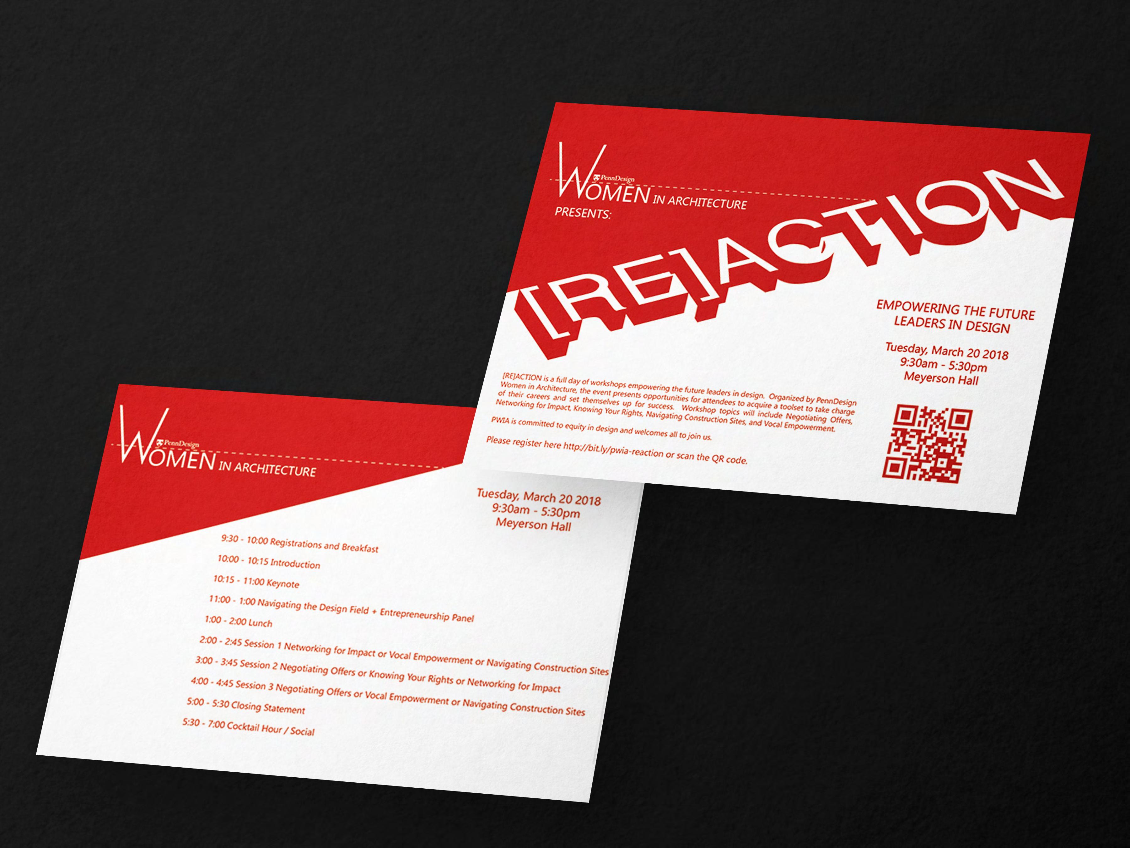
ReAction
As the Graphic Design Chair of PennDesign Women in Architecture I designed the graphics for their workshop “ReAction’.
The word ReAction is designed as 3D extruded text which bleeds into the page creating an angular divide between the top and bottom.
Red and white is used to make the graphics stand out.
7 2013 2014 2015 2016 2017 2018 2019 2020
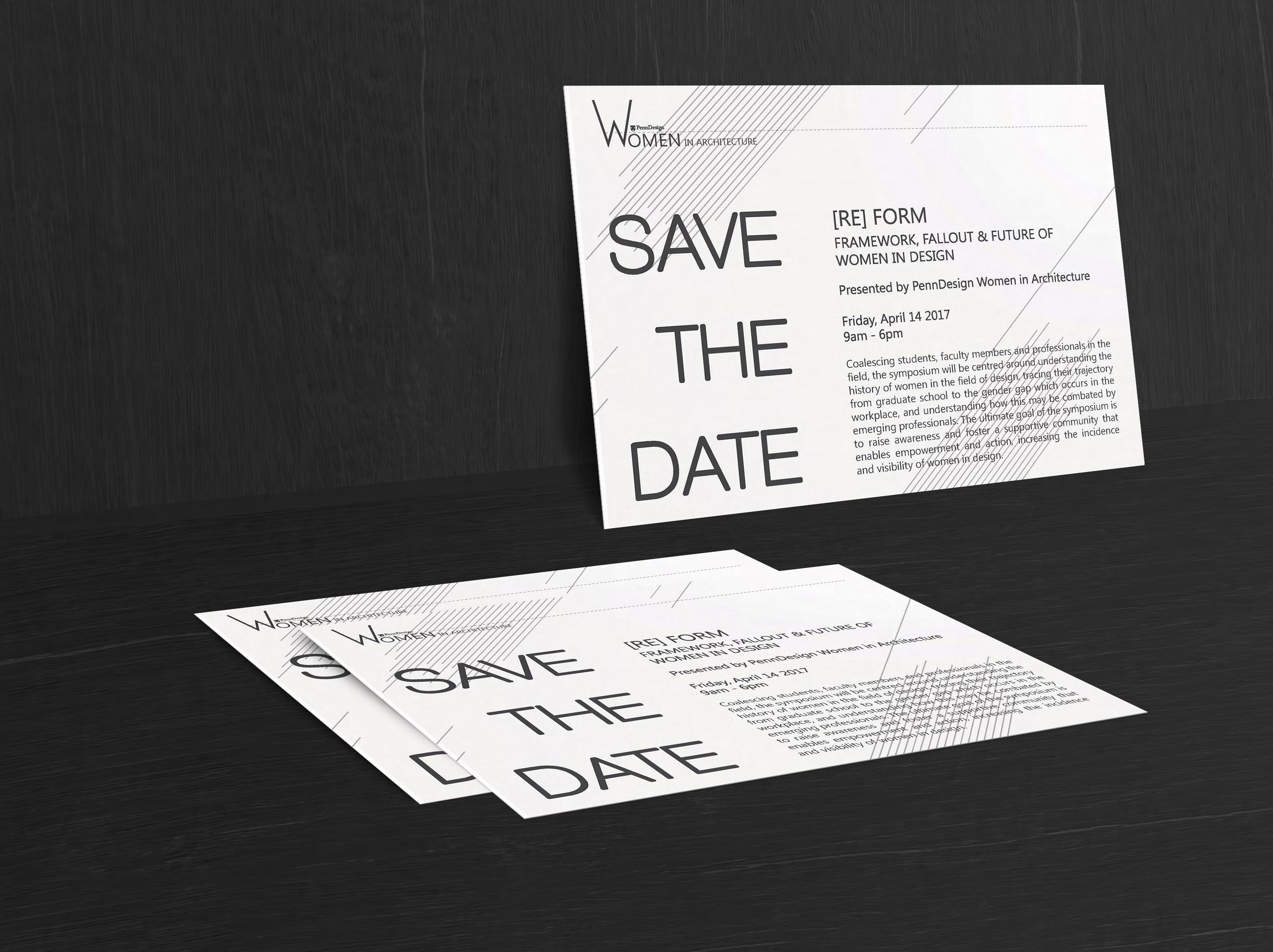
ReForm
As part of the PennDesign Women in Architecture Graphic Design committee I assisted in creating graphics for the group, like this Save the Date invite for a Symposium ‘ReForm’ held in 2017 .
8
2013 2014 2015 2016 2017 2018 2019 2020
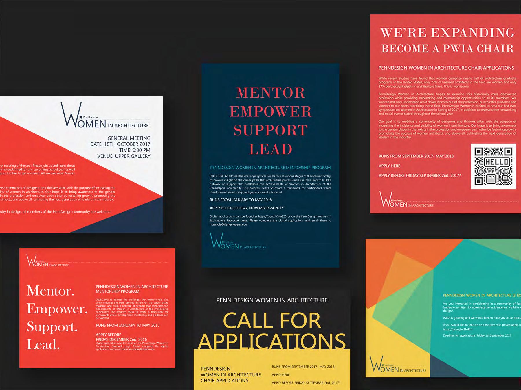
Women in Architecture
Posters and graphics designed for PennDesign Women in Architecture, to be vibrant and eye catching..
9 2013 2014 2015 2016 2017 2018 2019 2020
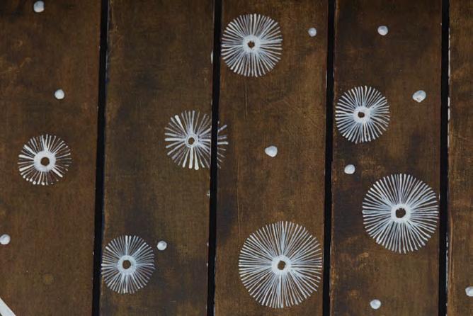
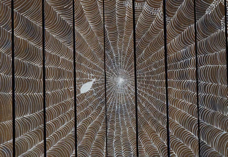
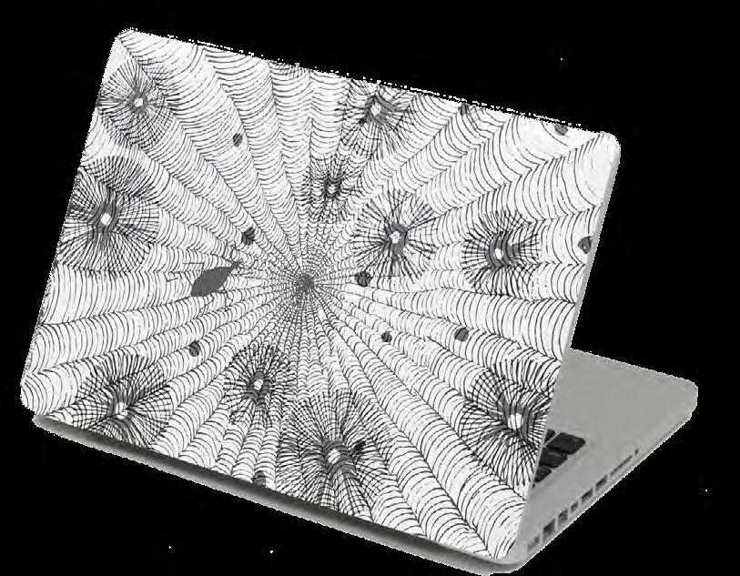
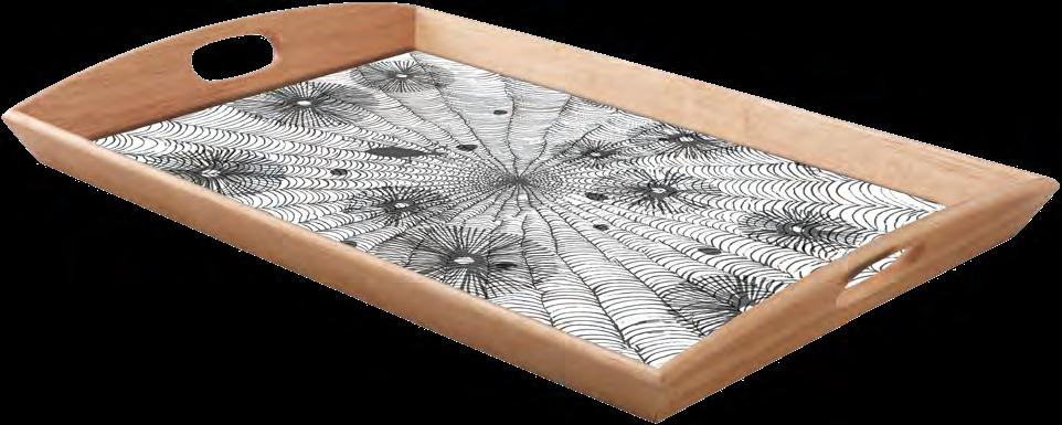
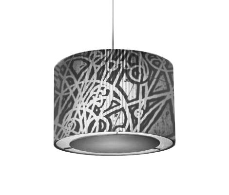
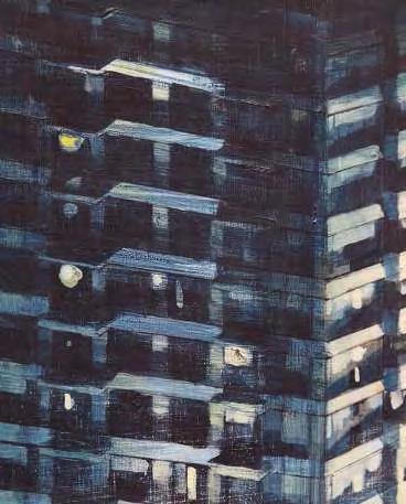
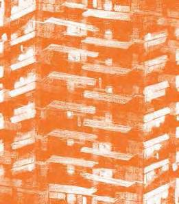
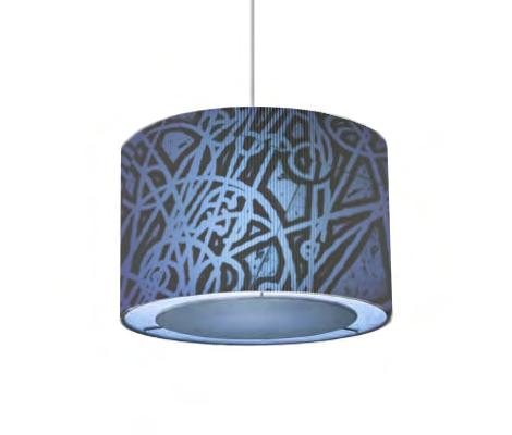
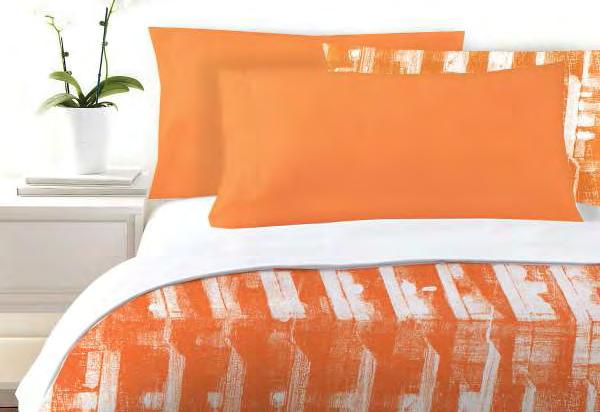
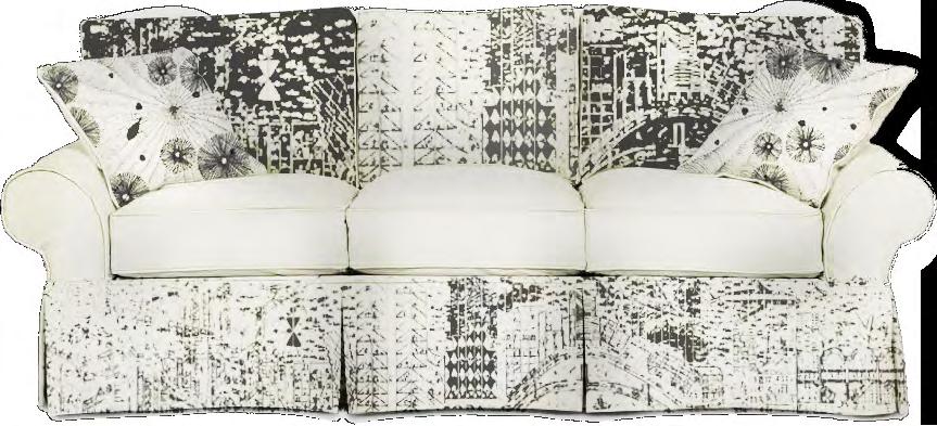
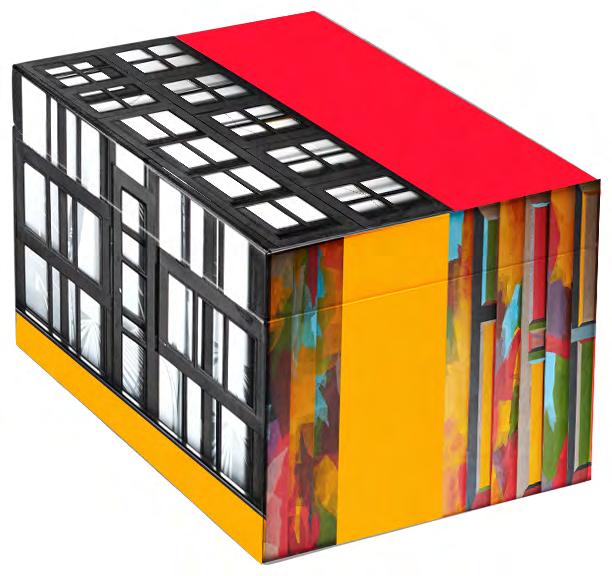
New Museum Store
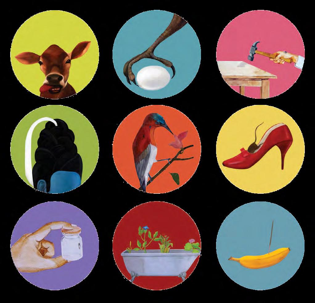
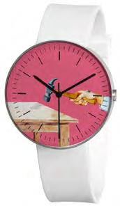
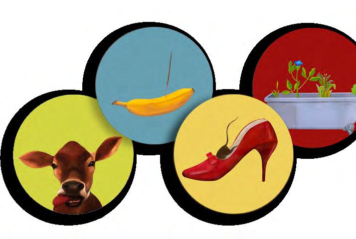
Various product graphic design for the GVK New Museum Store at the Mumbai International Airport. The idea was to use the artwork at the Airport Museum and adapt it to various products to sell at the Store.
Concept A: Taking a piece of art and manipulating its look so that it looks indistinguishable from the original, yet retains some of the elements from the original piece.
10
2013 2014 2015 2016 2017 2018 2019 2020
Original work
Original work
Sofa Upholstery
Tray
Lamp Shades Bedding
LaptopSkin Carpet
11
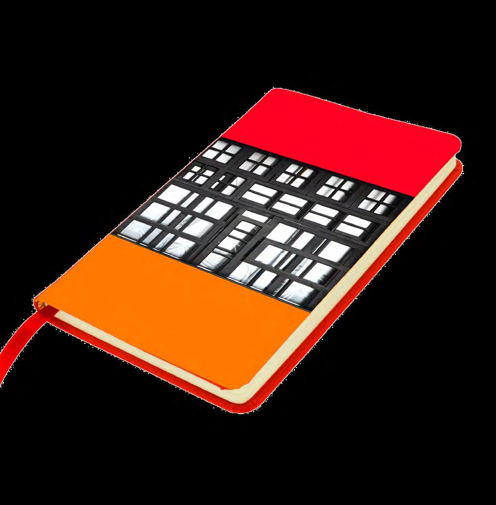
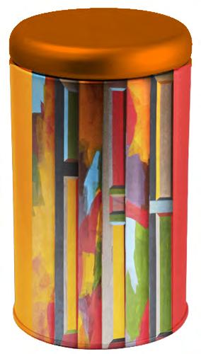
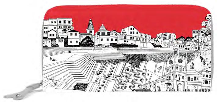
Concept B: Breaking up an artwork and graphically reassembling it.
Concept C: Creating a set from an artwork by dividing and combining. Box Tin
Notebook Wallet Coasters Watch Frame
Food For Thought
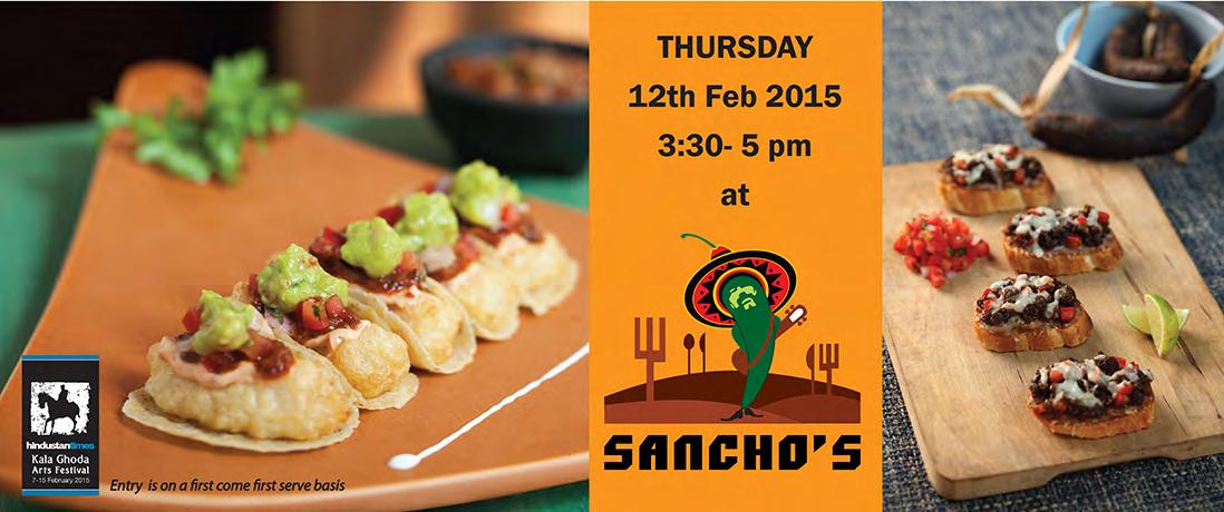
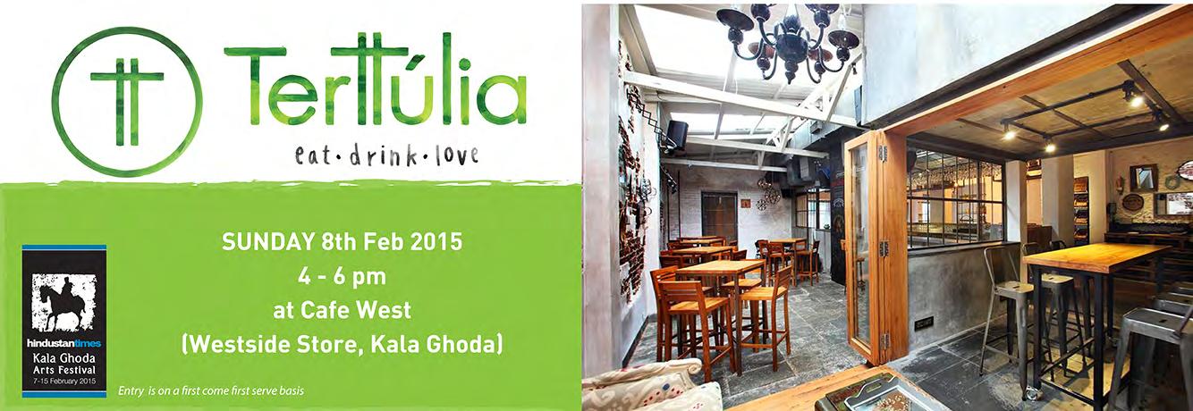
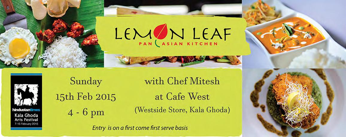
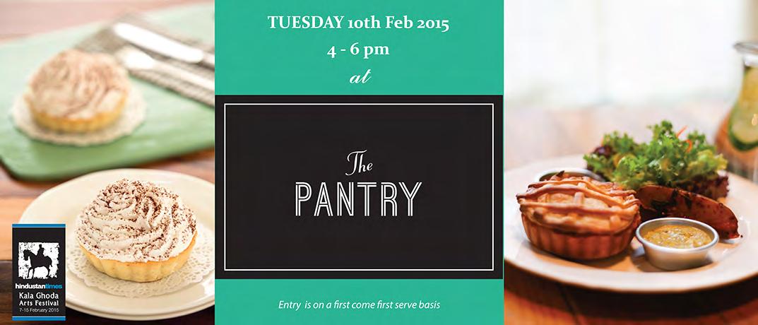
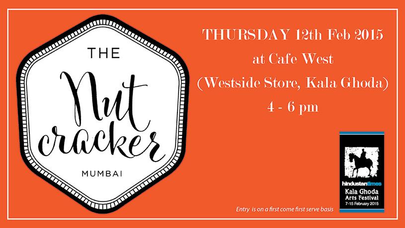
Banners designed to promote food workshops are the Kala Ghoda Arts Festival. Each one is simple, yet colourful to attract audiences on Facebook and other social media platforms.
12
2013 2014 2015 2016 2017 2018 2019 2020
Vittorio
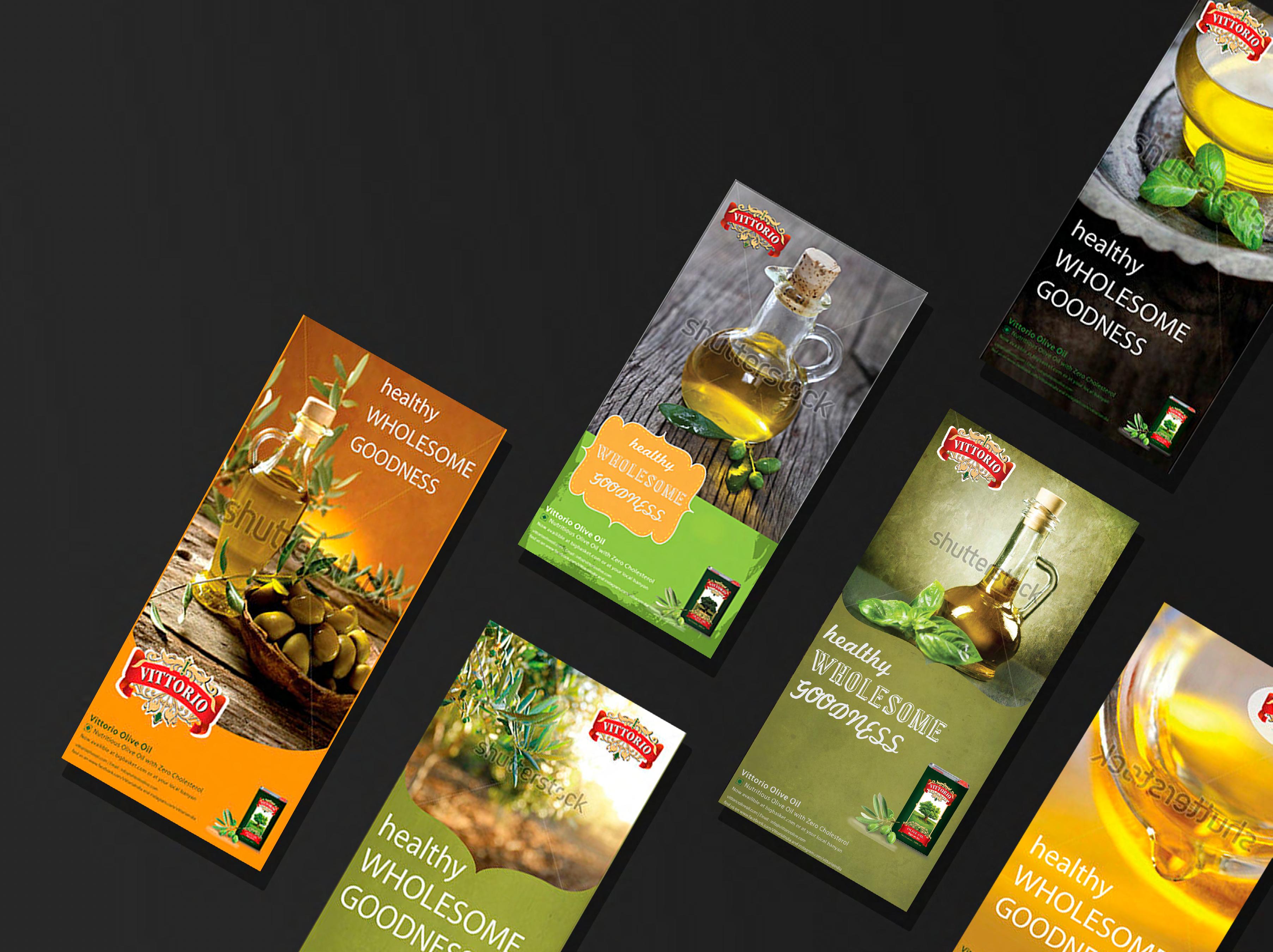
Banner options designed for Vittorio Olive Oil, keeping the color palette olive greens paired with oranges and yellows.
13
2013 2014 2015 2016 2017 2018 2019 2020
Logos & Branding
Monogram
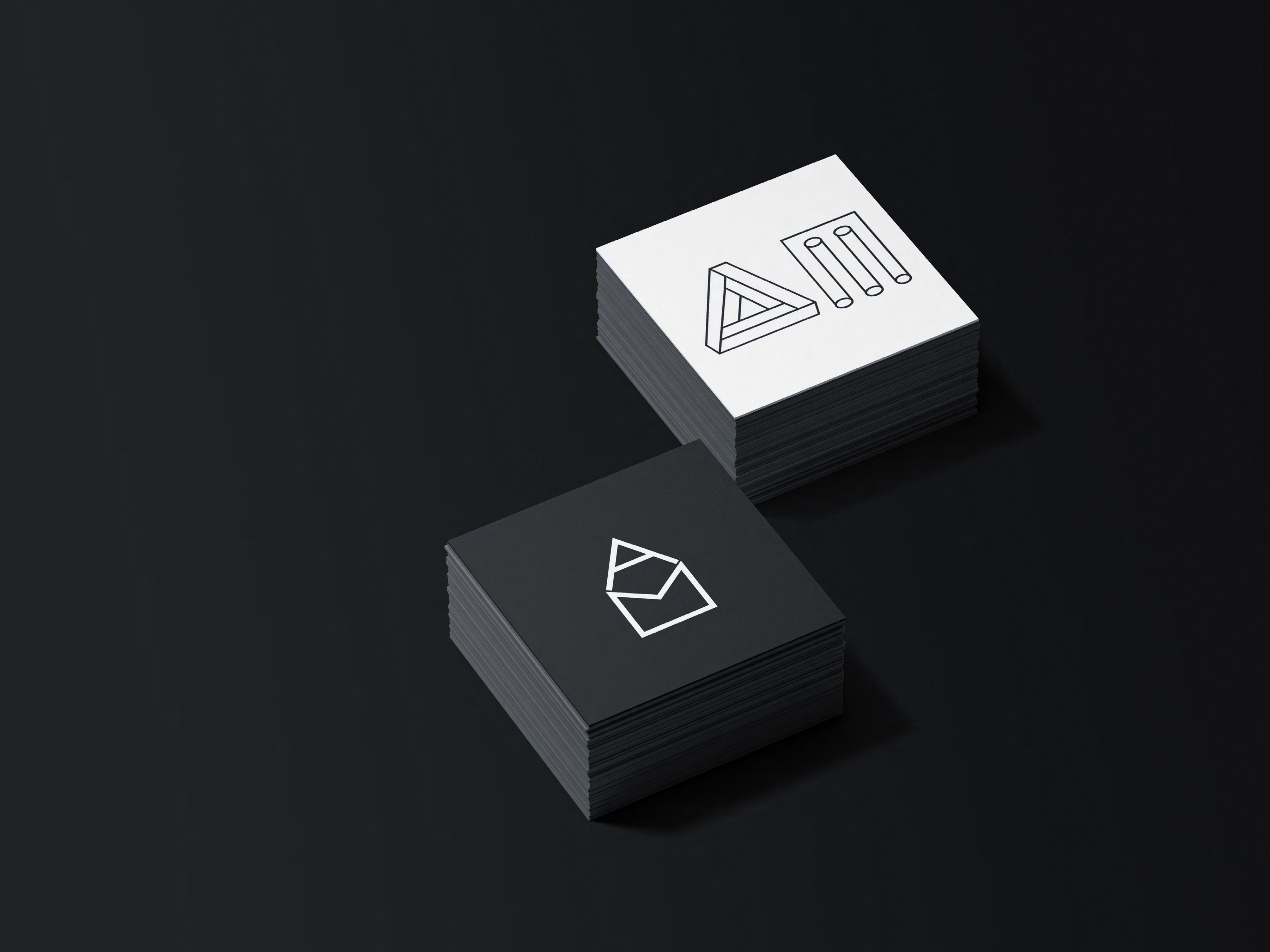
Design for two monograms of my initials ‘AM’. Being an Architect, I designed the first so that the initials form a house. The second consists of two optical illusions- a penrose triangle followed by the column illusion. A combination of these two give an architectural and monumental feel.
15
2013 2014 2015 2016 2017 2018 2019 2020
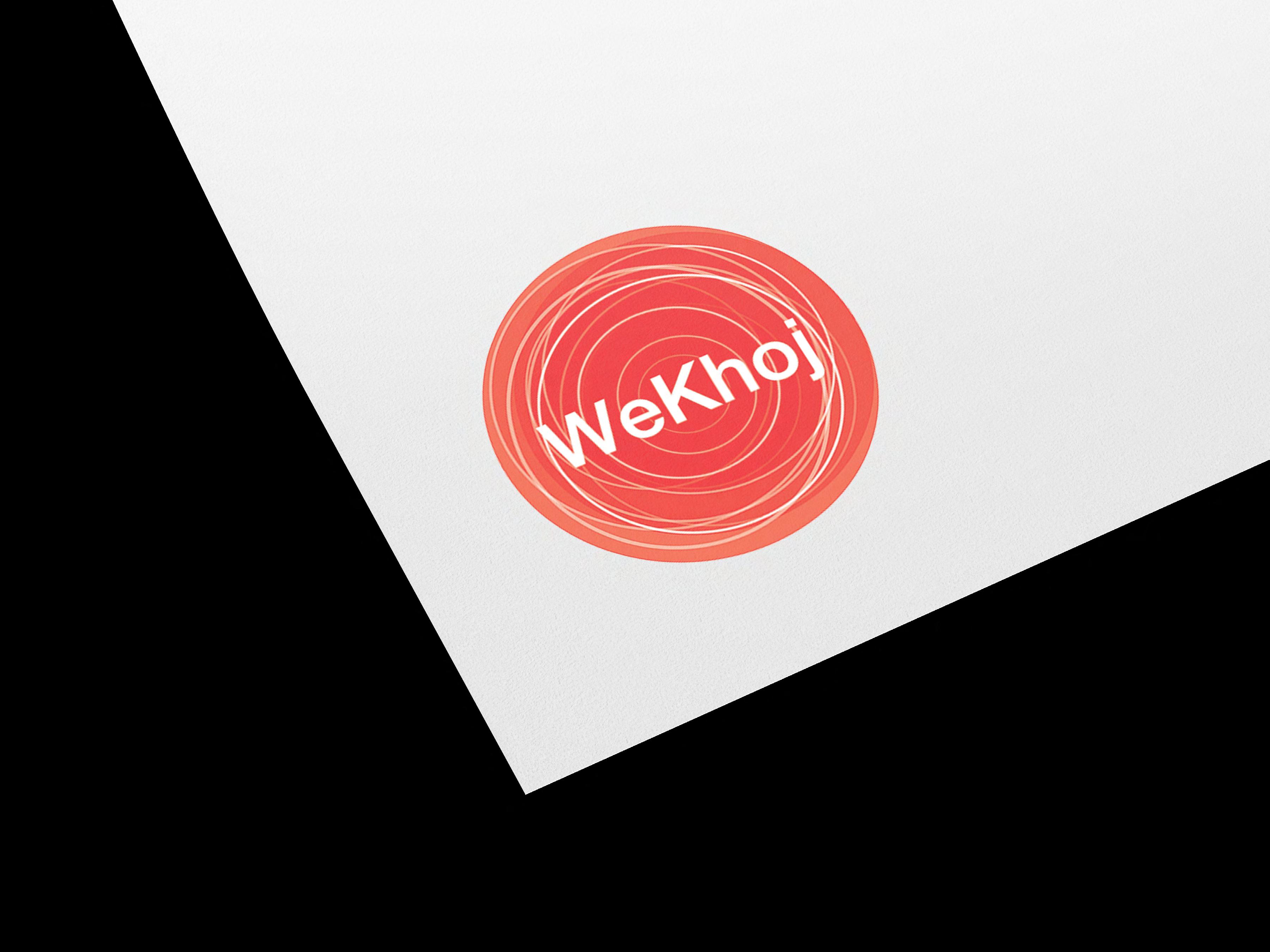
Logo design for a company called ‘We Khoj’ (translates to We Search), which explores ideas of searching. After several iterations the final logo represented the idea is that after searching when you find something you circle it.
Text in the center of a circle resembling the “universe” signifying that the “khoj” is infinite
Simple circle with silhouettes of objects
the ‘O’ has been replaced with a globe
J.com
WE KHOJ .COM
WEKH
WeKhoj.com
WeKhoj.com
WeKhoj WeKhoj WeKhoj WeKhoj.com WeKhoj.com WeKhoj.com 1 2 6 3 4 5 16 2013 2014 2015 2016 2017 2018 2019 2020 We Khoj
Objects hidden behind the text creates an interesting graphic
17
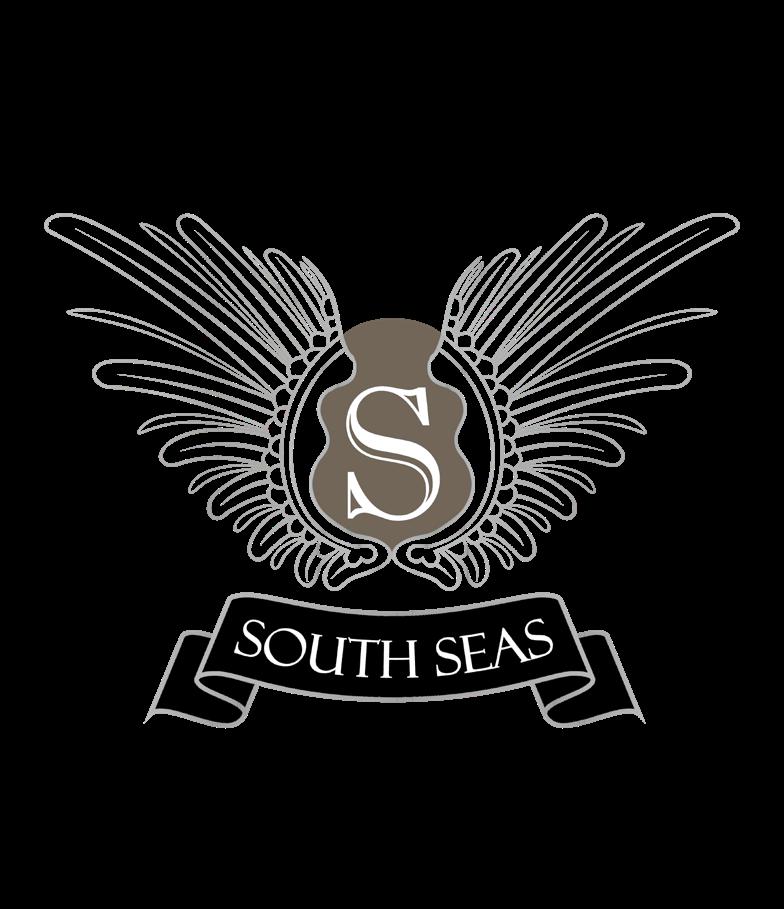
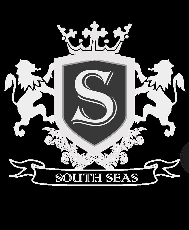
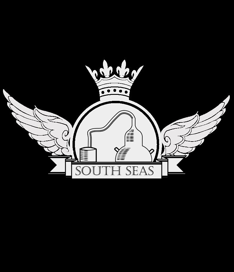
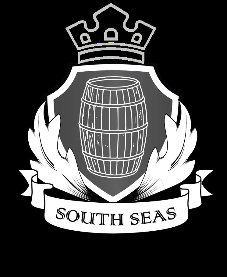
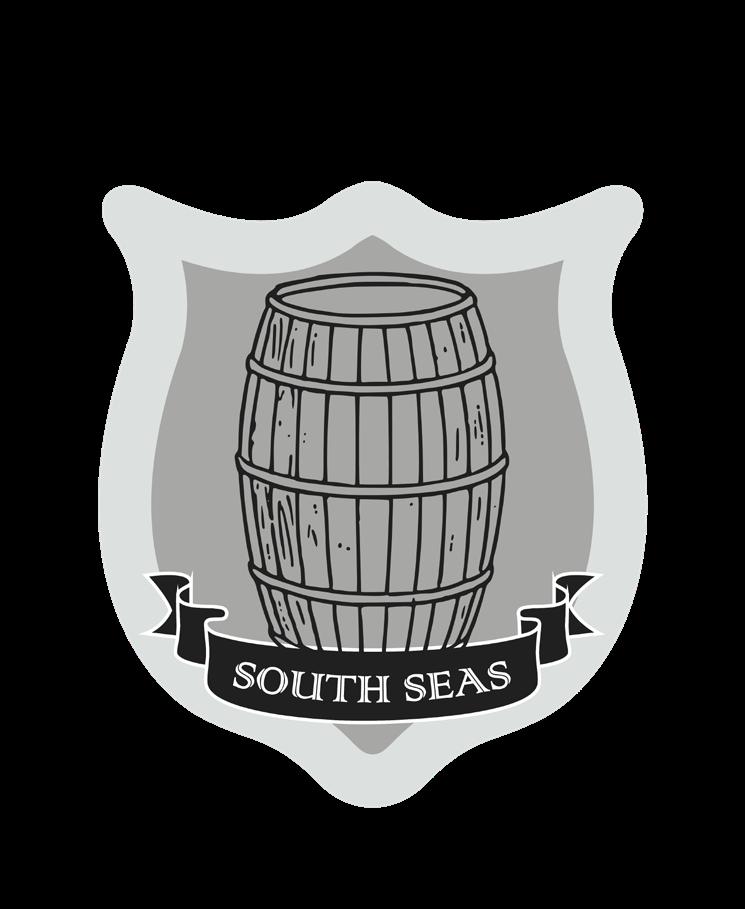
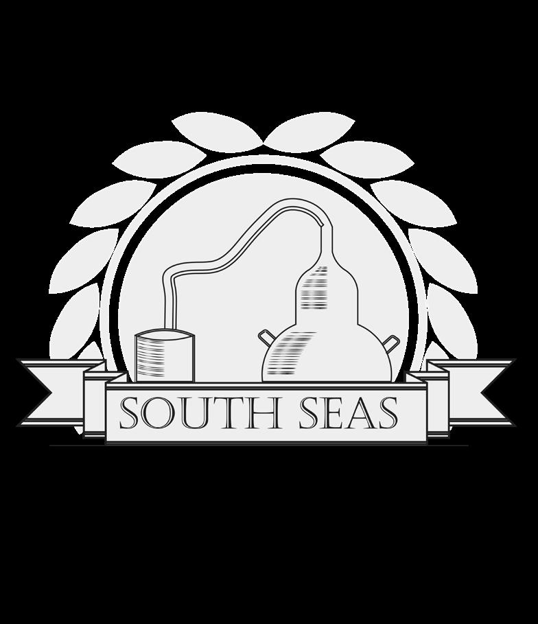
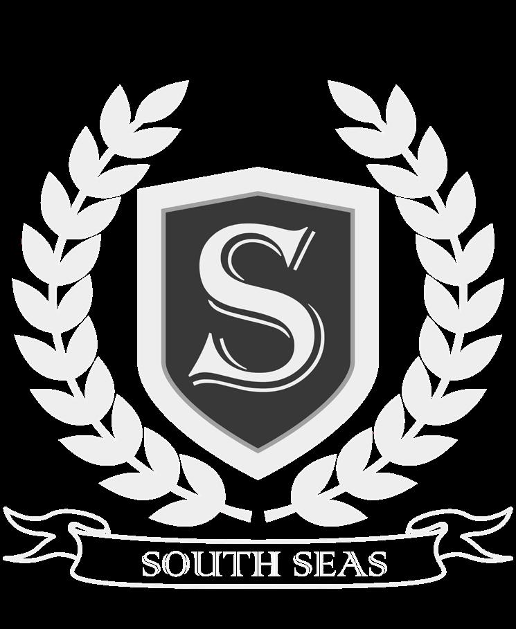
South Seas Distillery
Design for a logo for South Seas Distillery. The client wanted the logo to look like a crest. The logo options play with elements found in a distillery like a pot still or a barrel paired with crest-like elements like a crown, shield and wings.

18
2013 2014 2015 2016 2017 2018 2019 2020
This logo was for a freight company, using algorithms to pair trucks and shipping companies. The client asked me to design a logo based on the concept “Use Dipper at Night”, a slogan used the back of delivery trucks. The logo went through numerous iterations and was a challenging but fun project.
Playing
Using the word dipper with tire track underlays
Using the word dipper as truck headlights
19 2013 2014 2015 2016 2017 2018 2019 2020
dipper dipper dipper per dip dipper dipper dipper dipper
Dipper
on the word “Dipper” as the big dipper constellation
Logo design options for a Spa named Olivia’s Lake. The design takes inspiration from nature and uses colors that are bright but soothing. Options vary from using text to graphic icons, paired with font options.
Olivia’s Lake
Olivia’s Lake
Olivia’s Lake
Olivia’s Lake
Olivia’s Lake
Olivia’s Lake
Olivia's Lake
Olivia's Lake
20
Olivia’sLake
Olivia’s Lake
2013 2014 2015 2016 2017 2018 2019 2020
Secret Sanctuary
Logo design options for Secret Sanctuary, a Resort and Spa. The client wanted two options- One where the logo was the name of the resort and the second with a tree with the name of the resort in a smaller font. The following options were presented using colors that were pink and green.
Secret Sanctuary
Secret Sanctuary RESORT AND SPA
Secret SanctuaryRESORT AND SPA
Secret Sanctuary RESORT AND SPA
Secret Sanctuary RESORT AND SPA
Secret SanctuaryRESORT AND SPA
Secret Sanctuary RESORT AND SPA
Secret SanctuaryRESORT AND SPA
Secret Sanctuary RESORT AND SPA
21
2013 2014 2015 2016 2017 2018 2019 2020
22 breathe ZEKO SHOP UNIQUE 2013 2014 2015 2016 2017 2018 2019 2020 Logos
DiscoveRING.com Noveno
ZEKO
Logo concept designs, some of which are experimental.
DESIGNE EPUBLIC
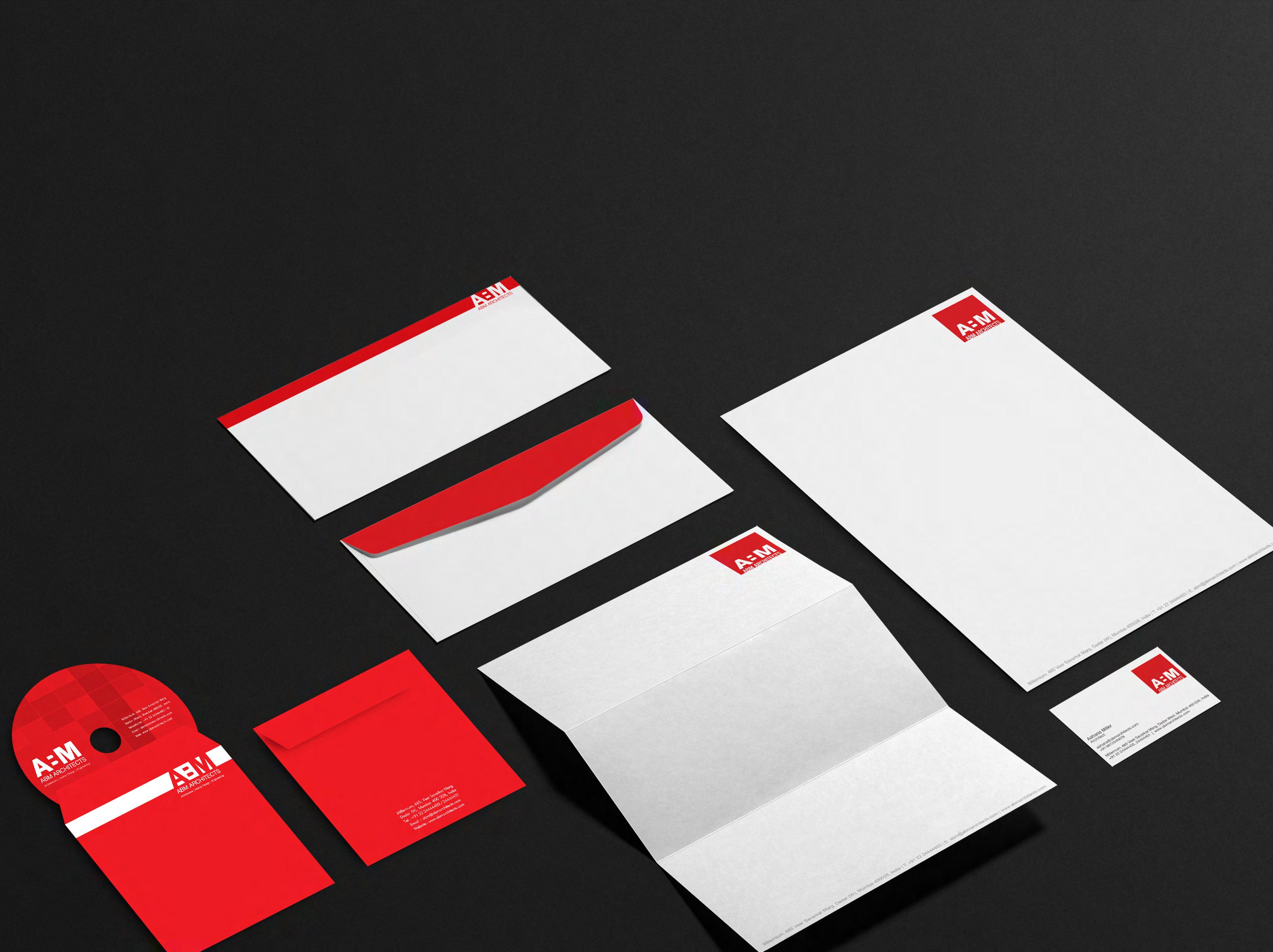
ABM Architects Branding
Letterheads, envelopes, business cards and CD stickers designed for ABM Architects. The square logo is placed on the top right of the letter head and business cards. For the envelopes a red band runs on the edge and folds over to the flap of the envelope. The CD case envelope is red with white text and the CD sticker designed with a red block grid pattern.
23
2013 2014 2015 2016 2017 2018 2019 2020
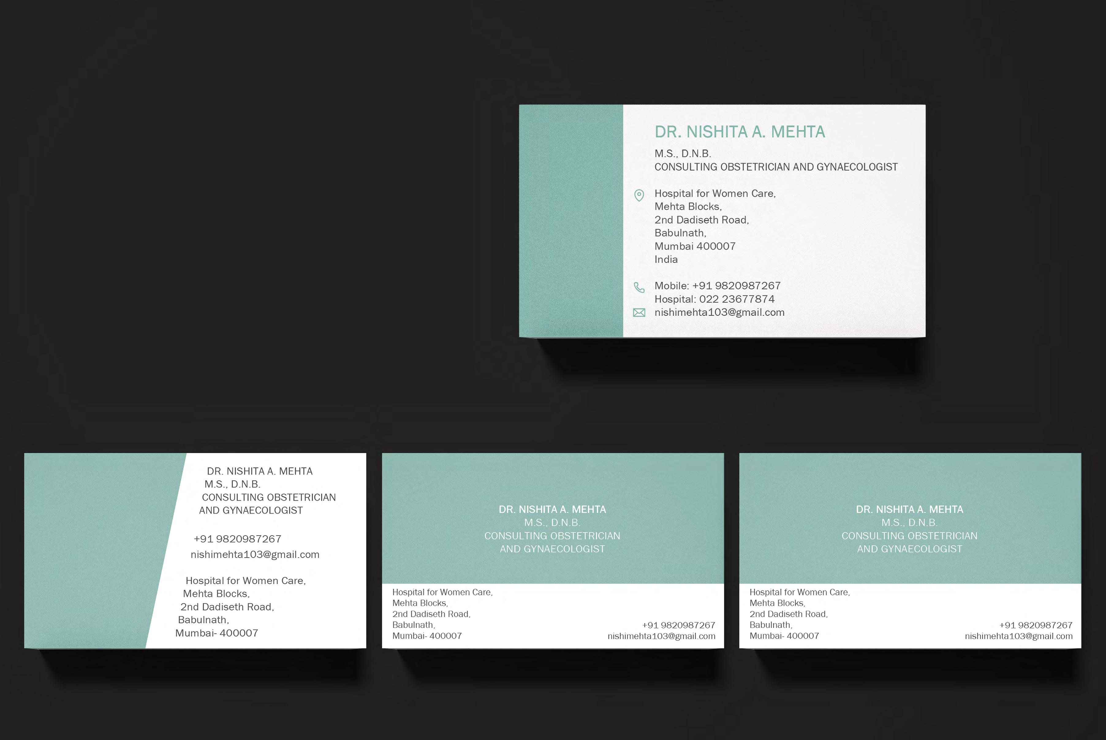
NM Business Cards
Design of business cards for Dr. Nishita Mehta. The layout is simple and text aligned to read clearly. The use of a sea green adds a hint of color to the card without distracting from the design. The image on the right is the final design, however alternate designs were explored.
24 2013 2014 2015 2016 2017 2018 2019 2020
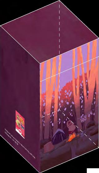
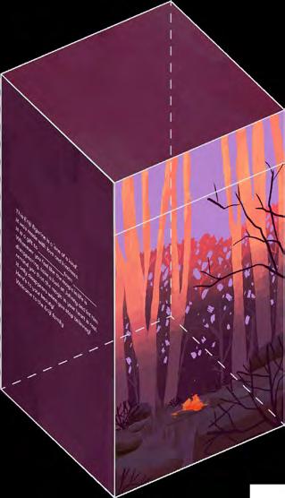
Enijimondo
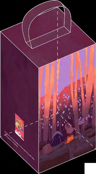
Design for packaging for artwork developed for Enijimondo. After trying various options for the box, the client chose two options which were then developed for printing and production. 2013
OPTION 1: Box with handle which fits into slot
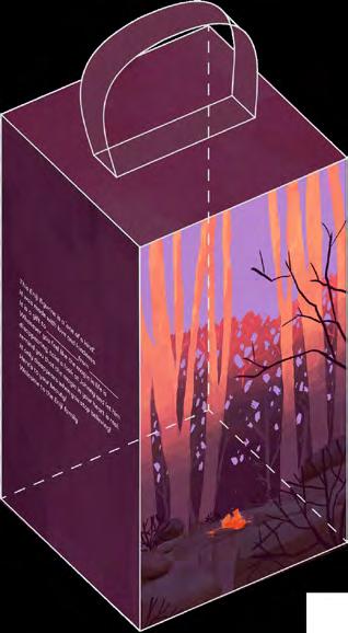
OPTION 2: Magnetic Flap FRONT BACK FRONT BACK


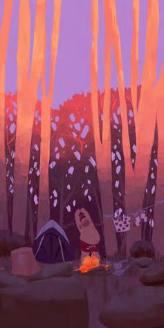


This Eniji figurine ‘one of kind’. It was made with love and kindness. It is a gift to from Whenever you feel like the magic life disappearing, take a look at Johnny and let him remind you that the magic in your heart real. It only disappears when you stop believing! Here’s to your beauty! Welcome to the Eniji family Designed and packaged in New York City, NY USA. Silbospark, LLC TM © Designed and packaged in New York City, NY USA. Silbospark, LLC TM © This Eniji figurine is ‘one of kind’. It was made with love and kindness. It is gift to from Whenever you feel like the magic in life disappearing, take look at Johnny and let him remind you that the magic in your heart is real. It only disappears when you stop believing! Here’s to your beauty! Welcome to the Eniji family 25
2014 2015 2016 2017 2018 2019 2020
Presentations
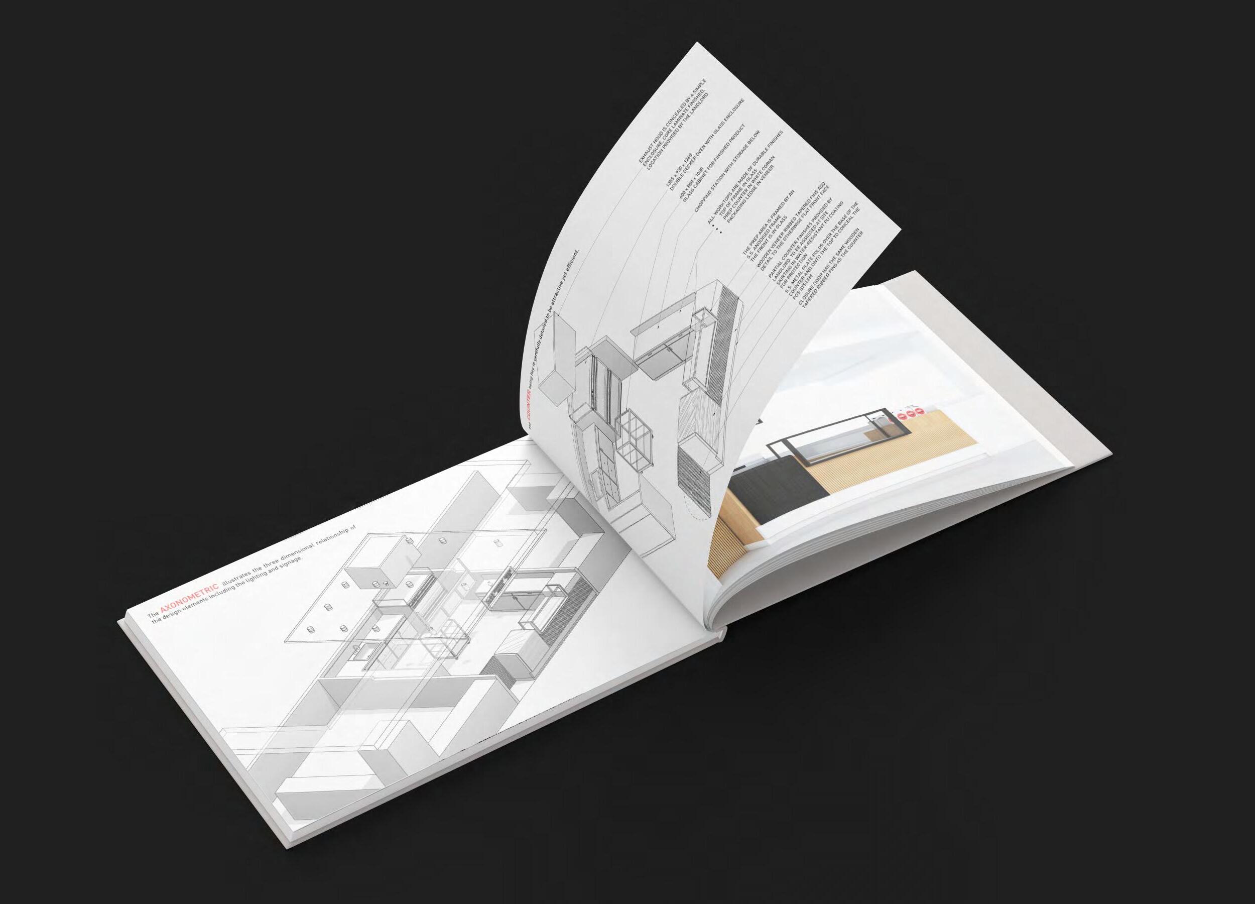
David’s Dangerously Delicious Char Siu
Design presentation for a food kiosk for Chef David is a simple clean template using the brand colorsblack, white and pink. Axonometric drawings were used to represent the design elements
27
2013 2014 2015 2016 2017 2018 2019 2020
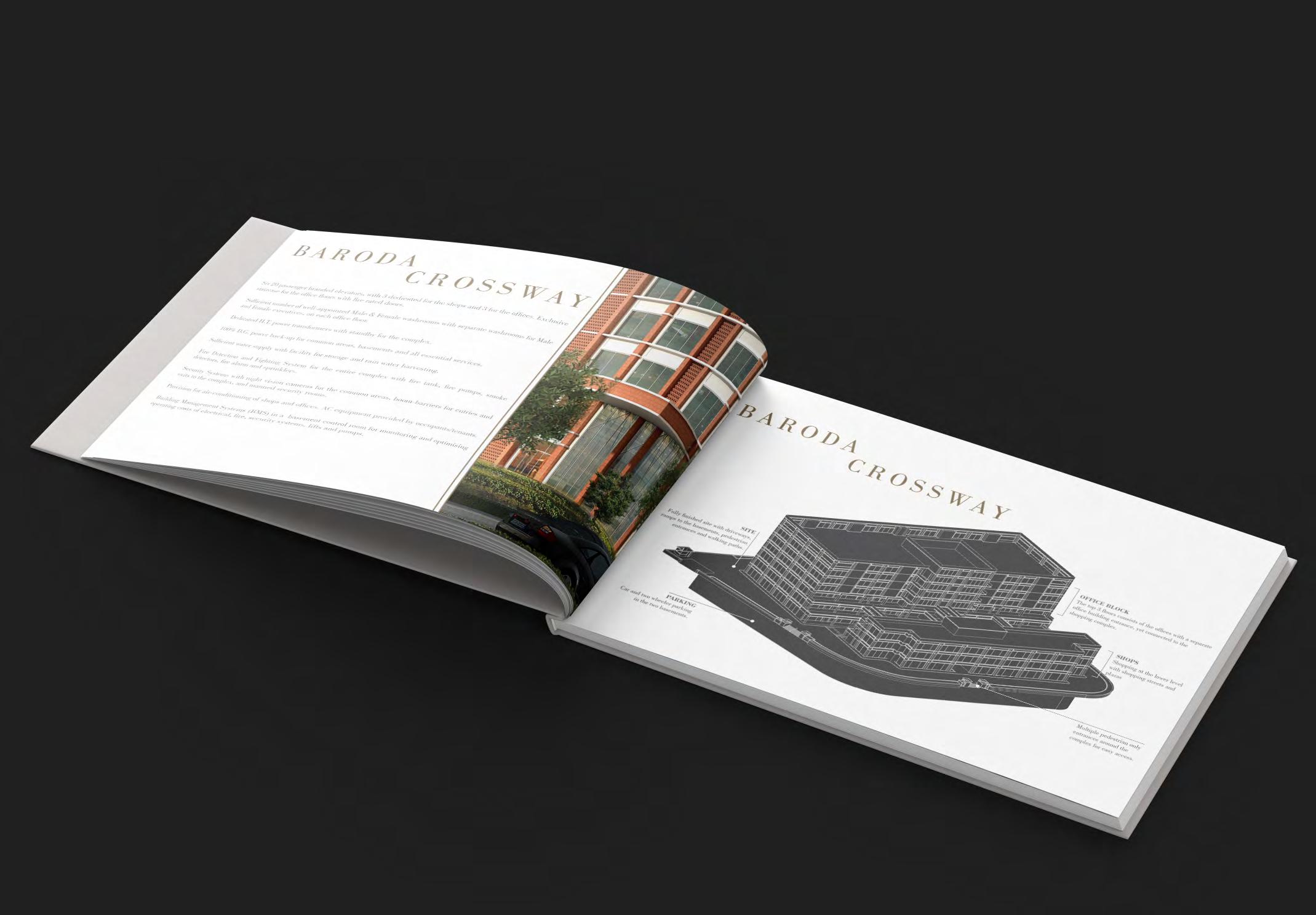
Baroda Crossway
Brochure design for Baroda Crossway an upcoming high street shopping center in Baroda, India. The brochure combines text, images and axonometric drawings.
28 2013 2014 2015 2016 2017 2018 2019 2020
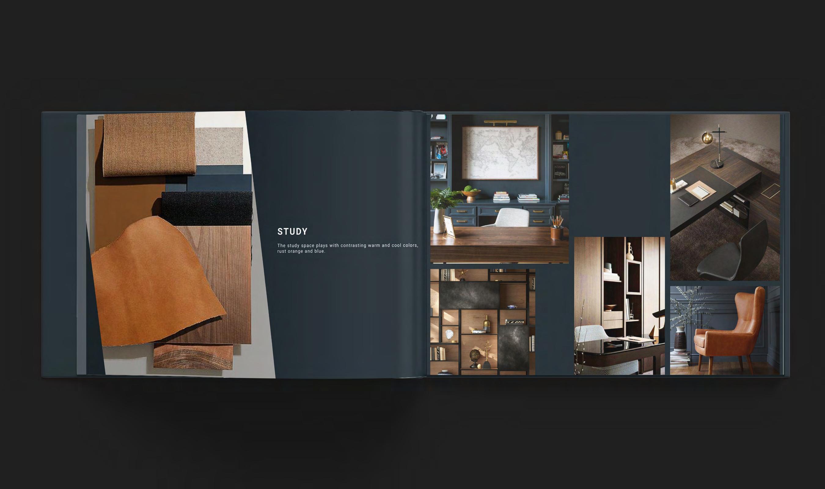
Penthouse Interior Concept Presentation
Presentation layout for a penthouse apartment design. The left side shows the material palette chamfered at an angle with design concept note. The right side shows the inspiration images arranged in a simple grid.
29
2013 2014 2015 2016 2017 2018 2019 2020
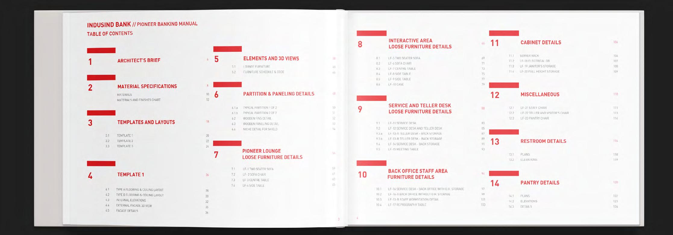
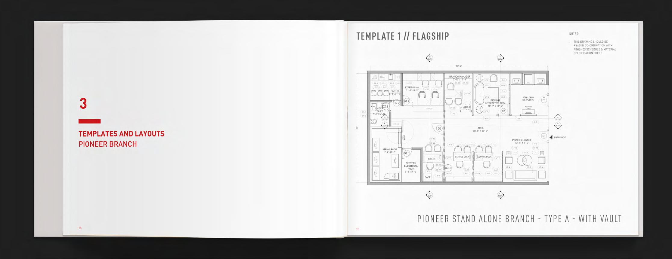
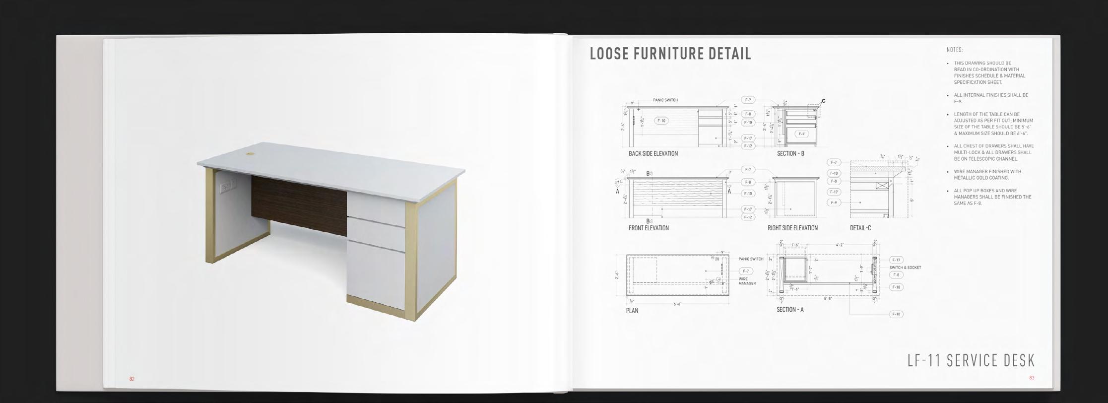
Banking Manual
Design of a banking manual using furniture detail drawings laid out with titles and headers highlighted with a red band.
30
2013 2014 2015 2016 2017 2018 2019 2020
Conference Center Presentation
Layout for a concept presentation for a hotel conference center / meeting space. The design of the space being simple but elegant, the layout reflects that using a charcoal grey background with gold border highlights.
31 2013 2014 2015 2016 2017 2018 2019 2020
Cartography
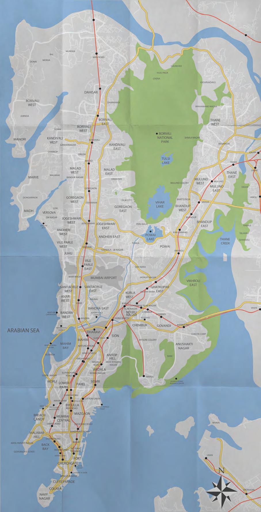
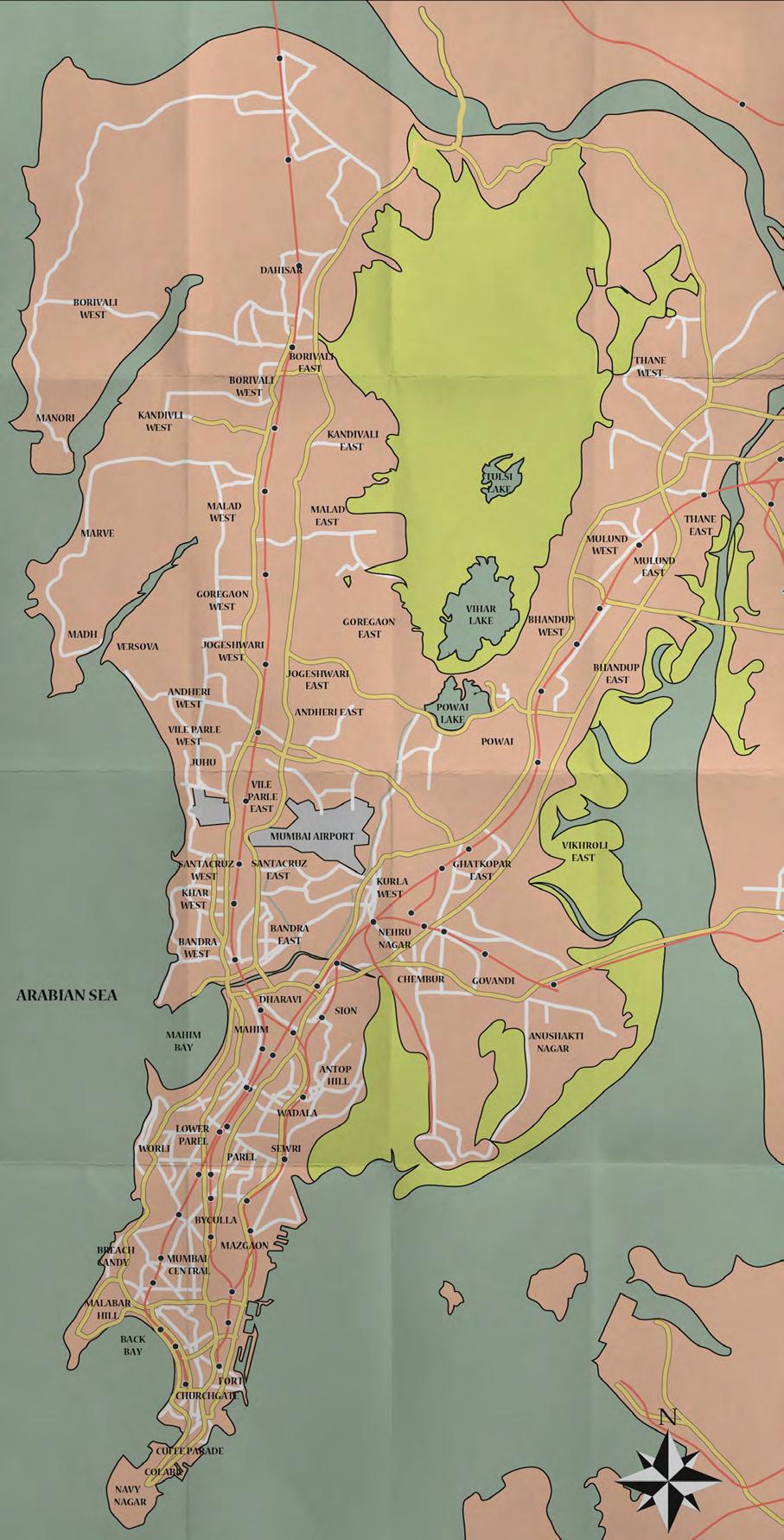
The City Story
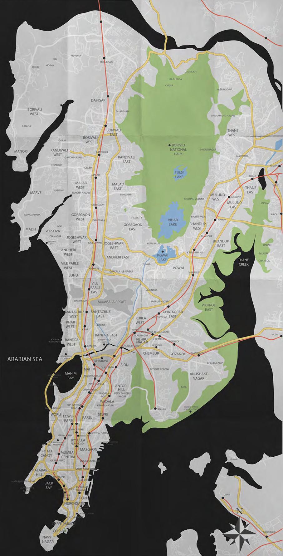
A collaboration with Aashti Miller, this was an exercise in mapping two major cities - Mumbai and London for The City Story. After tracing out both cities we experimented with various graphical representations.
33
2013 2014 2015 2016 2017 2018 2019 2020 Mumbai
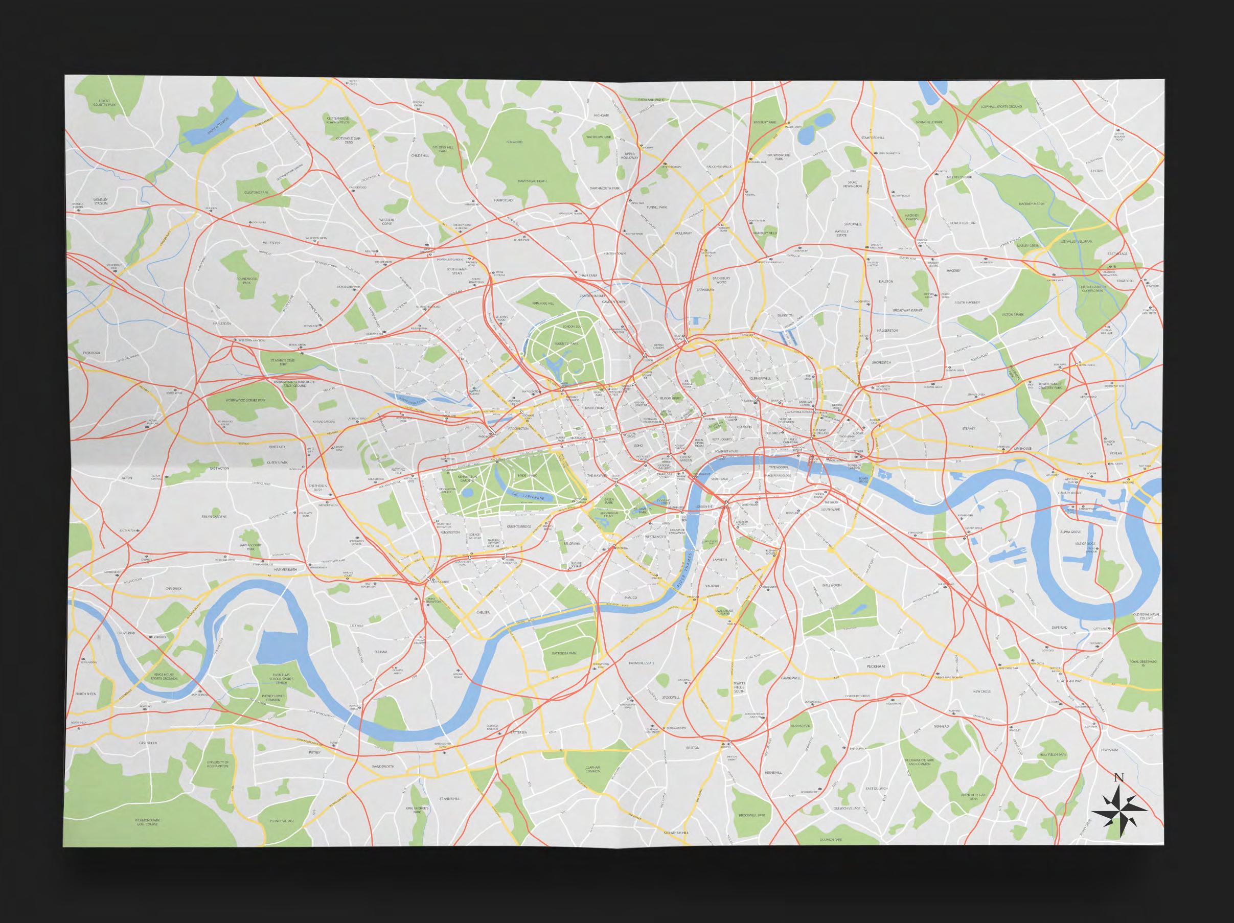
34 London
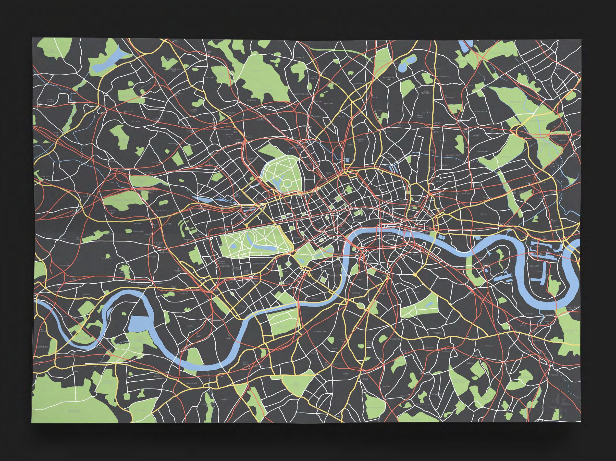
35 London
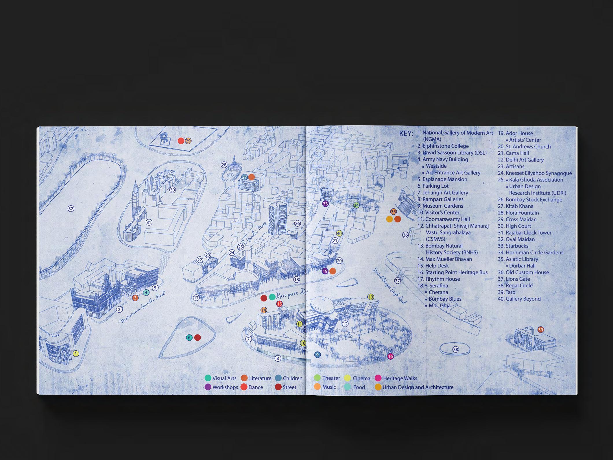
Kala Ghoda Map
This map was hand drawn by Aashti Miller and composed by me especially for the Kala Ghoda Arts Festival 2015.
36
2013 2014 2015 2016 2017 2018 2019 2020
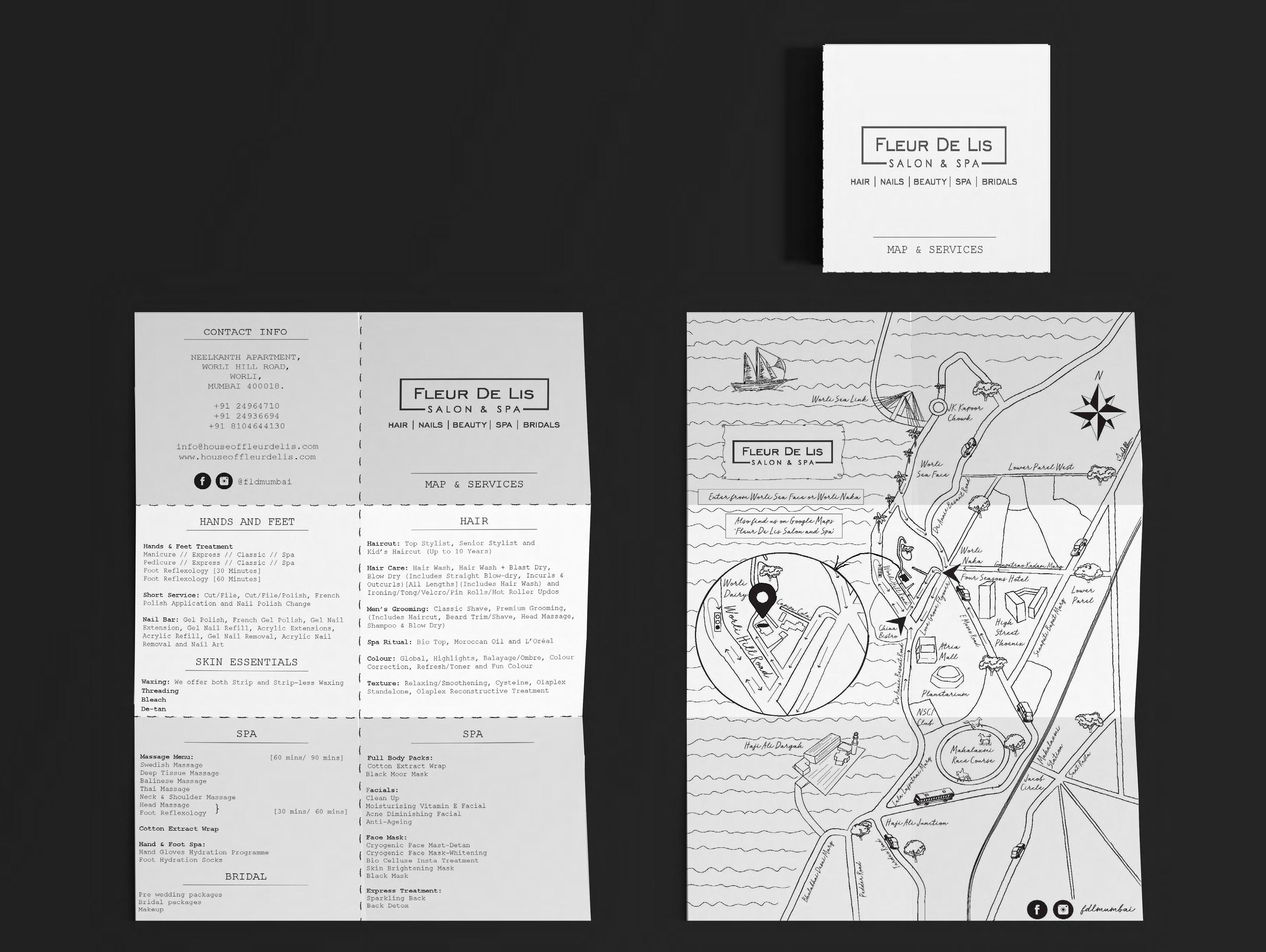
Fleur De Lis Map
A newly opened Salon in Mumbai ‘Fleur De Lis’ asked me to design a map so that customers were able to locate them. The map is a simple and clear monotone line drawing of Mumbai emphasizing the Salon at Worli. The map was designed in such a way that it could be folded; on one side are the services they offer and on the other is the map.
37 2013 2014 2015 2016 2017 2018 2019 2020
Web
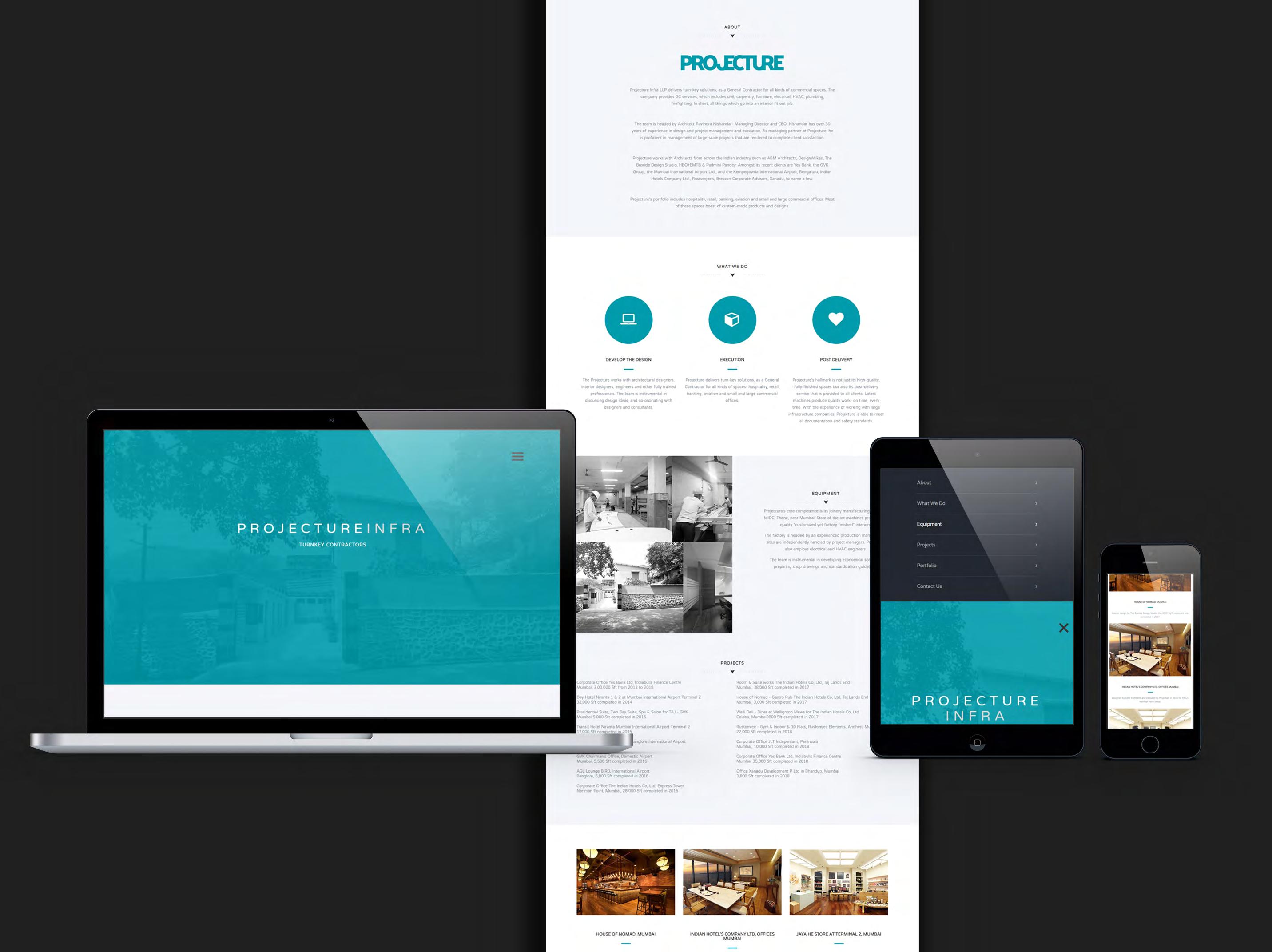
Projecture Infra
Website design for Projecture Infra a contracting firm in Mumbai. This one page responsive website is designed using the turquoise logo colors with a simple white and grey color scheme.
www.projecture.in
39 2013 2014 2015 2016 2017 2018 2019 2020
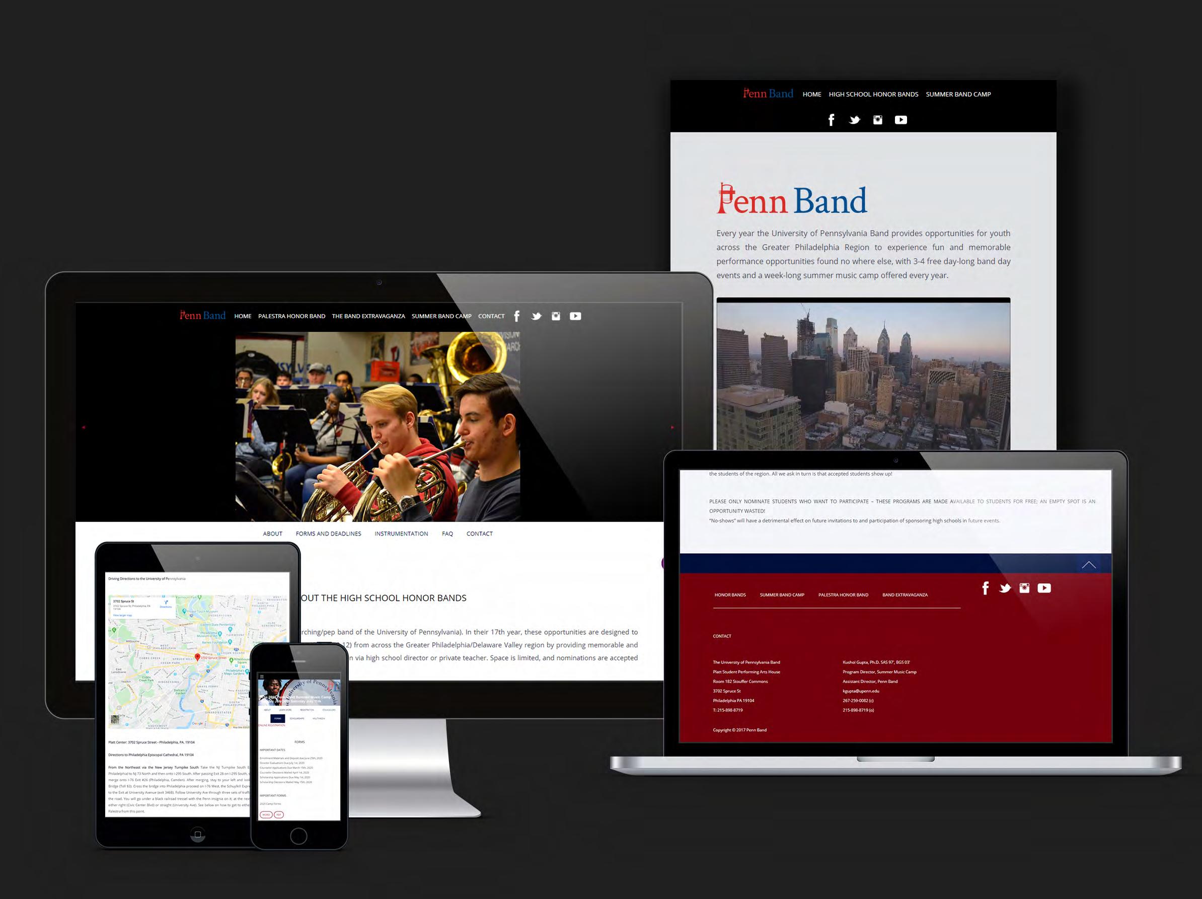
Penn Band
Website redesign for Penn Band at the University of Pennsylvania using the red and blue colors of the university. Link
40 2013 2014 2015 2016 2017 2018 2019 2020
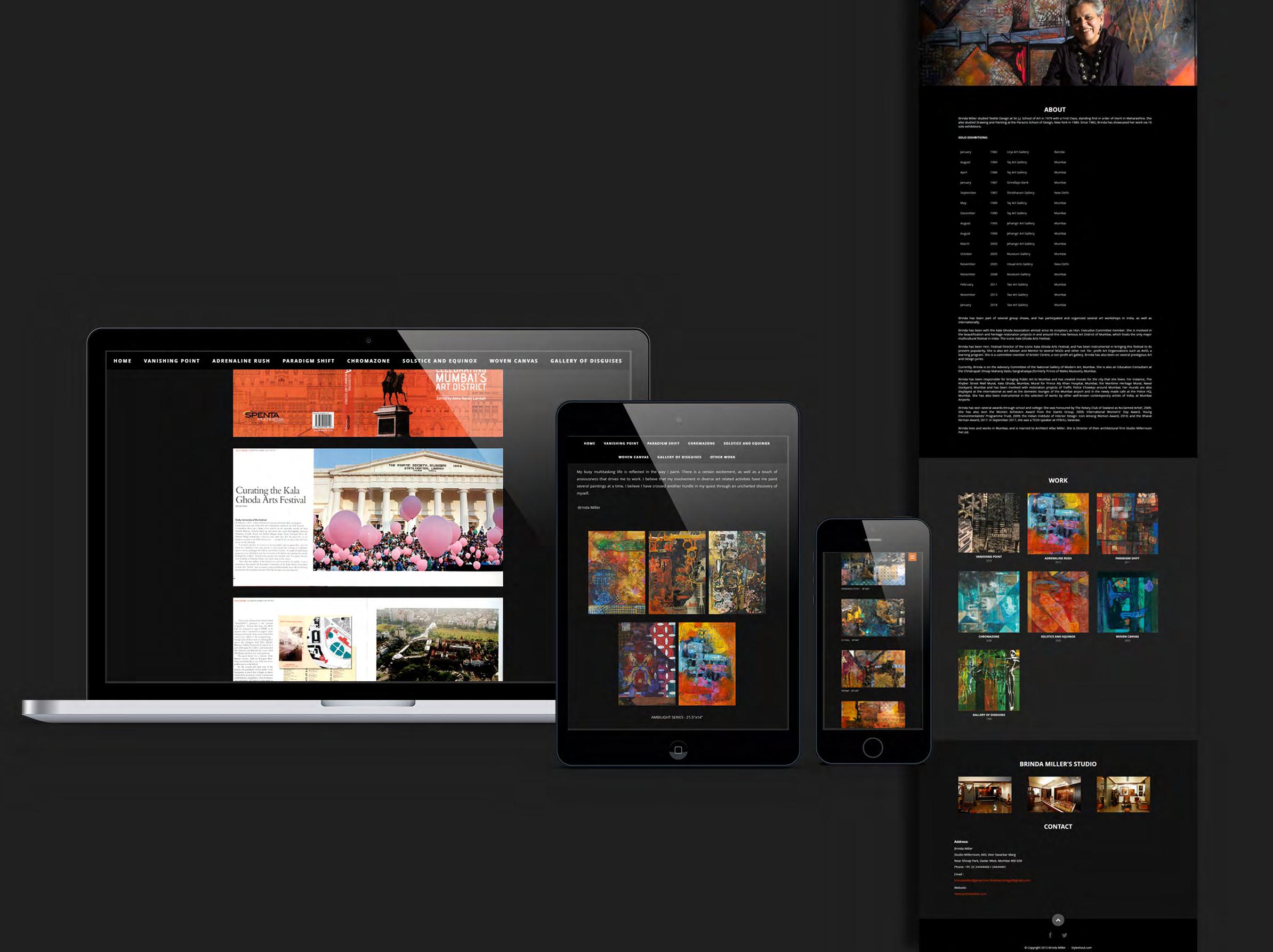
Brinda Miller
Website design for Brinda Miller to showcase her artwork. The background is black so that the artwork stands out.
www.brindamiller.com
41 2013 2014 2015 2016 2017 2018 2019 2020
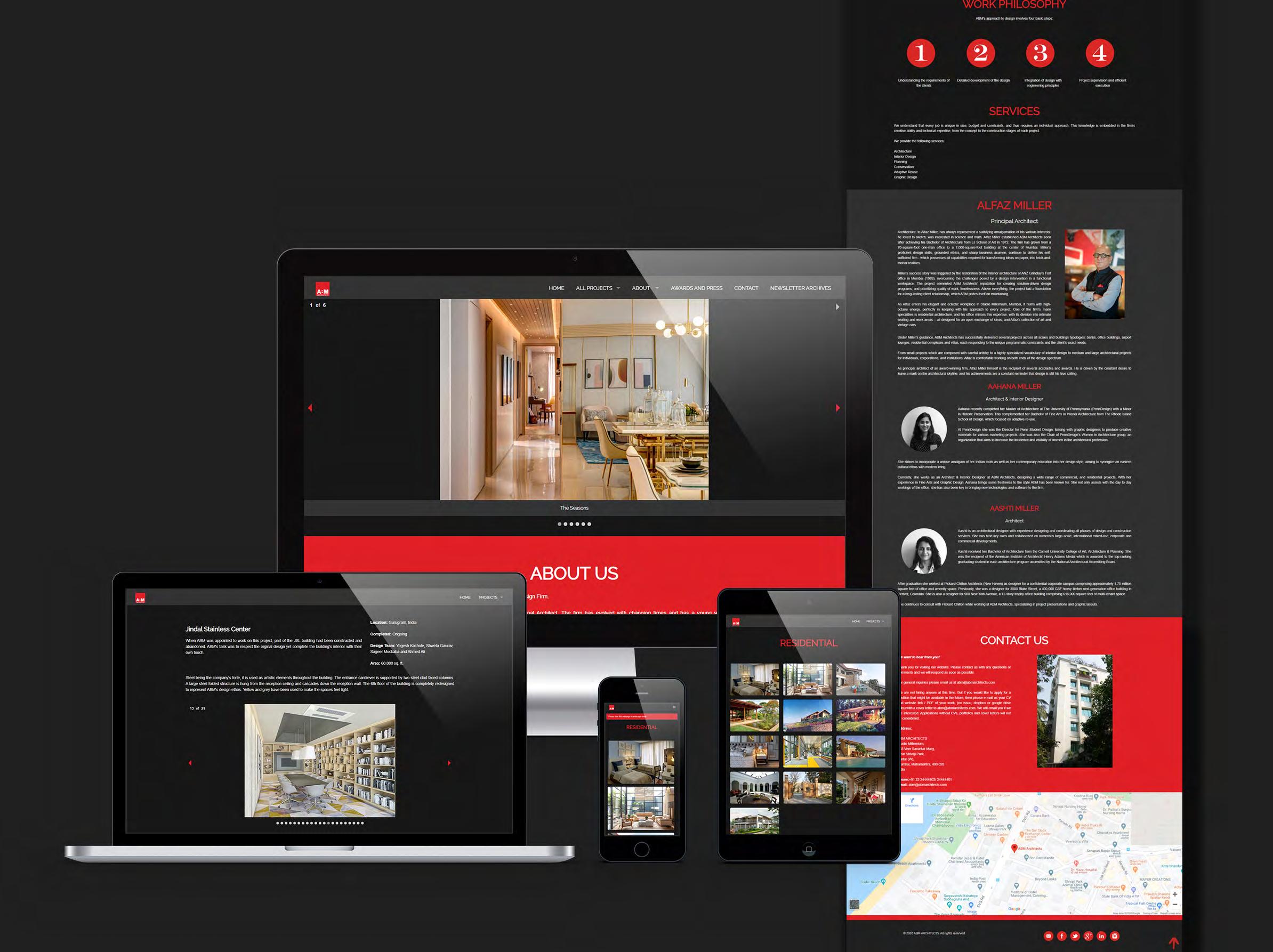
ABM Architects
Website design for ABM Architects using the logo colors which are red and white and complementing those with a black background.
www.abmarchitects.com

42 2013 2014 2015 2016 2017 2018 2019 2020
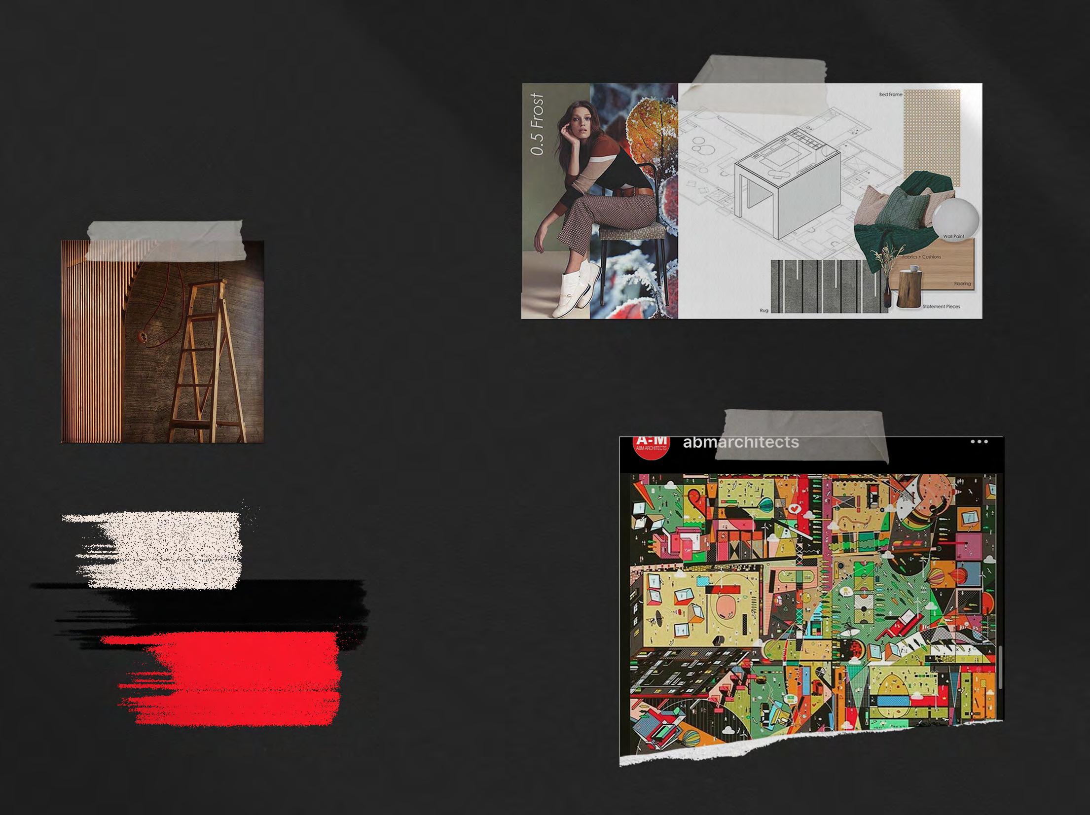
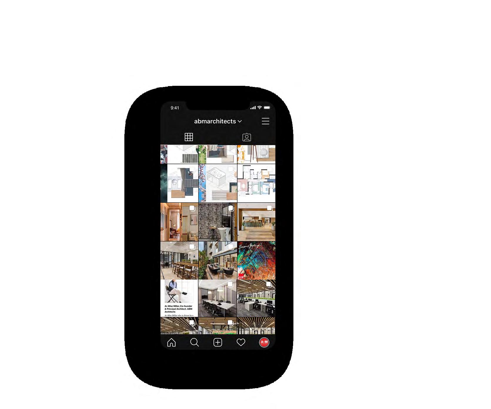
A Managing social media pages for ABM Architects. www.instagram.com/abmarchitects www.facebook.com/abmarchitectsmumbai
ABM Architects Social Media
43 2013 2014 2015 2016 2017 2018 2019 2020
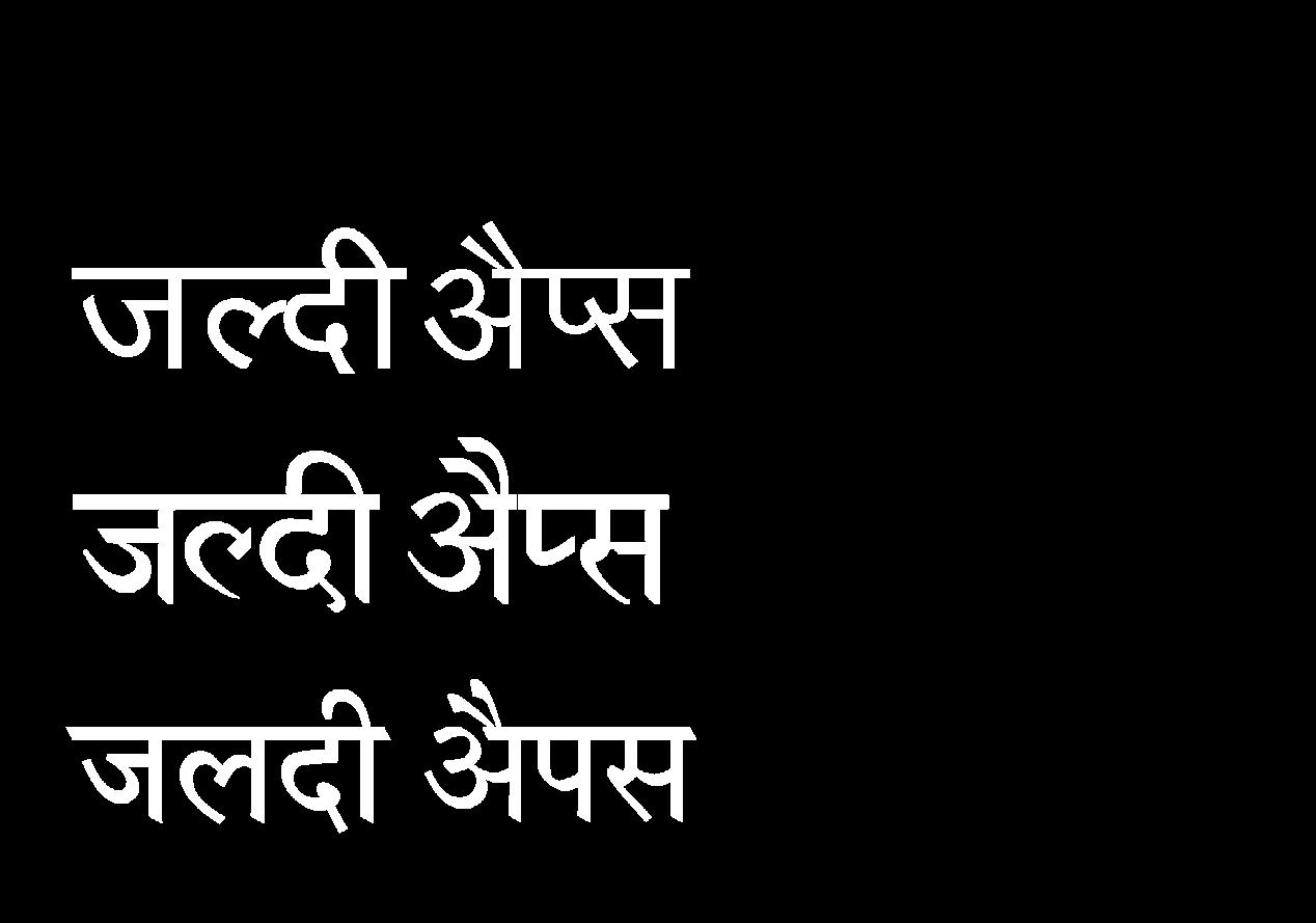
‘Jaldi’, meaning quick, was the design of a logo and app interface. The final logo depicts a lightning bolt reflecting the meaning of the word Jaldi. From that the app interface was designed for an Android phone along with instructions on how to download and install the app.

Font face used: Lato Regular and Lato Light
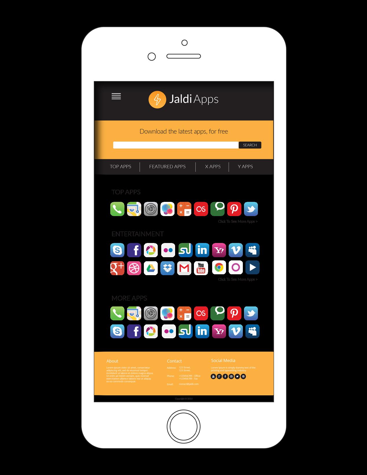
Unknown sources Security Lock screen and security Allow installation of apps from sources other than the Play Store. Search Apps... Download history .APK Install this application? It will have access to: Install this application? It will have access to: Installing... App installed. DONE org.app/apk NEXT INSTALL OPEN 44 2013 2014 2015 2016 2017 2018 2019 2020 Jaldi
App Download Instructions Hindi Logo Options
Font face used: Kruti Dev Font face used: Devangari Font face used: Arvind
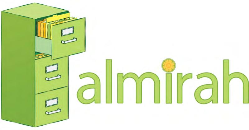
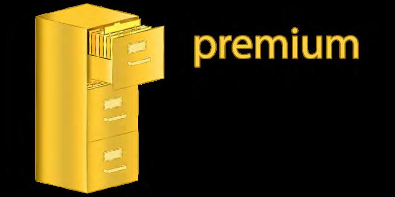
Logos and icons for www.almirah.co. The website is a secure file storage website. The logo design plays with the image of the ‘almirah’ (old cupboard).


a s kj dl fkj d s d k a d k d k d d k k a lk s k d k d k d d kej k dk d e t k a h k t he k k ej ke d ke kd f e t ke oi e ke o w e o iueor wleei u e ie d s kelkeldf eo u m c k la k a sl kj d fkj d as kj h s d kj w kj s 82 s k k dk jsh k s k s k w o s ld k a dl k d k d d kk a k s k d k d k d d kej k d k d e k a h kej lk e dl k e kd e ke oi e k e r o w e o iue o w ee iu e ie g w v dhs d d h s g d h nbdjf d bjfbjdb d jb db s h d b v d s jb d h s v d b s hf hs v h v bdn s b n dsbfndf n s vfb s v d hj v d h sf sa k b d k s jb dj hfbd 45 2013 2014 2015 2016 2017 2018 2019 2020 Almirah
Architectural Illustration
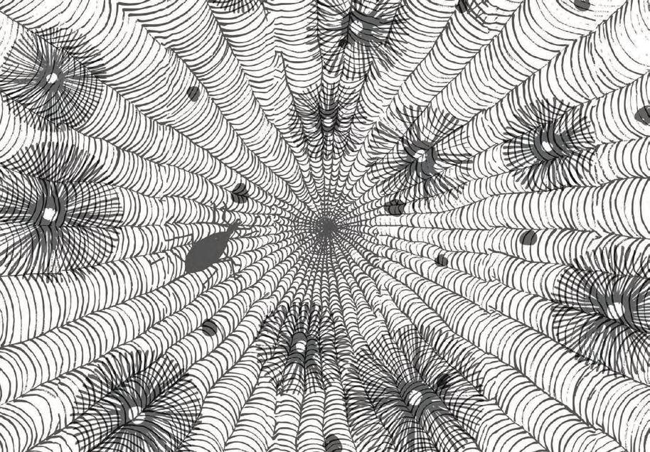
Chaos Theory
The concept for this drawing is “chaos theory”, which examines and redefines the existing function of interstitial spaces. The grasshopper script that generated the digital diagram was first used on puppets. This script was then applied to interstitial spaces to follow the puppet’s trajectory.
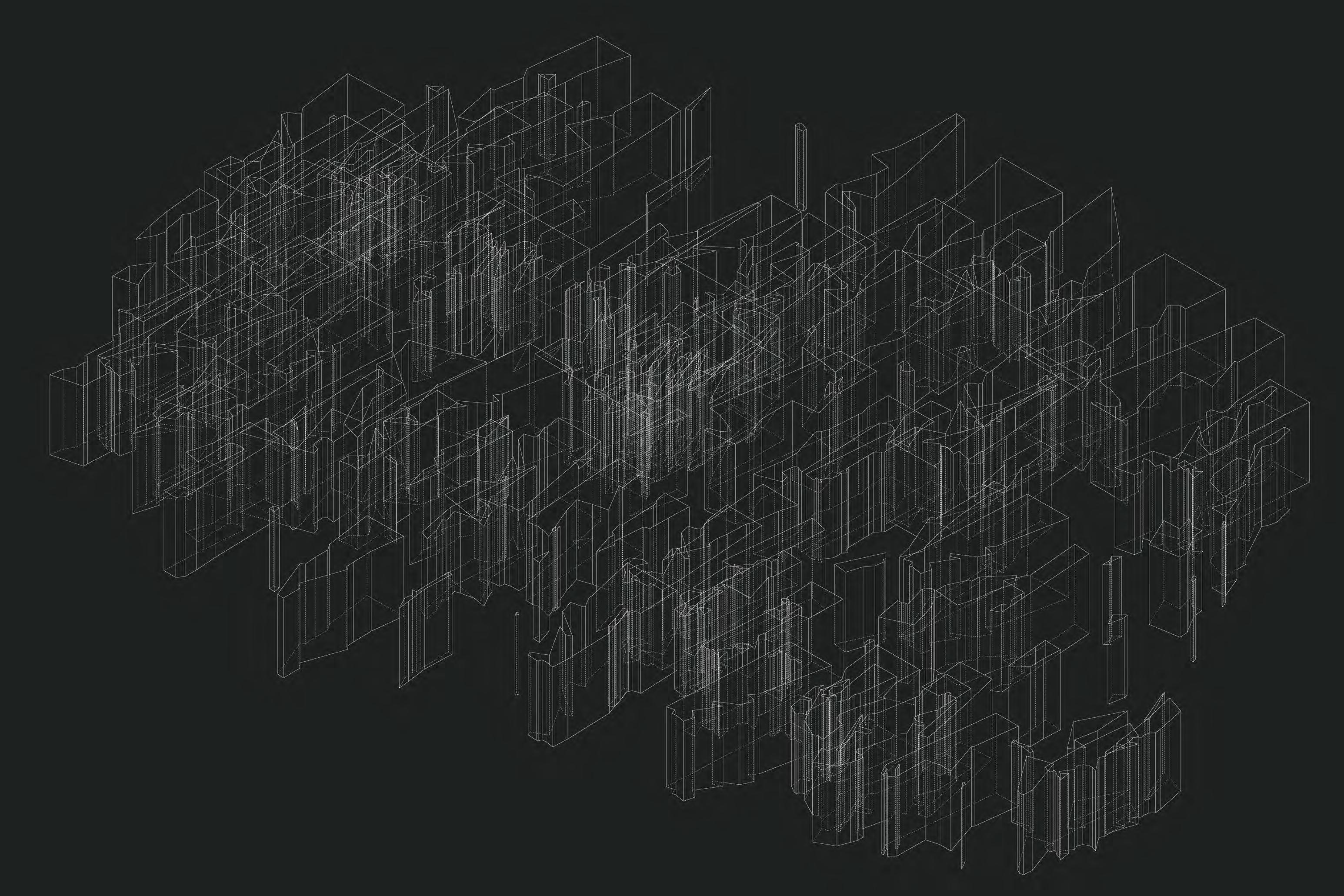
47 2013 2014 2015 2016 2017 2018 2019 2020
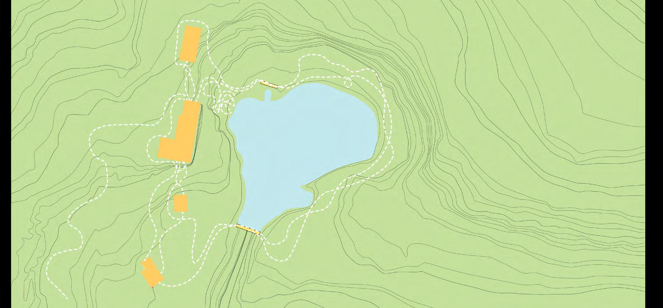
Mon Oncle
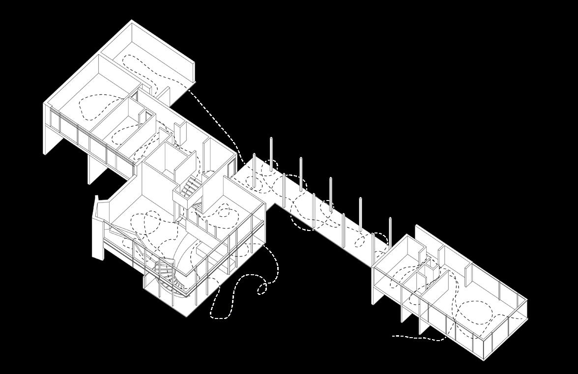
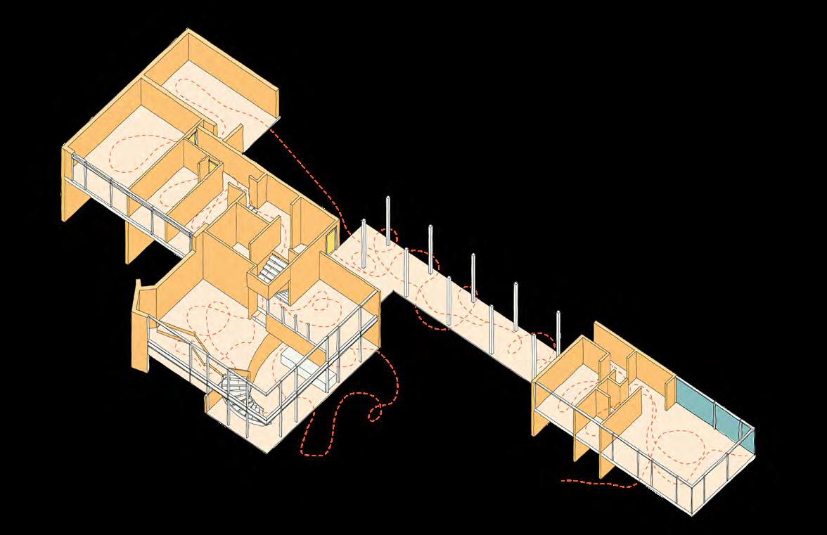
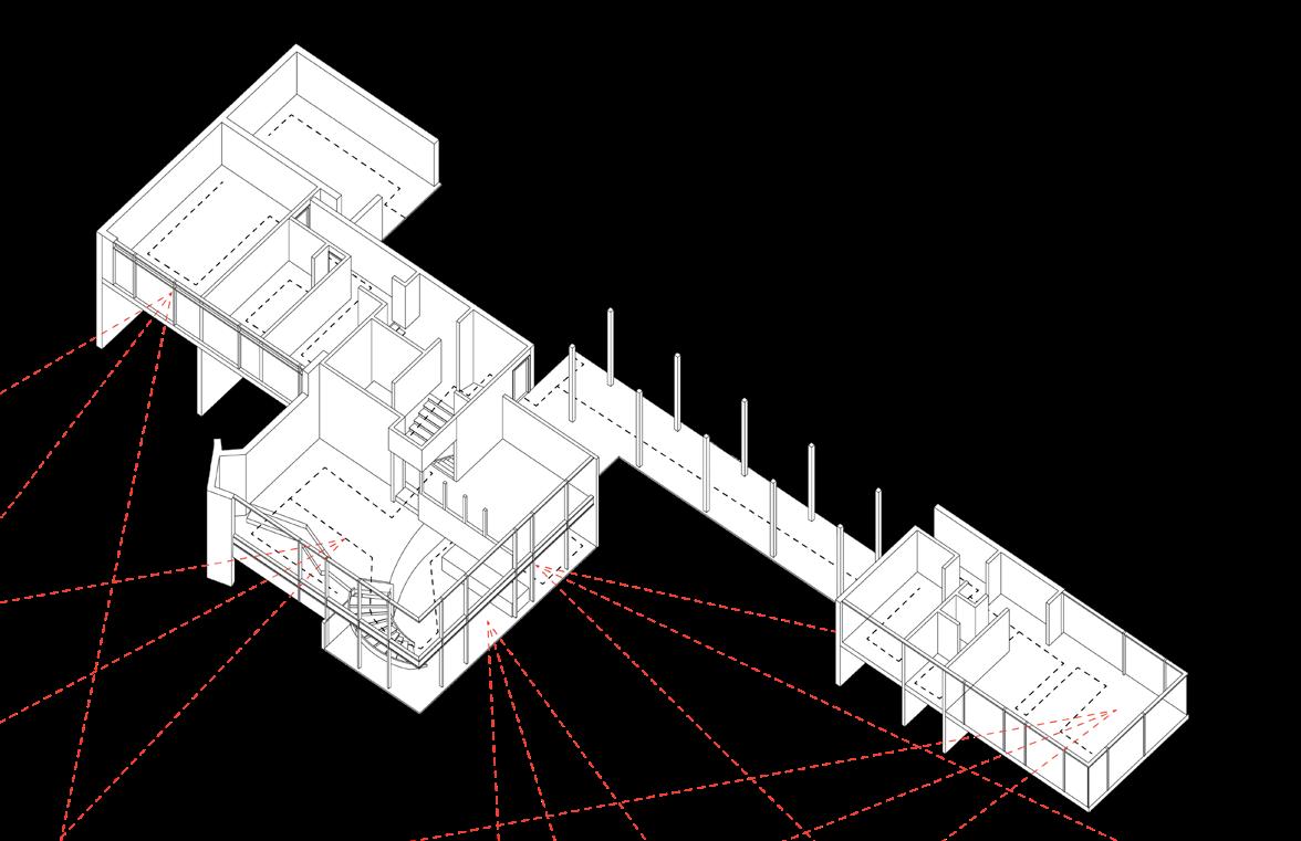
From the film Mon Oncle I extracted the protagonist Uncle Hulot’s movement through his home, moving upwards. I then displaced and mapped his movement through designer Russel Wright’s home. I found the Uncle Hulot enjoys multiple level of spacial organization and subjective to his interaction with the home. This is diagrammed as colourful illustrations.
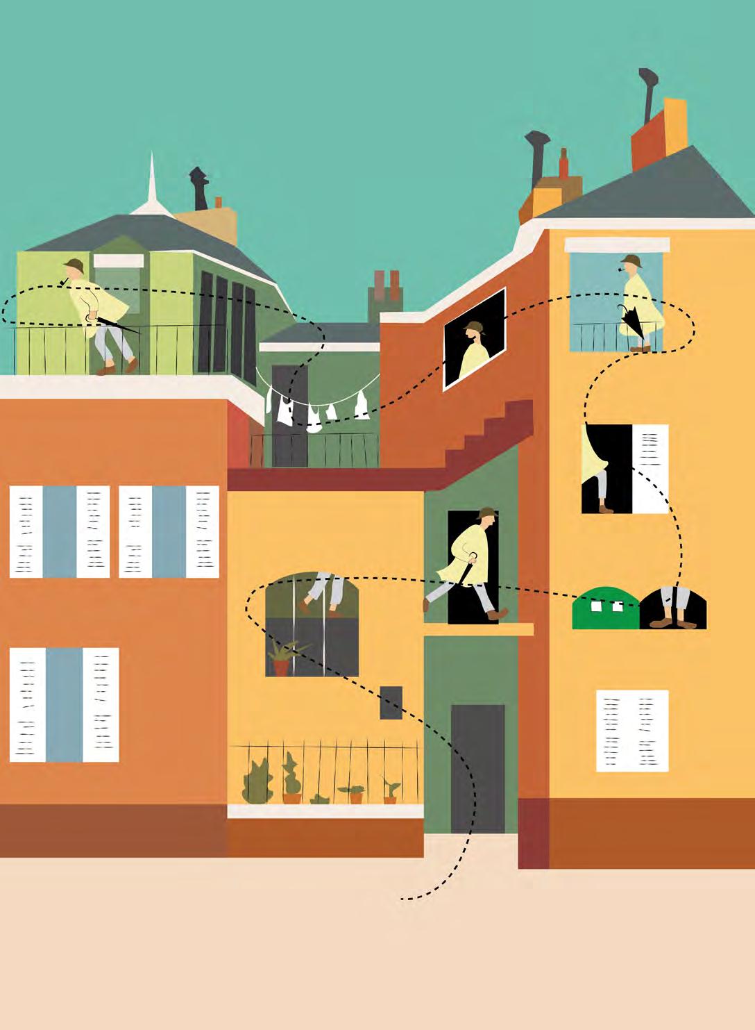
48 2013 2014 2015 2016 2017 2018 2019 2020
Mapping movement on the site
Mapping movement in Wright’s home
Mapping movement in Hulot’s home
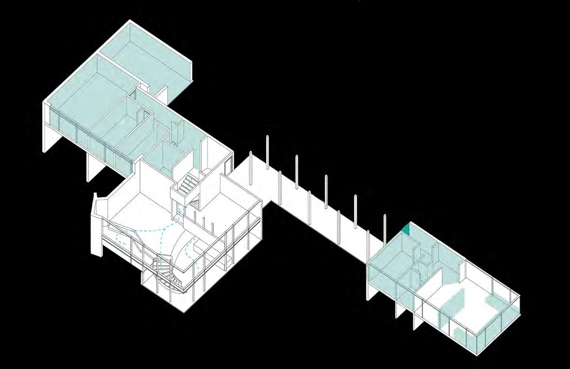
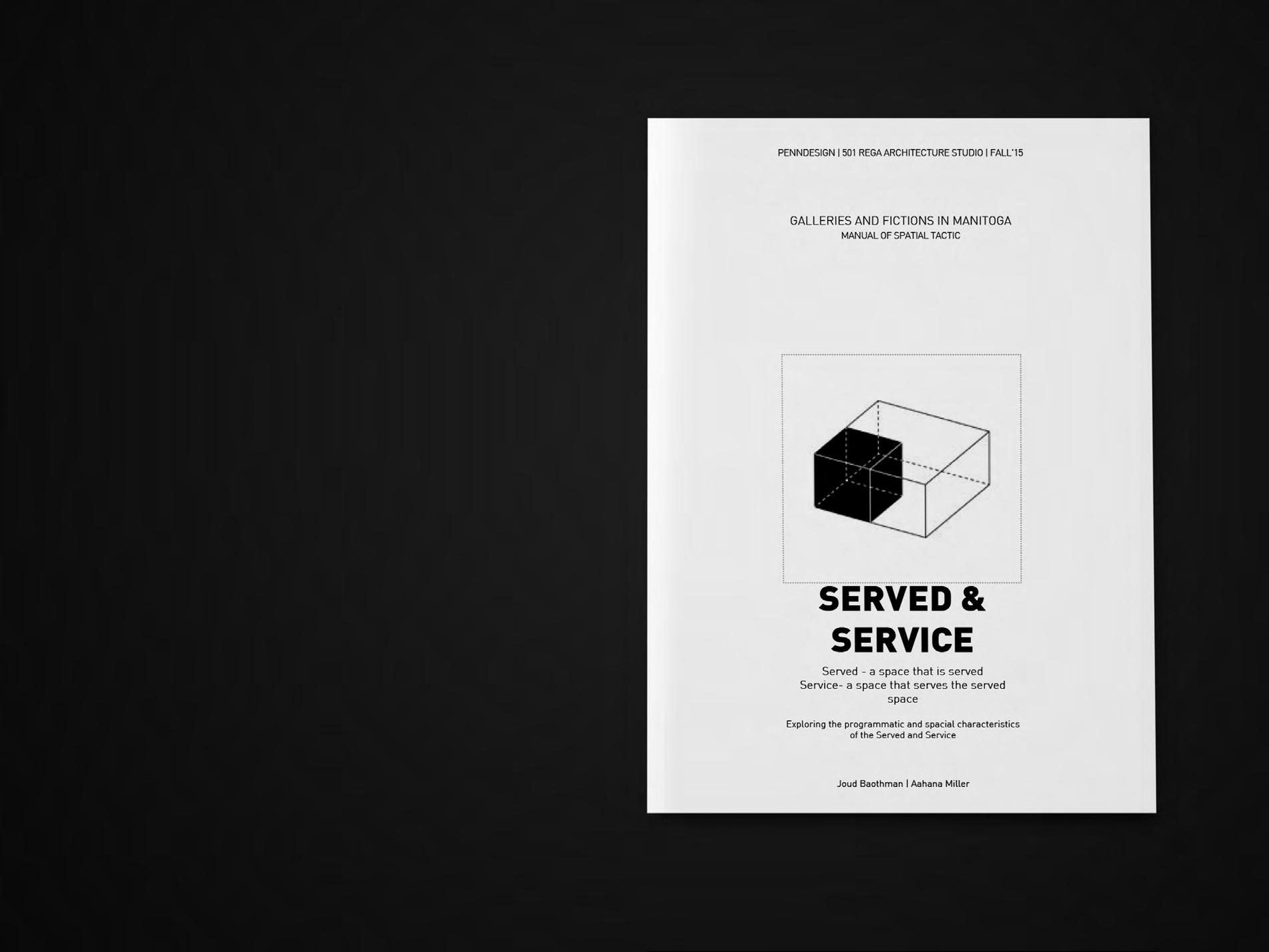
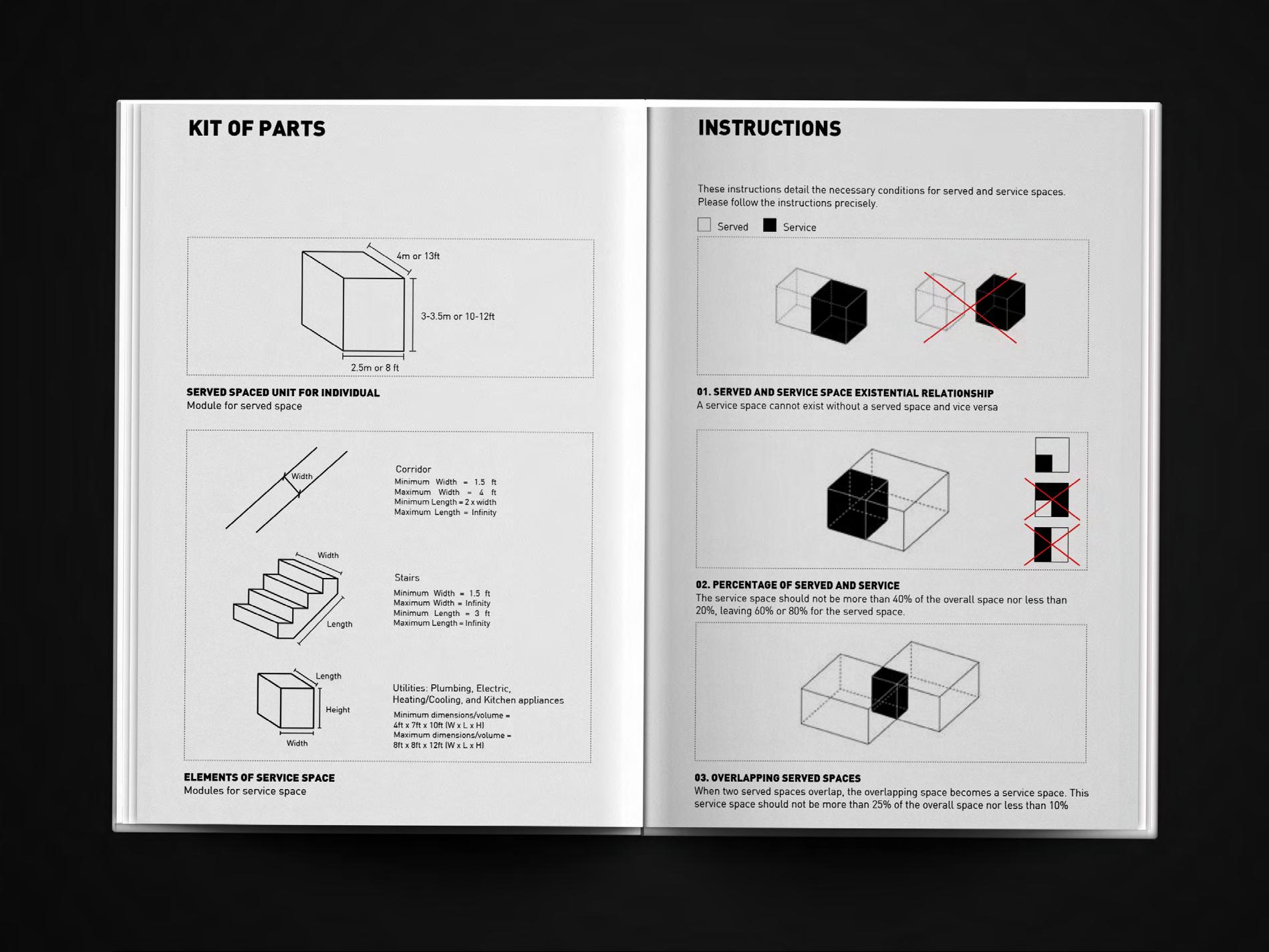
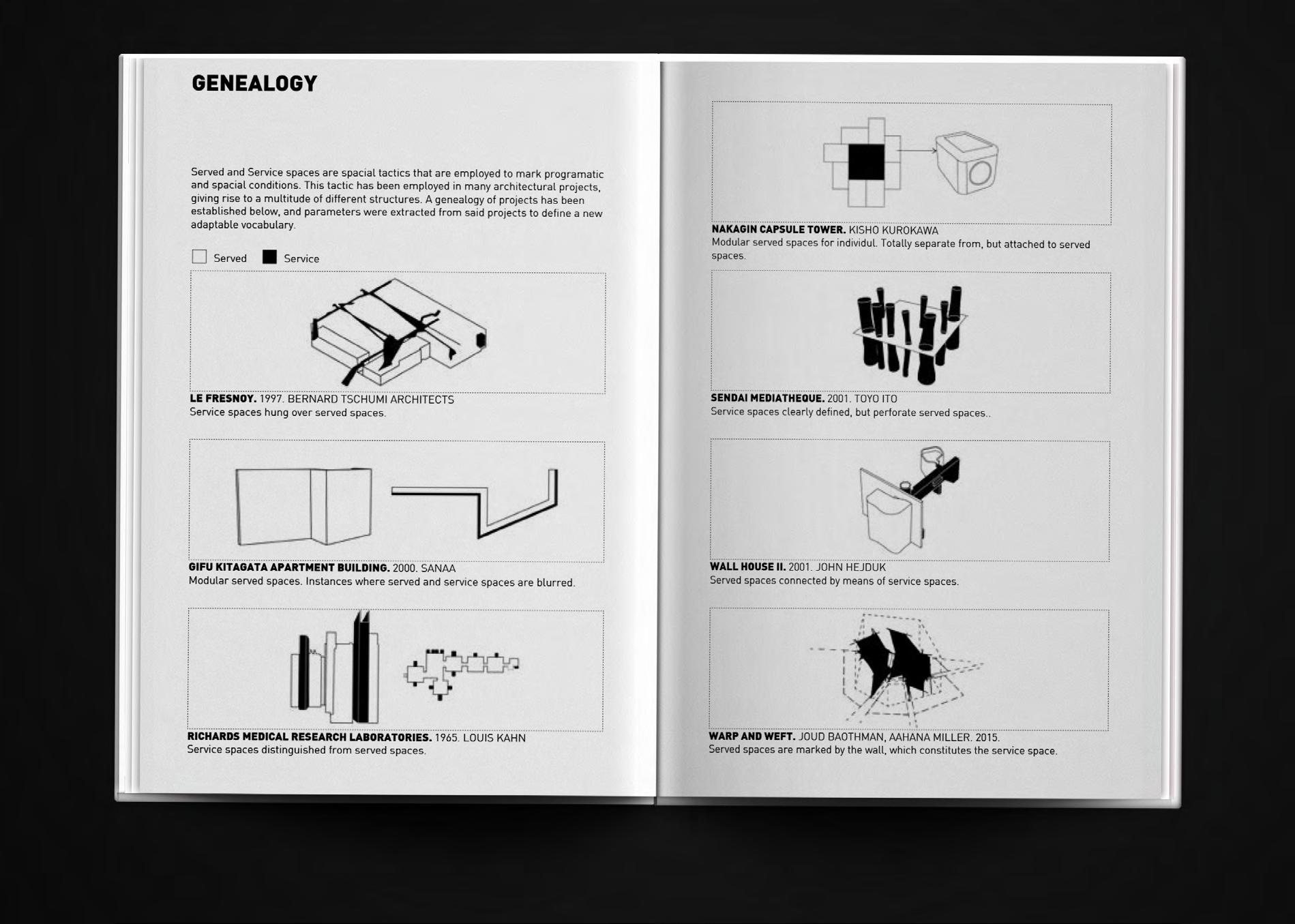
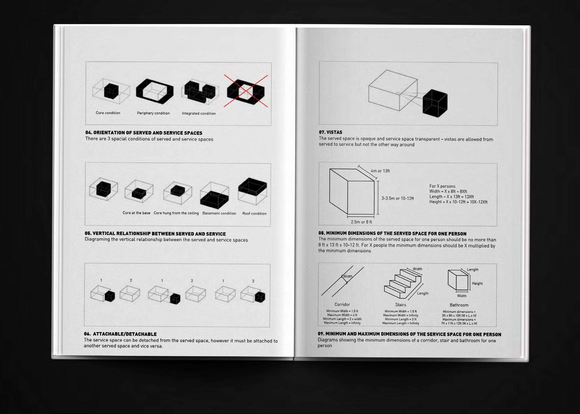
Served and Service
Creating a manual to define ‘Served’ and ‘Service’ spaces through diagrams.

49 2013 2014 2015 2016 2017 2018 2019 2020
Symphonious
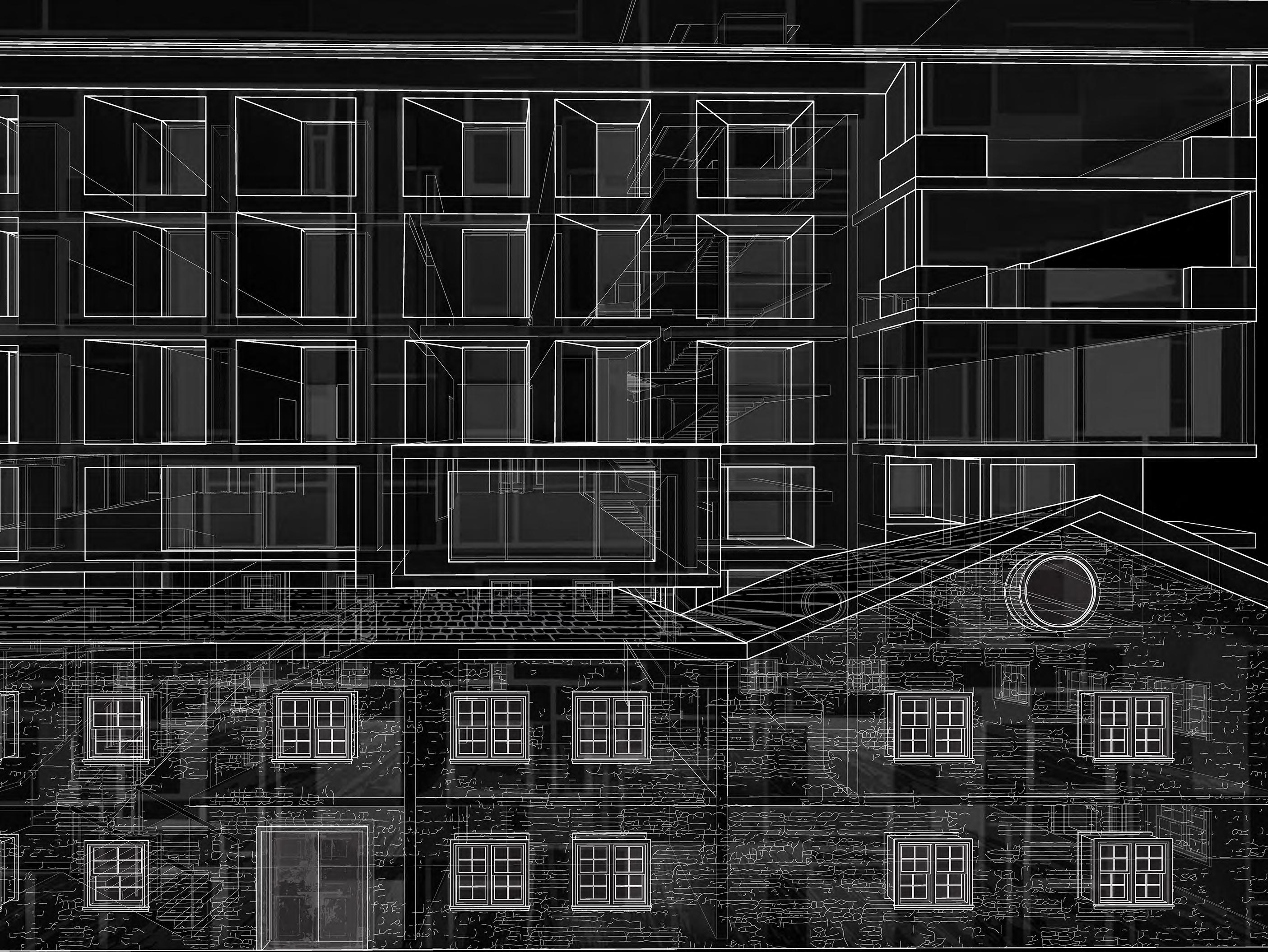
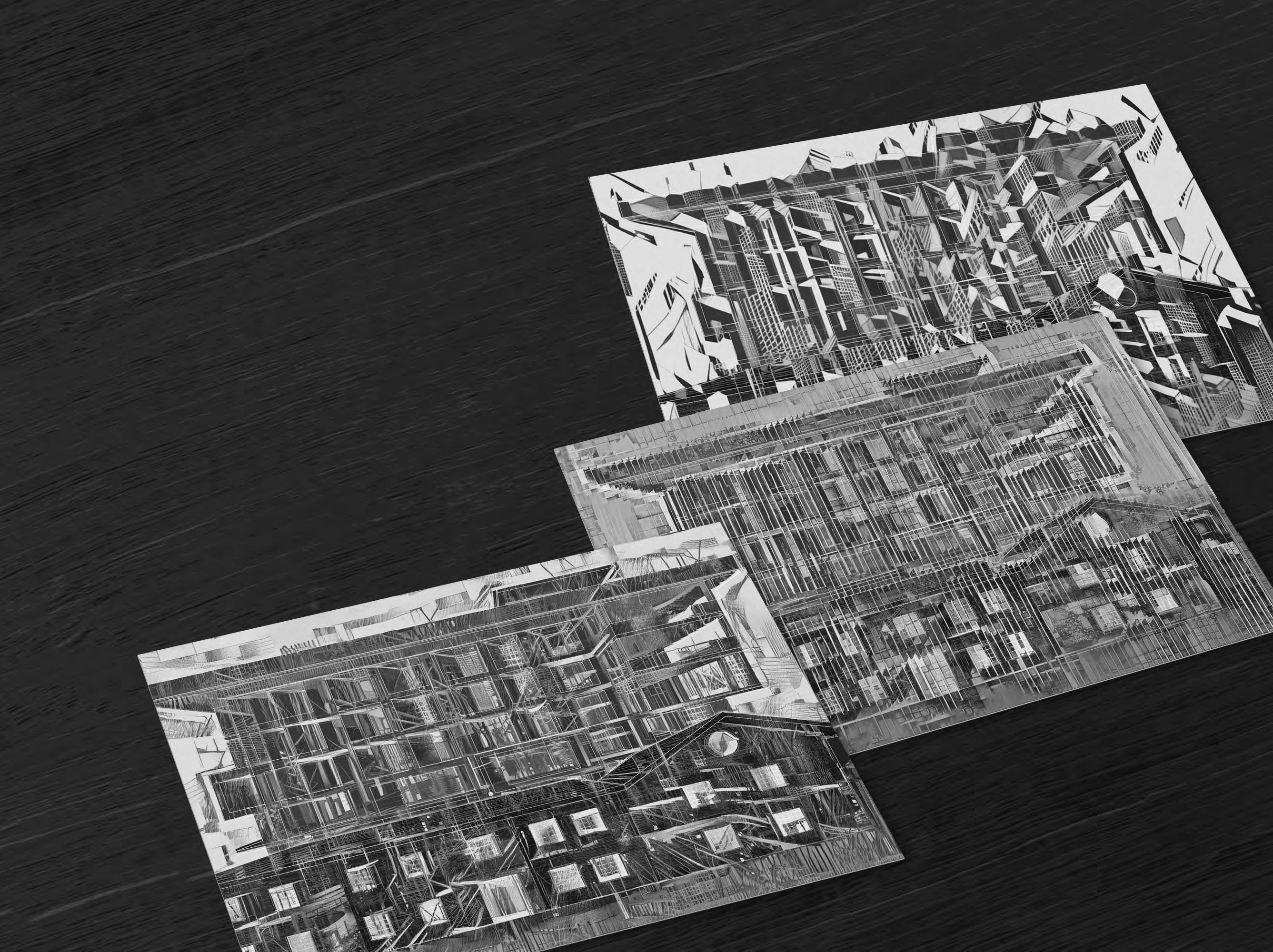
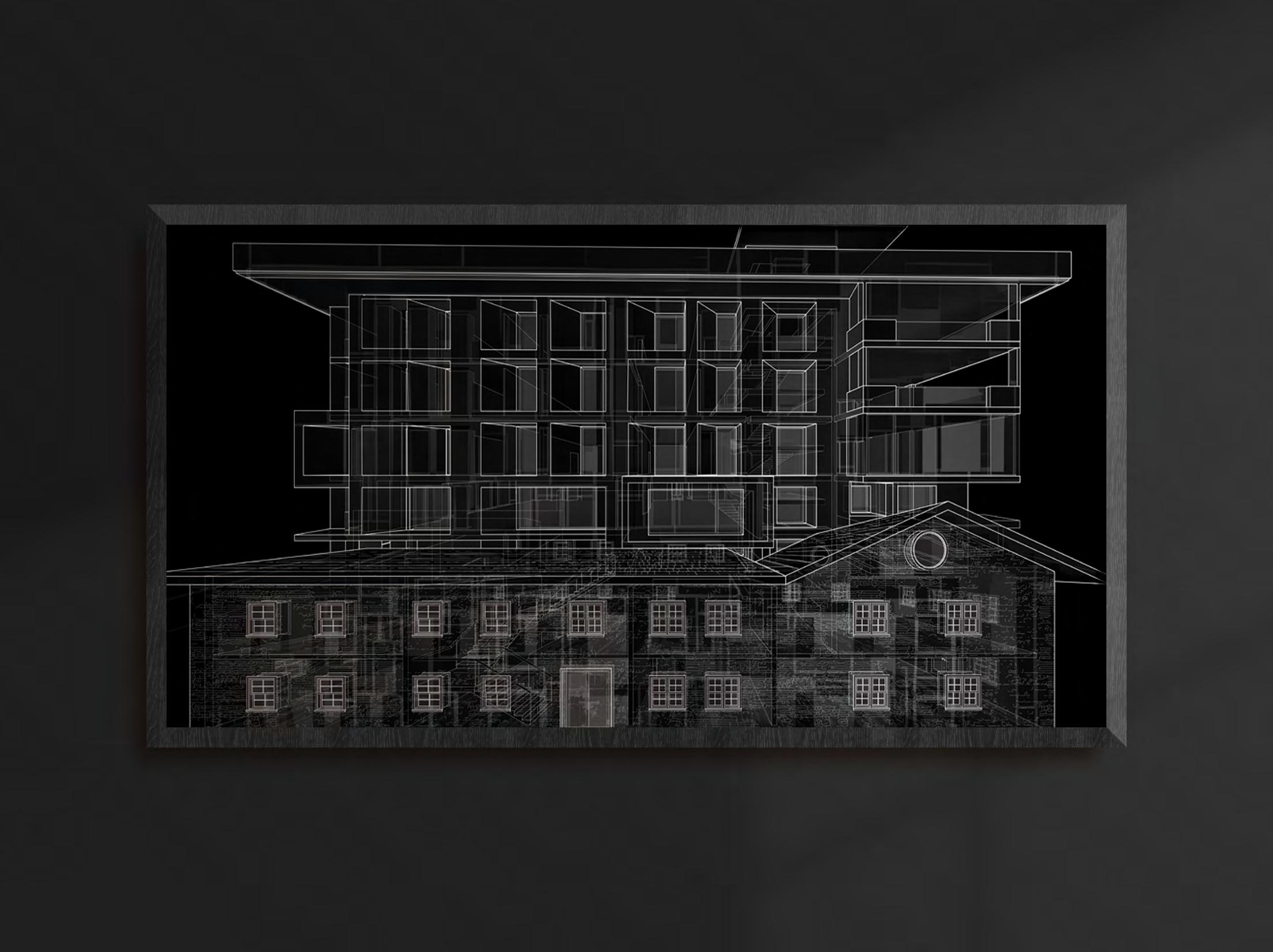
In its constantly (d)evolving meanings, Building Ruins aims to generate an archive of objects and ideas by RISD practitioners that demonstrates the inherently interrogative nature of artistic endeavours. Through the archive, the curatorial ambition of the show is to present enquiries embedded within the practices of RISD alumni in India. It takes a closer look at their investment in the range of materials, techniques and processes that they constantly engage within their everyday.
Building ruins manifests itself in an architectural section perspective drawing. The drawing depicts the mashup of two buildings – An old English building that is now demolished creeping over a contemporary multi-storey home. Overlaid with images generated by a neural network AI software, the images bridge the new and the old, and builds into the ruin. The drawings are a digital representation that uses 3 dimensional models, 2 dimensional line work and collage.
50 2013 2014 2015 2016 2017 2018 2019 2020
51
aahanamiller@gmail.com | www.aahanamiller.com
