19 minute read
INTERVIEW BY H. CANDEE
Next Article

LEE COMMON, WATERCOLOR MARGUERITE BRIDE
BERKSHIRES IN WATERCOLOR
Have you visited 51 Park Restaurant in Lee lately? I have just installed a new exhibit of 18 Berkshire scenes, on both floors of the restaurant. Included is a variety of original watercolors, and repros on stretched canvas too. I selected images that are the reason why we love the Berkshires so much…..Lee Common in Winter, Red Lion Inn, some old mills on the Housatonic, quaint village scenes of Otis and Becket, and Hancock Shaker Village, to name a few. All are for sale and can be taken right then and there. Go for it, there is something for everyone! Seasonal replacements will be happening…. well…seasonally. We painters who live in the Berkshires are really very lucky. There is always something inspiring to paint just by looking around outside. The inspiration never stops, no matter the season…. the iconic spots we all know and love, bucolic hillsides and landscapes, funky downtowns with their unique buildings, marketplaces, rivers, lakes….if it doesn’t move I have probably painted it. If you are interested in seeing more of these paintings, please visit the “Berkshires” gallery on my website. Do you have special occasions in your future? Anniversary? Wedding? Graduation? Retirement? Selling a home and downsizing? A custom watercolor painting of a wedding venue, a home or other special location is a treasured gift. Marguerite Bride – Home Studio at 46 Glory Drive, Pittsfield, Massachusetts by appointment only. Call 413-841-1659 or 413-442-7718; margebride-paintings.com margebride@aol.com; Facebook: Marguerite Bride Watercolors. Instagram: @margebride.

BERKSHIRE DIGITAL
Since opening in 2005, Berkshire Digital has done fine art printing for artists and photographers. Giclée prints can be made in many different sizes from 5”x7” to 42” x 80” on a variety of archival paper choices. Berkshire Digital was featured in PDN magazine in an article about fine art printing. See the entire article on the BerkshireDigital.com website. Berkshire Digital does accurate hi-res photoreproductions of paintings and illustrations that can be used for Giclée prints, books, magazines, brochures, cards and websites. “Fred Collins couldn’t have been more professional or more enjoyable to work with. He did a beautiful job in photographing paintings carefully, efficiently, and so accurately. It’s such a great feeling to know I have these beautiful, useful files on hand anytime I need them. I wish I’d called Fred years ago.” - Ann Getsinger We also offer restoration and repair of damaged or faded photographs. A complete overview of services offered, along with pricing, can be seen on the web at BerkshireDigital.com The owner, Fred Collins, has been a commercial and fine art photographer for over 30 years having had studios in Boston, Stamford and the Berkshires. He offers over 25 years of experience with Photoshop, enabling retouching, restoration and enhancement to prints and digital files. The studio is located in Mt. Washington, but drop-off and pick-up is available through Frames On Wheels, 84 Railroad Street in Great Barrington, MA (413) 528-0997 and Gilded Moon Framing, 17 John Street in Millerton, NY (518) 789-3428. Berkshire Digital - 413 644-9663, www.BerkshireDigital.com
Join us ... Promote your art here! ARTFULMIND@YAHOO.COM

NORTHERN CARDINALS, WATERCOLOR SALLY TISKA RICE
Sally Tiska Rice was born and raised in the beautiful Berkshires. She is the youngest of four children. Sally lives in a rural town with her husband, and pets, where she is inspired by her surroundings.
As a young girl she would sit with her father as he designed and drew many blueprints. This was the start of her love for art in all its forms. While painting and drawing she feels spiritually gratified and relaxed. She is a spine injury survivor that finds her creative nature healing. Sally focuses on blending and layering to achieve depth and dimension. She also experiments with light and color to create a piece that will be enjoyed. Sally employs many different techniques into her paintings, using acrylic, watercolors, oil paints, pastels, as well as mixed media. Her love to travel has given Sally opportunities to further her understanding of art in all its forms. She has been able to visit many areas in the Northeast, ranging from the majestic mountains to the scenic shores. Sally has enjoyed art abroad while in Italy, Greece, Spain and the Caribbean as well. These experiences have encouraged her knowledge and appreciation of the history of art throughout the world.
Sally uses spontaneity to compose artwork. She also creates many beautiful commission art pieces for customers internationally. Her commission pieces are usually created from one or more images that the customer has chosen to blend together to form a one of a kind piece of art. Sally also has many customers that have purchased fine art prints. Call to set up a studio appointment at the Clock Tower Business Center, 75 South Church Street, 3rd floor, studio 302, Pittsfield, Massachusetts. Sally Tiska Rice - 413-446-8469 http://www.sallytiskarice.com, http://sallytiskarice.com/STR/The_Artist.html, https://www.facebook.com/sally.t.rice, https://mobile.twitter.com/RiceTiska, https://www.linkedin.com/in/sally-tiska-rice-cpo5230777a/, https://www.instagram.com/sallytiskarice/ https://pixels.com/profiles/sally-rice.

Red Window, 2018 Carborundum Aquatint 19.5" x 19.5"
JULIE SHAPIRO VISUAL ARTIST
Interview by Harryet Candee Photographs Courtesy of Artist
“The process of making continues to interest and challenge me. In my studio I find a compelling conversation and exchange. It is this dialog and the ongoing questions it suggests that continues to draw me in.” —Julie Shapiro
Harryet Candee: I would like to demystify the work that you do by looking at your paintings, drawings, paper pieces, and printmaking. I would like to know how does your art making represent you in all your complexity? Julie Shapiro: Does it represent me in my complexity? That’s a big question. Certainly I am intimately tied to my art making and the pieces I produce are reflections of a multitude of experiences, thoughts and actions. I spend a lot of time in my studio, working and looking. Outside of the studio there are many things I cross paths with, visual and conceptual, that in one way or another find their way into my work. The hands on making that takes place in the studio, the working back and forth between different mediums, between accident and control, between intuition and historical knowledge, between reexamination and self-critique. all feed into my work. Repeated shapes overlapping within atmospheres, lines and color clearly distinguish your work. Can you tell us more about, Temporary, please. How does this piece fit or differ compared with other works you have done? JS: This piece takes on some of the ideas I’m working with. Broken connections and different kinds of alignment, the unexpected within the assumed, shifts as form and color meet up or don’t, as drawing and color cross over and under or collide, these are ongoing parts of my work. That there is a relationship between parts, but that there is a deviation from the expected logic. In different media I find different ways of putting together related but separate configurations, with the work on paper, as in this piece, it usually includes cutting and pasting. to you when beginning a new piece? JS: Most familiar are the materials. I don’t have one set way to begin a piece. Some pieces are started by assembling the surface that I will be working on, others start with a panel or stretched canvas that I’ll work on. Some pieces are started with hand made stencils, some with freehand drawing, some working from imagery of another piece which may be finished or in progress.
Through your formal training and studies as a student, what practices and principles in Art do you steadily apply presently to your work? JS: I don’t know that there is much that I regularly apply. There are certainly specific experiences that I remember. For example, I remember working on a painting that included pink and green, the teacher looked at it, and said to me something along the lines of … “this is not

Temporary 2020 Graphite, Colored Pencil, Acrylic / Gouache on collaged monoprint 30" x 16"
color…this is color…” and he pointed to several colors next to each other that had subtle but distinct variations in tone and hue. I don’t think this was meant to say that was the only kind of color, but that it was something to notice, not push aside and that it could be as powerful as two colors across the color wheel. Or at least, that has been my interpretation. Someone did look at a painting once and tell me that I didn’t need the horizon line, I did take it out of that piece. I’ve had the opportunity of working with many different artists and I’ve had a lot great teachers. One of the things that made graduate school so important was there would be several professors whose work one deeply respected coming into the studio, all looking at the same pieces of work and telling you different things. There was a lot of important information in those critiques, but it also made me realize that in the long run, I had to make the decisions. There are many painting/art conventions that one learns and becomes familiar with, but gathering them together doesn’t necessarily make an exciting painting, or an interesting experience in it’s making.
What work would you consider of yours to be exploratory, challenging and new for you? JS: Using new materials is one way to open up new explorations. This was the case when I first begin the paper pieces about 10 years ago. However, I find even with those materials with which I’m most familiar, there are always discoveries to make. I bring ideas to a piece, but I also like to find ways in the making to take me out of habits. Within the making of a piece I am always trying to keep the work open and challenging myself. The continuing questioning and surprises with the making is what keeps me excited and interested
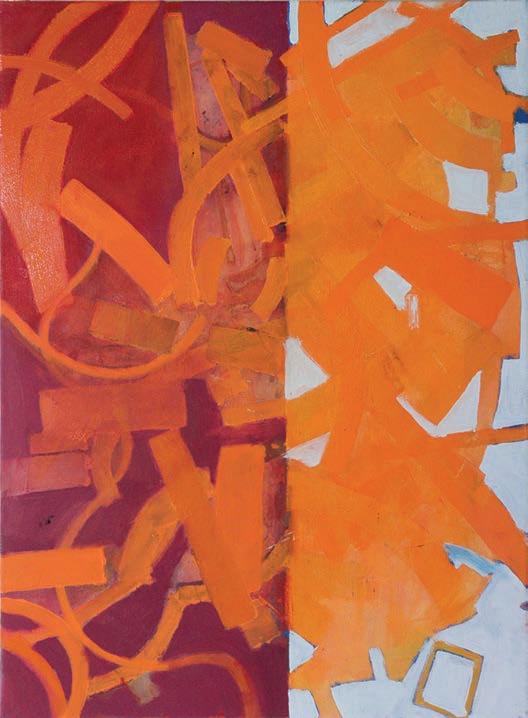
I am thinking of all the steps involved in the printmaking process. Woodcuts and intaglio printmaking are what I have found to be very absorbing and challenging for me. I love the complex steps involved, the relationship between the papers, press, and, what is left up to nature, and what you can actually control. I have never done carborundum aquatints, though. Can you explain the process and the outcome you strive for with Red Window, 2020? JS: Carborundum aquatint is a very painterly medium. It is actually a collagraphic process where one draws on the plate with a combination of acrylic medium and carborundum. Carborundum is the grit that one uses when grinding down stones in lithography. There are many variations including the choice of acrylic medium, the quantity of carborundum added to the medium, and the kind of plate one uses, plexiglass, or prepared mat board. Plates can be reused and reinked so they work well for monoprints or a limited edition, but the drawing doesn’t hold up over numerous printings or cleanings. Red Window, is a two plate carborundum print, the plate that was printed first was inked with a warmer/oranger ink, the second plate with a slightly cooler/bluer/red ink. The overall red tone is the result of the plates being slightly larger than the size of the paper, so that the ink goes over the full sheet. Continued on next page...

Near/Far 2017 Oil on Panel 16" x 16"

Bale 2013 Oil on Canvas 44" x 42"
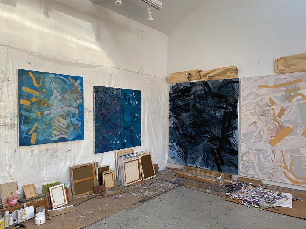
Studio walls, Julie Shapiro, 2022
The overall red color is plate tone, the result of the ink that remains on the plate after wiping, where there isn’t any drawn image.The plate tone is a physically thin layer of ink and therefore transparent, the overprinting of these plate tones gives a rich and light filled red that is an important part of the print. I’m interested in the multiple readings as the overlapping drawings visually resist each other and then merge, both in terms of image and visual location.
In printmaking, what do you find to be most tedious, challenging and satisfying for you? JS: I guess the most tedious part is cleaning plates. I think what is most challenging are some of the technical aspects. Though at the same time, the “accidents” caused by some of those difficulties is part of what excites me about the medium. I get excited by the seemingly endless possibilities that one can try, particularly in monoprinting. Not only can one imagine a change in color, or a second, third, fourth… plate printed in a different color, or upside down or over only half of the print already begun, but one gets to try out some of these possibilities in a physically tangible and actual print. Printmaking as a medium also has a unique wonderful range of mark making from extremely fine through rough and tumble and scratchy. There is also a particular kind of color and light, taking advantage of the white of the paper, in some ways similar to a watercolor. How did you find your way to printmaking? JS: I did some wood cuts when I was growing up, so I was first introduced to printmaking by my mother who used to print her own linocuts for holiday cards. At some point I was given a silkscreen set and learned in an informal way how to make screen prints. My more formal introduction came when I went to college. I knew I wanted to be an art major and started taking studio courses right away. Some time during my first year as an undergraduate, an art advisor or teacher suggested that I take a printmaking course so that if I liked it, I would have four years with access to a print shop. I followed through on the suggestion and started taking printmaking courses, both intaglio and lithography.
How did you find your way to painting? What is your approach all about? JS: First I think, I grew up with a mother who was an artist and in a house that was full of various materials. My father also did some watercolors. I started taking art classes when I was quite young and then when I went to high school I had an amazing art teacher. She was a serious and very good painter. In her class I did my first large paintings...4x5’, my first paintings from the figure and also learned some basic color theory. I took art classes outside of school and went to an arts camp. When I was applying to college, I knew I wanted to be an art major. I got my BA in studio art at UCSC, set up a studio, worked on my own for a couple of years and then decided to apply to graduate school. I left California for the east coast and received an MFA from Yale in Painting/Printmaking.
Tell us about Near/Far and also, Bale. JS: Bale is one of the earlier paintings that I did after I began to use stencils as one of my tools. These stencils were made by tracing my paper pieces. I often store the paper pieces pinned up and overlapped on my studio wall. This painting began in response to one of those arrangements. Two large stencils were used as a starting point. Stencils were brought back in as the painting developed, along with freehand drawing, wiping out and repainting, focusing on the whole and also individual areas. In Near/Far, one can also see the use of stencils, though in a different way. The white configuration with the pale pink drawing within it establishes a strong foreground presence. Though the blue paint was put on as a final “layer”, its placement and relatively darker color pull it back from the viewers space. Additionally, the blue, in my mind refers to the sky, which we may experience looking at it through other forms such as windows or tree branches. This experience offers a connection to one of my ideas in the paper pieces, the awareness, and/or inclusion of what is behind the paper piece and how we perceive that. Continued on next page...

Kudzu 2018 Paper and Archival Glue 31” x 21” Carrying Over 2022 Oil on Canvas 30” x 22”
Near/Far refers to my perception of ideas of location and positions in the painting, both visually and conceptually.
When you stand back and look at your work, what are you concerned with mostly? JS: There are so many concerns in looking at a painting, and I think they change as a painting develops. The first concern is primarily to get down an opening statement. This may be an idea I am working with, or perhaps a simple experience that sets off a spark. Often there is a direct relationship to previous pieces. A myriad of other things may also enter into the piece, perhaps the late afternoon light in late summer, a textile show I saw at a museum, or something I read. As the painting develops there is a conversation between my initial aims, how I read the painting as I step back and look, and how the painting develops in actuality. There are times when I want to continue to assert the idea that I began, and other times when I look at the piece and tell myself that it’s time to let go a bit and follow a suggestion that the painting seems to be demanding. Whichever direction. I always try to keep it open, to not “clean it up” too much, to not fuss around.
Before starting a new work, do you warm up with any drawing exercises, or anything that gets your conceptual plan in the right direction? JS: I don’t have a warm up as such. I start pieces in different ways. In part this depends on medium. Sometimes I start with freehand drawing, sometimes I’ll start with the configuration from a previous finished piece or a piece in progress, sometimes I’ll start from a stencil I’ve made, or perhaps a surface that I have collaged together.
Paper on paper, white paper shapes on paper surface that I see you create, would this be more of playful form of artmaking for you? Kudzu, for example, to me is playful and lively in many ways that it moves and creates shadows. How does this medium work its way into your spectrum in relation to the other mediums you also seem to be very involved with? JS: The first paper pieces I made were about 10 years ago. I needed a break from what I was doing and at that time was thinking a lot about the relationship of the piece to its location. I did a couple of pieces with cutouts that I placed over the window so that one would see the landscape through the piece. That led into the cut paper pieces. I think of them as drawings with paper. They continue to be part of my studio practice. Many are white, but some use paper that I have painted in a single color before starting, some use old prints, some are paper that I have drawn on as the form has developed. I am definitely attracted to white pieces in front of white walls, the shadows the pieces cast and how that changes through the day. Working with the white paper also accentuates the overlaps and piecing together of the paper within the larger form. Along the way, I have traced some of the paper pieces and cut them out of a single piece of paper which I then use as a stencil, a tool, in my paintings, drawing and prints.

Crossway 2022 Mixed Media on Collaged monoprints 15.5” x 14.75”
Which artists do you follow, and why? JS: I follow artists for many reasons, I like to see how artists deal with different issues, how they physically make a painting, how their work changes over time. I follow work of my friends and colleagues and I follow work of artists who have for one reason or another caught my eye along the way. To a certain point I like to have an idea of at least a fraction of what is going on in the commercial art world, so I keep and eye on that too. Sometimes I’ll go see work of particular artists, sometimes I’ll wonder through a gallery neighborhood in NY going to galleries that I am familiar with, seeing work by names I’m familiar with, and peeking in to see if there’s something that catches my eye. I might have an idea about something, and look at how other artists worked with that, or work that is related to what I am thinking about. Some of the artists do work that is closer to my own and some quite different. Right now the stack of books by my studio chair includes; Joan Mitchell, Georgia O’Keeffe, Elizabeth Murray, Terry Winters, Frank Stella, Philip Guston, Morandi, Hokusai, Jack Whitten, Robert Ryman, Rothko, Clare Falkenstein, The Complete Pompei and the Crown Point Press Magical Secrets about Printmaking series. These books include some of my favorites, but so there are so many more.
What are you presently working on and what is that all about? JS: Most recently I’ve been working on multipanel paintings or single panel paintings that have visible, simple geometric divisions. This in part comes out of some of the work on paper I’ve been doing over the last couple of years and also from a series of prints that have been an ongoing project with a printer in NYC. Working on multiple panels allows me to physically separate the paintings, work on them individually, put them back together or even exchange a panel. I try to approach the one panel pieces with drawn divisions in the same way. This becomes a tool to accentuate the unexpected connections, openness and surprises that interest me in both the making and the “resolution” of a piece. One of the surprises for me in the recent work is that some of the multipanel paintings have become single panel paintings in a configuration that I haven’t ever used in starting or resolving a painting, a long vertical rectangle. The idea of disrupting presumption remains important in the current work.
julieshapiro2@gmail.com
R
