PANTONE COLOR REPORT SPRING 2018 B Y
T E S S
S T A I R I K E R
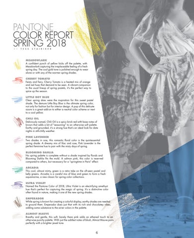
MEADOWLARK A confident punch of yellow kicks off the palette, with Meadowlark capturing the irreplaceable feeling of a fresh spring day. The cool gold tone is polished enough to wear alone or with any of the warmer spring shades. CHERRY TOMATO Feisty and fiery, Cherry Tomato is a heated mix of orange and red hues that demand to be seen. A vibrant companion to the usual lineup of spring pastels, it’s the perfect way to spice up the season. LITTLE BOY BLUE Clear spring skies were the inspiration for this sweet pastel shade. The demure Little Boy Blue is the ultimate spring color, not only for fashion but for interior design. A pop of this delicate azure is a great add-on to either a neutral color scheme or next to a cool yellow. CHILI OIL Deliciously named, Chili Oil is a spicy brick red with base notes of brown that adds a bit of “seasoning” to an otherwise soft palette. Earthy and grounded, it’s a strong hue that’s an ideal look for date nights in still-chilly weather. PINK LAVENDER Two shades in one, this romantic floral color is the quintessential spring shade. A dreamy mix of lilac and rose, Pink Lavender is the perfect feminine hue to pair with the misty days of spring. BLOOMING DAHLIA No spring palette is complete without a shade inspired by florals and Blooming Dahlia fits the mold. A salmon pink, this color is reserved compared to others, but necessary for a “springtime in Paris” effect. ARCADIA This cool, almost minty, green is a retro take on the oft-seen pastel and kelly greens. Arcadia is a careful mix of blue and green to form a fresh aquamarine, a new classic for spring color collections. ULTRA VIOLET Named the Pantone Color of 2018, Ultra Violet is an electrifying amethyst hue that’s perfect for capturing the magic of spring. It’s a distinctive color often found in nature, making it one of the new spring shades. EMPERADOR While spring is known for creating a colorful display, earthy shades are needed to ground them. Emperador does just that with its rich and chocolatey vibes, adding some substance to the airier colors in the palette. ALMOST MAUVE Breathy and gentle, this soft, barely there pink adds an ethereal touch to an otherwise punchy palette. With just the subtlest notes of blush, Almost Mauve pairs perfectly with a brighter jewel tone.
6 PANTONECOLORREPORT_SP18_FINAL.indd 1
3/30/18 10:41 AM