8 minute read
No


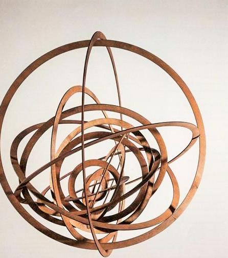
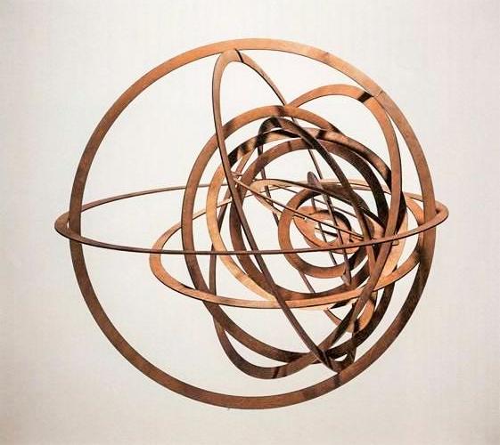
The composition creates a sense of harmony as all the ovals work together and fit perfectly into one another. This aspect of the construction could allude to the socialist ideals present in Russia at the time. A socialist society is one where all the different groups are equal and work together towards a common goal. I believe that Rodchenko wanted to show his support for this ideology through this construction and other work that followed. The piece also bears resemblance to a planets orbit system of the cosmos. The sculpture was hung in space by thin aluminium wire that is barely visible that is surrounded by space thus allowing the ovular forms to move own their own(fig 1).
The twisting circles increase in size from the centre, showing that a simple oval shape of plywood. This can be manipulated to create a visually complex 3d object. Rodchenko’s Spatial Construction employs many of the characteristics associated with constructivism. It uses practical industrial materials to create a piece of artwork while focusing on one singular oval shape and how the composition of the oval can be used to create a sense of depth and space.
Advertisement
Fig 1 Alexander Rodchenko Spatial Construction no.12 c.1920 fig(1)

No.12
Construction no. 12 was a sculpture, the work wasn’t bounded rather it was considered to be boundless. There was no canvas to depict the threedimensional illusion, however, Rodchenko utilizes the twisting of the various circles to indicate a three-dimension feel rather than having all the circles within one another and lining up sequentially. Circles are infinite and using various sizes of them illustrates many infinities.
Spatial Construction no. 12 was also a hanging sculpture, which meant that it was bounded to anything, However the space surrounding it was allowed to spin upon free will from its surroundings. Another sensation of infinity arrives from the different alignments of the various circles. This portrays that if infinite circles were added then those circle would be arranged in infinitely many directions.
The sculpture was created from plywood with aluminum wire and paint. To Constructivists, this was an example of bringing the artwork towards reality and using other materials than only paint. Rodchenko used industrial products, which could be flatten, easily transported, and handled, to construct all products within the series of“Raumkonstruktionen.” Rodchenko’s Spatial Construction no. 12 brought in various characteristics from Constructivism. It displays an illusion of a realistic artwork, descriptions of infinity, usage of irregular art materials, and the usage of talents outside of art
Rodchenko’s mind allows him to combine various elements into one to create his masterpieces and series of masterpieces. His unique mind and exceptional talents are that of what` Constructivism pursued and a reason why he is one of the founding fathers of Constructivism.
Aleksandr Mikhailovic Rodchenko, Alexander Rodchenko: Spatial Constructions = Raumkonstruktionen.
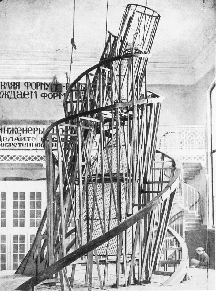
Tatlin’s Tower
Tatlin and an assistant with the Monument to the Third International in Moscow, 1920
A Symbol of the Future
Monument to the Third International, also sometimes known simply as Tatlin's Tower, is the artist's most famous work, as well as the most important spur to the formation of the Constructivist movement. The Tower, which was never fully realized, was intended to act as a fully functional conference space and propaganda center for the Communist Third International, or Comintern. Its steel spiral frame was to stand at 1,300 feet, making it the tallest structure in the world at the time taller, and more functional , more beautiful by Constructivist standards than the Effiel Tower. There were to be three glass units, a cube, cylinder and cone, which would have different spaces for meetings, and these would rotate once per year, month, and day, respectively. For Tatlin, steeland glass were the essential materials of modernconstruction. Although the tower was commissioned as a monument to revolution, and although it was given considerable prominence by the Bolshevik regime, it was never built, and it has continued to be an emblem of failed utopian aspirations for many generations of artists since.
As planned, the geometric volumes would be made of glass and serve both practical and symbolic functions. The largest and lowest was a cube, making one revolution per year, that would house meetings of the legislature of the Third International or Comintern, the international communist organization working for world revolution. The next volume up was a pyramid, making one revolution per month, that would host the Comintern executive.
Herbert Wright, “Rebuiding Tatlin’s Tower,” Blueprint: The Leading Magazine of Architecture and Design (December 20, 2011)
To start with the materials, a good starting point for dialectical materialists. Steel and glass with the latest in electronic technology to make it an active functioning monument spreading news by radio from the world's highest antenna, illuminating the surroundings with searchlights and the glow from its open glass interior. There were also plans for projectors to beam messages onto the clouds on overcast nights. Anticipating the age of electronic media? In sum, it was to be a monument to industrial technology as well as world socialism triumphant. Steel, not stone or marble symbolized this new age. The building looked forward, not back.
Since it was to be a building for the people, it should be open to the people. No stone or concrete walls to block visibility. The steel framework would support the enormous weight without blocking the view into the glass walled rooms of the interior. Three large geometric shapes diminishing in size as the tower rose: rectangular for the great hall where delegates from around the world would meet, an inverted pyramid for the executive offices of the new world government, and the cylindrical tube and sphere at the top to house communications equipment. The people's government of the whole world would not hide behind impermeable walls.
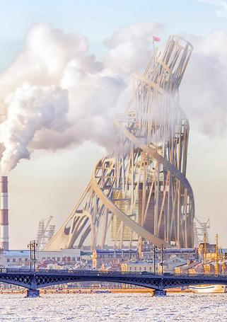
Figure 4: Tatlin's Tower at the Royal Academy of Art, London, 2011.

Twenty first Century digital imagery, we can envision how Tatlin's Tower would have looked in situ in St. Petersburg
Building for the people
Vladimir Tatlin’s
02
Founding Father
Rodchenko is often referred to as one of the founding fathers of graphic design.
Throughout my examination of his famous poster titled Books Please it will be evident to why this is. The subject of (fig 8) is a woman called Lilya Brik actress and a leading member of the avantgarde movement in post-revolution Russia. The piece has a socialist narrative like many of his posters he created at the time. The subject, Brik is sporting a simple kerchief a sign of lower class
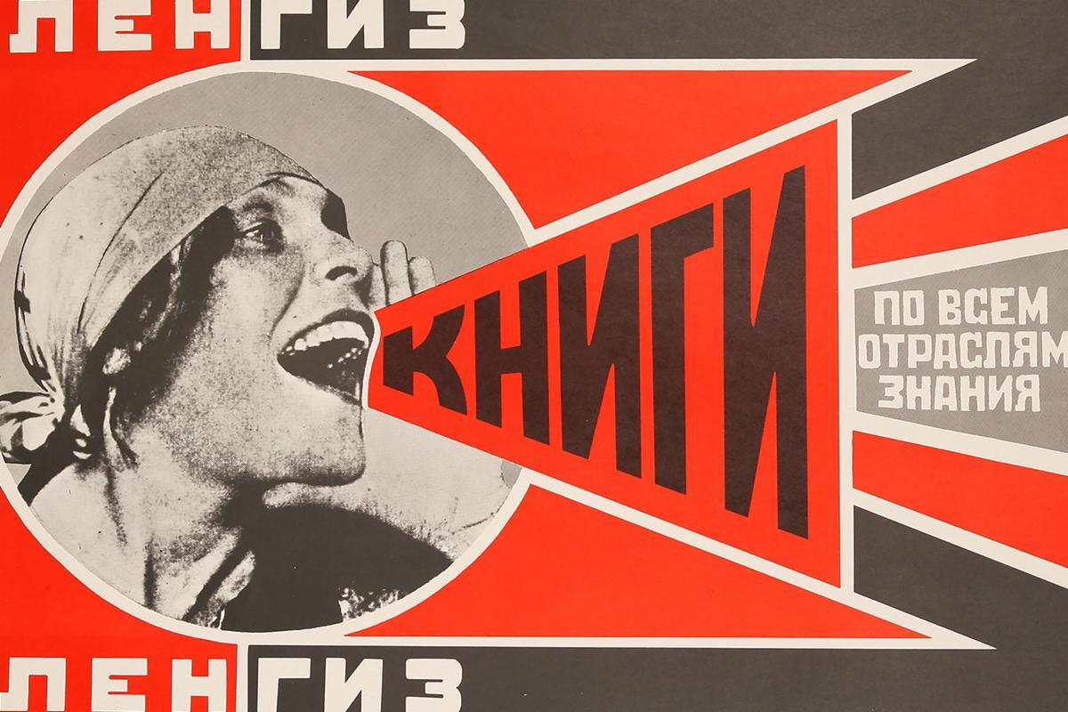
Fig 6 Alexander Rodchenko. Books Please. circa 1924
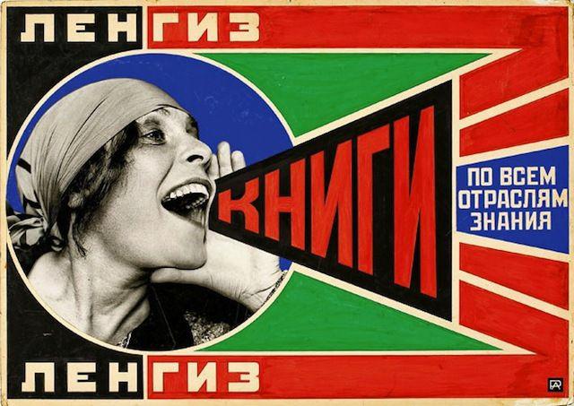
A commission from the State Publishing House in Leningra
Alexander Rodchenko uses bold colours (red,black and white) three distinctive colours of soviet design.The red word “books” in the poster and red active spaces around it push enthusiasm for the message on the poster. There is another version the poster (fig 6) that uses a slightly different colour way of green blue and red. The green could signify an element of trust you should have in the government at the time. Rodchenko used strong colour and geometric shapes to draw importance of modernity should be celebrated. The piece encompasses all the traits of poster design at the time. The photo montage and composition focuses
Khan-Magomedov., S. Rodchenko: The complete work by by S KhanMagomedov. n.d. He eschewed easel painting for ‘industrial art’ as he called it art with a social purpose and message for the masses. Although much of his earlier work was for political purposes and to change the world, he went on to apply this artistic movement to ads for ordinary objects such as beer, pacifiers, cookies, watches, and other consumer products.
In March 1923, Rodchenko published an article in which he said.. “there is now a new illustrative method: montage of printed and photographic materials focused on a certain subject. Providing ample material of great demonstrative value and conviction, it dispenses with illustration by drawing.”
the lady in design
The complete work by by S Khan-Magomedov. n.d.
Lilya Brik was an actress and a leading member of the avant-garde movement in post-revolution Soviet Russia. Today she is principally remembered as the woman shouting ‘BOOKS!’ in a 1924 advertising Rodchenko was at the height of his career when Lilya modelled for him. Though he was classically trained as an artist, by the time of their collaboration Rodchenko had already taken the decision to abandon painting and sculpture for photography, which he regarded as the perfect popular medium. In the 1920s, Lilya directed two films, a documentary titled Jews On the Land, based on a scenario about Jewish collective farms in Russia and a parody on bourgeois cinema titled The Glass Eye. The photo montage and composition focuses on the subject , Lilya with geometric lines directed towards her. However as Stalin rose to power , the view an art altered to promoting his agenda in the soviet union and no longer focusing on the beauty of ordinary Russia.

