Not So Secret Garden
Exhibited
by Long-Sharp Gallery
Long-Sharp Gallery 1 North Illinois, Suite A Indianapolis, IN 46204
The Indianapolis gallery is open by appointment, though you can always explore our virtual galleries here. To inquire about works available, make an appointment in Indianapolis, or speak with a member of the gallery team:
Telephone: +1 866 370 1601
Email: info@longsharpgallery.com
www.longsharpgallery.com
To view videos of any of the featured works, look for the icon

After the quiet slumber of winter, the world wakens itself again in the spring. LongSharp Gallery welcomes this change in Not So Secret Garden, an exhibition inspired by one of humanity’s most ubiquitous fascinations - nature. The earth is embraced in the untamed skies of Amy Kirchner and Tamar Kander, the organic patterns of Patrick Hurst and Julia Ibbini, and in the domesticated gardens of Joan Miró, Andy Warhol and Donald Sultan. Flora and fauna come alive in the works of Nicola Pietrantoni, Wayne Warren, and David Spiller; Sabina Klein and Howard Hodgkin reinvent the seasonal landscape; prints by Jason Myers personify the elements. Hosting works of nature, the gallery becomes a garden.
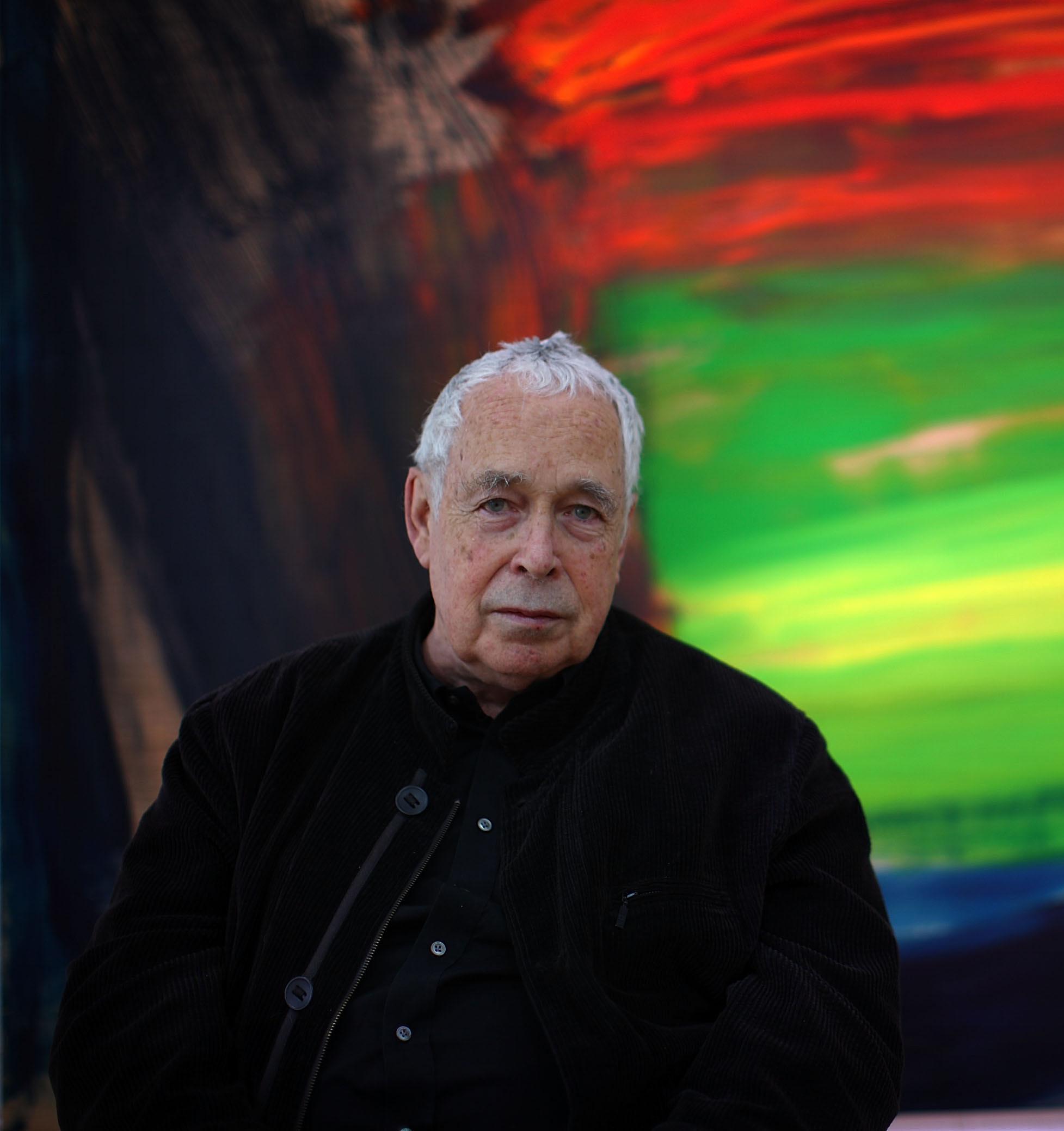
HOWARD HODGKIN (1932-2017)
Recognized as one of England’s most celebratory painters, Howard Hodgkin was born in London. He is recognized for his abstract paintings and prints which often pushed traditional boundaries – for example allowing the brushstrokes to continue off the picture “plane” and onto the frame.
Hodgkin’s works appear spontaneous, but are notoriously labor-intensive and time-consuming, with some taking years of layering and over-painting before the artist dubbed them complete. The works - both paintings and prints – often refer to private experiences and memories.
The artist garnered numerous prizes and awards throughout his decades-long career: he won the Turner Prize in 1985, was knighted in 1992, and served as a trustee of both the Tate and the National Gallery. His works have been exhibited across the world, from the Metropolitan Museum of Art (New York) to the Irish Museum of Modern Art (Dublin)..
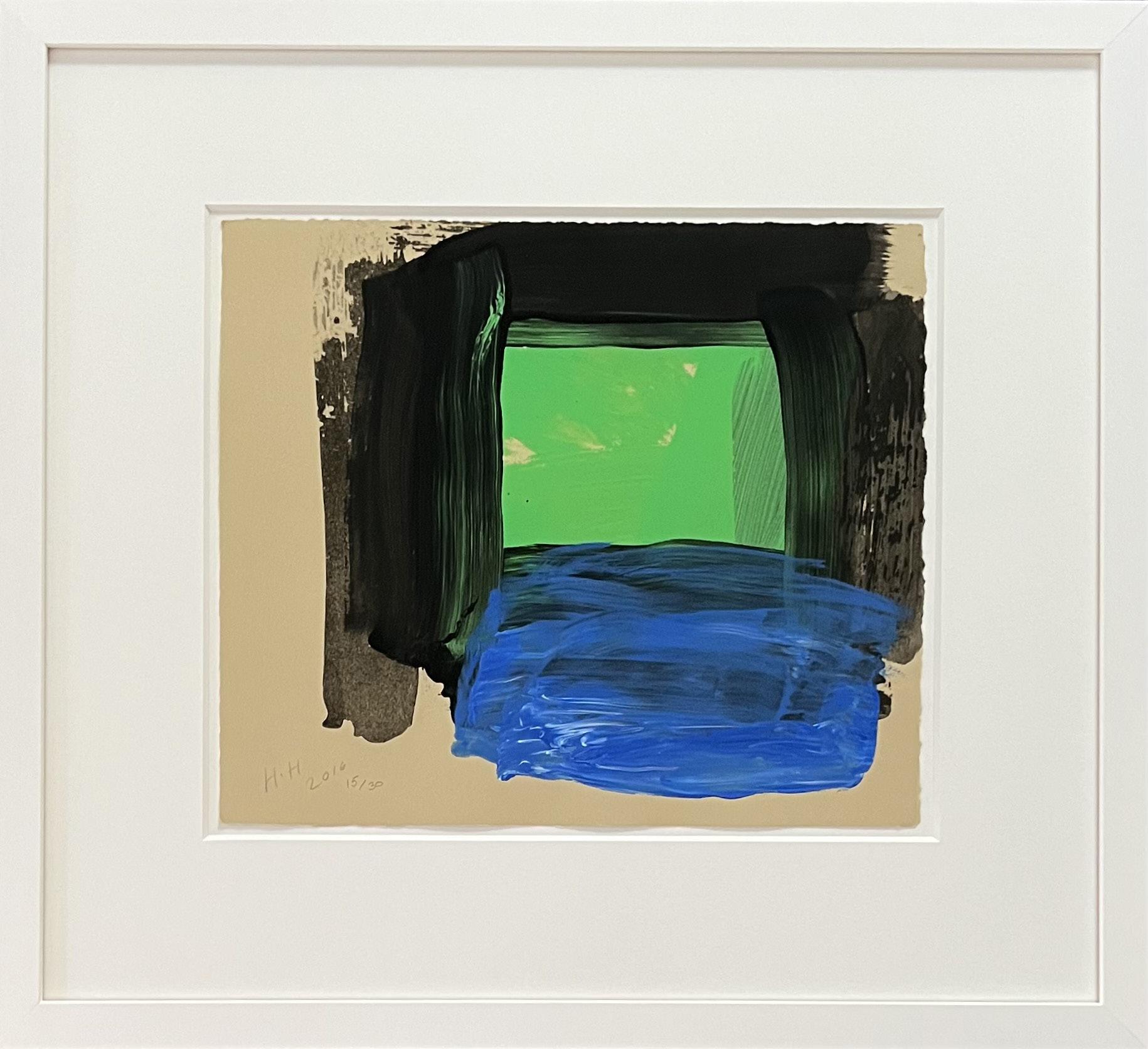
Springtime Year: 2015-2016
Medium: Hand-painted sugar lift aquatint from 1 plate, printed in Vine Black, then hand-painted in Carbon Black, Spring Green and Ultramarine/ Cyan/Zinc White mix on Velin Cuve BFK Rives Tan 280 gsm paper
Size: 14.25 x 16.5 in (36 x 42 cm)
Frame size: 24.75 x 27.25 in (63 x 29 cm)
Hand signed (HH), dated (2016), and numbered lower left From the edition of 30; fifteen of the thirty works were hand signed (including this impression), this is example 15/30
Provenance:
Cristea Roberts
Jonathan Novak Gallery
Long-Sharp Gallery
* Price on request
Click to view a film

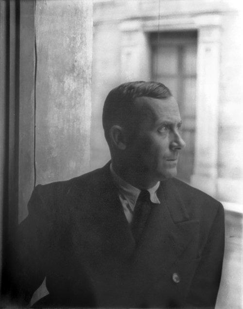
JOAN MIRÓ (1893-1983)
A pivotal figure in 20th century avant-garde painting, Barcelona born artist Joan Miró created a unique innovatory style rooted in memory, imaginative fantasy, and the irrational. Boasting an early portfolio heavily influenced by Fauvism, Cubism, and the folkloric Catalan art of his heritage, Miró created works that are distinguished by their juxtaposition of brilliant pure colors against flat neutral backgrounds. The artist’s signature abstract amoebic shapes are contrasted against sharp lines to create visions that are often whimsical and ethereal, resulting in their significant contribution to the Surrealist movement. Throughout his career, Miró experimented with various media, including etchings, lithographs, ceramics, sculpture, and tapestries.
The artist held his first solo exhibition in 1918 at José Dalmau’s gallery in Barcelona. Shortly afterwards, he made his first trip to Paris in 1920, where he was introduced to Pablo Picasso, André Breton, and other emerging artists of the time. It was during this time that Joan Miró aligned with the Breton led Surrealist movement. Although his future work was influenced by the tenets of Surrealism, the artist never fully accepted the movement’s creed, instead remaining on its periphery. Despite this rejection of the movement, Breton later described Miró as “the most Surrealist of us all.” In contrast to his art, Miró’s personality was orderly, detail-oriented, and meticulous.
Born in Spain, in 1893 as the son of a goldsmith and a jewelry maker, Miró displayed an early aptitude and passion for art in contempt of his parents’ discouragement. At the age of 14, Miró attended Fine Arts and Business school at La Lonja’s School of Fine Arts in Barcelona. After three years of studies, Miró followed his parents’ wishes, taking a job as an accountant, in which he later suffered a nervous breakdown. After his recovery, he abandoned his business career to re-commit himself to his art studies, enrolling at Francesco Gali’s Escola d’Art in Barcelona.
Miró settled in 1956 in a villa in Palma de Majorca, Spain, which was later transformed into the beloved Miró Museum. Though the artist died at age 90, his iconic works are displayed today in such collections as the Art Institute of Chicago, The Museum of Modern Art, and the Tate Gallery in London.
About these works: Joan Miró befriended several avant-garde writers in Paris in the 1920s; literary sources would inspire his works throughout the next several decades. According to Patrick Cramer [who has written books about the artist], Miró illustrated over 260 books, catalogues, and albums in his lifetime. In fact, the first poems Miró ever created were used to illustrate L’Arbre des Voyageurs, a book of poems by Tristan Tzara in 1930. “In no way should any of the artist’s prints be considered ‘mere illustrations’ for a given text or book... They were parallel creations: fine works of art in their own right”, says Murray Macaulay, head of Prints at Christie’s London.
Maravillas con Variaciones Acrósticas en el Jardín de Miró is one such book; it featured Miró’s artwork alongside poems [dedicated to Miró] by the famous Spanish poet Rafael Alberti. Miró’s visuals combine his love of nature with a playful, abstract imagination, bringing to life a garden where little “Maravillas” (“Wonders” or “Marvels”) exist amongst the butterflies and flowers. “Giving equal importance to bug, bird, and person, Miró depicts bodies represented and broken down into their most basic shapes.” (Miró: The Experience of Seeing, Educator Resource Guide, Seattle Art Museum, 2014, at page 11.)
The book was published in 1975 by renowned printer Ediciones Polígrafa and contains 22 lithographs.
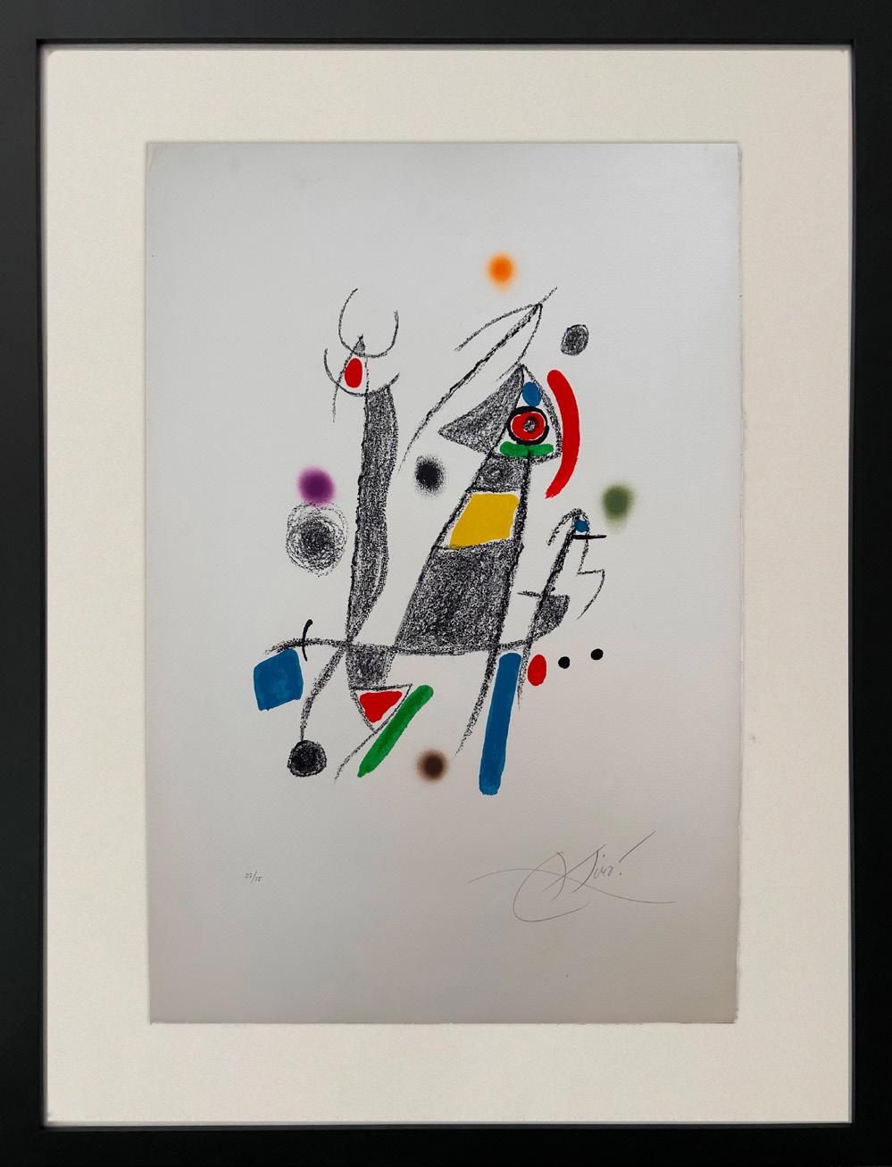
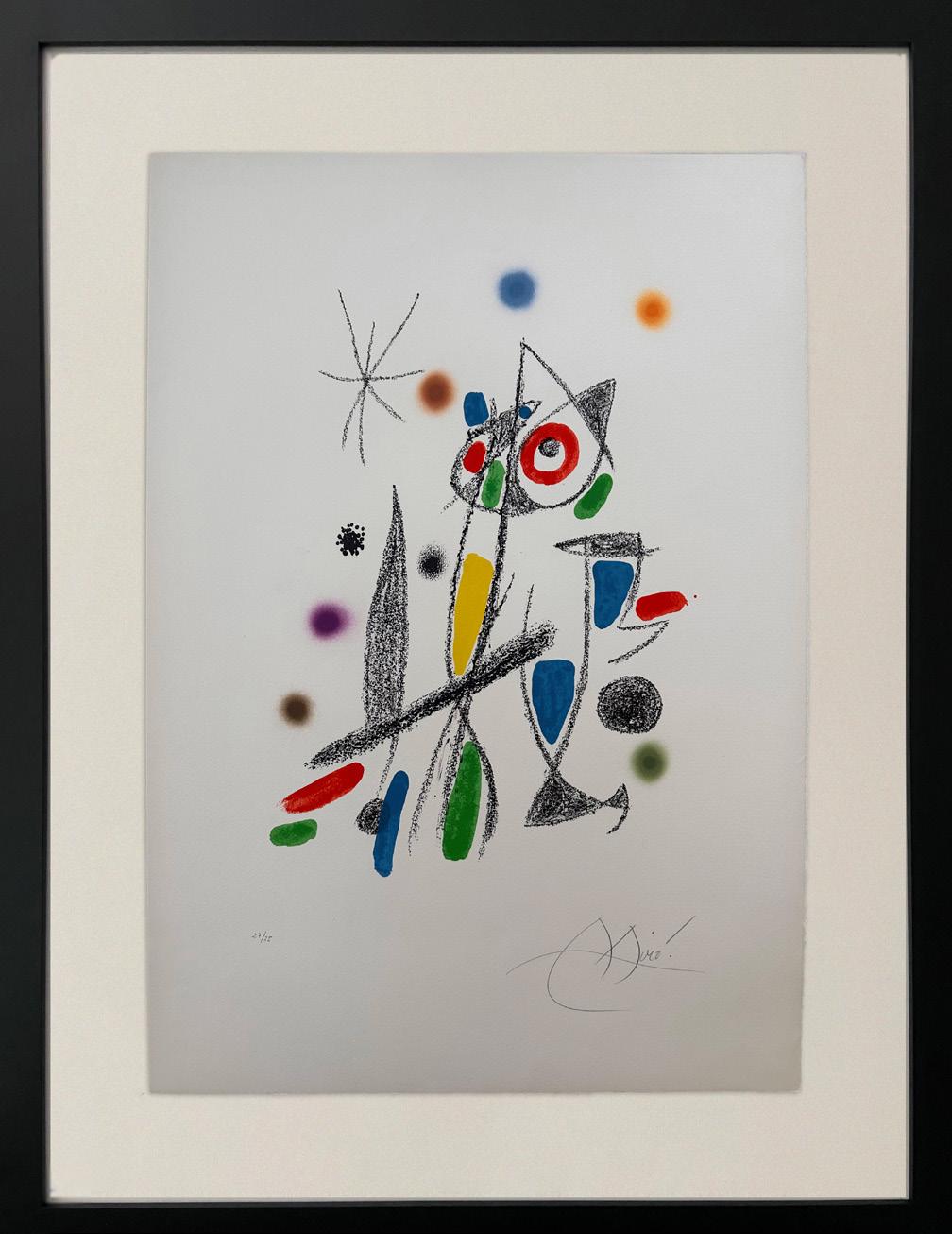
Maravillas con variaciones acrósticas En El Jardín de Miró
Year: 1975
Medium: Lithograph
Each hand signed and numbered (each is numbered 27/75)
From the hand-signed and numbered works reserved for the deluxe edition of 75 on Velin d’Arches, numbered 1/75 – 75/75, along with a tirage including 5 examples on Japon, 15 roman numeral examples, and 15 of the black state.
The deluxe edition is aside from the book of edition of 315 and the printed signature edition of 1500.
Size: 29.5 x 23.25 in (75 x 59 cm) (Each)
Frame size: 38.5 x 30 in (97.94 x 76.05 cm) (Each)
Printer: Ediciones LA Polígrafa, S.A., Barcelona
Publisher: LA Polígrafa, S.A., Barcelona
Reference: Mourlet 1058 and1064
Certified by Rosa Maria Malet
* Price on request for the pair
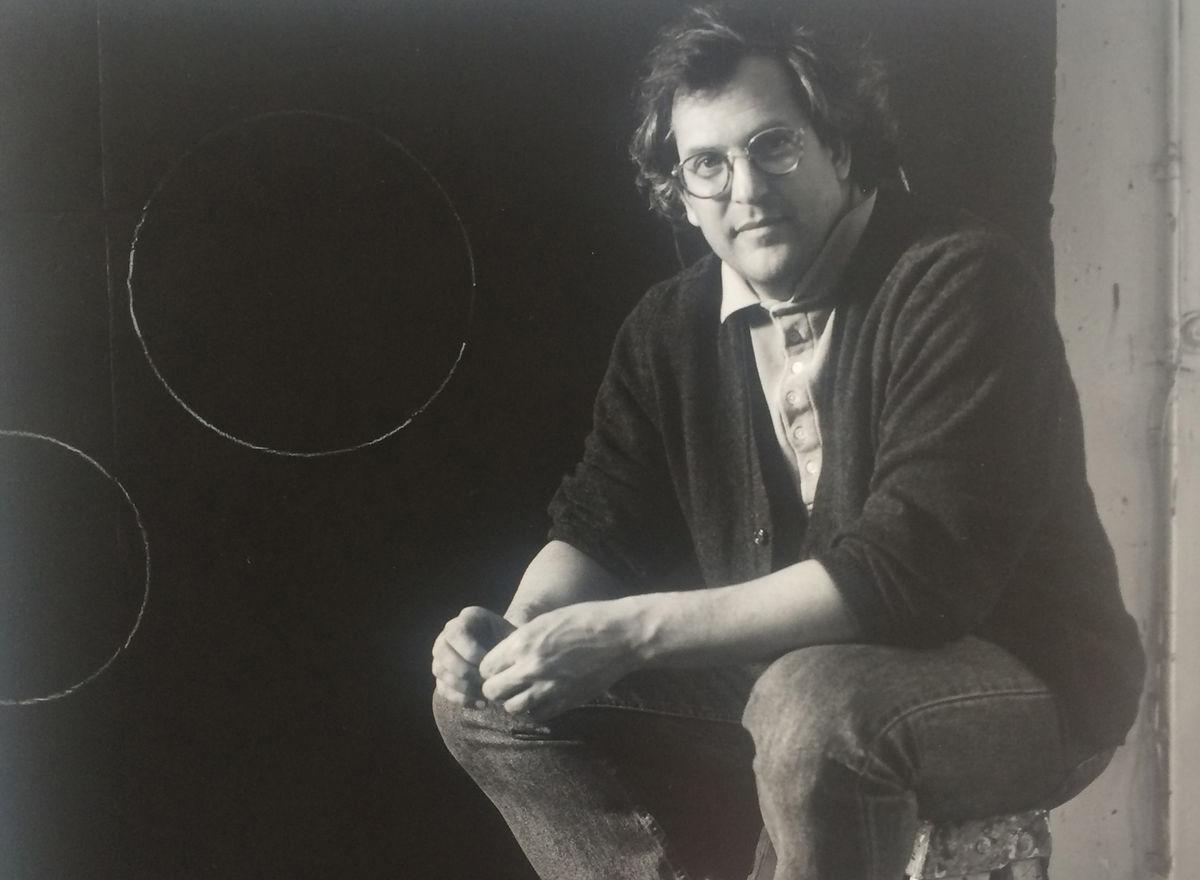
DONALD SULTAN
(b. 1952)
A sculptor, printmaker, and painter, Donald Sultan was born in Asheville, NC in 1952. He earned a Bachelors degree in Fine Arts from the University of North Carolina (Chapel Hill) and his Masters from the School of the Art Institute of Chicago before moving to New York in 1975.
Once in New York, Sultan became one of the major proponents of the New Image movement, alongside contemporaries Susan Rothenberg and Julian Schnabel. Although his works are primarily classified as “minimalist” and “still lifes”, Sultan maintains that his style is first and foremost abstract. This style is in keeping with the New Image movement, however – his simplified representations of objects (flowers, buttons, etc.) are most always disassociated from their backgrounds.
Today, Sultan’s works – paintings, prints, and sculptures alike – may be found in the collections of over fifty major museums across the globe, including the Museum of Modern Art (New York), Tate Modern (London), the Centre Georges Pompidou (Paris), and the Museum of Contemporary Art (Tokyo), among others. The artist still lives and works in New York.
About this work: Sultan’s signature style features simplified representations of everyday objects (flowers, buttons, etc.), typically depicted in stark colors and removed from their backgrounds. In keeping with this aesthetic, Sultan’s poppy imagery was initially inspired by his own garden, but also harkens back to World War I and the famous Flanders Field (where red poppies allegedly grew on the soldiers’ graves).
According to Sultan, the imagery refers more to paper poppies sold on Veteran’s Day than the actual poppies themselves. “I use a technique similar to lacquering furniture and polishing cars,” explains Sultan of the high gloss finish of the red poppies in his paintings. “It’s enamel paint and I polish it down until it gets shiny.” [1]
[1] Interview with Annette Hinkle, Sag Harbor Express, June 29, 2012.
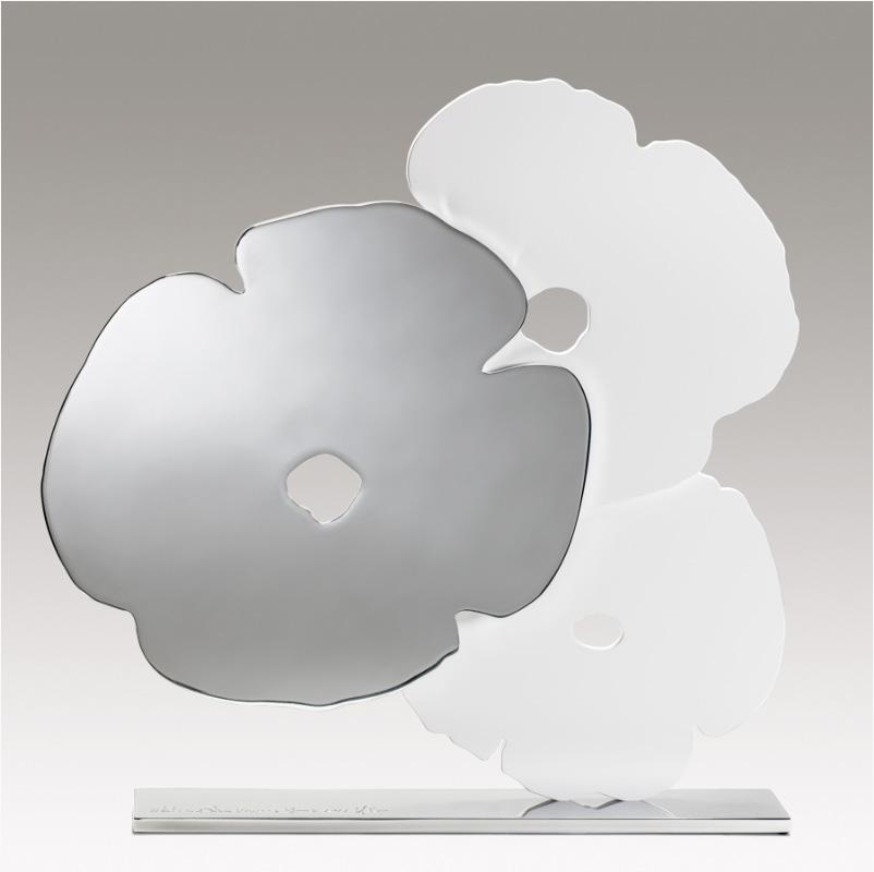
Year: 2021
Medium: Shaped aluminum, polished and with white powder coat, on polished aluminum base
From an edition of 25 plus 4 AP, 2 HC, 1 RTP
Size: 24.5 x 24 x 3.5 in (62 x 61 x 9 cm)
Base size: 21.25 x 3.5 x .5 in (54 x 8.9 x 1.3 cm)
Provenance: The publisher
Long-Sharp Gallery
15,000 USD
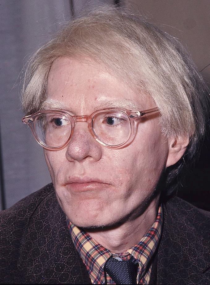
ANDY WARHOL (1928-1987)
Widely considered as one of the most influential artists of the twentieth century, Andy Warhol (1928-1987) is celebrated for his signature depictions surrounding daily objects of mass production. Identified as the first artist to convey the influence of mass media culture on the American life, Warhol created his most prolific works in the 1960s, when the US was quickly becoming a culture built upon television and mass consumerism. Consequently surrounded by a fascination with impactful and lasting images, audiences soon began to reject typical print media to embrace Warhol’s representation of media and commercialism. Throughout his successful career and numerous iconic collaborations, Warhol continued to firmly establish his patented impact of imagery on the development of our environment and identity. His beloved Campbell’s Soup cans and Coke bottles, as well as his silkscreen prints of famous personalities such as Marilyn Monroe and Elvis Presley are still widely celebrated today. Simply, Warhol is regarded as the King of Pop Art. His influence went beyond painting and printmaking.
Warhol founded The Factory in 1962, as a result of his interest in the mass production of his own works. In addition to serving as an industrial setting for his employees to extensively produce the artists’ prints and posters, The Factory also functioned as a performance venue for the Velvet Underground, and a filmmaking studio for his experimental films.
Born “Andy Warhola” in 1928 to Slovak immigrants, Warhol displayed an early talent for drawing and painting. Following high school, he enrolled in Pittsburgh’s Carnegie Institute of Technology, where he studied commercial art. After graduating in 1949, Warhol moved to New York to work as an illustrator for various magazines, such as Vogue and Harper’s Bazaar. He soon became one of New York’s most sought after and successful illustrators, and in 1952, he held his first oneman exhibition at New York’s Hugo Gallery. Warhol quickly became one of the most celebrated commercial artists in New York. His works were featured in every important magazine from Vogue to Harper’s Bazaar. The 1950’s also marked his most prolific period for his illustrating and publishing books – during this period he would go on to publish eight books.
In July of 1968, Warhol narrowly survived an attempt on his life by Valerie Solanis. Solanis, who had worked at The Factory occasionally, shot Warhol multiple times in the chest, proclaiming upon her arrest that he “had too much control over my life.” Throughout the 1970s, Warhol continued to produce art, as well as to expand his entrepreneurial interests through such ventures as founding Interview magazine as well as the opening of a successful nightclub. Warhol died tragically in February 1987 from complications following a gall bladder operation.
About this work: The 1950s was a particularly innovative decade for Warhol. In addition to the hundreds of successful advertisements he would create for some of New York’s biggest (and most fashionable) publications, Warhol also used this time to illustrate and publish books. He published eight books during this decade, with several other books created but never published.
Warhol’s whimsical study drawings from the 1950s often include cherubs and fairies captured in various moments of mischief. Many such fairies would find a more permanent home in Warhol’s book In the Bottom of My Garden, published in 1956. This cherub’s inspiration comes from the book Flower Fairies of the Autumn by British illustrator Cicely Mary Barker, which Warhol picked up in Amsterdam during his first trip abroad – also in 1956.
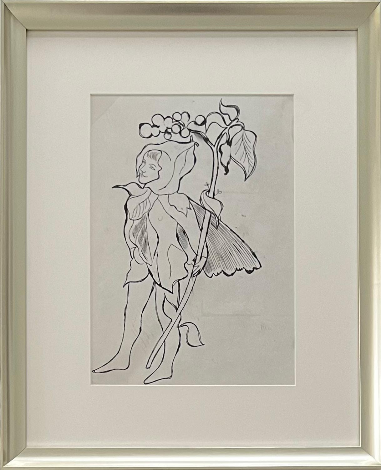
Cherub
Year: Circa 1956
Medium: Ink on paper, double-sided
Size: 18.125 x 16.125 in (46 x 41 cm)
Frame size: 27.5 x 24.5 in (69.8 x 62.2 cm)
From the Estate of Andy Warhol (stamp on verso) to the Andy Warhol Foundation for the Visual Arts to LongSharp Gallery; authenticated by the Warhol Foundation (stamp and archive number, ARD 407.011, on verso).
* Price on request
Click to view a film
About this work: Andy Warhol’s drawings from the 1950s stand in stark contrast to the Pop icon’s famous images of soup cans, Mickey Mouse, and dollar signs; they are whimsical, intimate, and – oftentimes – cheeky. Many of these drawings – especially his drawings of angels, cherubs, and fairies – served as studies for a book, In the Bottom of My Garden, that Warhol published in 1956.
In the Bottom of My Garden had numerous inspirations. The title was derived from the song “There Are Fairies at the Bottom of Our Garden” by Rose Fyleman and Liza Lehmann (1917). The vision for some of the cherubs and fairies was sparked by J.J. Grandville’s Les Fleurs Animées (1847). Further inspiration was gleaned from the fantastical flowers and fairies created by English illustrator Cicely Mary Barker (1923). According to Charles Lisanby, Warhol’s close friend who accompanied him on his first trip abroad in 1956, Warhol was enthralled with several books he encountered during their time in Amsterdam. For In the Bottom of My Garden, “Warhol adapted some putti from Jack Stella. To those inspirations one can add the famous Dance of Cupids (after Raphael) (1517-20) by Marcantonio Raimondi” [1]
Equipped with a masterful hand and a whimsical style, Warhol blended bits of these songs, books, and imagery to create a new world. With cherubs, cats, flowers, and other miscellany cavorting and frolicking throughout the book, every page of In the Bottom of My Garden brings a new surprise.
[1] Schleif, Nina, editor. Reading Andy Warhol. Hatje Cantz, 2013.
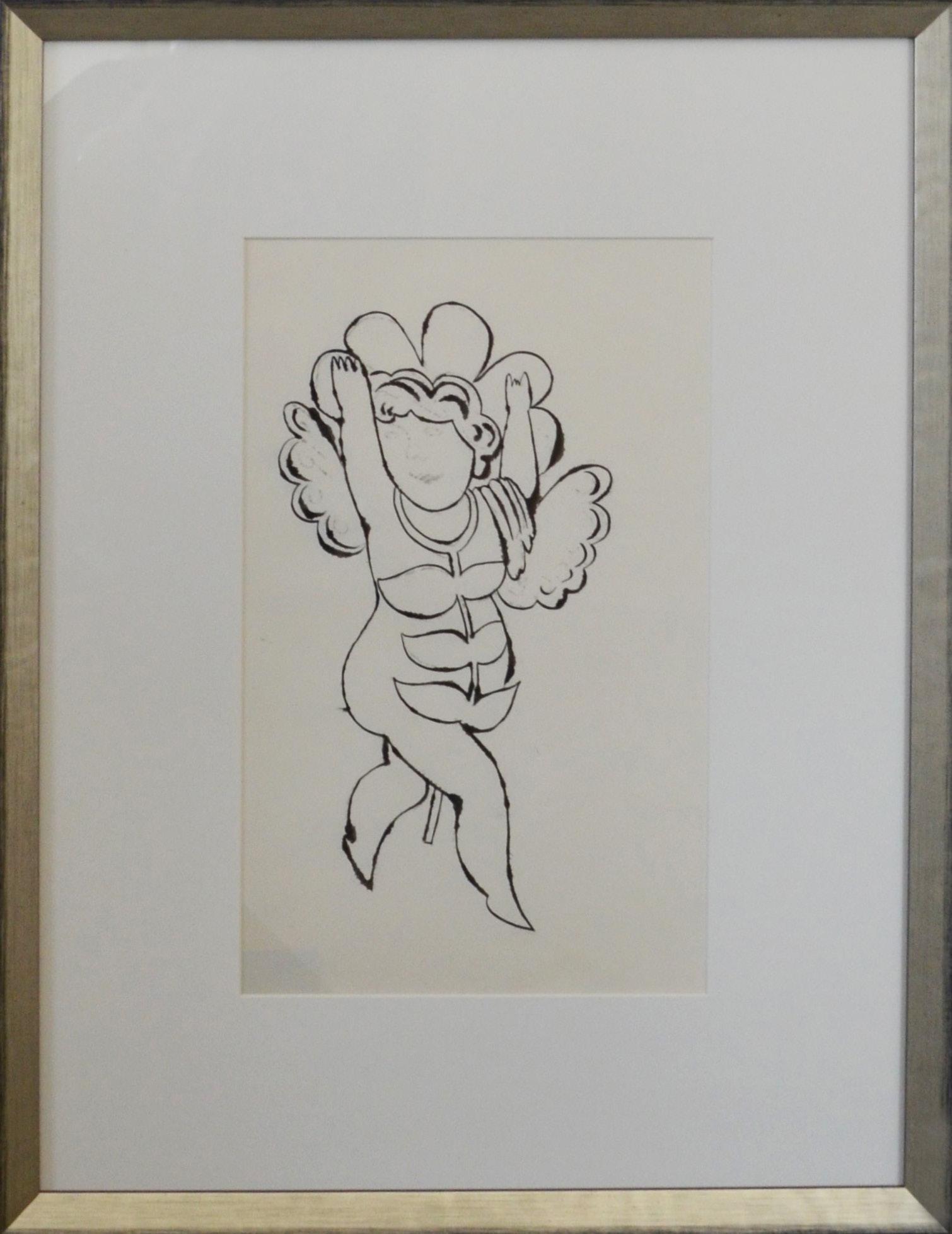
Flower Angel (Study for In the Bottom of My Garden)
Year: Circa 1955
Medium: Ink on paper
Size: 17.875 x 13.25 in (45.4 x 33.7 cm)
Frame size: 23.75 x 18 in (60.3 x 45.7 cm)
From the Estate of Andy Warhol (stamp on verso) to the Andy Warhol Foundation for the Visual Arts to LongSharp Gallery; authenticated by the Warhol Foundation (stamp and archive number, ARD 422.005, on verso).
* Price on request
PATRICK HURST
(b. 1988)
Patrick Hurst works primarily with metals to create large- and small-scale sculpture. His visual identity revolves around the minimal language of abstraction with a strong connection to geometry.
As Hurst has observed, “there is a strong similarity between the creative mind of the artist and the engineer.” Throughout his practice, Hurst employs manual machining, computeraided design, and industrial manufacturing processes to transform the raw materials for his sculptures into highly-finished, tactile shapes. He is a skilled fabricator with a deep knowledge of and interest in material and process.
The artist applies mathematical laws when conceiving the shapes of his sculptures, and most of his work has a satisfactory sense of proportion derived from Euclidean geometry. He frequently uses mirror-polished surfaces to challenge viewers’ expectations of reality when they encounter their reflections in the artwork. Hurst’s sculptures are therefore informed both by the objective and the subjective realms: the first fueled by science and facts, the second by the emotional response of his audience.
Hurst’s artwork is in part a response to our divisive times. Through application of the universal languages of physics, geometry, and mathematics, Hurst seeks to create opportunities for shared understanding. As Cassie Beadle, curator at Cob Gallery, London, describes: “Hurst’s recent sculptural work seeks to condense and harness the complexities of ancient mathematics, human history, and its experience into pure form – Hurst urges us to question the universalities of human experience.”
Hurst graduated in 2011 from the Cardiff School of Art and Design in Wales, UK with a BA (Hons) Fine Art. After graduation, he returned to his native Cambridge and worked at Kettle’s Yard Gallery, home to an eclectic collection of 20th century British masters, before pursuing his passion for sculpture. His work has been shown at Masterpiece London and Eye of the Collector. The artist now lives and works in Italy.
The Tree of Life takes inspiration from “Phylogenetic Trees”, a diagram that displays the evolution of species through time. This concept has been developed to become evolutionary trees, the subject of which can be varied, from the evolution of religions, languages, and individual ancestry to the lineage of a specific species (e.g. butteflies, bacteria, etc). As the evolutionary map of an isolated case is laid out, the study of its history becomes visually apparent.
This work pulls the two dimensional “evolutionary tree” into three dimensional space. It imbues a palpable physicality to a concept that seeks to convey a truth beyond our human scope, something obscured by time. The flat graphic is turned physical by extruding the lines into flat planes, relative to their position on the diagram. The closer they are to the centre, the longer they become and further back in time they represent. The closer to the edge the shorter the plane and the closer in time they become. This rationale generates the abstract form of a tree with a taller central core/trunk. This ramifies into a flat canopy with the form of the evolutionary tree.
The radiating branches cast their shadows along the planes of the “trunk”, obscuring its progression while hinting at its development. This speaks to a common concept in Hurst’s work that invites people to cultivate an awareness of the world beyond their own personal experience. The Tree of Life tree works with this concept both on a grand scale and a personal level. We can consider this tree a relationship, a cultural movement, a revolution as well as an evolution. Whatever it may represent, we can appreciate its origin and progression but its true history becomes more obscure the further back we regress.
Click to view a film
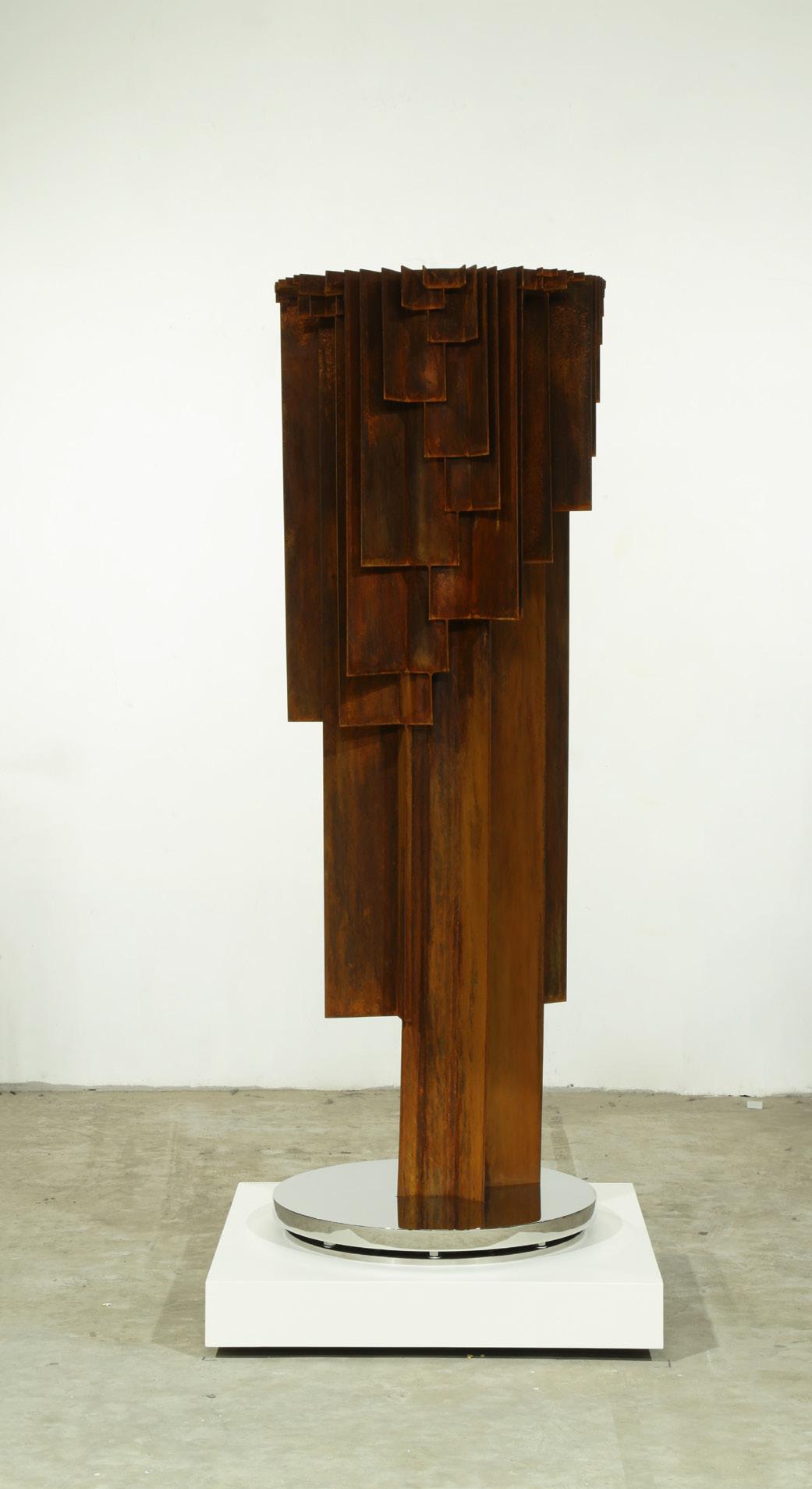
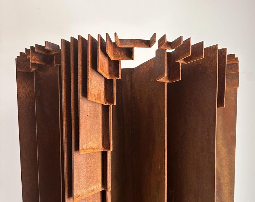
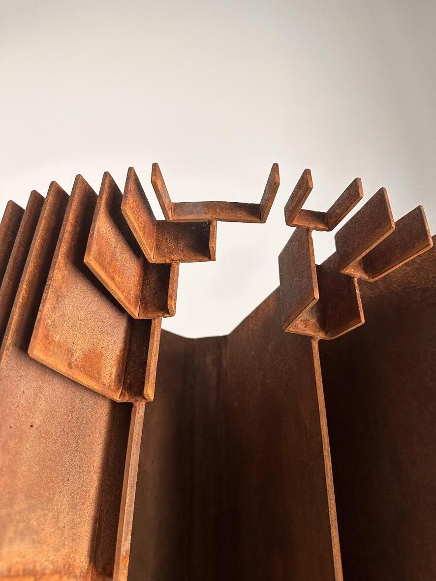
The Tree of Life
Year: 2024
Medium: CorTen steel on 316 stainless steel base, comprised of 171 pieces (on wheels)
From a unique series of 9; this is 2/9
Signature incised on base
Size: 61.8 x 21.2 x 21.2 in (157 x 54 x 54 cm)
Provenance:
The artist’s studio Long-Sharp Gallery
35,000 USD

JULIA IBBNI
(b. 1980)
Julia Ibbini is a visual artist and designer with a background in graphics and collage. She earned a BA (Hons) in Visual Communications from the Leeds University College of Art and Design, UK. Her work combines digital design processes and traditional craftsmanship to create highly detailed, visually complex, and delicate pieces that intersect contemporary design, art, and craft.
Studio Ibbini is an ongoing collaboration between Ibbini and Stephane Noyer, a computer scientist and maker with an interest in computational geometry. Ibbini and Noyer have worked on projects together since 2016, traversing analog and digital to create works of extreme intricacy and machined precision, but which remain distinctly human in origin. Studio Ibbini works predominantly with materials such as archival paper, veneer woods, or mother of pearl—selected for their delicate, tactile qualities—that are then layered and meshed together using a complex collaging method. Individual projects take up to a year to complete.
In 2019, Studio Ibbini received the prestigious Van Cleef & Arpels Middle East Designer Prize. Over the last few years, the work has been shown at Sharjah Islamic Arts Festival 2018, Art Basel Miami, LA Art Fair, Tashkeel Dubai and Jeddah 21,39 - 2020.
Studio Ibbini is based in Abu Dhabi in the United Arab Emirates.
According to the artist: “Ornamental Mixtapes is a series of works inspired by repeating ornamental motifs drawn from antique Persian carpets. I imagined the delicate tendrils of flowers and leaves growing outward, breaking away from the symmetry toward a more organic form. The pieces are hand drawn then algorithmically processed. They are cut, layer by layer, using a specialised laser machine with a single layer taking up to seven hours to cut. The cut paper layers are finished by hand and glued in a delicate collaging technique so that, when assembled, the many motifs and tendrils appear almost carved.”
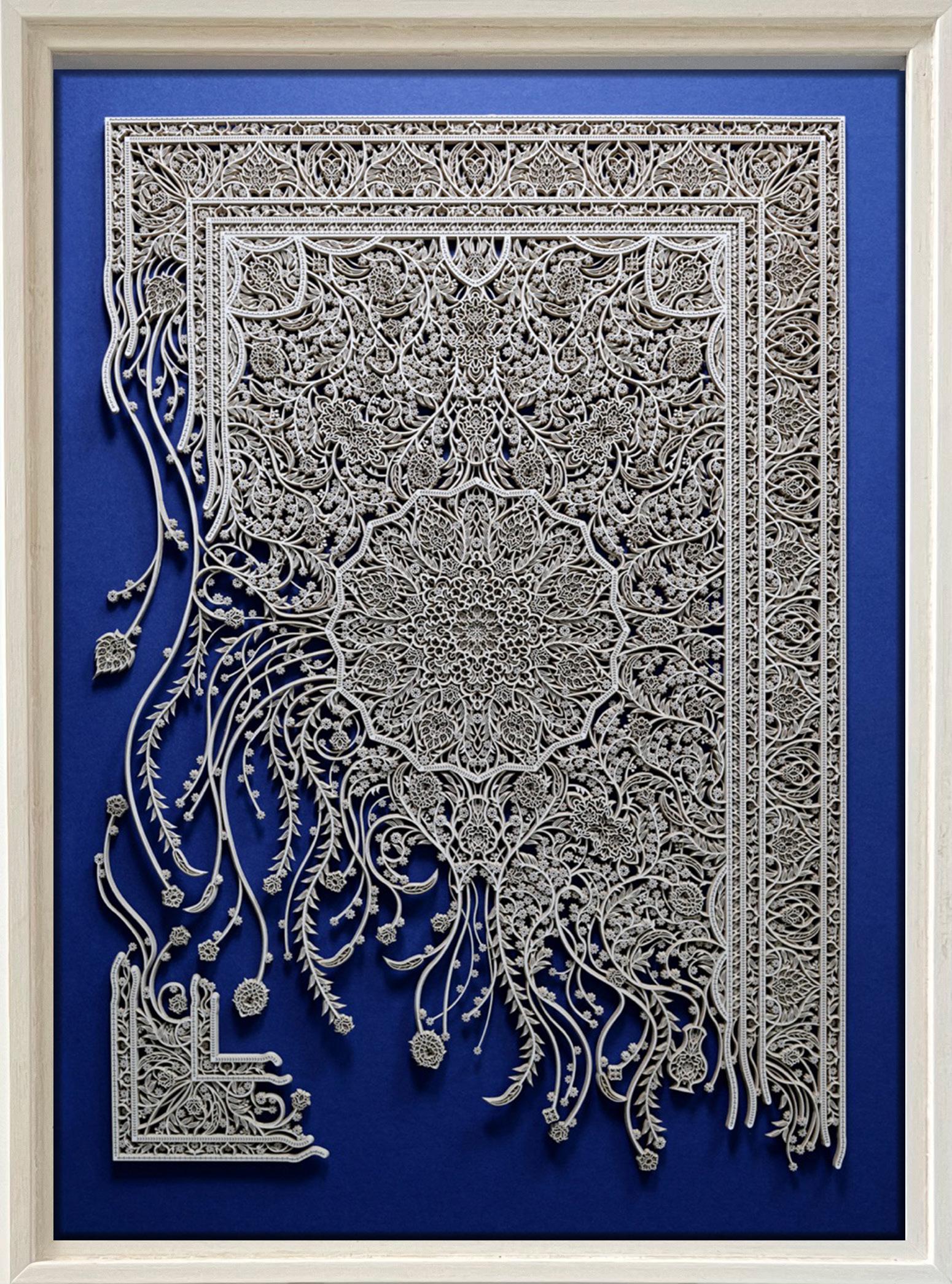
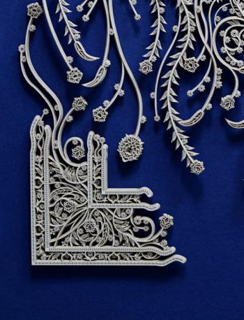
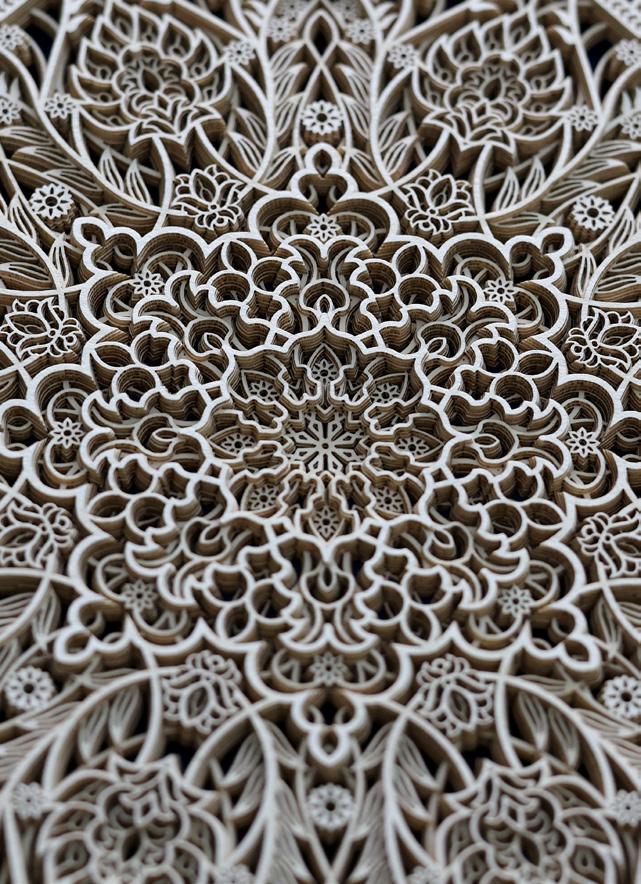
Ornamental Mixtapes v6.5
Year: 2024
Medium: Layered papers with mother of pearl inlay, ink on acrylic
Hand signed
Size: 22 x 15.75 in (56 x 40 cm)
Frame size: 23.5 x 17.25 in (59.7 x 43.8 cm)
Provenance: The artist’s studio
Long-Sharp Gallery
4,800 USD
TAMAR KANDER
(b. 1958)
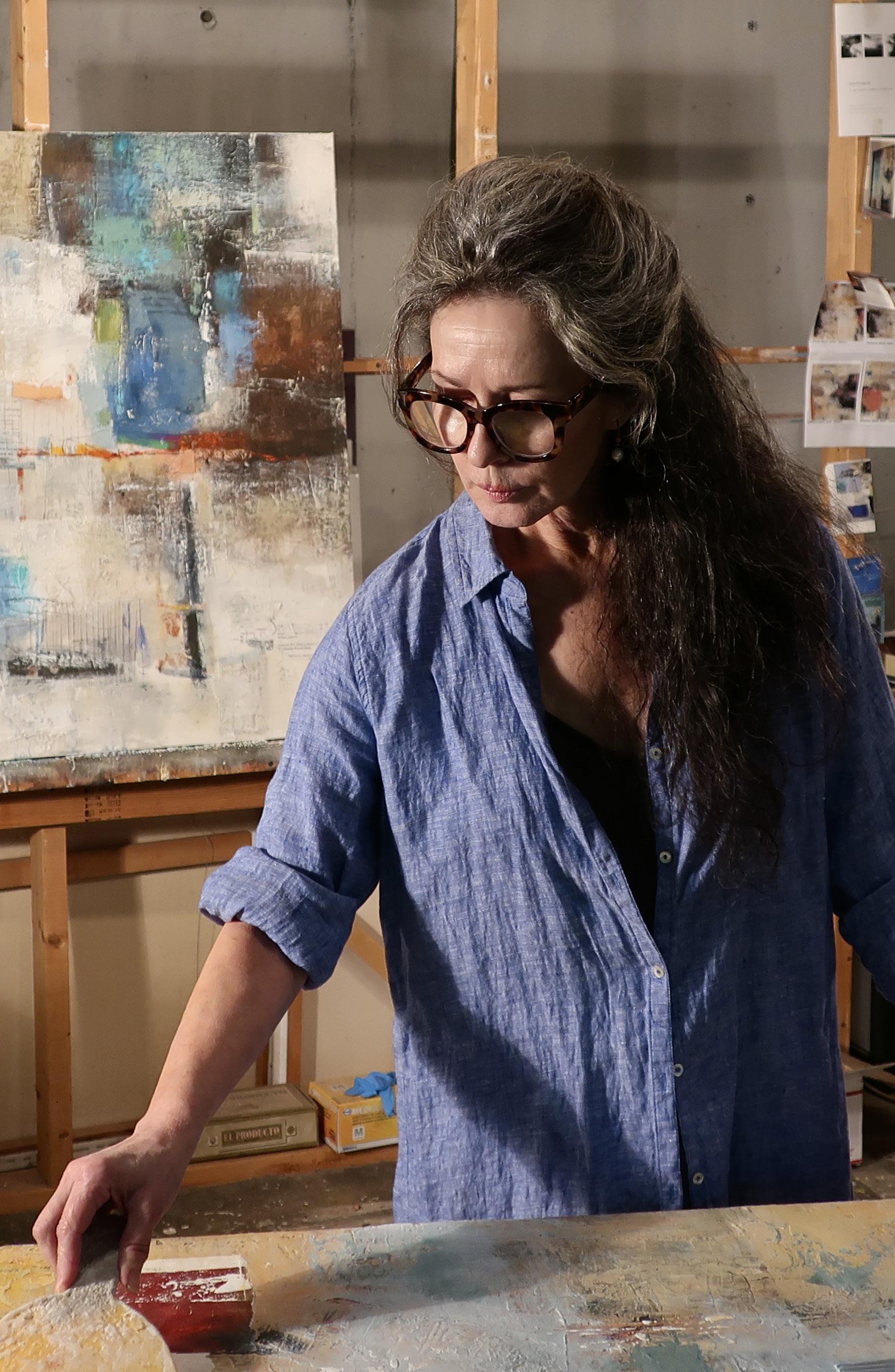
When asked to describe her work, Tamar Kander describes her pieces as metaphors for experiences and expressions of what she sees and feels. Her work comes from a place that reflects on one’s collective memory, specific thoughts, and associations that are unique to each person. She finds beauty hidden in the mundanity of everyday life – the texture and hues of an old, crumbling wall; the reflection of water; the arch of a bridge – music offers influence as well, particularly classical, jazz, and the blues.
Kander creates work that is primarily non-representational and is influenced by architectural symbols, landscapes, and her love of texture. Her canvases are vehicles for various materials and elements of collage. She works with a variety of materials, including powdered gesso, cold wax, dry-wall compound, acrylic medium, marble dust, and oils.
Building her surfaces onto canvas, sometimes adding collaged materials pertinent and personal mementos, she adds in marks and gestures made with brushes and other tools, all the while enjoying a reciprocal “conversation” with the work in progress.
Kander’s complicated yet fluid images illustrate her experiences as a world citizen. Kander was born in Jerusalem and grew up there and in South Africa. She studied fine art at the University of Witwatersrand (Johannesburg, BFA), traveled to Italy on scholarship, then attended Goldsmiths (London, MFA), and thereafter studied at the Art Students League of New York. She now resides in Indiana, US. Her works are included in museum, corporate, and private collections worldwide.
According to the artist: “First Light is about the lovely very early dawn light. I love being awake at that time, and in this painting I tried to evoke what I see and what I feel.
Additionally, I always use collage that is meaningful to me, and it also has to appeal to me aesthetically. For example I must be attracted to the color, shape, or texture, etc, as well.
The labels you see are shipping/customs labels off packages received from a good friend in Australia.
I had saved them because they were from her. And I liked the weight of the paper, they also had my name and my friend’s name on them. We go back a long way… She always says she waits for the very early morning to call me (when she knows I’ll be available to talk at the end of my day) because of the time difference. Another reference to first light.”
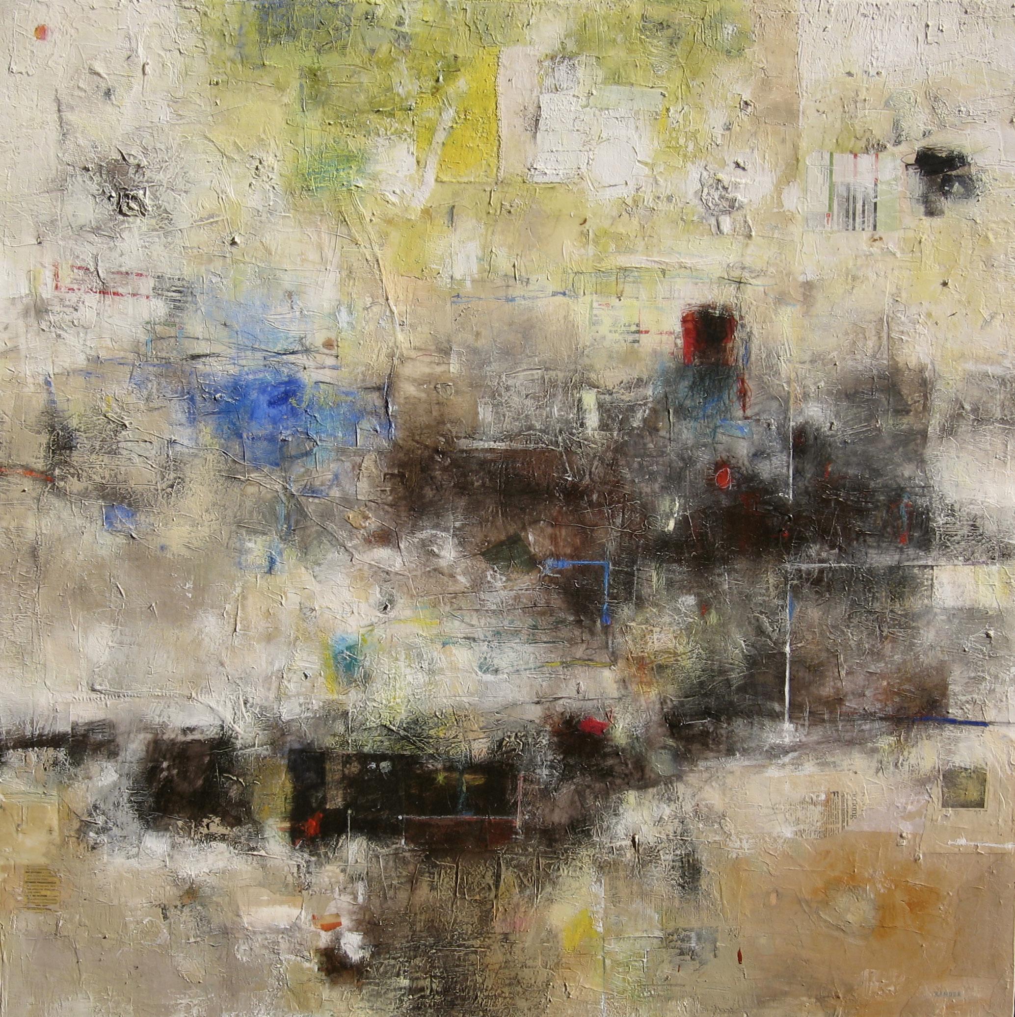
First Light Year: 2019
Medium: Mixed media on canvas
Hand signed lower right
Size: 60 x 60 in (152.4 x 152.4 cm)
Provenance:
The artist’s studio
Long-Sharp Gallery
13,000 USD
According to the artist: “Forever Love is another segment of a canvas that I salvaged to work on. I used paint and various bits of collage. I have added cardboard, sandpaper, and handmade paper along with ink.”
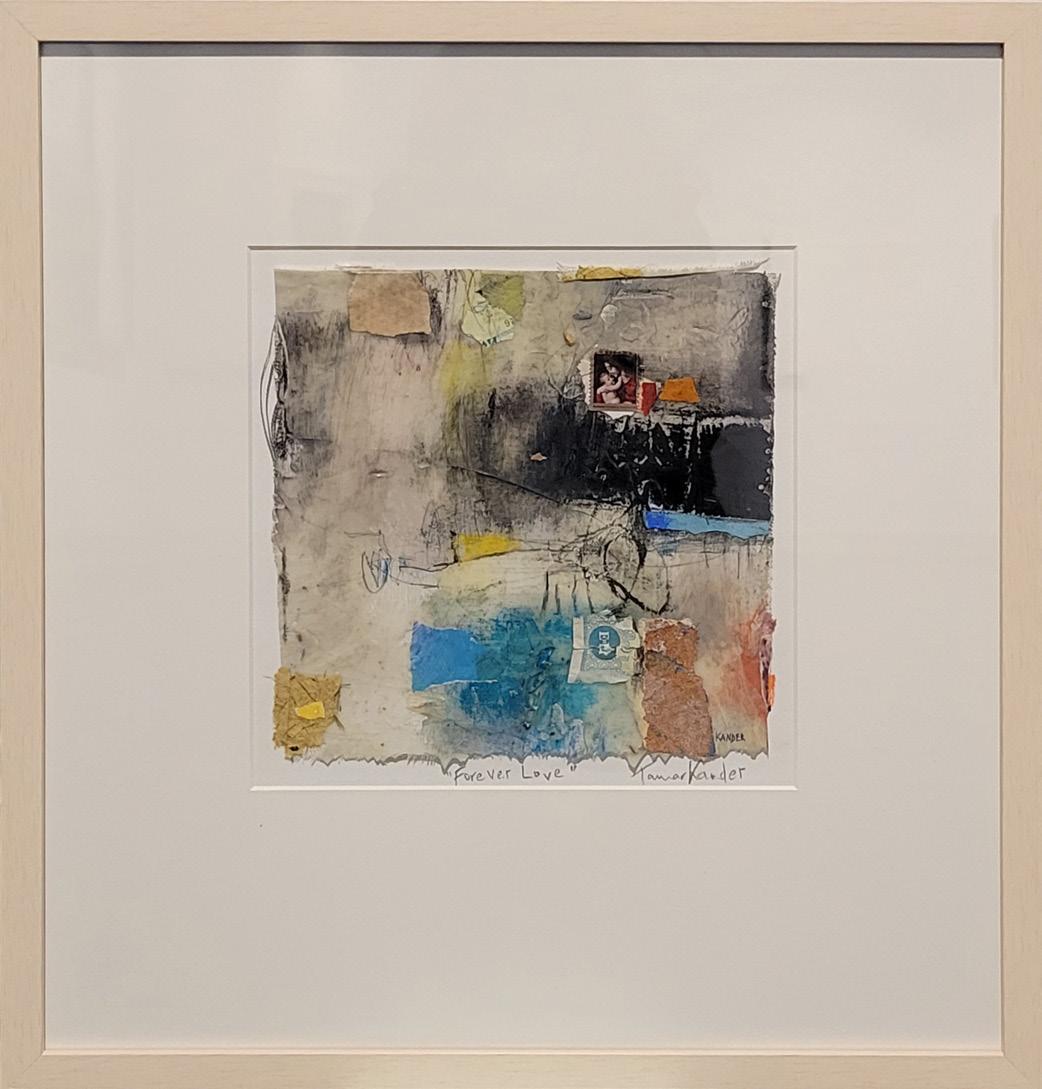
Forever Love Year: 2025
Medium: Mixed media on linen and canvas fragments
Hand signed and titled in the margin
Size: 9 x 9 in (22.9 x 22.9 cm)
Frame size: 20 x 19 in (50.8 x 48.3 cm)
Provenance:
The artist’s studio Long-Sharp Gallery
1,200 USD
According to the artist: “The definition of this title is the tide just after a new or full moon where there is the greatest difference between high and low water.
The colors I used are to reflect springtime, longer days and the element of water.”
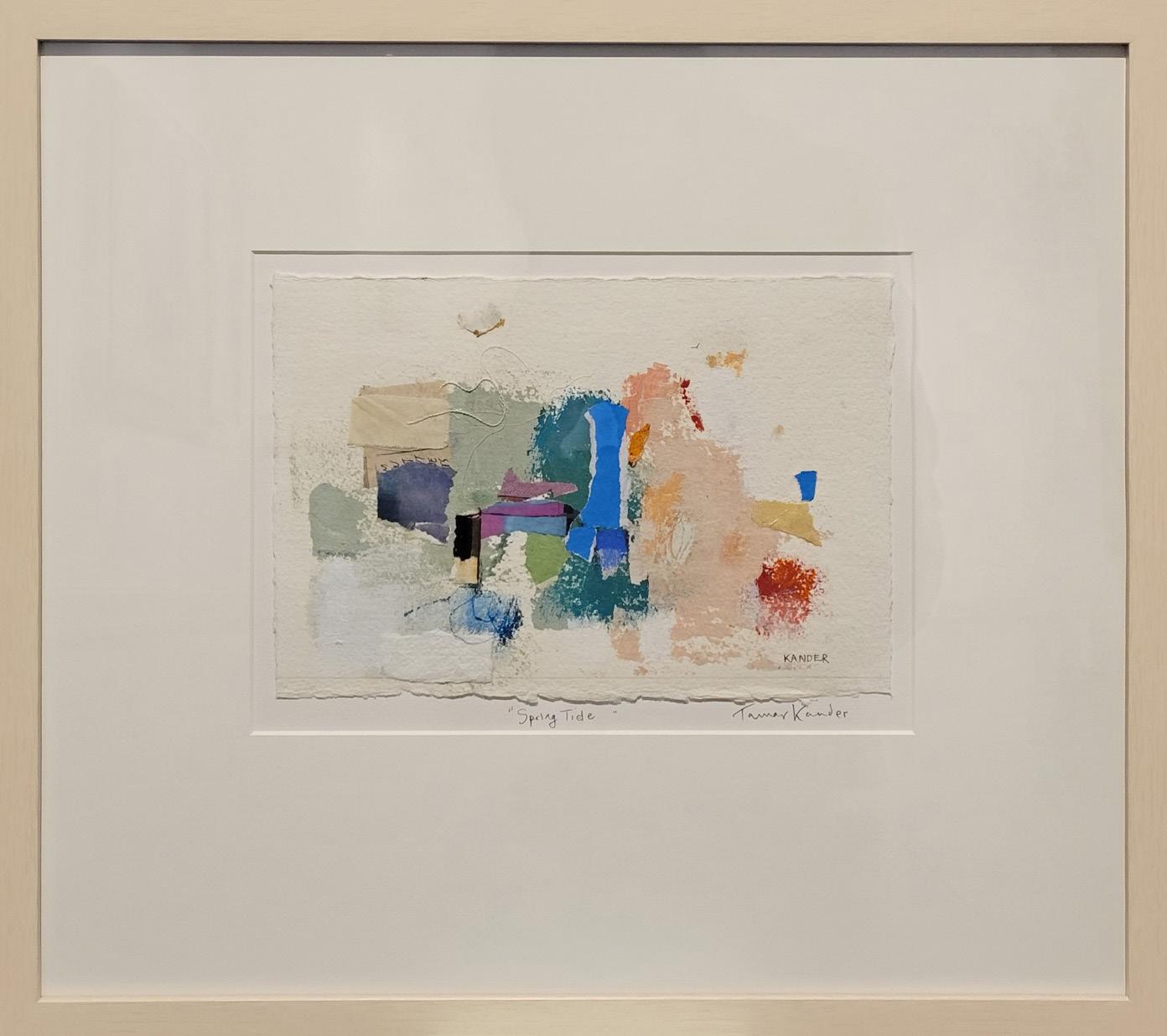
Spring Tide Year: 2025
Medium: Mixed media and collage on watercolor paper
Size: 7.25 x 11.25 (18.4 x 28.6 cm)
Frame size: 19 x 20 in (48.3 x 50.8 cm)
Provenance:
The artist’s studio Long-Sharp Gallery
1,200 USD
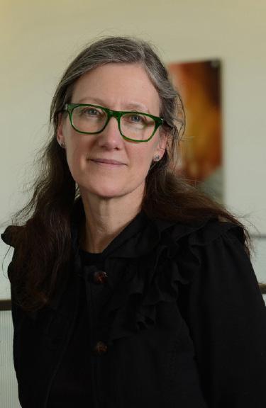
AMY KIRCHNER
(b. 1963)
Working in acrylic and graphite, Amy Kirchner creates large-scale paintings on canvas. Unanchored from the familiar through reduction, form, and color, the work becomes solely unto itself.
Kirchner studied art and advertising at the University of Nebraska. Since graduating in 1985, she has enjoyed a long and successful career in graphic design. Amy worked for an advertising agency in Chicago, Illinois, from 1985 to 1993. In 1993, she moved to Indianapolis where she freelanced for many Indiana-based companies. She currently serves as an art director for the Indiana University Foundation.
Eighteen years ago, Kirchner began to focus on painting. Kirchner paints in silence and sunlight. She paints mood. She paints the space between breaths. In a fast-paced environment she seeks to slow time, offering the viewer a respite.
Long-Sharp Gallery (Indianapolis) began exclusively representing Amy’s work in 2016. Since that time, her works have been exhibited at art fairs in New York (NY), Palm Beach (FL), Chicago (IL), and Palm Springs (CA) as well as solo and group exhibitions with Long-Sharp Gallery in Indianapolis and New York. Since 2016, Kirchner’s paintings have been placed in collections across the United Kingdom and the United States, including a solo exhibition at the Art Museum of Greater Lafayette in 2023.
Amy lives in the Butler-Tarkington area of Indianapolis with her husband, John, (also an artist) and their two dogs. Their daughter, Mary Nell, was born, raised, and educated in Indiana.
According to the artist: “Blue Field 2 has more pattern than I normally allow. I usually choose to make the darker strokes prominent as one dominant figure, or edit the pattern until it becomes just an essence. In this case, letting the strokes have more play was resolving itself due to the strong horizontal field. This painting strikes a balance between both processes.”
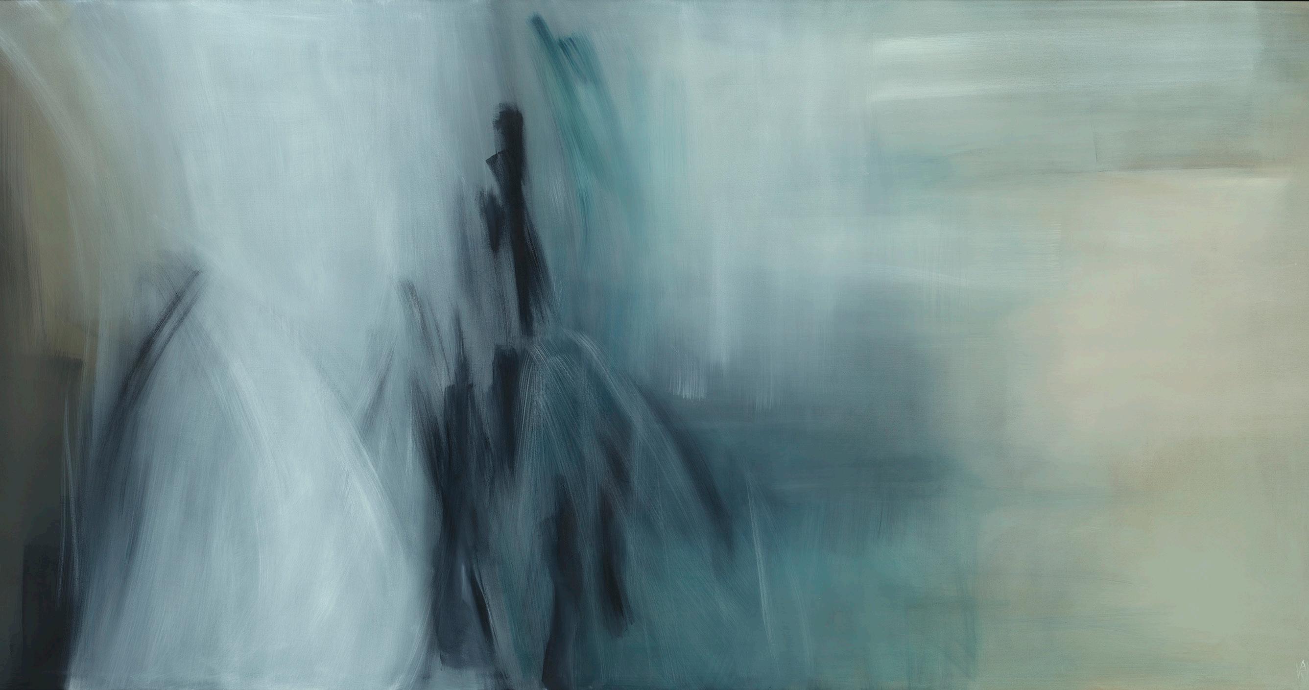
Blue Field 2
Year: 2024
Medium: Acrylic on canvas
Hand signed lower right and on verso Size: 48 x 96 in (121.9 x 243.8 cm)
Provenance:
The artist’s studio
Long-Sharp Gallery
8,700 USD
Click to view a film
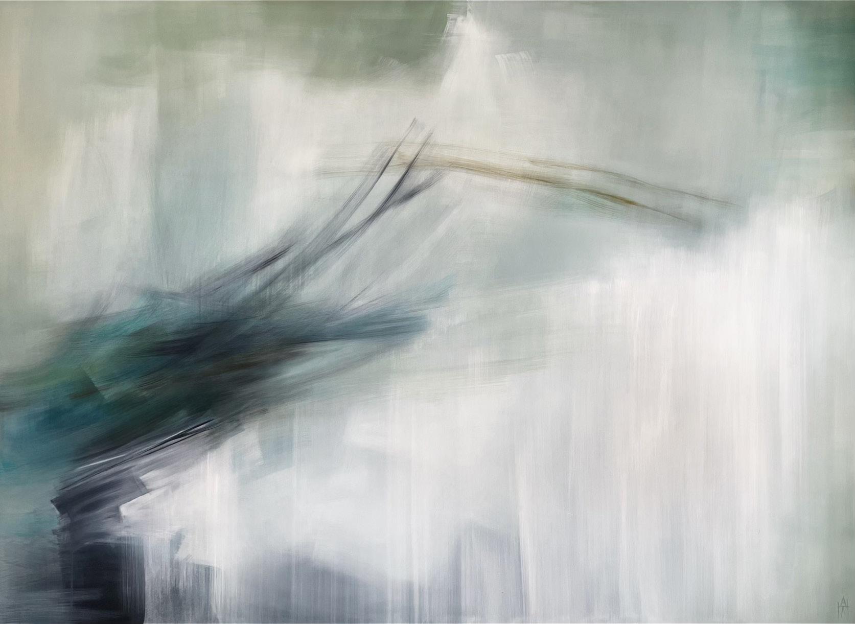
Gradient Wind
Year: 2024
Medium: Acrylic on canvas
Hand signed lower right and on verso Size: 70 x 96 in (177.8 x 243.8 cm)
Provenance:
The artist’s studio
Long-Sharp Gallery
11,300 USD
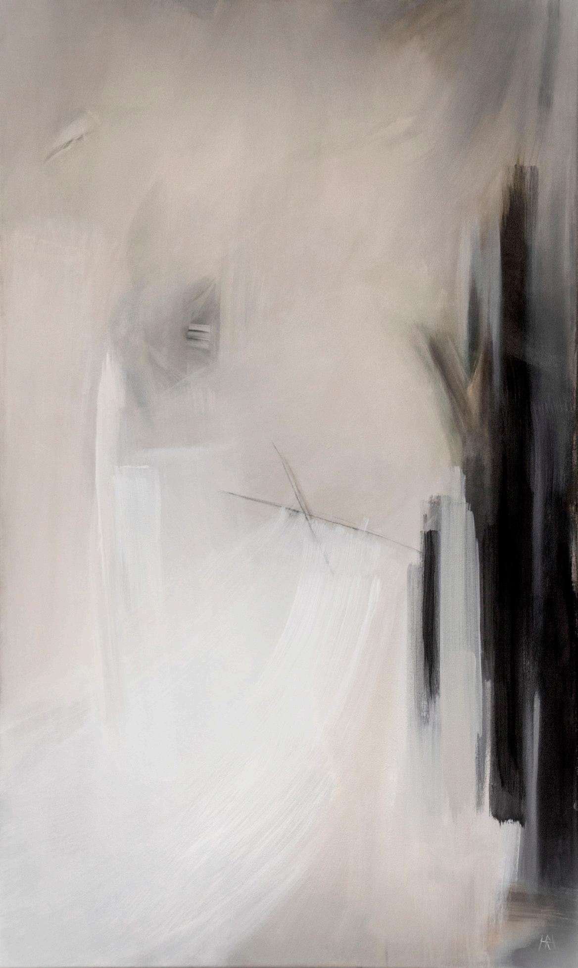
Spring Year: 2019
Medium: Acrylic and graphite on canvas
Hand signed lower right and on verso
Size: 60 x 36 in (152.4 x 91.4 cm)
Provenance: The artist’s studio
Long-Sharp Gallery
7,100 USD

SABINA KLEIN
(b. 1949)
A New Yorker at heart, Brooklyn-born Sabina Klein is a printmaker and painter whose work has been shown throughout the United States and around the world. Klein attended Hunter College where she received her bachelor’s degrees and her Masters. She continued her education in Paris for two years after Hunter. She studied with S.W. Hayter at Atelier 17 in Paris. She has printed for Krishna Reddy, Louise Nevelson, Al Held, Peter Milton, Larry Zox and Richard Haas, among others. She taught at Parsons School of Art and Design and the New School for Social Research.
Klein is a realist with traces of abstraction pervading her work. Her work has elements of light, atmosphere and mood which pervade her subject matter. Klein is presently owner and director of her own printmaking workshop, plate-making and edition printing for artists.
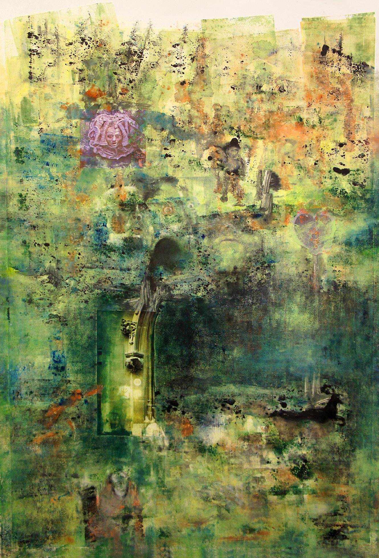
The Forest Year: 2014
Medium: Oil paint, oil sticks, and colored pencils on paper
Size: 47.5 x 31.5 in (120.7 x 80 cm)
Frame size: 52.75 x 36.5 in (133.9 x 92.7 cm)
Provenance:
The artist’s studio
Long-Sharp Gallery
9,500 USD

JASON MYERS
(b. 1972)
Jason Myers is a prolific multi-disciplinary artist with a breadth of experience working with different media. Over the years, his artistic practice has consistently evolved in both style and technique. His recent body of work is primarily figurative and includes paintings, drawings, prints, digitally manipulated images, and large-scale sculpture and installations.
Myers utilizes a unique combination of traditional artistic and industrial raw materials such as steel, resin, and computer-generated prints. Complex, layered, and exquisitely executed, Myers’s work often questions our current political and socioeconomic environment, reflecting on themes of technology, alienation, greed, wealth, and power.
Myers received his bachelor’s degree from the Kansas City Art Institute (Kansas City, MO) and his MFA from American University (Washington, DC). Forgoing the “typical” trajectory perhaps expected from modern-day artists (a New York studio, numerous assistants), Myers instead opts to work more solitarily from his studios in Indiana and the Netherlands.
With works exhibited across the United States and abroad, Myers’s acclaim has grown in recent years. His solo museum exhibit, STATUS: fluid/dynamic has traveled to both the Polk Museum of Art (Florida) and the Art Museum of Greater Lafayette (Indiana); a solo exhibition in the Lambla Gallery at the University of North Carolina (Charlotte). Myers’s monumental (60-foot tall, 38-ton) steel sculpture, “Trials of Gavin”, was commissioned for the Lowlands Music Festival (Netherlands) and currently towers over the train station in Zwolle, Netherlands. His works are in the permanent collections of several museums, including the Indianapolis Museum of Art (Indiana). In addition, individual works have been featured in museum exhibitions at the Mint Museum of Art (North Carolina), Museum de Fundatie/Kasteel het Nijenhuis (Netherlands), and Cornell Art Museum (Florida).
Myers’ most recent series, Fragility: Embracing the Impermanence and Beauty of Life, debuted at Long-Sharp Gallery Indianapolis which ran concurrently with his third solo museum exhibition at UNC Charlotte, I Am Algorithm curated by Adam Justice, Director of Galleries at UNC Charlotte.
According to the artist: “The journey of life can be a monumental struggle. Every person’s path through life has its own unique conflicts that must be overcome. Although many times those are physical in nature, more often we face psychological challenges. Through perseverance, we embrace the trials of tomorrow, and each of us is a soldier of life…in our own battles.”
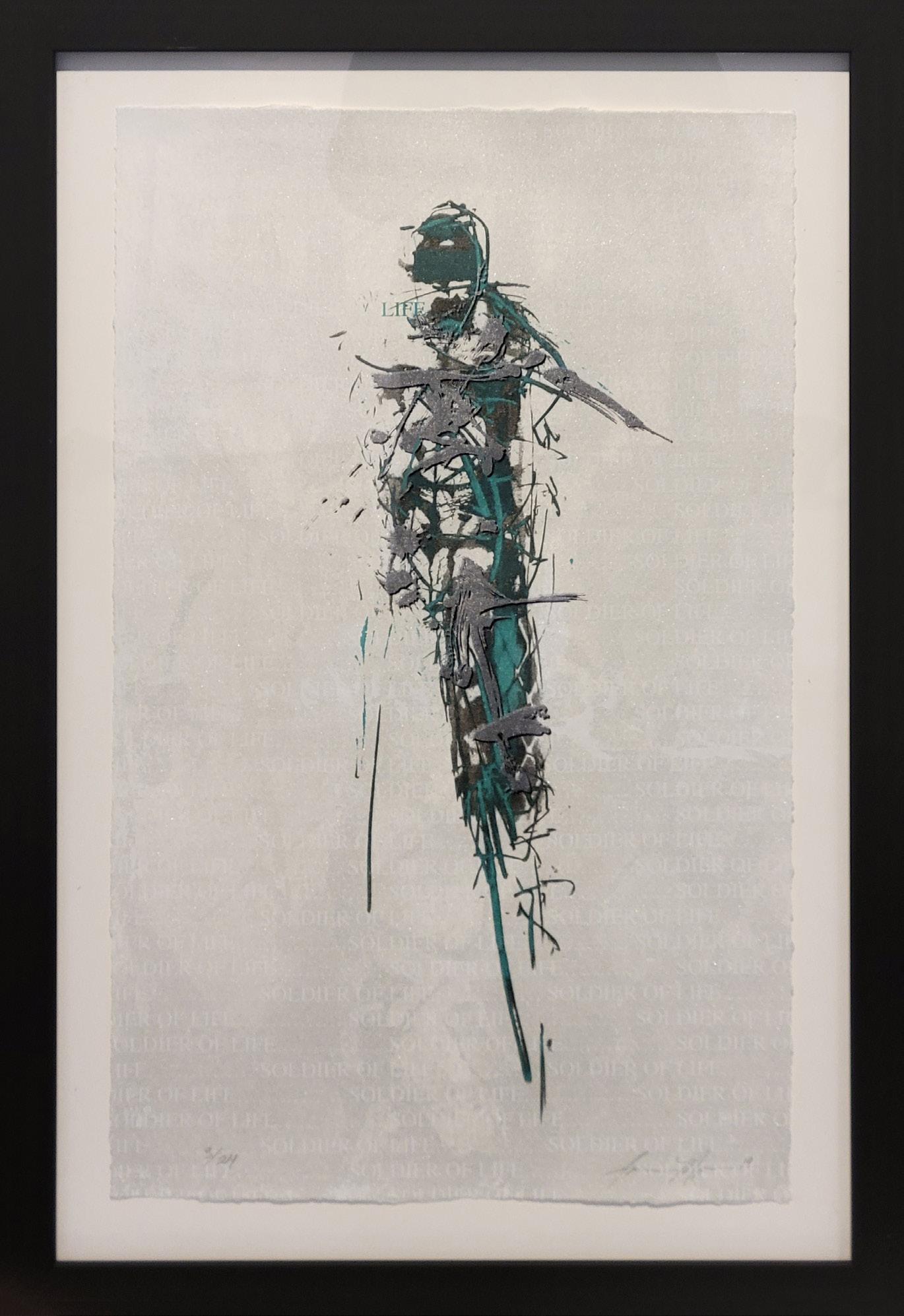
Soliders of Life (Earth)
Year: 2019
Medium: Screenprint in eight colors on paper
Hand signed and dated lower right, numbered lower left
Size: 25.5 x 16 in (64.8 x 40.6 cm)
Frame size: Frame size: 31 x 21.06 in (78.7 x 53.5 cm)
Provenance:
The artist’s studio
Long-Sharp Gallery
1,200 USD
According to the artist: “The journey of life can be a monumental struggle. Every person’s path through life has its own unique conflicts that must be overcome. Although many times those are physical in nature, more often we face psychological challenges. Through perseverance, we embrace the trials of tomorrow, and each of us is a soldier of life…in our own battles.”
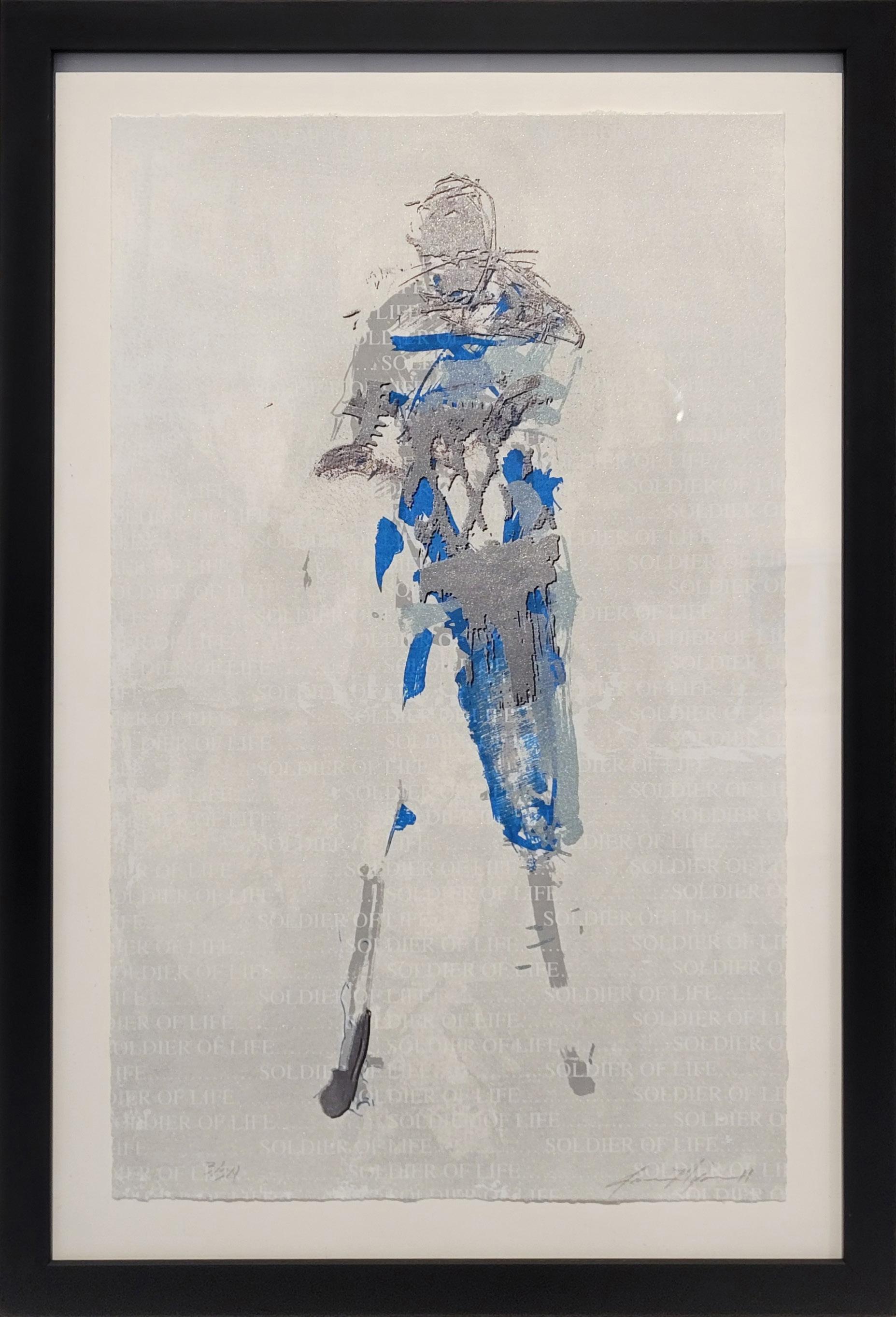
Soliders of Life (Water)
Year: 2019
Medium: Screenprint in eight colors on paper
Hand signed and dated lower right, numbered lower left
Size: 25.5 x 16 in (64.8 x 40.6 cm)
Frame size: 30.875 x 21 in (78.42 x 53.34 cm)
Provenance:
The artist’s studio Long-Sharp Gallery
1,200 USD
NICOLE PIETRANTONI
(b. 1981)
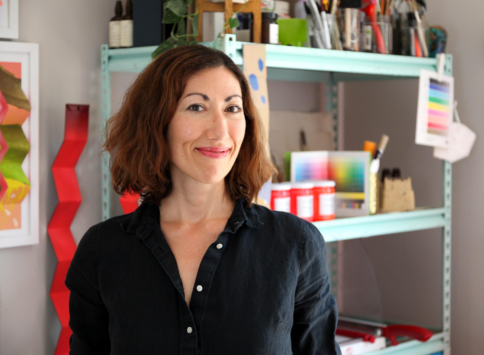
Nicole Pietrantoni is an artist best known for her colorful paper sculptures made from printed accordion books. Her work combines traditional printmaking and bookbinding techniques with painting and photography. Pietrantoni explores the traditions and materials of print media and, at the same time, critiques these disciplines and the ways in which printed matter sparks intrigue. Her artwork moves fluidly between digital and analog modes of making – intermeshing processes that are software-generated and traditionally handcrafted.
Pietrantoni is the recipient of numerous awards including a Fulbright to Iceland, an Artist Trust Fellowship, and the Manifest Prize. Pietrantoni has been awarded artist residencies at Meta Open Arts, the Nova Scotia College of Art and Design, Anderson Ranch Arts Center, and La Maldita Estampa in Barcelona, Spain, amongst others.
Pietrantoni has been a visiting artist and lecturer at over 40 institutions and her work has been exhibited in over 100 national and international exhibitions, including solo shows at the San Juan Islands Museum of Art (San Juan Island, WA) and the Manifest Gallery (Cincinatti, OH). Group exhibitions include showings at Galerie Gardette (Paris, France), Galleri Heike Arndt (Berlin, Germany), The Ashurst Emerging Artist Prize Shortlist Exhibition (London, UK), the San Francisco Center for the Book (San Francisco, CA), American University Museum (Washington, DC), and Lia Libro de Artista (Guadalajara, Mexico). Pietrantoni’s work has been included in publications such as Art in Print, The Washington Post, and American Printmakers (Schiffer Publishing).
Pietrantoni received her MFA and MA in Printmaking from the University of Iowa and her BS in Human and Organizational Development and Art History from Vanderbilt University. She is represented in the US by Long-Sharp Gallery and currently lives in Girona, Spain.
Click to view a film
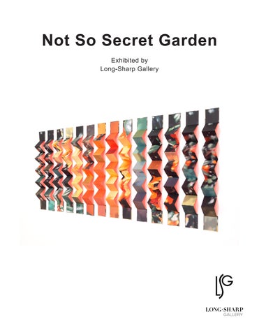
According to the artist: “Still Life: Darwin’s Barberry is a fragmented and pixelated view of this vibrant flowering plant. The snapshot was taken on a walk during the pandemic, when the sight of this nearly neon orange blossom burst into my field of view on a dreary winter day.”
Still Life: Darwin’s Barberry
Year: 2022
Medium: Inkjet print on Kozo paper, handbound into 14 accordion books. Acrylic paint
Total dimension: 26 x 62 x 2 in (66.04 x 157.48 x 5.08 cm)
Provenance: The artist’s studio
Long-Sharp Gallery
7,000 USD
DAVID SPILLER
(1942-2018)
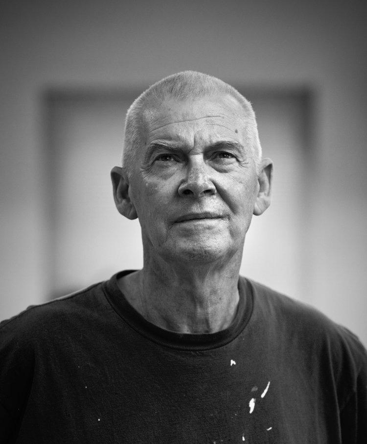
A veteran of the British Pop Art movement, David Spiller grew up in its defining period. Juxtaposing pop culture with urban sensibilities, Spiller created his own unique style of fine art that is distinctly “David Spiller.” As Martin Gayford wrote in his catalogue essay for Spiller’s 2008 exhibition at Beaux Arts London:
David Spiller’s pictures are much more than simply messages. A lot of them are also, an art historian might say, complex colour-field abstractions. […] To make works of this type, Spiller uses a technique that is, as far as I know, unique. He ‘floats’ the pigment onto pieces of canvas that he then sews together with incredible neatness and precision, so the final work is a sort of combine, made not with glue, like a collage, but with needle and thread. […] no one has ever, as far as I know, fitted geometrically precise square and oblongs of colour together in this fashion, like a precision-engineered quilt...
David Spiller’s place as an acclaimed artist was not achieved by happenstance. Spiller was trained in fine art and an early student of Frank Auerbach. He studied at the Sidcup School of Art (1957), Beckenham School of Art (1958-1962), and the Slade School of Art (1962-1965). During his distinguished career, Spiller had solo exhibits in over 10 countries (Austria, Belgium, Denmark, England, France, Germany, Holland, Italy, Spain and the United States). His work was exhibited at notable institutions such as the Rattingen Museum and Mannheim Kunstverein (Germany), Museum Van Bommel van Dam and Museum Utrecht (Holland), Museum Espace Belleville and Artcurial (Paris), the Royal West of England Academy (UK), and the Cornell Museum (Florida, US). His work is also in important public and corporate collections which include Hanwon Museum (Seoul), Foundation Carmignac Gestion (Paris), Harley Gallery Welbeck, Collection UCL, Morgan Stanley (Frankfort), and Belgacom Brussels. Important private collections also contain works by the artist; some are available on request.
When asked about his art, Spiller has said “I really want to make paintings that put some magic on the wall. Some of them are straightforward things. Some are wild things. But underneath, it says ‘I love you.’”
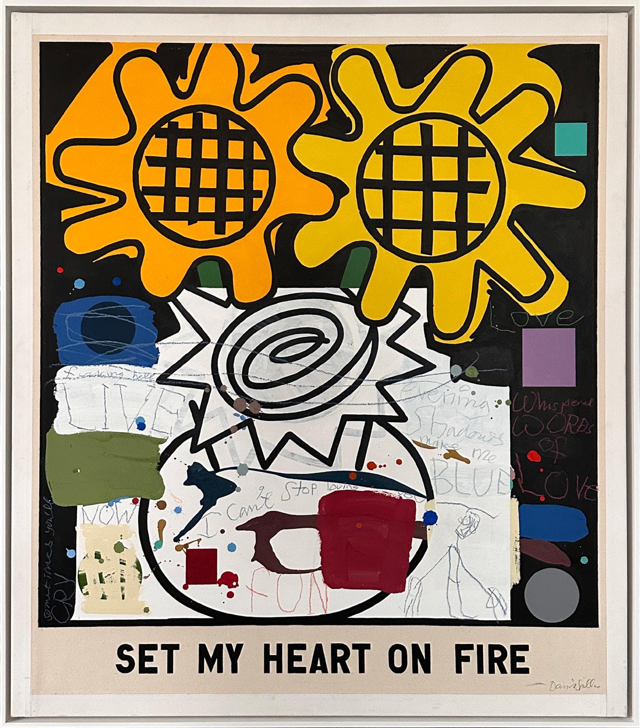
Set My Soul on Fire
Year: 2009
Medium: Acrylic and pencil on pencil on canvas
Hand signed on verso
Size: 48 x 41.75 in (122 x 106 cm)
Frame size: 49.375 x 43.25 in (125.41 x 109.86 cm)
Provenance:
The artist’s estate
Long-Sharp Gallery
[SOLD]
WAYNE WARREN
(b. 1940)
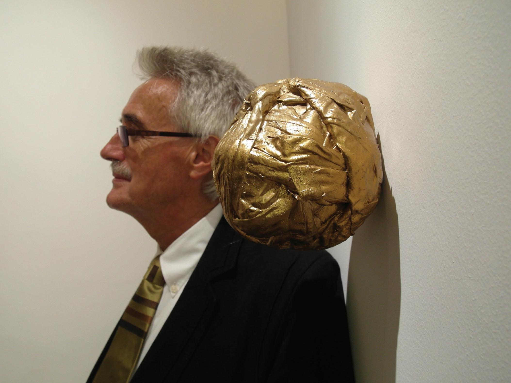
Graduating in 1972 from Exeter University, London, with a bachelor’s degree in Art and Education Psychology, Wayne Warren has established himself as a contemporary artist in both two- and three-dimensional pieces. His work highlights the consumer ’s fixation with materialism and challenges the market valuation of physical goods.
Warren’s oeuvre consists of works incorporating a most diverse spectrum of media: from 3D-printing, to sculpture incorporating found objects, to – most recently – lenticular printing. Warren uses these media and others to focus on a concept perhaps most succinctly summarized by curator Reg Newitt – that “we are driven by conflicting interests: idealism versus reality, want versus need, progression versus regression, construction versus destruction, knowledge versus purity…”
Most recently exhibited at the Bury Museum in the UK, Warren’s stunning creations are prominently featured in many public and private collections across the globe. His work may be found in many public collections such as Judith Neilson, Founder/Director, White Rabbit Collection, Sydney; Lloyds The First Ten Years Luton Museum and Art Gallery, England; The Long Gallery; Birmingham University; Lloyds Bank, England; Norwich Hospital; Montclair Kimberley Academy, NJ, USA; and Cambridge University.
According to the artist: “Wings are my own aspiration and represent our ambitions. We all want to succeed in some measure – to fly, to raise ourselves above the masses! Wouldn’t it be nice to buy a pair of wings from a shop rail, fit them on and lift off.
In the Garden of Eden, Adam was tempted by Eve. By hanging a wing off an apple tree, I wanted to show the moment he was tempted in his head - not by the forbidden fruit but by the idea of getting something ‘more’.
With this piece I wanted (unlike previous screenprints) to show the subtle movement of an idea. Lenticular printing – which was actually developed by my dear friend Professor Martin Richardson at the de Montford University – seemed an appropriate technique to convey this subtle transition. Professor Richardson is quite respected in his field, printing for Peter Blake and Damian Hirst, among others.”
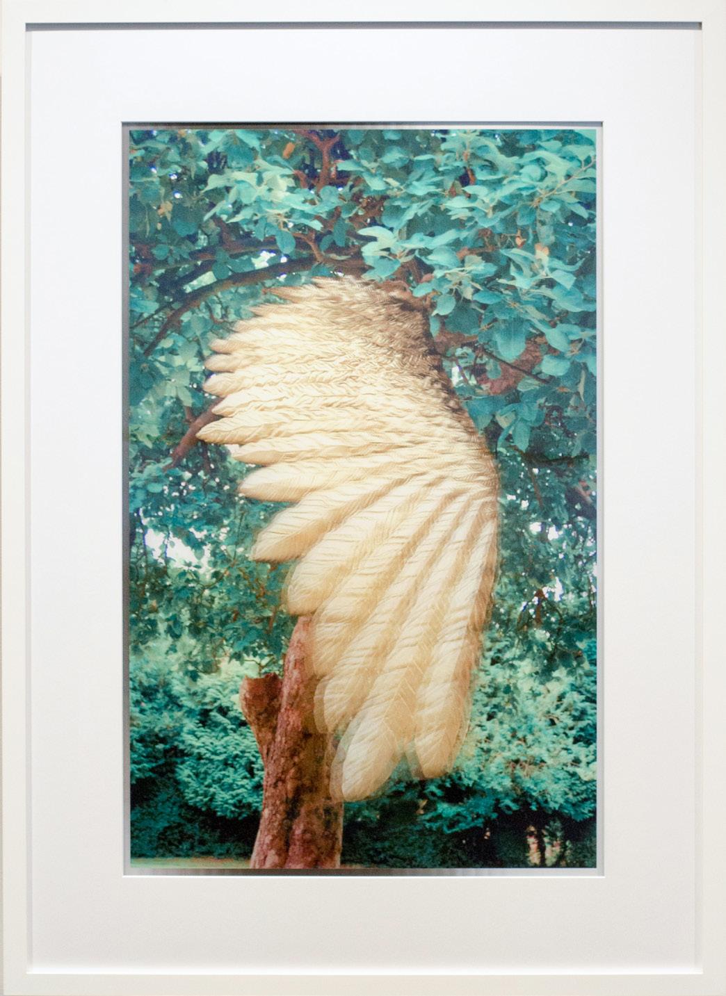
Wayne Warren
The Fall Year: 2017
Medium: Lenticular Print
Hand signed and numbered on verso
From an edition of 5 plus 2 AP; this is 4/5
Image size: 43 x 27 in (109.2 x 68.6 cm)
Sheet size: 48 x 36 in (121.9 x 91.4 cm)
Frame size: 54.25 x 39.25 in (137.8 x 99.7 cm)
Provenance:
The artist’s studio
Long-Sharp Gallery
5,000 USD
Click to view a film