Viewfinder wins awards for design excellence...again! we
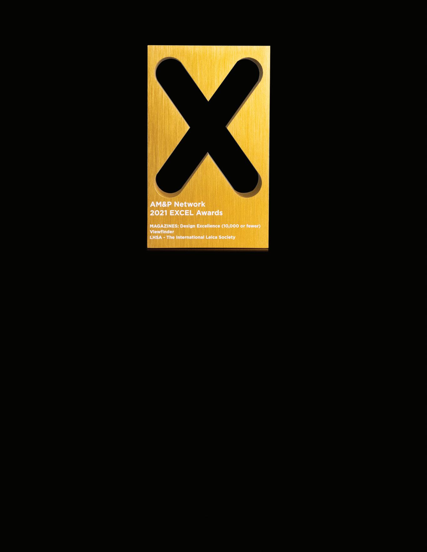
are so pleased to announce that Viewfinder has won two awards at the recent Excel Awards Virtual Ceremony in June 2021. Viewfinder took the GOLD Award for “Magazines: Design Excellence (circulation 10,000 or fewer) and the BRONZE Award for Feature Article Design: In Patagonia (circulation 10,000 or fewer). In 2020, Viewfinder took the Silver Award in Design Excellence.
The EXCEL Awards are the largest and most prestigious program recognizing excellence and leadership in association media, publishing, marketing, and communication. 240 awards across 82 categories were presented at the ceremony.
“This year’s EXCEL Award winners deserve special praise for producing outstanding work in the midst of a global pandemic resulting in quarantine and remote work,” said SIIA President and CEOJeff Joseph. “Our honorees overcame these challenges, truly representing the ‘best of the best’. Congratulations to all of this year’s winners!”
The Society wishes to thank Bill Rosauer, Viewfinder editor, and Kirsten Vignes, Viewfinder Graphic Designer, as well as all the authors and photographers who contributed to the success we now enjoy.
- Richard Rejino, Executive Director
OFFICERS & DIRECTORS
Inquries about membership, upcoming events, replacement Viewfinder issues, and special orders should be directed to:
Richard Rejino, LHSA Executive Director 14070 Proton Road, Dallas, TX 75244 info@lhsa.org, (972) 233-9107
Viewfinder is the official publication of the LHSA - The International Leica Society, a nonprofit organization incorporated in the state of Delaware. Copyright 2020. Reproduction or use of any material contained herein without permission of the Sociey if forbidden.
Leica is a registered trademark. It and other trademarks pertaining to the Leica System are the property of LEICA CAMERA, USA, INC.
ISSN 1543-8732
PRESIDENT
Keith R. Sbiral Chicago, IL
VICE PRESIDENT
Brad Husick Medina, WA
SECRETARY/TREASURER
David Knoble Charlotte, NC
IMMEDIATE PAST PRESIDENT
Alan Weinschel Roslyn Heights, NY
PRESIDENT EMERITUS
James L. Lager
Rolf Fricke
Bill Rosauer
APPOINTED OFFICERS
Viewfinder Editor
Bill Rosauer Buffalo Grove, IL lhsaeditor@yahoo.com
(pp. 16-23).
24 the story of 'dias eternos' & ana maria arevelo gosen by Richard Rejino
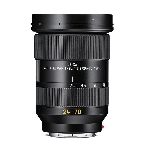
32 the leica vario-elmarit-sl 24-70mm f/2.8 asph by Jonathan Slack
38 late days: alehouses & a spook house by Dough Richardson
43 the leitz birthdays book by Ed Schwartzreich 46 address for elcan's 60th anniversary by Brian Veall
50 shades of new york by Jim Lager
Associate Viewfinder Editor Ed Schwartzreich Waterbury, VT
EXECUTIVE DIRECTOR
Richard Rejino Dallas, TX info@lhsa.org
ELECTED DIRECTORS Class of 2021 Wilbur Norman Santa Fe, NM
Jay Paxton Houston, TX
David Spielman New Orleans, LA
Class of 2022
Andrew Godlewski Middletown, RI
Bill Royce Kirkland , WA
Kirsten Vignes St. Petersburg, FL
Class of 2023
Sandra Eisert Redmond, Washington
William Fagan Dublin, Ireland
CONTRIBUTING EDITORS
S.R. Gilcreast, Jr. Peterborough, NH
James L. Lager Closter, NJ
S. Willis Wright Port Washington, NY
SENIOR DIRECTORS
Gary Hough Woodinville, WA
Douglas Drumheller Pittsburgh, PA
A LETTER FROM THE PRESIDENT
by KEITH SBIRAL greetings
LHSA Members! As this issue of Viewfinder is released, I will be wrapping up my term as President of our organization.
What a fantastic organization we have grown to be. With the momentum of the last 7 years behind us, there are only good things ahead in the future.
I encourage each of you again to enlist just one new member in an effort to keep our ranks strong and ensure financial viability of the organization over the long term.
I would like to thank Dr. Kaufmann, Stefan Daniels, and the entire Wetzlar and New Jersey team for their support and encouragement for our organization and mission. I’d also like to thank those who served before me and those who are about to take the reins. As I write this, the election hasn’t been held yet, but with a fantastic leadership team nominated and the work of our unstoppable and dedicated Executive Director, Richard Rejino, this organization is in good hands as I move into the past president role.
My final message to you is to enjoy your Leica, enjoy photography, enjoy the Viewfinder, and enjoy the camaraderie of this community of like minded people. I hope we continue to expand in all of these areas, which is why I have focused my efforts in LHSA on adding to the diversity of our organization, diversity of photographic methods and knowledge, and expanding our membership in underrepresented groups including women in photography, young photographers, as well as internationally. The challenge will be to continue to honor our history while providing new content, programming, and engagement that piques the interest of all members.
We have certainly made amazing progress.
I hope to see you each again in person at one of the future LHSA events.
Thank you for this opportunity to serve as President.
Keith R. Sbiral - President, LHSA International Leica Society
A LETTER FROM THE EDITOR
by BILL ROSAUER
am very pleased to announce that Viewfinder has won two major awards in the recent Excel Awards for 2021. Viewfinder won the Gold Award for Magazine Design Excellence and Bronze for Feature Article Design. This is the second year running we have won an award from this organization. Our Graphic Designer Kirsten Vignes deserves most of the credit for this, as well as the contributors to our journal. Thanks also to Richard, our Society Admin for entering us in the competition.
Dick Gilcreast continues his Tips and Techniques series with a lesson on how to achieve greater depth of field in your photos in poor lighting situations, with a very basic outfit. By following some very simple rules, something at which the rangefinder Leica excels, you don’t need a fancy camera with all the “bells and whistles” or a tripod to accomplish this.
Chats Chatterjee gives us some pointers in his quest for speed in handling his large image files on his home computer. As
the pixel count goes higher and higher with the newest Leica models, and we know there is more to come, this has become a very real concern for Leica photographers. Chats shares his approach to this challenge, and hopefully you can benefit from his quest. David Knoble shows us how to achieve consistent colors in your digital workflow. Many of us who have gone digital with our Leicas, and even those who still shoot film, incorporate programs such as Lightroom or Photoshop to take your original image (either digital or analog) to its final form. Whether a physical print or book, or in some form of online format is part of your digital workflow, David’s article is will be very helpful in explaining the process of utilizing color spaces.
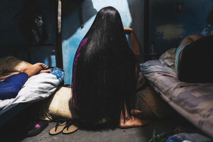
Richard Rejino tells the moving story of Ana Marie Gosen in his article “Dias Eternas” (Eternal Days). Ana Marie is the recipient of the LHSA Photography Grant for 2012. Here you can read about and see her work documenting the injustices these women endure and the plight of women in detention centers in her native Venezuela with her very impactful photography.
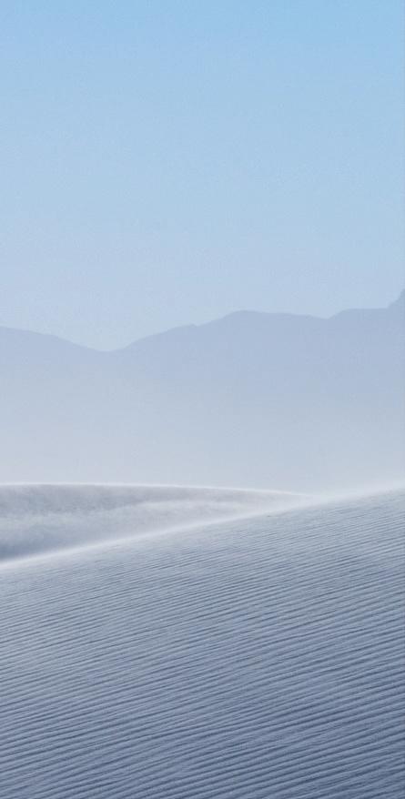
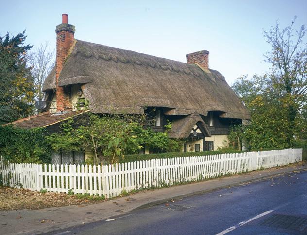
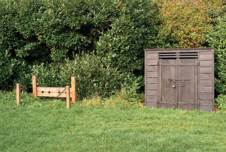
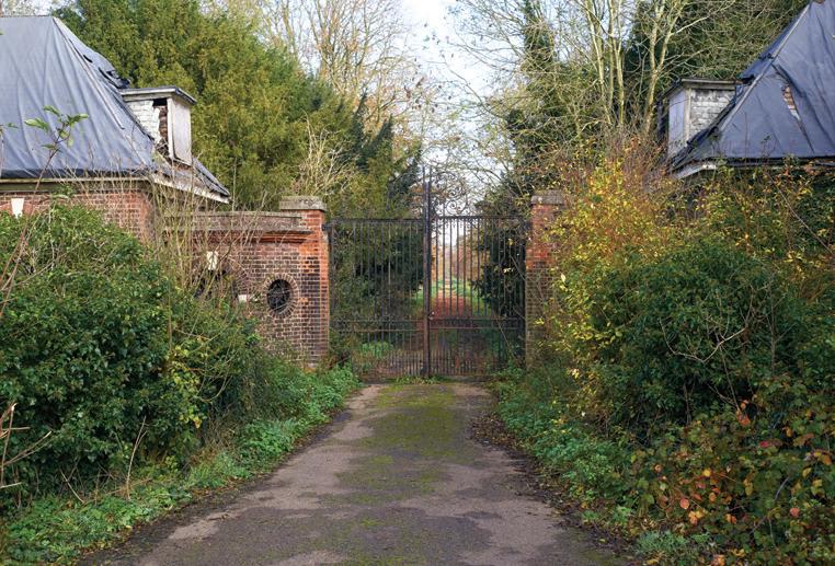
Doug Richardson explores some historic and scenic buildings in Roydon, England last autumn, during the shutdown of the area due to the Covid Pandemic. Doug was inspired by Albert Knapp and Ruth Oratz’ article “Early Days: Prelude to Spring”, which was taken in the early days of the Covid lockdown here in the US. Doug gives us an interesting look into these historic buildings near his home and their interesting stories. Speaking of Albert and Ruth, we have another one of their wonderful photographic essays, accompanied by their typical lyrical text. This time their subject matter is the White Sands National Monument in Alamogordo, New Mexico. I’m sure you will agree that their images are simply stunning!
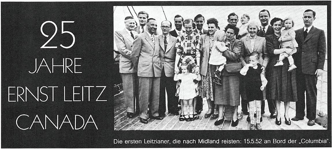
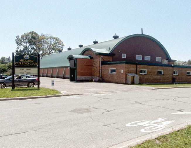
Brian Veall shares the fascinating history of the Canadian branch of the Ernst Leitz company in Midland, Ontario. He was asked to make this address for the 60th Anniversary of E. Leitz Canada. Brian gives an amazing overview of the operation in Midland from the very beginning when the first Leitzianer immigrated to Canada from Wetzlar. Two important players of the “Walter Werk” as it was sometimes called, were Walter Kluck and Walter Mandler, who both appeared at LHSA annual meetings in the past to share their stories. Brian does an excellent job of re-telling this history, which is not that well-known to new Leica enthusiasts. One could make an excellent case that Kluck and Mandler played a major part role in saving Leitz through the excellent lens designs by Mandler produced in Midland, and in rescuing the M camera with the Canadian M4, M4-2 and M4-P by Walter Kluck when Wetzlar had given up on the M after the M5 debacle. Brian was Leica Photo Division marketing manager in Midland from 1966 until the late Seventies when the
Wetzlar parent company gradually assumed overall Midland Leica production and export marketing functions. He retired from Raytheon ELCAN in 2002.
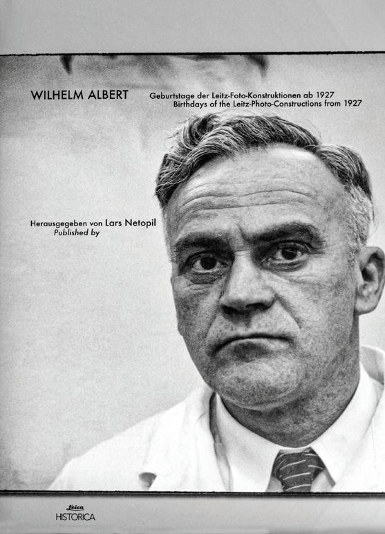
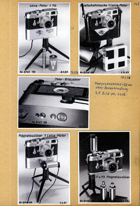
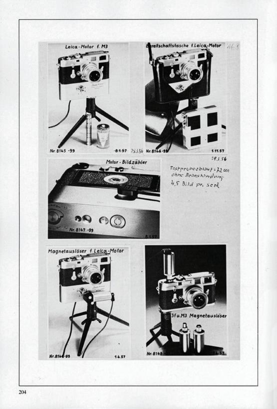
Ed Schwartzreich reviews the important re-issue of the Geburtstage der Leitz-Foto Konstructionen ab 1927, better known as the Geburtstage Buch (the Birthday Book). This was originally a reprint of the journal that Wilhelm Albert had assembled for himself and the Leitz company of new cameras, lenses and accessories made by Leitz on the first day of the finished example -- with a photograph, short description and date of the item. I first encountered the fabled 1993 Leica Historica red-covered edition while visiting Lars Netopil, having coffee and looking over Lars’ collection at that time housed in his grandmother’s house. I saw the title, and jokingly asked if it was a book of birthday party pictures at Leitz Wetzlar! When Lars handed me the book to examine, I was totally blown away with all of the prototypes depicted in it, even including the one-time top secret night vision apparatus and sights Leitz was working on during the War. Many of these things I had only heard whispered stories of. Just incredible! As Ed relates in his review, it took me many, many years to obtain my own copy. I would always ask Lars if a copy had surfaced to no avail. It seemed that the only way a copy became available was when the previous owner had passed away. Eventually, Jim Lager kindly gave me the personal copy of Dr. Harry Soletsky, which Jim had inherited. Harry was a good friend of mine as well, and we spent many good times together at early LHSA meetings. The new book Lars has published benefits from the advances in technology in reproducing to a “T” the original pages made by Albert. The images are a vast improvement over the original Leica Historica reproduction. Every image is sharp and clear, and it is a pleasure to study the images in the new volume. I can highly recommend this beautiful new book, and you can get your copy directly from Lars Netopil.
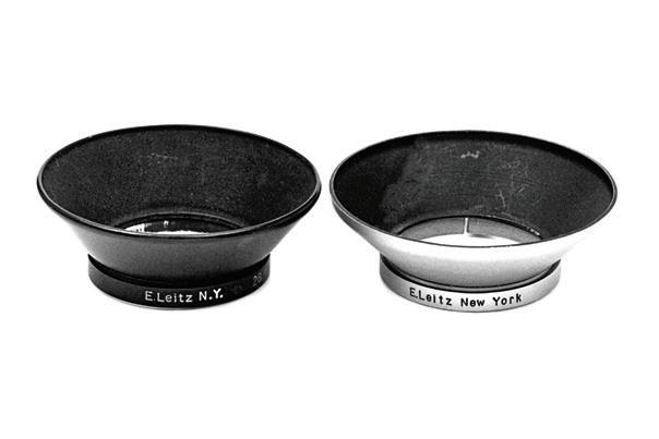
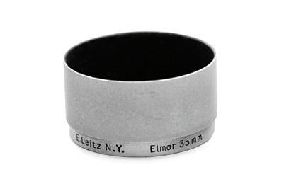
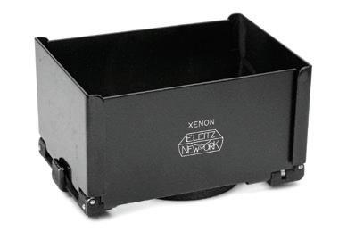
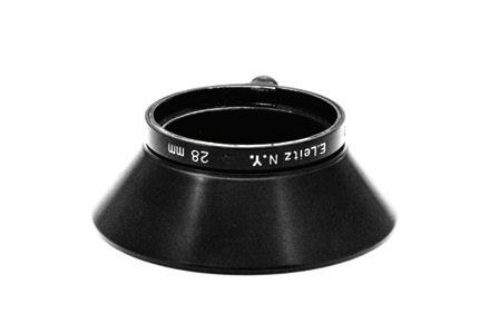
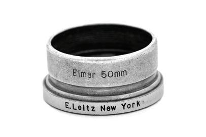
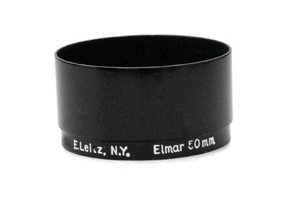
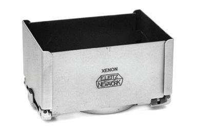
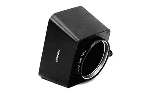
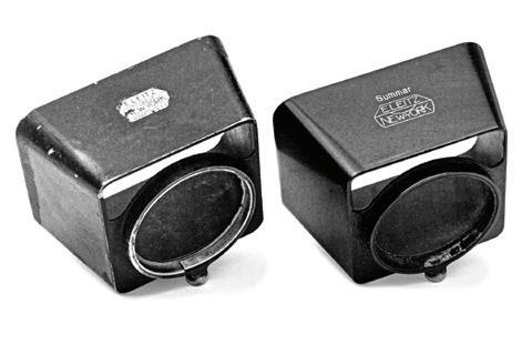
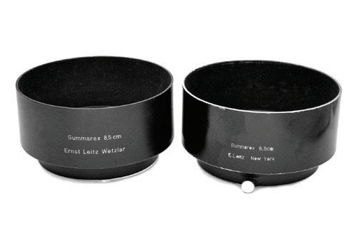
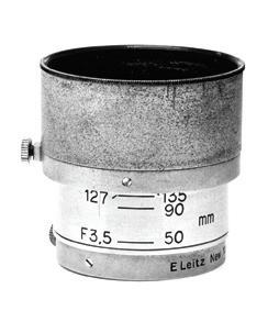
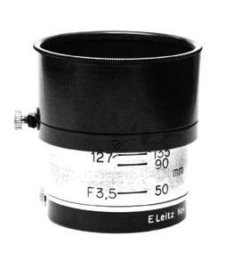
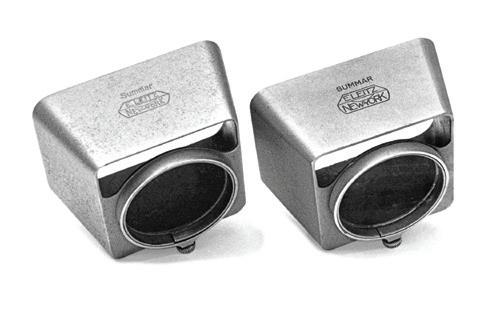
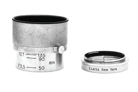
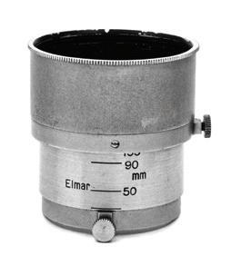
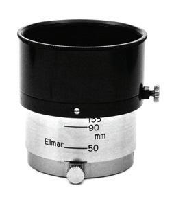
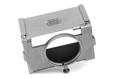
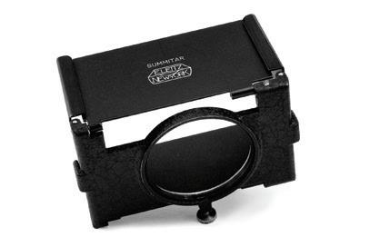
Of course, we have another piece by our good friend Jim Lager, “Shades of New York”, covering rare E Leitz New, York versions of Leitz lens hoods. Jim is recovering from some major surgery, and I’m sure he will appreciate your best wishes for his rapid recovery!
Stay tuned for more major announcements from Germany in the next issue of Viewfinder
Bis
nächste Zeit! - Bill
Deep Depth of Field i n Poor Light
the light is dim, how are we able to get good depth of field if we don't want to use flash? We need to stop down for more depth -- but then the shutter speeds get too slow and we need a tripod. Or do we?
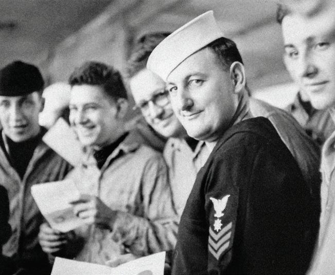
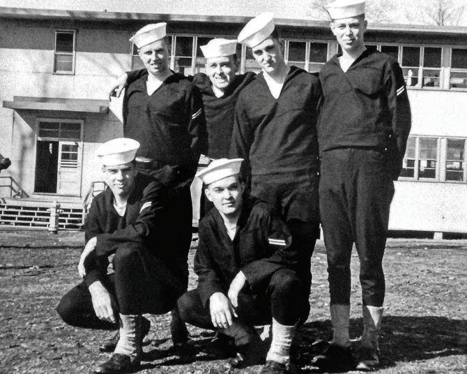
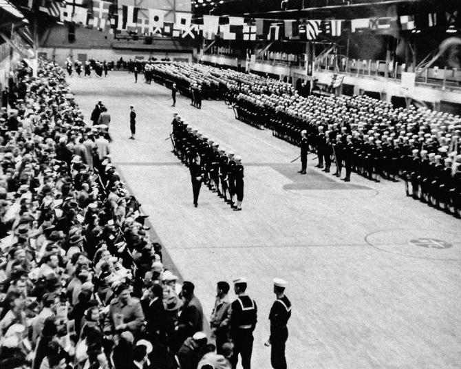
I learned this lesson backwards while-attending the Naval Training Center at Bainbridge, MD in 1955. I was using an older black dial Leica lllf equipped with a brand new 50mm f/1.4 Nikkor I'd bought for my fledgling freelance photo business in New England, just before bring drafted following college deferment. I had sent for the camera, Weston meter, and some film from home. I knew the great speed of that lens would be needed for the interior of the barracks buildings and the drill hall. But a problem arose when trying to get a large group along with the company commander all in focus inside the cramped and dim interior barracks space. How did I solve it? Simple: I couldn't. Instead, I had to concentrate on pictures of the commander and others singly, as well as the graduation ceremony in the drill hall, all nearly wide open at f/2 on the all-purpose ASA 80 Plus-X film I had at the time.
How I would have liked some extra width and depth in those situations! The only wide angle I then possessed was a 35mm f/3.5 Summaron which I hadn't asked to be sent because I knew it would be way too slow for the dim interior light. The wide angle would have provided the needed extra width and depth, even wide open, but the shutter speed required would have been way too slow to handhold.
However, with those experiences came the realization of a lesson I had missed when I admired some of the spectacular wide and deep shots made by famous photographers of the time. They used the same slow 35mm f/3.5 Elmar and Summaron lenses, but with inventiveness that I had yet to learn and practice. One picture I remembered in particular appeared in the Leica Manual of 1951, page 141, made by Peter Stackpole. It shows the mayor of Paoli on the main street, facing the camera while reading a newspaper. The picture has extreme depth from the newspaper page in the foreground all the way back to the town hall's clock tower at the top of the frame several hundred feet away. In the book reproduction you can read some of the larger print in the newspaper a little over
(left) A low light 50mm shot of a barracks group, including the Company Commander, showing the lack of depth of field at f/2.
(right) Group of friends in front of barracks building. Author in front row at left.
by DICK GILCREAST
three feet away near the bottom of the frame, and you can also read the clock on the tower at the top of the frame. I remember being impressed with it. But what I should have remembered was the photo data! It was made with a 35mm Elmar at a 20th at f/16. A 20th! He used that slow a shutter speed, even in daylight, yet the picture was very sharp!
The small aperture provided that great depth, but at a slower shutter speed than I would have thought reliably sharp at the time. The major part of the lesson I had missed was that rangefinder wide angle lenses (not retrofocus, as for a reflex camera) can be handheld at much slower speeds due to the very short distance between the optical center of the lens and the film plane. With that factor minimizing any effects of shake, and combined with the very smooth braking action on the leading shutter curtain in all Leicas, the camera can make pictures very steadily at quite slow speeds - even a 10th or an 8th can show little or no visible shake - where a longer handheld 50mm lens can start to show a little shake even at 30th. That was the "secret" I hadn't absorbed. The facts are that a wide angle has more depth at any aperture than a normal lens, and it can be handheld at very much slower shutter speeds,
therefore it can be used in the same low light as the 50! An exposure of 30th at f/2 with the 50 is exactly the same as a 10th at f/3.5 with the wide angle.
I could have gotten those whole groups in the dim light of the barracks with the wider angle combined with good depth of field quite easily handheld using the 35mm Summaron wide open. I would have been able to get more of the graduation ceremony through the upper floor window. And the photo of the group outdoors would have looked just about the same as with the 50. After my time at NATC Bainbridge was over, the lllf and Summaron and Nikkor and some other gearincluding the use of these new techniques - went on to provide good service during a tour of duty as a Naval aviation photographer. (For a story about that tour, see Viewfinder Vol. 27, No. 2, 1994, Shooting the "Blues" with Leicas, 1956-57).
Nowadays press photogs are using even shorter focal lengths like 14 to 18mm on digital sensors at astronomical ISOs to get their deep depth in low light, but it all started as early as 1930 with those first 35mm f/3.5 Elmar lenses taking advantage of the Leica's smooth 1/20th shutter speed!
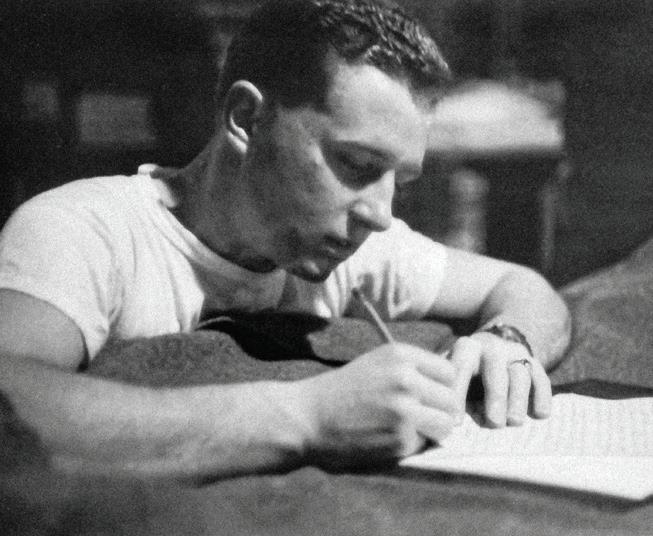
(left) A narrow shot of Graduation ceremonies with 50mm lens through an interior window. My notes say a 5oth at f/2. (right) A friend writing a letter home using the 50mm lens at f/1.4. The 35 could have done this shot better at a 10th at f/3.5.
ETERNAL QUEST FOR
by AMITAVA "CHATS" CHATTERJEE
Amitava “Chats” Chatterjee is an active member of the global LHSA and Leica family. He participates in various Facebook groups, published in Viewfinder, and its proofreader-at-large. You can find him at www.chatsphotog.com , Facebook (@Chatsphotogpilot), chatsphotog.medium.com, or Instagram (@Chatsphotog).
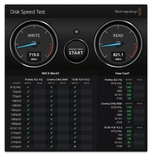
Who among you readers has not wished for a faster computer to process your photos? I certainly have and have been trying to get the fastest speeds possible without breaking the bank. However, fast response times are a function of many variables – the CPU, amount of total and available memory, size of virtual memory available, and file transfer bandwidth. This article deals with the last item on the list. As my image portfolio grew in size, I quickly realized I needed off-computer storage, preferably something I could access over my desktop or my MacBook Pro. After much discovery, I settled on network access storage, NAS for short. The problem, though, was the network interface board on the NAS, which limited my available “theoretical” bandwidth to around 100Mb/s (approximately 12.5 MB/s) . There is no more frustrating thing than waiting for a folder of large DNG files slowly paint across the screen in an Adobe Lightroom library. Each image file created by a Leica M10-R, M10 Monochrom, Q2, Q2M or SL2 is pretty large, 40MB or more! Fast access helps when you’re dealing with such large files. When I upgraded my desktop to an iMac Pro, I started investigating options for faster NAS speeds, because I really
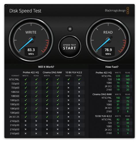
Figure 1 - Speed test on my existing Synology NAS (five spinning hard disks, RAID5).
was not getting anywhere close to what my heart desired. I decided to run some speed tests using Blackmagic Disk Speed Test, a commercially available piece of software which tests hard disk write and read speeds on MacOS and makes recommendations for suitable workloads. I very quickly determined, with metrics, that my existing setup was way too slow. I already knew that, but it was interesting to get a couple of baseline data points.
I knew that MacOS has a built-in RAID controller. RAID storage units are external hardware devices with a Redundant Array of Independent Disks. Data is written across multiple hard drives, speeding up the process, and there are multiple options, such as RAID0, RAID1, RAID5, RAID10, etc. If a disk fails, another can be inserted, and the array rebuilds itself (but not in RAID0) . I knew this was the way to go, but still worried that a single hard drive failure in the RAID array could potentially cause me to lose years of photography unless I had backups. I decided I would test out a few options, and use my existing slow Synology NAS as a backup device.
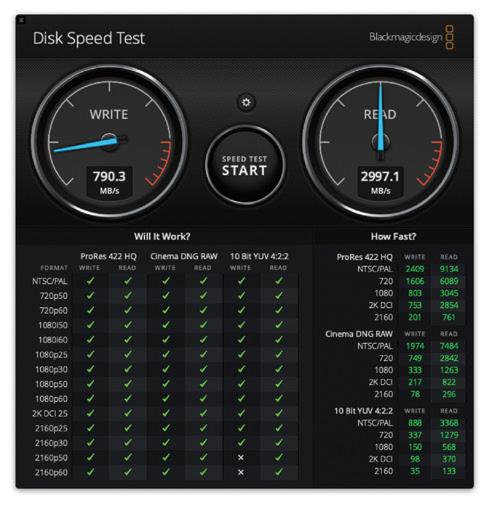
After some research, I bought a couple of LaCie hard drive units from my local Apple Store, and set them up in a RAID 0 configuration, knowing that I would be making regular backups to my NAS as well. RAID 0 scenarios split data cross two drives, and if either one fails, you’re toast. Having the regular backups would minimize loss, and it was an acceptable risk. No surprise, the LaCie was almost 10x faster for both writes and reads, but, dear readers, I wanted MORE!
My first Thunderblade test yielded slow writes but very fast reads, nearly 40x my baseline.
2 - Speed test using LaCie external hard drives with spinning hard disks (RAID 0).
I then started exploring SSD hard drives, of which there are a dizzying array. You can buy drives with storage, or drive shells that take SSD cards (made by Samsung, for example) I ultimately chanced up something called an OWC Thunderblade and was immediately intrigued. Very quickly, I managed to get two of them sent to me, and it was time to run some tests. Each Thunderblade has independent storage chips which can be configured as JBOD (just a bunch of disks) or they can be RAID’ed. Time to play.
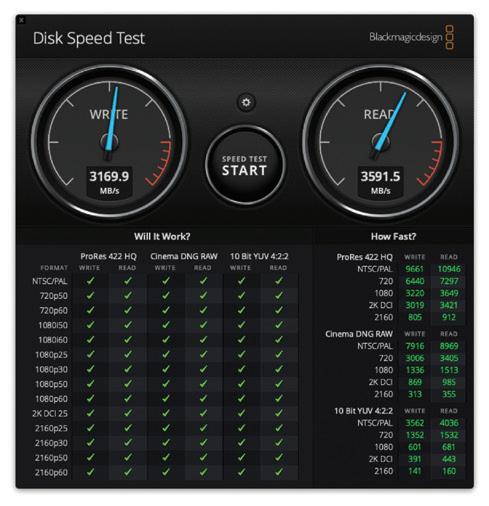
Finally, it was time for the mother of all configurations – two Thunderblades paired as a RAID 0 storage device. Both write and read speeds went up by a factor of 40x or higher! This was the motherlode.
4 - Speed test using two OWC Thunderblade SSDs configured in RAID 5 individually then paired in RAID 0.
As you can tell, the write and read speeds go up exponentially when a.) moving from spinning disks to SSDs (expected) and b.) moving from RAID 5 to Dual RAID 5 paired as RAID 0. This combination yielded the fastest speeds, and ultimately what I settled with. I keep my image portfolio on this setup, which gets backed up weekly to my older and much slower Synology NAS.
My quest for speed did not end here. I ended up buying a Gigabit Ethernet switch and cables rated for Gigabit throughput. I also paid a structured home cabling expert to run two shielded Category 7 ethernet cables from my basement (where the Verizon FIOS high speed modem sits) to my home office, and fed that into the office switch, and now I get fast speeds while working on the Internet (yes, I am a user of Adobe Creative Cloud) . I couldn’t be happier! I’m getting great response times when accessing images on my Thunderblade setup, and it is relatively painless to get files pulled down from the cloud as well. I know I am not going to be satisfied forever (I’ve had this setup since August 2019) and will want to upgrade again, but that is a story for another article some day in the future!
Figure
Figure 3 - Speed test using one OWC Thunderblade SSD (configured as RAID 5).
Figure
An Introduction to Color Management
by DAVID KNOBLE
CONSISTENT COLORS IN DIGITAL WORKFLOWS
Not all images are created equally! Instagram, Flickr, Facebook and LFI all provide ways to share your images online, so your images could be seen on various computer displays, phones and tablets - all containing different types of screens. Blurb and Artifact Uprising are two on-line self-publishing book companies where you can have your images bound in print with different paper types. You can order prints on many more paper types, metals and under acrylic or even print them yourself on inkjet printing systems. Did you know that using the same image with no adjustments for all of these would not produce images that looked the same? If you are not sure what sRGB, Adobe RGB and ProPhoto RGB are, this article is for you!
Before digital photography became mainstream and film was the media for making images, the photographer was also a physicist and chemist. The camera exposed film and the photographer developed it. The chemistry was the black box that converted the exposure to a permanent image. While a negative could be manipulated somewhat when printing, the choices were made much earlier in the process. Today, in the digital world, the photographer no longer needs a chemistry background because the black box is now the computer chip inside the camera developing each pixel on the sensor to create a digital negative file (DNG or RAW). However, a digital file allows for almost infinite manipulation. Each pixel can be
adjusted - for color and brightness - without impacting the pixel beside it. Computer noise can be added or subtracted and the resulting image can be made bigger by adding pixels or smaller by removing them.
One item remains the same. Photography is meant for viewing, for sharing and for preserving an image. The most complex step for processing a digital image after exposure is color. Even the LCD screen on the back of a camera presents colors differently than a computer screen, an internet browser, a print or a book. Because none of these ways we view an image shows colors the same way, you need to understand color spaces and how to use them in your workflow.
While I normally write about a location, lens and camera, this topic is certainly more technical. Here we explore reproducing your images, consistently, the way you see them in your mind and on your computer screen. There are some great resources if you want to learn more, and I will point you to those at the end. If you wish to master photography, today you must also master color. Even though black and white images contain only whites, grays and blacks, to avoid disappointment, you must understand color.
First, a few terms and concepts. When I talk about ‘displaying an image,’ I am referring to posting on the internet, printing in books, on paper and other media for hanging. Choosing a color space for displaying your RAW images has different implications based on your intended use of the image and your other equipment. Understand that a RAW file does not have a color space. A RAW file just records the amount of light hitting each pixel at exposure. Instead, our software chooses a color space to show on the screen, on the internet or on a printer. Leica chose to use a DNG file, which is a universal RAW file.
When exporting image files, like JPEGs, we must assign a color space so the computer, iPad or iPhone screen can determine how to display the colors. Paper is similar. If we send an exported file to a book printer, like Blurb, we must choose a color space so Blurb can print the image accurately on their paper with their printer in a book. If we pick a color space that Blurb does not use, we can lose control of how the image will look and it may or may not print well (I have made that mistake in my early books and they came out very dark and unusable).
To understand color management, we first remind ourselves what light capture is for a digital image. Then we talk about color spaces and finally how to manage the colors for various outputs. I will share some of the equipment I use, how I use it, and show examples of the impact color management has on some images.
Note that color management for video files is different than for digital image files, and while the concept is similar, video color management is not discussed here. If this seems too technical, you can skip to the bottom of this article and see how I manage my workflow.
LIGHT CAPTURE
In the beginning there was light, and then the shutter opened to capture an image. Light is the key to photography and color management is about displaying that light.
Light has an intensity - it is either bright, dim or somewhere in between. Our eyes see with light and we decide to take a photograph. We set our exposure based on the measured amount of light and something will record the light - either film or a digital sensor. For digital photography, we need to understand how the sensor reacts.
light capture key concept - Sensors record colors based the amount of red, green and blue light at any given point.
Light, on a camera sensor, measures the color based on the Bayer filter which uses a mathematical formula to convert light to color (for those that care, it was developed by Bruce Bayer of Eastman Kodak in 1976 where twice as many green points were used with red and blue points - thus over four pixels on a sensor, 50% or 2 are green and 25% or 1 are each blue and red). Leica uses the Maestro chip to convert the color-filtered-light and produce a DNG file containing a color value for each pixel. It takes four pixels to calculate a color value. Manipulating color with editing software does not affect the data in a DNG file, but it does affect how our computer monitor shows us that image. Color choices also impact how the LCD on our camera shows us the image and any resulting JPEG created by the camera and recorded on the SD Card - even when the choices are made by the camera.
WHAT IS A COLOR SPACE?
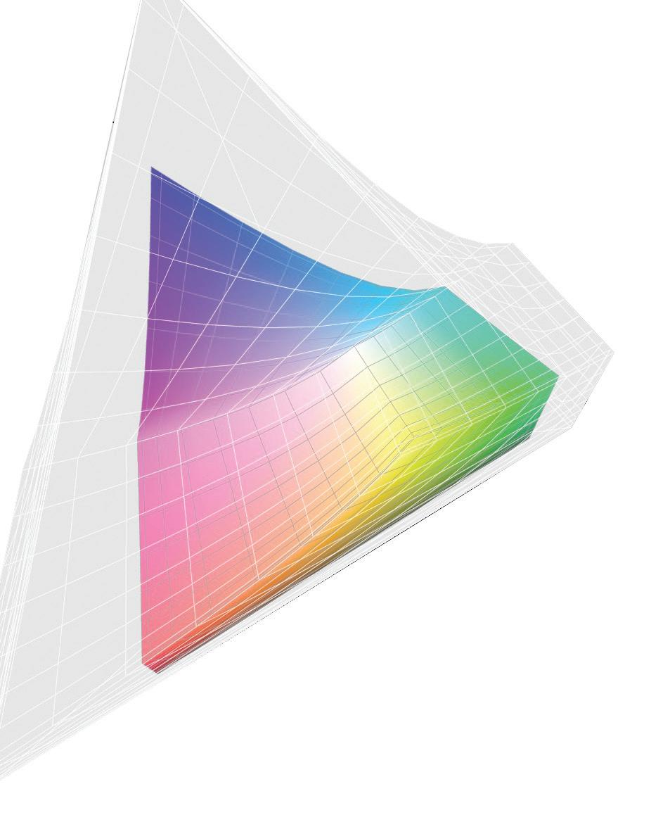
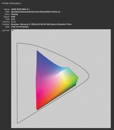
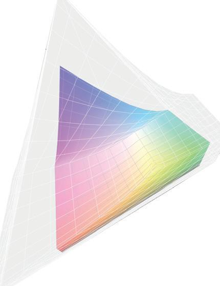
Color space is effectively a group of specific color values that is less than the total color space of all colors our eyes can see. There are different ways of showing color spaces, or gamut’s. My favorite is called the ‘horseshoe’ graph. Everything inside the horseshoe shape is effectively a color we can see.
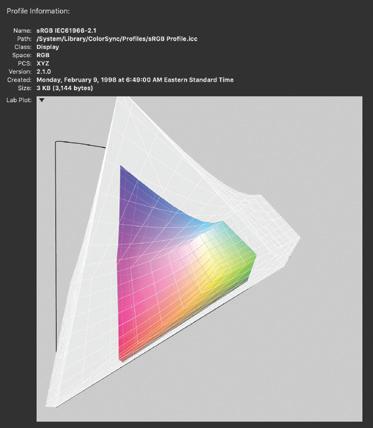
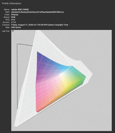
Figure 1 shows a colored shape inside a 'horsehoe' that does not touch the edges. This shape represents sRGB and it is the smallest color space of the three. Figure 2 shows sRGB inside the largest color space, ProPhoto RGB. You can see how much more color ProPhoto RGB can display. Figure 3 shows Adobe 1998 RGB inside ProPhoto RGB. So you see that some color spaces can show more colors than others. Why not just use the largest one and move on? Answer: It depends on your use.
Colorspaces are either independent or dependent. Independent colorspaces are determined by calculations and independent of the measurement of something. The representation of sRGB, Adobe RGB and ProPhoto colorspaces is based on a mathematical calculation. That is to say, the triangle would never change or move around, each of these three color spaces is fixed no matter what.
A device that measures light input or produces output based on measurements uses a dependent color space. Devices are all made differently - different camera sensors, different monitor screens and different printer inks and papers all have different characteristics. For any black and white film buffs, this is similar to different characteristic curves of film which produce different representations of blacks, greys and whites from the same exposure. So, anything we use to display an image uses its own special color space, specific to that device.
key concept number two - All devices do not show the same color in the same way, so an ICC profile is created to try and produce colors correctly, within the limits of the device.
Each device measures color and then does its best to reproduce that color. The problem is that none are perfect and none produce all colors. So, an ICC profile is created for each device. Printers have an ICC profile for each ink set and each paper used with the ink set. Monitors and displays are only capable of showing a certain amount of colors using their ICC profile. Each ICC profile contains two items: (1) the list of all colors that can be reproduced, displayed or acquired by the device and (2) the error correction needed from an input color to output it properly. ICC stands for International Color Consortium and they are the standard in color.
The ICC profile produces two main results to help us get the colors we expect from our workflow. First, if the device is
given a color on the list it can reproduce, it corrects that color and produces it - in the closest manner it can based on its limitations. Second, if the device is given a color not on its list of capable colors, it first has to convert that color to one that it can reproduce, and then it corrects that color and reproduces it. Using these ICC profiles is what color workflow is all about and this concept of color conversion becomes important when we choose a color space to use with our Leica.
Whew! Think of the ICC Profile as the magic that makes our images look the same, no matter how we want to show them, provided we know how to manipulate our image inside them. Nothing is more frustrating than looking at your prizewinning photograph on the computer screen and then looking at a print on paper or in a book that is dark, dull or lifeless. Let’s recap.
color space key concepts
1. There is only one independent color space for each type: sRGB, Adobe RGB and ProPhoto. It is a formula and shows exactly the same way on a color graph every time because no correction needs to be made to the formula. Independent color spaces are effectively the baseline all other dependent color spaces are trying to achieve.
2. On the other hand, there are dependent color spaces for each device created and they are all different because each device can reproduce a different number and type of colors and requires different error correction before outputting the colors.
3. Color workflow is about choosing a color space to work in and then using the proper ICC profile for your display, and manipulating your image to reproduce the image with the colors you expect to see.
figure 1
figure 2
figure 3
COLOR SPACE SATURATION
Remember that our fixed color space choices are sRBG, Adobe RGB, and ProPhoto. Remember also that each larger colorspace contains all the colors of the spaces below plus some additional, more saturated colors.
color saturation key conceptThe sRGB colorspace contains the least amount of highly saturated colors and the ProPhoto space the most saturated colors. The Adobe RGB color space, being in the middle, includes more saturated greens and slightly more saturated blues than sRGB. But, while ProPhoto RGB includes more saturated greens, it includes much more saturated blues and reds than sRGB and Adobe RGB.
Unfortunately, many devices still only reproduce sRGB. Even expensive monitors may only reproduce 98% of Adobe RGB. However, our camera sensor may be capable of capturing colors well outside that range, even if we cannot see it!
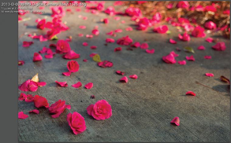
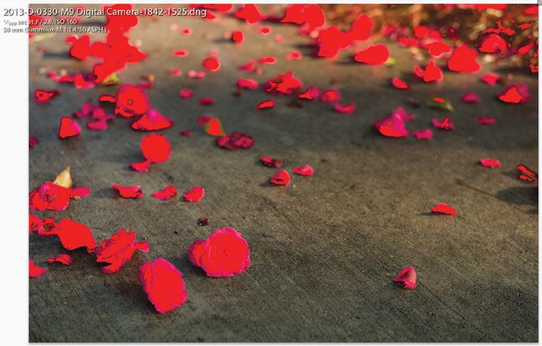
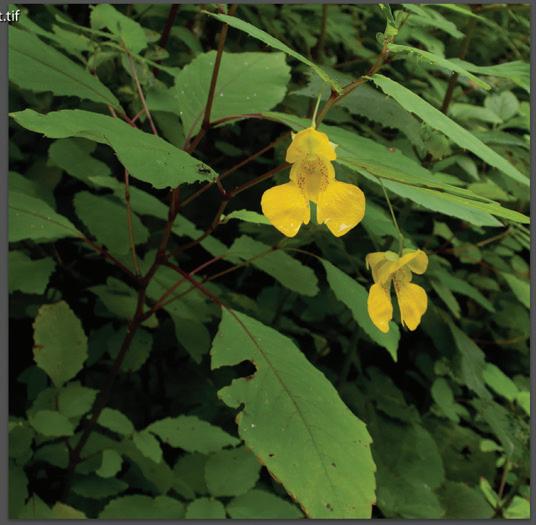
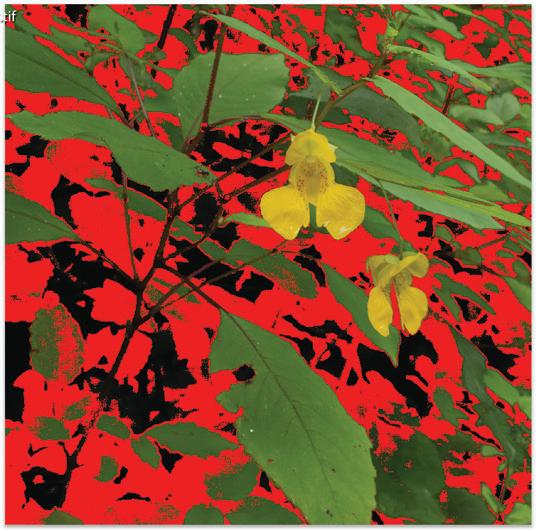
So, if our image does not contain a lot of saturated colors, it may look exactly the same in all three color spaces! But, if we have a landscape photograph full of greens, it may only look the same in Adobe RGB and ProPhoto RGB. Sunsets, on the other hand, may look different in all three color spaces because of the saturated reds! If we use a color space that is too small for the colors in our RAW file, then they all blend together in one big blob. See Figure 4a with a some red flowers. Figure 4b shows all the reds that will not print properly. If this image were printed as is, it might look like a red blob - not what we want!
Black and white film photographers have long had this same problem. Taking a photograph on different films shows different contrasts. Color filters produce different contrasts through
the light entering the lens. Different development times produce different negative densities, and to top it off, photographic papers show far less tones than the negative! In reality, digital photography has less moving parts than film and much can be handled by the computer. In fact, I perform all my photographic color management in Adobe Lightroom.
MY COLOR MANAGEMENT WORKFLOW
If you skipped everything in the middle of this article, you can now see what process I go through, but I encourage you to find some time to read the entire article and see how it might help you get images to show the way you want them to be seen.
my equipment I frequently shoot images of sunrise and sunset at the beach, which consists of a considerable amount of saturated reds, yellows and oranges. I also take images of lush green landscapes with blue skies. I hope that printing inks and papers will eventually catch up to the camera sensors, but even today printing is much easier than a decade ago. The Leica S007 provides a 15-stop dynamic range and
figure 4a
figure 4b
excellent color capture for most of my landscapes. The Leica SL and M10 both have strong color capture routines as well but slightly less dynamic range and I use them when traveling or walking around. But, I have hanging prints from images taken with an M8 and a Dlux 3 – and they use the full range of color on the paper and most people cannot tell the difference in camera used.
I have used EPSON printers exclusively because I prefer the EPSON results from their ICC profiles on various papers. I used an EPSON R2400 for many years and got fantastic 13x19 black and white and color prints using EPSON papers. I retired that printer for an Epson Sure Color 800 last year which has newer inks and prints to 17x22. Whatever printer you use, download the ICC profiles for that printer from the manufacturer’s website. While you can print directly from Lightroom, I use a product called ImagePrint Black because it provides great output on paper. This product is expensive and you do not need it, but it makes great prints to frame in color or black and white.
I also print Blurb books and so they use a printer and paper different from mine. Luckily, you can download an ICC profile to proof your work on your monitor before sending it to blurb. I do exactly that.
I process my images in Adobe Lightroom Classic on a 2011 iMac with a 27” display. This is an old computer, but I calibrate the monitor regularly with an X-rite i1Display Pro and rarely have trouble with some very saturated colors. My point in sharing this is that you do not need to most current equipment to get great images from your Leica camera. I use the factory ICC profiles on both my Leica cameras and the EPSON printers. But, I can see what I will get before I print - consistently. Today, most monitors have wide color spaces. If you print a lot, you may want to invest in a specialized monitor that covers 99% of the Adobe RGB space, but be prepared to shell out several thousand US dollars. The key is to calibrate your monitor to ensure colors are accurately represented. The X-rite i1Display Pro is about USD $250 and saves me more than that in ink, paper and Advil (for headaches!).
how i use color spaces So, when do you have to pick a color space? Answer: every time you export an image in Lightroom (or other software) or every time you print an image.
For printing my first choice is ProPhoto RGB as a color space, and that is what my default is set to in Lightroom Classic. To be fair, Adobe says that in all parts of the Lightroom Classic program, images are shown using Adobe RGB, except in the Develop module. In the Develop module, Adobe says that ProPhoto RGB color space is used. I use Adobe RGB when exporting to Blurb and sRGB when exporting to the
internet. My printer is somewhere in-between all of these color spaces, so I proof and adjust my image as I show you below.
my complete workflow
1. I calibrate my monitor using an X-Rite i1Display about once per month, although many professionals recalibrate after 200 hours of use. If I cannot get a print to work, I stop and recalibrate the monitor and then keep going. That fixes most problems. Also, I turn on my monitor about 30 minutes before I use it. This gives it time to warm up. Cold monitors show colors differently, so I use that time for emails, software updates and anything else but proofing colors.
2. I also have all the Epson SC 800 printer ICC profiles from Epson installed on my computer, including the Epson inkjet papers. I also installed the Canson Infinity ICC profiles for papers I use and the Blurb ICC profile from their website (see below for links). Most of my prints are 13x19 and 17x22 (inches), so getting the colors to separate the way I want them is important.
3. In Lightroom Classic, I select my image. Then I open the image in the Develop module and take a snapshot of the image, labeling it something like “Original Development and Cropping.” This is a fancy “undo” to go back to where I started.
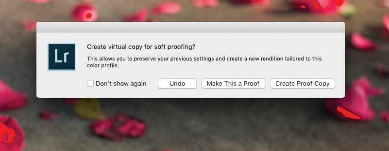
4. At the bottom of the Develop module screen there is a checkbox that says “soft proofing.” By checking that box, the image displayed on the monitor looses contrast and color saturation and the background turns white. On the top right is a list of ICC profiles. I select the ICC profile for the Epson printer and paper for printing (a device dependent color profile). Alternatively, I select the Blurb profile or another paper profile, like Canson (all device dependent color profiles). Then, I modify the development of the image - contrast, highlights, shadows, etc. Immediately after making the first adjustment, Lightroom Classic asks about creating a virtual copy (see Figure 5 ). I select “create a proof copy” and a virtual copy is created with just these adjustments and the name of the image includes the ICC profile. This allows me to reprint or adjust the image and my master image is not modified. soft proofing key concept - If you choose the current image as the proof, you will have to jump back and forth between print proofing and screen proofing. Virtual copies take no space and allow you to edit one image for printing and keep one for viewing. To distinguish them, I use the purple color attribute for all my proof copies. Then, I can search my entire database, or just a collection and filter on the purple attribute to get all my ‘proofed’ images ready to print!
5. Then I crop the image for my use. If the image will be
17x22, I use a crop of 17.0 and 22.0. Since I print a lot and use very specific frames and mattes, I created a spreadsheet for the various openings so I know exactly what print size I want. Then the computer is not adjusting the image to shrink or enlarge it, but prints it exactly the size I want.
6. When ready, I export using one of three modes: (1) for internet images, the file, export menu, making sure to choose the sRGB color space, which is most compatible with everyone else’s devices, (2) for book publishing, like Blurb, export the image to a hard disk folder for that book, or (3) for printing the image I use the “Edit In External Editor” menu item, which I have preset to open ImagePrint. I export the image using full resolution, a TIFF and the ProPhoto RGB color space. For printing, you can just as easily use the Lightroom Classic print module.
export in external editor key concept - Lightroom creates a TIFF file for external edits and leaves it in your catalog. This file takes up disk space and is not my original RAW file, so I delete it through Lightroom after I am done printing. The virtual proof copy and original remain untouched.
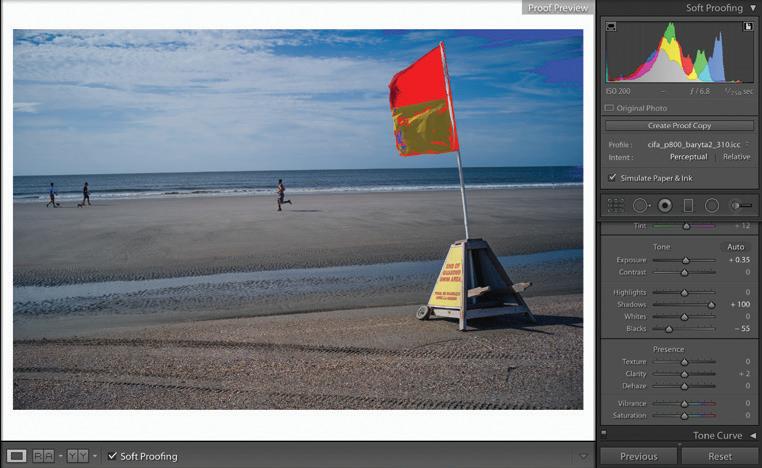
fixing oversaturated colors Here is the key to getting good prints of saturated colors. In the proof view of Lightroom, you can select the paper icon on the right side of the color profiles. That will show you on your image any colors that are outside of the ICC profile you selected. This is the same as showing blown out highlights or shadows with no detail, but shows colors that will be blended together.
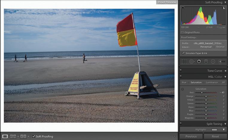
Figure 6a shows a beach flag proofing with a baryta paper. The red and yellow flag is too saturated. I used the HSL color sliders and lowered the red and yellow saturations until only a little was outside the print range. See
Figure 6b for the resulting image which looked the same on paper. The key was reducing the saturation in order to print. I have found three ways to fix this problem.
1. First, I lower the white slider under the basic section. White makes everything brighter and saturates some of the colors. If this fixes the problem and I am ok with the rest of the image, I am done. If not, I raise the white slider until I am somewhere in the middle, leaving more saturation to fix.
figure 6a
figure 5
figure 6b
figure 7a
figure 7c
figure 7d
figure 7b
2. After adjusting the white slider, I use the individual color sliders in the HSL development and reduce the saturation and change the luminance of the colors causing the problem. So, for my sunsets, it means reducing the red saturation and potentially reducing the luminance of the red. If it works overall, I am done. Sometimes the entire image starts looking too much like black and white. If so, I put the saturation back and move on to the last step.
3. The final adjustment is using the magic wan and painting an area surrounding the over-saturated colors that remain after the first two adjustments. Then, I play with the white slider and saturation sliders until I get what I want. Small adjustments are necessary here, or the image will look like it has an odd spot where the brush is.
This process I use for printing is exactly the same for exporting to the internet or exporting for a web site or even exporting to make a book. Create a proof copy, choose an ICC profile and then adjust the problem colors if any. You can find ICC profiles from the manufacturers of paper and printers. For the internet or my website, I use sRGB - the base standard that just about everything works with.
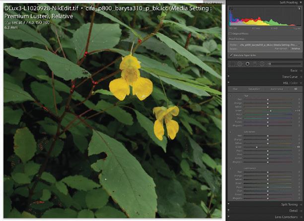
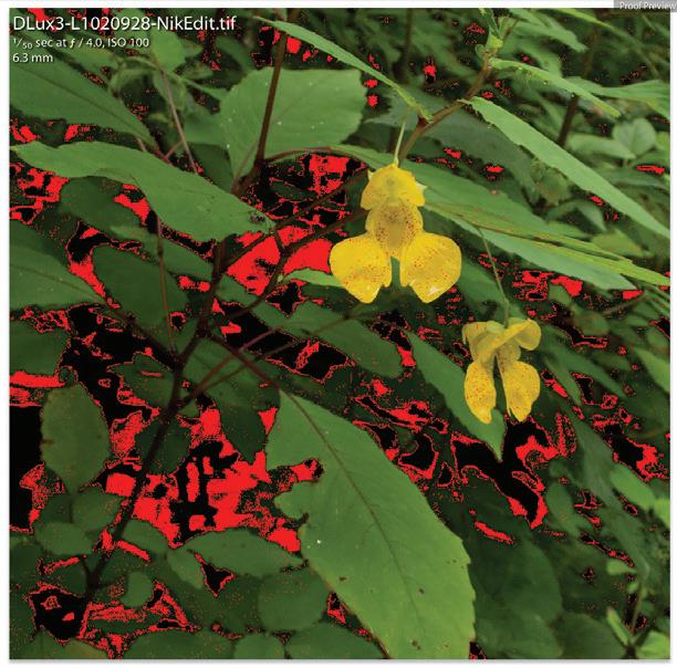
Figure 7a shows a flower image taken with the Dlux 3 directly in Lightroom. Figure 7b shows this image with proofing turned on for Canson Baryta paper. All the dark greens are too saturated to print on the paper. Figure 7c shows the final adjustments, boosting the hue of the green slightly (+13) and reducing the saturation of the green significantly (-49). Boosting the hue helped the image look less black and white after the desaturation. As an interesting comparison, Figure 7d shows the same original image, but with proofing for sRGB. Notice how even posting this image to Instagram with no modification might cause problems in the greens shadows!
CONCLUSION
There is so much more available on this topic by authors like Jeff Schewe who helped write Adobe Photoshop and Lightroom. Managing color is a lot like learning to use a flashyou have to practice to make it work. Most importantly, experiment and do not be afraid to choose different color spaces when you export or print your images - but proof it to see what it really looks like!
reading more For those that want to read more:
• Amaud Frich has written an extensive work on color managagement (https://www.color-management-guide. com) and he refers to sRGB as the “lowest common denominator” of colorspaces. Frich is telling us that effectively all independent and dependent colorspaces contain or produce sRGB.'
• The International Color Consortium talks about color management and profiles (http://www.color.org).
• Cambridge in Color is a great photography resources and has a color management section (https://www.cambridgeincolour.com/tutorials/color-management1.htm).
• Blurb Blog on color management for printing their books (https://www.blurb.com/blog/color-management-printing/) and download for ICC profile to use in Lightroom (https://www.blurb.com/downloads/Blurb_ ICC_Profile.icc).
white
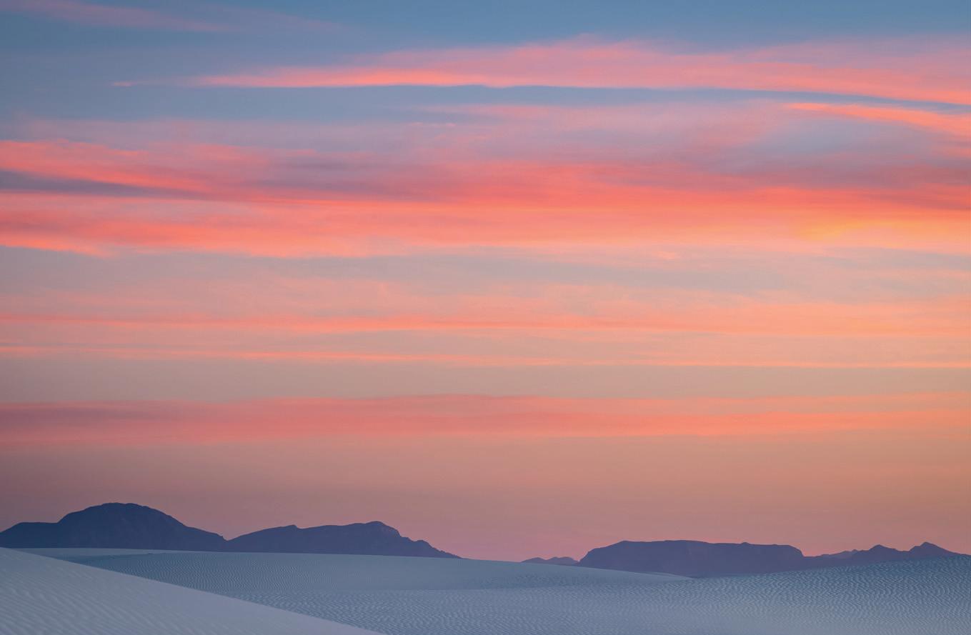
light refracted by the White Sands shatters into the full spectrum of visible color.
Aristotle believed that all color was derived from black and white, light and darkness. In 1666 Sir Isaac Newton purchased his first prism and began a series of experiments culminating in the crucial observation that white light was composed of all colors. He passed a beam of light through the first prism resulting in a continuous rainbow of hues, and then a second prism remixed these disparate rays back to a uniform white. Newton then chose the mystical number seven for his polychromatic vision –red, orange, yellow, green, blue, indigo, violet.
And when we see the arc of colors appearing in the heavens as sunbeams are split by raindrops - our hearts skip a beat, we stop to gaze and wonder, perhaps dream of love and magic, or chuckle about a pot of gold at the end of the world. So the spectrum of color deeply affects us.
white sands light
by RUTH ORATZ MD AND ALBERT B. KNAPP MD
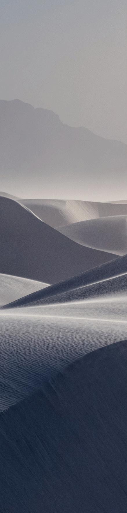
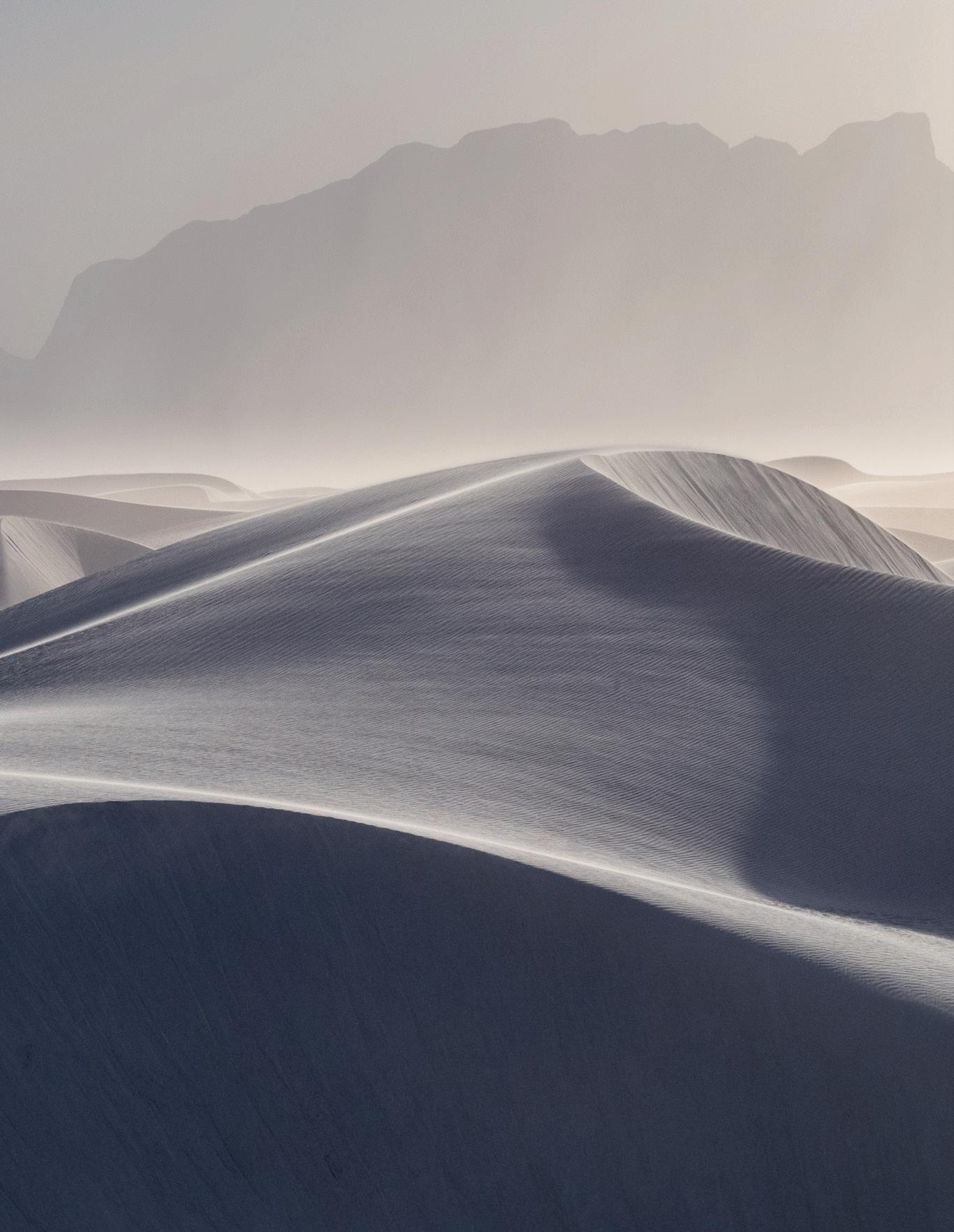
Afternoon in a Sandstorm. White Sands, Alamogordo, New Mexico. Leica S (Typ 007) & Summicron-S 100mm f/2 Asph. at f/9.5, 1/3000 sec, ISO 800
Mid-morning.
White Sands, Alamogordo, New Mexico.
Leica S (Typ 007) & Summicron-S 100mm f/2 Asph. at f/9.5, 1/1500 sec, ISO 800.
(opposite page)
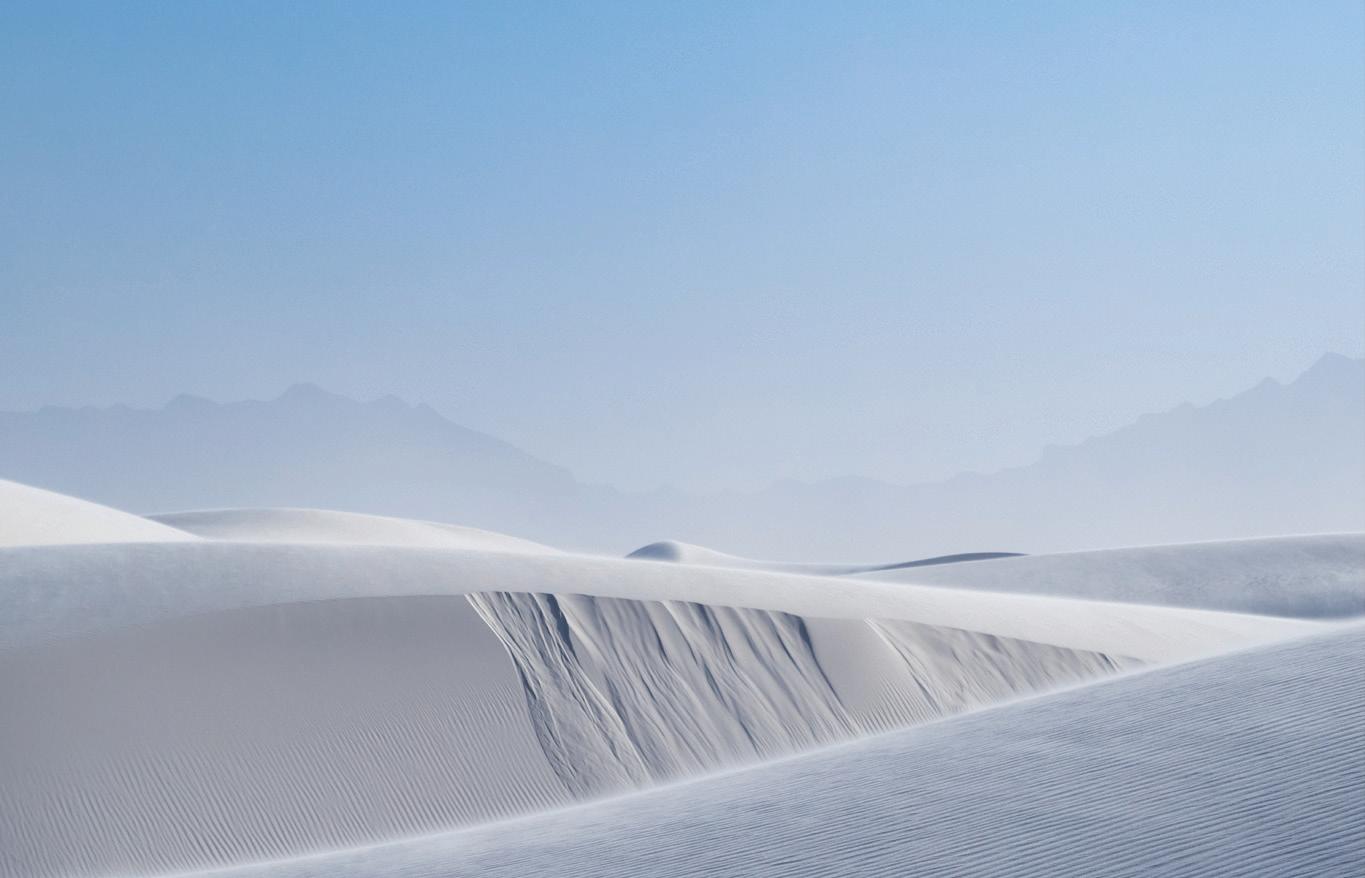
Late Afternoon.
White Sands, Alamogordo, New Mexico.
Leica Q2 Summilux 28mm f/1.7 Asph. at f/8, 1/500sec, ISO 100.
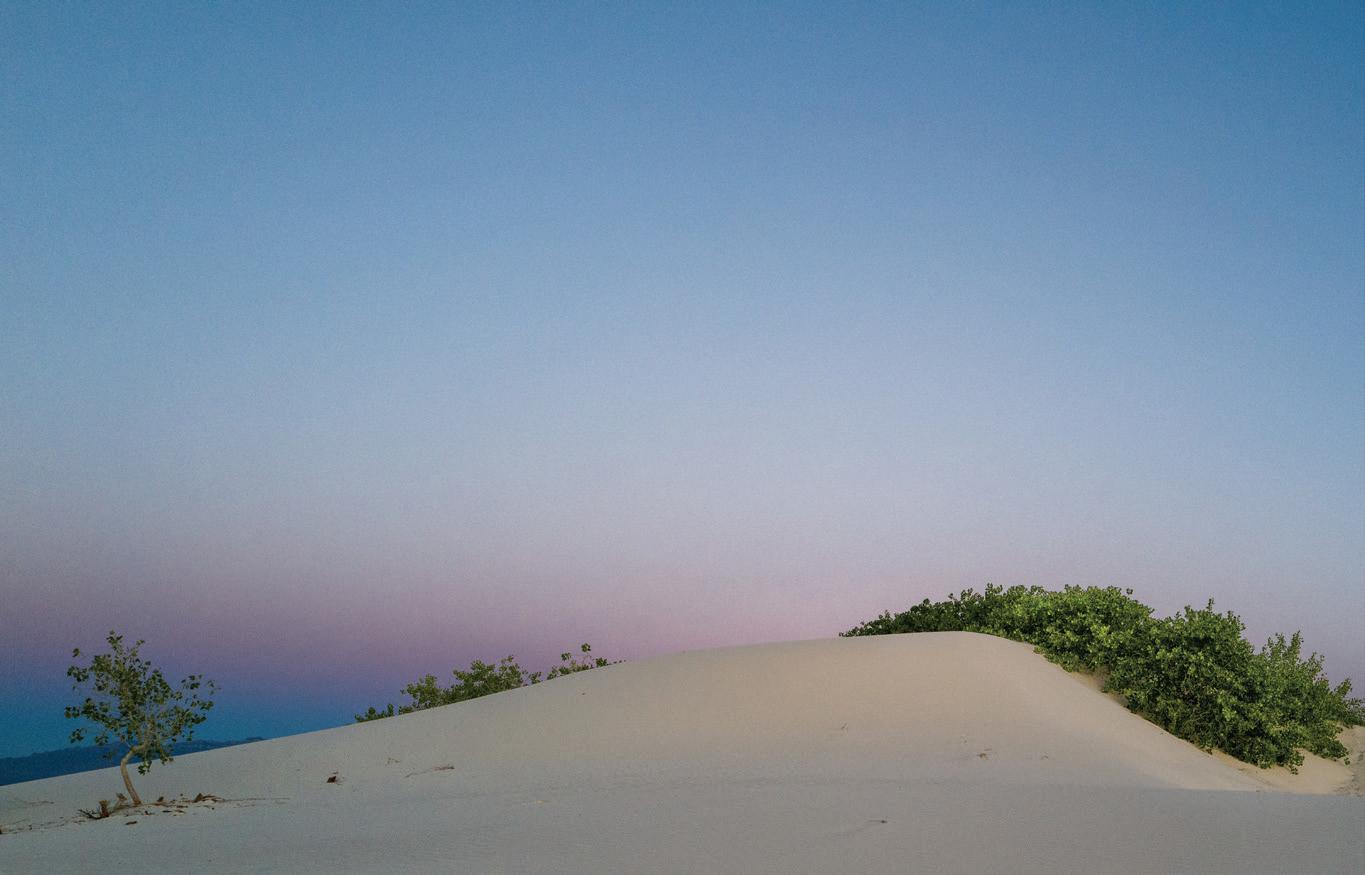
Desert Foliage at Dawn.
White Sands, Alamogordo, New Mexico.
Leica Q2 Summilux 28 mm f/1.7 Asph. at f/6.3, 1/250sec, ISO 3200.
In White Sands National Monument, Alamogordo, New Mexico, we experienced the profound impact of light and color on human emotion and the psyche. “Colour are light’s suffering and joy,” declaimed Goethe.
We drove down to the dune field in May 2019 anticipating a special experience. Albert brought his S (Typ 007) and used his Vario-Elmar-S 30–90 mm f/3.5–5.6 ASPH, Summicron-S 100 mm f/2 ASPH and APO-Macro-Summarit-S 120 mm f/2.5 lenses along with a RRS TVC-34L Mk2 tripod and a BH-55 ball-head. Ruth had just received her new Q2 and gave it a spin. The Q2 performed well in low light allowing her to push ISO easily to 3200 for handheld photos. The fact that the Q2 is weather-sealed gave her peace of mind in the blowing sand.
These dunes are like none other because they are not sand but the mineral gypsum. During the Permian period, this area was covered by shallow seas that left behind beds of calcium sulfate (gypsum). Tectonic shifts lifted this ancient seabed to create the San Andreas and Sacramento Mountains. Subsequent rainfall dissolved the gypsum and trapped it in the basin with no outlet. Weathering and erosion broke up the crystals into fine sand-like grains that prevailing
southwesterly winds then shaped into dunes. The crystals rubbed against one another scratching their surfaces thus allowing them to reflect light. The dunes are ever changing, their shape and position always shifting.
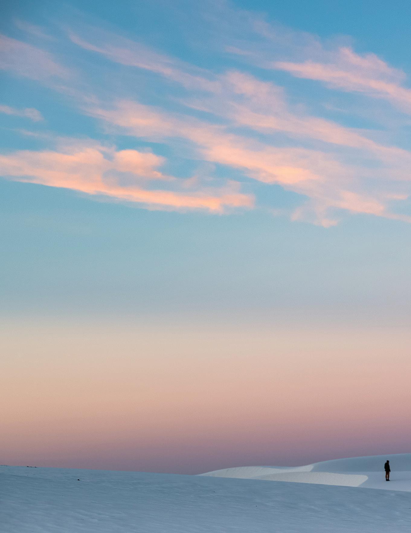
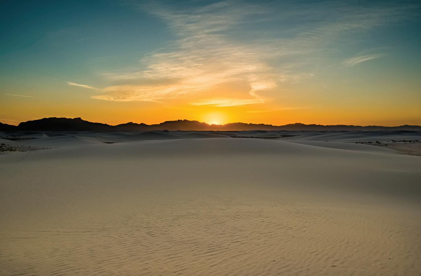
Light hitting the white gypsum from different angles and on the varying dune surfaces produces an infinite array of luminous and somber hues. Bursting forth from night, first light gleams golden, the human figure diminutive in the vast universe of heaven and earth.
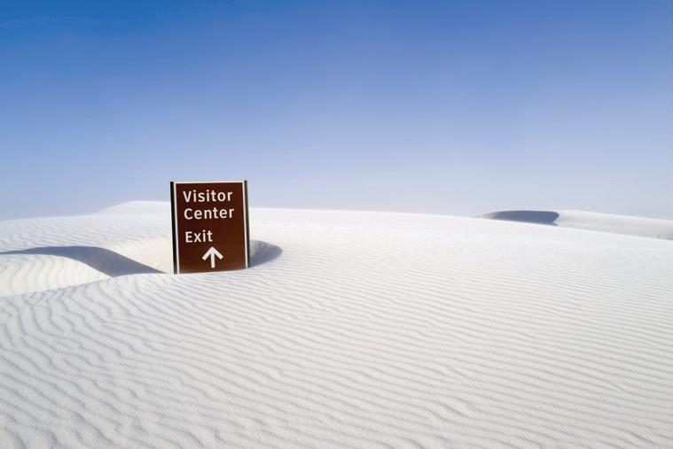
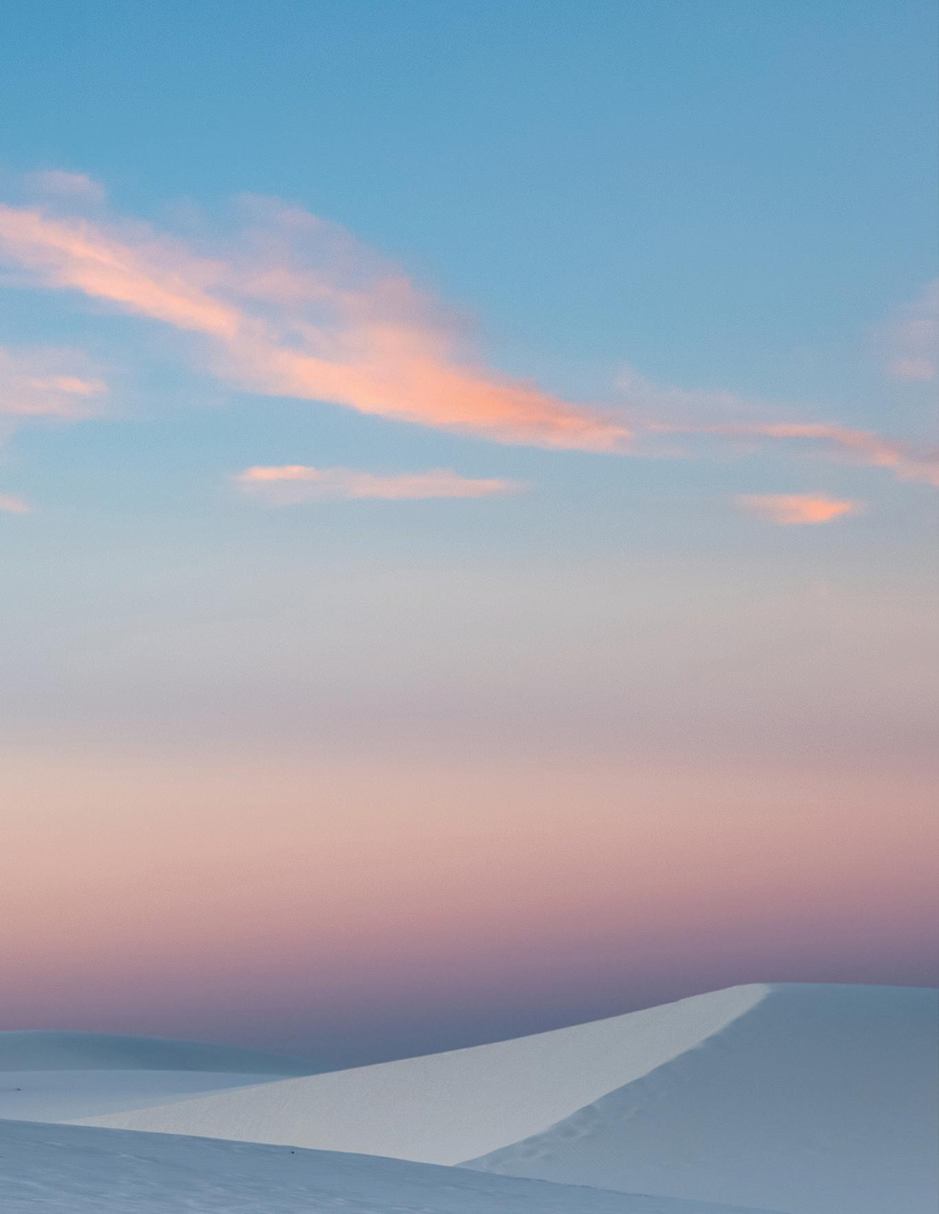
Moments later as day awakens rosy-fingered dawn adorns the sky with a more subtle pink suffusing the sands and surrounding peaks with a soft glow intensifying to a gleaming fuchsia. Foliage and flowers on plants like squaw bush sumac, soap tree yucca and prairie grasses become the subjects of desert portraits. As the sun climbs higher overhead burning directly down on the dunes, light becomes brighter and whiter, but the sands underfoot remain cool. Unlike the quartz-based sand of other dune fields, these calcium sulfate surfaces do not readily convert the sun’s energy; they are soft and welcoming even to bare feet. Hours pass, a windstorm kicks up and the dunes morph before our eyes, burying lost objects, submerging signposts and obscuring the road. By days end the sun is sinking close to the horizon and light is refracted anew.
The firmament is ablaze in resplendent red and fiery orange until the rotation of the planet causes darkness to fall. White light recedes. Color dissolves.
Sunrise. White Sands, Alamogordo, New Mexico. Leica S (Typ 007) & Vario-Elmar-S 30–90mm f/3.5–5.6 Asph. at 74mm, f/5.3, 1/30 sec, ISO 400.
Early Sunrise. White Sands, Alamogordo, New Mexico. Leica S (Typ 007) & APO-Macro-Summarit-S 120mm f/2.5 at f/8, 1/6 sec, ISO 400.
Sunset, White Sands, Alamogordo, New Mexico. Leica S (Typ 007) & Vario-Elmar-S 30–90 mm f/3.5–5.6 Asph. at 37mm, f/13, 1/2000 sec, ISO 400.
There are 96
women currently imprisoned in El Valle Detention Center. Most of them have not yet faced trial and cannot afford to pay the $1,000 to the police to go to a less overpopulated center of detention.
pho to gra phy
The Story of 'Dias Eternos' & Ana Maria Arevalo Gosen
by RICHARD REJINO
interview Ana Maria Arevalo Gosen, LHSA’s 2020 Photography Grant recipient, is to come away with the impression that she is as gregarious and engaging as she is intense and passionate. Ana Maria describes herself as a fighter for women’s rights who has chosen visual storytelling to document the injustices they endure. To hear her in a presentation and see her work is to feel and see an intense desire to defend those rights through the power of her images. Her story is one of personal growth, discovery, and following a burning passion for making a difference in the world.
Ana Maria was born in Caracas, Venezuela, and as a young girl she grew up in a world ruled by a corrupt, dictatorial government, where violence was the norm and social order was spiraling into steady decay. In her late teens, she witnessed a shooting in a bar six feet in front of her and on a separate occasion was beaten unconscious during a protest rally. At the young age of twenty, she reached a tipping point and made the decision to leave Venezuela to study political science at the Institut d’Etudes Politiques in Toulouse, France. Culturally in Venezuela, for a young woman to leave home, even at twenty years old, was considered rare but she felt she had no choice: “I left because I couldn’t be my whole self,” she said. “I couldn’t drive, shop, be with my friends, skate in the streets, play music, or anything without being aware of my circumstances.”
"I think it’s normal for anyone who works on a project like this to have guilt. But you do it seriously, for change, for impact."
In Toulouse she experienced what it felt like to be free from the oppression she felt for most of her life. “It was a beautiful casualty that I ended up in that city; it shaped me,” she remembered. “During the first years I went to University, I discovered something called photojournalism. The last year before getting into the journalism master’s degree, I plucked myself from the University and went straight to a photography school so I could learn about photojournalism. It became clear that the camera could be an effective and powerful tool. Since then, photography has been my weapon of choice in a very natural and instinctive way.”
Three years later in 2017, she returned home to even worse conditions. Buildings were decaying, the economy had further deteriorated, prices had skyrocketed. Moreover, she saw how much the people’s hope for a better future had crumbled like the buildings around her. Desperate to do something, she reached out to a journalist friend for advice: “I spoke to her about how I could approach the root causes of this crisis using photography. My friend belonged to an NGO that defends the rights of the people who are detained. A detention center is a place where people are expected to be held for only 45 days. But because of the country's long crises, this notion is a memory. I was shocked to learn that some of these centers were so overcrowded that the female detainees were getting pregnant because they shared cells with male detainees.”
This revelation ultimately led her to document the human rights abuses and unpardonable conditions that women in detention centers face in the Venezuelan prison system on a daily basis. She named her project Dias Eternos (Eternal Days) and in the years since, has dedicated herself to give a voice to these women.
Gaining access to the detention centers posed challenges, but her approach aligned itself with her philosophy on photography. For Ana Maria, photography is simply a vehicle to satisfy her natural curiosity for people. She describes Dias Eternos as an intentionally long-term project because she is determined to build relationships with her subjects first, as much to build trust as to understand their plight. This takes time. Her natural empathy enables her to capture their hopelessness and despair and puts the viewer into the “very skin of her subjects.”
When I asked her to describe some of the women she met and how the experience of walking into potentially dangerous situations affected her emotionally and physically, she had this to say:
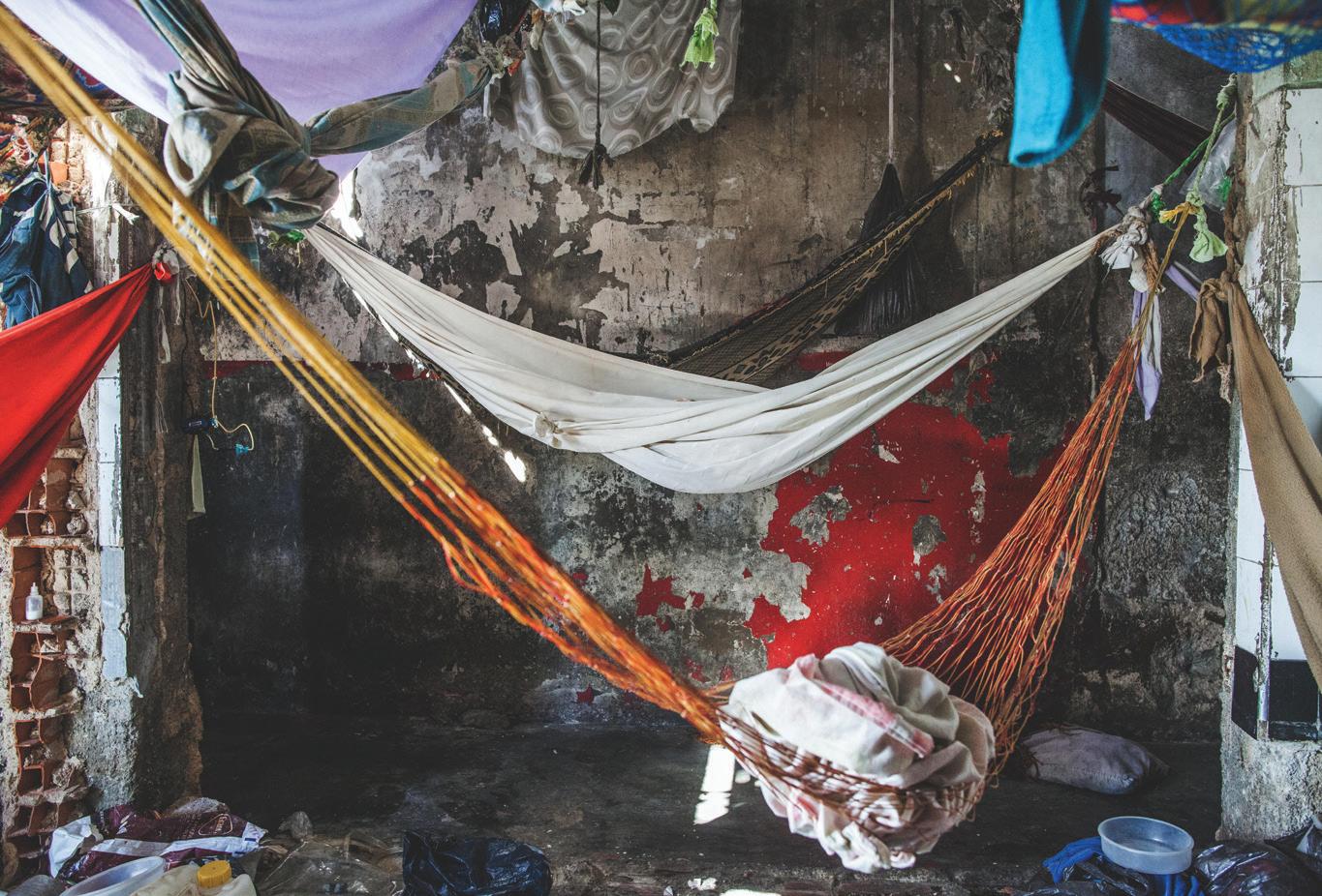
“My first visit to a detention center confirmed everything I had been told. It had five cells for a hundred detainees, including one cell for the detained women. The women used to share the space with the male detainees, but the police officers turned their office into a women-only cell. A group of eleven women, including a 21-year-old in her eighth month of pregnancy, were sharing the small space. The air inside was suffocating; they only had one small window to let the air come in and they shared skinny mattresses to sleep on the floor. These women did not know when they were going to move on to trial. They did not know if they were going to be released. They did not know their lawyers. Some had been waiting for their trial for years. The criminal justice system in Venezuela does not work equally for everybody. On the contrary, it takes away the rights of the poorest and the most vulnerable members of society. None of the persons that I met during the time of my reporting in Venezuela came from middle- or high-class groups. In Venezuela, if you are rich and guilty, you will not go to jail…the system bends towards the wealthy and the political sphere. Many women remain detained without dignity and stripped of their human rights.” The shame and anger she felt that day fueled her desire to expose the plight of these women and start a dialogue about current laws and justice systems in her country.
Lessons Learned - It isn’t difficult to imagine the adverse effects Ana Maria must have felt being around the detainees and getting to know them. I was curious to know how she felt about photographing her subjects during their most vulnerable and personal moments, whether she contemplated the moral versus aesthetic mission that her project sought to achieve. For example, many of the overcrowded cells do not have toilets, much less privacy, and the women are forced to relieve themselves in front of others using a can or a bucket. They sleep together, crammed on mattresses on the floor, legs and bodies intertwined. There are moments of intense sadness when a detainee is visited by a husband or loved one and must endure their leaving. I wondered how she reconciled the dichotomy of portraying them in an artistic way versus becoming voyeuristic with their circumstance in order to help them.
(opposite page) POLI-VALENCIA, CARABOBO - February 2017. Jakelin Rivero, 21, charged with robbery, is eight month pregnant. She waits to have a bath with buckets of water at an improvised outdoor toilet made from a cardboard by the police. About a hundred detainees use the same toilet bowl and shower in the same place.
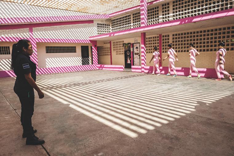
(this page) ANA MARIA CAMPOS II PRISON, MARACAIBO - December 2018. A group of female detainees warm up before exercising under the watch of a custodian inside a closed prison. Only women who have already gone to trial are admitted to this type of prison, where they have food, water, medical attention, and don't deal with overcrowding. Women detained here have the chance to take classes, participate in sports, and cook, however they are not allowed to make or receive phone calls and they only get one visitation day per month.
“There is a guilt,” she said, “but if I’m going to do a project, I do it as respectfully as I can. I make the decision to make it as ethically as possible and answer the hard questions that I am asking. I think it’s normal for anyone who works on a project like this to have guilt. But you do it seriously, for change, for impact. It’s important to reflect on this. We have enough photojournalists who drop in, do a story, and leave. It’s important to take your time to know the people that you are photographing, to open your heart to them and learn from each encounter. Listen to them. Fall in love with them. That is respect!”
Despite Ana Maria’s integrity and desire to humanize her subjects, it came at a price. “Leaving the detention center without crying is very hard,” she said. “…I see all these abuses and I have to behave and hide my anger at what I’m seeing. In the beginning, I used to bottle it all up until I came home, and I couldn’t sleep, couldn’t eat. I had to learn how to cope, so I write songs, I play a lot of sports, do a lot of yoga. Photojournalist friends understand what I go through. I have a therapist and a support group who help me. It’s important to have a community that I can depend upon.”
Throughout her journey with Dias Eternos , Ana Maria has remained positive and happy in her life. She’s learned to cope by always working on more than one project at a time, and she is also a singer songwriter. Her passion for music affords her a different form of personal expression that brings balance to her daily life. Ana Maria is also helped by her natural sunny outlook and the support of her husband. I asked her what the project has taught her and how she keeps herself moving forward. She paused and said, “Photographing these women, I learned about solidarity
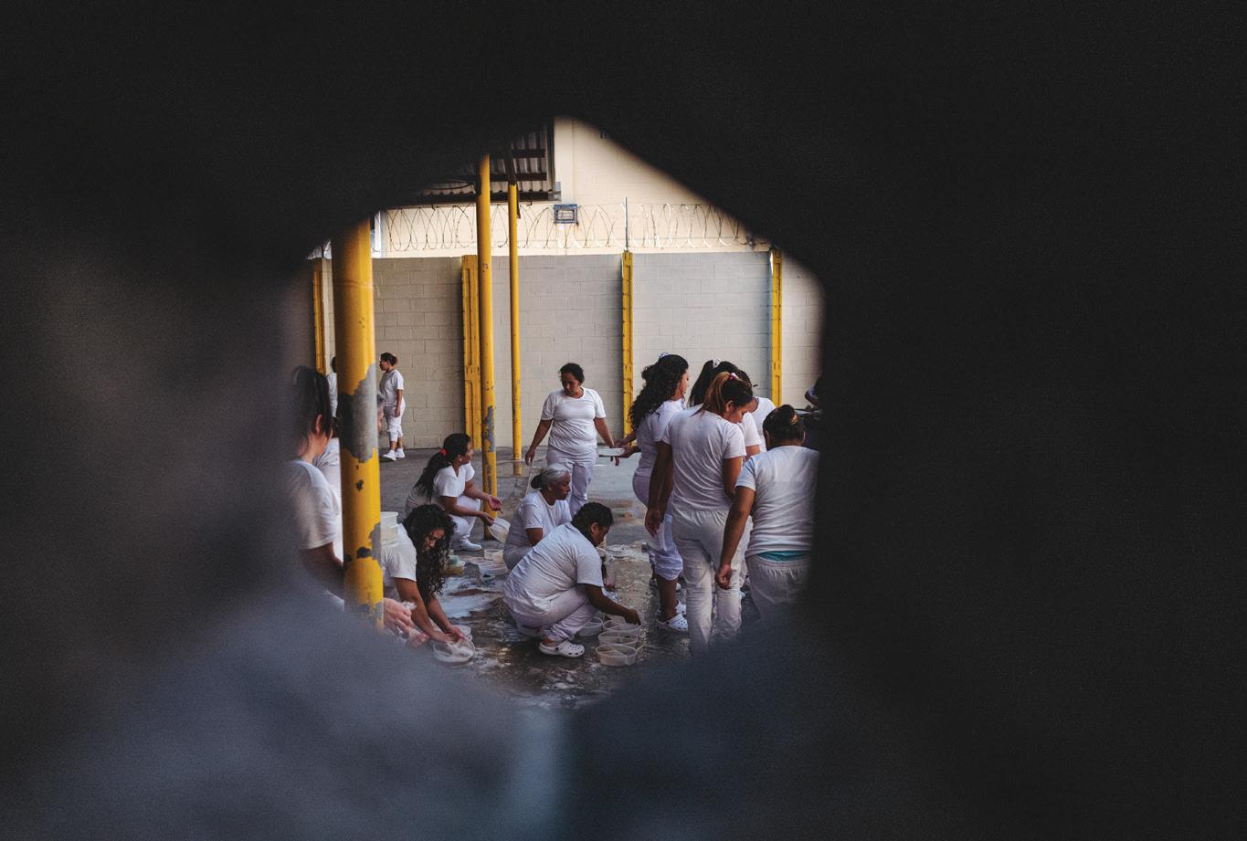
[this page] ILOPANGO, El Salvador. March 8, 2021. Women detained in the women's prison of Ilopango in sector B wash their dishes after eating. These women are in sector B of the prison and have not been declared guilty.
[opposite page] (top) LA YAGUARA CENTER OF DETENTION. - March 2018. Beauty has always been important in Venezuelan culture. Inside the centers of preventive detention, women take care of their looks even if they do not have mirrors or visitors.
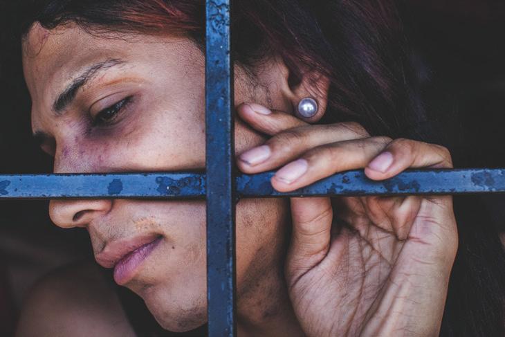
[middle] POLI-VALENCIA, CARABOBO - January 2017. A transgender woman detainee shows her wounds and scars through the bars of her cell. She is being held prisoner like a man, which means that she has to wait for her preliminary trial with male prisoners who often abuse her.
[bottom] LA YAGUARA CENTER OF DETENTION, CARACAS. - March 2018. A woman urinates in a bucket inside a prison cell surrounded by other detainees. Because of the overcrowding, these women live under unhygienic conditions.
"The women work together to survive...I’ve learned how resistant they are as human beings...they put on makeup and wash their hair as an act of vengeance, as if to say, ‘you’re not gonna make me fall.’ The women maintain their dignity and are resilient.”
“Leaving the detention center without crying is very hard,” she said. “…I see all these abuses and I have to behave and hide my anger at what I’m seeing.
and respect. None of them die from hunger; they become allies and friends and they share everything: clothing, food, water, medicine, they share mattresses. The women work together to survive, which is different from the men who fight amongst themselves in the prisons. I’ve learned how resistant they are as human beings. Personal hygiene is important to them, they put on makeup and wash their hair as an act of vengeance, as if to say, ‘you’re not gonna make me fall.’ The women maintain their dignity and are resilient.”
“I am always inspired by resilience,” she continued, “by the everlasting flame of those who never stop, of those who move forward. I am inspired by those who fight for their rights and those who think and speak freely. Today, I am inspired by those who want our survival as a species, of those who are listening to our most ancestral ways, of those who seek the balance of Nature…Patience inspires me. Life and death inspire me. An open heart during the process of creation can be a catalyst of inspiration for other ideas or projects. I am inspired by the mysterious and the underreported.”
afterword - Since its first recipient in 2017, the LHSA Photography Grant has been awarded to four aspiring photographers. Each of them has sought to create their own unique, personal project and has used photography as their weapon of choice to focus on issues and people who are on the verge of being forgotten. The Society can take pride in knowing it helped these warriors who fight to make a difference in the world through their images. Ana Maria Arevalo Gosen is our most recent reminder that the power of photography can be a tool to improve and celebrate the human condition.
LHSA is currently accepting applications for the 2021 Photography Grant. Visit www.lhsa.org for more information.
Maria’s
Tips for Finding & Completing a Photo Project
1.) finding a project feels like something you can fish out of the ocean! It is not. A project must have a dense layer of personal implication. It should be something that comes out from your heart, and that you decide is crucial to develop. To find a project you must dig into your heart and explore with your senses, emotions, and spirit where you want to go.
2.) research Once it is decided, you must go into a phase of research, to look for as much information possible about the subject, with patience. Patience is the key. Applying for grants and getting rejected is a good way to filter information because for grants you have to write, write, and write! It is important to put in words what you want to photograph, why is it important. It allows you to put into words what is essential.
3.) starting Sometimes for me it is so comfortable to stay doing research, but there comes a time when finally starting the project arrives. What I do in the beginning is to meet my subjects first, talk to them, get to know them, and then little by little the camera gets attached to your hand and suddenly you are making pictures of a person that you care about; eventually you fall in love with them. You respect them. You want to be there to tell their important story. Trust your intuition.
4.) reciprocate I always try to give something in return. I print the pictures and give them to my subjects.
5.) finishing With discipline and patience I usually edit, sequence, tune the work, and write again. I normally send it to two or three colleagues that give me very honest feedback. Those people should be people that come from different backgrounds if possible. Mine are for example: a magazine editor, a newspaper editor, a book designer and architect and my semiology teacher from Toulouse. I trust them to tell me the truth, but I always trust my instinct in the end.
Ana
Five
THE LEICA VARIO-ELMARIT-SL
by JONATHAN SLACK
Here it is, Leica has just announced the new Vario-ElmaritSL 24-70mm f/2.8 ASPH for L-Mount cameras. It's smaller and 300 grams lighter than the 24-90mm, has a constant f/2.8 aperture and is only a little bit more than half the price of it's bigger sibling. Even cheaper if you buy it as a kit with the SL2 or SL2-S.
Conventional wisdom would have made such a lens both bigger and more expensive than the 24-90, so what's the story? A careful examination of the lens body gives a clue: "Made in Japan" (all the other SL lenses are "Made in Germany")
Leica has had successful collaborations for many of their products over the years, more recently with the D-Lux and V-Lux cameras. Lens collaborations with Konica, Minolta, Kyocera, Zeiss, Schneider and Sigma have all resulted in fine lenses over the years, sometimes at more 'sensible' prices than Leica originals.
In this article I'm going to look at the new lens with relation to the existing 24-90 zoom in the hope that it will help photographers make a reasoned decision about which they should buy, or whether they might need both.
design The new lens has an all-metal construction and looks exactly like the other members of the Leica SL zoom range. It has an 82mm front element like all the other zooms do. It is weather-sealed and has a beautiful metal petal shaped lens hood (slightly ironic that the other Leica zooms have plastic lens hoods!) . The lens hood actually works well on the 24-90mm without causing vignetting. The lens is manufactured in accordance with Leica tolerances and QA requirements.
It also focuses extremely close. As is often the case, it focuses closer at wide angle. More unusually, the reproduction ratio is greater at the wide angle end: 1:2.9 at 24mm and 1:4.5 at 70mm. In contrast, the 24-90 is 1:7.2 at 24mm and 1:3.8 at 90mm.
The Leica Vario-Elmarit-SL does not have buttons for AF/ MF focus lock and zoom lock, however the manual focus over-ride works really well on the SL cameras and in my view makes the buttons redundant. By touching the manual focus ring, you can invoke manual focus or focus lock at any time. I guess it might be more of an omission if the lens was used on another brand of L-Mount camera.
The lens does not have Image Stabilisation - which might be a disappointment using it on the SL (Typ 601) - but as the newer models have IBIS, it doesn't feel like a problem. It would inevitably have been larger and heavier if it did have it. Another slight irritation is that the zoom ring works the other way around compared to the rest of the Leica zoom lenses.
constant aperture vs. variable aperture A constant aperture zoom lens is one (like this Leica 24-70 f/2.8) where the aperture does not change as you increase the focal length. A variable Aperture zoom is one where it does change (like the Leica 2490 f/2.8-f/4)
Traditionally variable aperture zoom lenses were cheaper and smaller than constant aperture lenses, however Peter Karbe once explained to me that in designing a zoom lens you either had a variable aperture or you were forced to 'throw away' the opportunity of a larger aperture at the wider end. He felt this was a waste, and I'm inclined to agree. Certainly there is nothing 'cheap' (or small) about the design of the 24-90mm. Leica made the best lens they possibly could, but decided not to make it a constant f/4 (which of course it could be)
There are various reasons why constant aperture lenses are considered to be advantageous - some reasons are better than others! Definitely there is a snobbery amongst some photographers, probably fuelled by the fact that the most expensive zoom lens from any manufacturer is usually of constant aperture.
For video recording you certainly don't want the exposure to change when you zoom in or out. So this lens will be a welcome addition for video photographers who would have had to limit themselves to an aperture of f/4 or smaller when shooting with the 24-90mm.
(top) 1/800 th sec, f/2.8, ISO 100 (bottom) 1/100 th sec, f/6.3, ISO 100
(above) 1/1600 th sec, f/5.6, ISO 100
(top) 1/200 th sec, f/2.8, ISO 100 (middle) 1/250 th sec, f/9, ISO 100 (bottom) 1/800 th sec, f/2.8, ISO 100
Stills photographers, many of whom shoot with manual settings would also say that they need a constant aperture, but it seems to me that this is a problem from the days of film, where the ISO value was fixed (and the low light performance pretty poor)
These days if you want to shoot with manual exposure in low light - for example a concert when you want to set the slowest sensible shutter speed and a suitable aperture - then you can use the Auto ISO feature to ensure the correct exposure, and, unlike video, it doesn't matter if this changes when you zoom in and out (and of course it will be advantageous to have the widest aperture possible available)
image quality The image quality with the 24-70mm VarioElmarit-SL is quite excellent. The lens is sharp at all apertures and focal lengths. Like all zooms there is a little fall off towards the corners, but it's never serious. Being so good wide open, there isn't a great deal of benefit to be had by stopping down. Like many mid-range zooms, sharpness drops a little at the telephoto end.
I've done detailed comparisons between the new 24-70mm and the older 24-90mm. I shot a series of images at 24, 35, 50, 70mm and f/2.8 (or the largest aperture available in the case of the 24-90mm) , f/5.6 and f/8. One setup was a brick wall at about 3 metres and the other a poplar tree at about 40 metres.
1. chromatic aberration -Both lenses are admirable in this context - even tree branches against a grey background seem to be okay - I think it's a draw.
2. colour - Shooting daylight white balance (in the daylight) I think that the 24-70 has a very slight yellowness compared to the excellent colour on the 24-90 - nothing in it again.
3. flare - I spend a lot of time shooting into the sun, and both of these lenses perform admirably in very difficult lighting.
4. bokeh - It's very difficult to make any real judgements here, but my instinct is that the bokeh on the 24-90 is a little more 'nervous' than the 24-70.
5. resolution / sharpness - I was really expecting the 24-90 to be sharper right down the line, but it is very nuanced and the difference quite small (as you might expect by looking at their respective MTF charts) . Both lenses performed extremely well at all focal lengths.
I've come to the conclusion that the 24-90mm is slightly better, especially at longer focal lengths, but it's a very close call. At 24mm the 24-70mm is sharper at the corners and the 2490mm sharper at the centre. By 35mm the 24-90mm is slightly sharper at the corners; it's a dead heat at centre. By 50mm
the 24-90mm is a little better and by 70mm it is noticeably better if you really look. The 24-90mm is still excellent at 90mm at all apertures.
It should be emphasised that both lenses are extremely good at all focal lengths and apertures, and I think it's vanishingly unlikely that these small differences would make the difference between a good shot and a failure.
which should i buy? The big question! In terms of image quality the difference is small enough not to matter, but I suppose that shooting landscape I would probably prefer to use the 24-90mm, partly because of the longer range and partly because of the sharper corners.
If you are contemplating buying into the Leica SL system then I really think that the new kits with either the SL2 or SL2-S are a 'no-brainer'. And, if you plan to shoot a lot of video, especially in low light, then the 24-70mm with it's constant aperture is a definite attraction.
For event shooting, weddings and concerts, I think I'd still use the 24-90mm for it's longer range, but there is a real argument for using the new, lighter lens if you are going to have to carry it about all day!
conclusion The new lens certainly feels and operates just like any of the other SL lenses, the only real distinction is the "Made in Japan" engraved on the body. Most SL users would prefer to have a Leica lens, and if Leica can achieve it this way, I hope that they do more collaborations in the future. The L-Mount is really gathering momentum, but there are lots of users who would like Leica telephotos and extreme wide angle, and this is a great way to achieve it.
The 24-70mm Vario-Elmarit-SL is a fine lens and a welcome addition to the stable of SL zoom lenses. The image quality is really good, it has lovely bokeh and is great for close up. The build quality is just what one expects from Leica and the lens handles very nicely on any of the SL cameras. The lens is compact and relatively lightweight and very well priced. It also has a constant aperture which will be welcome for videographers. What's not to like!
(opposite page) 1/1000 th sec, f/5.6, ISO 100 (left, top) 1/125 th sec, f/2.8, ISO 150 (left, bottom) 1/250 th sec, f/2.8, ISO 100
L a t e D ays
alehouses & a spook house
by Douglas Richardson
the article Early Days: Prelude to Spring by Albert B. Knapp MD and Ruth Oratz MD in the 53/2 issue of Viewfinder documented a spring season passed under Covid-19 conditions, I wondered what I might do to document an English late autumn in which our freedoms were still restricted by measures intended to limit the spread of the disease.
England lacks the open spaces of the US, so while Albert and Ruth have a property through which a river flows, the only thing that might flow into my property would be the occasional rainwater runoff from the car parking area in front of my garage. I would need to look further afield for my subject matter, and since I'm not a motorist this would have to be found in the village of Roydon where I live.
Located some 19 miles north of London, Roydon dates back to at least the 11th century, when it was known as 'Ruindune', but had acquired its current name by 1467. When I settled there in 1981, this village made up of only three principal streets and around half-a-dozen side streets had no less than four drinking establishments ('bars' in US parlance, but 'pubs' to the British).
Located along the village's High Street, all but one of these were in buildings several centuries old, and three were known to some local people not by their official names, but as the 'Top House', 'Middle House' and 'Bottom House' respectively – references to their locations on the street. Although the anti-Covid regulations announced by the United Kingdom (UK) government temporarily closed all pubs in the summer of 2020, and again in November, these premises seemed suitable subjects for my camera.
As its original title of 'eala-hus' suggests, the concept of the alehouse dates back to AngloSaxon times. These establishments seem to have been popular, and may even have become a social problem – in the year 965 the English King Ēadgār the Peaceable ordered that each village in his realm should have only a single alehouse.
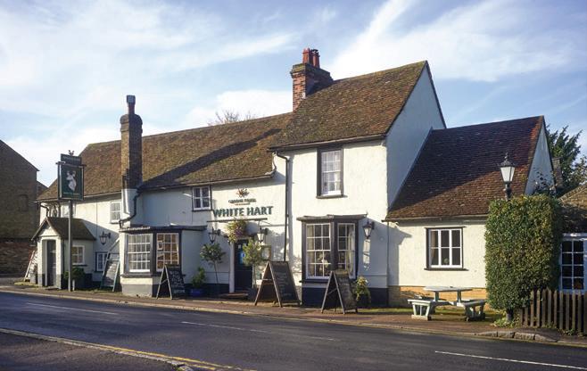
The term 'alehouse' is long obsolete, having been followed by the terms 'inn', 'tavern', and the current 'public house', though in the 19th century the latter gave way to the abbreviated form of 'pub'. Some English pubs can trace their history back to the 14th century, although most if not all have been rebuilt at a later date. Roydon's White Hart (known locally as the 'Middle House') is less than a minute's walk from my front door. While some parts date back to the 15th century, the main section is a long timber-framed building, perhaps of 17thcentury origin. By 1789 it had become an alehouse.
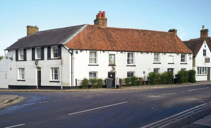
A building at the top of the High Street had been used intermittently as a drinking establishment since 1671 or even earlier. It was replaced – probably in the 18th century –by The White Horse (the 'Top House'), a timber-framed building which acquired its current brick front during the 19th century. Although the pub was converted for residential use several years ago, its sign can still be seen over the door.
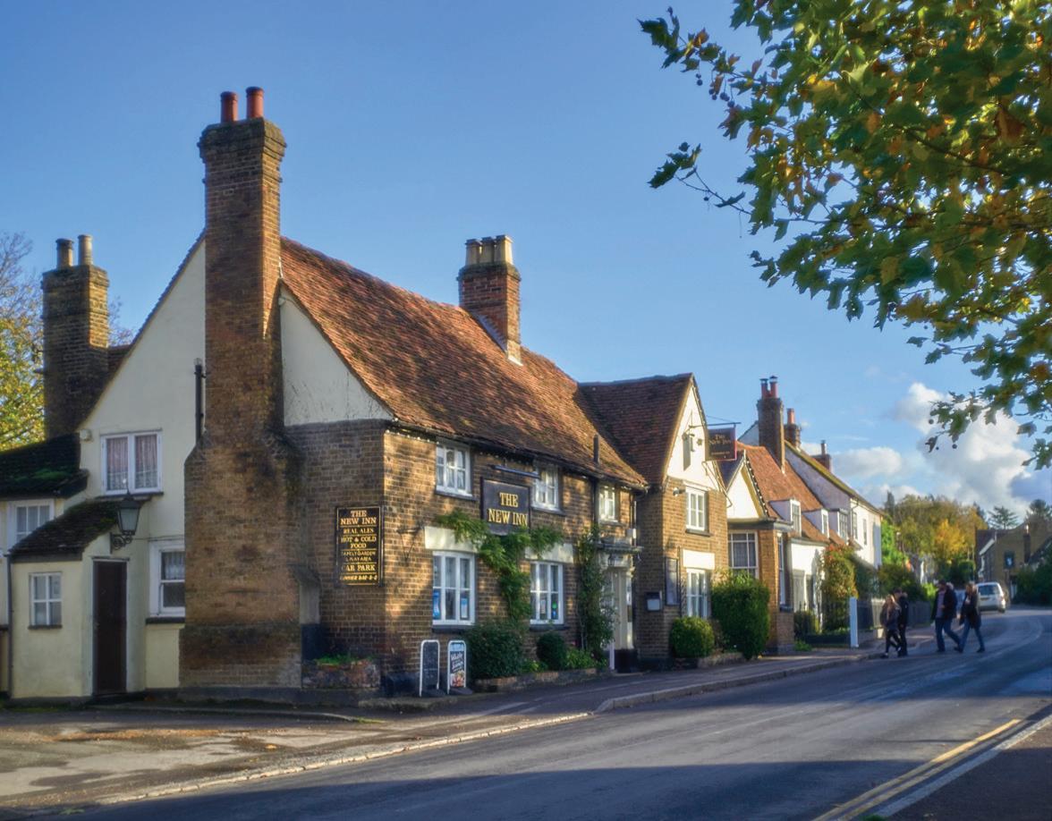
The New Inn (the 'Bottom House') is an early 17th-century timber-framed building recorded in 1769 as being a drinking establishment. Built on the site of a late medieval house, it incorporates the south cross wing of the older building. For a time, this establishment seems to have also met local needs of a non-alcoholic sort. On 11 August 1890, Theophilus Blades, publican of The New Inn, appeared before local magistrates charged with having presented unlicensed stage plays on his premises. (Until 1968, UK law required official censorship of stage plays.)
Originally known as The Temple Inn, a name that recalls how part of Roydon parish was once owned by the 12th-14th century Knights Templar military order, then later by the Knights Hospitaller, The Crusader was Roydon's youngest pub. Built early in the 19th
(opposite page) The first pub that thirsty 'cloak and dagger' folk from the secret wartime establishment at Briggens House would have reached after taking the long walk to the village would have been The New Inn, seen here shortly before an early-winter sunset. (35mm Summaron with B+W Soft Pro filter)
(left) The frontage of The White Hart catches the early-morning winter sunlight. Probably built in the 17th century, but incorporating some 15th century structure, by 1789 it had become an alehouse. (28mm Summaron with B+W Soft Pro filter)
(right) Despite a recent conversion into apartments, The White Horse has retained its sign, which displays the former pub's name, as well as its nickname of 'The Top House'.
century, it originally had to pay a seventh of its annual income to the Lord of the Manor each Michaelmas (29 September). The Crusader was closed with the introduction of the 2020 anti-Covid regulations, and its future is now uncertain.
In the 19th century the village had a fifth alehouse in the form of The Plough. Probably built around 1600, this is now used as a residence, and has been renamed Plough Cottage. Another named The Eagle existed on the outskirts of the village. Thought to be of 17th century origin, it is now a five-bedroom residence named Eagle House.
During the Second World War, the clientele of the Roydon pubs is likely to have included what a small rural community might have regarded as rather strange individuals. The man indirectly responsible for this was British wartime prime minister Winston Churchill. “Set Europe ablaze”, he had commanded in 1940, and the clandestine organisation tasked with doing this was the then recently-formed Special Operations Executive (SOE). Created to carry out espionage, sabotage, and raiding operations, the SOE grew to the point where it had more than 70 facilities in the UK. These included Briggens House, an early 18th century building incorporating Tudor foundations, and located in extensive grounds on the outskirts of Roydon.
After being taken over by government order, this was initially used as the ‘STS 38 Polish Training Section’ for an elite unit of special-operations paratroopers from the Polish Army in exile. Records show that 316 personnel – including one woman – were parachuted into occupied Poland as secret agents. It was a dangerous business – 103 of them were killed in action, executed after capture, or died in crashes.
By 1941 Briggens House had become 'Station XIV', the location of the SOE’s False Document Section, a secret unit whose personnel included convicted counterfeiters and forgers who had been released from British prisons so that their illicit skills could be exploited. By 1945, this unconventional team had created more than quarter of a million forged documents such as identity cards, work permits, and ration books that SOE agents could use when operating in occupied countries. These fake documents were of high quality, and the Germans had problems in spotting them. On one occasion, the Germans introduced a new form of ration book (presumably as an anti-faking measure), but by the end of the first day of its use, Briggens House had already created its own version.
Station XIV also printed fake Polish banknotes that were dropped into occupied Poland in an attempt to disrupt the economy, and had even created a German passport for Adolf Hitler. Now preserved in the UK's National Archives, this document may have been devised as a training exercise to demonstrate the unit's forging skills, but shows its creators’ sense of humour. Hitler’s occupation is listed as ‘painter’, and his distinguishing feature is described as a 'little moustache'. One forged stamp made on its pages is the red letter ‘J’ that indicated that the bearer had been classified as Jewish, while another is a visa that gave permission to enter Palestine, which was under British control at that time!
Given that wartime prices were about 1/50 of their present-day equivalent, buying beer in the Roydon pubs in those days would in most cases have been a transaction involving coins rather than banknotes. This was probably a good thing – while we can be fairly confident that any banknotes used by local people would have been printed by the Bank of England, the same perhaps could not be said for any banknotes proffered by Station XIV personnel. Some just might have been highly unofficial and unauthorised products of Briggens House.
Given the stresses of wartime, one suspects that 'cloak and dagger' types from Briggens House and even some of the Roydon villagers might not have been the best-behaved of pub
clients, but not far from The New Inn are what were once Roydon’s potential solutions to bad behaviour or petty crime – the village lockup and stocks.
Built around 1828, the lockup is a small wooden shed with a flat roof, lockable double doors, and slatted vent to admit fresh air, while the stocks are an example of a traditional instrument of punishment that was used from medieval to early modern times. The miscreant's ankles were placed in cutouts between the upper and lower wooden boards. Now immobilised, he could expect to be jeered and mocked, or pelted with refuse.
An English law of 1351 required that stocks should be available in every town and village, and devices of this type remained in service for the next five centuries. The last official instances of their use in the UK were in 1872, but stocks were still used in rural communities for some time after that date. Some 50 years ago a then-elderly Roydon parishioner recalled having seen a man being punished in the village stocks some time around 1885.
These potential subjects having been chosen, it was time to plan my picture-taking. Much though I enjoyed the imagery created by Albert's 90mm Thambar, this is a lens that I've never had any desire to own, and given that I'm in my late 70s and semi-retired, it's not one that I could easily afford. But I wondered whether an alternative and relatively inexpensive route to obtaining soft-focus imagery for my project might be possible. Although Zeiss no longer offers its legendary Softar soft-focus filter, the company still supplies the transparent component formerly used in this device to German filter manufacturers B+W and Heliopan, who install these into their own mountings.
While the Thambar achieves its soft-focus effect by exploiting undercorrected spherical aberration, Softar-type filters consist of a transparent disk with a series of small hemispherical protrusions on one surface. A portion of the incoming light passes through what is essentially a clear filter, and creates a normal image on the film or sensor, while the rest passes through the protrusions and is defocused. According to aficionados of Softar-type filters, the end result is a combination of a sharp image and scattered light that cannot be mimicked by software-based manipulations.
The effect created by these filters depends on the focal length and aperture setting of the lens to which it is fitted, but is much milder than that available from the Thambar. Using
(left) The name of this traditional thatched cottage recalls its earlier life as The Plough alehouse. What is now a front garden located behind the white fence was originally part of the pub's forecourt, which extended to the road at a time when the current pavement ('sidewalk' to US readers) did not exist.
(right) Until the late 19th century, Roydon's stocks were used to punish malefactors, while drunks and rowdies may have been left to 'sleep it off' in the lockup.
Locked gates and crumbling gatehouses are evidence that after operating as a hotel in the late 20th century, Briggens House – once used as a 'spook house' by Britain's clandestine Special Operations Executive (SOE) – has now fallen out of use.
too short a focal length or to small an aperture (and in the worst case, a combination of both) can create sufficient depth of field to begin to upset the effect of the filter's surface structure.
The issue of Viewfinder containing the article 'Early Days' had reached me at the end of September, but I was not able to acquire a B+W Soft Pro filter until mid-October. For photographers in the upper northern latitudes, the approach of winter often means poor weather, weak low-angle sunlight, and long harsh shadows. I had to wait though many days of heavy overcast or rain before getting several days of winter sunshine, and one when the sun was just visible through thin cloud.
The pubs and former pubs are all located directly on the street, and since the latter are fairly narrow, I had to rely on my Leitz-era 28mm f/5.6 Summaron and 35mm f/2.8 Summaron. Both have front elements of small diameter – about 5mm and 12mm respectively – and my limited experience with the Soft Pro suggests that the effect of the filter are minimal with the 28mm lens, but more visible with the 35mm. But even when the filter is used with lenses of greater diameter, the resulting softness is much less than that from a Thambar.
Being close to London, and having a direct rail link to that city, Roydon has long been a 'commuter village'. The High Street tends to be fairly quiet except when local commuters are heading to and from the railway station, children are making their daily trips to and from the village school, and when the business community from the local area arrive for lunch in the village pubs. But during the anti-Covid lockdowns imposed by the UK government, few people could be seen.
Gone also were the long nose-to-tail processions of cars for whose owners our village is just part of their daily route between home and a distant workplace. Stepping out onto the road in order to obtain the best vantage point for a photograph would normally be unwise, but a sharp reduction in traffic through the village caused by the anti-Covid measures made it practical.
My photographic outings into near-deserted streets with closed pubs brought to mind Samuel Pepys' diary entry for 16 August 1665 recording the effects of the Great Plague then affecting the city of London. "But, Lord! how sad a sight it is to see the streets empty of people... and about us two shops in three, if not more, generally shut up."
THE LEITZ BIRTHDAYS BOOK
Perhaps 10 years ago, I was asked by one of our members whether I knew of “The Leitz Birthday Book” and how to obtain one. I had no idea what that person was talking about, but not wanting to appear as ignorant as I felt, I replied “perhaps you could tell me more”. I must admit I had mental images of my own baby book from earliest childhood. Well, it turns out this was a publication of Leica Historica, LHSA’s German counterpart, and had pictures of rare prototypes and the like. It was all news to me and sounded quite interesting.
I had become a member of Leica Historica sometime prior to that interchange, and did know that periodically LH issued compendia of articles in book format on their anniversaries.
by ED SCHWARTZREICH
The Birthdays Book (note the plural) was their first such offering, in 1990 for their 25th anniversary, and was entitled: “Geburtstage der Leitz Fotokonstruktionen ab 1927”. The book referenced the work of Wilhelm Albert, Oskar Barnack’s closest assistant, and developer, after Barnack’s death in 1936, of the later Leica SM cameras models and apparently many other items. Herr Albert had over his years at Leitz photographed many of the new, unusual, or unique Leitz items on approximately the date their construction was finished (their birthdays) , from 1927 on. Many of these projects Albert himself had worked on. Much later these images were mounted onto cards with identifying information, the new images placed into two sequenced scrapbooks / diaries and the ensemble
rephotographed. Included with them were also reproductions in blueprint of Albert’s typed tables of references to the images, including information about who had worked on these projects. Three exemplars of the resulting books were made, and one set was presented to Ludwig Leitz. After Albert’s death, his own copy of these volumes was obtained from his estate by Leica Historica, and a combined facsimile was made. Officially, 333 numbered copies (with certificates!) were issued, and probably went mostly to the membership. Text of course was only in German. Trying to find a copy years later for oneself meant persuading a member to relinquish his own book, or working through the insider grapevine for one from an estate.
I did not find a copy for myself for several years. Once one did make a ghostly appearance, briefly whizzing by me on the internet. This quest, however, afforded me the great pleasure of meeting on line and befriending Alfred Wehner, one of the founders of Leica Historica and the editor of this rare volume! And no, Alfred did not have any extra copies, but we found much else to talk about. Finally, and unexpectedly, in 2018 at LHSA’s Wetzlar Annual Meeting, Alfred and his friends surprised me with Nr. 032/333. Should I wish to buy it, I should make an offer!!! “Bob’s your uncle” as they say.
The reproductions of equipment in the original LH book are clear and legible, but it must be said that from a certain perspective they are rather rough and ready, being thirdgeneration copies. Still, this is a necessary book for a Leica historian to have for reference. It is both a resource, with time stamps, photo reproductions, and provenances for period Leitz equipment, and also an historical document in its own right. Herr Albert did a magnificent job, typically Germanic in the best sense, in composing, photographing, and then annotating his images, such that the editor of the facsimiles could make ready use of his tables for reference. In the book one will find several equipment “old friends” and many new and unexpected ones very worth meeting, all from the fecund minds and talented hands of the Leitz personnel! Albert documented Leitz’s most famous projects as well as some that did not make it to market, and some that were only made on special order. Also included are many projects made for the German Armed Forces in WWII such as the IR (Infra Red) Night Vision devices, which were classified as “Top Secret” at the time and some were even kept secret for years after the war ended. There are in addition several specialized scientific and medical optical instruments, based on such common items as the Visoflex line. Other important projects were either never photographed but are still documented in Albert’s tables, or are missing due to the sheer volume of items that Leitz produced.
However, nothing could prepare this Leica afficionado for the surprise announcement of a new volume of the same scrapbook which Lars Netopil and David Pitzer have now brought out. New features are superb images of the highest quality German and English texts for their forewords. This new edition happened for at least two reasons. First, demand for the original facsimile remained high, and a second edition was indicated. More importantly, however, was the procurement of the actual original photographs on their cards as mounted onto their scrapbook pages; these had been obtained years before from Albert by his friend and co-worker Werner Schlapp, who died in 2009. The new material allowed modern reproduction techniques to be used to reformulate the images in the Birthdays Book.
Physically, the old and new books are very close to A4 dimensions (guessing that A4 was the size of the original scrapbook pages); the new book is just a bit larger. The old book has 232 pages, and the new one 248 - the difference is due to expanded / different editorial material in the updated volume. The paper stock is also thicker in the new version, which one can judge in the slide-view closeup. The new book is unpaginated, but Albert’s page numbers are retained, so navigating from Albert’s tables is not a problem. The tables and the labels on the photos are in German, but that ought not to deter most English-speaking readers with Leica interest. There are perhaps 12-15 German words related to photographic equipment that are used frequently throughout, and if necessary, these can be easily translated with an on-line translation engine and saved. The introduction to the new book is bilingual German / English.
One only needs to compare images side by side to see what they have achieved. I am appending one page-pair as an example. Here is Albert’s page 168 from the two volumes (my scanner could not visualize the white border around the image in the new book; what you see is only the image of Albert’s original page) . This page details a motor for an M3, together with everyready case and electromagnetic release. The text says that this is a test sample, and that it was tested successfully 72,000 times, 4-5 pictures per second. Albert’s tables (actually for page 169, in error) mostly repeat the image’s text, saying that this is a “Leicamotor for M3. 12V/ 1 Amp, with a switch knob for single / series, an image counter, 4-5 images per second, which was test-run 72,000 times without complaint. Construction dates were from March 29, 1956 to April 1, 1957. Designer / builder was Herr Hilgendorf”. The text goes on to describe the EM release (and other items on the following page)
The edition of Lars’s new book consists of 300 copies. One can order the book from Lars, by email to: lars-netopil@lars-netopil.com
Wilhelm Albert - Birthdays of the Leitz Photo Constructions from 1927
• Published by Lars Netopil Classic Cameras, Wetzlar
• 248 pages with 176 images
• Graphic- Design by David Pitzer
• Text bi-lingual (English/German)
• Wilhelm Albert’s diary in a new edition with the highest image quality
• 21X30cm, Hardcover in cloth, with dust-jacket
• Price: EUR 129,– per copy plus shipping-charges
• ISBN 978-3-00-068326-8
"The 'famous' shot on 15.5.1952 of the Leitz passengers of the S.S. Columbia. The group includes 9 of the 12 Leitz Canada pioneers and also the families of several of them (including both Guenther and Marianne Leitz, his wife and son). Brian Veall included this picture in an article he wrote for the Leitz house magazine, 'objektiv' back in 1977".
Adress on August 20, 2012 for Elcan's 60 th Anniversary
by BRIAN VEALL by
way of introduction, my name is Brian Veall and I feel very honoured as we celebrate our company’s 60th anniversary to have been asked to say a few words – or as few as the scope of the subject allows – on the history of Raytheon ELCAN Optical Technologies. Having retired from ELCAN in 2002, I realize that many of the younger, or more recent co-workers will be unfamiliar with how ELCAN came into being and has become what it is today.
The origins of Raytheon ELCAN Optical Technologies (or Ernst Leitz Canada Limited, as it was called prior to the mid70s) can be traced back some 65 years to the conclusion of World War II when most major countries in Europe became polarized politically according to their location to the west, or east of the Iron Curtain. Germany was bisected into two republics for the next 45 years and opposing NATO and Warsaw Pact forces were massed within metres of each other along the newly-created political border between East and West Germany, both on constant high alert.
The renowned Ernst Leitz Optical Company in Germany was fortunate in being located in Wetzlar, some 60 km north-west of Frankfurt in the so-called American Zone. In the early 1950s, in a move that was prompted primarily by concern for possibly adverse political developments in Europe, but also by the desire to find a postwar re-entry into the U.S. photo market, Gűnther Leitz, of the Leitz Wetzlar management team, possessed the farsightedness to explore, for the first time since the company’s foundation in 1849, the possibility of setting up an overseas assembly facility for Leica products in North America. The U.S. State Department, however, showed little enthusiasm for having a world-class optical company – least of all a German one – competing directly with major American optical manufacturers of the era – Kodak, Bausch and Lomb, American Optical, Bell & Howell and others – and so an approach was made instead to the Canadian government. By contrast, having no optical industry of its own, Canada regarded the project with warm approval and smoothed the way for a Leitz delegation to travel to Canada in 1950 to
research potential locations for the new company. Visits were made to Smith’s Falls and Granby in Quebec among other communities, including Midland, Ontario. The decision was finally made in favour of Midland, a town then of only 7,500 inhabitants, partly because of its pleasant, rural setting, road and rail access to a major city, its similarity in some ways to the parent company’s home in Wetzlar, and − not least – the multilingual ease of pronouncing the town’s name on Midlandmade products.
In 1951, work began on the very building before which we are gathered today, located on the southwest corner which now houses the company administration offices. On May 15, 1952. the S.S. Columbia set sail from Bremerhaven, North Germany, with Günther Leitz, the president of the new company, and a group of 9 hand-picked ‘pioneer’ personnel – including two current retirees, Heinz Schmitz and Henry Weimer - and their families on board. Former photo assembly manager, Heinz, who celebrated his 90th birthday in Midland last year, still recalls the anxious feelings of the emigrants as they watched their homeland disappear over the horizon, wondering how they would be received in their new environment with an unfamiliar language and culture. Arriving in Montreal on May 24, 1952, the immigrants were documented and embarked on the train to Toronto, where they were met by members of the Canadian Leitz representative agency. Finally, on May 28, 1952, the group arrived in Midland, where they were welcomed at the railway station – formerly located next to where the Boathouse Eatery now stands - by local dignitaries and joined the advance party of three Leitz employees, Walter Kluck, Karl Kraiker and Georg Matthias, who had meanwhile been busy unpacking machinery and supervising building progress.
Nowadays, used as we are to jetting off to foreign destinations and the comparative ease of multicultural travel, we are perhaps puzzled by the anxiety felt by these German newcomers to Midland. Such misgivings can be best understood if we remember that, only a few years previously, Germany and Canada had been at war with each other.
Happily, the newcomers’ worries proved groundless. Courses in English and introduction to the Canadian way of life smoothed the transition for the immigrant employees and their families. However, on the business sector, a steel shortage delayed the completion of this building until Fall of 1952. Fortunately, the company obtained permission to requisition the Midland Curling Rink as a temporary manufacturing location. Work started almost immediately there and, amazingly, the very first Leica cameras and 50mm lenses to leave Leitz Canada were assembled - and some elements were even ground, polished, coated and mounted - in the Curling Rink just up the road from here!
By November 1952, work on the 700 meter-square company building was completed and in May 1953, the company workforce had grown from 12 to 26. The arrival of additional equipment from Germany, including chroming and anodizing installations, meant that Leitz Canada was now capable of treating semi-finished metal parts and manufacturing lenses entirely independently. The days of Leitz Canada as a mere assembly facility for prefabricated parts from Wetzlar were clearly numbered.
By 1954, the effective area of the building had expanded to 1900 square metres – nearly three times its original size – and the fact that a Canadian, high-precision optical manufacturer was now open for business did not escape the attention of the Department of Defence in Ottawa. In 1954 the Canadian government placed the first of many large defence contracts with Leitz Canada for a 16mm aerial gunnery camera recorder for mounting in CF104 fighter jets. This show of confidence in Leitz Canada’s capabilities prompted not only a further expansion of floor space, but also the need for additional engineering expertise. The requisite personnel was shipped from Wetzlar, initially for a period of six months, but later extended to twelve months.
A few of these ‘loaned Wetzlarer’ remained in Canada for good, among them chief designer – later vice-president of R&D - Dr. Walter Mandler, an extremely gifted young physicist, who is today still recognized indisputably as one of the world’s all-time leading optical designers. Walter Bauer joined the company from Wetzlar as plant manager, who, with Walter Kluck, completed the trio of Leitz Canada vice-presidents under president Gűnther Leitz.
The installation of a digital IBM computer in 1955 meant that the company could now design its own lenses. Despite the excellence of Midland-built Leitz products, it was not easy to convince long-standing Leica customers that the traditional level of Leitz quality had not suffered through its jump across the Atlantic. However, even the greatest sceptics had to admit that Midland-built products were indistinguishable from their German counterparts. In 1956, Leitz Canada exceeded the one-million dollar turnover mark for the first time.
In 1957, the Midland Leica programme was augmented for the first time by a lens designed here by Dr. Mandler; the highaperture reportage Summicron f/2 90mm. Only two years later, this was joined by the Summicron f/2 35mm. Both lenses set new benchmarks for photographic excellence. Canada was making waves of its own in the photographic world! In 1959 the 10,000th Leica left the Midland production line.
In 1960, the world’s largest-aperture wide-angle, the Summilux f/1.4 35mm, was introduced as an ‘All-Canadian Lens’ to
complete the foundation of the Midland Leica lens dynasty. Later this was enriched by Canadian-designed super-wideangle, mid-telephoto and telephoto lenses ranging from 21mm to 280mm in focal length. In 1969, five years after the introduction of the Wetzlar-built Leicaflex programme in 1964, Midland came up with the Summicron-R f/2 90mm lens, followed later by 19-R, 35-R, 180-R and 250-R lenses. An unsurpassed Midland achievement was the debut in 1977 of the design by Dr. Mandler of the Noctilux-M f/1.0 50mm, still the fastest, highly-corrected lens of its type in the world. Since its earliest days, Leitz Canada had sold and exported its Leica products numbering nearly a score of Midland-designed lens types and various camera models direct to some 30 representative agencies worldwide, until the parent company assumed this function in 1980.
By the early seventies, the range of special optical systems –now known generically by the acronym ‘ELCAN’ products’ to distinguish them from the Leica line – had assumed a 50% share of Leitz Canada’s manufacturing programme, not only for a number of major defence contracts, but also for the domestic and international commercial and scientific research markets. Our customers for the special, custom-designed products that only Midland expertise could offer, have numbered a veritable, ‘who’s who’ of blue-chip companies over the past 50 years – Hughes Aircraft, National Cash Register, Lockheed Martin, Northrop Grumman, Westinghouse, Picker X-Ray, General Dynamics, Loral Fairchild and Zeiss, to name but a few, and, in more recent decades, in major breakthroughs in the civilian entertainment and medical imaging markets, Imax, Panavision, Polaroid and Kodak. In 1974, Wetzlar was seriously considering phasing out the Leica rangefinder camera to concentrate more on its reflex camera programme. Thanks to the energetic intercession of Walter Kluck, meanwhile president of our company, the demise of the M-system was headed off by his bold proposal to transfer the manufacture and design of the rangefinder model entirely from its birthplace, Wetzlar, to Midland. Our company re-designed the Leica M4 model, and, in 1976, the first Midland-designed and -built Leica M4-2 camera model (succeeded by a later variant, the Leica M4-P) along with an optional, new Midland-built winder, was shipped. The Midland rangefinder camera programme was finally closed out in 1986 in favour of the new Wetzlar-made Leica M6 model and during the same decade most of the Midland Leica lens programme was gradually repatriated to Germany.
When I joined Leitz Canada from Wetzlar via Leitz London in 1966 as photo marketing manager, I was employee No. 221, which gives some idea of how the company has grown meanwhile. Interestingly, at that time about 65 to 70% of the
(above) The Midland Curling Club building (a recent shot by the author), where the first Midland Leica screw-mount cameras and lenses were assembled from Wetzlar-made components. As mentioned in the talk, later vacuum coating chambers and grinding/polishing equipment were also shipped there for Midland Leitzianer to process lenses independently of Leitz Wetzlar".
company were German-speaking and one could say that German was pretty much the lingua franca at Leitz Canada. Routinely, internal memos and meetings – other, of course, than those involving non-German-speaking personnel – were conducted in German and on many occasions I recall taking the minutes in German. How times have changed!
In 1974, Leitz Wetzlar and, by association, Leitz Canada, merged with the Swiss instrument company, Wild Heerbrugg, which acquired a controlling interest in 1975. Initially, this had little impact in Midland. Walter Kluck retired as president, staying on as consultant, and the interim management of the company was assumed by Hans Witt (formerly of Boeing Seattle) as vice-president until the arrival in 1987 of a new Swiss president, Dr. Jőrg Wullschleger, from Wild Heerbrugg. Our company was meanwhile renamed Wild-Leitz Canada Limited. This somewhat turbulent phase in our company’s history brought increased involvement by the Swiss head office in Midland’s internal, corporate activities. The familiar, red Leitz Canada logo was replaced by the Wild logo (known here rather disrespectfully as, ‘the sliced tomato’).
In 1990, our company was sold by the European Leica consortium to long-time business partner, California-based Hughes Aircraft Company, a subsidiary of General Motors, in a move that, surprisingly, saw Hughes Optical Industries in Chicago closed down in favour of the Midland company. Hughes Optical diamond-turning technology and some key members of the Chicago operation were transferred to Midland. Our company was renamed yet again, this time, Hughes Leitz Optical Technologies.
Hughes Aircraft wisely refrained from changing our corporate culture; our current president, Dr. Joe DeRemigis, with Dr. Mike Riggin and Dr. John Mactaggart as senior vice-
presidents, under whose outstanding management I’m proud to have worked until my extended retirement in 2002, led the company into the new decade. As the right to use the Leitz name lapsed in the mid-1990s, we opted to incorporate the acronym, ‘ELCAN’, as being familiar to our vast government and commercial customer base, subsequently settling on ELCAN Optical Technologies as the new company name. The name Leitz lives on, however, in the adjacent thoroughfare and, as most of you will, of course, know, we were sold by Hughes Aircraft to our current American owners, Raytheon of Lexington, MA, in 1998.
Owing to time constraints, I’ve purposely omitted in-depth treatment of business data and the full scope of our company’s activities over the past 60 years and particularly the current decade. So I apologize for having glossed over a multitude of important facts, but hope this will have provided a nottoo-boring overview of the genesis and always interesting evolution since 1952 of the Raytheon ELCAN Optical Technologies of today, a company that has earned the respect of countless photographers and our many high-tech customers in North America and throughout the world.
Long may she flourish! Thank you for listening.
Brian Veall – August 30, 2012
SHADES OF NEW YORK
by JIM LAGER
during
1940-1945 direct delivery of Leitz Wetzlar product to E.Leitz, Inc. New York was terminated. In 1946-1947 Leicas and their accessories began to reach the American market. American Leica enthusiasts who wanted a lens hood could not obtain it. Leitz New York had orders they could not fill. During the War years production of lens hoods and other small accessories commenced in the Leitz New York machine shop. The illustrations show various lens hoods bearing the E.Leitz, Inc. New York marking. In some cases the finish and workmanship did not match the genuine Wetzlar product but at least orders could be filled. In Leitz New York product availability sheets 1947-1951 lens hoods carry 66 thousand catalog numbers. In 1952 Leitz Wetzlar lens hoods arrived carrying 12 thousand catalog numbers.
If you have a Leitz New York lens hood not shown please share it with the membership. Send your comments and photos to Editor Bill Rosauer.