PORTFOLIO
A COLLECTION OF SELECTED WORKS GRAPHIC DESIGN 2023 2024
Im kelvin Kurniawan, Creative Graphic Designer
From Jakarta, Indonesia
Graduated From Bina
Nusantara University
Majoring Visual Comm Design - animation from 2014 - 2018 with GPA 3.09
I can use various design software, especially for the Adobe family such as Photoshop, Adobe Illustrator and After Effect
I Have Working Experience this past years start from Local E-commerce to Fmcg with diffrent culture and guideline makes me loves new challenges in design world. My graphic design style are usually “fun” clean “modern” i aslo can do and experienced in motion graphic field
Sep 2014 - Sep 2018
Bina Nusantara University
Visual Communication Design - Animation
Sep 2018 - Mar 2019
Mayora Indah, Tbk
FMCG
Junior Graphic Designer
Apr - Agu 2019
Violad Creative Creative Agency Graphic Designer
Software Used
Adobe creative suite
Photoshop Illustrator
After Effect Indesign
Nov 2023 - Feb 2024
Rakamin Academy
UI/UX Design BootCamp
Sep 2019 - Jan 2021
Farmaku.com
Startup E-commerce (Health & Beauty Product)
Graphic Designer
June 2023 - Present
OPPO Indonesia
Smartphone Brand
Senior Creative Designer
Feb 2021 - June 2023
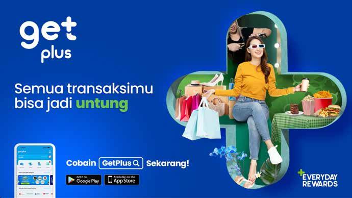
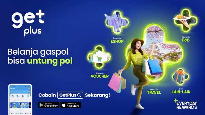
GetPlus ( Djarum Group )
Startup Digital Application (Loyalty Program)
Creative Designer
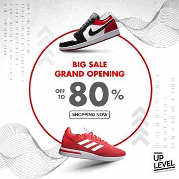
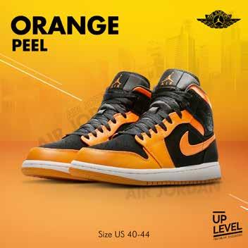
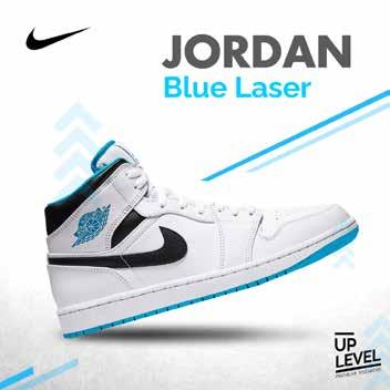
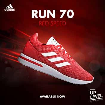
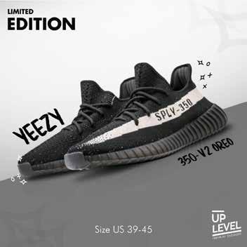
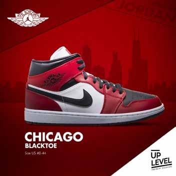
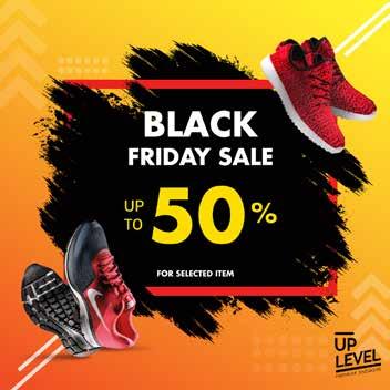
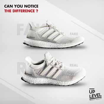
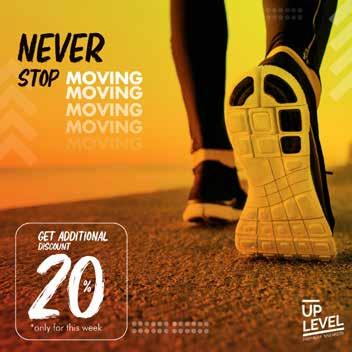
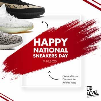
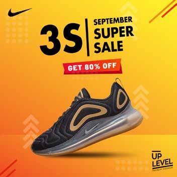
level up sneakers is my personal pitching project where I was asked to design a layout for their Instagram feed to make it looks clean dan premium . here I use a consistent color between white, red and orange . and also follow the color of the shoes being advertised

For printing material
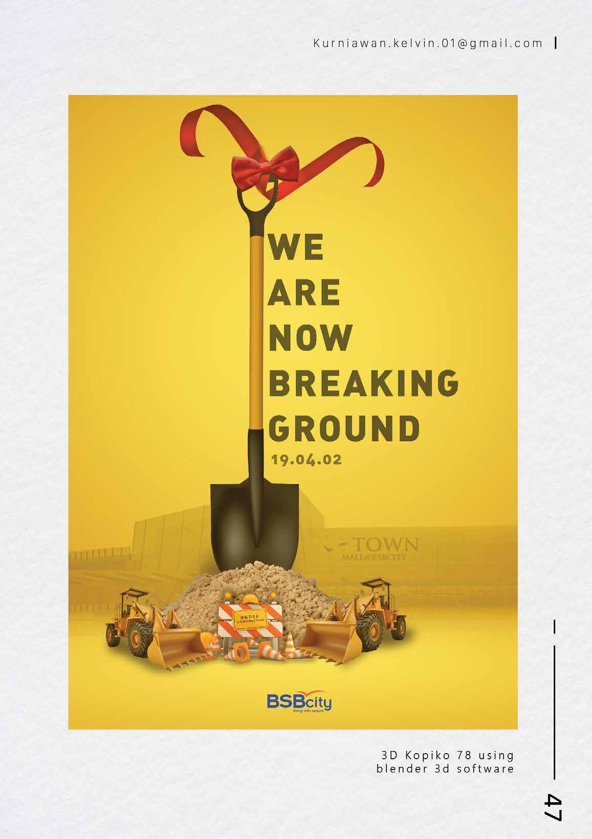
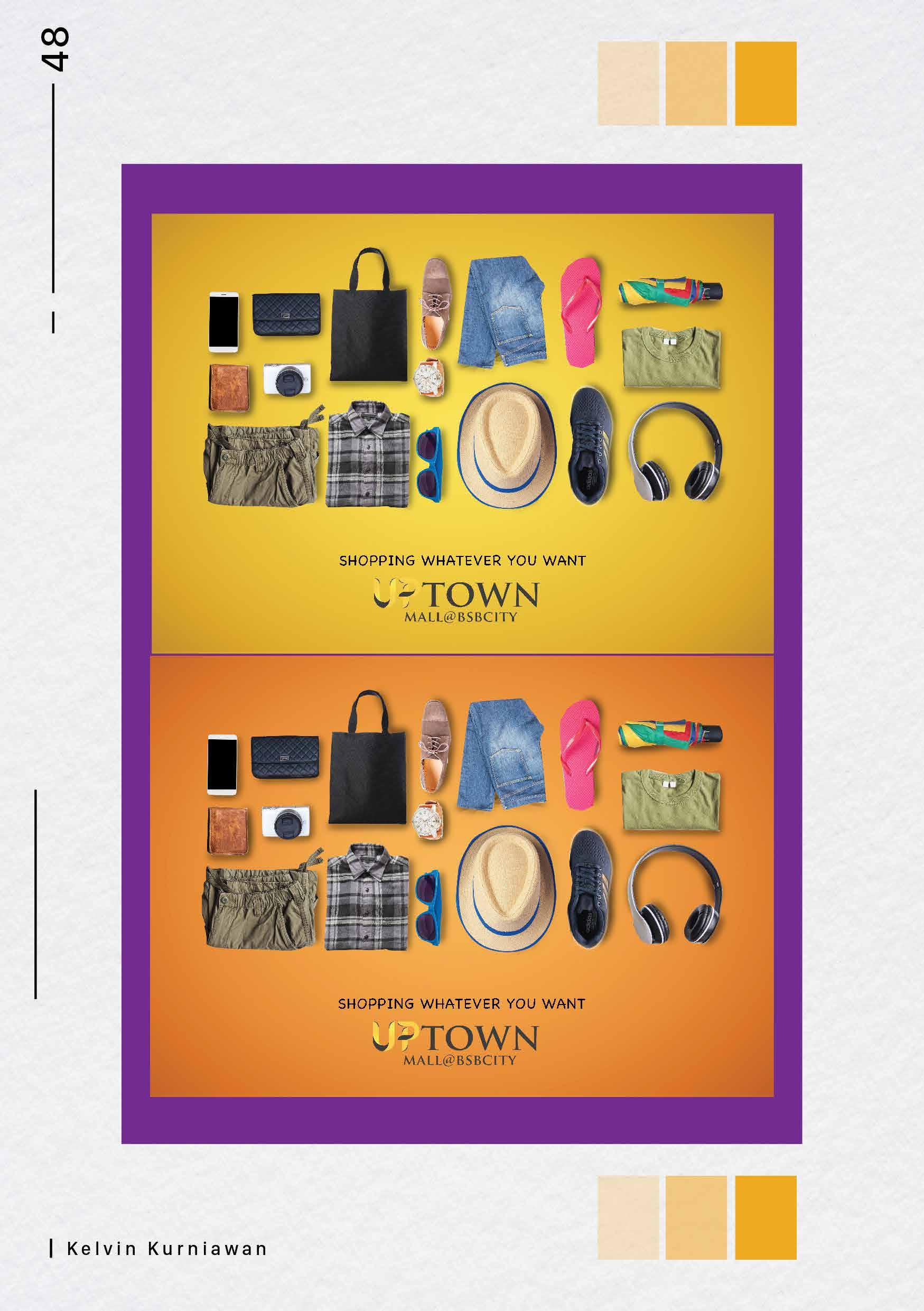
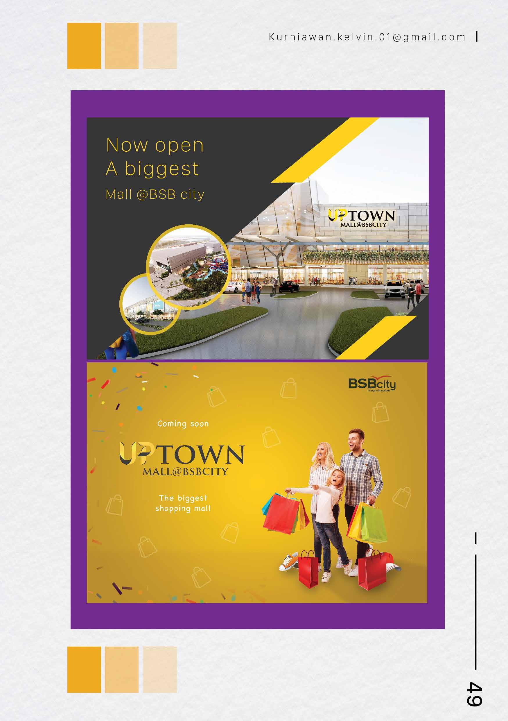
BSB City is a project that I worked on while at Violad Creative agency.. here I handle the needs for the promotion of a mall that will soon open in Malang City in the next few years. The main color for this design is yellow and contrast
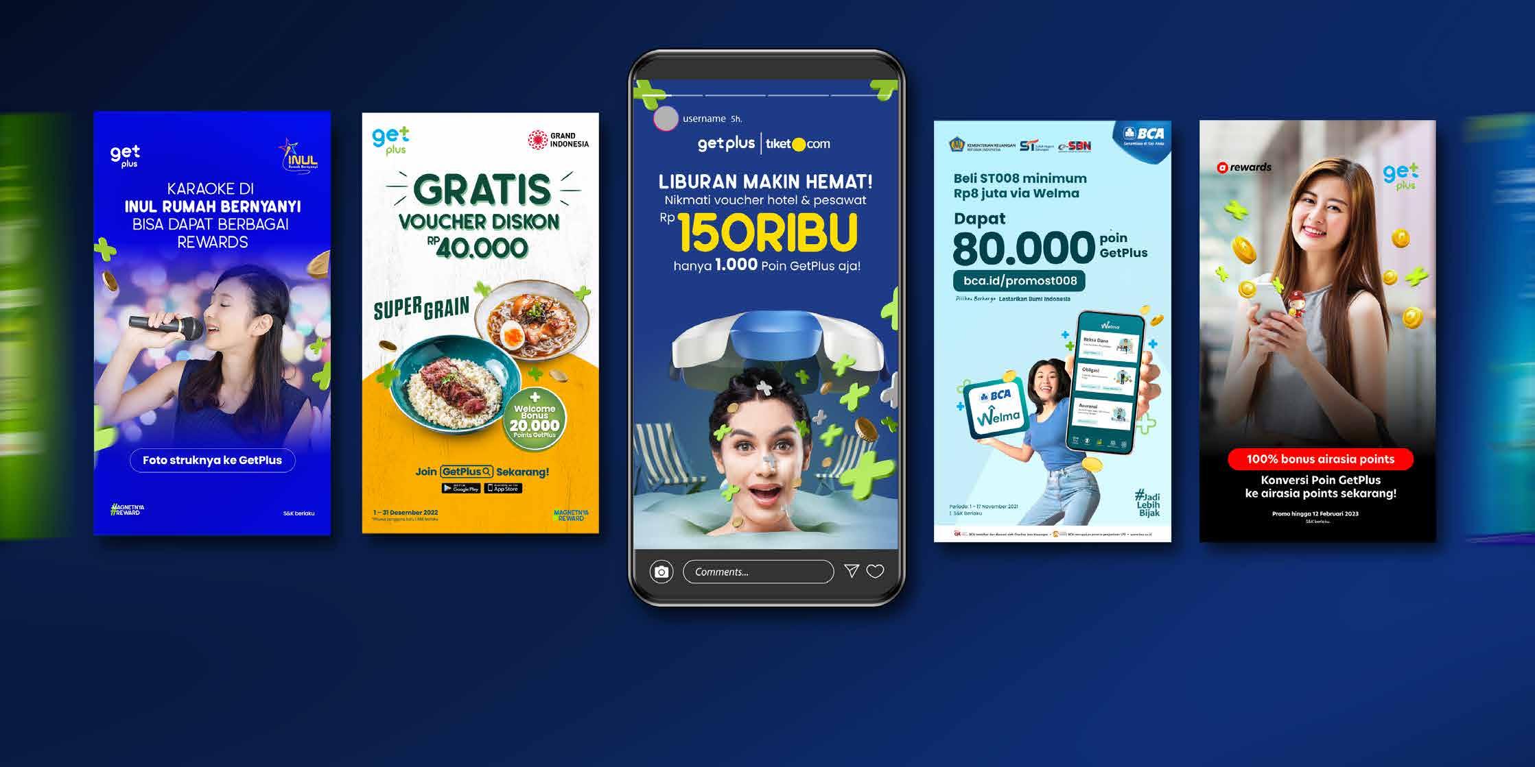
These are some of the key visuals that I worked on for several brand partners such as tiket.com, Air Asia and also BCA in collaboration with GetPlus.. I made some adjustments to the design style so that it was in accordance with the brand guidelines of each brand.
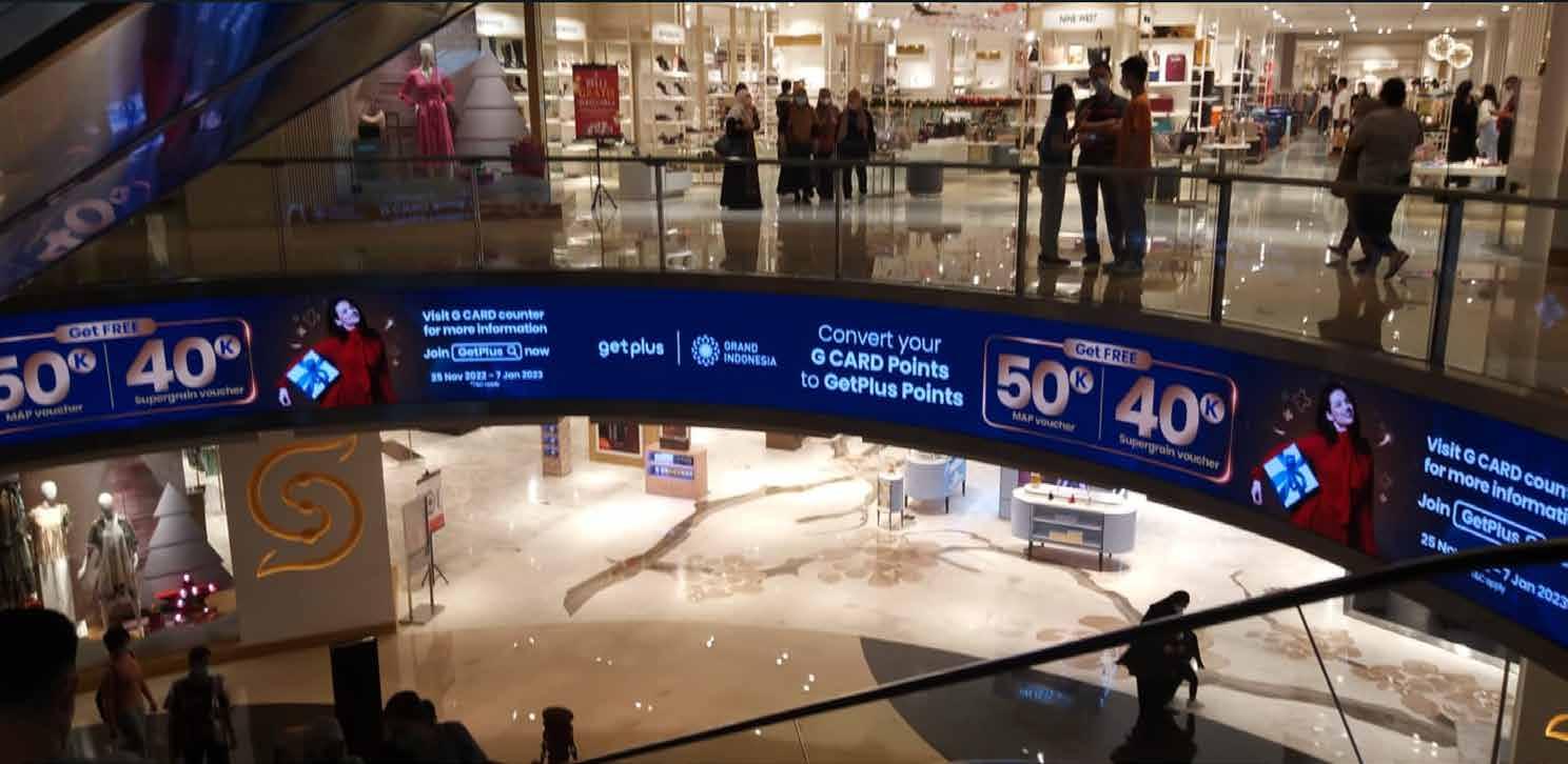
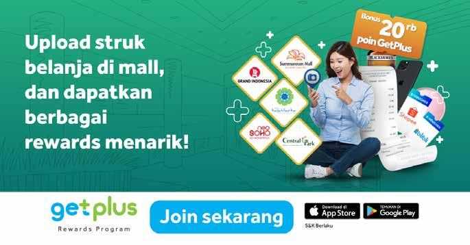
I am also working on a design for cooperation between Getplus and Grand Indonesia Mall. Where the design is displayed at the Grand Indonesia Mall LED for a certain period. In this design I have to adapt to Grand Indonesia's key visual style which is more luxurious

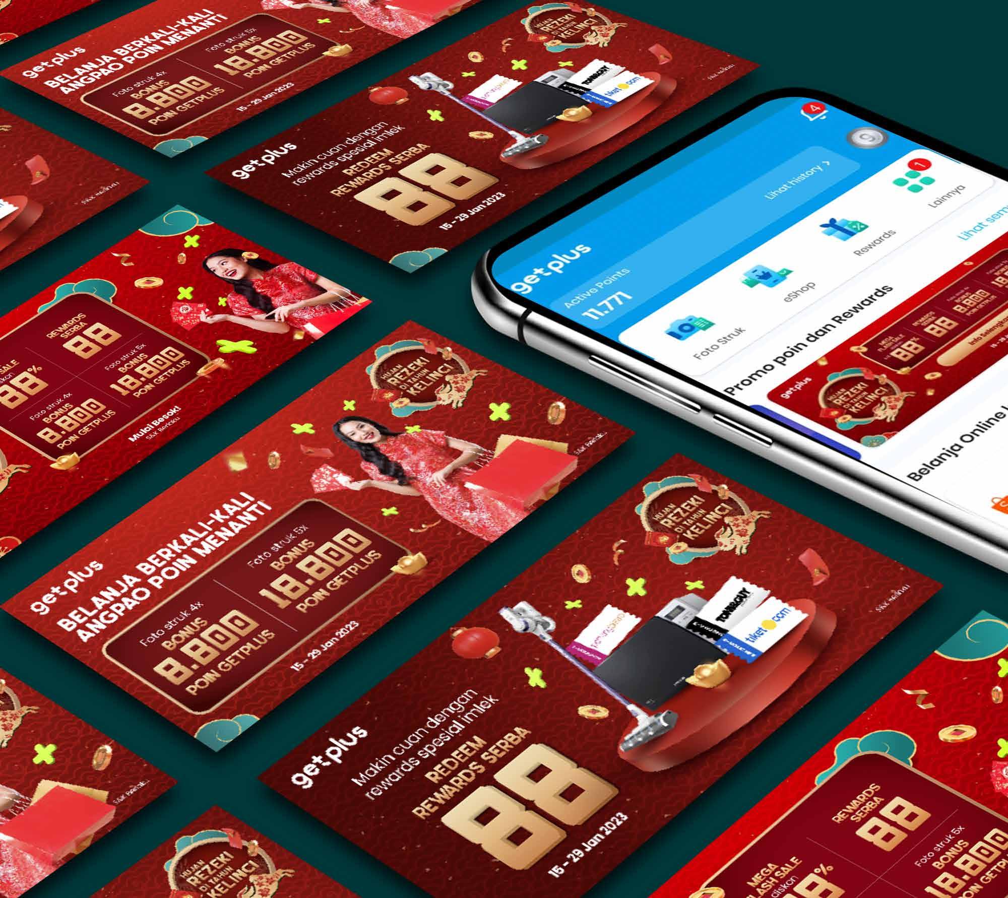
In the Chinese New Year 2023 campaign, I worked on the main key visual. where the design style is red with various ornaments. I worked on everything from the campaign logo to editing the model photos which were previously done by a team of photographers who worked freelance for getplus. and the main output for this campaign is displayed on the getplus application and its various derivatives
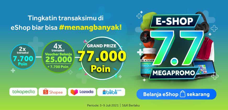
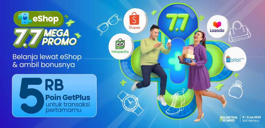
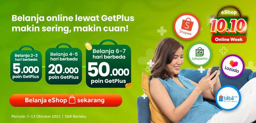
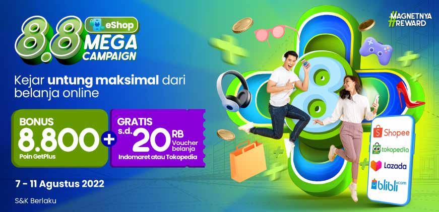

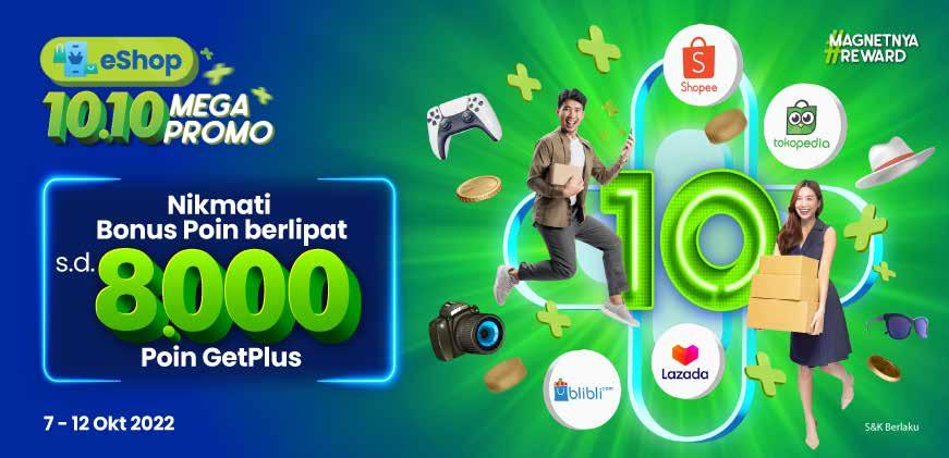

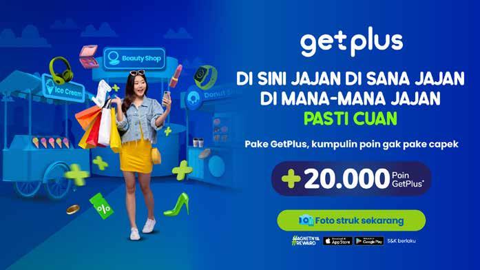
This campaign is a must getplus monthly campaign on every twin date like 7.7 8.8 9.9 . where to invite people to shop online through getplus..here I work on various design ideas according to the directions from the results of meetings with the marketing manager and art director
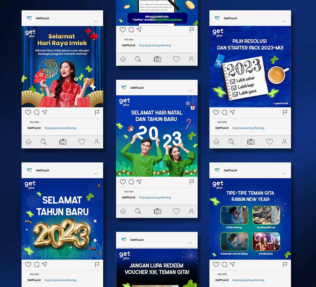
These are some of the instagram feeds that I worked on at getplus..the style for social media getplus itself is more towards navy blue with various ornaments plus

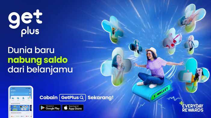
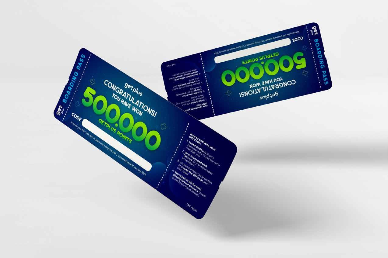
Paid ads are useful for encouraging new users to download GetPlus. These are some of the paid ads designs that have been running.
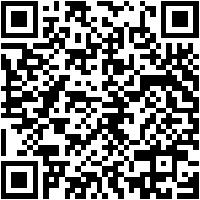
To see the
motion-animated version. can be scanned here
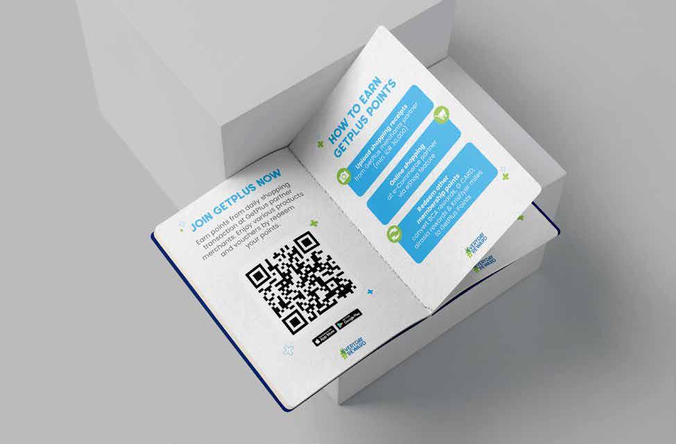
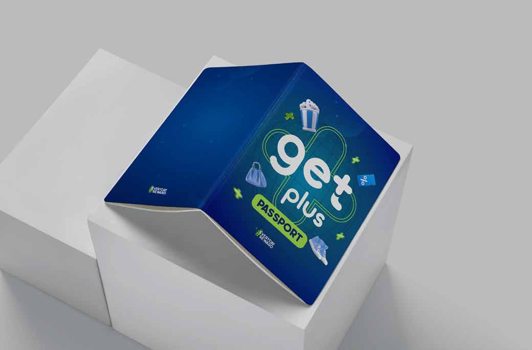
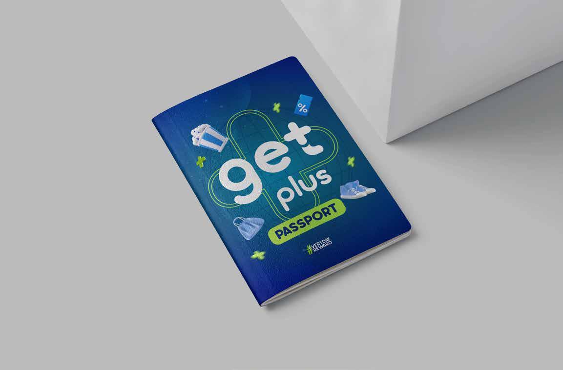
The introduction book is useful for informing new users about GetPlus, starting from how to download it to the benefits.
here the concept is a passport book that is distributed to people who are in the mall/getplus booth in the mall.
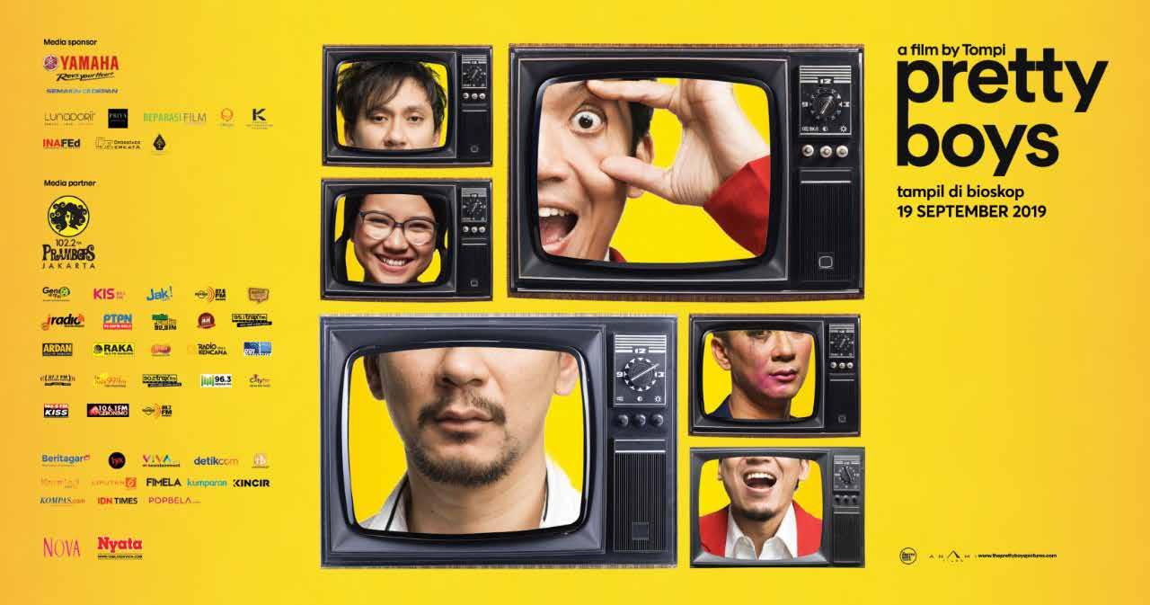
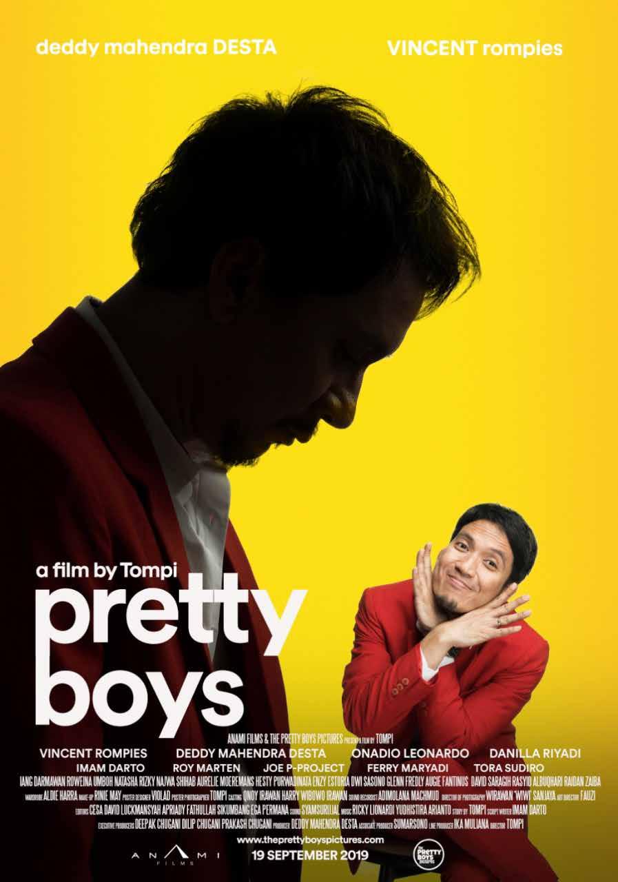
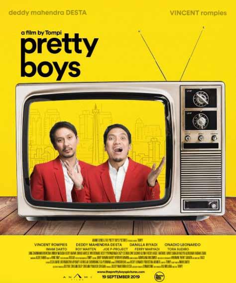
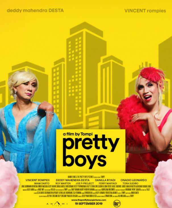
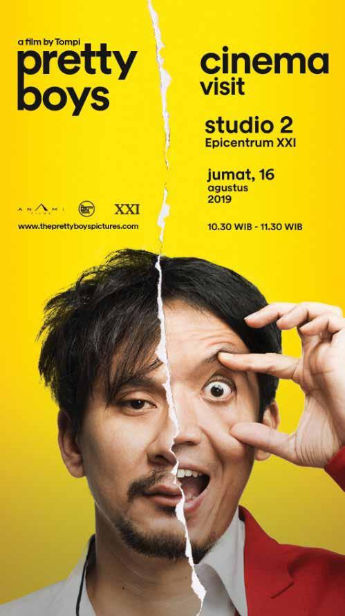
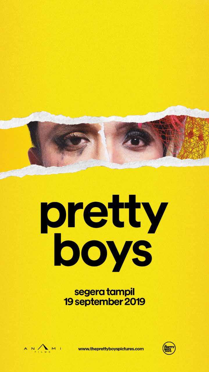
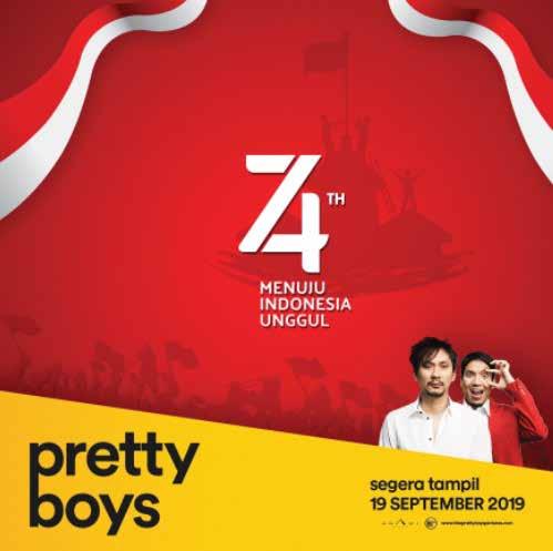
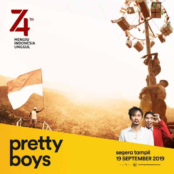
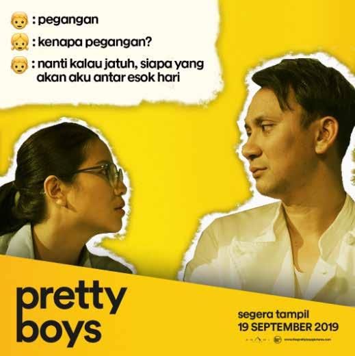
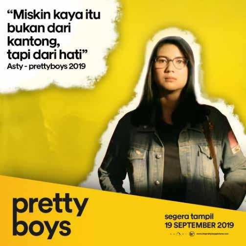
pretty boys is Movie project in 2019 the work that I did while I was at Violad Creative Agency. In this project, I worked on designs for derivative and alternative movie posters.

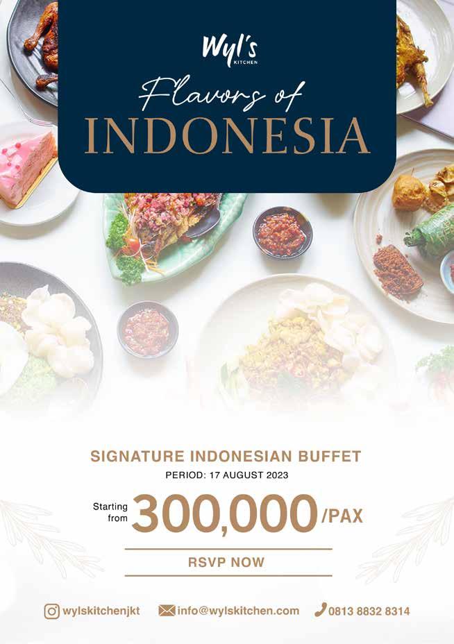
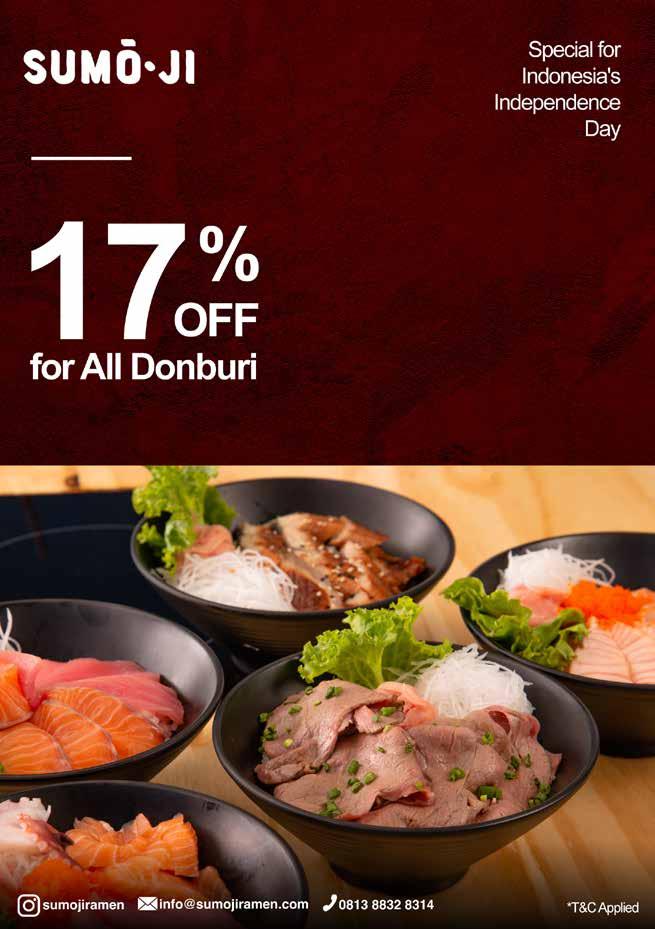
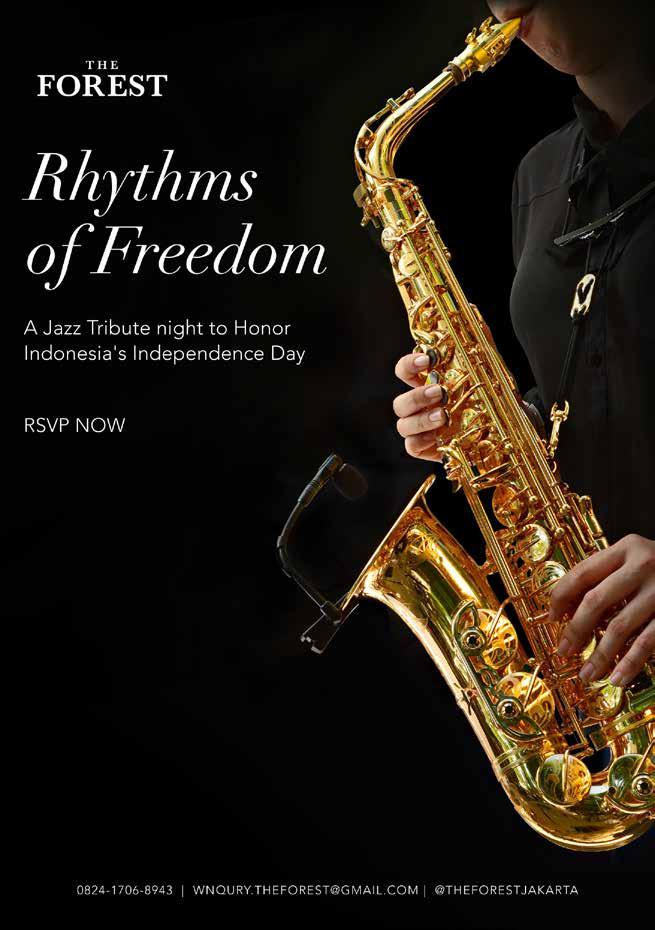
Here are some previews of F&B projects I've done: Wyls Kitchen, Sumoji, and The Forest. Wyls Kitchen is an Indonesian fine dining themed restaurant, so I designed the key visual to look clean and luxurious. Then, Sumoji is a Japanese themed restaurant, so I created the key visual with a dominant background of red, as red symbolizes Japan. The Forest is a luxury themed bar, so I designed the key visual to look clean, luxurious, and black.

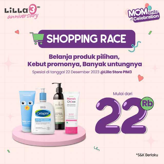
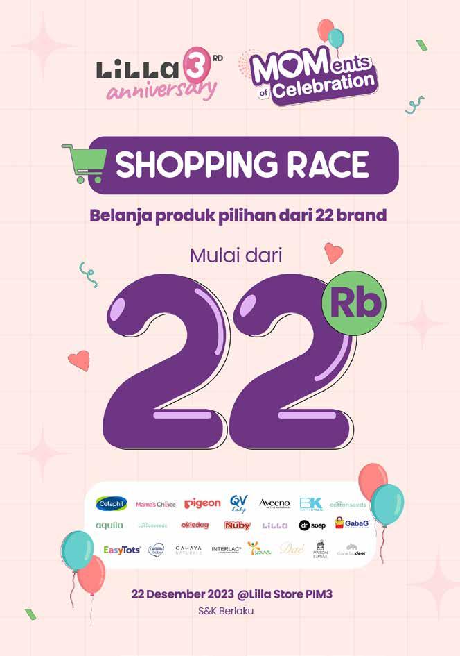
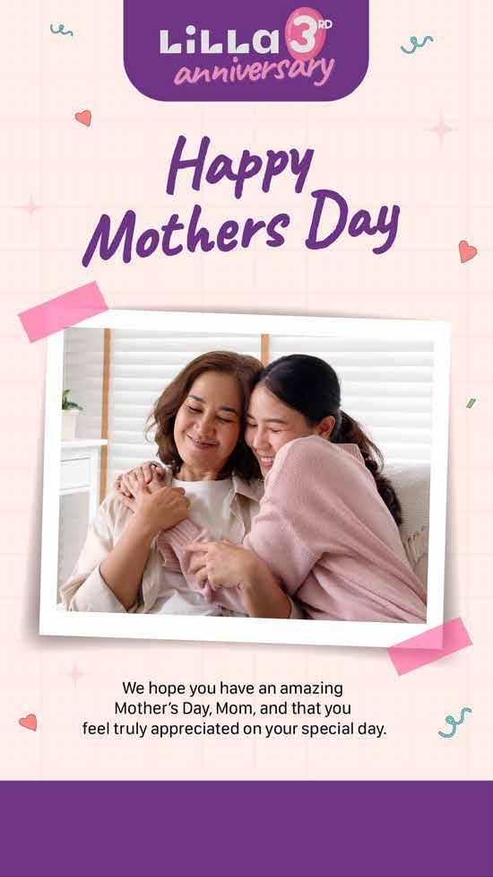
Lilla is a brand for pregnant and breastfeeding mothers. The products range from skincare to necessities pregnant and breastfeeding mothers. Here I made a design starting from the anniversary logo, main banner down to its social media derivatives
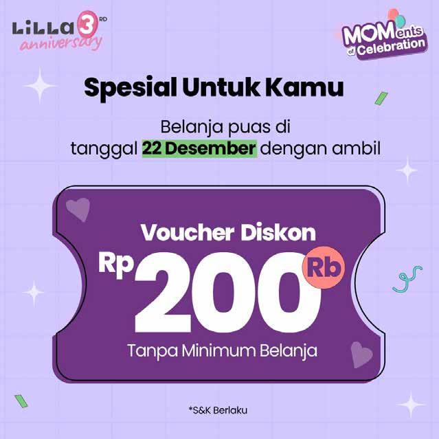
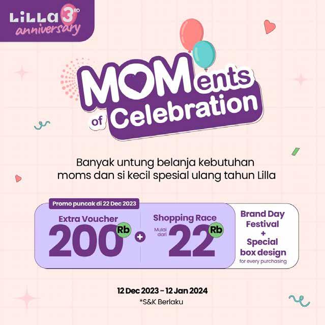


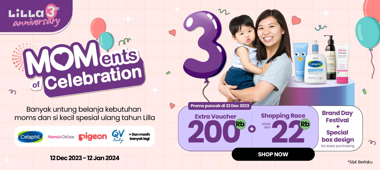

The key visual that I offer aims to convey the impressions of the keywords red, fun, and playful. Therefore, I use a style like the following and many design ornaments such as confetti, balloons, etc. I also create a logo type for the birthday logo so that it can be used in various derivative campaigns.


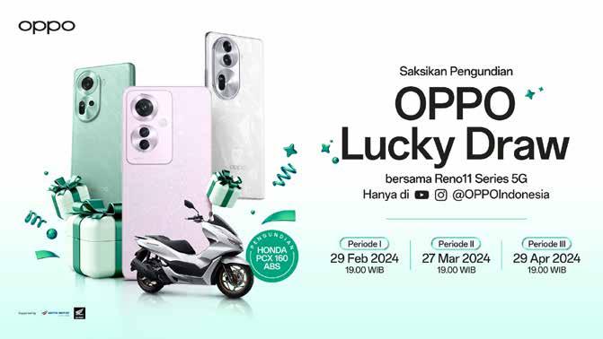
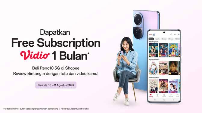
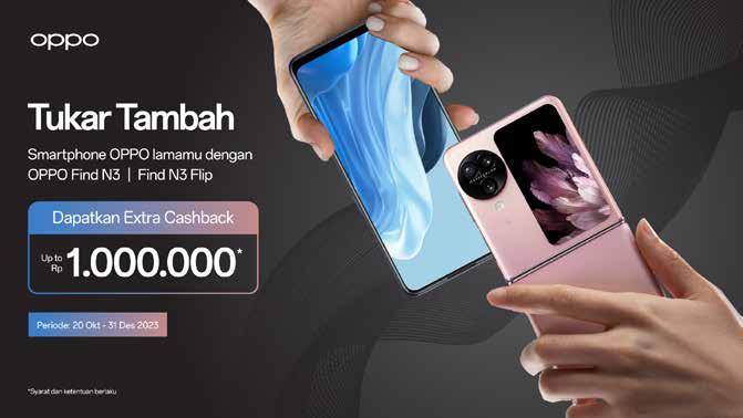
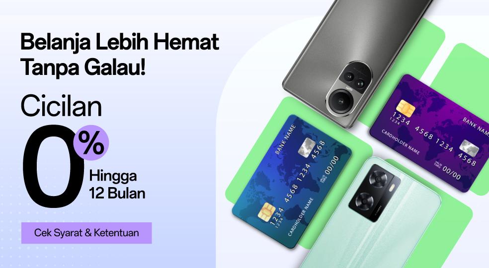
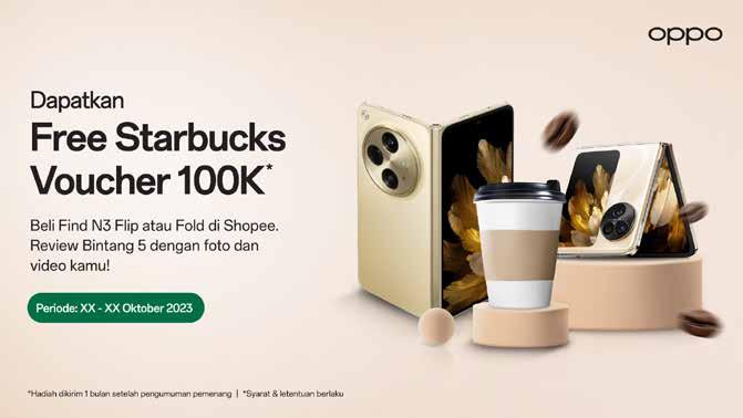
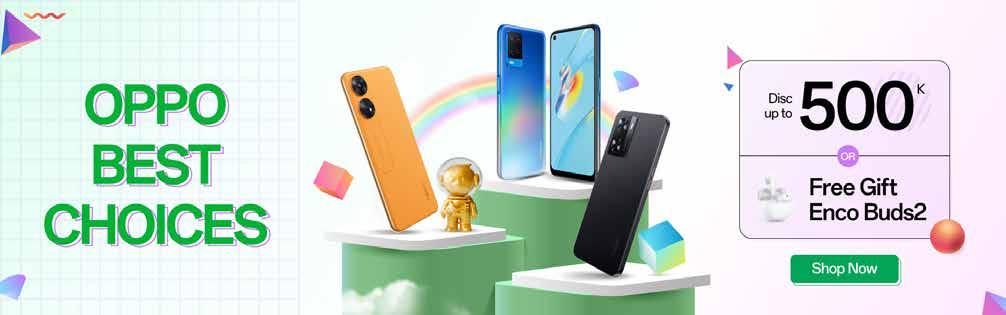
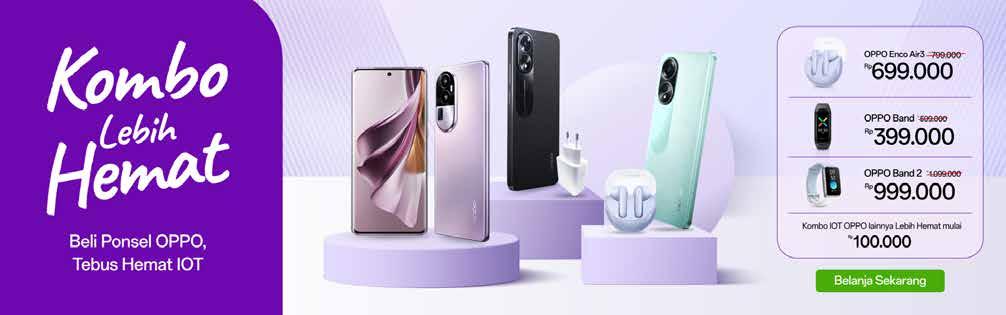
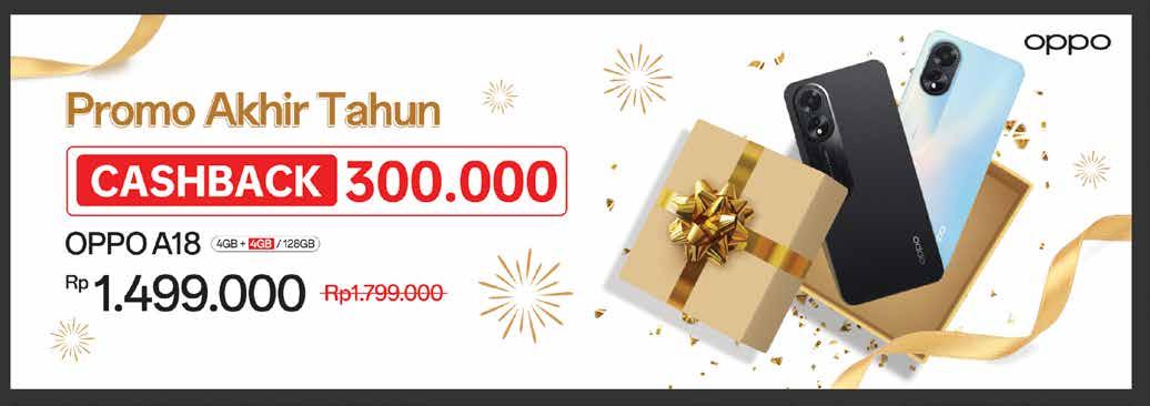
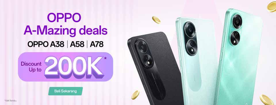
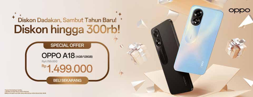
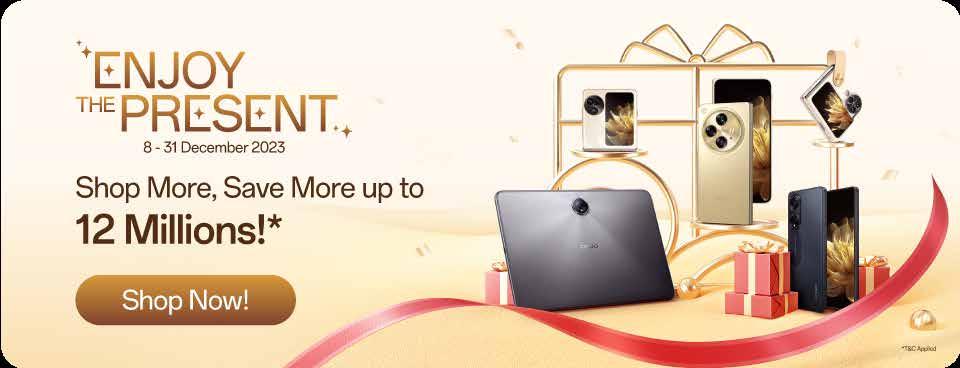
Oppo is a well-known cellphone brand, and here I showcase various key visual promotions and campaigns that I've worked on, starting from lucky draws for every cellphone purchase up to cellphone exchanges.
This campaign has primarily appeared in e-commerce, but there are also some derivatives on social media and displayed on the website

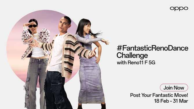


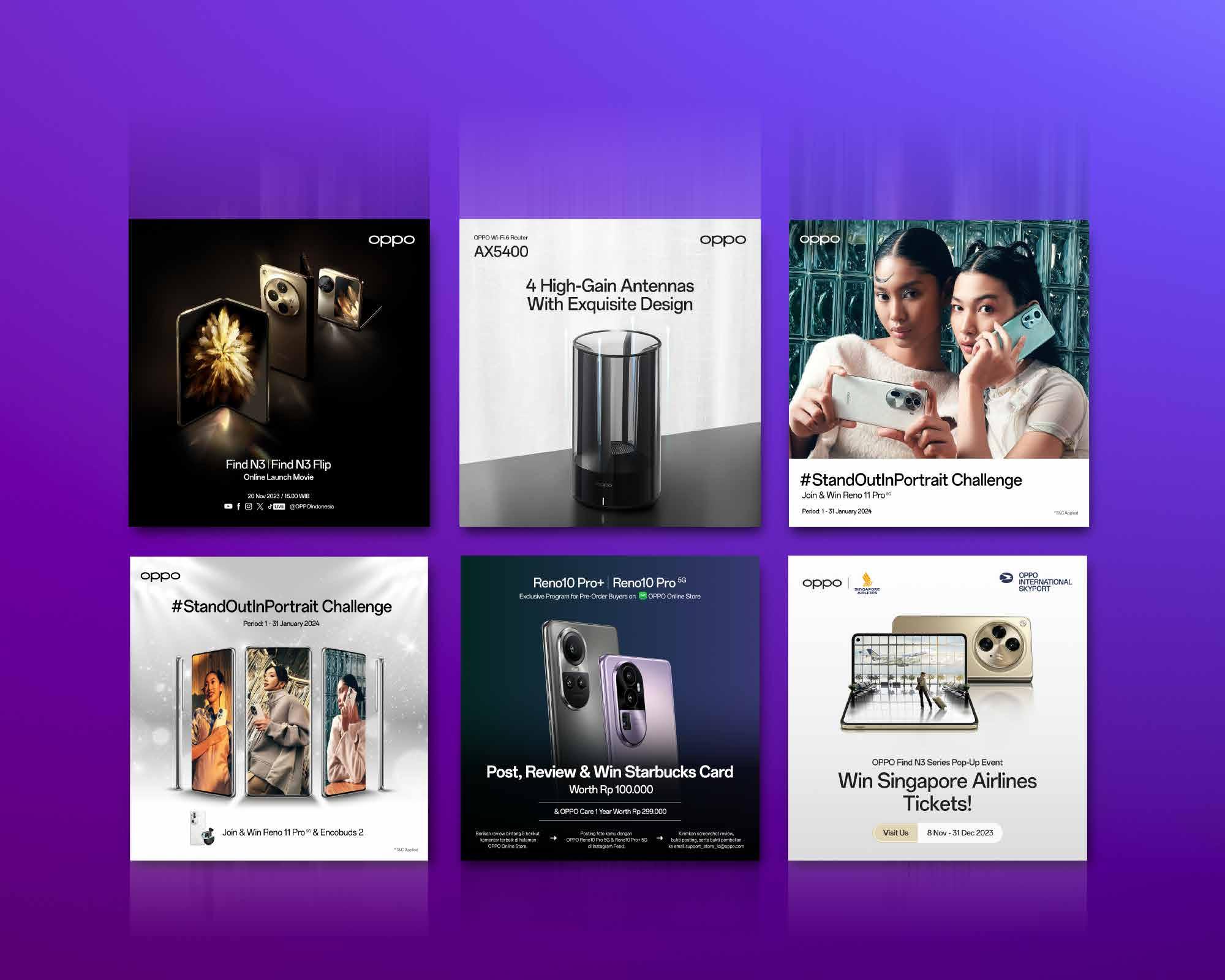
Oppo's social media also has many unique campaigns outside of the website and e-commerce. Here, I help design several appearances for its social media feed. Oppo's social media itself has a clean and luxurious appearance, so I adapt accordingly.
A COLLECTION OF SELECTED WORKS
User Interface layout + Creative promotion material
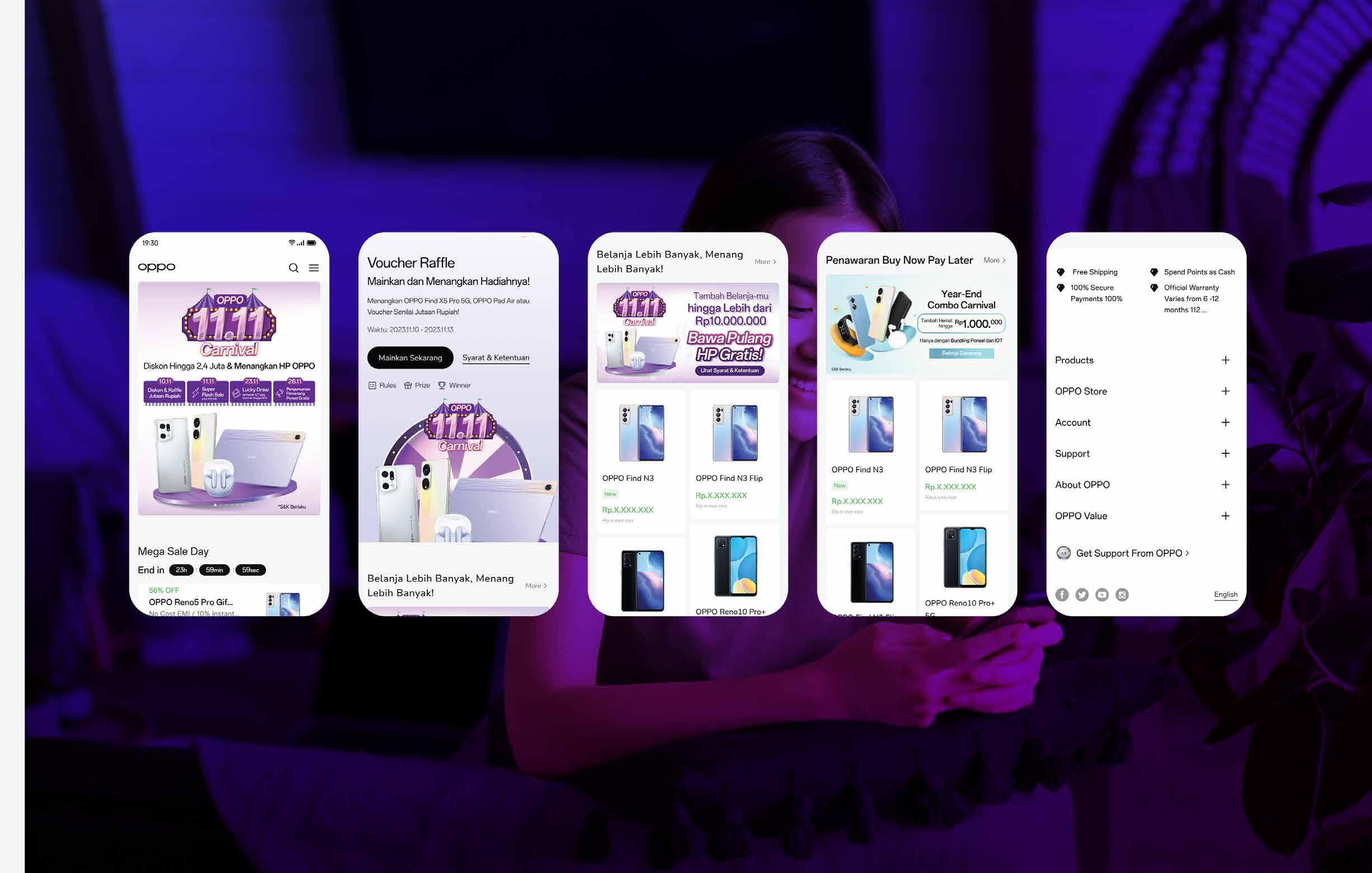
These are some UI Design projects that I worked on at OPPO. I take the example, making a landing page for the OPPO Online store... here I made it from the banner, layout to product display ideas

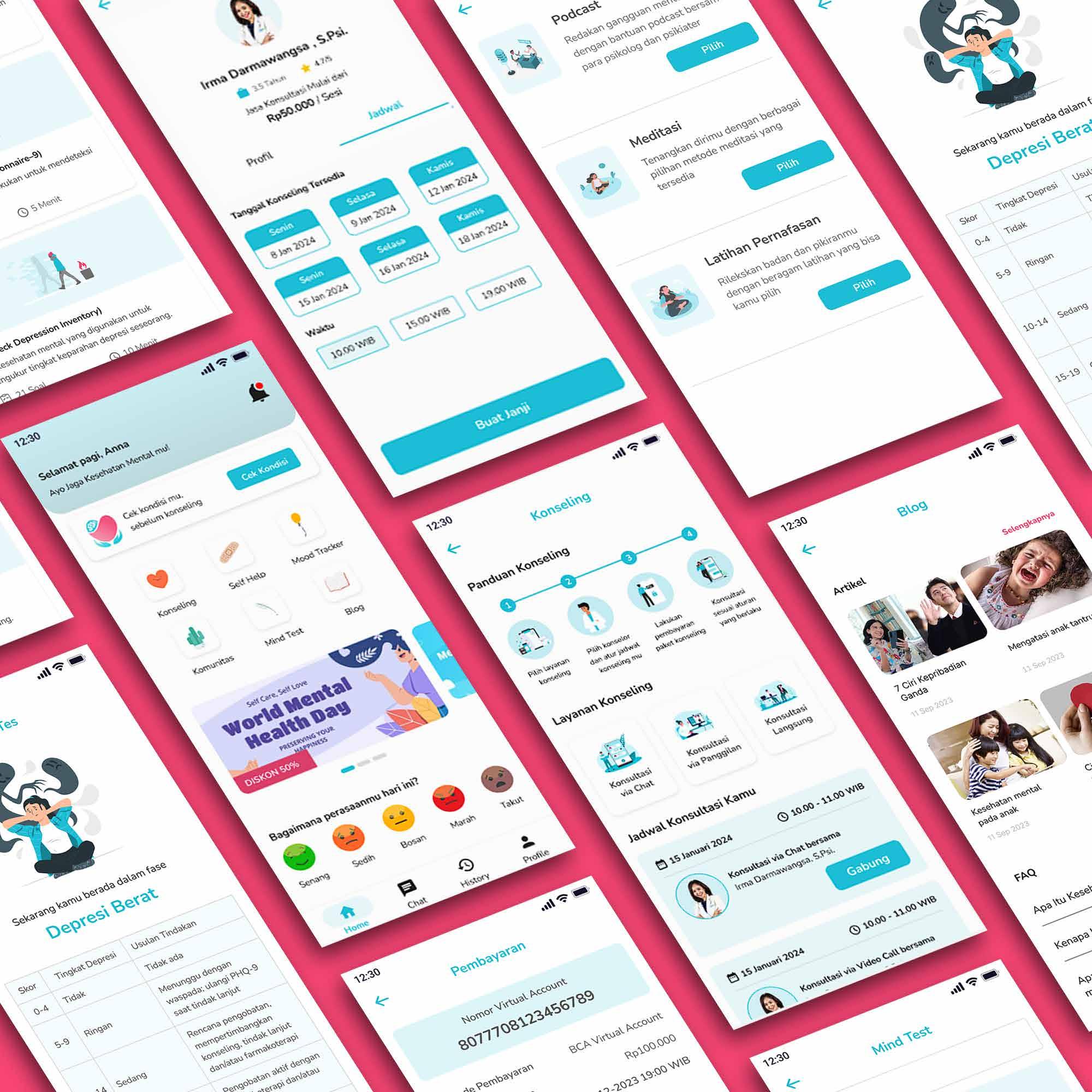
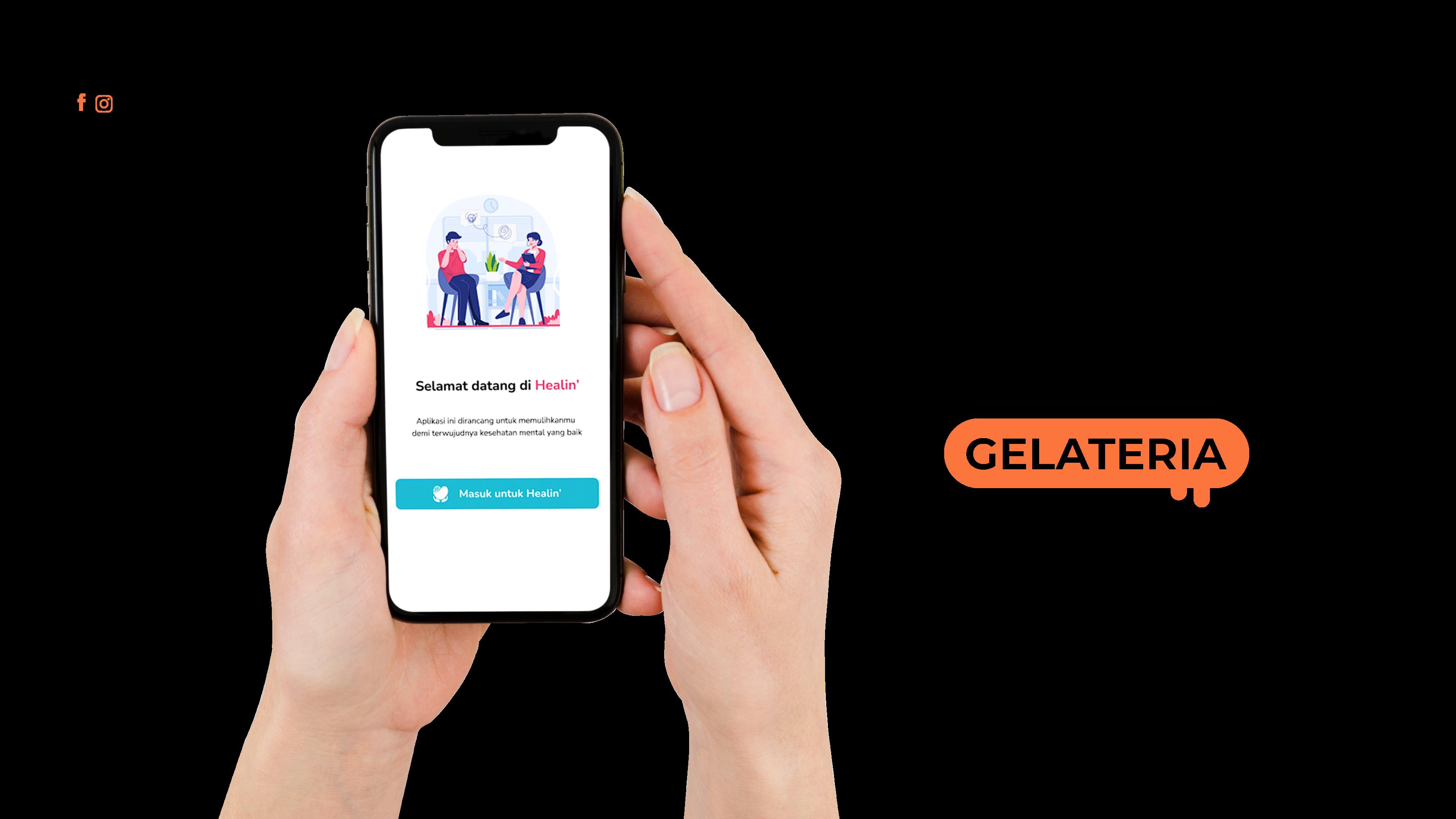


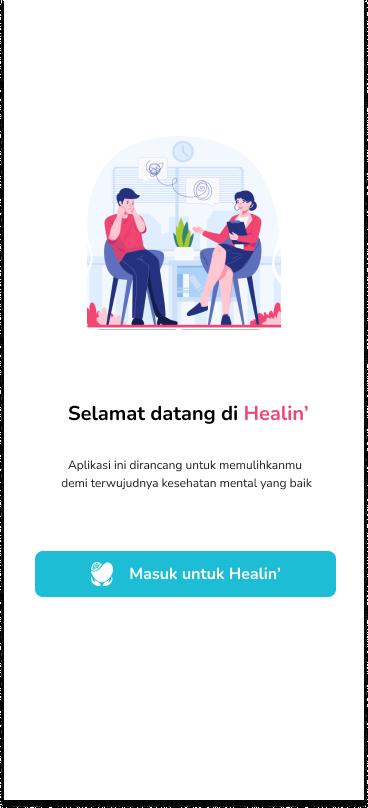
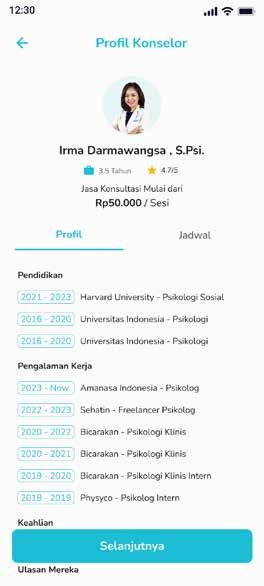
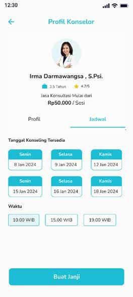
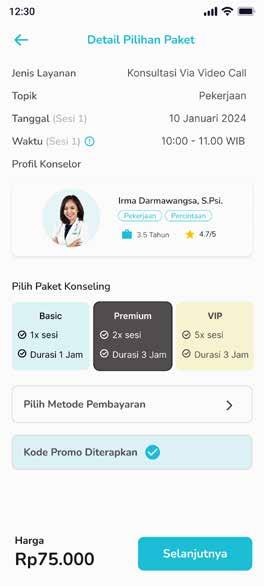
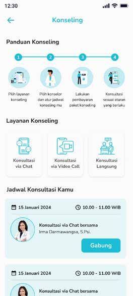
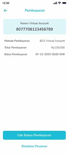
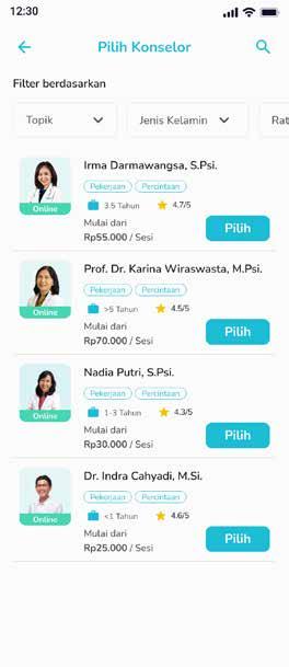
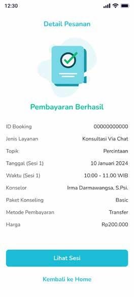
Here are the results of the UI Design I did it starting from the login page directed towards selecting a counselor, look at the counselor's schedule until the checkout process is made follow brand guidelines is on the previous page


farmaku.com is where
farmaku.com is where
I worked before getplus. this is an ecommerce startup for health and beauty products. the visual style for key visual is simpler and cleaner because it is more related to health. However, sometimes a festive style is also needed for certain campaigns
I worked before getplus. this is an ecommerce startup for health and beauty products. the visual style for key visual is simpler and cleaner because it is more related to health. However, sometimes a festive style is also needed for certain campaigns
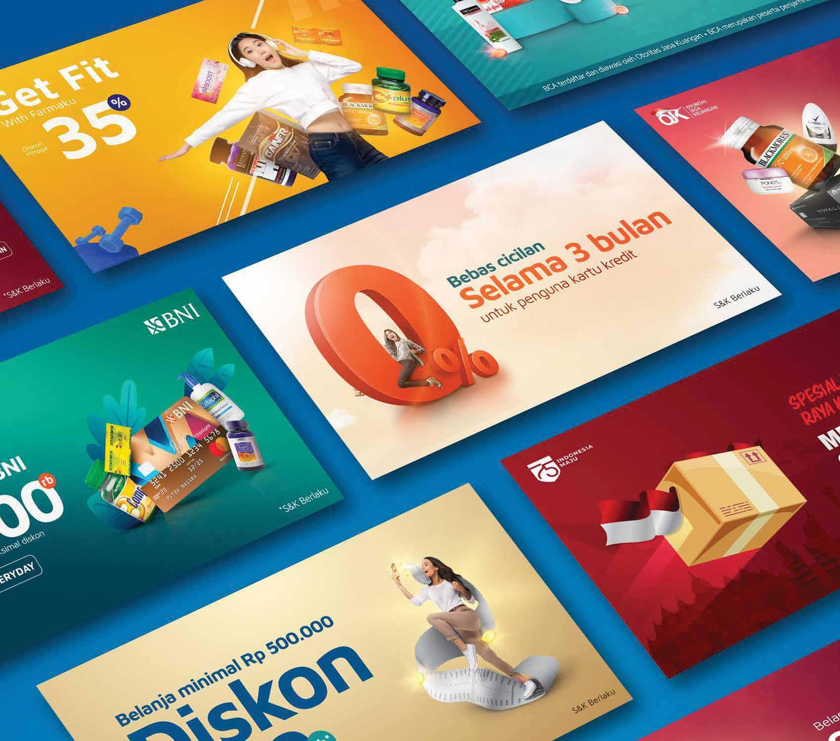
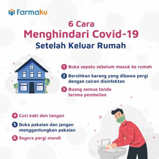
at farmaku.com
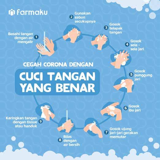
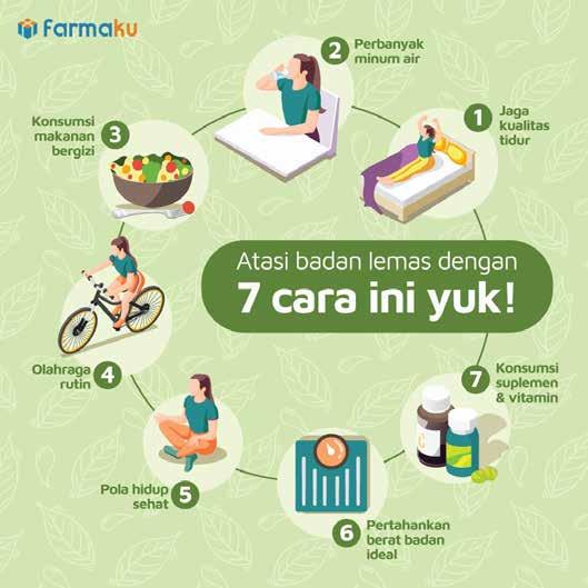
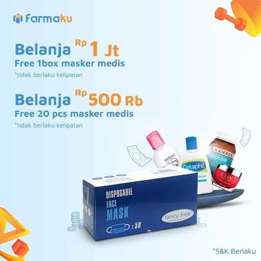
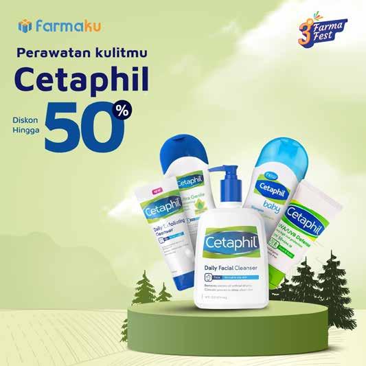
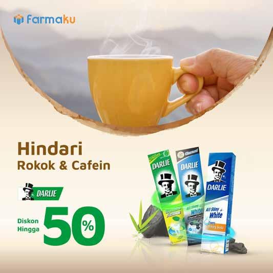
I also handle the design for the social media. starting from derivative campaigns, to infographics the style and mood used tend to use soft colors towards pastels. and in terms of images other than infographics tend to display products
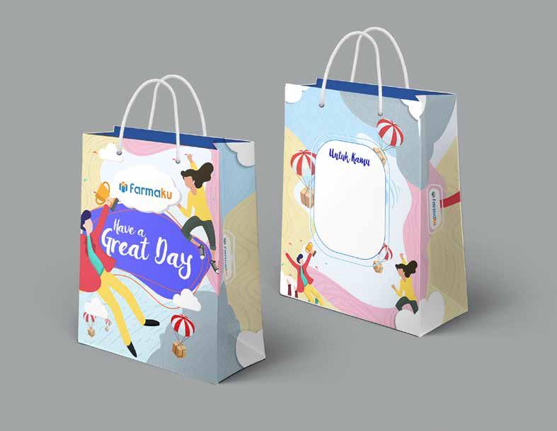
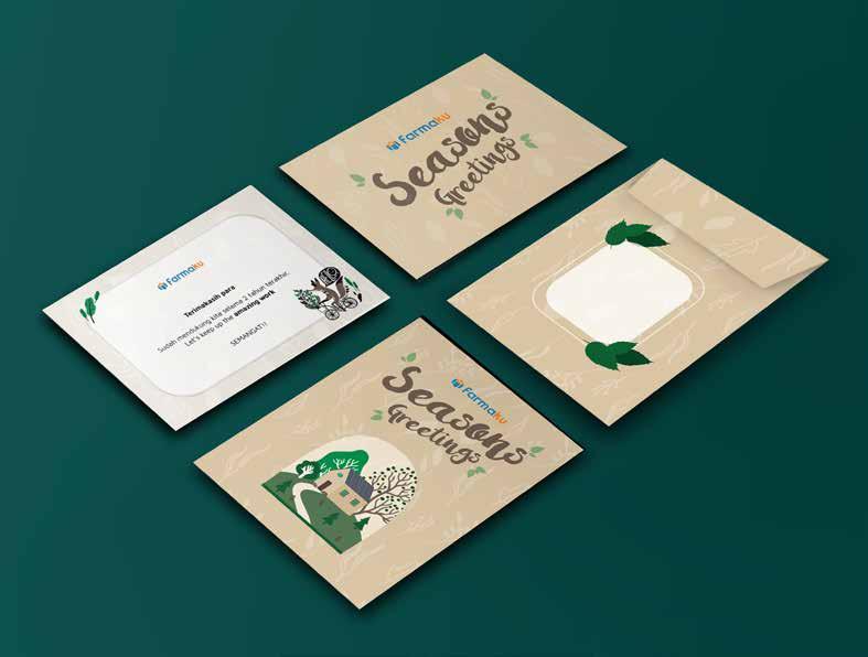
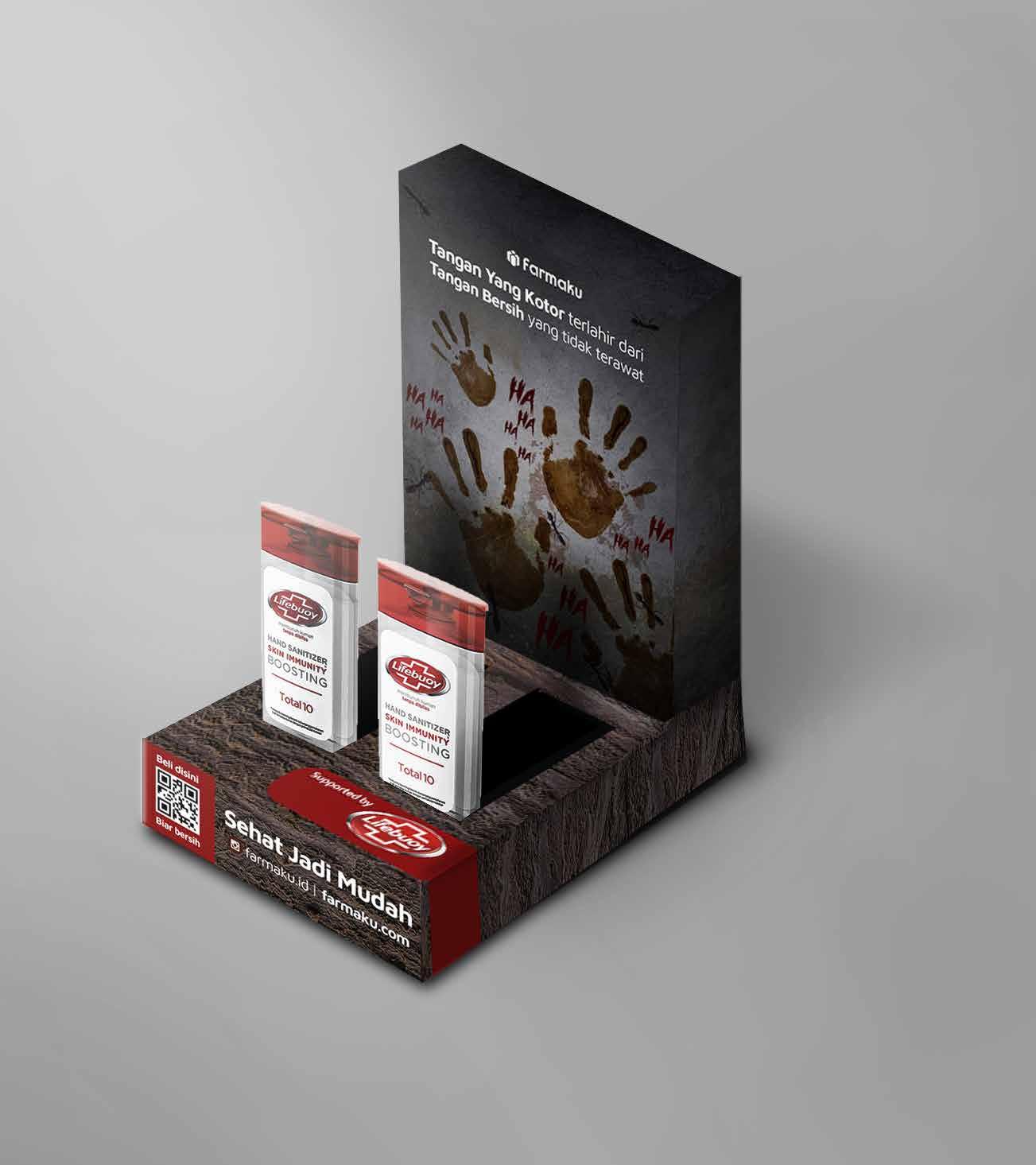
These are some designs for printing purposes. starting from paper bag designs for customers who shop in large quantities. thank you cards for customers, to designs for advertisements and hand sanitizer boxes in grab cars.. all based on my own idea and approval to the creative manager
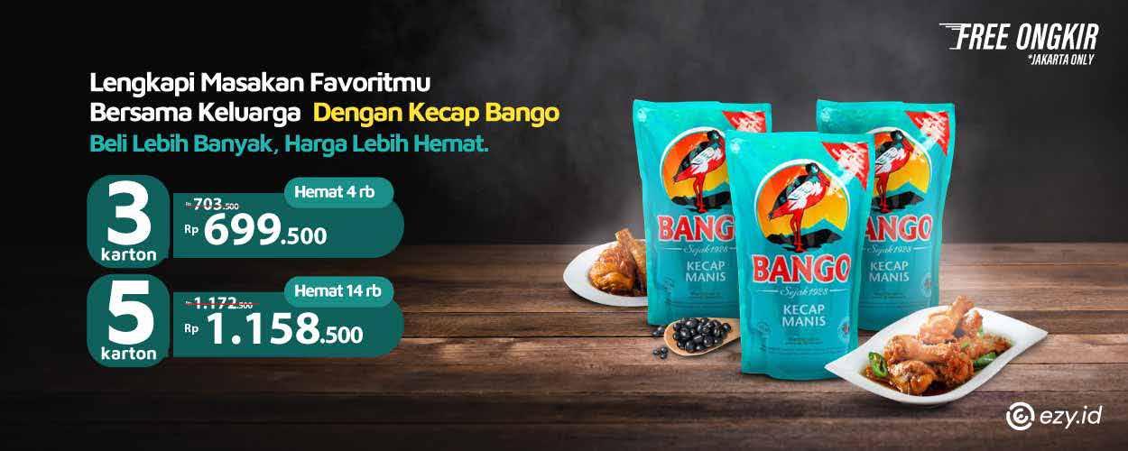
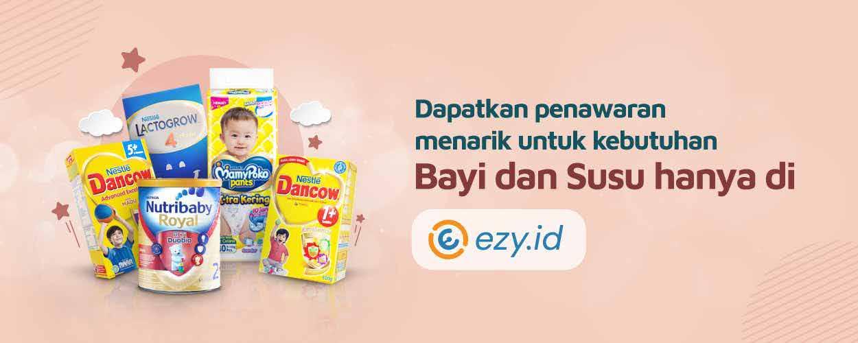
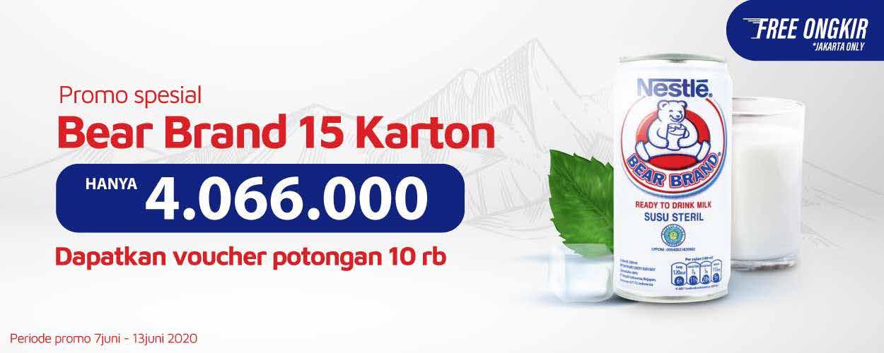
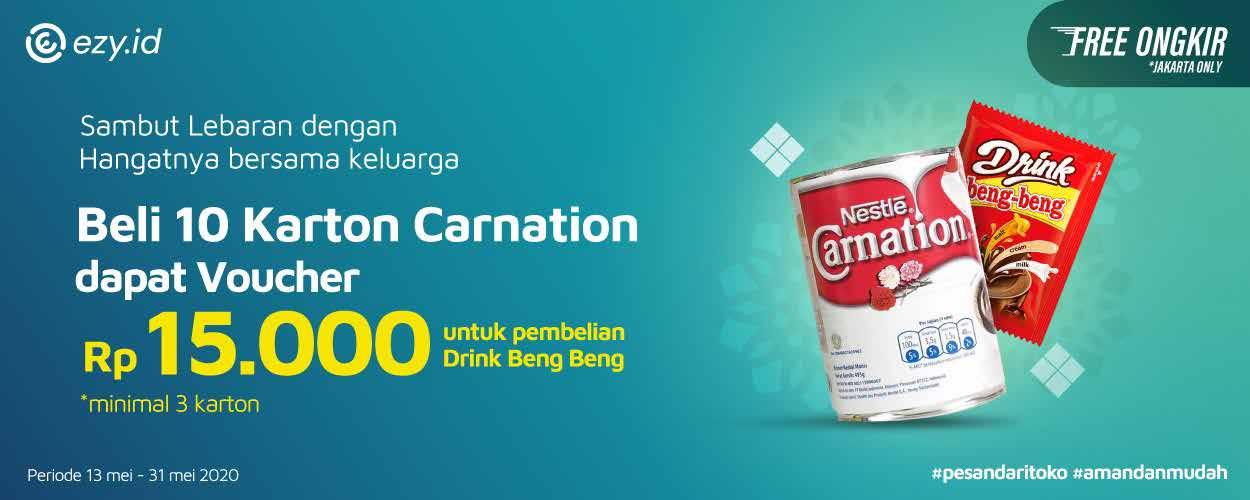
ezy id is a subsidiary of farmaku.com. which specifically handles the b2b segment. selling products in large quantities cheap price is the main attraction in every ezy.id campaign
In terms of style, it's almost the same as Farmaku. however, it has more varied and contrasting colors and is broad because the products offered are mostly in the form of daily necessitie
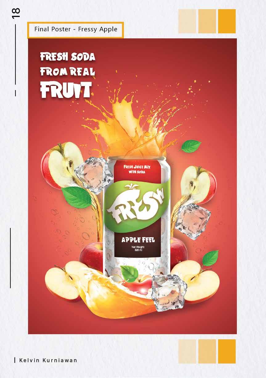
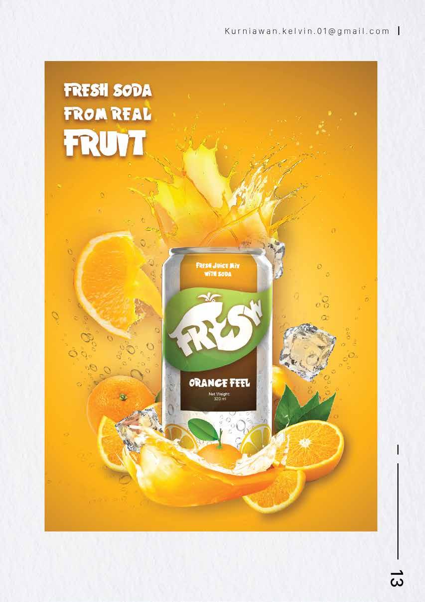
I worked on this project alone in about 3 months starting from the initial concept..typography.. 3d mockup until it was advertised in the form of a poster
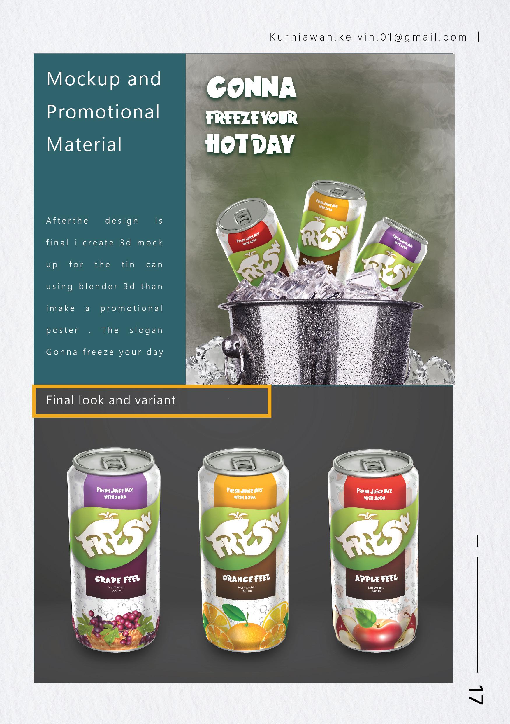
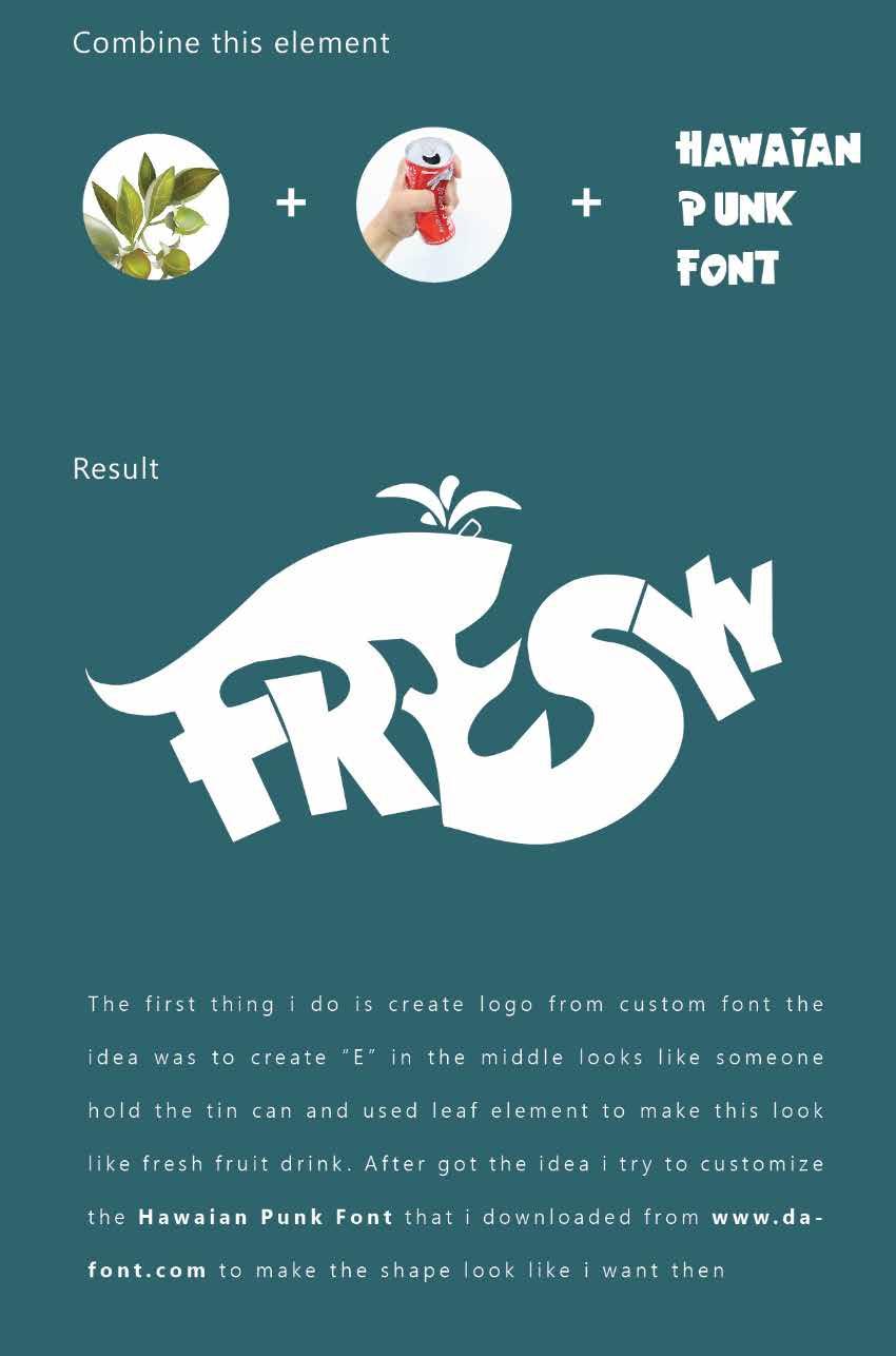
Fressy is a concept product for fruit juice drinks. This drink has 3 initial flavors. in this design I use contrasting and bright colors to show the impression that this fresh drink will make your day very excited... the target market for this drink is more children - adults so in terms of design language it tends to use a combination of styles illustrations and pictures of fruits
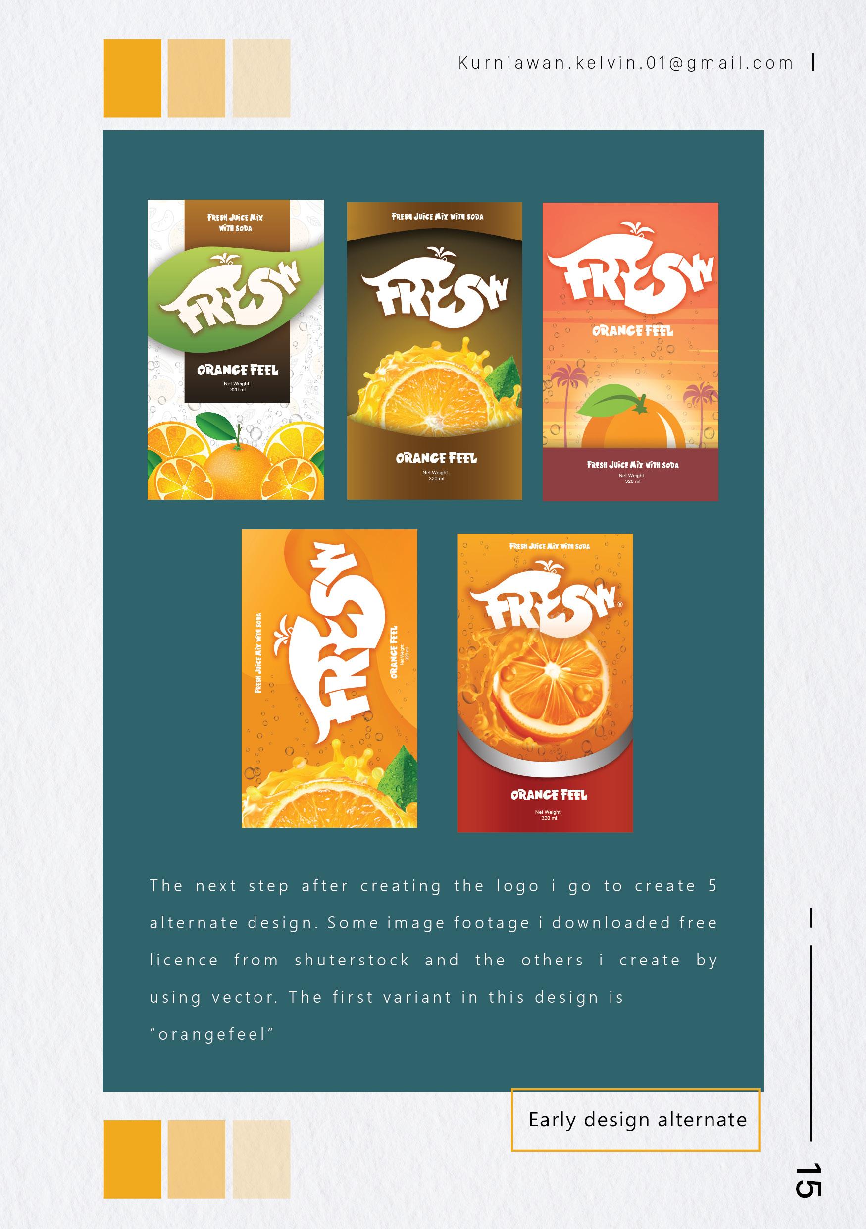
Alternatives

Key visual

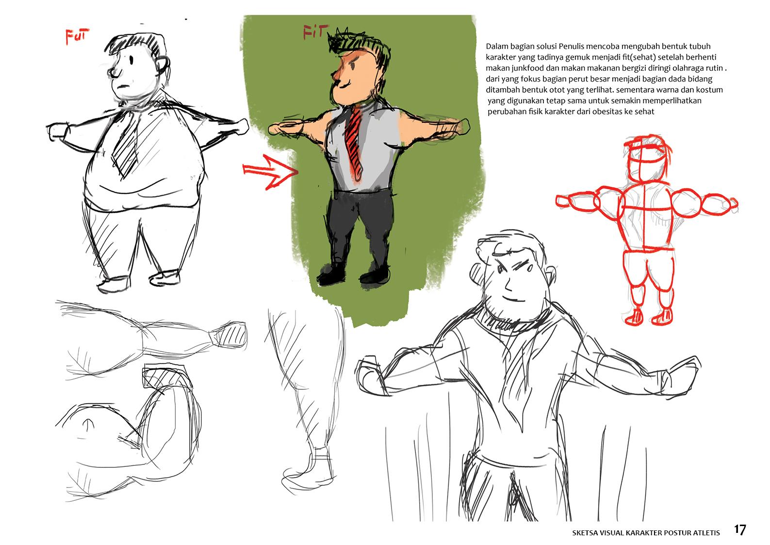
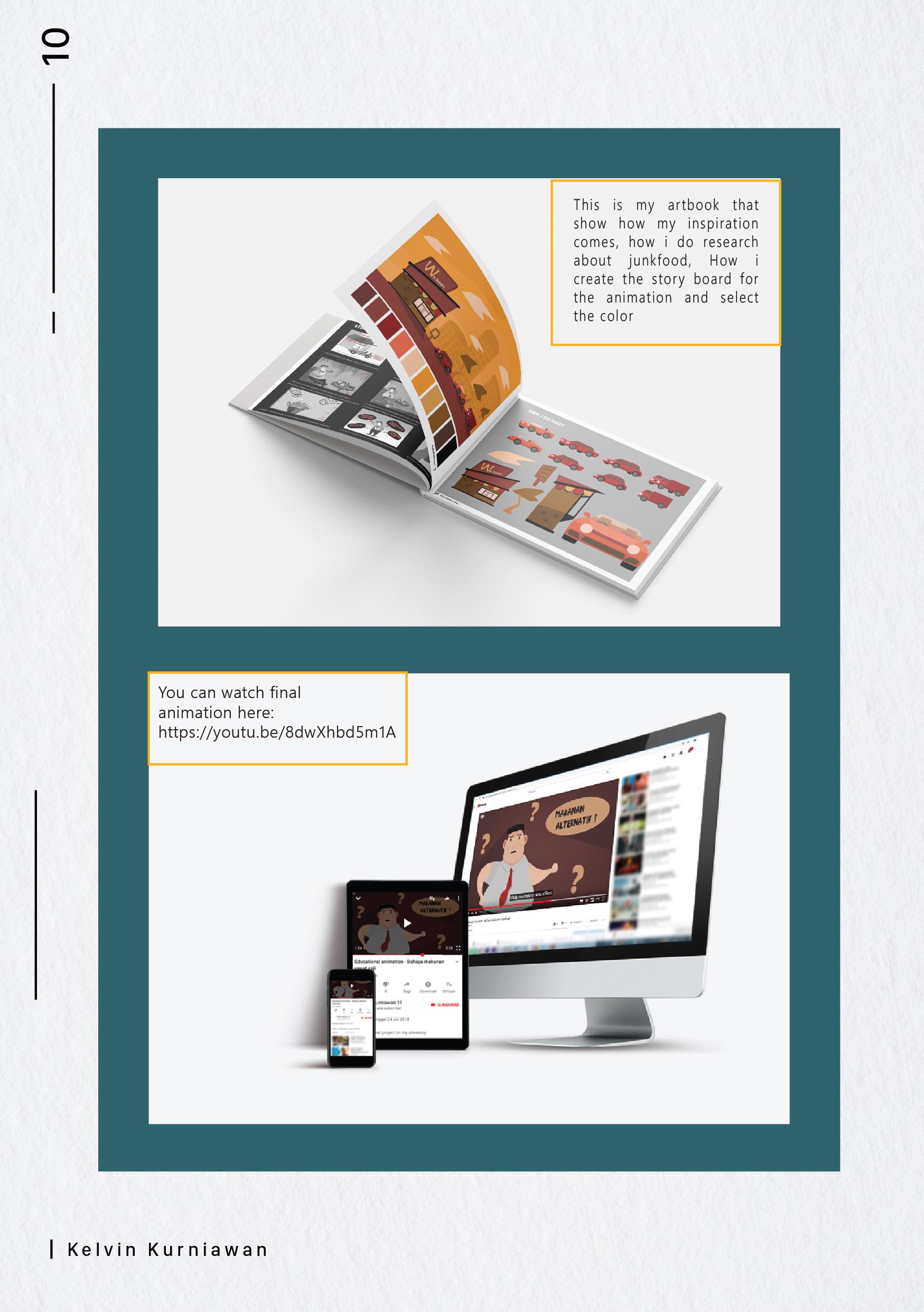
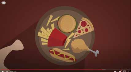
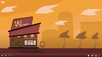
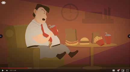
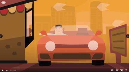
this campaign tells about how dangerous fast food is...from this campaign I worked on the whole visual.. starting from the concept. .character sketches to motion graphics
This is a project for my final assignment on campus as a graduation requirement. done by myself. it took about 3 months to work on the design from start to finish
Key visual
This character sketch is more intended for concept creation purposes. here I show the difference in the depiction of thin and fat characters. by using red and green as a differentiating background