KATHERINE WETTERGREN
UNDERGRADUATE ARCHITECTURE STUDENT
EMPLOYMENT HISTORY
NORDSTROM
CUSTOMER SERVICE SPECIALIST
CAMPCO DAY CAMPS
COUNSELOR
BRIZIO’S PIZZA
SHIFT MANAGER
EDUCATION
THOMAS JEFFERSON UNIVERSITY
BACHELOR OF ARCHITECTURE
AWARDS
THOMAS JEFFERSON
UNIVERSITY DEAN’S LIST
EL TORO HIGH SCHOOL
HONORABLE STUDENT
AWARD
SKILLS
AUTO CAD
REVIT
RHINO 7
ENSCAPE
ADOBE PHOTOSHOP
ADOBE ILLUSTRATOR
ADOBE INDESIGN
3D PRINTING
PHYSICAL MODELING
HAND DRAFTING
EXCEL
2023- PRESENT
2020- 2022
2020- 2022
2022- PRESENT

STAY CONNECTED

www.linkedin.com/in/katie-wettergren

kgwettergren@gmail.com
(734) 308-6153
ABOUT ME
I am excited to find an architectural internship this summer. Utilizing my three years of architecture knowledge of architecture for real world applications is an exciting prospect for me. I’m ready to take the next step forward, to become a better, well rounded architecture student. I am proficient in Auto Cad, Revit, Rhino 7, Enscape, Adobe Photoshop, Adobe Indesign and Adobe Illustrator, as well as hand drafting, physical modeling and 3D printing.
I pride myself on my time management and design skills as well as my ability to successfully execute difficult projects. I work well in fast paced, social environments. I love working with other people and collaborating on ideas. I find that working with others opens my eyes to new perspectives and novel ways executing ideas.
To me, architecture is more than the art of designing buildings; it is the craft of shaping spaces that inspire, connect, and uplift the public. I want to facilitate a way for art to become a part of people’s everyday lives through creating thoughtfully designed spaces that promote health, encourage social interaction, and provide a sense of belonging. I always take a passionate and sensitive approach to every project, and put everything I can into creating the best architecture for my clients.
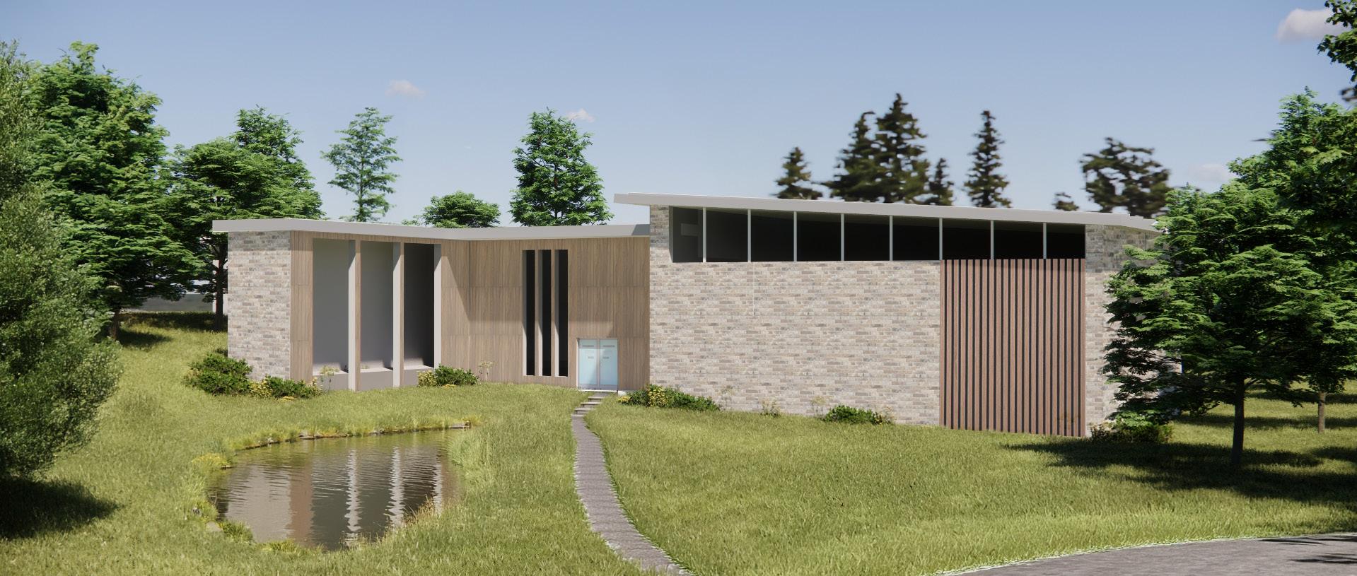
NON PROFIT INTEGRATION
NON PROFIT INTEGRATION
Design 5 | Urban Operations Studio | Professor Betty Hackney
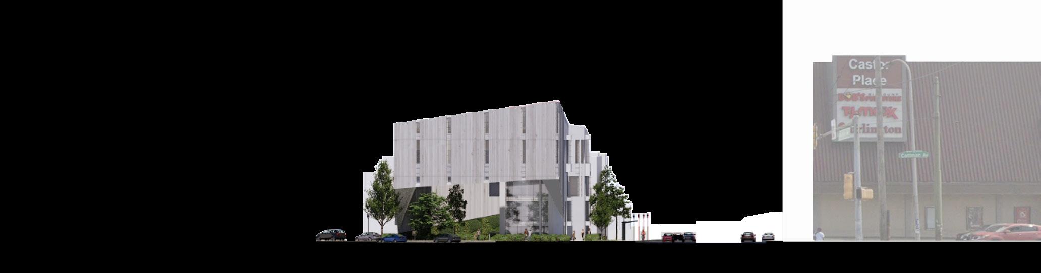
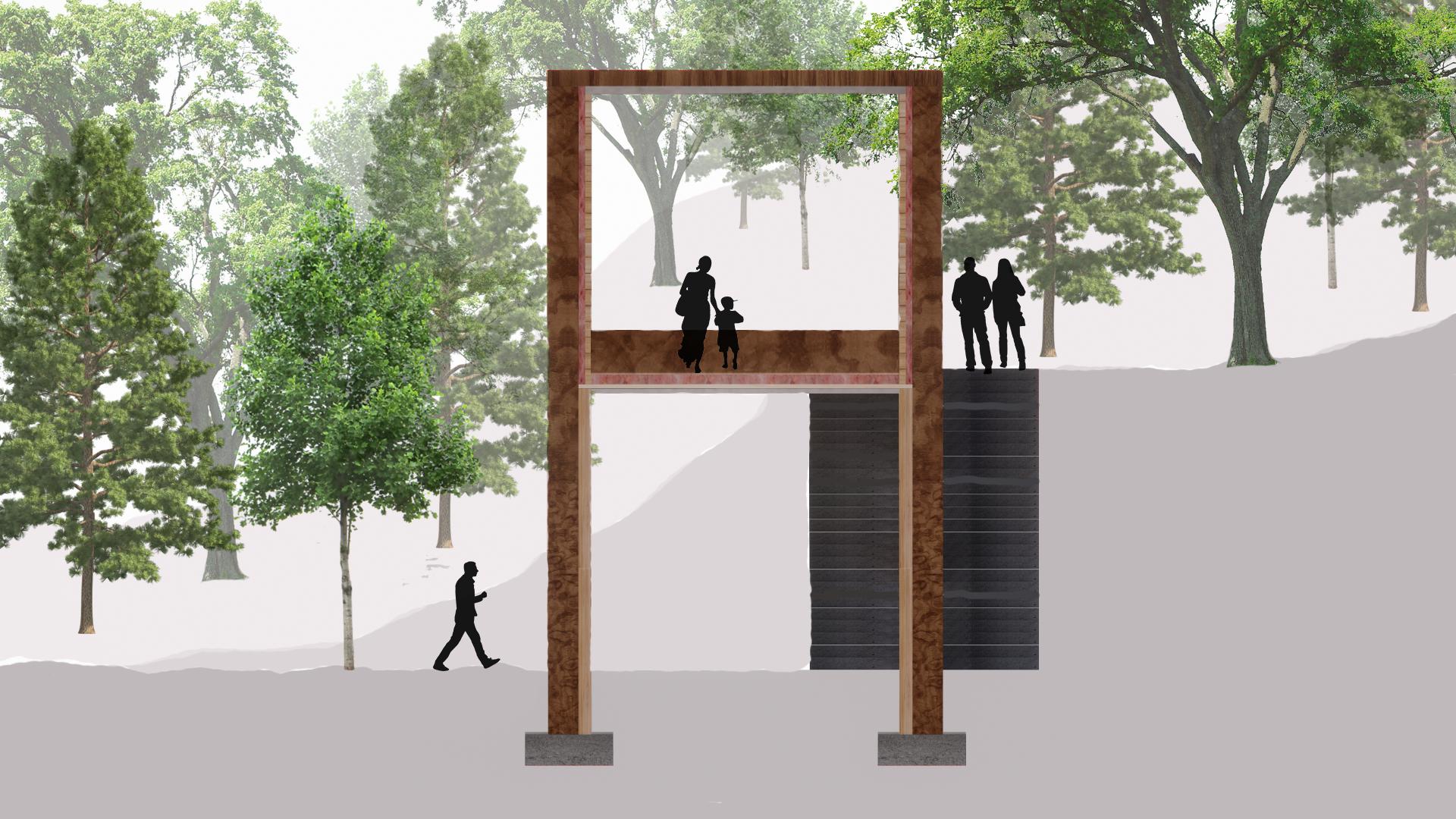
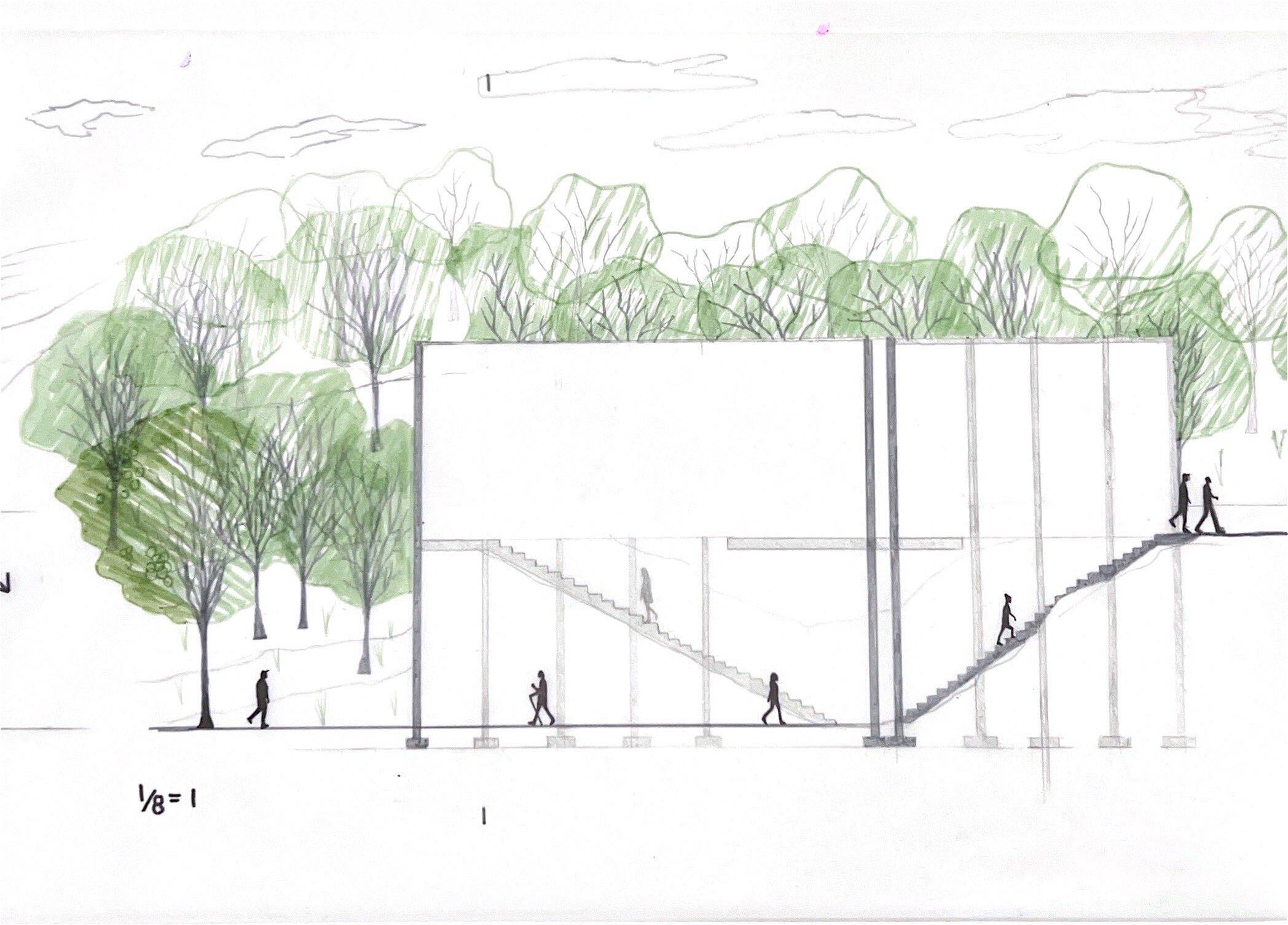
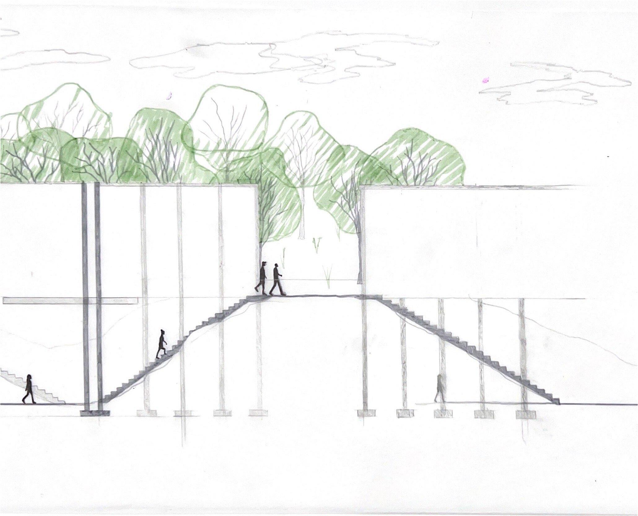
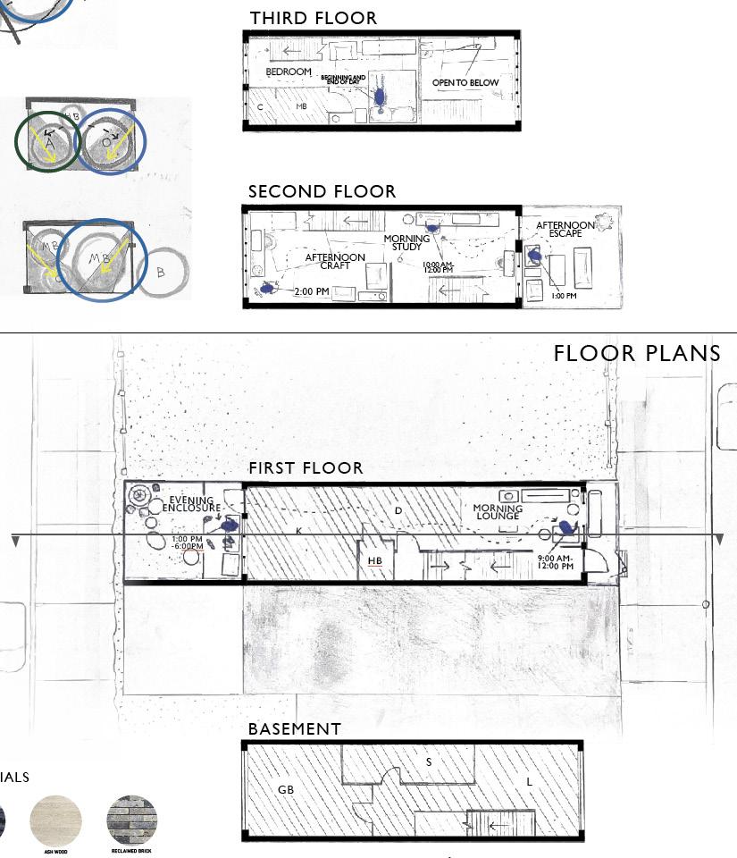
Non profit integration was a semester long project that aimed to create a safe space for non profit organization. My non profit was Never Surrender Hope, located in Northeastern Philadelphia. This client spreads awareness about and provides resources to those affected by the Philadelphia drug crisis. After doing extensive research on Northeastern Philadelphia, the Philadelphia drug crisis, and Never Surrender Hope, I shaped my intention for the architecture. The structure aims to create a protected environment for Never Surrender Hope by, providing event spaces, counseling spaces, an office and sober living housing. I created an overhanging walkway to act as a visual boundary and reflected this design feature onto the ground plane by recessing the landscape. These strategic moves were executed in order to make my architecture’s inhabitants feel safe within but not trapped.
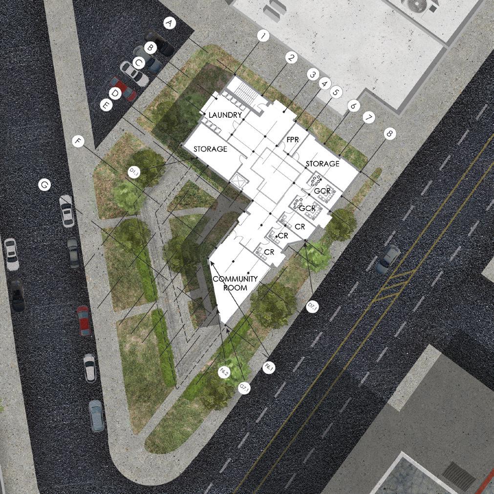
HOUSING
FOURTH FLOOR
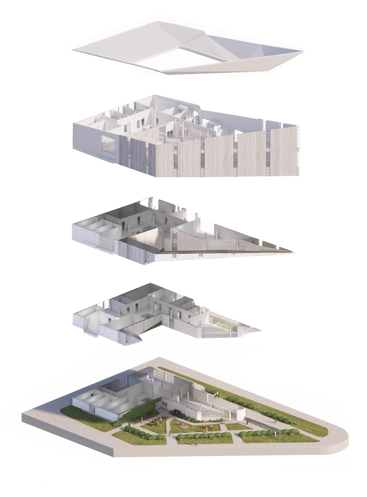
ARCHITECTURAL FORM
OFFICE
THIRD FLOOR
COUNSELING
SECOND FLOOR
PUBLIC
FIRST FLOOR
I felt my non-profit would benefit from a protective form, therefore I created a cantilever walkway and recessed the landscape to reflect the visual boundary existing on the elevated plane. Splitting up the program into four different levels helped direct circulation through my architecture.
FIRST FLOOR

THIRD FLOOR
FLOOR PLANS
SECOND FLOOR
FOURTH FLOOR

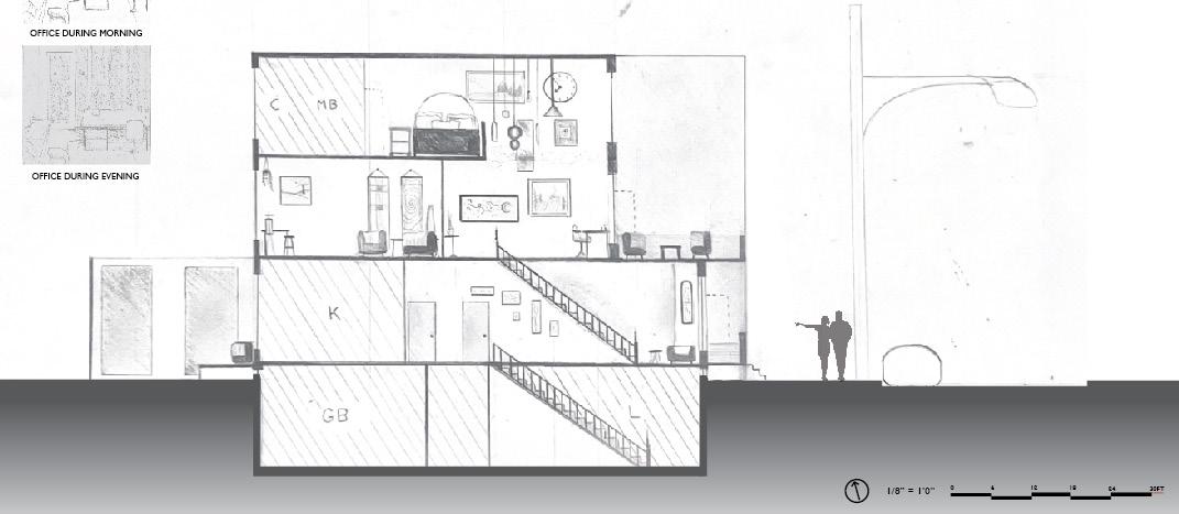
The interior program is split up into four different levels, each one serving a different purpose. The architecture has roughly 14,000 sq ft. of program, consisting of community spaces, counseling rooms, office spaces, housing spaces and supporting spaces.

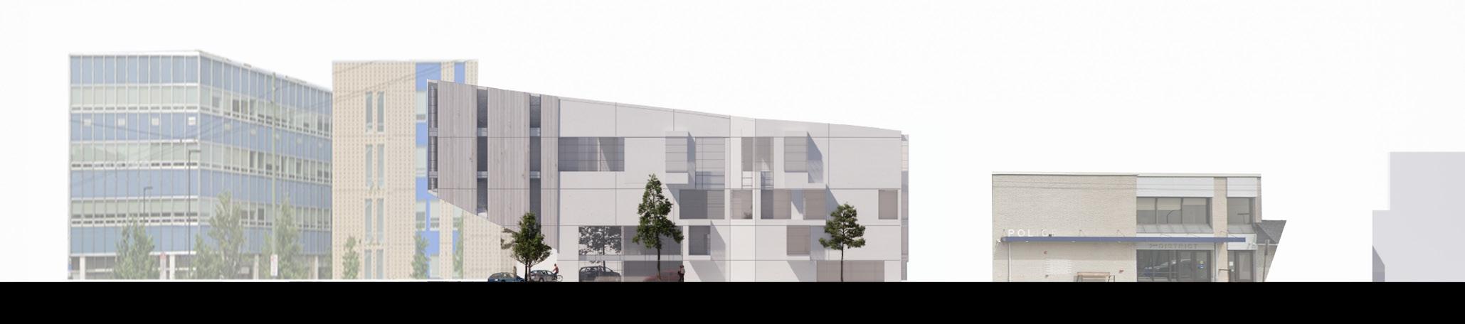


ELEVATIONS AND SECTION
The materials selected for the exterior were meant to create a light and airy feeling. The fenestration design and mullion design were intentionally crafted to break up the monolithic form. The section shows off the maneuvers made to the roof and bottom of the cantilever plane, to better blend it with the rest of the form.
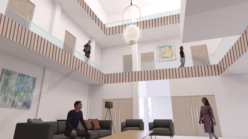
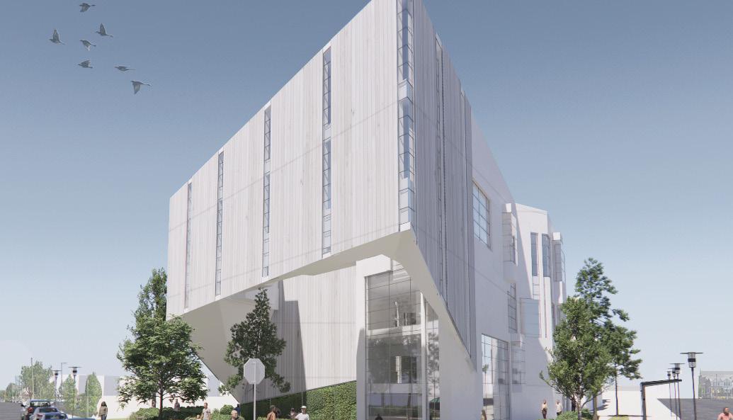
ARCHITECTURAL VISUALIZATIONS
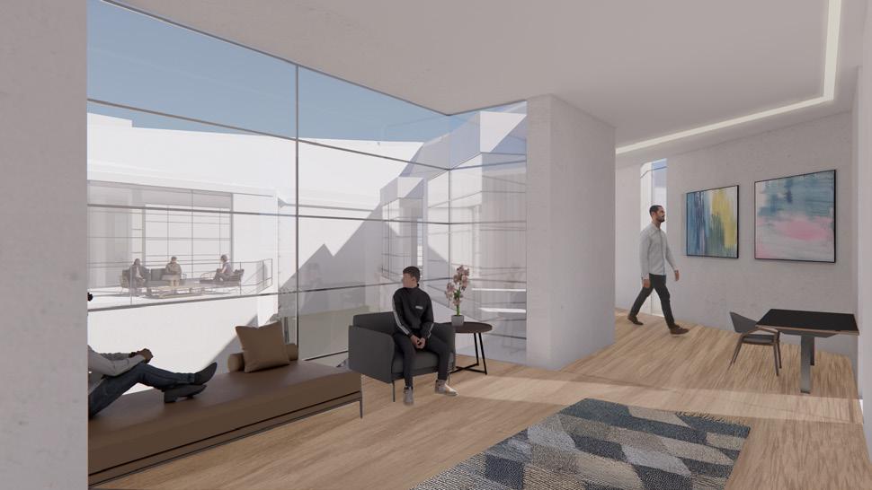
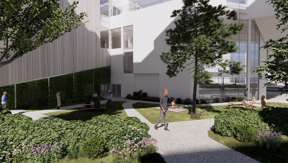
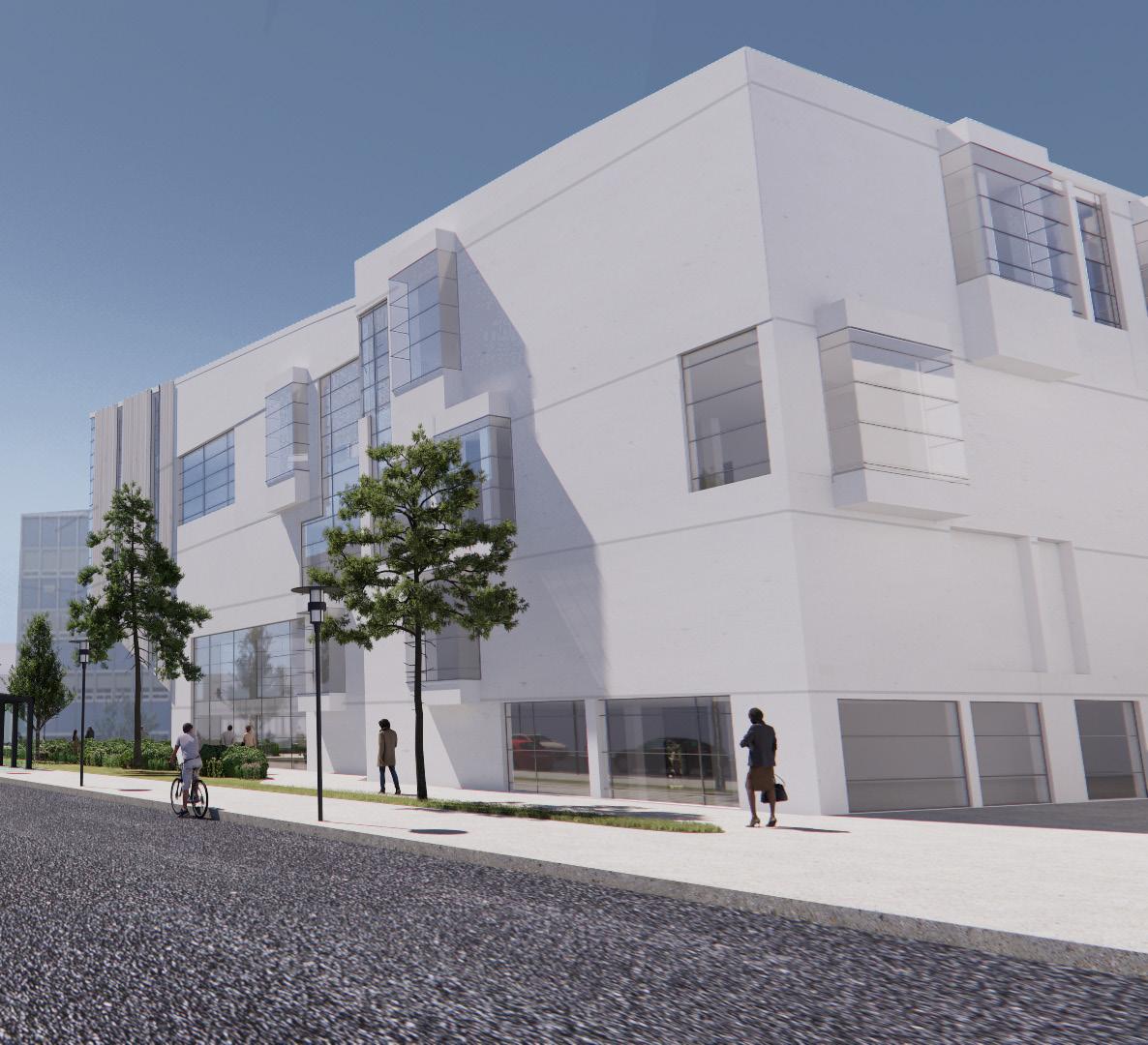
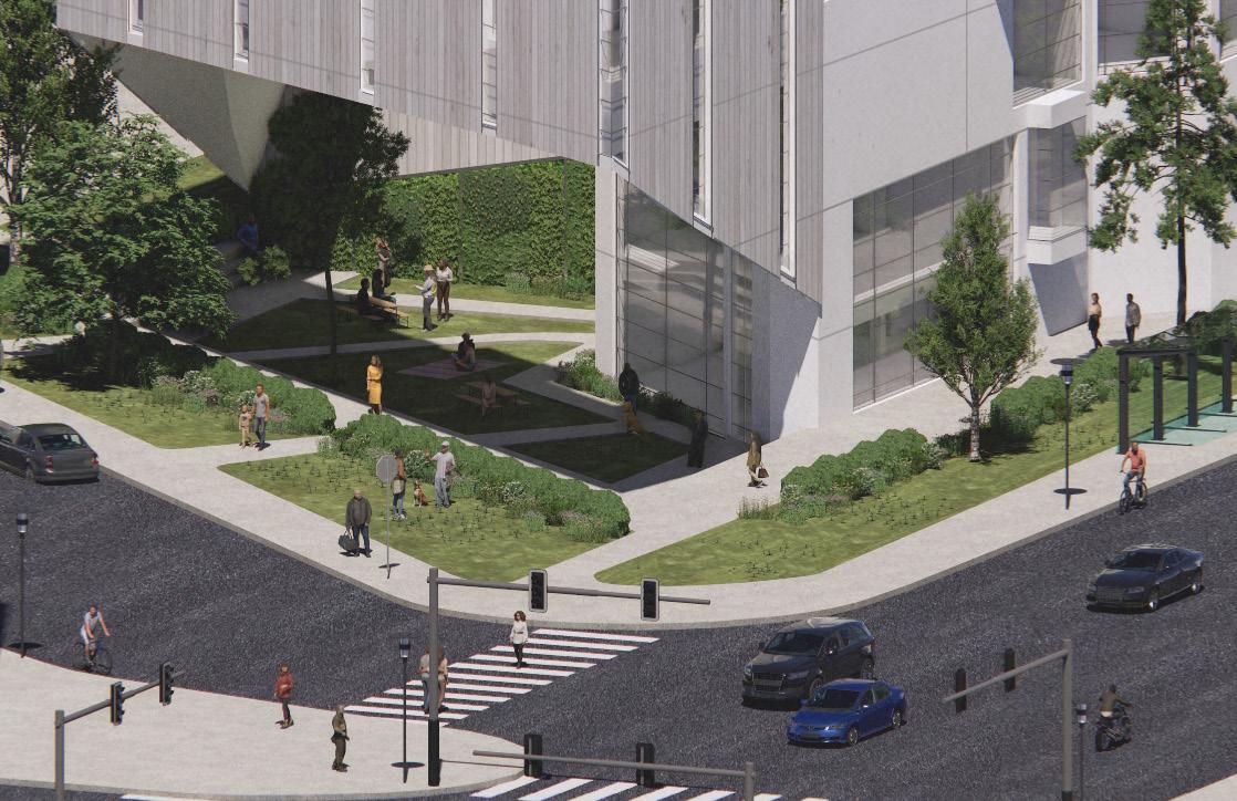
These interior and exterior visualizations express how my architecture interacts with the context around it. (1) Lobby space, (2) corner exterior view, (3) cantilever perspective, (4) recessed courtyard, (5) side fenestration, and (6) lively urban environment.
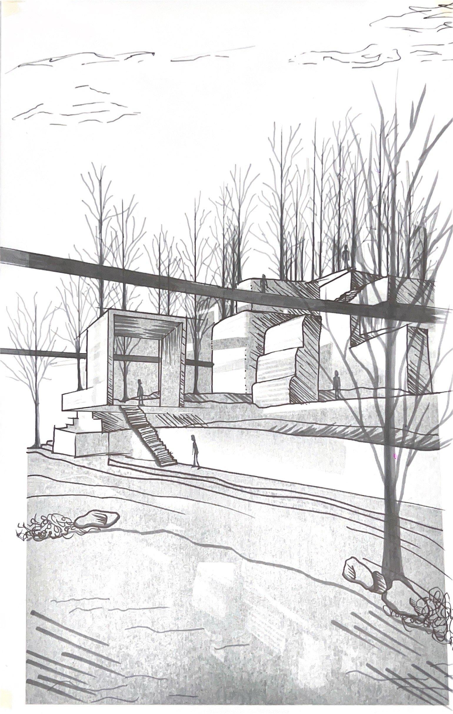
Design 4 | Architectural Foundations Studio| Professor Andrew Hart
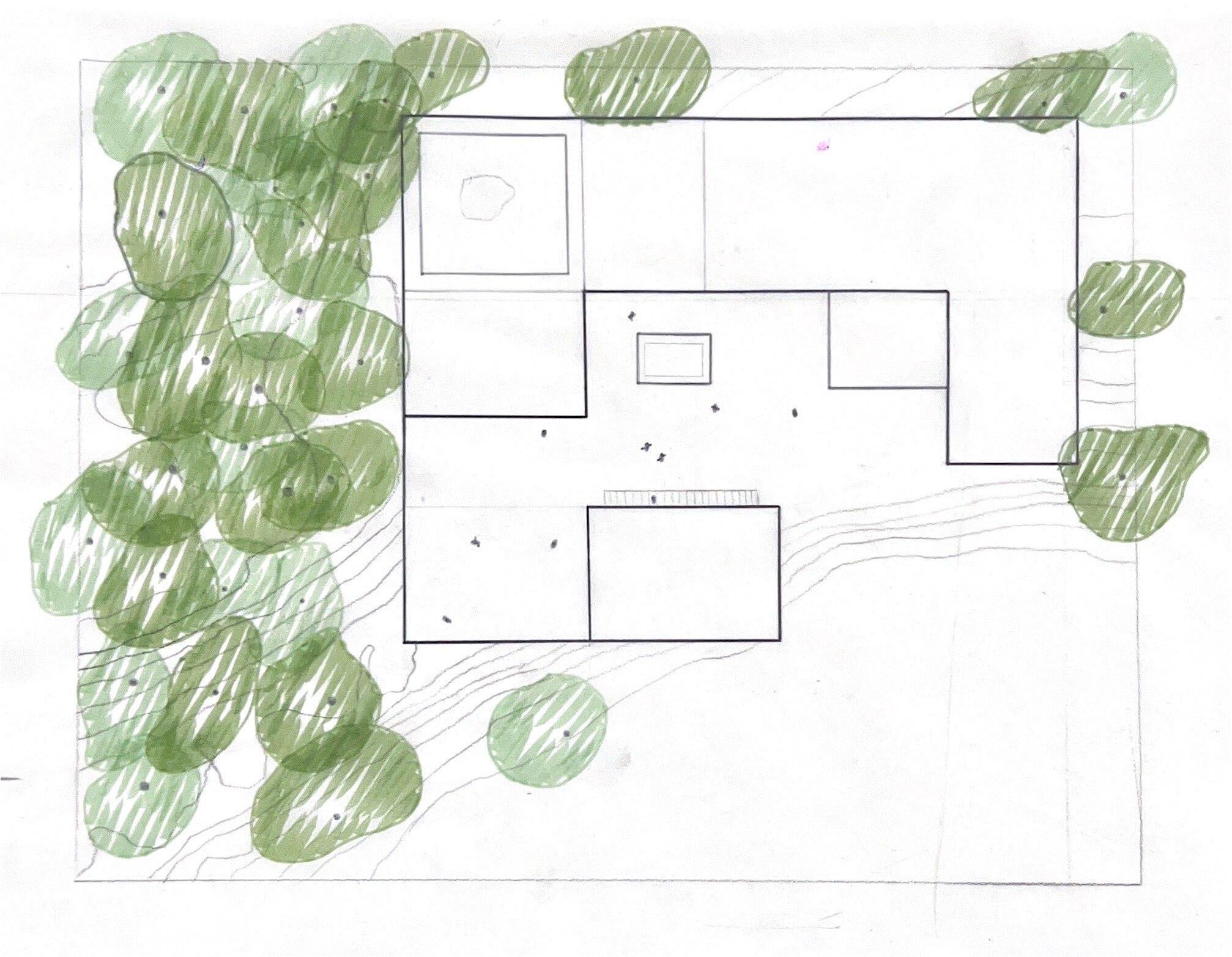
I was instructed to create an altar of peace located in Glendenning Rock Garden in Philadelphia. Inspired by a sketch over a photo of modular programmatic blocks, this experience has many twists, turns, and interesting features. I opted to embed the architecture with the landscape was an intentional choice to force my garden to have many levels and views. The task of the first half of this project was to create a conceptual idea of the entire sanctuary, and the second half was to pick a specific location and expand on it further. Expanding the entry sequence allowed me to rethink elements that were not working, as well as develop structure, substructure and skin.
ALTAR OF PEACE
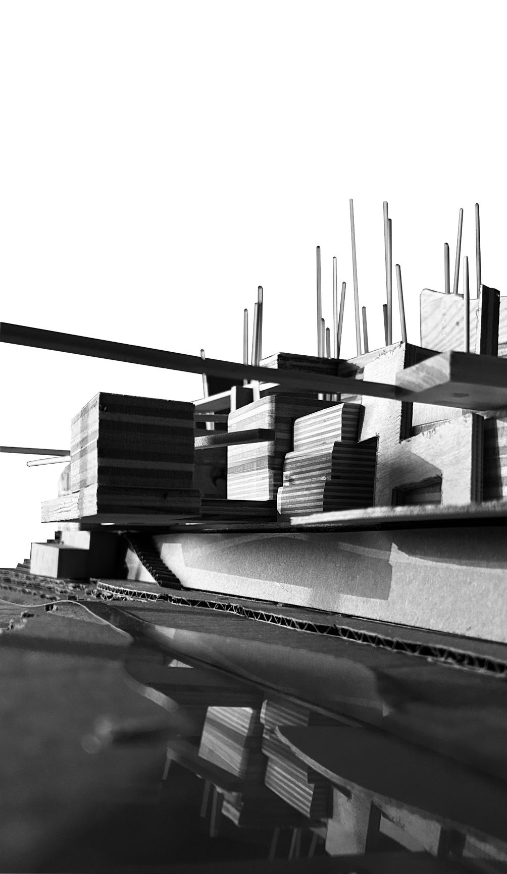
PHOTO INSPIRATION
By creating modular programmatic blocks and photographing them, I was provided with an architectural shape to work on. Putting a layer of trace over this, I was able to carve out spaces and decide a final form for my sanctuary.
TRACE OVER PHOTO
PHOTO
SANCTUARY PLAN
Zooming into a portion of Glendenning Rock Garden, I chose a heavy slope to challenge myself with integrating my sanctuary into the landscape. I decided to focus on the entry sequence of my architecture, because it could add more developments to it, by increasing the circulation.
SITE MAP
SITE PLAN
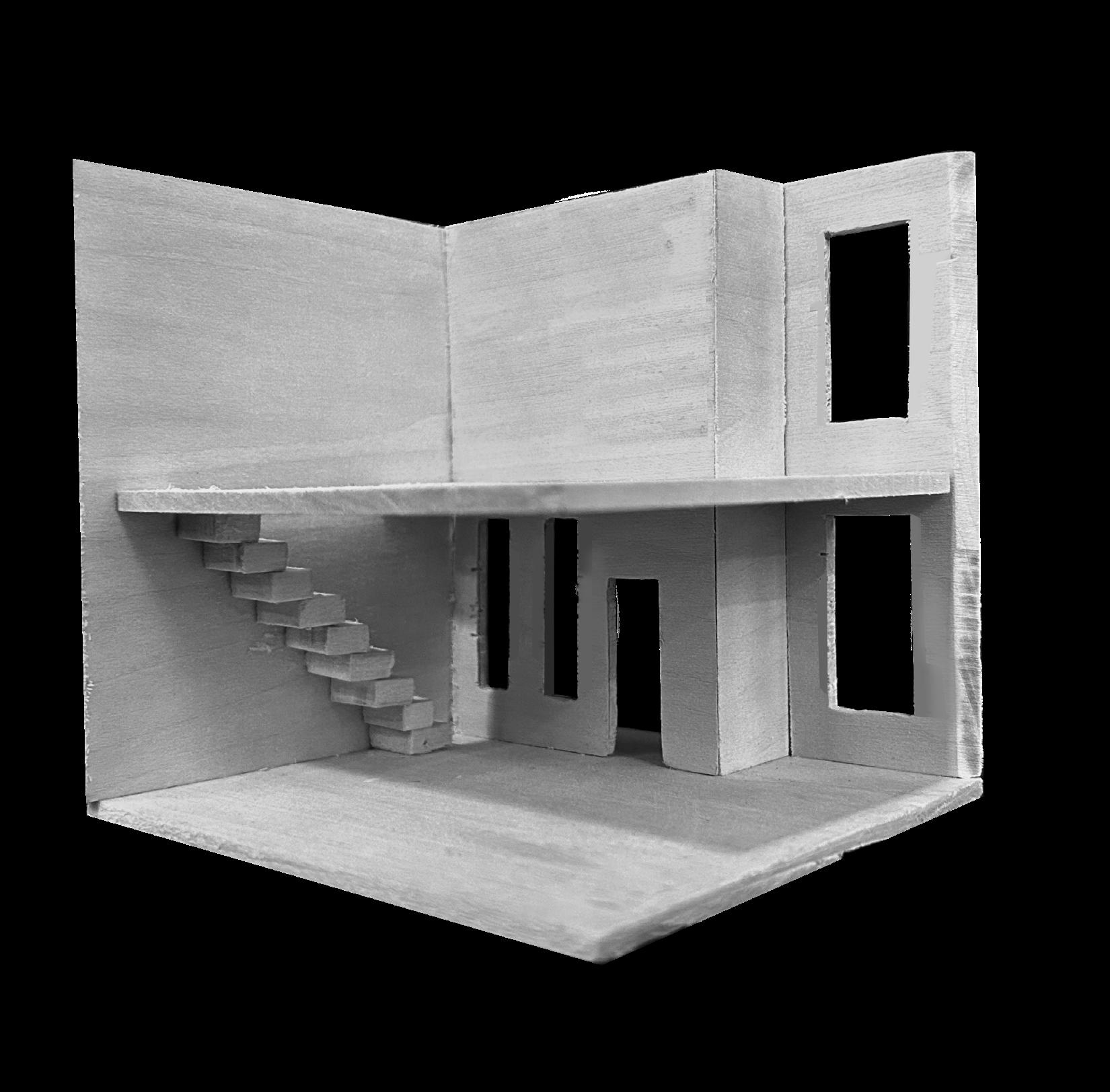
SECTION AND WALKING SECTION
Creating a walking section throughout the space I chose to develop, helped me analyze the user experience within. Using pencil and paper sketch to portray my ideas helped me work fast and focus more on the experiential qualities rather than making every line perfect.
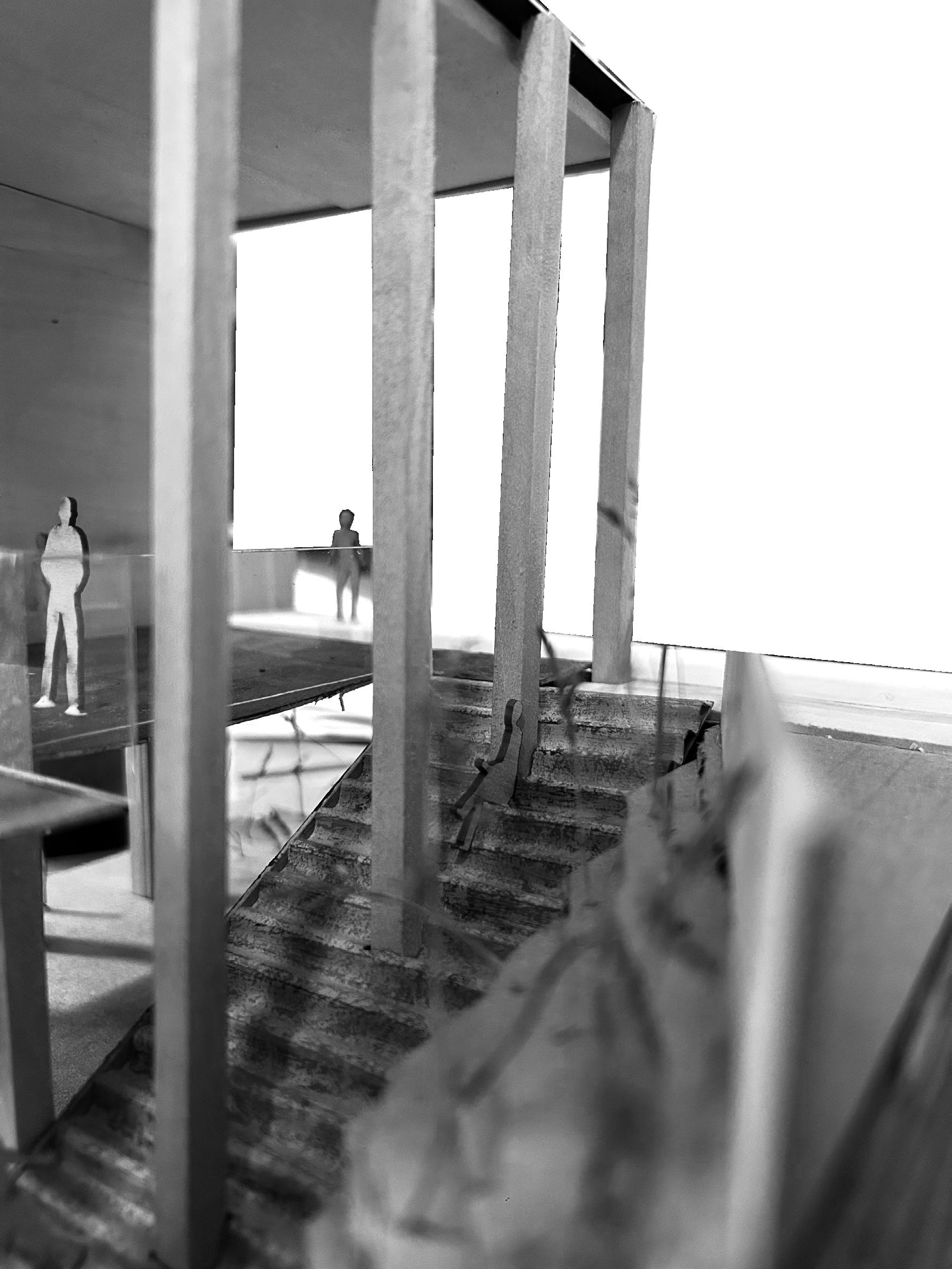
FINAL MODEL
By integrating the staircase into the side of the slope I was working on, I was able to create moments of pause within the columns in my structure.
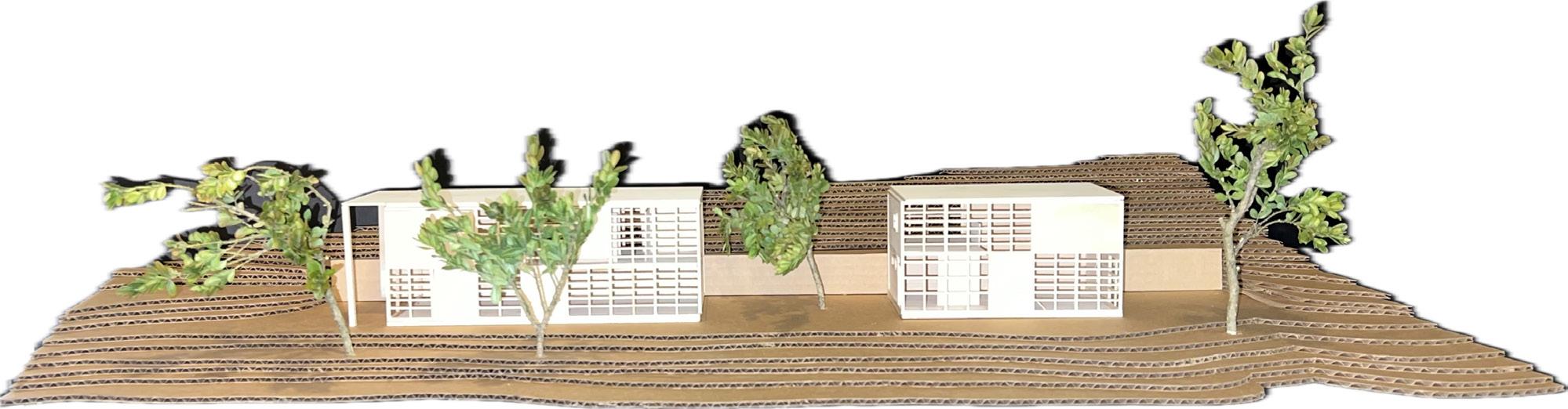
COMMUNITY INTEGRATION
3 | Community Context Studio| Professor Raymond Bracy
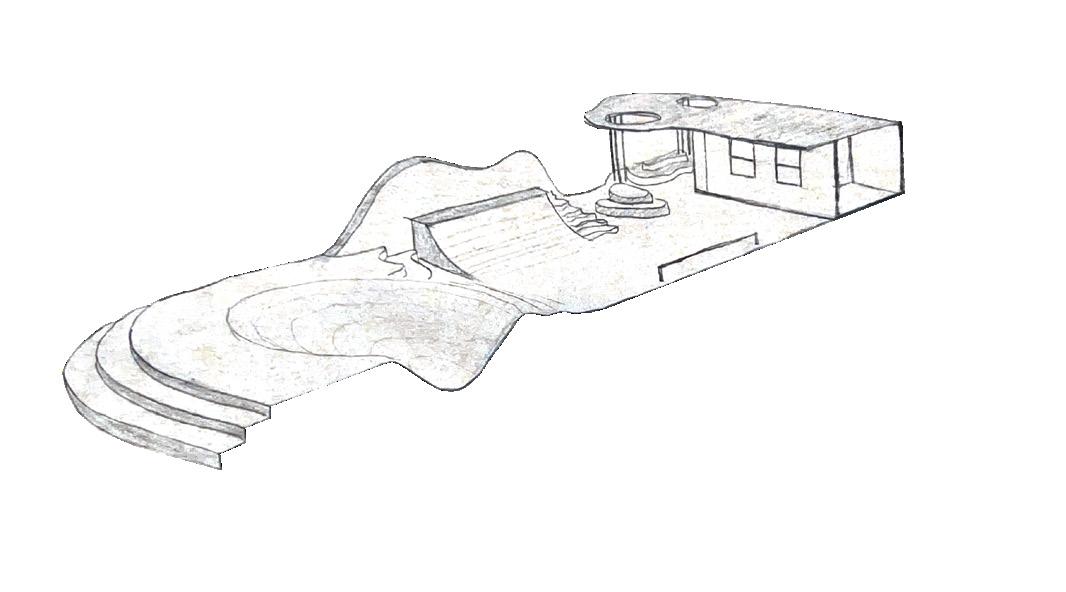
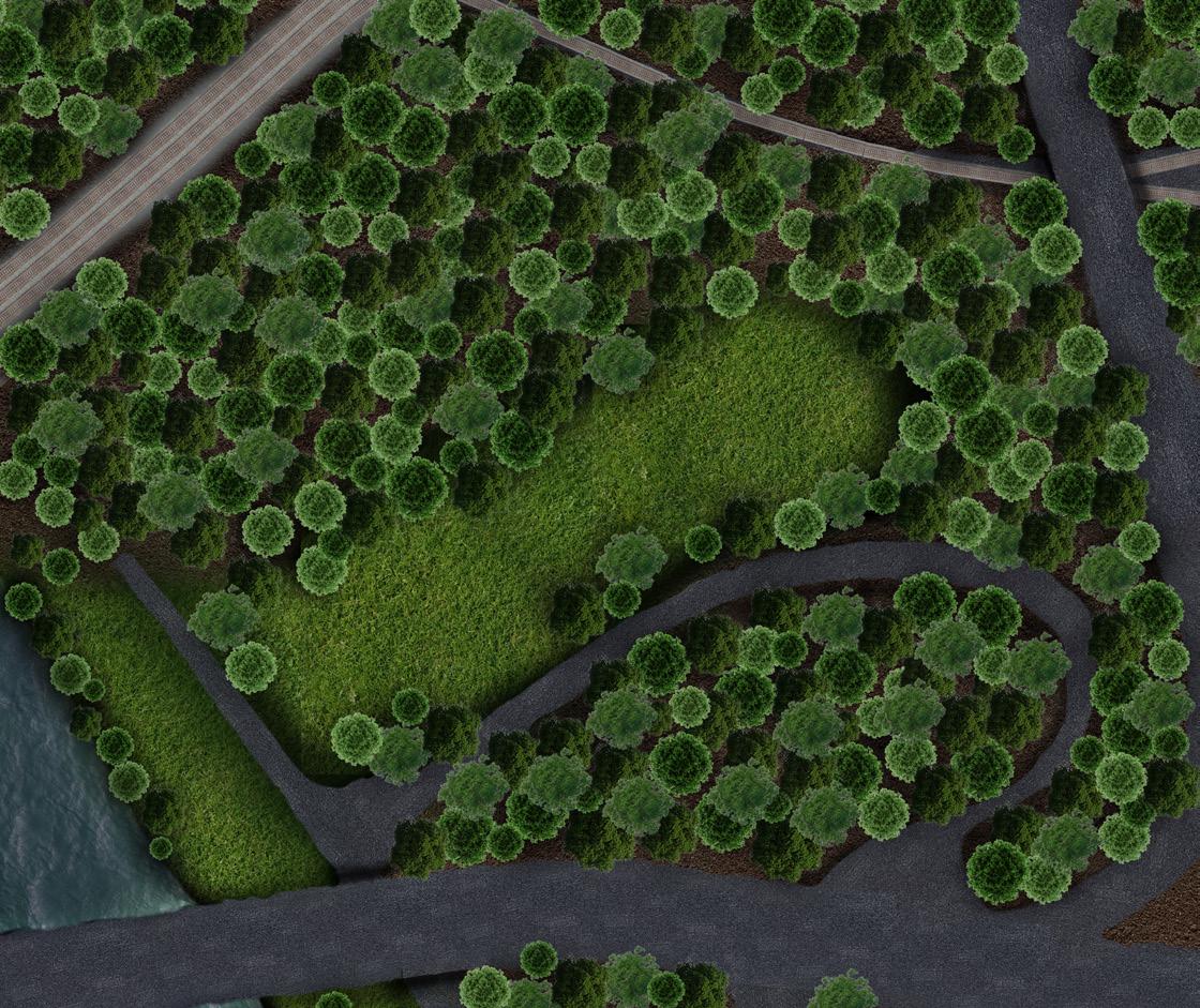
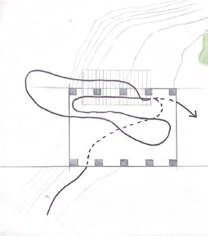
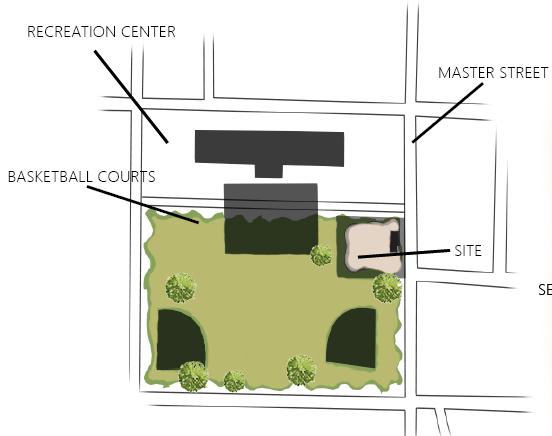
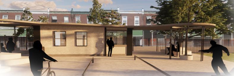
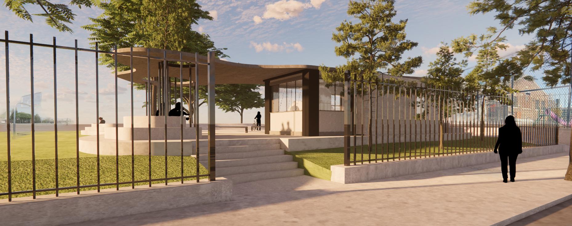
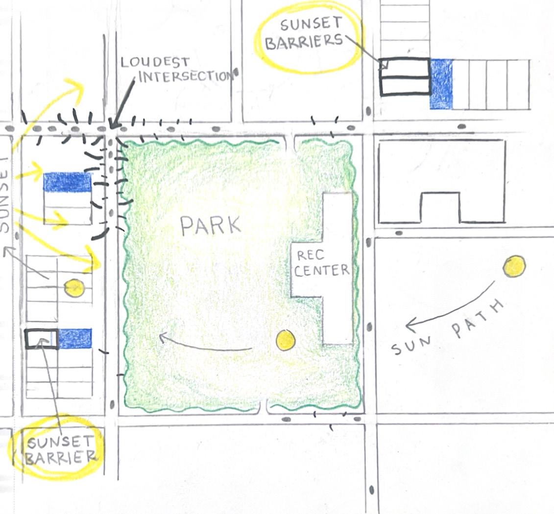
Working within the neighborhood of Sharswood, in Philadelphia I was tasked with creating a structure that provided some kind of resource to the community. While visiting the public park where the project is located, I noticed a group of people skating and a few skate shops in the area. When looking at a map, I noticed there were only two skate parks in Philadelphia, therefore I deemed that the people of Sharswood would benefit from a skate park that doubled as a public forum for people passing by.
Design
CAREFUL INTEGRATION
While working in this dense neighborhood, I wanted to ensure that people would not feel threatened by my new implementation to the park. In order to include everyone within my design, I created a second entrance to the park that allowed people who wanted to interact with my skate park to interact, and let those who didn’t want to be a part of it, simply walk by.
SITE MAP
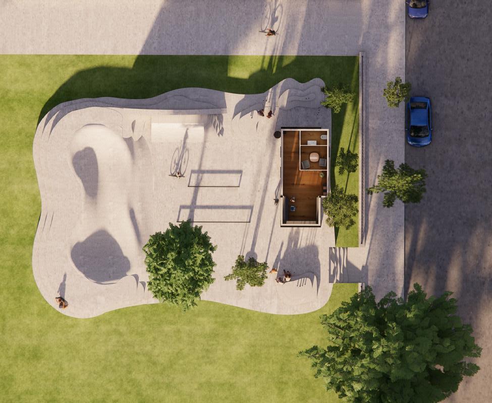
SITE PLAN
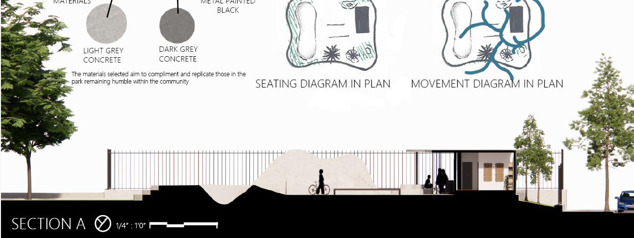
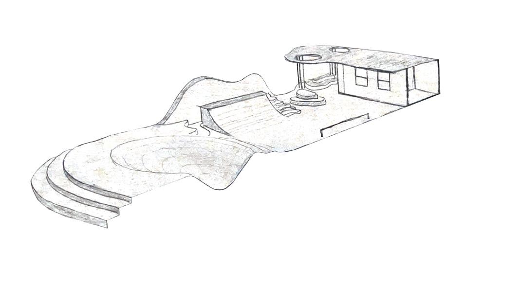
SECTION
This section shows a complete view of the proposed rental building I placed within my skate park. I intended the skate park to be inviting to those who were new to learning how to skate, so rentals would be cheap and easy to attain, unlike many rental skate parks in the Philadelphia area.
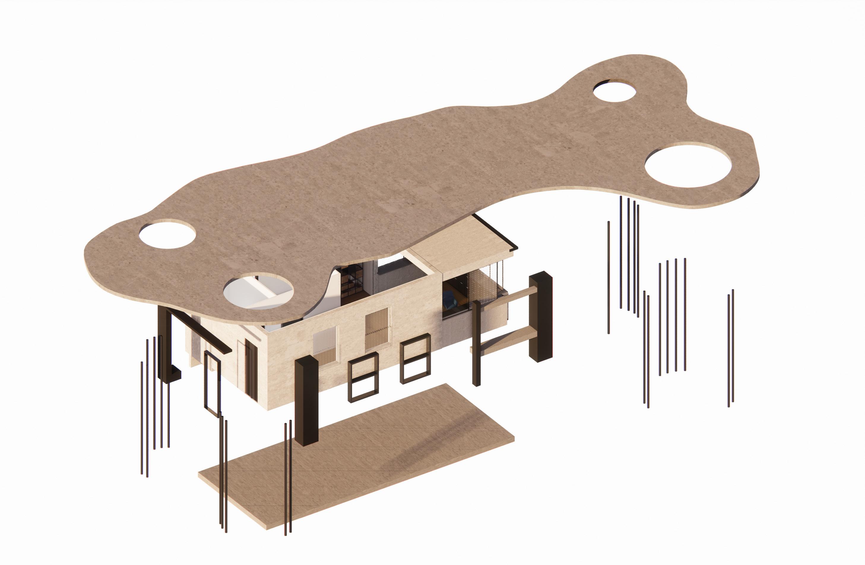
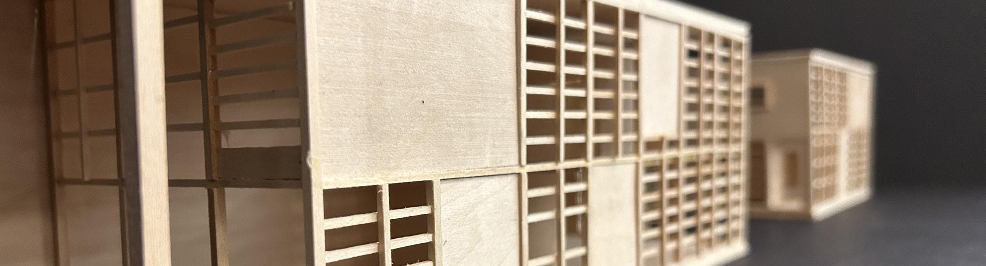
CANOPY
This exploded axonometric view shows the rental building, as well as the canopy draping over the seating areas in my skate park. Circular holes are carved to let light in, and some of these holes have trees placed within to further integrate my park with the nature that surrounds it. Small columns hold up the canopy and act as a linear break in the monolithic nature of the concrete.
ARCHITECTURAL VISUALIZATIONS
Making sure that my design seamlessly fit in with the neighborhood of Sharswood was a huge challenge, but the subtle moves I made to integrate it into the park it sits in definitely worked. These visualizations show how populated the area might be if it was situated in this park, as there was a need for a hang out spot at this park.
ROW HOME
Design 3 | Community Context Studio| Professor Raymond Bracy
Working within the neighborhood of Sharswood, in Philadelphia I was tasked with creating a new row home that would be completely bespoke for a client. My client was Sierra Kirby, a stay at home entrepreneur who enjoys working under sunlight, talking with her neighbors and the ‘music of the street’. My architecture aimed to give Sierra all of those things, while creating an inspiring space for her to work in. I decided to give her wall to wall windows and a balcony facing the street overlooking her main workspace. I also provided a secondary work space in the back of the home so Sierra could let the sunlight guide her as she worked throughout the day.
PICKING A SITE
For this project, I was given three options for a site. After carefully interviewing my client and taking in her needs, I decided site two was the best site for her. It existed on a busy intersection which brought my client the ‘music of the street’ that she wanted. It also had minimal neighbors which allowed for the maximum amount of light on the street side.
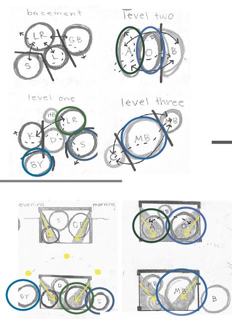
SPACIAL ADJACENCIES
After picking the spaces that were necessary to my client, I started to arrange them in a way that would help sunlight pour into the spaces that needed it. After this process, I decided which spaces needed to be on which levels of the row home.
FLOOR PLANS
I was instructed to not worry about spaces that were not important to my client, such as the storage, laundry, dining and kitchen. Instead I chose to focus on the spaces she would occupy the most frequently, and I carved out a path of circulation that would illustrate how my client would interact with the spaces throughout the day.
SECTION
Creating a double height space within the main office allowed for sunlight to pour in during the morning hours of the day. Creating a balcony on the street side of the architecture also allowed for more views and sounds that my client wanted.
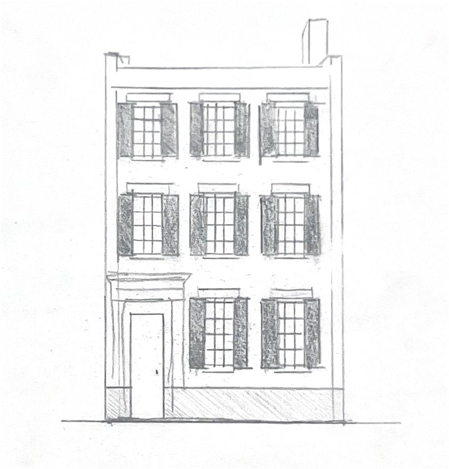
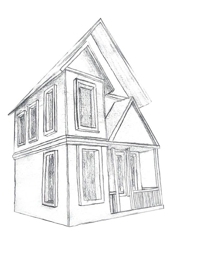
Design 2 | Architecture Foundations Studio | Professor Carol Herman TECTONIC MAQUETTE
This project involved adding steps on a weekly basis in order to create a finalized maquette. We were allowed to do what we wanted with the space so I decided to do a Victorian style home, as I’d always admired the detailed facades of Victorian architecture. Working in a smaller scale (5 inches X 5 inches) forced me to be more critical of the ornamentation I chose to include. I experimented with mullion design and layering different sizes to increase interest with small basswood sticks.
INTERIOR
The interior remained quite simple, with two levels and a staircase connecting the two. I based the interior of this home on my childhood home, mirroring things like the entryway and living spaces. The fenestration was designed as a means to facilitate light on the interior spaces.

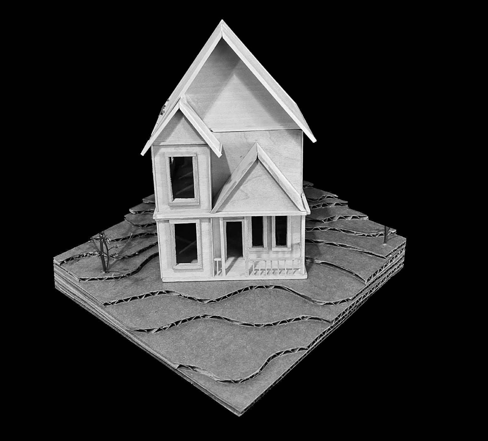
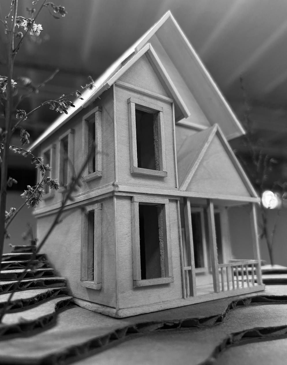
EXTERIOR AND TOPOGRAPHY
Creating two pitched roofs allowed for more mullion design on the exterior plane. Adding a small front porch created more interest in the entry sequence. I decided to slope my topography to include a second entrance in the back of the architecture.
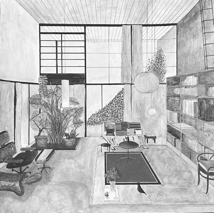
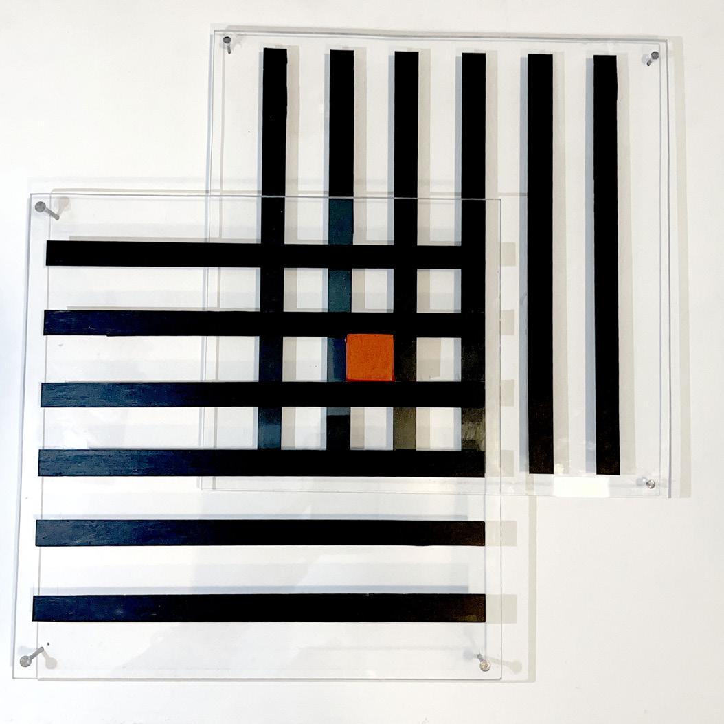
EAMES HOUSE CASE STUDY
Design 2 | Architecture Foundations Studio | Professor Carol Herman
The Eames house, designed in 1961 by Charles and Rey Eames was my focus of study for this semester. Producing plans, sections, elevations and a model of this building, my partner Zoie Hatton and I took on this project with high excitement. After finishing the case study project, we went on to create art pieces based on the home we were studying; one 2D art form, and one perspective.
CASE STUDY
Completing a comprehensive case study project on this home was an extremely eye opening experience. Going into this as a young, impressionable architect proved to be very valuable to my attention to detail going forward in this practice. This home taught me about site to architecture relationships and building functional spaces. This is the model I created for the final presentation, as well as the site that my partner created.
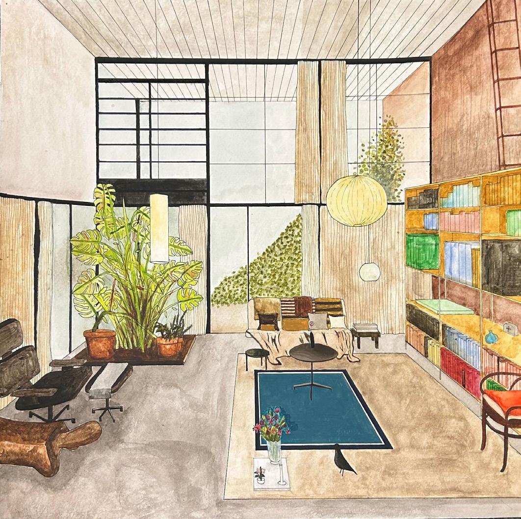
VISUALIZATIONS
Creating a painting of the front living space in the Eames House helped me focus on the elements that made their house a home. Sketching in the little artifacts from Charles and Rey’s life, I started to feel very connected to them as people. For my 2D artwork, I chose three words that reflected the home: grid, module and layer. I then took those three words and created an art piece containing two layers of plexiglass with lines painted on that would act as a grid, and layering them to create a module in the middle.