
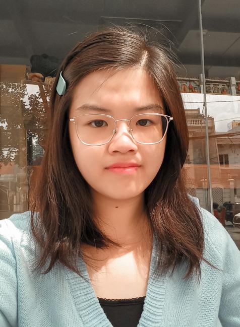
Get to Know Me
About Me
I am a Visual Communication Design student in Bina Nusantara University, Bandung. I am good at promoting. I love to work with people. I am also a hard working person and easily adapted to new environment. I am also known to be a neat and tidy person, also a bit perfectionist. Also, I always want to get things done as soon as possible.
I am also good at designing product packaging, graphic design, manual painting, digital painting, branding design, using Photoshop, using Illustrator, videography, video editing, and photography.
Experience
2022 Sharing is caring 2022 Committee | Divisi Acara
2022 PKM HIMDKV 2022: 7 Days of Saving Energy Coordinator | Divisi Desain
2021 PKM HIMANDA Binus 2021: Healthy Life, Healthy You Participant | Virtual Campaign
2021-2022 First Year Program B2025
Freshmen Partner | EESE1 dan EESE2
2021 Equip101: Spacetract Committee | Divisi Dokumentasi
2021 KMB Dhammavaddhana Binus Alam Sutera: One Million Help Participant | Virtual Campaign
2021 Sharing is Caring 2021 (SMP PL Domenico Savio) Committee | Divisi Acara
Contact
Phone +62-812-9108-9084
Email jacquelineandrea2401@gmail.com
Website https://www.behance.net/jacquelandrea
Education
2020-2024 Bina Nusantara University (Bandung)
Visual Communication | GPA 3.67
2017-2020 SMA Bunda Hati Kudus Science Major
Skills
Branding Painting Photo manipulation
Video editing
Photography
Illustration Languages
English Indonesian
2021 HIMDKV Binus Bandung: Movie Day
Volunteer | Desain Poster
2021 Virtual Trip “Indonesia-Singapore”: Virtual Knowledge Exchange
Participant | Mentor
2021 HIMDKV Binus Bandung: Be at Ease Without Diseases
Participant | Virtual Campaign
2019 Galvanize Festival
Volunteer | Tim Desain
2017 Lomba Mural Tingkat SMA 60 Tahun Yayasan Asti Dharma
Sekolah Bunda Hati Kudus Kota Wisata
Participant | Anggota Tim
2
Acrylic Paintings Personal Works Adobe Photoshop Vector Illustration Branding Photography UI/UX Design Poster Design Photo Manipulation 1 2 3 4 5 6 7 8 9 Contents 3
01
Acrylic Paintings
4
Imaginations
Mountains Under the Aurora Sky

May 22, 2020
Playing in the Waterfall

May 26, 2020
Santorini
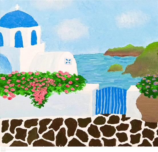
May 29, 2020
Somewhere Over the Rainbow

May 25, 2020
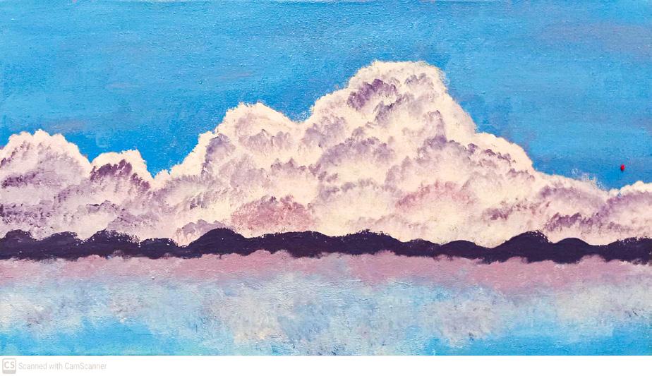
Clouds Over the Lake and Mountains
July 27, 2020
5
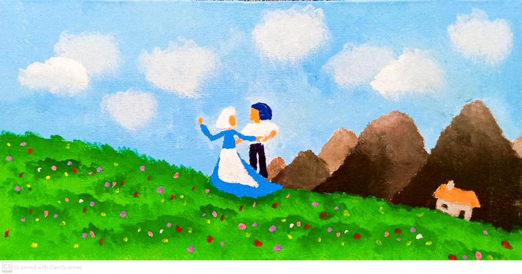
I See the Light
May 23, 2020
Movies
La La Land
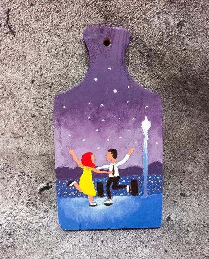
June 9, 2020
A Day at Hogsmeade
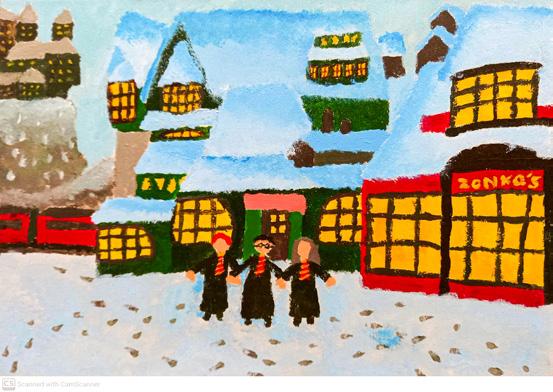

June 29, 2020
Howl and Sophie
June 18, 2020
Kiki’s House
August 18, 2021

6
02
Personal Works
7
Cecillia Tallis of Atonement (2007)

April 25, 2021
Casa Madrigal from Encanto (2021)
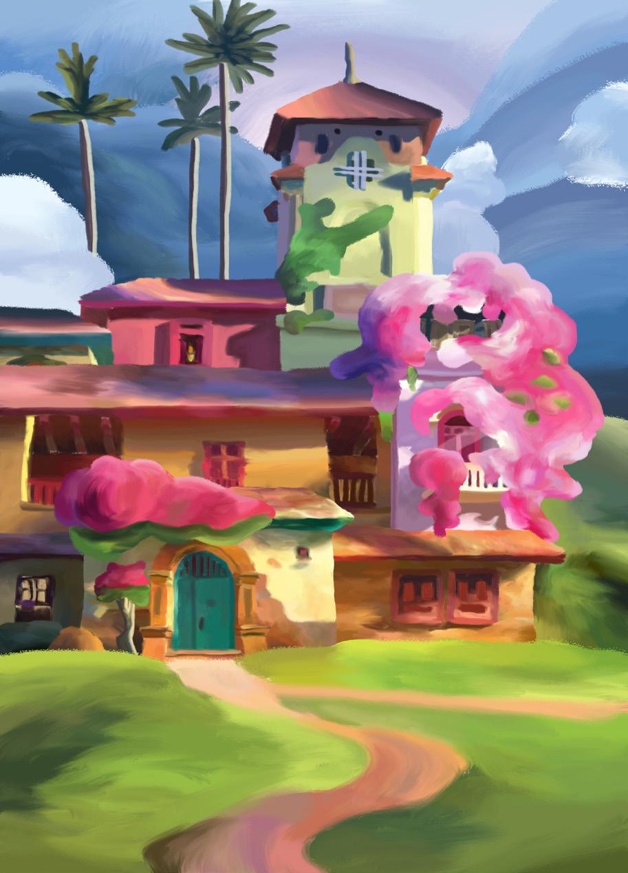
February 15-16, 2022
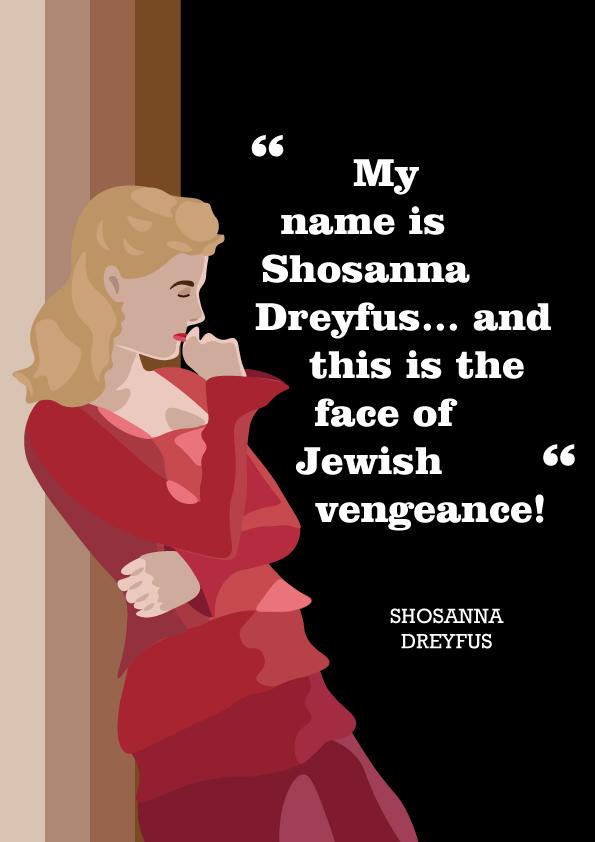
Shosanna Dreyfus of Inglourious Basterds (2009)
April 25, 2021
8
Sushi Time
March 2, 2021
May 14, 2021
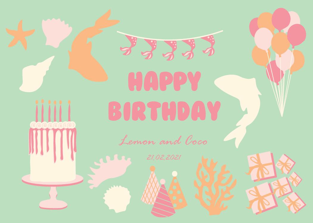
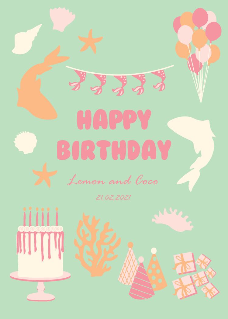
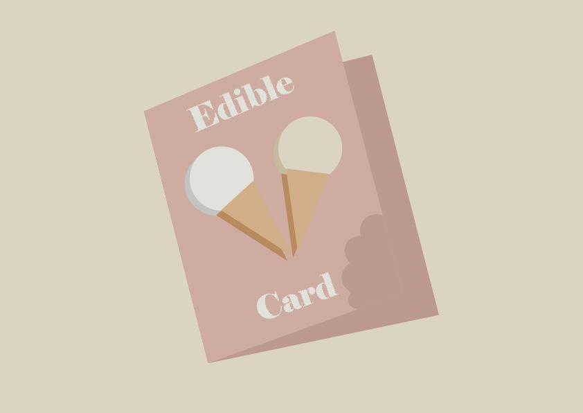
50th Birthday Card


March 30, 2022
Hot Whale-Balloon

September 1, 2021
Karoline Pietrowski (2021)
July 14, 2021
Cherries Charm 1K DTIYS
September 7, 2021

9
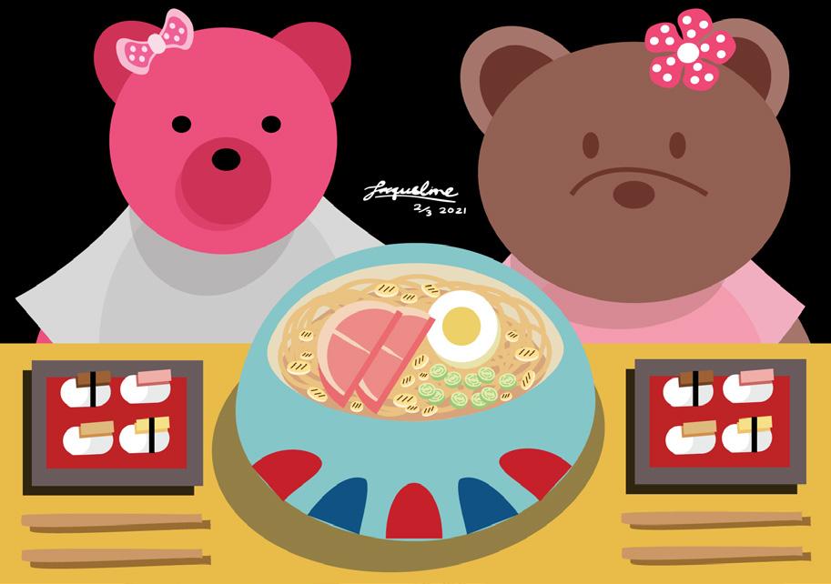
Teddy Bears X Khong Guan
10 Adobe Photoshop 03
Heydar Aliyev Cultural Center

October 13-15, 2021
Portrait Digital Painting of Rosé

October 23, 2021
Tropical Futuristic
December 3-13, 2021

11
Still Life Painting


November 3-7, 2021
October 4-7, 2021
12
Beach Pixel Art
04
Vector Illustration
13

14 10 Things March 30, 2021 Friends Care Community March 7, 2022 Silhouette Object Poster April 15, 2021
Greeting Cards


15
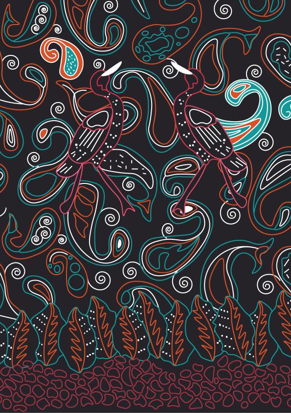
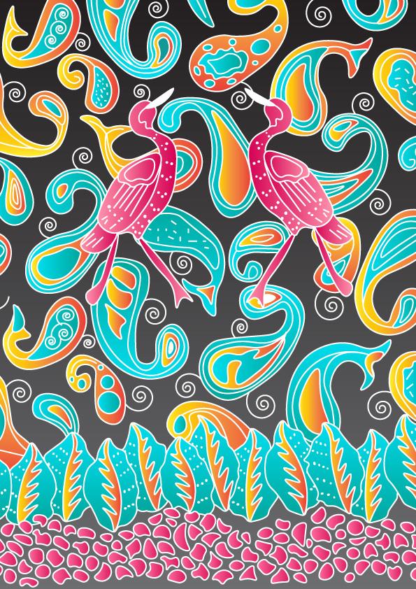
Batik Bali Merak Abyorhokokai


16
05
Branding
17
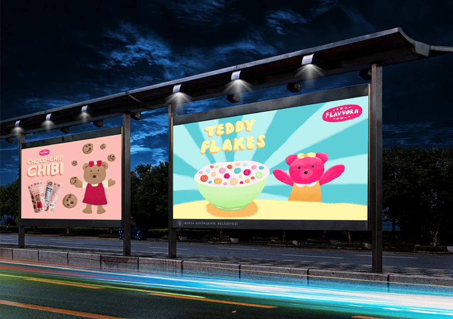
Teddy Flakes
My cereal brand is Flavvora. Flavvora is a multinational food manufacturing company that usually produces food for children. The brand name comes from the word flavor, which means taste. Flavvora produce many foods, one of which is cereal.
One of the products launched by Flavvora is cereal with the Teddy Flakes brand. Teddy Flakes is a cereal for children that is full of nutrition. Teddy Flakes have a variety of fruit flavors in one package. Teddy Flakes itself has a mascot, which is a dark pink bear.

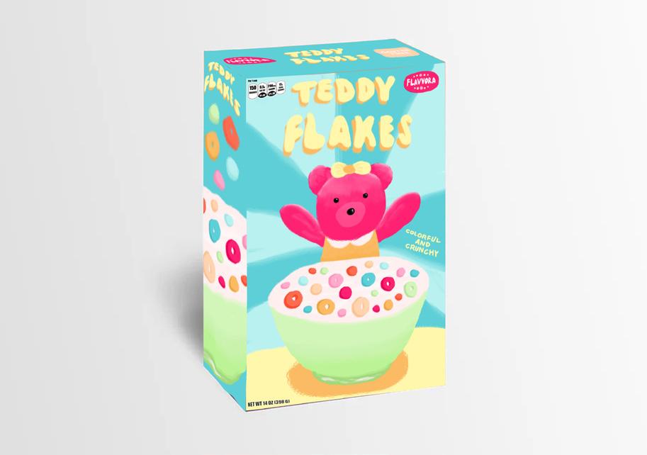
The color palette used is bright and colorful. This is to give a friendly impression to the brand, so that it attracts the attention of children. Also, to show that the food products produced by the brand vary greatly.
The design for his company logo depicts a dark pink circle with the inscription Flavvora in ivory white, as well as various colorful candies surrounding it. This is to show that the company produces a variety of foods that are healthy and full of nutrition, but still pay
attention to the appearance of the food to make it more attractive and friendly to children.
The design for this logo is in the form of Teddy Flakes in a vintage font, similar to a retro 1970s font and uses yellow with orange shadows. This is to show that they are very attractive and friendly, and show that the brand is always up-to-date.
The design on the package depicts a dark pink bear holding a bowl of cereal on the table against a blue background which makes the focus of the cereal. This is to prove that the cereal is delicious, so that it is welcomed when you want to eat it. Also, the background is to show that the cereal is the best and nutritious cereal.
The design in the ad is similar to the packaging design, but the difference is that the cereal bowl is very large and the bear is a bit far from the bowl. This is to show that the cereal is the best cereal that people feel small when compared to the cereal bowl.

18
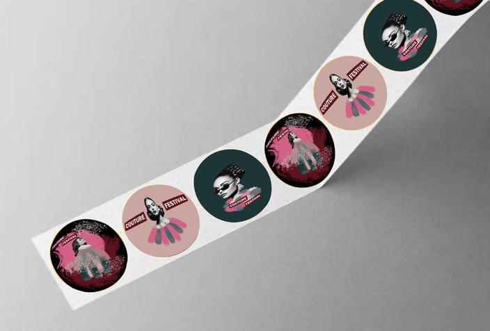
Couture Festival

The festival that I chose was a fashion festival, because I am interested in unique and eye-catching fashion designs in this day and age. This my fashion festival showcases a variety of haute couture clothes by various young designers today. This festival is aimed at millennials to hone their creativity by seeing the various designs on display. This festival will take place on January 21-24, 2022 at Merdeka Square, Jakarta. The entry ticket price is Rp. 50,000.00 so that
it is not too expensive for young people.

My festival is called Couture Festival. Couture means high level stitch or high class stitch. I named it Couture, so that people could easily understand that the festival showcased high-level design clothes.


19
Jomblo (2017)
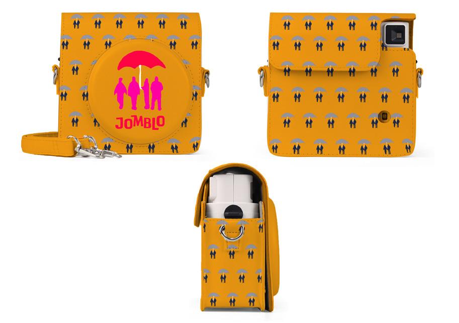


For this Indonesian film poster assignment, I chose the film Jomblo (2017) by Hanung Bramantyo, which tells the story of 4 single friends who want to find a girlfriend. For the poster I made, I depicted 4 friends holding the same umbrella. They were surrounded by young couples also holding umbrellas. This is to illustrate that the 4 friends are single, while the people around them already have girlfriends.
The art style used in this poster is inspired by posters by Saul Bass, who is famous for his geometric style. He is also known for his typeface that uses handwriting. In some of his posters, he sometimes gives a frame effect, so that the poster looks framed.

20
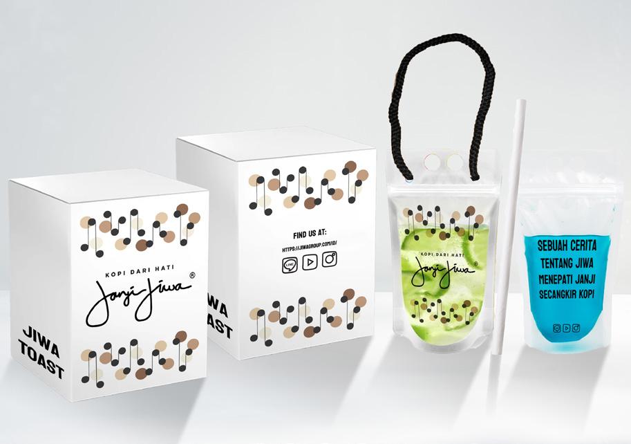
Kopi Janji Jiwa
The old Janji Jiwa drink packaging was in the form of a plastic cup with a picture of the Janji Jiwa logo and on the lid, there were confused quotes. Also equipped with a plastic straw.
For the bread packaging, it is a non-waterproof cardboard box with the words Jiwa Toast written on it. The box is opened from the side, not from above.
After redesigning the packaging, the new Janji Jiwa drink packaging is in the form of a drink pouch made of polypropylene plastic, which is recyclable plastic. The front has an illustration with a brand logo in the middle, while on the back there is a quote in the middle and social media below. Also, for hot drinks, I added a rope made of synthetic fiber, so people don’t have to hold the glass. The straws are paper straws, so they don’t waste plastic. The result of my redesign uses environmentally friendly materials, in order to reduce plastic waste. Because the old packaging used too much plastic. In terms of design, I added an illustration on the packaging, so that the brand of Janji Jiwa has
certain characteristics, unlike the old packaging.
The bread packaging is in the form of a water-resistant white box. The front has an illustration with a brand logo in the middle, while on the back there is an illustration with social media and websites in the middle. The redesigned packaging was also added with illustrations, in order to give a distinctive character to the Janji Jiwa brand. Also I use waterproof material, so it can hold food and last longer.

21
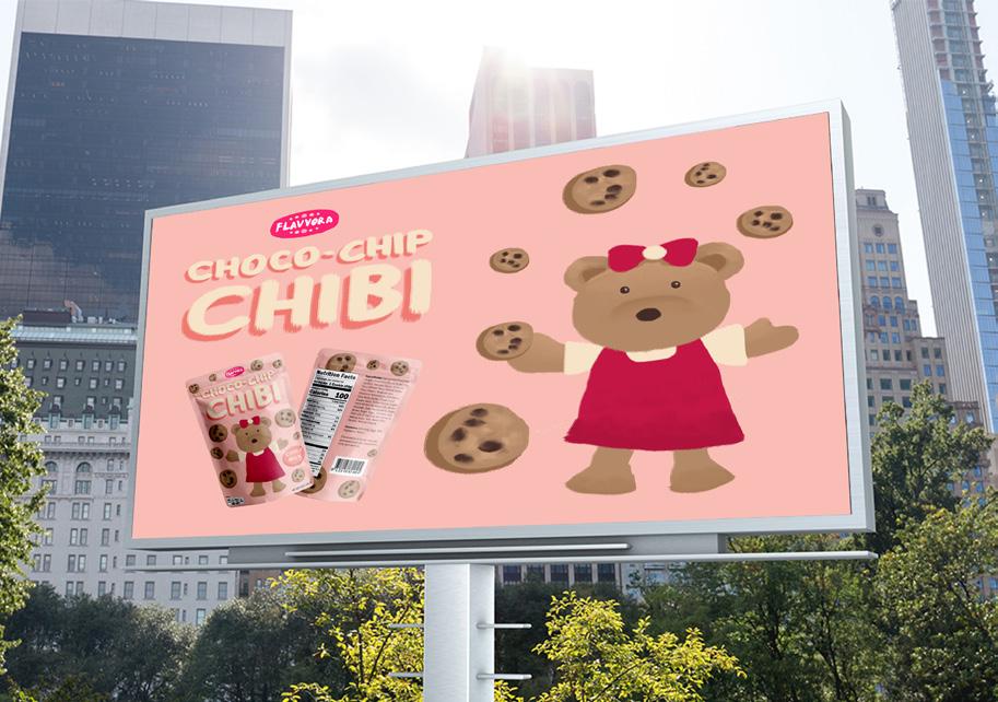
Choco-Chip Chibi


22
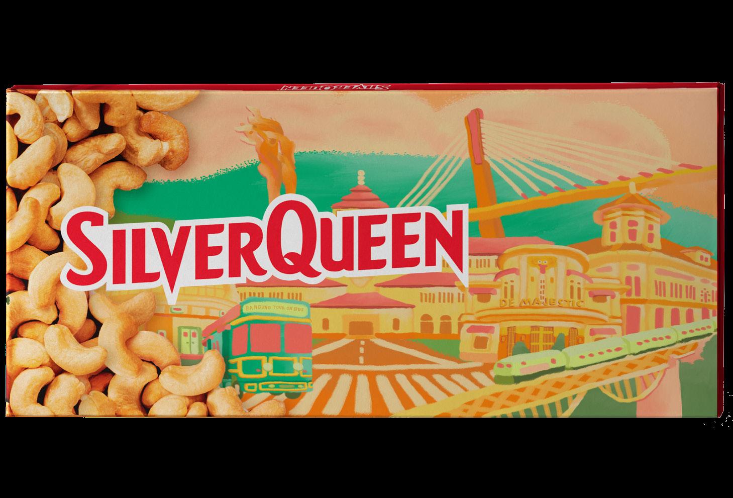
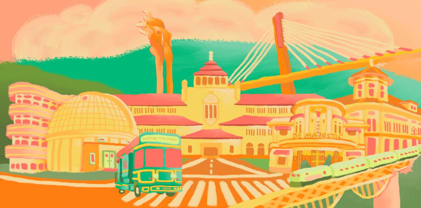
Ini Indonesiaku
This packaging design is for SilverQueen with the theme “Ini Indonesiaku“. Therefore, I describe the city of Bandung in my packaging. My SilverQueen packaging depicts the famous buildings and icons of Bandung City.

23
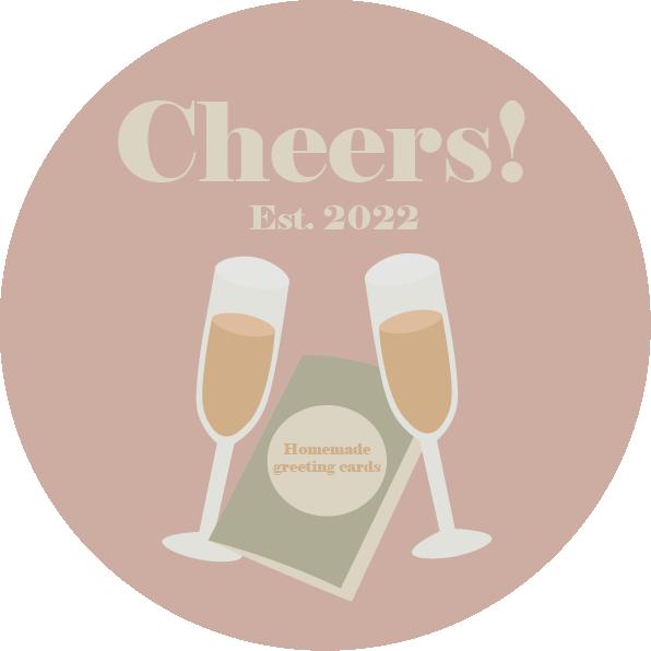
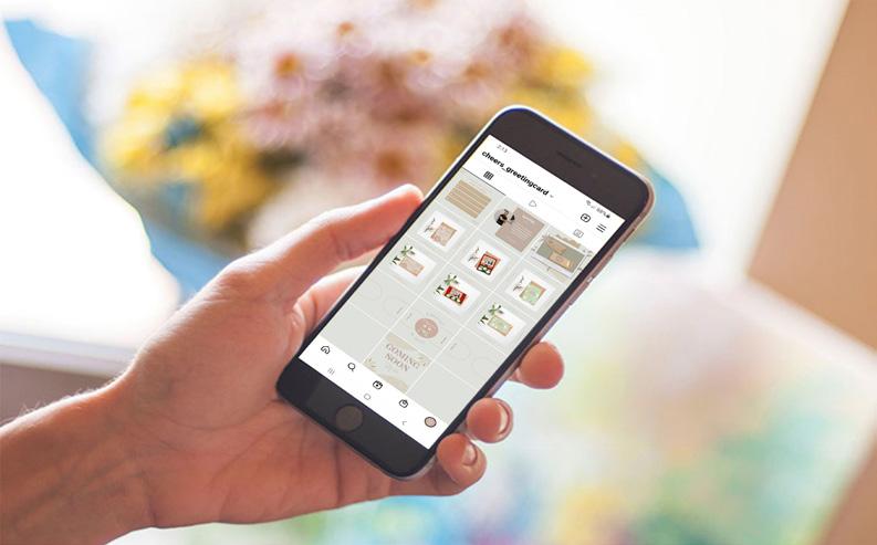
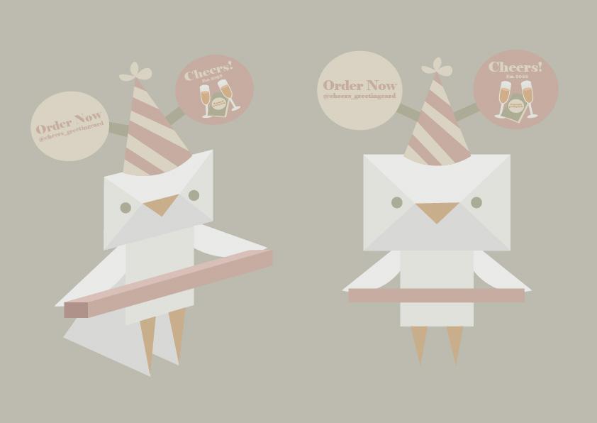
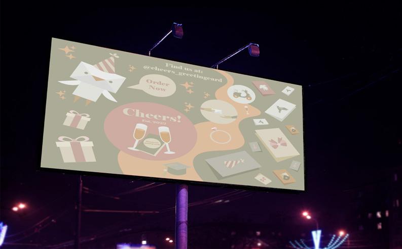
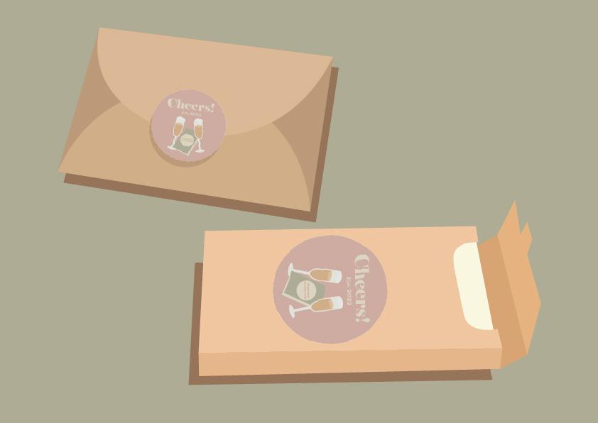
Cheers!


24
Photography
25
06

26
07
UI/UX Design
27
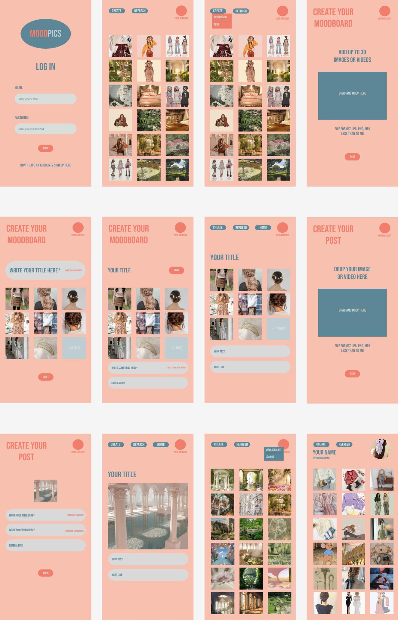
Mood Pics
https://www.figma.com/proto/jeIEfY7YCXpFV9L4TcSeV6/Design-and-Digital-Media-Wireframe?node-id=0%3A1
28
Portfolio UI (PC)
https://www.figma.com/proto/C54Qb6eBBXBlEgaTPpCqBu/Design-and-Digital-Media-Portfolio-UI-PC?node-id=0%3A1

29
https://www.figma.com/proto/lYmlmxE99fANBXQkHRpfUW/Design-and-Digital-Media-Portfolio-UI-Mobile?node-id=0%3A1

30
Portfolio UI (Mobile)
08
Poster Design
31
Rhetorical Tropes


32
Long Distance Relationship (LDR)
15, 2021 Migrate June 15, 2021 Online Motorcycle Taxi June 15, 2021 Netizen June 15, 2021
June
July 8-16, 2021
December 17, 2021-January 17, 2022
March 7, 2022
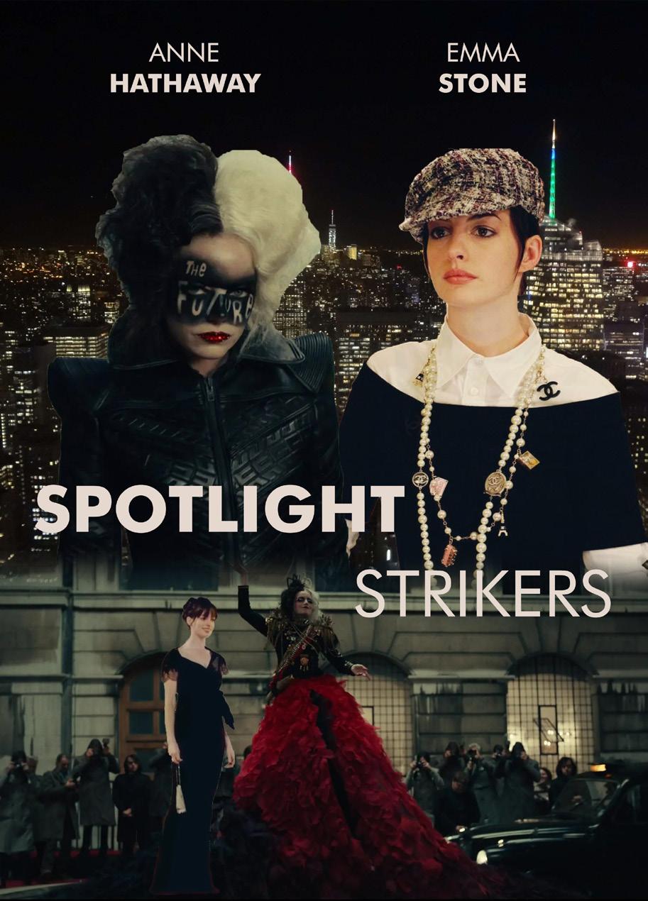

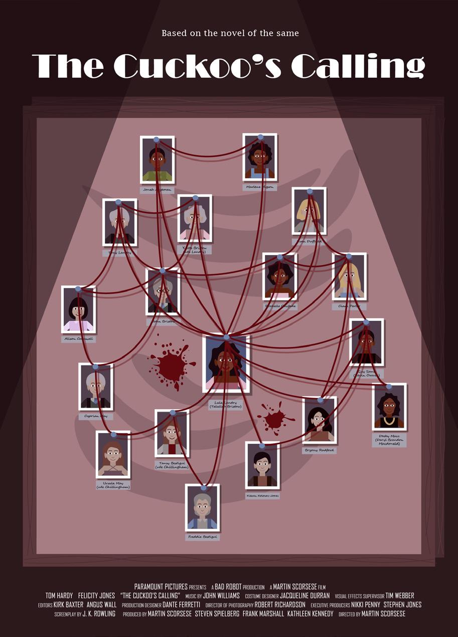
33 The Cuckoo’s Calling
Strikers
Spotlight
Culinary
Bandung
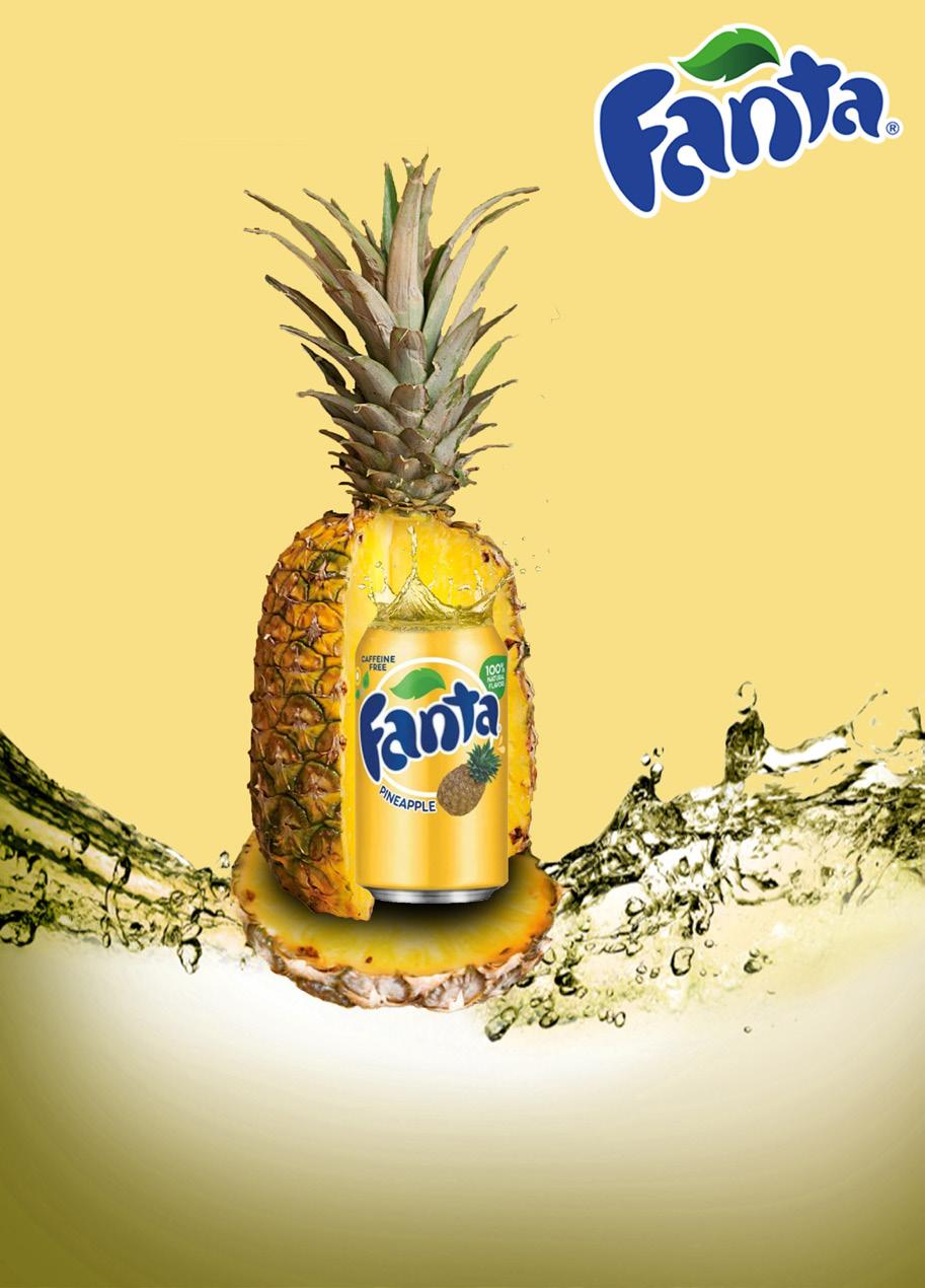
Pineapple Drinks

Pepsi
December 19-23, 2021
Fanta
December 19-23, 2021
34
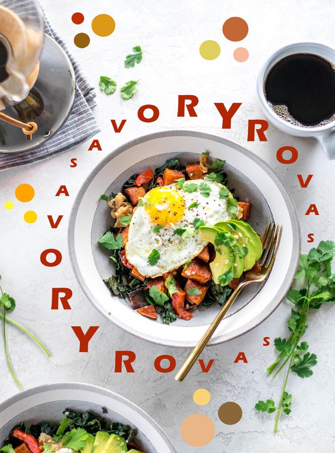
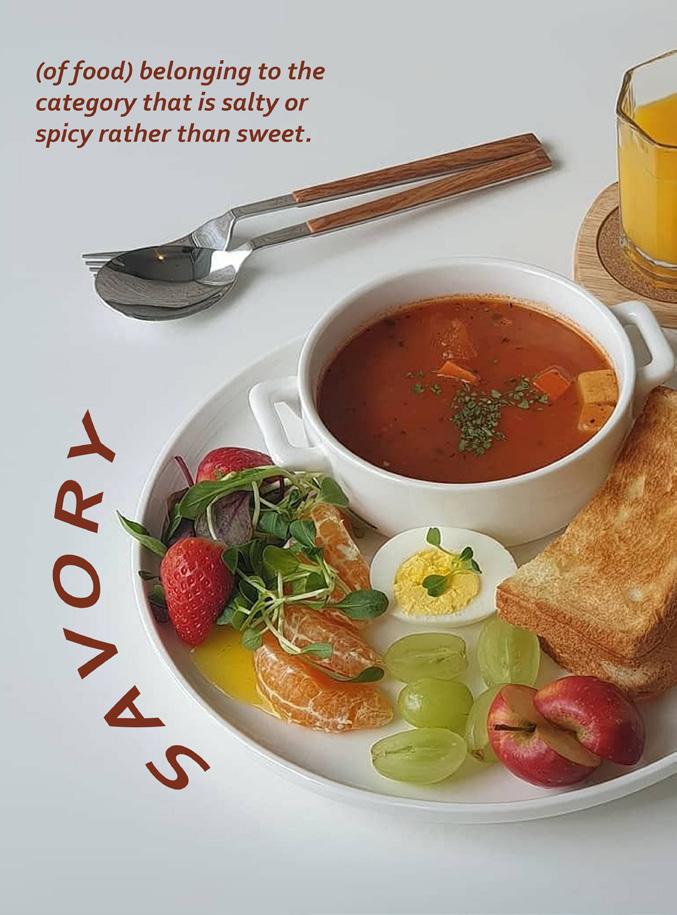
Savory: Separation


35
Emphasis March 17-18, 2022 Proportion March 17-18, 2022 Rhythm March 17-18, 2022 Balance March 17-18, 2022
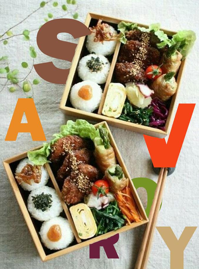
Savory: Fusion


36
Emphasis March 23, 2022 Proportion March 23, 2022 Rhythm March 23, 2022 Balance March 23, 2022
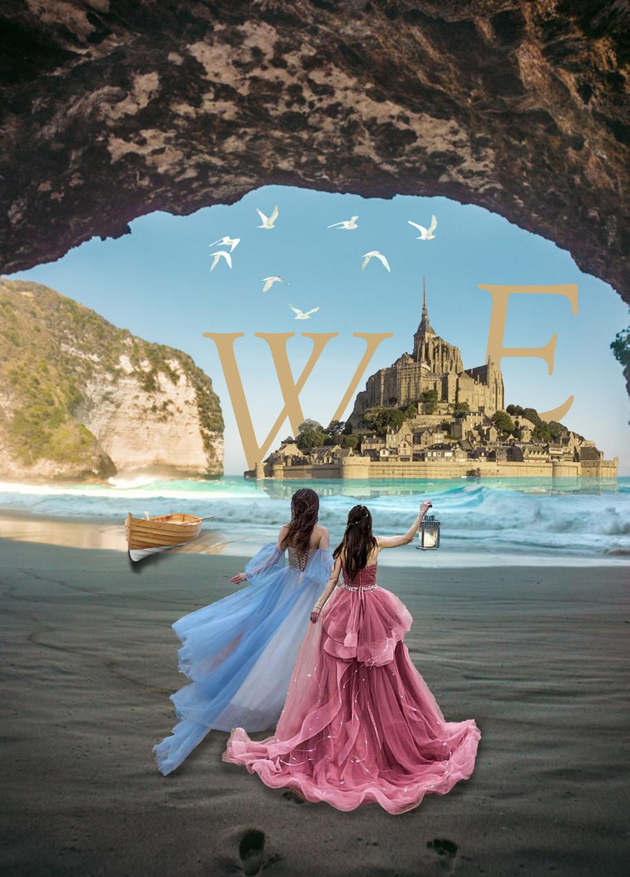
We May 17, 2022
June 6, 2022
June 6, 2022


37
Mystery: Saul Bass
Jump: Ken Garland
09
Photo Manipulation
38
Waterfall on Mobile
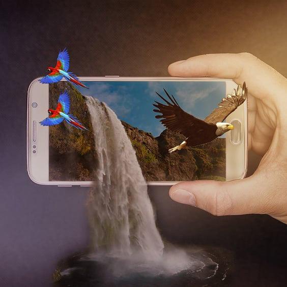
July 1, 2018
Falling Into a Story
December 11, 2018

39
July

Story Book
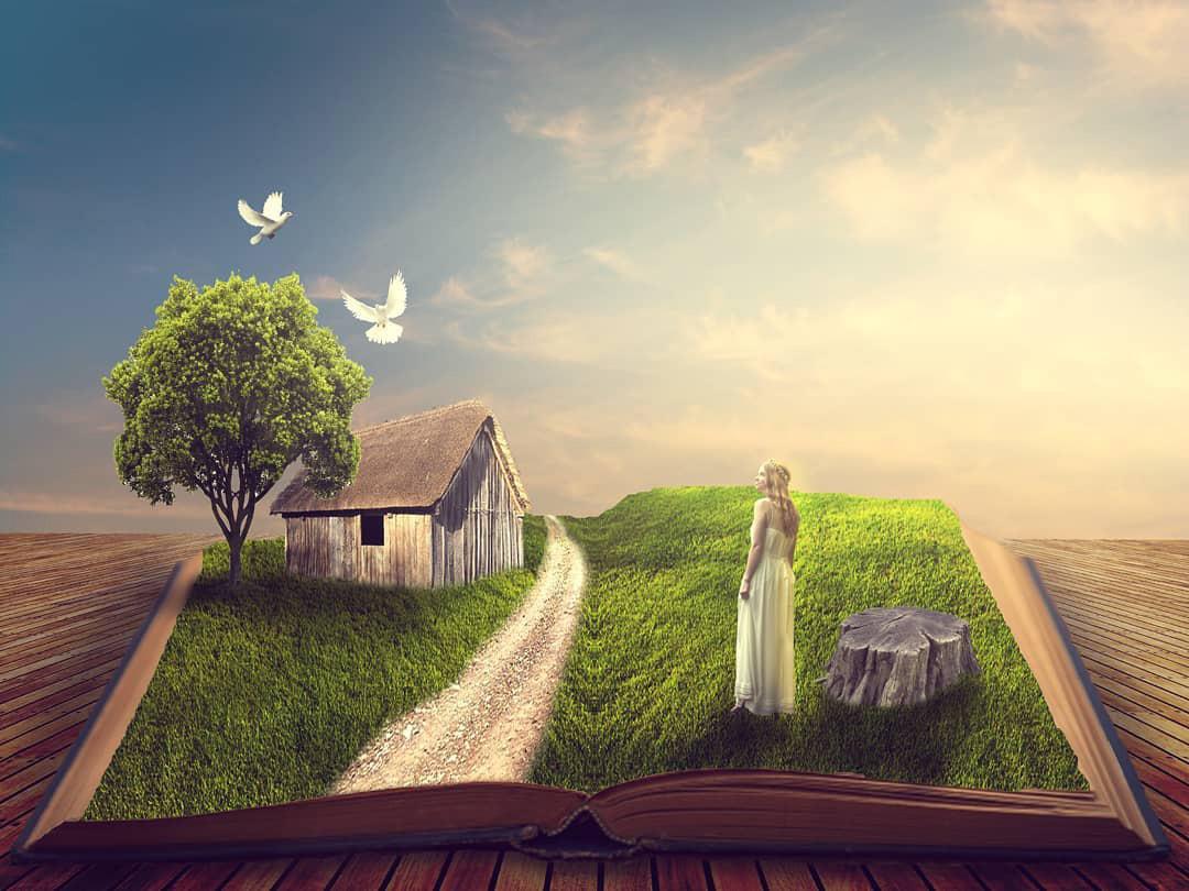

July 10, 2018
July 10, 2018
July 11, 2018
40
The Sea on a Guitar
1, 2018
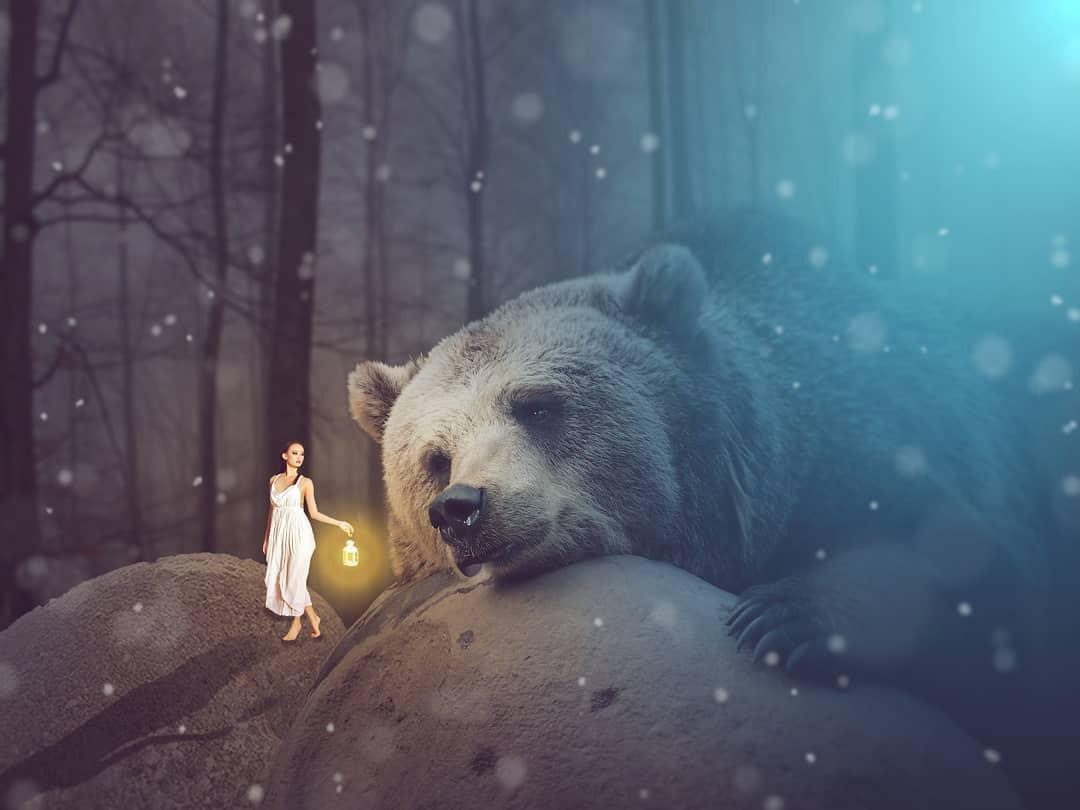
Walking to Heaven July 10, 2018 Giant Bear
July 10, 2018
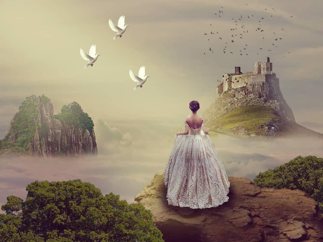
Kingdom on the Clouds
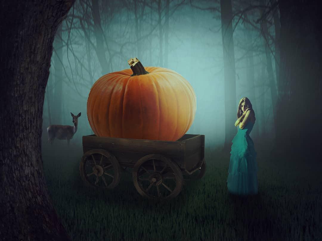
Pumpkin Wagon
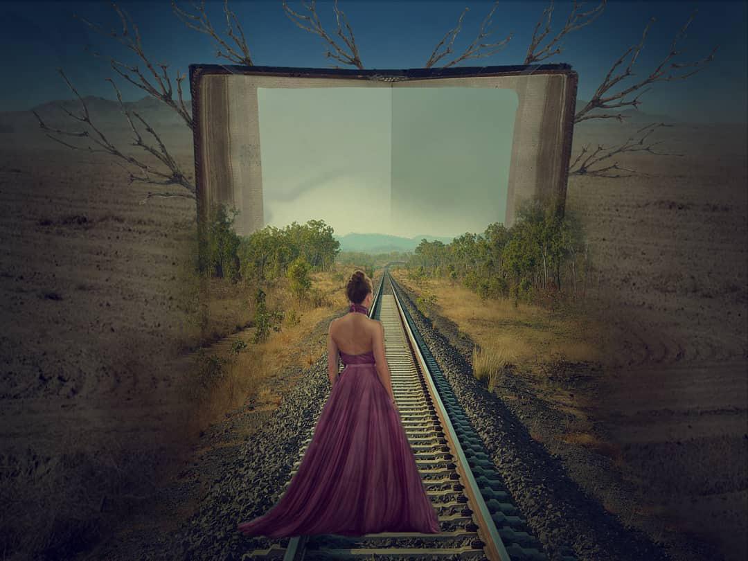
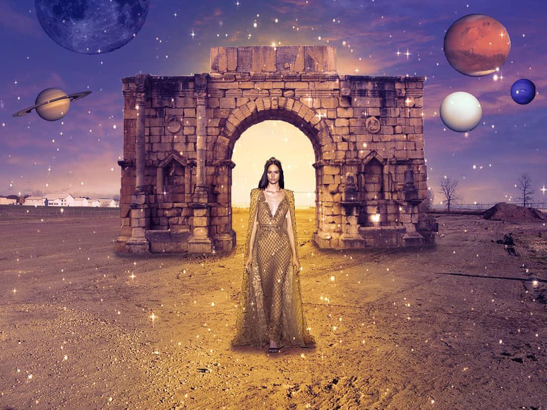


41 Journey Book July 11, 2018 Somwhere in Space July 12, 2018
the Clouds July 15, 2018 Missing You July 20, 2018 Science Fiction August 17, 2018
Above
July 27, 2018
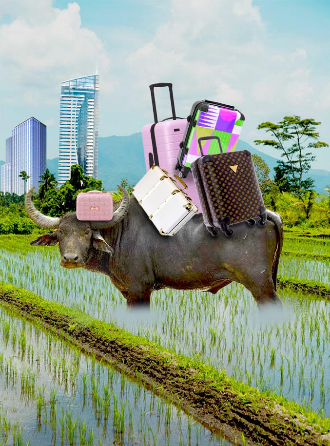
Fashion
August 19, 2018
Spaceship
October 15, 2018
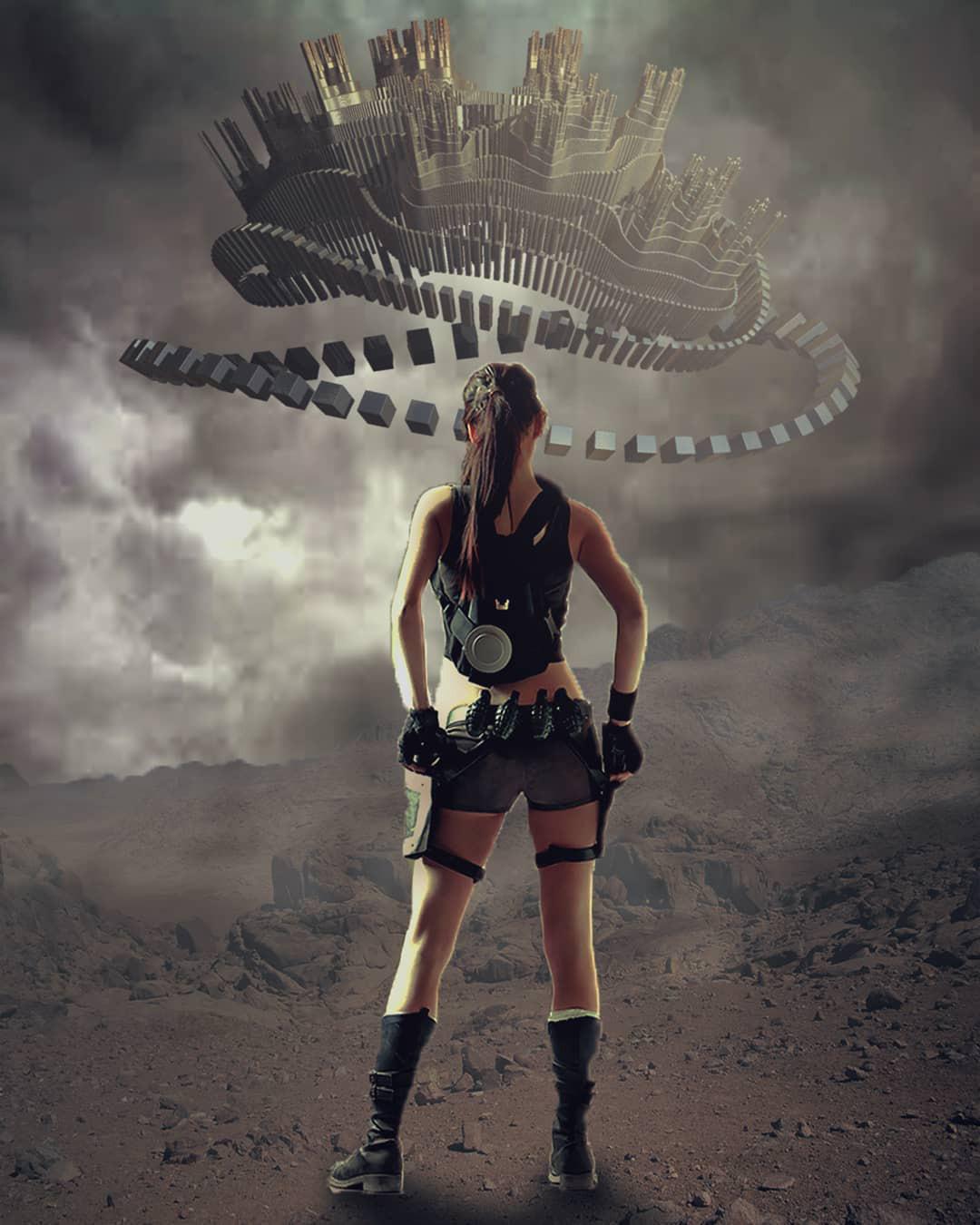
Ocean Cube in the Mountains


August 31, 2018
Once Upon a Jaws

March 30, 2019

42
The Lost City
