19 minute read
7.3 Measures of Australia’s distribution of income and wealth


7.2 Definition, nature and direction of income and wealth
KEY KNOWLEDGE
Advertisement
• the definition of the selected economic issue, including relevant measures and statistical indicators
Source: VCE Economics Study Design (2023–2027) extracts © VCAA; reproduced by permission. Many people get income and wealth confused. As we shall see, they are not the same thing. 7.2.1 Definition and nature of income Income represents the flow of money to households measured over a period of time and is a major influence on consumption levels and material living standards. Each year in Australia, a total national income of well over $20 000 billion is generated from the production and sale of goods and services. As shown in figure 7.1, most people gain income from economic activities and selling their natural, labour and capital resources to the business sector. For instance, wages and salaries come from the sale of labour, whereas rent from property and interest and profits are derived from investments.
FIGURE 7.1 The creation of incomes in the circular flow model of the economy Flow 4 — Total value of finished production (GDP) per year Flow 2 — Total value of incomes (earned and unearned) paid per year 1. Wages and salaries 2. Rent 3. Interest, profits The Australian Economy Flow 1 — Total value of resources sold per year 1. Labour resources 2. Land resources 3. Capital resources Flow 3 — Total value of spending per year on Australian-made production (AD)
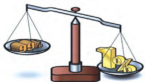
Business firms sector Household sector UNCORRECTED PAGE PROOFS When looking at incomes, we need to be aware that there are different measures. The two parts making up figure 7.2 shows some of the different types of income and how they are related. For instance, income can be earned and unearned. There is also transfer income from welfare, gross income before tax, disposable income, nominal income and real income or purchasing power that takes account of changes in prices. Each sheds light on slightly different aspects of income.
Types of income
Earned income Unearned income Transfer income Gross income Disposable income Social wage income Nominal income
Real income
Type of income Description
Earned income Comes from households selling their labour or supplying intellectual talents and physical power to businesses Unearned income Includes rent and interest. It is received for allowing others to use your property or savings, or sometimes it represents a reward for risk.
Transfer income and other forms of income
Derived from government welfare payments. This is income mainly collected from taxation and then transferred to the neediest individuals by means of government welfare payments. They are a one-way transaction from the government to individuals where nothing is given in return. These transfers include cash benefits given to the aged, unemployed, families, students, war veterans and the sick. These cash benefits are not available to the relatively rich and higher income earners, since they are based on an assets (wealth) and/or a means (income) test. Finally, there are other types of income — income from superannuation, along with fringe benefits (sometimes referred to as ‘perks’) such as the provision of a house or car, entertainment or school fees by companies that may be associated with some jobs. Gross income The sum of all income received by an individual from various sources such as wages, salaries, rent, interest, dividends and government welfare benefits, but before the payment of taxes Disposable income Equals the gross income of a person from all sources including government welfare payments, after the payment of personal income tax Social wage income The disposable income received by an individual, including private income and government welfare, after the payment of income tax and following the addition of the value of government services like health care provided free of charge or at a lower, subsidised price. Clearly, the level of a person’s social wage income gives a very clear picture of their actual purchasing power or access to goods and services, and hence their material living standards. Nominal income The number of dollars of income received by an individual measured over a period of time — perhaps an hour, a week, a month or a year (e.g. $750 per week). It does not take into account the actual quantity of goods and services that these dollars will purchase (purchasing power), since this depends on the prices that are paid or the general inflation rate that is often measured by the consumer price index (CPI). This is where it is handy to use another measure called real income. Real income Equal to a person’s nominal level of income measured in so many dollars, after taking into account the inflation rate or change in general level of consumer prices. For example, if the average level of household’s nominal incomes went up by, say, 4 per cent during 2017–18 and average consumer prices during the year went up by 3 per cent, then real incomes or purchasing power would have risen by 1 per cent UNCORRECTED PAGE PROOFS (i.e. 4 per cent rise in nominal income minus 3 per cent rise in inflation equals a 1 per cent rise in real incomes). Normally, the rise in real income would lead to better average material living standards.
1. The distribution of market or private incomes from personal sources (such as wages, interest, rent, dividends and profits)
2. The receipt of government welfare benefits or income support
3. The distribution of gross income (total income from all sources) 5. The distribution of disposable household incomes (spendable incomes) 4. The payment of government personal income tax The distribution of social wage income 6. The receipt of indirect benefits including government community services (for example, education and health often provided cheaply or free) 7.2.2 Definition and nature of wealth Wealth is different from income. Wealth consists of a stock of assets or things of value owned by private individuals or governments, measured at a point in time (e.g. at 30 June), while income is a flow of money measured over a period of time (e.g. one financial year from 1 July one year to 30 June the next year). • Private wealth includes the value of property, houses, shares, bonds, savings, superannuation contributions, and antiques or collectibles. • Government or public wealth includes land, buildings, equipment, and other infrastructure associated with the provision of collective or public services such as power, transport, health and education. For most individuals, wealth takes years to accumulate. Those with high incomes can use their surplus income or savings to purchase and expand their assets or wealth and, in turn, increase their level of unearned income. However, although it takes a lifetime for most to accumulate wealth, in Australia considerable wealth is inherited or passed from one generation to the next, usually when family members die. As investments, these assets can earn extra income for the owner. As a result, inequality in the income–wealth cycle in one generation continues into the next.UNCORRECTED PAGE PROOFS
FIGURE 7.3 Some wealthy Australians. For example, Gina Rinehart was Australia’s wealthiest person, reputedly worth over $31 billion. While some of her wealth was inherited from her father’s mining company, Hancock Prospecting, many years ago, she has significantly grown these assets, partly through astute decision making. As can be seen, other wealthy Australians are involved with mining, building, transport and technology.
Permission clearance pending
7.2 Activities
Students, these questions are even better in jacPLUS
Receive immediate feedback and access sample responses Access additional questions
Track your results and progress UNCORRECTED PAGE PROOFS
Find all this and MORE in jacPLUS
7.2 Exercise
1. Define the term income.
(1 mark)
2. Distinguish between the three types of income: earned income, unearned income and transfer income.
3. Define the term wealth.
(3 marks)
(1 mark)
4. Explain the relationship that exists between income and wealth. (2 marks) 5. a. Classify each of the following types of income as earned, unearned or transfer income. (5 marks) Income Classification of income i. Interest from your savings account ii. Casual wages from your part-time job iii. Dividends from some shares you own iv. The aged pension v. Sales commissions for a job b. Classify each of the following items as either income or wealth. (7 marks) Item Classification (income or wealth) i. Your superannuation account ii. Your at-call savings deposit in the CBA iii. Rent from an apartment you own iv. A small business you own v. The value of your shares in Rio Tinto vi. Your AUSTUDY allowance vii. Your old coin and stamp collection c. Use the information below to calculate: i. the percentage rise in your real gross wages between one year and the next (1 mark) ii. the annual percentage change in your real disposable wage. (1 mark) • Your annual nominal wage rises by 5.3 per cent. • The annual inflation rate is 1.9 per cent. • The annual percentage rise in the amount of your total tax is 2.0 per cent. Fully worked solutions and sample responses are available in your digital formats. 7.3 Measures of Australia’s distribution of income and wealth UNCORRECTED PAGE PROOFS
KEY KNOWLEDGE
• relevant measures and statistical indicators of the distribution of income and wealth
Source: VCE Economics Study Design (2023–2027) extracts © VCAA; reproduced by permission.
It is important to measure changes in Australia’s income and wealth over a period of time since this helps us to track changes in society’s wellbeing and living standards. In doing so, it is not just a matter of knowing the levels of income and wealth in dollar terms but, more importantly, how each is divided or shared across the total population.
7.3.1 Measures of Australia’s income distribution
FIGURE 7.4 The Australian Bureau of Statistics (ABS) helps us monitor changes in the way the nation’s ‘income cake’ is sliced, or divided between different groups, states and occupations. Recent data for Australia and around the world shows a general increase in income and wealth inequality. Income distribution refers to the way the nation’s ‘income cake’ (or ‘income pie’ as it is often called) is divided or shared between individuals and income units making up the population. The pattern of income distribution is regarded as fairly even if all people receive similar-sized slices of the income cake. However, in Australia, the distribution pattern is uneven because people receive vastly different percentage shares of total national income. Despite this inequality, there would be even more unevenness if the Australian government did not use redistribution policies to reduce inequality. The Australian Bureau of Statistics (ABS) measures income distribution every few years (the last in 2017–18, released in July 2019) using a survey of income units (i.e. family or other groupings of people living in the same household) in private dwellings throughout Australia. Trained interviewers go around to a small but representative cross-section of the population (i.e. about 0.2 per cent of the population). Typically, the interviewers collect a range of statistical data that measure the distribution of different types of incomes. Some common measures of income distribution include the following: • The distribution of market or private income refers to how equally or unequally personal incomes of all types (wages, salaries, profits of the self-employed, rent, interest, dividends) are divided, prior to any government efforts to redistribute income more evenly. • The distribution of disposable weekly income refers to how personal or private incomes (wages, salaries, profits of the self-employed, rent, interest and dividends, plus the receipt of government welfare benefits, and after the payment of personal income tax) are divided between individuals. • The distribution of equivalised disposable income is a similar measure to disposable income (outlined above), except that special statistical adjustments have been made (i.e. equivalence scales have been applied) to the disposable incomes of households. This allows for clearer comparisons to be made of the economic wellbeing or living standards of households of different sizes and composition. For example, to enjoy the same living standards, a household consisting of three people would normally need more income than a household with only one person. The resulting measure is a far better indicator of actual income distribution, and it is the main one to which we will refer. • The distribution of final income takes full account of the impact of government policies — including the payment of welfare, income tax, provision of free or subsidised services, and the payment of indirect taxes such as the GST — on the level of market or private incomes. This measure best indicates how evenly or unevenly incomes are ultimately divided and whether individuals can consume or have access to basic goods and services.UNCORRECTED PAGE PROOFS For Australia, the most common measure of how income is shared or divided up is the distribution of equivalised disposable weekly income. There are five main steps involved in the measurement of this, summarised in figure 7.5.
Step 1 Conduct the income survey.
Step 2 Rank income recipients by income level from lowest to highest.
Divide income recipients into five equal-sized quintile groups and calculate the average income and average income share for each quintile.Step 3 Use the data to draw a Lorenz diagram.Step 4 Calculate the Gini coefficient as a measure of inequality.Step 5 Step 1: Conduct the income survey The ABS conducts a household survey of income and wealth in which it collects data about the sources and level of weekly income based on a representative cross-section or sample of the population. Step 2: Rank income recipients by income level Once the information is collected, the ABS ranks income recipients from the lowest to the highest weekly income in ascending order. This establishes the spread or range of all weekly incomes. Step 3: Divide income recipients into five quintile groups and calculate the average income and average income share for each quintile The ranked weekly incomes are then broken into five equal-sized groups with the same number of income recipients in each group. These five groups are called quintiles (each representing 20 per cent of the total number of income recipients). By adding up the total income of each quintile and dividing this by the number of income recipients, an average level of income for that quintile and the other quintiles can be calculated. These results can then be used to draw a pie graph like that in figure 7.6 for 2017–18. This graph for Australia clearly shows that there is significant income inequality between the average income in quintile 1 relative to that in quintile 5. For instance, quintile 1 receives a mean income of only $399 per week against $2142 for quintile 5. Put another way, some people receive a much larger share or slice of the nation’s income ‘cake’ than others. In addition, with this data it is also possible to calculate the proportion or percentage of Australia’s total income cake that is received by each quintile (each representing 20 per cent of the whole population) — those making up quintile number 1 (the lowest 20 per cent of all income units), through quintiles 2, 3 and 4, up to quintile number 5 (the highest 20 per cent of all income units). Naturally, in totally equal societies all quintiles would receive exactly the same-sized slice or proportion of the income cake (i.e. 20 per cent). However, as shown in figure 7.7, in unequal societies like Australia quintile number 1 would receive a much smaller percentage share of the income cake than quintile number 5. Notice that in 2017–18, quintile 1 receives just 7.5 per cent of the income cake, compared with a massive 40.8 per cent for quintile 5. Step 4: Use the data to draw a Lorenz diagram UNCORRECTED PAGE PROOFS If we choose to do so, data showing the percentage of total income received by each quintile can be used to construct a graph called, a Lorenz diagram (named after the US economist, Max Otto Lorenz, 1905). From this, it is possible to calculate the level of income inequality in a country. Referring to figure 7.8, notice that this
Lorenz diagram plots cumulative quintiles numbered 1 to 5 along the lower horizontal axis, and the cumulative percentage of equivalised disposable income (i.e. this cumulative figure can be gained by adding up each successive income share) up the vertical axis. Notice, too, that there is a diagonal line sloping upwards from left to right, representing total equality in income distribution where all quintiles receive exactly the same-sized income share and potentially enjoy the same levels of consumption and living standards. Figure 7.8 also contains the actual 2017–18 Lorenz curve for Australia’s income distribution. Notice that this curve bends downwards away from the diagonal line (the line that represents total equality). The greater this bend or deviation in the actual Lorenz curve, the greater the degree of inequality, whereas a flatter curve shows more equality in income distribution.
FIGURE 7.6 Mean equivalised weekly disposable income by quintile, Australia, 2017–18 399 664 902 1204
2500 2142
2000 1500 1000 500 0 Income quintile 1 ($) — lowest Income quintile 2 ($) Income quintile 3 ($) Income quintile 4 ($)
Level of equivalised disposable weekly income ($) Income quintile 5 ($) — highest
Cutting up or distributing Australia’s income cake
Quintile 2 $664 Quintile 3 $902 Quintile 4 $1204
Quintile 5 $399 Quintile 5 $2142 Source: Data derived from ABS 6523.0 (Table 1.1).
FIGURE 7.7 Inequality in the share of Australia’s equivalised weekly income received by each quintile 7.5 12.5 17.0 22.7
50 40.4
40 30 20 10 Non-cumulative quintile 1 (20%) Non-cumulative quintile 2 (40%) Non-cumulative quintile 3 (60%) Non-cumulative quintile 4 (80%)
Percentage share of the total income cake by each quintile Non-cumulative quintile 5 (100%)
Percentage share of Australia’s equivalised weekly disposable income cake by each individual quintile, 2017–18 0 UNCORRECTED PAGE PROOFS
Source: Data derived from ABS 6523.0 (Table 1). Individual income quintile
FIGURE 7.8 Lorenz diagram showing inequality in Australia’s distribution of equivalised weekly disposable income received by cumulative quintile, 2017–18
Australia’s Lorenz curve showing the distribution of income
7.5 20.0 37.0 59.7 100 20
40 60 80 100 100 90 80 70 60 50 40 30 20 10 0 Cumulative quintile 0 (0%)
Cumulative quintile 1 (20%) Cumulative quintile 2 (40%) Cumulative quintile 3 (60%) Cumulative quintile 4 (80%)
Cumulative share of total equivalised disposable income (percentage) Cumulative quintile 5 (100%)
Equivalised income share by cumulative quintile 2017–18 Total equality in income distribution Total inequality in income 0 distribution
Area between the two lines determines the Gini coefficient for income = 0.328 Quintile
Cumulative quintile 0 (0%) Cumulative quintile 1 (20%) Cumulative quintile 2 (40%) Cumulative quintile 3 (60%) Cumulative quintile 4 (80%) Cumulative quintile 5 (100%)
Gini coefficient Equivalised income share by cumulative quintile 2017–18 Total equality in income distribution Total inequality in income distribution
0 7.5 20 37 59.7 100 0.328 0 20 40 60 80 100 0.000 0 0 0 0 0 100 1.000 Australia’s Lorenz curve for the cumulative distribution of income, 2017–18 Diagonal line represents the line of total equality in income distribution Note: Cumulative shares of income are calculated by working out a running total of previous individual quintiles. Cumulative quintile 2, for instance, is the sum of the individual percentage shares for quintiles 1 and 2. Cumulative quintile 4, for instance, is the sum of the individual percentage shares for quintiles 1, 2, 3, and 4. Source: Data derived from ABS, Household income and wealth, (Excel Table 1.1, EQUIVALISED DISPOSABLE HOUSEHOLD INCOME, Australia, 1994–95 to 2017–18), Data downloads, see https://www.abs.gov.au/statistics/ec onomy/finance/household-income-and-wealth-australia Step 5: Calculate the Gini coefficient as a measure of inequality Using this data for income distribution, the ABS publishes a general measure of income distribution called the Gini coefficient. It is a number between 0 (where there is total equality in income shares) and 1 (where there is total inequality in income shares). This data is shown in the table accompanying figure 7.8. Essentially, the Gini coefficient can be calculated using the Lorenz diagram. It involves measuring the area between the diagonal 45-degree line of absolute equality, and the actual Lorenz curve. The resulting figure is then expressed as a proportion of the total triangular area below the diagonal. This is illustrated in figure 7.9. Gini figures collected 0 UNCORRECTED PAGE PROOFS over a number of years can also be compared, to determine whether Australia’s inequality in income distribution is increasing or decreasing. Figure 7.10 shows that between 1994–95 and 2017–18, there was a general upward trend (see the broken trend line marked in red) in Australia’s Gini coefficient for equivalised disposable weekly income — that is, inequality has been increasing slowly. We will investigate the possible reasons for this later in the topic.
100
Gini coefficient = Area A (Area A + Area B)
Cumulative share of total income (%)
Line of total inequality Cumulative percentage of population
Area A Area B Lorenz curve Line of total equality
100 FIGURE 7.10 Trends in Australia’s Gini coefficient, 1994–95 to 2017–18 0.31 0.302 0.30 0.292 0.29 0.28 0.27 1994–95 0.31 0.311 0.309 0.297 0.314 0.336 0.329
0.32 0.333 0.323
0.33 0.328 Gini coefficient 0.32
Trends in Australia’s Gini coefficient for equivalised household disposable income 0.34 1996–97 1999–00 2000–01 2001–02 2002–03 2003–04 2004–05 2005–06 2006–07 2007–08 2008–09 2009–10 2010–11 2011–12 2012–13 2013–14 2014–15 2015–16 2016–17 2017–18 Source: Data derived from ABS, Household income and wealth, see https://www.abs.gov.au/statistics/economy/finance/hous ehold-income-and-wealth-australia. Some other measures of Australia’s income inequality Apart from measuring income inequality by quintile, the ABS also measures other aspects of income distribution. For example, as shown in figure 7.11, there are at least three additional measures, each showing that there is considerable income inequality in Australia. 0 UNCORRECTED PAGE PROOFS 1. Graph 1 shows Australia’s distribution of income by state or territory. Surprisingly, there is considerable variation with higher average incomes in Western Australia, for example, against those in Tasmania. 2. Graph 2 illustrates Australia’s distribution of income by gender. It indicates that average male weekly income is 17 per cent higher than that of females. 3. Graph 3 is about Australia’s distribution of income by occupation. For instance, average weekly wages in mining are more than double those in accommodation and food services.
Graph 1 – Inequality in average weekly income before tax ($) by state Annual average weekly income ($) 2500 1908 1879 1764 1750 1737 1695 1569 1520 2000 1500 1000 500 ACT WA NSW Vic Aust State NT SA Tas 2000 1919.5 1500 1598.6 (83% of male 1000 earnings) 500 0 Average all male full time total weekly Average all female full-time total earnings ($) May 2021 weekly earnings ($) May 2021.
Graph 2 – Inequality in Australia’s distribution of total weekly earnings between males and females ($) Average weekly earnings ($) Gender Mining 0 500 1000 1500 Average weekly income ($) 2000 2500 3000 Finance and insurance Education & training Australian average Transport, postal & warehousing Rental, hiring & real estate Arts & recreation services Administrative & support services Accommodation & food services 1201 1311 1512 1534 1544 1562 1593 1695 1696 1697 1737 1844 1850 2037 2065 2102 2674 Graph 3 – Inequality in Australian average weekly income by occupation ($) Source: All data derived from ABS, Average weekly earnings, Australia, May 2021, see www.abs.gov.au/statistics/labour/earningsand-work-hours/average-weekly-earnings-australia/latest-release. 7.3.2 Measures of Australia’s wealth distribution The distribution of wealth refers to the way the nation’s ‘wealth cake’ is divided or shared between individuals making up the total population. The pattern of wealth distribution is regarded as relatively even, if all people own similar-sized slices of a nation’s wealth pie. However, in Australia, the pattern of distribution is highly 0 UNCORRECTED PAGE PROOFS uneven. Just a few people own far more assets than the rest of the population.