“c07TheDistributionOfIncomeAndWealth_PrintPDF” — 2022/6/2 — 15:01 — page 14 — #14
To monitor trends, every couple of years the ABS estimates the distribution of Australia’s wealth by quintile, or as it is called, net worth. It uses the same approach as that for the distribution of income. Net worth refers to the difference in value between an individual’s assets owned, minus any debt or liabilities. There is positive net worth when there is an excess of assets owned by households over their liabilities, but negative when the values of liabilities exceed assets.
O
O
FS
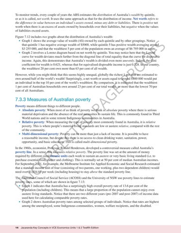
Figure 7.12 includes two graphs about the distribution of Australia’s wealth: • Graph 1 shows the average value of wealth (A$) owned by each quintile and by other groupings. Notice that quintile 1 has negative average wealth of $5000, while quintile 5 has positive wealth averaging around $3 255 000, and that the wealthiest 5 per cent of the population owns an average of $6 795 000 in assets. • Graph 2 involves a Lorenz diagram based on net worth by quintile. You may notice here that the Lorenz curve for wealth deviates much further from the diagonal line of total equality than the curve for disposable income. Again, this demonstrates that Australia’s wealth is divided even more unevenly. Indeed, the Gini coefficient for wealth is 0.621, whereas that for equivalised disposable income is just 0.328. In our country, the wealthiest 20 per cent own more than 63 per cent of all wealth.
PA
7.3.3 Measures of Australian poverty
G
E
PR
However, while you might think that this seems highly unequal, globally the richest 1 per cent are estimated to own around half of the world’s wealth! Surprisingly, a net worth or assets equal to around $100 000 would put an individual in the top 10 per cent of the world’s wealthiest. By comparison, it is estimated that the wealthiest 1 per cent of Australian households own around 23 per cent of our total wealth, or more than the lowest 70 per cent of all Australians.
CO RR EC
TE
D
Poverty means different things to different people. • Absolute poverty: When most of us think of poverty we think of absolute poverty where there is serious material deprivation and the absence of the real necessities to sustain life. This is commonly found in Third World nations and in some remote Indigenous communities in Australia. • Relative poverty: When measuring the type of poverty most commonly found in Australia, it is relative poverty. This is where people’s material living standards are low or austere relative, compared with the rest of the community. • Multi-dimensional poverty: Poverty can be more than just a lack of income. It is possible to have a reasonable income, but despite this there is no access to clean drinking water, sanitation, power, opportunity, and basic education. This is called multi-dimensional poverty. In the 1960s, economist, Professor Ronald Henderson, developed a controversial measure called Australia’s poverty line. In a sense, this measures relative poverty. The poverty line was set at the amount of money required by different-sized income units each week to sustain an austere or very basic living standard (i.e. to purchase essential food, shelter and clothing). This is normally set at 50 per cent of median Australian incomes. For September 2021, for example, the Melbourne Institute for Applied Economic and Social Research estimated that a standard income unit of four (consisting of two parents, one working, plus two dependent children) would need over $1,034.85 per week (including housing) to stay above the standard poverty line.
U
N
The Australian Council of Social Service (ACOSS) and the University of NSW use poverty lines to estimate poverty rates, some of which are shown in figure 7.13: • Graph 1 indicates that Australia has a surprisingly high overall poverty rate of 13.6 per cent of the population (including children). This means that a large proportion of the population cannot enjoy even austere living standards. Notice that there are two different years (pre-2007 and post-2007) of income data used here for calculating comparable poverty rates. • Graph 2 shows Australian poverty rates among selected groups of individuals. Notice that rates are highest among the unemployed, some Indigenous communities, women, welfare recipients, and the disabled.
14
Jacaranda Key Concepts in VCE Economics Units 1 & 2 Twelfth Edition


