“c02DecisionMakingInMarkets_PrintPDF” — 2022/5/25 — 13:13 — page 96 — #30
O
O
FS
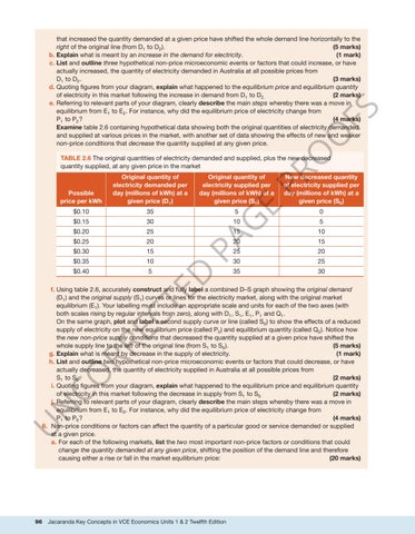
that increased the quantity demanded at a given price have shifted the whole demand line horizontally to the right of the original line (from D1 to D2 ). (5 marks) b. Explain what is meant by an increase in the demand for electricity. (1 mark) c. List and outline three hypothetical non-price microeconomic events or factors that could increase, or have actually increased, the quantity of electricity demanded in Australia at all possible prices from D1 to D2 . (3 marks) d. Quoting figures from your diagram, explain what happened to the equilibrium price and equilibrium quantity of electricity in this market following the increase in demand from D1 to D2. (2 marks) e. Referring to relevant parts of your diagram, clearly describe the main steps whereby there was a move in equilibrium from E1 to E2 . For instance, why did the equilibrium price of electricity change from P1 to P2 ? (4 marks) Examine table 2.6 containing hypothetical data showing both the original quantities of electricity demanded and supplied at various prices in the market, with another set of data showing the effects of new and weaker non-price conditions that decrease the quantity supplied at any given price.
35
$0.15
30
$0.20
25
$0.25
20
$0.30
15
$0.35
10
$0.40
5
New decreased quantity of electricity supplied per day (millions of kWh) at a given price (S0 )
5
0
E
$0.10
Original quantity of electricity supplied per day (millions of kWh) at a given price (S1 )
G
Possible price per kWh
Original quantity of electricity demanded per day (millions of kWh) at a given price (D1 )
PR
TABLE 2.6 The original quantities of electricity demanded and supplied, plus the new decreased quantity supplied, at any given price in the market
5
15
10
D
PA
10 20
15
25
20
30
25
35
30
U
N
CO RR EC
TE
f. Using table 2.6, accurately construct and fully label a combined D–S graph showing the original demand (D1 ) and the original supply (S1 ) curves or lines for the electricity market, along with the original market equilibrium (E1 ). Your labelling must include an appropriate scale and units for each of the two axes (with both scales rising by regular intervals from zero), along with D1 , S1 , E1 , P1 and Q1 . On the same graph, plot and label a second supply curve or line (called S0 ) to show the effects of a reduced supply of electricity on the new equilibrium price (called P0 ) and equilibrium quantity (called Q0 ). Notice how the new non-price supply conditions that decreased the quantity supplied at a given price have shifted the whole supply line to the left of the original line (from S1 to S0 ). (5 marks) g. Explain what is meant by decrease in the supply of electricity. (1 mark) h. List and outline two hypothetical non-price microeconomic events or factors that could decrease, or have actually decreased, the quantity of electricity supplied in Australia at all possible prices from S1 to S0 . (2 marks) i. Quoting figures from your diagram, explain what happened to the equilibrium price and equilibrium quantity of electricity in this market following the decrease in supply from S1 to S0. (2 marks) j. Referring to relevant parts of your diagram, clearly describe the main steps whereby there was a move in equilibrium from E1 to E0 . For instance, why did the equilibrium price of electricity change from P1 to P0 ? (4 marks) 6. Non-price conditions or factors can affect the quantity of a particular good or service demanded or supplied at a given price. a. For each of the following markets, list the two most important non-price factors or conditions that could change the quantity demanded at any given price, shifting the position of the demand line and therefore causing either a rise or fall in the market equilibrium price: (20 marks)
96
Jacaranda Key Concepts in VCE Economics Units 1 & 2 Twelfth Edition


