The Cape Peninsula University of Technology
Brand Identity Manual

1 Introduction 3 Our mission and vision 6 Our core values 7 Our brand plan 8 Our brand architecture 10 Leadership structures 10 Governance structures 11 Administration 12 Faculties and departments 13 Faculties and courses 14 Research centres and units 15 Recreational sports and codes 16 Clubs and societies 17 Brand management 19 Brand custodians 20 Brand signature rules & regulations 21 Our primary logotype 22 Single colour logotypes 24 Sub-logotypes 27 Co-branding 28 Brand colour and font palette 31 Primary colours 32 Faculty colours 34 Font palette 36 Brand copy style guide 43 Language style 44 Brand design language 49 Graphic elements 50 Photography 51 Stationery - letterheads, business cards, etc. 56 Stationery - envelopes 57 Stationery - folder 58 Stationery - email signature 59 Stationery - PowerPoint template 60 Brand design languagegrids and guidelines 61 Brand literature 62 Brand literature: Type 1A4 landscape 63 Brand literature: Type 2A4 portrait brochures 65 Brand literature: Type 3 A & BA5 portrait booklets 67 Brand literature: Type 3 CA5 portrait booklets 68 Brand literature: Type 4A5 graduate magazine 70 Brand literature: Type 5A4 Z-fold units 72 Brand promotional: Pull-up banners 73 Brand promotional: Posters 74 Faculty literature: Type 1 & 2A5 portrait boolets 75 Faculty literature: Type 3A & 3BA4 books and reports 76 Faculty literature: Type 4A5 departments 78 Faculty literature: Type 5A4 Z-fold 81 Faculty promotional: Wall banners 83 Faculty promotional: Posters 84 Vehicles 85 Clothing 88 Signage 93 Glossary of terms 95 CONTENTS
2
Brand Identity Manual
33
Introduction
The brand identity of an institution is the face it presents to clients, staff and suppliers, or the general public.
This face is not only the logotype and brand colours, it can extend to the tone and manner of marketing concepts and text, service methods, and in some cases, the way staff communicate with and treat their customers. In other words, its personality – its brand persona.
The purpose of the brand identity graphics is to improve the entity’s profile and to lend it wide recognition and a sense of professionalism, experience, reliability, prestige and permanence, amongst many other attributes, depending on the entity’s business plan, or mission and vision.
Its purpose is to brand the entity, and sometimes, through this branding, to reveal something about what the entity does, often with the help of a slogan, whilst giving it a unique look, to set it apart – to create a brand that is instantly
4
INTRODUCTION
recognisable, often merely by a logo symbol.
Its purpose is also to be the basis for a brand design language.
Consistency is the mainstay of building a strong, instantly- recognisable brand. It is important that we are all aware of this, and that those of us who are involved in producing marketing material of any kind, must be consistent in what we use and how we use it. Therefore, the brand must have an established set of rules and regulations for the use of the brand graphics. And for this reason, it is absolutely necessary to have a detailed Brand Identity Graphics Manual, which may also include examples of a brand design language, or elements of it.
In a large institution such as ours, where there are several campuses and faculties, and where large amounts of material is produced by a number of staff and thirdparty suppliers, it becomes absolutely necessary to have a system of capturing, archiving and updating advertising, graphic design, photography and brand
identity files – a central knowledge repository that includes an interactive training programme, a manageable and efficient process of approvals, and the appointment of a group of brand guardians responsible for the on-going maintenance of the brand.
This manual forms the printed version of the comprehensive Brand Identity Graphics and Design Language Manual.
An abridged version of this manual is available online as part of the website. An archive of all design files and photography for staff and approved suppliers is also available online.
Think of a brand as a person.
When creating or revising a brand, it helps to understand the brand and its image, by thinking of it as a person with attributes. We call this a brand persona and define its attributes in five ways:
• Physique – e.g. tall, well-built etc.
• Character – e.g. friendly, wild etc.
• Style – e.g. slick, well-dressed, fashionable etc.
• Tone – e.g. soft, musical, etc.
• Manner – e.g. confident, humble, assured etc.
The brand persona can also be represented in the way that text is written – its tone and manner – the way staff dress and speak to the public, the choice of causes to promote, and even the imagery and music it uses in its advertising.
Most importantly, the brand persona can inform the vision and mission of the brand.
5
Our vision: CPUT is Africa’s leading Smart University of Technology, globally renowned for innovation, with graduates that shape a better world for humanity.
Our mission:
CPUT transforms its students through world-class researchers who inspire knowledge production and innovation that are cutting edge.
Our values: CPUT agrees to oneness and smartness by:
• Embracing a culture of Ethics and Integrity;
• Seeking Kindness and showing compassion (human heartedness) for the well-being of all our students, staff, stakeholders and the CPUT community, as expressed in ubuntu as a way of living;
• Embracing Restoration as we deal with the legacy of our past and as we redress issues of equality, gender-based violence, and any form of discrimination;
• Being a testimony of Unity (ubunye) whilst embracing Diversity (ukungafani) in all its forms by being honest, transparent, credible and respectful;
• Showing Passion and demonstrating enthusiasm, devotion, intensity, tenacity and total commitment to everything that we undertake as a university of technology; delivering uncompromising quality service, and always searching for better ways of doing things;
• Taking Accountability and accepting responsibility for all our actions and the actions that we commit to; and
• Being Technologically Astute and understanding, as staff members or students of CPUT who aspire to become technologically astute, we will embrace and take ownership of and experiment with the possibilities technology offers.
66
OUR VISION, MISSION & VALUES
oneness and smartness:
environmentally conscious
high quality teaching
sustainable
kindness
passion
quality research & knowledge production
restoration
accountability
unity ( ubunye ) and diversity ( ukungafani )
curriculum relevance
ethics and integrity
technologically astute
vibrant living & learning environment
7
The CPUT Marketing & Communication Department (MCD) is responsible for the formulation of the brand plan, advertising and promotion plan, and their execution.
A brand plan includes:
• a defined brand essence and brand persona;
• brand architecture – see Brand Architecture on pages 7 – 10;
• defined and detailed target markets, shown here;
• overall marketing and advertising objectives and strategies;
• objectives and strategies for each of:
- promotional print – banners, flags, posters;
- print literature – prospectuses, reports, booklets leaflets;
- press advertising – newspapers and magazines;
- radio advertising, and
- online – website, blog and social media – dialogue;
• a media choice rationale;
• objectives and strategies, for each medium – radio, newspaper, magazine, outdoor.
It also includes a brand graphics manual such as this one, identifies Brand Custodians to help manage the brand’s image, marketing, promotion and advertising, and the training process for them.
Target audiences
Our customers
Primary: current and prospective students
MCD objective: to instill a sense of belonging and brand engagement, as well as work towards converting the current student into a brand ambassador for CPUT; to recruit undergraduate and postgraduate students.
MCD strategy: actively partner with internal units, structures and departments to communicate effectively and actively instill a CPUT culture among current
students; use various media to recruit students as part of the annual marketing plan, i.e. through school visits, career exhibitions, pamphlets, above-the-line advertising, and social media, etc.
Secondary: parents/ guardians
MCD objective: inform parents about the programmes on offer.
MCD strategy: use various media to inform parents/ guardians about CPUT as part of the annual marketing plan, i.e. through school visits, career exhibitions, pamphlets, above-the-line advertising, and social media, etc.
Tertiary: staff
MCD objective: establish, reinforce and validate the CPUT brand amongst staff.
MCD strategy: implement initiatives such as the custodian programme, but also MCD-driven marketing such as clothing, signage and vehicles along with
8
OUR BRAND PLAN
advertising and on-campus promotion, such as banners, posters and flags. All ads should be seen online and on notice boards around the various campuses, so that staff also see the external image MCD is building – see Brand Persona on page 9.
Our brand persona
Physique
This is how CPUT should appear. CPUT is larger than life. Its arms are widespread.
Tone
This is how CPUT should sound in all things.
Authoritative, knowledgeable, approachable.
Niche: Academia/ potential staff (global)
NOTE: This audience is also aimed at for recruitment purposes.
MCD objective: create a good impression of CPUT as a leading university of technology.
MCD strategy: publicise CPUT staff, academic, research and innovation and alumni/ achievements – see Brand Persona.
It is big, its campuses are widely spread, its hard to ignore in that it is a main player of provincial education culture, and its influences directly reach three provinces, and indirectly the whole country.
Character
This is how CPUT should impress. Respected, qualified, patient, inspiring. Similar to the teacher you liked the most at school.
Style
This is how CPUT should look in all things.
Innovative, modern, informative, consultative, caring.
Manner
This is how CPUT should act/ move in all things.
Assured, confident and inspiring.
NOTE: Some attributes in character, style, tone and manner can be shared.
Once the brand persona is agreed on it must be fully understood, accepted and used by any staff or third parties who deal with any aspect of marketing CPUT.
It is extremely important that the brand persona is used as an initial reference during the briefing stages of every piece of communication.
9
BRAND ARCHITECTURE
Office bearers Chancellor
Chairperson of Council
Vice-Chancellor & Principal
Deputy Vice-Chancellor: Teaching & Learning
Deputy Vice-Chancellor: Research, Technology Innovation & Partnerships
Deputy Vice-Chancellor: Knowledge & Information Technology Services
Registrar
Executive Director: Infrastructure Development & Facilities Management
Executive Director: Office of the ViceChancellor
Executive Director: Finance
Executive Director: Student Affairs
Executive Director: Human Capital
Chancellor
Vice-Chancellor and Principal
Deputy Vice-Chancellors
Registrar Executive Directors
Deans of Faculties
10
Chair of Council
BRAND ARCHITECTURE
Ministry of Higher Education and Training
Institutional Forum
Executive Management Committee
Council Council Committees
Senate
Joint Committees of Council and Senate
Governance Structures
Executive Management
Sub-Committees
Student Representative Council
Senate Committees
11
BRAND ARCHITECTURE
Administration
The University is administered through the departments as shown in the diagram.
VICE-CHANCELLOR
Personal Assistants
Personal Assistant
Director: Office of the Vice-Chancellor
DVC: Teaching and Learning
DVC: Teaching & Learning
Faculty Deans (6)
Fundani Centre for Higher Education Development
Campus Management
Continuing Education
Work Integrated Learning
Academic Planning
DVC: Research, Technology Innovation and Partnerships
DVC: Research, Technology Innovation & Partnerships
Postgraduate Studies Research Development Technology Transfer, Innovation & Industrial Linkages
Community Engagement & Partnerships
DVC: Knowledge & IT Services Registrar
DVC: Knowledge and IT Services Registrar
Computer Technology Services Management Information Systems
Library Services
E-Learning Technologies
CIET - Centre for Innovative Educational Technology
Central Student Administration
Central Academic Administration
Secretariat
Legal Services Records & Archives
Postal Services
Compliance Management
Executive Director: Finance
Executive Director: Student Services
Executive Director: Human Resources
Executive Director: Finance Executive Director: Student Services Executive Director: Human Resources
Finance & Cost Management
Finance Operations
Supply Chain Management/ Procurement
Health & Wellness
Student Governance & Leadership Development
Sports & Culture
Residences
Learning & Development
Employee Relations Policy, Remuneration & Benefits
Administration
Operations
Executive Director: Infrastructure Development & Facility Management
Executive Director: Infrastructure Development & Facility Management
Facility Management
Protection & Transport Services
Maintenance
Infrastructure Development & Planning
Advancement
Transformation & Development Quality Management
Strategic Planning
Internal Audit and Risk Management
Internal Audit & Risk Management
Marketing & Communication
12
BRAND ARCHITECTURE
Faculties and courses
The University has six faculties with various departments, distributed over six campuses and several satellite sites.
• Agriculture
• Agricultural Management
• Analytical Chemistry
• Biotechnology
• Consumer Science: Food & Nutrition
• Environmental Health
• Environmental Management
• Food Technology
• Horticulture
• Landscape Architecture
• Marine Science
• Nature Conservation
• Mathematical Sciences
• Accountancy
• Business & Information Administration
• Entrepreneurship
• Events Management
• Financial Information Systems
• Hospitality Management
• Human Resources Management
• Management & Project Management
• Marketing
• Operations Management
• Paralegal Studies
• Printing Management
• Public Administration
• Real Estate
• Retail Business Management
• Sports Management
• Tourism Management
• Diploma in Education
Grade R
• Ed in Foundation Phase
Teaching (Grade R – 3)
• Ed in Intermediate Phase
Teaching (Grade 4 – 7)
• Ed in Senior Phase & Further Education & Training Teaching (Grade 8 – 12)
• Ed Hons in Teaching & Learning
DISTRICT SIX CAMPUS
• Engineering: Chemical
• Medical Laboratory Sciences
• Dental Assisting
• Dental Technology
• Emergency Medical Care
• Somatology
• Nursing Science
• Optical Dispensing
• Daignostic Radiography
• Diagnostic Ultrasound
• Radiation Therapy
• Construction, leading to: Construction Management & Quantity Surveying
• Geomatics
• Engineering: Chemical
• Engineering: Civil
• Clothing and Textile Technology
• Computer Systems
• Engineering: Electrical
• Engineering: Industrial
• Nuclear Medicine Technology
• Architectural Technology
• Interior Design
• Fashion
• Visual Comunication Design
• Surface Design
• Product Design
• Jewellery Design & Manufacture
• Film Production
• Journalism
• Photography
• Public Relations & Communication
• Information & Communication Technology
• Applications Development
• Communication Networks
• Multimedia Applications
• Urban & Regional Planning
Disclaimer: This information is subject to change on each of these particular pages.
• Diploma in Education
Grade R
• B Ed in Foundation Phase
Teaching (Grade R – 3)
• B Ed in Intermediate Phase
Teaching (Grade 4 – 7)
• B Ed in Senior Phase & Further Education & Training Teaching (Grade 8 – 12)
• B Ed Hons in Teaching & Learning
• M Ed
• D Ed
• Engineering: Mechanical
• Engineering: Mechatronics
• Quality Surveying (BTech only)
• Engineering: Mechanical
• Maritime Studies
• Accounting leading to: Cost & Management
Accounting & Internal Auditing
• Office Management & Technology
• Sport Management
• Tourism Management
14
Research centres and units
• Centre for Computational and Applied Technology Mechanics
• Centre for Distributed Power and Electronic Systems
• Centre for Instrumentation Research
• Centre for Mechanics and Technology (CMT)
• Centre for Power Systems Research (CPSR)
• Centre for International Teacher Education
• Centre for Real-Time Distributed Systems (CRTDS)
• Centre for Substation Automation and Energy Management Systems (CSAEMS)
• Centre for Tourism Research in Africa (CETRA)
• Flow Process Research Centre (FPRC)
• Functional Foods and Research Unit (FFRU)
• Oxidative Stress Research Centre
• Product Lifecycle Management Competency Centre (PLMCC)
• Website Attributes Research Centre (WARC)
• Community Water Supply and Sanitation Unit
• Functional Foods Research Unit
• Obesity and Chronic Diseases of Lifestyle Research Unit
• Work-Integrated Learning Research Unit
• The Language Unit (the Fundani Centre for Higher Education Development)
• South African Renewable Energy Technology Centre (SARETEC)
• Biocatalysis and Technical Biology Research Group
• Computational and Applied Technologies Manufacturing
• Crystal Engineering
• Energy Institute
• Environmental Toxicity and Remediation
• French South African Institute of Technology (F'SATI) CPUT Satellite Programme
• Human Performance Laboratory
• HVDC and Harmonic Analysis Computational Studies
• Institute of Biomedical and Microbial Biotechnology (IBMB)
• Molecular Pathogenic Microbiology Research Group
• Radiochemistry and Ion Exchange Chromatography
• Technology Institute: Community Water Supply & Sanitation
NON-faculty units
• HIV & AIDS Unit
• Disability Unit Technology stations (supported by CPUT)
• Agrifood Technology Station
• Technology Station in Clothing and Textiles
• TIA Adaptronics Advanced Manufacturing Technology Laboratory
BRAND ARCHITECTURE
Research centres and units
The University supports or has affiliations with research centres and units both on and off campus as shown in this listing.
Disclaimer: This information is subject to change on each of these particular pages.
1515
BRAND ARCHITECTURE
Recreational sports and codes
The University offers a wide range of recreational and sports activity through its many clubs.
RECREATIONAL SPORTS
• Inter-residence netball league
• Inter-residence football league
• Weight-loss programme
• Rock climbing
• Learn to swim
• Learn to surf
• Zumba classes
• Hip hop
• Sport clinics
• Kick-boxing
Disclaimer:
This information is subject to change on each of these particular pages.
SPORTS CODES
• Aerobics
• Athletics
• Badminton
• Basketball
• Body building
• Boxing
• Chess
• Cricket
• Dance sport
• Football
• Golf
• Hockey
• Judo
• Karate
• Rugby
• Squash
• Supa pool
• Swimming
• Table tennis
• Tennis
• Volleyball
16
CLUBS AND SOCIETIES
• ACTS (Association of Catholic Tertiary Students)
• Anglican Society
• AOG (Assemblies of God)
• AIS (Association of International Students)
• ANSOC (Anglican Students’ Society)
• BARUCH
• BLW (Believers Love World)
• BMF
• Campus for Christ
• Campus Fellowship
• CPUT Bellville Choir
• CSP (Christian Students’ Powerhouse)
• CYQ (Campus Youth Quake)
• Celebrations Church Ministries
• Climbing club
• COTH (Church Over The Hill)
• Debate Society
• DENOSA
• DLCF (Deeper Life Campus Fellowship)
• EFFSC
• ELOHIM SOCIETY
• GCI (Green Campus Initiative)
• GPCF (Gospel Pillars Campus Fellowship)
• HIS PEOPLE
• JTL (Jesus Christ To all Languages)
• Lighthouse Chapel International
• METHSOC (Methodist Students’ Society)
• MSA (Muslim Students’ Organisation)
• OYLMUA
• Afriforum Youth
• PASMA
• Planet Uni
• RFC (Rapha Fellowship Centre)
• Rhapha Ministries
• SADA
• SASCO
• SCO (Students’ Christian Organisation)
• SDASM (Seventh Day Adventists’ Student Movement)
• Sife
• TASA (Twelve Apostles’ Students’ Organisation)
• UCSA
• UNASA
• Val du Charron
• WIL (Women in Leadership)
• Way of Life
• YMCA
• YWAM (Youth with a Mission)
• ZCCSF (Zionist Christian Church Students’ Federation)
BRAND ARCHITECTURE
Clubs and societies
The University offers a wide range of activity through its many clubs and societies.
Disclaimer:
This information is subject to change on each of these particular pages.
1717
18
Brand Identity Manual
Brand Management
1919
BRAND CUSTODIANS
In a large institution like ours, with currently over 30 000 students and 5 000 staff members in six faculties and several departments, units, structures and affiliates, on six campuses and several satellite sites, it is imperative that there are a good number of staff who are tasked with maintaining the integrity and authenticity of our visual image, our brand. An important part of this is our brand graphics, how we are presented visually to the students, their families, the academic fraternity and the public.
It is imperative that the selected staff involved, or brand custodians, are fully aware of the brand’s graphic rules and guidelines, and that they are directly responsible for its presentation in all media.
The appointed brand custodians are responsible for the first phase approvals within their area of responsibility – a faculty or unit, department or division. When they have approved the work, they pass it on to MCD for final approval.
The Marketing & Communication Department is responsible for all approvals of all artwork produced by anyone that carries the CPUT logotype, whether by a staff member, or a third party supplier.
The person directly responsible within MCD is the Brand Specialist, who is responsible for all final approvals.
Is the work on strategy? Does it meet the objective?
Is the strategy appropriate for the intended audience?
Is the tone and manner appropriate for CPUT?
A guide to approving brand communication
All communication work, print or digital, must have a clear objective and a strategy to meet that objective. It is advisable not to have more than two objectives and matching strategies.
Prospective students (school leavers), current students, parents, staff, the academic fraternity, government, the press.
Refer to mission, vision and core values.
Is all the text legible?
Are the visuals appropriate?
Are the colours correct?
Some design elements, may use typographic design that includes non-brand fonts. All ‘ordinary’ text, headlines, sub-headlines, body text and captions, MUST use brand fonts.
See visual guidelines in this manual.
Refer to brand colours and colour systems – and when to use them.
A good size for body text is at least 9 point on 12 point line spacing. 10 point on 15 point is even better.
Is the logotype correct?
Has the work been professionally sub-edited and proofread for style, spelling and grammar?
Refer to approved logotypes –and when to use them.
In South Africa, we use the UK English setting for operating systems and all software applications. This must also be set for dictionary, and spelling and grammar checks. CPUT also has a text style guide, contained within this manual.
Brand Custodians are expected to study and have a set of key elements, such as posters and a brand manual, and then complete the Brand Graphics Tutorial, available online. The Marketing & Communication Department (MCD) must be informed of any change of brand custodian, so that the new custodian can be properly trained.
20
Are the fonts brand fonts?
Brand Identity Manual
Brand Signature Rules & Regulations
21
This is our primary ‘logo’
It is the most commonly used of the approved variations. Any other approved variations may only be used in circumstances outlined in this manual.
Our brand signature
The brand signature is a term used for the constant graphic components of the brand’s image. It can consist of one or more of the following elements:
creating futures
RULE: The logotype must always be used as one of the finished art files supplied by MCD, or downloaded from the online file archive, using your personal username and password.
No one may copy, design or revise the logotype under any circumstances.
The slogan ‘creating futures’ is always set in Helvetica 45 Light lower case, with a tracking of 100. The position of the slogan varies from design to design. Some examples are shown further on in this manual.
OUR PRIMARY LOGOTYPE
Logo symbol: a pictograph or graphic icon. It can be made up of alphabet characters, often the entity’s acronym, or a graphic symbol or symbols. It often represents what the entity is or does, but is sometimes a unique abstract composition.
Logotype: the name in a font or specifically-designed font. Sometimes the logotype includes a symbol or pictograph. Ours is Cape Peninsula University of Technology.
Descriptor: can be one or more words that always appear with the logotype, such as ‘investment bank’, ‘leisure resorts’, or ‘motor dealership’. In our case, it is part of the logotype – University of Technology.
Slogan: a word, phrase or sentence, that promotes the entity and projects the image of how it wants to be seen by its customers for instance, Standard Bank’s ‘Moving forward’. Ours is creating futures.
All logotype variants and colour variants are available in a number of sizes, file formats (Adobe Illustrator, Photoshop) and colour production formats (CMYK, RGB and PANTONE).
For convenience and simplicity, our brand signature will be referred to as ‘our logo’ in this manual.
22
Primary logotype – area of isolation.
This is our primary ‘logo’. It is the most commonly used of the approved variations. Any other approved variations may only be used in circumstances outlined in this manual.
All logotype variants and colour variants are available in a number of sizes, file formats (Adobe Illustrator, Photoshop) and colour production formats (CMYK, RGB, PANTONE).
This is our primary logotype to be used in full colour print (CMYK) or online (RGB).
RULE: The logotype must always be used as one of the finished art files supplied by MCD, or downloaded from the online file archive, using your personal username and password.
No one may copy, design or revise the logotype under any circumstances.
2323
LOGOTYPE
creating futures OUR PRIMARY
SINGLE COLOUR LOGOTYPES
Logotype – variations
Our logotypes may be used in only two different positive single colour options –process blue and black.
RULE: Black may only be used in black & white print. Blue may only be used in either single colour blue print, or twocolour black and blue print.
RULE: The logotype must always be used as one of the finished art files supplied by MCD, or downloaded from the online file archive, using your personal username and password.
No one may copy, design or revise the logotype under any circumstances.
24
SINGLE COLOUR LOGOTYPES
Logotype – variations
Our logotypes may be used in only two different negative single colour options –black and process blue.
RULE: The white on black version may only be used in black & white print.
The white on blue version, or any background colour, may be used in either single colour blue print, or two-colour black and blue print, or full colour print and online communications.
RULE: The logotype must always be used as one of the finished art files supplied by MCD, or downloaded from the online file archive, using your personal username and password.
No one may copy, design or revise the logotype under any circumstances.
2525
SINGLE COLOUR LOGOTYPES
Logotype – variations
The logotype variations on the previous pages are the only ones that may be used.
The logotype variations on this page are some examples of what may not be used – under any circumstances.
Use only logo files supplied by MCD or available on the online archive.
Refrain from doing any of the following
RULE: The logotype must always be used as one of the finished art files supplied by MCD, or downloaded from the online file archive, using your personal username and password.
No one may copy, design or revise the logotype under any circumstances.
26
There are no sub-logos. There is only one brand: CPUT.
The most important image to promote to the public is the University’s brand image, not its component parts.
The decision has been taken that no sublogos will be used, however, faculties may promote themselves through the use of their respective faculty colour - see Faculty Colour Palette on page 32.
Any other entities such as departments and units may only identify themselves in letters – see Stationery on page 54.
2727
SUB-LOGOTYPES
CO-BRANDING
These rules govern co-branding – jointly participating in events, sponsorships, or promotions.
This page and the next one show how to lay out one or more logos with the CPUT logo, where there are several sponsors or participants in advertising, promotion or events.
Shown here is the layout for one or more logos in the horizontal format.


HORIZONTAL: co-branding with one other logo, where CPUT is not the main sponsor or client.
CPUT logo appears on the far right.
SIZE: no logo must exceed the width or height of the CPUT logo.
HORIZONTAL: co-branding with several other logos, where CPUT is the main sponsor or client. CPUT logo must appear on the far right.
SIZE: no logo must exceed the width or height of the CPUT logo.
28
VERTICAL secondary sponsor: co-branding with one other logo, where CPUT is not the main sponsor, promoter or advertiser. The CPUT logo appears below main sponsor/ client.

VERTICAL primary sponsor: cobranding with one other logo, where CPUT is the main sponsor, promoter or advertiser. The CPUT logo appears larger and above other logos.
CO-BRANDING

The rules governing co-branding
This page and the previous one show how to lay out one or more logos with the CPUT logo, where there are several sponsors or participants in advertising, promotion or events.
This page shows the layout for one other logo in the vertical format.
2929
30
31
Brand Identity Graphics Manual Colour & Font Palette
OUR COLOUR PALETTE
These are our primary colours.
The three blues shown here are called our primary colour palette. They are the colours of our logo symbol and logotype –our brand signature.
They can also be used as the colours for design elements in print and digital design and advertising.
The colour palette shown here gives exact values for full colour print (CMYK), spot colour print (PANTONE), and for digital media (RGB and web safe) colours.
These values are constant and must never be changed under any circumstances.
For further approved colours, see the secondary colour palette in this manual.
peninsula and sea
RULE:
The preferred brand signature must always be represented in these colours.
Other variations of the brand signature which are negative (white on a coloured background), use only one colour. See the approved variations of the brand signature in this manual.
Sea Blue
CMYK: 45c 0m 10y 10k
RGB: 102r 204g 204b
Web safe: 99CCCC
PANTONE: 550
Mid Blue
CMYK: 100c 9m 0y 6k
RGB: 0r 153g 204b
Web safe: 0099CC
PANTONE: Process Blue
higher learning
Dark Blue
CMYK: 100c 51m 0y 31k
RGB: 0r 102g 153b
Web safe: 003399
PANTONE: 541
32
}
}
technology
}
OUR COLOUR PALETTE
These are our secondary colours. This palette consists of any percentage tint of our primary colour palette and any tint of black (making greys).
GUIDELINE:
It is recommended that percentage tints are defined decimally in increments of 5% or 10%.
A tint of less than 10% will not register in most digital printers and less than 5% will be almost invisible in lithographic printing.
These tints can be created in all colour systems.
33
100% 90% 80% 70% 60% 50% 40% 30% 20% 10% 100% 90% 80% 70% 60% 50% 40% 30% 20% 10% 100% 90% 80% 70% 60% 50% 40% 30% 20% 10% Light Blue Medium Blue Black Dark Blue 100% 90% 80% 70% 60% 50% 40% 30% 20% 10%
FACULTIES COLOUR PALETTE
These are the colours used to individually identify our six faculties.
These colours are for internal use, should faculties want to instil a sense of belonging within the faculty.
They are only used for internal, on campus advertising and promotion, and not for external use, in the public domain.
Applied Sciences
Engineering
CMYK: 100C 0M 0Y 0K
RGB:
PANTONE: Process Cyan
Web safe: 0099FF
CMYK: 80C 0M 100Y 15K
RGB:
PANTONE: 362
Web safe: 009900
Business & Management Sciences
Health & Wellness Sciences
CMYK: 100C 70M 0Y 15K
RGB:
PANTONE: Reflex Blue
Web safe: 000099
Education
CMYK: 40C 75M 0Y 0K
RGB:
PANTONE: Process Purple
Web safe: 993399
Informatics & Design
CMYK: 0C 75M 80Y 0K
RGB:
PANTONE: 172
Web safe: FF6600
CMYK: 0C 100M 70Y 20K
RGB:
PANTONE: 200
Web safe: CC0000
34
FACULTY COLOURS & LOGOTYPES
The logotypes and faculty colours
This page shows the only acceptable way to use the brand logotypes with faculty colours.
Only the white (or reversed) logotypes can be used on the faculty colour as a background.
3535
Our font family
Our primary font is Helvetica Neue LT Standard, which has a large number of weights and variants. It is advised that not all of these are used. The following are recommended:
• 35 Thin/ 36 Thin Italic
• 45 Light/ 46 Light Italic
• 55 Roman/ 56 Italic
• 65 Medium/ 66 Medium Italic
• 75 Bold/ 76 Bold Italic
The condensed faces, such as 47 Light Condensed, can also be used, particularly where there is a large amount of body copy and limiting space, keeping the number of pages to a minimum, is a priority.
The following pages contain examples of the above.
This is our primary font Helvetica Neue LT Std.
36
It is a large font family with several weights and variants. This design is set in 35 Thin.
THE BRAND FONT PALETTE
THE BRAND FONT PALETTE
ABCxyz123
Below is Helvetica Neue LT Std 45 Light shown here in a size of 7 point on 10.5 point line spacing, also known as leading (pronounced ledding). It has a tracking of 30 and is justified.
ABCDEFGHIJKLMNOPQRSTUVWXYZabcdefghijklmnopqrstuvwxyz
1234567890,.:;”’{}[]!@#$%^&*()_+-=<>?/~
Below is Helvetica Neue LT Std 45 Light shown here in 14 point on 21 point line spacing, also known as leading (pronounced ledding), with a tracking of 30 and is ranged left.
ABCDEFGHIJKLMNOPQRSTUVWXYZ
abcdefghijklmnopqrstuvwxyz
1234567890,.:;”’{}[]!@#$%^&*()_+-=<>?/~
Below is Helvetica Neue LT Std 45 Light shown here in 25 point on 33 point line spacing, also known as leading (pronounced ledding), with a tracking of 30 and is ranged left.
ABCDEFGHIJKLMNOPQR
STUVWXYZabcdefghijklmn
Body text typefaces
Helvetica Neue LT Std 45 Light is preferred as the standard body typeface for all CPUT communication.
Helvetica Neue LT Standard 45 Light makes a good body text typeface. This paragraph is set in 8 point on 9 point leading, with a tracking of 30 and justified over the column width. It compares favourably to 55 Roman (in the paragraph below), which is a slightly heavier variant.
Helvetica Neue LT Standard 55 Roman also makes a good body text typeface, as can be seen by this paragraph in 8 point on 9 point leading, with a tracking of 30, justified over the column width. It can be used as a body text typeface, particularly in point sizes below 9 point and rendered in grey, at 70% black, as in the paragraph below.
This paragraph shows Helvetica Neue LT Std 45 Light 8 point on 9 point leading, in grey (70% of black), with a tracking of 30 and justified. Grey text, projects a softer, more sophisticated style than black and can be used in both print and web executions. Although the 55 Roman works well, it does not project as much style as 45 Light – in black or grey – but it is slightly more legible.
37
This page shows Helvetica Neue LT Std 45 Light
This
Body text typefaces
Helvetica Neue LT Std 45 Light is preferred as the standard body typeface for all CPUT communication.
Helvetica Neue LT Standard 45 Light makes a good body text typeface. This paragraph is set in 8 point on 9 point leading, with a tracking of 30 and justified over the column width. It compares favourably to 55 Roman (in the paragraph below), which is a slightly heavier variant.
Helvetica Neue LT Standard 55 Roman also makes a good body text typeface, as can be seen by this paragraph in 8 point on 9 point leading, with a tracking of 30, justified over the column width. It can be used as a body text typeface, particularly in point sizes below 9 point and rendered in grey, at 70% black, as in the paragraph below.
This paragraph shows Helvetica Neue LT Std 45 Light 8 point on 9 point leading, in grey (70% of black), with a tracking of 30 and justified. Grey text, projects a softer, more sophisticated style than black and can be used in both print and web executions. Although the 55 Roman works well, it does not project as much style as 45 Light – in black or grey – but it is slightly more legible.
shows
Below is Helvetica Neue LT Std 55 Roman shown here in a size of 7 point on 10.5 point line spacing, also known as leading (pronounced ledding). It has a tracking of 30 and is justified.
ABCDEFGHIJKLMNOPQRSTUVWXYZabcdefghijklmnopqrstuvwxyz
1234567890,.:;”’{}[]!@#$%^&*()_+-=<>?/~
Below is Helvetica Neue LT Std 55 Roman shown here in 14 point on 21 point line spacing, also known as leading (pronounced ledding), with a tracking of 30 and is ranged left.
ABCDEFGHIJKLMNOPQRSTUVWXYZ abcdefghijklmnopqrstuvwxyz
1234567890,.:;”’{}[]!@#$%^&*()_+-=<>?/~
Below is Helvetica Neue LT Std 55 Roman shown here in 25 point on 33 point line spacing, also known as leading (pronounced ledding), with a tracking of 30 and is ranged left.
38
page
Helvetica Neue LT Std 55 Roman
ABCxyz123
ABCDEFGHIJKLMNOPQ
THE BRAND FONT PALETTE
RSTUVWXYZabcdefghijkl
This page shows Helvetica Neue LT Std 47 Light Condensed and 37 Thin Condensed
ABCxyz123
Below is Helvetica Neue LT Std 47 Light Condensed shown here in a size of 7 point on 10.5 point line spacing, also known as leading (pronounced ledding). It has a tracking of 30 and is justified.
ABCDEFGHIJKLMNOPQRSTUVWXYZabcdefghijklmnopqrstuvwxyz
1234567890,.:;”’{}[]!@#$%^&*()_+-=<>?/~
Below is Helvetica Neue LT Std 47 Light Condensed shown here in 14 point on 21 point line spacing, also known as leading (pronounced ledding), with a tracking of 30 and is ranged left.
ABCDEFGHIJKLMNOPQRSTUVWXYZ
abcdefghijklmnopqrstuvwxyz
1234567890,.:;”’{}[]!@#$%^&*()_+-=<>?/~
Below is Helvetica Neue LT Std 37 Thin Condensed shown here in 25 point on 33 point line spacing, also known as leading (pronounced ledding), with a tracking of 25 and is ranged left.
ABCDEFGHIJKLMNOPQRSTUVW
XYZabcdefghijklmnopqrstuvwxyz
THE BRAND FONT PALETTE
Headlines and sub-headlines
THREE WAYS TO TREAT HEADLINES (A guideline, not a rule.)
The first way to treat a headline is to use a bold typeface, in this case, Helvetica Neue LT Standard 75 Bold. The second is to use capital letters.
The more modern way, which lends an air of sophistication is to use light typefaces or light condensed typefaces as shown here. Often these work best in upper and lower case (u/c) and not all capitals.
A guide for sub-headlines is to use the same point size as the body text (as above) in a medium-weight typeface. In this case Helvetica Neue LT Standard 65 Medium is used in lower case (only the first word starts with a capital).
Picture, illustration, table and graph captions can use the italic version of the body text. A guide is that they can be set in a smaller point size than the body text. This paragraph is set in 46 Light Italic 7 point on 9 point, where the body text is 45 Light 8 on 9 point.
For comparison, this paragraph is set in 56 Italic 7 point on 9 point, as the caption typeface, where one uses 55 Roman 8 on 9 point as the body text typeface.
39
THE BRAND FONT PALETTE
Headlines and sub-headlines
THREE WAYS TO TREAT HEADLINES (A guideline, not a rule.)
The first way to treat a headline is to use a bold typeface, in this case Helvetica Neue LT Standard 75 Bold . The second is to use capital letters.
The more modern way, which lends an air of sophistication is to use light typefaces or light condensed typefaces as shown here. Often these work best in upper and lower case (u/c) and not all capitals.
A guide for sub-headlines is to use the same point size as the body text (as above) in a medium-weight typeface. In this case Helvetica Neue LT Standard 65 Medium is used in lower case (only the first word starts with a capital).
Picture, illustration, table and graph captions can use the italic version of the body text. A guide is that they can be set in a smaller point size than the body text. This paragraph is set in 46 Light Italic 7 point on 9 point, where the body text is 45 Light 8 on 9 point. For comparison, this paragraph is set in 56 Italic 7 point on 9 point, as the caption typeface, where one uses 55 Roman 8 on 9 point as the body text typeface.
40
ABCDxyz123 ABCDxyz12345 ABCDxyz123 ABCDxyz12345 ABCDxyz123 ABCDxyz123456
This page shows Helvetica Neue LT Std in various weights ~
65 Medium
66 Medium Condensed
75 Bold
66 Bold Condensed
35 Thin
37 Thin Condensed
THE BRAND FONT PALETTE
This page shows Arial Regular and Bold
ABCxyz123
Below is Arial Regular shown here in a size of 7 point on 10.5 point line spacing, also known as leading (pronounced ledding). It has a tracking of 30 and is justified.
ABCDEFGHIJKLMNOPQRSTUVWXYZabcdefghijklmnopqrstuvwxyz
1234567890,.:;”’{}[]!@#$%^&*()_+-=<>?/~
Below is Arial Bold shown here in 14 point on 21 point line spacing, also known as leading (pronounced ledding), with a tracking of 30 and is ranged left.
ABCDEFGHIJKLMNOPQRSTUVWXYZ
abcdefghijklmnopqrstuvwxyz
1234567890,.:;”’{}[]!@#$%^&*()_+-=<>?/~
Below is Arial Bold shown here in 25 point on 33 point line spacing, also known as leading (pronounced ledding), with a tracking of 30 and is ranged left.
ABCDEFGHIJKLMNOPQ RSTUVWXYZabcdefghij
Secondary font
Arial is our secondary brand font. It must only be used where Helvetica Neue LT cannot be, such as in Word stationery.
Arial* has a large font family, consisting of Light, Regular, Medium, Bold Extra Bold and Black, with all of these in italic variations.
(There are condensed versions of most weights too, and fonts called Arial Narrow and Arial Rounded. None of these may be used as the secondary font.)
* Sometimes denoted as Arial MT on computers.
Tertiary font for WEBSITE ONLY
Open font is our tertiary brand font. It is a Google font and must only be used on our website.
41
42
43
Brand Identity Graphics Manual Brand Copy Style Guide
LANGUAGE STYLE
A brand has a defined way of communicating in words as well as design and imagery.
The purpose of copy style guide is to ensure that all communication “speaks with one voice” and creates a distinctive tone for the brand – see Brand Persona on page 5.
The following pages give the basic points to follow in copywriting for the brand.
SPELLING
Use British, not American, spelling (e.g. analyse not analyze). Set this to English UK in your operating system, Windows or MacOs, and in all the software applications you use, e.g. Microsoft Word, Excel and PowerPoint.
TITLES
1. Check that the names of people and organisations are spelled correctly.
2. Do not make use of titles such as: Mr Mrs Miss
3. There are no full stops after Prof and Dr as in:
Dr Nhlapo and Prof Mazwi-Tanga
4. Professor and Doctor should be abbreviated to Prof and Dr on the first mention:
Prof John Doe
Dr Jane Doe
5. Always capitalise the job titles of CPUT senior management, i.e. Deputy Vice-Chancellor, Dean, Director and insert their title before their faculty, department, unit or structure:
Prof Anthony Staak, Deputy ViceChancellor: Academic
Prof Michael McPherson, Director: Postgraduate Studies
Prof Marshall Sheldon, Dean: Faculty of Engineering
6. Do not make use of the term HOD or HOP; instead, write out in full in lower case, or initial case, if used at the beginning of a sentence:
Head of department, Dr John Doe. Middle of a sentence: head of department, Dr John Doe head of programme, Dr Jane Doe
7. Do not place job titles in brackets.
8. When listing names, use commas not semi-colons to separate them.
9. When listing names with job titles, use semi-colons to separate them:
Prof Anthony Staak, Deputy ViceChancellor: Academic;
Prof Michael McPherson, Director: Postgraduate Studies; and Prof Marshall Sheldon, Dean: Faculty of Engineering
ABBREVIATIONS
1. Spell out all abbreviations the first time you use them, with the abbreviation in brackets; and abbreviate thereafter:
The Centre for Continued Education (CCE) has offices in Cape Town and Bellville. The CCE offers a variety of short courses.
44
2. Use capital letters for abbreviations (e.g. CSIR, HSRC), but upper and lower case for acronyms, e.g. Nepad, Cosatu.
3. Do not introduce abbreviations unless you plan to use them later in the text.
4. Cape Peninsula University of Technology should be abbreviated to CPUT on first mention in all news items published in CPUT media. It should only be written in full in press releases intended for the external press.
5. UK, USA and RSA must be written in full on first mention.
NUMBERS
1. Spell out numbers from one to nine; use figures from 10 and upward.
2. Do not begin a sentence with a numeral: either spell out the number or rewrite the sentence to move the number to a different position in the sentence.
3. Use a space, not commas, to indicate thousands and do not use decimals unless needed, i.e. do not use R20 000.00, but rather R20 000.
4. Use a point, not a comma to indicate decimals:
12.5% R12.55 million
5. Write millions and billions out in words not numbers: R26 million
DATES
1. Use the following format for dates: 1 June 2009
2. Numerical plurals do not take an apostrophe:
1970s
The mid-1990s
GENDER
1. Consider alternatives to language that emphasizes a person’s gender: Policeman, policewoman, use police officer instead.
ACADEMIC AND SUPPORT DEPARTMENTS
1. Names of departments are capitalised only when using the full formal name.
2. Do not abbreviate to “dept.” See below examples:
Department of Office & Management Technology
English Department
Marketing & Communication Department
Procurement Stores
3. The term ‘Faculty’ must appear before the name of the faculty.
Faculty of Applied Sciences
Faculty of Business & Management Sciences
Faculty of Education
4. When referring to a faculty, department, unit or structure in an article, after you have already mentioned it, do not use title case: CPUT held the launch at the Faculty of Applied Sciences. The faculty is one of the largest in the university.
5. When referring to an area of study as part of the name of a department, faculty or course, it is written in title case. However, when referring to the area of study in general, it is written in lower case:
The Faculty of Engineering
The student is studying Mechanical Engineering at CPUT. The mechanical engineering industry is suffering from a skills shortage.
45
CAMPUS/ BUILDING NAMES AND ROOMS
1. Capitalise campus when used in conjunction with a specific campus name, otherwise use lower case: Bellville Campus, District Six Campus
The event took place on campus.
2. Lower case ‘building’, except when related to specific buildings. ‘Room’ should always be lower case:
The signing of the memorandum took place in room 210 in the Administration Building.
RESEARCH CENTRES AND UNITS
1. Capitalise the full name on first reference. Abbreviate on second reference:
Agrifood Technology Centre. The Agrifood Technology Centre (ATS) is situated on the Bellville Campus. Larry Dolley is the lead researcher and head of the ATS.
DEGREES, COURSES AND DIPLOMAS
1. The following are qualifications conferred at CPUT and must be written out as follows:
National Diploma
Diploma MTech DTech
2. Qualifications that have been recirculated must be written out as:
Faculty of Education: BEd MEd DEd PGCE
3. The above qualifications must be followed by name of the course eg, BEd Further Education and Training.
Faculty of Applied Sciences: BHSc BSc BEMC MEMC
4. The above qualifications are followed by name of the course e.g., BHSc Medical Laboratory Science.
5. Qualifications with further extensions should be treated as follows:
ND Engineering: Mechanical (Mechatronics)
HYPHENS, FORWARD SLASH
AND AMPERSAND (&)
1. Part-time and full-time, use lower case and are hyphenated:
John September is a full-time student at the District Six Campus. John September is a part-time student.
2. Add a space after every forward slash; no space before the slash: HIV/ AIDS unit
Undergraduate/ postgraduate
3. Ampersand (&) should only be used in the titles of faculties, units and structures:
Faculty of Business & Management Sciences
Marketing & Communication Department
UNDERGRADUATE AND POSTGRADUATE
1. Write these out as one word and in lower case:
CPUT graduates can apply for postgraduate study following the completion of their undergraduate program.
QUOTATION MARKS
1. Use a colon before a quotation mark: Prof Jones said: “CPUT is a wonderful university.”
2. Where the person to whom you are
46
attributing the quote is mentioned at the end of the sentence no colon is necessary:
“CPUT is a wonderful university,” said Prof Jones.
3. Direct quotes must be attributed to someone.
4. Never use ‘sic’.
5. Do not use quotes that are grammatically incorrect. If you are unsure of the grammar used by the person in a quote, then present the quote as indirect speech.
6. Do not start articles with a quote – this is a tool mainly used in feature writing. It is also reserved for instances where quotes are very dramatic or powerful.
7. With all articles, try and get at least one direct quote. If this is not possible, then include at least one substantial indirect quote from a reliable source.
BULLETS
1. When listing bulleted phrases, do not add a full stop at the end of the line: Avoid the following:
• Passive voice writing
• The over-use of brackets
• Verbosity in your writing
2. When listing bulleted sentences, add a full stop:
The four aims that comprise our mission:
• We will build a university that is highly efficient, sustainable, and environmentally conscious.
• We will be known for the high quality of our teaching and learning, and the relevance of our curriculum.
TEXT FORMATTING
1. Italics should only be used for words that are not in English, e.g. cum laude, and for the titles of publications, e.g. books, journals, films.
2. Underline formatting may be used for website addresses.
3. When submitting website addresses, supply the full URL.
4. Bold should not be used in a news item.
5. When submitting articles ensure all writing is in Arial, font size 12 – black (this includes headline, caption etc.).
CAPTIONS
1. Captions should be written out as follows:
ACTION: Hundreds of students arrived to support the HIV/ AIDS event.
2. If there are more than seven people in a photograph, supply only selected names in the caption.
3. Try to keep captions concise.
4. All photos must be accompanied by a caption.
WRITING STRUCTURE AND PHRASING
When writing an article, take note of the following:
1. Bear in mind the five Ws and H, i.e. what, where, who, when, why and how. Answer these questions to make sure you have covered everything.
2. The introductory paragraph should be concise and clear.
3. The angle of the story should be firmly established by the end of the second paragraph.
4. Provide a coherent and logical development of ideas.
5. Always keep your audience (external/ internal) top of mind to facilitate the organisation of ideas and tone of voice.
6. Structure the paragraphs according to order of importance, rather than simply chronological order. For example, if the final speaker on the day was the most newsworthy, mention this speaker first.
47
7. Write in the active voice, use direct expressions and avoid verbosity, unnecessary words and phrases.
8. Be careful of word order, as incorrect word order can lead to ambiguity. See previous point.
9. Avoid jargon, clichés and slang.
10. Avoid subjectivity and personal opinion. As a writer for CPUT, you are speaking as the voice of the university. To give a story a promotional slant, bring positive facts to the fore or provide a supportive quote from a reliable source.
11. Check all facts, figures, dates, citations, job titles, acronyms and names.
12. Avoid the following:
• Passive voice writing
• The over-use of brackets
• Verbosity in your writing
TAKING PHOTOGRAPHS FOR NEWS STORIES
1. Try to get a shot of the key roleplayers facing the camera.
2. Avoid photos of people with their backs turned.
3. Avoid photos of people making hand gestures such as peace signs etc.
4. To make portraits of people more interesting, try to include objects and settings relevant to the story in the picture. For example, if an academic
has written a book, ask them to hold a copy. If a researcher has made a scientific breakthrough, ask them to pose in the lab with the equipment used in the research.
5. Action shots, interiors, crowd shots and pictures of objects are useful to submit in addition to pictures of the main role-players.
6. Avoid the following:
• Taking photographs in front of exit signs, toilets, signage (unless relevant to the article)
• Untidy offices – ask staff to walk to a corridor or nearby outside area for a visually pleasant background
• Areas where the background is untidy, e.g. untidy classrooms
• Crowds in poor attendance
Please note that articles cannot be published without a relevant image and copy approval.
LENGTH OF ARTICLES
1. Try to keep articles between 300 and 500 words long. However, in certain cases, depending on the topic and its importance, articles can exceed 500 words.
2. In some cases, articles may be less than 300 words.
GUIDELINES SPECIFIC TO THE CPUT WEBSITE
1. All news items must be submitted with an accompanying image.
2. For features, where the photograph is enlarged and therefore subject to higher scrutiny, the article must be submitted with at least one posed picture.
3. Story headlines need to be unambiguous and contain keywords relevant to the story, so that a user can easily find the story in the news archive or by using a search engine.
4. Photos for the website must be in landscape orientation.
SIGN OFF
1. When unsure about an article, e.g. research, scientific terms, fact etc., please have the story or text signed off by the main source before publication. This is essential to stop writers from being held liable for misinformation or misquotes.
2. In items where visitors from outside of CPUT are the main interviewees, the CPUT staff member who requested coverage of the story should sign off the item.
3. Create contingency time for sign-off into the production schedule.
48
Brand Identity Graphics Manual
Brand Design Language
49
A brand design language is often, but not always derived from the elements of the brand signature.
The purpose of a design language is to create a distinctive and unique style for the brand that is easily recognisable and identifiable.
It may consist of the brand colours and fonts, the slogan and abstracted parts of the logo symbol, but it can also make use of graphic elements that represent the brand or are randomly chosen.
Our chosen element is waves, a design that represents technology, as in sound and light waves, oscillations, and graph parabola used in business and economics, amongst others.
NOTE: The number, frequency (how many times they rise and fall), depth, length, thickness and colour are optional – at the designer’s discretion. Waves for brand executions must use the brand blues and shades of them. They can also use greys. Waves for faculty executions must use shades of the faculty colour, but can use brand colours in combination with them.


50
40
DESIGN LANGUAGE – elements
PHOTOGRAPHY
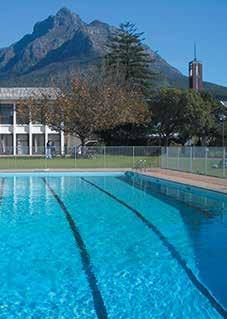
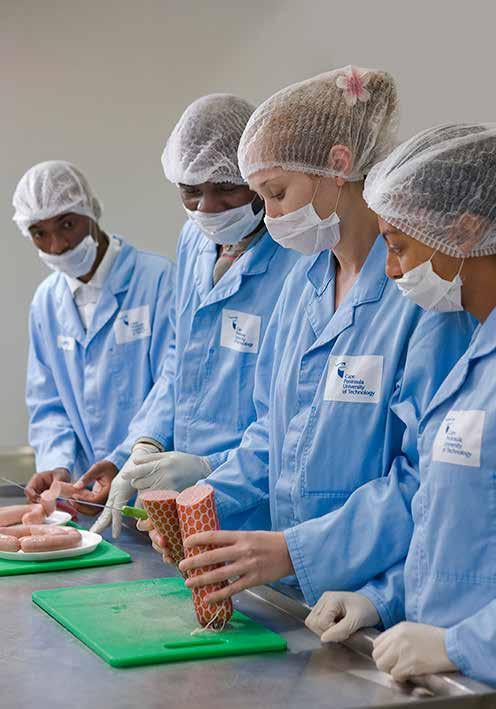
Photography helps to establish and entrench our brand image and promote our brand.
Photography brings our brand to life for our important audiences, and it is vital to have professional photography taken each year.
Although we are proud of our campuses and buildings, what defines us and sets us apart is technology. It is of primary importance that emphasis is placed on this aspect of our brand.

See more brand-appropriate photographic images on the following pages.

5151
PHOTOGRAPHY
Photography helps to establish, promote and entrench our brand image.
Images of student life and student interaction show that our campuses and our institution as a whole offers a fulfilling and friendly learning environment.

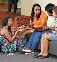
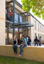
Experiential learning is a vitally important component of our programmes.


52
PHOTOGRAPHY
Photography helps to establish, promote and entrench our brand image. Besides our world-class campuses and facilities, life at CPUT offers excellent recreational facilities for sport and leisure, clubs and societies.

53
PHOTOGRAPHY
Faculties – representative portraits

A fair amount of the marketing material is for the faculties, and photography brings our brand to life for our important audiences.
It is vital to have professional photography taken each year. These photographs were taken at different locations and manipulated in Photoshop with a blue cast and relevant graphics for each faculty. It is also vital to have options as shown here.


Each of these photographs has added graphic symbolism that relates to their specific faculty. The technique used reflects a style that is appropriate to the technological and digital world, within which CPUT specifically operates.


54
Health & Wellness
Engineering Informatics & Design
Applied Sciences
Education
Business & Management Sciences
Education
Engineering
PHOTOGRAPHY
Faculties – representative portraits


It is important to build a library of photographs for each aspect of the university and its faculties, and to have a broad selection of both portrait and landscape formats, shown here, of high resolution images.


55
PHOTOGRAPHY
STATIONERY – main print items
Main printed stationery items
Letterheads


A letterhead template is available in the online archive. The template can be personalised for any individual, faculty, department or unit.
Letterheads can be pre-printed if necessary using a third party supplier, or simply printed internally on a CPUT digital printer.
Business cards
A business card template is available in the online archive.
The template can be personalised for any individual, faculty, department or unit.
Business cards require an order and are printed by third party suppliers.
Compliments slip/ delivery note
A compliments slip/ delivery note template is available in the online archive. The template can be personalised for any individual, faculty, department or unit. They are set up as three to an A4 sheet, so can be printed internally, or ordered from a third party supplier.
NOTE: To understand how to use online resources, or how to go about procuring print of any of these items, contact the Senior Publications Officer in the Marketing & Communication Department.
56
PO Box 1906 Bellville 7535 Symphony Way, Bellville, Cape Town South Africa +27 (0) 21 959 6160 +27 (0) 21 959 6104 info@cput.ac.za www.cput.ac.za creating futures 28 / 11/ 2016 Addressee title / name and surname Designation Company / institue Address line one Address line two Address line three Address line four Subject of the correspondence Dear Sir or Madam: The letter begins here … Addressee title / name and surname Designation Faculty Department first line Department second line Division +27 (0) 21 959 6767 info@cput.ac.za @CPUT @wearecput www.facebook.com/cput.ac.za www.cput.ac.za creating futures with compliments Joe Sample (PhD) Designation Faculty/ Department/ Unit PO Box 1906, Bellville, 7535 South Africa +27 (0) 21 000 0000 +27 (0) 83 000 0000 sample@cput.ac.za www.cput.ac.za creating futures PO Box 1906 Bellville 7535 Symphony Way, Bellville, Cape Town South Africa +27 (0) 21 959 6160 +27 (0) 21 959 6104 info@cput.ac.za www.cput.ac.za creating futures 28 / 11/ 2016 Addressee title / name and surname Designation Company / institue Address line one Address line two Address line three Address line four Subject of the correspondence Dear Sir or Madam: The letter begins here … Addressee title / name and surname Designation Faculty Department first line Department second line Division
STATIONERY – envelopes
C4, C5 and DL envelopes
This page shows how to use branding on a basic range of white envelopes.
Envelope templates in colour are available in the online archive.
The templates can be personalised for any individual, faculty, department or unit.
Envelopes require an order and are printed by third party suppliers.
NOTE: To understand how to use online resources, or how to go about procuring print of any of these items, contact the Senior Publications Officer in the Marketing & Communication Department.
5757 creating futures PO Box 1906 Bellville 7535 Symphony Way, Bellville, Cape Town South Africa +27 (0) 21 959 6160 +27 (0) 21 959 6104 info@cput.ac.za www.cput.ac.za
PO Box 1906 Bellville 7535 Symphony Way, Bellville, Cape Town South Africa +27 (0) 21 959 6160 +27 (0) 21 959 6104 info@cput.ac.za www.cput.ac.za creating futures PO Box 1906 Bellville 7535 Symphony Way, Bellville, Cape Town South Africa +27 (0) 21 959 6160 +27 (0) 21 959 6104 info@cput.ac.za www.cput.ac.za creating futures
Generic folder
This page shows how to use branding on a generic brand all-purpose portrait format folder, which can carry A4 sheets.
A folder template is available in the online archive. The template can be customised for any faculty, department or unit.
Folders require an order and are printed by third party suppliers.
NOTE: To understand how to use online resources, or how to go about procuring print of any of these items, contact the Senior Publications Officer in the Marketing & Communication Department.
58
creating futures Our vision To be at the heart of technology education and innovation in Africa. Our mission We will build university that is highly efficient, sustainable and environmentally conscious. We will be known for the high quality of our teaching and learning and the relevance of our curriculum. We will create a vibrant and well-resourced living and learning environment for our students. We will enhance and develop the quality and effectiveness of our research and knowledge production. Core values We undertake to deal with others in a spirit of Ubuntu. All our interactions will be governed by a spirit of mutual respect. We support the principle of equity. We will promote innovation in all aspects of our work. We will uphold the principle of accountability for our actions. We prize excellence. We will strive for efficiency in all our operations. creating futures creating futures +27 21 959 6767 info@cput.ac.za @CPUT @wearecput www.facebook.com/cput.ac.za www.cput.ac.za STATIONERY – folder
FONT: Use only the Arial Regular 10 point throughout, unless otherwise indicated below.
To create the character spacing: Main menu > format > font > Advanced > Spacing > Expanded by 0,4pt > Kerning for fonts: 10 Points and above
COLOUR: Use only our primary blue. Click the text color icon in MS Word and select More Colors, then select the slider icon (second from left). Choose the RGB Sliders from the drop down menu and create a colour using the values: and create the values: red 0 green 153 blue 204.
STATIONERY – email signatures
Email signatures are vitally important in communication and should contain all your relevant details, so that contact can be made through means other than email.
This page shows the only acceptable way to create a personalised email signature.
These rules are designed to ensure brand image consistency and integrity. Any deviation from this format will undermine the strength of our brand.
Please strictly follow the rules laid out here.
NOTE:
The following are not allowed:
• personal photographs
• favourite quotations or messages
• religious or political messages
NOTE: To understand how to use online resources, or how to go about procuring print of any of these items, contact the Senior Publications Officer in the Marketing & Communication Department.
59
t: +27 (0) 21 000 0000 | f +27 (0) 21 000 0000 | e: sampleJ@cput.ac.za | w: www.cput.ac.za PO Box 1906 Bellville 7535 | Symphony Way, Bellville, Cape Town, South Africa Use only the RGB jpeg file at a length of 6 cm. Arial Regular 11 point lower case Kind regards and name in Arial Bold Include all details you deem necessary in this exact format Arial Regular 8 point capitals justified
STATIONERY –
PowerPoint templates
PowerPoint presentations
This page shows how to use branding on a generic brand Powerpoint presentation.
A PowerPoint template is available in the online archive. The template can be customised for any faculty, department or unit.

NOTE: To understand how to use online resources, or how to go about procuring print of any of these items, contact the Senior Publications Officer in the Marketing & Communication Department.
creating futures
creating futures
CPUT
Brand Identity Management S ystem
The System Design Process
PHASE TWO
• Concept, design and copywriting of basic printed design language manual, with examples
• Brand custodian buy-in and management approval
• Printing of posters and manuals
PHASE THREE
• In-depth consultation with CPUT web staff
• Concept, design, copywriting of web-based BI manual
• Concept, design, copywriting of web-based design language manual
Brand Identity ~ in brief
An institution's brand consists of the logo symbol, logotype (its name), a descriptor (what it is/ does), the brand colours and typefaces/ fonts, and its slogan (how it wants to be viewed).
• An institution s brand identity consists of the logo symbol, logotype (its name), a descriptor (what it is / does), the brand colours and typefaces / fonts, and its slogan (how it wants to be viewed).
• Together these form the brand s signature.

These elements are the visual representation of the brand, and their control, maintenance and management is paramount to the integruty of the brand's image.
• These elements are the visual representation of the brand, and their control, maintenance and management are paramount to the integrity of the brand’s image.
THANK YOU
60
Brand Design Language
Grids & Guidelines
61
There are only two types of literature –brand and faculty.
Brand literature deals with any literature that is not specific to a faculty.
The following pages show guidelines and grids for brand literature.
Brand Literature: Type 1 – A4 landscape format report
This page deals with an A4 landscape format cover, currently only being used by the annual Research Report.
35mm white space from top to picture
The year must always appear, reversed out of a dark blue rectangle size: 35 x 20mm
‘2016’: Helvetica Neue LT Std 47 Light Condensed 36 point 0 tracking mid blue

title and ‘creating futures’ to range left
‘Research Report’: Helvetica Neue LT Std 35 Thin – 36 point 100 tracking mid blue
Research Report 2016
logo 85mm wide
logo 30mm from right
creating futures
60mm to the highest point of the white wave logo 20mm from bottom
‘creating futures’ in Helvetica Neue LT Std 45 Light – 18 point 100 tracking / mid blue
Brand literature: Type 1 A4 landscape – Research Report cover
NOT ACTUAL SIZE
62
PRINT – brand literature
30mm space
20mm space
3 columns: 80 x 150mm
Gutters: 2 x 8,5mm
Headlines: Helvetica Neue LT Std 45 Light 16 on 16 point 10 tracking mid blue para space: 2mm before
Body copy: Helvetica Neue LT Std 45 Light – 9 on 12 point 10 tracking
Justified left and right para space: 2mm before
20mm space
Brand Literature: Type 1
PRINT – brand literature
– A4 landscape format report
Brand Literature: Type 1 – A4 landscape format report
column rules 0,5 pt dark blue 155mm high 30mm space
As a higher education institution, and more particularly a university of technology, CPUT has a vital role to play in supporting technology development and access, as well as the system of innovation. Key contributions must include:
• Developing human capital
• Generating and exploiting knowledge
• Providing knowledge infrastructure
• Overcoming the innovation chasm would like to extend my deepest appreciation to the many researchers, support units, the Council and the Executive Management for their unwavering support during 2012. As DVC, am humbled by the intense and stressful hours researchers have worked for the benefit of this institution. trust that we have set a new standard which will be upheld in order to achieve our transition to greatness.
Research and Technology Innovation Blueprint

The face of research, innovation and technology at CPUT is being revolutionised with the official roll-out of the RTI blueprint. This 10-year blueprint provides the institution with a strategic frame within which it can seek to produce research and innovation relevant to the needs of the province, South Africa and the world.
Speaking at the launch of the RTI blueprint, the DVC: Research, Technology Innovation & Partnerships, Dr Chris Nhlapo, said it outlines programmes and practical intervention strategies for breakthrough improvement in research activities. Some of its objectives include the establishment of Research Chairs in each faculty, the appointment of senior researchers in niche areas, and an increase in postgraduate students and postdoctoral fellowships.
Dr Nhlapo said the blueprint also aims to build on the institution’s strengths through the following seven focus areas: Bio-Economy and Biotechnology; Space Science and Technology; Energy; Climate- Change and Environment; Human and Social Dynamics; Economic Growth and Design for Sustainability.
CEO of the Cape Higher Education Consortium, Ms Nasima Badsha, commended CPUT for rolling-out the RTI blueprint. “Your blueprint is an important and exciting step in achieving your vision of growing research at CPUT that responds to the needs of the province, the country and beyond.”
CPUT is a pioneer of research and innovation. DVC: Research, Technology Innovation & Partnerships, Dr Chris Nhlapo, has been appointed to a national task team which is developing a new framework for innovation in South Africa. The task team, comprising key role-players in the South African higher education sector, was handpicked by the National Advisory Council on Innovation (NACI), a body created to advise the South African Minister of Science and Technology on the role and contribution that innovation plays in addressing economic, social, scientific and technology challenges. Dr Nhlapo said their first task was to “unpack the concept of innovation”. According to NACI, innovation consists of three phases. The first is a conception of a new idea, while the second is the conversion of this idea into a product, service or process. The final phase is commercialisation or the successful uptake by users. However, Dr Nhlapo said that innovation is unfortunately often misunderstood, with many people limiting its scope to science and technology. He said innovation cuts across all disciplines, from science and technology right up to business.
“Innovation is not only for monetary gain. There is also social innovation, which benefits the community,” he said. Dr Nhlapo said the task team is focusing their attention on developing a national innovation framework that encompasses all disciplines. They are conducting a survey on the South African innovation terrain between 1994 and 2011 and exploring existing successful frameworks.
introduction
‘introduction’ in Helvetica Neue LT Std 35 Thin – 55 point 230 tracking/ mid blue

Brand literature: Type 1 A4 landscape – Research Report typical body page
NOT ACTUAL SIZE
Brand literature: Type 1 A4 landscape – Research Report typical body page
NOT ACTUAL SIZE
This is a guideline grid for the typical body pages for an A4 landscape format book, such as the research report.
This is a guideline grid for the typical body pages for an A4 landscape format book, such as the research report.
Note that, as with all literature, the text should be of an easily readable size and styled elegantly without being compressed into the available space. It is vitally important, therefore, that the copywriting is kept succinct.
Note that as with all literature the text should be of an easily readable size and styled elegantly without being compressed into the available space. It is vitally important therefore that the copywriting is kept succinct.
63 PRINT – brand literature
5
30 15 20 35
53
The face of research, innovation and technology at CPUT is being revolutionised with the official roll-out of the RTI blueprint.
Brand Literature: Type 1
– A4 landscape format report

Back cover treatment for an A4 landscape book.
Brand literature: Type 1 A4 landscape – Research Report back cover
NOT ACTUAL SIZE
64
PRINT – brand literature creating futures ATHLONE BELLVILLE CAPE TOWN GEORGE GRANGER BAY MOWBRAY WELLINGTON WORCESTER +27 21 959 6767 info@cput.ac.za www.cput.ac.za PO Box 1906. Bellville 7535 Bellville Campus, Symphony Way, Bellville www.facebook.com/cput.ac.za @CPUT @wearecput Brand Literature: Type 1 – A4 Back cover treatment for an A4 PRINT – brand literature visually centre address panel logo 85mm wide logo 30mm from bottom logo 30mm from right
futures’ in Helvetica Neue LT Std 45 Light –18 point 100 tracking / mid blue campus line 10mm from bottom
‘creating
Autumn Graduation 2016
Herfs-gradeplegtigheid
Ukwindla uthweso-zidanga
Brand Literature: Type 2
– A4 portrait brochures
In the A4 portrait format, there is currently only one design, which is for the graduation book.
Brand literature: Type 2 A4 portrait book cover
NOT ACTUAL SIZE
65 PRINT – brand literature
creating futures
Brand Literature: Type 2
– A4 portrait brochures
Shown here is another guideline for the body content of brand literature A4 format booklets.
Note that, as with all literature, the text should be of an easily readable size and styled elegantly without being compressed into the available space. It is vitally important, therefore, that the copywriting is kept succinct.
20mm space
Sub-headline: Helvetica Neue LT Std
45 Light
18 on 22 point
0 tracking
70% black
Numeral: Helvetica Neue LT Std
35 Light 76 point
0 tracking 70% black
Headlines: Helvetica Neue LT Std 35 Thin 40 on 32 point 40 tracking mid blue
Second line: Helvetica Neue LT Std 35 Thin
on 28 point
First column: Helvetica Neue LT Std 45 Light
14 on 24 point
50 tracking/ mid blue
Second column: Helvetica Neue LT Std
45 Light
11 on 20 point
25 tracking/ mid blue
Body copy: Helvetica Neue LT Std 45 Light –10 on 15 point
25 tracking Range left para indent: 5mm 70% black creating futures: Helvetica Neue LT Std
Light
NOTE: This layout guideline can be used for A5 portrait format booklets or brochures, but must be adapted in terms of measurements.
2 columns: 80 x 240mm
Gutter: 10mm
Focus area five:
Column rules: 1point Mid blue
Human & Social Dynamics Including issues
related to service delivery
Now is the time for the teaching of and research in the social sciences and the humanities to take their place again at the leading edge of our struggle for transformation and development of South African society. They must play a leading role in helping our people understand and tackle the scourges of poverty, unemployment, racism, discrimination of all kinds and HIV/AIDS. At a deeper level, we also look to our social scientists, to help us to rebuild our sense of nationhood, our independence and our ability to take our place proudly in the community of nations.
(Charter for Humanities and Social Sciences, 2011)
INTRODUCTION
The Human and Social Dynamics (HSD) research and innovation focus at CPUT aims to maximise the benefits of research by advancing fundamental knowledge and contributing to good quality public education, better public policy, improved health outcomes, economic prosperity, social cohesion, community identity, culture, and the quality of life of South Africans and the continent as a whole.
The key goal of the Human and Social Dynamics focus is to strengthen and improve research and innovation capacity at CPUT for producing high-quality postgraduate students, research, and innovation outputs. This would include expanding the scientific research and innovation capacity of the humanities; improving South Africa’s international research and innovation competitiveness while responding to social and economic challenges of the country; attracting and retaining excellent researchers and scientists; increasing the production of master’s and doctoral graduates; and creating research career pathways for young and mid-career researchers, with a strong research, innovation and human capital development output trajectory.
The creative, imaginative, critical and analytical qualities of the human sciences have a symbiotic role to play alongside natural science and technological capacities in the growth and development of a vibrant and successful society.
The nurturing and generation of such capacities is in dialogue with the worlds of techno-science. Research and innovation initiatives should provide a platform in the academe for academics and students to acquire an understanding of recent scientific revolutions and their implications for society, for example, the digital, genetic and eco-centric advances. But it is equally vital that the CPUT academic community becomes a significant partner in the world’s knowledge production and dissemination alongside centres of excellence in the north and the global south. Concomitant, too, of the fact that the research system is central to the social and economic evolution of societies, universities are a vital coagent of change. Being a dynamic epicentre on the continent, being partners in global initiatives, and being a key energy centre for ideas of progress and change, should be central to our research and innovation agenda.
CONTEXT
The RTI blueprint (CPUT, 2012) provides CPUT with a strategic frame which seeks to produce research and innovation which is relevant and aligned to the needs of the province, the country, the continent and the world through knowledge discovery, social impact of research, excellence in teaching, and community service. Many of our research and innovation focus areas in the human and social sciences disciplines at CPUT are well positioned to support:
• The Western Cape Economic Development
formulated ‘The Provincial Vision 2040’ (WCEDP, 2012) that recognises the potential future shifts in social and economic systems, and the need to equip citizens to respond to these future possibilities. These include:
shifts to digital media, a resource-constrained world, and risk and uncertainty related to climate research and innovation focus at CPUT aims to maximise the benefits of research by advancing fundamental knowledge and contributing to good quality public education, better public policy, improved health outcomes, economic prosperity, social cohesion, community identity, culture, and the quality of life of South Africans and the continent as a whole.
The key goal of the Human and Social Dynamics focus is to strengthen and improve research and innovation capacity at CPUT for producing high-quality postgraduate students, research, and innovation outputs. This would include expanding the scientific research and innovation capacity of the humanities; improving South Africa’s international research and innovation competitiveness while responding to social and economic challenges of the country; attracting and retaining excellent researchers and scientists; increasing the production of master’s and doctoral graduates; and creating research career pathways for young and mid-career researchers, with a strong research, innovation and human capital development output trajectory. The creative, imaginative, critical and analytical qualities of the human sciences have a symbiotic role to play alongside natural science and technological capacities in the growth and development of a vibrant and successful society. The nurturing and generation of such capacities is in dialogue with the worlds of techno-science. Research and innovation initiatives should provide a platform in the academe for academics and students to acquire an understanding of recent scientific revolutions and their implications for society, for example, the digital, genetic and eco-centric advances. But it is equally vital that the CPUT academic community becomes a significant partner in the world’s knowledge production and dissemination alongside centres
creating futures
Brand literature: Type 2 A4 portrait – typical body page
NOT ACTUAL SIZE
66
PRINT – brand literature
5 12
45
85 point 370 tracking 20% mid blue
24
40 tracking mid blue
2016
Research and Innovation Focus Areas
Bio-economy and biotechnology


Space science and technology
Energy
Climate change and environment
Human and social dynamics
Economic growth and international competitiveness
Design for sustainability
2016
Research and Innovation Focus Areas

Brand Literature: Type 3A & B – A5 portrait booklets
In the A5 portrait format, there are three possible cover designs: one with type only, one with a photograph, and one with just a headline title. The first two options are shown here. The third is shown on the next page.
The treatment for the body content and the back cover are shown on the following pages.
Brand literature: Type 3A A5 portrait book cover – text intensive
NOT ACTUAL SIZE
NOT ACTUAL SIZE
67 PRINT – brand literature
creating futures
creating futures
Brand Literature: Type 3C – A5 portrait booklets
In the A5 portrait format, there are three possible cover designs: one with type only, one with a photograph, and one with just a headline title, as shown here.
The treatment for the body content and the back cover are shown on the following pages.
Academic Rules & Regulations 2016


Registration 2016
Brand literature: Type 3C
A5 portrait booklet cover
NOT ACTUAL SIZE
Brand literature: Type 3C
A5 portrait booklet cover
NOT ACTUAL SIZE
68
creating futures
creating futures
PRINT – brand literature
Sub-headline: Helvetica Neue LT Std 45 Light
18 point
0 tracking
70% black
Numeral: Helvetica Neue LT Std 35 Light
76 point
0 tracking
70% black
Headlines: Helvetica Neue LT Std 35 Thin
36 on 30 point
40 tracking mid blue
‘INTRODUCTION’ in Helvetica Neue LT Std 35
Thin – 14 on 21 point
100 tracking / mid blue
Biotechnology ....
Helvetica Neue LT Std
45 Light 10 on 18 point
40 tracking / mid blue
Body copy: Helvetica Neue LT Std 45 Light – 9 on 12 point
25 tracking
Justified left and right
para indent: 5mm
creating futures:
Helvetica Neue LT Std
45 Light
62 point
300 tracking
20% mid blue
2 columns: 50 x 165mm Gutter: 8mm
Brand Literature: Type 3A, B & C – A5 portrait booklets
BIOTECHNOLOGY
Focus area one:
Bio-economy and1Biotechnology
INTRODUCTION
Biotechnology has been heralded as “the next revolutionary scientific endeavour in the history of humanity”. Just as steam power played a key role in the industrial revolution, and more recently the way in which the information and communications revolution has impacted on society, so it is believed that biotechnology will change the way we live by considering the great potential of living systems, their applications and potential impact on the development of society as a whole (Pouris & Pouris, 2009).
CONTEXT
Over the past two decades, it has become increasingly clear that the successful economic development of any country will be built on the pillars of science and technology. Biotechnology is considered to be a key sector required for future economic growth and it has been the main driving force for the development of environmentally sustainable production practices and the development of various innovative products.
The continued use of biotechnology for commercialisation will lead to a biology-based economy where a large proportion of economic output will be dependent on the use of biological materials and processes (Arundel & Sawaya, 2009)
For a bio-economy approach to succeed, various grand challenges need to be addressed while innovative policy frameworks, strategic thinking and the general support of society will be required to meet these challenges (Arundel & Sawaya, 2009).
According to the National Biotechnology Strategy for South Africa (NBS, 2001), biotechnology can be defined as “a body of techniques that use biological systems, living organisms, or derivatives thereof to make or modify products or processes for specific use”. It is applicable to various industries or economic sectors, and historically, has been grouped or colour-coded according to the different sectors: green – agriculture; red – health; white –industrial; blue – marine; and black – biofuels (Llobell, 2010). Biotechnology has existed for thousands of years and has developed through three stages. First generation biotechnology involved the direct application of living organisms in the production of food and drink (e.g. cheese, bread, beer). Second-generation biotechnology involved the use of cell or tissue culture to yield new products, for example, antibiotics, vitamins and enzymes, while third-generation biotechnology (also known as modern biotechnology) is associated with the use of recombinant DNA technology. Most modern day biotechnologists make use of thirdgeneration technology irrespective of whether their core processes are first-, second-, or third-generation approaches (NBS, 2001).
Biotechnology is further characterised by four unique considerations (NBS, 2001):
• It is a cross-cutting technology (one type of technology can be applied in various economic sectors, for example, a technology developed for application in agriculture can also be translated to be applied in the health sector).
• It is research intensive and requires a balance between fundamental and applied research.
• It requires appropriate combinations of various disciplines (it is multidisciplinary).
• It is a highly networked endeavour, requiring interaction between science, engineering and technology institutions and private companies.
With the adoption of the National Biotechnology Strategy for South Africa in 2001, the main aim was to create a culture of innovation and entrepreneurship in the field of biotechnology. The establishment of the Biotechnology Regional Innovation Centres (BRICs) in 2002 allowed for the further development of biotechnology in South Africa,
creating futures
Brand literature: Type 3 A5 portrait – typical body page
NOT ACTUAL SIZE
Shown here is a guideline for the body content of brand literature A5 format booklets.
Note that, as with all literature, the text should be of an easily readable size and styled elegantly without being compressed into the available space. It is vitally important therefore that the copywriting is kept succinct.
NOTE: This layout guideline can be used for A4 portrait format booklets or brochures, but must be adapted in terms of measurements.
69 PRINT – brand literature
59
9 20mm space
Brand literature: Type 4 – A5 graduate magazine
This is a newsletter-type publication, aimed at alumni, but it remains a representative of the CPUT brand and must, therefore, conform to the brand design language.
Brand literature: Type 4 A5 portrait newsletter – cover
NOT ACTUAL SIZE

70
PRINT – brand literature
Brand literature: Type 2, 3 & 4 A5 portrait back cover
NOT ACTUAL SIZE
Brand literature: Type 2, 3 & 4

– Back covers
Shown here are two options for back cover design for A4 and A5 portrait formats of brand literature.
71
PRINT – brand literature
creating futures +27 21 959 6767 info@cput.ac.za www.cput.ac.za www.facebook.com/cput.ac.za @CPUT @wearecput ATHLONE BELLVILLE CAPE TOWN GEORGE GRANGER BAY MOWBRAY WELLINGTON WORCESTER ATHLONE BELLVILLE CAPE TOWN GEORGE GRANGER BAY MOWBRAY WELLINGTON WORCESTER creating futures +27 21 959 6767 info@cput.ac.za www.cput.ac.za www.facebook.com/cput.ac.za @CPUT @wearecput
Brand literature: Type 5 – units
Z-fold leaflets
Shown here is a guideline for layout for an A4 Z-fold leaflet for units.
Note that as with all literature the text should be of an easily readable size and styled elegantly without being compressed into the available space. It is vitally important therefore that the copywriting is kept succinct.

Should it arise that the information is not going to fit properly and elegantly, then a M-fold or Roll fold leaflet must be considered.

Brand literature: Type 5 Units – A4 Z-fold leaflet
NOT ACTUAL SIZE
72
PRINT – brand literature
futures
creating
2016 HIV & AIDS unit
Brand promotional: Pull-up banners/ Mini wall banners
NOT ACTUAL SIZE
Brand promotional: Pull-up banners/ Mini wall banners
2000mm x 850mm
Shown here are two options for brand banners, one for type only and one using a picture.
Text
It is recommended that, due to the format that Helvetica Neue LT Std Condensed typefaces are used.

Transparency
A transparent rectangle will help to make text more legible on full colour (picture) backgrounds.
Campuses
Including the campuses is optional. It may be redundant on campus banners aimed at students.
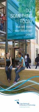
73
PRINT – brand literature
PRINT – brand literature
Brand promotional: posters
– A3 to A0 sizes
Shown here are two options for guidelines for brand posters; one for type only and one using a picture.
DO something
Text
It is recommended that, due to the format that Helvetica Neue LT Std Condensed typefaces are used to get the largest point size in the smallest space.
today that will make your future self
Transparency
A transparent rectangle will help to make text more legible on full colour (picture) backgrounds.
creating futures

Campuses
Brand promotional: Poster – text only
Brand promotional: Poster – with picture
NOT ACTUAL SIZE
74
something
will make your
self PROUD
DO
today that
future
Campuses must be included on all brand posters. PROUD
creating futures
NOT ACTUAL SIZE
The
2016:
Titles: Helvetica Neue LT Std 45 Light 36 on 36 point with 0 tracking.
Faculty literature: Type 1 & 2 – A5 booklets
This page shows cover designs for faculty A5 portrait format literature, with and without a picture. The example is for the Engineering faculty.
Faculty:
Note that the waves are the brand colours and not the faculty colours, which are only used on the vertical rectangle.

Engineering:

Logotype is 65mm wide, positioned 20mm from the right-hand edge. Slogan positioned 20mm from the left-hand edge.

Faculty literature: Type 2 A5
Prospectus booklet or roll fold leaflet – text only
NOT ACTUAL SIZE
Faculty literature: Type 1 A5
Prospectus booklet or roll fold leaflet – with picture
NOT ACTUAL SIZE
75 PRINT – brand
literature
creating futures
Engineering | 2016 creating futures creating futures
creating futures Engineering | FACULTY 2016 creating futures creating futures
Prospectus
Faculty Handbook
Helvetica Neue LT Std 47 Light Condensed 24 point u/lc with 100 tracking.
Helvetica
LT Std 35 Thin capitals 14 point with 200 tracking.
Neue
baseline
of all headlines and years is in the same position
Helvetica Neue LT Std 47 Light Condensed 28 point with 0 tracking.
The ‘wave’ graphic is the same size and in the same position.
The slogan and logotype are on the same baseline.
Slogan x height same as the logotype x height.
Faculty literature: Type 3A & 3B
A4 books or reports
This page shows cover designs for faculty
A4 portrait format literature, with and without a picture. The example is for the Department of Construction Management and Quantity Surveying in the Engineering faculty.
Note that the waves are the brand colours and not the faculty colours, which are only used on the vertical rectangle.


Management
Department of Construction Management and Quantity
South African Council for Professional and Technical Surveyors
Department of Construction Management and Quantity
South African Council for Professional and Technical Surveyors
Faculty literature: Type 3B
A4 report brochure or roll fold leaflet – text only
NOT ACTUAL SIZE
Faculty literature: Type 3A
A4 report brochure or roll fold leaflet – with picture
NOT ACTUAL SIZE
76
Accreditation Visit
BTECH: QUANTITY SURVEYING ND: BUILDING creating futures Engineering FACULTY 2016 creating futures Engineering creating futures creating futures
Surveying
Accreditation
BTECH: QUANTITY SURVEYING ND: BUILDING creating futures Engineering | FACULTY 2016 creating futures
South African Council for Professional and Technical Surveyors
Visit Department of Construction
and Quantity Surveying
Surveying
Visit BTECH: QUANTITY SURVEYING ND: BUILDING 2016 Engineering | FACULTY creating futures creating futures
Accreditation
–
PRINT – brand literature
Faculty literature: Types 1 – 3 A4 report brochure or roll fold leaflet – content/ body layout
Faculty literature: Types 1 – 3 A4 report brochure or roll fold leaflet – content/ body layout
NOT ACTUAL SIZE
Faculty literature: Type 1 – 3 A4 or A5 booklets
Faculty literature: Type 1 – 3 A4 or A5 booklets
This page shows a guideline for the layout of a typical body page of A4 or A5 faculty literature.
Note that as with all literature the text should be of an easily readable size and styled elegantly without being compressed into the available space. It is vitally important therefore that the copywriting is kept succinct.
This page shows a guideline for the layout of a typical body page of A4 or A5 faculty literature. Note that as with all literature the text should be of an easily readable size and styled elegantly without being compressed into the available space. It is vitally important therefore that the copywriting is kept succinct.
77
PRINT – brand literature
67 PRINT – faculty literature 5
NOT ACTUAL SIZE
Faculty literature: Type 4 – Faculty departments

A5 booklets or roll fold leaflets
This page shows a cover design example guideline for faculty department A5 portrait format covers, with a picture. The example is for the Chemical Engineering department in the Engineering faculty.
Department of Chemical Engineering

creating futures
creating futures
creating futures
Faculty literature: Type 4 A5 report booklet or roll fold leaflet – cover
NOT ACTUAL SIZE
78
Cape Town Campus
Engineering | FACULTY 2016
PRINT – brand literature
Faculty literature: Type 4
A5 roll fold leaflet
NOT ACTUAL SIZE
Faculty literature: Type 4 – Faculty departments


A5 roll fold leaflets
Faculty literature follows the faculty design language, that is, uses the faculty colours. In this case process blue for the Faculty of Applied Sciences.
This shows a typical grid for a four-panel, A5 roll fold leaflet which departments may produce*.
RULE: *The design can only be produced by a department under the guidance of a brand custodian. The final approval resides with the Marketing & Communication Department (MCD), and the brand custodian is responsible for gaining this final approval before going to print.
Alternatively, the department may request that MCD be responsible for design and/ or print.
79
PRINT – brand literature
Faculty literature: Type 4 – Faculty departments


A5 roll fold leaflets
Faculty literature follows the faculty design language, that is, uses the faculty colours. In this case dark blue for the Business & Management Sciences faculty.
This shows a typical grid for a four-panel, A5 roll fold leaflet which departments may produce*.
RULE: *The design can only be produced by a department under the guidance of a brand custodian. The final approval resides with the Marketing & Communication Department (MCD) and the brand custodian is responsible for gaining this final approval before going to print.
Alternatively, the department may request that MCD be responsible for design and/ or print.
Faculty literature: Types 4
A5 roll fold leaflet
NOT ACTUAL SIZE
80
PRINT – brand literature Subject Minimum % Achievement Description English 50% and more E4 Mathematics or Mathematical Literacy 30% and more or 50% and more M2 or ML4 Business Studies 50% and more BUS4 Economics or Accounting 50% and more or 50% and more ECON4 or ACC4
Faculty literature: Types 5 faculty or department
A4 Z, M or roll fold leaflet – covers NOT ACTUAL SIZE
Faculty literature: Type 5 – Faculty or department

A4 Z, M or roll fold leaflets
A4 Z, M or roll fold leaflets can be produced for faculties, or departments or programmes within faculties.
In these cases the faculty colour distinguishes the design language of each faculty.


81 Begin your creative career Industrial creating futures Informatics & Design FACULTY 2016 creating futures Start a great career in Applied Sciences creating futures Applied Sciences | FACULTY 2016 creating futures Begin your great career as a Teacher creating futures Education | 2016 creating futures Begin your great career in Civil Engineering creating futures Engineering | FACULTY 2016 creating futures Begin your great career in Business creating futures Business & Management Sciences | FACULTY 2016 creating futures Begin your great career in Nursing creating futures Health & Wellness Sciences | FACULTY 2016 creating futures cr eating futur es cr eating cr eating futur es cr eating futur es cr eating futur es cr eating futur es Begin your creative career in Industrial Design creating futures Informatics & Design FACULTY 2016 creating futures Begin your great career as a Teacher creating futures Education | 2016 creating futures Begin your great career in Civil Engineering creating futures Engineering | FACULTY 2016 creating futures Begin your great career in Business creating futures Business & Management Sciences | FACULTY 2016 creating futures Begin your great career in Nursing creating futures Health & Wellness Sciences | FACULTY 2016 creating futures cr eating futur es cr eating futur es cr eating futur es cr eating futur es cr eating futur es
PRINT – brand literature
Faculty literature: Type 5 – Faculty departments

A4 Z-fold leaflets
Faculty literature follows the faculty design language, that is, uses the faculty colours.In this case the green of the Engineering faculty. This shows a typical grid for a three-panel, A4 Z-fold leaflet which departments may produce*.
Note that as with all literature the text should be of an easily readable size and styled elegantly without being compressed into the available space. It is vitally important therefore that the copywriting is kept succinct.
Should it arise that the information is not going to fit properly and elegantly, then a M-fold or roll fold leaflet must be considered.
RULE: *The design can only be produced by a department under the guidance of a brand custodian. The final approval resides with the Marketing & Communication Department (MCD) and the brand custodian is responsible for gaining this final approval before going to print.
Alternatively, the department may request that MCD be responsible for design and/ or print.
Faculty literature: Type 5
Faculty or department A4 Z-fold leaflet
– content layout guideline
NOT ACTUAL SIZE

82
PRINT – brand literature Begin your great career in Civil Engineering creating futures Engineering | FACULTY 2016 creating futures cr eating futur es
Faculty promotional: Mini wall banner – text only
NOT ACTUAL SIZE
Health & Wellness Sciences

Faculty promotional: Pull-up banners/ Mini wall banners
2000 mm x 850 mm
Faculty promotional items follow the faculty design language, that is, uses the faculty colours. In this case purple for the Faculty of Health & Wellness.
This shows a typical grid for a four-panel, A5 roll fold leaflet which departments may produce*.
Faculty promotional: Mini wall banner – with picture
NOT ACTUAL SIZE
RULE: *The design can only be produced by a department under the guidance of a brand custodian. The final approval resides with the Marketing & Communication Department (MCD) and the brand custodian is responsible for gaining this final approval before going to print.
Alternatively, the department may request that MCD be responsible for design and/ or print.
83 c r e a t n g f u u r e s c r e a t n g u t u r e s
PRINT – brand literature
Faculty promotional: Posters
A-sizes (A3, A2, A1, A0)
Faculty promotional items follow the faculty design language, that is, uses the faculty colours. In this case purple for the Faculty of Health & Wellness Sciences.
This shows a typical grid for a four-panel, A5 roll fold leaflet which departments may produce*.
RULE: *The designs can only be produced by a department under the guidance of a brand custodian. The final approval resides with the Marketing & Communication Department (MCD) and the brand custodian is responsible for gaining this final approval before going to print. Alternatively, the department may request that MCD be responsible for design and/ or print.
Faculty promotional: Posters
– text only
NOT ACTUAL SIZE
creating
Faculty promotional: Posters

– with picture
NOT ACTUAL SIZE
84
futures Do Something Today that will make your future self proud Health & Wellness Sciences | FACULTY 2016
creating futures Do Something Today that will make your future self proud
PRINT – brand literature
VEHICLES
Vehicle fleet livery
Primary design – Option A
The samples shown here are of the Toyota Corolla. They are just one type of vehicle in the fleet, so these designs should be used as guidelines for the entire fleet branding.
Vehicle signs are the responsibility of the Transport department in consultation with the Marketing & Communication Department.
85 www.cput.ac.za creating futures creating futures www.cput.ac.za creating futures creating futures www.cput.ac.za creating futures creating futures creating futures
VEHICLES
Vehicle fleet livery
Primary design – Option B:
The samples shown here are of the Toyota Corolla. They are just one type of vehicle in the fleet, so these designs should be used as guidelines for the entire fleet branding.
Vehicle signs are the responsibility of the Transport department in consultation with the Marketing & Communication Department.
86
www.cput.ac.za creating futures creating futures www.cput.ac.za creating futures creating futures www.cput.ac.za creating futures creating futures
VEHICLES
Vehicle fleet livery
Secondary design:
The samples shown here are of the Toyota Corolla. They are just one type of vehicle in the fleet, so these designs should be used as guidelines for the entire fleet branding.
Vehicle signs are the responsibility of the Transport department in consultation with the Marketing & Communication Department.
87
creating futures creating futures creating futures creating futures creating futures creating futures creating futures
CLOTHING - staff


Uniforms, overalls, lab coats etc.
Branded clothing for staff is available in a range consisting of blazers, jackets, body warmers, golf shirts, shirts, blouses, ties, scarves, and laboratory coats and workmen’s overalls, amongst others.
NOTE: The apparel shown here is for reference only and does not represent the exact styles or graphics that will be available. This page will be updated as soon as the actual clothing range is finalised.
For further information on the ordering process, contact the CPUT Marketing & Communication Department, Administration Building, Bellville Campus.
88
CLOTHING – staff
Uniforms, overalls, lab coats etc..
Branded clothing for staff is available in a range consisting of blazers, jackets, body warmers, golf shirts, shirts, blouses, ties, scarves, and laboratory coats and workmen’s overalls, amongst others.
NOTE: The apparel shown here is for reference only and does not represent the exact styles or graphics that will be available. This page will be updated as soon as the actual clothing range is finalised.
For further information on the ordering process, contact the CPUT Marketing & Communication Department, Administration Building, Bellville Campus.
89
79
CLOTHING - sportswear
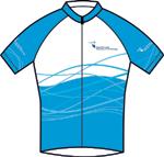


Team sports
The range includes apparel for men and women for the following sports, amongst others:

• cycling
• baseball
• basketball
• golf
• handball
• hockey
• netball
• rugby
• running
• soccer
• volleyball
hockey
NOTE: The apparel shown here is for reference only and does not represent the exact styles or graphics that will be available. This page will be updated as soon as the actual clothing range is finalised.
Sportswear can be ordered through the relevant Student Development Officers in consultation with the Marketing & Communication Department.
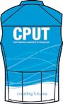

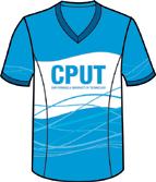
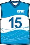
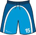
basketball
cycling
rugby
90
80
CLOTHING - sportswear
Casual streetwear
Streetwear will be available in the clothing shops located on the District Six and Bellville campuses.
The range may consist of items such as beanies and caps, track pants and baggies, hoodies, baseball jackets, t-shirts and golf shirts amongst others.
NOTE: The apparel shown here is for reference only and does not represent the exact styles or graphics that will be available. This page will be updated as soon as the actual clothing range is finalised.
For further information on the ordering process, contact the CPUT Marketing & Communication Department, Administration Building, Bellville Campus.
91
81
CLOTHING - faculty
Faculty clothing
A range of faculty t-shirts may be available in our two clothing shops located on the Disctrict Six and Bellville campuses.
- faculty
NOTE: The apparel shown here is for reference only and does not represent the exact styles or graphics that will be available. This page will be updated as soon as the actual clothing range is finalised.
For further information on the ordering process, contact the CPUT Marketing & Communication Department, Administration Building, Bellville Campus.
92
CLOTHING
Post-mounted signs
Traffic directional single header
SIGNAGE
Way-finding sign systems
A way-finding sign system consists of an hierarchical system of signs that include main entrance, main building and wayfinding signs both interior and exterior that assist students, staff and visitors in quickly and efficiently arriving at their destination.
These can be freestanding, wall-mounted or suspended, and range in size.
The system includes name signs, directional signs, fire and escape signs, door signs and information signs.
Shown here is just one example indicating the corporate colour and font usage.
Any queries regarding signage should be directed to Adriana Hornea via email at horneaa@cput.ac.za
93
83
140 200 40
94
Brand Identity Graphics Manual
Glossary of Terms
95
GLOSSARY OF TERMS
Acrobat: An application in the Adobe Creative Cloud suite, which is essentially a universal file viewing, presentation and production file application.
Adobe: A range of software programmes, or applications, used for graphic design for print and the web, such as Photoshop, Illustrator, InDesign and Dreamweaver etc.
ai: Is the file extension for an Illustrator file.
Application: Another name for a software programme.
Ascender: The stroke of a letter that extends above the body of the letter, such as that in an h.
Blind emboss: A blind emboss is an emboss that is not printed in any colour ink. (See Emboss and Deboss.)
Brand: A brand is a company, product, service or institution, usually sizable, that advertises and promotes itself through various communication media.
Brand communications: A blanket term used to describe the ways a brand speaks to its target audience, which all
have different creative and marketing approaches, including advertising: in traditional media - television, newspaper, magazine, radio and outdoor (billboards and bus shelters etc.); promotion: in-store price or premium offers, other events, expos and sponsorships; graphic design - brand identity development and print design - literature, stationery, packaging and environmental design (store and signage); digital - website, advertising or promotion for email, the internet and social media, or interactive computer-based presentation, (sometimes collectively referred to as new media); direct marketing or direct response, one-on-one personal communication through traditional mail, telephone, SMS and e-mail offers and loyalty programmes, that require a response.
Brand design language: A brand design language is the graphic design style of the brand in visual communication.
Brand essence: A sentence or phrase that succinctly describes the brand, based on how it wants to be perceived by its target audience. It may include a description of what
it is and does. It often informs the creation of the brand's descriptor and slogan.
Brand identity: A brand identity is the face, or image that a company, product, service or institution presents to its clients, staff and suppliers, and the general public. It is expressed in its brand identity graphics and behaviour, or brand persona.
Brand identity graphics: Brand identity graphics are the graphic elements of the brand's signature, together with the brand's colours and fonts, but may also include other graphic elements used in a brand design language.
Brand persona: A brief description of the brand using human attributes to describe the essence of the brand and its behaviour, usually consisting of physique, character, style, tone and manner.
Brand signature: The elements that are symbolic of the entity’s identification and image. It comprises the logo symbol, logotype, descriptor and slogan.
Character: A word describing a letter, numeral or glyph.
96 85
CMYK: A colour system on which full colour printing is based. It divides all colours or images into percentages of C (cyan), M (magenta), Y (yellow) and K (black).
Copy: The words written by a copywriter before they become text in a design.
Deboss: A deboss is where the element is sunken from the flat surface of the paper, rather than raised.
Descender: The stroke of a letter or character that extends below the body of the letter, such as that in a y.
Descriptor: The word, or phrase, usually below or next to the logotype, which describes the company, product, service or institution, or it’s function.
Duotone: A two-colour half tone image.
Em: A type space measurement system, usually used to express kerning. (See Point sizes and Kerning.)
Emboss: An printed element that is raised from the flat paper surface by compression from a male/female metal block in the
shape of the element.
eps: Is the file extension for a Photoshop file type, the acronym for Encapsulated Postscript file, commonly used for deepetched images, or ones that are resizeable in a design application.
File extension: The letters after a full stop denoting the file type. For instance .ai for an Adobe Illustrator file.
Flash: A multimedia animation application, now almost obsolete, because it cannot work on iPads. It was the web standard for vector graphics, animation and sound, and was also used in interactive presentations, kiosks, ATMs, gaming consoles, etc.
Foiling: A printing process in which a thin metal foil is impressed on paper by a metal block. It is the only way to get gold, silver or any other metallic colour authentically metallic, but foils now include other colours and white in both gloss and matt finishes.
Font: Another word for typeface - a complete set of characters in a particular style.
Four colour: CMYK printing. (See Full colour.)
Full colour: Another term for process colour, usually applied to printing, as in full colour printing.
Glyph: One of a series of symbols included in a font, such as a tilde, which is the symbol ~.
gsm: An abbreviation of ‘grams per square metre’, is the standard unit of paper weight, also called grammage.
HEX: (Hexadecimal). At its simplest, hex numbers are base 16 whereas decimal numbers are base 10. HTML calculates colour values using the hex, a decimal system.
HTML: Hyper Text Markup Language (HTML) is the major programming language on the Internet. Most web sites and web pages are written in, or based on, HTML.
indd: Is the file extension for an InDesign file.
InDesign: An application in the Adobe Creative Cloud suite, which is essentially a page layout programme.
97 86
Illustrator: An application in the Adobe Creative Cloud suite, which is essentially a design and illustration programme.
Interactive: Any presentation, such as a website, that requires the user to select options, such as moving to the next, or a particular page of the website or presentation.
jpg: Is the file extension for a Photoshop file type, a jpeg, (pronounced jay-peg), short for Joint Photographic Experts Group, generally a low resolution RGB file only used in digital applications. It can only be used at the same size or smaller, not larger than that set in the file.
Kerning: Character spacing, usually denoted as a positive or negative percentage (%) em. (See Em in this glossary.)
Leading: (pronounced ‘ledding‘). The vertical space between lines of text. Also referred to as ‘line spacing’.
Livery: A design element on vehicles, used to identify them as belonging to and representing a particular brand. Also, the
uniforms worn by staff members.
Logo symbol: An icon, symbol, or pictograph that forms the brand signature, along with the logotype.
Logotype: The custom-designed alphabetic letters that form the text of the logo, in this case, Cape Peninsula University of Technology.
Lower case: Refers to letters that are not capitals.
Monotone: A single colour half tone image.
PANTONE: The PANTONE Matching System (PMS) is a colour-matching system that assigns code numbers to spot colours. It covers a vast range of matt, gloss and metallic inks and shades. By specifying a swatch code (e.g. PANTONE 343C), it is made clear to the printer what colour is to be matched. C denotes coated and indicates that the printer must match the coated colour, even if printing on uncoated paper. A U denotes the colour is from the uncoated range.
pdf: The file extension for a file created for, or in Adobe Acrobat, which is an acronym
of Portable Document Format.
Photoshop: An application in the Adobe Creative Cloud suite, which is essentially a photographic editing and manipulation programme.
Point sizes: A point (often abbreviated to ‘pt’) is the standard unit of type size. Body copy, or text, is usually between 8pt and 12pt in most publications.
Process colours: These refer to the four special ink colours used in four-colour printing, namely cyan (blue), magenta (red), yellow and black.
Programme: Another term for an software application.
RGB: (Red, Green, Blue). A colour system used by the human eye and all computer and television monitors, emitting light made up of RGB.
Slogan: A catchphrase used primarily for advertising purposes, which is part of the brand signature. Often a short description of what the brand is or does, its essence, designed to make a positive impression with the target audience.
98
Spot colour: A single colour, usually applied to printing and usually using a PANTONE colour.
Spot varnish: A colourless ink, overprinted in the shape of a particular element in the print.
Swatch: A perforated piece of paper that shows the exact colour of the ink in CMYK or PANTONE. Also the list of colours represented in design software applications.
Text: Refers to any copy in a design application.
tif: Is the file extension for a Photoshop file type, a tiff, the acronym for Tagged Image File Format, a high resolution file. Can only be used at the same size or smaller, not larger, than that set in the file.
Tint: A percentage of any colour, made up of a pattern of fine dots, e.g. 10% tint of black is a very light grey.
Ton sur ton: Where the colour of a logo is either a darker tint of the background or the same colour as the background. Most often used in embroidery or spot varnishes.
Tracking: Horizontal line spacing, as opposed to kerning which is letter spacing.
Typeface: An alternative term for font. The set of letters, numerals and glyphs, also referred to as characters, with a customdesigned shape and form.
Upper case: An alternative term for capitals, when referring to letters or characters.
Variant: A variation which refers to different versions of the font, such as Extended, Condensed or Italic, etc.
Varnish: A colourless ink, overprinted on the paper surface and other coloured inks, which can be either a matt or gloss finish.
Web: A shortened form for the World Wide Web (www), also called the Internet.
Weight: Refers to the thickness of characters in a font, such as Light, Regular or Plain, Medium, Bold etc.
x height: The height of a lower case letter, excluding any ascender or descender.
99
+27 21 959 6767
info@cput.ac.za
www.cput.ac.za
www.facebook.com/cput.ac.za
@cput @wearecput
V09/2022
