Design Portfolio

Catharina Neves Schultz
About Me
To me, design is about transforming identity and perspective into a visual form that invites interaction and learning. As an Honours graduate in Visual Communication Design, I have explored various mediums, including web design, typography, illustration, and brand identity.
Throughout my career, I have refined these skills, focusing on print and typography while expanding into digital marketing and social media content creation. This has allowed me to develop visuals that strengthen brand presence and engage diverse audiences online.
2010 - 2016
International Baccalaureate and High School Diploma from OVERSEAS FAMILY SCHOOL in SINGAPORE
2017 - 2020
Bachelor of Visual Communication Design with Honours from MASSEY UNIVERSITY in NEW ZEALAND
SOFTWARE SKILLS
Languages Education Contact
Portuguese
English
EXPERIENCE
Adobe Photoshop
Adobe Illustrator
Adobe InDesign
Adobe XD
Adobe Lightroom
Adobe Premiere
Adobe After Effects
Microsoft Office Apps
Prinect Cockpit
Prinect Signa Station
Canva
Google Web Designer
CREATIVE SKILLS
Illustration
Photography
Video Editing
Digital Drawing
Photo Editing


02102786802 cnschultz02@gmail.com _cns_designs
https://issuu.com/catharinans/docs/ catharina_neves_schultz_portfolio
Catharina Neves Schultz
References provided upon request.
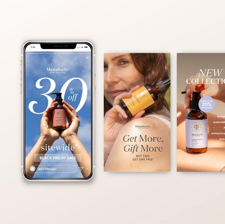
designing for MANUKARX
Digital Marketing
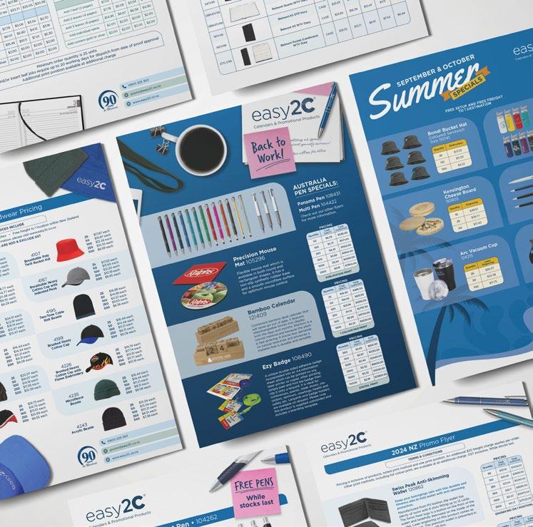
designing for easy2c
Stationery Design
Typography 02 01 03
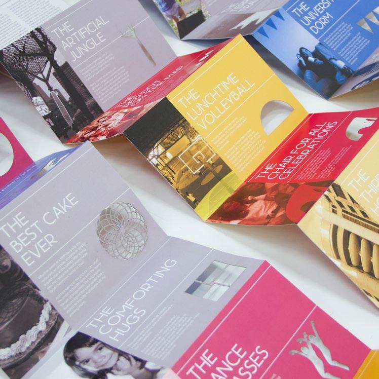
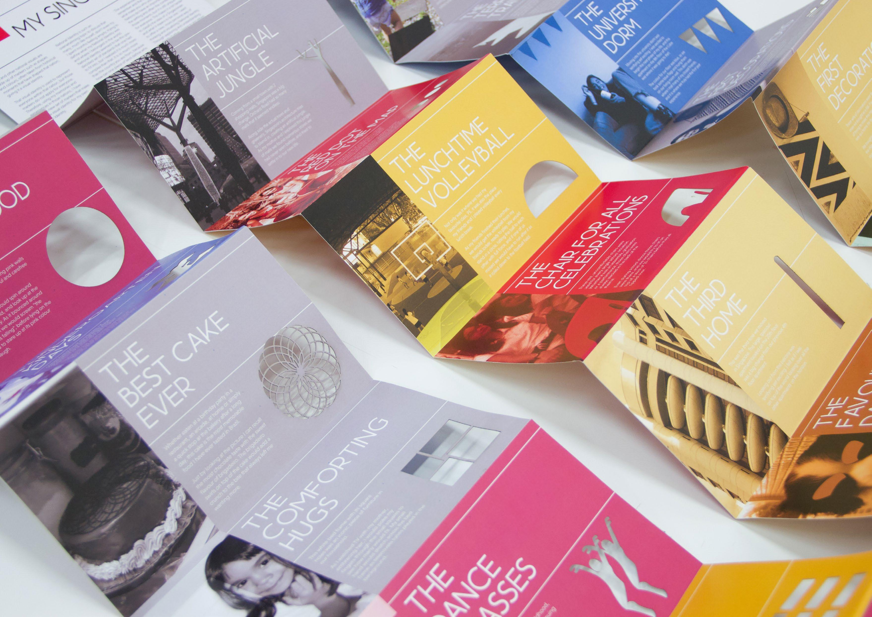
MEMORY MARKERS
Booklet Design
Typography
Logos Logo Design too late for the maui dolphins?
Red Boost oTHER pROJECTS
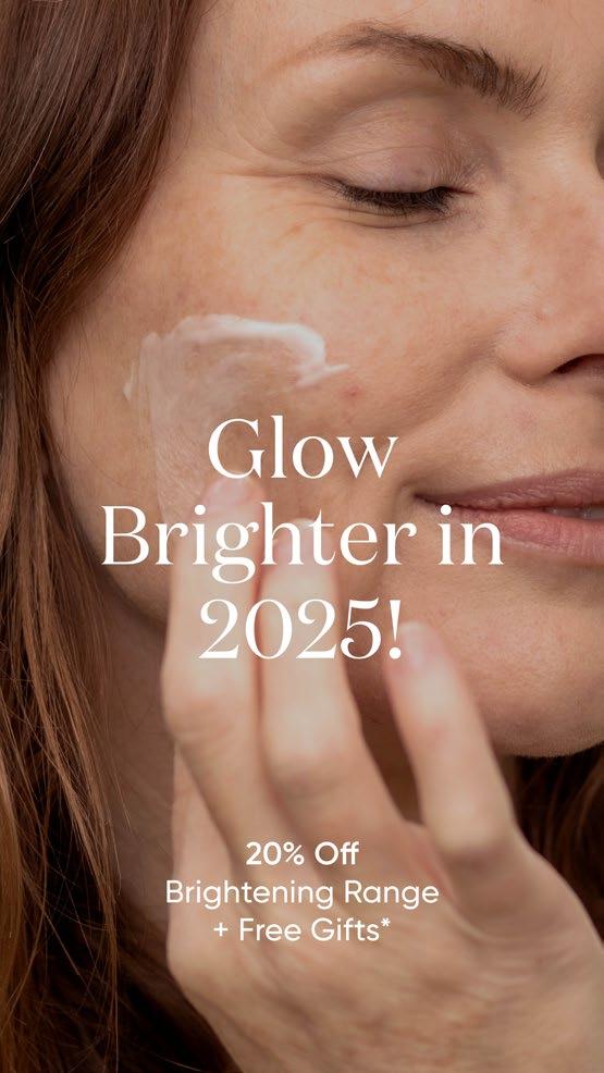
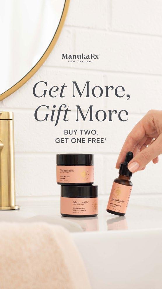
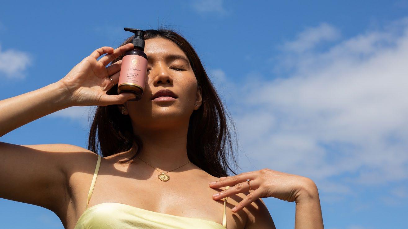
DESIGNING FOR MANUKARX 01
2024-CURRENT digital marketing typography
As the sole Graphic Designer at ManukaRx, I have managed all visual communication, collaborating with teams across the company to create presentations, flyers, business cards, brochures, and digital campaigns.
Over time, my role expanded to include social media content creation, digital marketing strategy, and video editing, allowing me to shape the brand’s online presence and engagement.
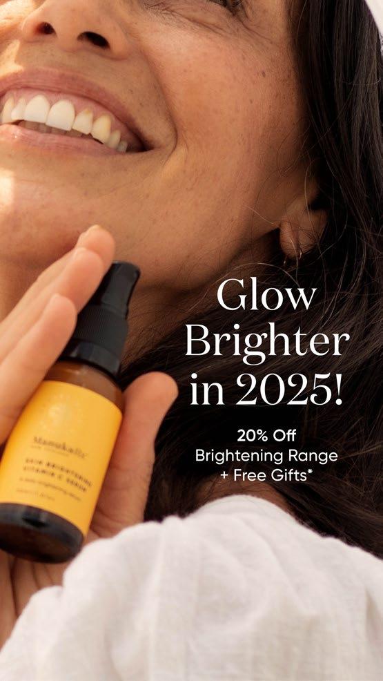
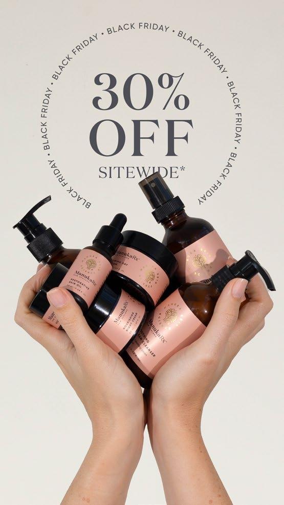
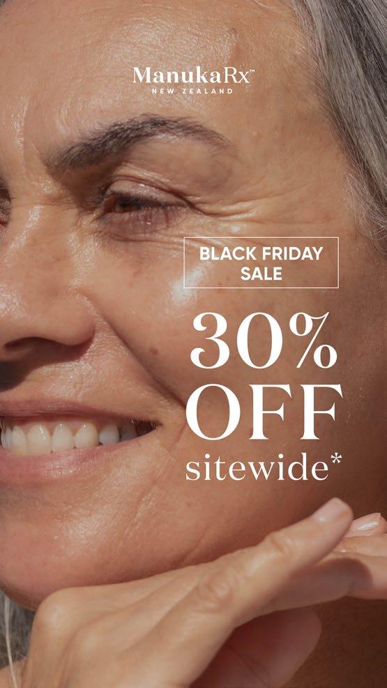
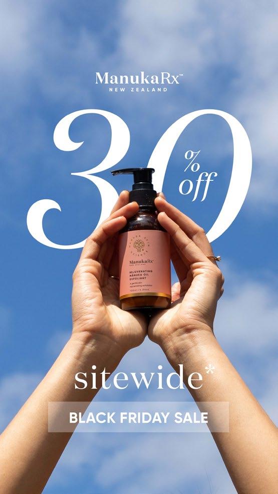
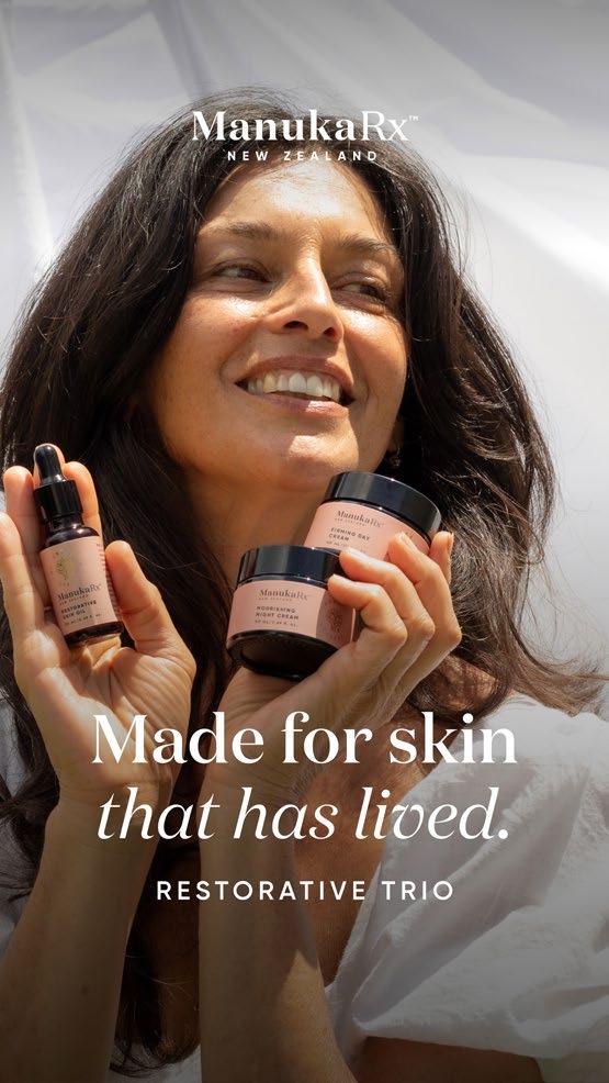
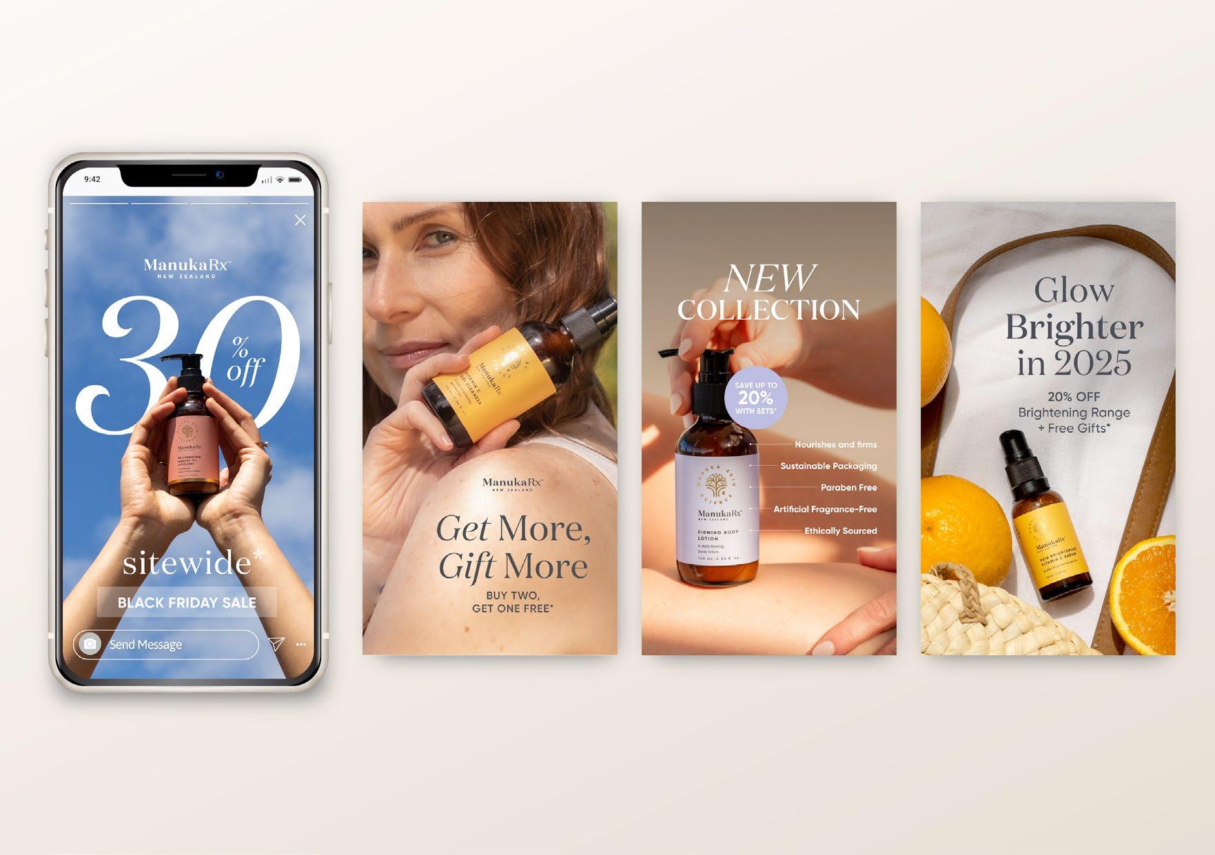
At ManukaRx, I have been actively involved in creating social media ads and organic content, contributing to the brand’s digital presence. As part of the marketing process, I collaborate on campaign strategies, ensuring the visuals align with key messaging and audience targeting.
Through this experience, I have developed a strong understanding of digital marketing, audience engagement, and the end-to-end process of crafting effective campaigns—from concept development to execution. This has refined my ability to design compelling content that optimizes reach and drives engagement.

I have designed numerous presentations for ManukaRx, tailored for both sales and marketing purposes. The sales presentations are information and data-heavy, providing in-depth insights, product performance metrics, and market analysis to support strategic decision-making.
Meanwhile, the marketing presentations focus on brand storytelling, visual appeal, and customer engagement, highlighting key messaging, product benefits, and compelling visuals to captivate audiences. Each presentation is carefully crafted to align with its purpose, ensuring clarity, impact, and effectiveness in communicating the ManukaRx vision.

Harnessing
the Power of Nature for Skincare Excellence


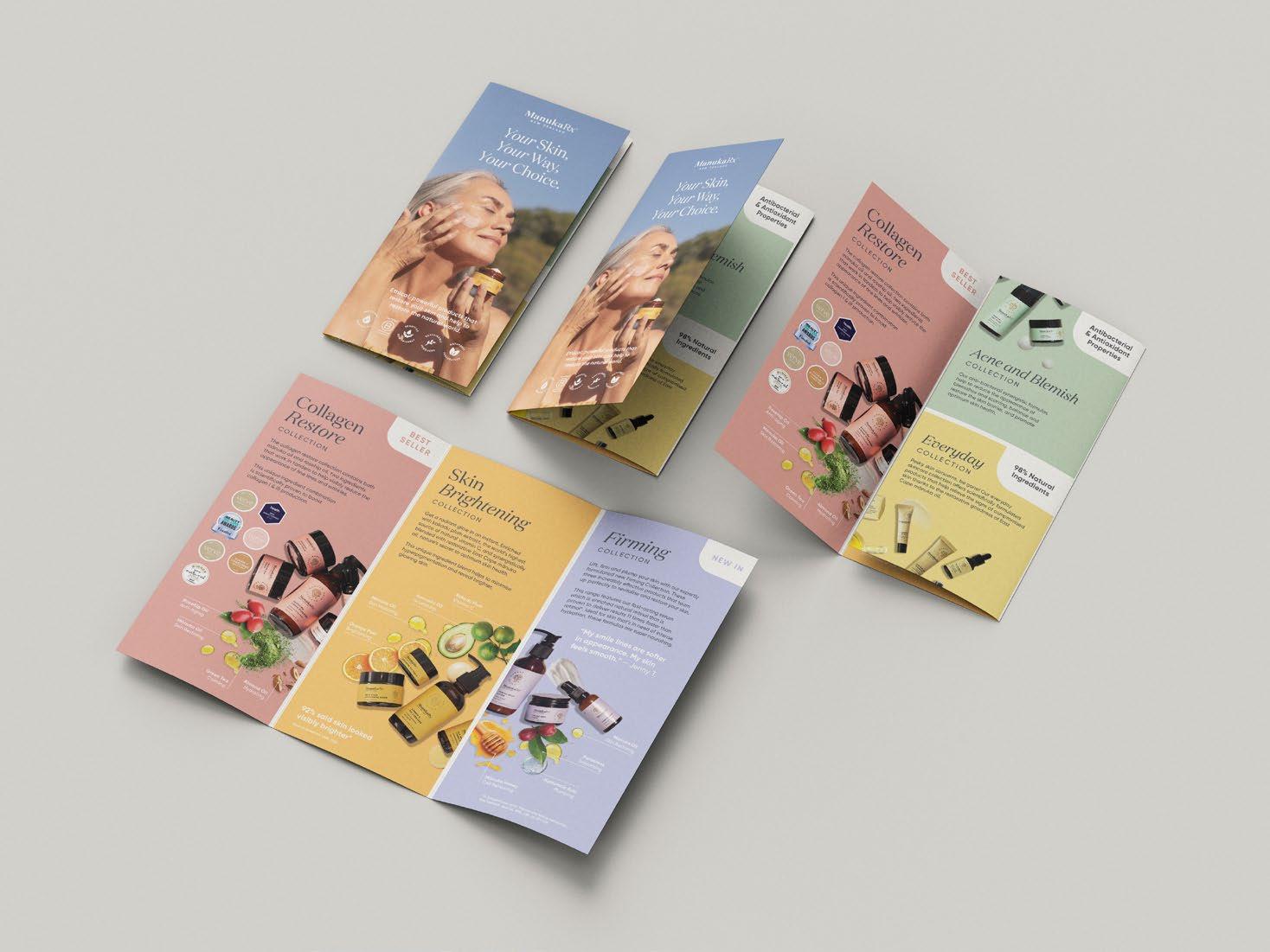
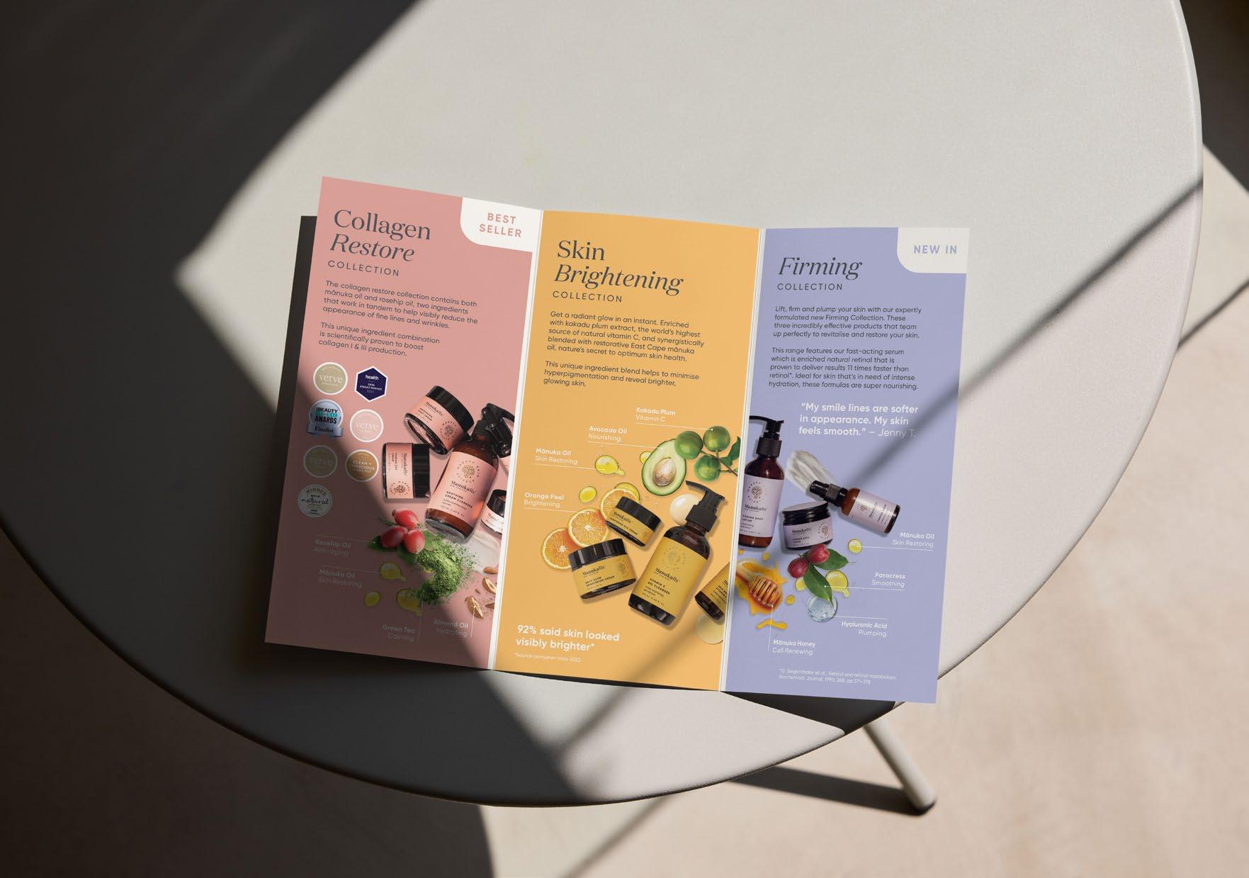
A visually stunning and informative brochure that showcases the Manukarx brand and its most popular skincare collections: the Collagen Restore Collection, Brightening Collection, and Firming Collection. This brochure highlights the brand’s commitment to science-backed formulations and nature-inspired ingredients, delivering powerful, results-driven skincare solutions.
Each collection is presented with detailed descriptions, outlining its unique skin benefits, hero ingredients, and transformative effects. Stunning imagery, customer testimonials, and expert skincare tips enhance the brochure, providing an engaging and immersive experience.
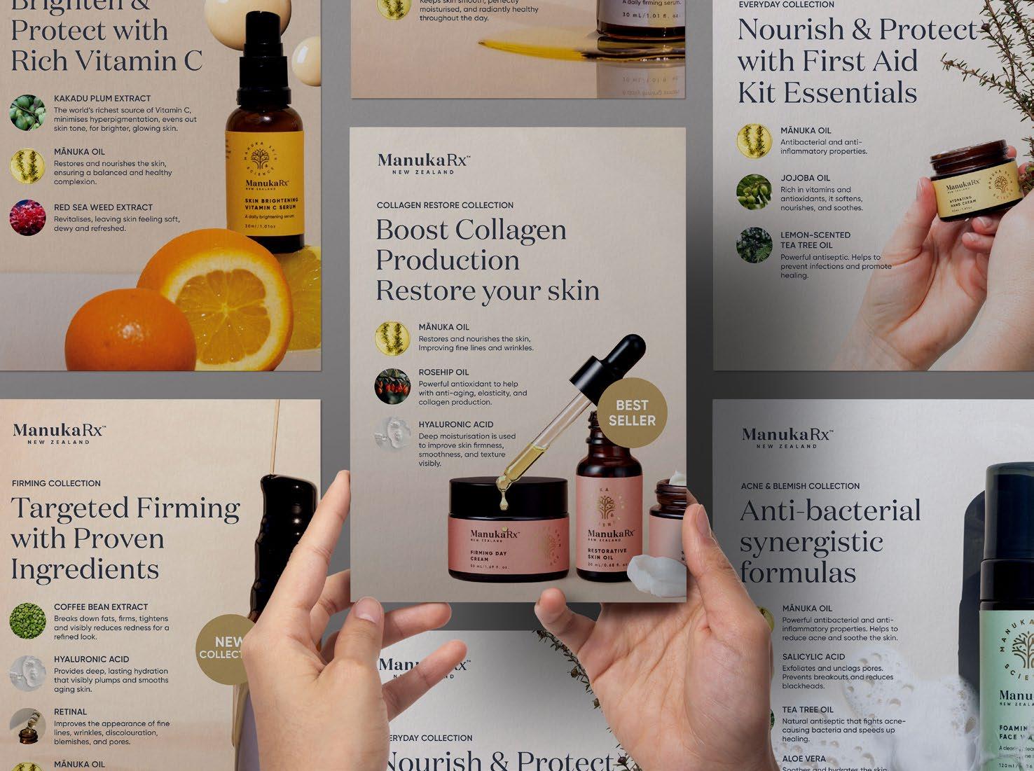
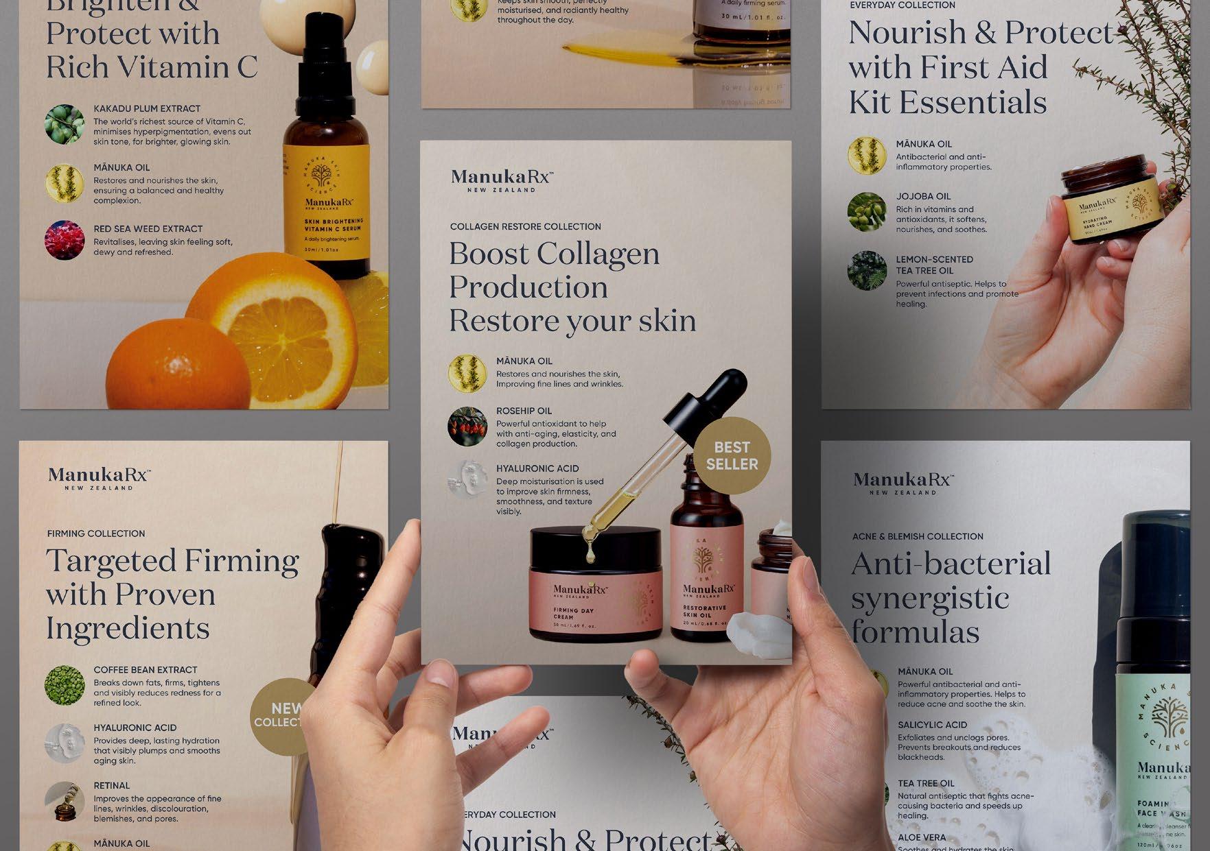
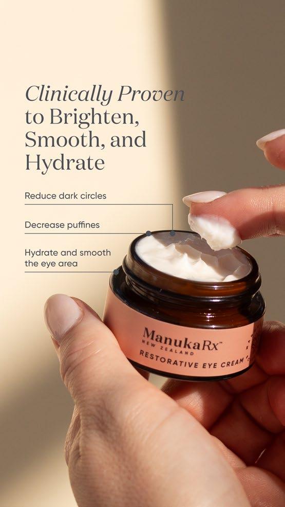
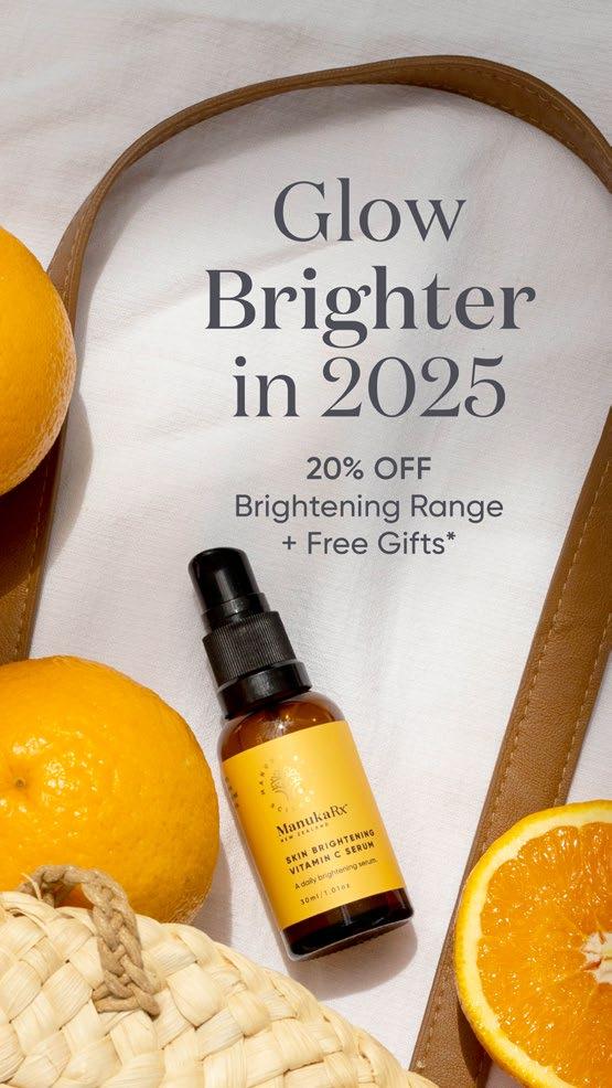
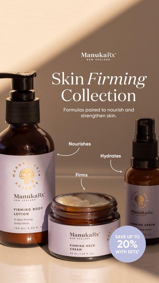
I have designed five unique flyers, each dedicated to one of my signature skincare collections: Collagen Restore, Brightening, Firming, Everyday, and Blemish. Each flyer features a compelling title, a concise description of key skincare benefits, and a showcase of powerful ingredients. From antiaging and hydration to brightening and blemish control, the collections are designed to address diverse skincare needs.
To guide customers, I have included a curated selection of star products, usage tips, and skincare routines, complemented by high-quality visuals that reflect the luxury and efficacy of Manukarx. QR codes and call-to-action prompts provide easy access to product details, exclusive offers, and skincare consultations. These flyers serve as a valuable resource for customers, beauty professionals, and retailers, making it effortless to explore and embrace the Manukarx skincare collections.
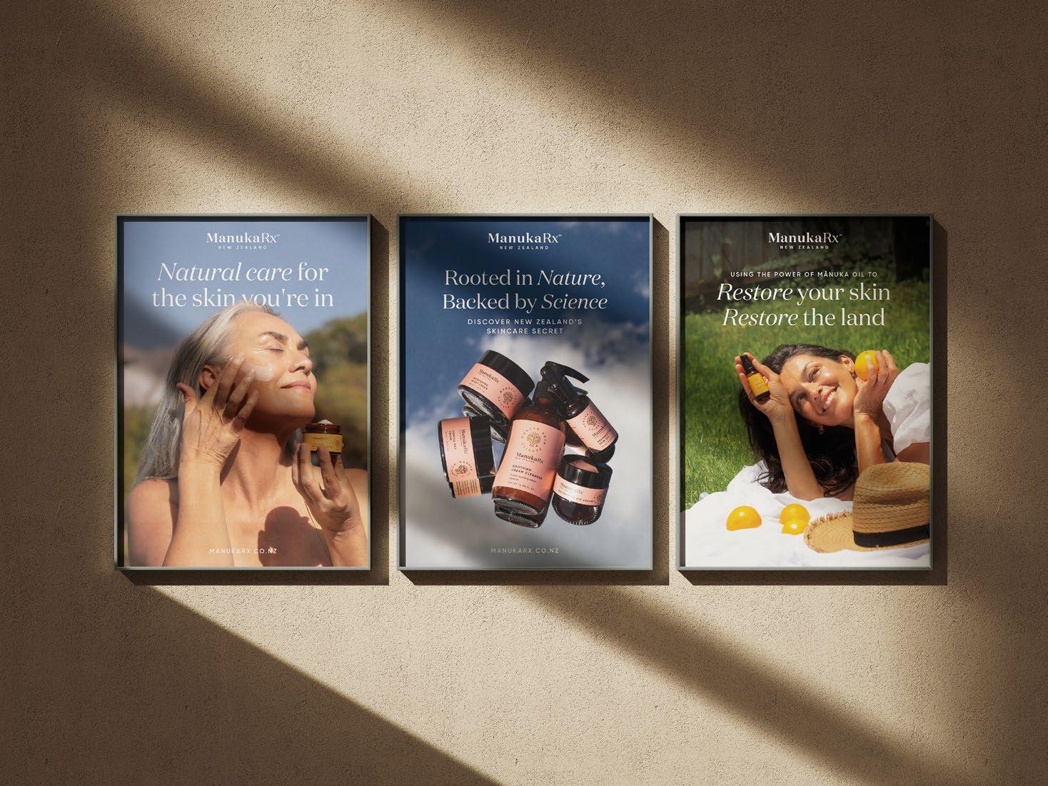
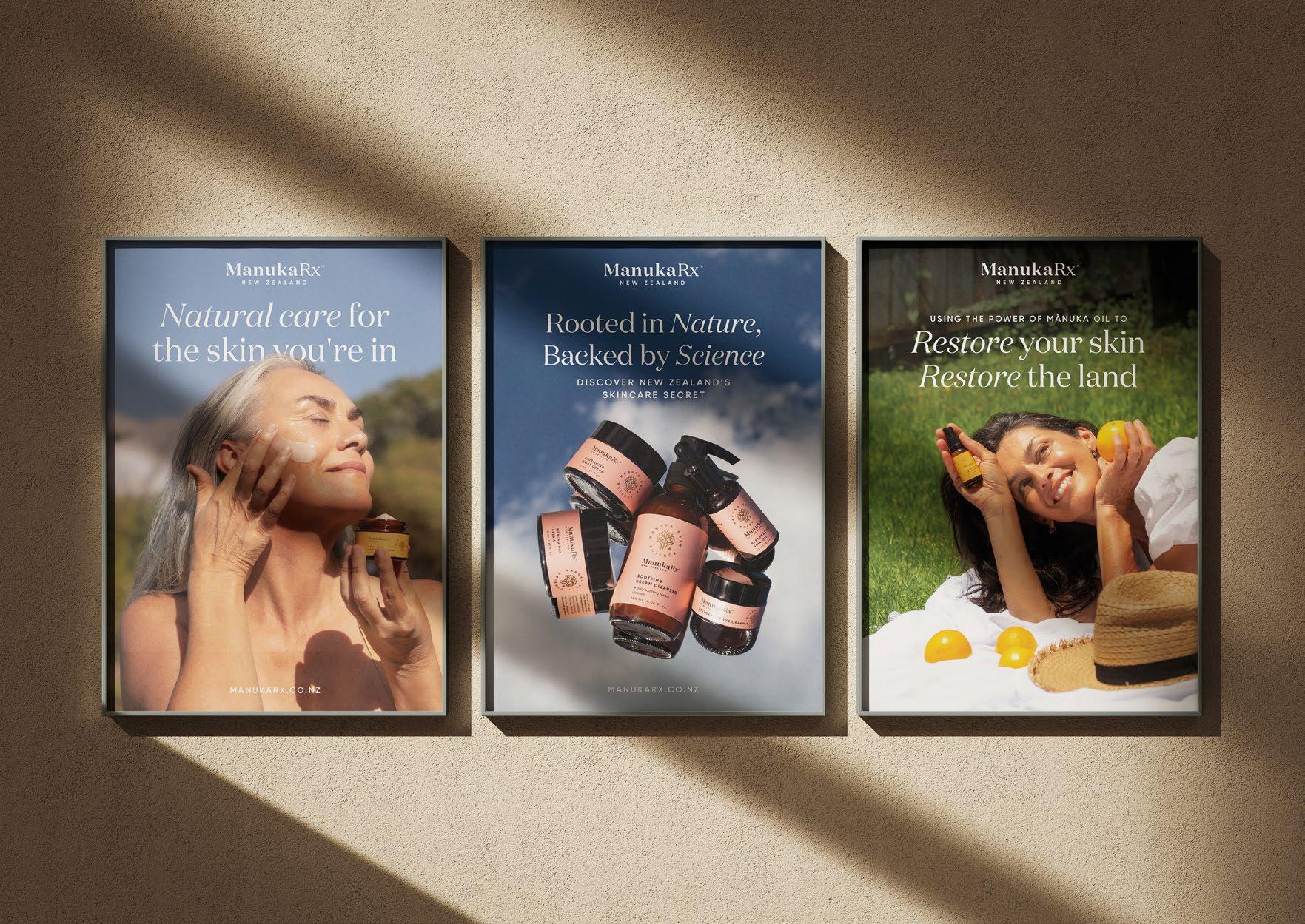
Six striking, attention-grabbing posters designed for display in stores, spas, and other commercial spaces to captivate customers and showcase the essence of Manukarx skincare. Each poster features bold visuals, compelling messaging, and high-impact design to highlight the brand’s most powerful skincare solutions.
These posters emphasize the luxury, efficacy, and innovation behind Manukarx, featuring stunning imagery, key product benefits, and hero ingredients from our most popular collections. Thoughtfully designed layouts ensure maximum visibility and engagement, drawing attention to the transformative effects of our products. With a focus on brand storytelling, skin wellness, and science-backed formulations, these posters serve as both aesthetic décor and powerful marketing tools, reinforcing Manukarx as a leader in premium skincare.
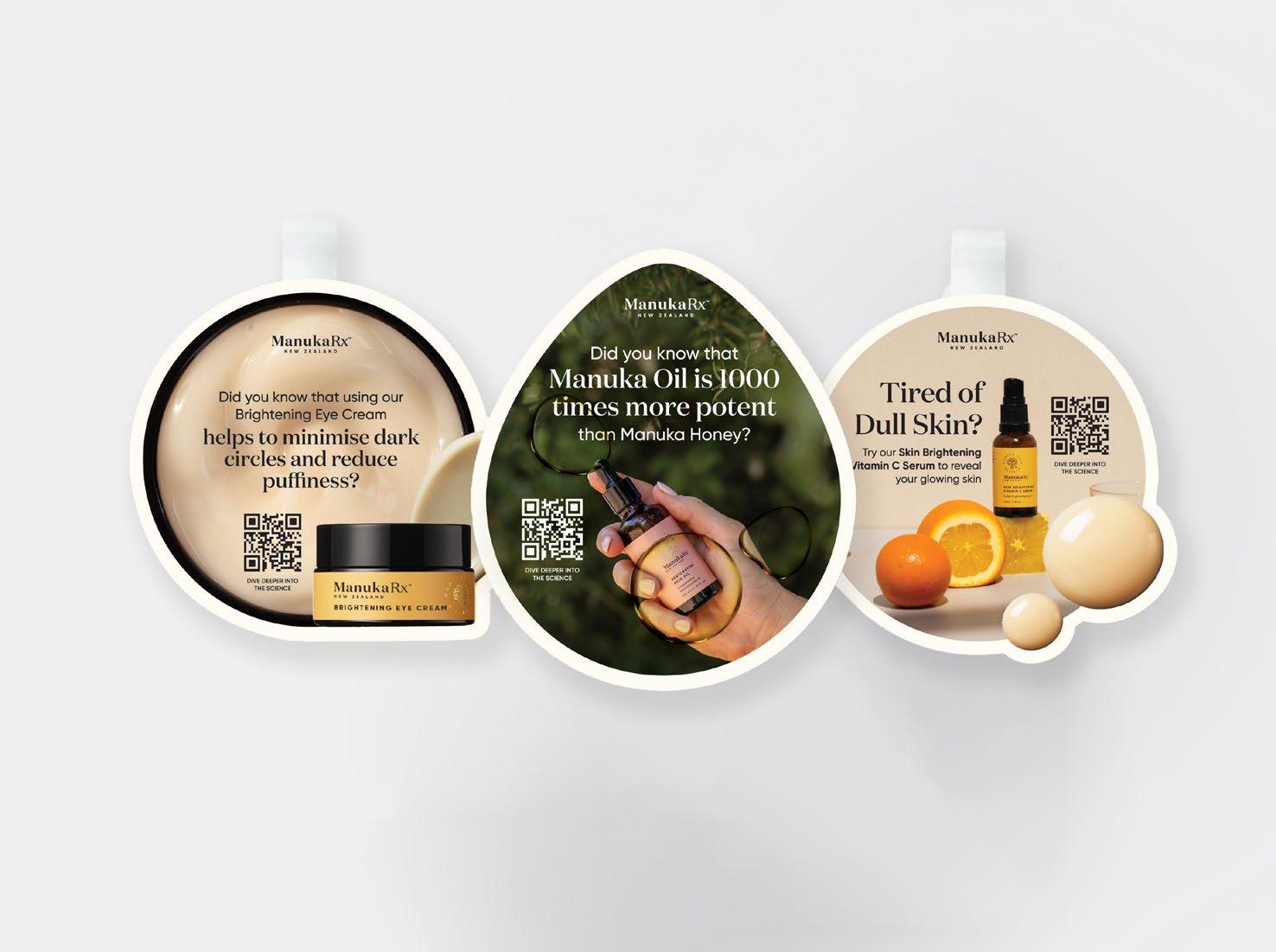
We’ve created three distinct wobblers for store shelves, designed to grab attention and spark curiosity. Each wobbler features a bold statement and a scannable QR code directing customers to a dedicated page on Mānuka Oil—highlighting its powerful skincare benefits and the science behind it.
With striking visuals and compelling messaging, these wobblers seamlessly connect customers to detailed brand insights, product information, and exclusive offers. They serve as both in-store engagement tools and digital touchpoints, reinforcing Manukarx’s commitment to high-performance, nature-inspired skincare.
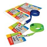
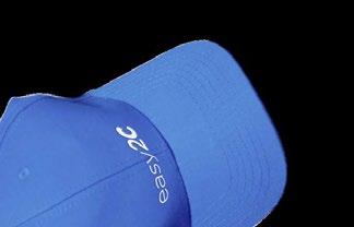
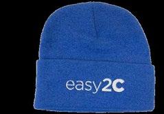
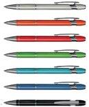
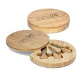
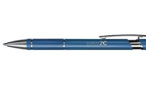
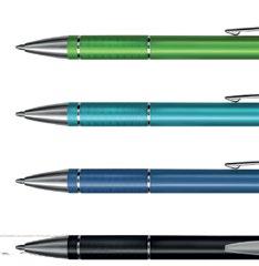
DESIGNING FOR EASY2C 02
2021-2023
STATIONERY DESIGN
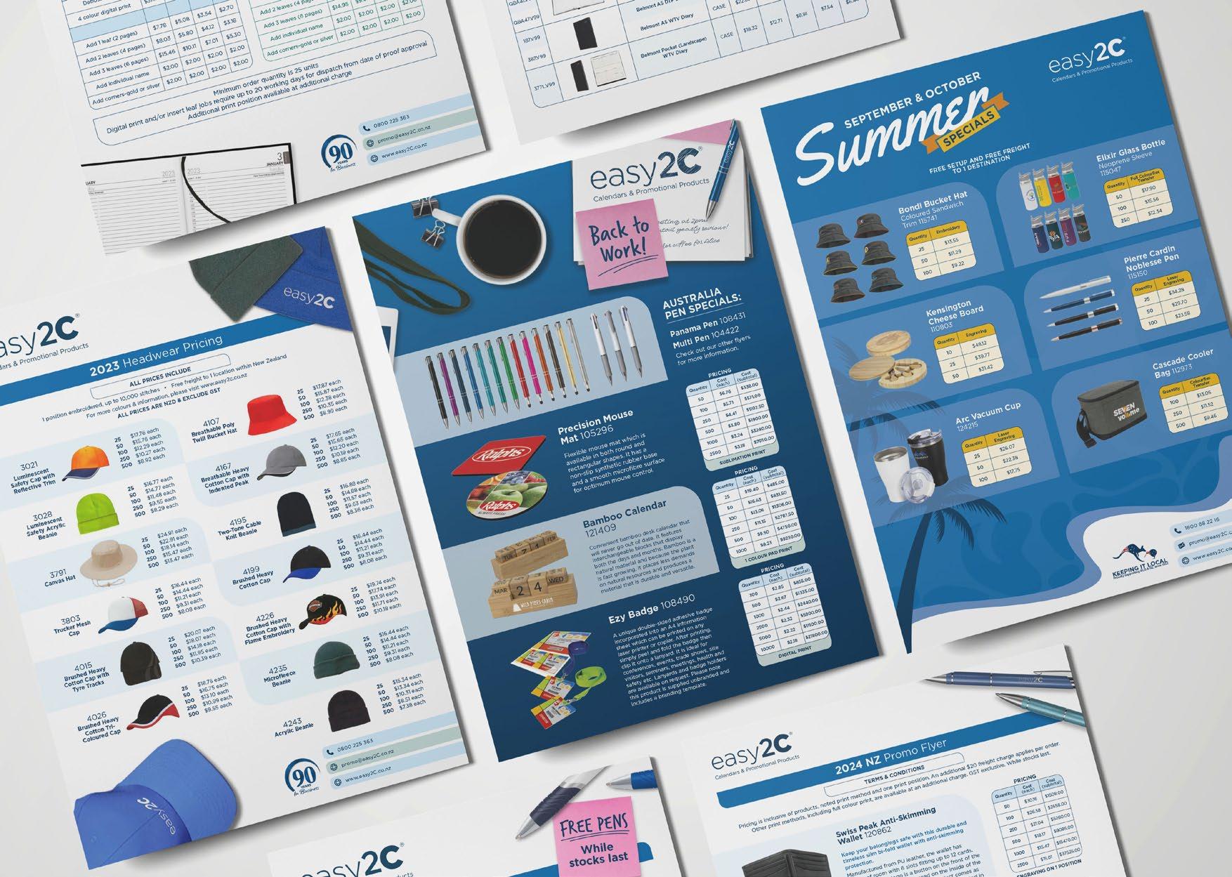
At easy2C Promotional Products and Calendars, I designed a range of stationery products, including promotional flyers, company forms, and car decals. I also led the redesign of a calendar collection sold directly to consumers, updating their style to create a more modern and visually appealing look.
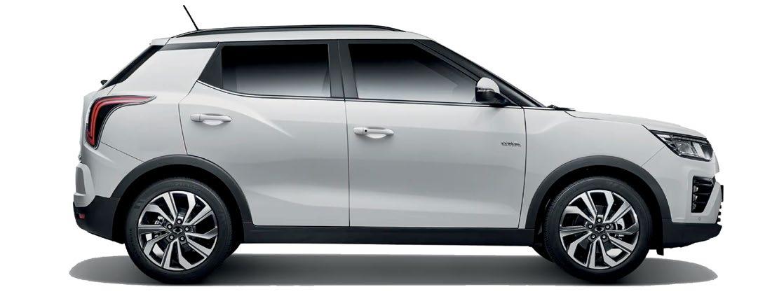
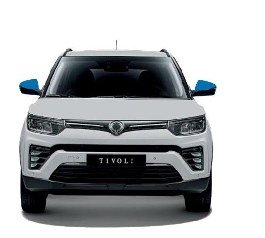
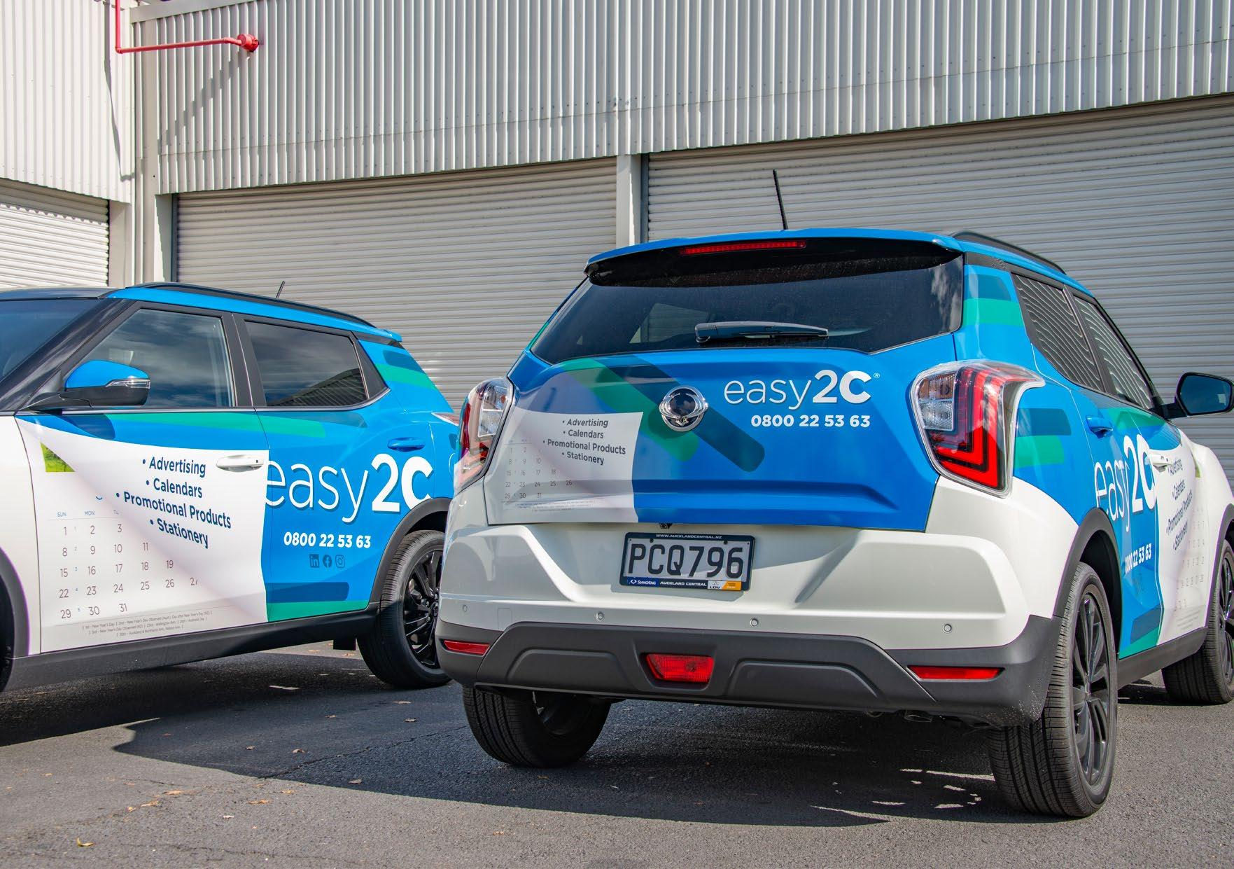
At easy2C, the design team was tasked with creating individual concepts for in-house stationery and advertising. My design was selected for the company car decal. Given the company’s focus on calendars and printing, I incorporated a paper-like effect that peeled back to reveal a calendar underneath.
The brief called for a dynamic, eye-catching design, so I opted for a 3D, interactive look to add visual interest. To enhance visibility on the road, I used the more vibrant colors of our branding to contrast against the white car. Angling the logo and pattern further emphasized a sense of movement, complementing the flying paper effect and reinforcing the theme of motion.
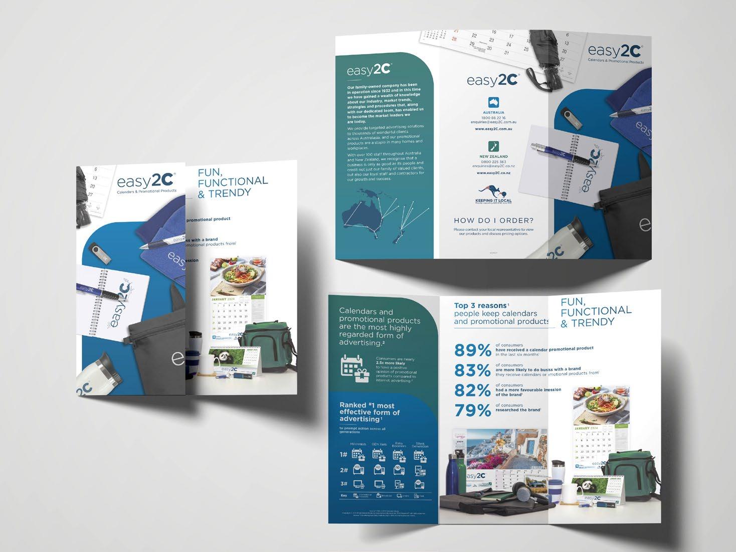
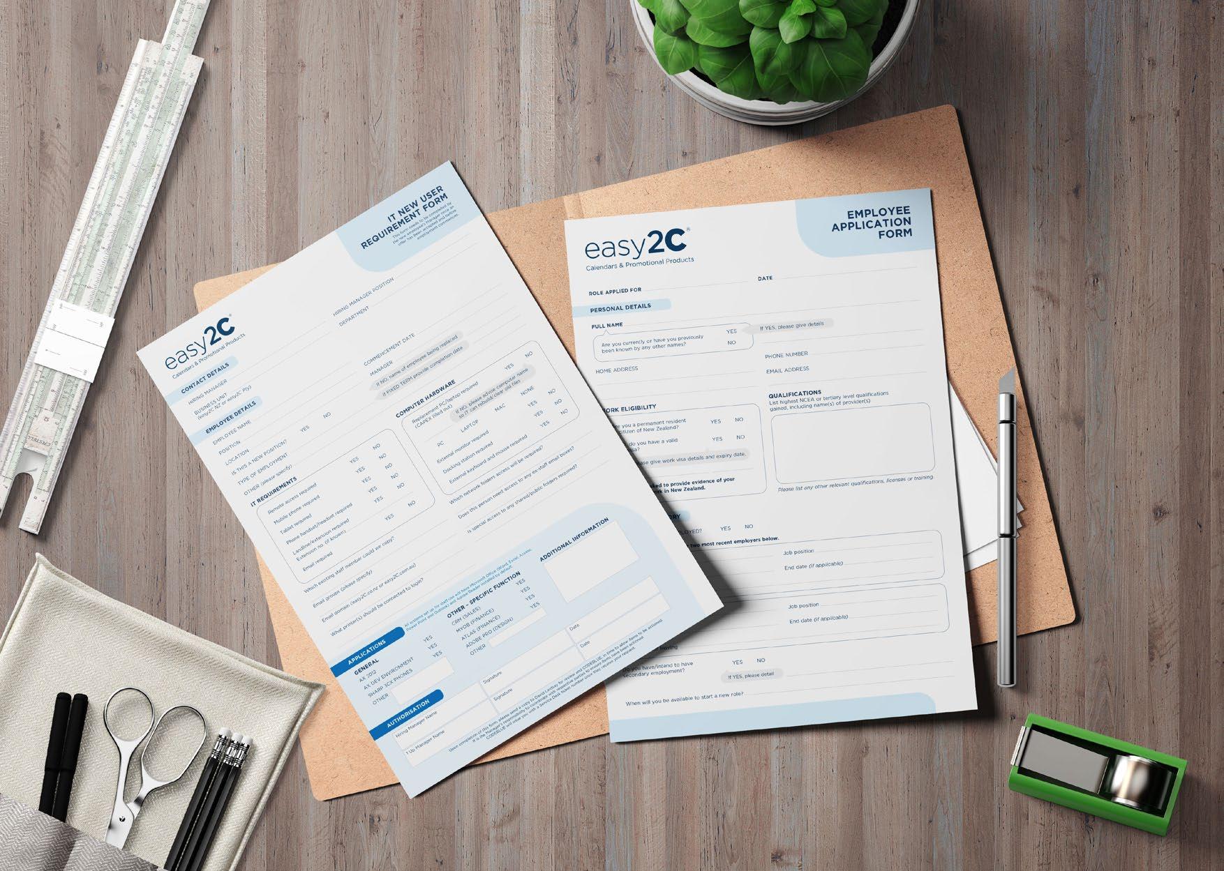
I also designed flyers and company documents, tailoring each to their purpose. For the flyers, I focused on bold, colorful, and eye-catching designs to engage customers. In contrast, I streamlined the company documents, maintaining the same design language while maximizing space for essential information.
To ensure consistency, I incorporated the brand’s signature rounded square shapes and color palette, while allowing for creative flexibility in the flyers to enhance their visual appeal or align with specific themes when needed.


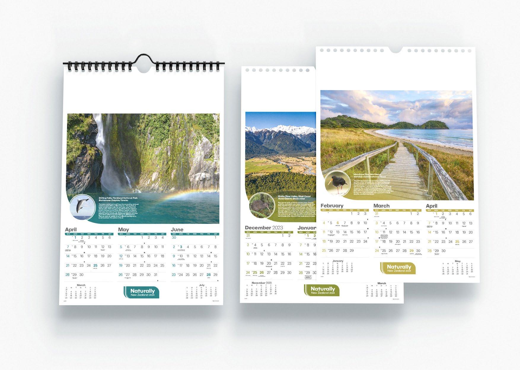
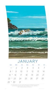
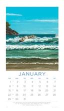
Calendars were our primary retail product, and I had the opportunity to redesign several outdated designs. My main goal was to modernize their appearance while maintaining functionality and ample space for note-taking and personalization, as most customers were corporations. Since the designs needed to remain practical rather than overly dynamic or experimental, I focused on aligning them with each calendar’s theme. For example, I incorporated curves and subtle asymmetry in the nature-themed calendar and used gradients to enhance the light-themed calendar. Leveraging these thematic elements allowed me to create visually distinct designs while preserving the calendars’ usability.

With the company open to new calendar concepts, I developed a design based on a provided brief. The goal was to create a modern calendar that didn’t rely on images as the main focus, unlike our existing designs. To achieve this, I centered the concept around global patterns, selecting distinctive designs and vibrant colors from various countries. This approach allowed for a cohesive yet dynamic layout, with each month featuring a unique pattern. I incorporated circular elements to unify the design across all months, ensuring a clean, modern aesthetic that could be easily adapted with different patterns in the future.
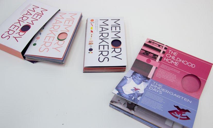
MEMORY MARKERS 03
2020
Booklet Design/
Typography
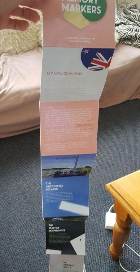
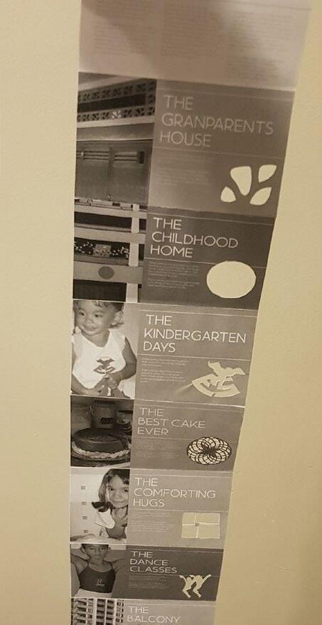
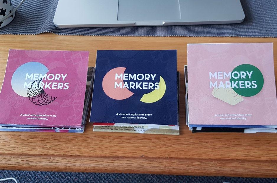
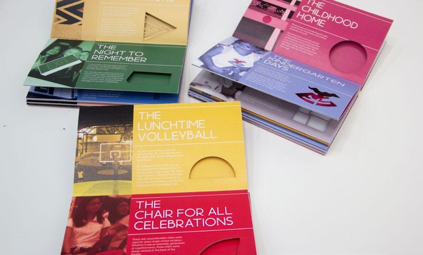
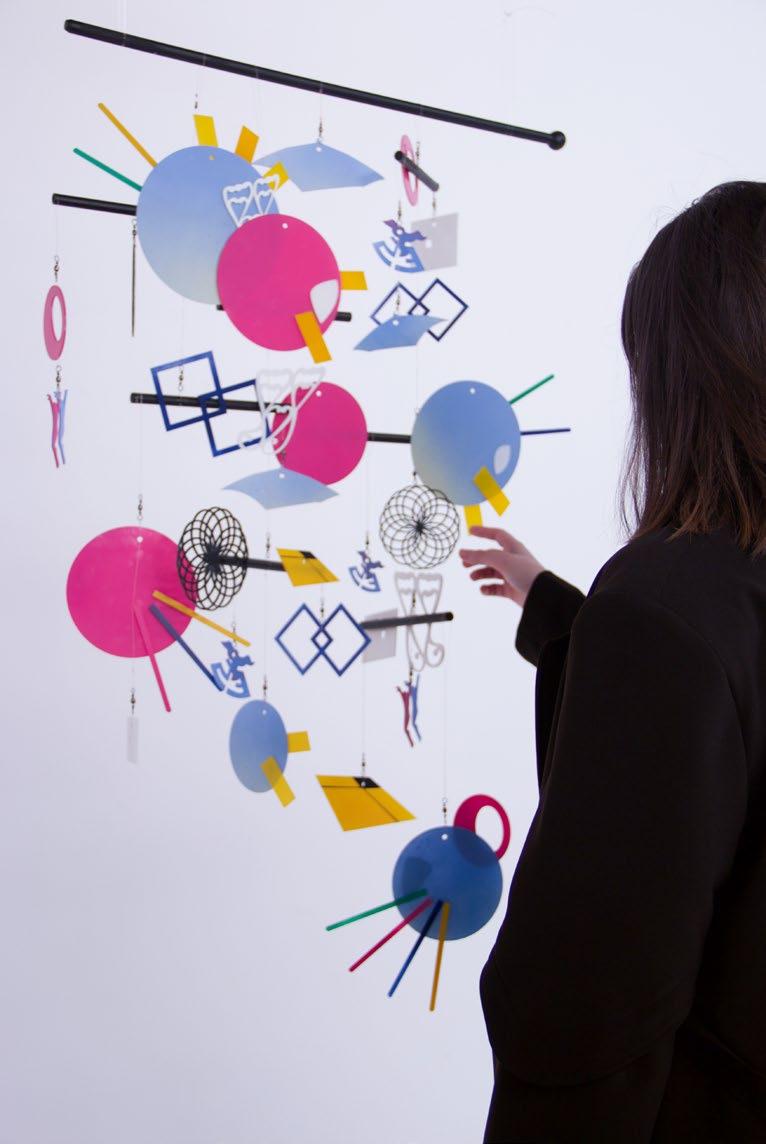
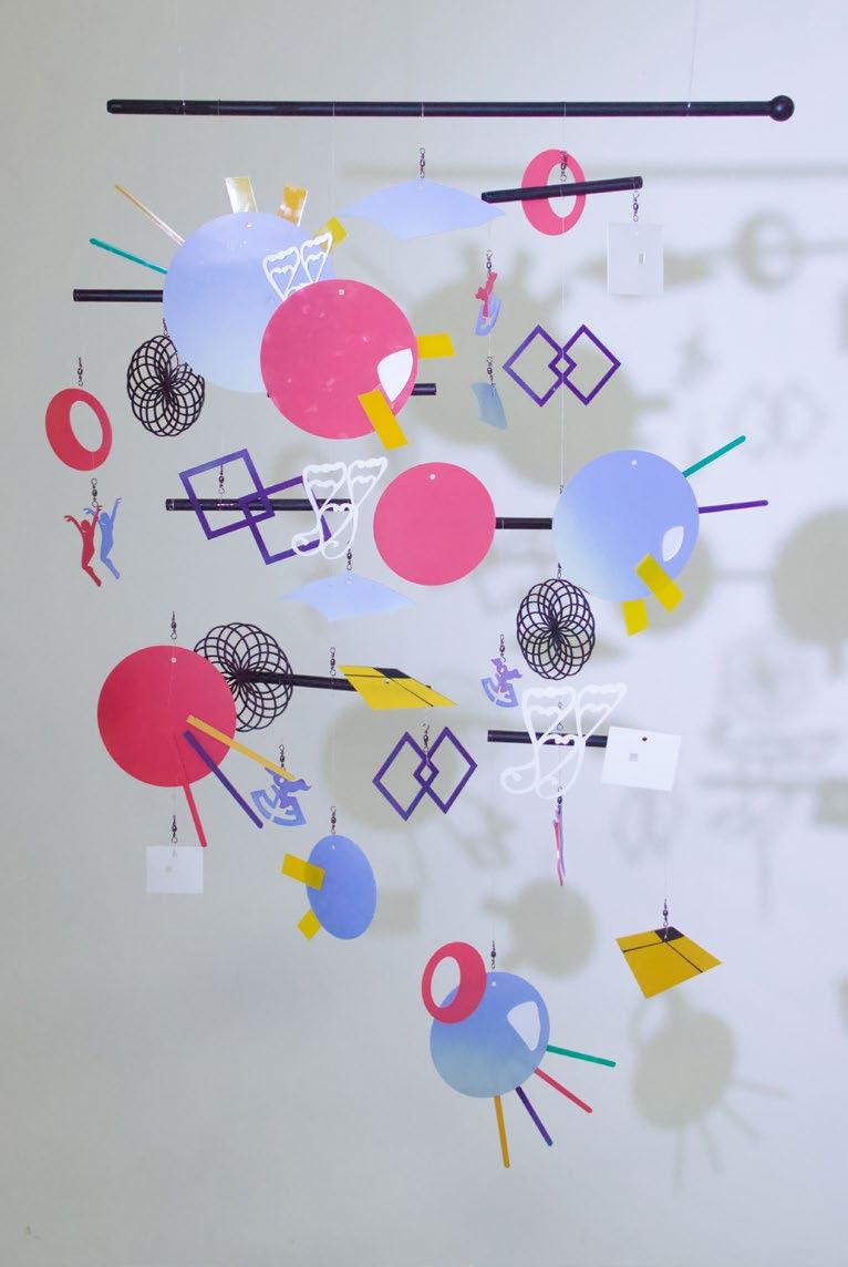
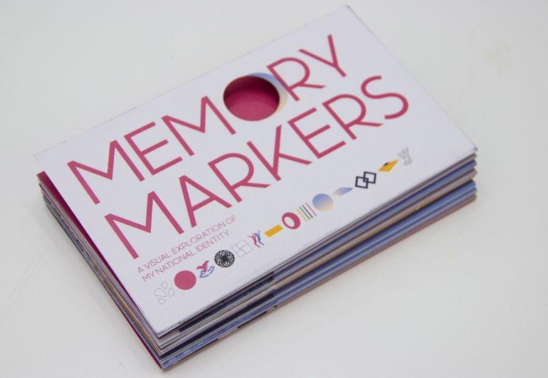
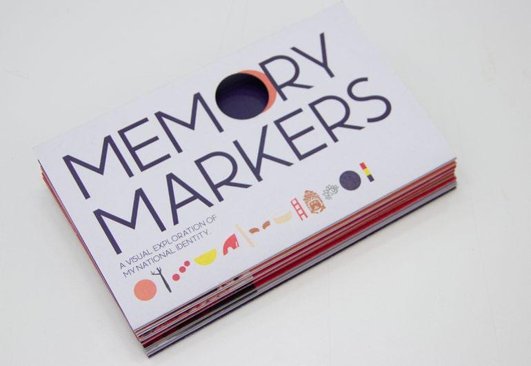
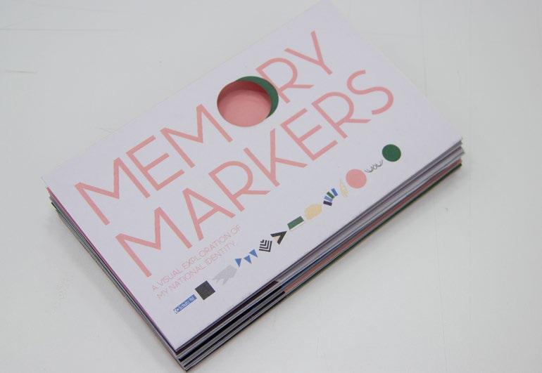
Memory Markers explores national identity through a personal lens by transforming memories and experiences into visual markers. Using colors, shapes, and forms drawn from my own experiences, I created three mobiles representing my Brazilian, Singaporean, and Kiwi identities. Each mobile is accompanied by a booklet that serves as a key, explaining the origins of these visual markers and how they connect to my sense of national identity.
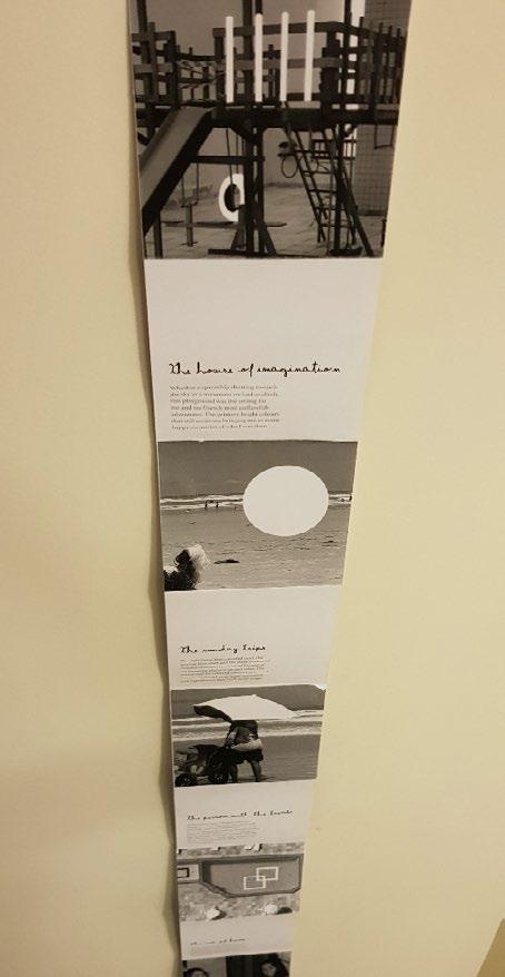
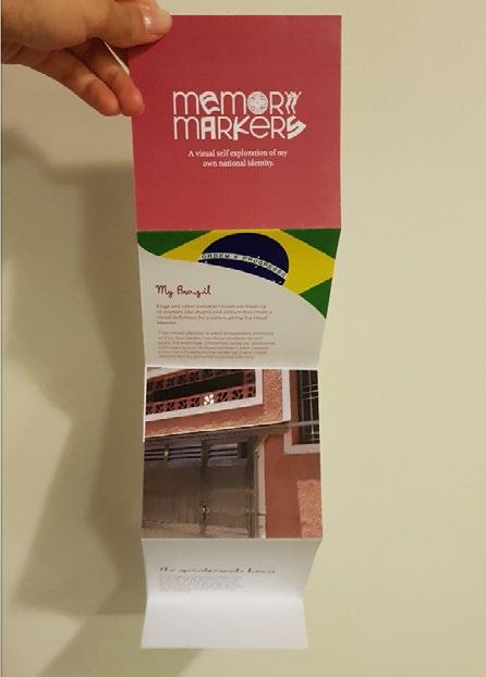
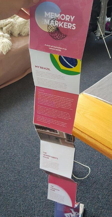
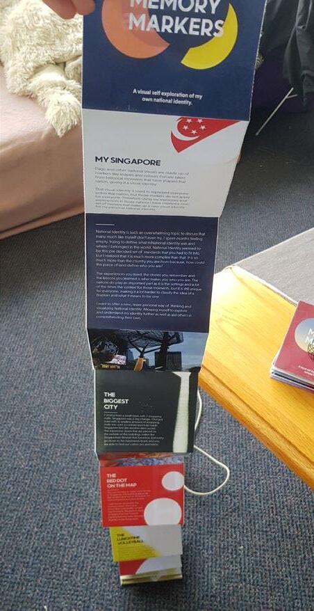
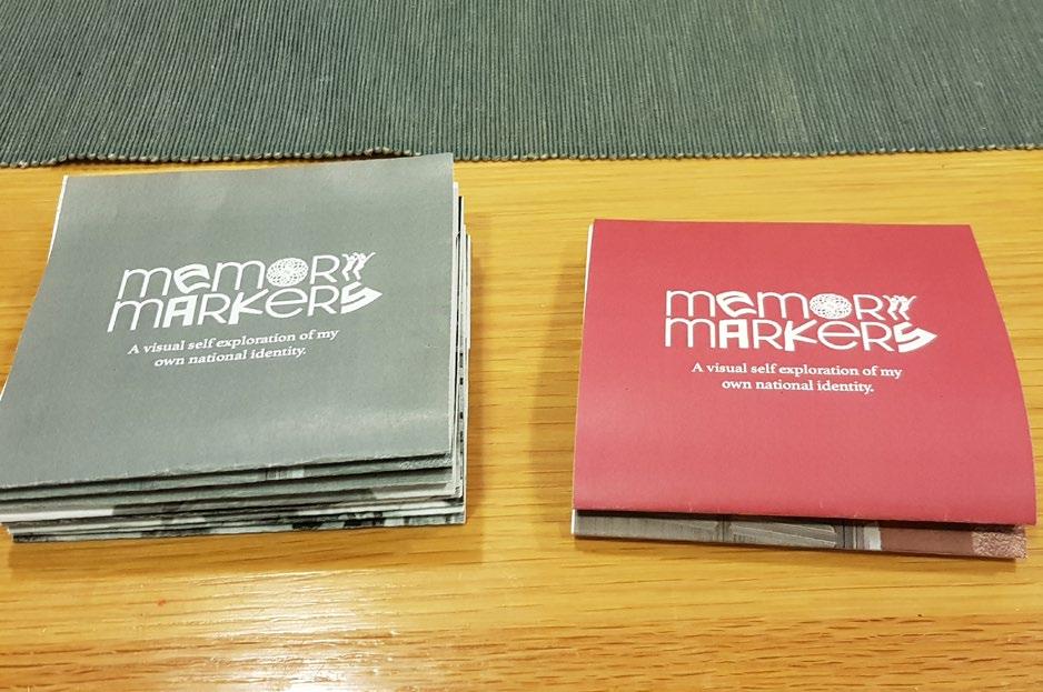
Designing the booklet layout was a challenge, as I wanted it to visually connect with the mobiles while maintaining their elegant and minimalist aesthetic. To achieve this, I used thin fonts, a structured grid, and lines across the pages to mirror the threads suspending the shapes in the mobiles. Additionally, I incorporated laser cutting into the booklets, reinforcing the connection to the mobiles while symbolizing the layered nature of meaning and identity.
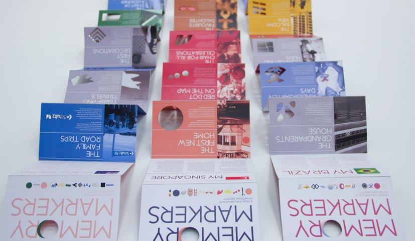
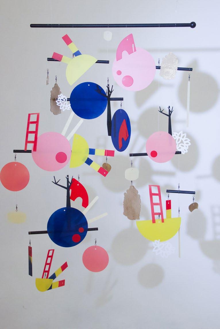
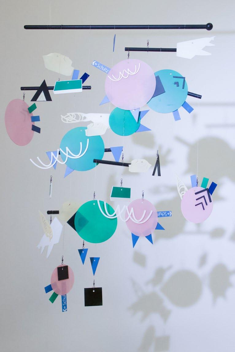
Brazil mobile and booklet Singapore mobile and booklet
New Zealand mobile and booklet
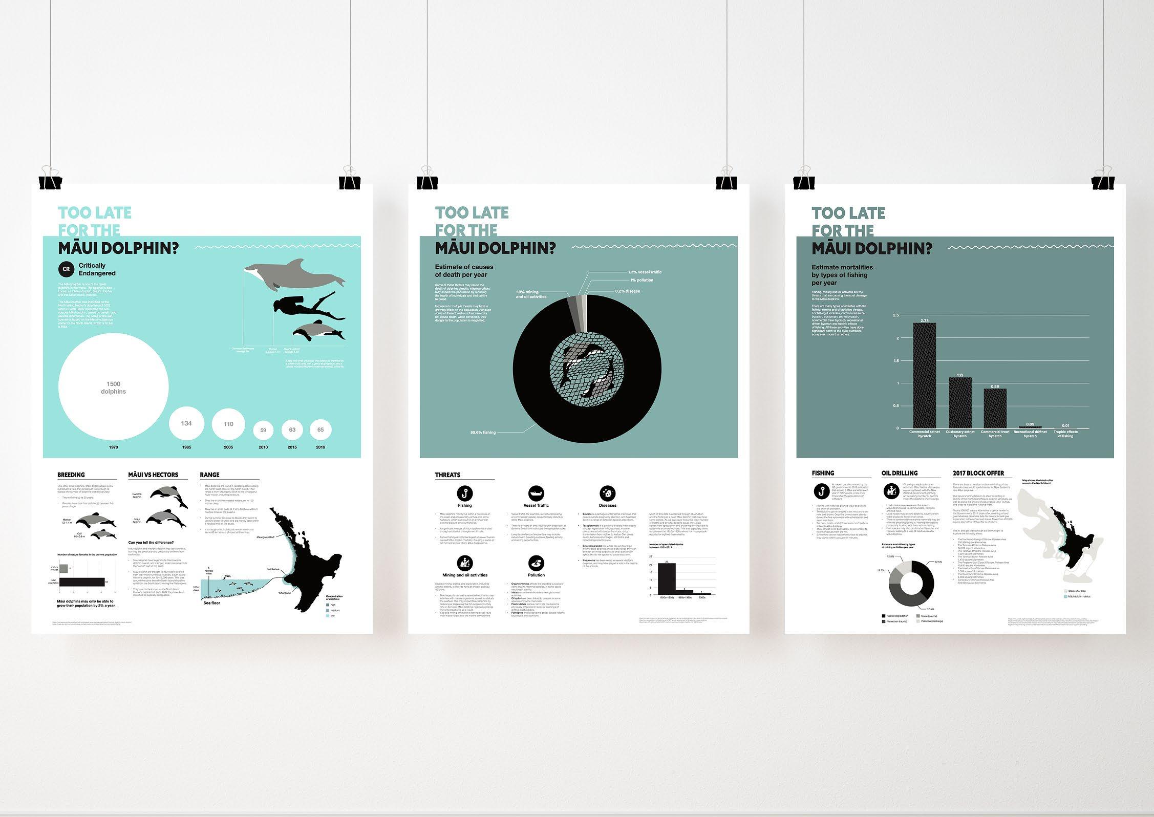
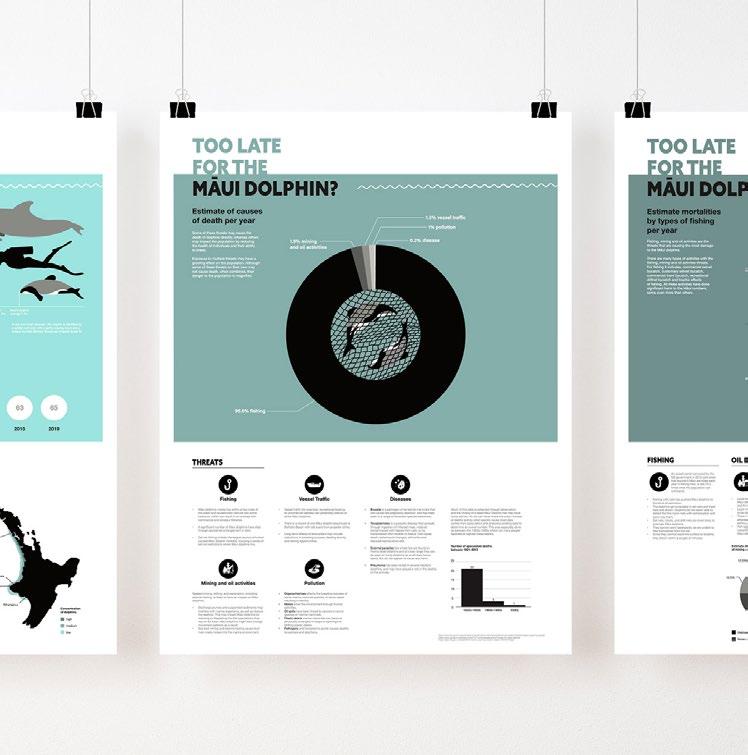
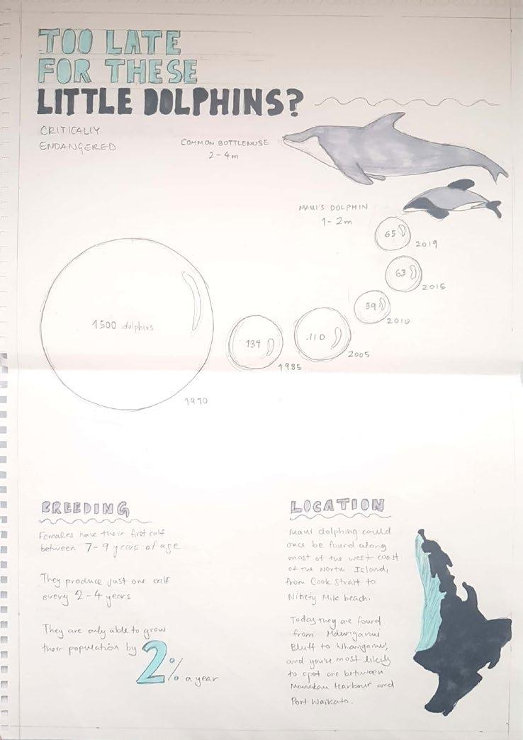
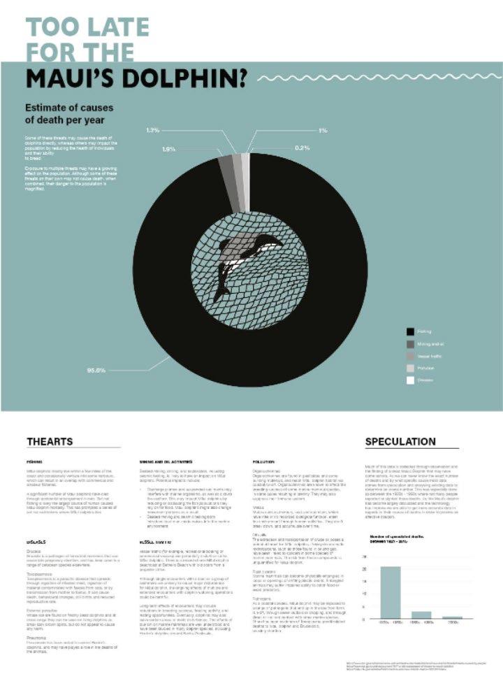
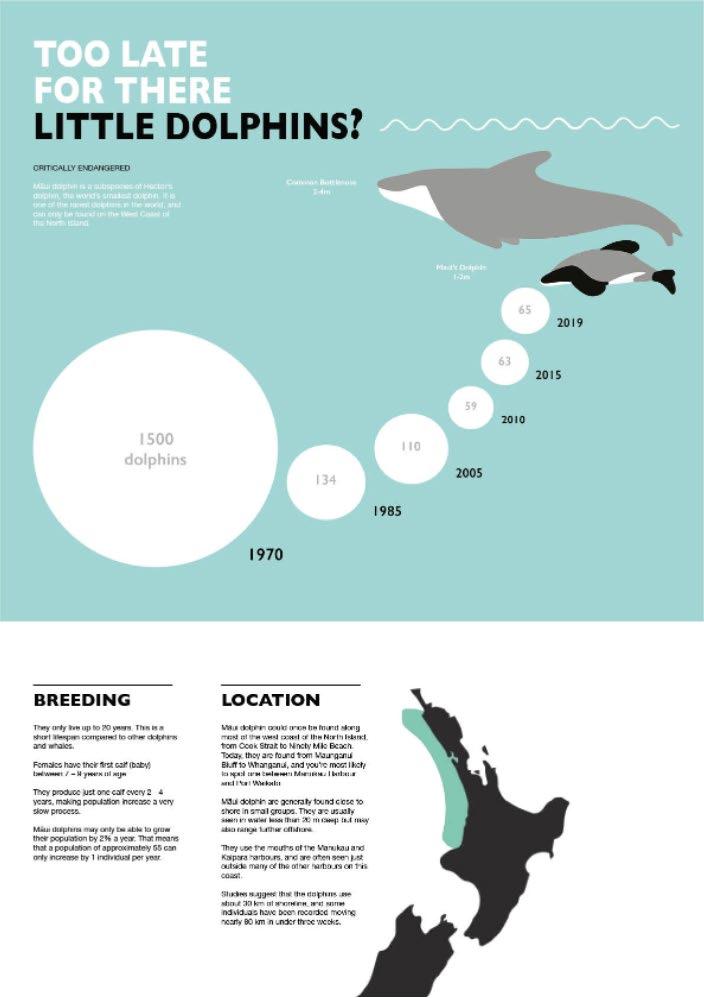
Too late for the maui dolphins? 04
Information Design
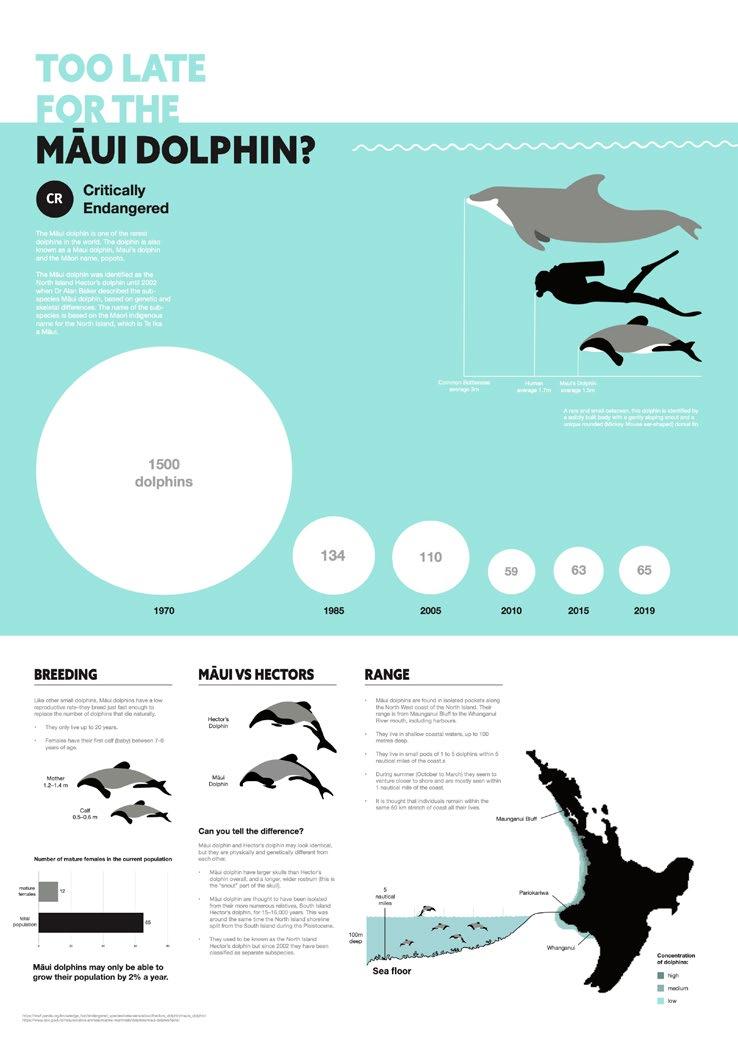
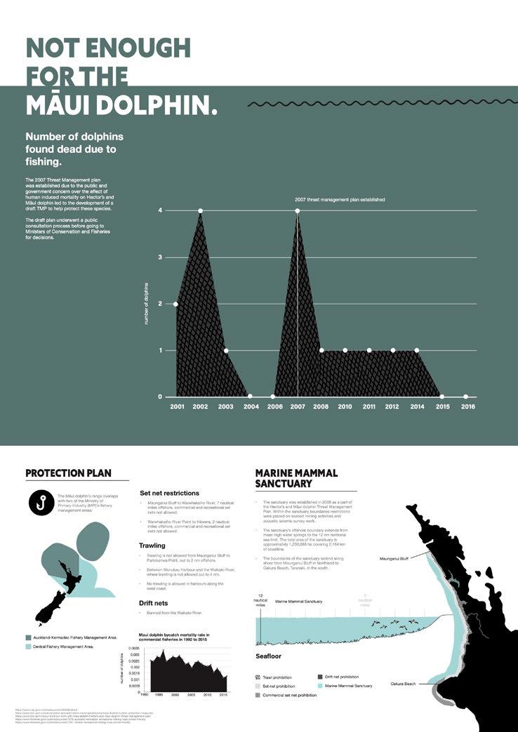
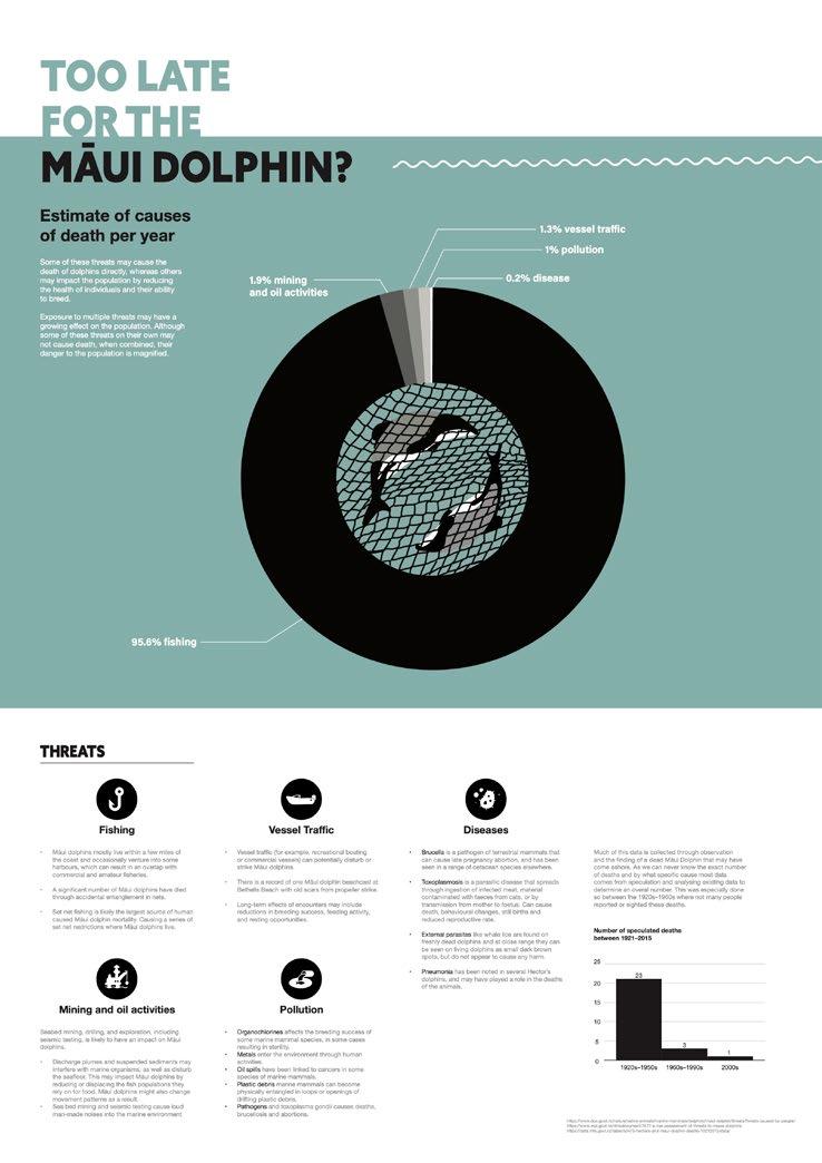
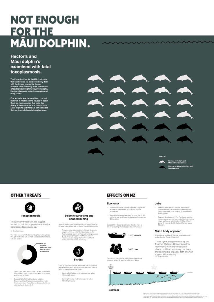
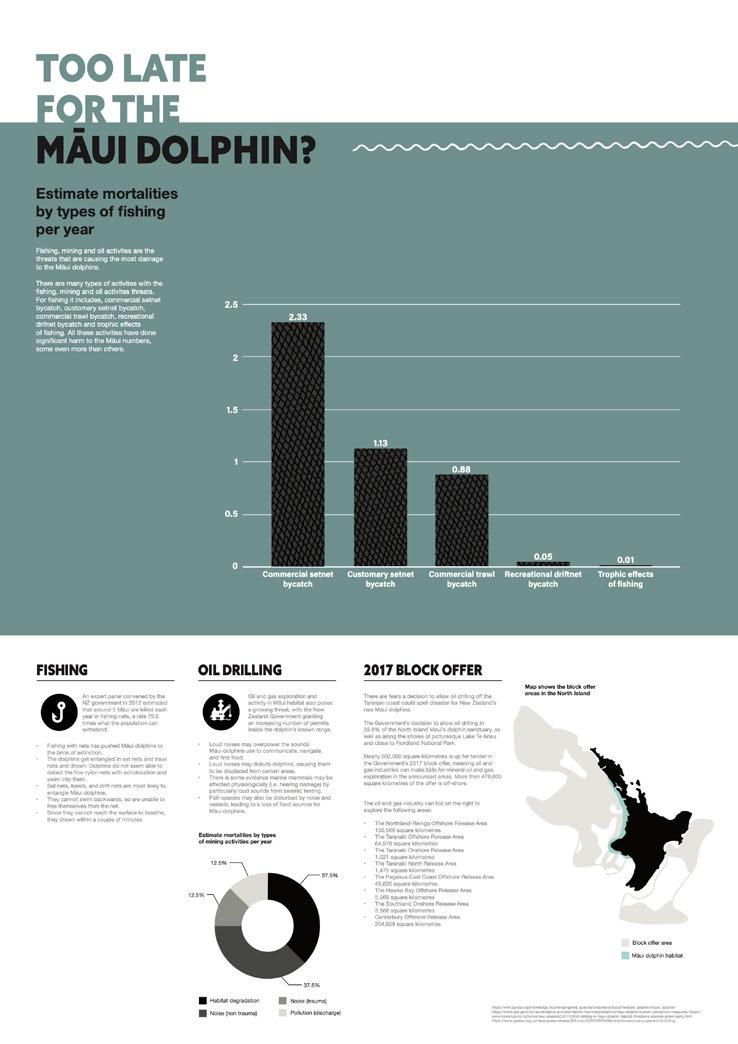
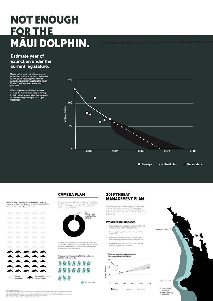
Too Late for the Māui Dolphins? is a university project designed to raise awareness about the critically endangered Māui Dolphins. It consists of a series of six infographics/posters that function both individually and as a cohesive sequence, illustrating the dolphins’ declining population and encouraging conservation efforts. To reinforce the message visually, I used a color palette that reflects the dolphins’ worsening condition, creating a gradual shift that highlights the urgency of their plight. This approach not only enhances the narrative but also deepens the viewer’s connection to the topic.
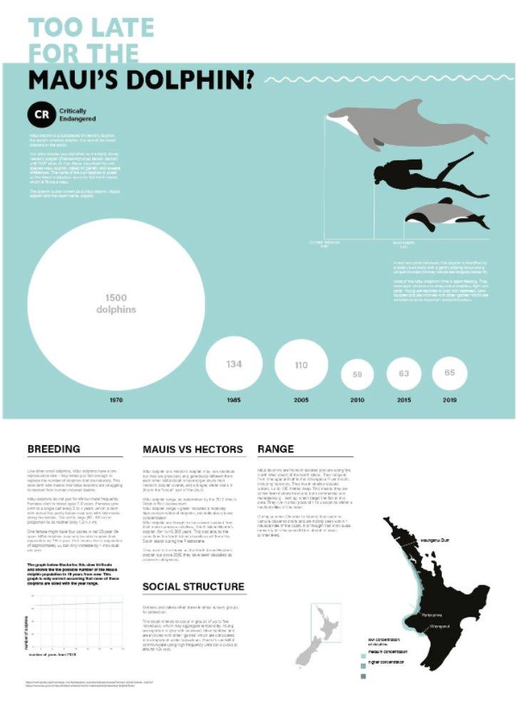
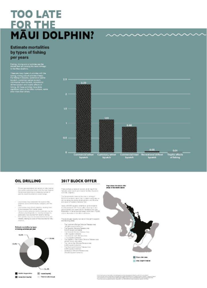
I chose a color palette inspired by the Māui Dolphin’s natural coloring—black, white, and grey—while incorporating a pop of blue to represent the ocean. To emphasize this connection, I created a horizon line with the blue and added subtle details like a wave pattern.
The first poster, which introduces basic information about the dolphins, features bright and playful colors to reflect their vitality. As the series progresses and shifts focus to the threats they face, I gradually darkened the ocean color to symbolize their declining condition. I also used a visual narrative by reducing the number of dolphins depicted—starting with multiple on the first poster, a few on the second, and none on the third—to illustrate the potential consequences of inaction.
To enhance clarity and hierarchy, I used green to highlight key data points while reserving white space for text-heavy sections, ensuring a balanced and effective presentation of information.
Logos 05
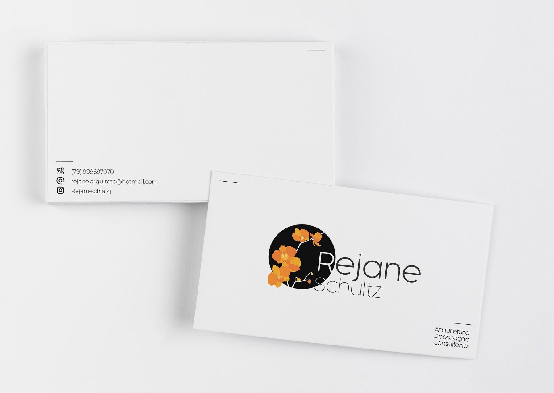
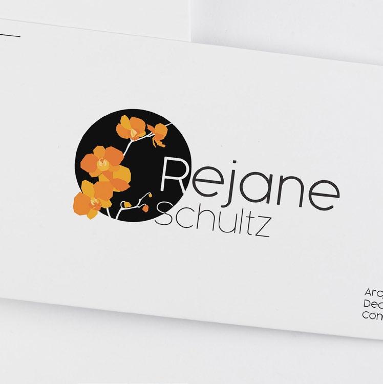
REJANE SCHULTZ
2019
LOGO DESIGN/ BRANDING
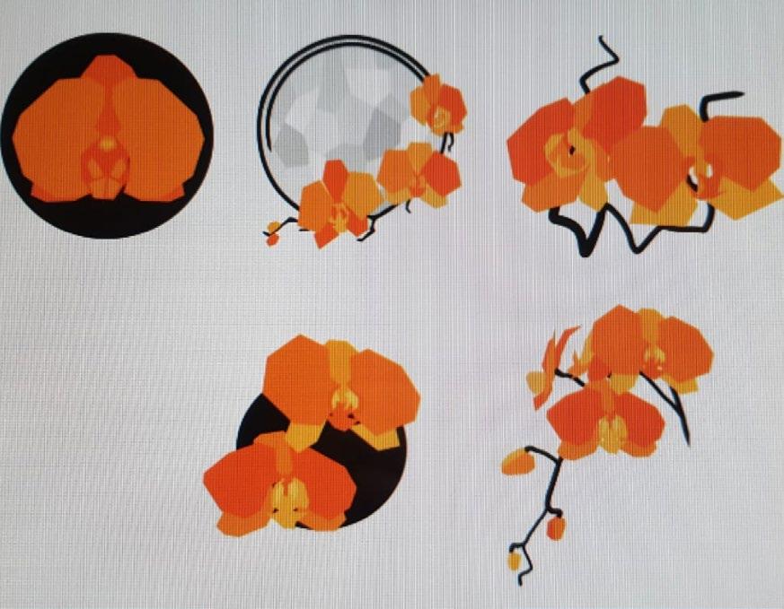
For this project, a freelance architect approached me to design a logo and business card. Having lived in Singapore, she had a deep admiration for its national flower, the orchid, which I incorporated into the logo design. I balanced this with elements of symmetry and simplicity, reflecting the clean, structured aesthetics often found in architectural design.
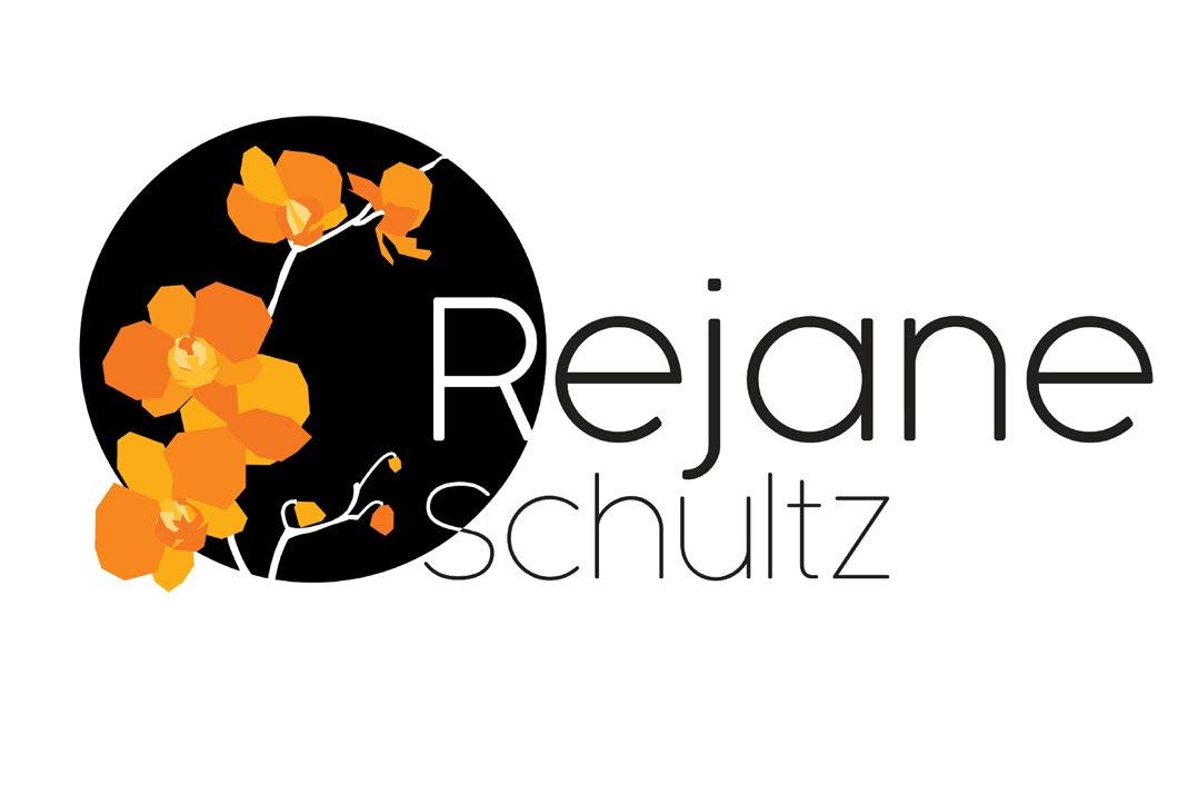
I began by thinking about a concept that would fit my client and what they wanted. My client wanted something professional that showcased their personality and values. I first thought of their favourite flower as it deeply reminded them of their home.
After choosing that flower I created a series of quick iterations. The colour scheme was already chosen by the client so I had to incorporate those into my design.
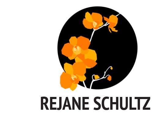
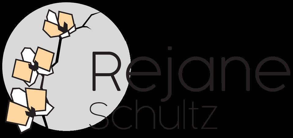
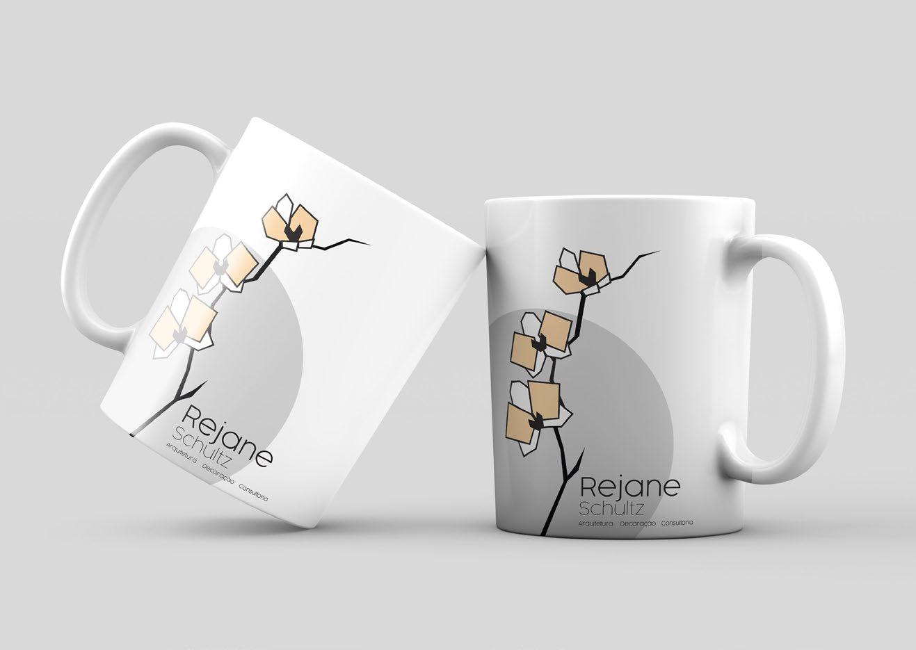
I also designed a simplified version of the logo to meet the client’s need for frequent printing while conserving ink. Since they wanted to keep the original as well, I ensured both versions remained visually cohesive, allowing for flexible use across different applications while maintaining brand consistency. Additionally, I applied the simplified design to a mug, as requested by the client.
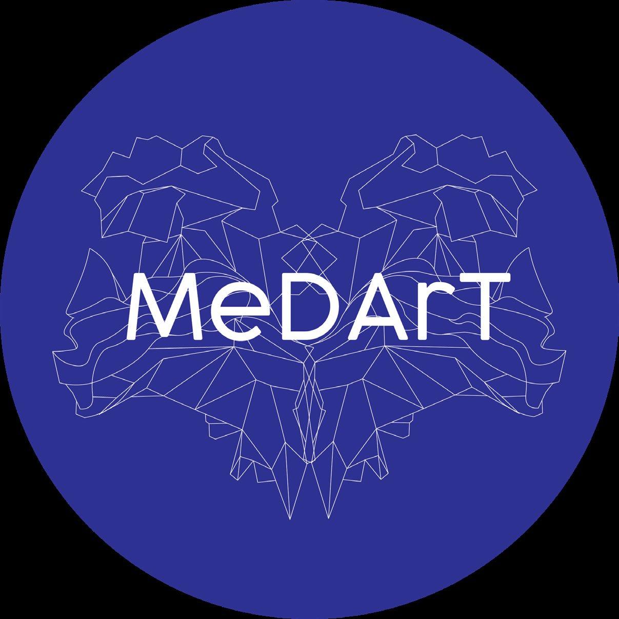
MEDART
LOGO DESIGN/ BRANDING
In my role at MeDArT, I was responsible for designing the logo and overall visual identity for the brand. As a research initiative exploring the connection between the arts and early indicators of dementia, I aimed to create a design that balanced both scientific precision and artistic expression. To achieve this, I developed a geometric yet visually dynamic logo that could adapt to the various sub-projects within MeDArT while maintaining a cohesive brand identity.
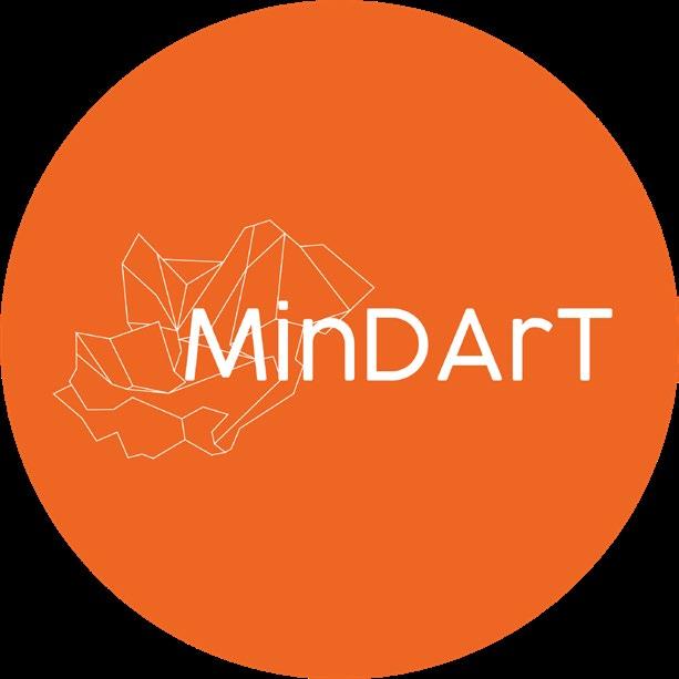
I also designed app icons for MinDArT, incorporating the clean line work and vibrant colors from the logos to maintain visual consistency and brand identity.
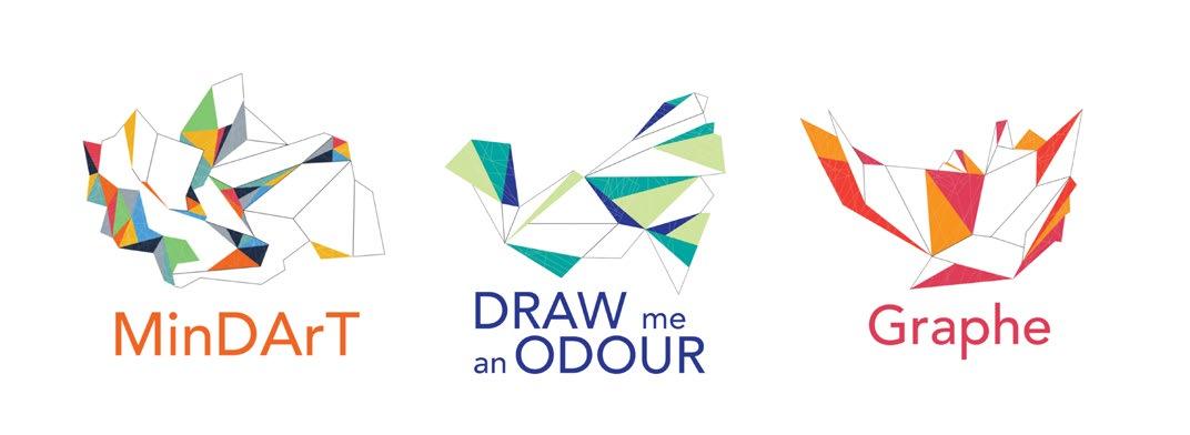
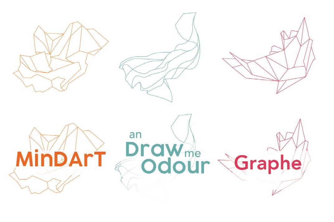

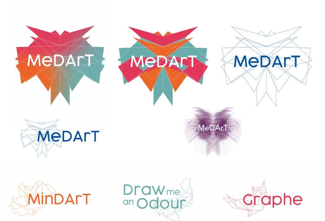
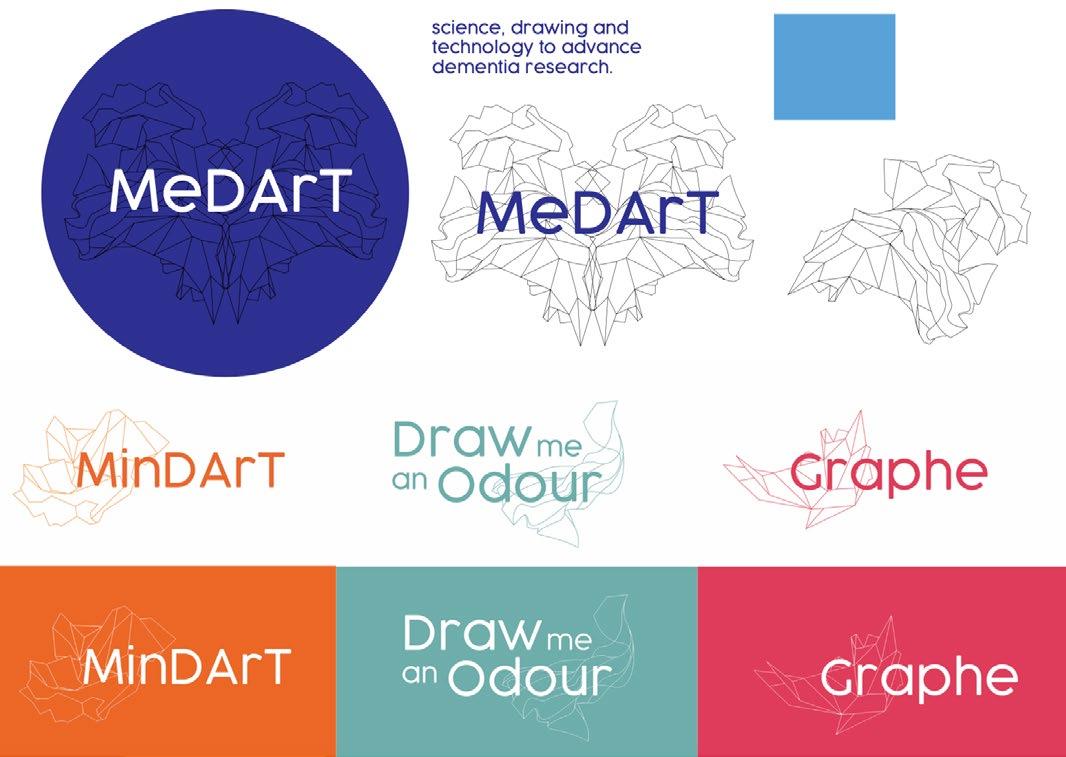
Finding the right balance between a scientific, artistic, and dynamic aesthetic was a challenge. Through extensive development, I experimented with various approaches before ultimately refining the design to feature clean, simple line work—moving away from the more complex initial concepts.
Other LOGOS
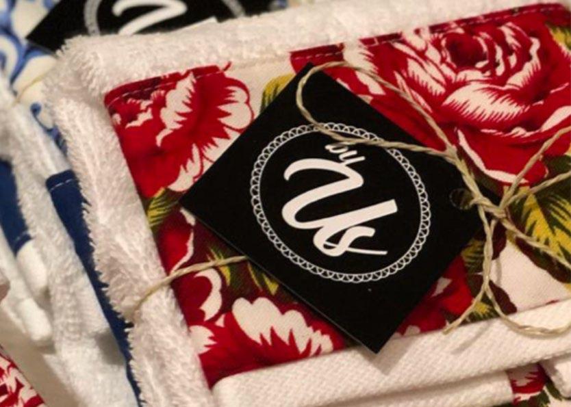
BY US
By Us is a project where I was commissioned to design a logo for a dining table decoration business. The client and their co-workers wanted a design that reflected the handmade nature of their products while remaining simple and versatile. To ensure adaptability, I created a logo that could be used in multiple colors and on a variety of vibrant backgrounds.
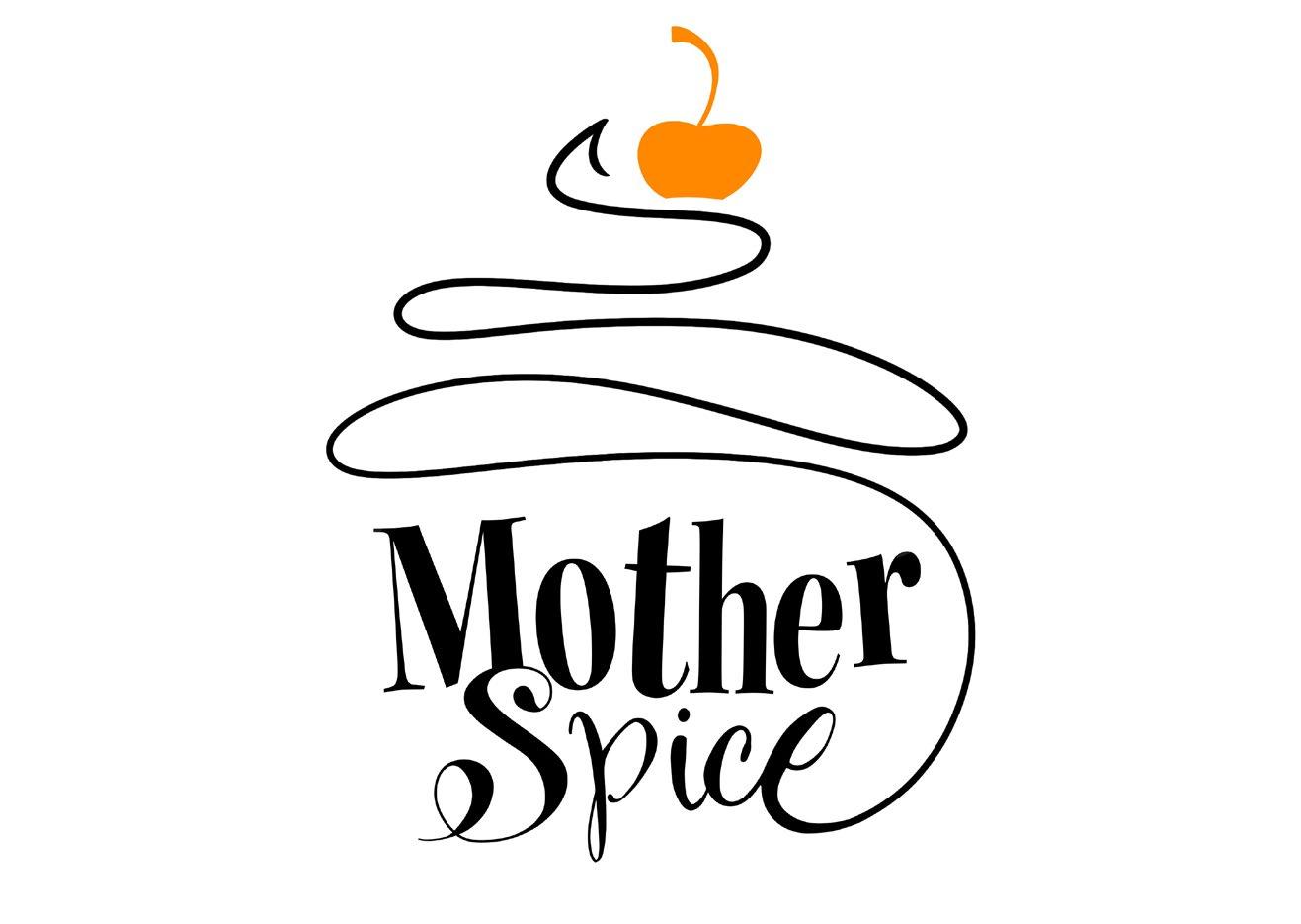
MOTHER SPICE
Mother Spice is a project where I was commissioned to design a logo for a baking and cooking business. To capture the warmth and comfort of home cooking, I incorporated smooth lines and playful fonts, creating a design that feels inviting, familiar, and approachable.
DESIGN
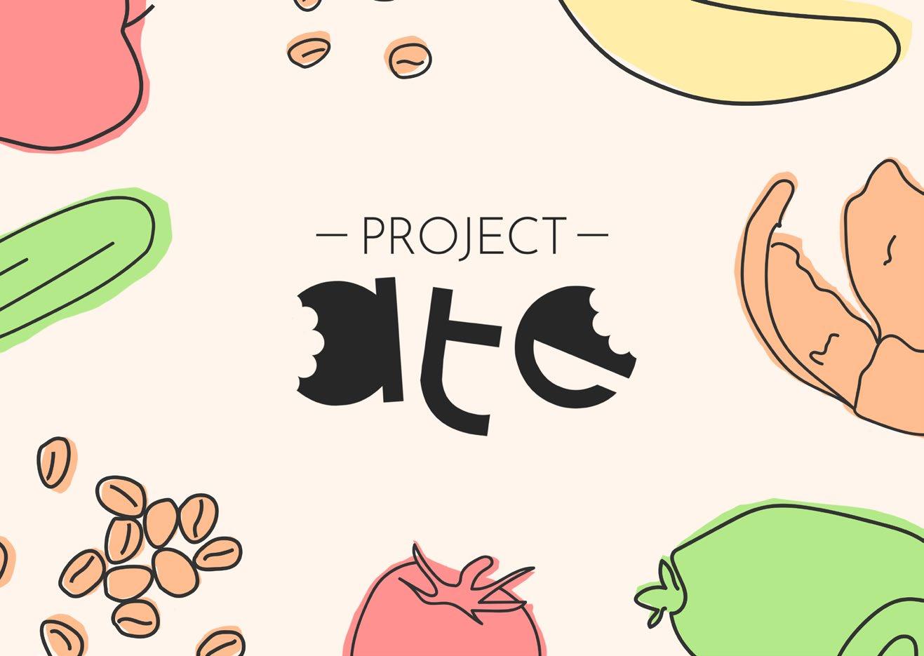
PROJECT ATE
Project Ate was a university group project focused on normalizing public composting in Wellington’s CBD. For the logo and visuals, I aimed to make composting feel simple and visually appealing, challenging the common association of waste with traditional rubbish bins.
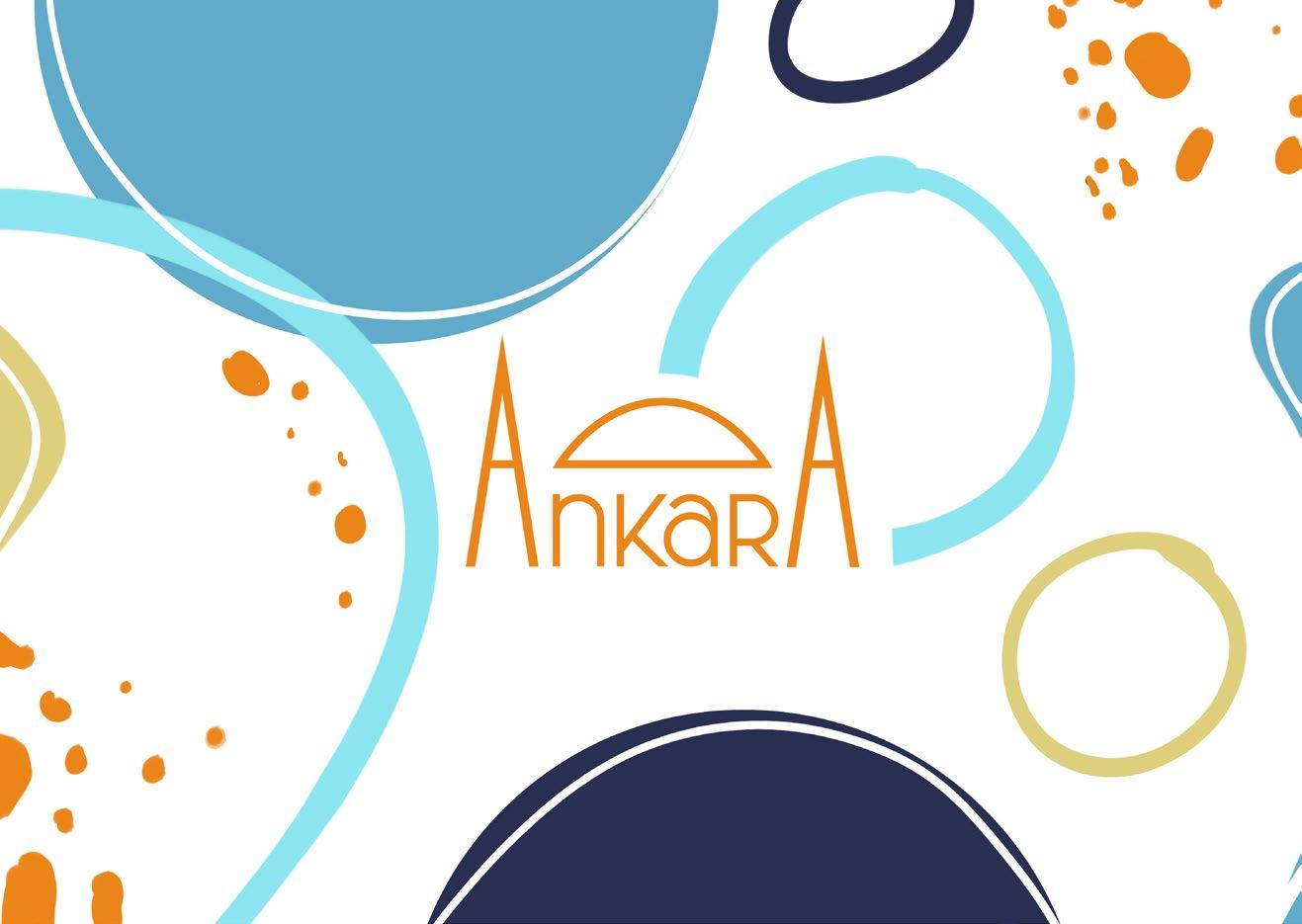
ANKARA
Ankara was a project for a client who needed a logo and visual identity for her fashion initiative inspired by Ankara, the capital of Turkey. Drawing from the city’s cuisine, landscapes, and architecture, I incorporated flowing shapes alongside the logo, visually echoing Ankara’s iconic landmarks.
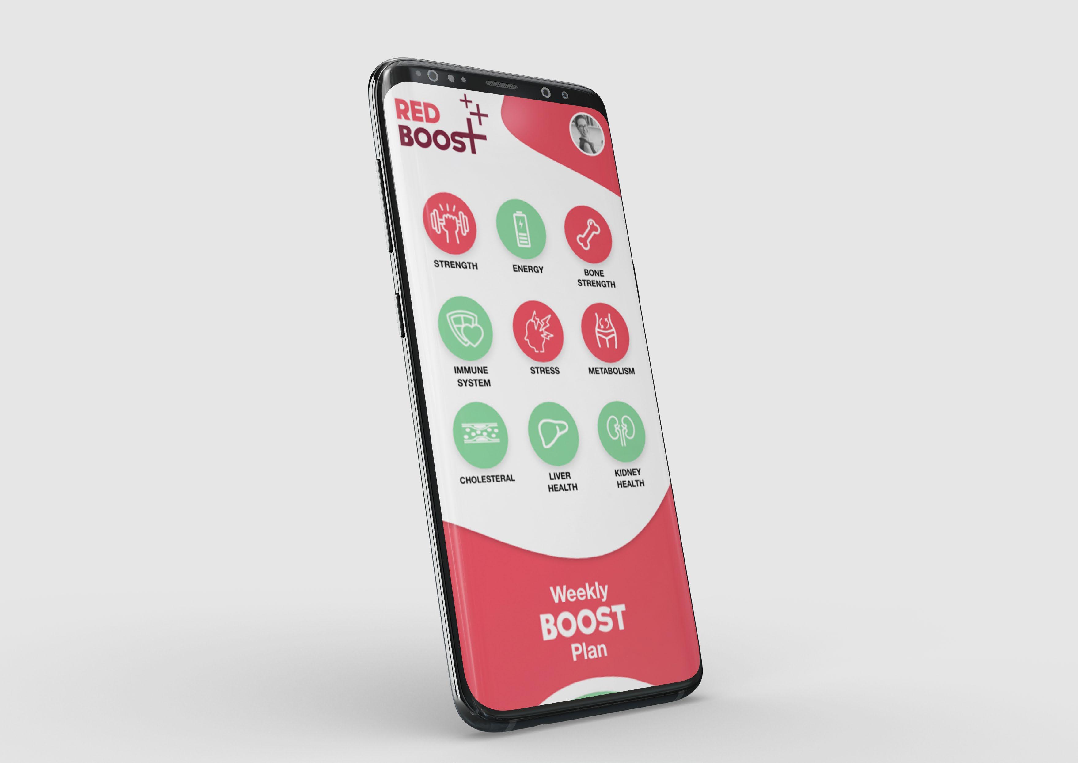
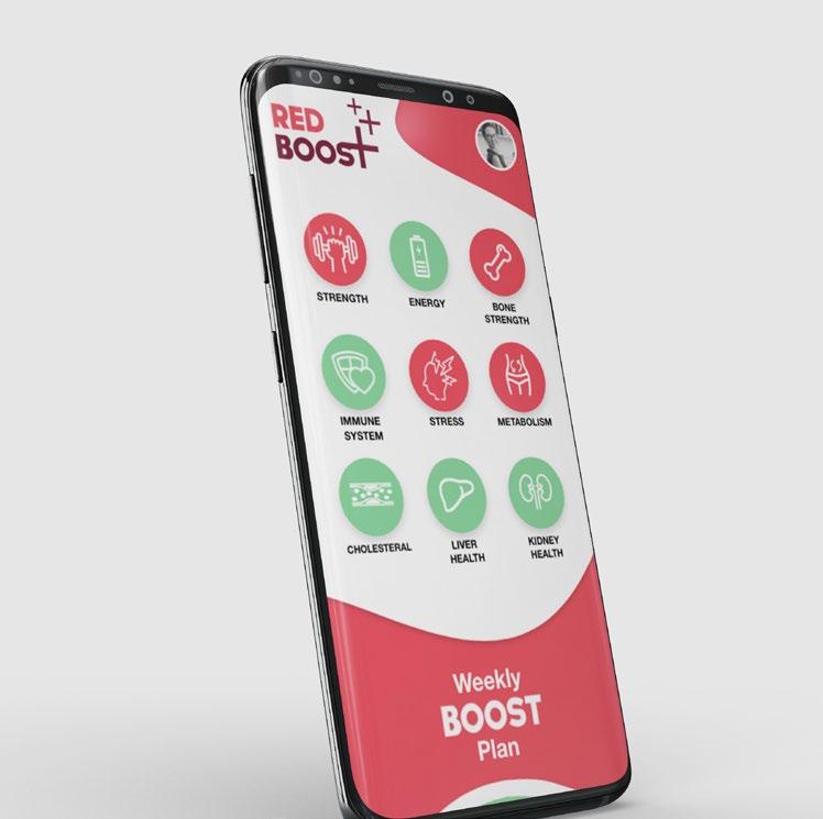
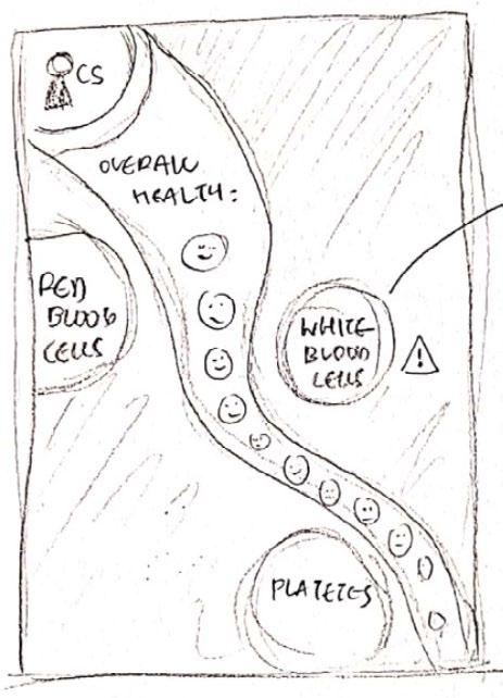
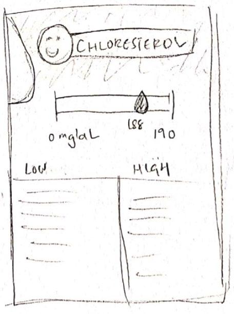
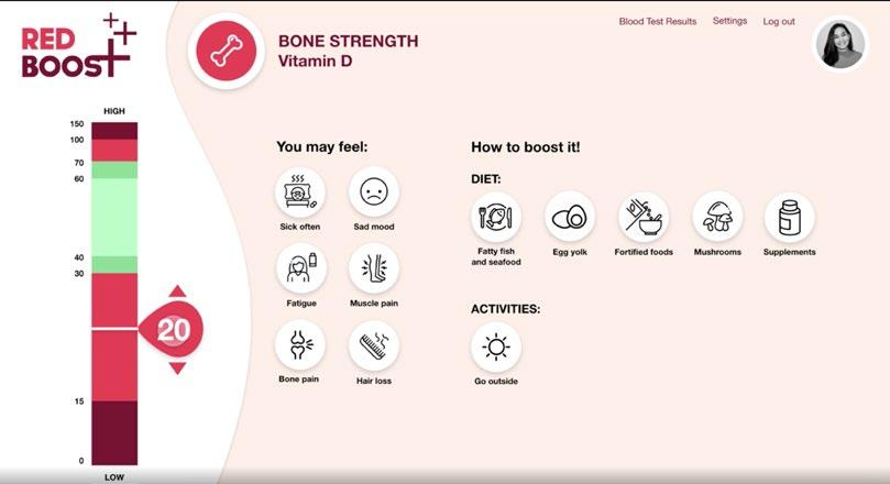
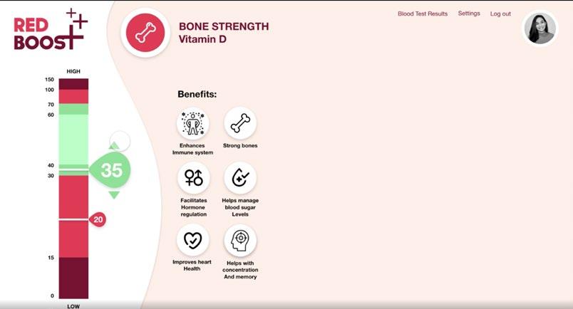
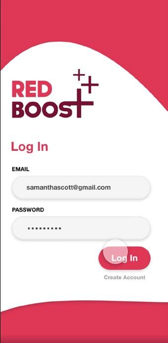
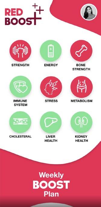
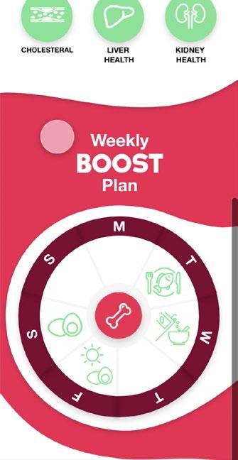
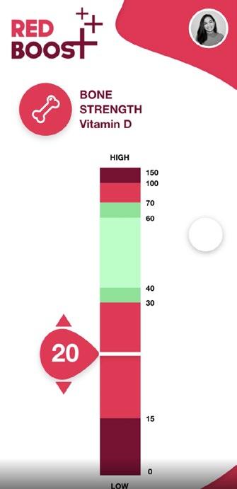
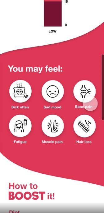
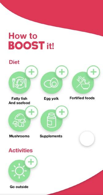
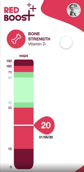
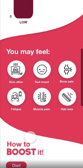
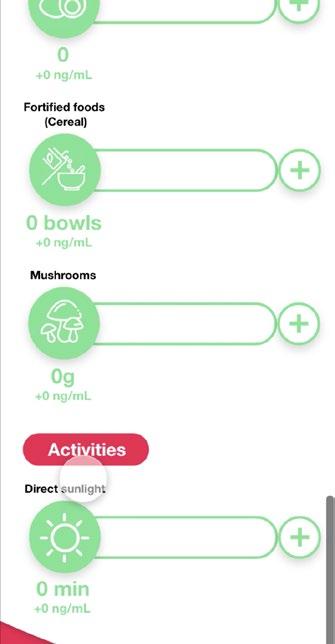
Red Boost 06 2020
Web Design/ information design
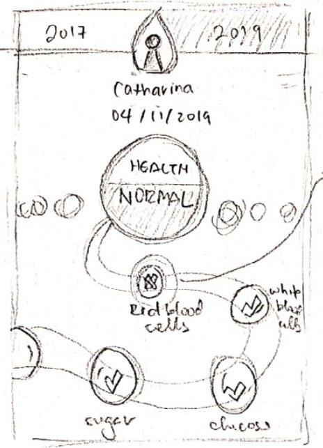
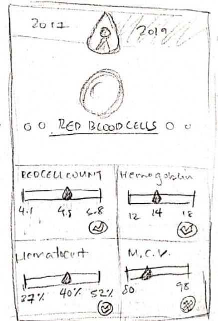
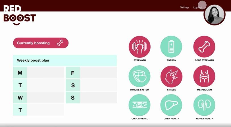
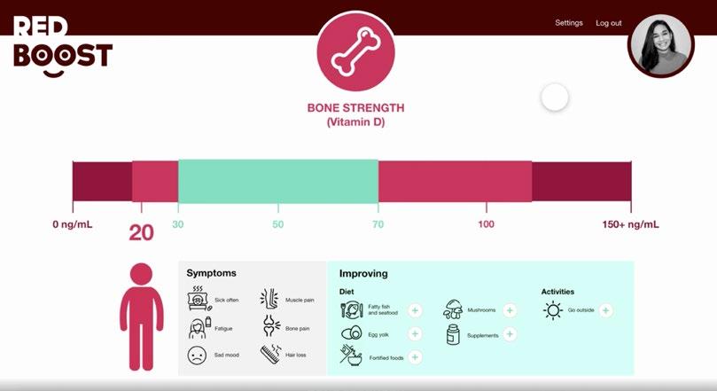
Red Boost is an app-based tool designed to help users track and understand their blood test results in a clear and accessible way. Centered around the goal of improving health, the app highlights how awareness of blood test data can guide users in making informed changes to their diet and daily lifestyle.

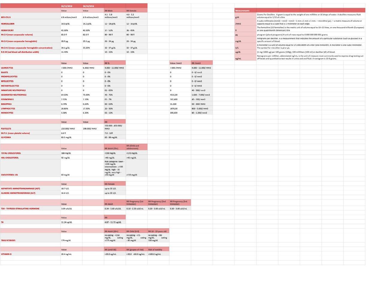
After selecting the dataset, I organized the information in a spreadsheet to categorize it and identify any unnecessary data.
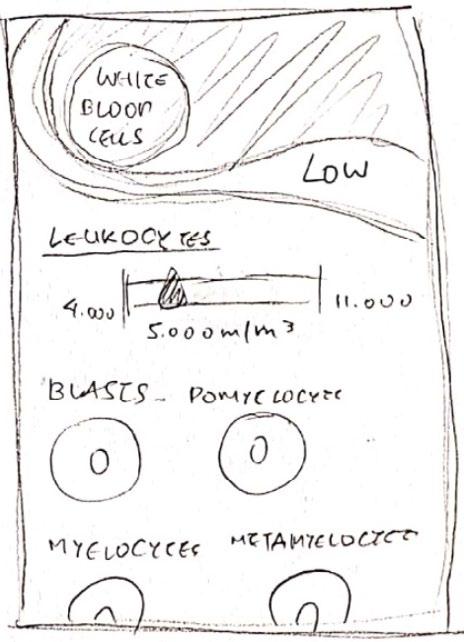
I then sketched initial design concepts on paper, aiming for a visually rich interface that simplified complex information while keeping users engaged.
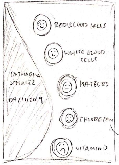
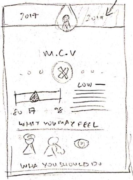
In Adobe XD, I initially explored the idea of designing the interface as a website. However, since my main focus was simplifying data, I found that an app provided a more efficient and streamlined experience, avoiding unnecessary space.
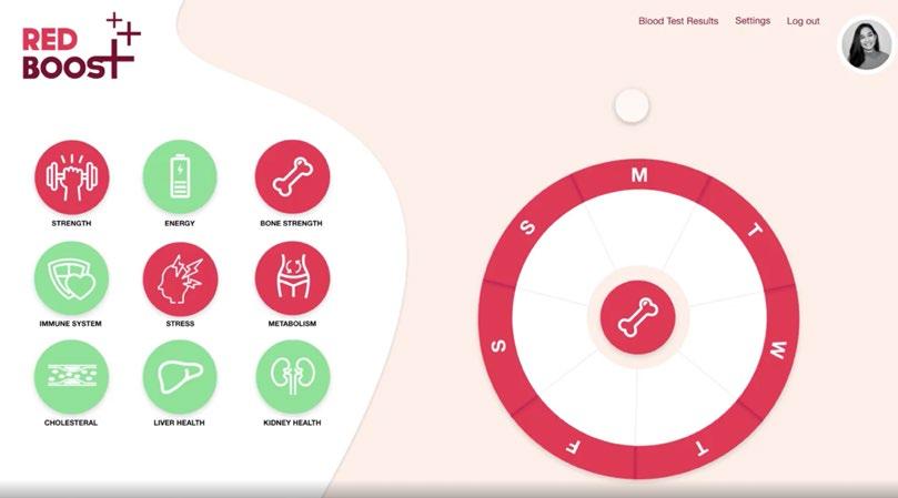
From the start, symbols played a key role in the design, a concept I carried through to the final version. To enhance user engagement, I introduced a customizable weekly calendar feature, allowing users to take control of their lifestyle changes rather than having them imposed.

Other projects 07
BRANDING
POSTER DESIGN
BOOKLET DESIGN
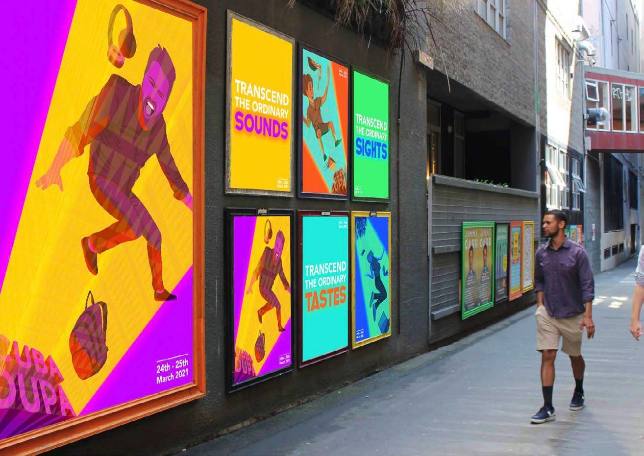
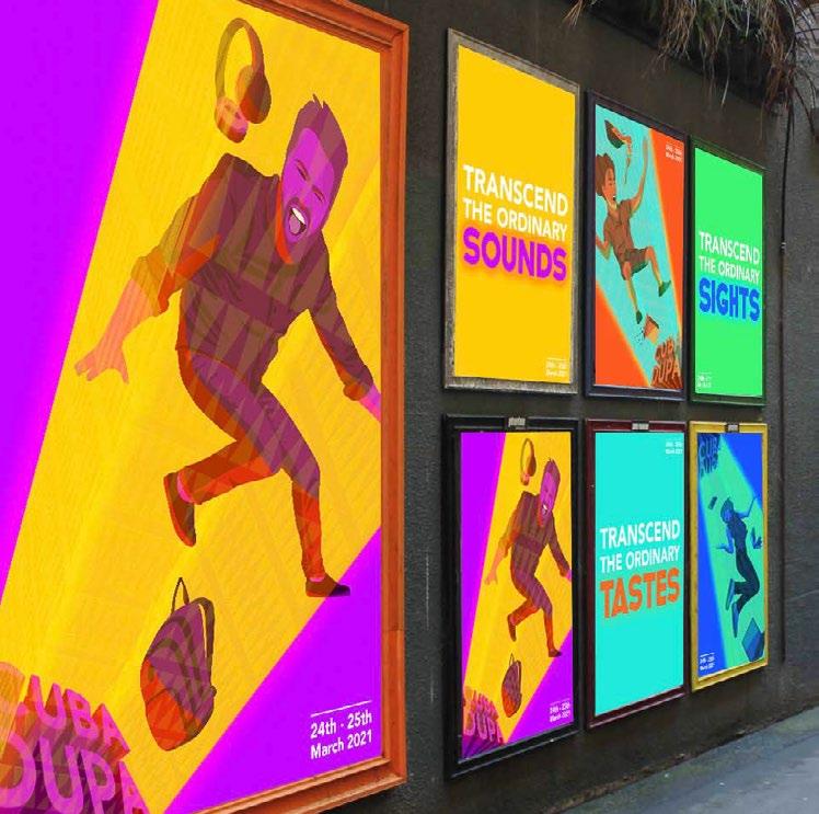
CUBA DUPA
REBRAND
2020
BRANDING/ POSTER DESIGN
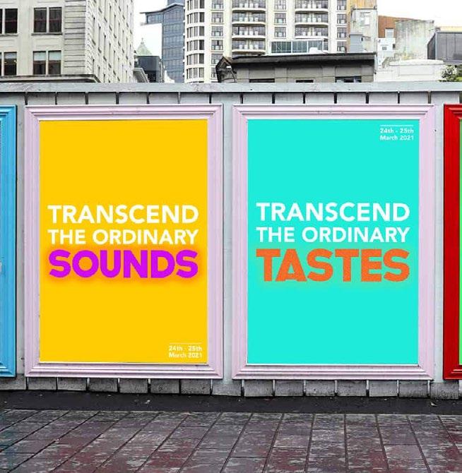
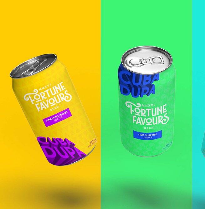
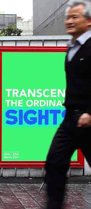
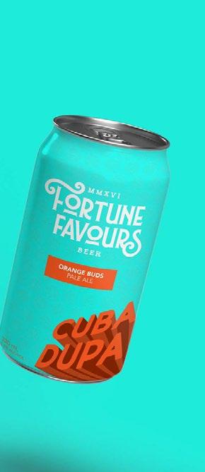
This CUBA DUPA rebrand centers around the theme of “Transcending the Ordinary,” capturing how the festival transforms everyday life into a vibrant, extraordinary experience. The design highlights three key festival elements—music, food, and performances—through a dynamic set of visuals and text. I created six posters that function both individually and as a cohesive series, along with specially designed beer cans available during the festival, reinforcing the immersive and celebratory atmosphere.
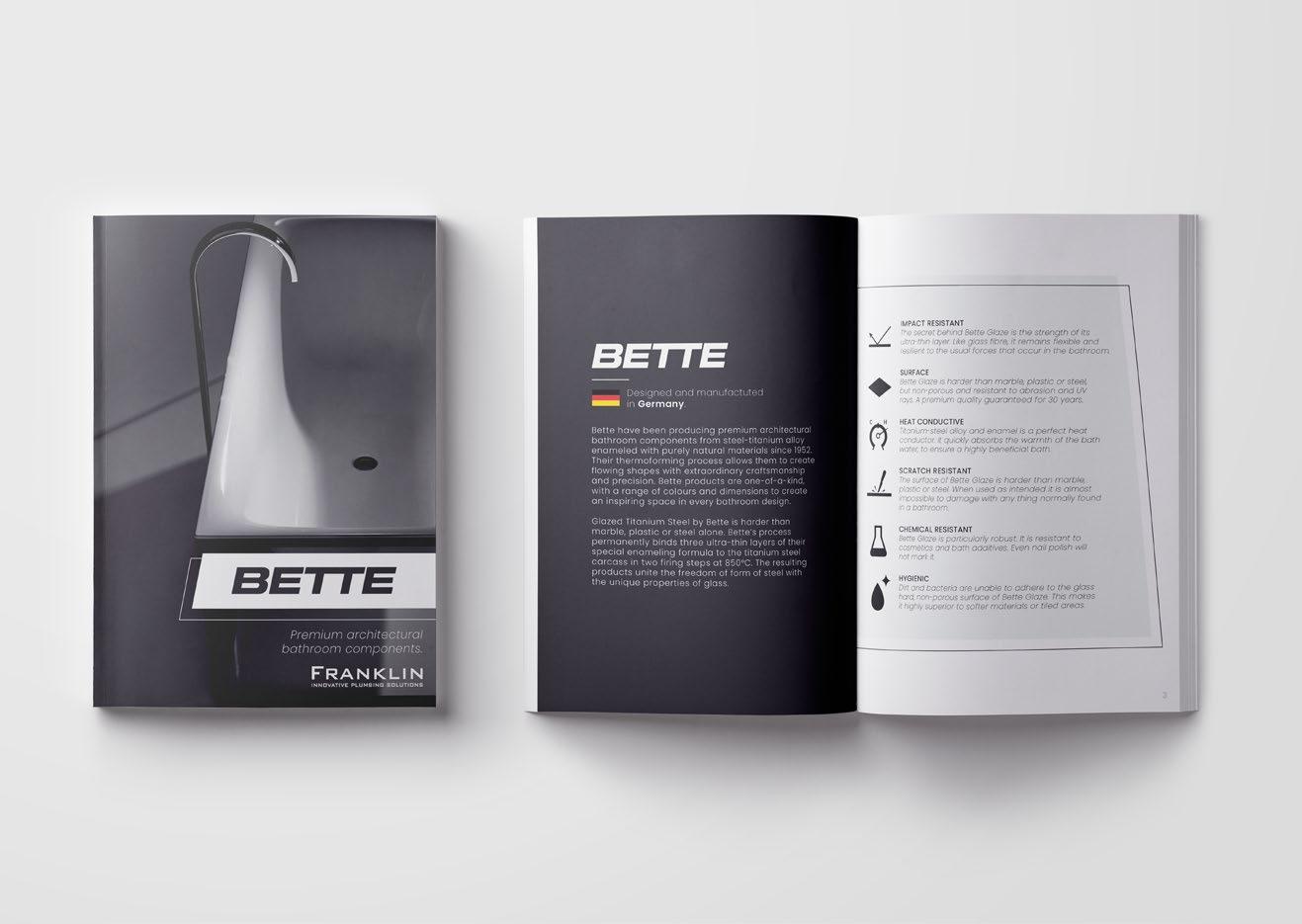
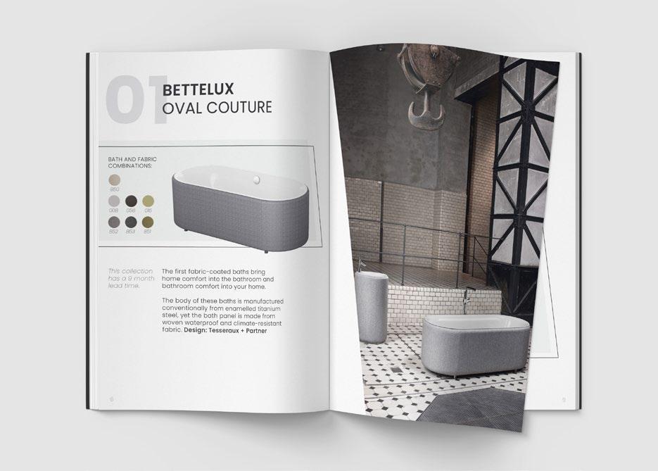
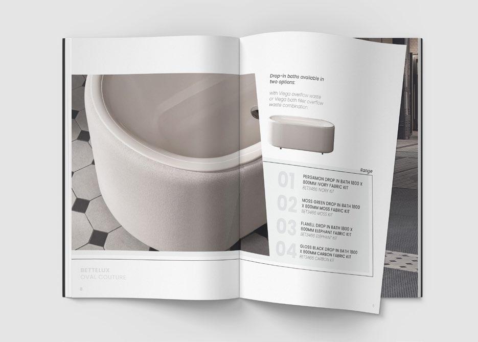
betTe brochure
booklet DESIGN
This brochure was designed to showcase Bette’s range of bathroom furniture. Given the brand’s sophistication and elegant designs, I reflected these qualities in the brochure’s layout and aesthetics. Drawing inspiration from one of their bath designs, I incorporated contemporary line work to complement the brand’s refined style. To ensure clarity, I structured the information in a well-organized and concise manner, allowing the high-quality product images to take center stage—highlighting their craftsmanship and visual appeal as the primary selling points.
Other projects 07
BRANDING
POSTER DESIGN
BOOKLET DESIGN
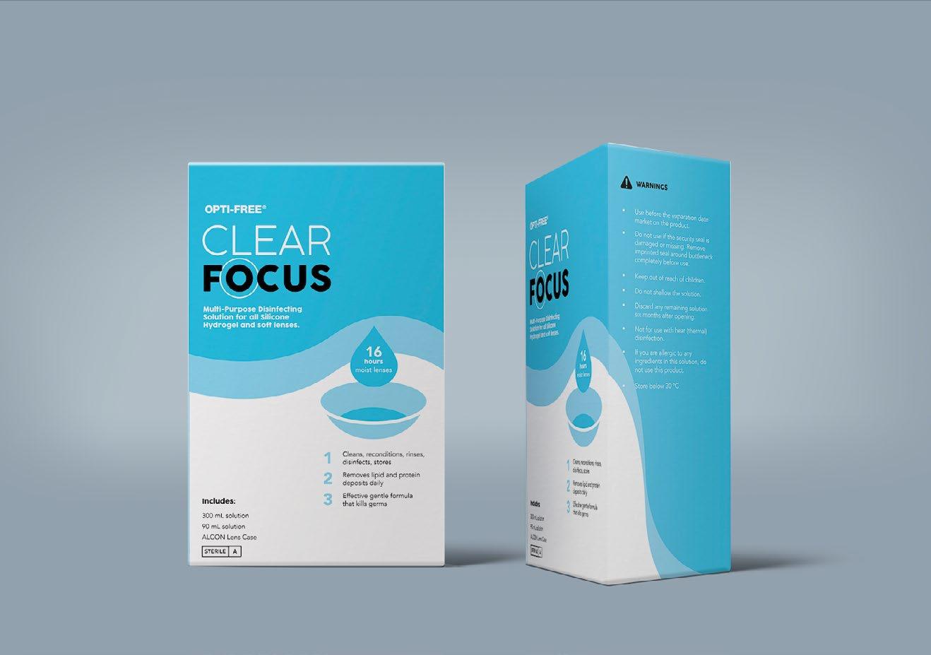
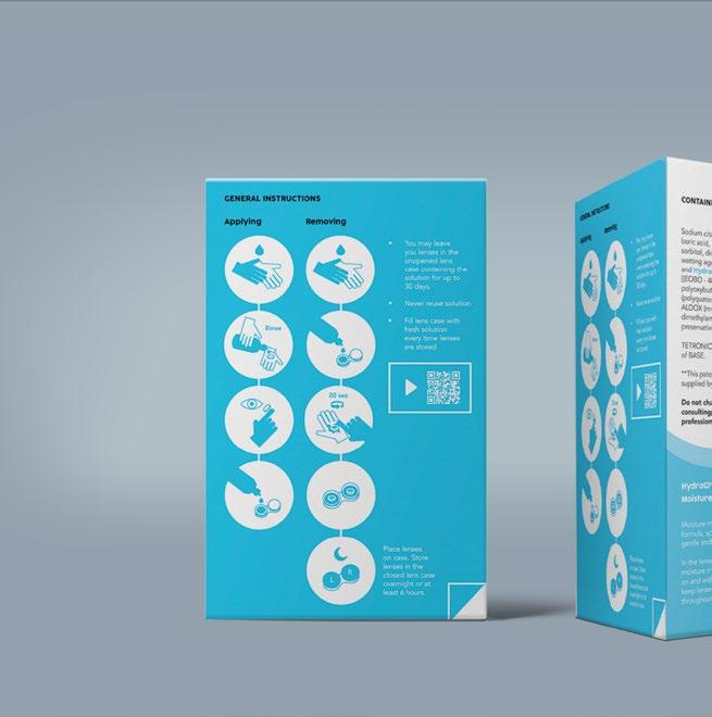
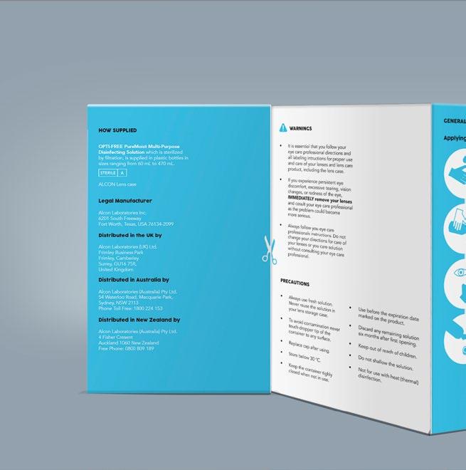
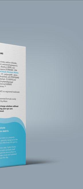
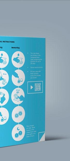
CLEAR FOCUS
2020
Information Design/packaging design
Clear Focus is a rebrand of the contact lens solution “Pure Moist,” aimed at making information clearer and more accessible, particularly for first-time users of washable contact lenses. The redesign prioritized simplifying the general instructions, which were previously buried among other details in bullet points. To improve clarity, I streamlined the packaging by reducing repetition and unnecessary wording, ensuring that essential information was easy to locate and understand at a glance.