CASANDR A RIVER A
G r aphic D esi g n • C r e a ti v e
1

G r aphic D esi g n • C r e a ti v e
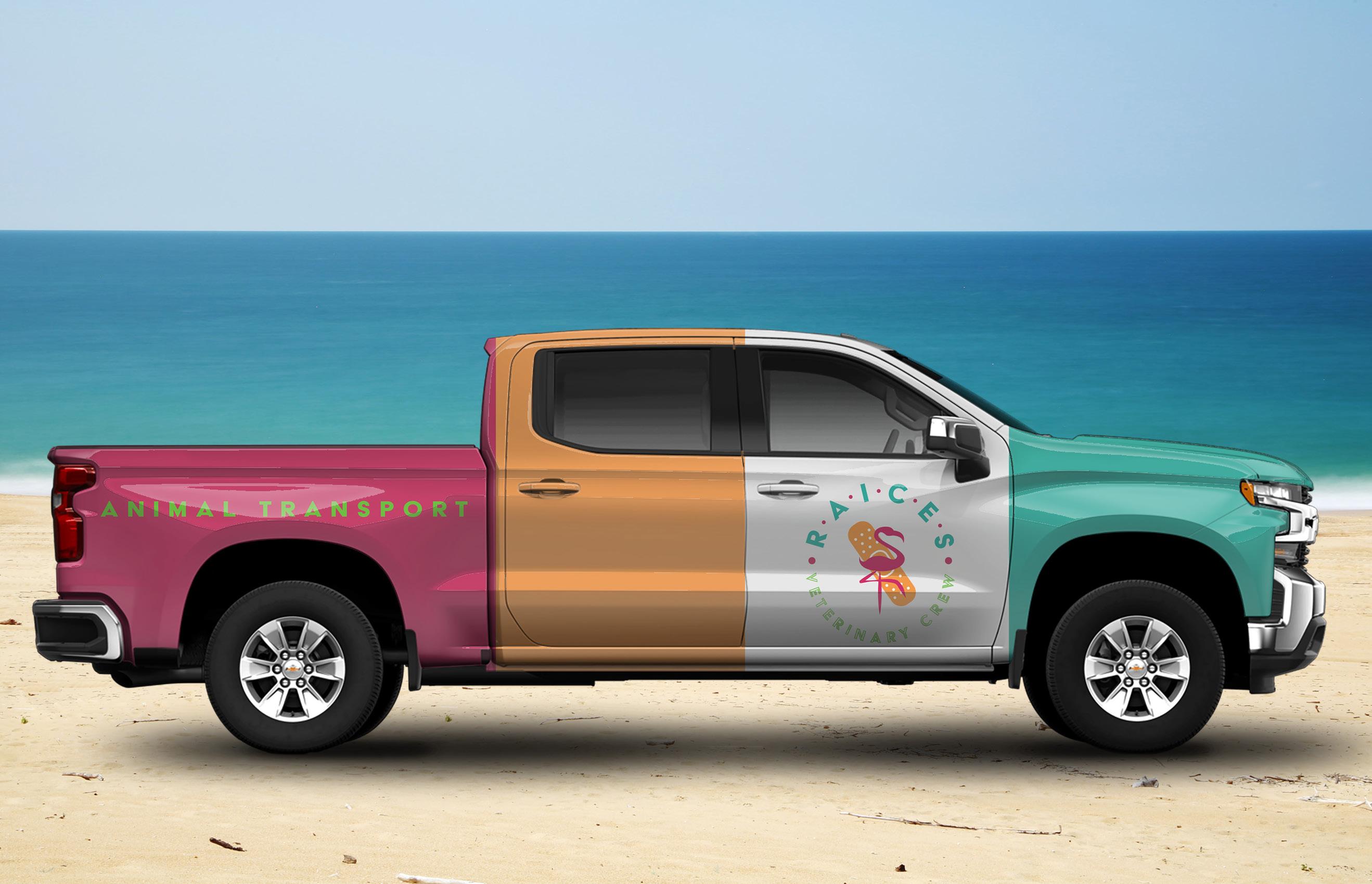
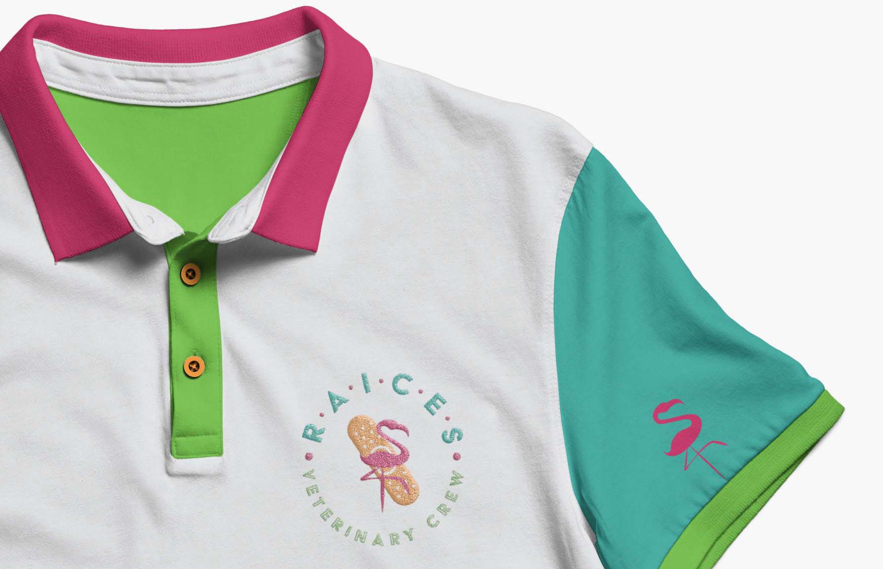
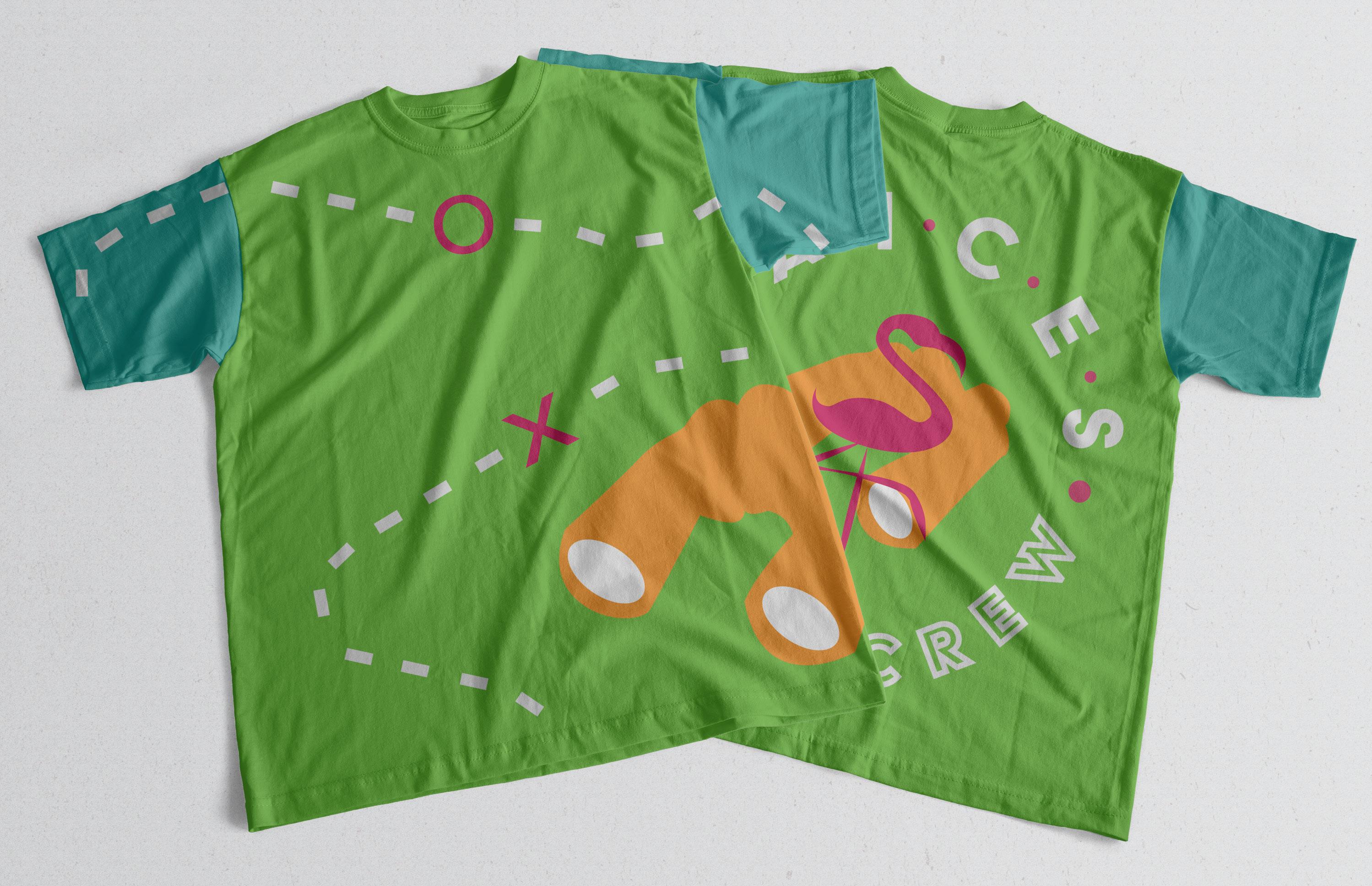
The main goal of this project was to have a cohesive brand all around without slapping the same tired logo on absolutely everything. The required elements included a vehicle wrap, series of logos, uniforms, and business cards. I decided to have color blocking as part of the overall look and feel of the brand. From the vehicle wrap to the employee uniforms, the brand carries this common theme throughout. My logo was not just a singular one, either. I wanted them to differ in ways that are significant enough to notice, but not enough to disturb the cohesiveness of the whole brand.
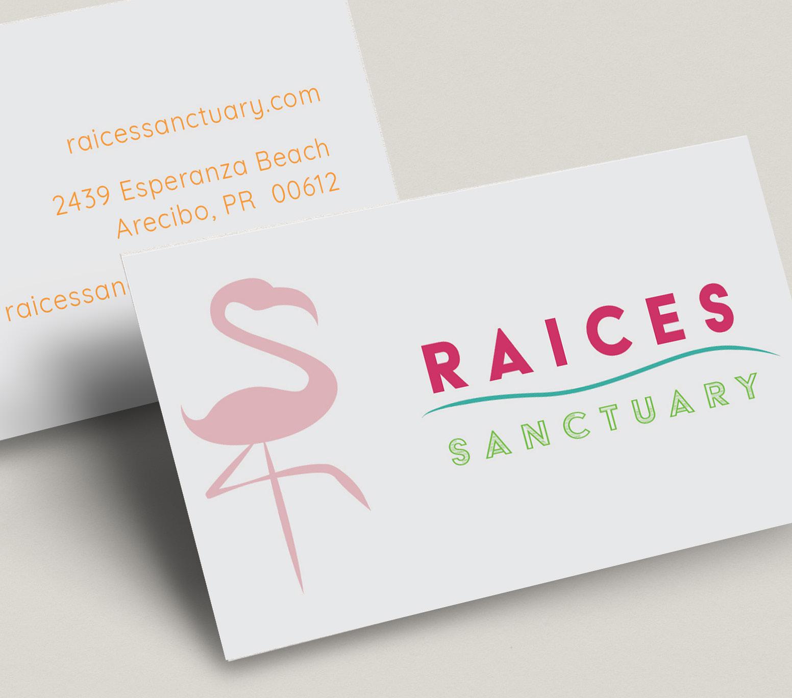
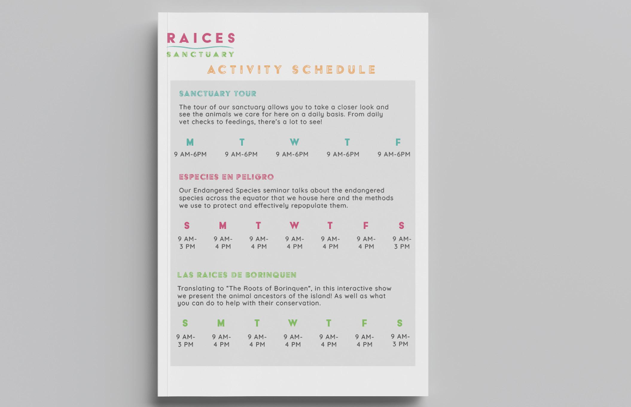
S ANCT U A R Y
Typography Illustration
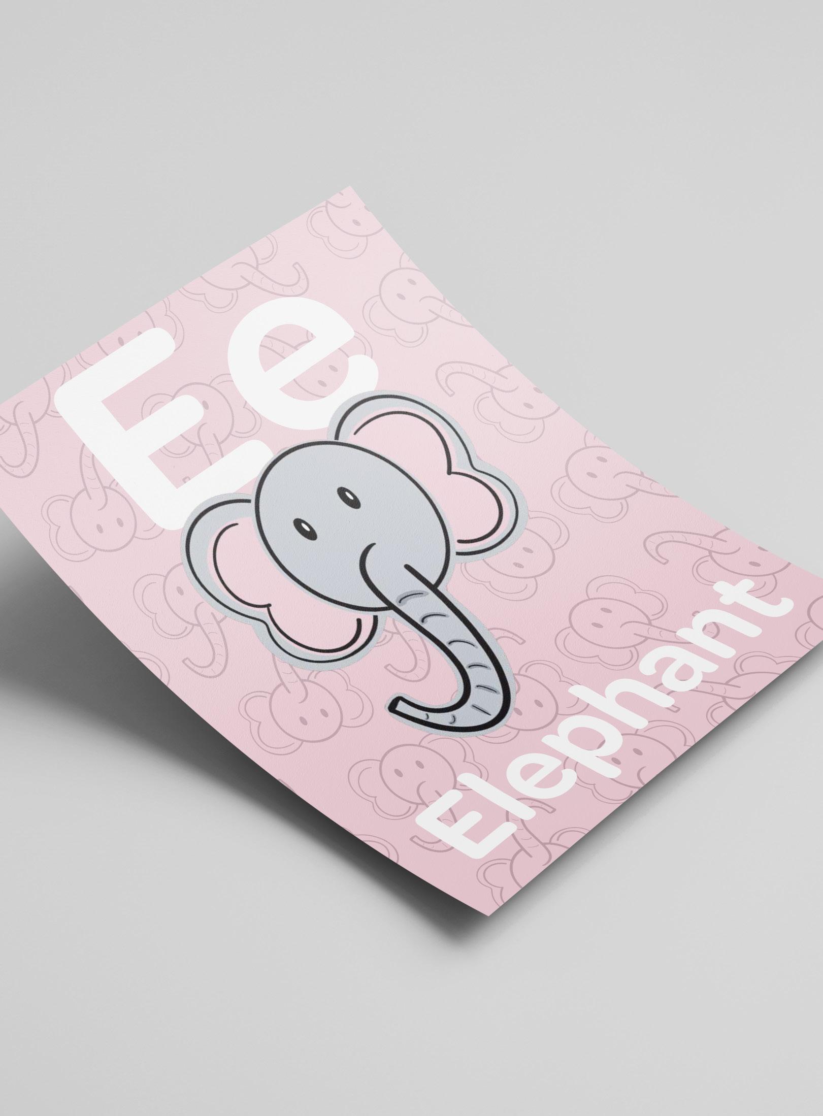
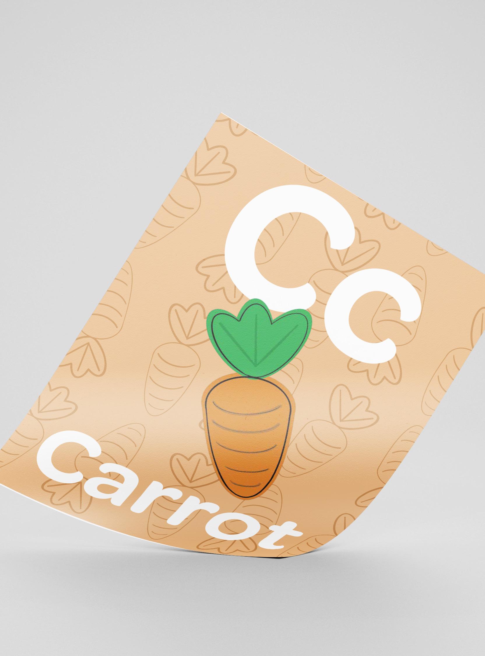
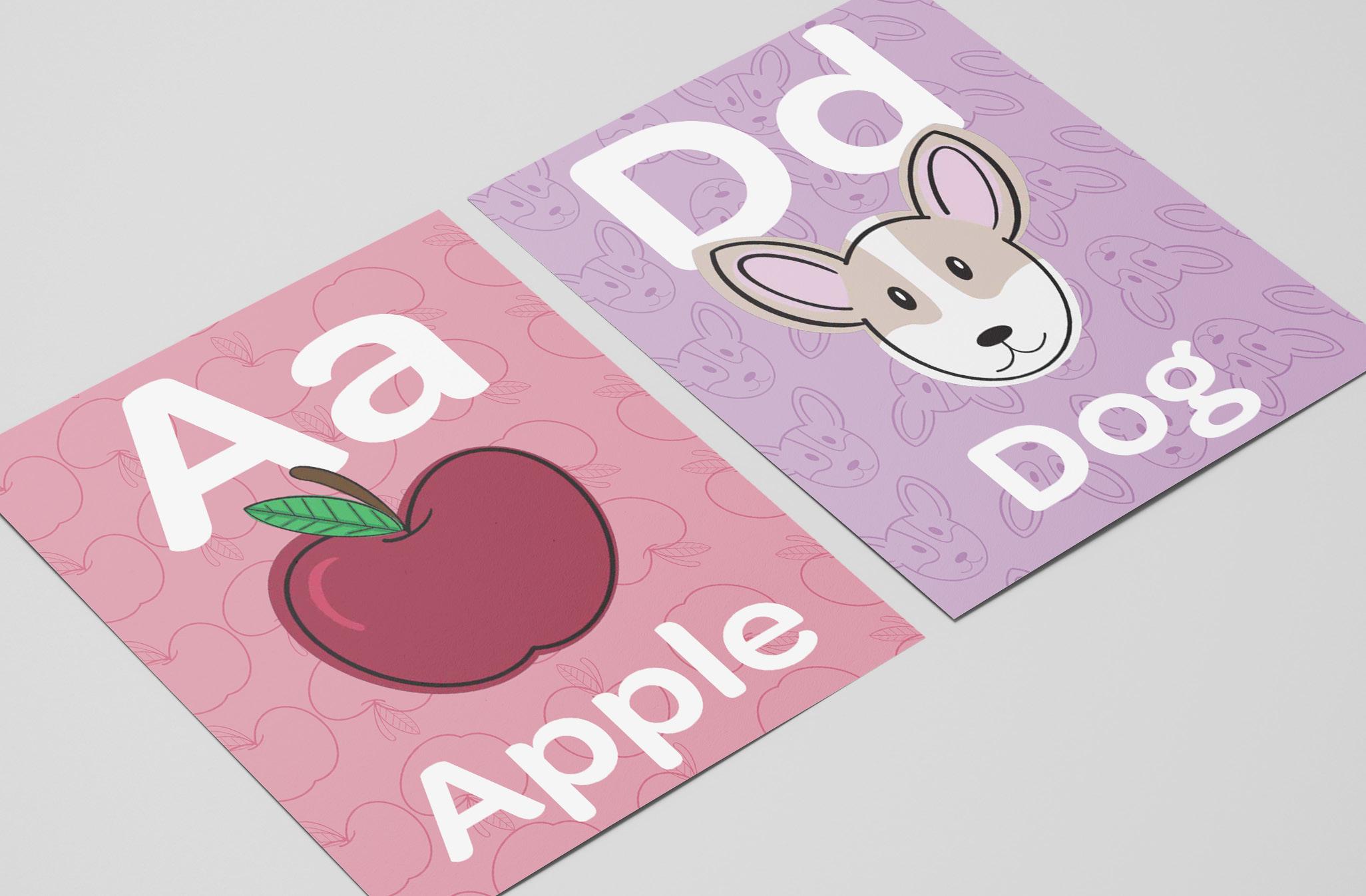
Classrooms. We spend most of our youth in one, and at times it gets boring, but the one thing that you can count on as a healthy distraction was the decoration. For this project, I had the joy of creating a classroom alphabet poster series for my mother’s classroom of second graders. With the understanding that English was not the first language of many of the students, I focused on utilizing a typeface that was simple enough for the students to be able to easily identify each letter. While creating the illustrations, I also followed a simplistic yet playful route to allow for the students to associate each one to the respective letters.

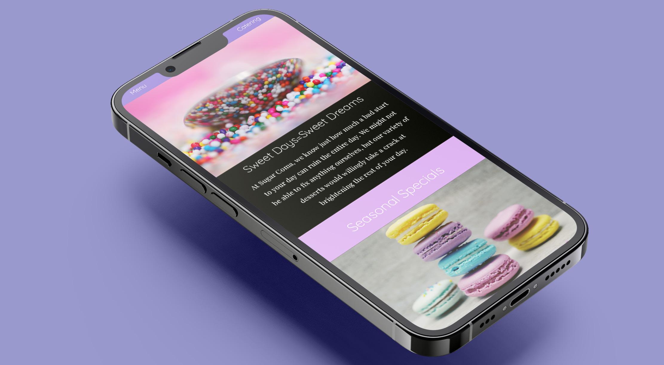
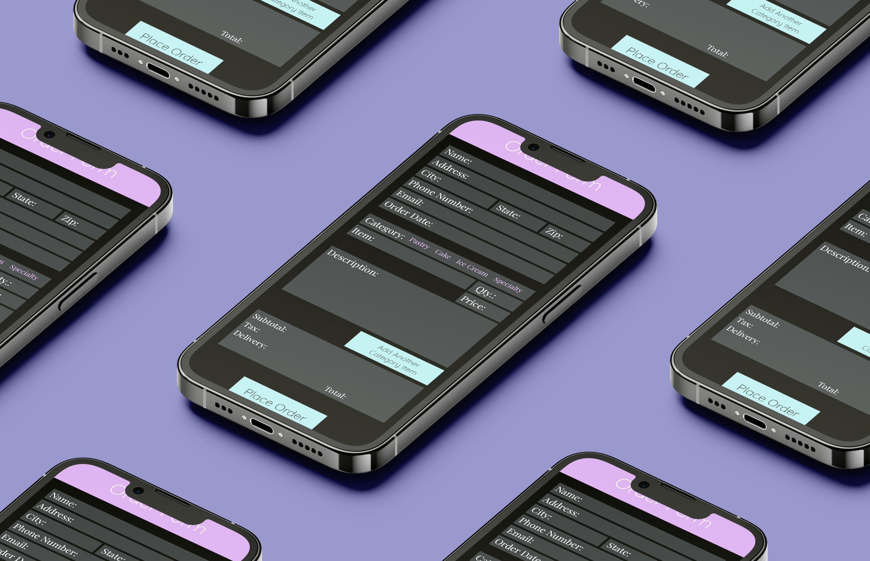
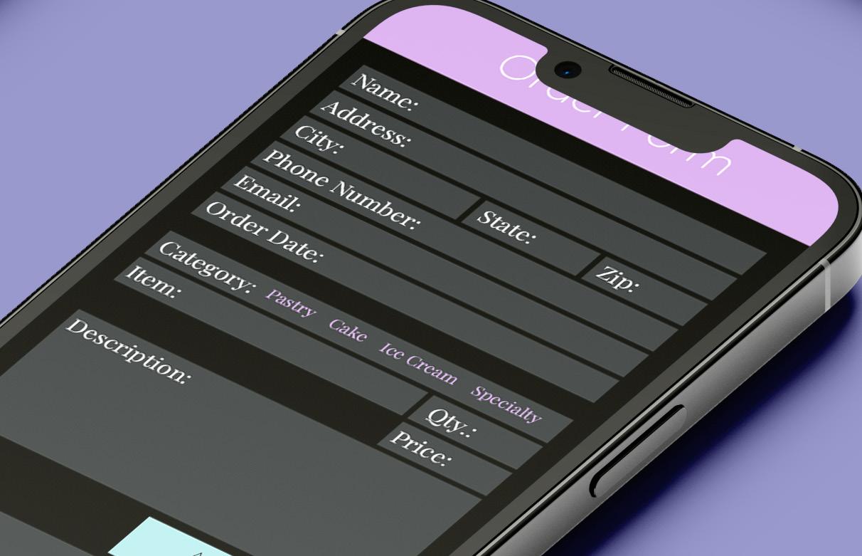
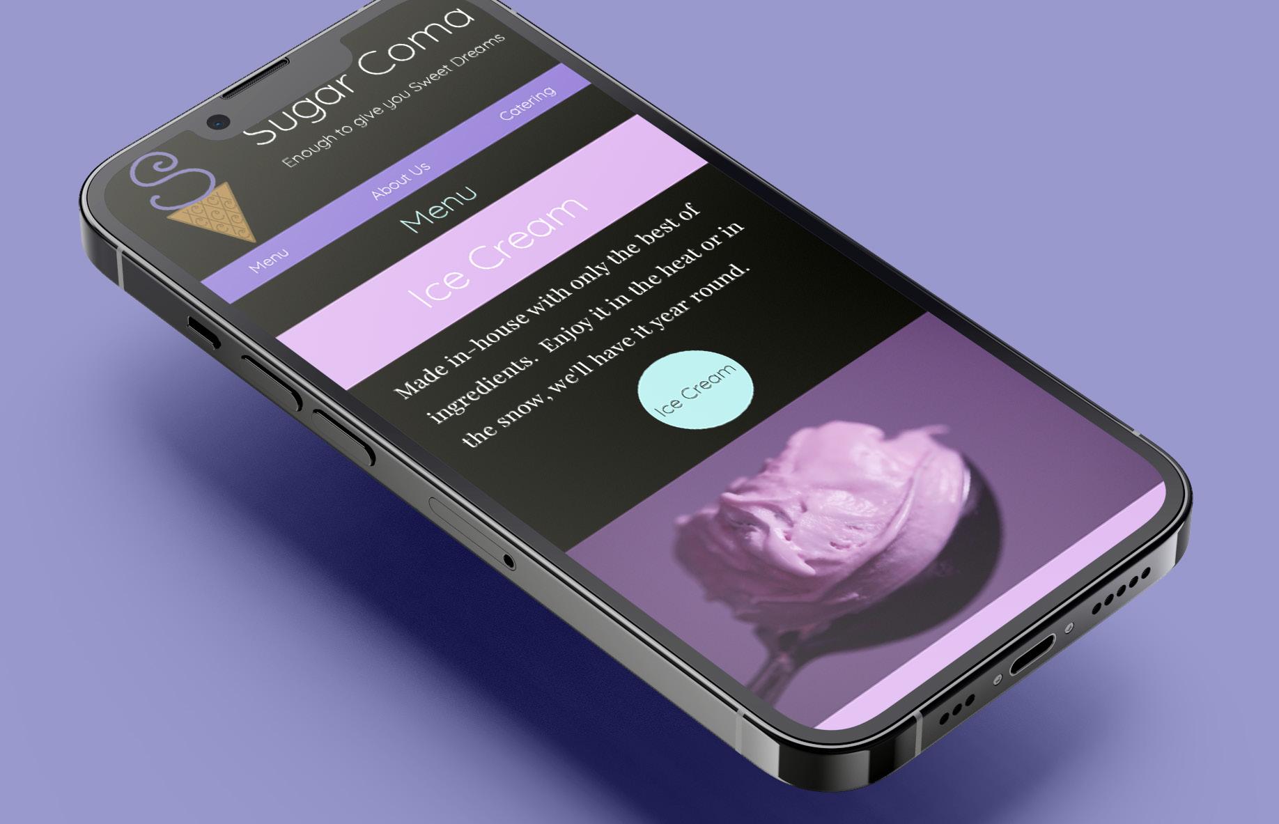
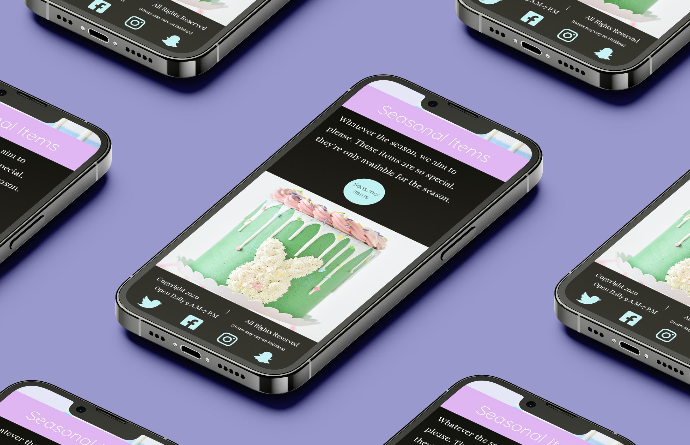
As a print focus designer, I do not find myself in the habit of creating for a web or mobile interface, so making the layout and branding for a hypothetical bakery was a welcome challenge for myself. With the use of the Adobe Xd, I began getting a general layout by creating wireframes to depict the way I wanted the layout to work. Upon finishing the general layout, adding brand elements followed such as the logo and colors. Upon inserting the stock images, I watched everything come together in order to get to the finished look.
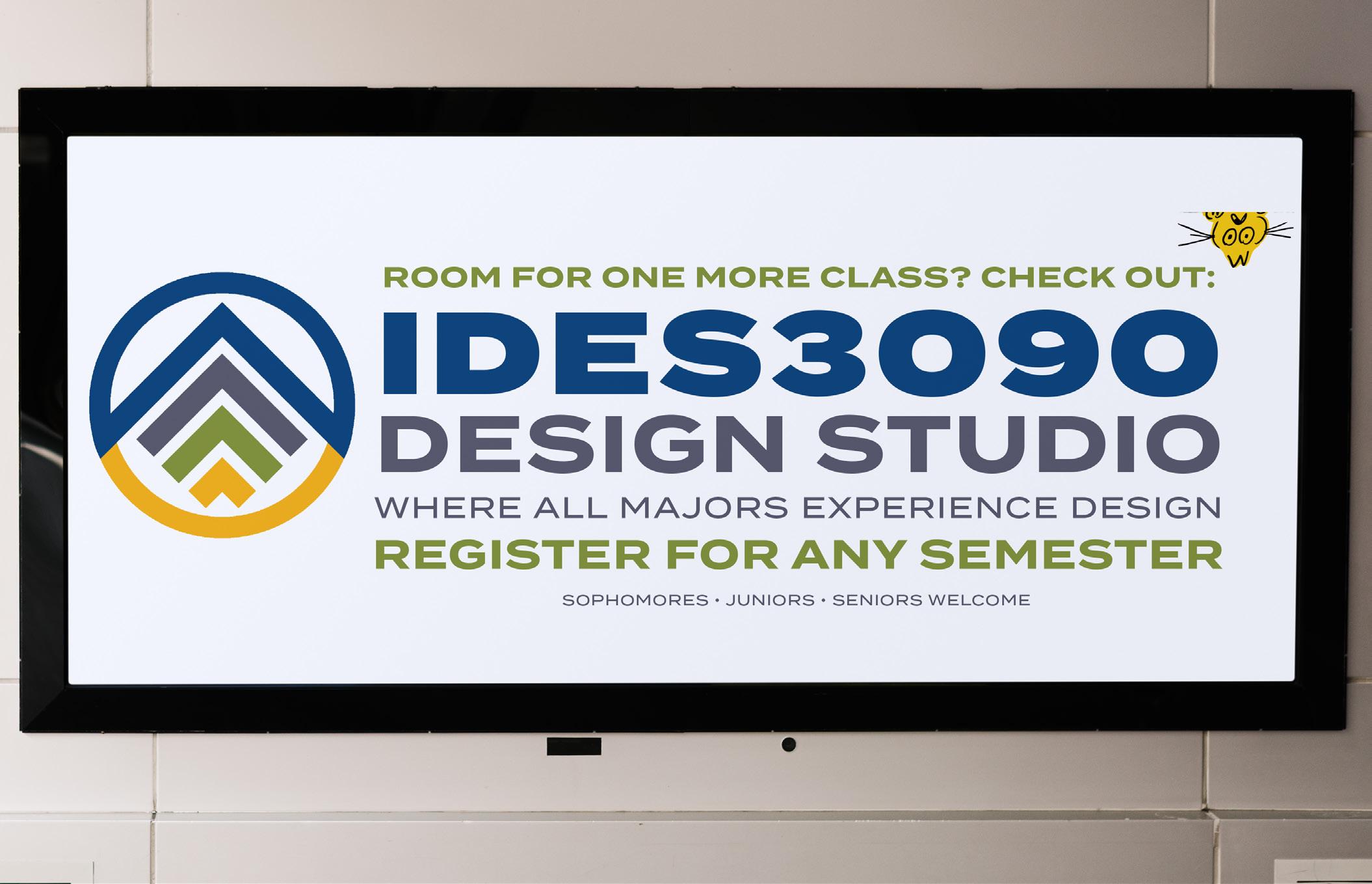
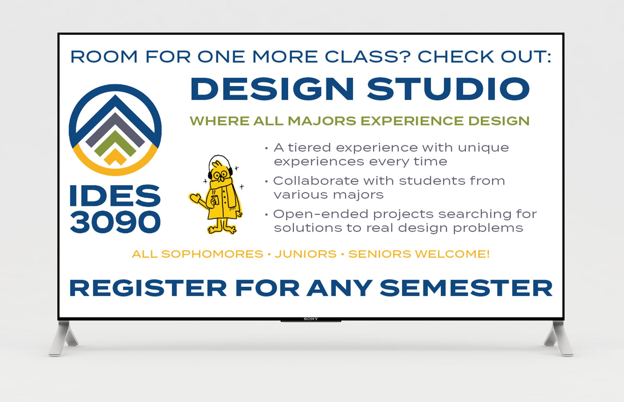
This client that was assigned to my team and I, we were in charge of creating branding and promotional materials for a new product design studio course at Johnson & Wales University. Due to the branding having to follow the general University brand standards, there were limitations that we had to follow in terms of color palette and typefaces. My deliverables included the banner design that was to be hung in the spring 2024 semester as well as the TV Ad design. Due to the linitation of having only one typeface, I had to focus on size, weight, and color in order to establish a typographic heirarchy. I also had to ensure that each design had a balanced amount of text as too not overwhelm the viewer.
ROOM FOR ONE MORE CLASS? CHECK OUT:
WHERE ALL MAJORS EXPERIENCE DESIGN

• A tiered experience with unique experiences every time
• Collaborate with students from various majors
• Open-ended projects searching for solutions to real design problems
ALL SOPHOMORES • JUNIORS • SENIORS WELCOME!

SOPHOMORES • JUNIORS • SENIORS WELCOME
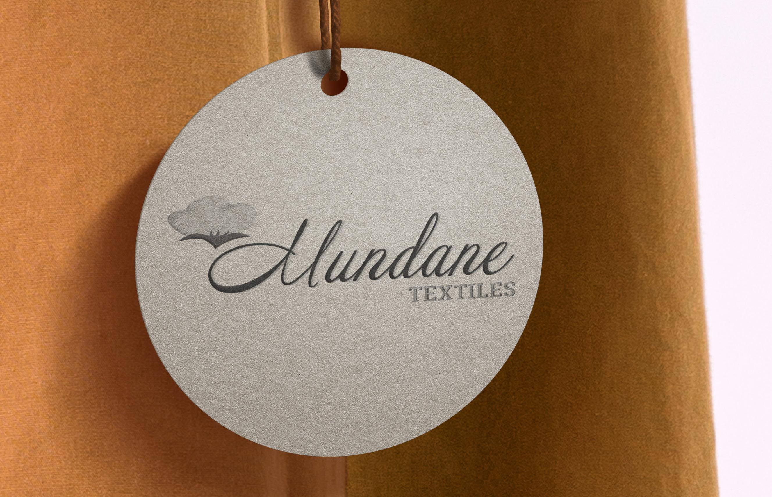
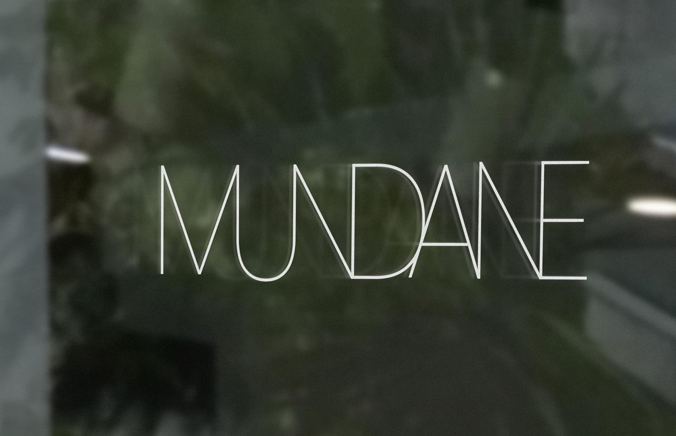
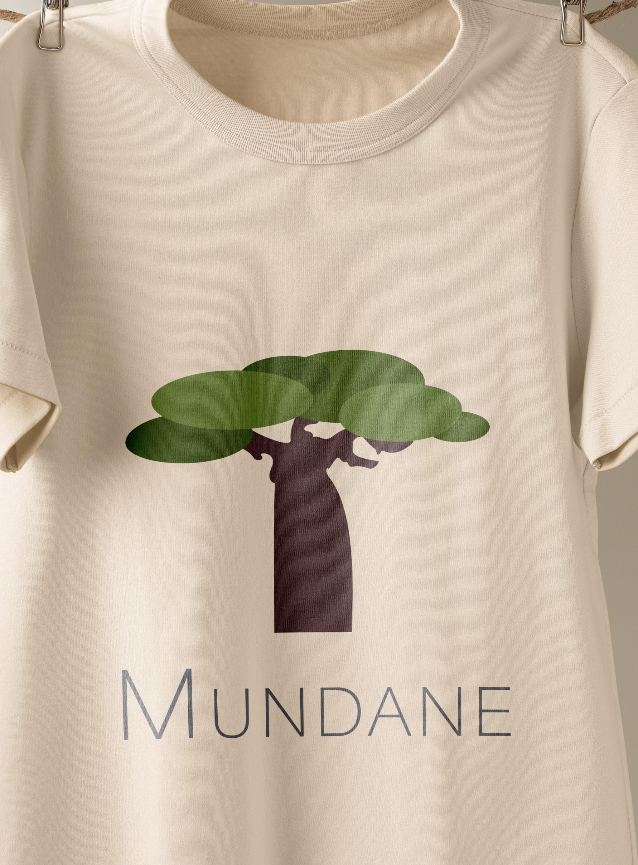
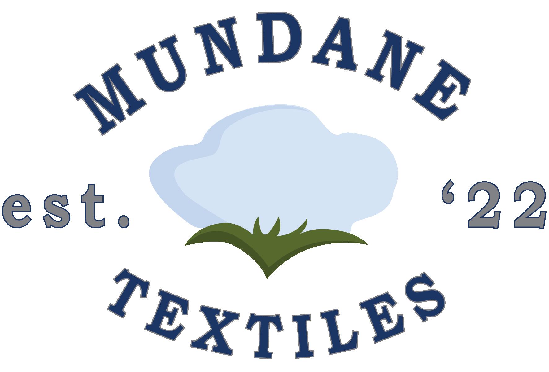
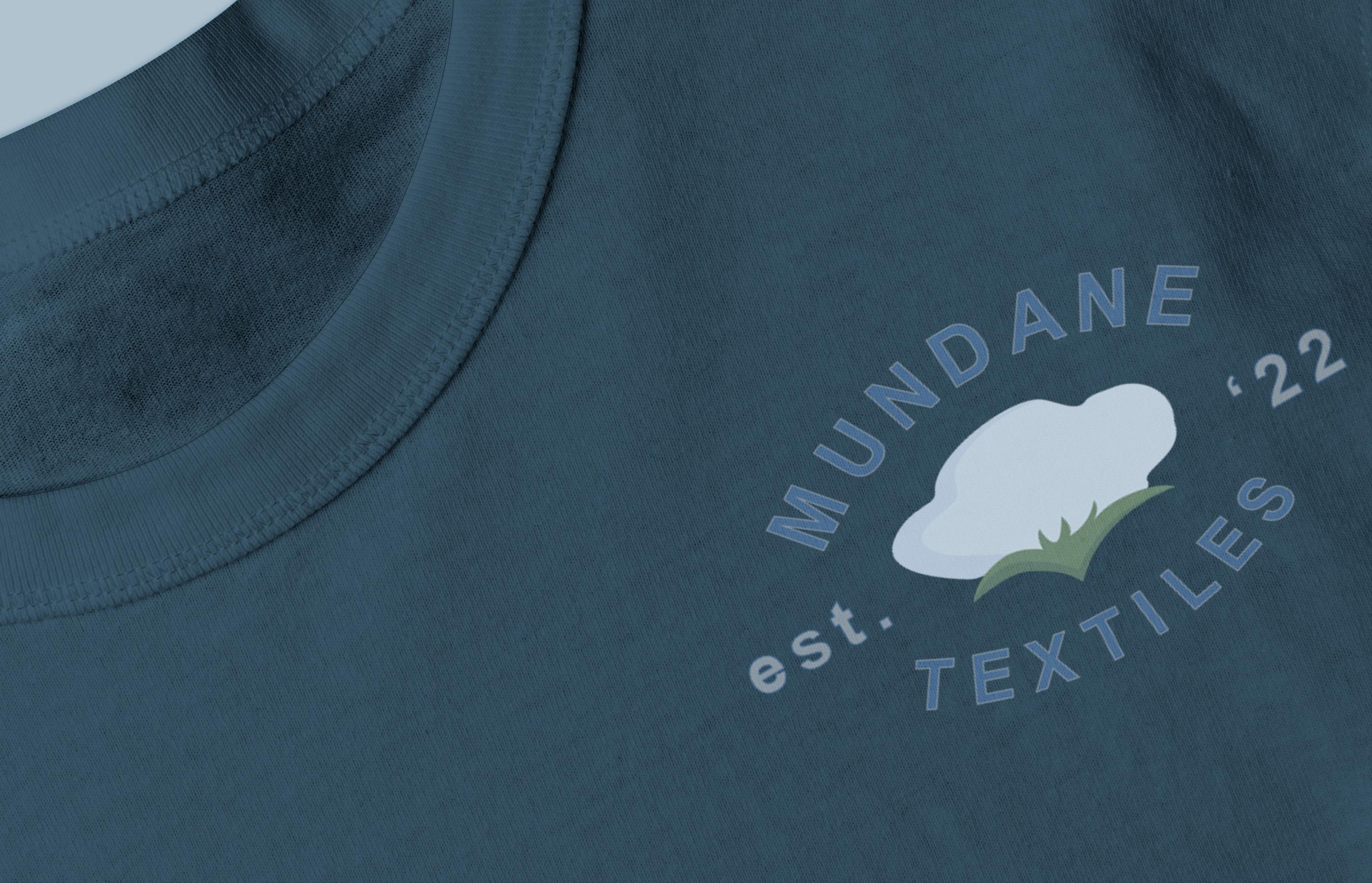
The meaning of this project was to design a series of logos that each follow a famous logo design style for a hypothetical brand. With the mission in mind to create a unique brand name that will serve as inspiration for my designs, I chose the word ‘mundane’. Keeping in mind the definition of the word, the logos I sketched out held natural and/or organic elements that held true to the word. Through following each style, I found new ways to create an organic aesthetic through multiple design elements. Through color, space, and form the logos speak of a brand that is of the earth, and by the earth.
Typography Print Design
Editorial Design
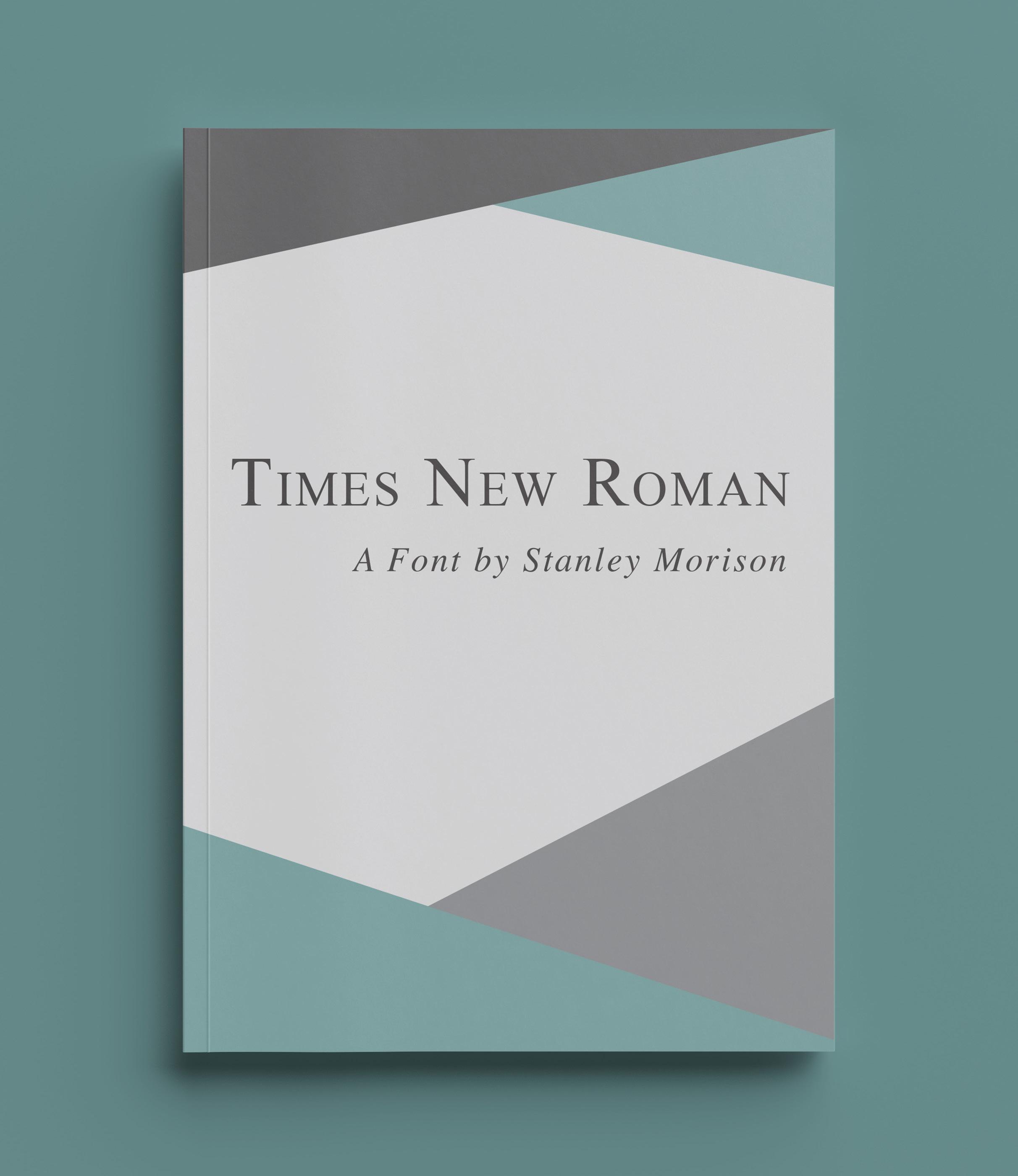
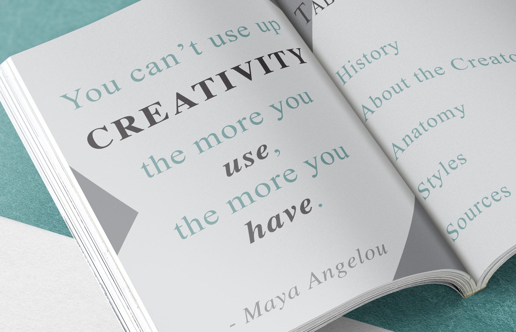
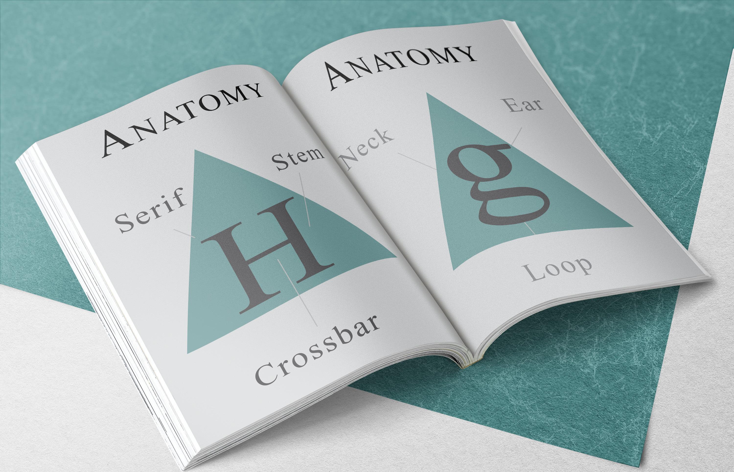
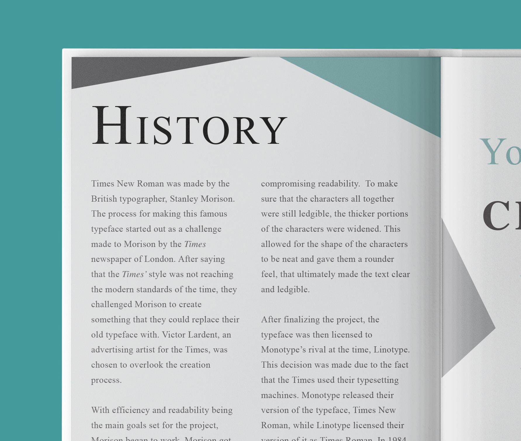
Creating a type specimen book for a typeface commonly used for school essays is rather difficult. Times New Roman is a typeface that no one really connects to a good time, but I wanted to challenge myself. With such a small font that was made to fit as much on a page as you can get away with, I wanted to give the content on each page room to breathe by incorporating negative space. Paired with a gray tone color palette with a light accent color, this type book allows you to look at Times New Roman in a different light.
Typography Print Design Poster Design
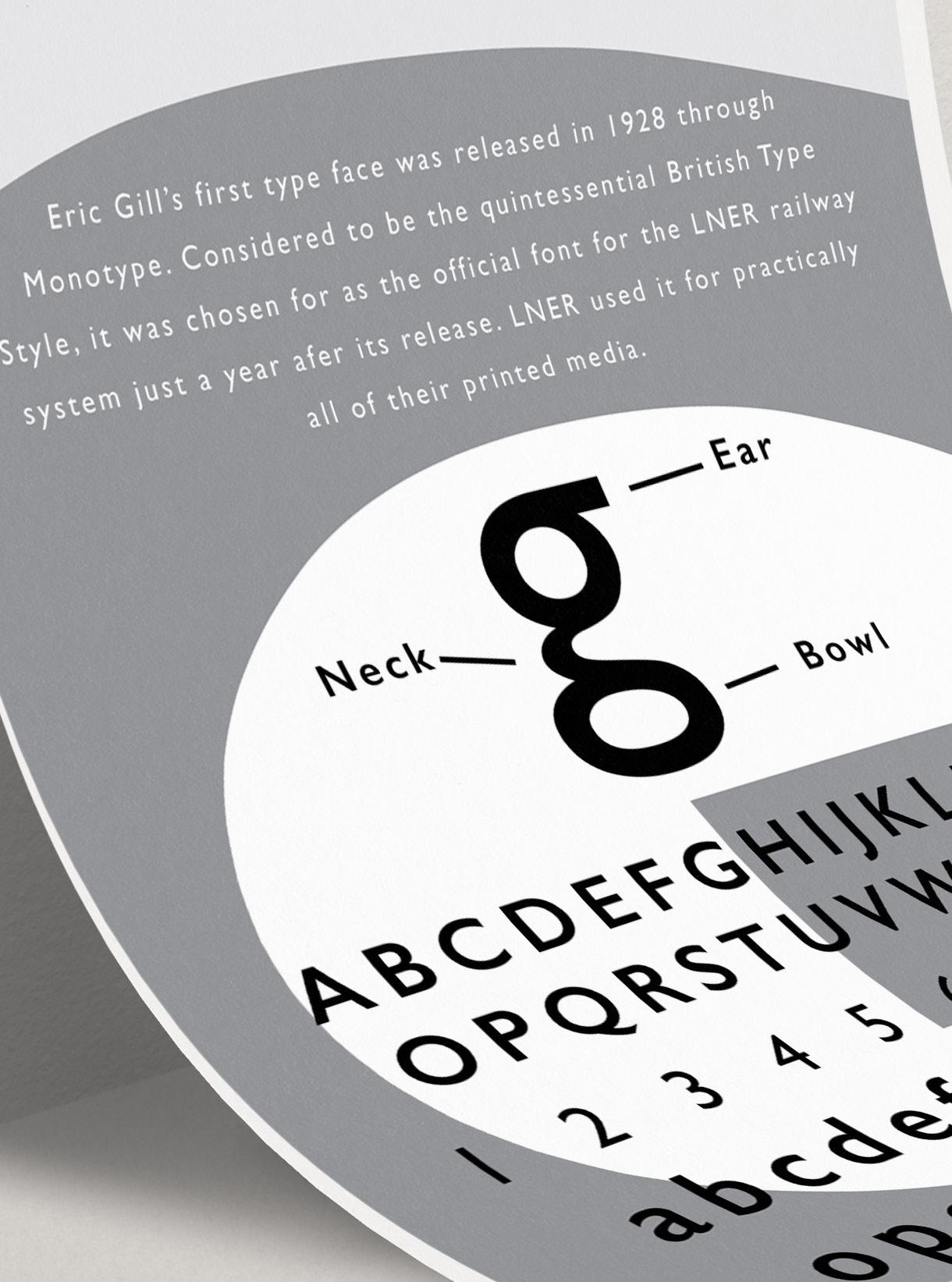
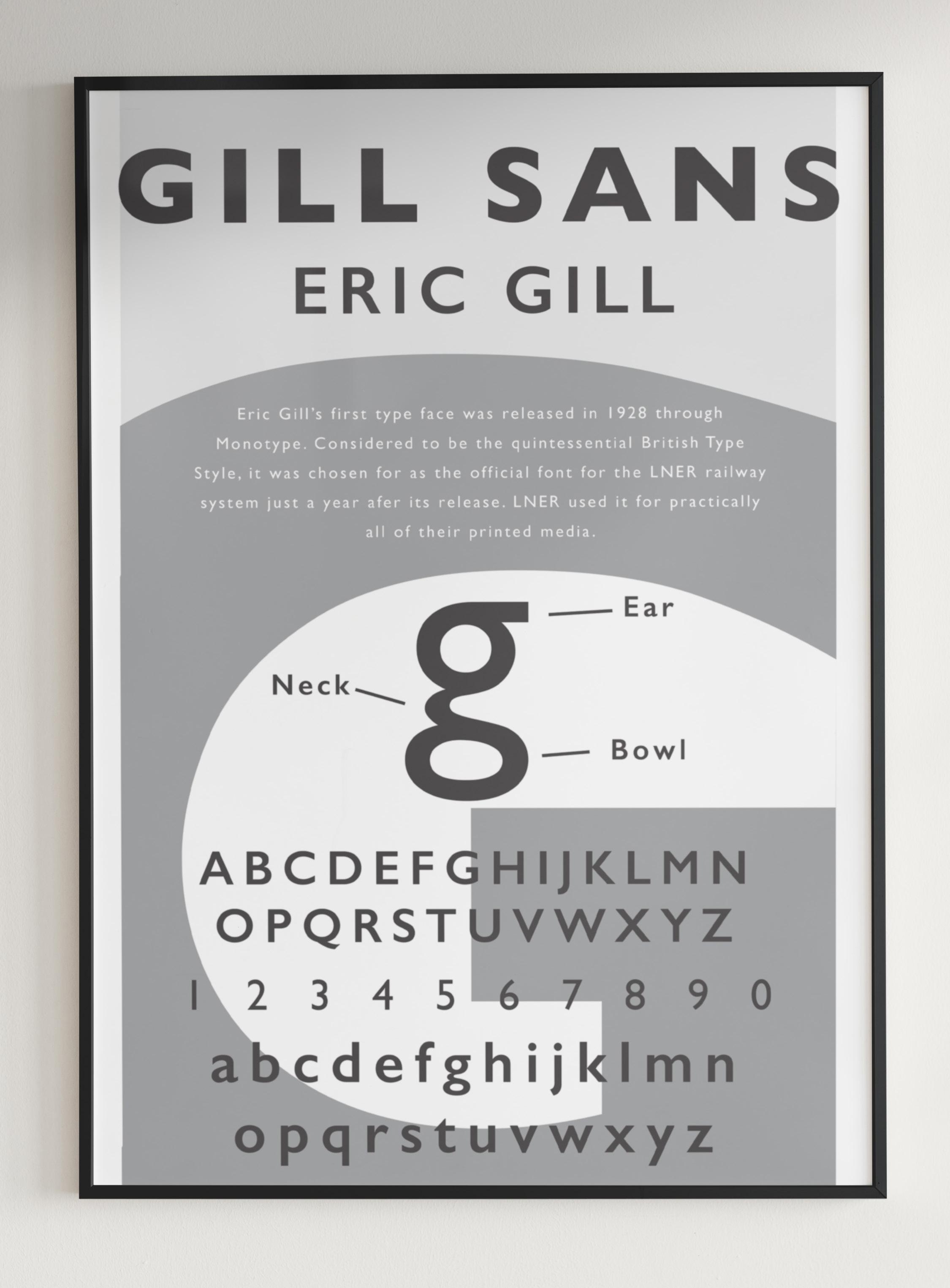
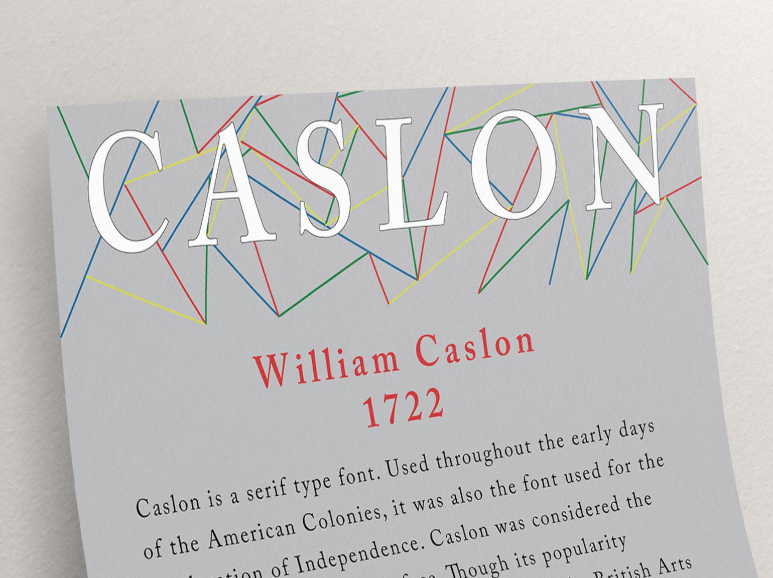
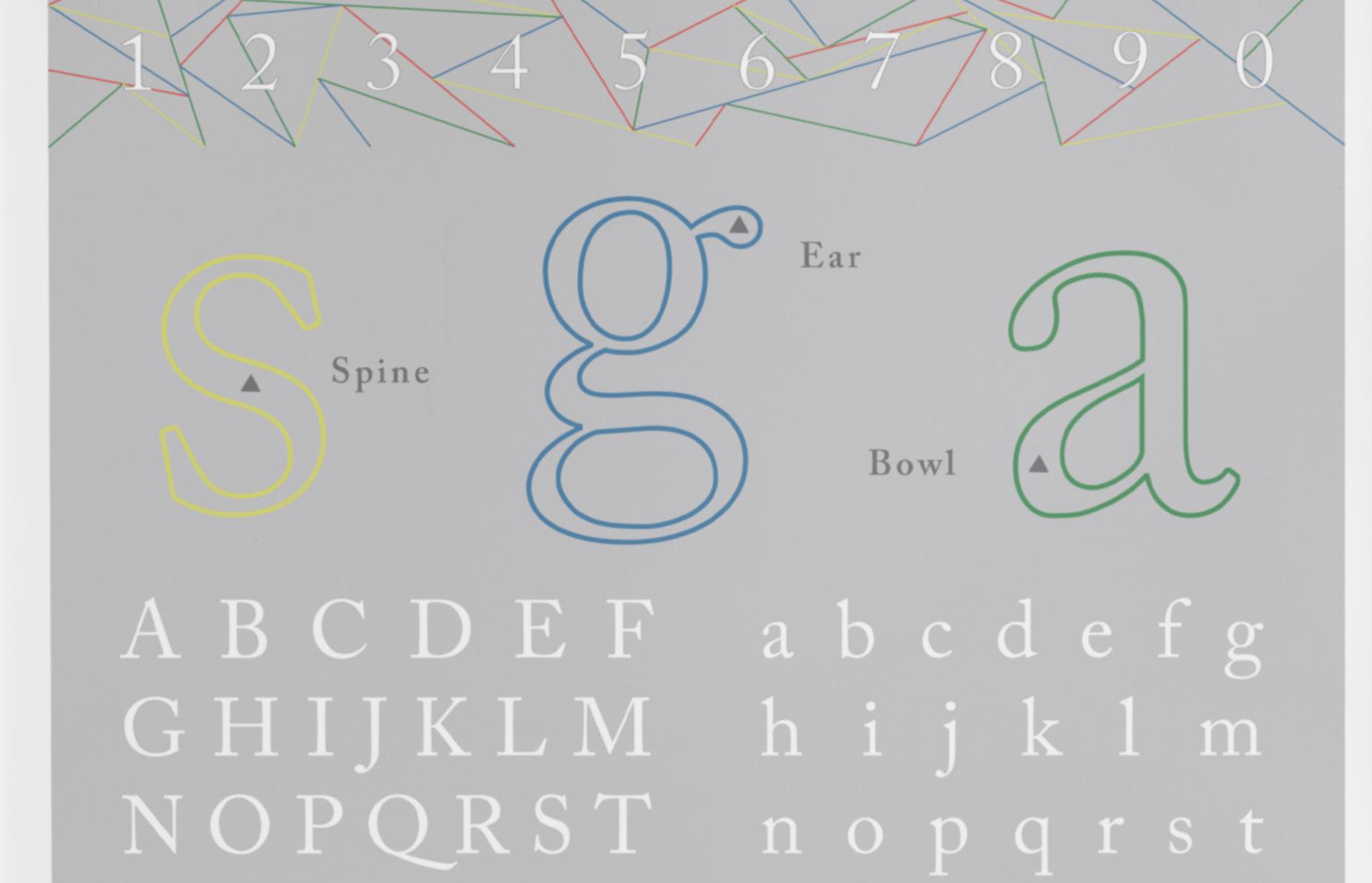
This project called for two poster designs dedicated to one typeface each. With the Gill Sans poster, I wanted to display the versatility of the typeface through manipulating the size and weight of the characters. The poster displays the range that the typeface from a paragraph style to a large and playful header. Caslon is often used as a professional print typeface, which can make it seem rather plain. Choosing a light background, I added a linear design that added color in order to enhance the design.
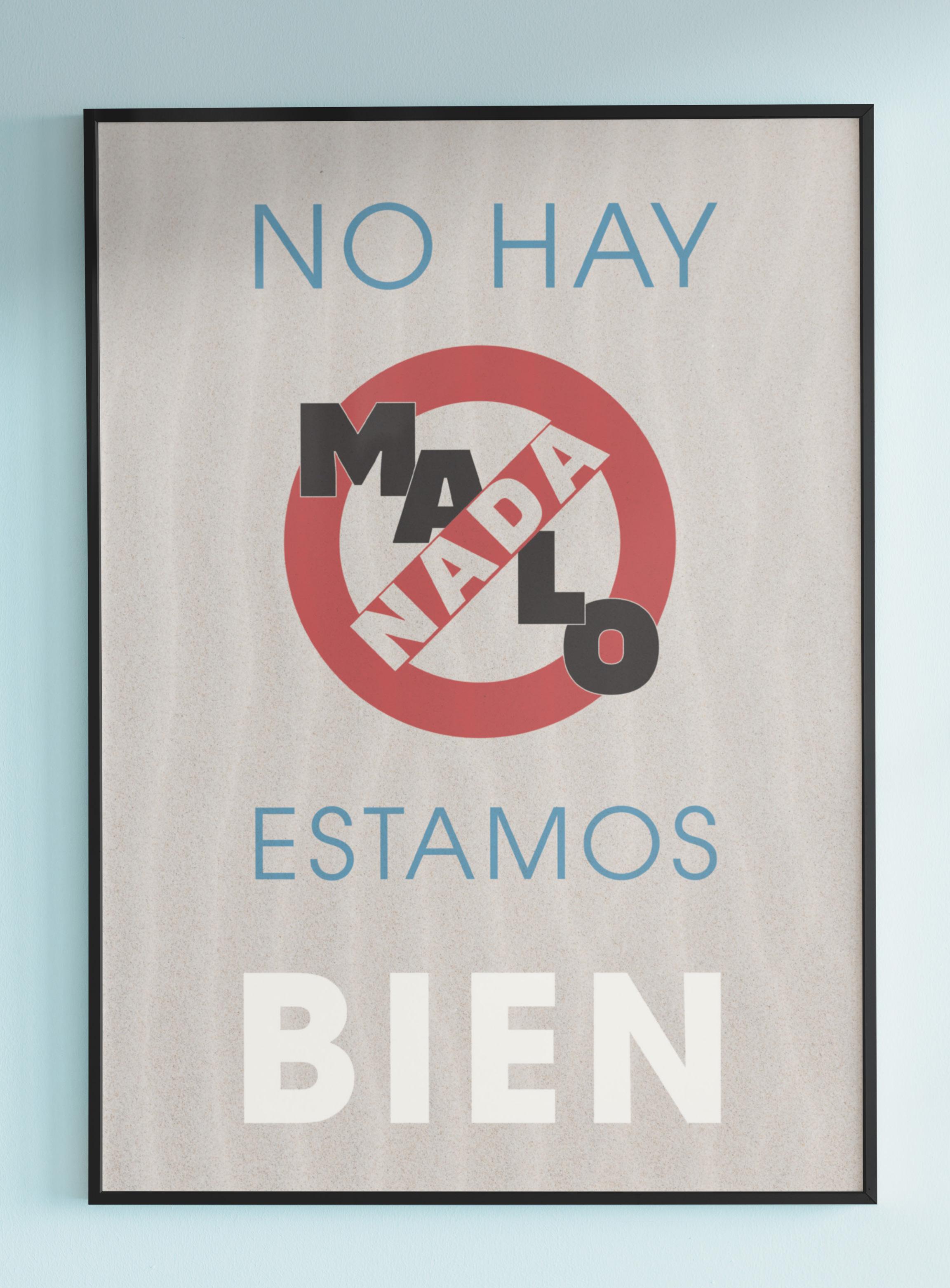
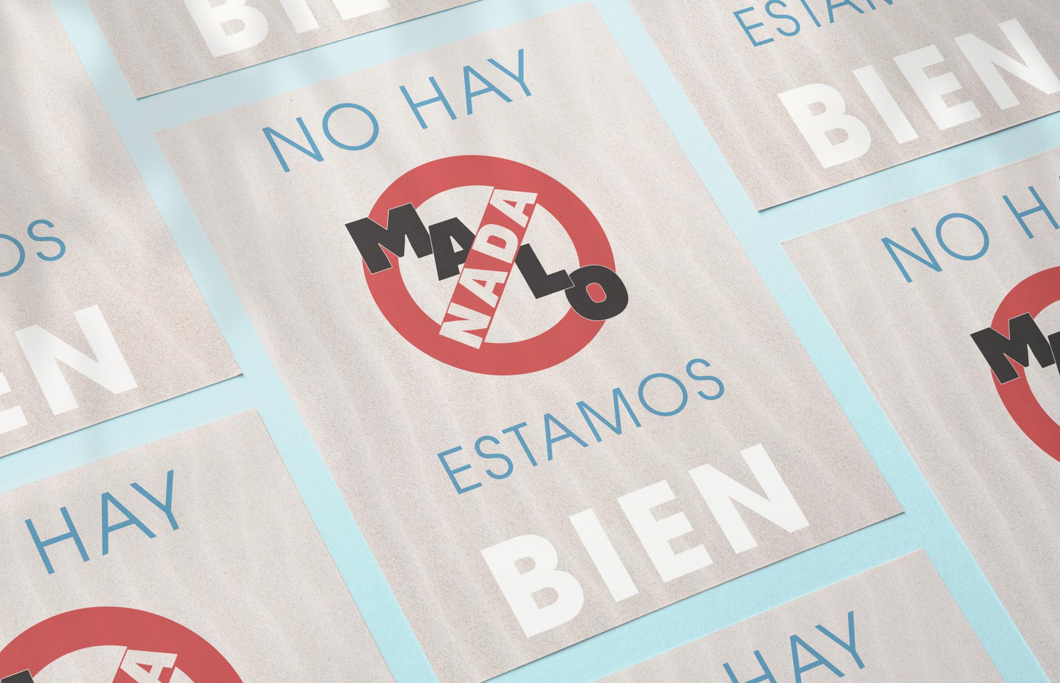
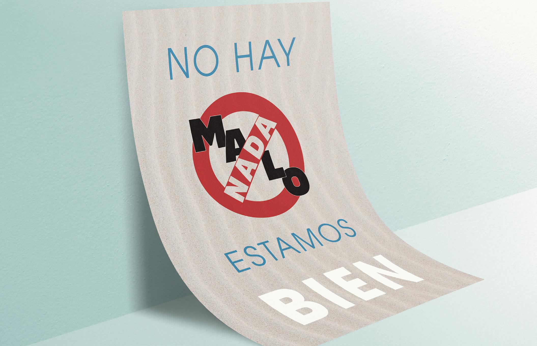
This design was created in order to improve comfortability with typographic hierarchy, type pairing, and spacial relationships between text. While choosing the typefaces for the poster, I decided with a thin sans serif font for the general text and a bolder sans serif for emphasised words. Although I wanted the design to be simple, there was a need for dimension in the overall design. Seeing this, I added a textured background image with a lightened opacity in order to compliment the design and not take away from it.

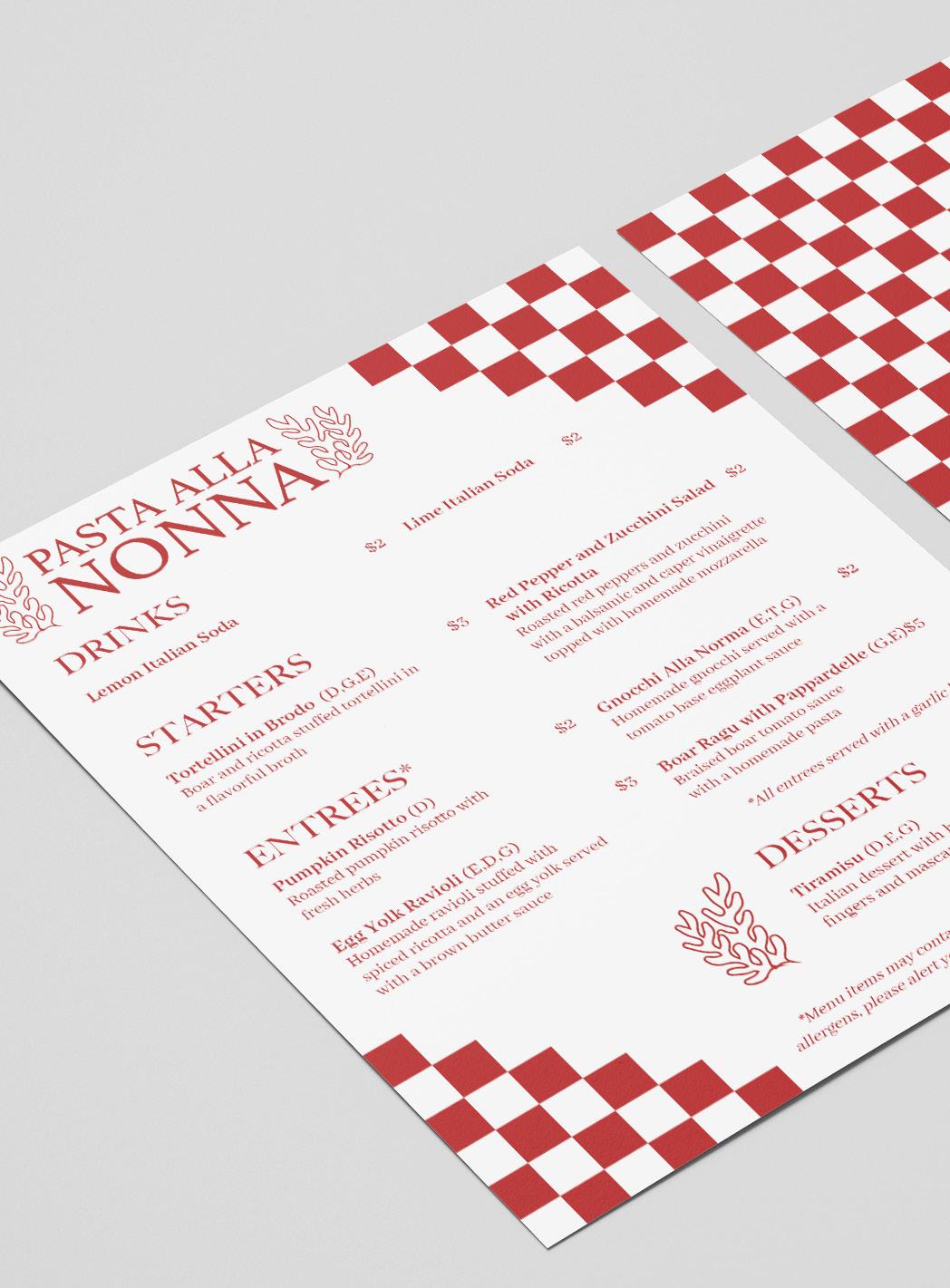
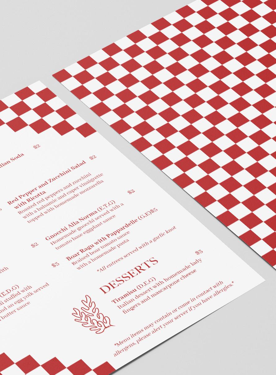
This menu design was created for a group of senior culinary students for their pop up Italian restaurant, Pasta Alla Nonna. The layout was made to enhance ledgibility through sufficient balance of negative space and use of branding. In order to create a heirarchy of type, I used various sizes and weights of one font to differentiate different areas such as the allergy information. With the clients wanting a mom and pop aesthetic, the color pallete was limited to red and white. Though limited in color, the red along with the added branding elements create an enticing teaser to the flavors that were served on plates.
Lemon Italian Soda $3
Tortellini in Brodo (D,G,E) $4
Spicy pork and ricotta stuffed tortellini in a flavorful broth
Blood Orange and Basil $3 Italian Soda
Grilled Artichoke $4
Grilled artichoke served with roasted garlic aioli
Pumpkin Risotto (D) $3
Roasted pumpkin risotto topped with fresh herbs
Egg Yolk Ravioli (D,G,E) $4
Homemade ravioli stuffed with spicy ricotta and an egg yolk served with a brown butter sauce
Gnocchi Alla Pesto (E,G,T) $3
Homemade gnocchi served with a homemade pesto
Boar Ragu with Pappardelle (G,E)
$5
Braised boar tomato sauce served with homemade pasta
*Allentreesservedwithagarlicknot
Tiramisu (D,G,E) $4
Italian dessert with homemade lady fingers and mascarpone cheese
*Menuitemsmaycontainorcomeincontactwith allergens,pleasealertyourserverifyouhaveallergies.*
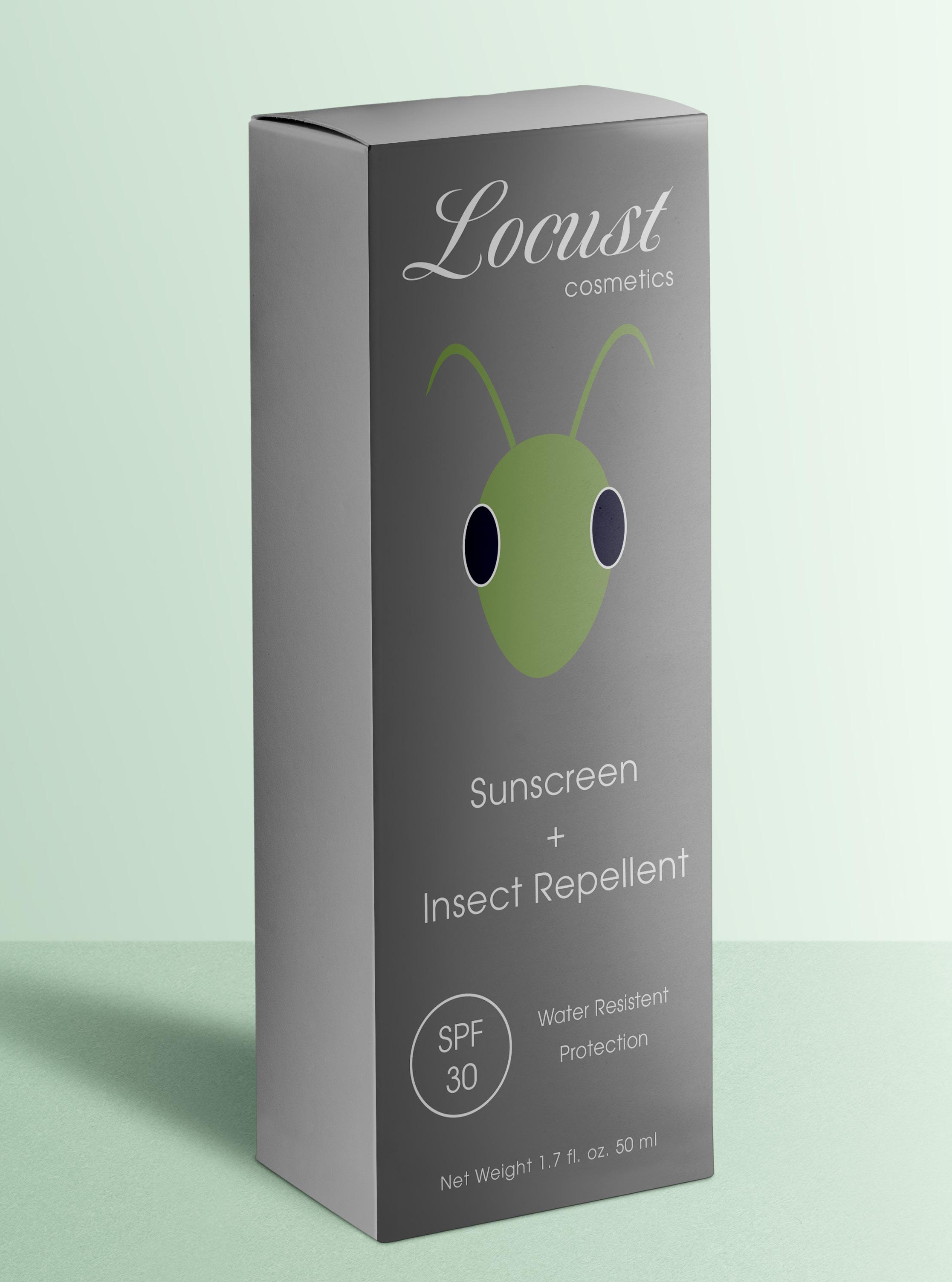
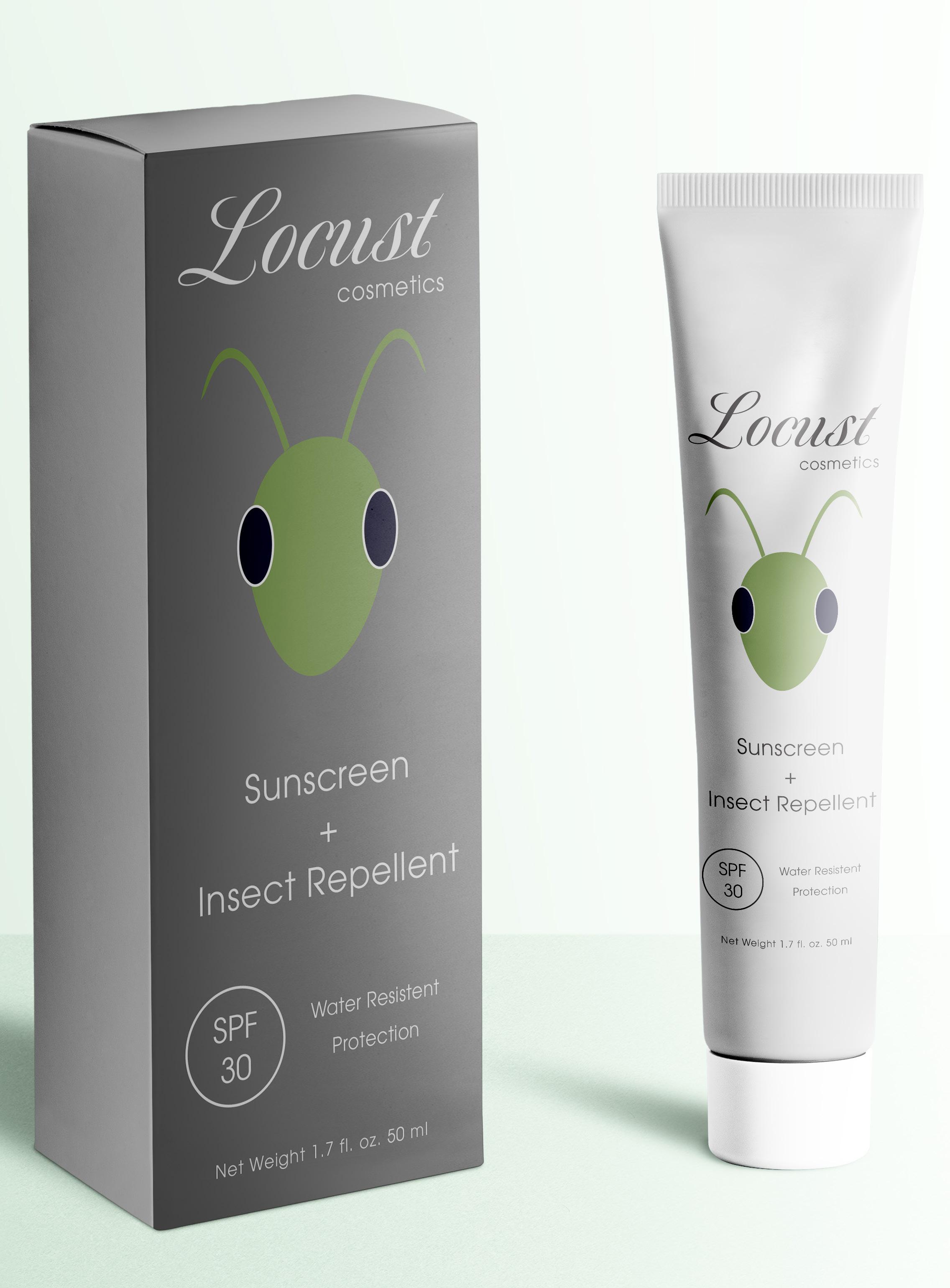
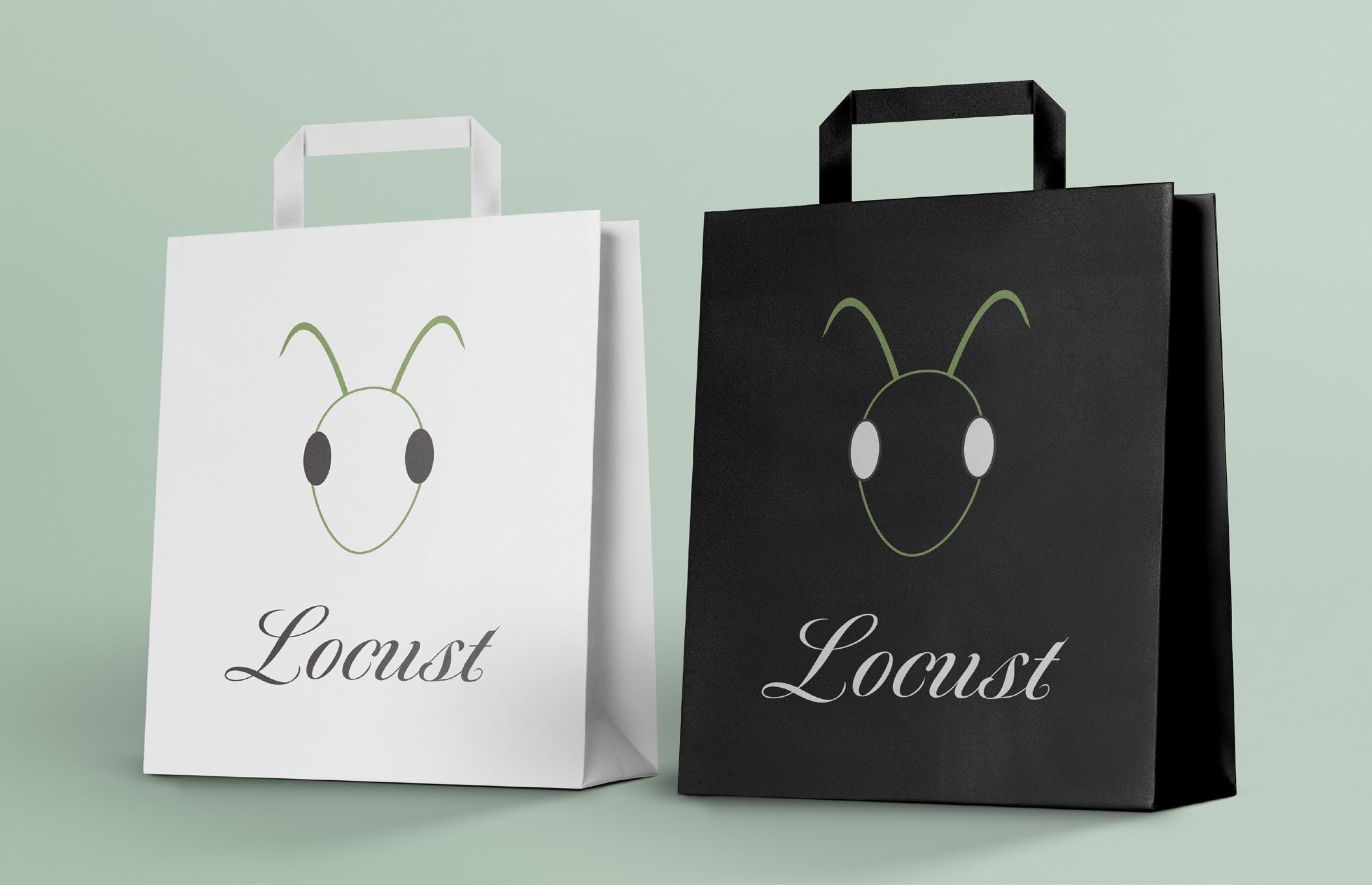
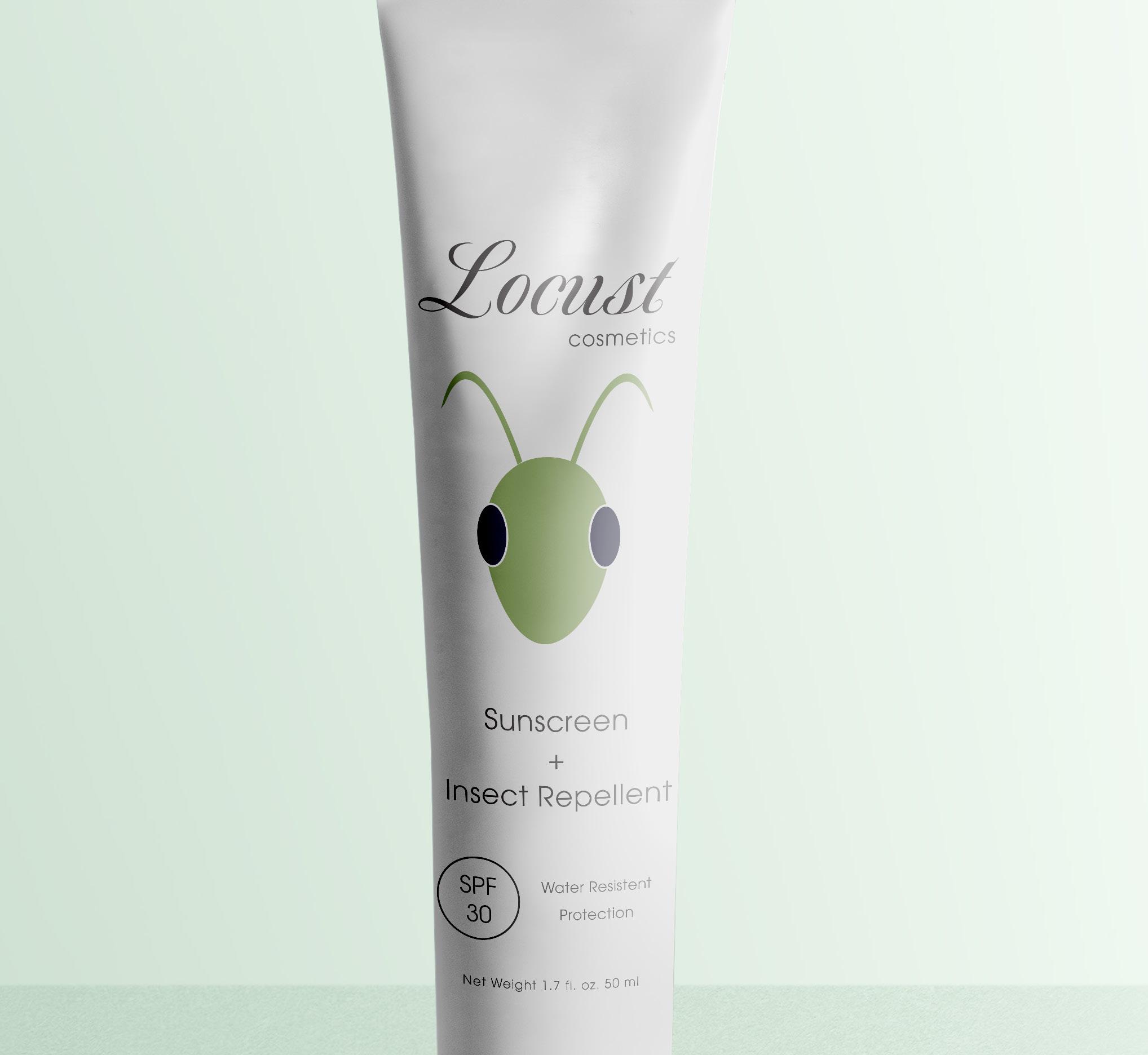
This project had the objective of designing and creating the packaging for a hypothetical sunscreen brand. With a target market of women in their mid twenties to late thirties that are often outdoors, the logo called for something natural and organic that also caters to someone that has a minimalistic aesthetic. Although the original project called for a physical handmade prototype, I decided to digitize my design. While recreating the original packaging, I refined the typography as well as the visual hierarchy of the packaging in order to have more fluidity when reading the information. The overall colors used are minimal in order to direct the eye straight to the vibrant logo placed in the center.
Photography Photoshop
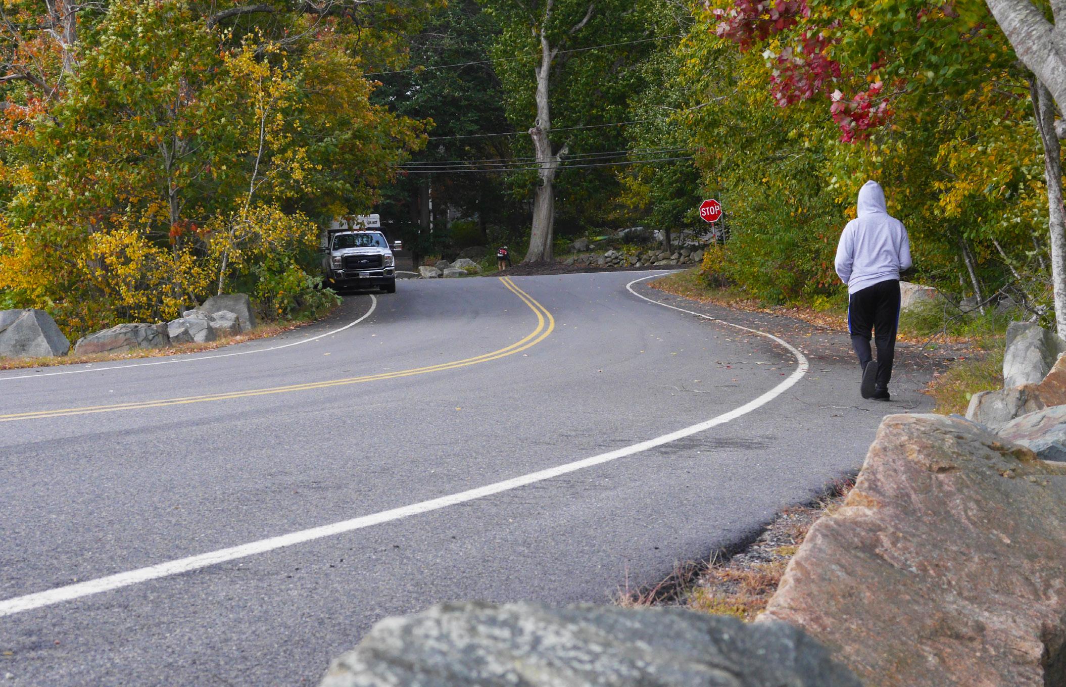
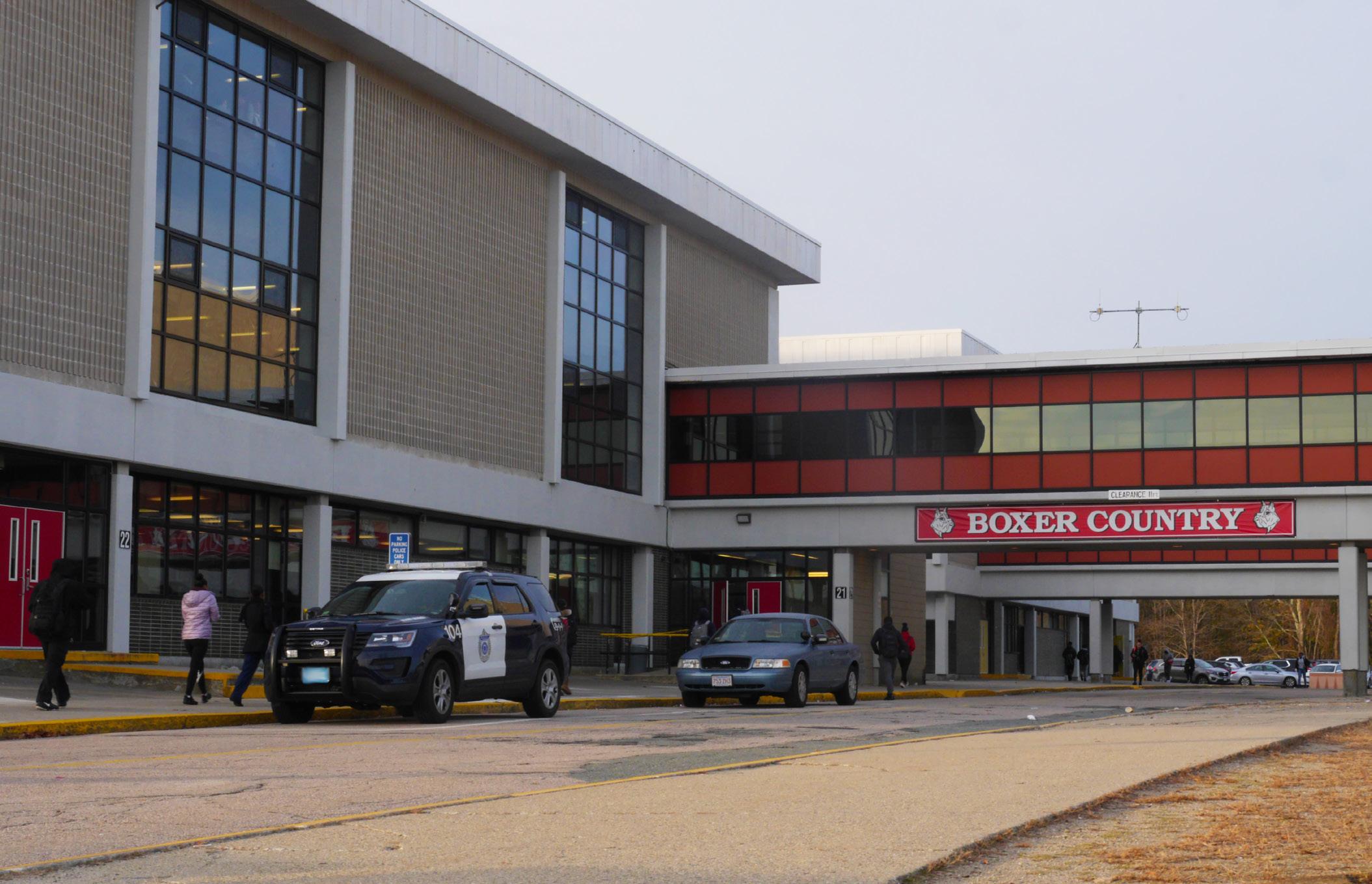
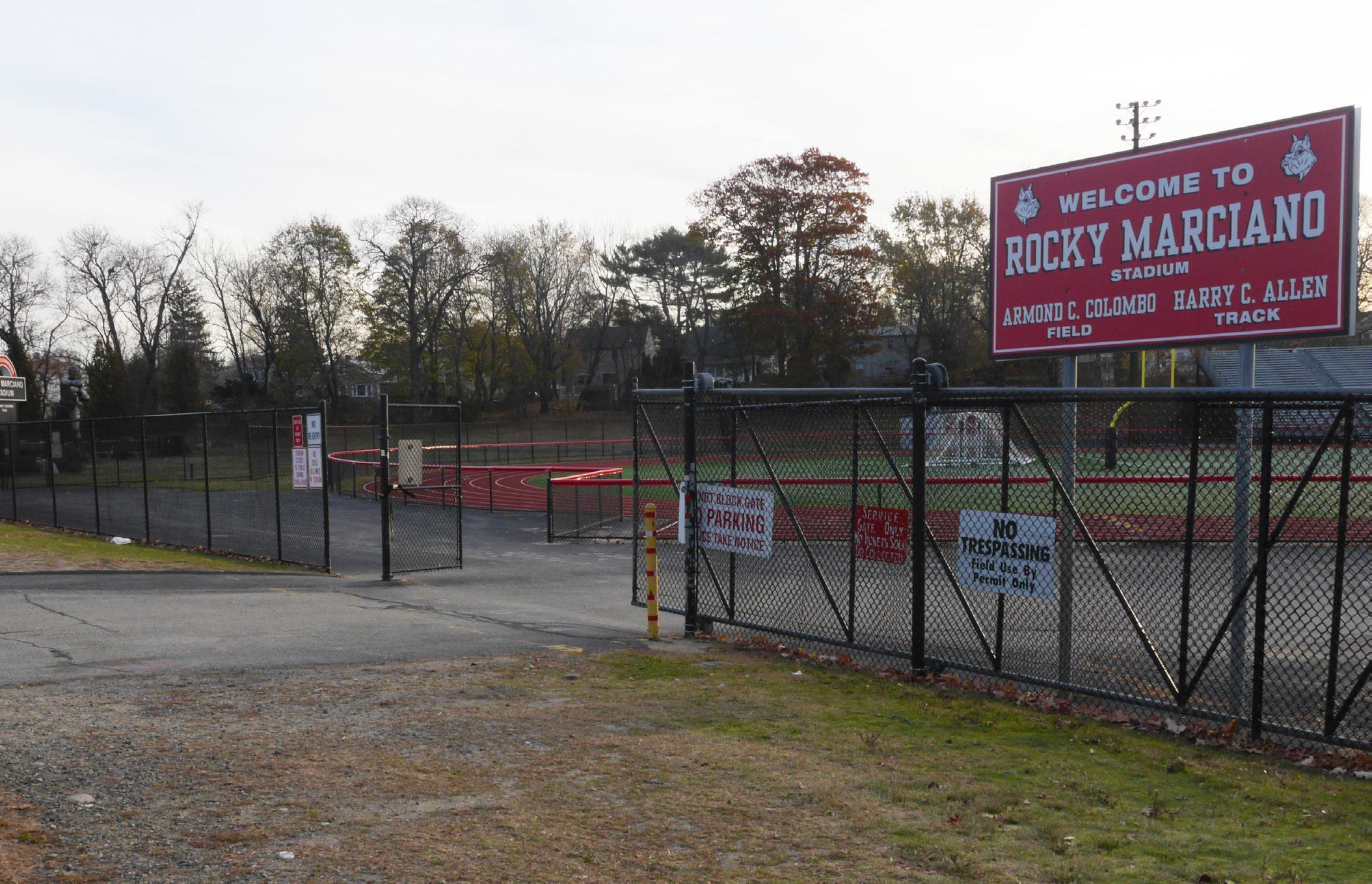
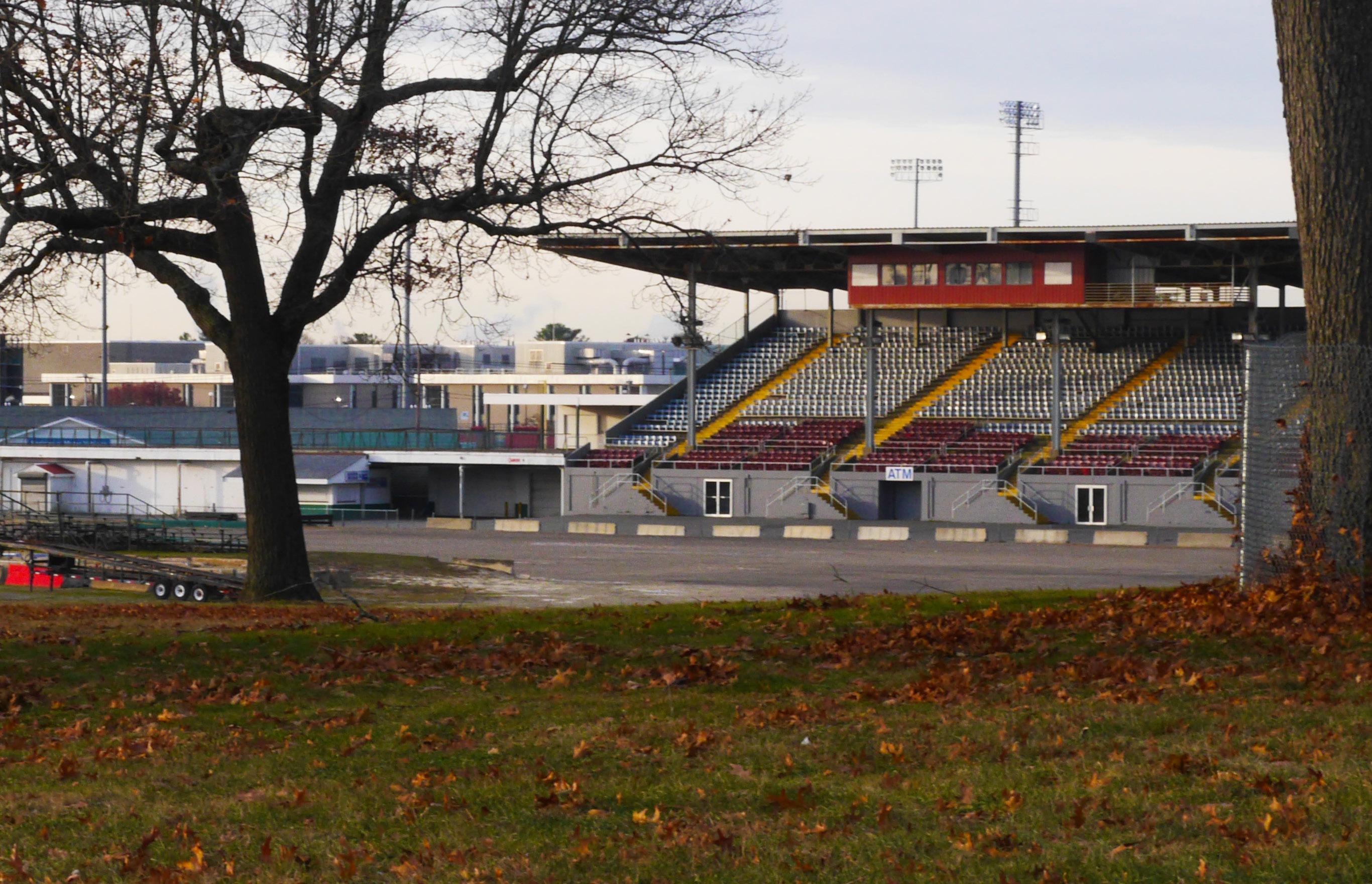
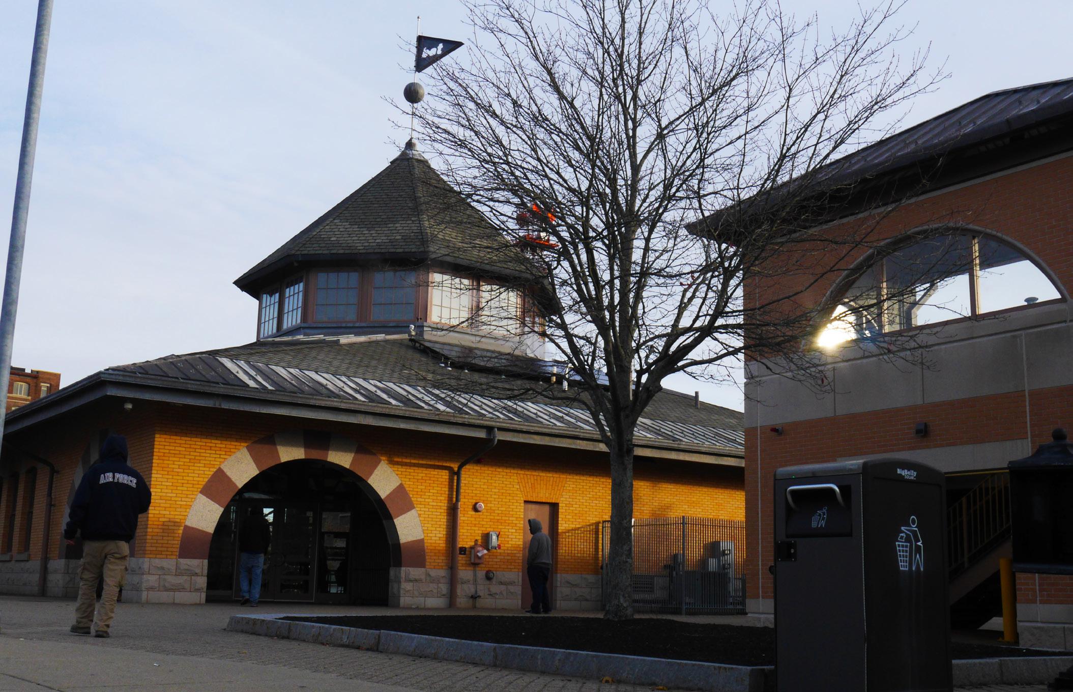
When asked to create a story through original photography, I thought of home. I was born in a city that does not always get the best wrap, but has a unique charm about it. While capturing the mini landmarks that all locals have ties to, my goal was to capture them in a warm tone with vibrant colors to portray the essence of my community. Although the raw images captured the desired colors, some of the images came out a bit dark. In order to create a balance for the highlights and shadows, I raised the brightness and the vibrancy levels of the images in Photoshop to achieve the desired effect.