VAULT THE C
Core First. Always.
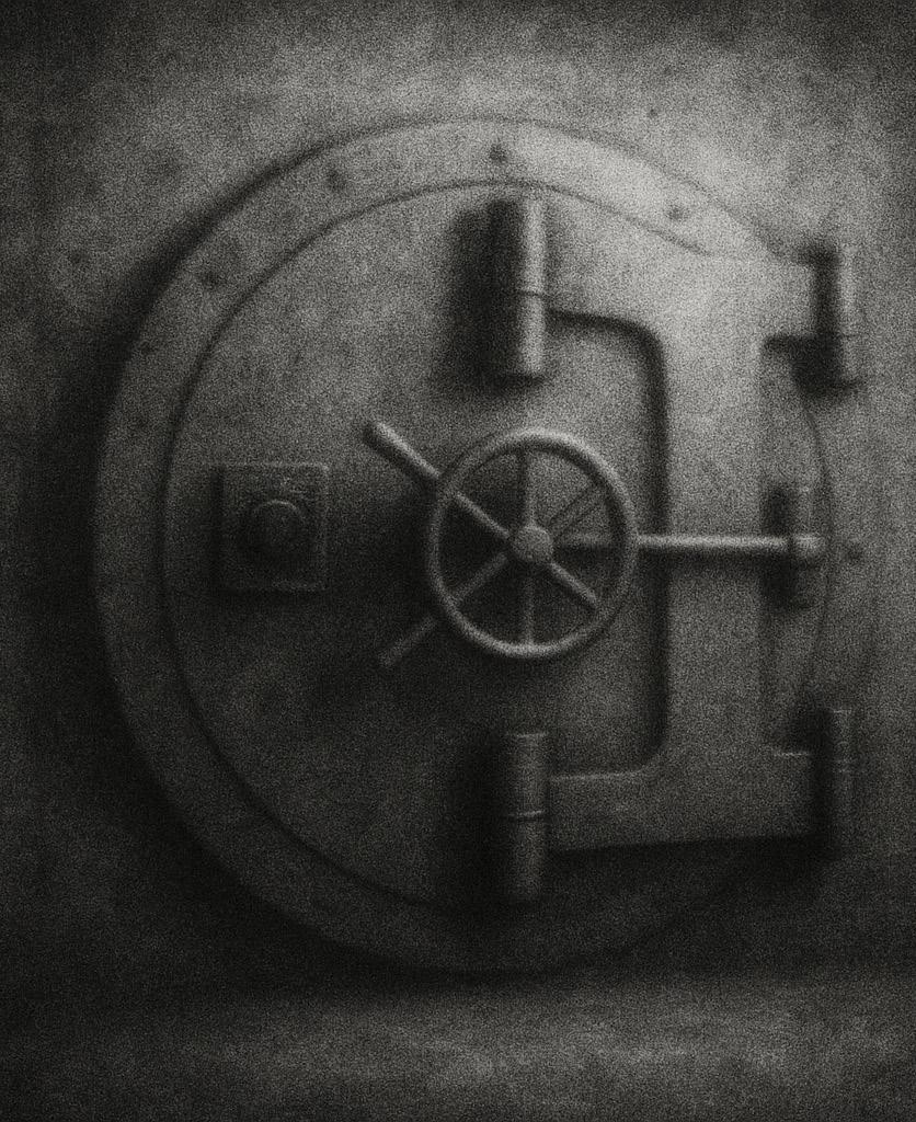
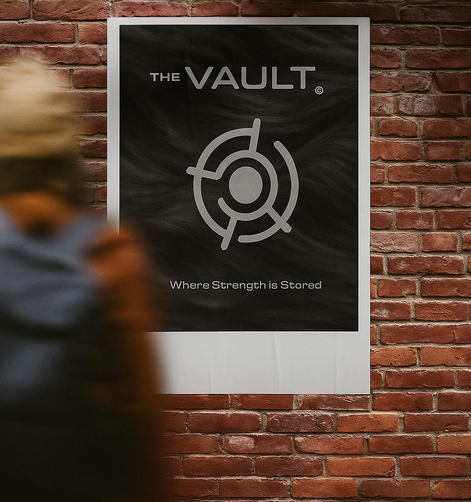
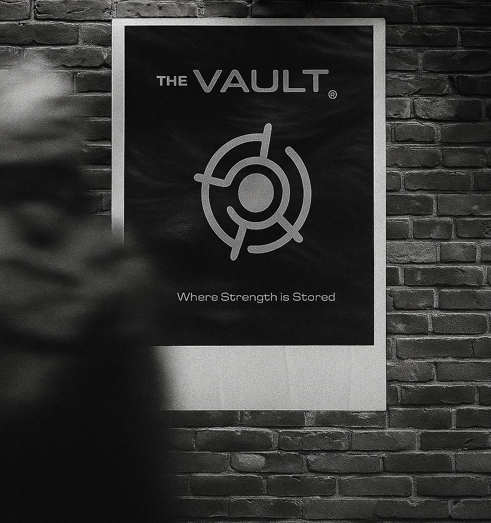
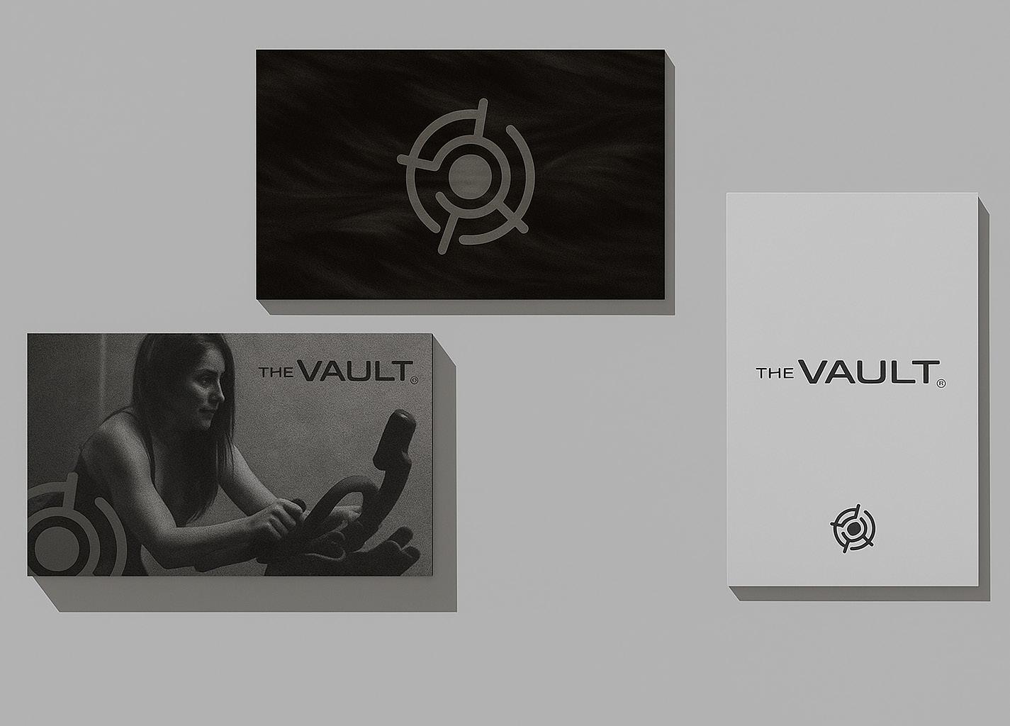
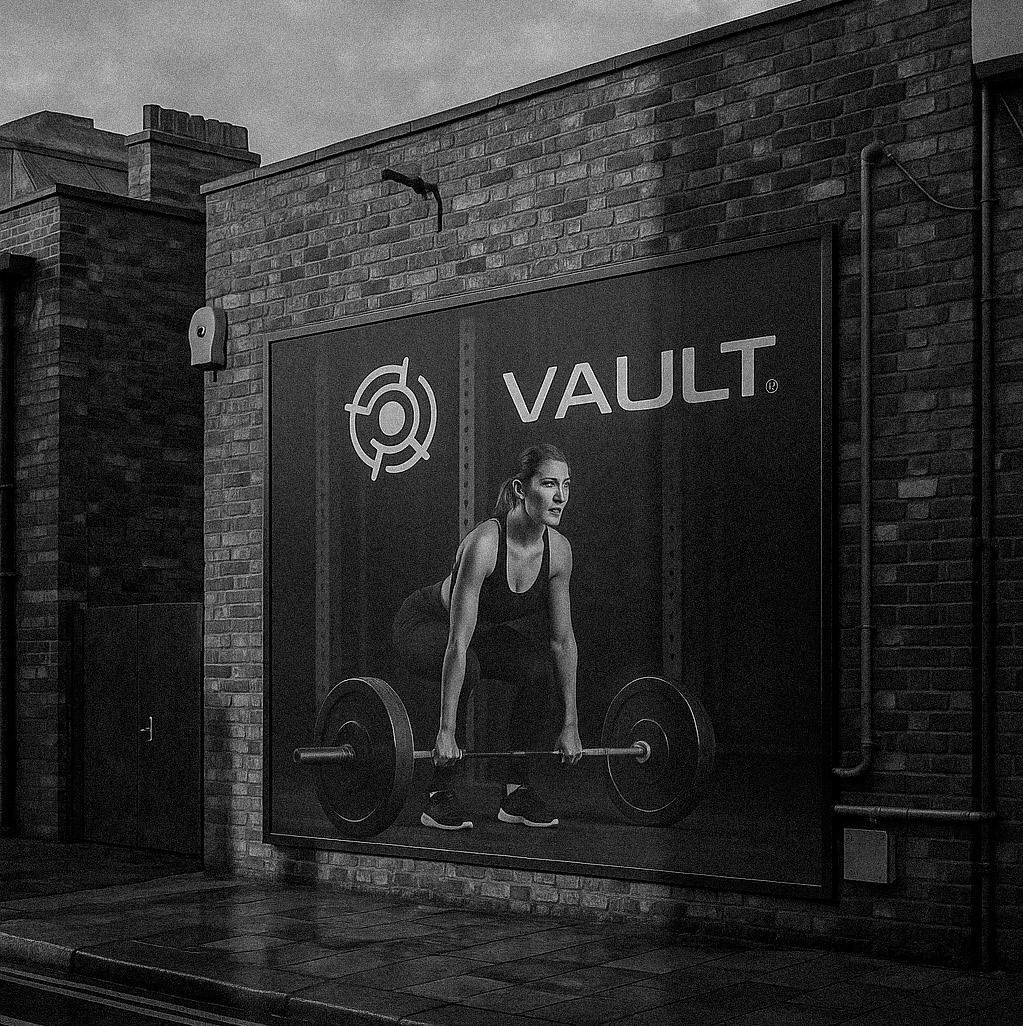
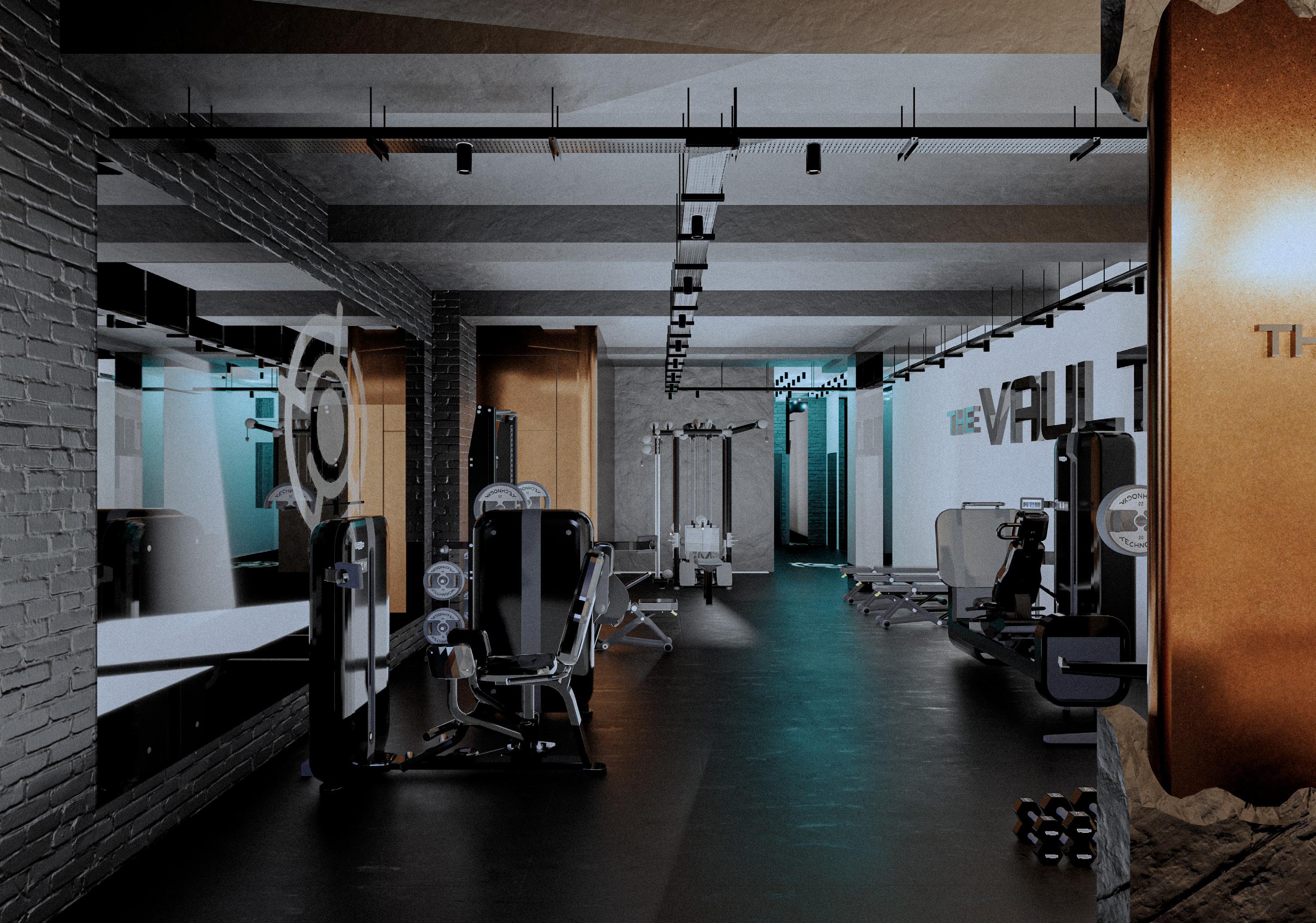
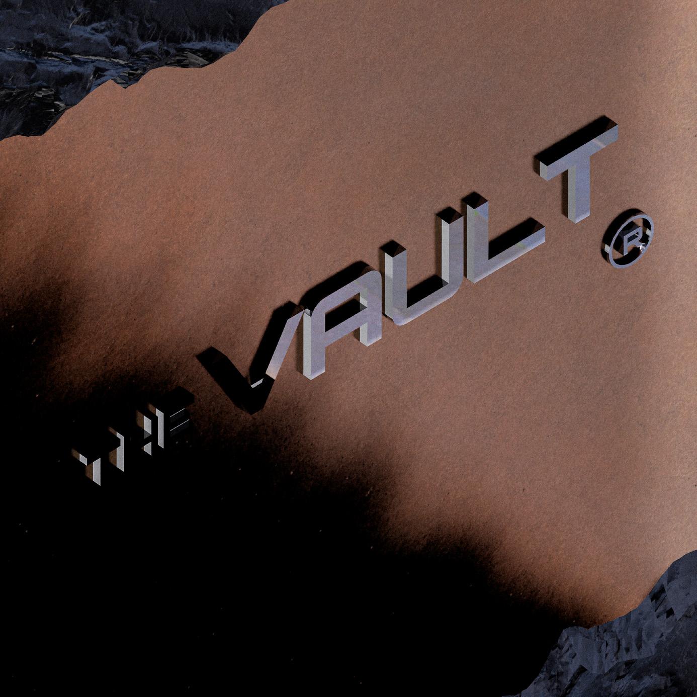
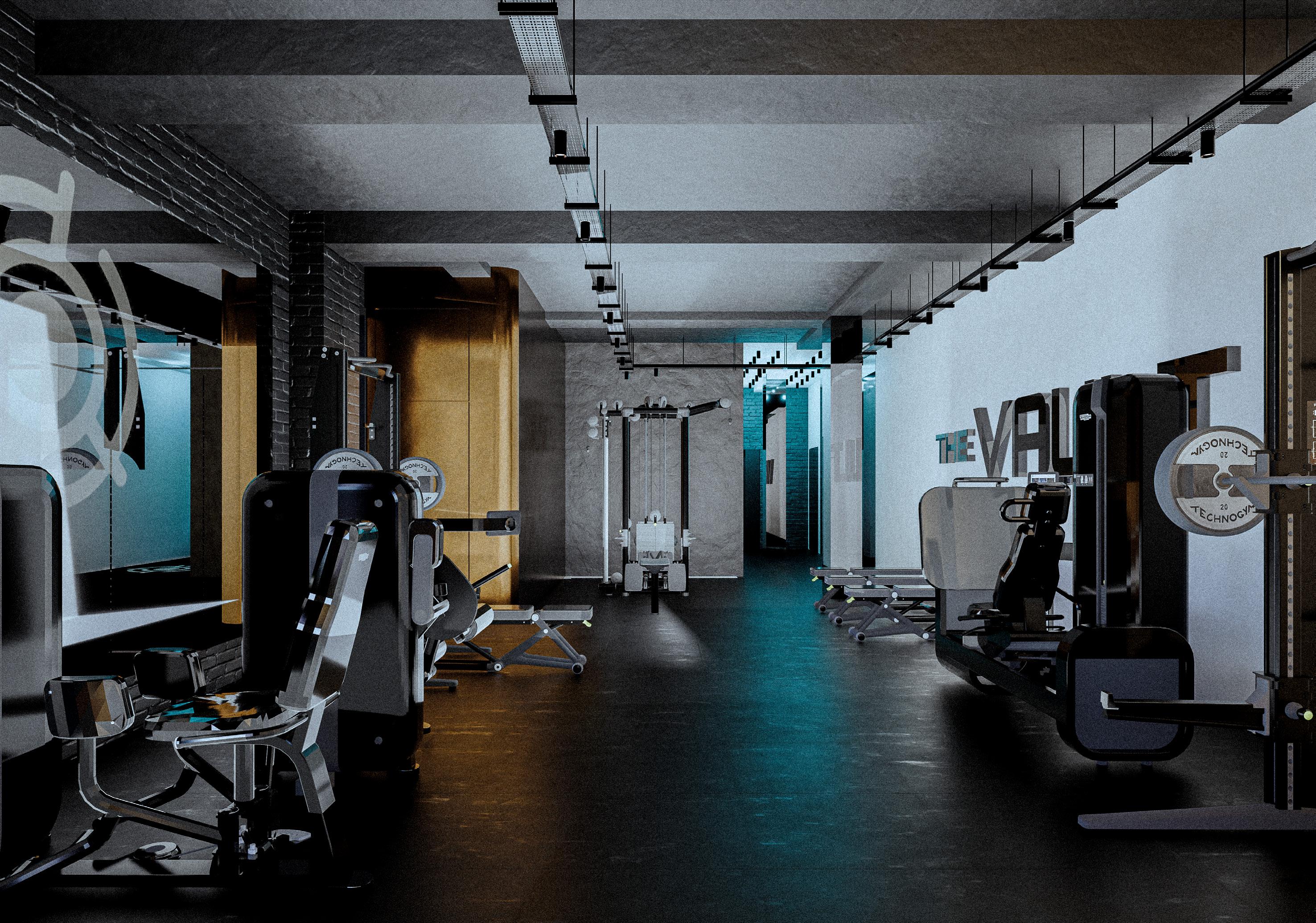
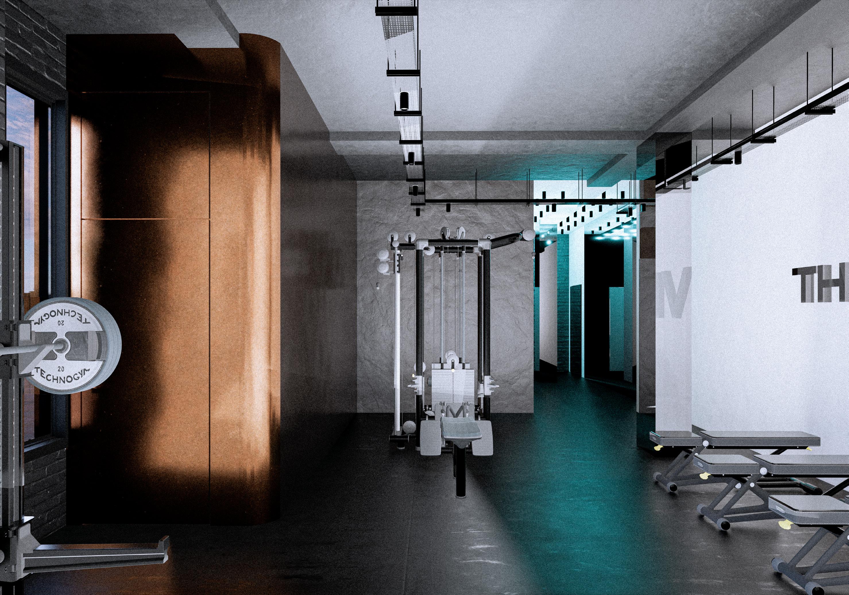
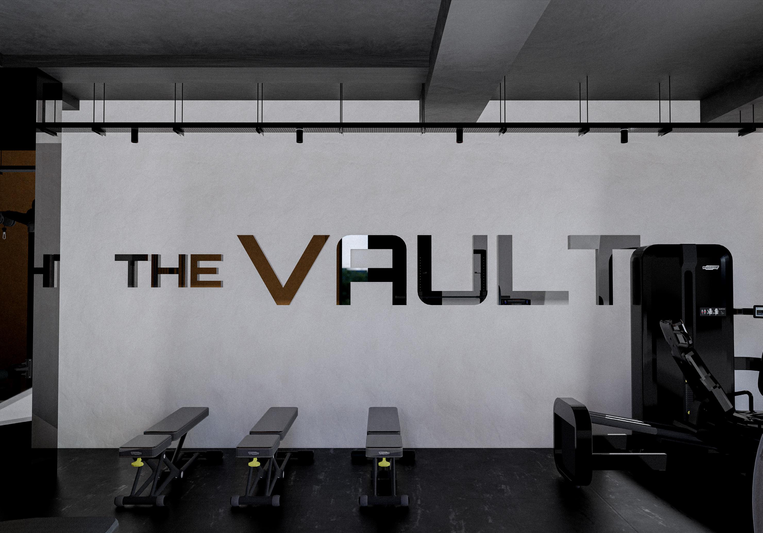
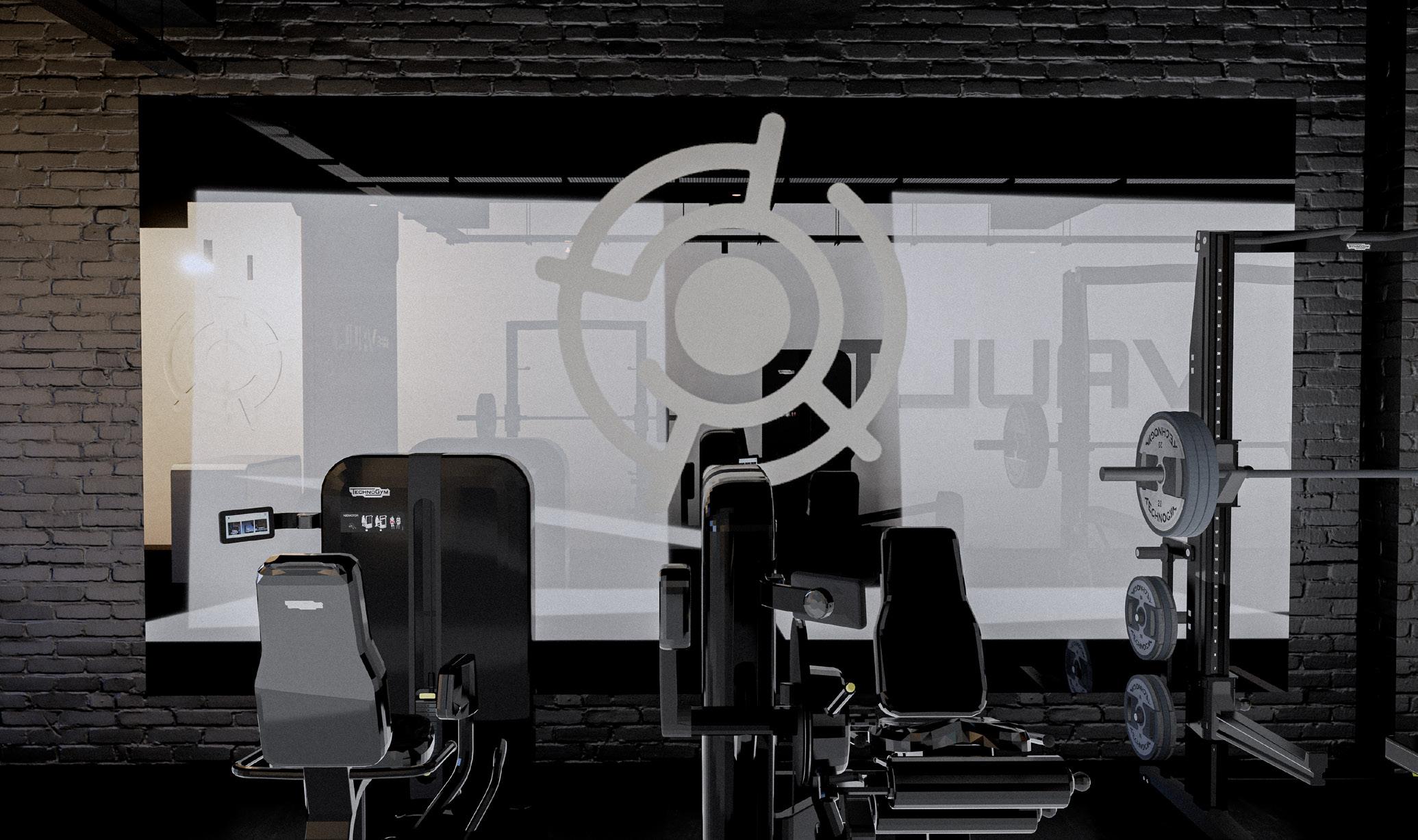
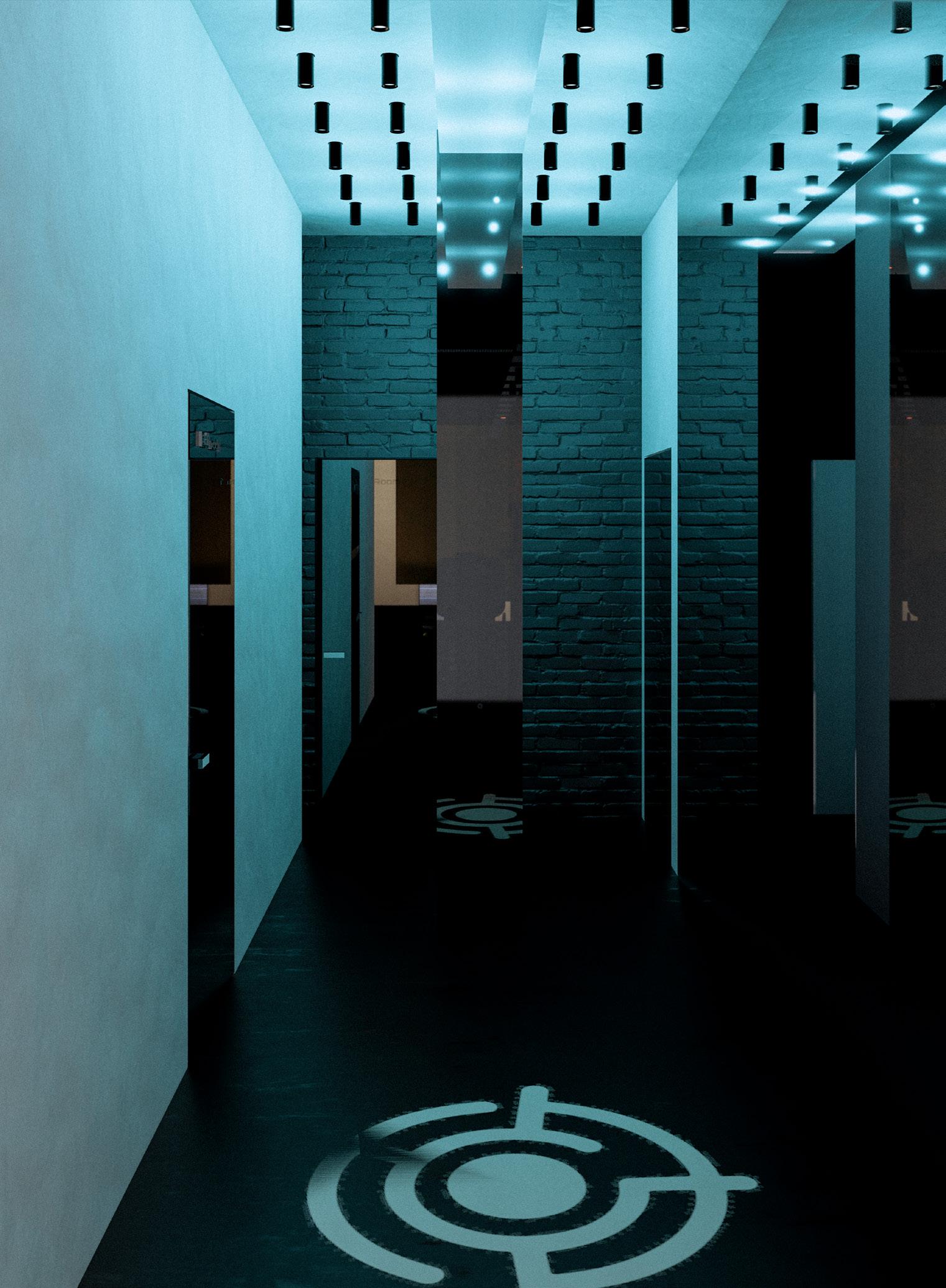
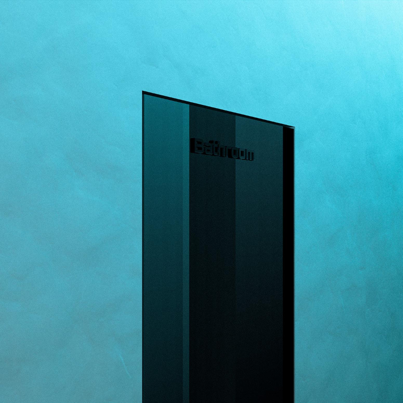
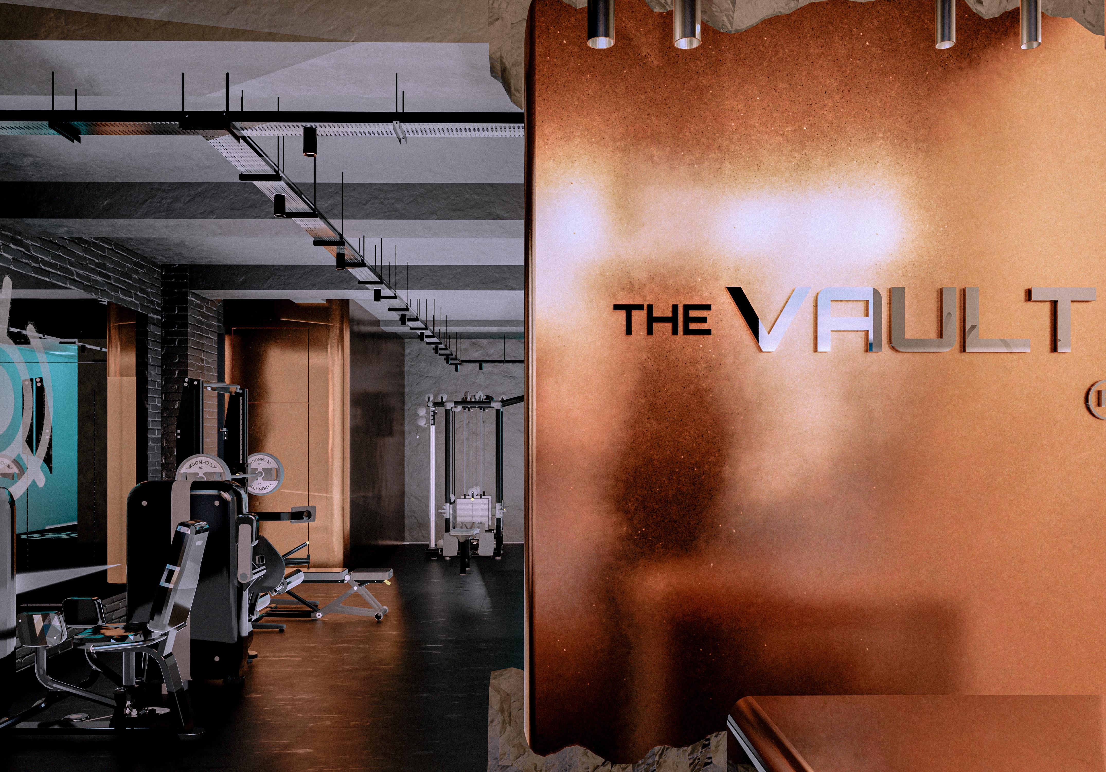
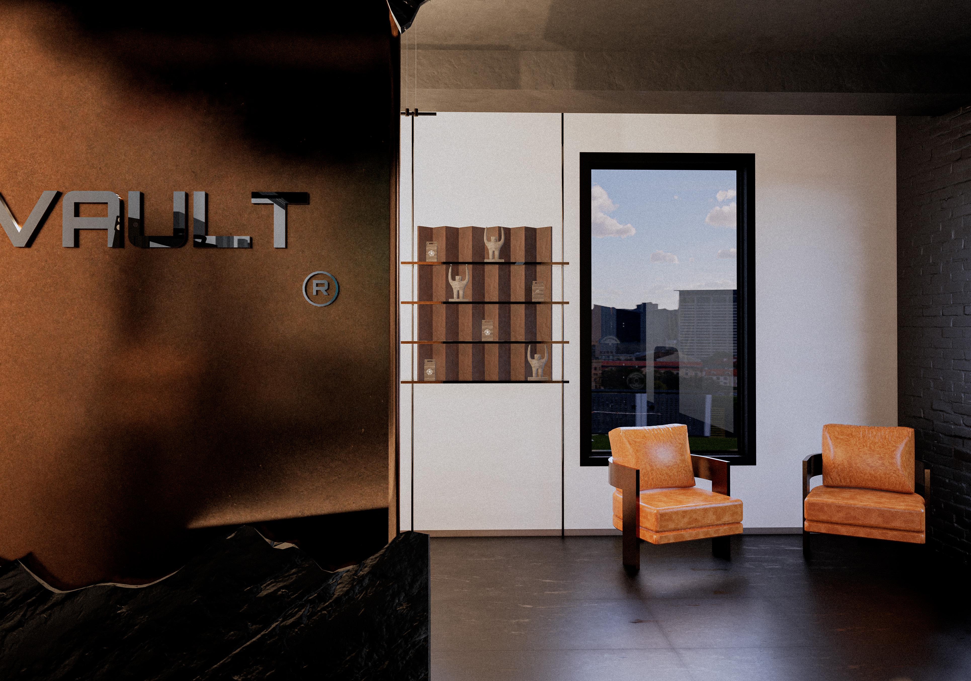
The Vault is a boutique gym brand built on transformation, of space, body, and self. Once a real bank vault, our location now serves as a temple of inner strength, where power is no longer stored but actively built. The name, space, and identity all draw from this symbolic transition.
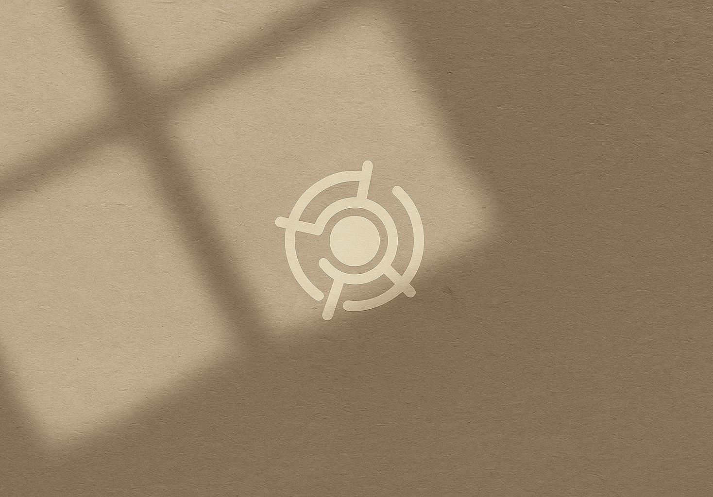
We had the pleasure of shaping a brand identity that reflects this evolution, through a bold, futuristic wordmark and a symbol inspired by the locking mechanism of a vault, reimagined as a core of energy and movement. The minimalist system captures symmetry, tension, and flow, just like the human form in motion.
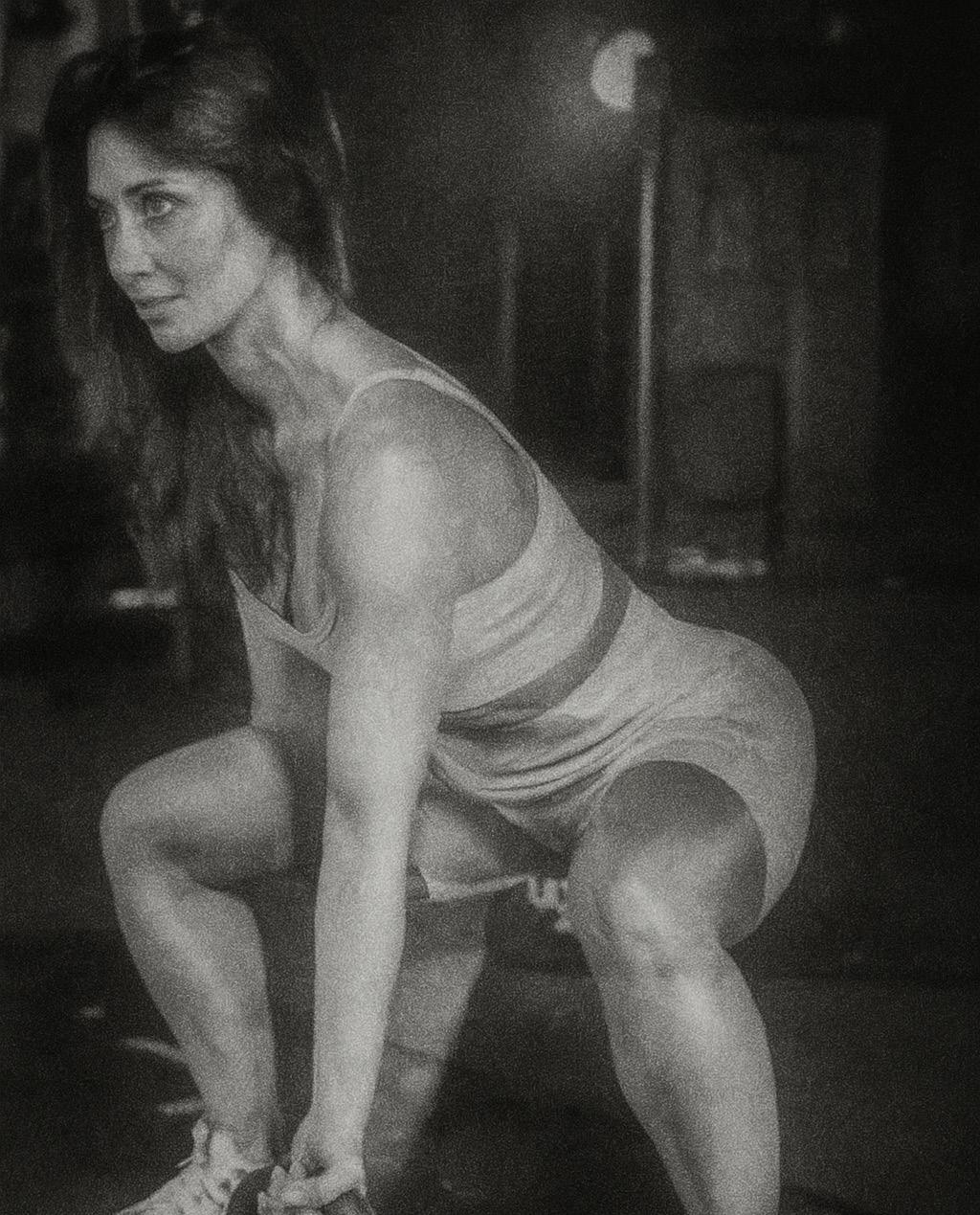
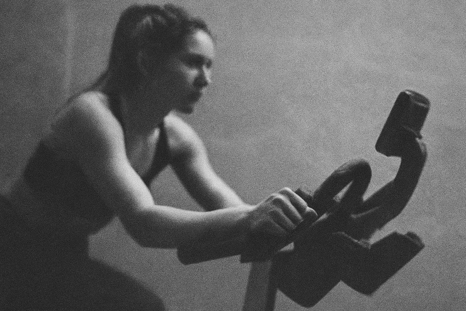
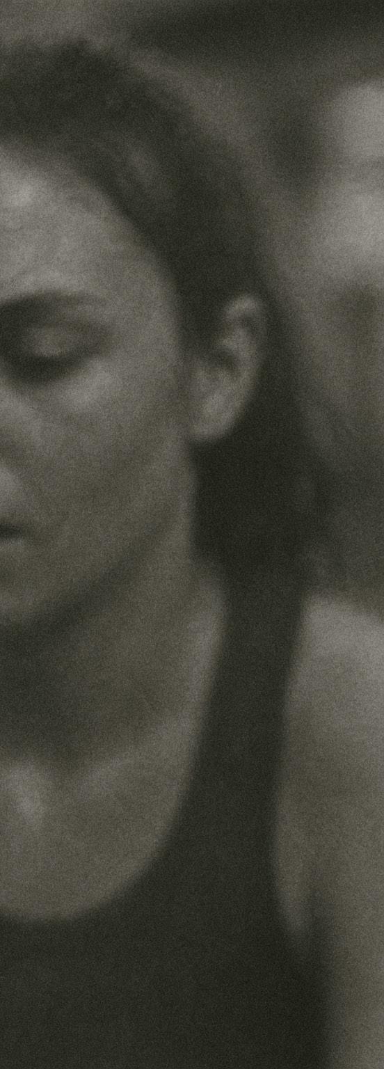
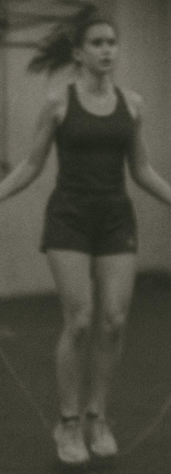
Paired with textured, grainy visuals that evoke grit and momentum, The Vault’s identity speaks to a clientele that values strength, focus, and personal discipline, a space where balance meets force.
Armonda.H


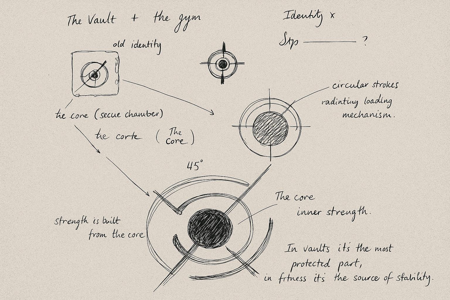
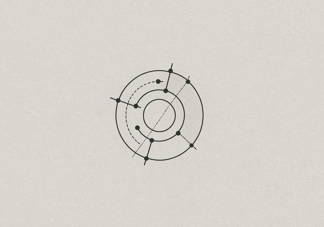
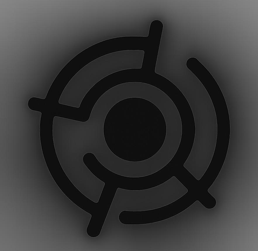
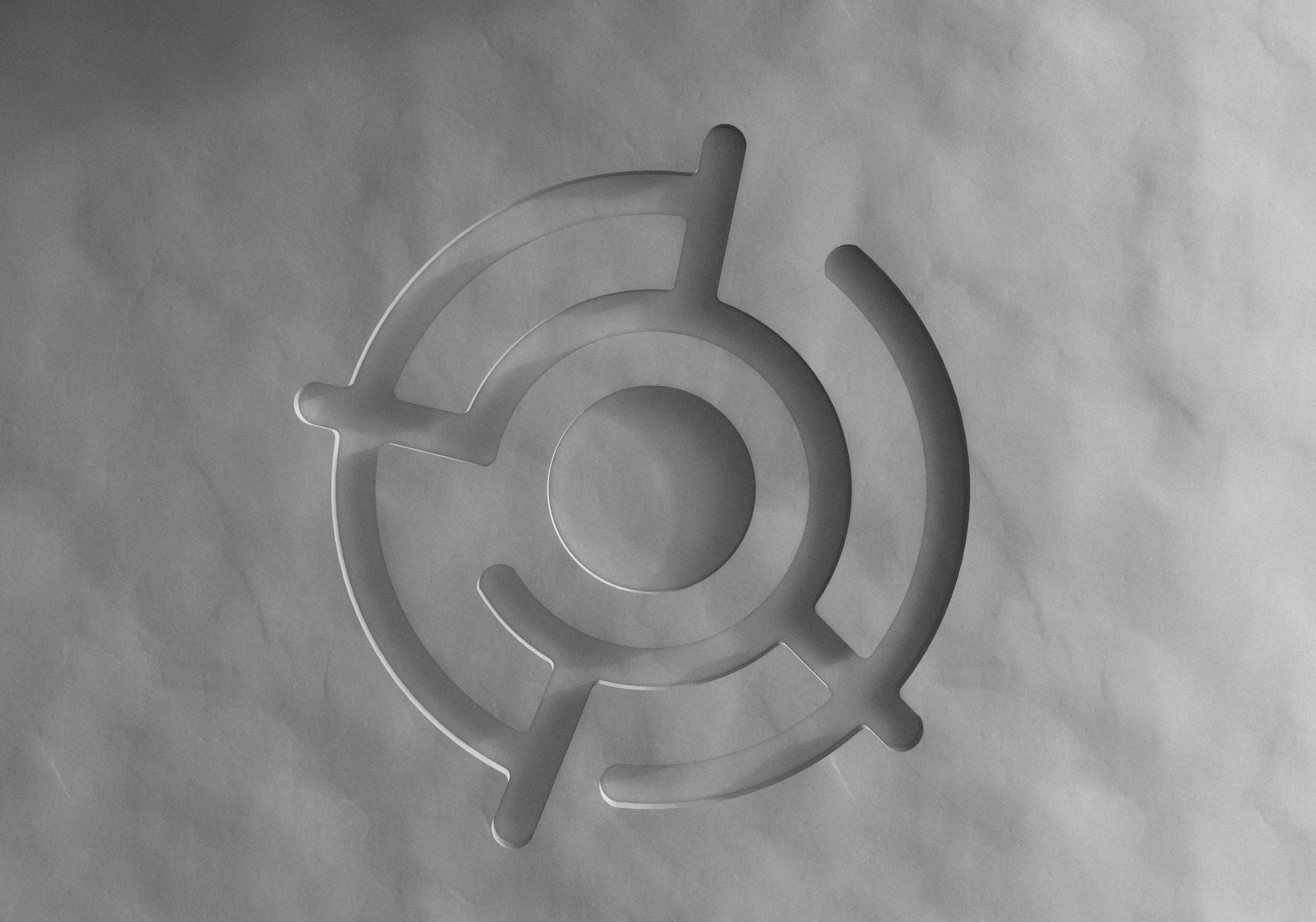
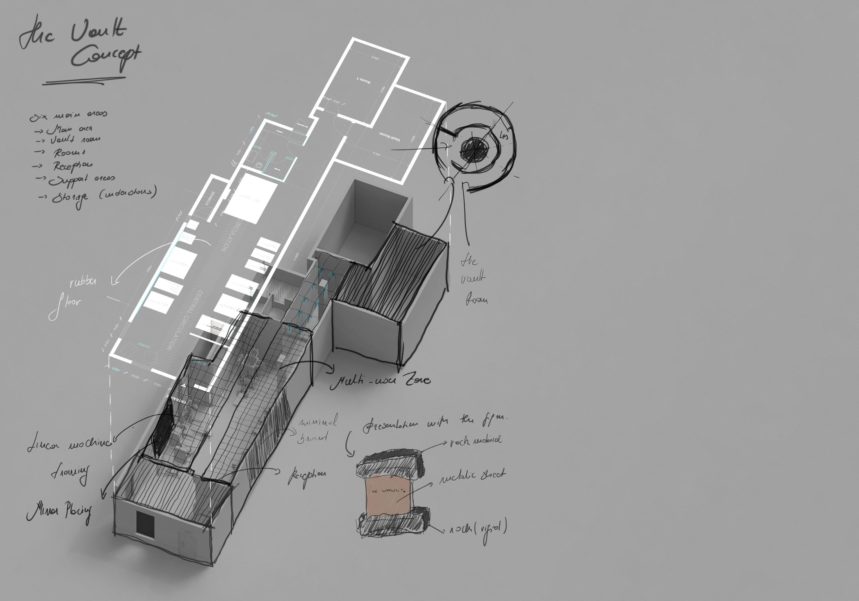
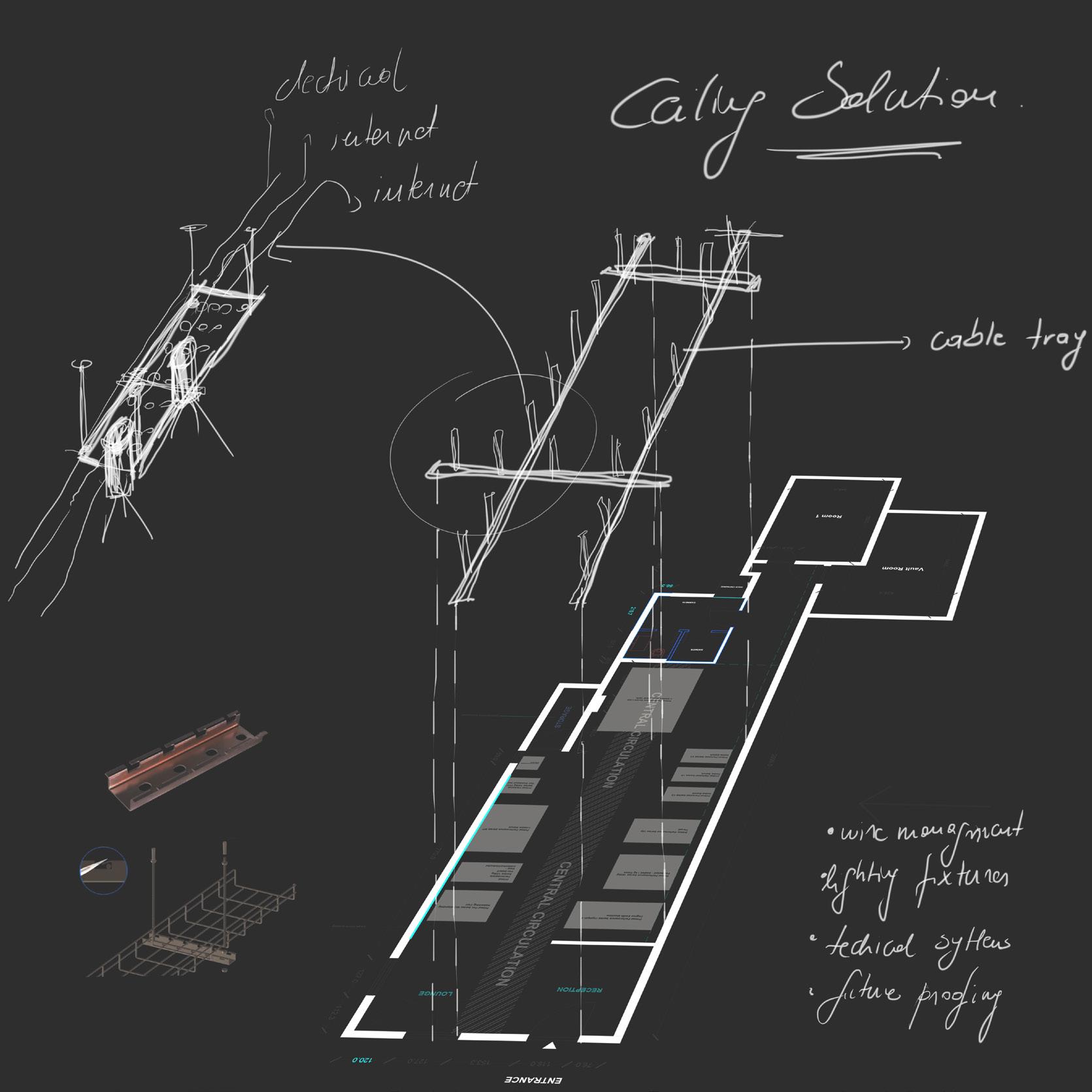
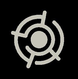
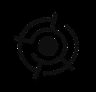
The Vault logo is built as a geometric system, with circles, anchor points, and technical lines inspired by vault mechanisms and architectural blueprints.
It symbolizes strength, precision, and transformation, bridging engineering logic with human resilience.
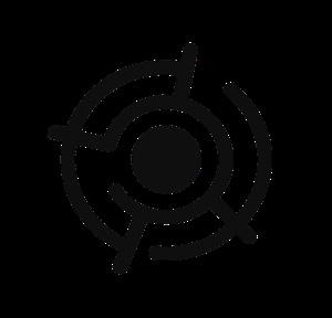


Central Circle (Core)
Radiating Segments (Distorted Bars)
In vaults, it’s the most protected part; in fitness, it’s the source of stability.
Their uneven weights reflect real-life training: the journey isn’t linear, it’s sculpted through challenge and effort.

Symmetry with Distortion Circular Geometry
A deliberate balance between control and chaos, exactly what training delivers: Strength through discipline, flexibility through resilience.
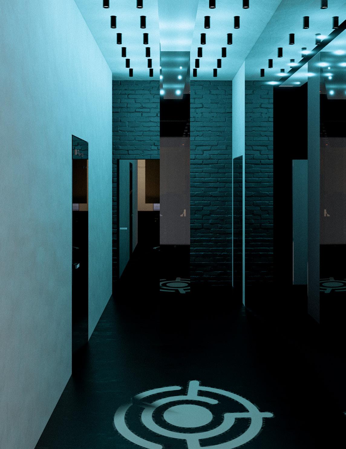
Resembles focus targets or tracking rings aligning with the idea of setting goals, improving, and tracking performance.
01 02 03 04