COLOR-CODE
COLOR-CODE
Annabella Pugliese BU MFA GD 2023
To Mom & Dad
INTERVIEW—Stephanie Specht 012 GRADIENT WEAVES 020 CONDITIONAL DESIGN WORKSHOP 054 RISOGRAPH STUDIES 096 INTERVIEW—Alex Luciano 106 FIFTY QUESTIONS 114 EXTREME SCALE 120 BOBA EXPERIMENTS 148 BEGINNER'S MIND 162 IMAGE ESSAY 186 INTERVIEW—Jerry-Lee Bosmans 200 PROCESS BOOK 204 PLACES: UTAH 216 CMYK CALENDAR 250 A 01 02 03 B 04 05 06 07 08 C 09 10 11 ABSTRACT 004 ESSAY 006 PART I: COLOR-CODE
PART II: MFA EXHIBITION
PART III: ARCHIVE
PROJECT INVENTORY EXHIBITION IDENTITY 266 HIDE SELF VIEW 278 REKLAME-ELZEVIR 298 OFFSET PRINTING 306 BEYOND SURFACE 314 ARTIST MONOGRAPH 320 TAXONOMY 348 INTERSECTIONALITY 350 FIFTY ITERATIONS 352 POSTER COLLECTION 356 TWO YEARS OF PHOTOS 360 ACKNOWLEDGMENTS 386
REFERENCES 384
Color-Code is an investigation into my design methodology as it relates to the interplay of systems and aesthetics, logic and intuition, and control and chance in my design process and final outputs. Coming from a background in fine art, I am naturally drawn to visual aesthetics and opportunities for creative freedom. My proclivity for logic and reason, however, led me to graphic design—a space where artistic expression meets objective communication. In my current design practice, I see this balance of seemingly contradictory forces as an interesting area for examination. How do objectivity, logic, and control work in tandem with subjectivity, intuition, and chance to create a successful design? Specifically, how do these elements find synergy in my work? I’ve found that I rely heavily on organization and order. Many of my projects involve working with data or distilling
COLOR-CODE 004
dense content into a logical system. I find great satisfaction in documenting, cataloging, and arranging information in a digestible manner. Patterns, geometry, and symmetry ground me. Experimentation in my work usually manifests in small degrees by way of form. Once I’ve made sense of the content and laid a systematic design foundation for myself, I’m able to test the limits of traditional design mediums through the unique application of color and creative yet deliberate treatments of the form. The result is highly analytical yet imbued with aesthetic value.
This body of work is an investigation into the ways I both embrace and challenge my reliance on order, logic, and control through design. Using this line of inquiry, I aim to explore the shifting balance of subjectivity and objectivity in my own work and in the broader realm of design.
ABSTRACT
005
BACKGROUND
LEFT BRAIN VS. RIGHT BRAIN
I first learned about the left versus right brain theory in elementary school. My fourth-grade teacher explained to the class that if you tend to be logical and orderly, your left hemisphere is dominant, whereas if you find yourself to be more creative and artistic, your right hemisphere is dominant. I remember examining the illustrated diagram of a brain projected on the board—the left half depicted in black and white with math equations, lab tubes, and interlocked gears; the right illuminated in bright color and surrounded by paintbrushes and musical instruments. Surely, I was right-brained. I loved art, music, and nearly anything that involved some form of creativity. I’d known this about myself my whole life. I was imaginative, emotional, and intuitive just like the diagram described. Right? Looking closer at the words on the left side—analysis, control, reason—I began to second-guess myself. I could easily identify with all of these traits as well.
While I’ve since learned that this dichotomous representation of the brain is oversimplified, the concept struck a chord with me as a young girl and still helps me conceptualize an innate duality within my character.1 On the one hand, I have a very active “right brain”. I appreciate art and aesthetics and have always found joy in expressing myself through visual mediums. On the other hand, I am fundamentally “left-brained”. I plan, organize, pay close attention to detail, and seek purpose in everything I do. When something doesn’t make sense or have a clear answer, I get frustrated. 2
For a long time, I doubted that these two very different aspects of my personality could work together harmoniously and often sensed that they were at odds with one another. I studied fine art as an undergraduate, and while I enjoyed my courses in drawing, painting, and photography, I had a nagging feeling that these fields weren’t quite right for me. I knew I was happiest when creating but felt limited by the controlling and rational attributes of my left brain. It wasn’t until I discovered graphic design that I realized my right and left brain could work together and not against one another.
INQUIRY YIN YANG (TAIJITU)
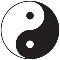
Yin Yang is a Chinese philosophical concept that describes the dualistic yet interdependent nature of all things in the universe. It is based on the idea that everything in existence is made up of two opposing yet complementary energies—yin and yang—which are not absolute but rather exist in a dynamic balance, interacting with and transforming into one another (Fig. 1).3 As someone who craves balance, yin yang is a key framework through which I examine and assess many areas of life.
COLOR-CODE 006
In the context of graphic design, I relate yin yang to the balance of artistic expression and objective communication. The ultimate goal of a graphic designer is to create a visually appealing form that serves a specific function. This requires a delicate blend of logic and intuition. In my current practice, I see this intersection of seemingly contradictory forces as an interesting area for examination. How do objectivity, logic, and control work in tandem with subjectivity, intuition, and chance to create a successful design?
Much like yin and yang, subjectivity and objectivity in design are not mutually exclusive, nor do they typically occur in a 50/50 proportion. Instead, they exist on a spectrum. The position at which a designer is situated on this spectrum determines their personal style. Over the last two years, I’ve grown increasingly curious as to how these divergent elements find synergy in my own work and in that of others.
METHODOLOGY COLOR-CODE
Color-Code is an investigation into my design methodology as it relates to the interplay of systems and aesthetics, logic and intuition, and control and chance in my design process and final outputs. Reflecting on my work over the last two years, I’ve found that I rely heavily on organization and order. Many of my projects involve working with data or distilling dense content into a logical system. I find great satisfaction in documenting, cataloging, and arranging information in a digestible manner. Patterns, geometry, and symmetry ground me.
Yet there is also an element of experimentation in my work that usually manifests by way of form. While I am driven by logic and reason, I am also determined to maintain a high degree of aesthetic value in the finished product. By applying vivid color and implementing small degrees of unexpectedness into traditional design forms, I can achieve this. My ultimate goal is to elevate the complex (and sometimes mundane) information I am naturally drawn to into something visually striking that my audience can appreciate. In the end, I hope my work can function as an informative piece of art that is as interesting to look at, as it is to decode.
A Note on the Title: A color-code is a set of numbers and letters used to represent a color in a way that a computer can interpret.4 In effect, a color-code translates a perceptual, abstract color into a logical set of values and ensures consistency in a design. Color-code, as a verb, means to assign specific colors to items, categories, or information in order to improve clarity and organization. Color-coding is an especially useful tool for graphic designers to communicate complex information in a simple yet visually appealing way.
007 ESSAY
For the purpose of this thesis, the term “color-code” is used as both a noun and a verb. It simultaneously represents my interest in the intersection of subjectivity and objectivity in graphic design as well as my tendency to organize and arrange dense information. (It also, of course, nods at my love of color.)
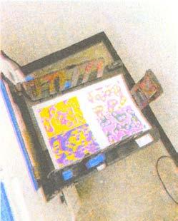
A Love Letter to the Risograph: Risograph printing plays a major role in my design process and style. Because I love using color, not just as a supplement design element but as the primary content and form of my work, I see the Risograph an exciting playground for experimentation with an array of vibrant hues. The production process also caters to my methodical way of thinking and making. I appreciate the underlying science involved in separating colors, creating masters, and finding the right ink densities. This systematic process, paired with the unpredictability of the final product’s imperfections, make it all the more appealing. Finally, I enjoy using the Risograph for projects that document personal experiences and memories, as it creates a unique, nostalgic charm that truly elevates the work.
1 Popular psychology has oversimplified the science behind brain lateralization, and functional differences between hemispheres are widely considered more absolute than is actually the case. See: Novotney, A. (2013, November 1). No such thing as ‘right-brained’ or ‘left-brained,’ new research finds. Monitor on Psychology, 44(10). American Psychological Association.
2 As a child, I experienced Symmetry OCD, a subtype of obsessive-compulsive disorder characterized by an intense fixation on the precise arrangement and placement of objects. I vividly recall rewriting words in my school notebooks until I achieved a sense of perfection. If I touched something with my right hand, I felt compelled to touch it precisely the same way with my left. I couldn’t fall asleep at night unless I had taken exactly seven sips of water from the faucet after brushing my teeth. Although I’ve outgrown this, I now experience occasional episodes of Rumination OCD, during which I think intensely about the complexities of the world in an attempt to make sense of it all.
3 Yin is typically associated with qualities such as darkness, coldness, passivity, femininity, and introspection, while yang is associated with light, warmth, activity, masculinity, and extroversion.
4 The three most common types of color codes are: RGB (Red Green Blue) codes used for screens; CMYK (Cyan Magenta Yellow Black) codes used for printing; and HEX (hexadecimal) codes used for web development.
COLOR-CODE 008
FIG 1: The concept of yin yang is commonly represented by a symbol known as Taijitu. It consists of two swirling teardrop shapes, one black and one white, that fit within each other to form a perfect circle. Each figure contains a part of the other so that there is a black dot in the white half of the circle and a white dot in the black portion. These seemingly opposing, but complementary halves make a whole and thus, are incomplete without each other.
009 ESSAY
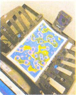
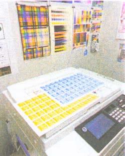
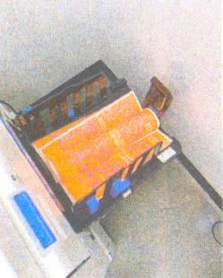
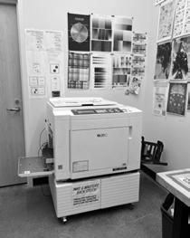
FIG 2: The MF9450 Risograph digital duplicator at Boston University.
PART I: Color-Code
03.15.2023 // 10:00 AM EST A
Stephanie Specht
AP As I mentioned in my email, I'm an MFA graphic design student in Boston, and my work has been influenced by the path that I took to get to graphic design. I come from a fine arts background, so I'm really interested in art, visual aesthetics, and creative freedom, but I also have a very logic-oriented side to me. I'm very organized, and I really like systems and working with constraints, patterns, and geometry. So I decided to pursue graphic design because it felt like the perfect combination of those two things, where I can use my artistic side and my logical side and essentially be creative with a clear purpose.
Now that I've been studying graphic design for a year and a half, almost two years, I've found that I'm still really interested in the intersection of subjectivity and objectivity that graphic design represents. How those two things kind of ebb and flow in my work is something I'm really interested in, as well as in other people's work. For my thesis, I'm more specifically exploring how my reliance on order, logic, and reason manifests itself in my design work, and then looking into the balance of systems and aesthetics, logic and intuition, and control and chance in graphic design.
So I was wondering if you have any initial thoughts about this topic, because when I was doing some research about you and looking at some of the interviews you've done, I learned that you started by studying architecture, and then eventually transitioned to graphic design because you weren't really into the mathematics side of architecture.
SS So, I didn't go exactly that way. I wanted to study architecture, so I went to an art school for high school where you could choose a concentration that was in line with graphic design (but wasn’t exactly graphic design yet because you’re still a teenager) or a concentration in line with architecture. I was studying the architectural route to become an architect later. It was like art school preparation for going to study at an academy or a university. I loved the architectural courses, the model-making, the visual side, and the 3D aspects, but my mathematics skills were super, super bad.
I think my teachers were a bit conservative, maybe, and thought that I couldn't become an architect if I wasn't good at math.
In a way, I agree, but sometimes I wonder what would have happened if they had helped or pushed me more. So, I never followed an official course in architecture after high school.
AP I see. My dad's an architect, so I have a little bit of exposure to it. After I graduated from college, I was thinking about where I wanted to go, because I didn't really think fine art was the place for me. I guess I had this impression that architecture was a little too rigid and math-based, and I didn't know if that was for me. So I thought graphic design was more on track. I'm also not good with 3D, only 2D.
I read in your bio that freedom is really important to you and that you like to work intuitively. I think that definitely comes across in the stuff I've seen in your portfolio, but at the same time, everything is very intentional and controlled. So I was wondering if you could talk more about your process and how you find balance in your work in terms of creatively expressing yourself while still maintaining a clear message. How do you balance freedom and meeting the goals of an assignment or client project?
SS For me, every design starts with looking for typography that I feel suits the project. And I try to go in all directions. So, I push myself to look for something that is edgy, but I also try to find something that I know the client will like, so I can show different routes. Typography is my main base. Sometimes I have a visual idea in my head that I want to approach or try to make, and then I look for a typeface that fits that. Other times, I just let typography inspire me, and I search for a typeface that clicks with me. So, you could call it an intuitive process.
Once I have the typeface, the process becomes more mathematical. I have to consider things like how much text I need to include and what proportions I want to maintain. It's like a puzzle, and I play around with the design, making about 20 variations of the same thing and saving everything. There's a crossover between intuition and logic. Sometimes I have a calculated idea in my head, and I follow certain rules to put the design together. But then I’ll realize that something needs to be different, so I try to break the rules and experiment with hierarchy or size to make the design stand out. It's always about using the left and right brain.
013 INTERVIEW—STEPHANIE SPECHT
AP That’s really interesting. It sounds like typography is the foundation for you, or what keeps you on track. And then you have rules, but you can still tweak them and not exactly follow them.
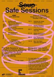
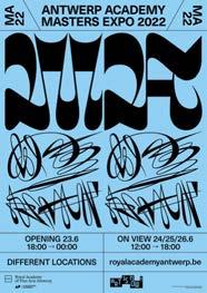
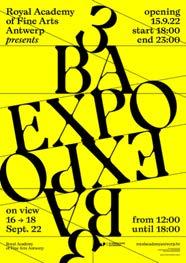
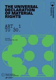
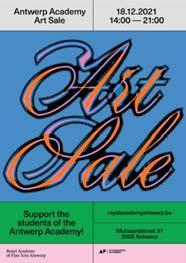
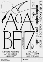
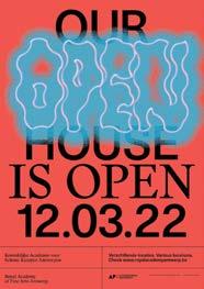
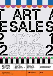
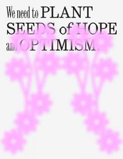
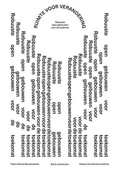
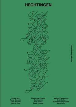
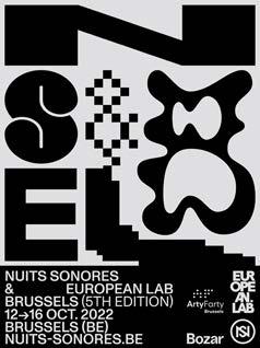
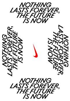
SS There are certain projects where I have more time to do research and come up with an idea or concept, but then there are others where I have to work at a really fast pace and there's not a lot of time to come up with a concept. The posters I do for the Royal Academy of Fine Arts, for example, happen at such a high tempo it’s unbelievable.1 For those, it's really important for me to use type to grab people's attention and create a certain feeling, rather than come up with a specific concept (Fig. 1).
AP I saw the Royal Academy posters on your website, and they're really cool. It seems like you have a system that you iterate on. They all have a similar structure to them.
SS True. It’s interesting that you mention it because a couple of years ago, the school had an agency create an identity for them, and then a year later, when I came into the picture, they asked me to make their identity more lively. I ended up stripping down a lot of the stuff that was designed for the identity because I felt that the school is always growing and evolving, and it shouldn't be pinned down to one rigid structure. We should be able to reinvent ourselves all the time. So the only given element for the posters and communication is just a small band with the name of the school in a certain typeface. For the rest, there is no fixed typography because I felt that it would constrain us too much.
AP You were talking about quick turnaround times and how the concept development phase can be compressed sometimes. But I also read in a previous interview you did that this phase is actually your favorite part of the design process because that's when you have the most freedom. I was wondering if you could talk a little more about that, because for me, it's often the most stressful part of the design process. I get a little overwhelmed by the endless possibilities, especially in school when the
client is basically myself. I find that trying to come up with ideas can lead to analysis paralysis and feeling stuck. Do you have any advice on how to leverage all that freedom at the beginning and make the best use of it without getting overwhelmed? How do you end up finding a direction for your projects? I know you talked a bit about this before, but maybe you can elaborate.
SS That's really difficult. Personally, for me, it varies from project to project. It’s probably the same for you. Not every project is the same, and sometimes you have a lot of ideas, and sometimes you don't. When you don't, it's easier because then you can focus on one thing. When I have a lot of ideas, I create a folder for the project. Within that folder, I create subfolders (Idea 1, Idea 2, etc.) and put my inspiration there. It can be typography, colors, furniture, architecture, clothing, fabric, anything that can be part of a mood board. I don't use online places like Pinterest or Miro. 2 I prefer to keep everything separately on my computer. Then, I open my notes and write about my idea, just keywords or a couple of sentences. I put that in the folder as well. Hopefully, I'll have around three or four folders.
Then, I start sketching for every idea that I have very loosely. For each idea, I spend one day and give myself complete freedom to do whatever I feel like doing. After working the same amount on every idea for the same amount of time, it sometimes becomes super clear which idea is working the best. If I come really far with one idea, it’s a sign that it really works. If I have to work really hard to get an idea across, even for myself to see, then most of the time, it's a sign that it's not working. If you feel resistance when you're working or stuff isn't going smoothly, that's really a sign that I take seriously. If you have four ideas and work on each for one hour, for sure, there will be one idea that you feel like, 'Oh my god, in one hour, I got all of this.' That's the sign. I think that is the point when you feel like, 'Okay, this is how I need to continue.'
AP It's interesting because even in that process where you have so much freedom, you're very organized about it. Your model is good
014 COLOR-CODE
2 An online collaboration platform designed to facilitate remote and distributed team communication and project management.
1 Stephanie graduated from the Royal Academy for Fine Arts in Antwerp in 2004 and now creates all visual communication for the institution.
to know because I'm so new to design, and I'm still figuring out my workflow and process. I often have a ton of tiny ideas, and I don't spend enough time fleshing them out in the sketch phase. I just pick a direction and go full into it without doing tests for several ideas, if that makes sense. I think that also has to do with the turnaround times for our projects; I have to pick something and go. But I feel like I spend too much time researching and coming up with tiny ideas instead of doing tests on multiple ideas. It's nice to hear about other designers' processes. My next question is, what is your favorite design medium or area of design?
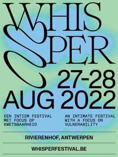
SS I can't really answer that, because if I do too many posters, I start to get bored and want to do a book or an identity. And if I do too many identities, I want to do a poster. I really need that variation. It's because often, while working on a poster, I get ideas for something else and write them down or take a screenshot. But one thing can’t go without another, basically. I think it's super enriching to do a little bit of everything (Fig. 2).
AP I guess that's where it's nice to have your own studio because you can do a little bit of everything.3 But you mostly stay within printed mediums, right?
SS I sometimes do consulting for web design, but I prefer to leave that to web designers. For me, designing a website requires a different way of thinking. But I will say that in the last couple of years, maybe like six years, people are not that happy to have stuff printed out anymore. They think that everything can live online, and we can communicate everything online, which is true. But I think the emphasis or the impact of a physical poster is still significant. Not everyone is constantly on their phone or looking to get that kind of information. I think it's important that when people walk down the street they see posters.
AP I definitely gravitate towards printed mediums as well, particularly book design. I feel that with book design, you need to have the book in front of you or it’s really not the same experience.
My next question is about collaboration. As I mentioned earlier, my thesis is about control, so I find it difficult to collaborate with people sometimes because I like to be in charge of every step along the way. However, I obviously recognize the value of having input and perspectives from others. This semester, I've been challenging myself to work with more of my classmates and professors. So I was wondering, what is your experience with collaborating with others? Do you enjoy it? Do you think it benefits you as a designer? And what do you look for in a collaborator?
SS I used to have interns, but I don't anymore because it's difficult with the type of work I'm doing now. But when I had an intern, it was always a collaboration, and they would never work alone on something. What I loved the most was that we worked together on ideas at the same time without putting restraints on each other. It would be like, "Okay, this is the project, and we're going to spend two days doing whatever we feel is good. After two days, we’ll put everything we learned together and see what the strong points are.” Sometimes it became a mix of something from myself and something from the other person, and then we each worked on that separately. I found it very interesting and inspiring. I think I would benefit the most out of it when there was also a lot of time. But I think it's special when two people come together to create one design that has elements from both people.
Right now, I'm collaborating with another designer on a large book, over 400 pages, and we're almost finished with the page design phase. It's a ping-pong effect where I create some elements, she creates some elements, and we see what's strong and put things together or take them apart. It’s time-consuming, but the results can be super strong. But like you said, it's also about trusting the other person and letting go of control.
AP I’m currently on a team with another student in my class, and we’re working together on the MFA exhibition identity. I feel like this is the first time I have worked closely with a classmate. We’re sharing all the work and doing everything together,
015 INTERVIEW—STEPHANIE SPECHT
3 Specht Studio. Stephanie's has been working as an independent graphic designer since 2006.
and I’ve found that what we’ve been producing is much stronger than anything we could have created individually. It's been a really cool experience for me, and I’ve learned so much.
What is a piece of advice you would give to your former self, maybe when you were starting out in graphic design or when you were starting your own studio?
SS Oh, that’s an important one. Don't show all your work all at once on your website. When I started out and became self-employed, I said yes to anything that came my way, even when I felt like it wasn't really my thing. But I was really afraid of not having an income, so I was only focused on getting work, and it generated a lot of stress. I mean, I think everyone starting out needs to find a balance in that. But my biggest mistake was putting everything on my website, even if I felt like I only liked 50% of the project. It just generated more of these projects that I didn’t like. It took me years to realize that I shouldn't show work that I didn't like working on or where the relationship with the client was really bad because it shows in the energy of your work. It’s something people feel when they go to your website.
So, for a really long time maybe half of the projects on my website were ones that I did because I needed income. Maybe I liked the client, but I didn’t like the project. Or I liked the project, but the client was really difficult. Bad energy projects. And I just kept getting more of them. I think it was only in 2013 that I decided to show stuff on my website that I was 100 percent happy with. I didn’t have many at the time, so I added self-initiated work in between. Then when people went to my website they would see what I really love doing. And that was the best thing I’ve ever done. If I had made that decision earlier, my life would have been a lot easier as a designer.
AP That's good to know because I’ll be working on my portfolio and applying to jobs. Only showing the work that I enjoyed doing will help me avoid being in a position where I have to work on something that I don't actually love. That's good advice.
SS It's stronger if you put three projects on your website that you really enjoyed doing and felt that you nailed, whether they were for school or a client. Then you can also include some self-initiated work, even if it's small, to show people visiting your website what your universe is and what you like to do.
AP Quality over quantity.
SS Totally.
AP I have a couple quick questions to wrap it up. What are your favorite typefaces right now?
SS That’s hard. Last year, my intern introduced me to Tartuffo from Lift Type.4 It has the most beautiful ligatures. It’s a very in-your-face, high contrast typeface, and I was looking for a project to use it on. It reminds me of music, culture, and theater. So, I used it for the first time today and I'm really happy with it. I can’t say it's my favorite, but I'm really drawn to it and find it very interesting. Another one that I love and have used a bit too much by now is Romie from Margot Lévêque. 5
AP That one's beautiful.
SS It's so beautiful that it's been overused, so I need to stop. But it's always in my head, like, “Should I use it if it suits the project? Or should I stop using it?” But yeah, there are so many interesting typefaces out there. I think my favorite sans type is Monument from Dinamo.6,7 I use it a lot. It's timeless.
AP Do you do any type design? Or custom type?
SS No. Sometimes for logos, I dare to tweak the type a little bit, but I prefer to leave it to the real type designers. It's been on my mind for a while to study typography, but then I think, “There are already so many type designers out there, I shouldn't add anything else to my plate.”
AP Yeah, I'm taking a type design class with Christopher Sleboda right now, and I'm realizing how difficult it is. We're working on one typeface for the whole semester, and I don't think I'll be anywhere close to finished by the end of the semester. There are so many
016 COLOR-CODE
4 Independent type foundry based in Montpellier, France.
5 Calligraphy-inspired display font designed by Margot Lévêque Type Foundry.
6 Grotesk typeface featuring "honest, unrefined, and idiosyncratic shapes." Offered in seven weights.
7 Swiss type design agency offering retail and bespoke typefaces, design software, research, and consultancy.
details to work out and so many iterations to go through. It's a real challenge.
SS Yes, it sometimes takes years.
AP But it’s good to know the terminology and the science behind it. Do you have any other design resources you’d be willing to share? Anything you’re currently reading?
SS W hen I want to be inspired, I often don't look at graphic design books. I try to look into stuff that is not graphic design, like architecture. I have a book on the visual history of beehives. It’s a really tiny, thick book. For me, what's interesting is the non-design part because it's really a bunch of scanned images related to beehives. On every page, there's also a little bit of text from the source material from which the image was taken. So, they didn’t crop the images. They just saw an article with a photograph of a beehive, scanned or photographed it, and put it in the book. This, to me, is super interesting. Flipping through, I get ideas for layouts for posters and whatnot because of the kind of intentional randomness. Another thing that's really interesting is that it's a book about one thing, but everything looks different. So, it’s always refreshing because there are so many different variations on one element. If I'm stuck with a job, then I sometimes look in this book, and it helps me to see different options.
AP That’s great. I’ll have to check it out.
017 INTERVIEW—STEPHANIE SPECHT
8 HIVES: A Visual History of the Beehive, 2020. Designed by Nicholas Polli for Apian. An ongoing research by Aladin Borioli exploring the interspecies relationship between humans and bees. Published by RVB Books.
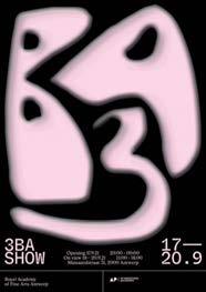
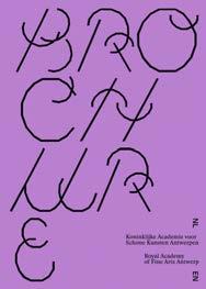
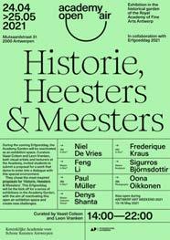
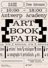
018 COLOR-CODE
FIG. 1: Posters for Royal Academy of Fine Arts Antwerp designed by Stephanie Specht.
019 INTERVIEW—STEPHANIE SPECHT
FIG 2: Miscellaneous work from Specht Studio.
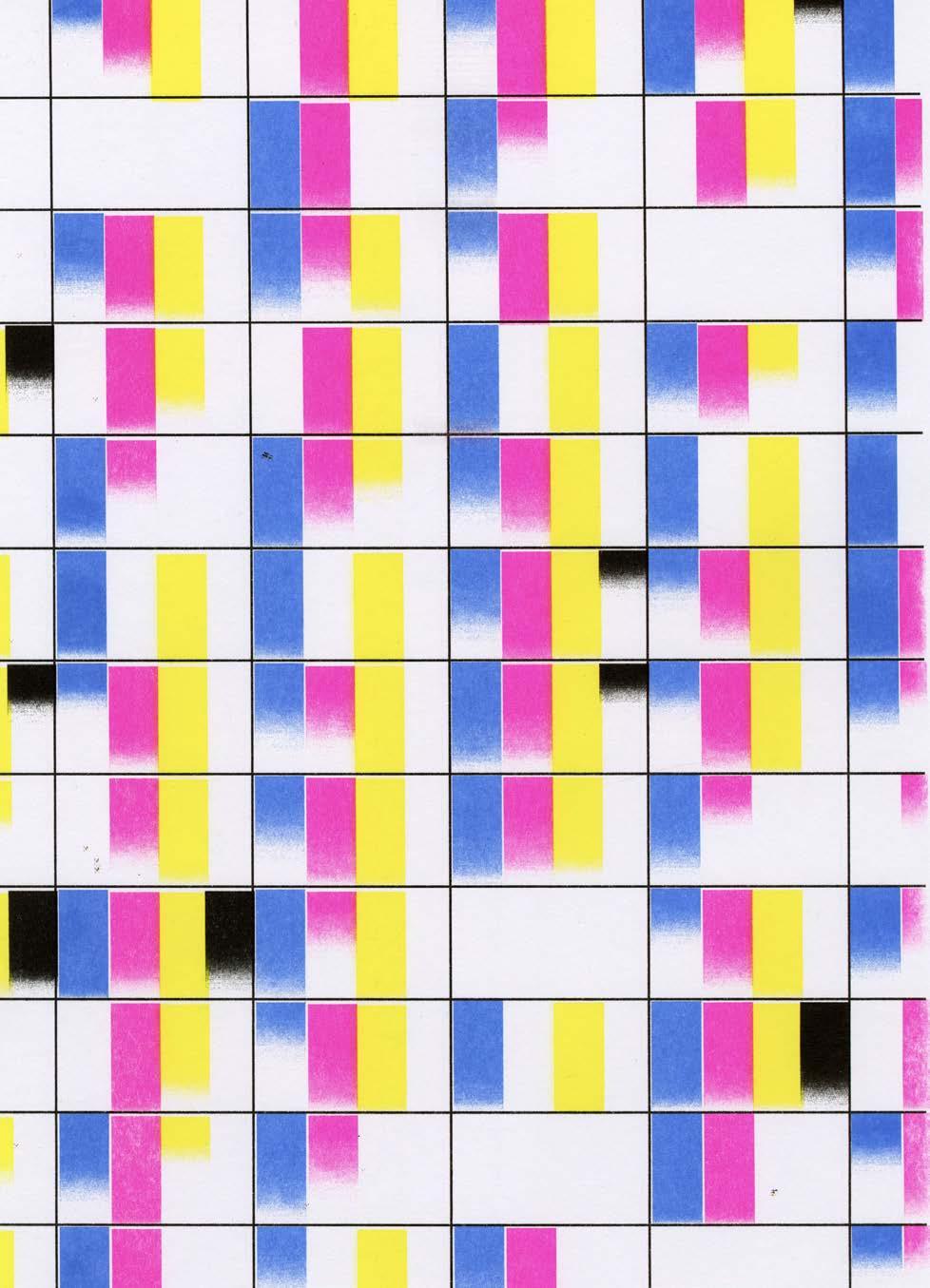
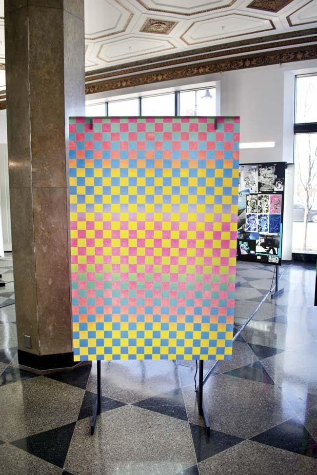
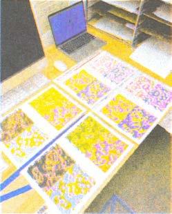
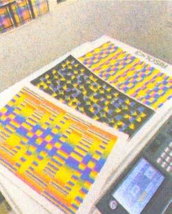
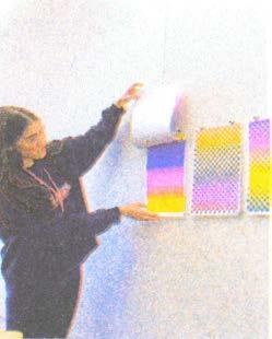
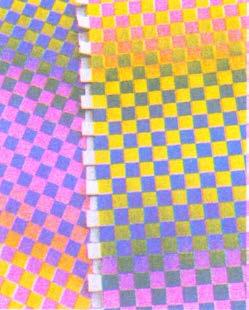
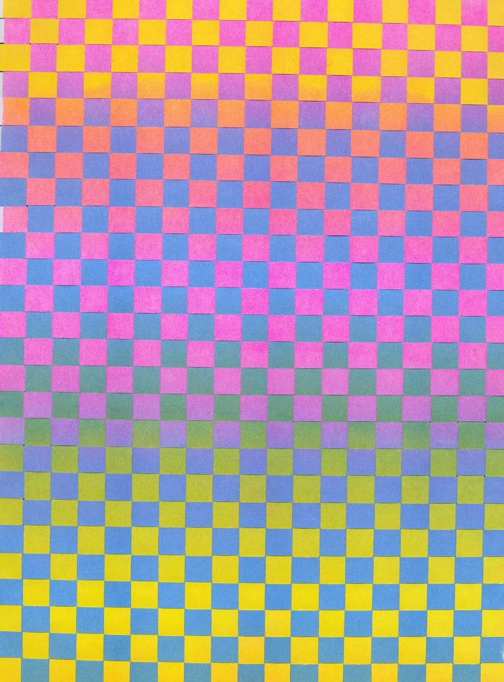
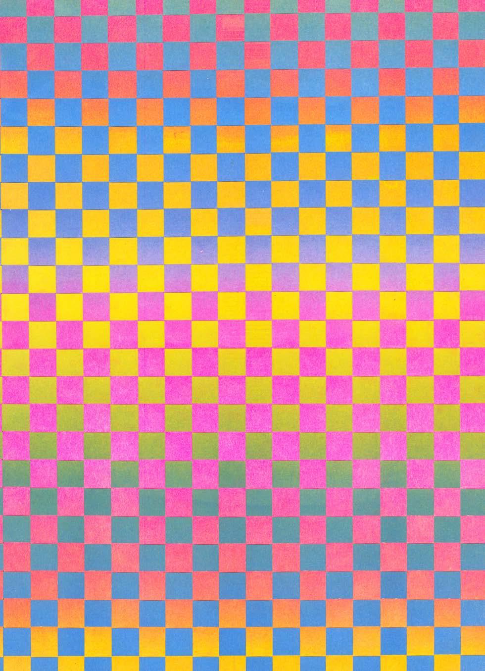
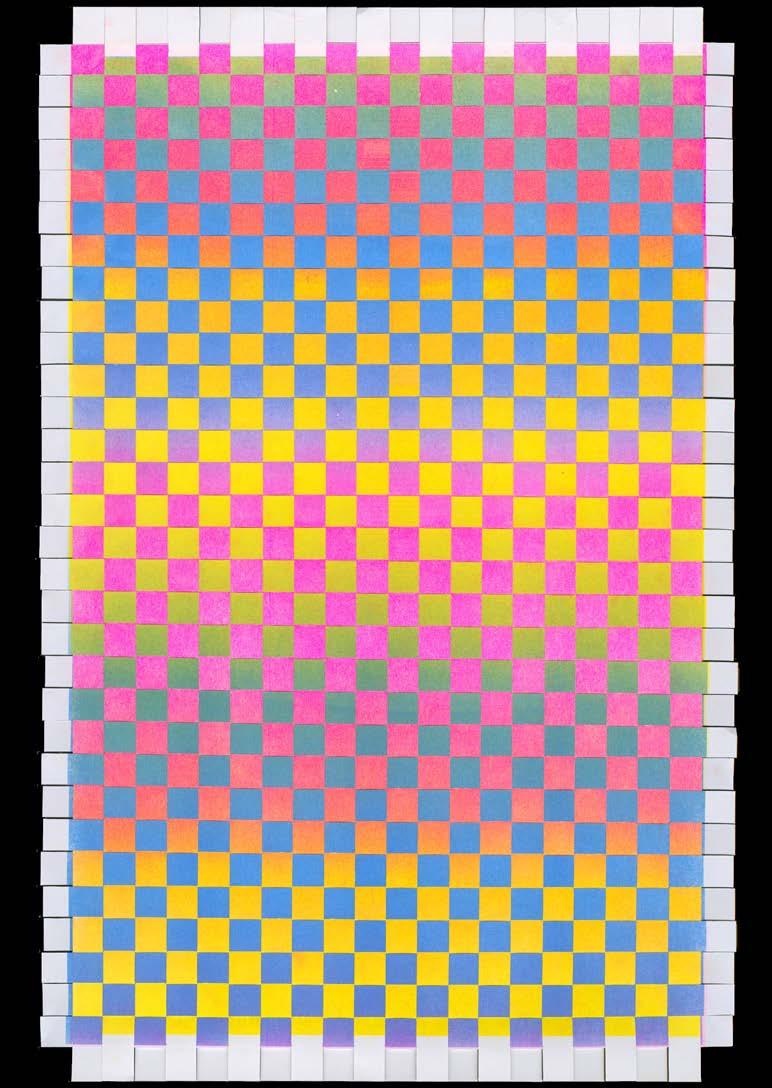
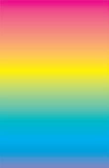
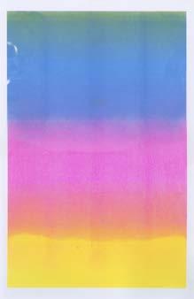
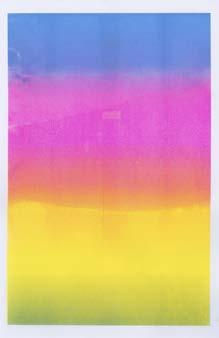
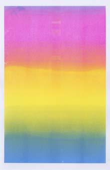
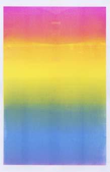
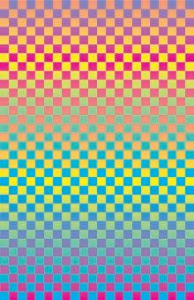
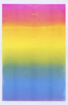
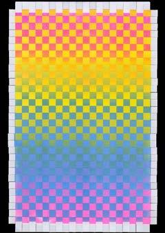
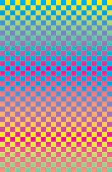
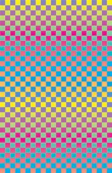
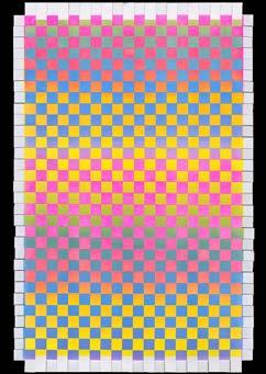
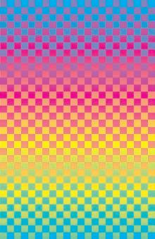
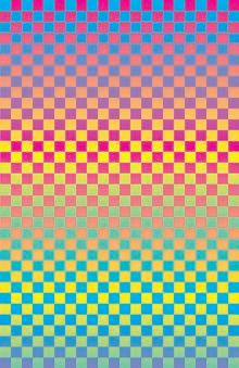
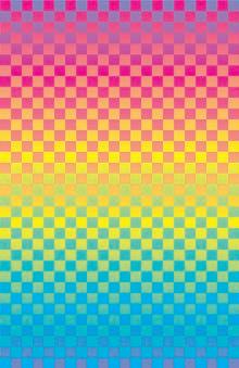
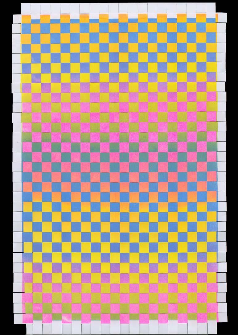
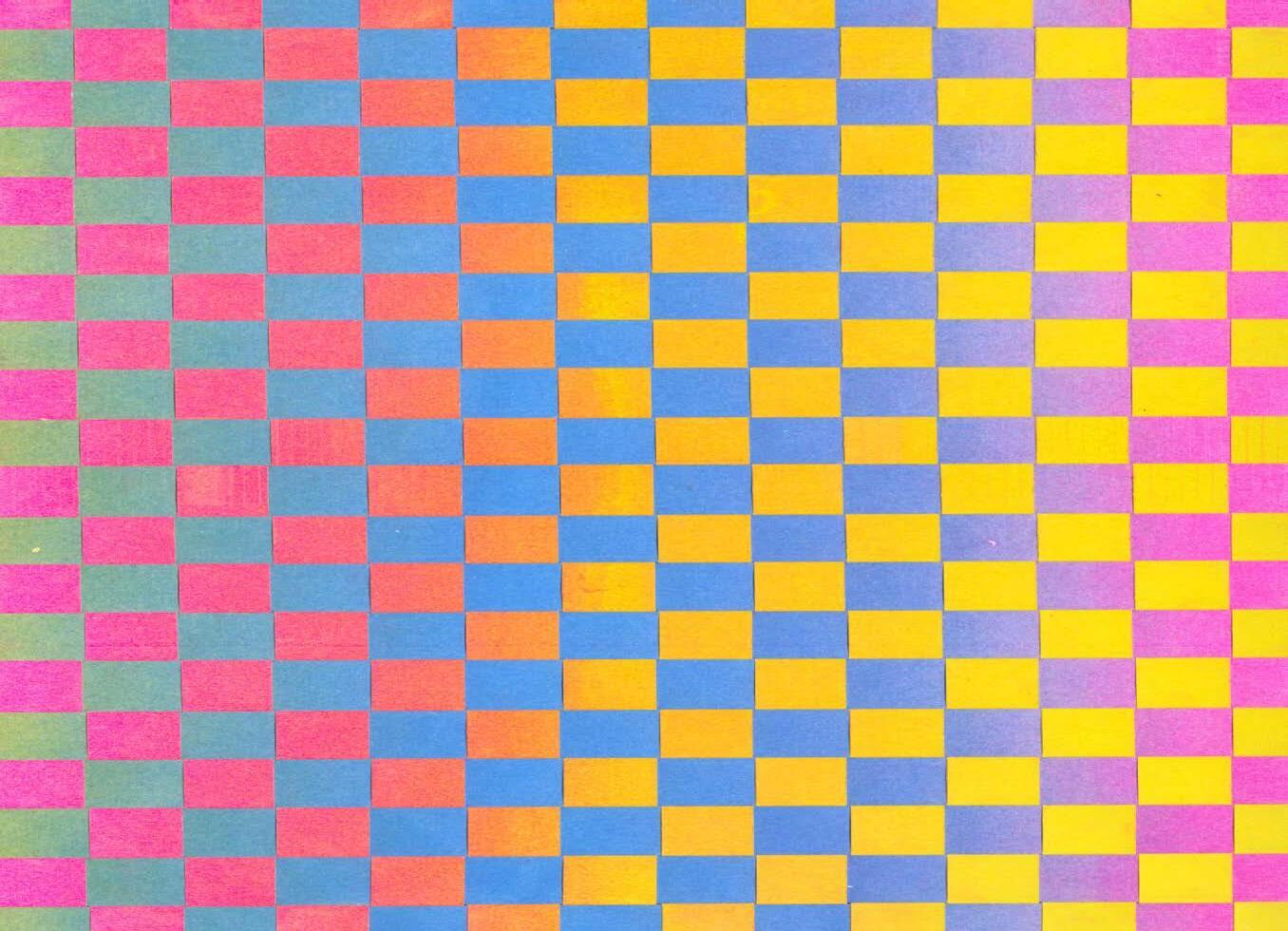
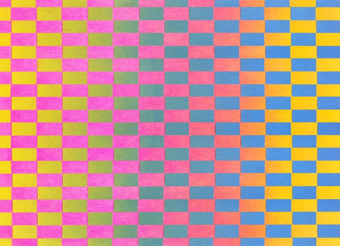
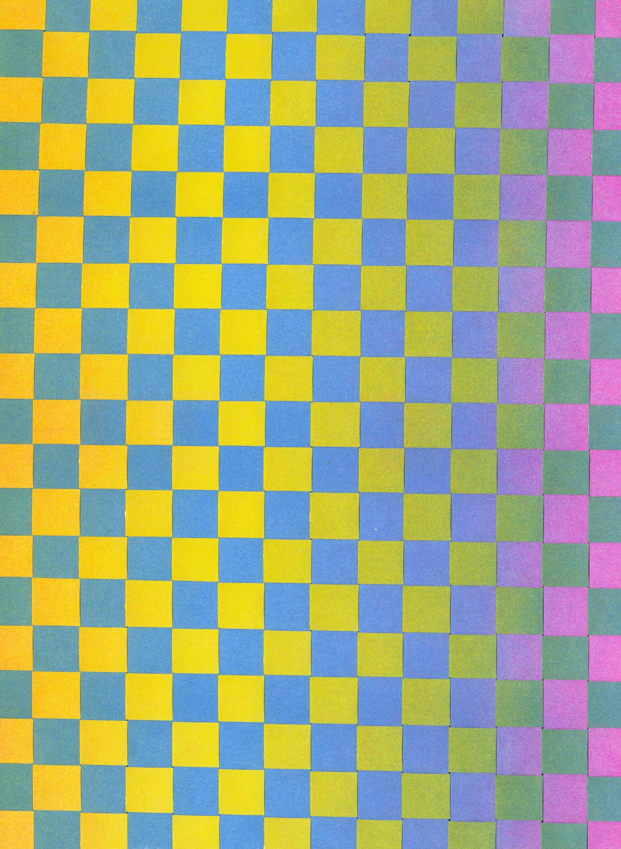
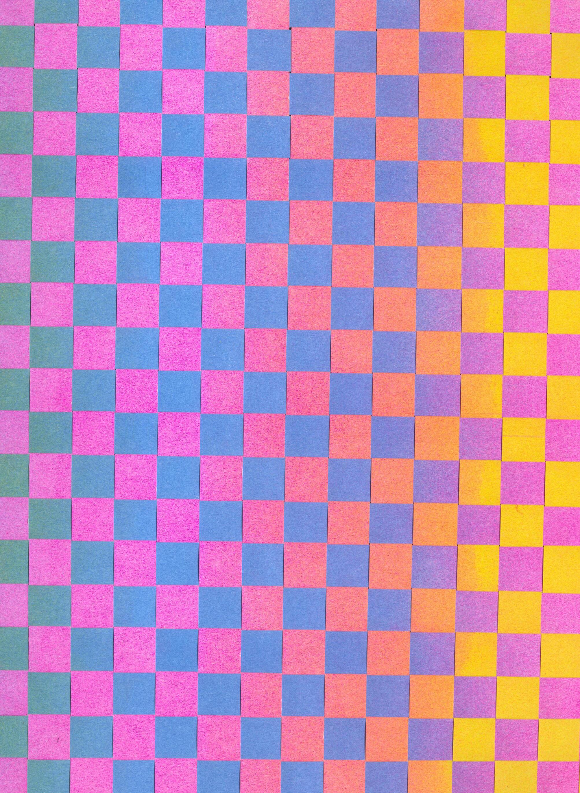
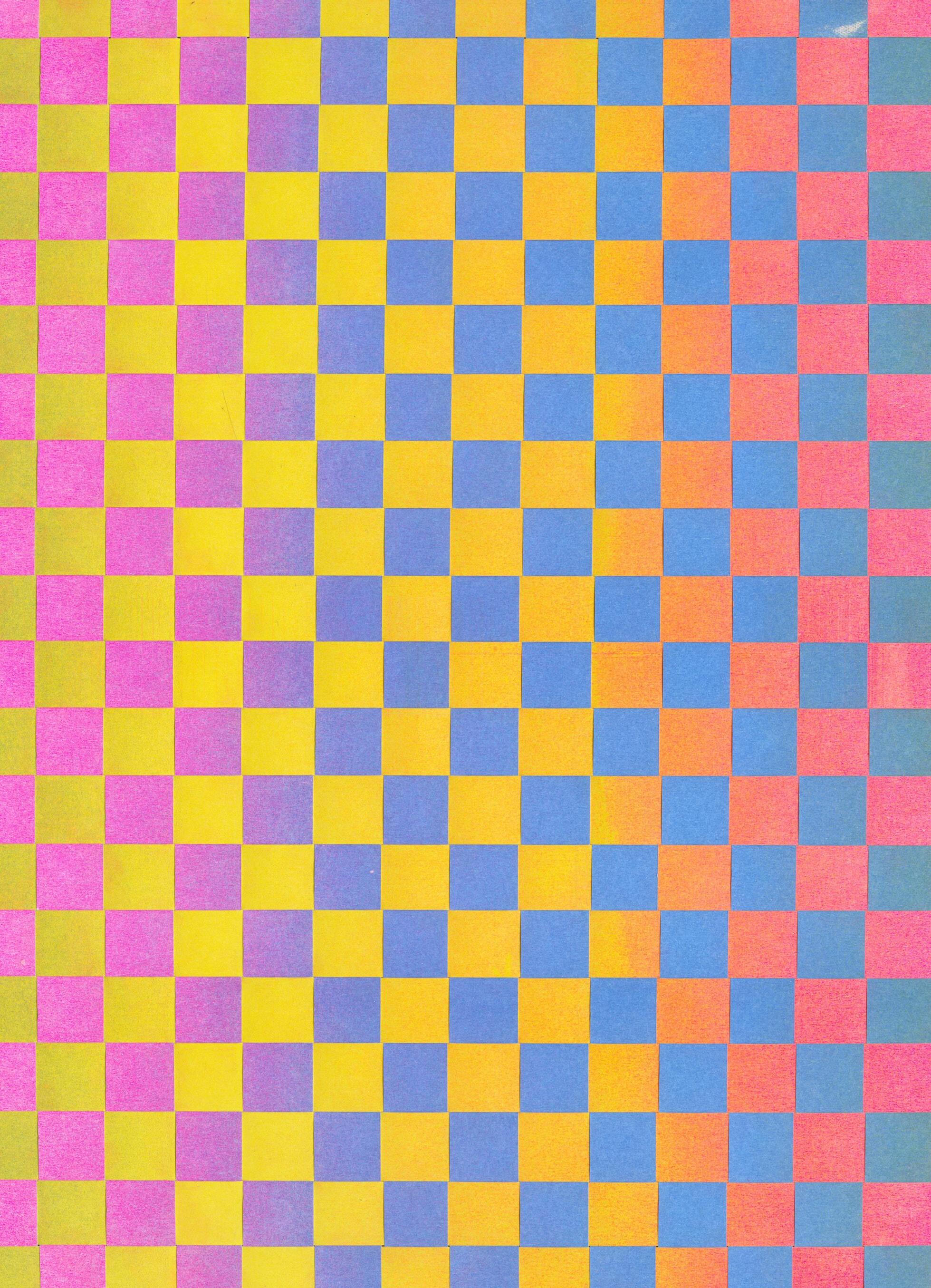
I’m infinitely curious about the ways colors can layer and interact with one another. To explore this concept further, I experimented with six different gradients printed on the Risograph using cornflower blue, fluorescent pink, and yellow. By weaving two of these gradients together, I was able to recontextualize them and observe the dynamic interaction of color that resulted. In total, I completed fifteen weaves to account for every possible combination of the six gradients, resulting in a rich exploration of color and form.
020 COLOR-CODE
#SP2023 01
GRADIENT WEAVES
GRADIENT WEAVES
021
CF, 2023. Woven Risograph prints, 11 × 17 in.
Digital gradients, each 11 × 17 in.
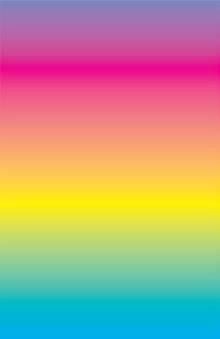
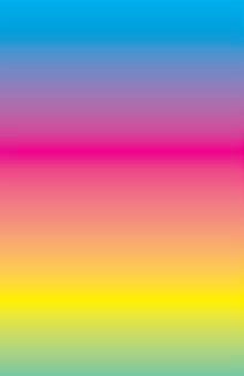
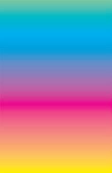
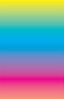
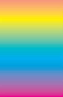
Risograph gradients, each 11 × 17 in.
PG 024–033: Gradient combinations; digital (L) & Risograph (R).
COLOR-CODE 022
A
B C D E F


GRADIENT WEAVES
023
A B C D E F


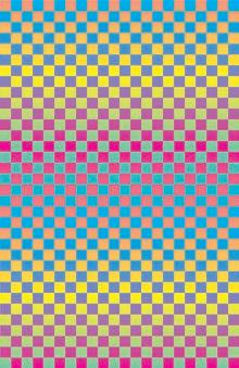
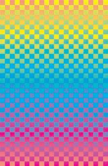
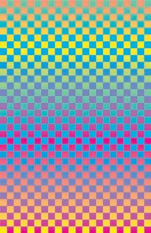
A B AB A C AC A D AD COLOR-CODE 024


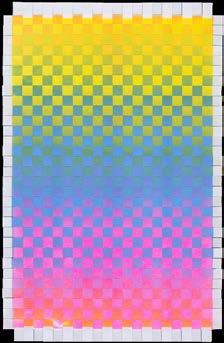

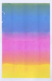
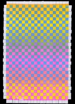


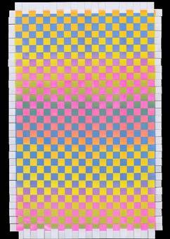
GRADIENT WEAVES
A B AB A
AC A D AD 025
C




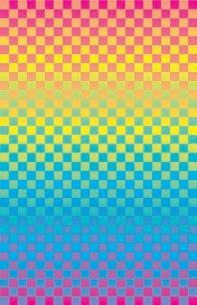


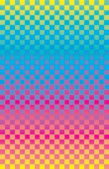
A E AE A F AF B C BC COLOR-CODE 026

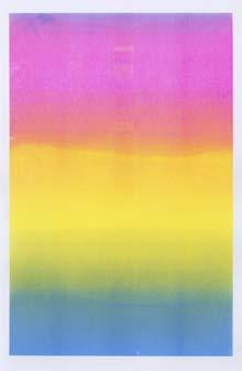
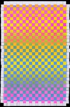



GRADIENT WEAVES
E AE
027
A
A F AF B C BC






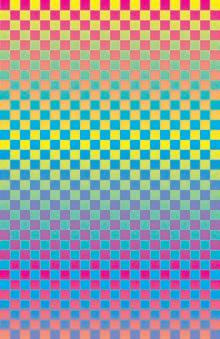
B D BD B E BE B F BF COLOR-CODE 028


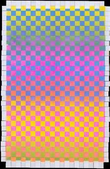


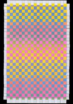


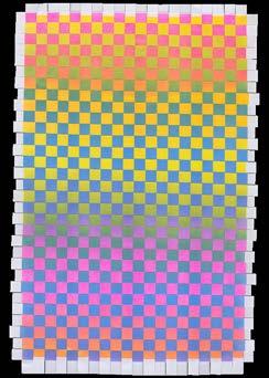
GRADIENT WEAVES
B
BF 029
B D BD B E BE
F


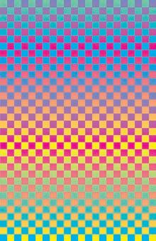


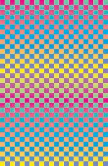
C D CD C E CE C F CF COLOR-CODE 030


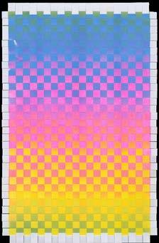


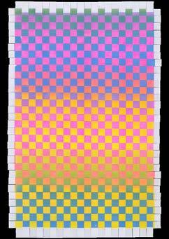


GRADIENT WEAVES
C D CD
CF 031
C E CE C F






D E DE D F DF E F EF COLOR-CODE 032


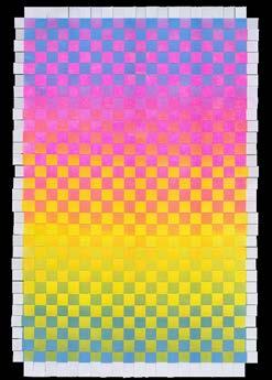


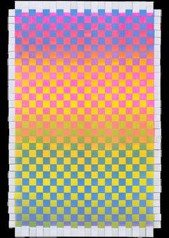


GRADIENT WEAVES D E DE D F DF E F EF 033
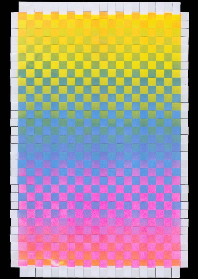
AB COLOR-CODE 034
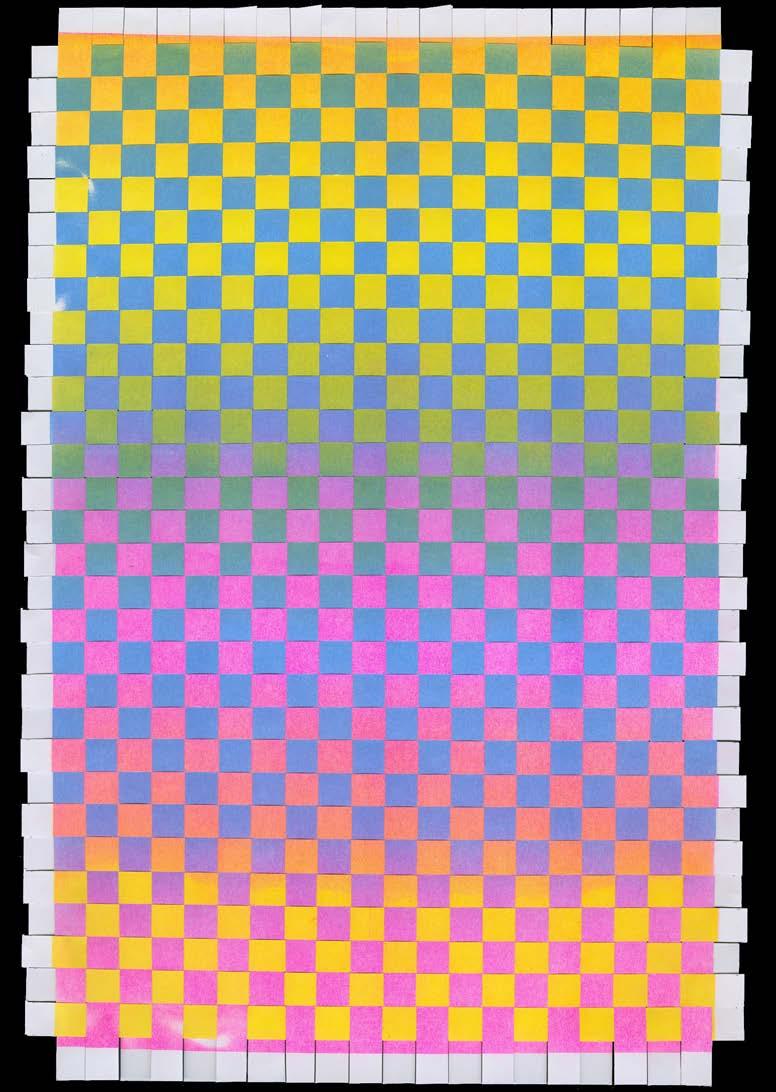
GRADIENT WEAVES AC 035
AD COLOR-CODE 036
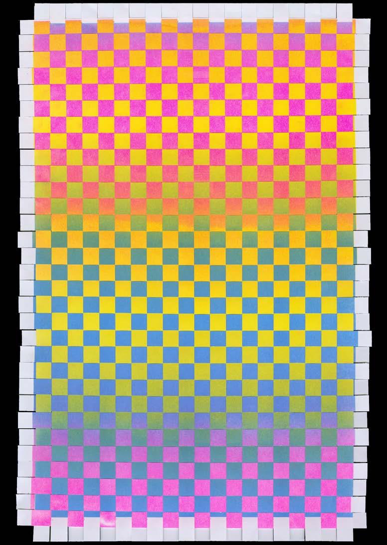
GRADIENT WEAVES AE 037

AF COLOR-CODE 038
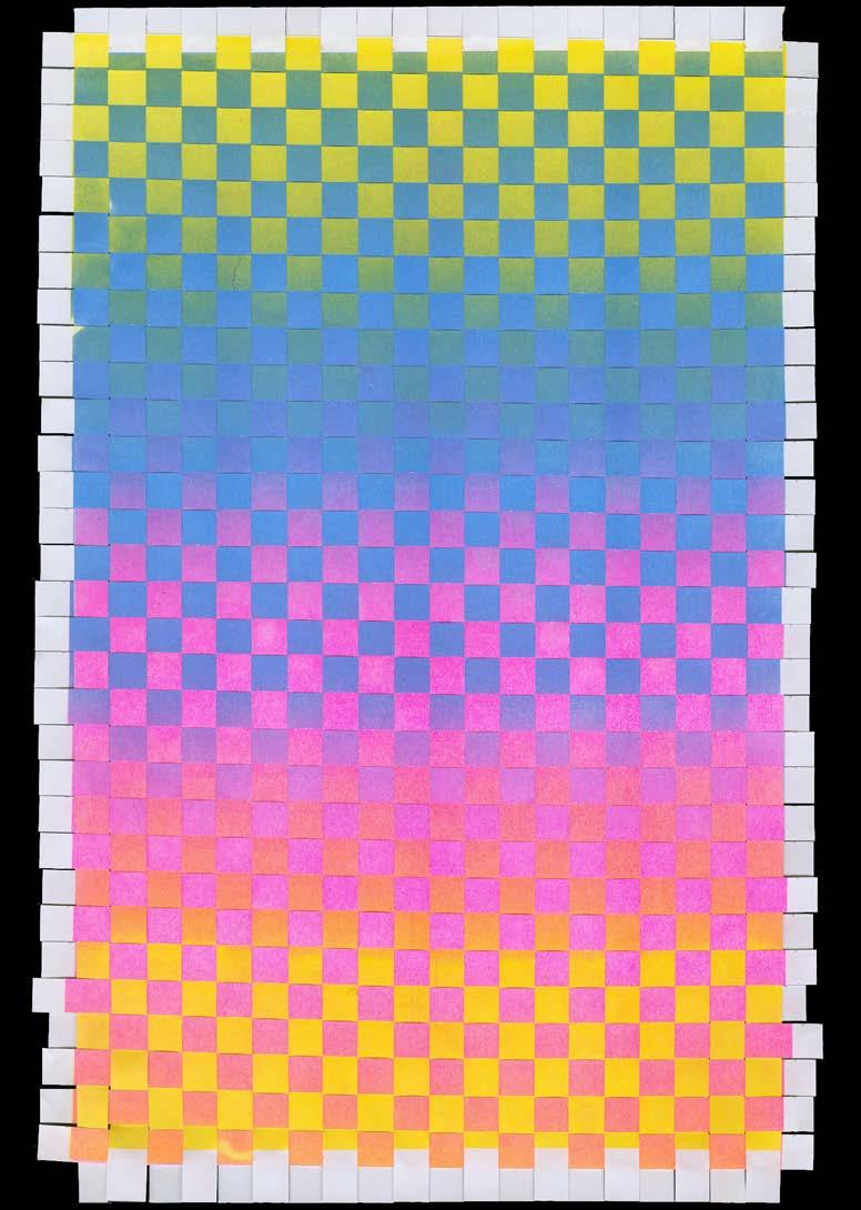
GRADIENT WEAVES BC 039
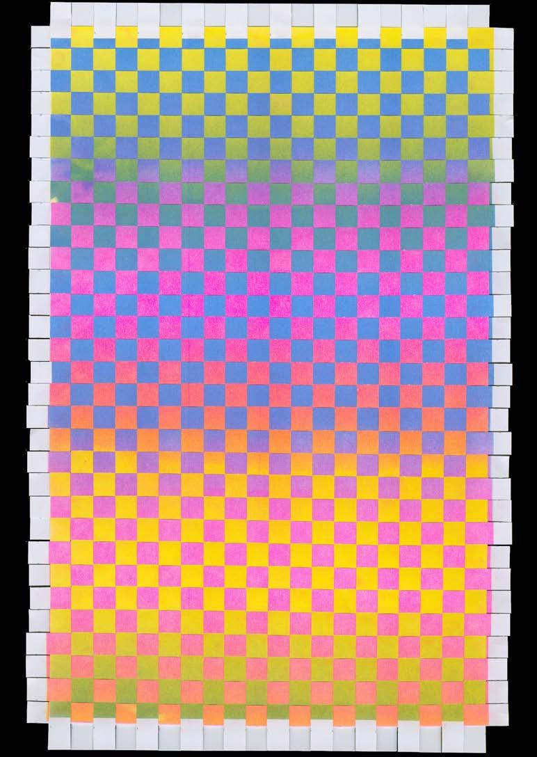
BD COLOR-CODE 040
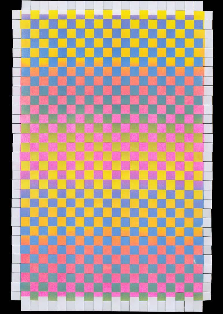
GRADIENT WEAVES BE 041
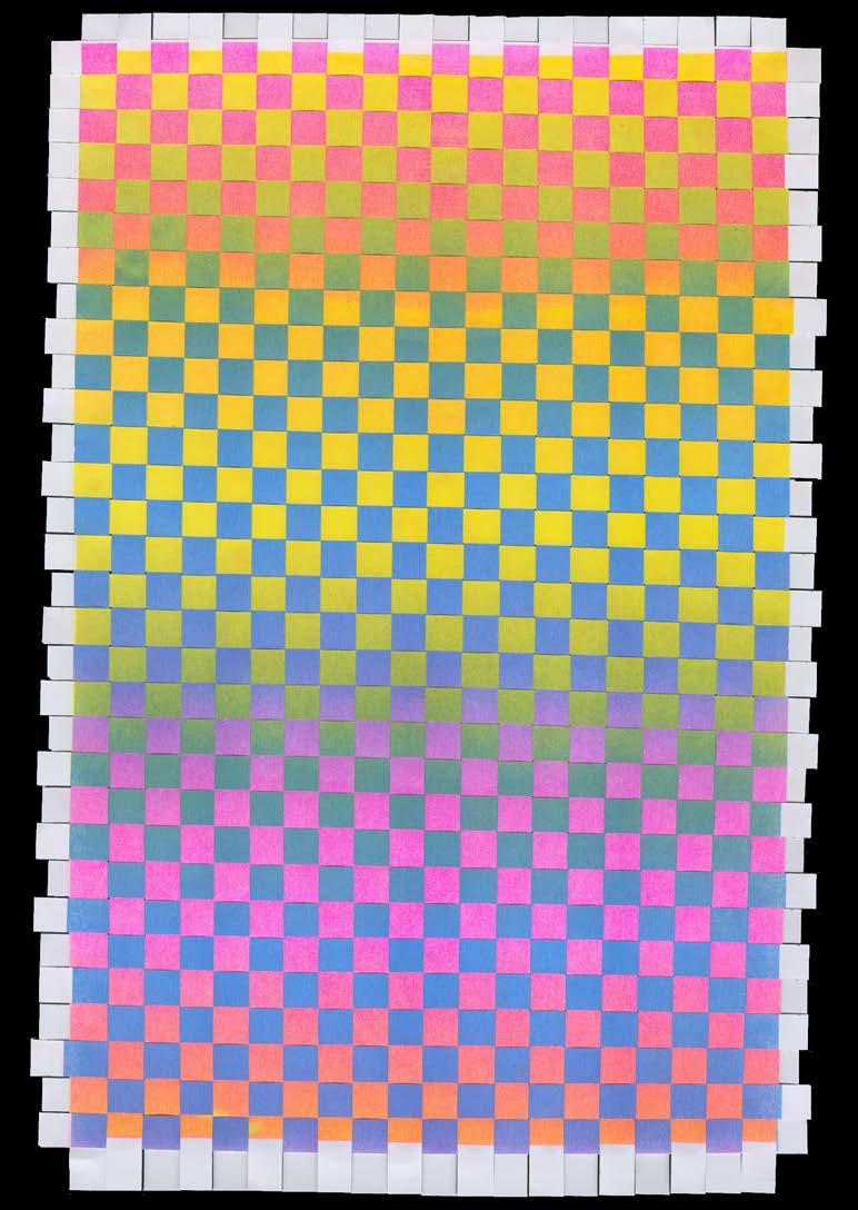
BF COLOR-CODE 042
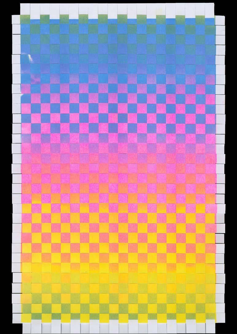
GRADIENT WEAVES CD 043

CE COLOR-CODE 044
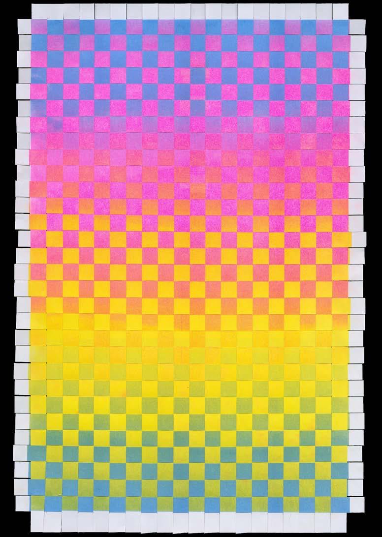
GRADIENT WEAVES DE 045
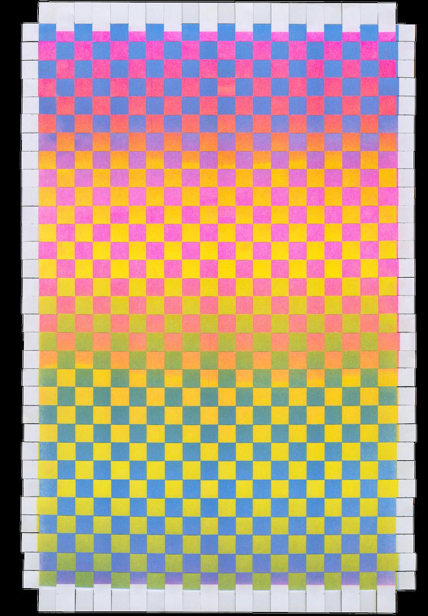
DF COLOR-CODE 046
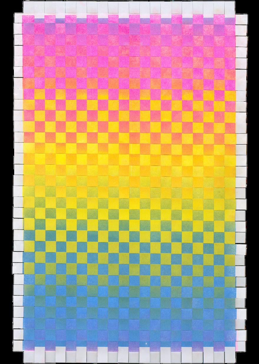
GRADIENT WEAVES EF 047

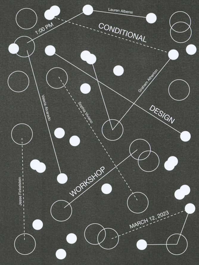
CONDITIONAL DESIGN WORKSHOP
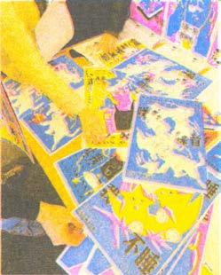
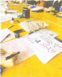
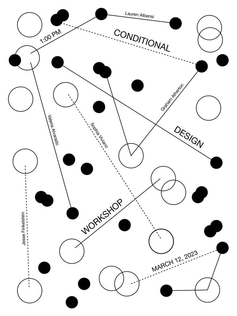
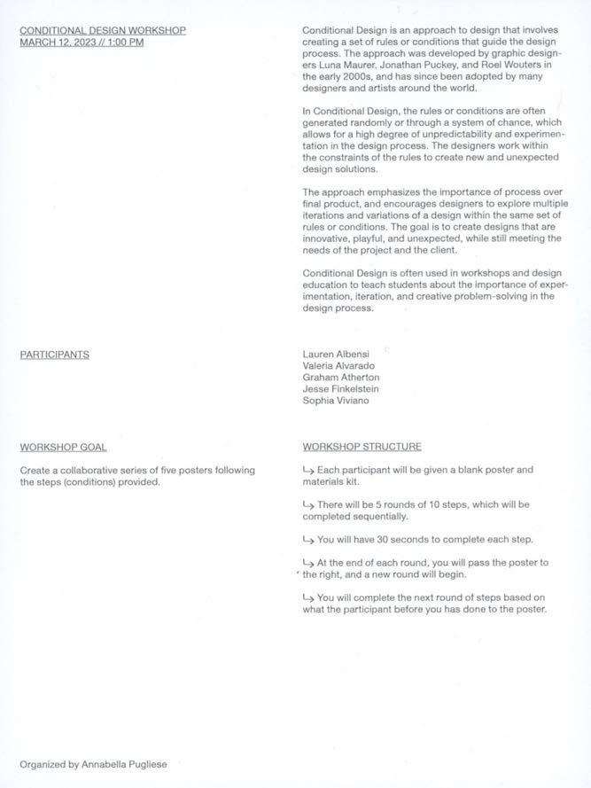
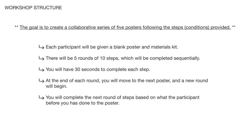
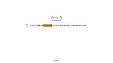
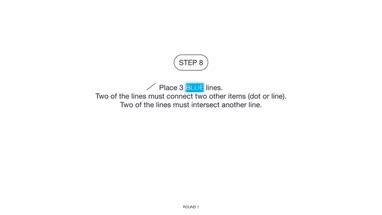
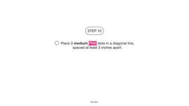
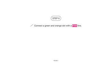
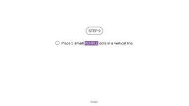
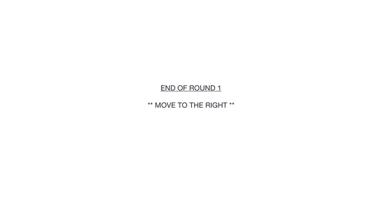
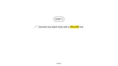
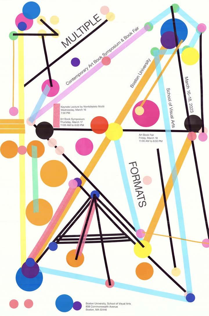
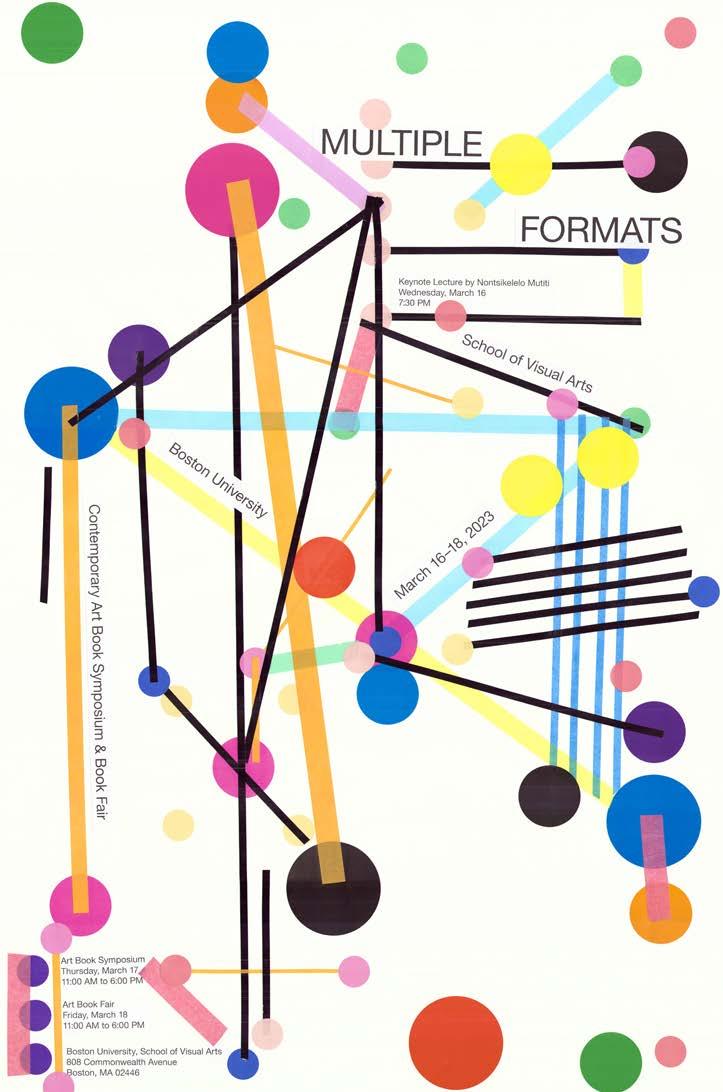
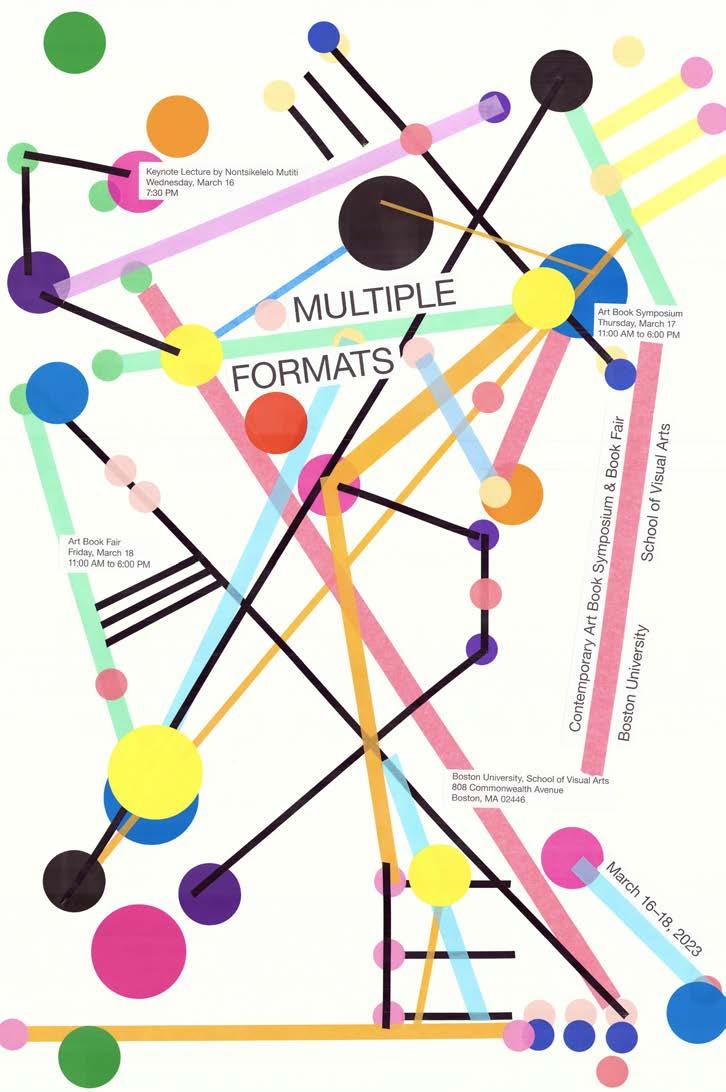
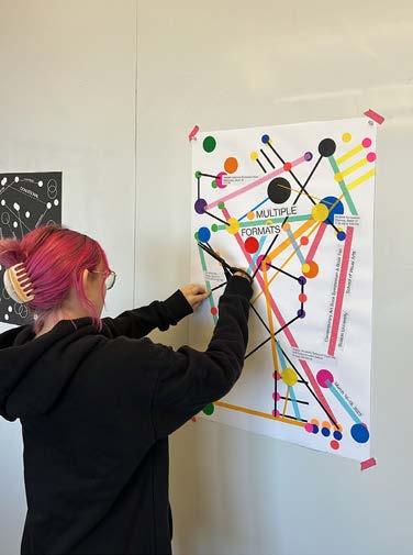
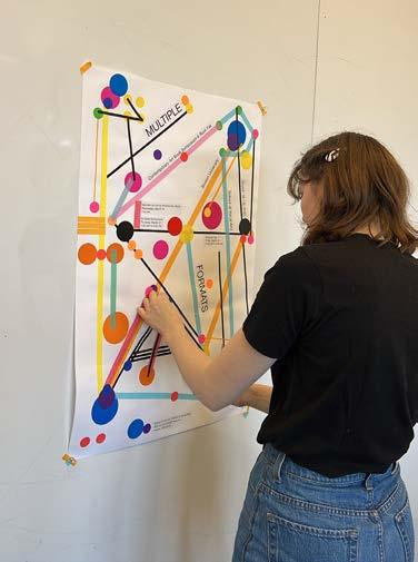
Conditional Design is a unique approach to design that prioritizes processes over products. As a design strategy, it involves using playfully designed sets of rules and conditions that encourage collaboration among participants and allow for unexpected outcomes. For this group poster-making workshop, I employed Conditional Design as a way of relinquishing control over the final product and introducing unpredictability to my output-oriented design process. This workshop is modeled after Luna Maurer and Jonathan Puckey's project for Graphic Design in the White Cube.
054 COLOR-CODE #SP2023
02
CONDITIONAL DESIGN
055
Conditional Design Workshop promotional poster, 18 × 24 in.
COLOR-CODE 056
Conditional Design Workshop participant card, front scan, 6 × 8 in.
CONDITIONAL DESIGN
057
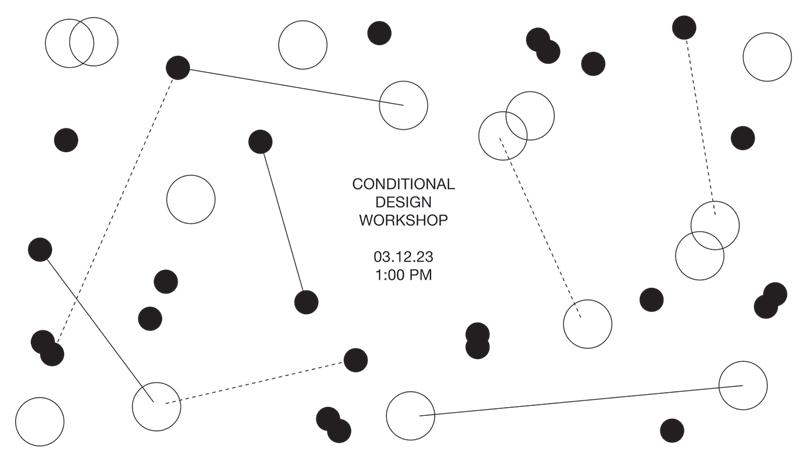
Conditional Design Workshop participant card, back scan, 6 × 8 in.
COLOR-CODE 058
Cover slide, Conditional Design Workshop deck, 1920 × 1080 px.
CONDITIONAL DESIGN
059
Overview slide, Conditional Design Workshop deck, 1920 × 1080 px.

COLOR-CODE 060
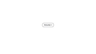
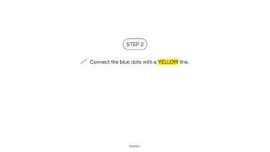
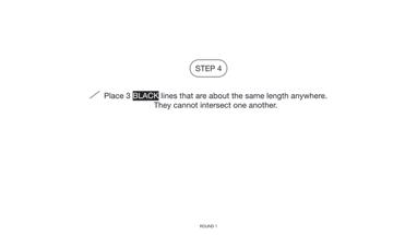
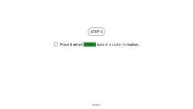
Round 1: Steps 1–10, Conditional Design Workshop deck, 1920 × 1080 px.
CONDITIONAL DESIGN 061
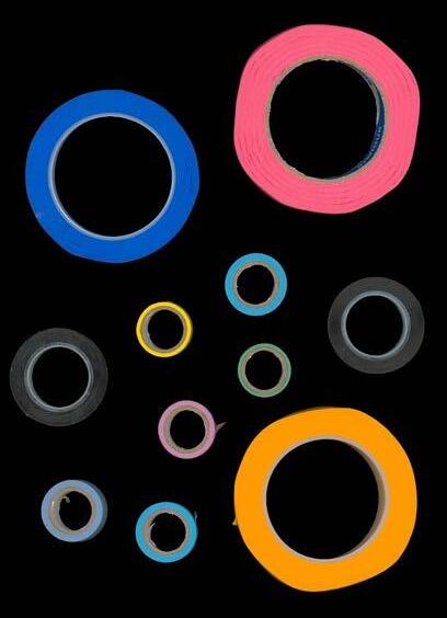
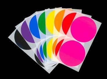
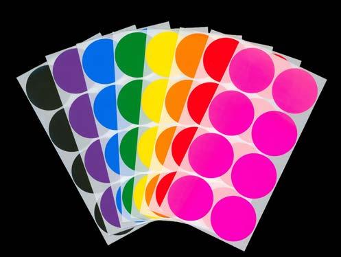
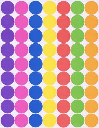
Conditional Design Workshop materials, dimensions variable.
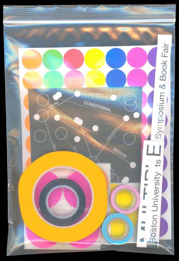
Conditional Design Workshop materials kit, 9 × 12 in.
COLOR-CODE 062
CONDITIONAL DESIGN 063
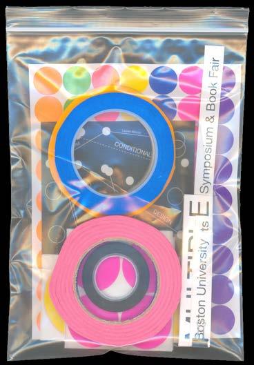
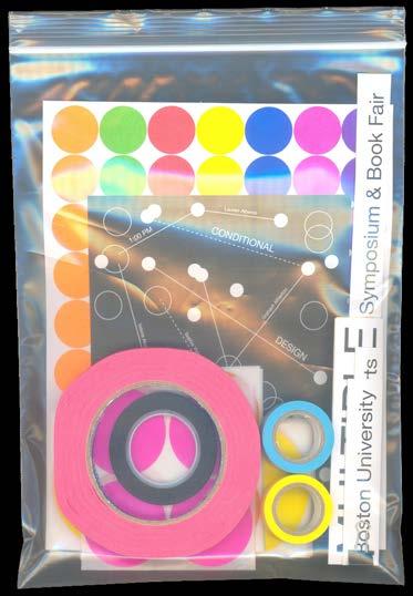
COLOR-CODE 064
Conditional Design Workshop materials kits, each 9 × 12 in.
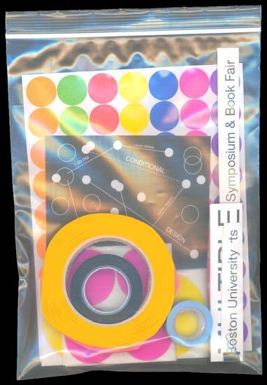
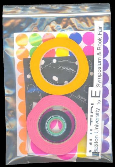
CONDITIONAL DESIGN 065
COLOR-CODE 066
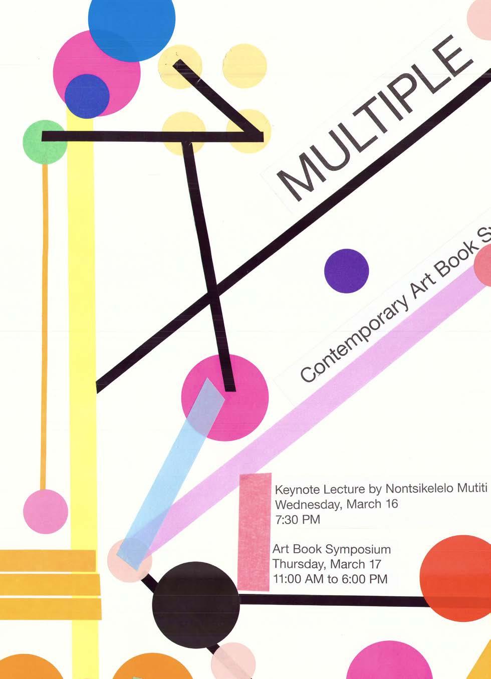
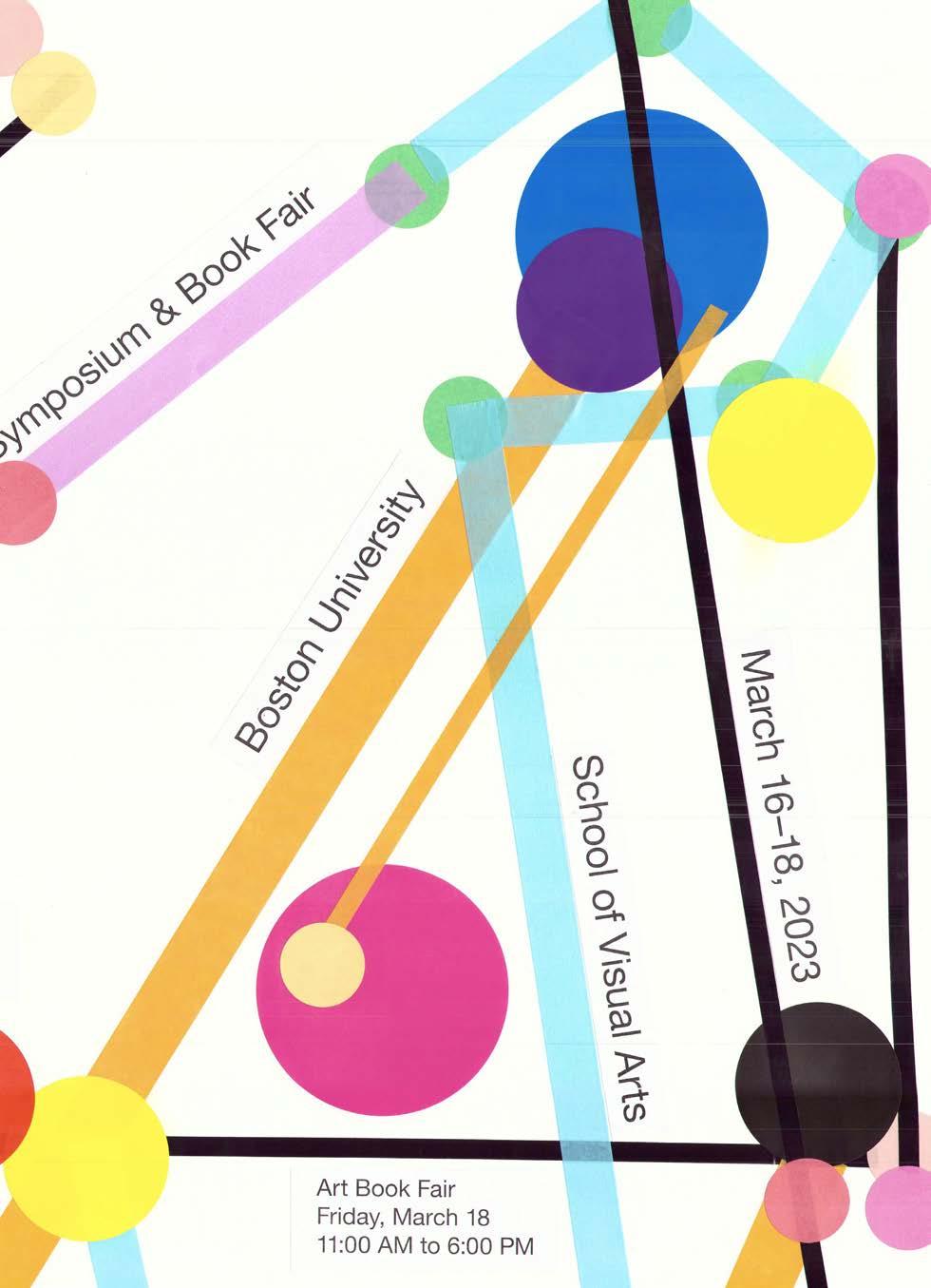
Conditional Design Workshop Poster #1, 2023. Scanned poster, 24 × 36 in.
CONDITIONAL DESIGN
067
Conditional Design Workshop Poster #2, 2023. Scanned poster, 24 × 36 in.

COLOR-CODE 068
Conditional Design Workshop Poster #3, 2023. Scanned poster, 24 × 36 in.
CONDITIONAL DESIGN
069
Conditional Design Workshop Poster #4, 2023. Scanned poster, 24 × 36 in.

COLOR-CODE 070
Conditional Design Workshop Poster #5, 2023. Scanned poster, 24 × 36 in.
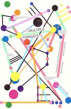
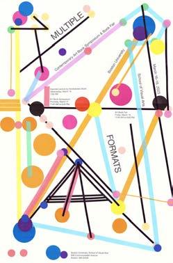
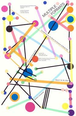
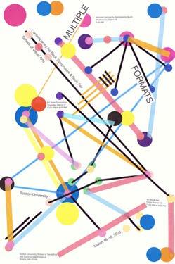
CONDITIONAL DESIGN
071
All five Conditional Design Workshop posters, each 24 × 36 in.
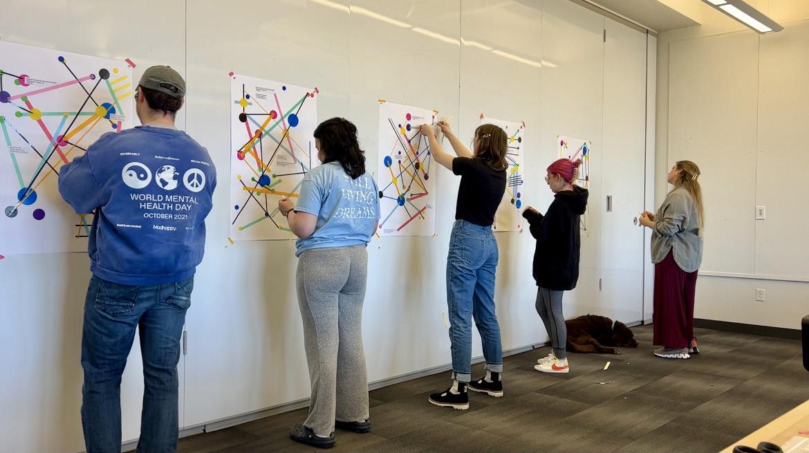
COLOR-CODE 072
Conditional Design Workshop, 2023.
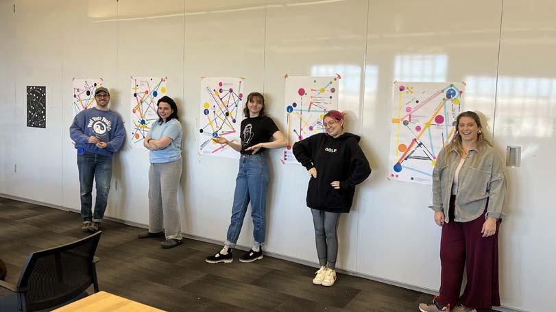
CONDITIONAL DESIGN 073
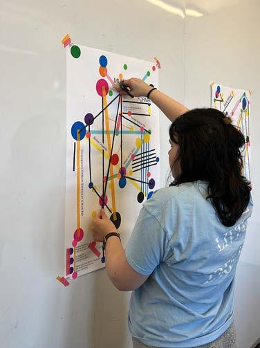
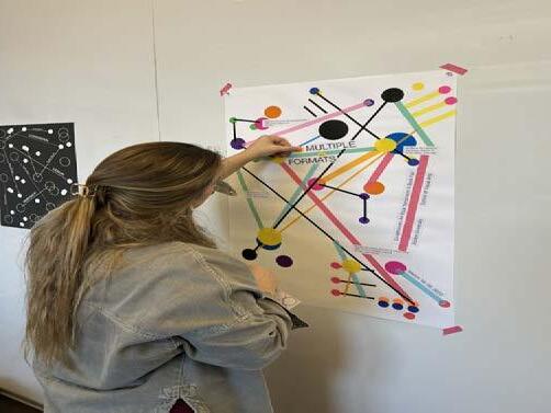
COLOR-CODE 074
Conditional Design Workshop, 2023.
CONDITIONAL DESIGN 075
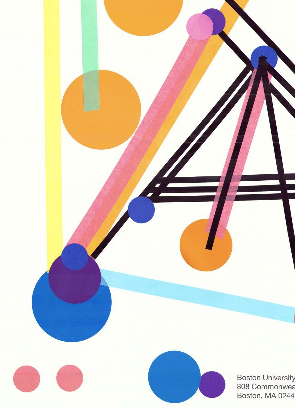

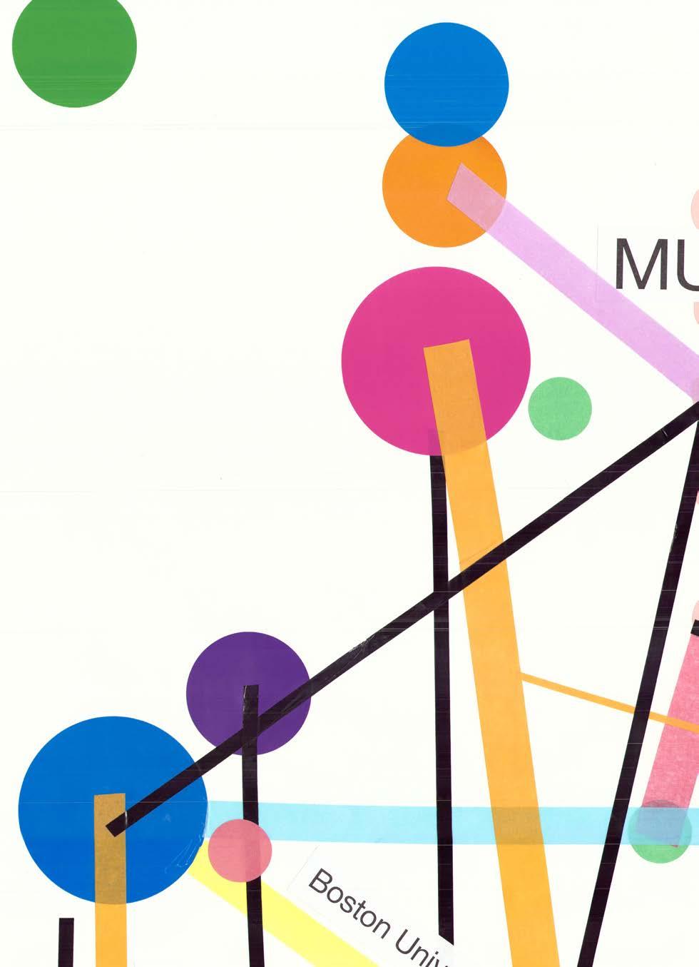
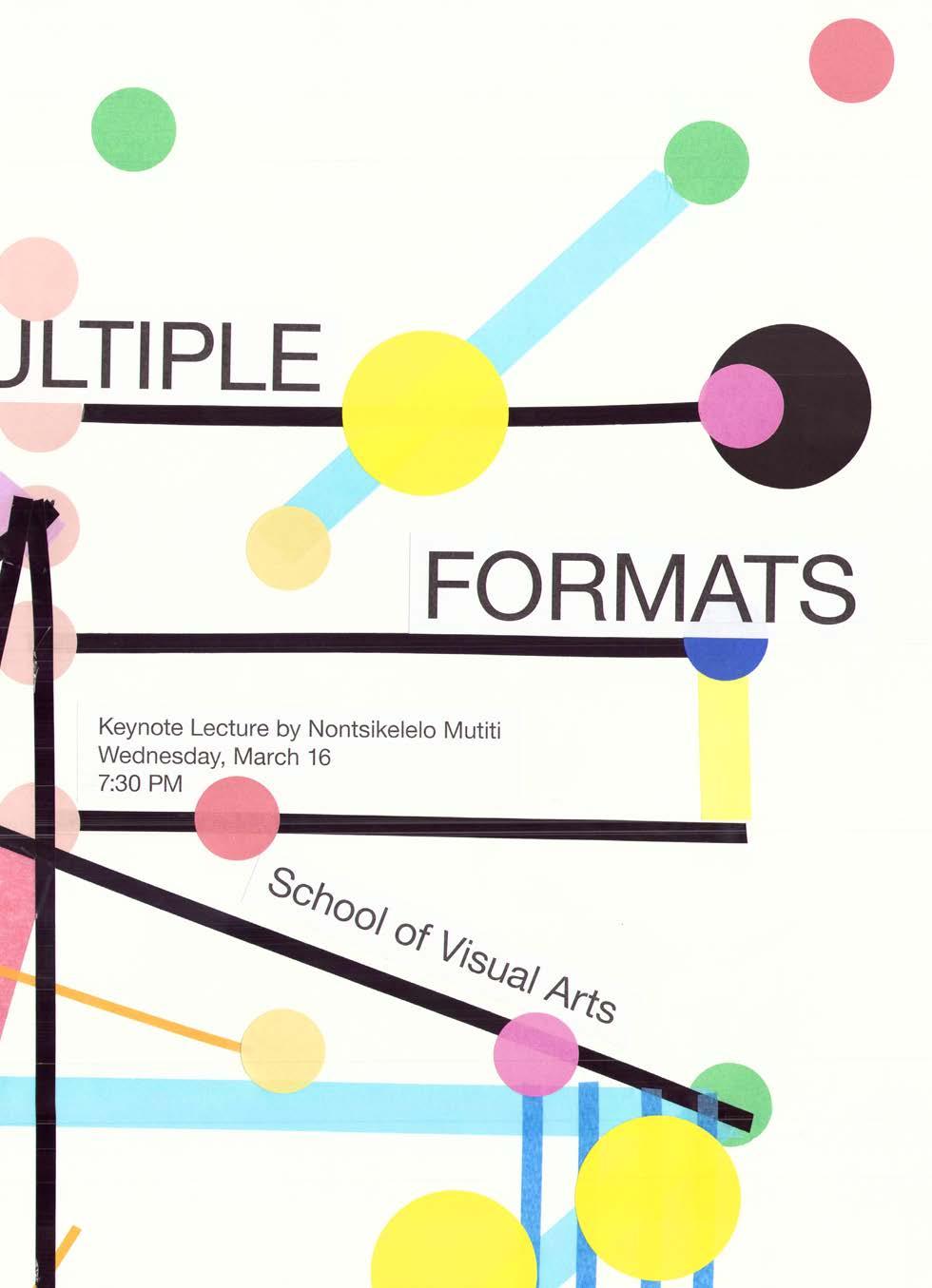
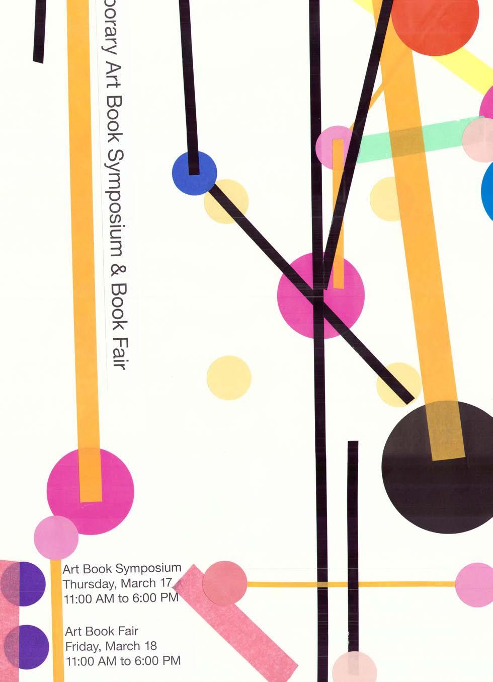
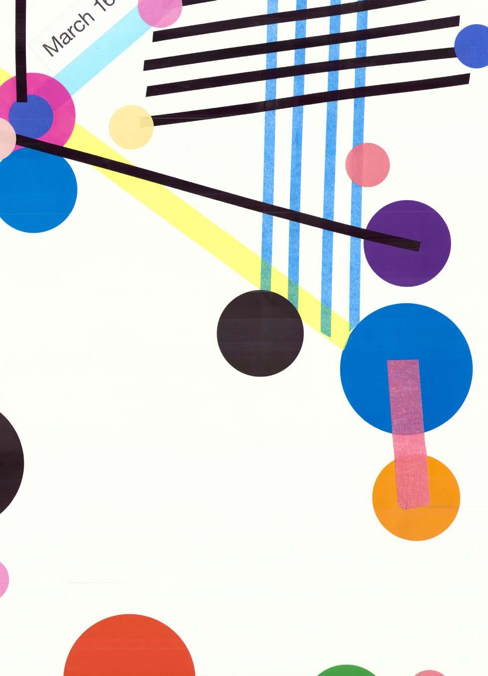
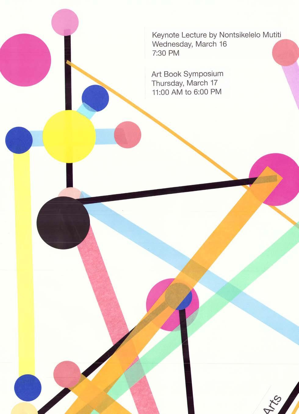
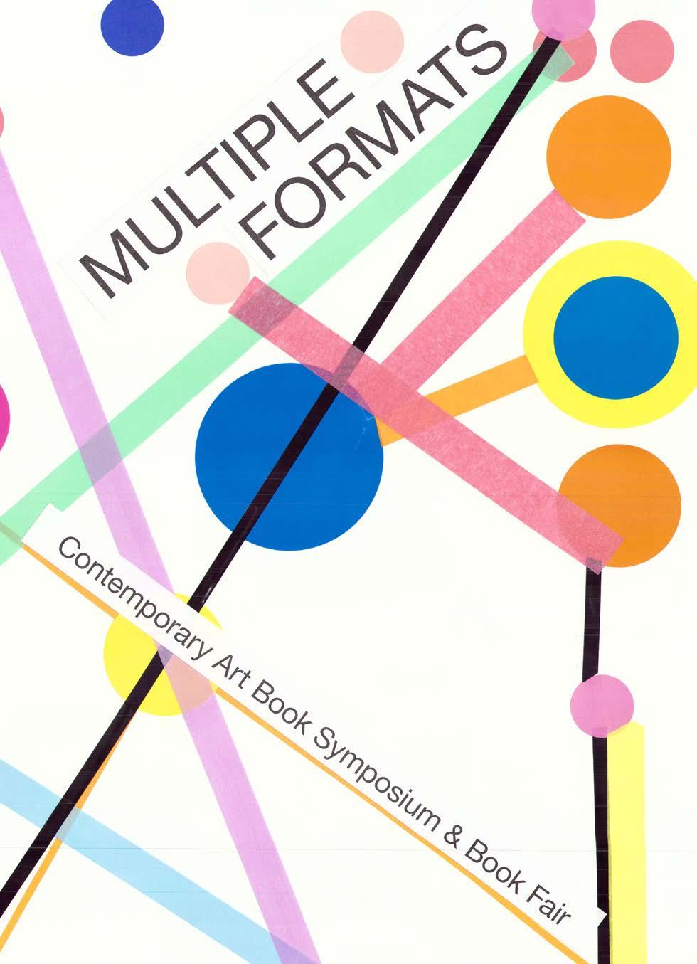
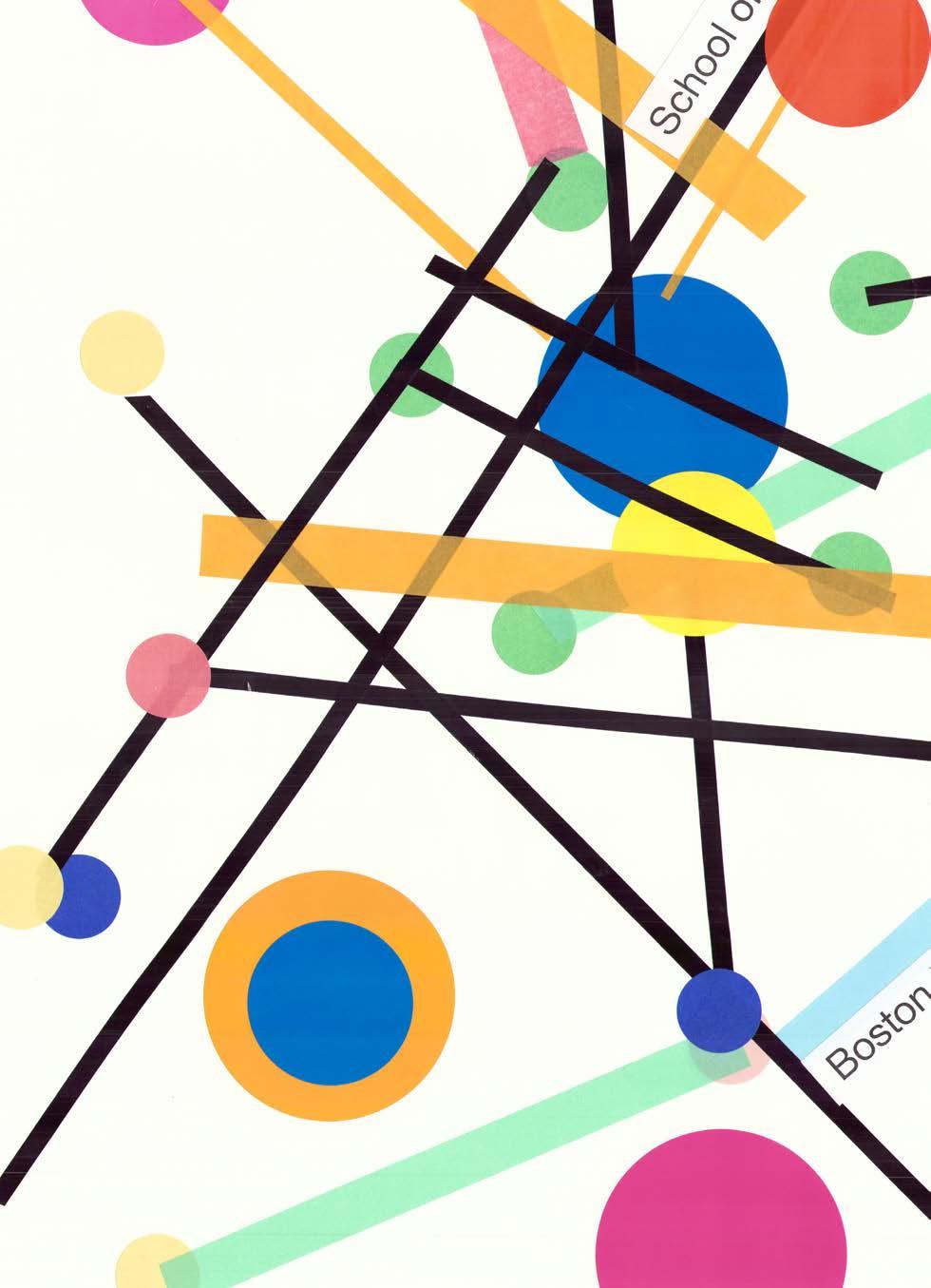
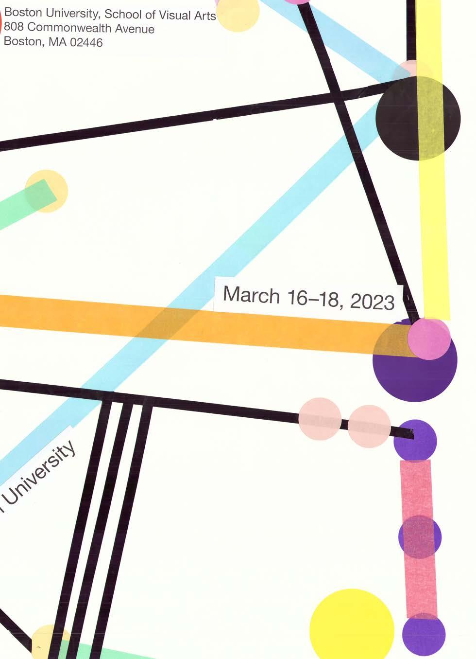
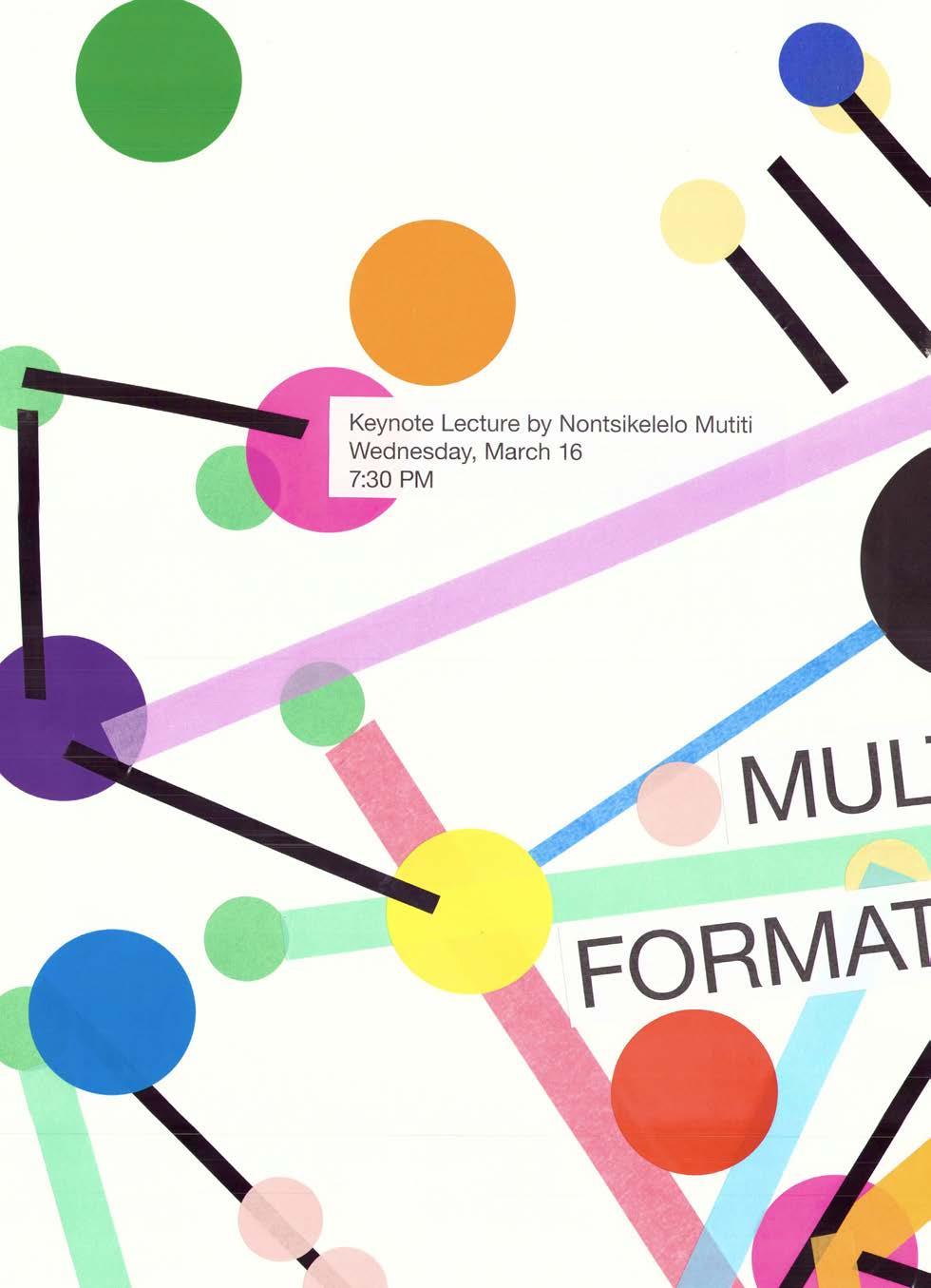
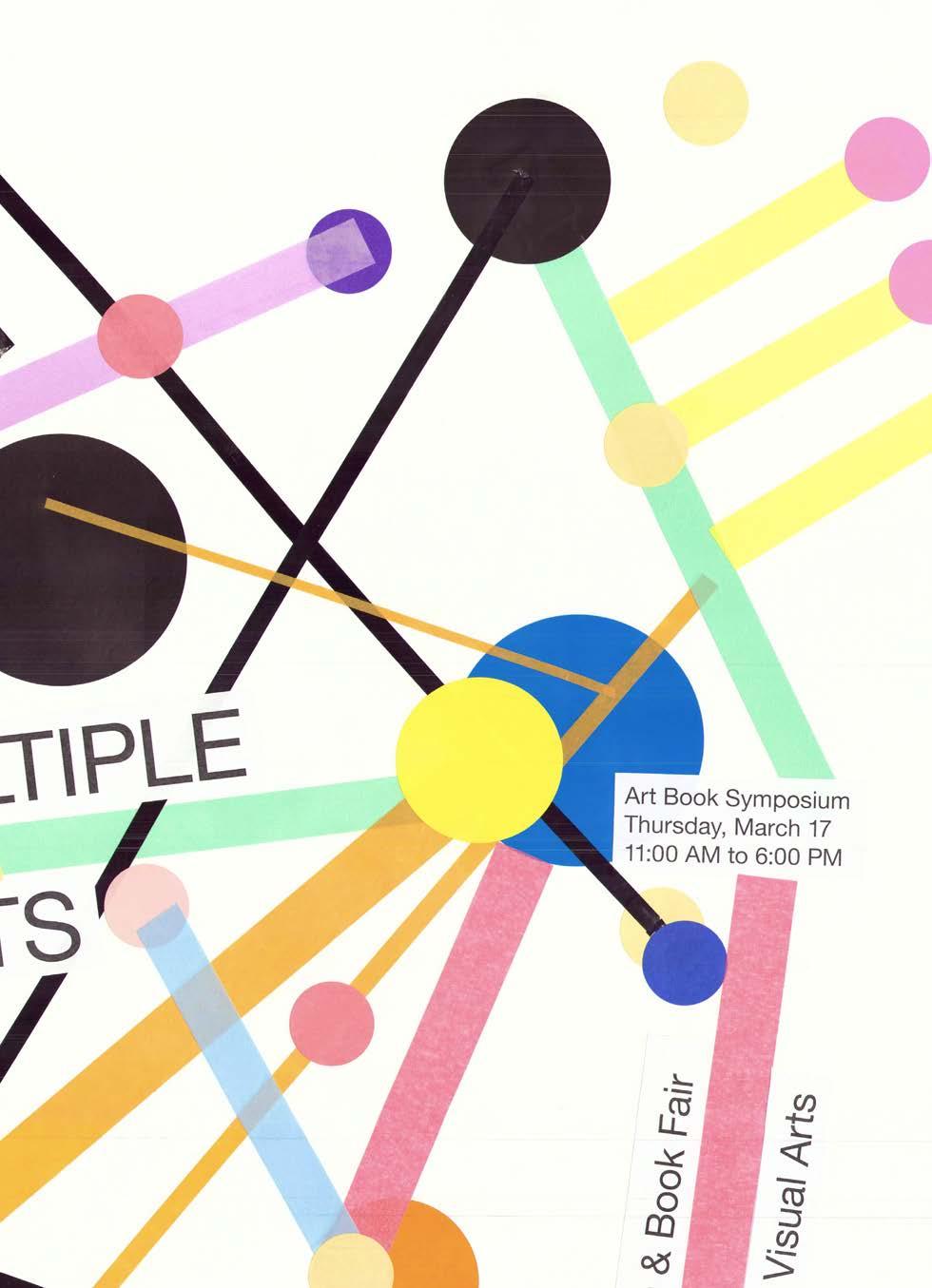
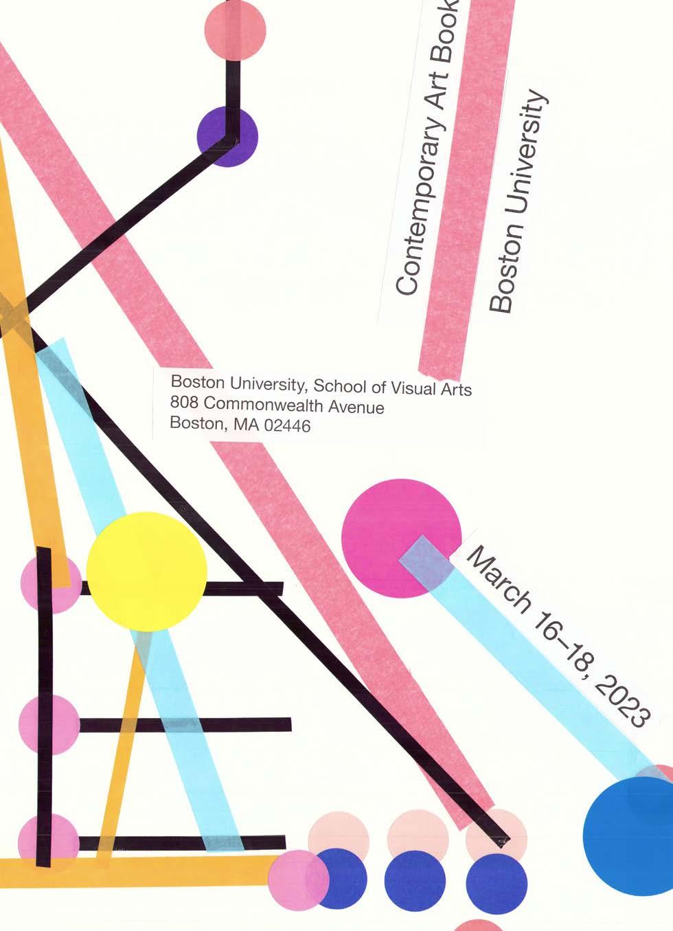
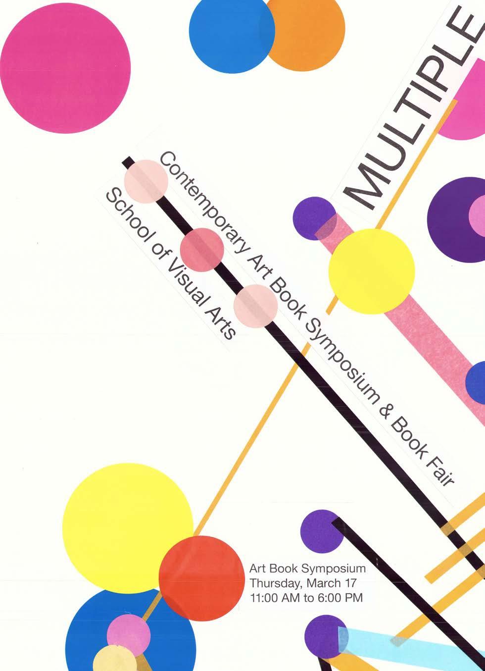
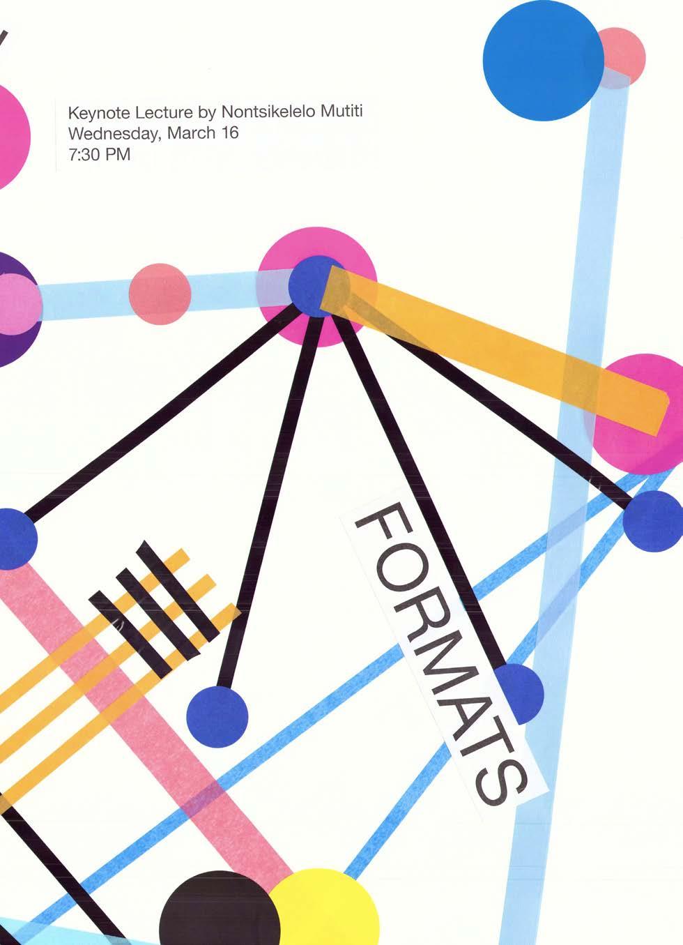
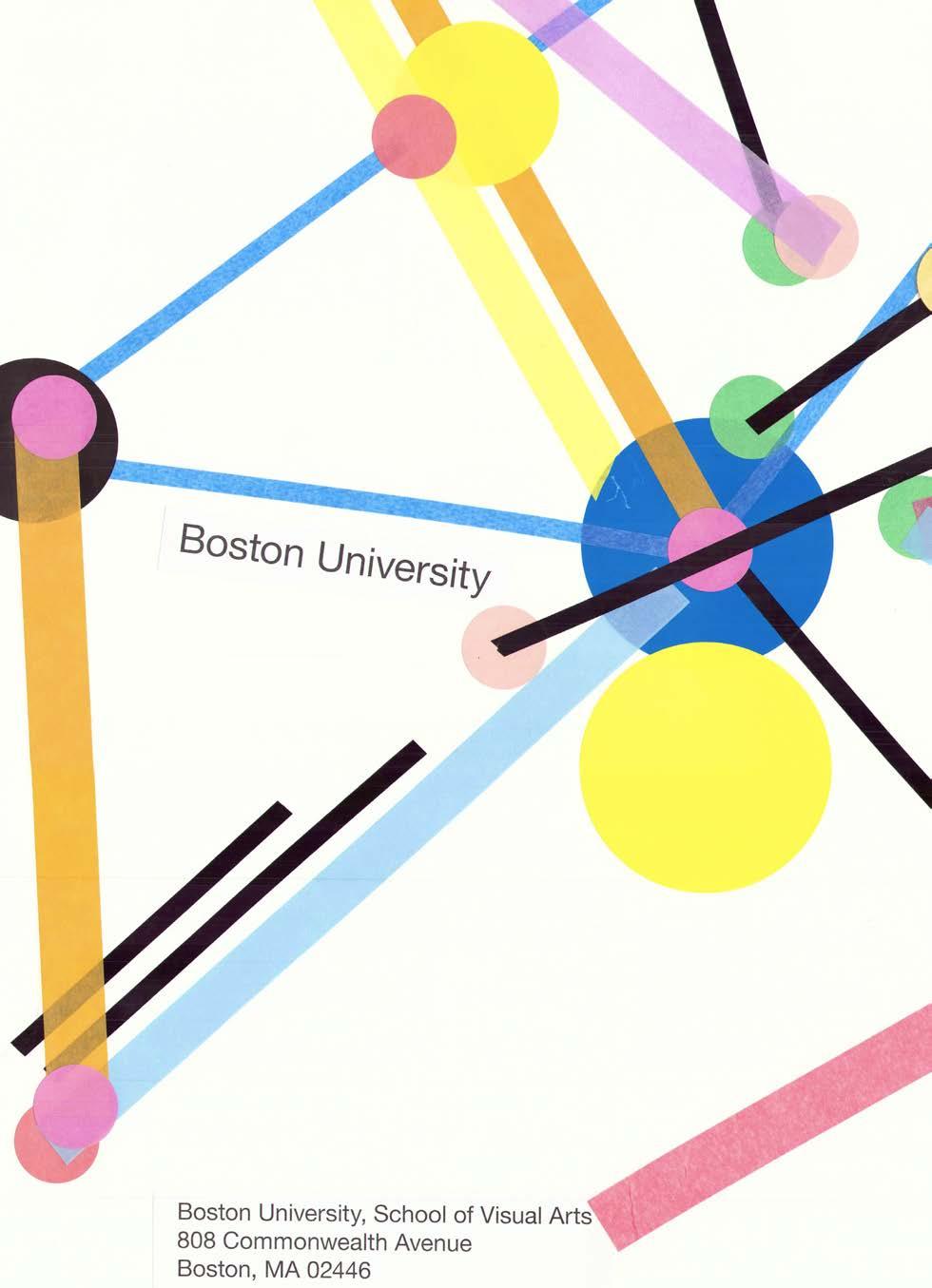
03
RISOGRAPH STUDIES
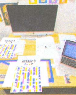
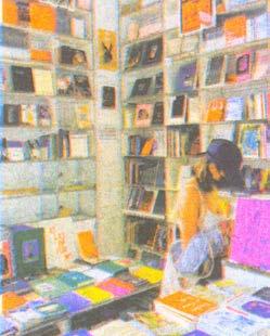
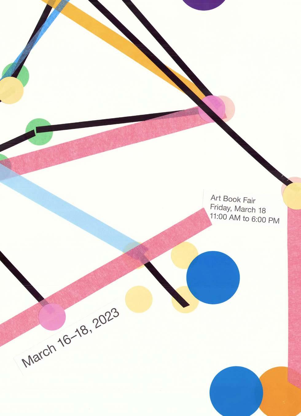
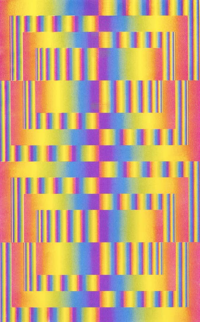
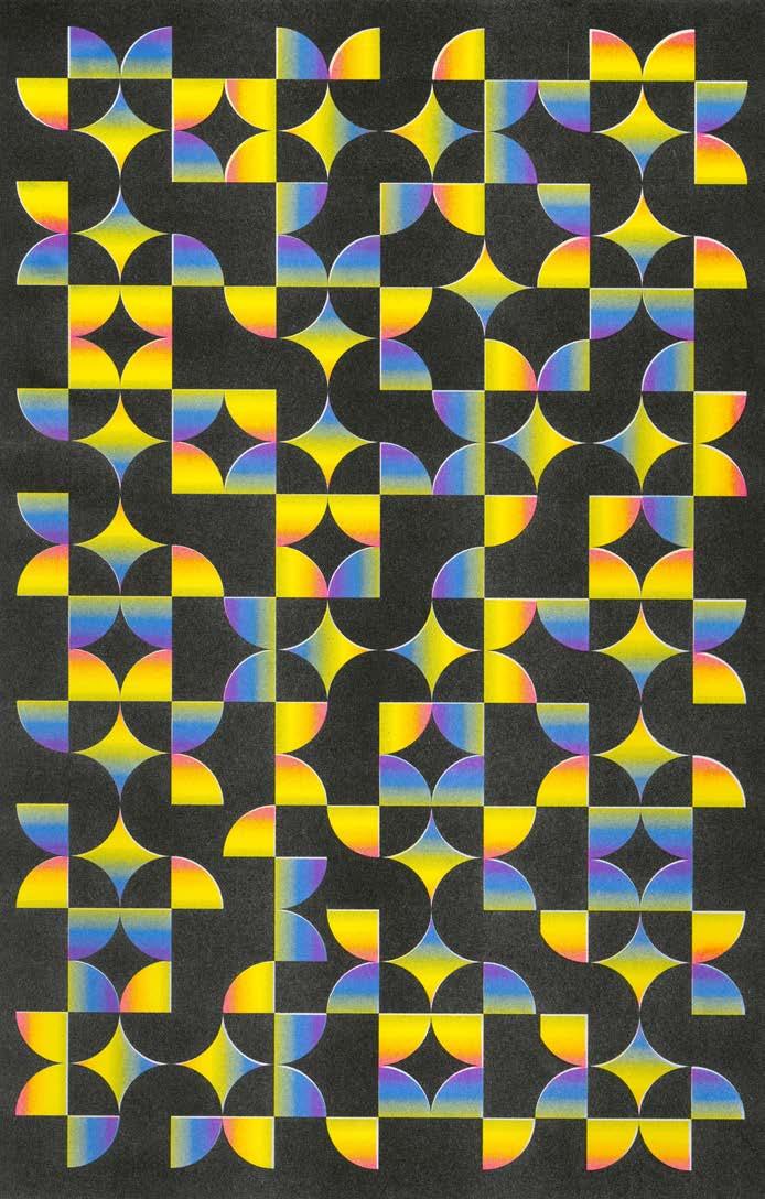
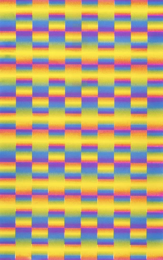
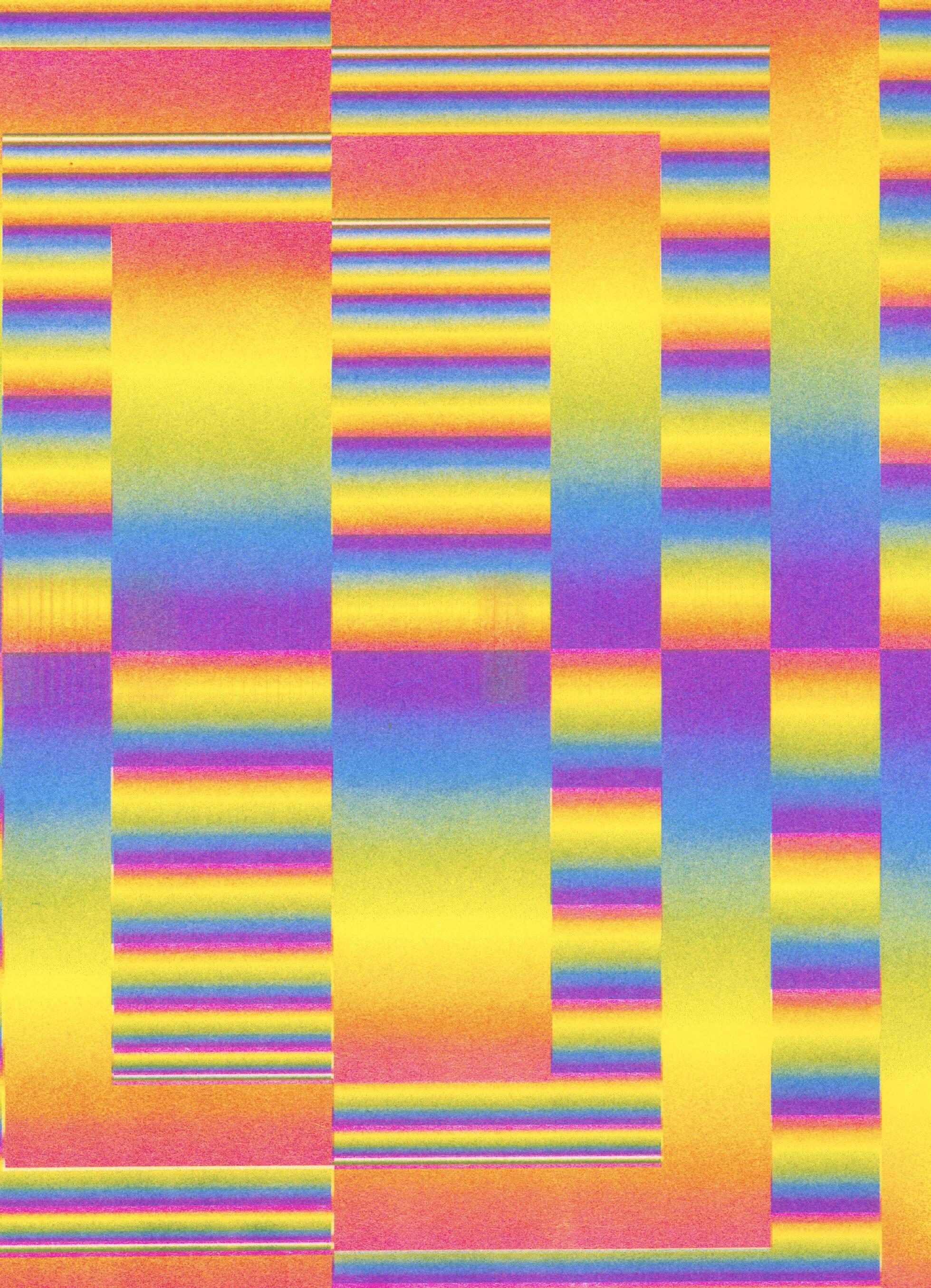
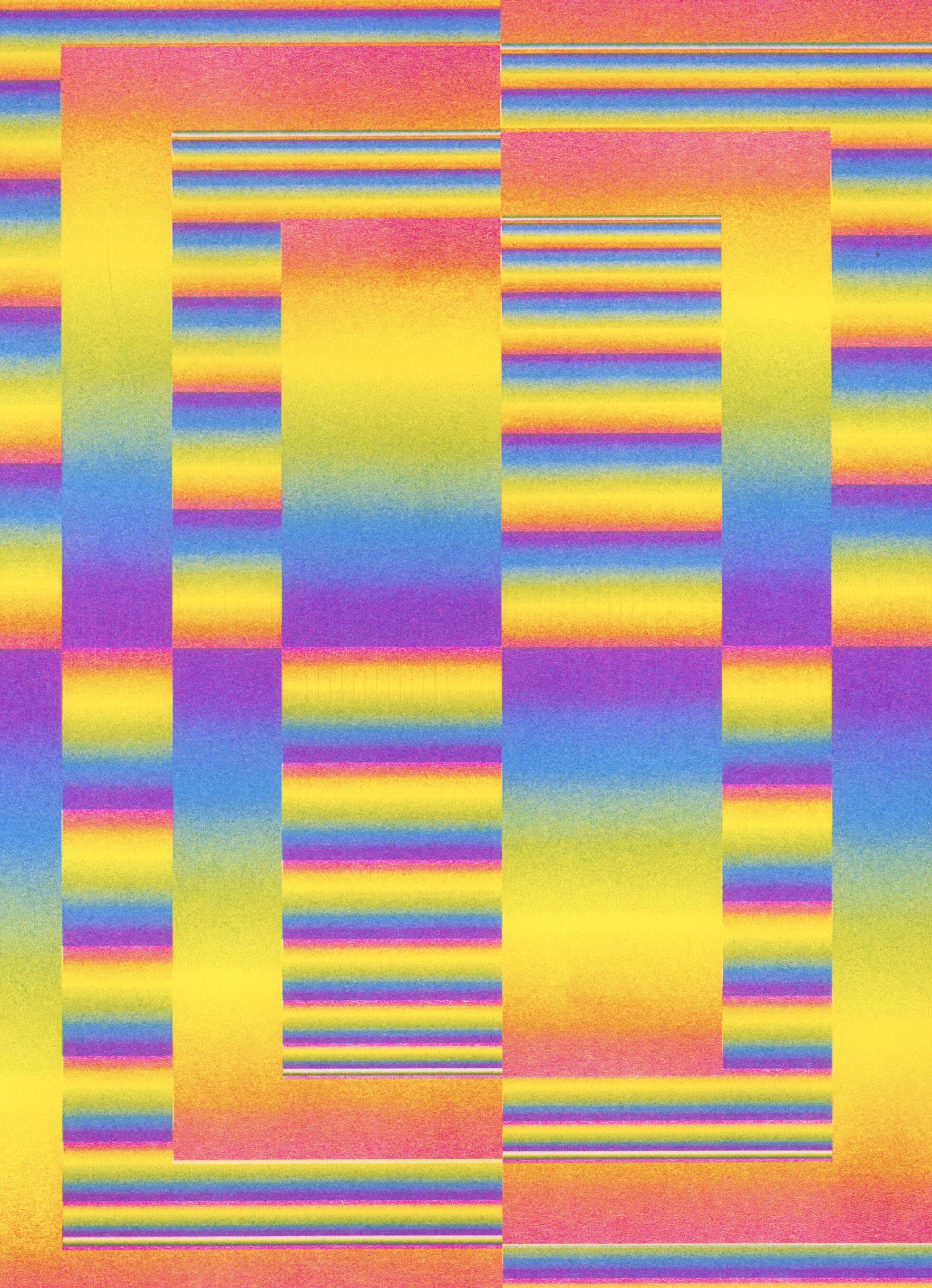
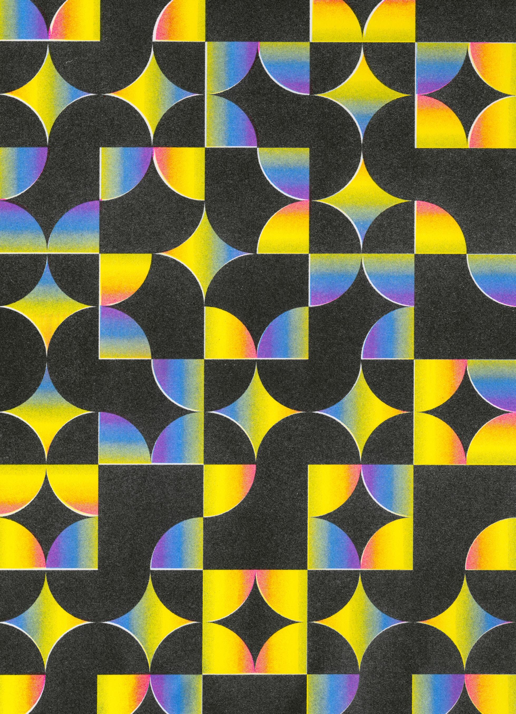
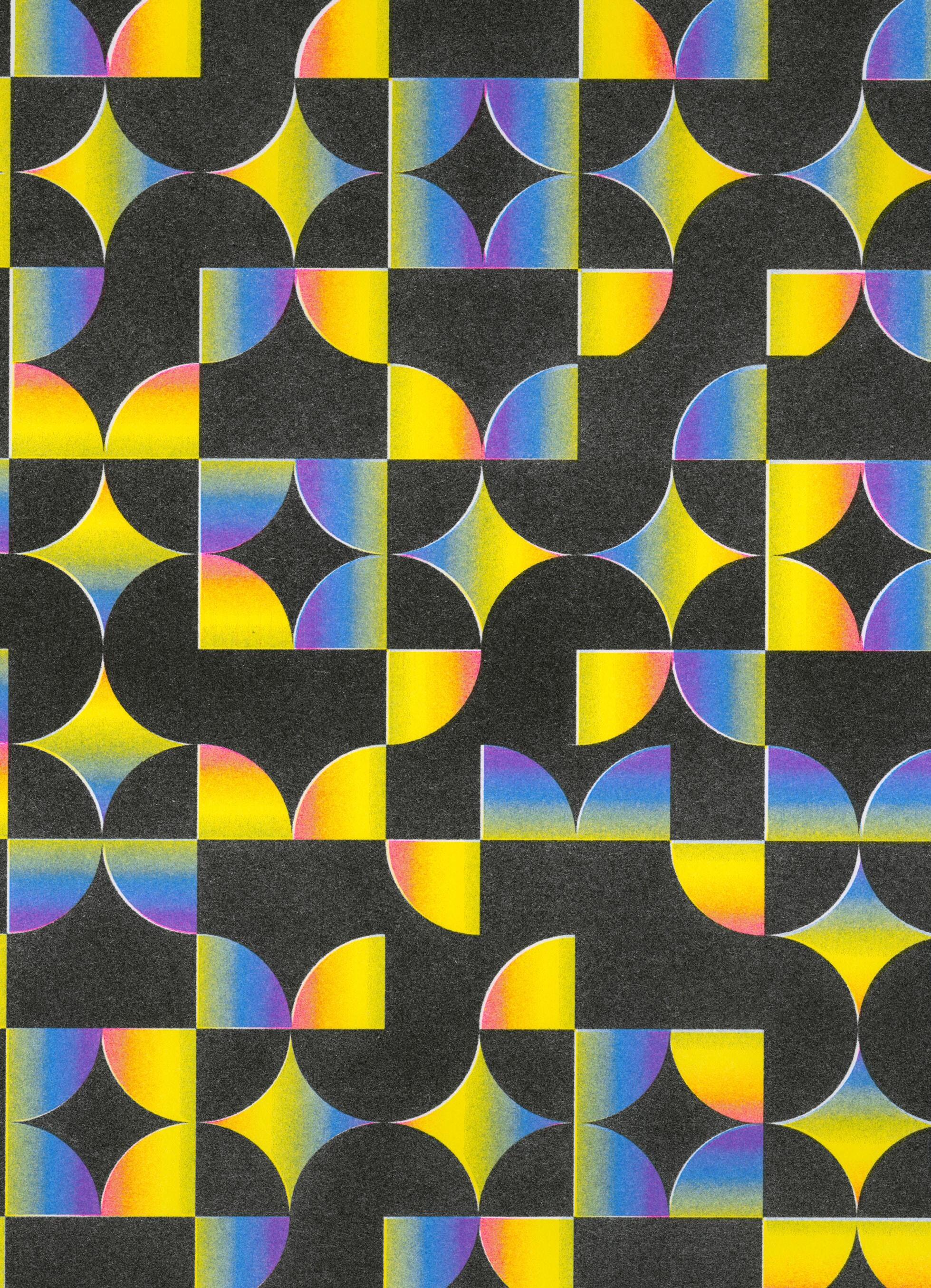
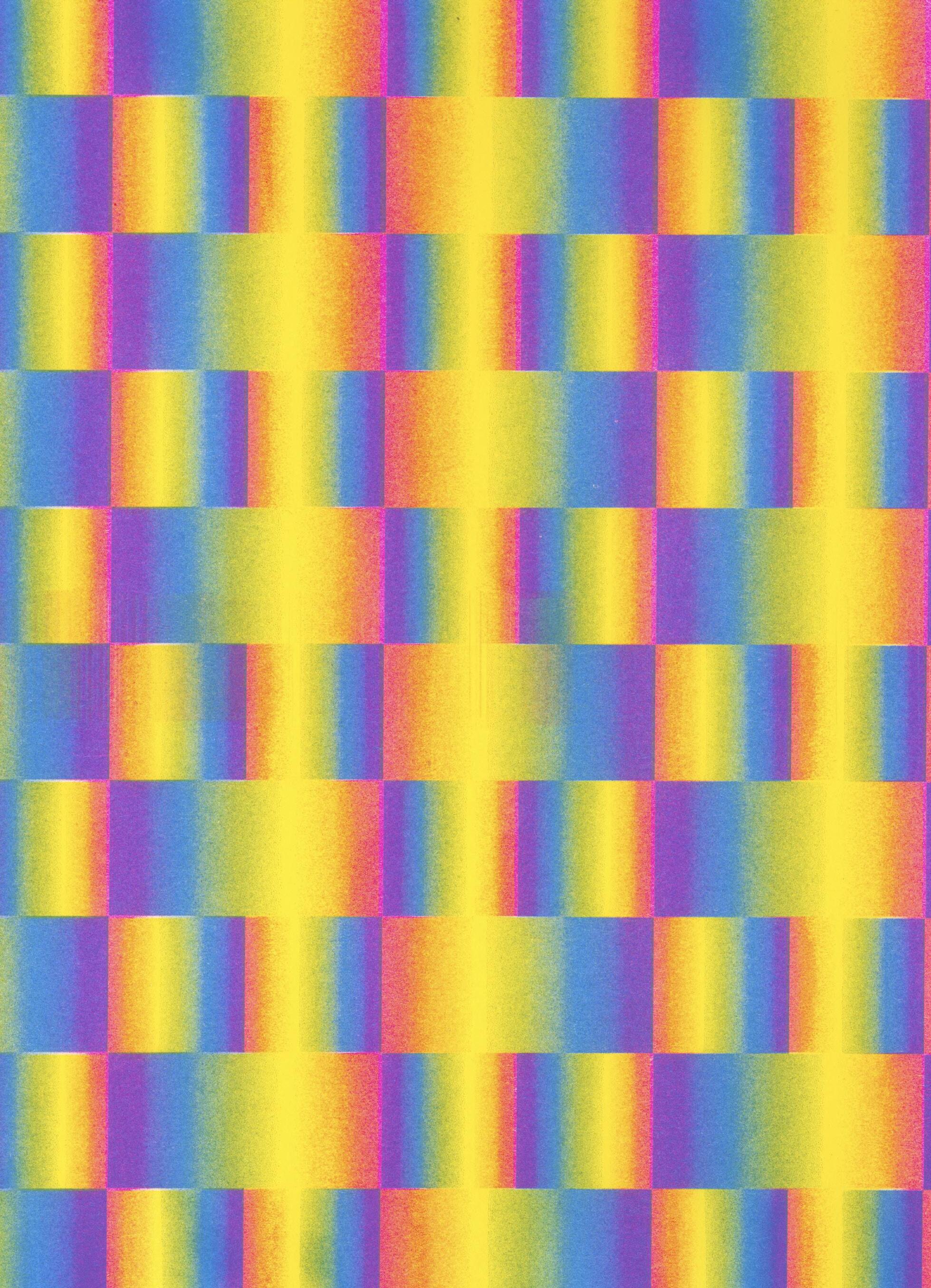
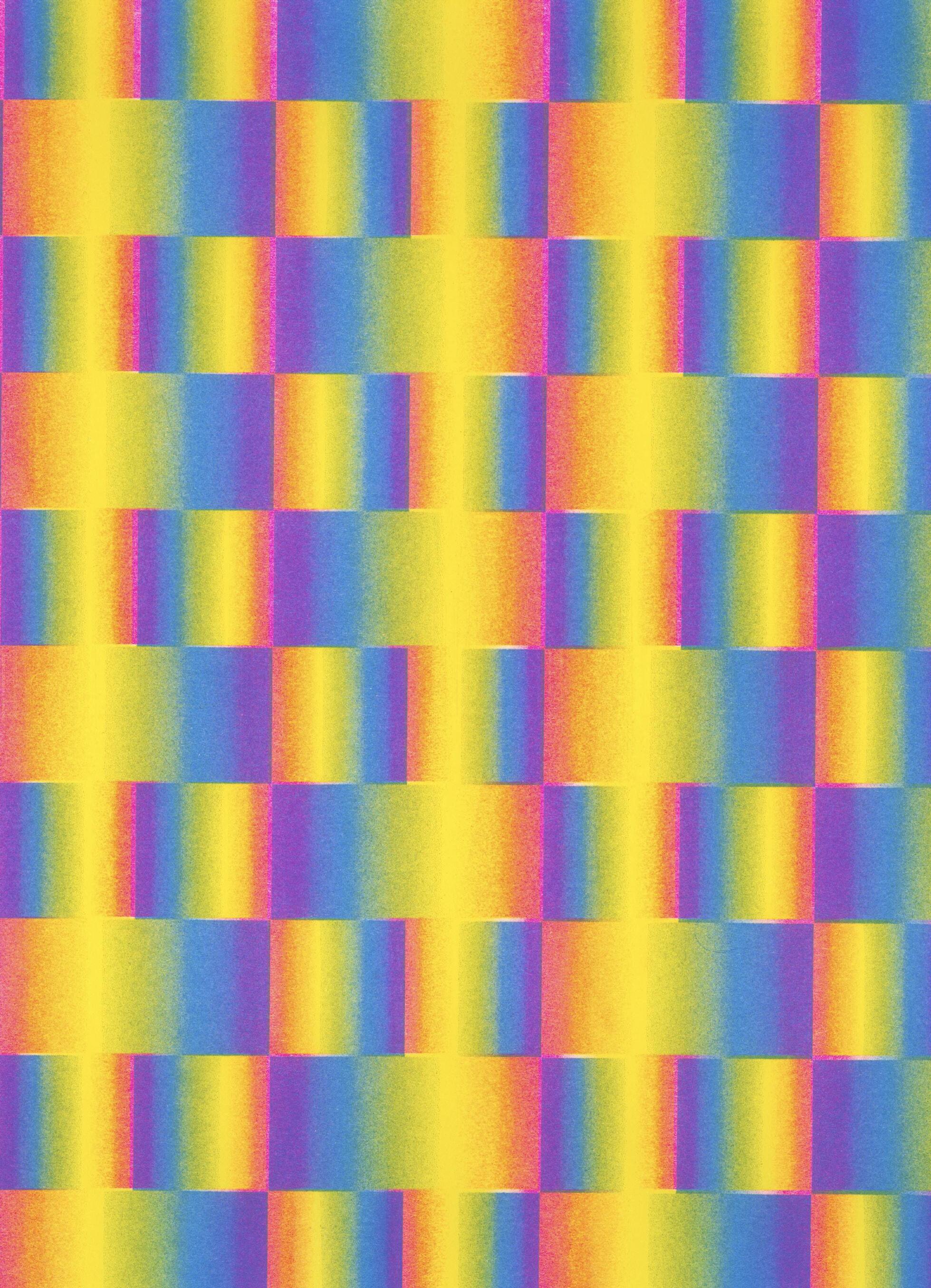
In preparation for the Multiple Formats Art Book Fair at Boston University, I designed and produced a series of Risograph prints using cornflower blue, fluorescent pink, and yellow. The series serves as a study in combining geometric patterns with vibrant color gradients to create engaging graphic compositions.
096 COLOR-CODE #SP2023
RISOGRAPH STUDIES
097
Risograph Color Study #1, 2023. Risograph print, 11 × 17 in.
COLOR-CODE 098
Risograph Color Study #2, 2023. Risograph print, 11 × 17 in.
RISOGRAPH STUDIES
099
Risograph Color Study #3, 2023. Risograph print, 11 × 17 in.
03.24.2023 // 12:00 PM EST
Alex Luciano B
AP How did you get into illustration and Risograph printing? What do you love about it?
AL I started first as a novice screen printer. I joined the studio I currently work out of— Studio Two Three—as an intern in early 2019.1 Before that, I didn't really have much art training or experience. I went to college briefly for Digital Media Production, which is more like video editing, and then I toured in the band I’m in for years. 2 I left college to do that.
In 2019, I decided to pause touring and explore other things. I found the organization I work out of and asked if I could be an intern and learn what they had going on. They had screen printing and letterpress, and they had a riso printer. I think they had just gotten it and nobody really knew how it worked.
I had kind of dabbled in illustration through Procreate on my iPad, and it was just a hobby of mine. 3 As I learned in my internship, mostly about screen printing, I got really excited about print media and how it can give that nostalgic sense to an illustration. Digital work can feel so cold sometimes, and I was excited about how making it physical really warmed it up and made it a tangible thing I could hold.
So I started with screen printing and then took a riso class. At the time, we only had two drums at the studio, pink and teal, which was pretty limiting. I was like, "Okay, this is cool, but I'm gonna stick to screen printing." Then we got yellow and a regular blue. I think there was also black, so we had enough to do kind of like a fake CMYK split.4 I started experimenting using my illustrations and learning about how the colors were overlaying.
At the time, I was scouring the internet because there wasn't a class near me, and I couldn't find any online classes. So I was really just experimenting and failing a lot, making color charts, and really indulging in the process of finding out how the colors layer and what they do. Slowly, I started getting the hang of it. I read the whole manual front to back because I was like, "No one else is going to teach me this. I guess I have to read the manual," which I didn't want to do.
But then COVID hit. The thing that really got my wheels turning was the Patreon
I had started for my band at the time. 5 One of our rewards was that they would get a riso print every month at one of the tiers. It forced me to try something with the riso every month at the very least. Having that kind of schedule or discipline in the beginning of my experimenting really forced me through a lot of my unsureness and perfectionism and just pushed me into trying new stuff. So that's really how I got started with riso printing, through my COVID Patreon, which was the thing that really motivated me to get going.
AP That’s cool that you taught yourself how to use it.
AL Yeah, it was really frustrating at first. But it forced me to learn a lot about it.
AP Yeah, I went through a similar process. We had a professor show us how to operate the riso, but after that, it was like, “Okay, just figure it out.” I remember my first two projects on it were so stressful. I thought I couldn't use it again. But once I got the hang of it, it was so much fun. I think part of the reason it's so enjoyable is the DIY, 'figure it out as you go' element.
AL It really makes you work for it. I feel like people think, “Oh it’s riso, it’s easy.” And yeah, when it's functioning properly, it is easy. But when it's jamming and your coverage gets all weird, there's so much to troubleshoot. I think that's kind of half the fun if you just lean into it, but it can also be frustrating.
AP How would you describe your art and design style? How does riso facilitate or inform that style?
AL Well, I feel like the limited palette of riso really informs my style. My process is really about finding my color because, for most of what I'm making, the end product is a riso print. I talked about it a little bit in the talk I did at Multiple Formats.6 I make these sculptures, but oftentimes, they're just part of the process to get to the end goal of a riso print featuring them. So, throughout my whole process, the riso colors are on my mind, like “What am I going to use? How are they going to layer?”
107 INTERVIEW—ALEX LUCIANO
1 Nonprofit arts center based in Richmond, Virginia.
2 Alex is the guitarist and lead vocalist of indie rock band, Diet Cig.
3 Raster graphics editor app for digital painting.
4 Using Risograph inks to mimic CMYK color printing.
5 Online membership platform that allows creators to receive financial contributions from their fans in exchange for exclusive content, rewards, perks, etc.
6 Contemporary art book symposium and fair hosted at Boston University.
When I was first starting, I had that thought that I think every artist has: “What’s my style? How do I define what I make?” And I feel like riso specifically helped me to find that because of the limited palette. You can only use as many colors as drums you have. For me, my style goes between illustrative work, kind of like iPad illustrations mixed with 3D modeling, and then actual 3D sculptures.7 So, a lot of 3D work paired with illustrations, and then photographic work (Fig. 2). Somehow, they all come together because of the process. I really feel like riso has helped me define my artistic style by being the one through line. It branches out into illustration, digital sculpture, physical sculpture, and photography. If those are all branches on a tree, the tree is me using riso. So, I think riso is a really defining part of my work and my style.
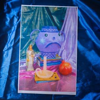
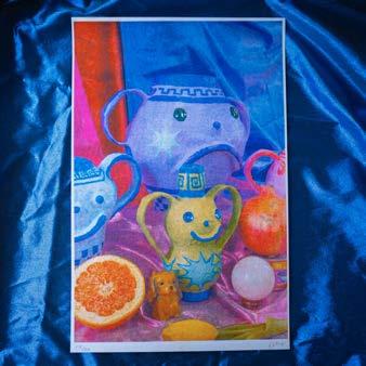
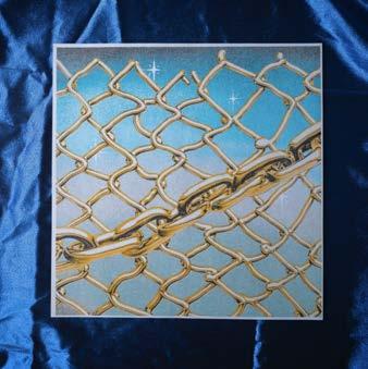
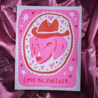
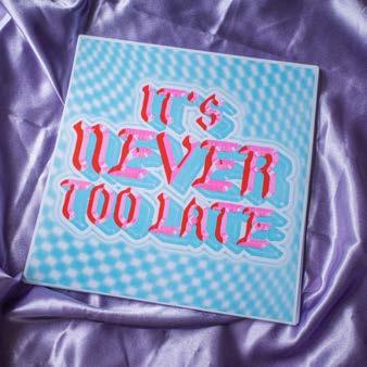
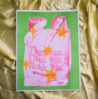
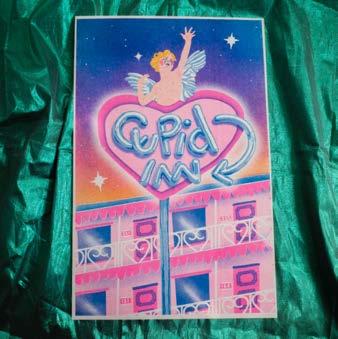
AP I was wondering if you could tell me more about your ‘Nothing is Real’ project (Fig. 1). What I love about it is that you go back and forth between analog and digital mediums. You start with sculptures, photograph them digitally, bring them into the computer, separate the colors, and then return to analog with the riso. I think that process is really cool. I did something similar in terms of going back and forth between digital and analog last semester when I worked on a Risograph animation project.8 I started with iPhone footage, separated all the frames, printed them in four colors on the riso, scanned them back in, and then pieced them back together in a digital animation. It involved different analog and digital techniques. So, I'm curious about the idea behind your project, how it came about, and what the process was like.
AL Yeah, absolutely. This project is my current personal obsession. My personal heart project, I guess. It's one of the things that really serves my creativity, unlike some work I do that is more for selling. This project is something that I’m really personally excited about, and it feels like it fulfills my artistic and creative pursuits in a larger way.
I was working in 2D for a while, and I was getting fatigued with just having pieces of paper and going straight from the computer
to prints. I wanted something more tactile to do with my hands—which is how I started with riso, through collaging and scanning. So, I started creating paper-mache sculptures.
Then I started thinking about how they were one-of-a-kind objects, and in the art world, value is assigned by how scarce an item is. If it's one of a kind, it's really high value and goes to auctions for a lot. I think that's super wack, and the art world being so driven by capitalism makes for a lot of bummer art.
So, I wanted to push back against the idea of scarcity making value by creating one-ofa-kind objects, but then that not being the finished piece. The finished piece is photographed still lifes where the sculptures sit amongst abundance, beloved objects, fruit, food, and lush fabrics. Printing a series of those photographs highlights the juxtaposition between one-of-a-kind objects, which are inaccessible as a piece of art, versus an edition of prints that is inherently more accessible when you're making multiples, and more people can physically get their hands on them. The prints don't serve to prop up the value of the individual sculptures; the sculptures exist as just one piece of the larger narrative of this edition of prints.
For me, it was important to lean into the abundance mindset versus scarcity in the art world. So that is the line that was driving me through that print series and still does. It allows me to make one-of-a-kind pieces and put my intention into them without feeling like I'm a production artist.
This process also allows me to preserve the fun of the artistic process of these sculptures while making my art accessible to more people. A core ethos that I have is that art should be for everyone, and it shouldn't be so scarce and commodified and expensive for the sake of being expensive. It's against the riso ethos, which is punks reclaiming an office tool. So, that's why this project is so important to me.
AP That's really cool to hear about. It's eyeopening for me because I didn't know about the commentary behind it. The accessibility thing is so important to riso too. People love it because you can cheaply and quickly reproduce things, and it’s so accessible.
108 COLOR-CODE
7 Technique in computer graphics for producing a 3D digital representation of any object or surface.
8 See Beginner's Mind on page 164.
What inspired you to start Cowboy Press?9 How did you go about sourcing a riso machine and everything you needed?
AL Well, I feel like I started because it was a way to make money. It was a fun way to feed my riso printing habit. People saw my work, and they asked if I could print work for them. It began through word of mouth, with friends in my area saying, "Oh snap, you’re riso printing? I want my art printed." Similarly, through the internet and Instagram, people would say, "Oh, wait, you have these colors? Well, I need to get those colors printed." So, it started pretty organically as I posted my own work, and people began asking if I was printing for other people.
I selectively took on jobs that I thought would be fun or cool. It's kind of exciting to set aside my creative process and just be a riso operator. I started taking more Cowboy Press jobs as a way to turn my brain off, and it was nice because I love operating the riso. I love the troubleshooting and problem-solving. My little ADHD brain loves a puzzle. I found it really rewarding to be the operator, to print without worrying about what the image is. It was kind of like a brain break.
I go in waves of needing to focus more on my creative stuff and then needing to just be an operator of the riso. Having a press and my own practice balances each other. Right now, I'm taking a break from the press because I'm feeling creatively inspired.
When I started, I was lucky enough to have access to a riso machine, which is the number one thing you need if you want to start a press. Maybe this is obvious, but you have to have a riso available to you, whether it's through your school or a community organization. Eventually, our community had over 140 artists who had access to it, so it could get a little busy and sometimes broken. I did a lot of the fixing of it, but it wasn't mine, and I wanted a little bit more ownership over making changes to the machine, buying more drums, and that kind of thing.
So, I started scouring eBay, and that's where I bought my home press. The way you get lucky on eBay is by putting in alerts for keywords. I had alerts for riso, so anytime someone listed anything like that, I would
get an email, and that was crucial because risos are going really fast right now since everyone is excited about them. Often, you'll see them go up on eBay for really cheap from an organization like a church or school that is just getting rid of what they see as old office equipment. You can get them for cheap on eBay through those avenues if you're lucky, but you have to be fast because everyone else is also looking.
I found a guy in Georgia who was selling five machines for $1,000, which was insanely cheap because the type of machines I got from him usually sell for $1,000 each. I have a big van because I used to be in a touring band, so we took all the seats out of it and drove down, and he gave me five EZ221s.10 So, they’re not the fanciest risos. They can only print up to 8.5 by 14, not the full ledger size. And they were not networked, so you couldn't connect them to a computer, but they had a scanner, and he also had eight drums with them, which he gave to me for free because he said, "Just get these out of my basement. My wife wants to have a home gym."
I brought them back to Richmond, where I live, and texted all my artist friends, asking if they wanted one for really cheap. I wanted to get them to people who could use them. It was very lucky, but deals like that happen on eBay fairly often with risos because some people don't get that others are using them for art.
So, I would say, scour eBay, scour Craigslist. They are out there. Call schools and churches and ask them if they have a riso that they're not using, or if it's sitting in storage. You know the classic saying, 'you need to own the means of production.' It really can make a difference. I mean, all of a sudden, you have a printing press. The hardest part is getting the tools, but once you have them, then you just have to print. In a lot of areas, there are communal use risos. But having your own rocks because then you can break it and fix it, really dive in, take things apart, and put them back together. So, I think that the most crucial step of running your own press is having control over the means of production.
AP Yeah, definitely. I've looked online and was surprised by how difficult it is to find one. They go fast, as you were saying. I even
109 INTERVIEW—ALEX LUCIANO
9 Risograph micropress run by Alex Luciano in Richmond, Virginia.
10 One-drum RISO digital duplicator model.
checked the official RISO website, but they don't even list the prices.11 It's very elusive.
AL Yeah, if you were to buy a new one straight from RISO, it would cost like $16,000. They're double drum machines and are still marketed towards big companies, even though there's been a resurgence in artists using them. Do you know about Hallagan? 12 They're a riso distributor based in Chicago; a family-owned, women-owned company. They've been selling riso machines, ink, parts, and drums for around 25 years. They're really leaning into the fact that people in the artist community are using them to create art. So, they're a great US supplier and often have machines for sale at fair prices. You'll have to get it freight shipped from Chicago to wherever you are, but a lot of presses in the US that have popped up in the last few years have bought machines from them. It's a good place to look.
AP Yeah, that's good to know. It's the dream to have your own riso machine. Right now, we have the one at BU, and it’s really nice. It has two drums. But you have to sign up for a time slot, and there are always people in there. Something about having a time slot is so stressful, especially when you need to get something done.
AL Yeah! Especially when the riso is not always behaving. That sounds really stressful.
AP But yeah, we're lucky to have one for sure. I'm trying to use it as much as I can before I graduate because I'm not sure what I'm going to use after that.
You mentioned earlier how having a press allows you to produce without the pressure of creating something that's entirely your own. When making your own work, there's a lot of pressure to make it perfect and exactly what you want. Having a press allows you to help others bring their vision to life. That sounds great, but are there any challenges with that too? Working with other clients can be stressful at times, I'm sure.
AL Oh yeah, for sure. Especially with an imperfect medium like riso. It can be really challenging when a client has heard of riso or seen
it online and thinks it's super cool, but isn't necessarily familiar with the process or how an image they send gets turned into a print. Navigating file setup with someone who isn't familiar with the riso process can almost feel like teaching a mini-workshop, which can require a lot of labor before even starting to print. It's important to set people's expectations correctly and get their files prepped the way they want.
My friend Rachel, who runs Taxonomy Press, teaches online classes and requires new print clients to take one because it covers file setup.13 The fee for the class goes towards their design or printing, which I think is smart, because getting files straight is often the hardest part, and managing expectations can be tricky, like deciding on colors and accepting that registration can be off.
Personally, I had to start setting boundaries, which meant saying no to more jobs. I did a lot of wedding invitations in 2021, which was so stressful because they're very important to the client and they want them to look perfect. But riso isn't great for lots of layers with little text because of the misregistration. And I was just stressed out. Normally, I accept that riso isn’t perfect, but because it was their wedding stuff, I was freaking out. So, I had to say no more wedding invites.
AP And invites they’re handled so much, which is not great for riso.
AL Totally! I’m like, “Don’t get it on your nice clothes!” So, I definitely started picking and choosing which jobs to take on. I’m at a place now where I’m only accepting work from returning customers who have printed with me before, had a positive experience, and know how to send me files that are already set up.
A lot of times, people will send me a digital file that, with just a quick glance, I can tell is not suitable for riso-ing. Just the design alone—like there’s a lot of small text or heavy coverage or full bleed color. So, I’ve really had to navigate the balance between teaching clients how to set things up and what to expect and also saying no to some jobs.
Sometimes I tell people to go to Risolve, who makes perfect work and is more expensive.14 I honestly don’t know how they do it.
110 COLOR-CODE
11 Japanese corporation that invented the first Risograph digital duplicator and is now the largest manufacturer and distributor of Risograph machines. 12 Hallagan Business Machines (HBM).
13 Risograph micropress located in Detroit, Michigan and run by Rachel Hays.
14 Risograph print and design studio located in Lancaster, Pennsylvania and run by Sebastian and Lyndsey Burke.
I’ve only seen their work online, but it looks so good. They're just like the top tier, créme de la créme riso printer. They have all the state-ofthe-art equipment. I do not make perfect work, and I think it's important to accept that this is an imperfect medium and only work with people who embrace this as part of their work.
AP I feel like there are a lot of overlaps between that and freelance designing. Finding the right balance of everything seems very finicky. Do you do any freelance work for people?
AL I used to do freelance illustration here and there, but even when I was doing it more, I was really picky because designing and illustrating for a client's brief really stressed me out. I learned after doing it a couple of times that I do not find peace in that process. It’s not very fun. And I would always second-guess myself. I don’t know, I just had a hard time with it mentally.
I would also devalue my work with the quotes I was giving because I was still new to it. So I stepped away from that and have only done a couple jobs in the last few years, and they were with friends. For example, my friend was managing a fancy butcher shop in New York in 2020 and wanted designs of all their meats, and I did that for her. This year, I designed a hot sauce bottle for a friend, which was fun. But I’ve really stepped away from freelance illustration and design and mostly just do freelance printing now.
AP Since I'm graduating, I’ve thought a lot about whether to go into freelance or work for a company, and I’ll probably stay away from freelance because I'm not good with self-direction. I prefer to work with others and have more structure.
AL Yeah, it's really hard to motivate yourself sometimes. But some projects I am easily motivated by, and I just decided to start leaning into those. Project where I'm motivated to go print because I like doing it.
AP I want to go back to asking you about your band. I know you said that when you first started doing riso it was something that helped you stay disciplined in learning the
riso process. Do you still do illustration and design work for your Diet Cig?
AL Not as much because we're not as active right now. But I used to merge my visual art world with Diet Cig stuff quite a bit. I felt like the ethos of Diet Cig was always very personal. The songs were personal, our online presence was personal. At first, I felt like there was a divide between my visual art and the band. But then I thought, "Why not just merge them together?"
I riso-printed posters for some tours and events that we did, and I had prints for our Patreon. We also made a riso comic anthology, which was a spiral-bound book full of mini-comics for our most recent album.15 We hired ten different artists, one for each song, and had them design a two-color riso mini comic for their assigned song. We printed all of those and put them in the book as a fun merch art thing that could go along with the album.
So, I definitely tried to incorporate riso and stuff like that into our latest album cycle, which started in 2020. Just because it's what I liked doing, and I thought, “These things don’t have to live in separate places. They can coexist together.”
AP That's so cool. I feel like you can have a fully personal brand if you're doing all the art and music and stuff. You're living a creative person's dream.
AL You've got it. That right there is the goal for me as an artist. It's not about being the best at any one medium, but curating myself as a well-rounded creative person and balancing things so that I don't get burnt out. I am a fulltime artist, but that's because I have like eight different jobs. I'm in my band, I print for other people, I print for myself, and I sell wholesale. I also teach classes. There are all these different branches on this larger tree that is my creative practice, and it all works because it's so diversified. I'm not just focused on one thing, and that makes it sustainable. I think a lot of people get burnt out if they're doing the same thing for too long. So, incorporating all my different creative pursuits together has been the way that I'm able to sustain a living and career so far.
111 INTERVIEW—ALEX LUCIANO
15 Do You Wonder About Me? is Diet Cig's second studio album. It was released May 1, 2020.
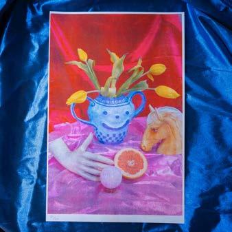

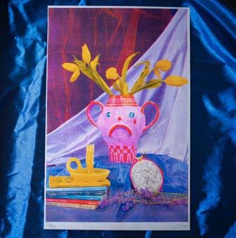
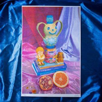
112 COLOR-CODE
FIG. 1: Alex Luciano, Nothing is Real, 2022. Three-color Risograph print series, each 11 × 17 in.
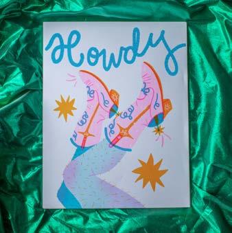
113 INTERVIEW—ALEX LUCIANO
FIG 2: Miscellaneous work by Alex Luciano.
FIFTY QUESTIONS
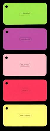
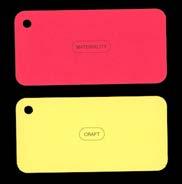
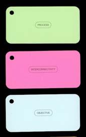
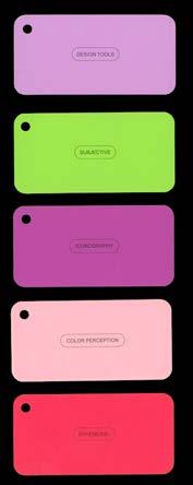
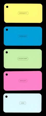
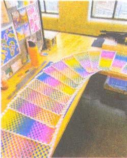
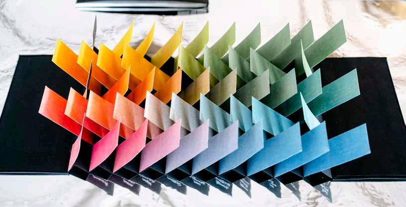
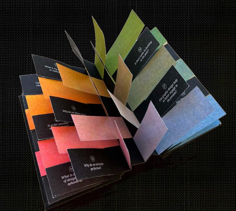
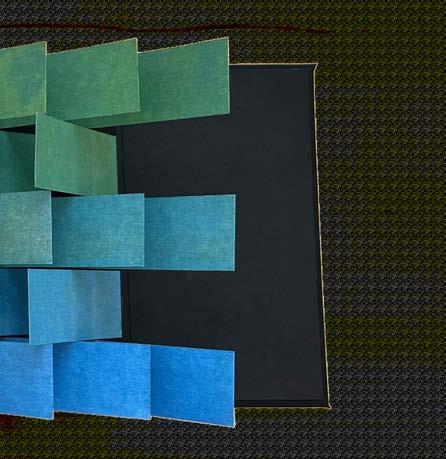
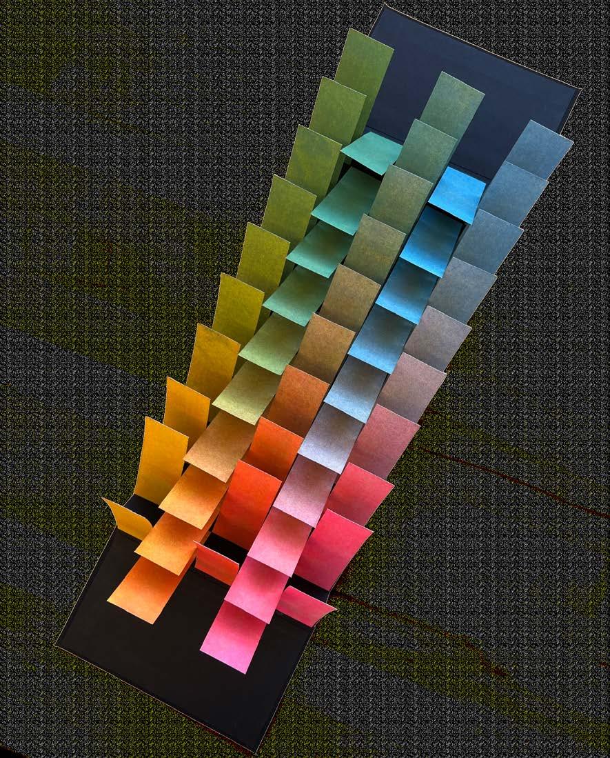
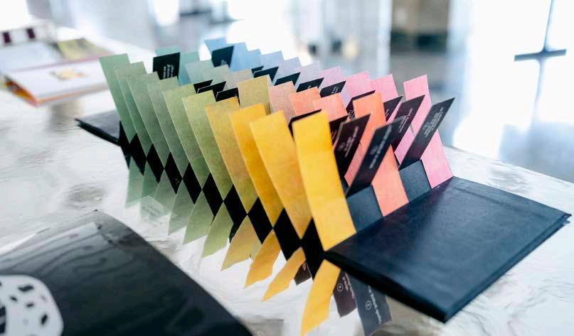
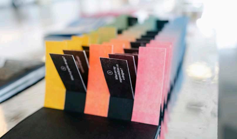
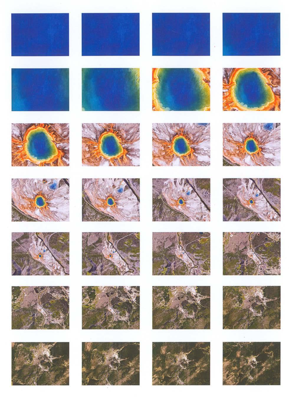
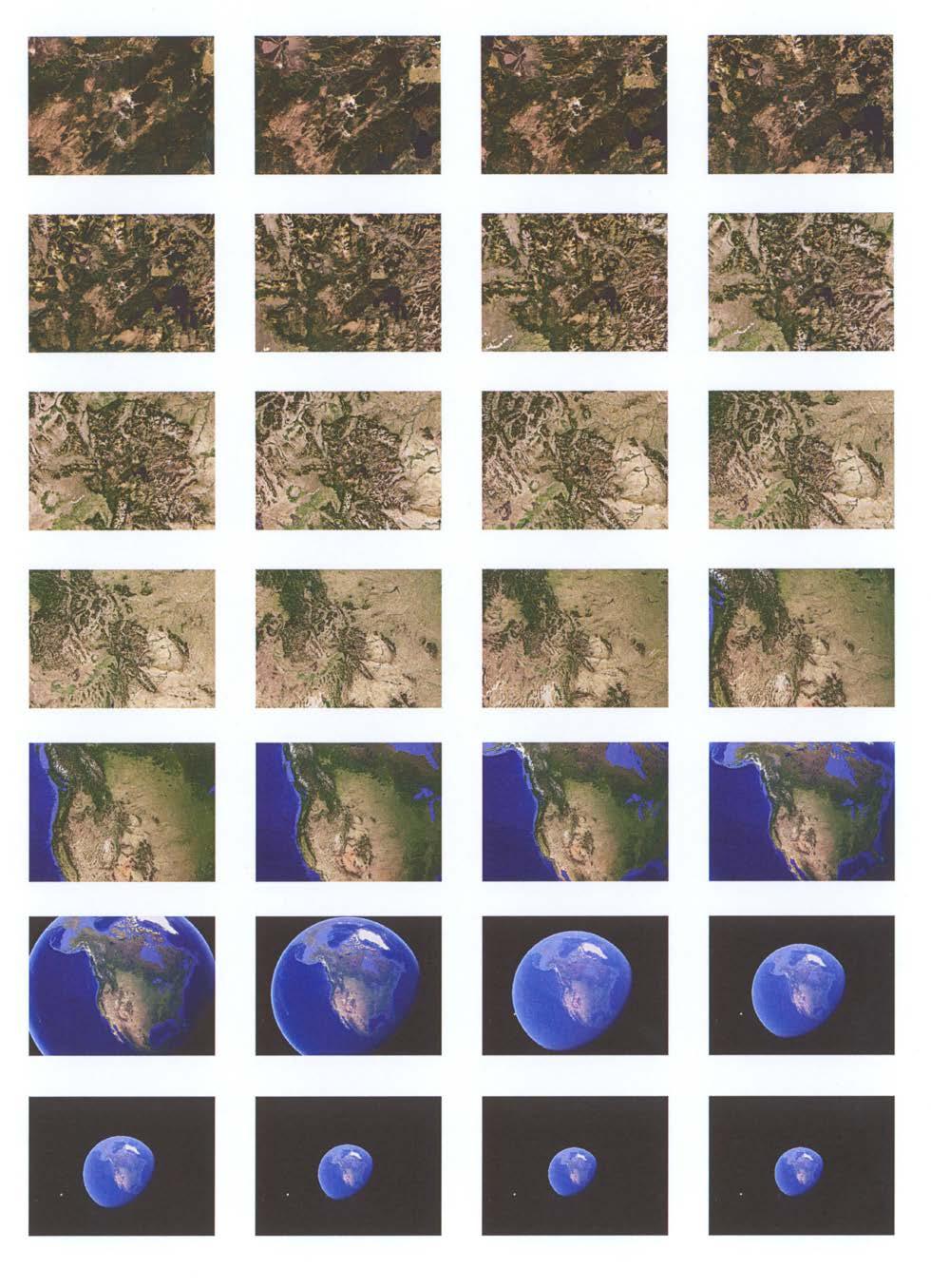
As part of a studio assignment, we were tasked with curating a collection of fifty questions related to our thesis ideas and presenting them in a compelling design format. To bring my questions to life, I chose to employ a unique and sculptural form: the flag book. Each question is printed on the backside of a flag, while the front comes together to create a Risograph tritone color chart showing varying opacities of cornflower blue, fluorescent pink, and yellow.
114 COLOR-CODE #FA2022
04
FIFTY QUESTIONS
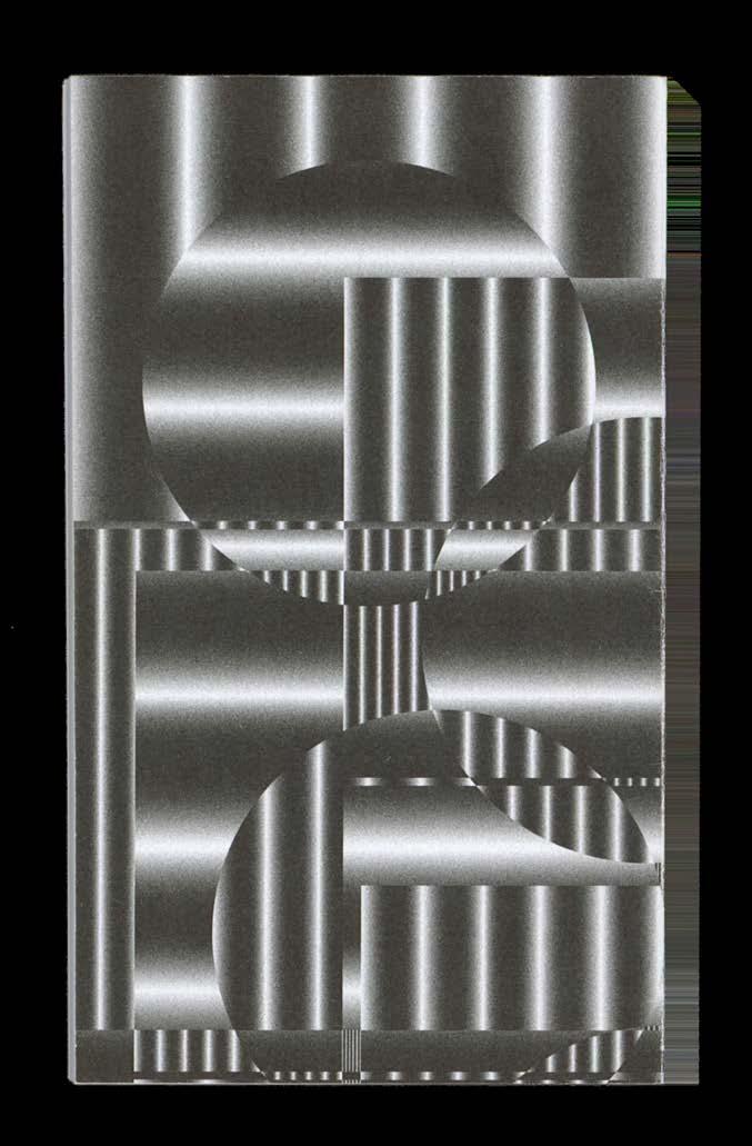
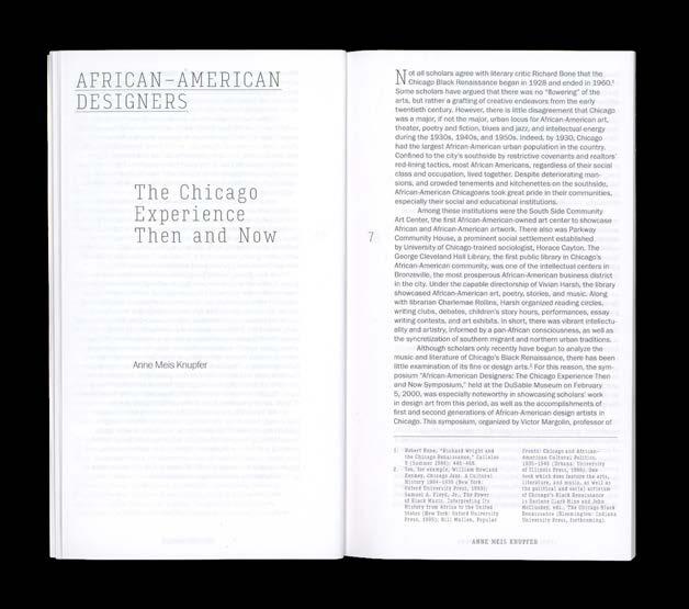
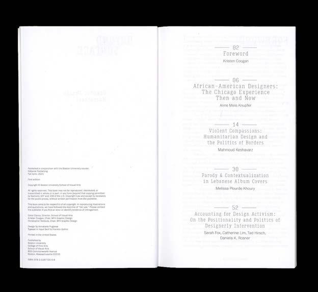
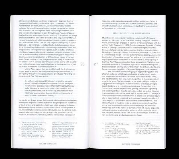
115
Fifty Questions, 2022. Flag book, 3.75 × 6.375 in.

COLOR-CODE 116
117 FIFTY QUESTIONS
Fifty Questions, 2022. COLOR-CODE 118
FIFTY QUESTIONS 119
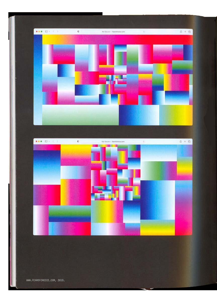
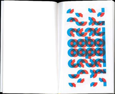
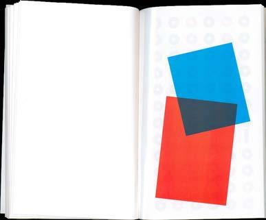
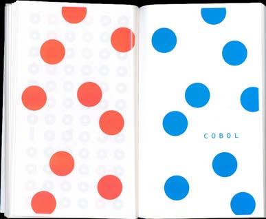
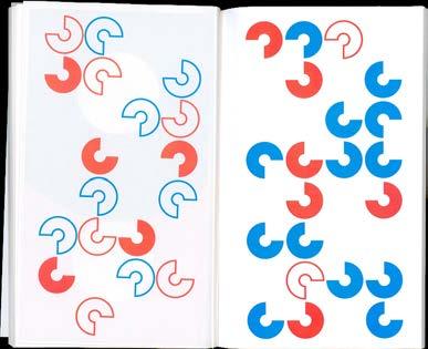
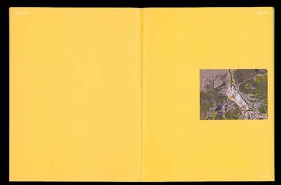
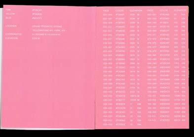
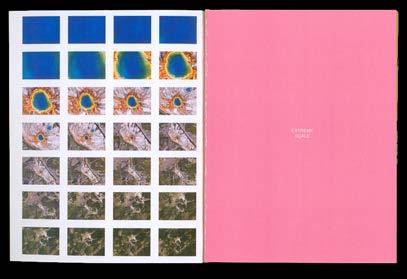
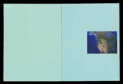
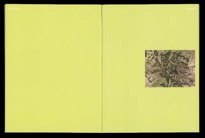
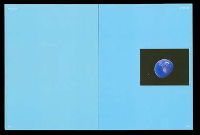
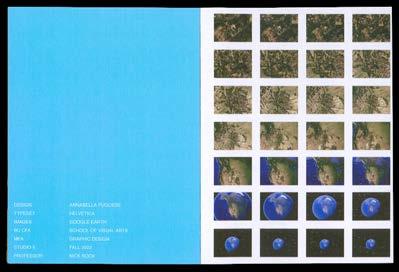
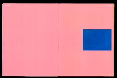
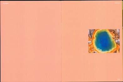
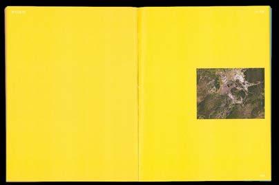
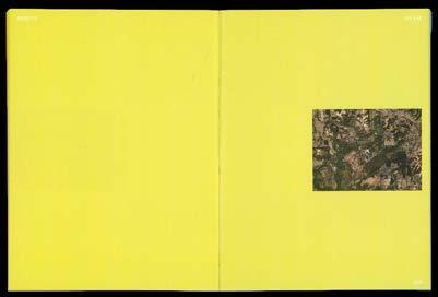
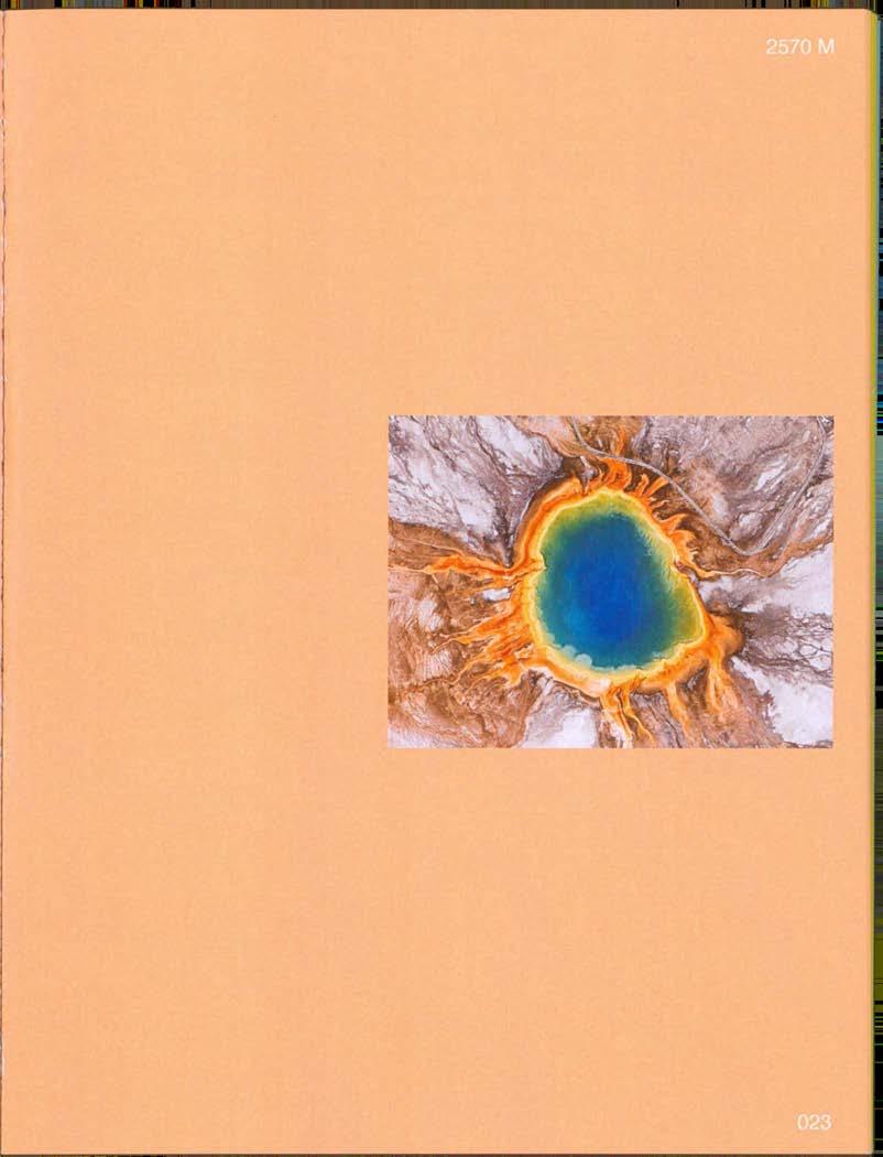
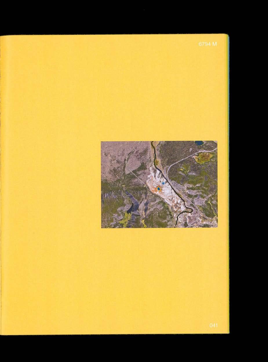
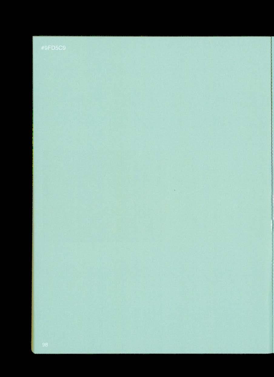
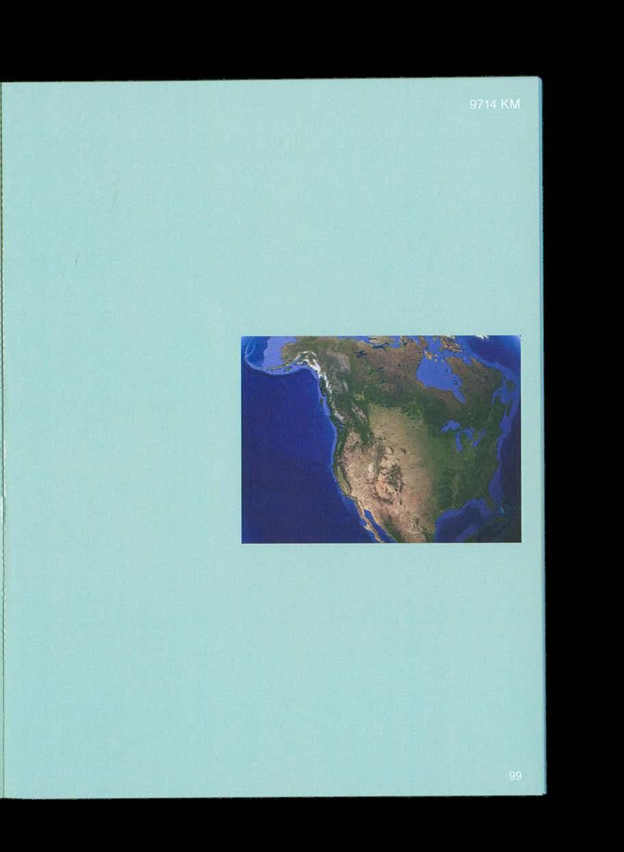
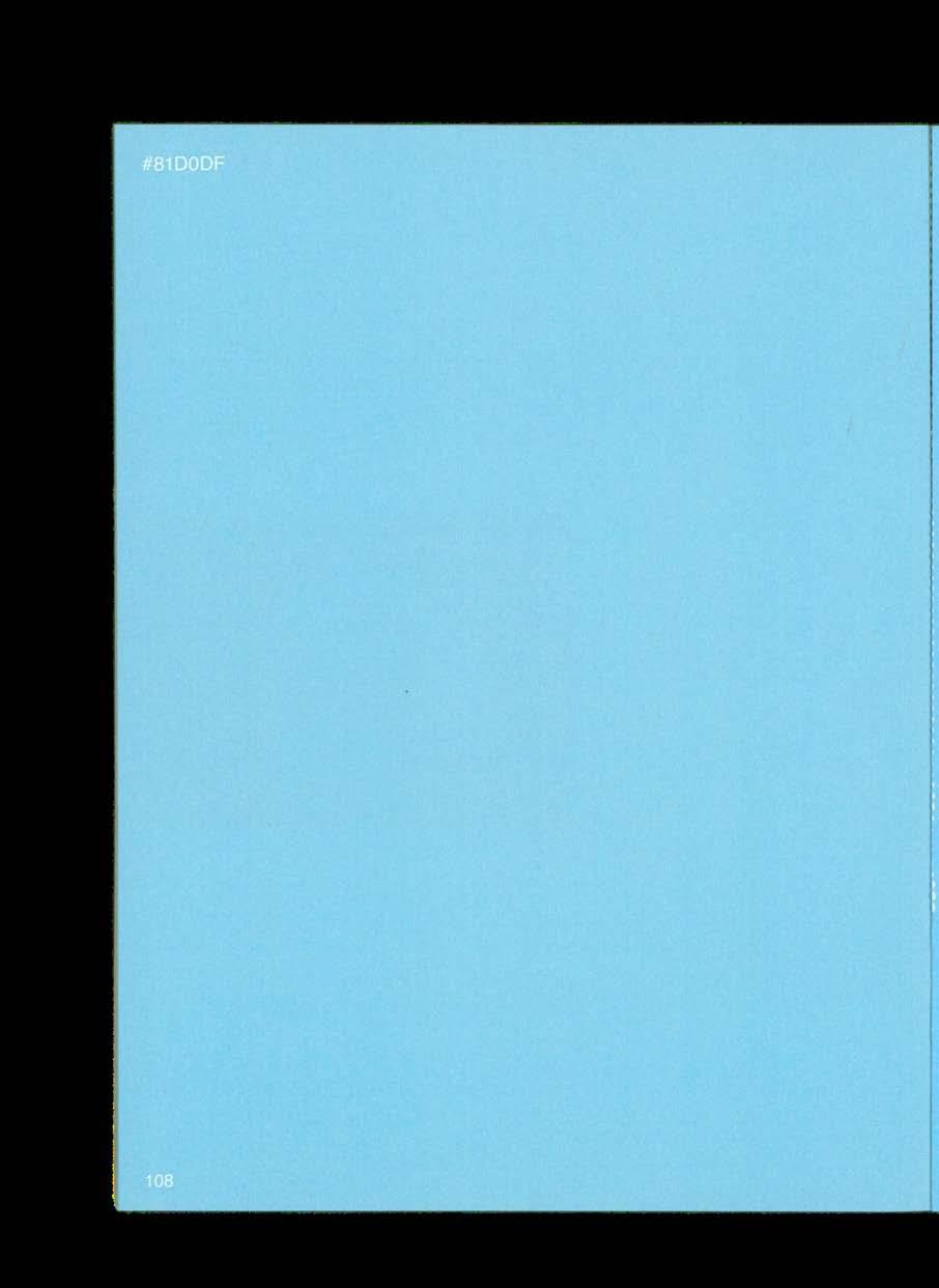
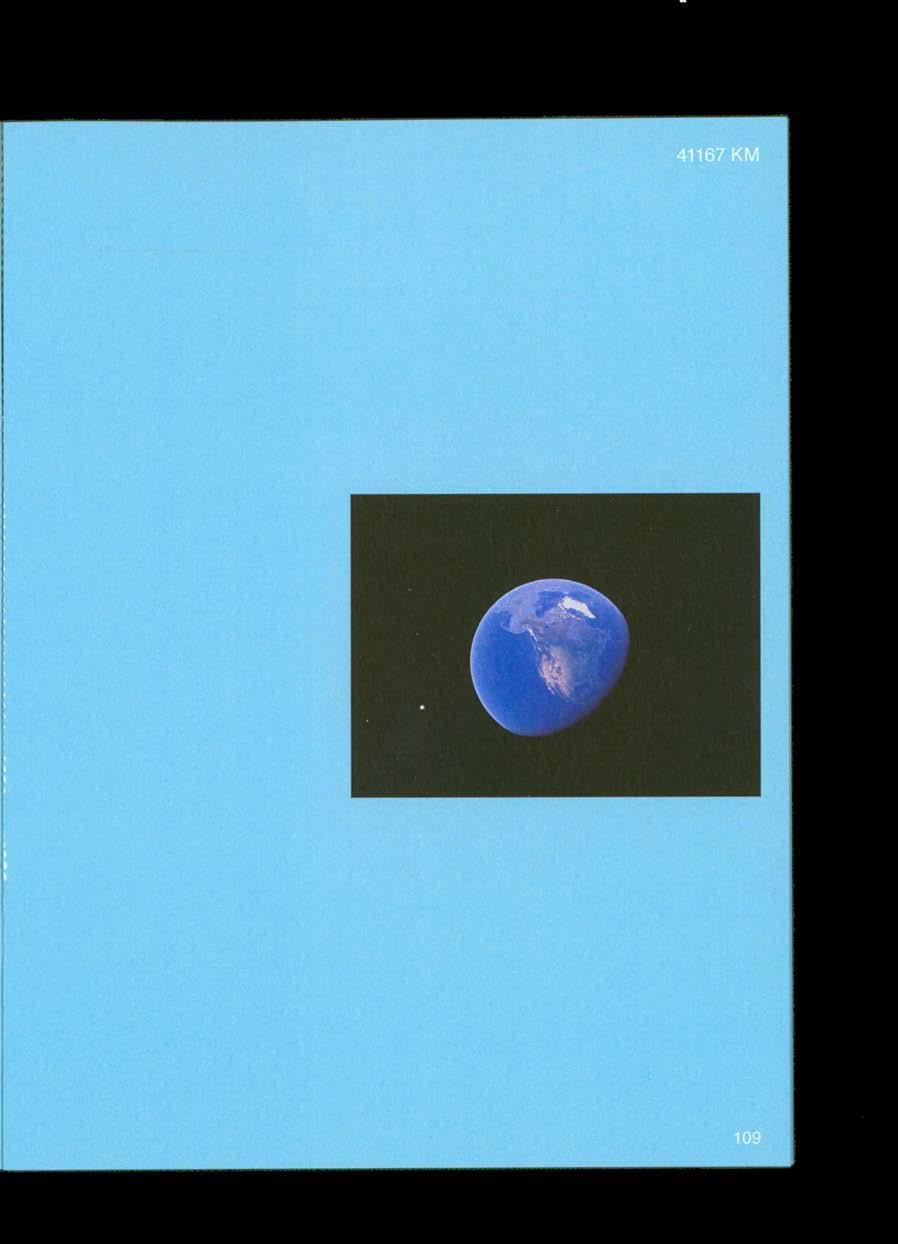
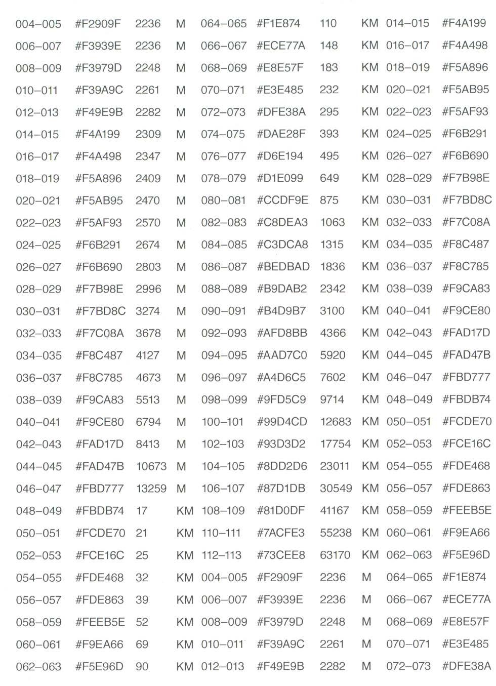
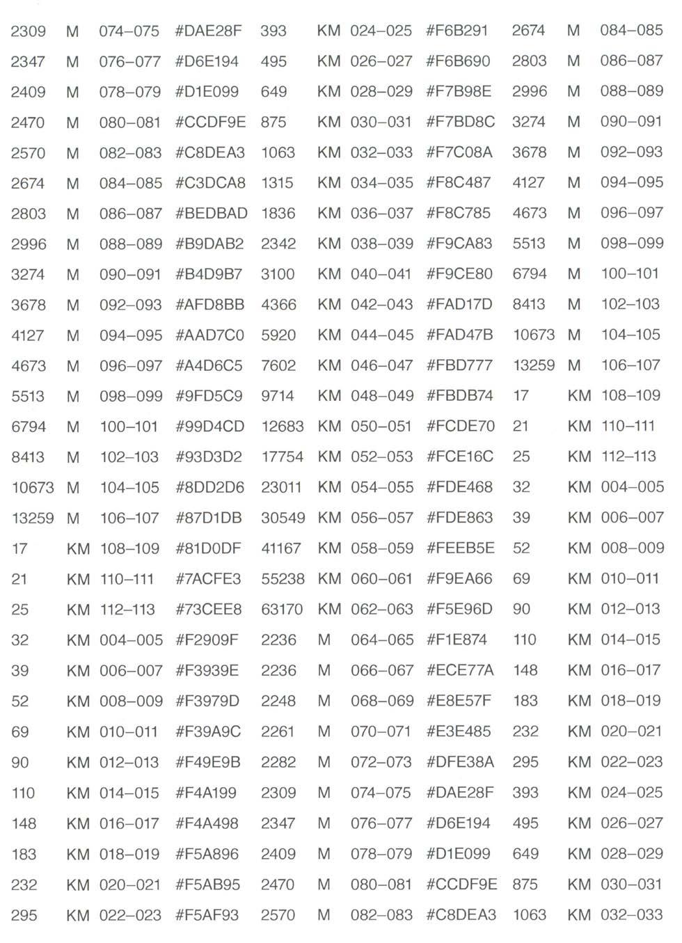
This publication gives form to two sets of data, operating at both a micro and macro level. It takes the viewer through each minute position in a gradient from pink to yellow to blue, with each page showcasing a slightly different color along the gradient. Simultaneously, the book features a series of images taken at increasingly greater distances from a specific geographic location, superimposed over the color backgrounds. This creates a visual effect in which the viewer can experience both a “scroll” along the x-axis and a "zoom out" effect along the y-axis as they flip through the book.
120 COLOR-CODE #FA2022
05
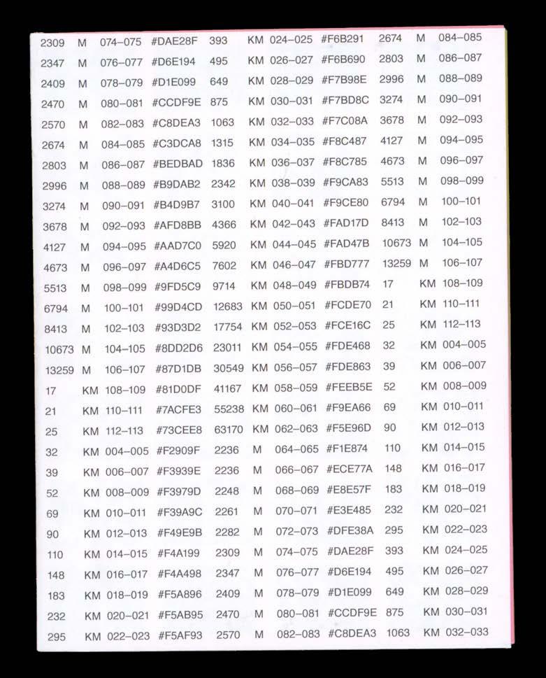
EXTREME SCALE
121 EXTREME SCALE
Extreme Scale, front cover, 2023. Perfect-bound, 6 × 8 in.
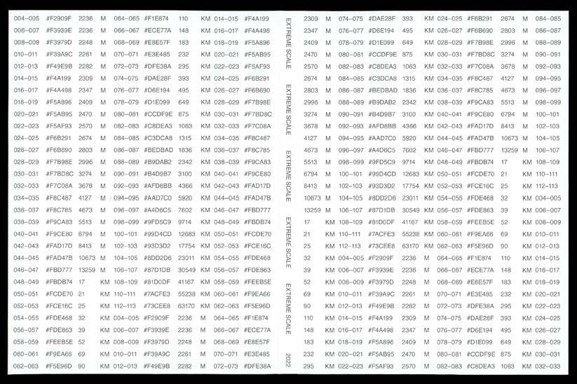
Extreme Scale, outside cover. COLOR-CODE 122

EXTREME SCALE
123
Extreme Scale, inside cover.
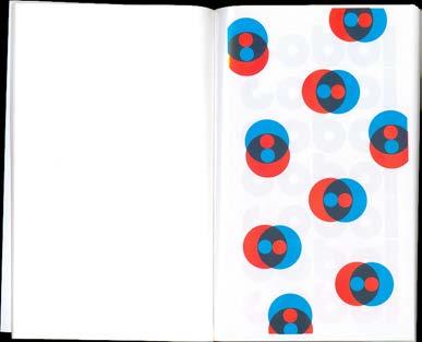
Extreme Scale, select spreads.
PG 126–143: Extreme Scale, select spreads.

COLOR-CODE 124
EXTREME SCALE 125

COLOR-CODE 126
EXTREME SCALE 127
COLOR-CODE 128
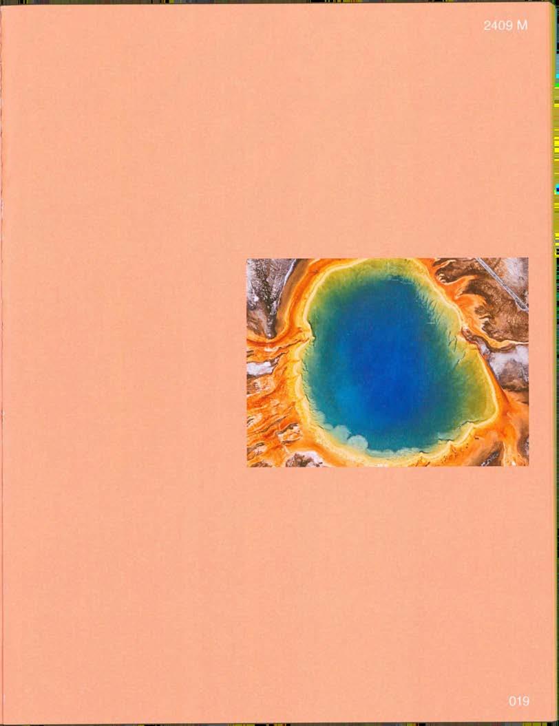
EXTREME SCALE 129
COLOR-CODE 130
EXTREME SCALE 131
COLOR-CODE 132
EXTREME SCALE 133
COLOR-CODE 134
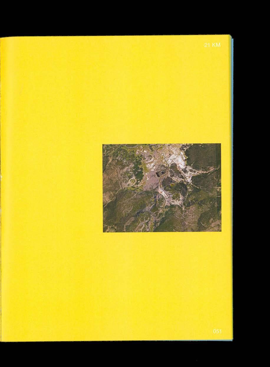
EXTREME SCALE 135
COLOR-CODE 136
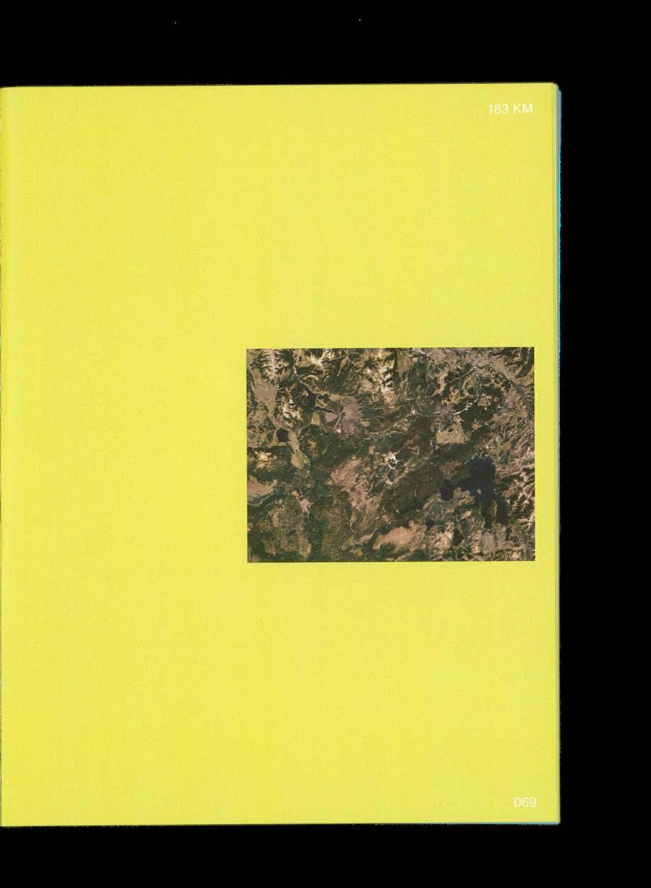
EXTREME SCALE 137

COLOR-CODE 138
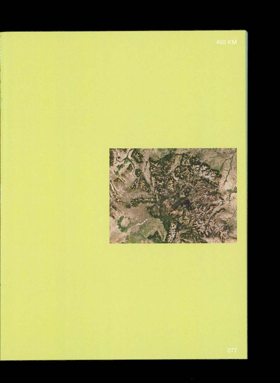
EXTREME SCALE 139
COLOR-CODE 140
EXTREME SCALE 141
COLOR-CODE 142
EXTREME SCALE 143
06
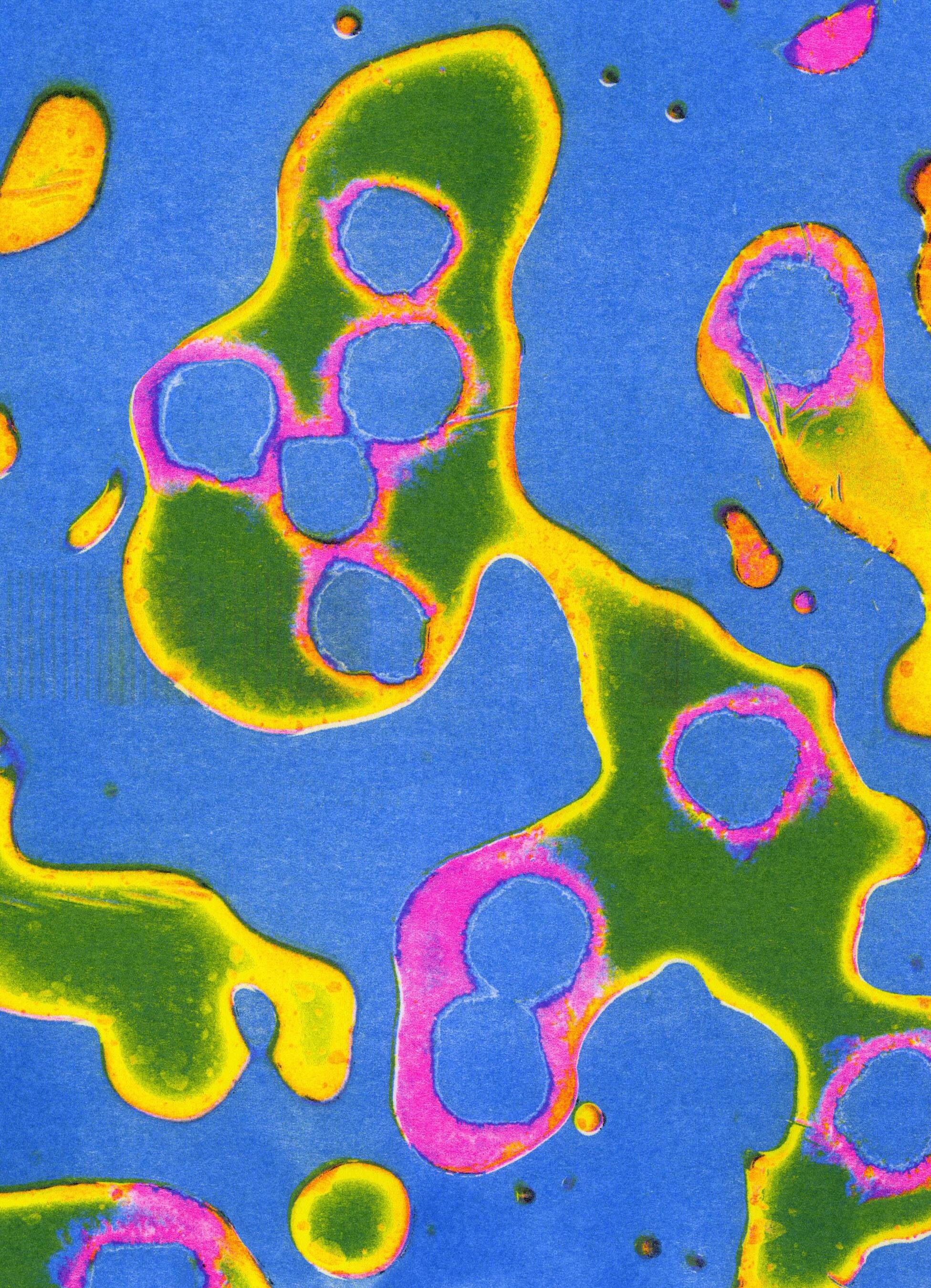
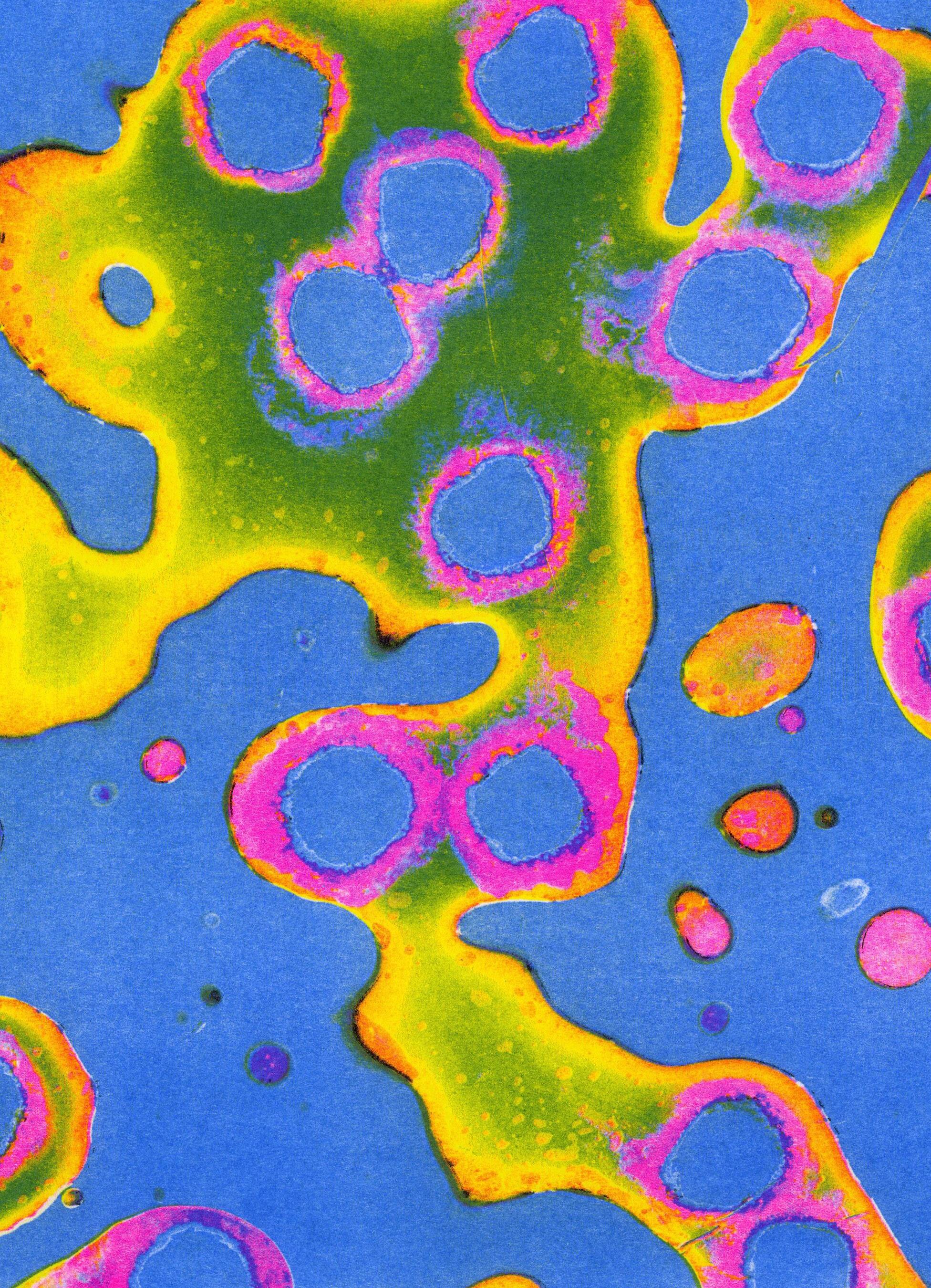
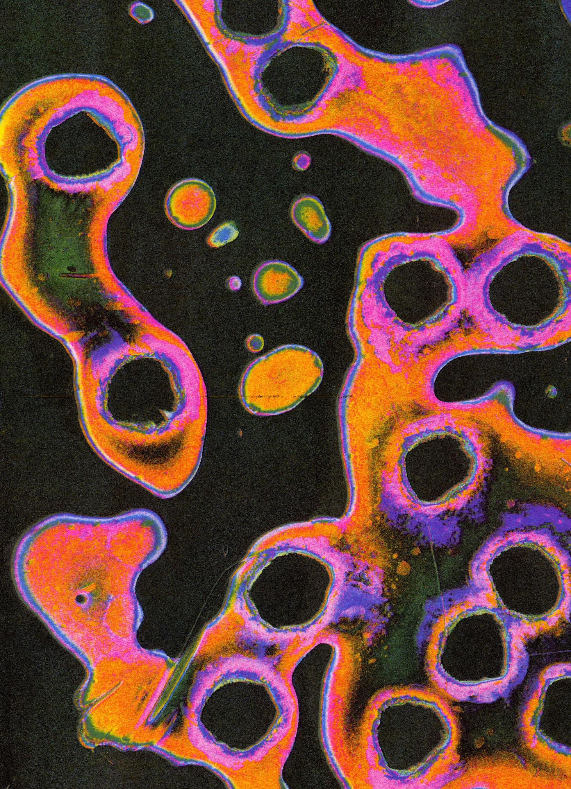
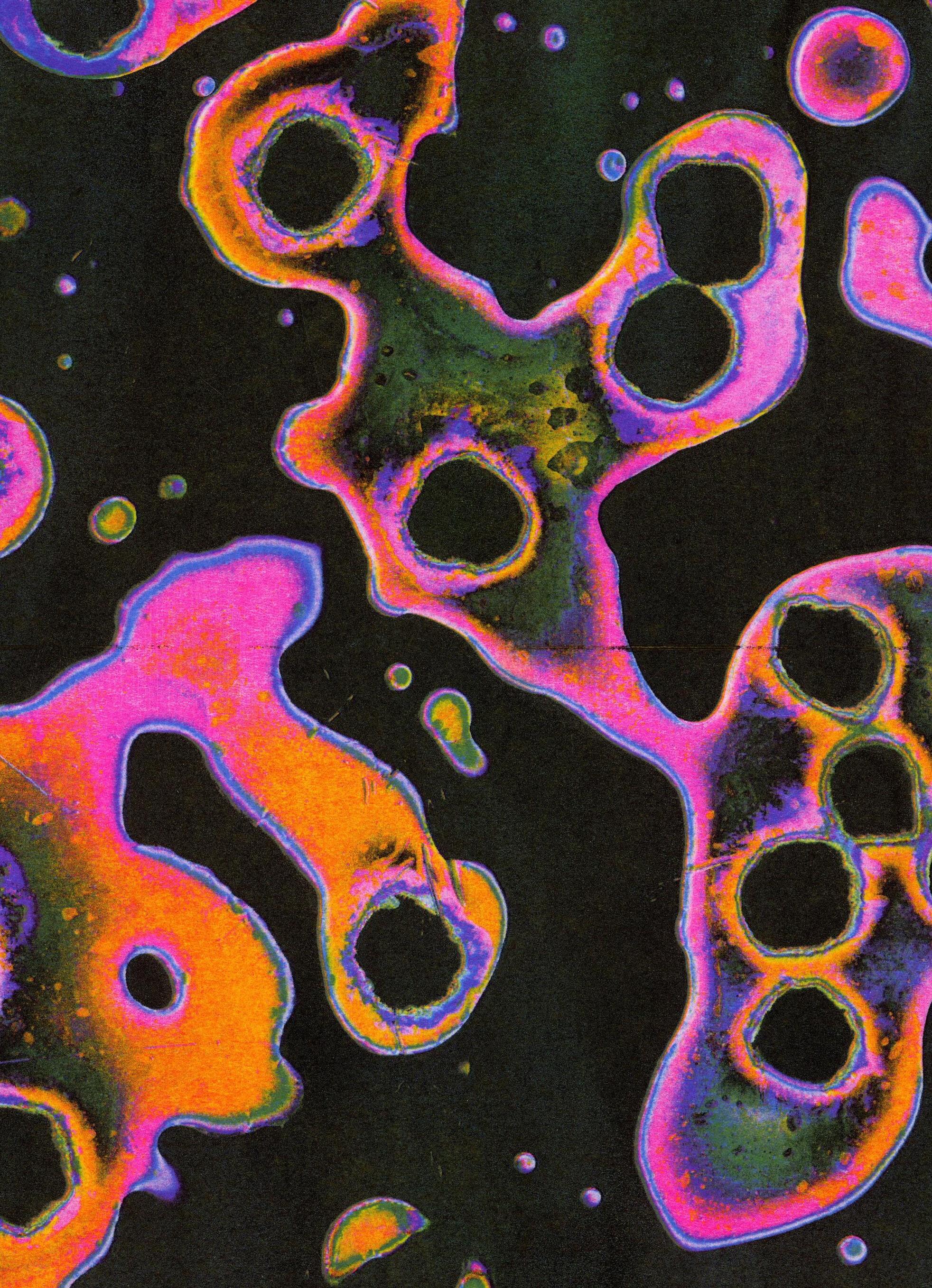
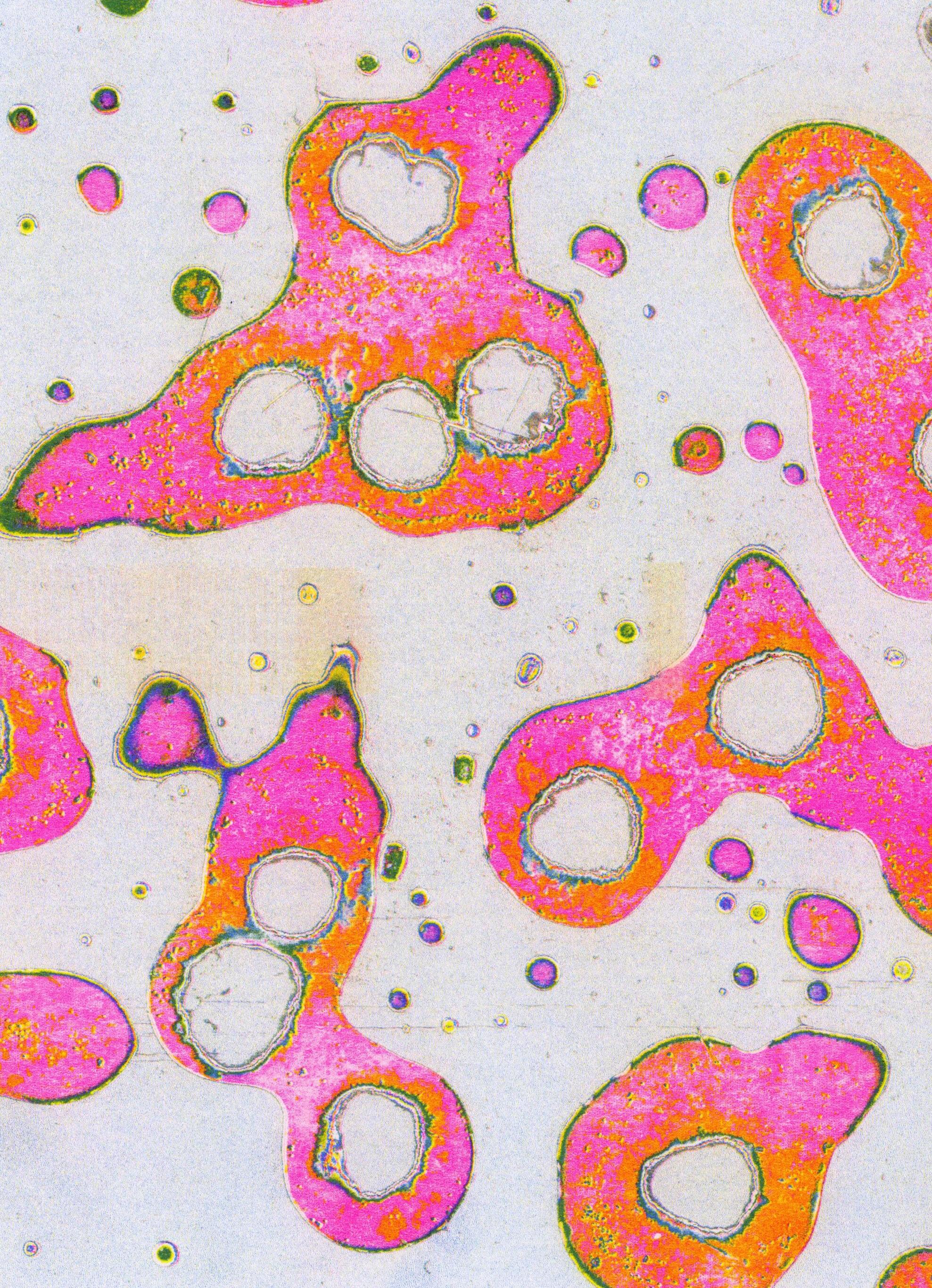
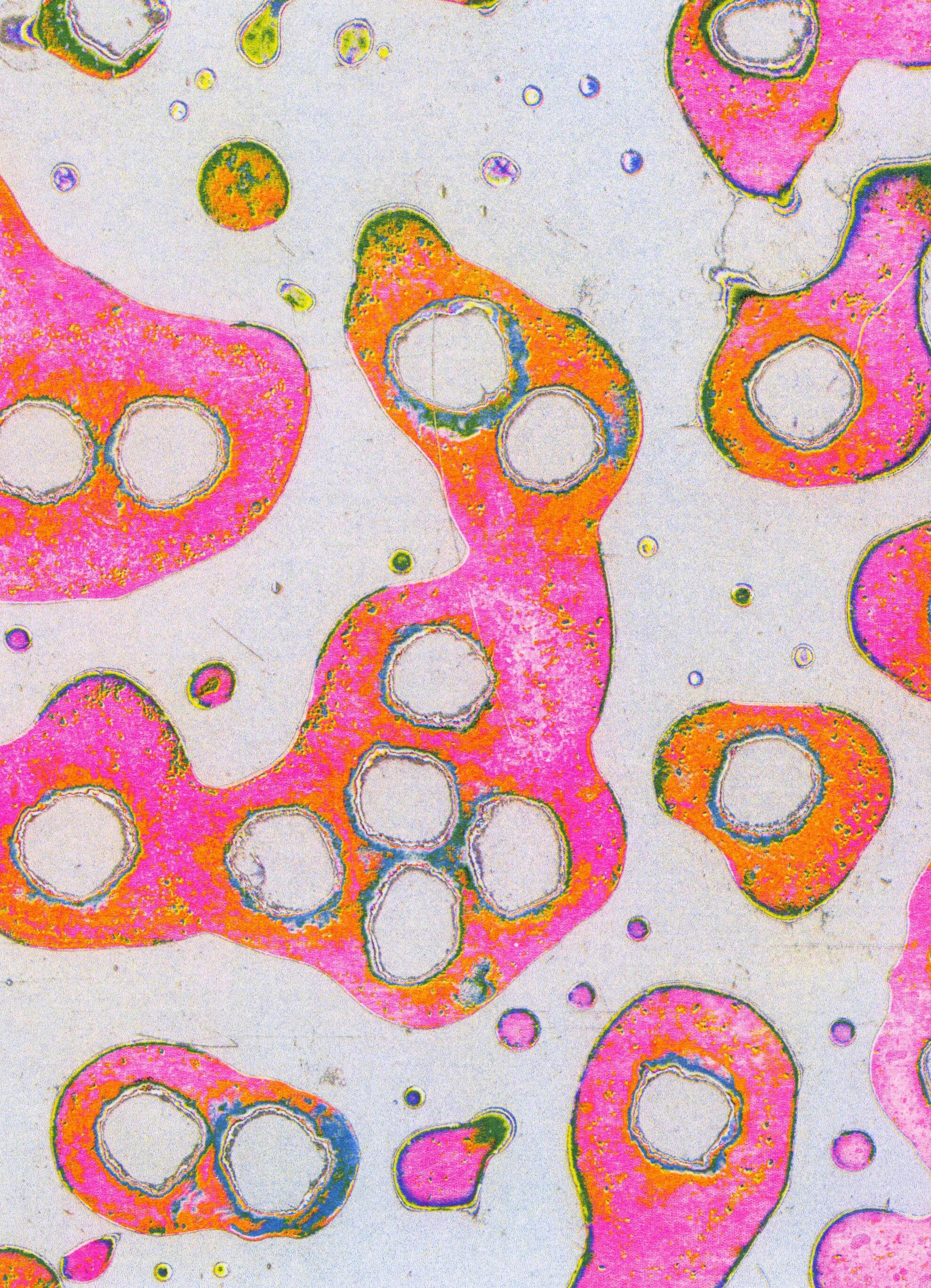
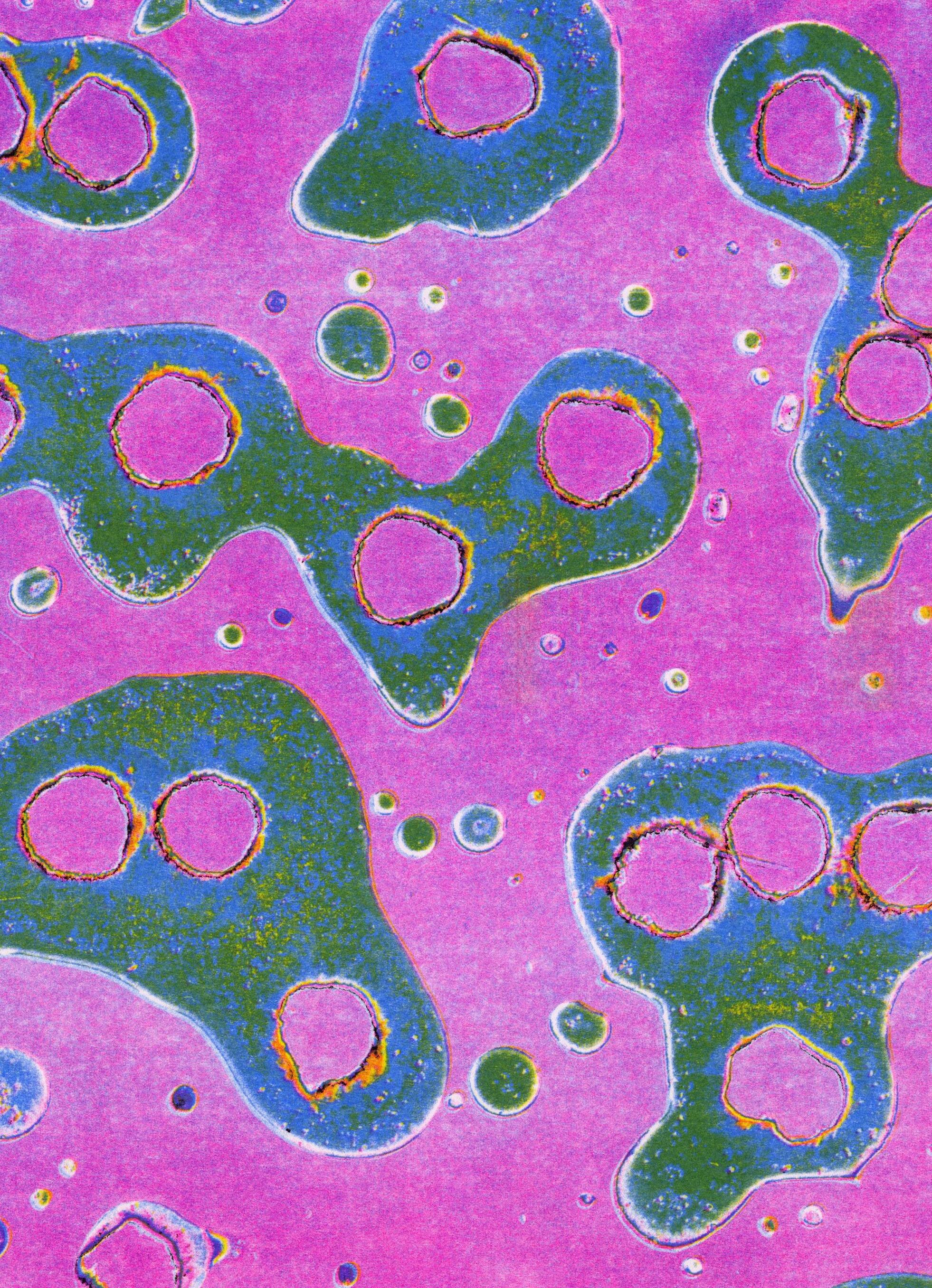
BOBA EXPERIMENTS
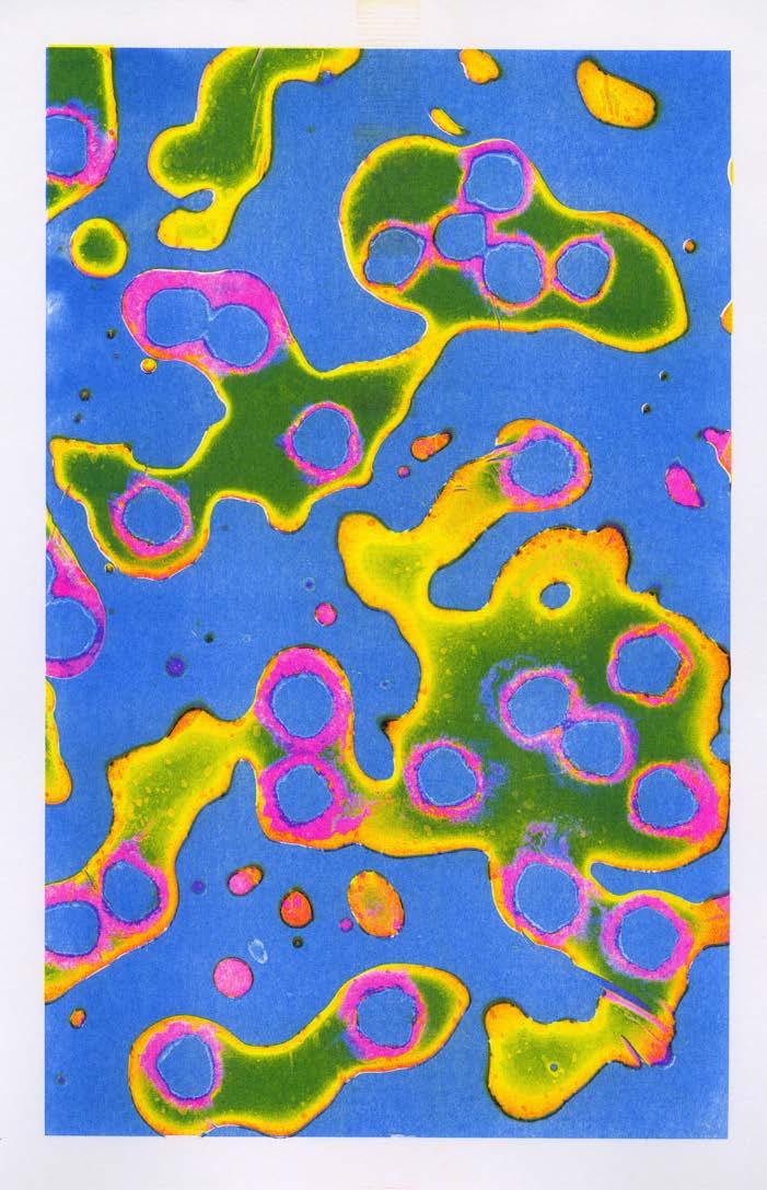
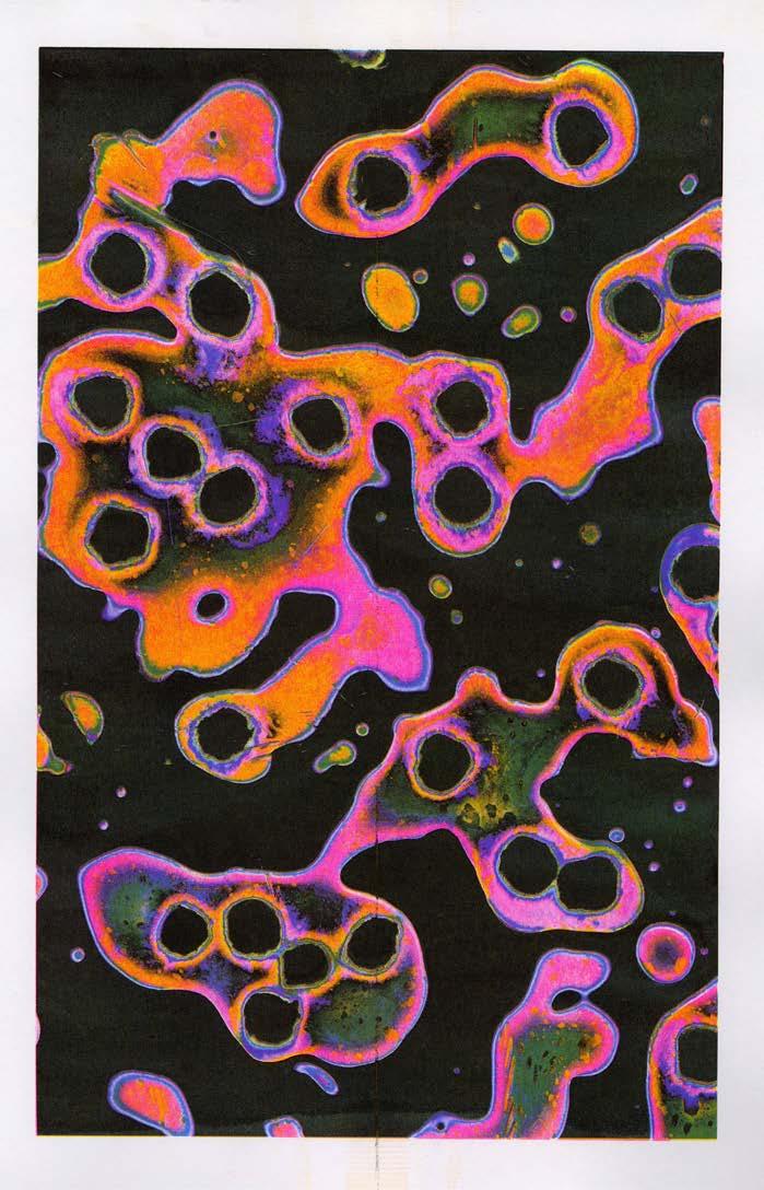
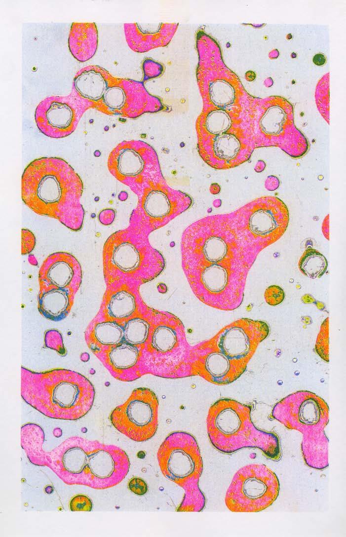
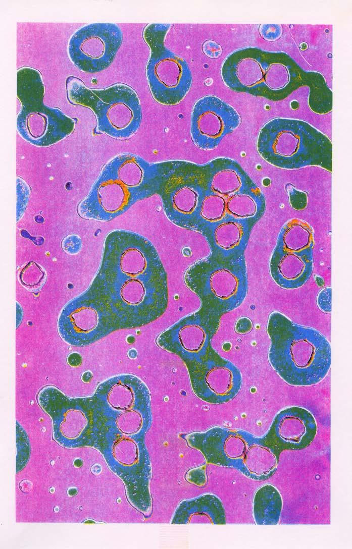
This Risograph print series was born out of an exercise in experimental form-making. Inspired by the textural qualities of boba tea, I created abstract compositions using scans of the drink itself. I then altered the colors of the images and reproduced them in four colors on the Risograph to create vibrant and dynamic prints.
148 COLOR-CODE #FA2022

149 BOBA EXPERIMENTS
Boba Experiments, 2022. Risograph print series, each 11 × 17 in.
COLOR-CODE 150
Blue Boba, 2022. Risograph print, 11 × 17 in.
151 BOBA EXPERIMENTS
Black Boba, 2022. Risograph print, 11 × 17 in.
COLOR-CODE 152
White Boba, 2022. Risograph print, 11 × 17 in.
153 BOBA EXPERIMENTS
Purple Boba, 2022. Risograph print, 11 × 17 in.

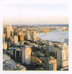
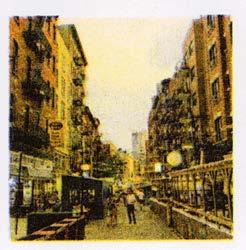
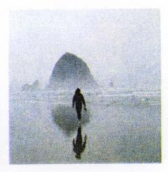
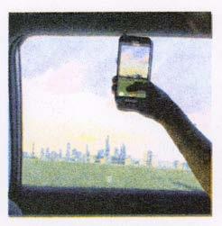
BEGINNER'S MIND
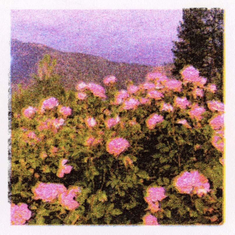
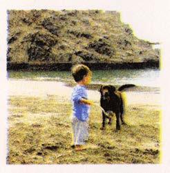
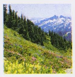
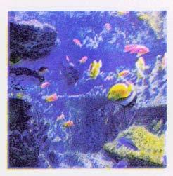
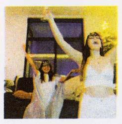
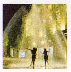
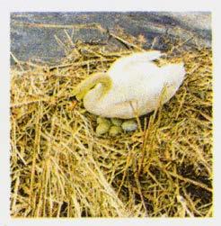
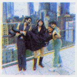
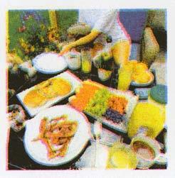
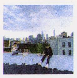
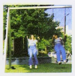
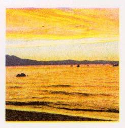
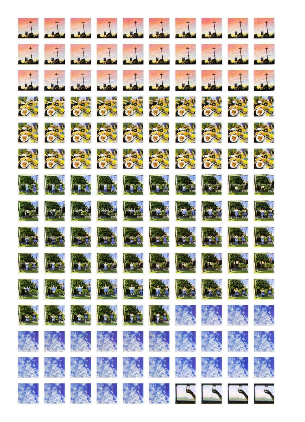
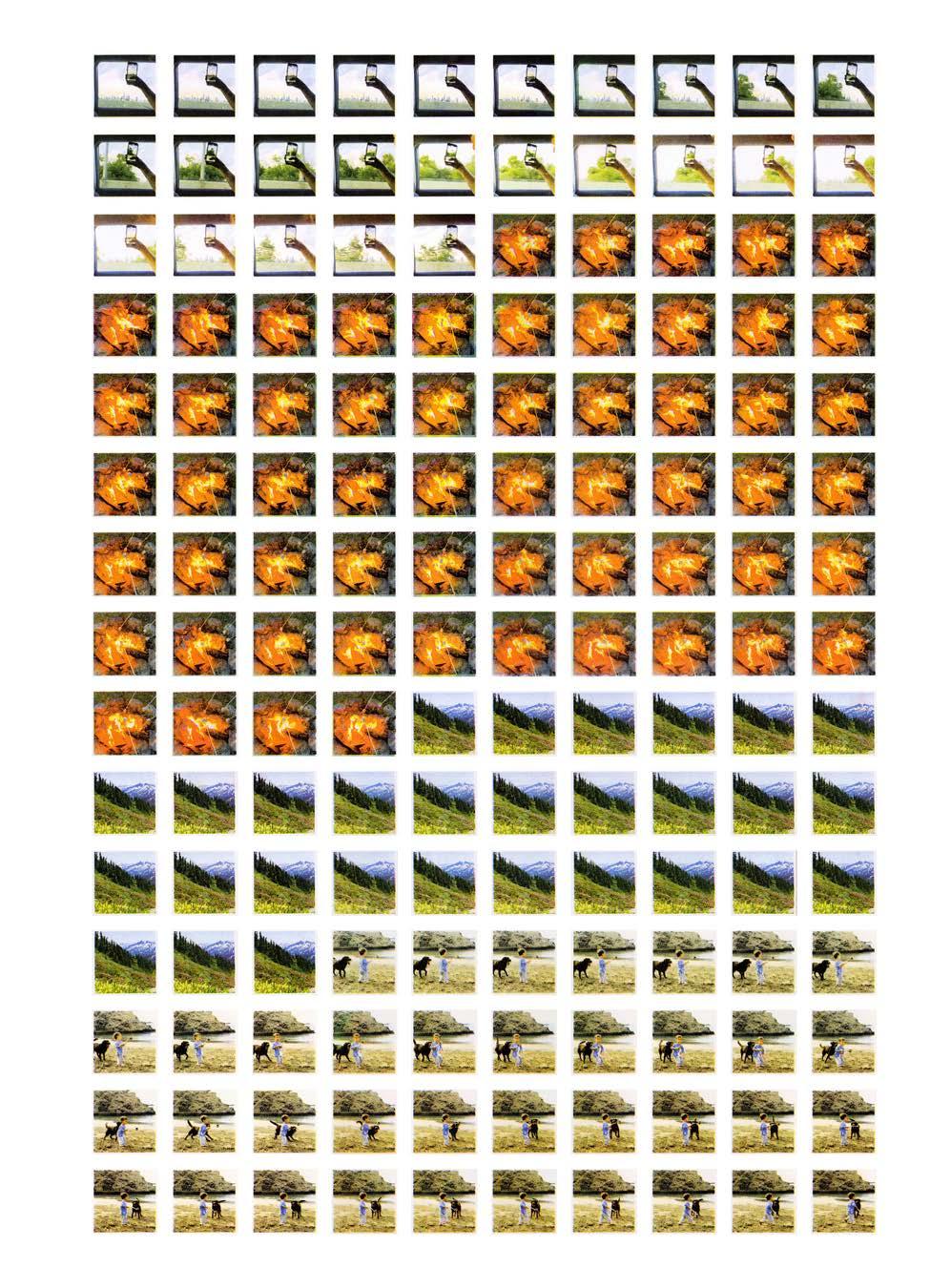
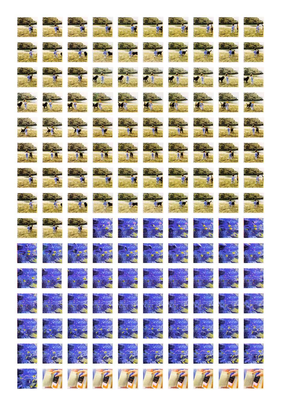
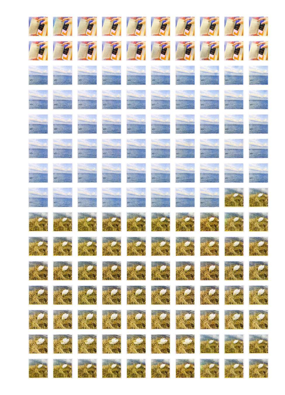
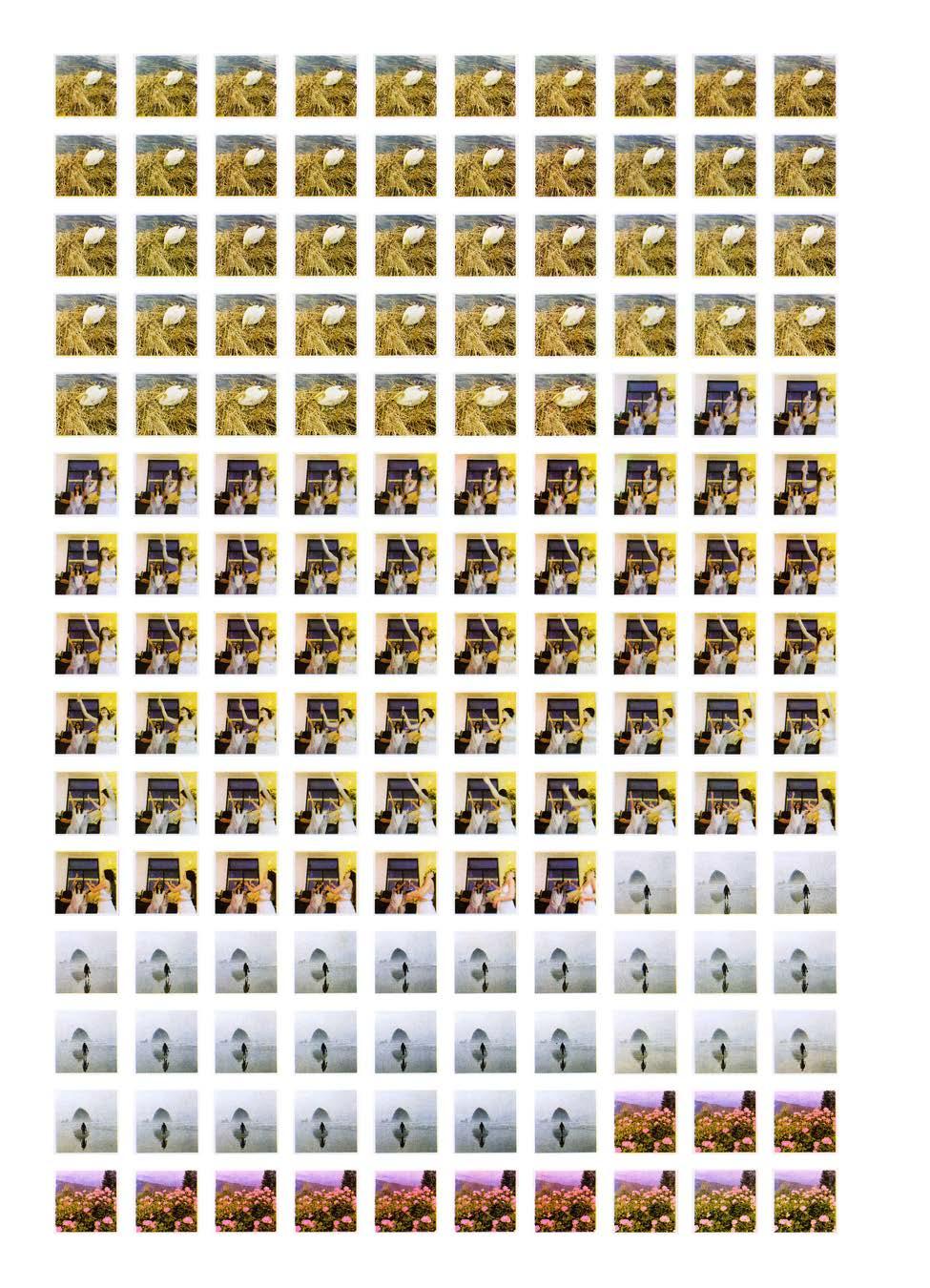
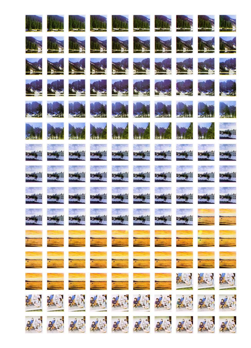
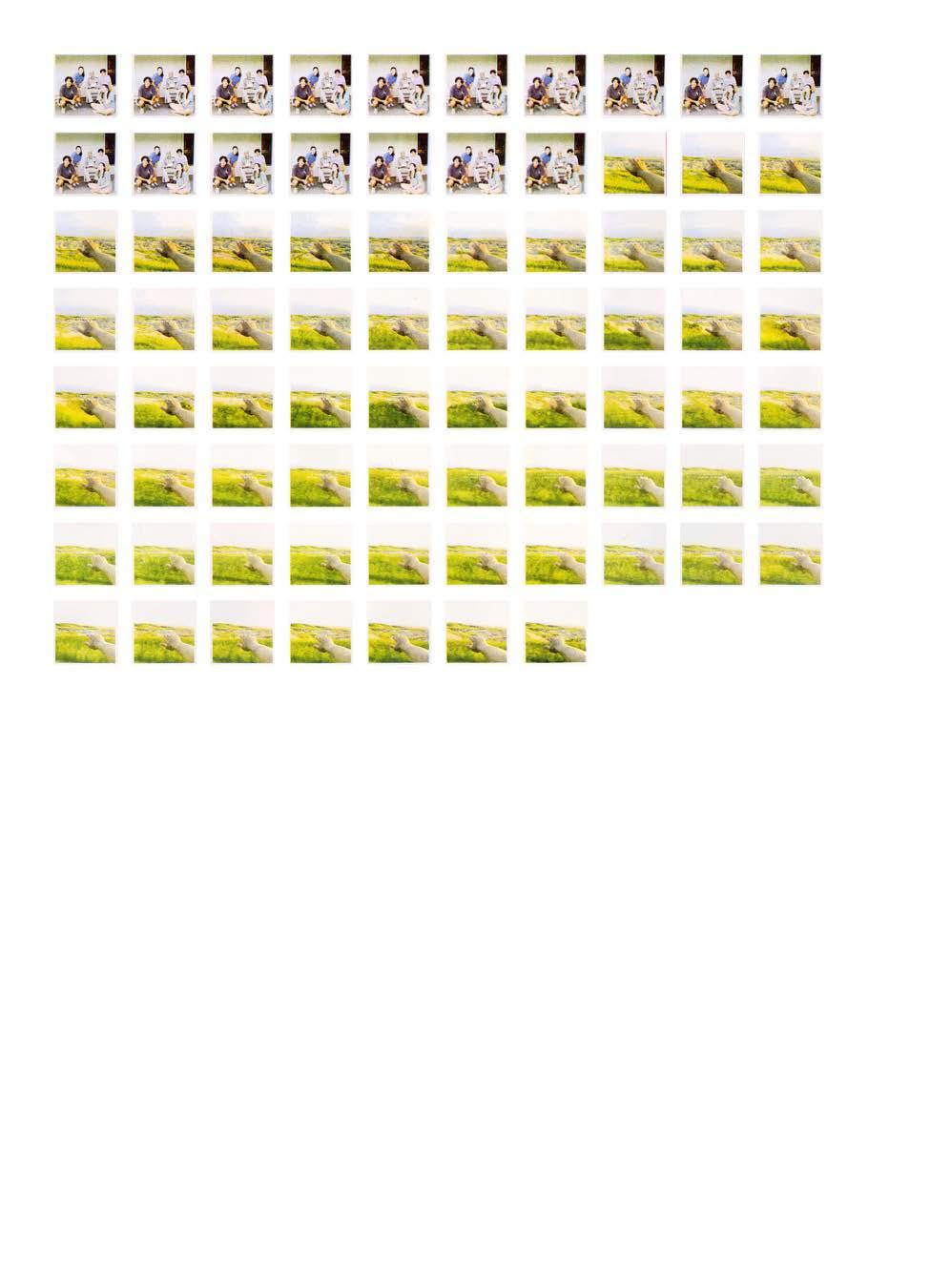
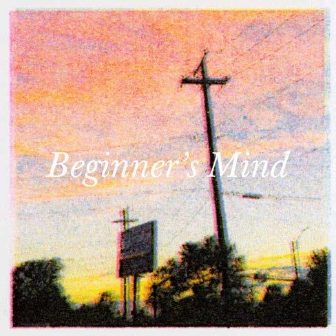
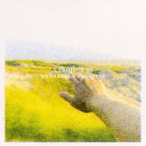
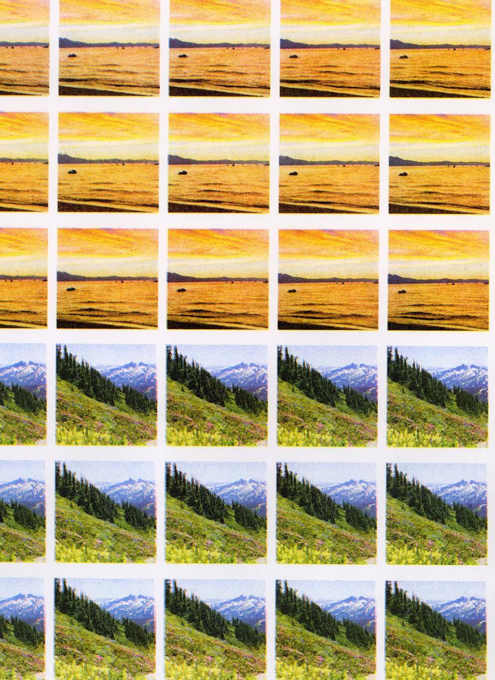
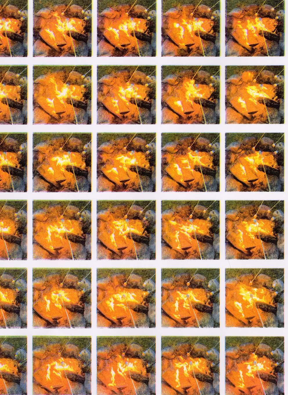
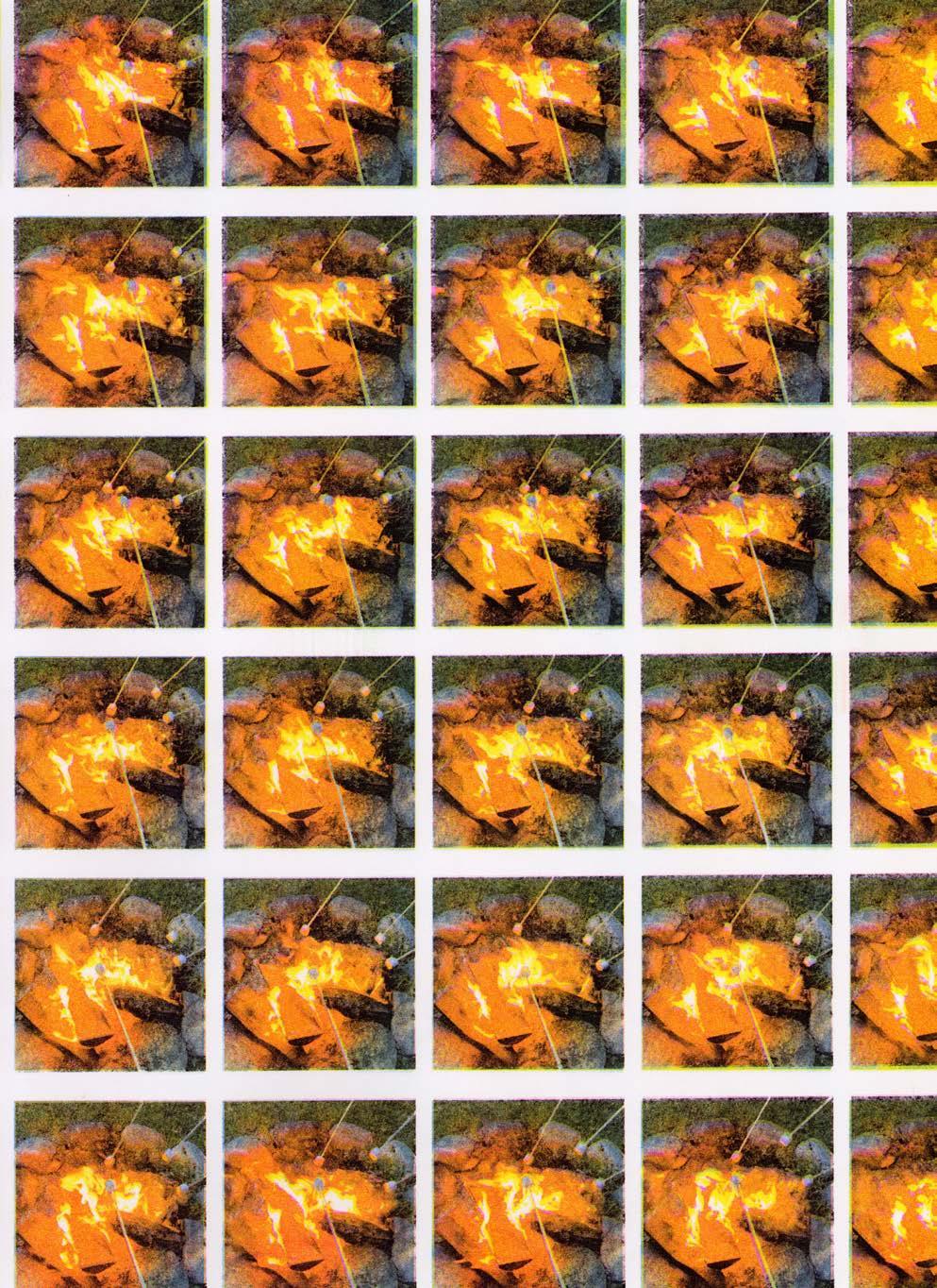
Beginner’s Mind is a collection of Risograph animations based on specific memories recounted by five of my peers. The animations range from three to six seconds and are derived from video footage either provided to me or selected from my own camera roll. They are accompanied by interview recordings with my classmates as well as background music and audio from the original videos to create an emotional and nostalgic visual experience.
162 COLOR-CODE #FA2022
07
163 BEGINNER'S MIND
Beginner's Mind (still), 2022. Risograph animation, 1080 × 1080 px.
Beginner's Mind, select stills.
PG 166–176: Beginner's Mind, all frames.

COLOR-CODE 164
BEGINNER'S MIND 165
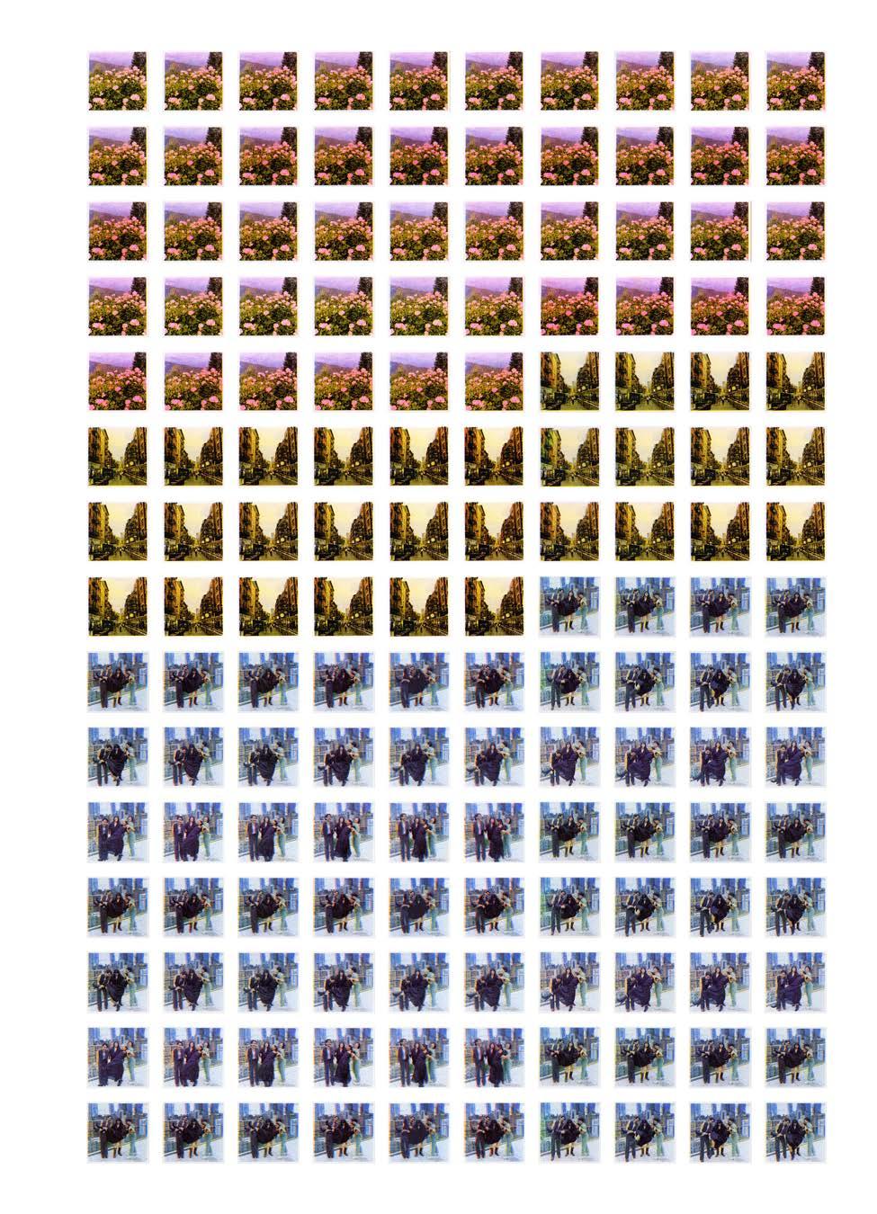
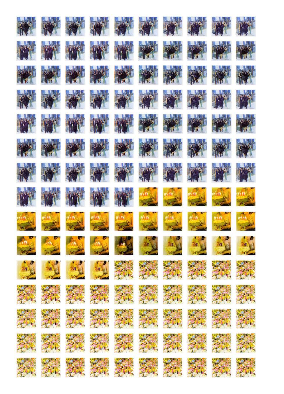
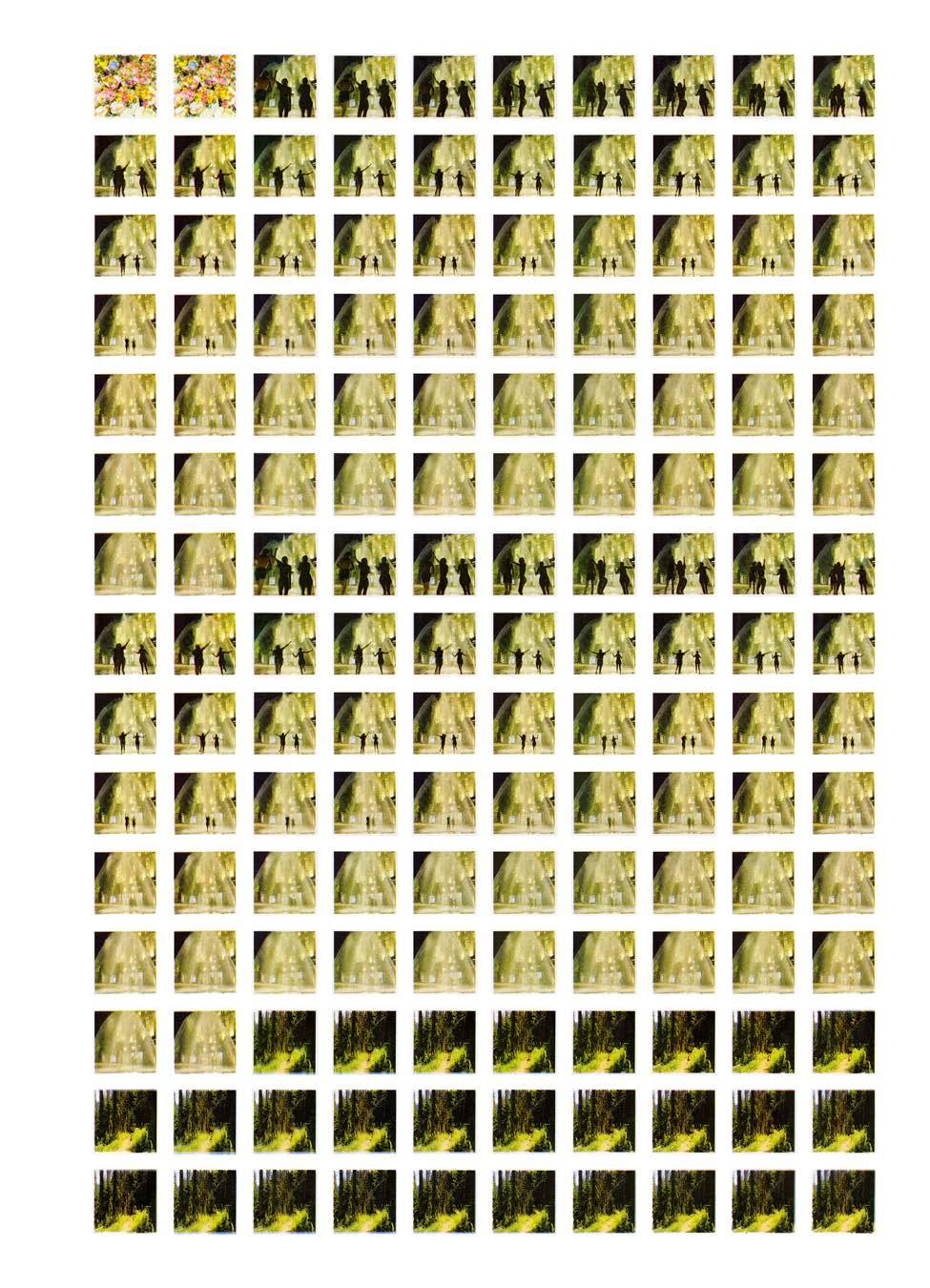
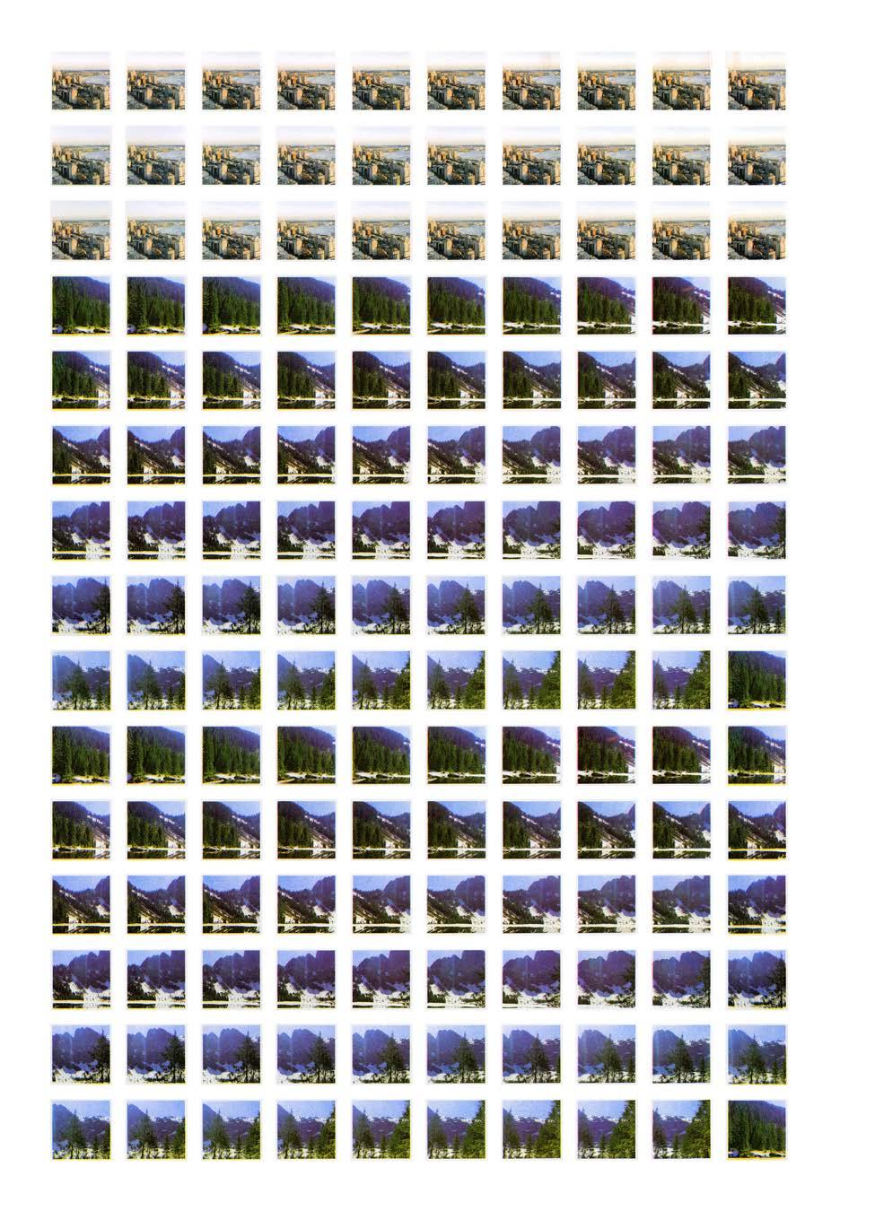
BEGINNER'S MIND
177
Beginner's Mind, title frames.
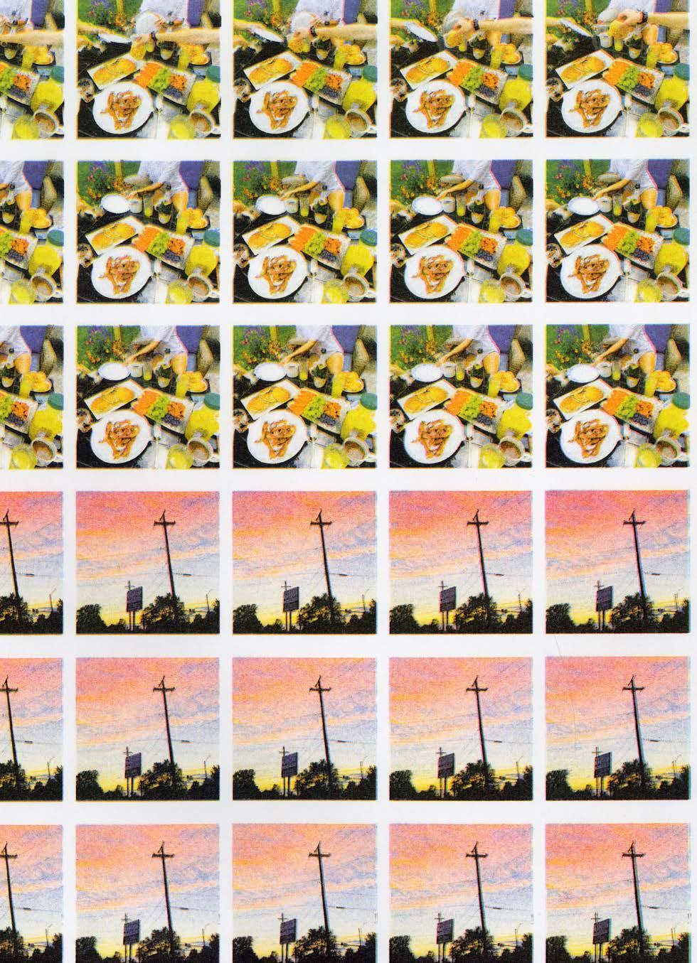
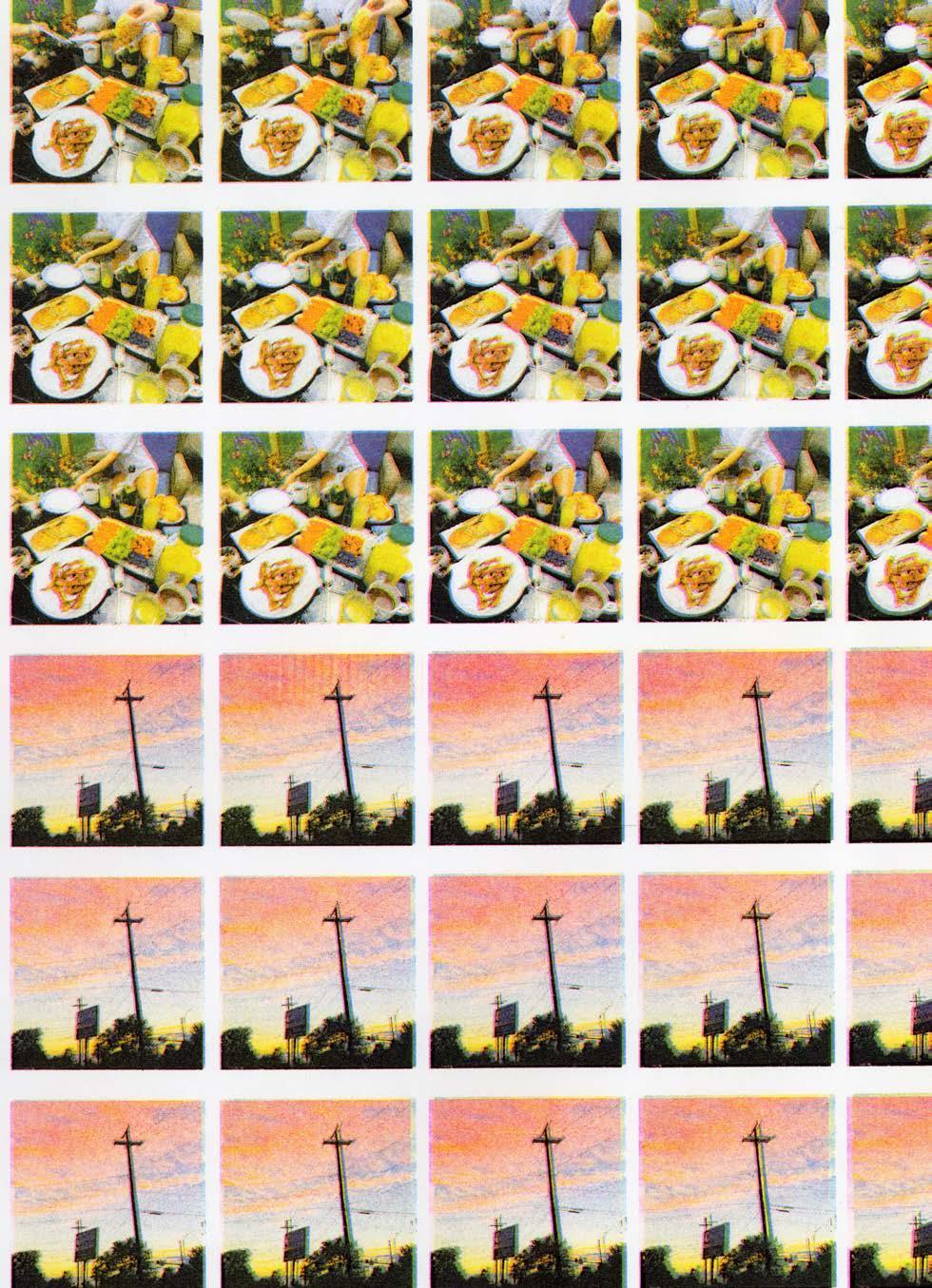
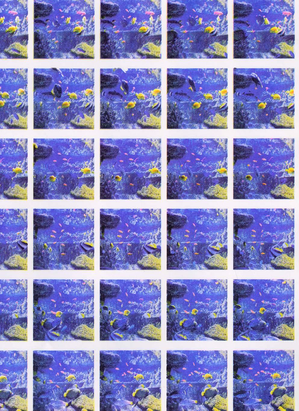
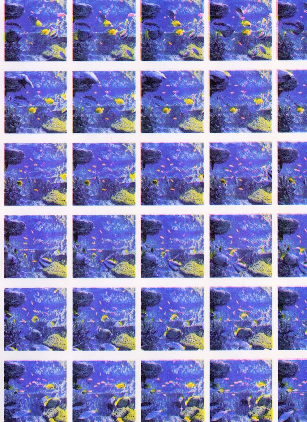

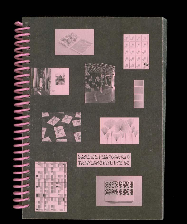
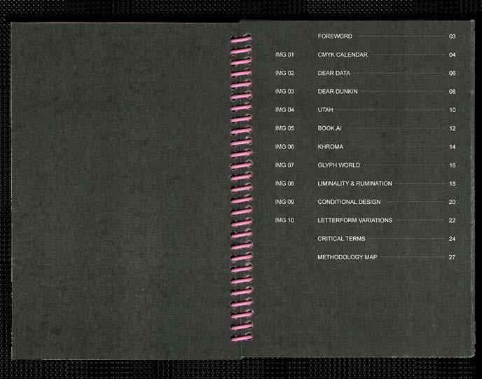
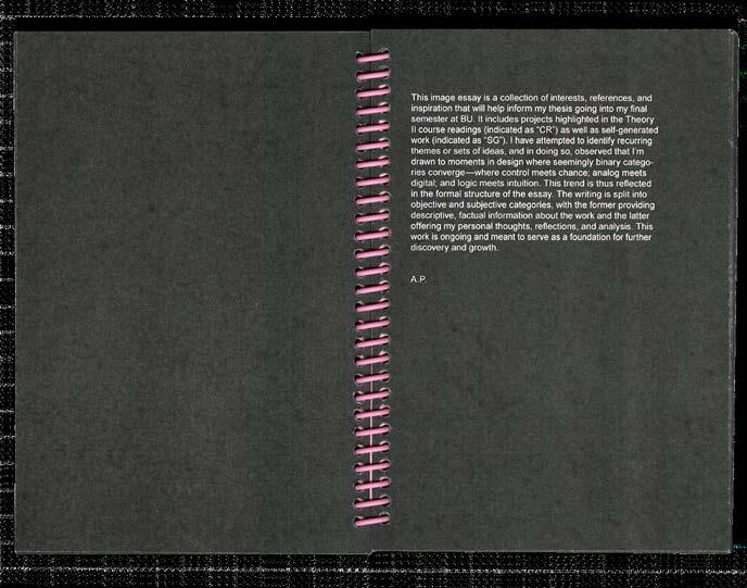
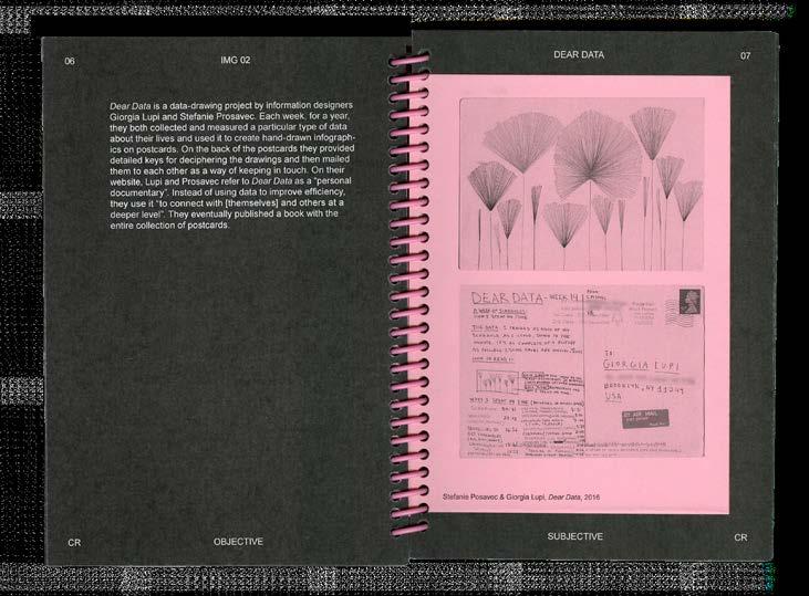
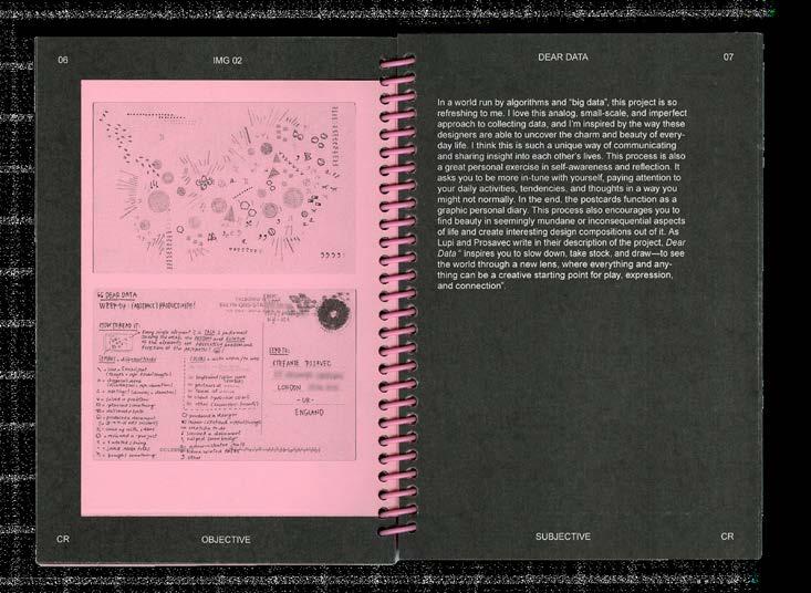
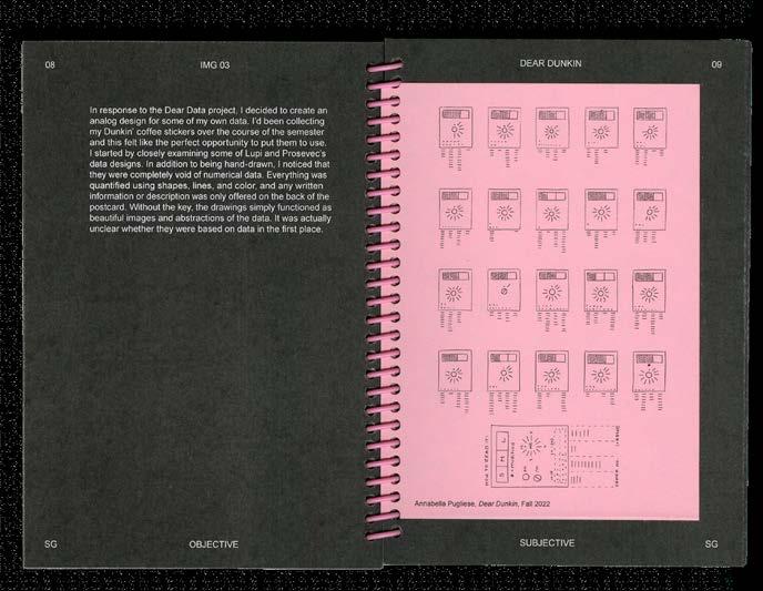
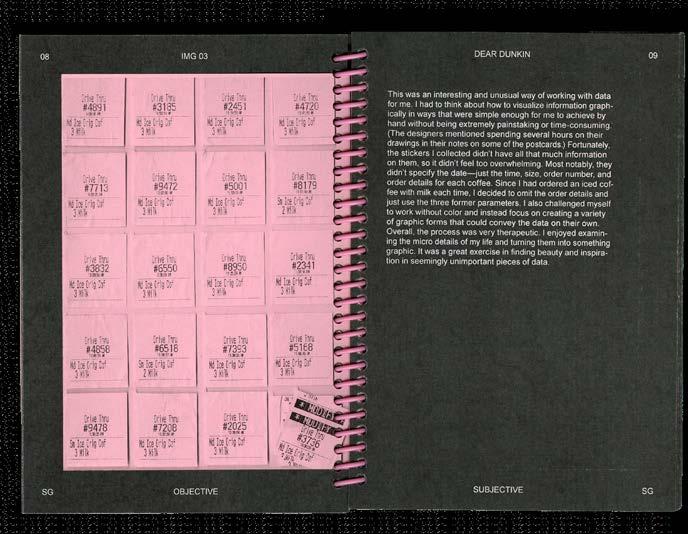
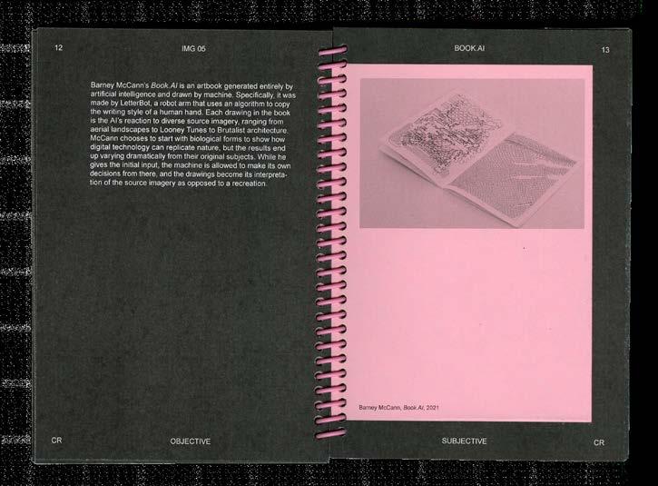
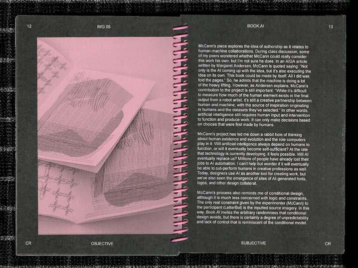
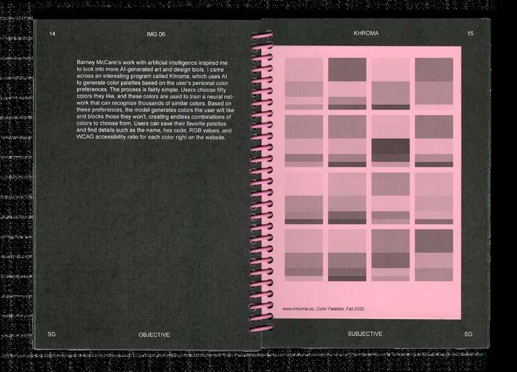
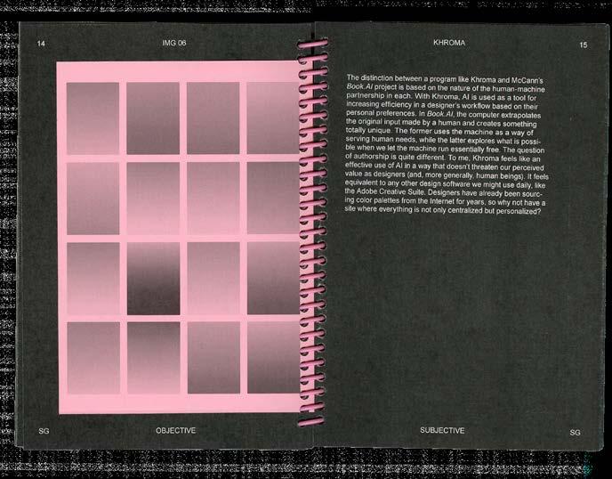
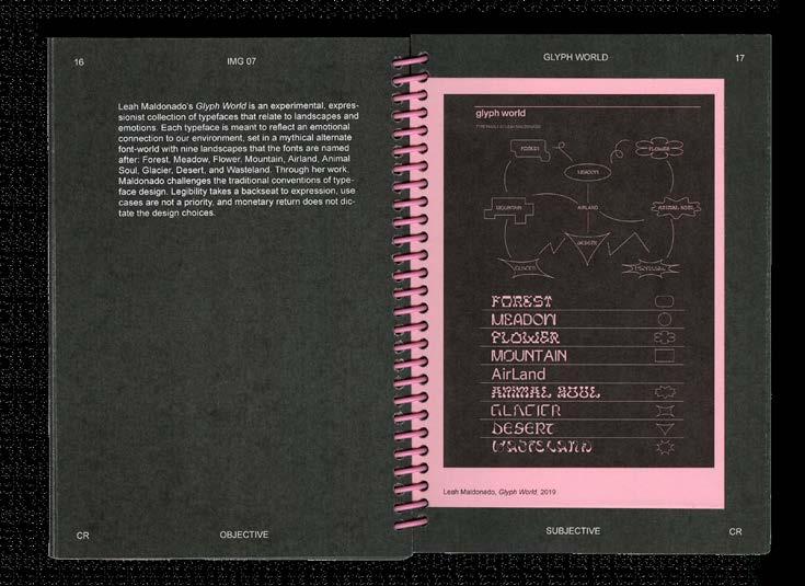
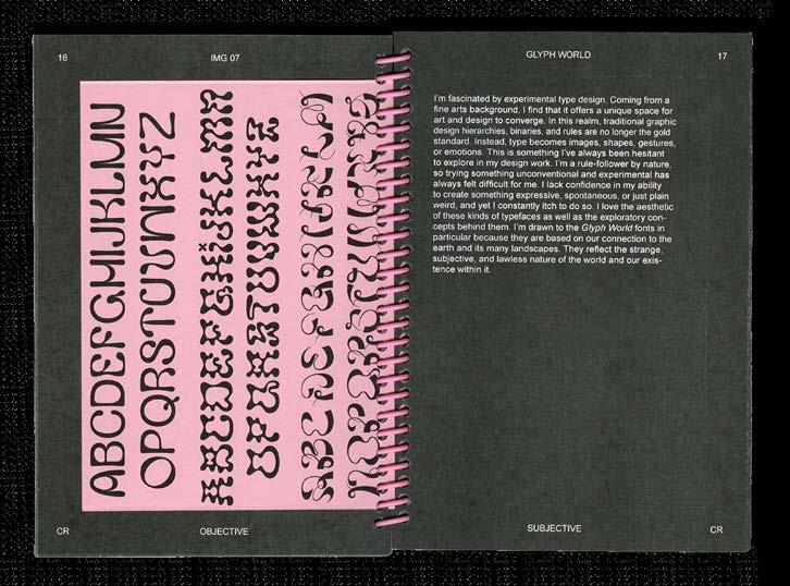
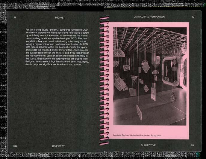
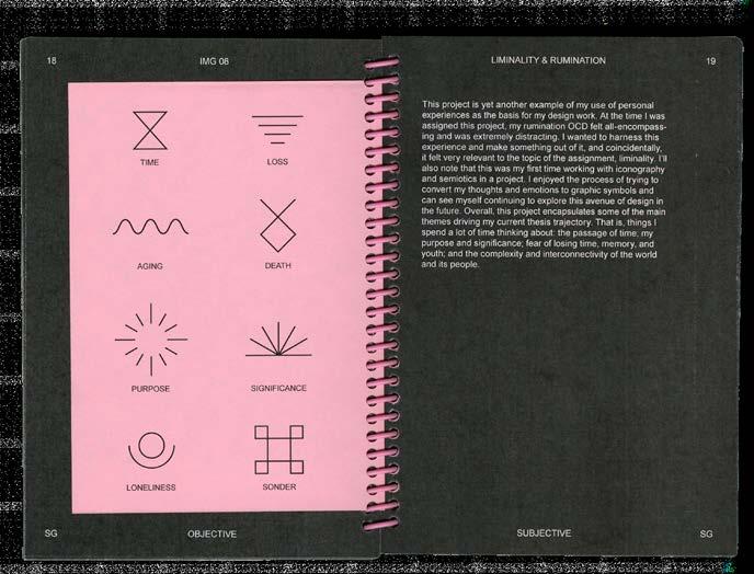
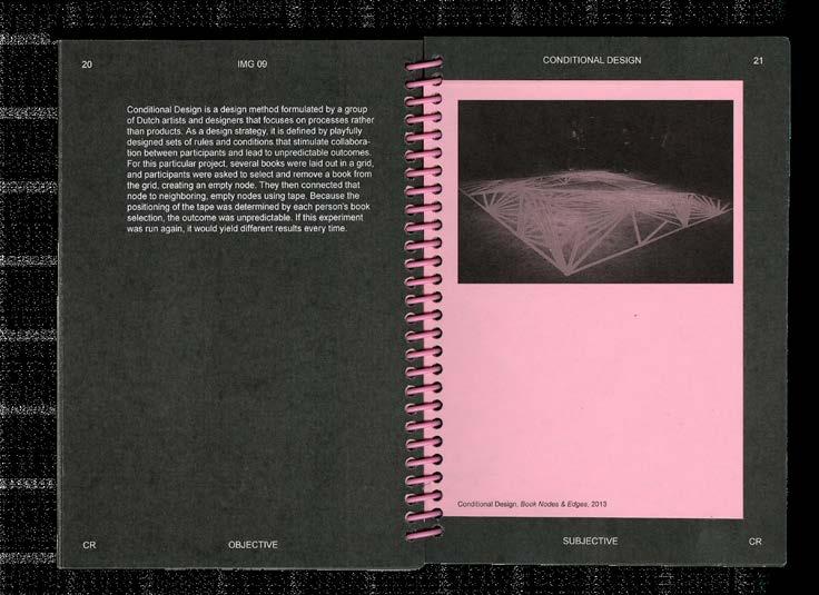
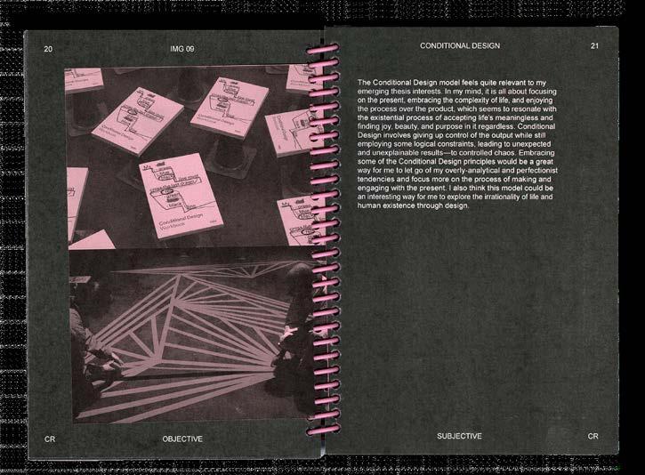
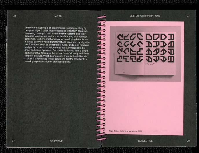
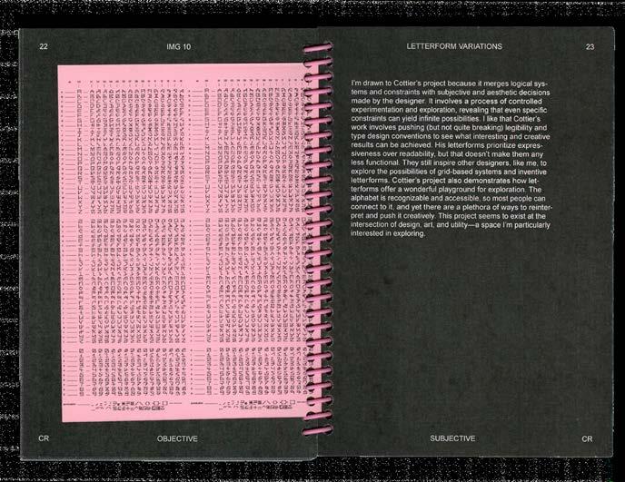
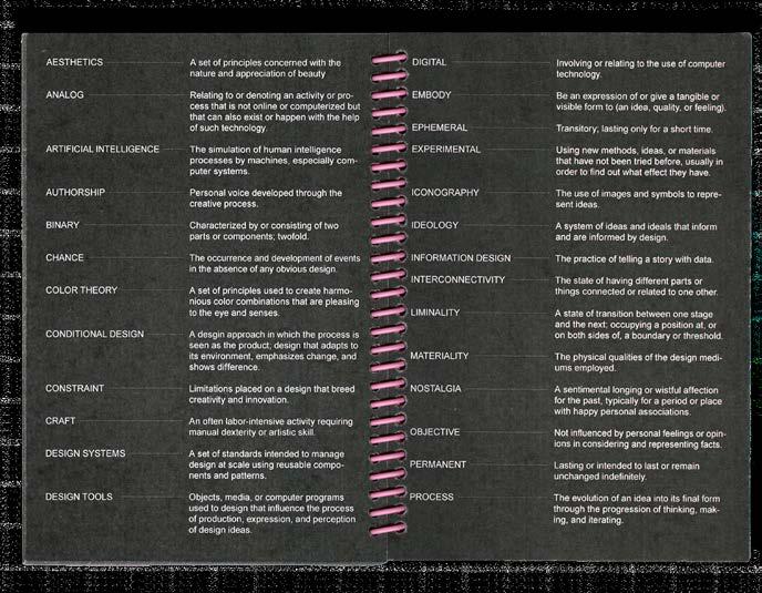
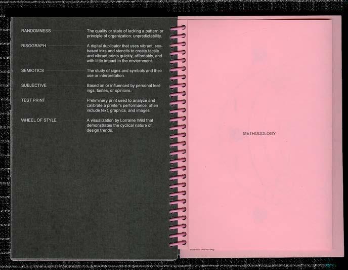
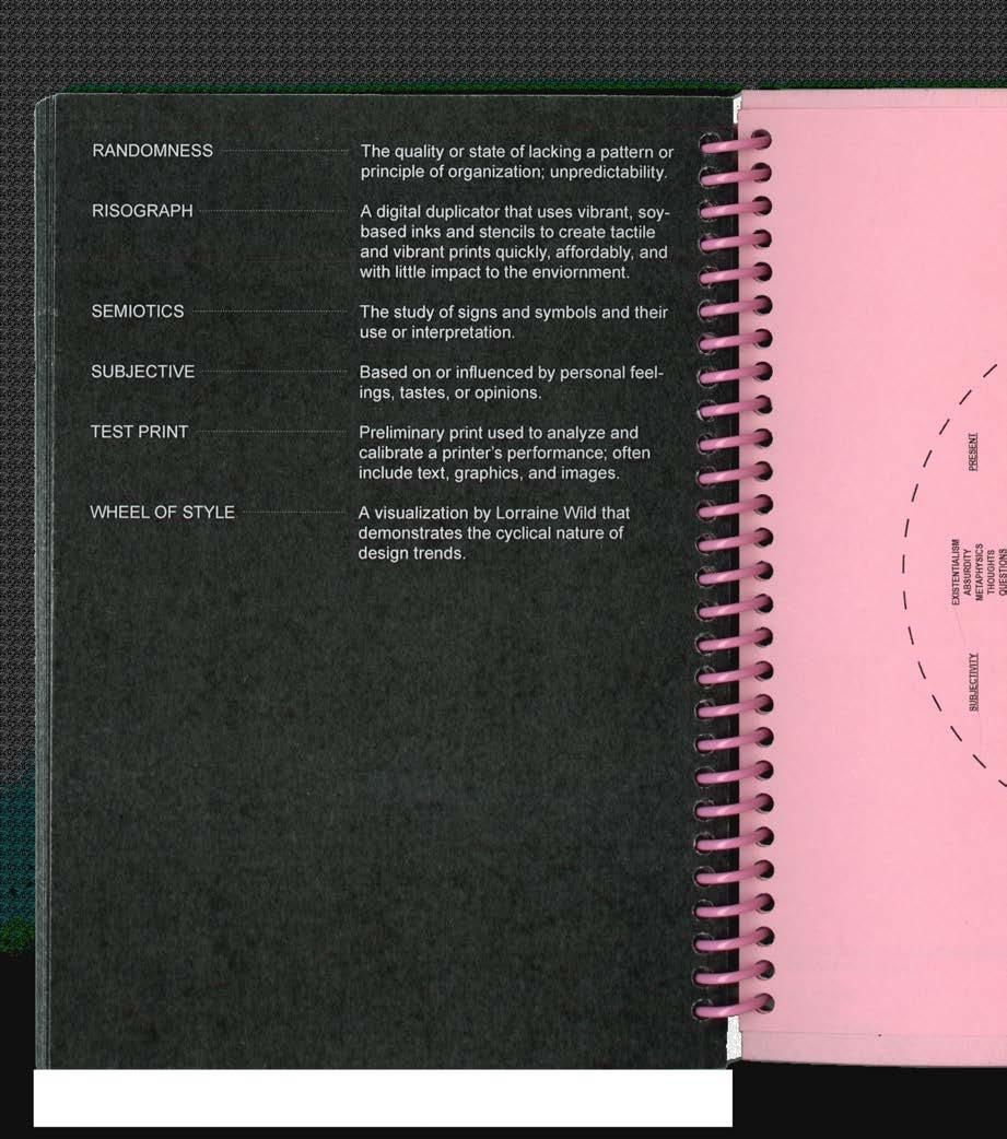
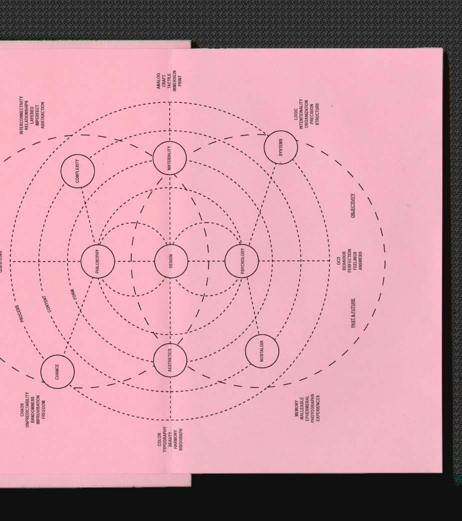
This publication is a collection of interests, references, and inspiration that informed my thesis thinking during the fall semester of 2022. It includes projects highlighted in the Theory II course readings as well as my own work and attempts to identify recurring themes or sets of ideas in my design interests. In making this publication, I observed that I am drawn to moments in design where seemingly binary categories converge—where control meets chance; analog meets digital; and logic meets intuition. This proclivity is thus reflected in the formal structure of the essay. The writing is split into objective and subjective categories, with the former providing descriptive, factual information about the work and the latter offering my personal thoughts, reflections, and analysis.
186 COLOR-CODE #FA2022
08 IMAGE ESSAY
187 IMAGE ESSAY
Image Essay, front cover, 2022. Spiral-bound, 5 × 7 in.
COLOR-CODE 188
PG 188–197: Image Essay, select spreads.
189 IMAGE ESSAY
COLOR-CODE 190
191 IMAGE ESSAY
COLOR-CODE 192
193 IMAGE ESSAY
COLOR-CODE 194
195 IMAGE ESSAY
COLOR-CODE 196
197 IMAGE ESSAY
COLOR-CODE 198
Image Essay, fold-out methodology map.
199 IMAGE ESSAY
Jerry-Lee Bosmans
04.28.2023 // 12:00 PM EST (EMAIL) C
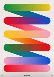
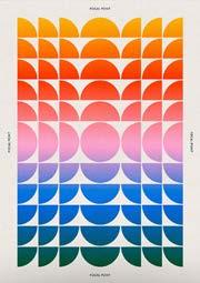
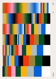
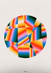
AP What inspired you to start your Printmaking Challenge series? How did it evolve to what it is today?
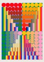
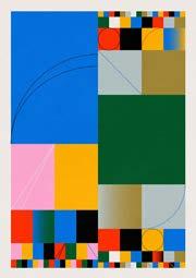
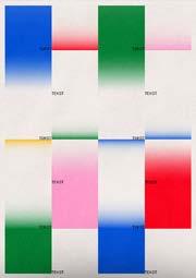
JB Printmaking Challenge originated during the first lockdown due to COVID-19 back in April 2020 (Fig. 1).1 At that time, I was studying at the art academy AKV St. Joost in Den Bosch, and the lockdown gave me time to work on something for myself. 2 Because I always liked to make visual experiments and wanted to improve my graphic skills, I came up with the idea to make posters and share them on social media. The initial intention was to make a handful of posters about COVID, but I soon found out that this project was so fun and challenging that I didn't want to stop3. Thanks to this project, many beautiful things have come my way, and I have been able to turn my passion into my "job."
AP How did you develop your design style?
JB My style evolved while creating many different works as part of my personal project. The vibrant colors and shapes that I now use in my work are the result of a lot of experimentation and continue to develop with every new work I make.
AP I love your work because it is experimental and diverse while still feeling unified. Do you have a system that you follow while designing? Are there parameters that you work within? What is your process like when making these compositions?
JB The system I use to create new work is subject to constant change. At the moment, I have a template document in which I have saved all my favorite colors and visual elements so that I do not have to look for specific documents. One of the most important indicators of any work is whether I have tried something new in making it. I also ask myself if the created work is something I would want to sell. If this is not the case, I know that the experiment does not meet my standards. This is sometimes very difficult, so it helps
enormously to leave work alone for a day or half a day, so you can see things you had not noticed before.
AP What have you learned from working in this experimental, iterative way?
JB Experimenting is the ultimate way for me to have fun in my work, and I am always curious about how my work is developing. The thought of "you haven't made your best work yet" motivates me to keep making new work and not dwell too long on past successes and styles.
AP Color is clearly a driving force in your work. What do you enjoy or find interesting about working with color? Particularly spectral or rainbow color and gradients?
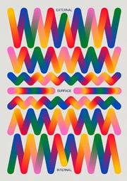
JB The use of color has not always been standard in my work. For a long time, I considered color as an extra, but through a lot of experimenting, I found out that playing with color is great fun. Playing with the endless possible color combinations is one of the most enjoyable parts of the making process. The reason why I use my rainbow palette is to add more positivity and joy to everyday life.
AP Where do you find inspiration for your work?
JB Major influences on my artistic work include Piet Parra,4 Felipe Pantone, 5 Xtian Miller,6 Studio Feixen,7 and Andy Gilmore, 8 to name a few. In addition, friends and family have also been a great influence and have always motivated and supported me in my creative practices. Inspiration often comes from seeing other artists' work either online or in-person, but also during moments when I can clear my head, such as long walks and extensive showers (guilty).
AP How do you know when a design is complete?
JB Gut feeling. Usually when I feel like there's nothing more I can add or remove that isn't necessary.
201 INTERVIEW—JERRY-LEE BOSMANS
1 Bosmans' goal is to create 1000 prints in order to discover new techniques and styles.
2 St. Joost School of Art & Design is a Dutch academy based in Breda and Den Bosch, Netherlands.
3 Bosmans now has over 200 Printmaking Challenge designs on his website (www.jerryleebosmans.com).
4 Dutch artist known for his saturated color palettes and surreal characters.
5 Argentinian-Spanish artist whose kinetic art, installations, graffiti, and designs are characterized by the use of bold colors, geometrical patterns, and Op Art elements.
6 British product and communication designer known for his geometric and typographic work.
7 Small design studio based in Lucerne, Switzerland.
8 Graphic artist and illustrator from Rochester, New York whose work explores the physical properties of sound and light put to form.
AP What are you currently working on? Are you still doing the daily Printmaking Challenge?
JB At the moment I am a full-time freelancer working on many different projects, from keyboard design to corporate illustrations. What I mainly focus on is my webshop 4 and developing new backgrounds for the wallpaper packs that I sell. I am still making new experiments for Printmaking Challenge on a daily basis.
AP What advice would you give to aspiring artists/designers who are just starting out in their creative practice? Are there any resources you would recommend?
JB Make. Reflect. Share. Repeat. Starting a personal project where you work on something you are passionate about, even for ten minutes a day, is one of the best things you can do to develop your skills and stay motivated.
202 COLOR-CODE
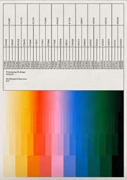
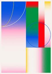
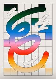
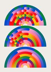
203 INTERVIEW—JERRY-LEE BOSMANS
FIG. 1: Select works from Jerry-Lee Bosmans' Printmaking Challenge.
09 PROCESS BOOK
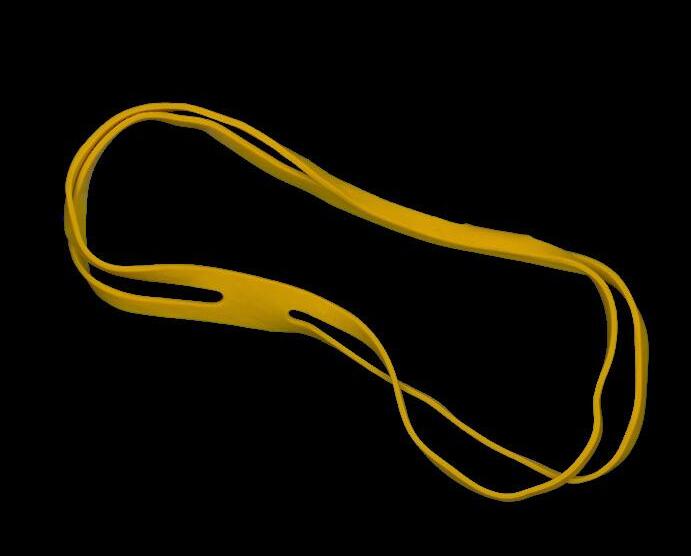
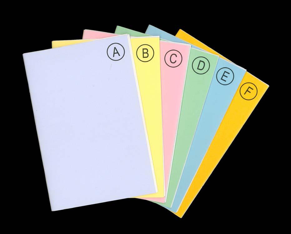
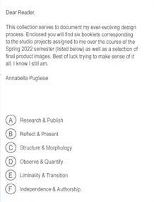
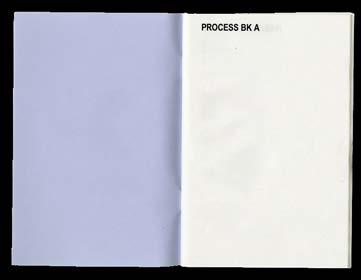
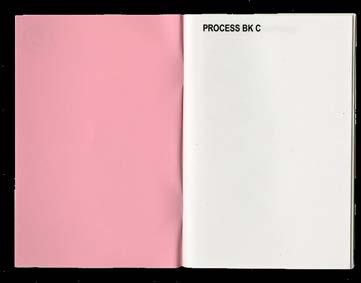
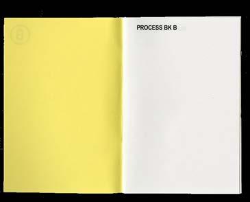
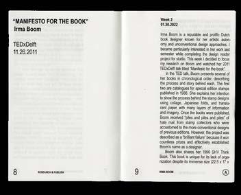
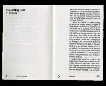
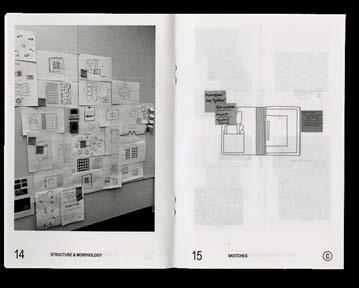
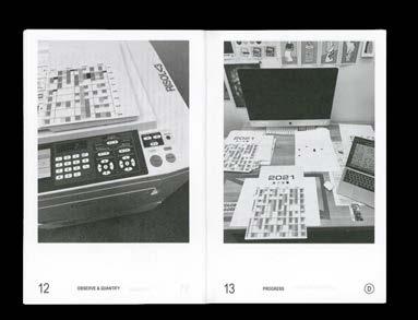
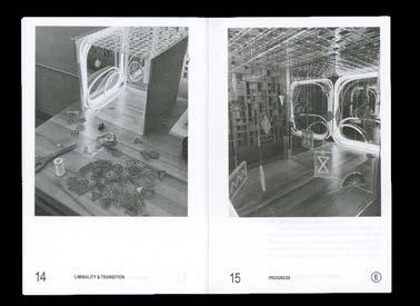
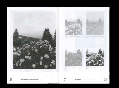
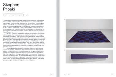
This publication documents my design process over the course of the Spring 2022 semester. Each booklet is printed in grayscale and corresponds to a different studio project assigned to me. They contain notes, writing, and progress photos that shed light on my working methodology. The accompanying image book features full-color photos of the final outputs.
204 COLOR-CODE #SP2022
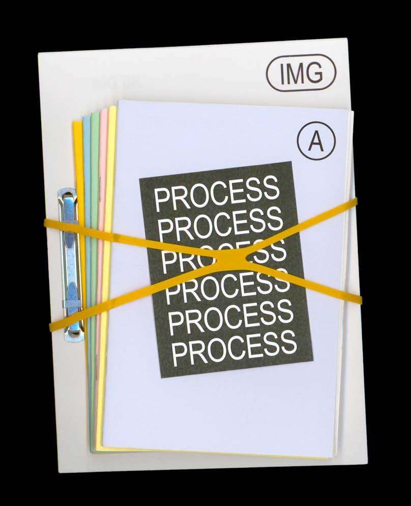
205 PROCESS BOOK Process Book, 2022. Printed matter, various. Dimensions variable.
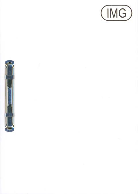 Image book, 6 × 8.5 in.
Top: 4-way rubber band and contents card (front & back), 3 × 4 in.
COLOR-CODE 206
Bottom: Project booklets, each 4.5 × 6.75 in.


PROCESS BOOK 207


COLOR-CODE 208
Project booklets, front covers.


PROCESS BOOK 209


COLOR-CODE 210
Project booklets, select spreads.


PROCESS BOOK 211

COLOR-CODE 212
Image book, interior spread.


PROCESS BOOK 213

COLOR-CODE 214
Image book, interior spread.


PROCESS BOOK 215
10
PLACES: UTAH
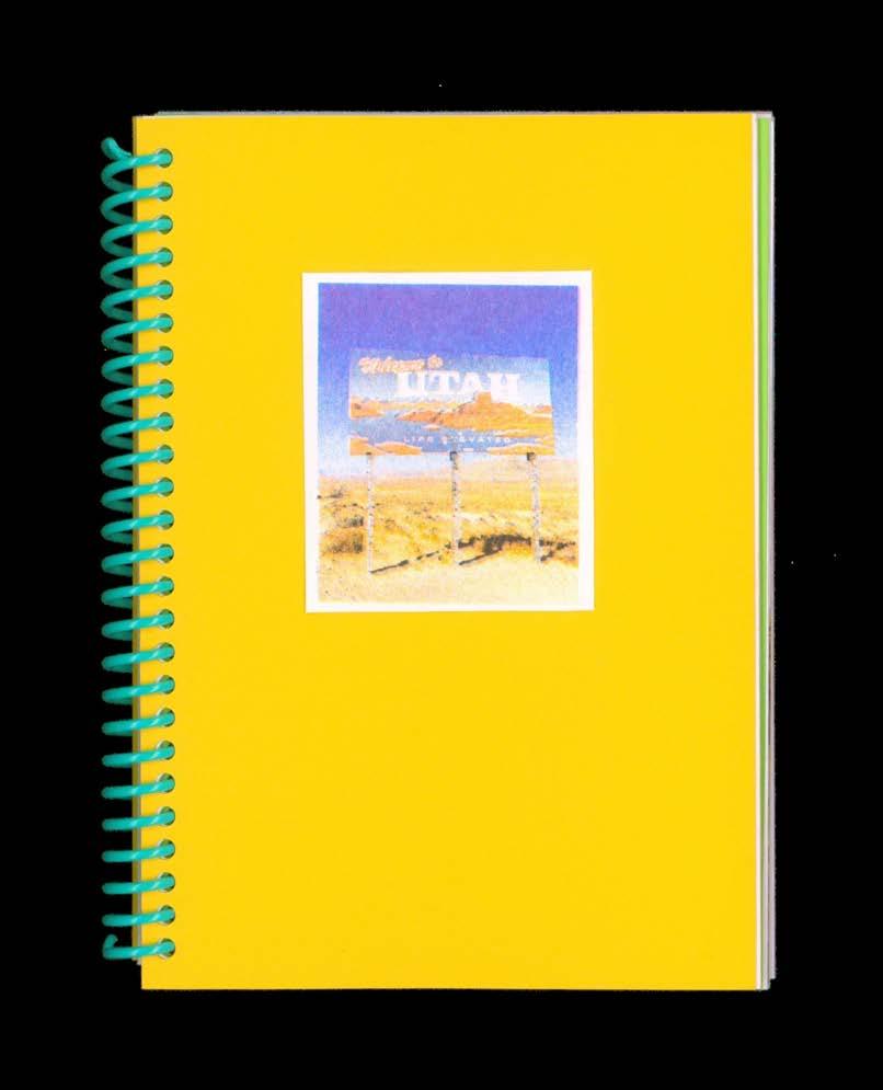
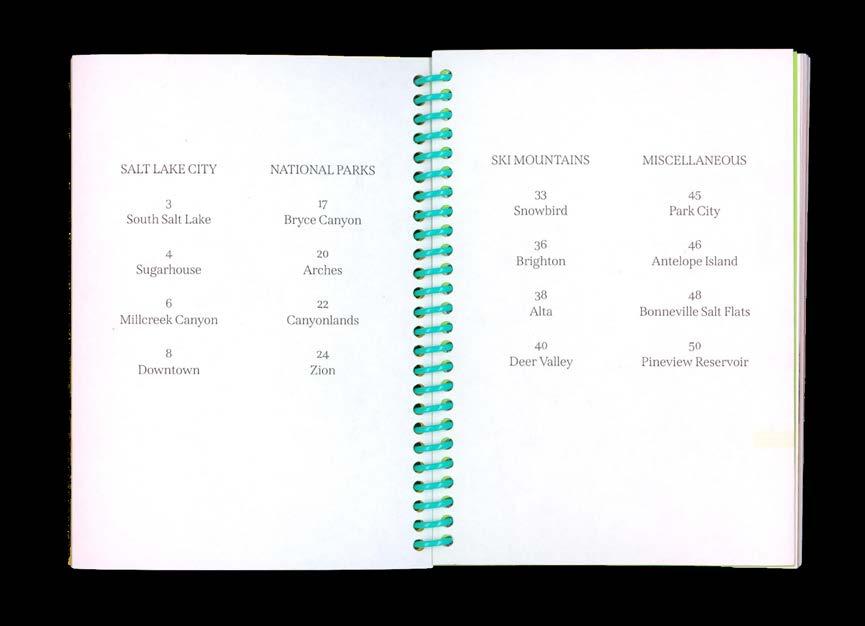
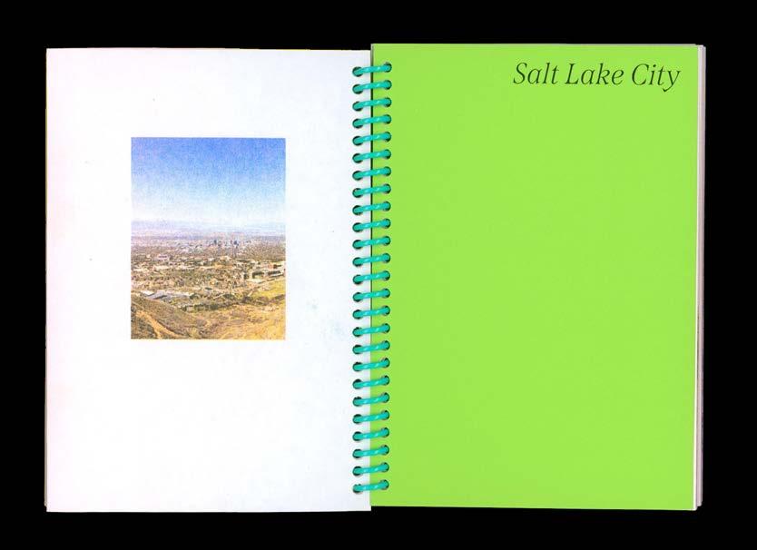
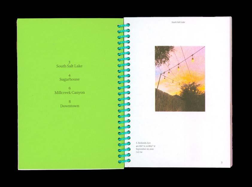
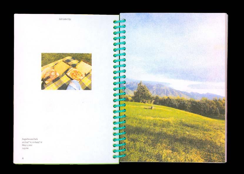
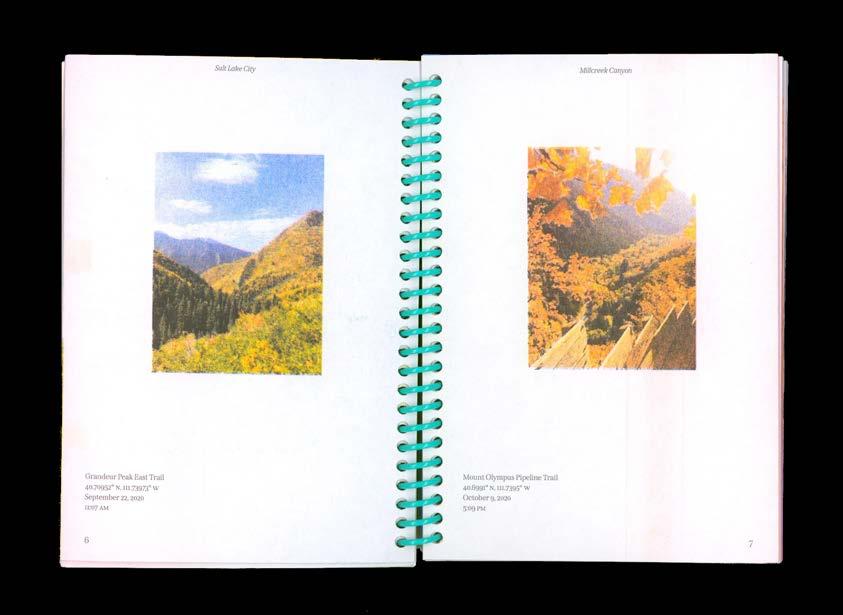
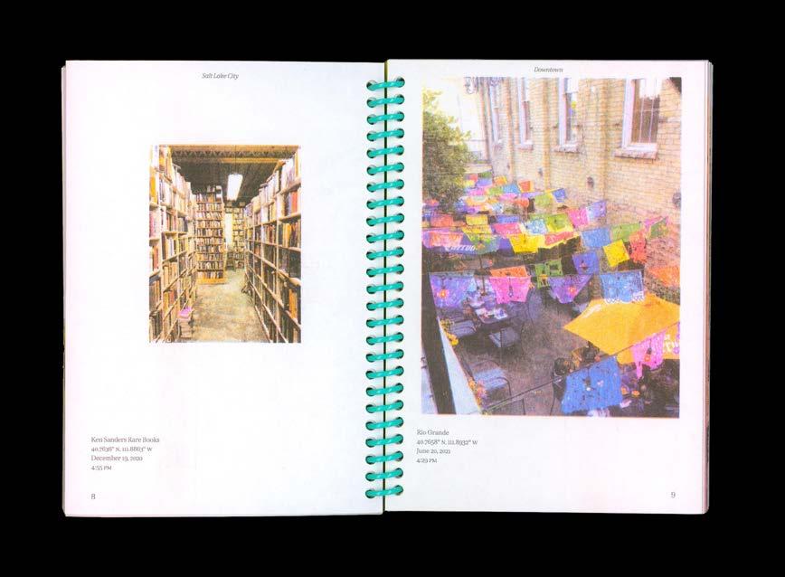
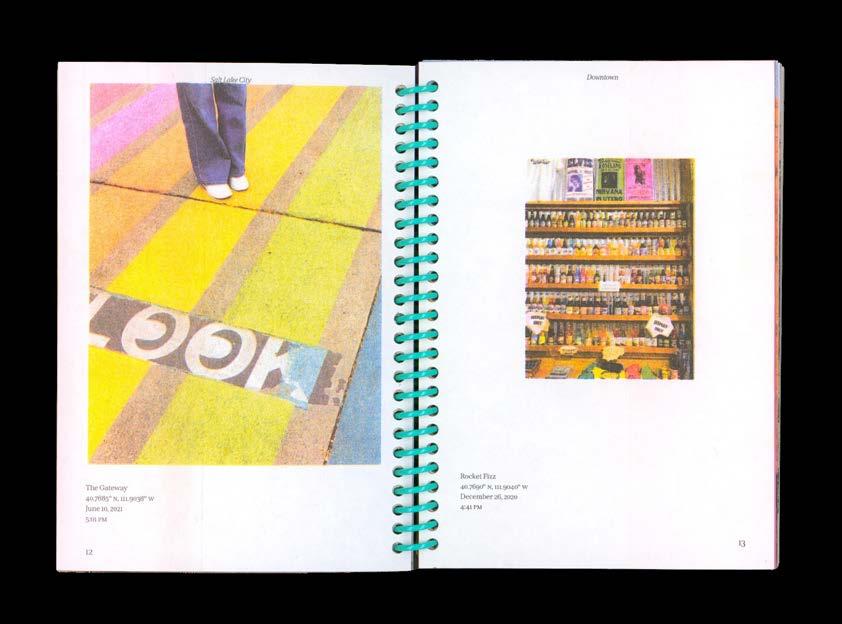
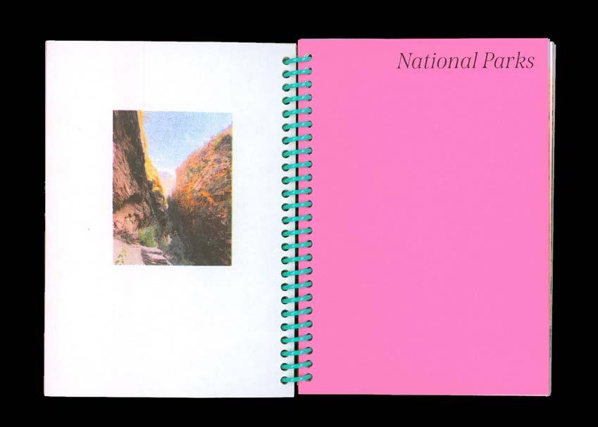
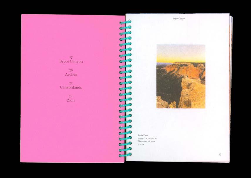
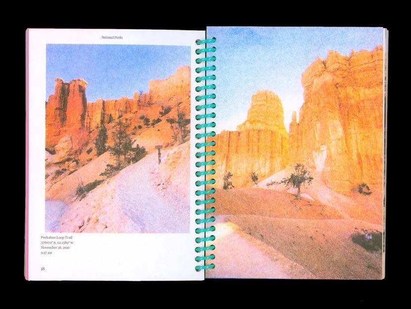
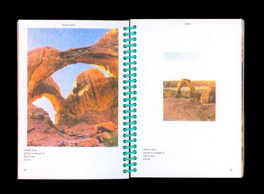
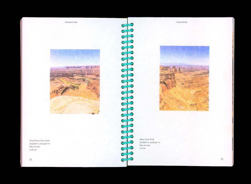
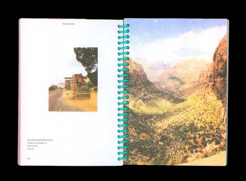
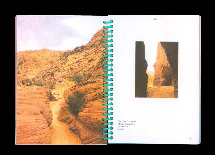
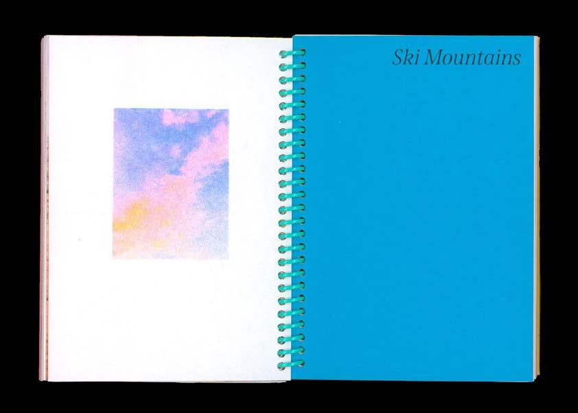
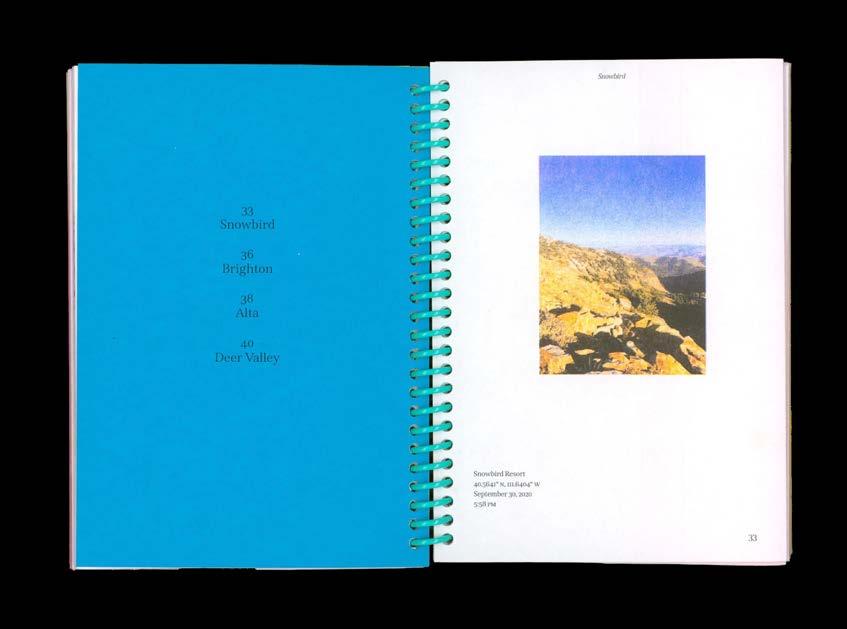
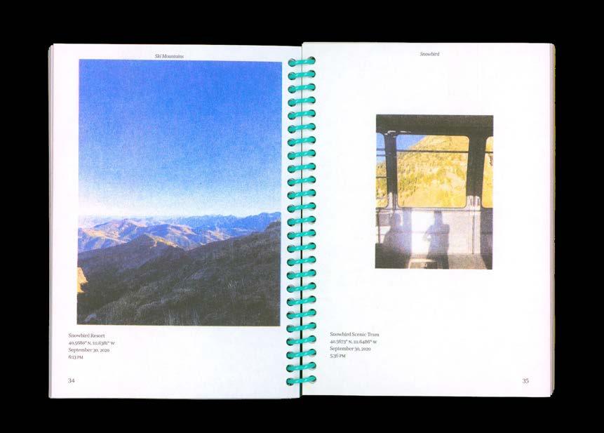
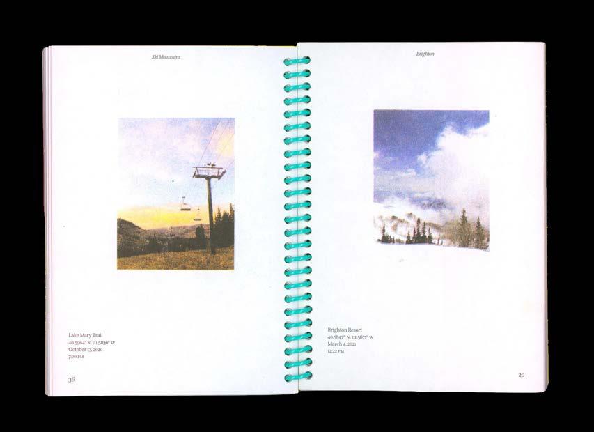
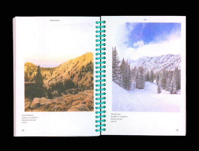
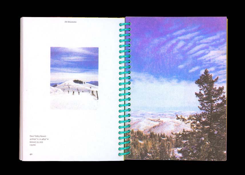
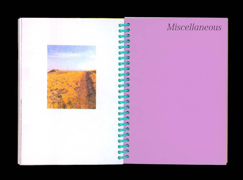
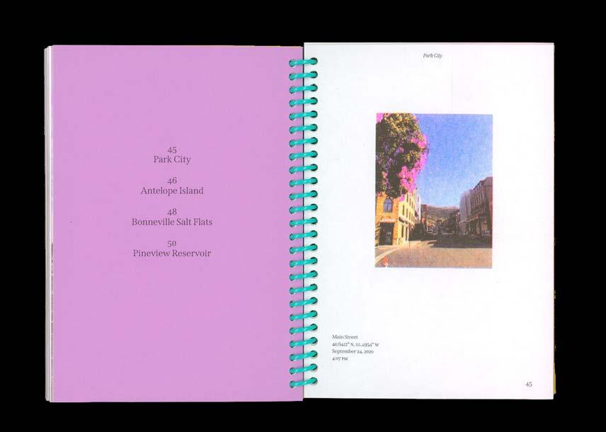
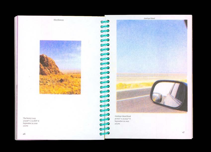
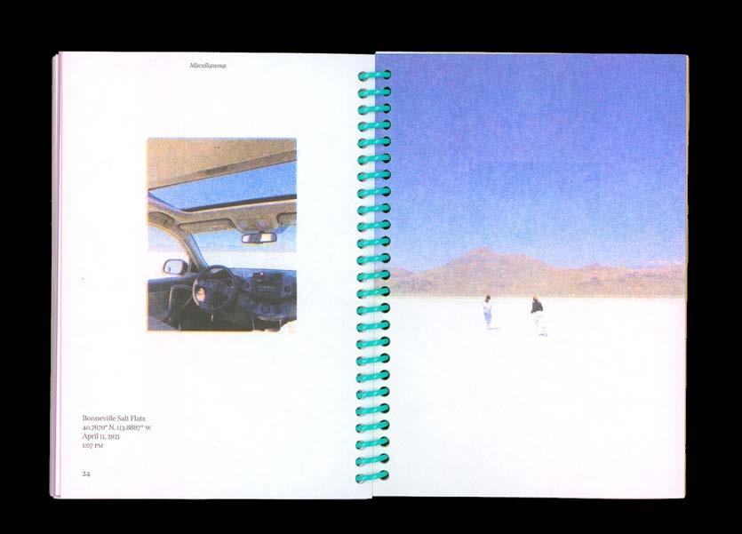
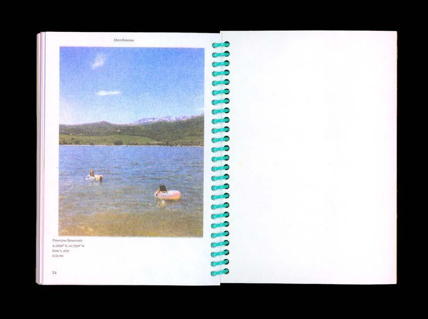
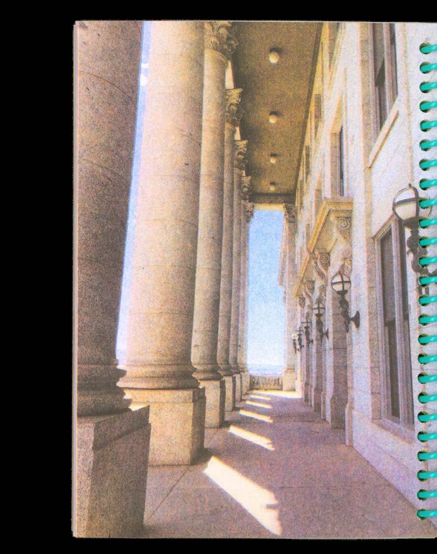
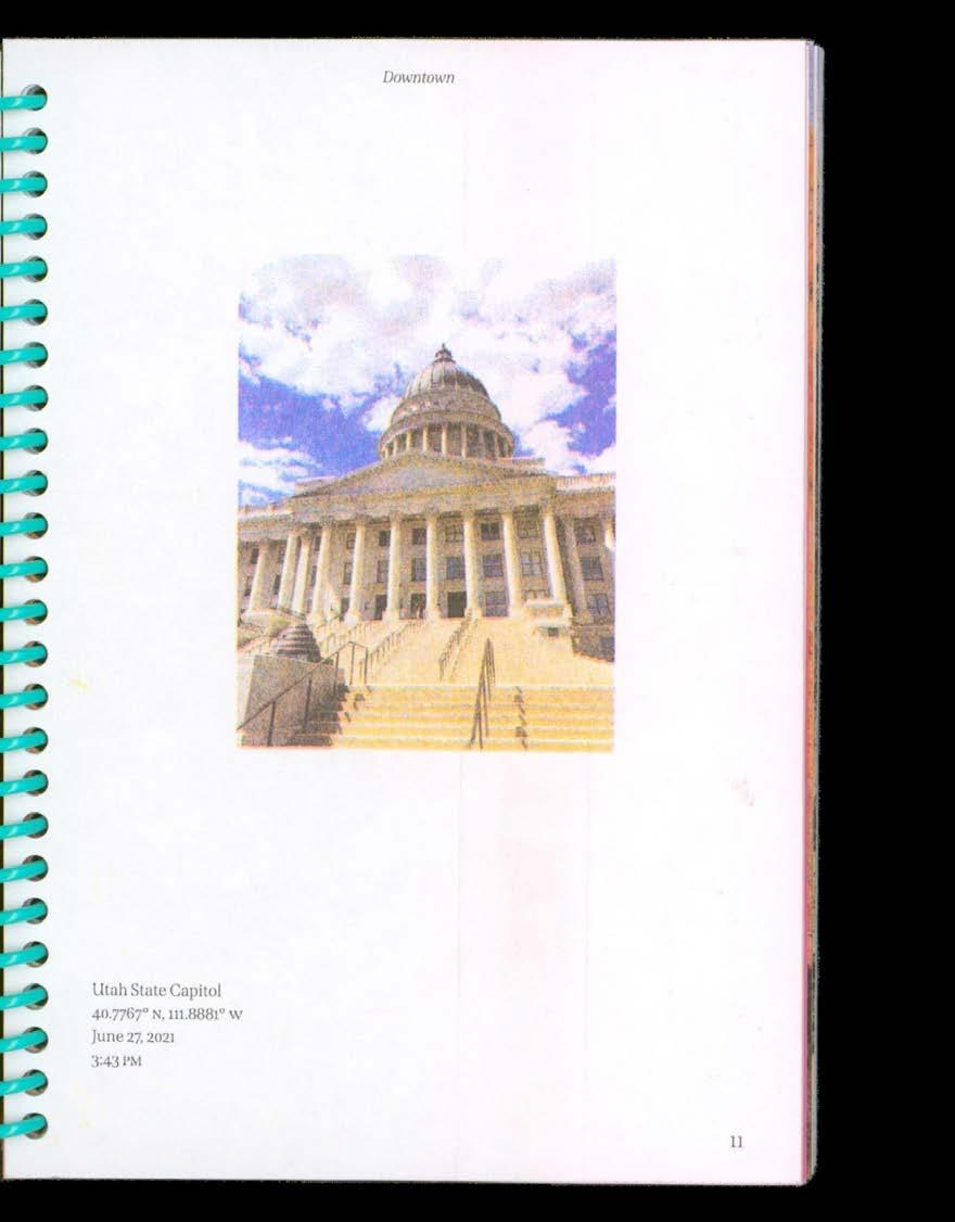
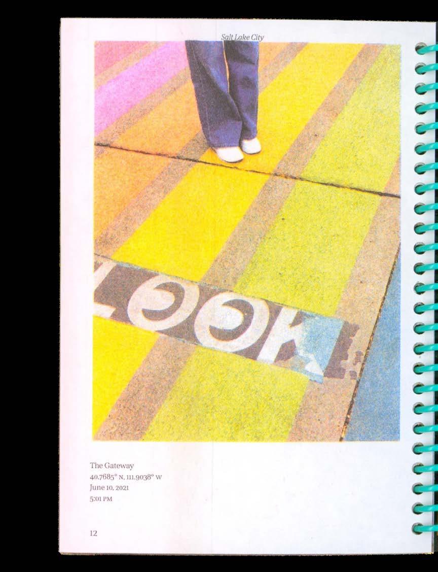
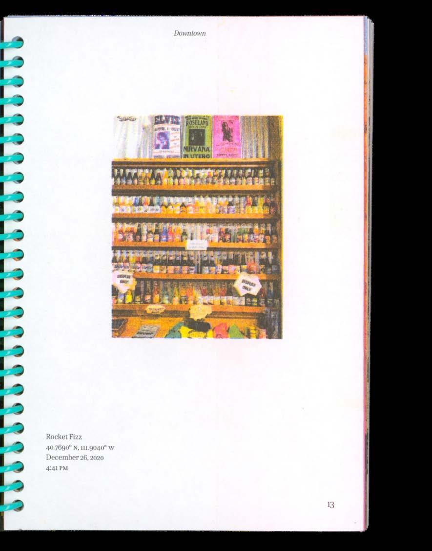
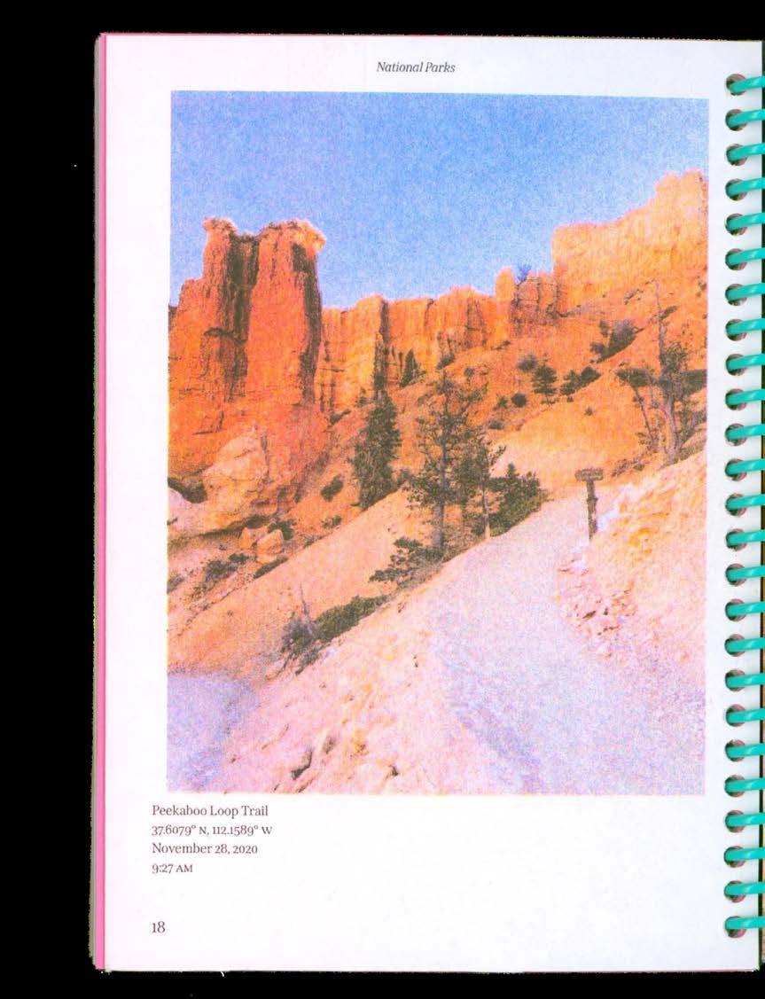
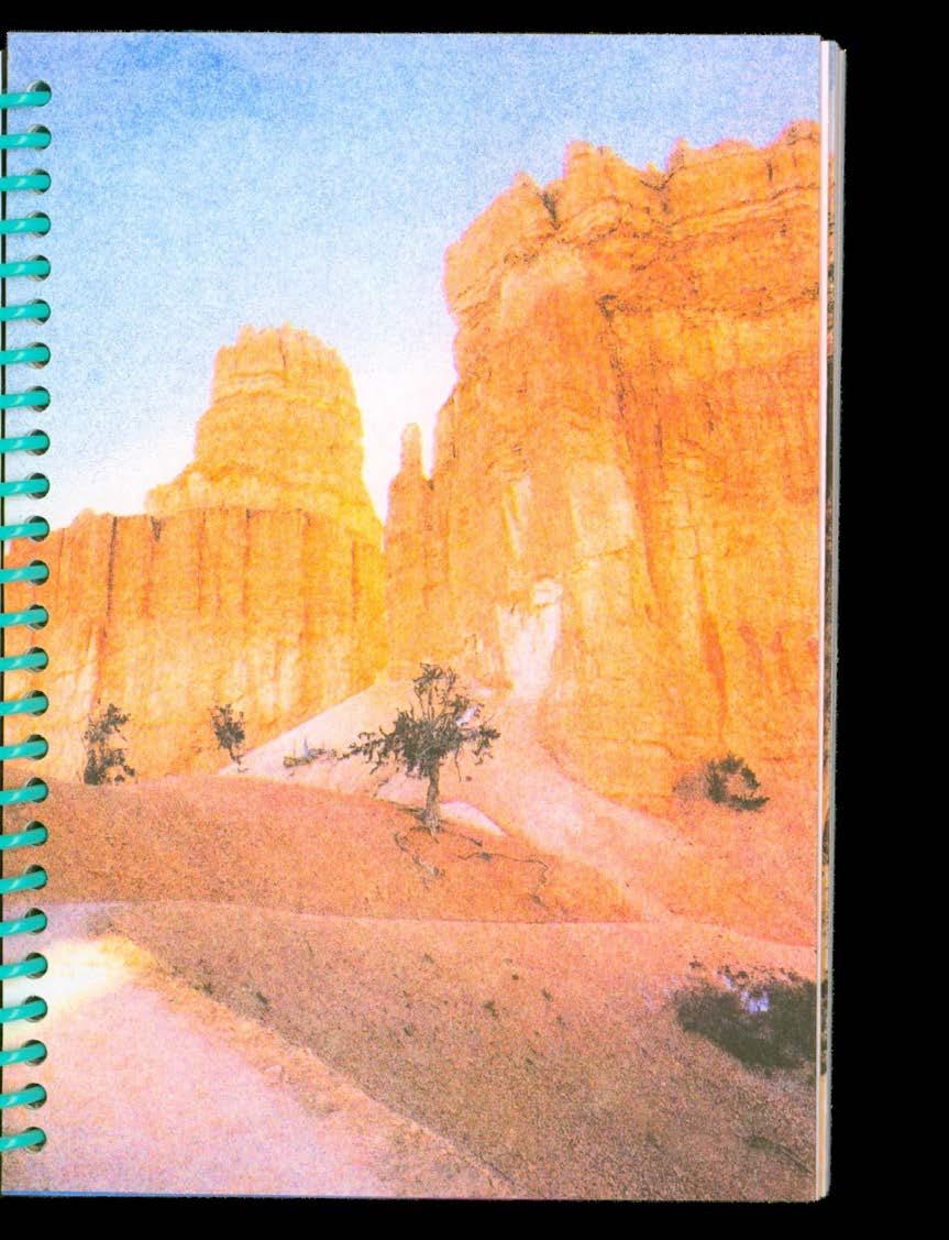
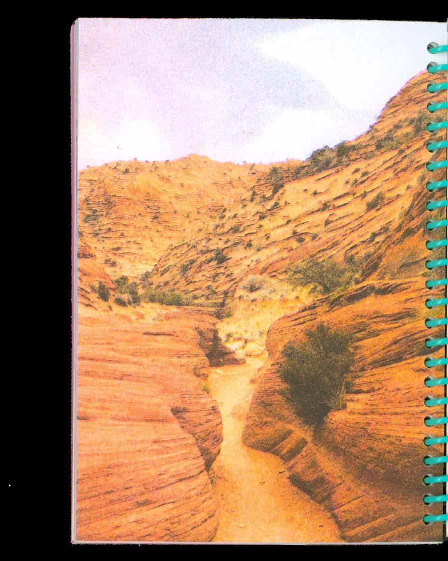
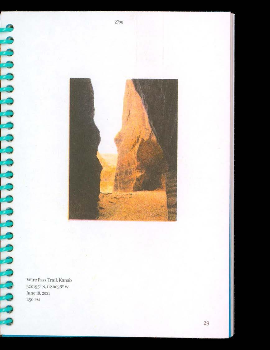
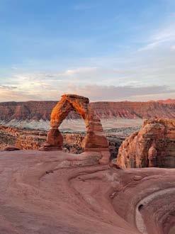
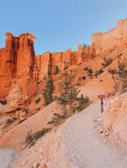
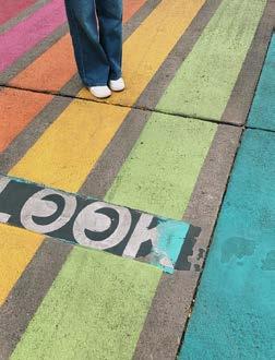
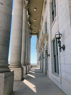
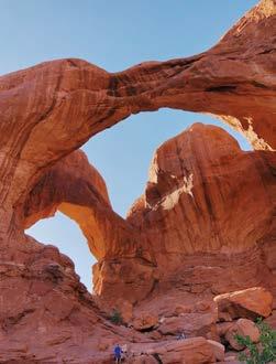
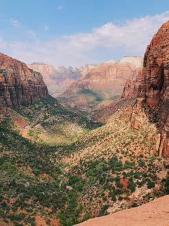
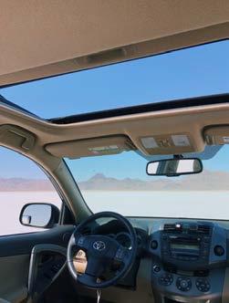
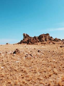
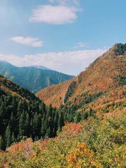
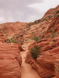
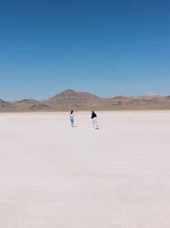
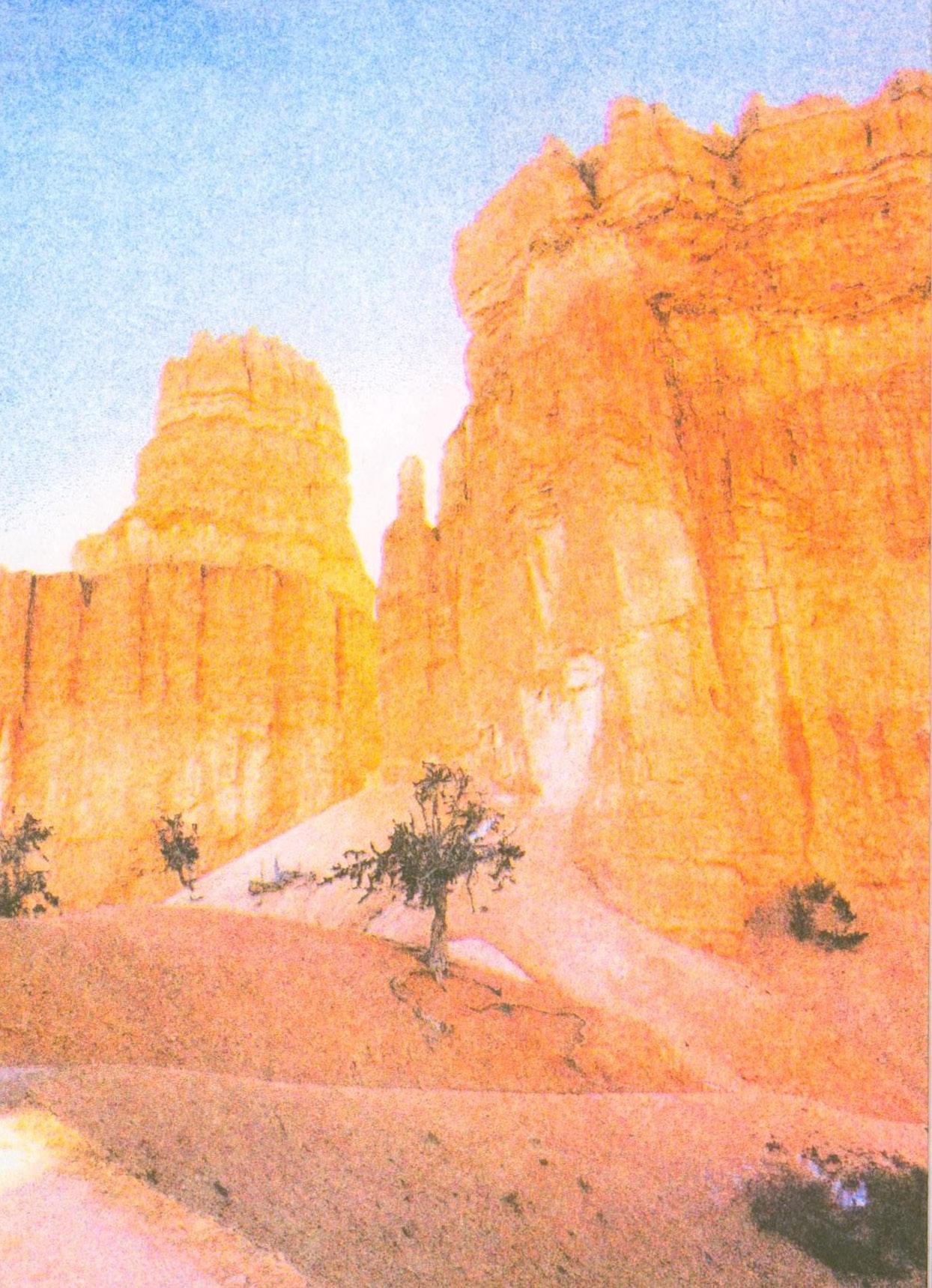
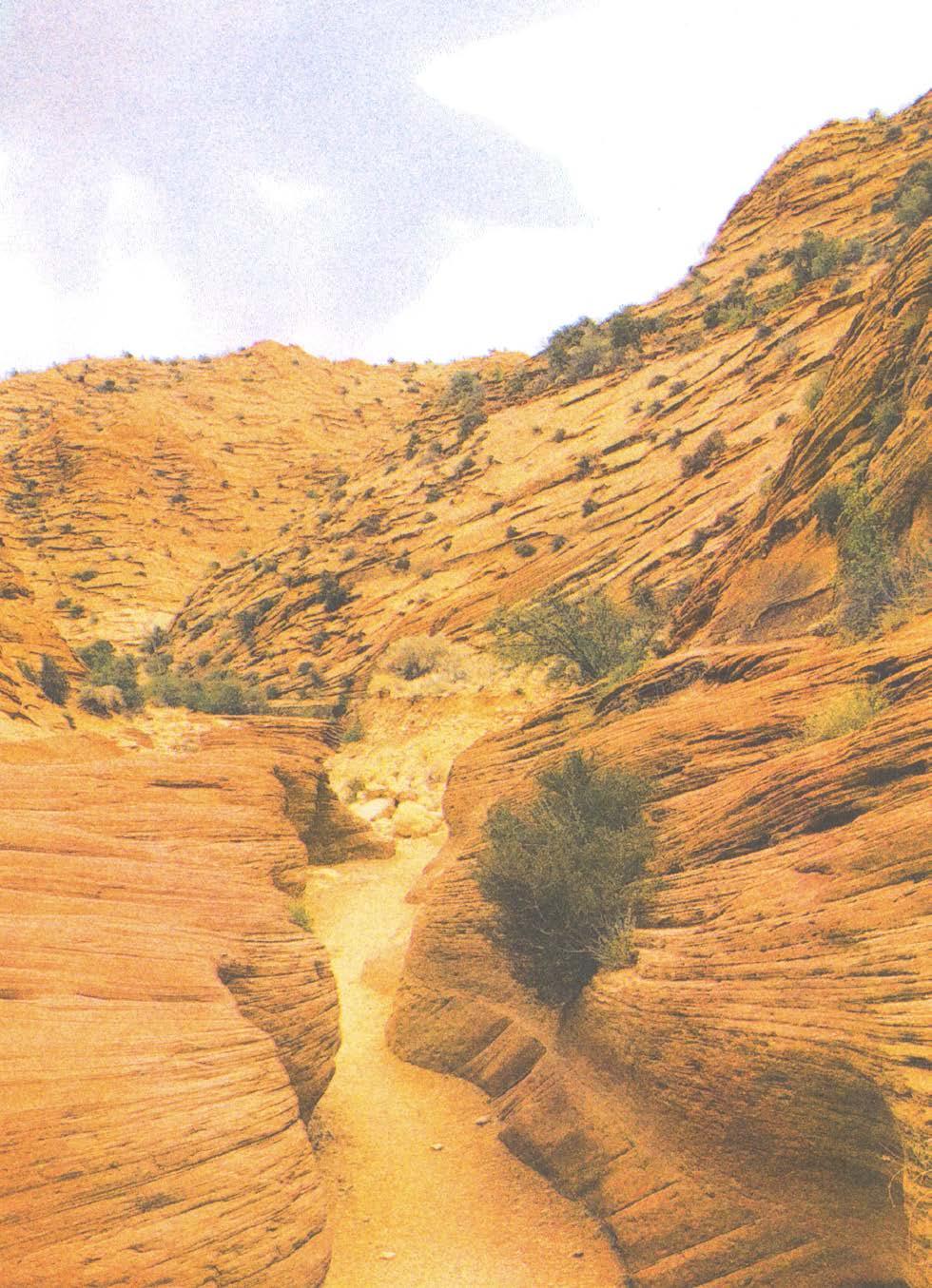
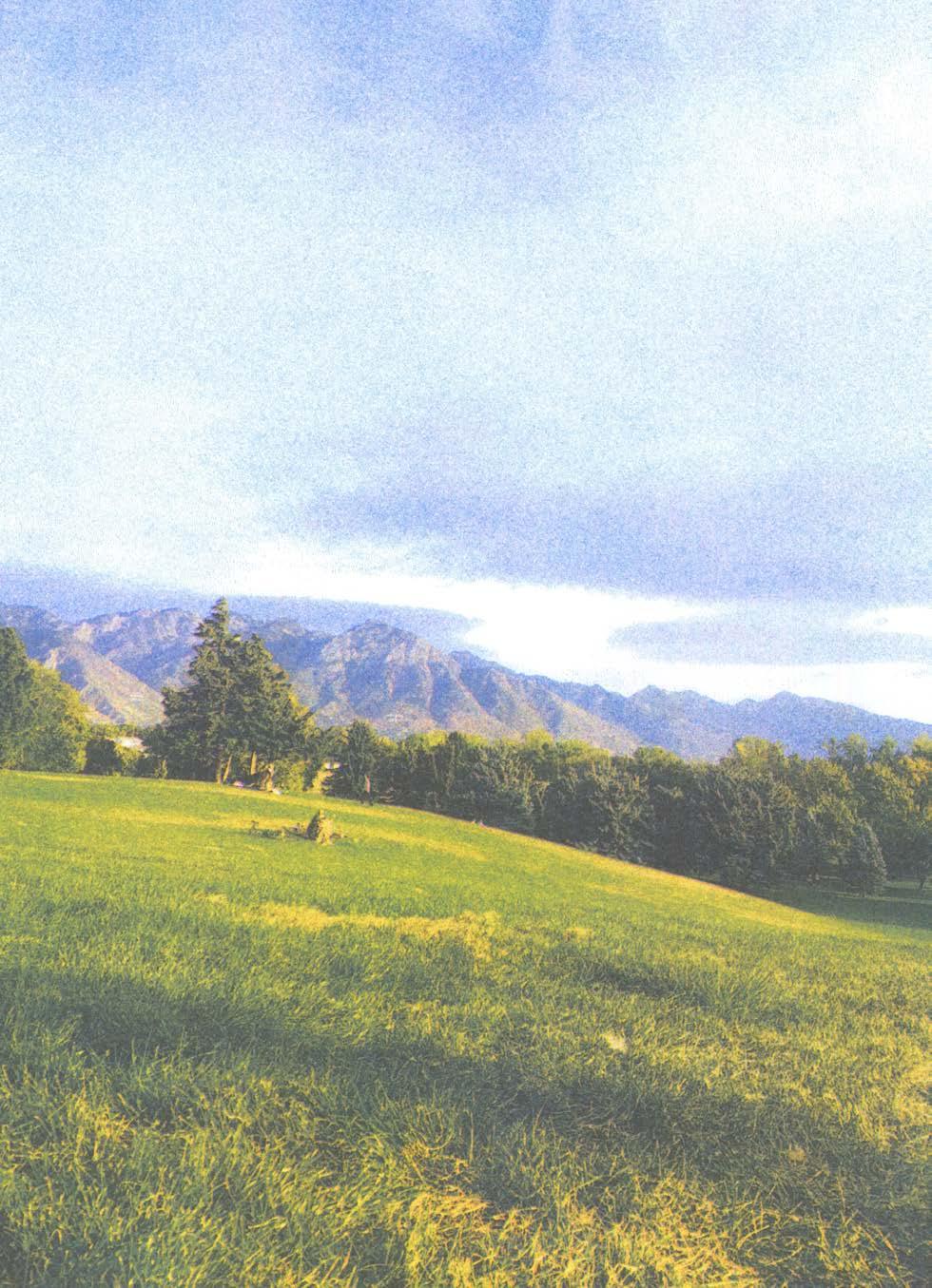
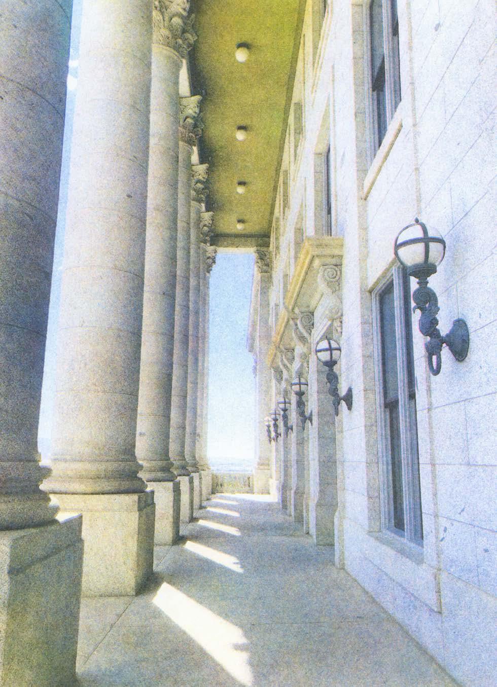
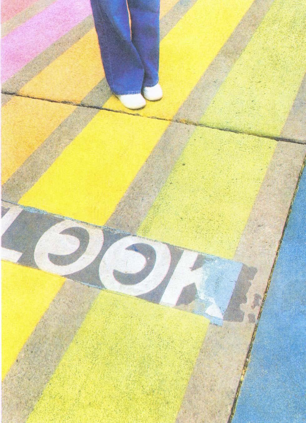
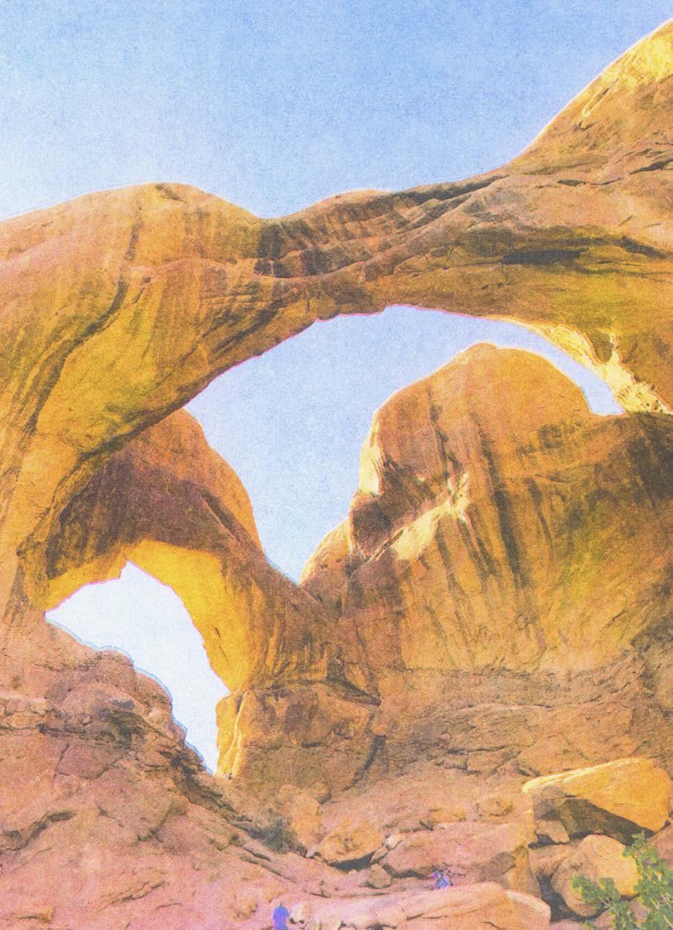
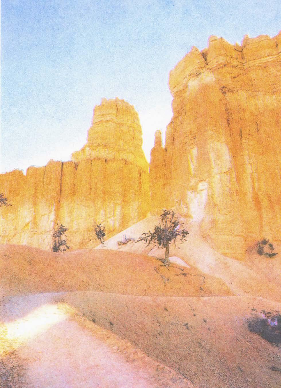
Living in Utah for ten months was an extremely exciting and formative period of my life. Places: Utah is a Risograph publication documenting this experience. It features a series of photos taken at my favorite locations around the state, organized chronologically within four categories: Salt Lake City, National Parks, Ski Mountains, and Miscellaneous. Each Risograph image is marked with the exact coordinates, date, and time at which the original photo was taken.
216 COLOR-CODE #SP2022

217
PLACES: UTAH
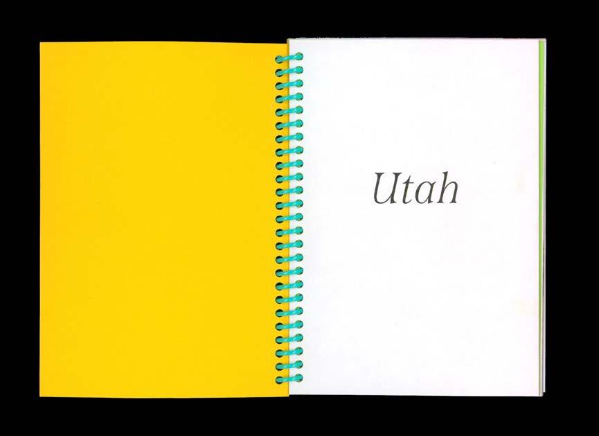
Places: Utah, 2022. Spiral-bound Risograph book with French folds, 4.5 × 6.5 in.
PG 218–239: Interior spreads.


COLOR-CODE 218


PLACES: UTAH 219


COLOR-CODE 220


PLACES: UTAH 221


COLOR-CODE 222


PLACES: UTAH 223


COLOR-CODE 224


PLACES: UTAH 225


COLOR-CODE 226


PLACES: UTAH 227


COLOR-CODE 228


PLACES: UTAH 229


COLOR-CODE 230


PLACES: UTAH 231

COLOR-CODE 232

PLACES: UTAH 233

COLOR-CODE 234

PLACES: UTAH 235

COLOR-CODE 236

PLACES: UTAH 237

COLOR-CODE 238

PLACES: UTAH 239


COLOR-CODE 242
Original iPhone photos
French fold interior gradient.


PLACES: UTAH 243


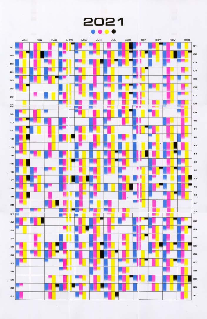
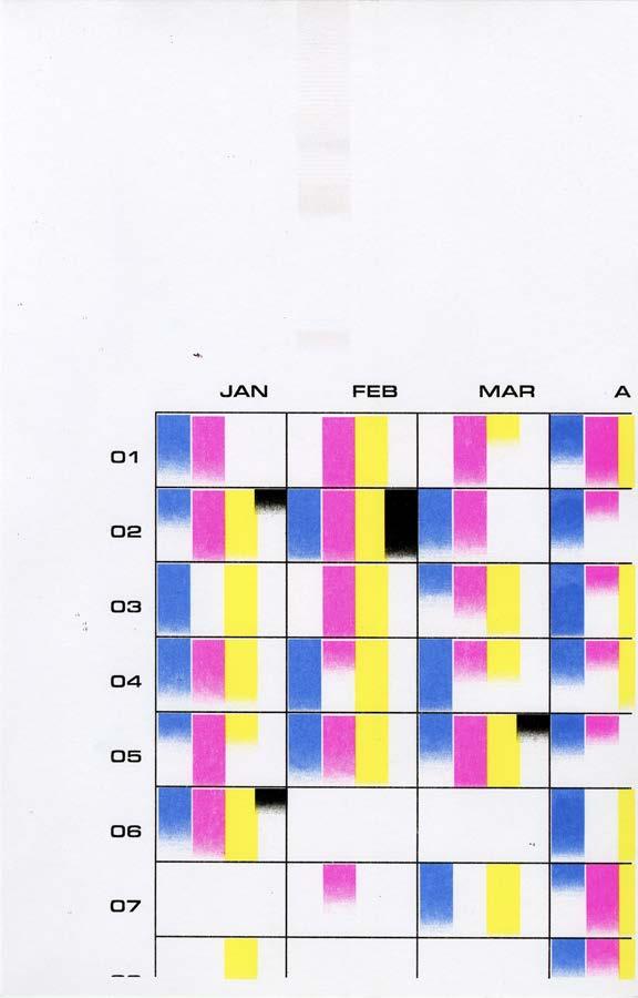
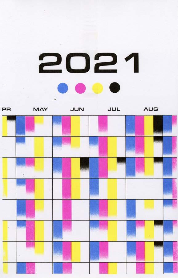
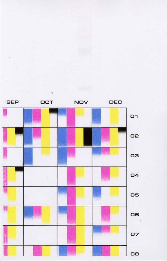
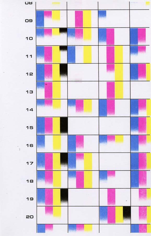
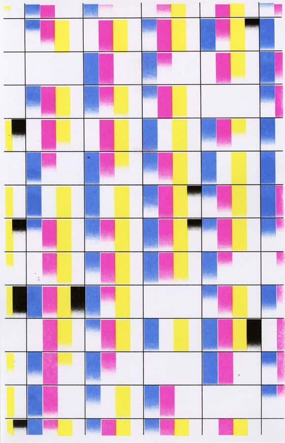
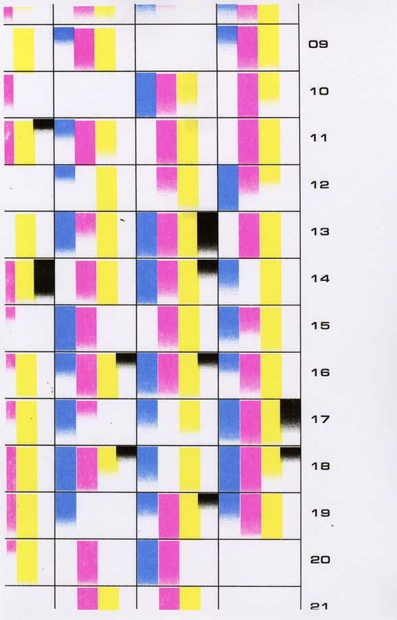
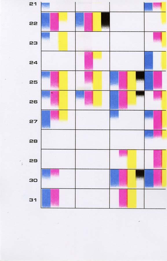
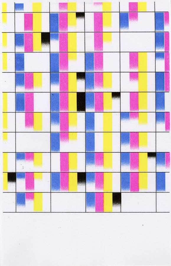
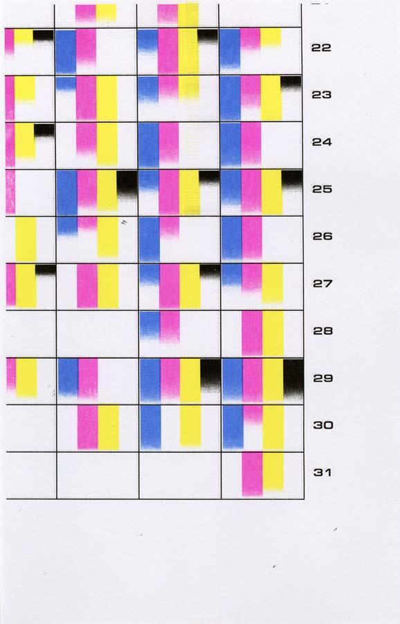
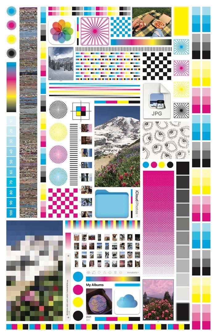
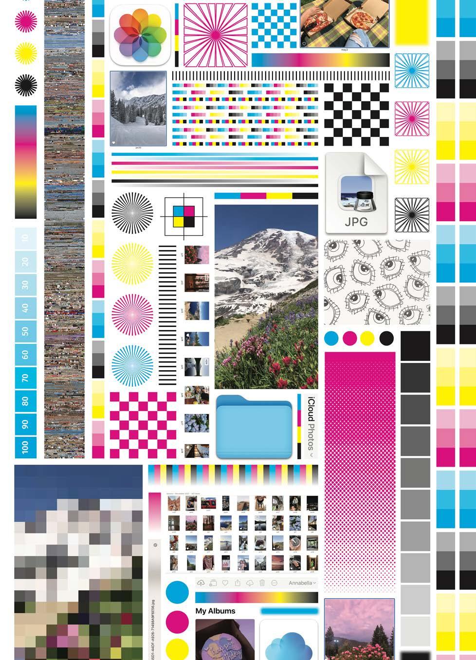
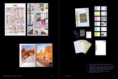
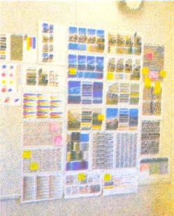
Using my iPhone camera roll as the source of raw data, I selected one photo for every day of 2021. I then pulled a specific color from each photo that I felt represented the image or day as a whole, and after identifying the CMYK percentages of each color, I charted them on a calendar grid using gradients to indicate each value. The length of the blue, pink, yellow, and black gradients in the poster correspond to the amount of cyan, magenta, yellow, and black in the color chosen for that day, respectively. The final result maps the coloring of my life over the course of the year and suggests what information might be required to further memorialize it in print.
250 COLOR-CODE #SP2022
11 CMYK CALENDAR

251 CMYK CALENDAR
CMYK Calendar, 2022. Tiled Risograph poster, 33 × 51 in.

Risograph Panel 1, 11 × 17 in. COLOR-CODE 252

CMYK CALENDAR
253
Risograph Panel 2, 11 × 17 in.

Risograph Panel 3, 11 × 17 in. COLOR-CODE 254

CMYK CALENDAR
255
Risograph Panel 4, 11 × 17 in.

Risograph Panel 5, 11 × 17 in. COLOR-CODE 256

CMYK CALENDAR Risograph
6, 11
257
Panel
× 17 in.

Risograph Panel 7, 11 × 17 in. COLOR-CODE 258

CMYK CALENDAR Risograph Panel 8, 11
17 in. 259
×

Risograph Panel 9, 11 × 17 in. COLOR-CODE 260

CMYK CALENDAR
261
CMYK Calendar, 2022. Plotter poster, 33 × 51 in.


PART II: MFA Exhibition

MFA EXHIBITION IDENTITY
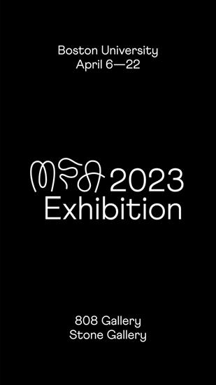
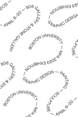
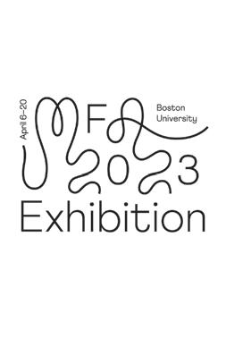
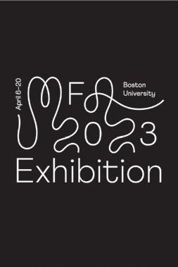
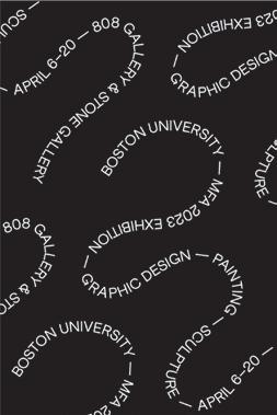
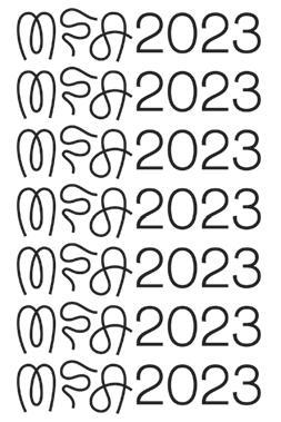
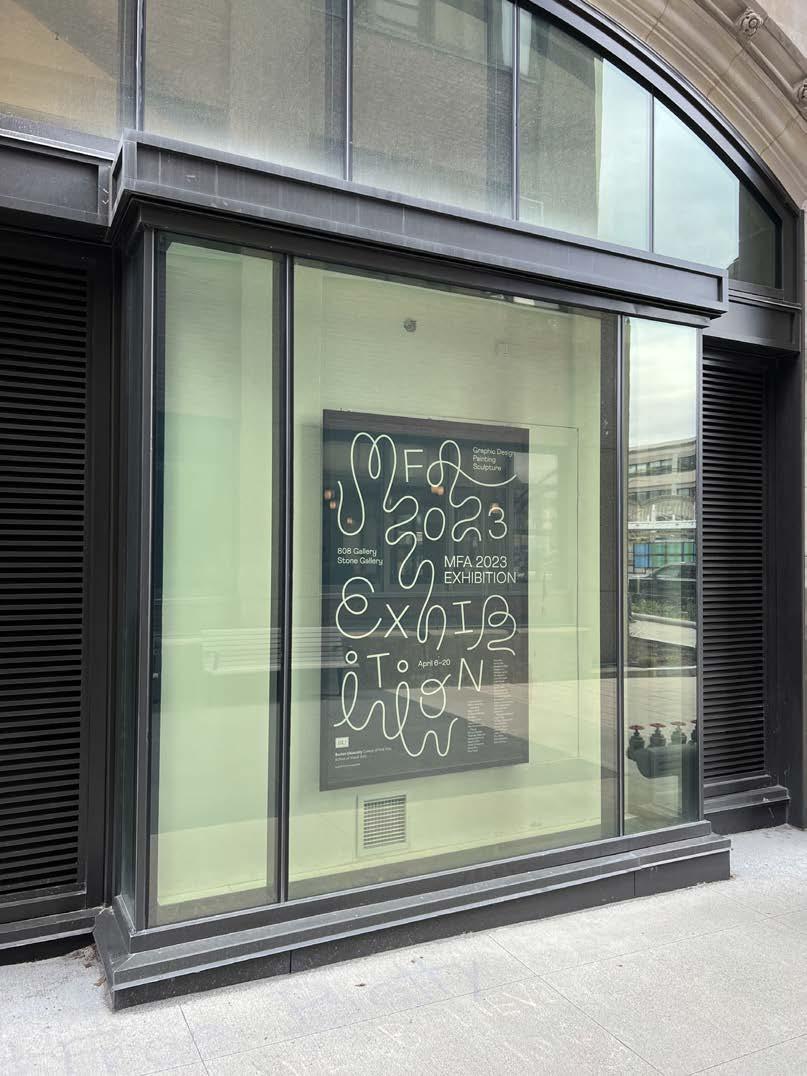
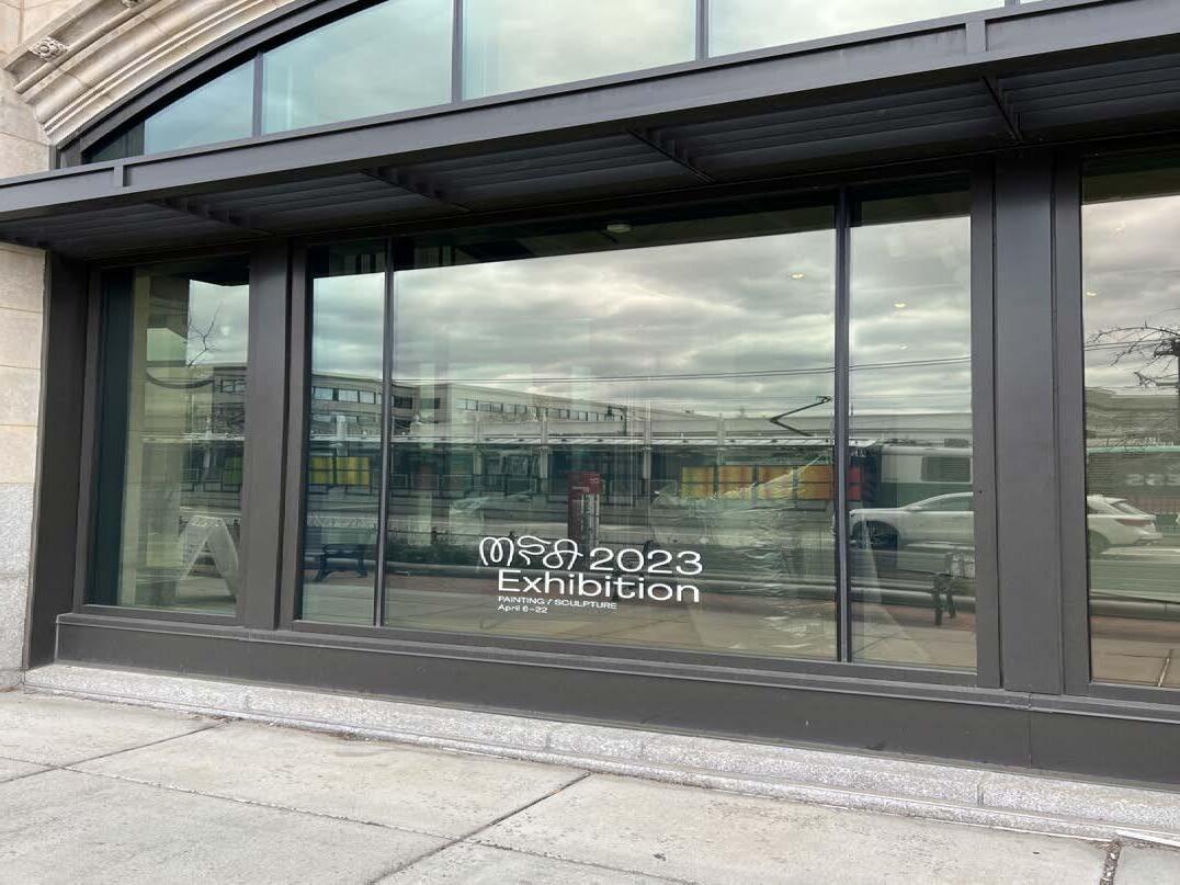
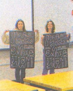
Under Christopher Sleboda's guidance, I worked alongside Sophia Viviano, Ash Wei, and Lucy Zou to create the 2023 MFA exhibition identity for Boston University's painting, sculpture, and graphic design graduate programs. The identity was based on our experiences at BU, emphasizing concepts such as connectivity, extension beyond boundaries, and informed exploration.
266 MFA EXHIBITION
SPRING 2023
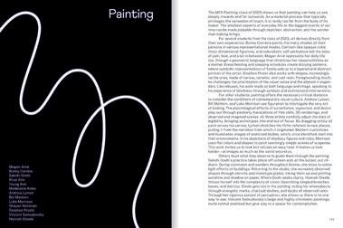
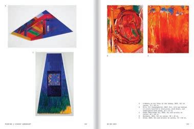
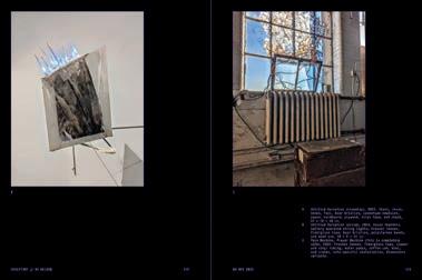
267 IDENTITY Graphic Design Painting Sculpture MFA 2023 EXHIBITION F 3 0 X N I Lauren Albensi Valeria Alvarado Gutierrez Megan Arne Graham Atherton Ry Beloin Hongjie Chen Yulu Chen Wanzhu (Summer) Cheng Bunny Correia Yingxuan (Eilis) Dan Hannah Diamond Sakshi Doshi Jesse Finkelstein David Gao Nina Gozzi River Kim Young Kim Madelaine Kobe Beiqiao Liu Andrew Lyman Bill Mattern Luke Morrison Leah Naxon Shayan Nazarian Sarah Olick Sohyoung Park Stephen Proski Annabella Pugliese Shuning Ren Vincent Samudovsky Olivia Sanderford Hannah Steele Siddharth Thanganatarajamani Jing Yi Tsai Yu-Ting (Tommy) Tsai Tiana Umbach Reshma Vijayan Sophia Viviano Jialun Wang Shu Wang Riva Weinstein Sishu Zhong April 6–22 T peset Athletics by Family Type. Designed by Annabella Pugliese, So phia Viviano, Ash Wei, Lucy Zou. 808 Gallery Stone Gallery Boston University MFA 2023 Exhibition official poster, 24 × 36 in.

268 MFA EXHIBITION
Static Instagram post, 1080 × 1080 in.


269 IDENTITY
Static Instagram stories, each 1080 × 1920 px.


270 MFA EXHIBITION
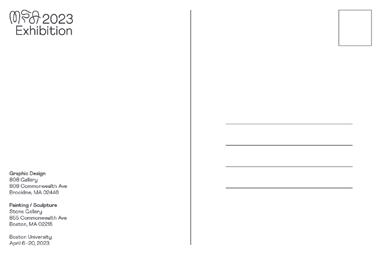
Postcards, each 4 × 6 in.
Stickers, each 3 × 3 in.
Postcard back.


271 IDENTITY

272 MFA EXHIBITION
Exhibition backlit duratrans poster at 855 Commonwealth Ave., 46 × 70.25 in.

273 IDENTITY
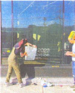
Exhibition window vinyl at 855 Commonwealth Ave., 35.25 × 19.25 in.

274 MFA EXHIBITION
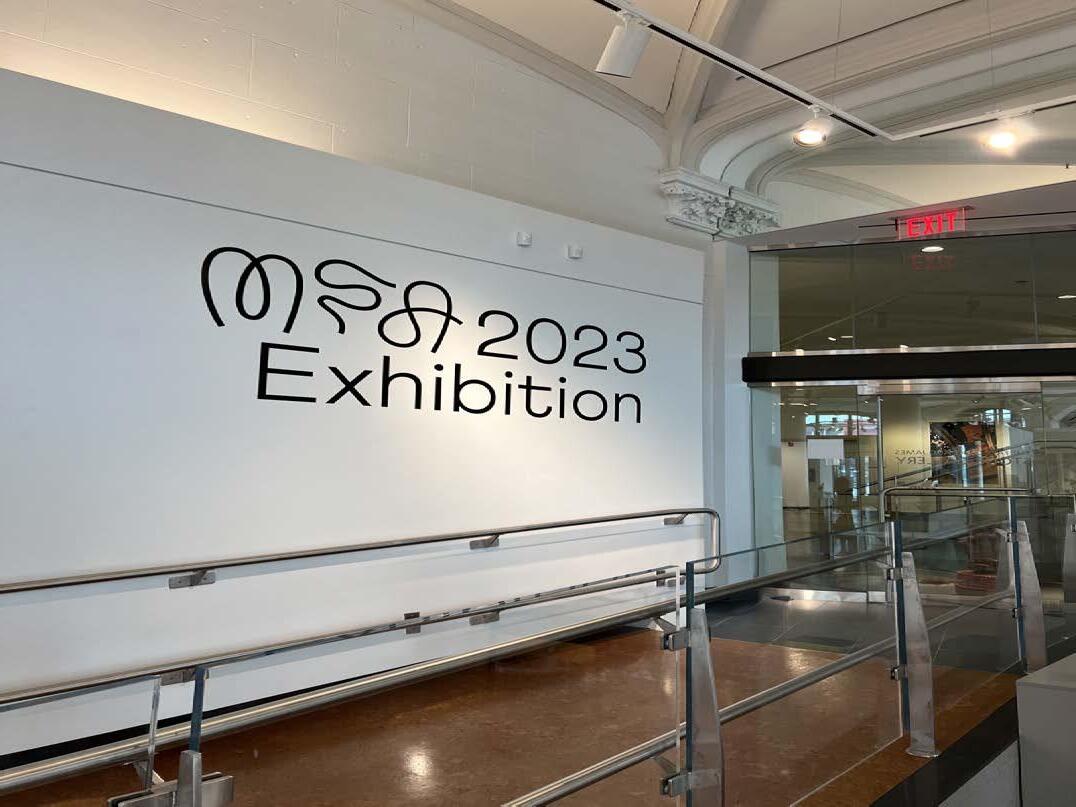
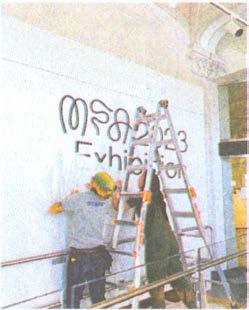
Exhibition entry title wall in Stone Gallery.


275 IDENTITY
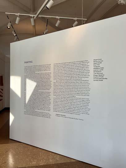
Painting title wall in Stone Gallery.
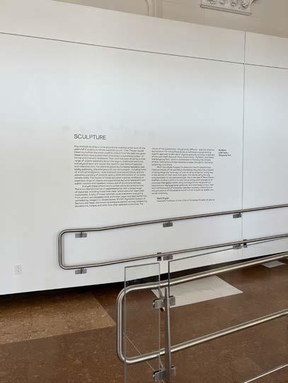
Sculpture title wall in Stone Gallery.
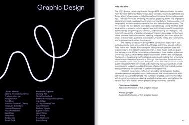
MFA Thesis Catalog, outside cover, 2023. Perfect-bound, 6 × 8 in. Select spreads.
276 MFA EXHIBITION BU SVA MFA 2023
Boston University School of Visual Arts


277 IDENTITY
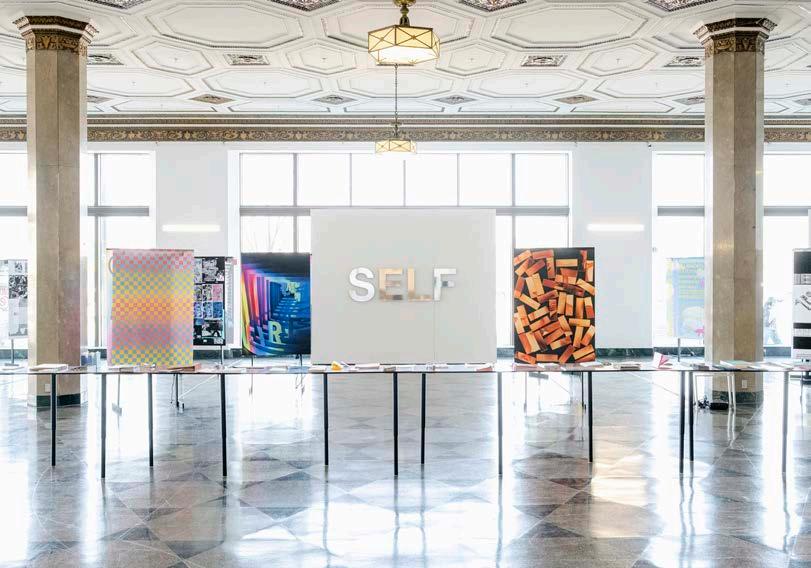
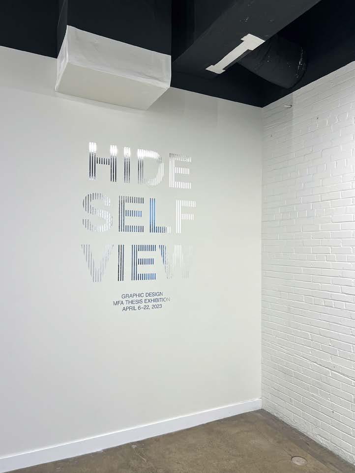
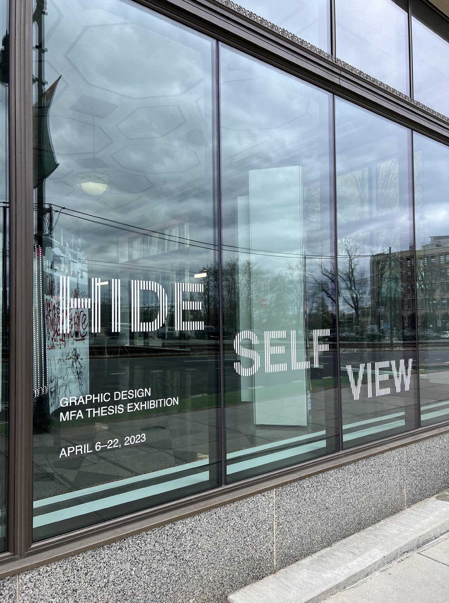
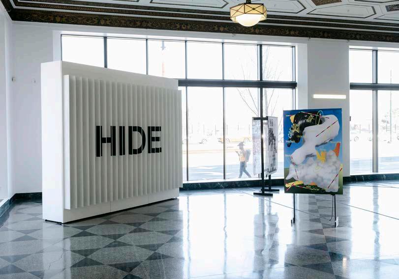
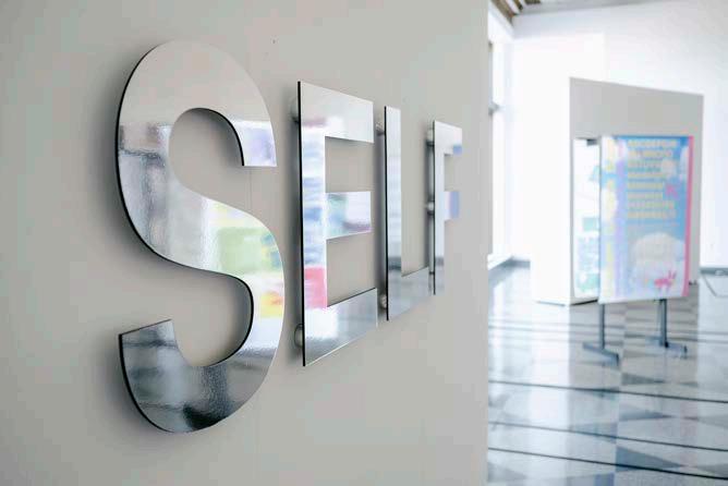
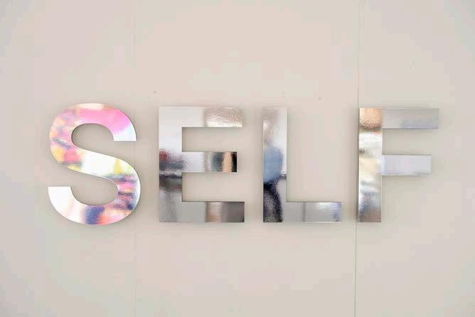
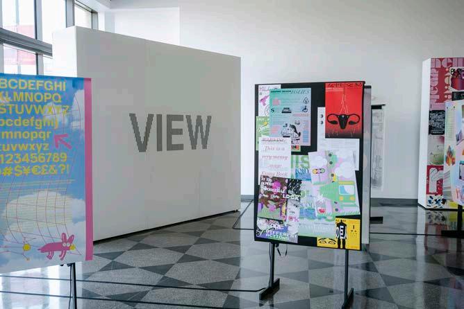
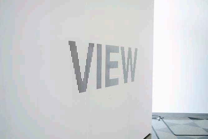
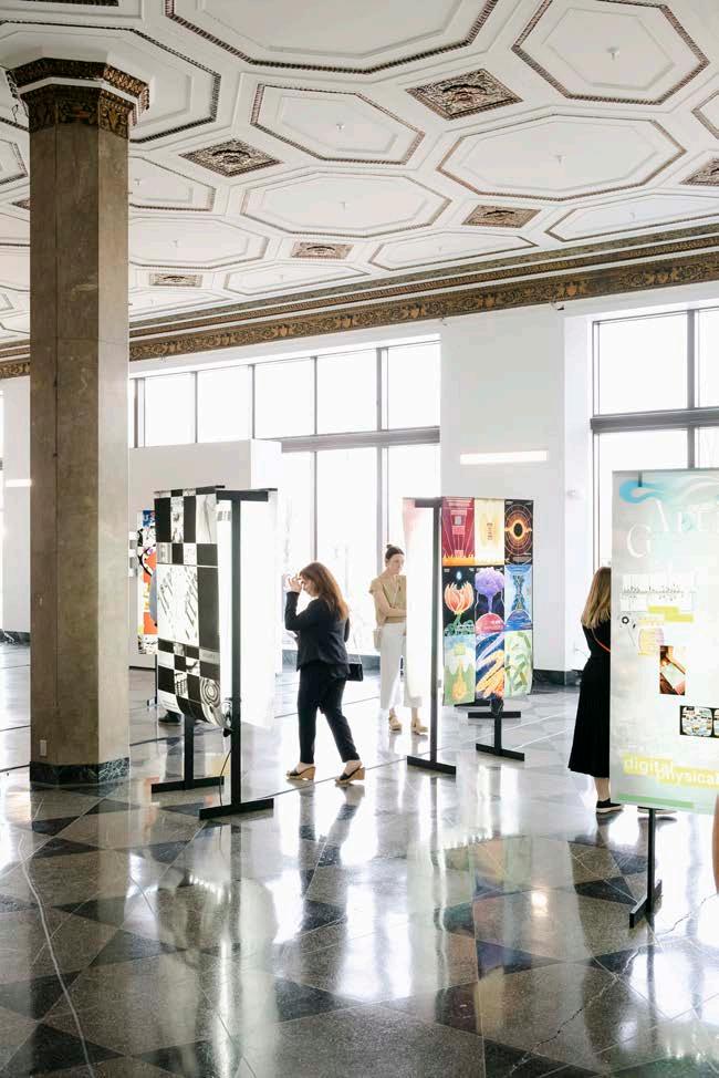
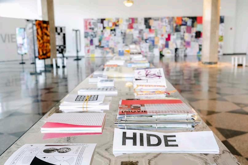
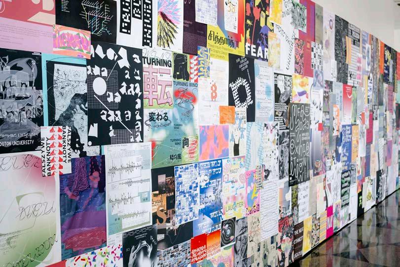
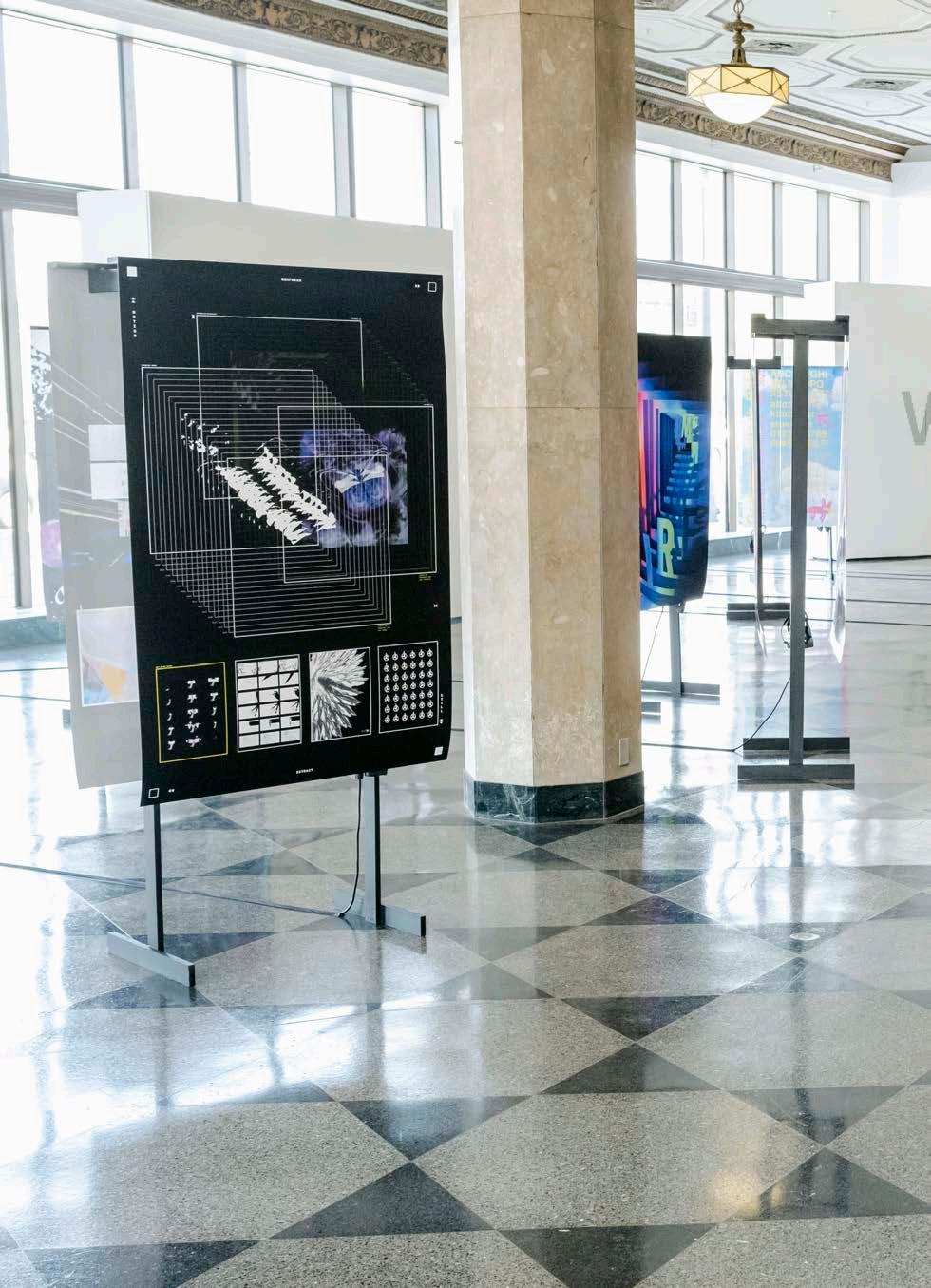
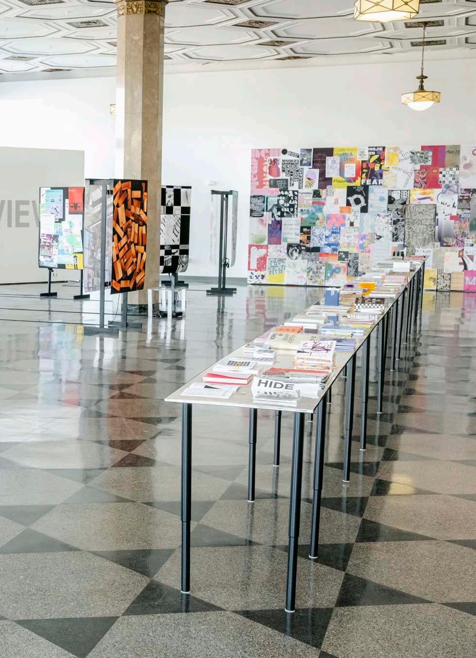
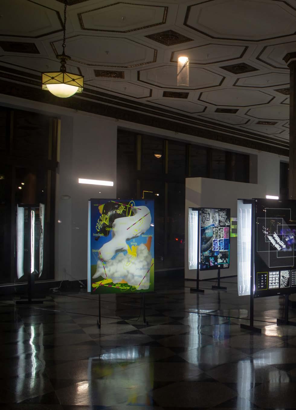
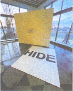
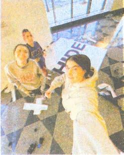
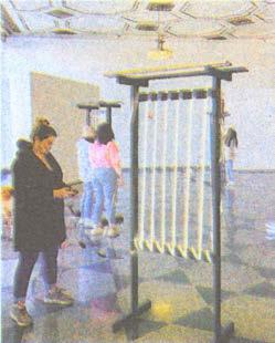
Sophia Viviano and I led the visual identity team behind Boston University's MFA graphic design thesis show, Hide Self View. The identity was built upon three key motifs used throughout the show: reflection, lenticular images, and moiré patterns.
APRIL 6–22, 2023
278 MFA EXHIBITION
HIDE SELF VIEW

279 HIDE SELF VIEW
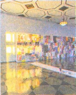
View from front entrance of Hide Self View, 2023.

MFA EXHIBITION
280
Hide Self View entry title wall at 808 Commonwealth Ave., 45 × 60 in.

HIDE SELF VIEW Hide Self View window vinyl at 808 Commonwealth Ave., 133 × 50 in. 281

MFA EXHIBITION
282
Lenticular 'HIDE' title wall in 808 Gallery, left-side view.

HIDE SELF VIEW
283
Lenticular 'HIDE' title wall in 808 Gallery, right-side view.


MFA EXHIBITION
284
Reflective 'SELF' title wall in 808 Gallery.


HIDE SELF VIEW
285
Moiré 'VIEW' title wall in 808 Gallery.

MFA EXHIBITION
286
Backlit duratrans displays, each 40 × 72 × 20.75 in.

HIDE SELF VIEW
287
Gradient Weave, 2023. Backlit duratrans poster, 40 × 60 in.

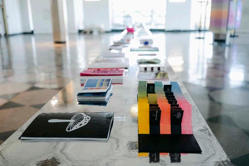
MFA EXHIBITION Reflective table for student publications, 2 × 48 ft. 288

HIDE SELF VIEW 289

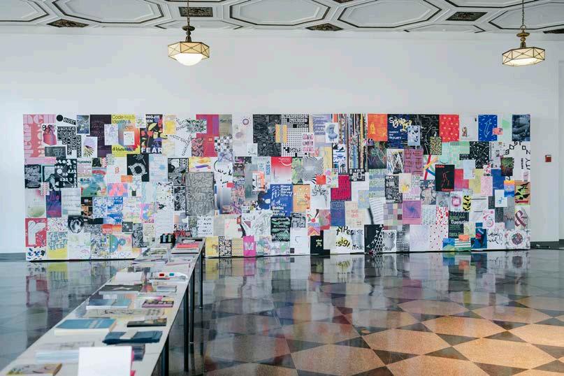
MFA EXHIBITION Poster wall, 9
36
290
×
ft.

HIDE SELF VIEW 291


PART III: Archive


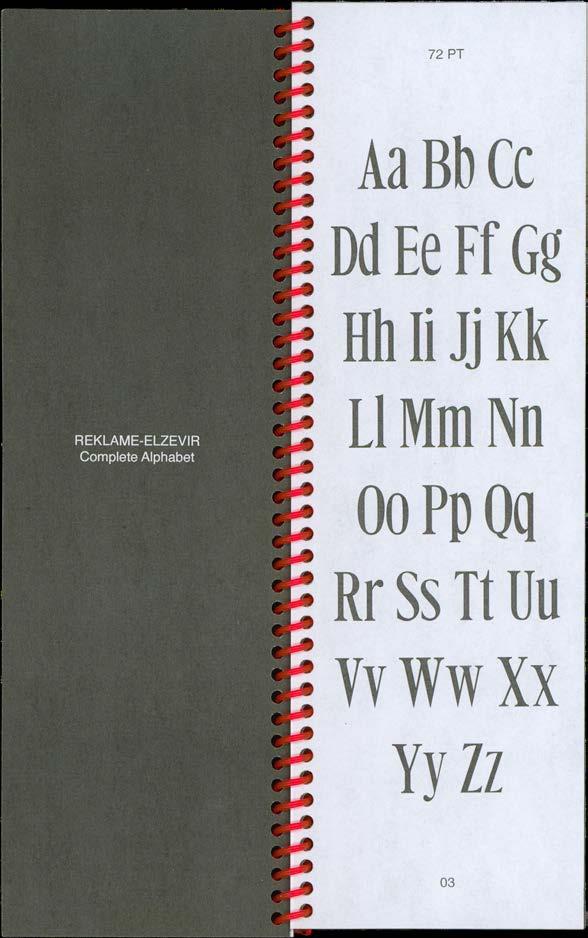
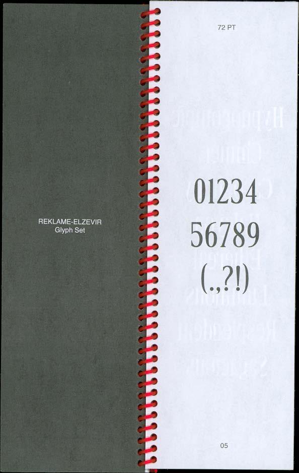
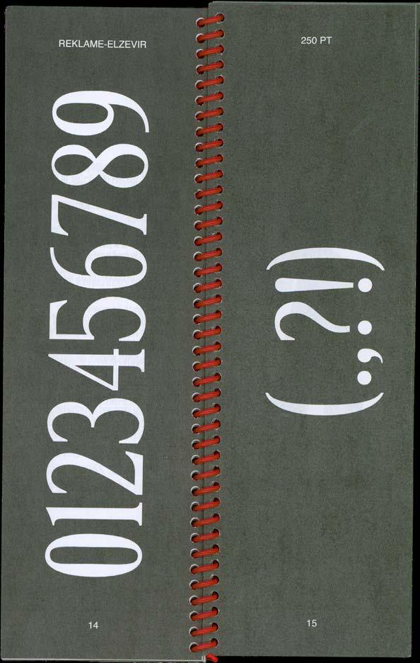
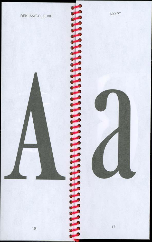
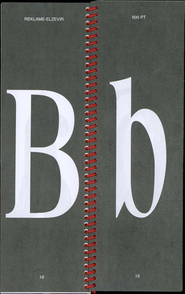
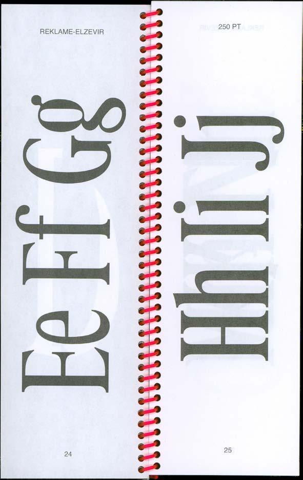
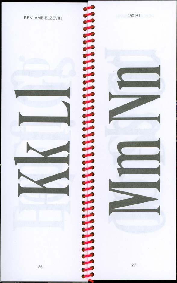
298 ARCHIVE REKLAME-ELZEVIR
Reklame-Elzevir Specimen, select spreads, 2023. Spiral-bound, 3.75 × 11 in.

299 PROJECT INVENTORY TYPE DESIGN

Reklame-Elzevir Specimen, select
2023. 300 ARCHIVE REKLAME-ELZEVIR
spreads,

301 PROJECT INVENTORY
TYPE DESIGN

Reklame-Elzevir Specimen, select
2023. 302 ARCHIVE REKLAME-ELZEVIR
spreads,

303 PROJECT INVENTORY TYPE DESIGN

Reklame-Elzevir Specimen,
304 ARCHIVE REKLAME-ELZEVIR
select spreads, 2023.

305 PROJECT INVENTORY TYPE DESIGN

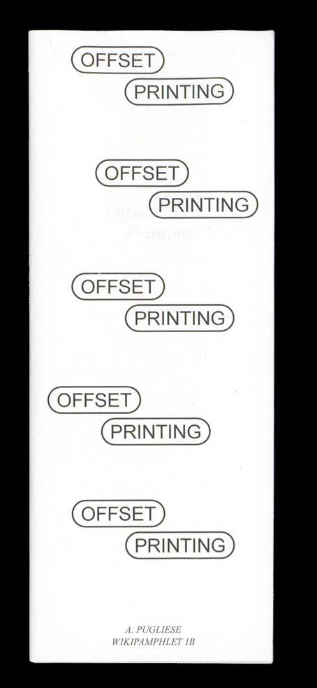
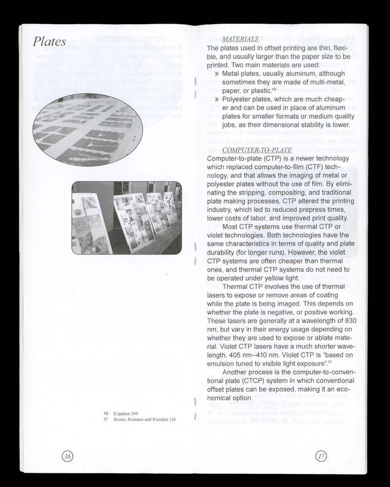
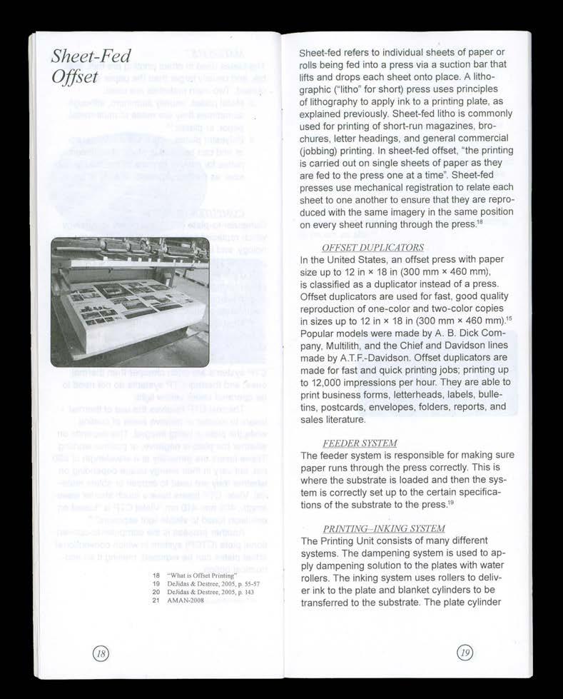
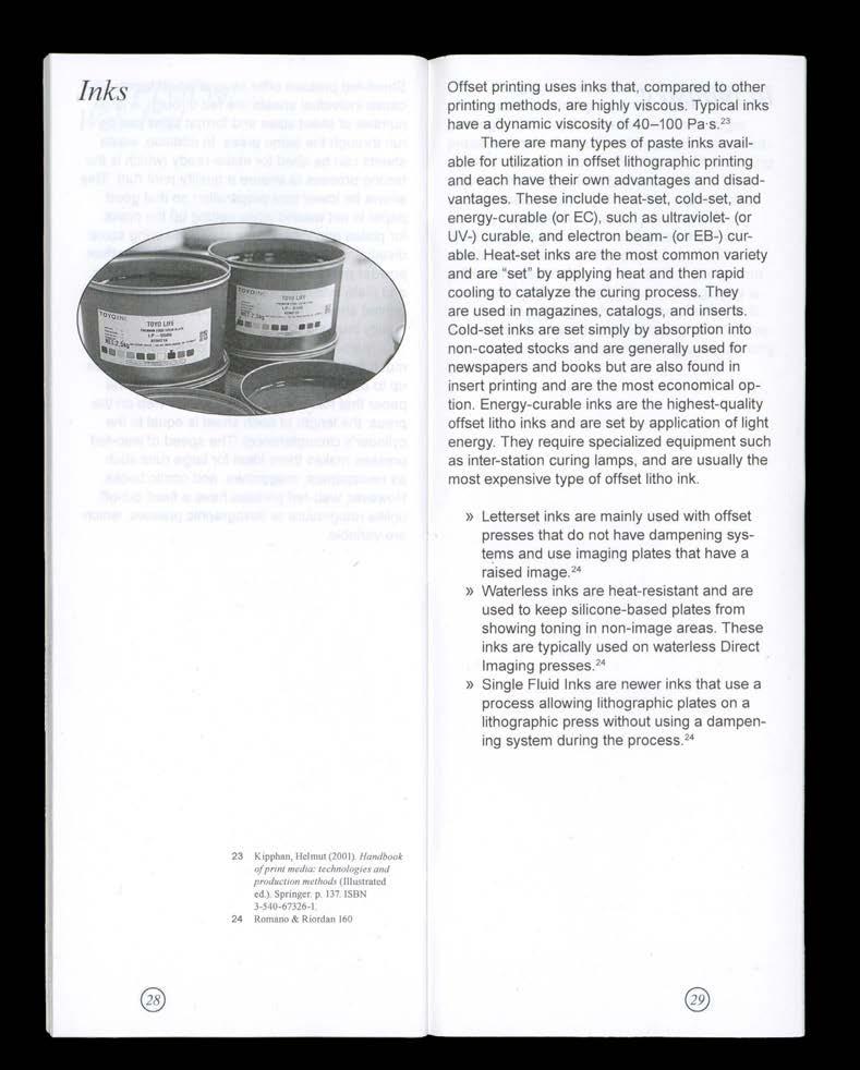
Offset
306 ARCHIVE OFFSET PRINTING
Printing,
front and back cover, 2022. Saddle-stitch booklet, 3.75 × 9.75 in.

307 PROJECT INVENTORY EDITORIAL PUBLICATION

Offset Printing, select spreads, 2022. 308 ARCHIVE OFFSET PRINTING

309 PROJECT INVENTORY EDITORIAL PUBLICATION

Offset Printing, select spreads, 2022. 310 ARCHIVE OFFSET PRINTING

311 PROJECT INVENTORY EDITORIAL PUBLICATION

Offset Printing, select spreads, 2022. 312 ARCHIVE OFFSET PRINTING

313 PROJECT INVENTORY EDITORIAL PUBLICATION

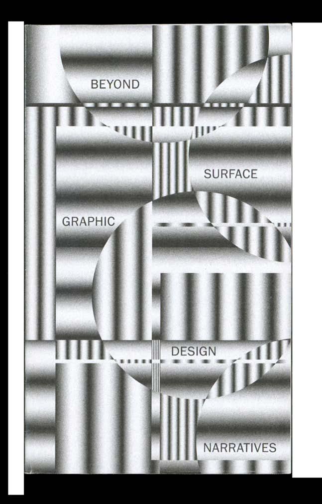
314 ARCHIVE BEYOND
Beyond Surface: Graphic Design Narratives, front and back cover, 2022. Perfect-bound, 5 × 8.5 in.
SURFACE

315 PROJECT INVENTORY EDITORIAL PUBLICATION
Beyond Surface: Graphic Design Narratives, select spreads, 2022.


316 ARCHIVE BEYOND SURFACE


317 PROJECT INVENTORY EDITORIAL PUBLICATION


318 ARCHIVE BEYOND SURFACE
Beyond Surface: Graphic Design Narratives, select spreads, 2022.


319 PROJECT INVENTORY EDITORIAL PUBLICATION
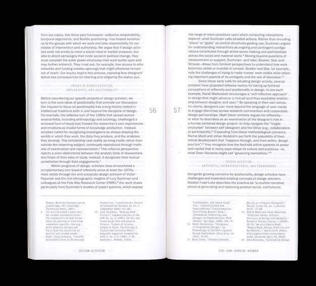
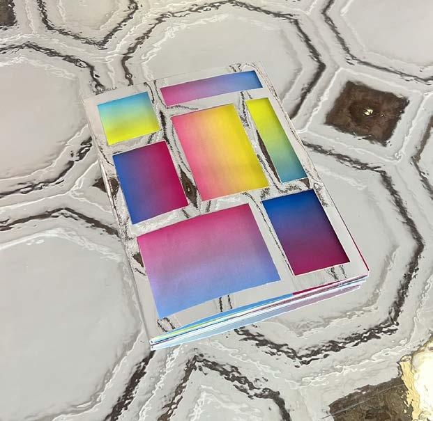
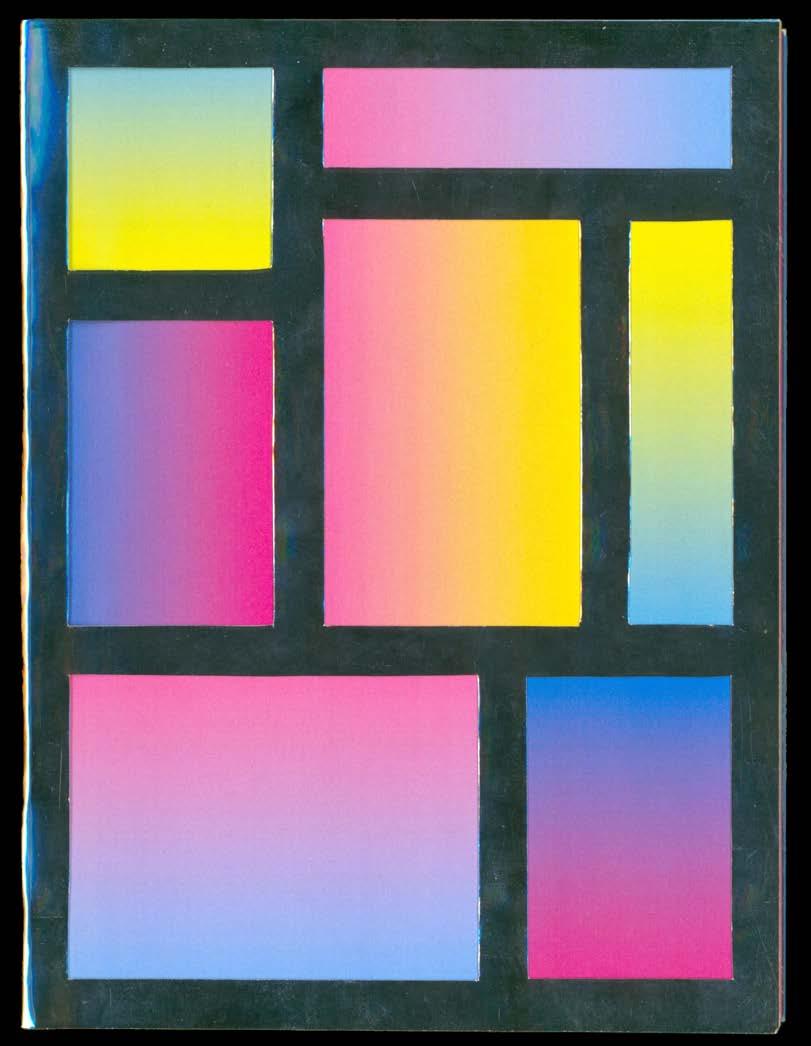
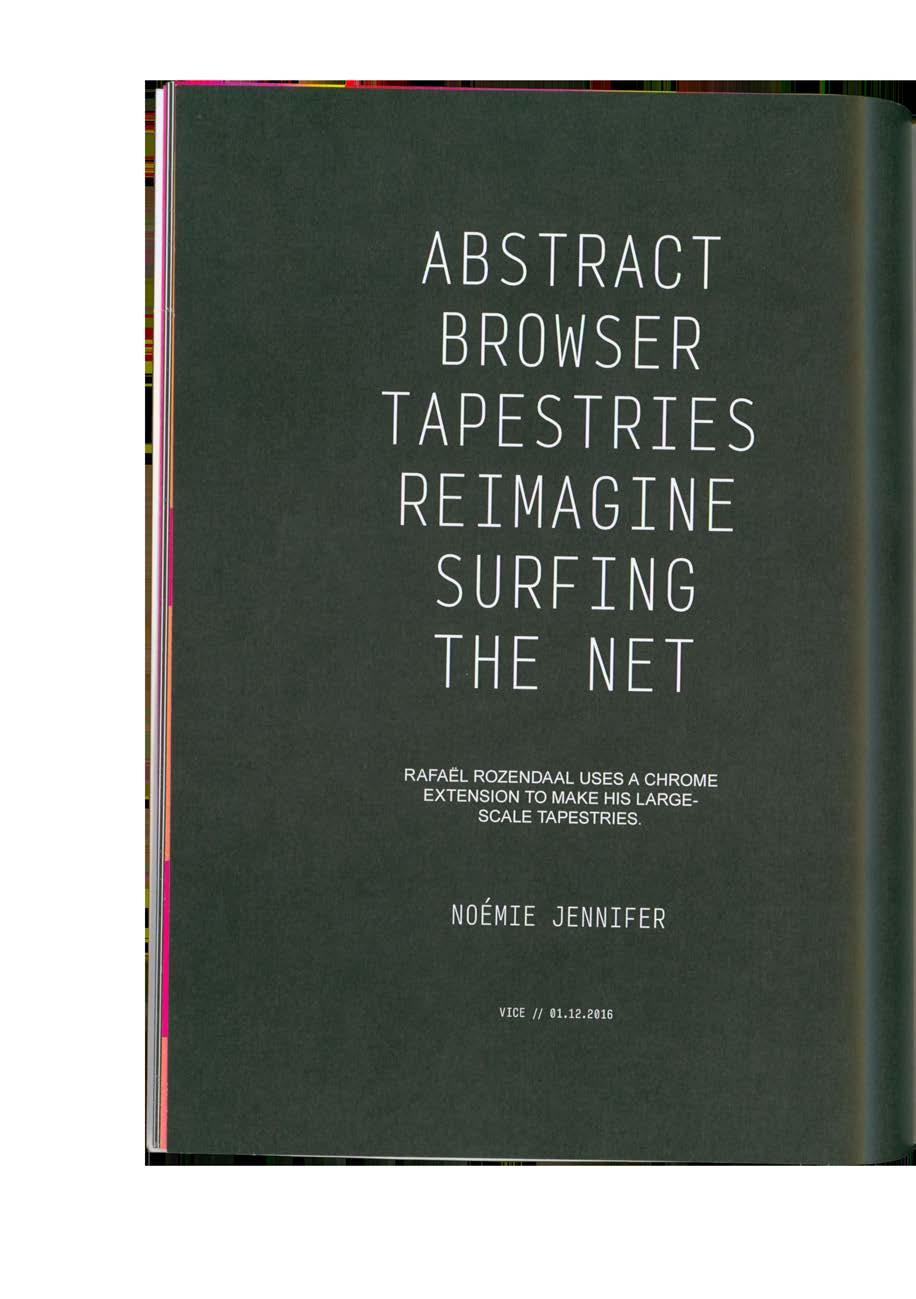
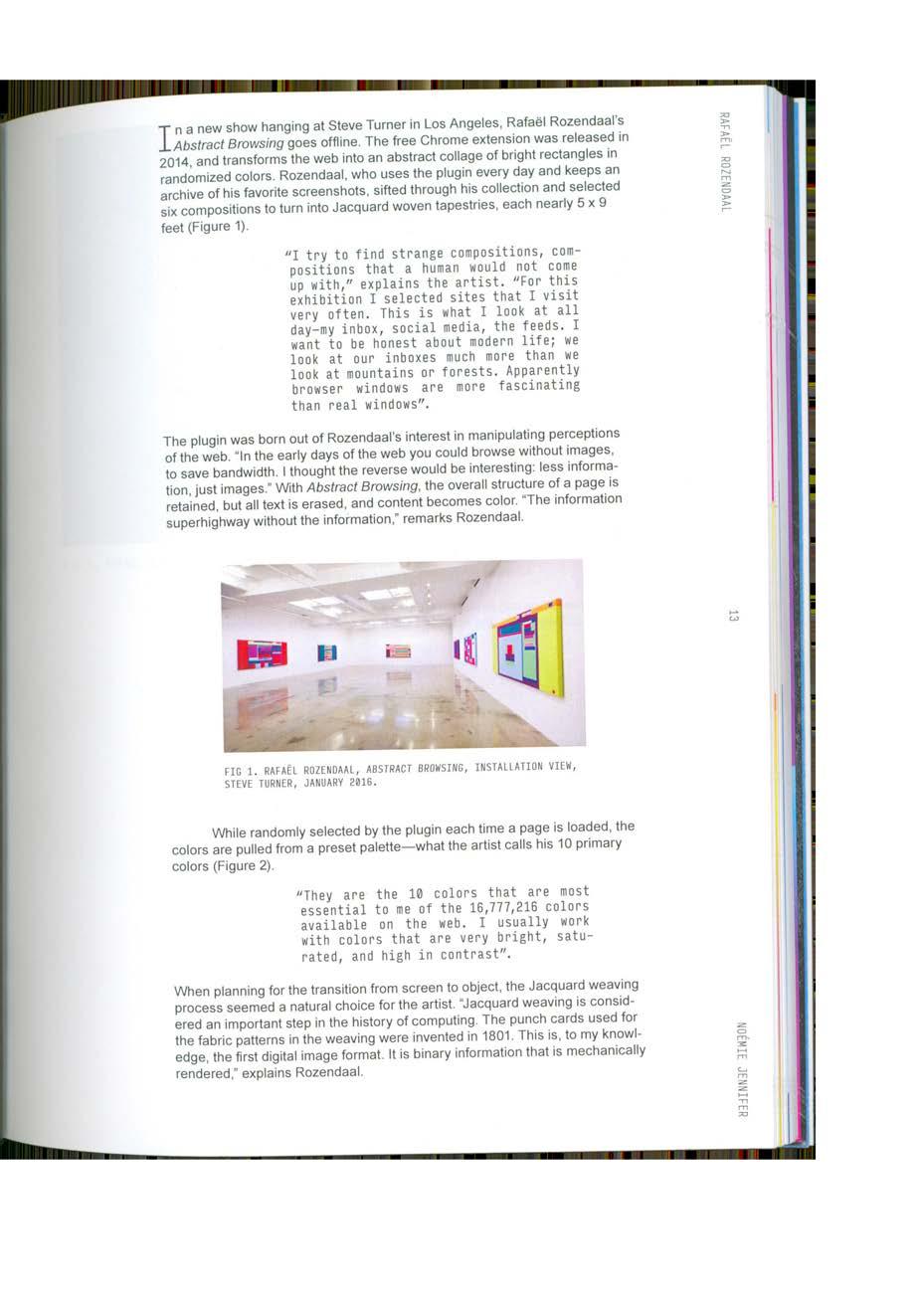
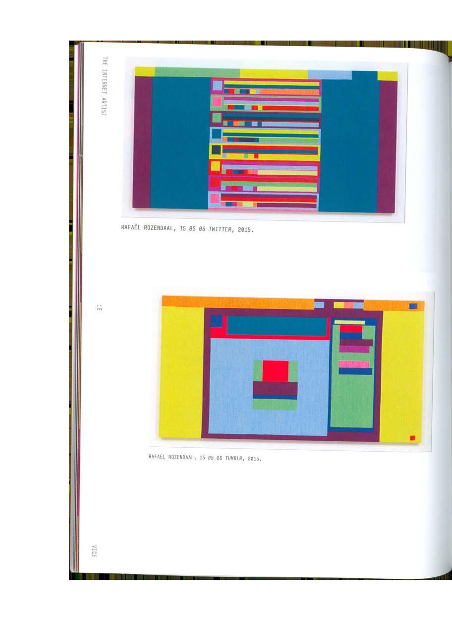
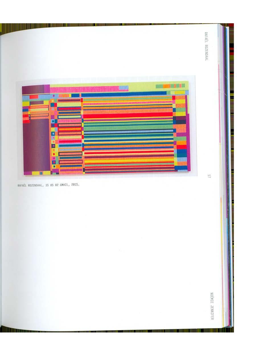
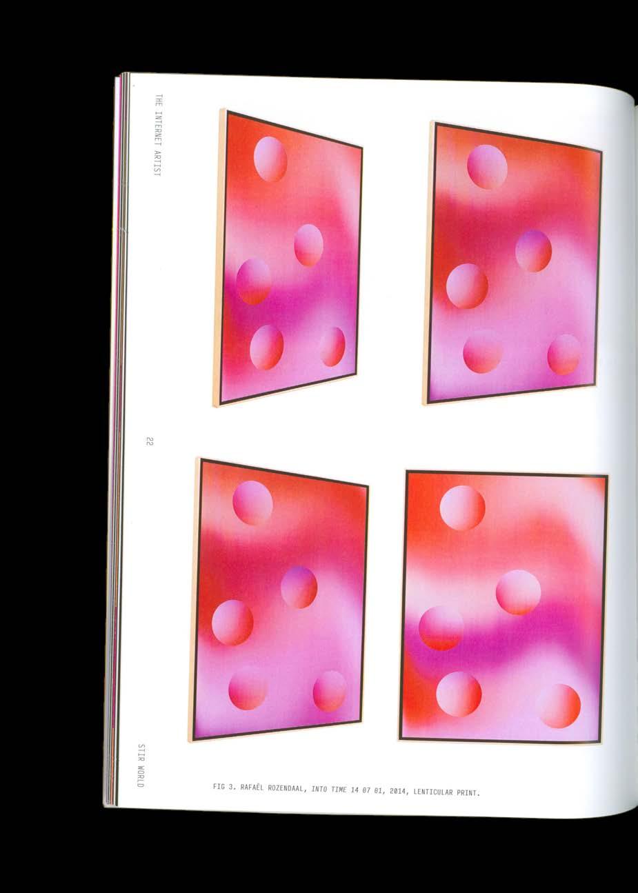
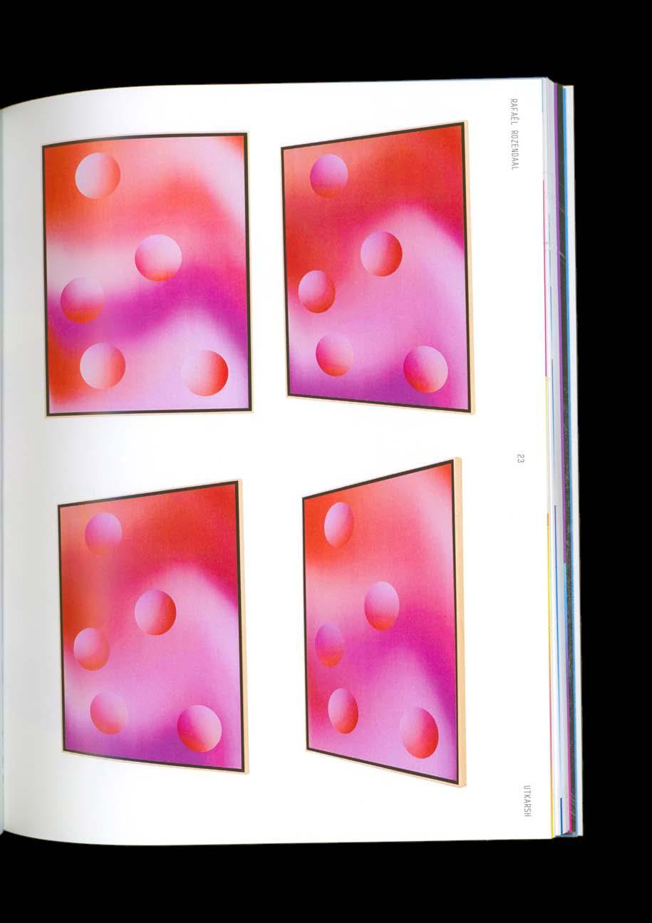
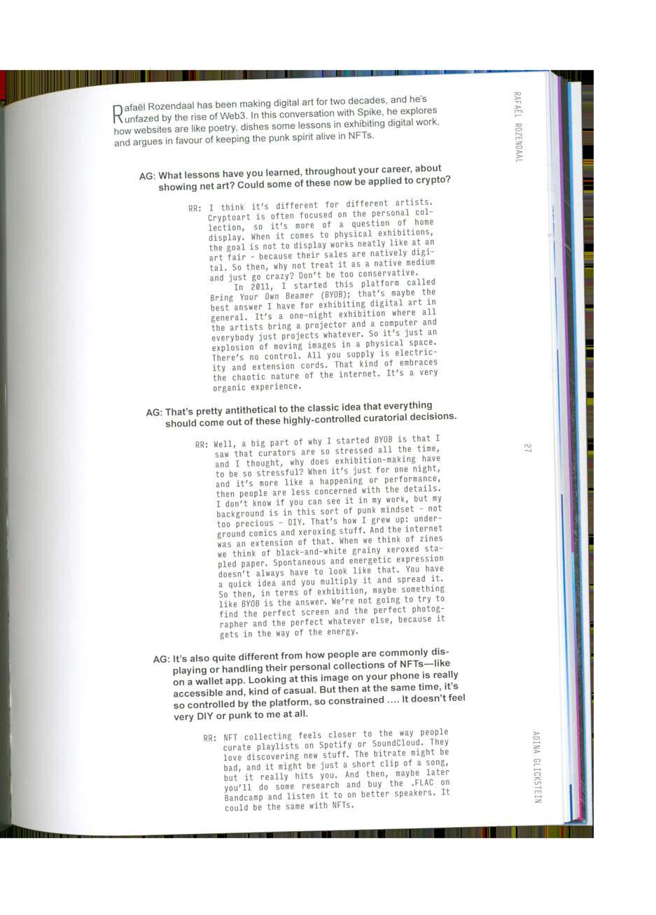
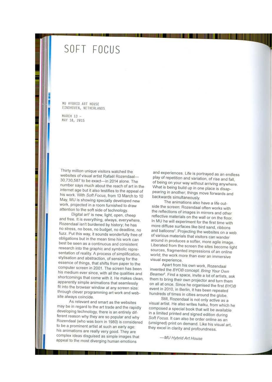
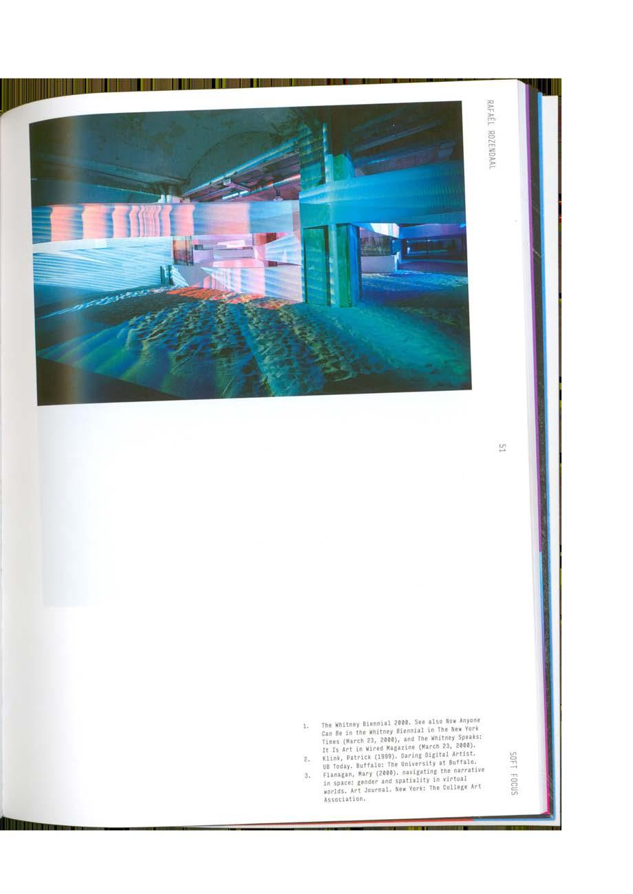
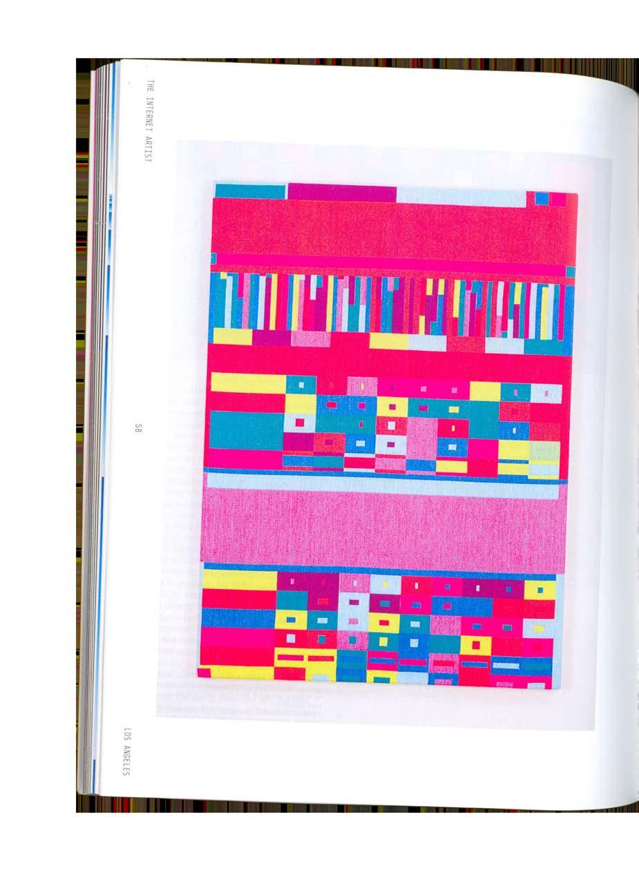
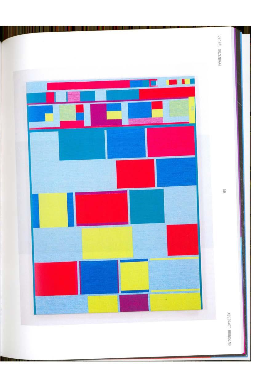
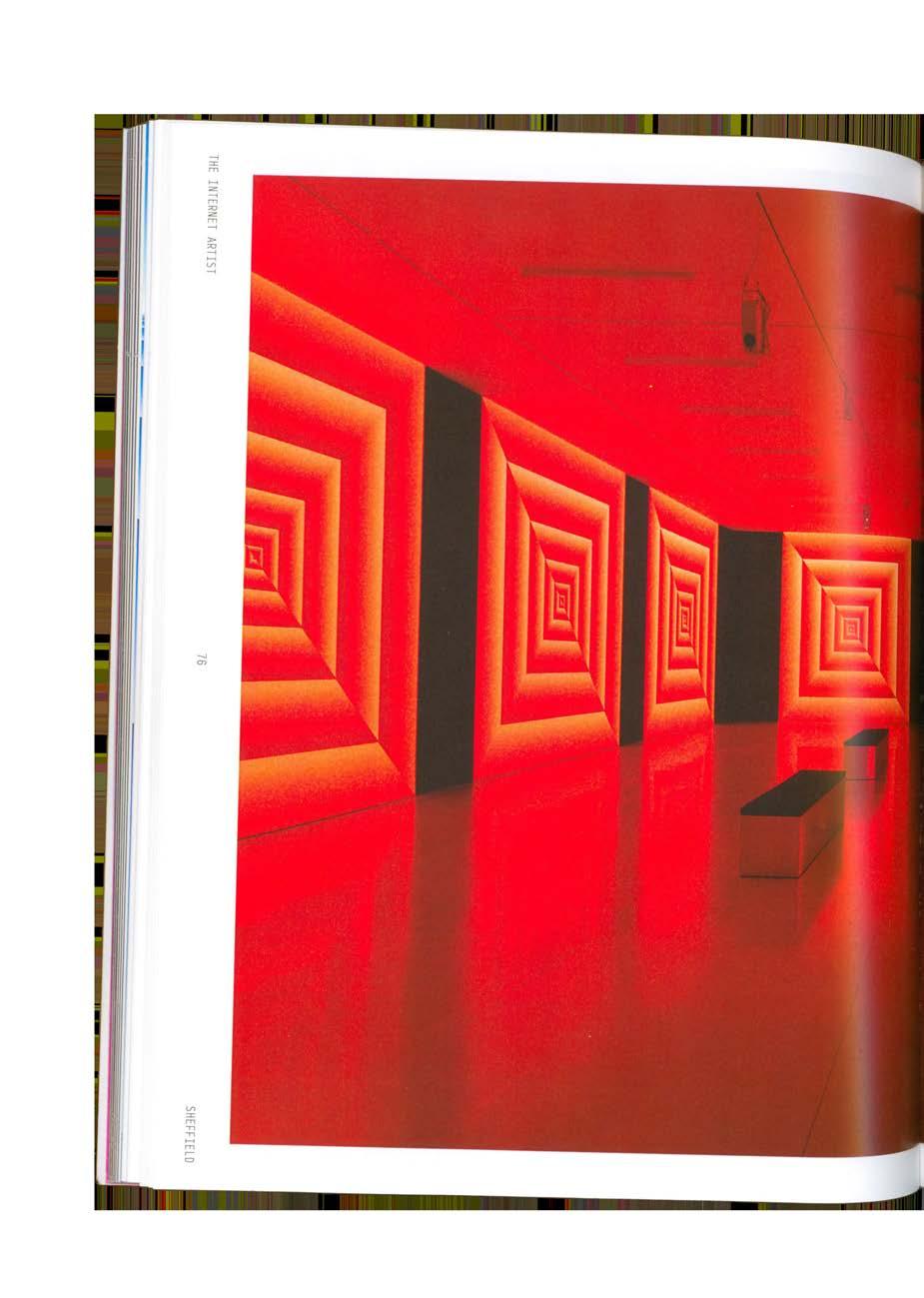
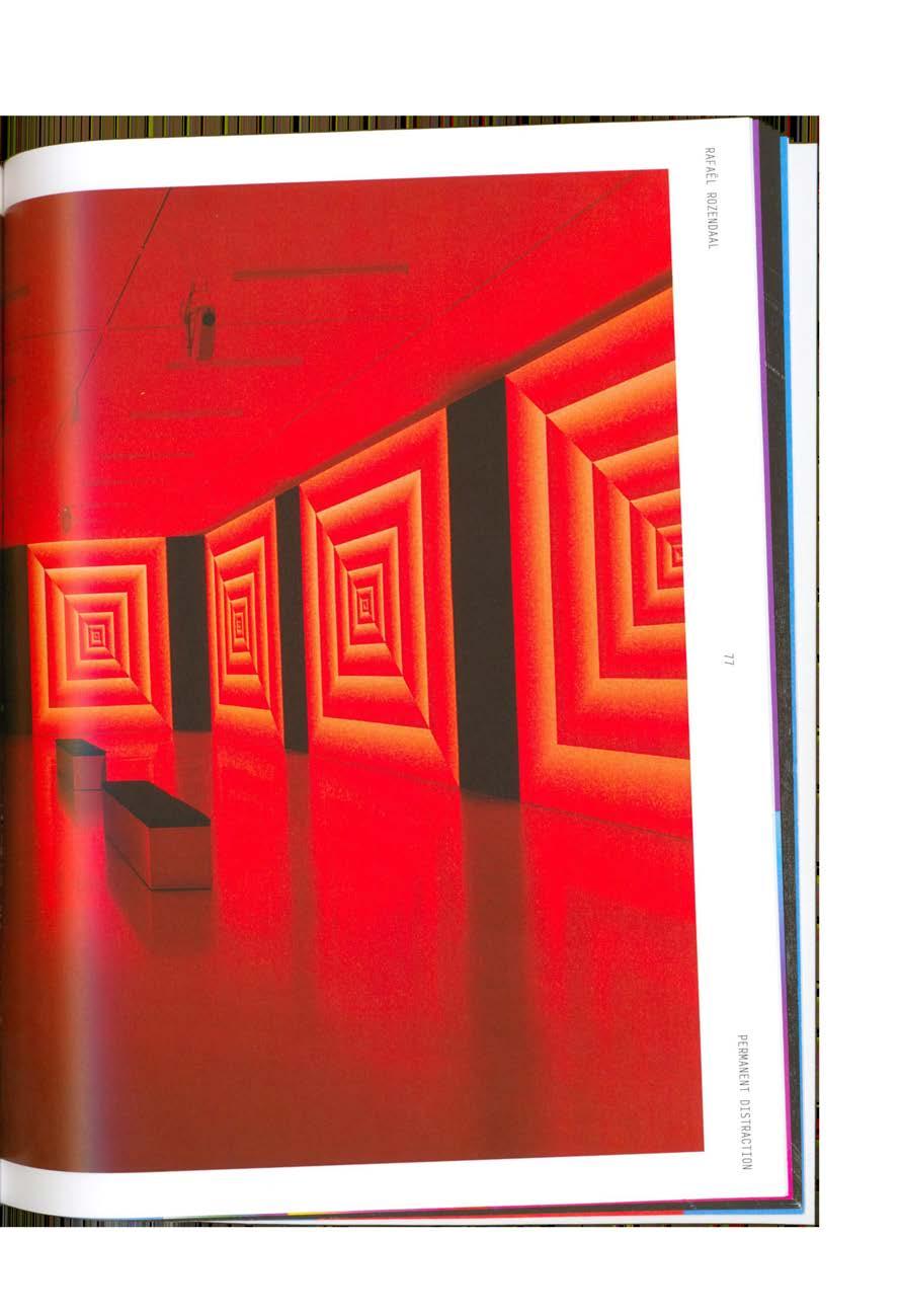
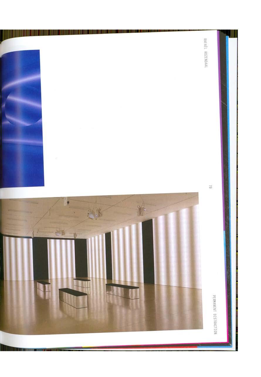
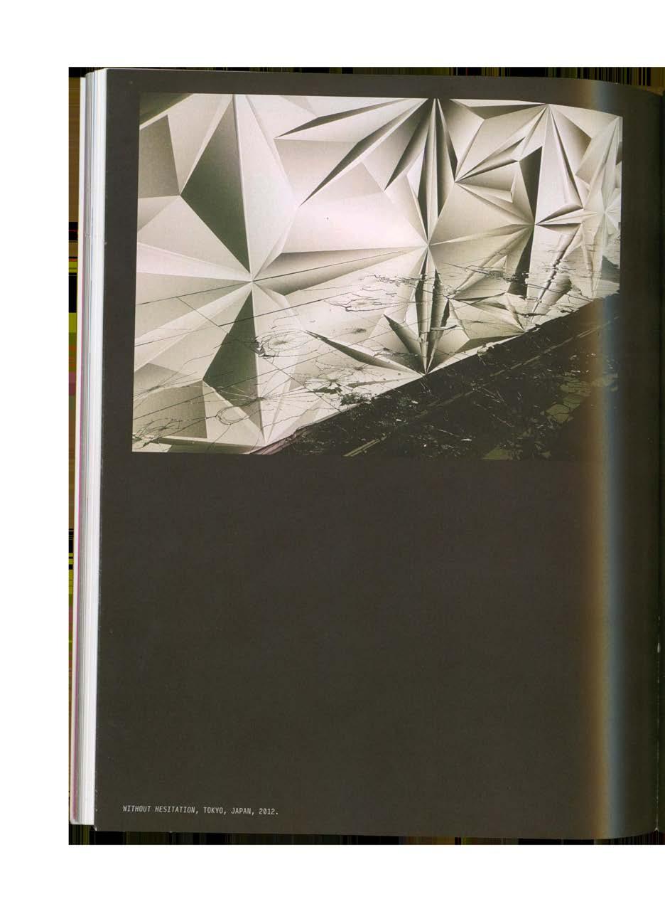
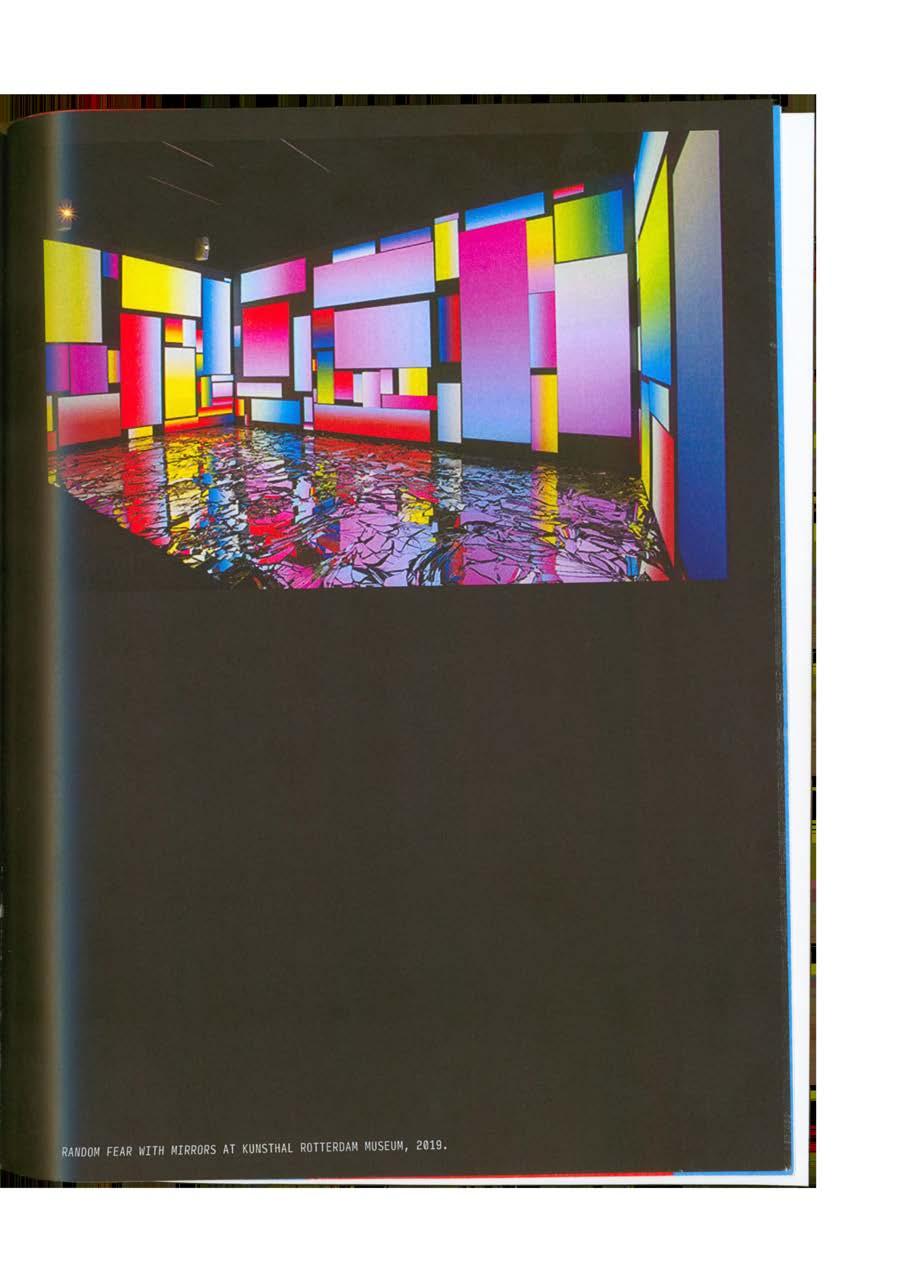
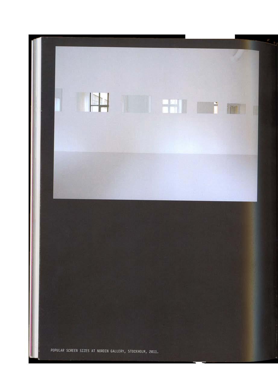
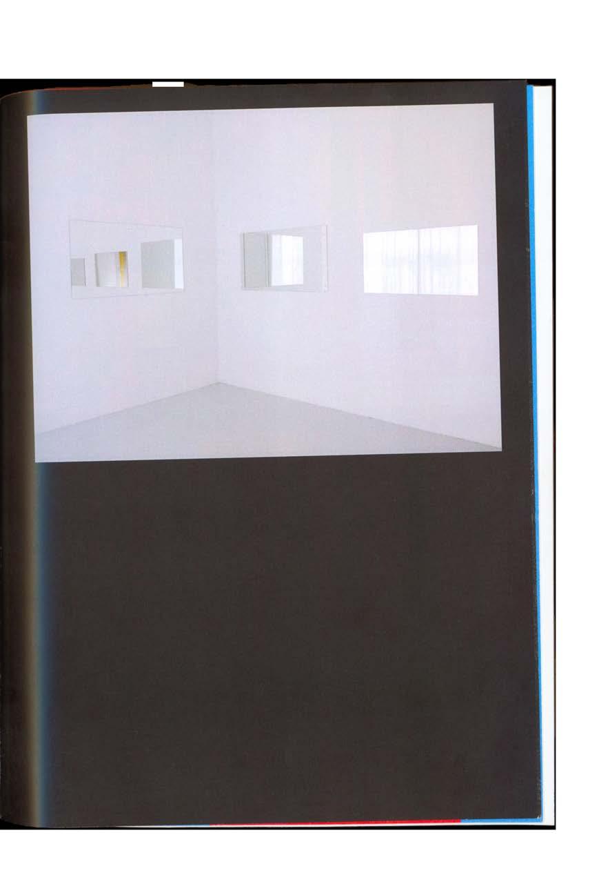
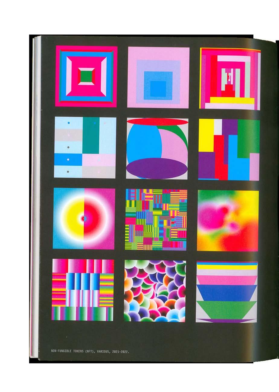
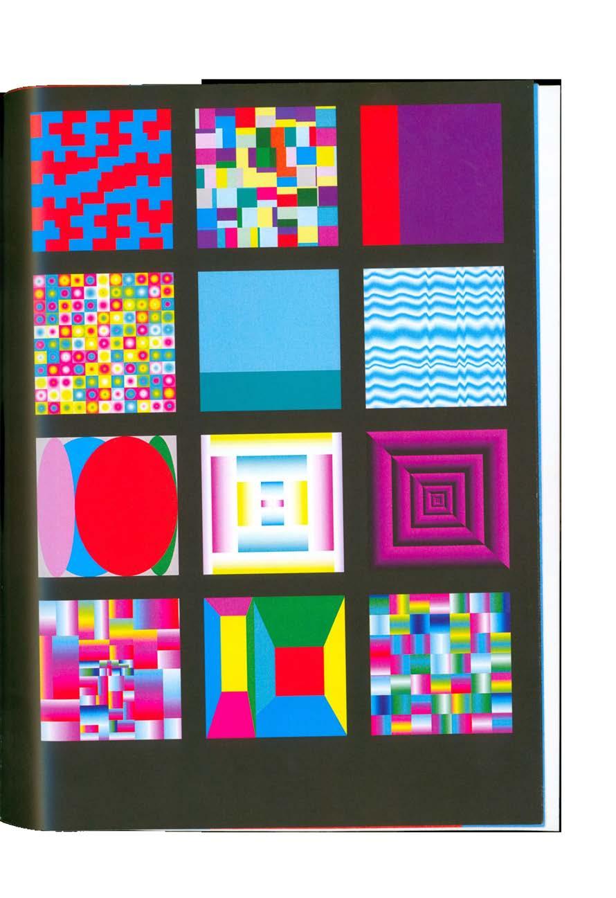
Artist Monograph: Rafaël Rozendaal, front cover, 2022. Perfect-bound with reflective die-cut cover, 7 × 10 in.
PG 322–347: Select spreads.

320 ARCHIVE ARTIST MONOGRAPH

321 PROJECT INVENTORY EDITORIAL PUBLICATION

322 ARCHIVE ARTIST MONOGRAPH

323 PROJECT INVENTORY EDITORIAL PUBLICATION

324 ARCHIVE ARTIST MONOGRAPH

325 PROJECT INVENTORY EDITORIAL PUBLICATION

326 ARCHIVE ARTIST MONOGRAPH

327 PROJECT INVENTORY EDITORIAL PUBLICATION

328 ARCHIVE ARTIST MONOGRAPH

329 PROJECT INVENTORY EDITORIAL PUBLICATION

330 ARCHIVE ARTIST MONOGRAPH

331 PROJECT INVENTORY EDITORIAL PUBLICATION

332 ARCHIVE ARTIST MONOGRAPH

333 PROJECT INVENTORY EDITORIAL PUBLICATION

334 ARCHIVE ARTIST MONOGRAPH

335 PROJECT INVENTORY EDITORIAL PUBLICATION

336 ARCHIVE ARTIST MONOGRAPH

337 PROJECT INVENTORY EDITORIAL PUBLICATION

338 ARCHIVE ARTIST MONOGRAPH

339 PROJECT INVENTORY EDITORIAL PUBLICATION

340 ARCHIVE ARTIST MONOGRAPH

341 PROJECT INVENTORY EDITORIAL PUBLICATION

342 ARCHIVE ARTIST MONOGRAPH

343 PROJECT INVENTORY EDITORIAL PUBLICATION

344 ARCHIVE ARTIST MONOGRAPH

345 PROJECT INVENTORY EDITORIAL PUBLICATION

346 ARCHIVE ARTIST MONOGRAPH

347 PROJECT INVENTORY EDITORIAL PUBLICATION

348 ARCHIVE TAXONOMY
Taxonomy, 2022. Cards on binder ring, 2 × 4 in.
Individual cards.


349 PROJECT INVENTORY STUDIO II
Intersectionality in Graphic Design, front cover, 2022.

Folding poster-pamphlet, 4.25 × 5.5 in.
Fold-out poster, 11 × 17 in.
350 ARCHIVE INTERSECTIONALITY

351 PROJECT INVENTORY THEORY I
Fifty Iterations, spine and front cover, 2021.

Fifty Iterations, back cover, 2021.

352 ARCHIVE FIFTY ITERATIONS

353 PROJECT INVENTORY STUDIO I


50 Iterations, select spreads, 2021. 354 ARCHIVE FIFTY ITERATIONS


355 PROJECT INVENTORY STUDIO I

Biography: Lauren, 2021, 24 × 36 in. TNLS: Dakota Mace, 2022, 18 × 24 in. 356 ARCHIVE POSTER COLLECTION

357 PROJECT INVENTORY MISCELLANEOUS

Aggregate, 2021, 24 × 36 in. Interrupt, 2021, 40 × 60 in. 358 ARCHIVE POSTERS COLLECTION

359 PROJECT INVENTORY MISCELLANEOUS


ARCHIVE 360 [007] [008] [009] [004] [005] [006] [001] [002] [003]


TWO YEARS OF PHOTOS 361 [016] [017] [018] [013] [014] [015] [010] [011] [012]


ARCHIVE 362 [025] [026] [027] [022] [023] [024] [019] [020] [021]


TWO YEARS OF PHOTOS 363 [034] [035] [036] [031] [032] [033] [028] [029] [030]


ARCHIVE 364 [043] [044] [045] [040] [041] [042] [037] [038] [039]


TWO YEARS OF PHOTOS 365 [052] [053] [054] [049] [050] [051] [046] [047] [048]


ARCHIVE 366 [061] [062] [063] [058] [059] [060] [055] [056] [057]


TWO YEARS OF PHOTOS 367 [070] [071] [072] [067] [068] [069] [064] [065] [066]


ARCHIVE 368 [079] [080] [081] [076] [077] [078] [073] [074] [075]


TWO YEARS OF PHOTOS 369 [088] [089] [090] [085] [086] [087] [082] [083] [084]


ARCHIVE 370 [097] [098] [099] [094] [095] [096] [091] [092] [093]


TWO YEARS OF PHOTOS 371 [106] [107] [108] [103] [104] [105] [100] [101] [102]


ARCHIVE 372 [115] [116] [117] [112] [113] [114] [109] [110] [111]


TWO YEARS OF PHOTOS 373 [124] [125] [126] [121] [122] [123] [118] [119] [120]


ARCHIVE 374 [133] [134] [135] [130] [131] [132] [127] [128] [129]


TWO YEARS OF PHOTOS 375 [142] [143] [144] [139] [140] [141] [136] [137] [138]


ARCHIVE 376 [151] [152] [153] [148] [149] [150] [145] [146] [147]


TWO YEARS OF PHOTOS 377 [160] [161] [162] [157] [158] [159] [154] [155] [156]


ARCHIVE 378 [169] [170] [171] [166] [167] [168] [163] [164] [165]


TWO YEARS OF PHOTOS 379 [178] [179] [180] [175] [176] [177] [172] [173] [174]
COLOR-CODE 380 ARCHIVE Waiting for the bus 09.14.2021 // 9:43 AM Trimming my first poster 09.22.2021 // 6:38 PM First time using the Risograph 10.20.2021 // 10:24 AM Overlay charts in the riso room 11.01.2021 // 4:02 PM Sunset at 808 11.03.2021 // 5:31 PM Trimming aggregate poster 11.14.2021 // 8:01 PM Type I masonry project 12.03.2021 // 10:19 PM Final Type I crit 12.06.2021 – 5:26 PM Interrupt poster at final crit 12.06.2021 // 5:53 PM First final review 12.08.2021 // 12:56 PM Marie visiting Boston 12.13.2021 // 3:25 PM Beacon Hill 12.13.2021 // 3:36 PM NYE in NYC 12.31.2021 // 5:30 PM Walking to class 02.02.2022 // 1:06 PM Carson Beach in Southie 02.06.2022 // 5:16 PM Draw Down press sheet 02.07.2022 // 2:47 PM Boston Boardwalk 02.11.2022 // 4:46 PM Corner of K St & Marine Rd 02.12.2022 // 5:03 PM [001] [002] [003] [004] [005] [006] [007] [008] [009] [010] [011] [012] [013] [014] [015] [016] [017] [018] Observe & Quantify sketches 02.24.2022 // 3:11 PM Jaylen’s posters at final crit 03.03.2022 // 4:32 PM Working with Processing 03.17.2022 // 5:24 PM Printing CMYK Calendar 03.18.2022 // 10:52 AM Workshop with Paolo Scoppola 03.24.2022 // 1:46 PM Evening in the studio 03.28.2022 // 10:24 PM Risolve sample book 04.07.2022 // 11:18 AM Brainstorming for studio projects 04.07.2022 // 8:06 PM Unbound RISD Art Book Fair 04.09.2022 // 1:12 PM Providence, RI 04.09.2022 // 2:13 PM RISD campus Blick 04.09.2022 // 2:24 PM Shopping for supplies with Lauren 04.19.2022 // 6:34 PM FRAME/WORK/SITE flags 04.15.2022 // 5:16 PM F/W/S poster wall 04.15.2022 // 5:17 PM Lauren at F/W/S bookshelf 04.15.2022 // 5:33 PM Cup collection 04.18.2022 // 11:44 PM Laser cutting at EPIC 04.19.2022 // 1:51 PM 101.4℉ fever (COVID) 04.22.2022 // 8:45 PM [019] [020] [021] [022] [023] [024] [025] [026] [027] [028] [029] [030] [031] [032] [033] [034] [035] [036] WFB (work from bed) 04.25.2022 // 12:49 AM Cody being a good boy 04.28.2022 // 3:36 PM Spring final review 04.29.2022 // 1:01 PM Process book (post all-nighter) 05.05.2022 // 7:51 AM Me & Nicole at Red Sox game 06.01.2022 // 7:58 PM My desk 06.05.2022 // 7:14 PM Sunset in Dorchester 06.19.2022 // 8:23 PM Walking Breezy & Riley 06.25.2022 // 8:18 PM Rainbow outside 808 06.27.2022 // 8:14 PM Me & Cody 06.27.2022 // 8:22 PM Pink mirror in studio 06.28.2022 // 1:27 PM Trip home 07.04.2022 // 6:12 PM New nails 07.12.2022 // 2:52 PM Cozy golden hour 07.17.2022 // 7:24 PM Jellyfish at NE Aquarium 07.20.2022 // 4:09 PM Boston Waterfront 07.20.2022 // 7:26 PM Yvonne’s 07.21.2022 // 9:20 PM Flowers for Grandma 07.22.2022 // 4:38 PM [037] [038] [039] [040] [041] [042] [043] [044] [045] [046] [047] [048] [049] [050] [051] [052] [053] [054]
PG 360–361
PG 362–363
PG 364–365
381 TWO YEARS OF PHOTOS Grandpa’s 87th birthday 07.22.2022 // 8:06 PM Charlotte Congregational Church 07.23.2022 // 1:16 PM Burlington Waterfront 07.28.2022 // 7:51 PM Trip to Portland 07.30.2022 // 7:48 PM Dinner with Marlee 07.30.2022 // 7:56 PM Boba on the go 08.03.2022 // 12:06 PM Golden hour in living room 08.04.2022 // 7:19 PM Evening in Milton 08.09.2022 // 7:41 PM Evening at Carson Beach 08.10.2022 // 7:16 PM Fenway Park 08.11.2022 // 7:39 PM Picnic at Carson Beach 08.14.2022 // 7:04 PM Isabella Stewart Gardner Museum 08.15.2022 // 12:54 PM Acai bowls in Porter Square 08.16.2022 // 12:28 PM Paul Revere Mall 08.19.2022 // 1:10 PM Reading on the bus to NYC 08.25.2022 // 12:03 PM Spoonbill & Sugartown Books 08.26.2022 // 12:29 PM Pretty lamps in Brooklyn 08.26.2022 // 4:44 PM Pizza at Roberta’s 08.26.2022 // 5:20 PM [055] [056] [57] [058] [059] [060] [061] [062] [063] [064] [065] [066] [067] [068] [069] [070] [071] [072] Lea at Printed Matter St Marks 08.28.2022 // 1:41 PM Browsing at Printed Matter 08.28.2022 // 4:41 PM Browsing at Printed Matter 08.28.2022 // 4:41 PM Me & Lauren at Dreamscapes 09.06.2022 // 3:59 PM Pink lilies at my desk 09.09.2022 // 3:49 PM Studio desk drawer 09.15.2022 // 12:04 PM Xerography booklet 09.16.2022 // 2:10 PM Seven years of bad luck... 09.26.2022 // 6:02 PM Katherine Small Gallery 09.27.2022 // 1:58 PM Scanning boba 09.27.2022 // 9:04 PM Experimenting with boba scans 09.27.2022 // 10:51 PM Dunkin break 09.29.2022 // 12:03 PM Cey Adams at Stone Gallery 09.29.2022 // 4:20 PM Good advice in Editorial 09.30.2022 // 11:45 AM More boba scans 10.03.2022 // 7:53 PM Riso-printing boba spreads 10.05.2022 // 4:33 PM Riso boba spreads 10.05.2022 // 5:14 PM Printing Blue Boba 10.06.2022 // 11:51 AM [073] [074] [075] [076] [077] [078] [079] [080] [081] [082] [083] [084] [085] [086] [087] [088] [089] [090] Prepping for inquiry presentation 10.12.2022 // 3:44 PM Bus ride into New York 10.14.2022 // 11:46 AM NY Art Book Fair 10.141.2022 // 1:34 PM Browsing at NYABF 10.14.2022 // 1:59 PM Cartoon of me & Lauren 10.14.2022 // 2:15 PM Porch pumpkins 10.16.2022 // 3:39 PM Question wall 10.27.2022 // 1:28 PM Inquiry presentation 10.27.2022 // 4:07 PM LIFE magazine exhibit at MFA 10.30.2022 // 2:39 PM Felipe Pantone monograph 11.04.2022 // 12:33 PM BU MFA Poster Collection 11.05.2022 // 2:44 PM Hongjie & Jaylen at BABF 11.05.2022 // 4:21 PM Browsing at BABF 11.05.2022 // 4:52 PM Boston Art Book Fair 11.05.2022 // 4:54 PM Body & Forma table at BABF 11.05.2022 // 5:15 PM Bathroom fit check 11.06.2022 // 1:01 PM Sight of Sound senior show 11.11.2022 // 2:36 PM Slot machine at Encore 11.18.2022 // 10:51 PM [091] [092] [093] [094] [095] [096] [097] [098] [099] [100] [101] [102] [103] [104] [105] [106] [107] [108]
PG 366–367
PG 368–369
PG 370–371
COLOR-CODE 382 ARCHIVE Printing Beginner’s Mind 12.04.2022 // 2:32 PM Fall final review 12.09.2022 // 12:18 PM Printing the Future at dieFirma 12.16.2022 // 4:24 PM Kris Andrew Small book 12.16.2022 // 4:40 PM 25th birthday in Brooklyn 12.31.2022 // 12:48 PM Birthday pancakes 12.31.2022 // 12:52 PM My plants 01.13.2023 // 11:08 AM Watching New Girl 01.15.2023 // 11:38 PM Walking home in the rain 01.19.2023 // 11:07 PM First day of Type Design 01.25.2023 // 9:26 AM Riso-printing MFA posters 01.27.2023 // 5:15 PM Visiting Marlee & Abby 01.28.2023 // 3:35 PM Steve Jobs day 01.30.2023 // 5:11 PM Studio desk 02.02.2023 // 2:29 PM Coldest day of the year 02.03.2023 // 8:58 PM Desk selfie 02.04.2023 // 1:35 PM COVID round 2 02.07.2023 // 8:27 PM Lauren measuring the gallery 02.13.2023 // 2:51 PM [109] [110] [111] [112] [113] [114] [115] [116] [117] [118] [119] [120] [121] [122] [123] [124] [125] [126] Rainbow riso trash 02.13.2023 // 8:48 PM Gradient weave detail 02.14.2023 // 12:47 PM Me sharing weaves in class 02.14.2023// 3:42 PM Me & Lauren in the North End 02.18.2023 // 10:15 PM Parking ticket collection 03.01.2023 // 12:51 PM Weave rainbow 03.02.2023 // 4:00 PM Printing riso experiments 03.10.2023 // 2:20 PM Dunkin selfie 03.12.2023 // 10:43 AM Conditional Design Workshop 03.12.2023 // 1:16 PM Me & Tommy being tall 03.13.2023 // 5:55 PM Unboxing MFA postcards 03.16.2023 // 10:23 PM Lea at Multiple Formats 03.18.2023 // 2:25 PM Me & Sophia’s MF table 03.18.2023 // 3:37 PM Party at Pellas Gallery 03.18.2023 // 11:23 PM Sophia with MFA poster 03.20.2023 // 2:08 PM Box of MFA posters 03.20.2023 // 2:17 PM Me & Sophia with MFA poster 03.21.2023 // 11:27 PM Juli hard at work 03.23.2022 // 7:11 PM [127] [128] [129] [130] [131] [132] [133] [134] [135] [136] [137] [138] [139] [140] [141] [142] [143] [144] Working in the woodshop 03.23.2023 // 7:24 PM WIP duratrans frames 03.24.2023 // 6:29 PM Painting lenticular panels 03.26.2023 // 1:51 PM Fifth floor windows 03.26.2023 // 2:55 PM Painting lenticular panels again 03.26.2023 // 6:15 PM Lenticular panels in the sun 03.26.2023 // 6:32 PM Valeria testing duratrans lights 03.29.2023 // 1:09 PM Installing ‘HIDE’ vinyl 03.29.2023 // 6:55 PM WIP ‘HIDE’ wall 03.29.2023 // 6:58 PM Cody hard at work 03.30.2023 // 5:26 PM Golden hour in 808 Gallery 03.30.2023 // 6:23 PM Poster wall in the sun 03.30.2023 // 6:49 PM Vinyl install in Stone Gallery 04.03.2023 // 2:29 PM Window vinyl install at 855 04.03.2023 // 3:52 PM Duratrans selfie 04.05.2023 // 7:35 PM Another parking ticket 04.06.2023 // 4:38 PM Unboxing MFA catalog 04.10.2023 // 1:38 PM Catalog spines 04.10.2023 // 1:49 PM [145] [146] [147] [148] [149] [150] [151] [152] [153] [154] [155] [156] [157] [158] [159] [160] [161] [162] PG 372–373 PG 374–375 PG 376–377
[163]
PG 378–379
MFA catalog 04.10.2023 // 1:52 PM
My catalog spread 04.10.2023 // 1:53 PM
Type Design crit 04.12.2023 // 10:07 AM
Monograph in Hide Self View 04.12.2023 // 10:33 AM
Reviewing catalog with Sleboda 04.12.2023 // 10:46 Am
Sunset at Telegraph Hill 04.12. 2023 // 7:09 PM
Me, Sophia, & Lauren at HSV 04.14.2023 // 6:29 PM
Me with HSV poster wall 04.14.2023 // 6:35 PM
Cody & my duratrans poster 04.14.2023 // 6:45 PM
Me at HSV 04.14.2023 // 6:49 PM
Me & Kaylee at HSV 04.14.2023 // 6:51 PM
Me, Kaylee, & Meghan at HSV 04.14.2023 // 7:04 PM
MFA poster in 808 hallway 04.17.2023 // 2:04 PM
Blue nails 04.17.2023 // 5:32 PM
HSV poster wall detail 04.19.2023 // 12:26 PM
Ground strawberry 04.26.2023 // 4:02 PM
Indian food after last class 04.26.2023 // 4:39 PM
383 TWO YEARS OF PHOTOS
Paper-making workshop 04.28.2023 // 2:57 PM [164] [165] [166] [167] [168] [169] [170] [171] [172] [173] [174] [175] [176] [177] [178] [179] [180]
REFERENCES COLOR-CODE 384
Albers, Josef, and Nicholas Fox Weber. Interaction of Color. Yale University Press, 2013.
Anderson, Kelli.”Design to Challenge Reality.” TED, Mar. 2012, https://www.ted.com/speakers/ kelli_anderson
Angelos, Alya. “Stephanie Specht on Renovations, Collaboration and ‘Running in a Field’ to Create Her Best Work.” It’s Nice That, 26 Aug. 2021, www.itsnicethat.com/articles/specht-studiographic-design-260821.
Gustafson, Brandon. “Creating Order out of Chaos.” Medium, 19 Jan. 2021, medium.com/ skilluped/creating-order-out-of-chaos682978bee1d.
Hall, Peter. “Bubbles, Lines, and String: How Information Visualization Shapes Society.” Graphic Design: Now in Production, Minneapolis: Walker Art Center, 2011, pp.170–185.
Ihwa, Lu, et al. No Magic in Riso. 3rd ed., O.OO Design & Risograph ROOM, 2022.
Kinross, Robin, et al. Karel Martens: Re-Printed Matter. Roma Publications, 2019.
Laranjo, Francisco. “Graphic Design Systems, and the Systems of Graphic Design.” Modes of Criticism 5 – Design Systems, 10 Dec. 2019.
Leray, Alexandre, and Stéphanie Vilayphiou. “Writing Design: Towards a Culture of Code.” The Graphic Design Reader, edited by Teal Triggs and Leslie Atzmon, Bloomsbury Publishing, 2019, pp. 807–818.
Maurer, Luna, et al. Conditional Design, www. conditionaldesign.org/.
Morley, Madeleine. “Na Kim on Design as ‘Found Fiction’ amidst Defined Systems.” AIGA Eye on Design, 21 Jan. 2020, eyeondesign.aiga.org/ na-kim-on-design-as-a-found-fiction-amidst-defined-systems/.
Philips, Miklos. “Art vs Design – a Timeless Debate.” Toptal Design Blog, 8 May 2018, www.toptal.com/designers/creative-direction/ art-vs-design.
Puckey, Jonathan. “Graphic Design in the White Cube.” Jonathan Puckey, 2006, jonathanpuckey. com/projects/graphic-design-in-the-white-cube/.
“Visual Artist Jerry-Lee Bosmans’ Playfully Experimental Posters & Art Prints Drip in Color.” Design & Paper, 8 Nov. 2022, www. designandpaper.com/visual-artis-jerry-lee-bosmans-playfully-experimental-posters-art-printsdrip-in-color/.
Wang, Robin R. “Yinyang (Yin-Yang).” Internet Encyclopedia of Philosophy, iep.utm.edu/yinyang/.
385 REFERENCES

This body of work would not be possible without the support of many. I am incredibly grateful for everyone who has helped me along the way.
To Claire Bula, Kristen Coogan, James Grady, Amy Kunberger, Nick Rock, Christopher Sleboda, Kathleen Sleboda, and Mary Yang: Thank you for your wonderful mentorship and guidance over the last two years. I greatly admire and respect you all.
To Jerry-Lee Bosmans, Alex Luciano, and Stephanie Specht: Thank you for generously sharing your time and wisdom with me. Your insights were critical in shaping this publication.
To my talented and inspiring classmates, Lauren Albensi, Valeria Alvarado Gutiérrez, Graham Atherton, Hongjie Chen, Yulu Chen, Wanzhu (Summer) Cheng, Yingxuan (Eilis) Dan, Hannah Diamond, Jesse Finkelstein, David Gao, Nina Gozzi, Beiqiao Liu, Sarah Olick, Shuning Ren, Olivia Sanderford, Siddharth Thanganatarajamani, Jing-Yi
Tsai, Yu-Ting (Tommy) Tsai, Tiana Umbach, Reshma
Vijayan, Sophia Viviano, Jialun Wang, Shu Wang, Riva Weinstein, and Sishu Zhong: I am lucky to have learned and grown alongside you all. I will forever cherish the friendships we have made.
To my parents, Judy and Sam Pugliese: I cannot thank you enough for the endless love and support you have shown me throughout my personal and academic endeavors. I would not be who or where I am today without you.
387 ACKNOWLEDGMENTS
Design: Annabella Pugliese
Typeset: Helvetica Neue by Linotype & Rhymes by Maxitype
Exhibition Photos: Dan Pinnolis
Printing & Binding: Mixam
A publication submitted by Annabella Pugliese in partial fulfillment for the requirements for the Master of Fine Arts Degree in Graphic Design.
School of Visual Arts, College of Fine Arts
Boston University
First Edition, May 2023


 Image book, 6 × 8.5 in.
Top: 4-way rubber band and contents card (front & back), 3 × 4 in.
