
ach creationis an extension

ach creationis an extension
Created by Ana Cristina León Cordoba
Faculty of Arts and Design
Graphic Design, First Edition 2024
Portfolio
Under the guidance of Magdalena Monsalve Jorge Tadeo Lozano University
All rights reserved.
Any form of reproduction, distribution, public communication, or transformation of this work is only permitted with the author’s authorization, except where otherwise provided by law. This portfolio was created for academic purposes. Copying or scanning any part of it is strictly prohibited.
Graphic Design: Cristina Leon
Cover Design: Cristina Leon
Photography and Ilustrations: Cristina León
© 2024 by Ana Cristina León Cordoba
New York. Contact: +1 (929) 468-6758 https://www.behance.net/cristina-leon
Impreso en Studio Selection
Impreso y hecho en Colombia
I am in continuous transformation
Contemplating all the experiences life has to offer
following wherever the road of passion takes me, down unexpected paths,
Presenting each creation as a true extension of the soul.

My life has been in constant change, full of learning and fluidity. I observe and appreciate the spaces that are part of my daily life, remembering each one of them and always learning something. I am in continuous transformation, yet always holding on to who I want to become, recognizing each of my steps as a feeling, contemplating all the experiences life has to offer in order to create versatility and authenticity in every piece I create. I transform things into something that transcends their natural essence, allowing rhythm and harmony to always be part of my life. following wherever the road of passion takes me, down unexpected paths, always exploring, learning, and expanding my ideas. Presenting each creation as a true extension of the soul, reflecting a deep emotional and spiritual connection with the space, making each element tell a unique story.
To all the professors who helped me along the way, who made design a passion and sparked my interest to keep learning; to my tutor Magdalena, for encouraging me to explore and give more of myself in every project; to my family, for always supporting me and being by my side throughout the entire process, which, although not easy, has been achieved little by little; and to those who have dreamed alongside me and celebrated each one of my accomplishments.


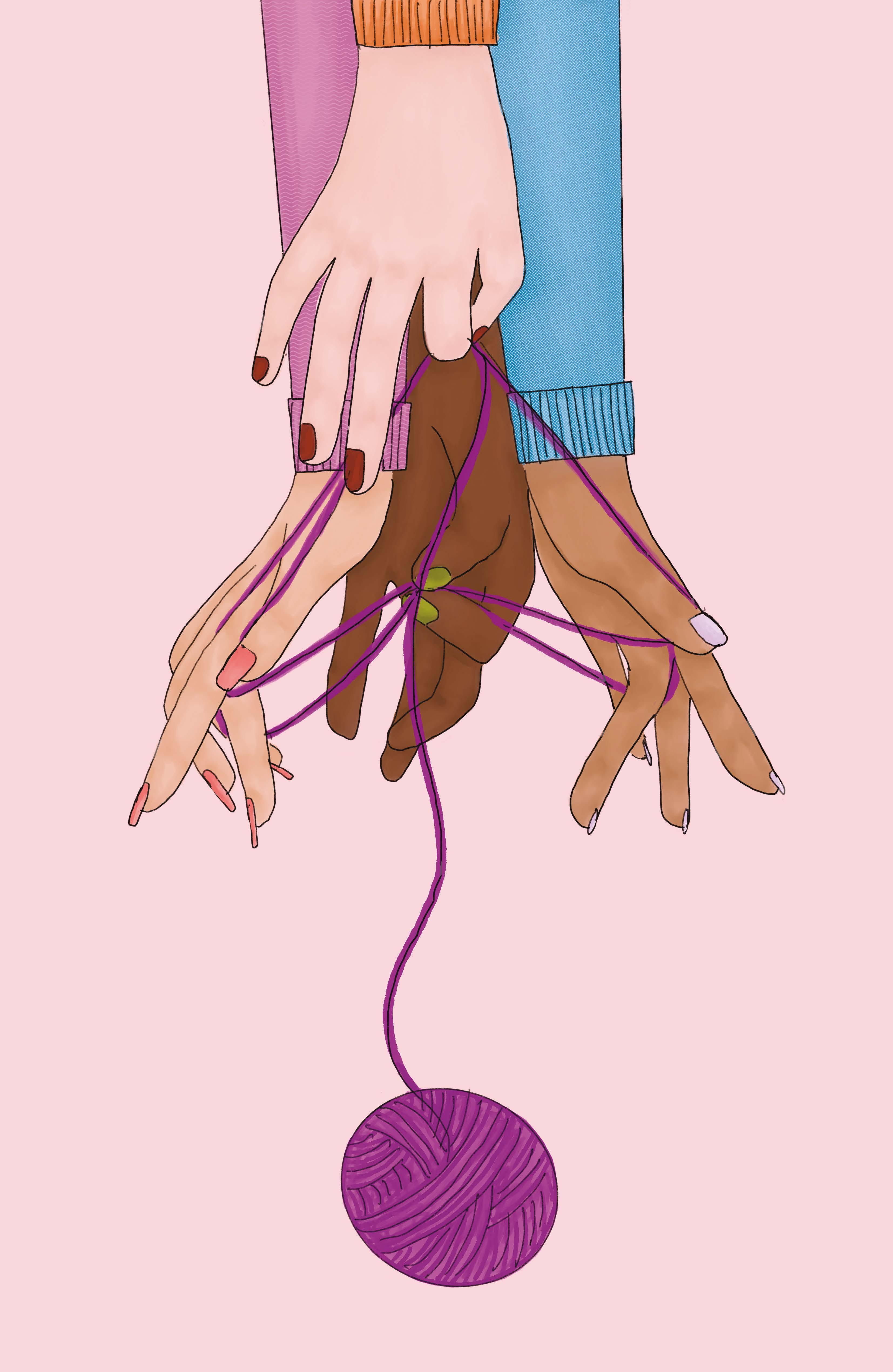
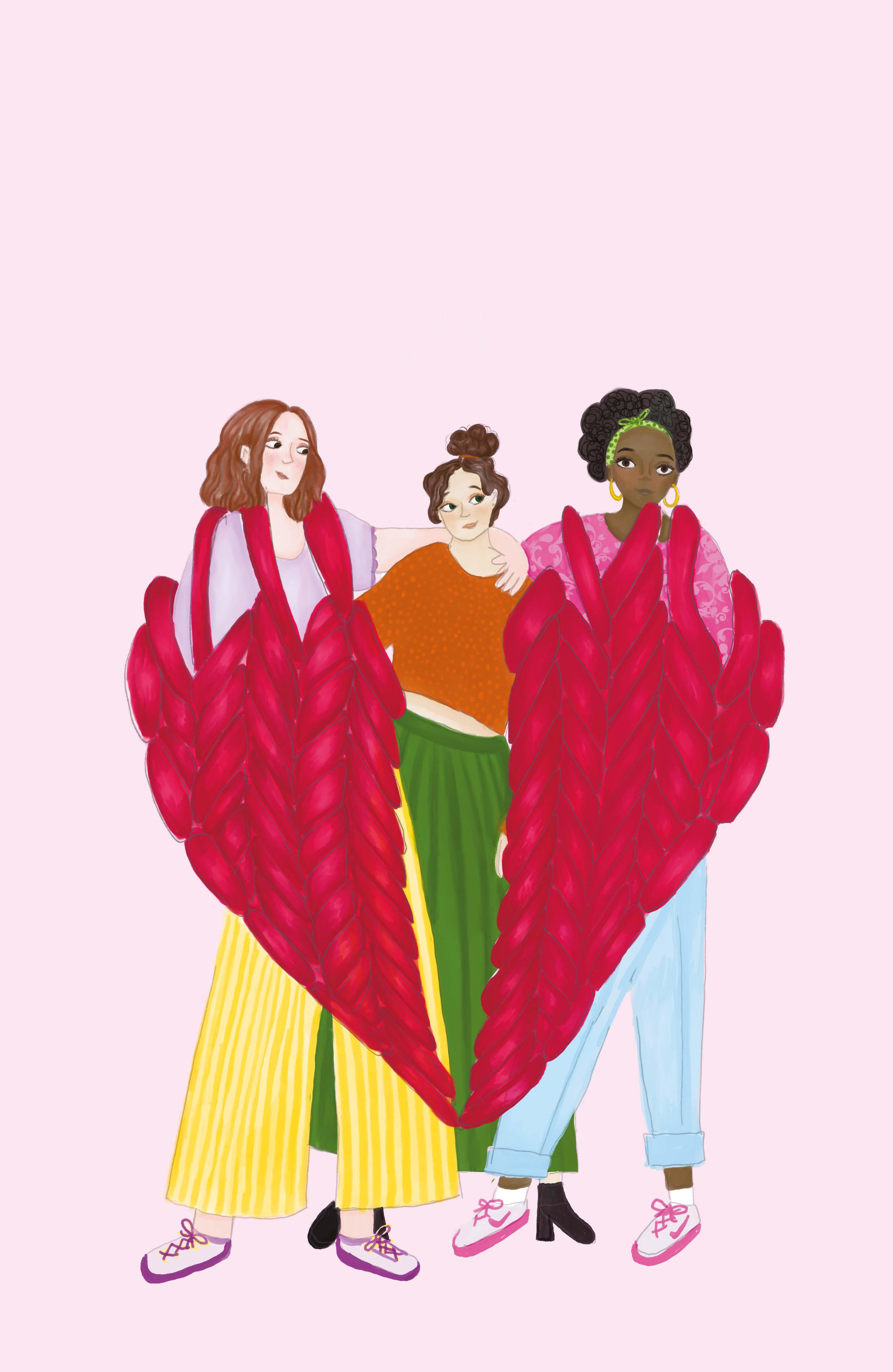
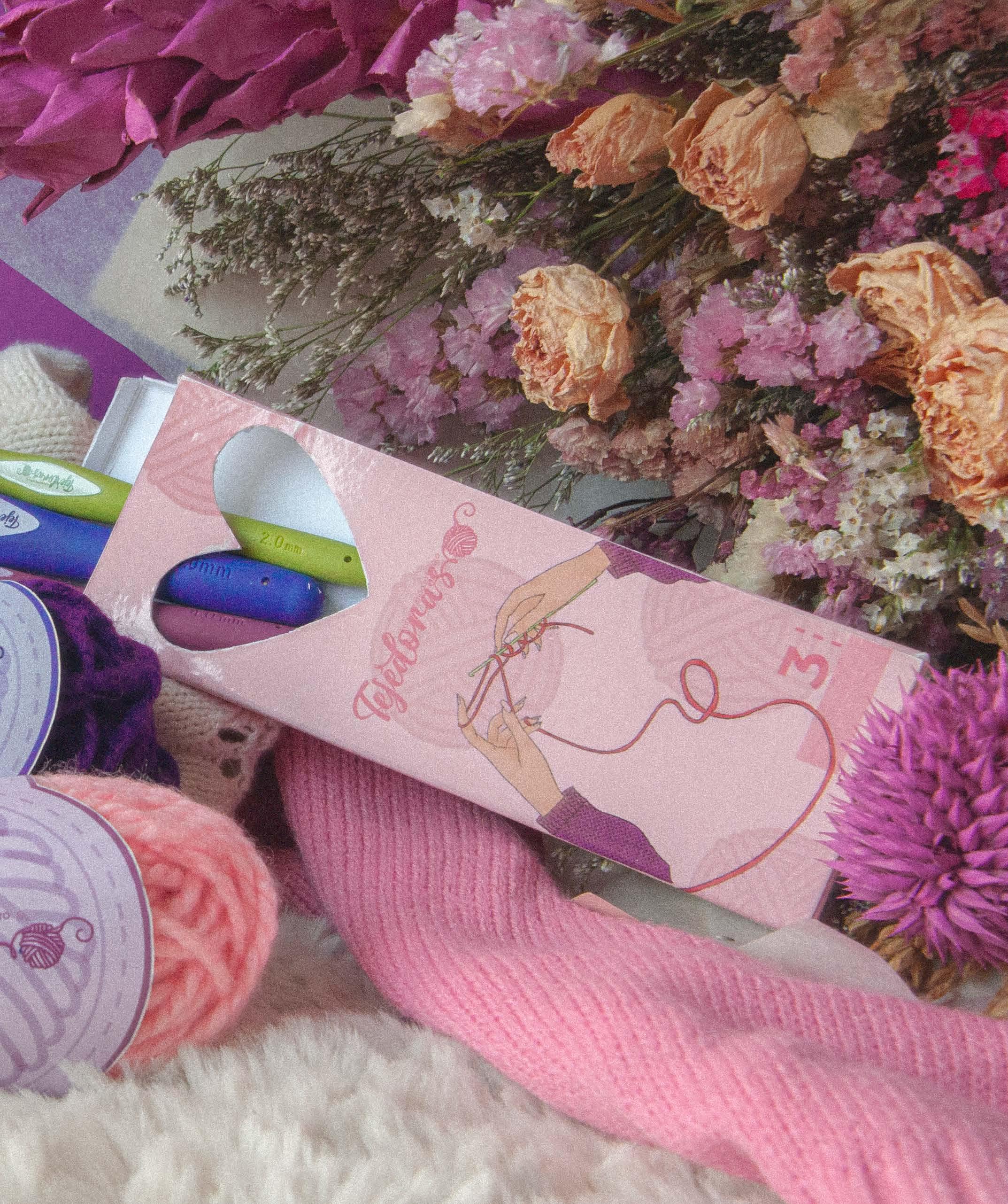
Creating craftswomen who seek a better future.


Tejedoras is a community that empowers women to overcome life’s challenges and build a better future for themselves.
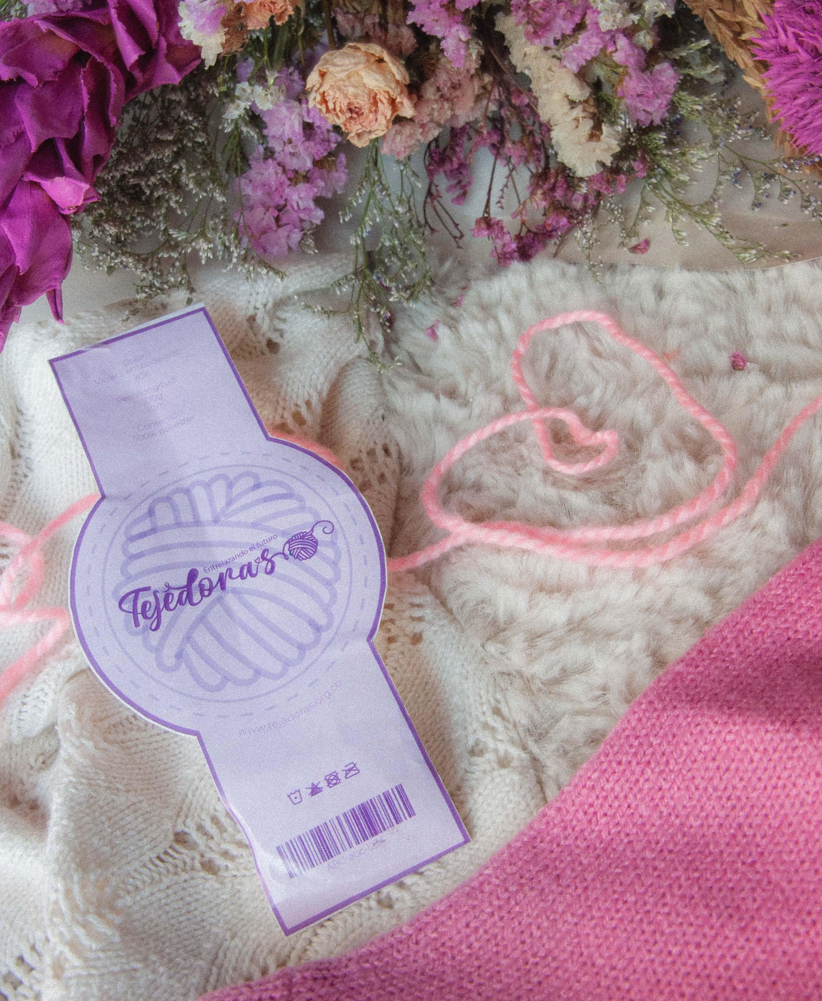
Developing a brand identity for the foundation

Symbolizing the unity of working women
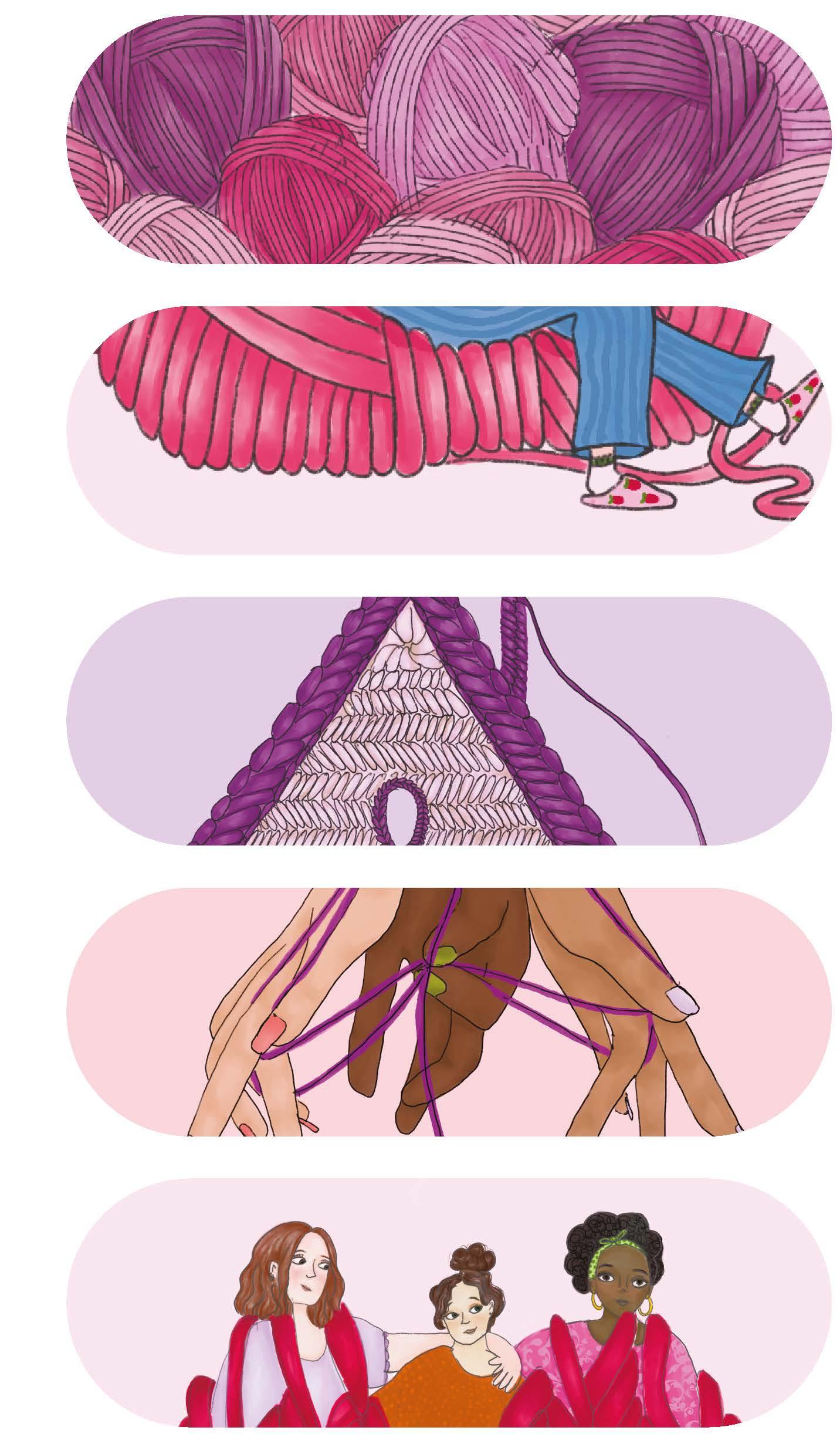

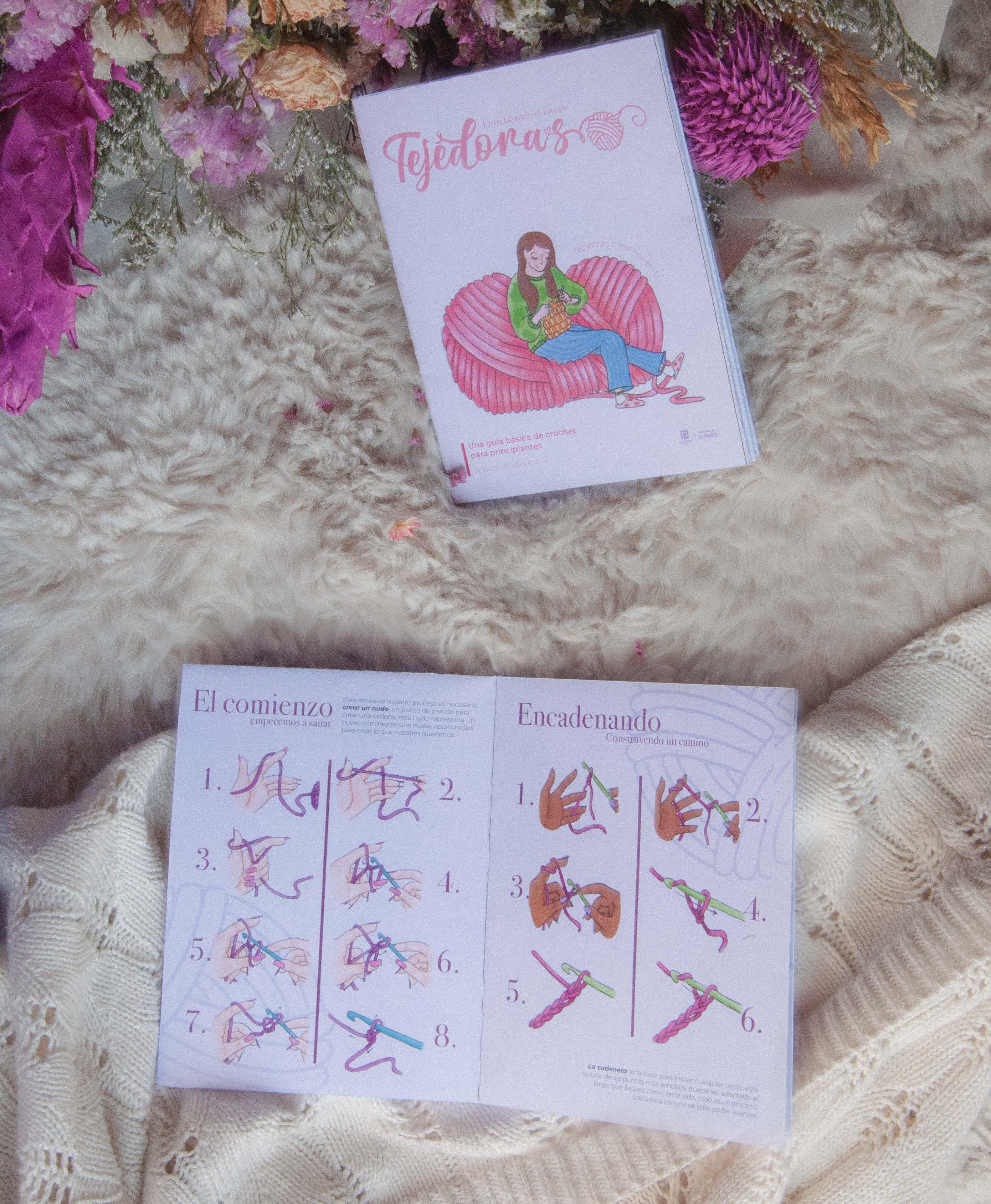
Weaving is widely recognized for its therapeutic benefits. It helps reduce stress and improves mental health, contributing to enhanced emotional well-being by fostering a more positive identity and thereby reducing trauma.

Highlight the comfort and ease of knitting through clear illustrations that make different techniques easy to understand and show how this supports personal and professional healing.
As a tool for creation
Fostering a passion for the work
Admiring the process step by step
Intertwine
Problems and building something good out of them
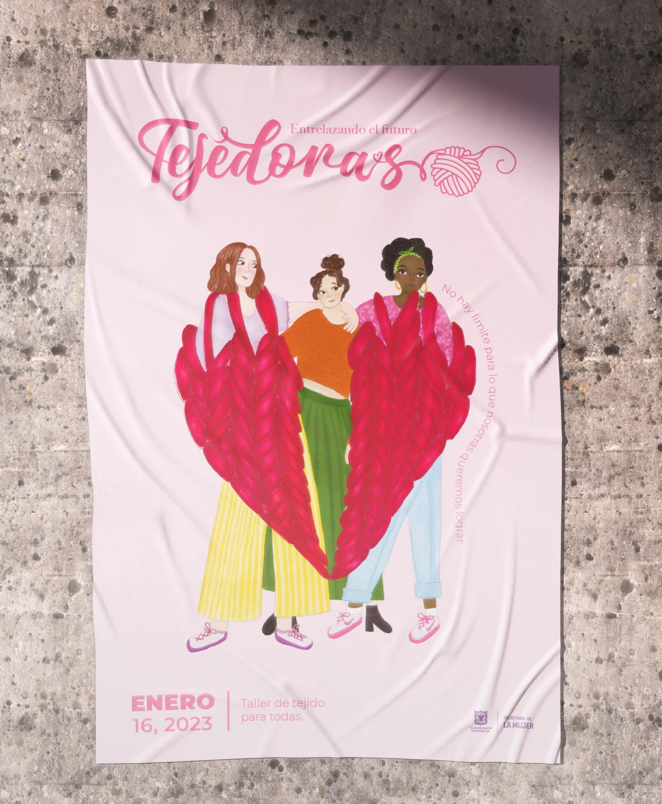
O l v i demosnuesro p a s a d o t e j a m o s n ues t r o f u t u r o
Entrelazando el futuro
ENERO | 14, 2023
Taller de tejido para todas.
Entrelazando el futuro Construyamosnuevas

Entrelazando el futuro
ENERO | 16, 2023
Taller de tejido para todas.
Taller de tejido para todas.
ENERO | 15, 2023

Handcrafting products while learning to value the effort and dedication behind each piece, reflecting the value of each piece in the eyes of others
Weaving as a metaphor for personal growth
r o m o t ing
s k i l sl
Helping create dignified and sustainable employment
We aim to foster the creation of social bonds among women in similar situations, building a strong support network.


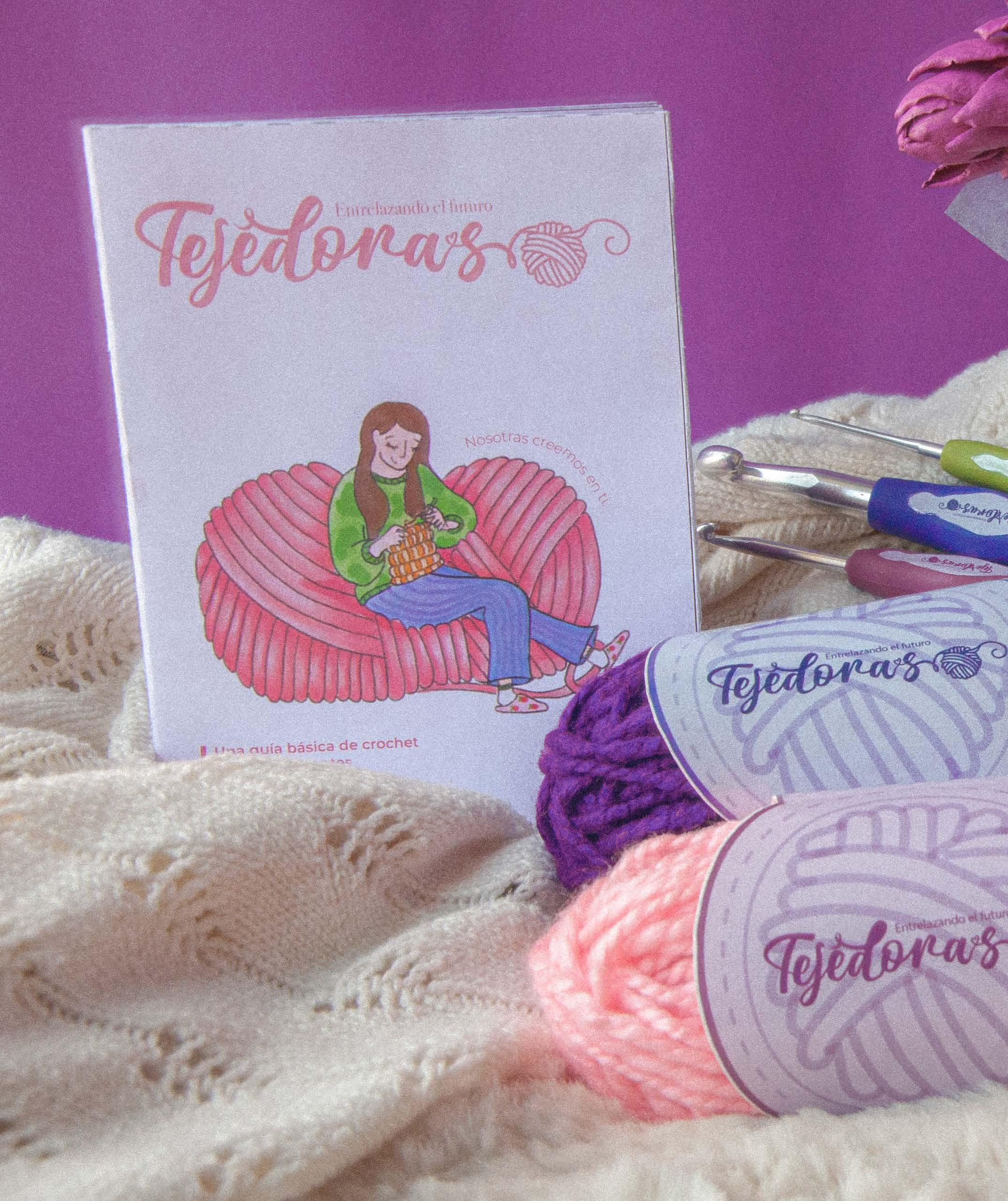
Each piece designed to help you begin with the basics.

Enhancing economic conditions while decreasing reliance on others.
There’s no limits to what we can achieve.” “

Healing the past


Products 100% made by them


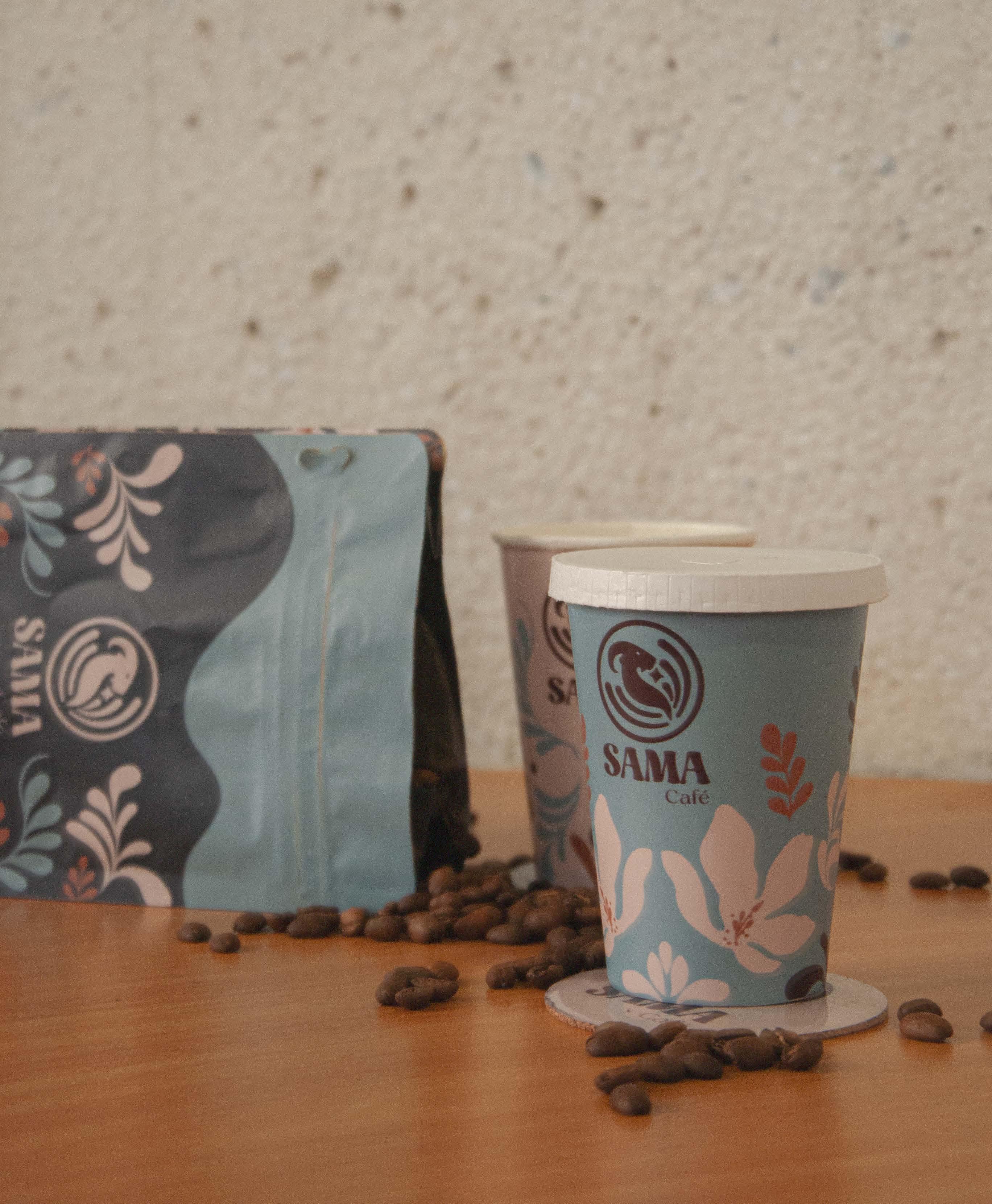
Faced with strong competition in the area, they aim to present themselves as a close and empathetic brand, characterized by the warmth of their stores and the passion poured into each product.

Creating a new identifier to capture the brand’s essence

Imagined as a space for transformation, a place where change takes root. Here, every sip of coffee becomes a moment to pause, to breathe, and to let emotions flow freely, turning a simple cup into an experience of renewal.
Circle Union, what coffee represents Goat Behavior change

Latte art
Fluidity, craftsmanship, natural symmetry
Point of reference
A place to meet or gather
Capturing the essence of the brand through a youthful, dynamic, friendly, and professional tone that reflects an atmosphere of tranquility, comfort, and delicacy.
Establishing connections with consumers
´ cafes Bogota´ is full of different. but we’re here to be
One cup at a time
Each piece is designed to create visual unity and offer a meaningful consumer experience, while incorporating complementary graphics to ensure the design is visually appealing.
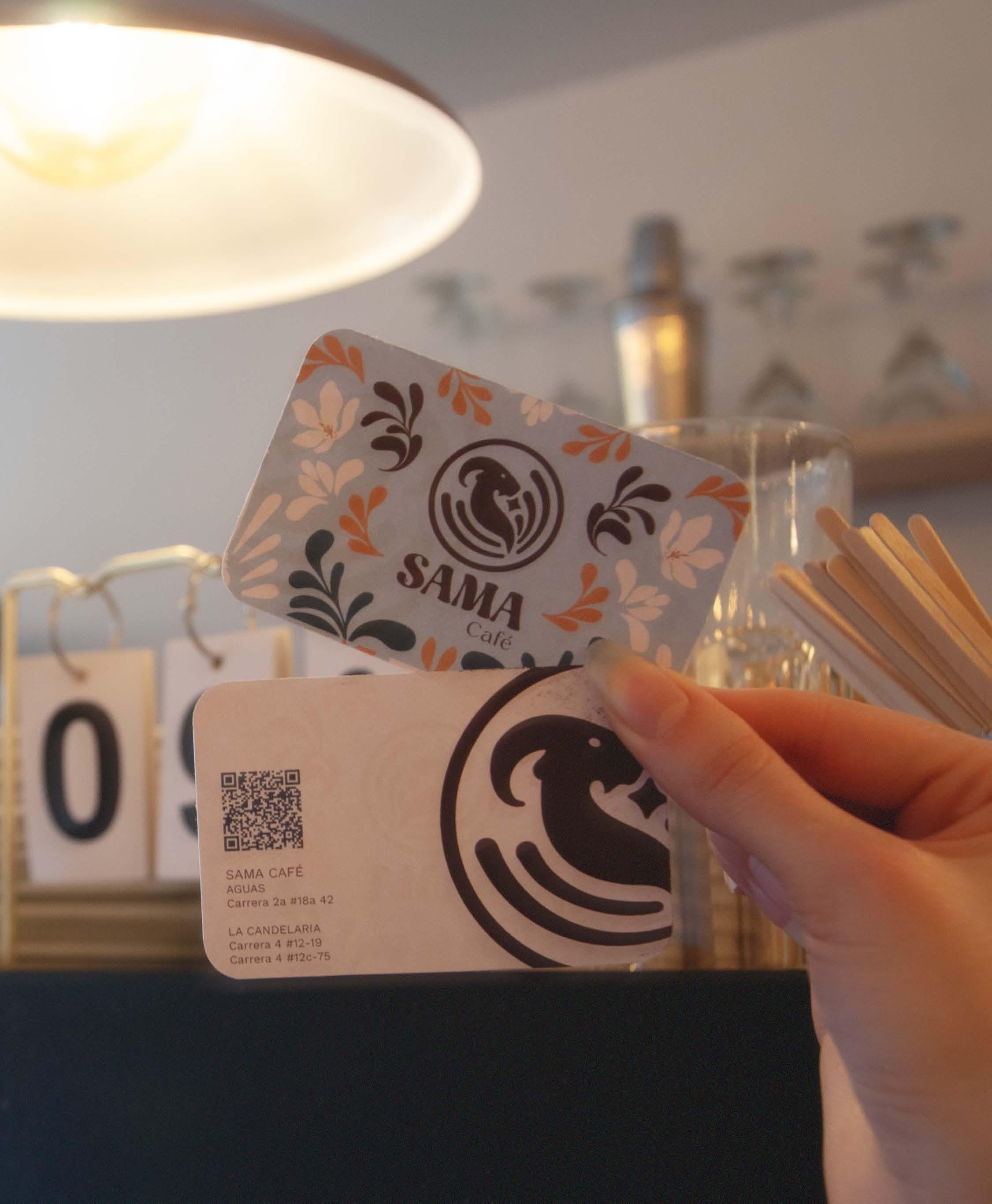

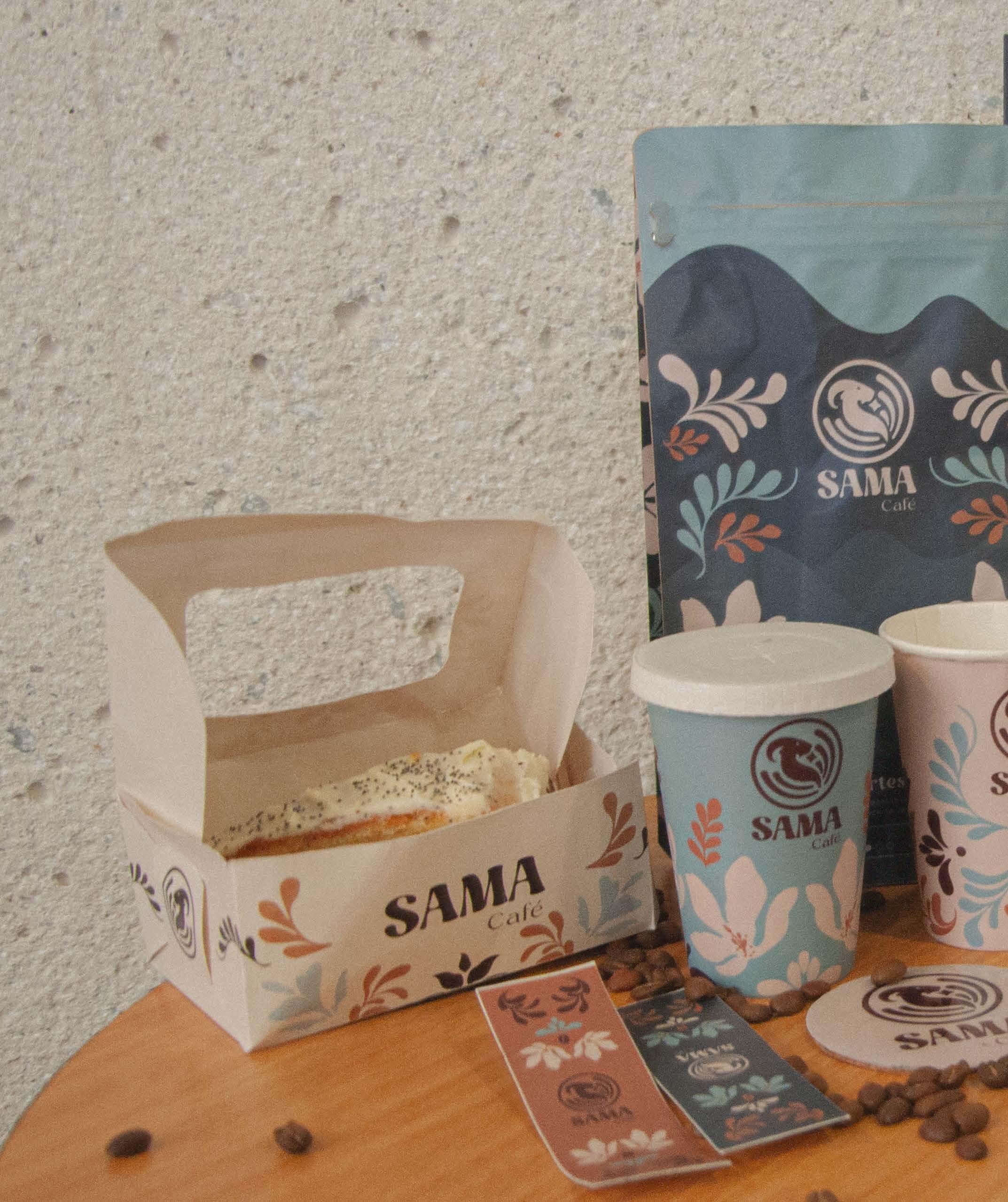
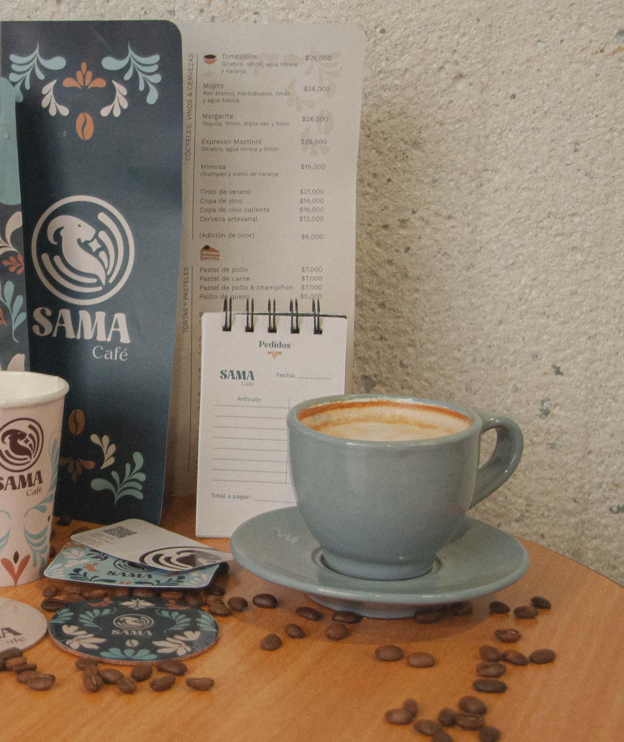
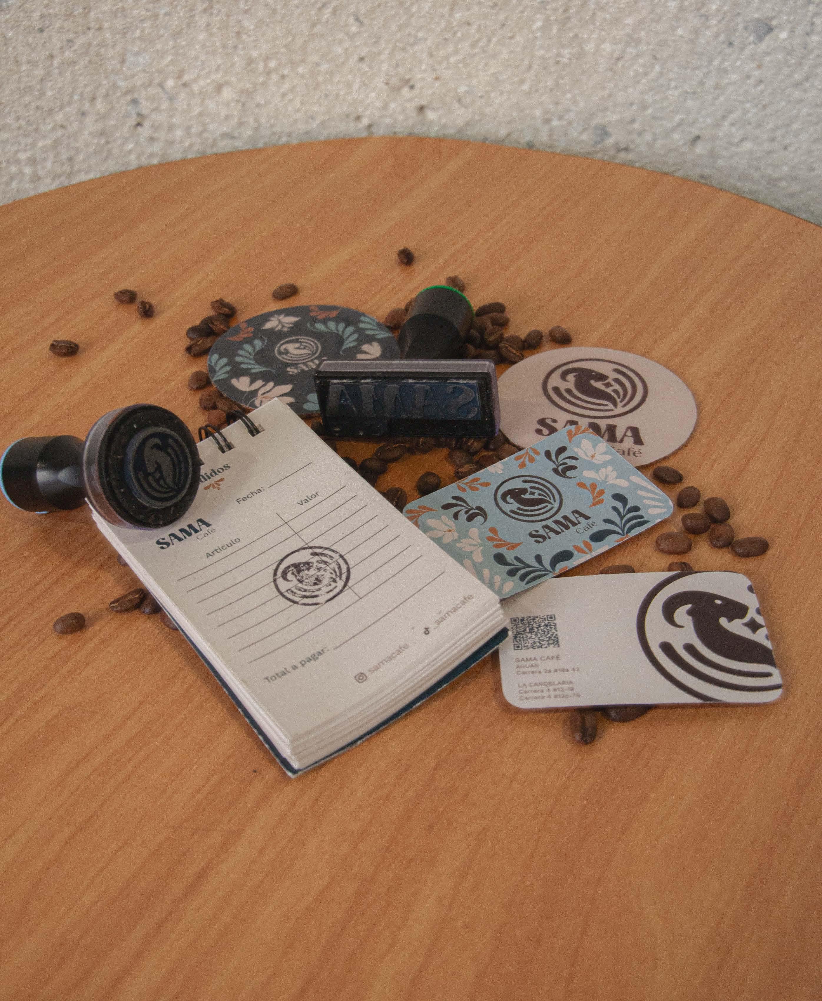
SAMA café
Offering diverse flavors in a space of peace and comfort.
Everything is in the little details that make us stand out. “ ”

Drawing in an even larger audience.


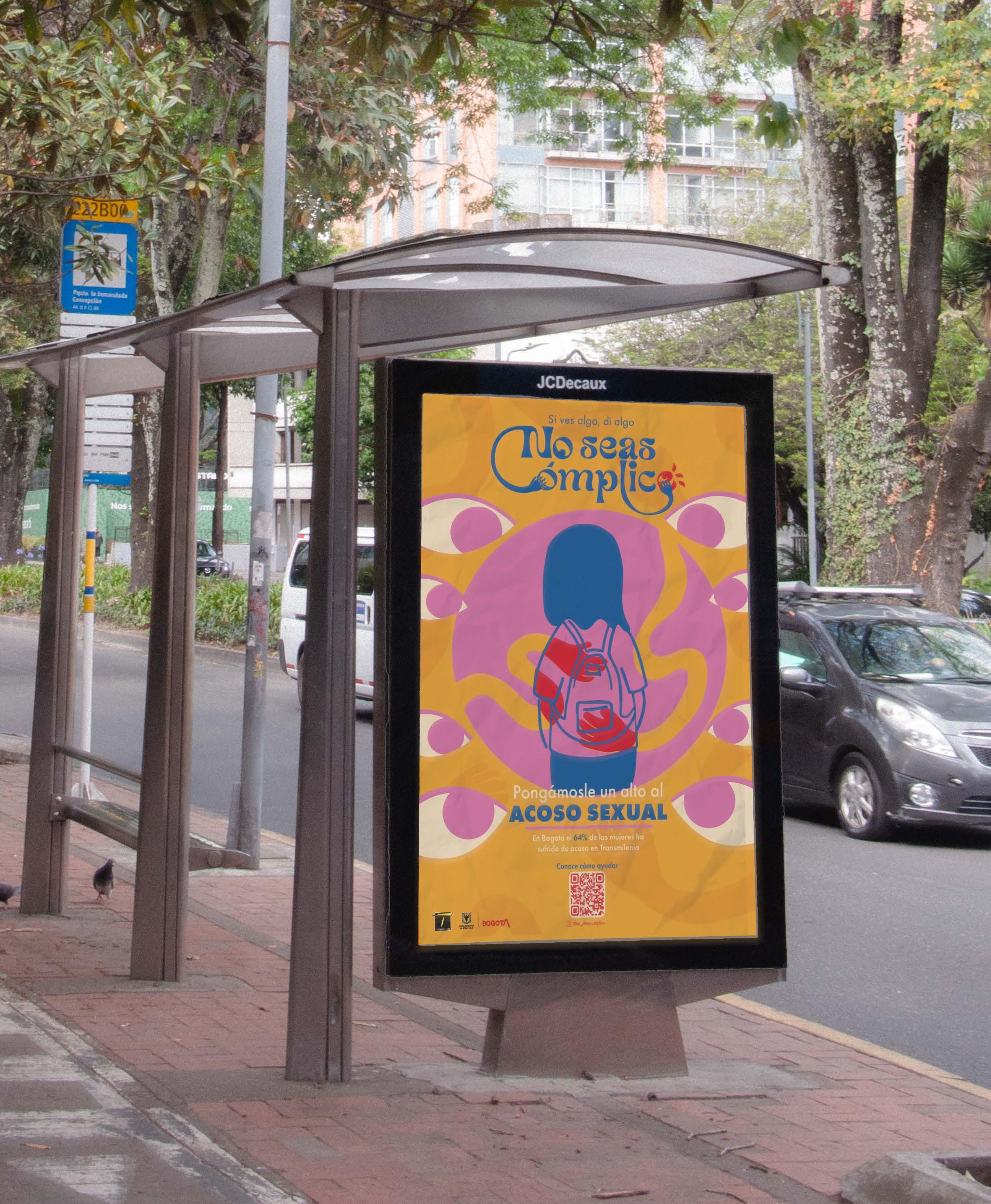
Don’t be an

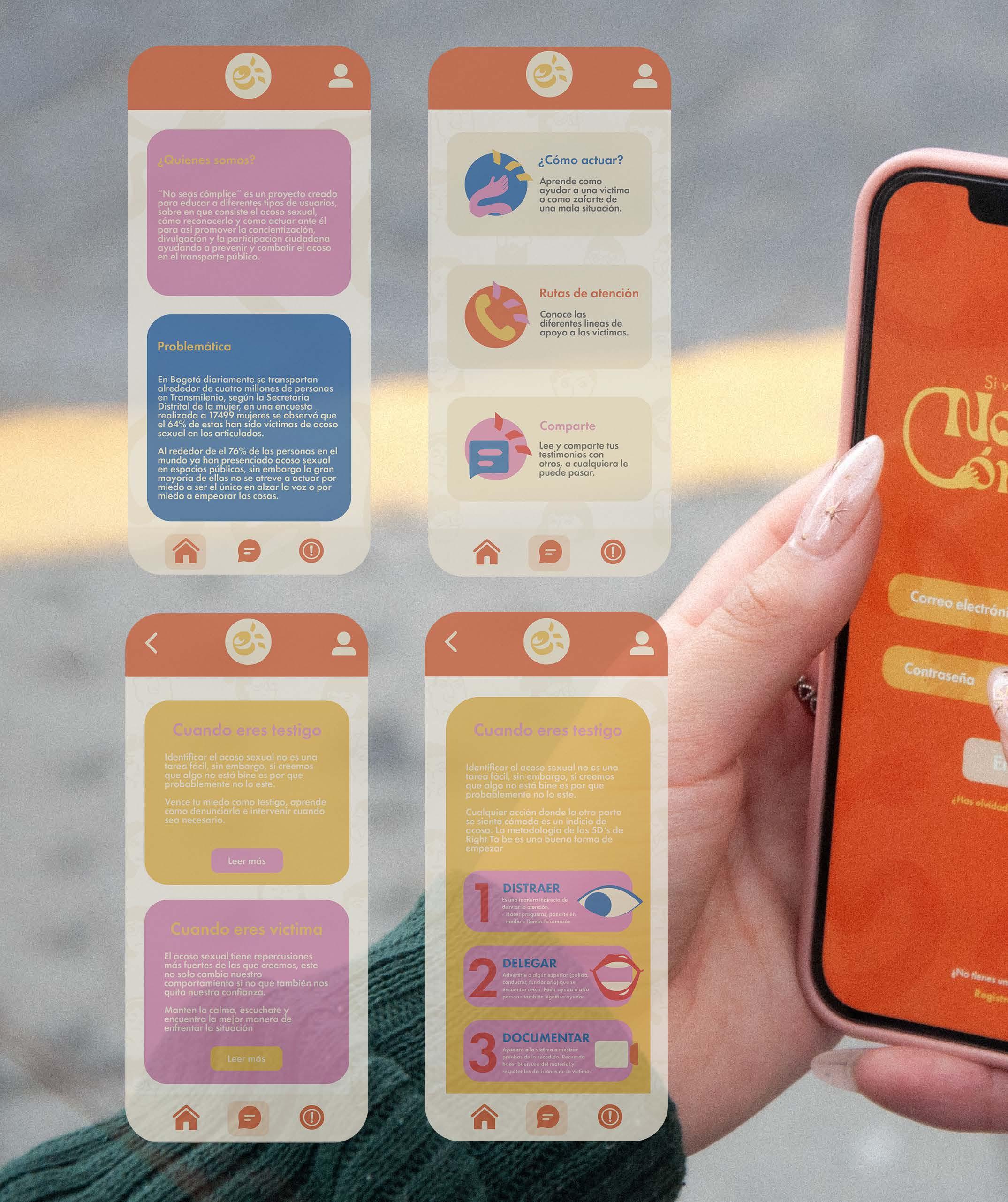
Building on civic competencies, the concept is grounded in the values of respect and empathy within the community. The design is centered around the circle, symbolizing protection, unity, and continuous movement.


The objective is to provide public transportation users with a guide to foster greater awareness and empathy toward victims of sexual harassment, outlining the appropriate ways to act from both the victim’s and the bystander’s perspective.
Building the identifier based on critical issues
How people respond to harassment
Groping that occurs in crowded spaces
Encouraging people to take action
Brand identity Don’t be an accomplice Applied ilustration

While numerous campaigns against sexual harassment focus on the victims, this project is primarily aimed at bystanders, emphasizing their behaviors and the ways they can respond effectively.
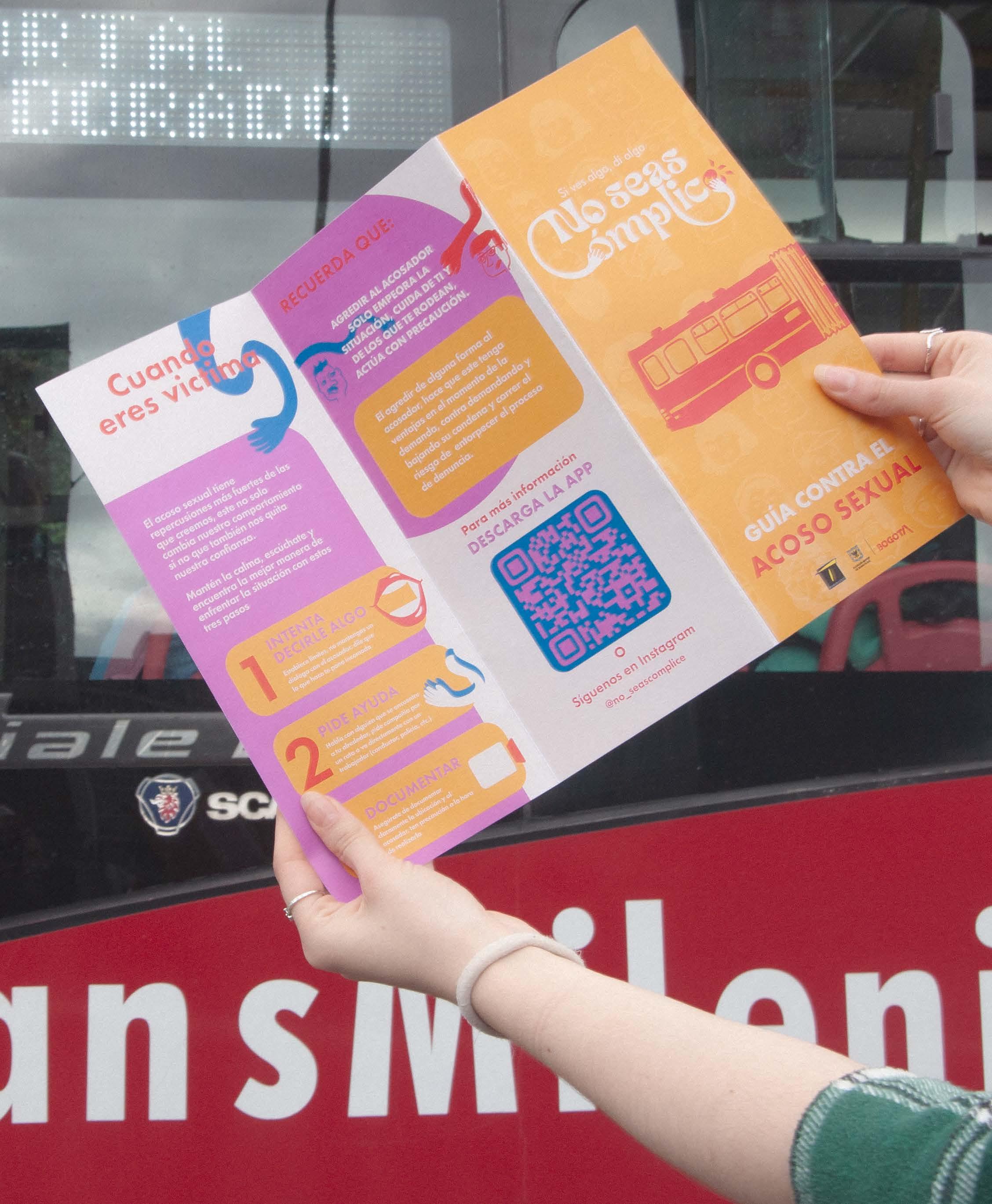
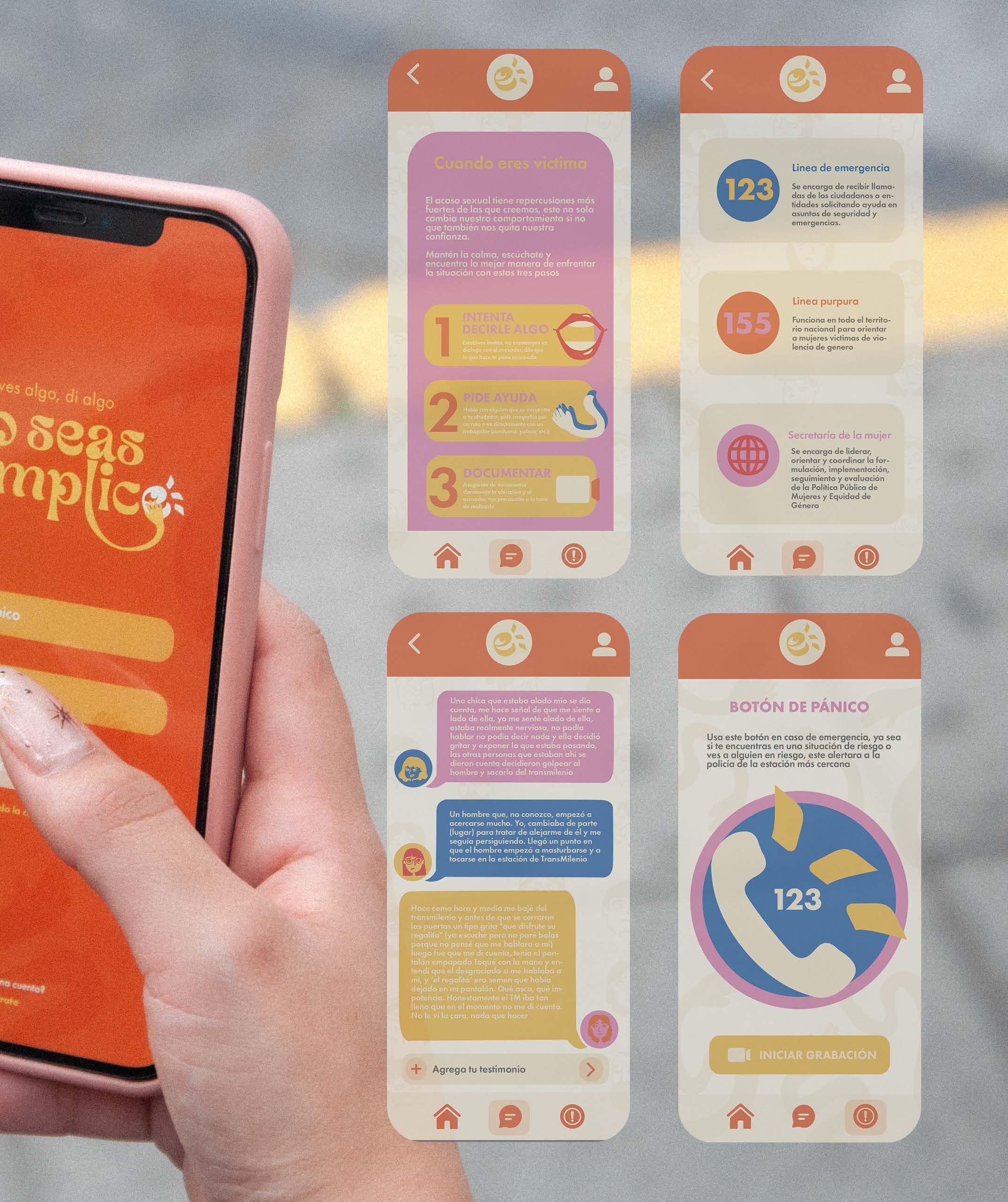
El acoso sexual tiene repercusiones más fuertes de las que creemos, este no solo cambia nuestro comportamiento si no que también nos quita nuestra confianza.
Mantén la calma, escúchate y encuentra la mejor manera de enfrentar la situación con estos tres pasos
1
INTENTA DECIRLE ALGO
2
PIDE AYUDA
Habla
3
DOCUMENTAR Asegúrate
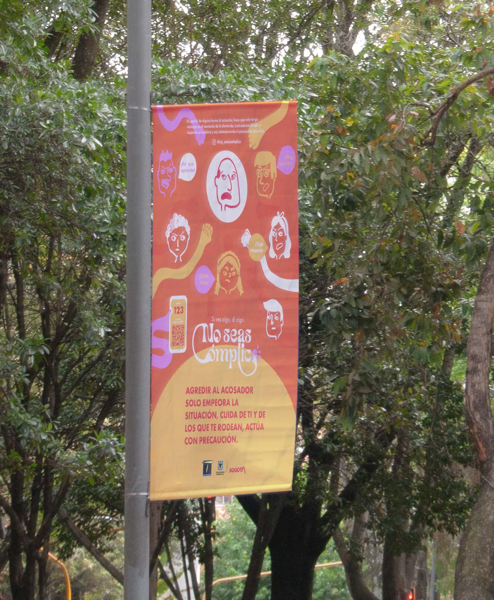
RECUERDA QUE:
AGREDIR AL ACOSADOR
SOLO EMPEORA LA SITUACIÓN, CUIDA DE TI Y DE LOS QUE TE RODEAN, ACTÚA CON PRECAUCIÓN.
El agredir de alguna forma al acosador, hace que este tenga ventajas en el momento de la demanda, contra demandando y bajando su condena y correr el riesgo de entorpecer el proceso de denuncia.
Para más información DESCARGA LA APP
Si ves algo, di algo O Síguenos en Instagram
@no_seascomplice
Identificar el acoso sexual no es una tarea fácil, sin embargo, si creemos que algo no está bine es por que probablemente no lo este.
Acoso sexual físico
Manoseos o tocamientos, pellizcos, palmadas, apretones, roces, contacto físico innecesario, miradas obscenas, guiños, persecuciones, impedir el paso intencionalmente.
Acoso sexual verbal
Expresiones verbales de connotación sexual: Silbidos, sonido de besos, piropos, burlas y comentarios alrededor de la identidad de género y orientación sexual.
En caso de emergencia comunícate
La metodología de las 5D’s de Right To be es una buena forma de empezar
A la hora de encarar
1
DISTRAER Es una manera indirecta de desviar la atención. - Hacer preguntas, ponerte en medio o llamar la atención
2
DELEGAR
Advertirle a algún superior (policía, conductor, funcionario) que se encuentre cerca. Pedir ayuda a otra persona también significa ayudar
3
DOCUMENTAR
Ayudará a la victima a mostrar pruebas de lo sucedido. Recuerda hacer buen uso del material y respetar las decisiones de la victima.
4
DAR ASISTENCIA
Habla con la victima, justifica sus emociones, aclarale que no es su culpa, mostrar empatía marca una gran diferencia.
5
DIRIGIRSE
Directamente al acosador, explicarle que lo que hace esta mal sin entrar en discusión, pídele que deje a la victima tranquila
AYUDAR SALVA VIDAS, NO TE QUEDES CALLADO
En Bogotá el 64% de las mujeres ha sufrido de acoso en Transmilenio y muy pocas han sido ayudadas por la comunidad.
This not only gives visibility to the project but also provides it with greater reach.
Establishing engagement with digital platforms.
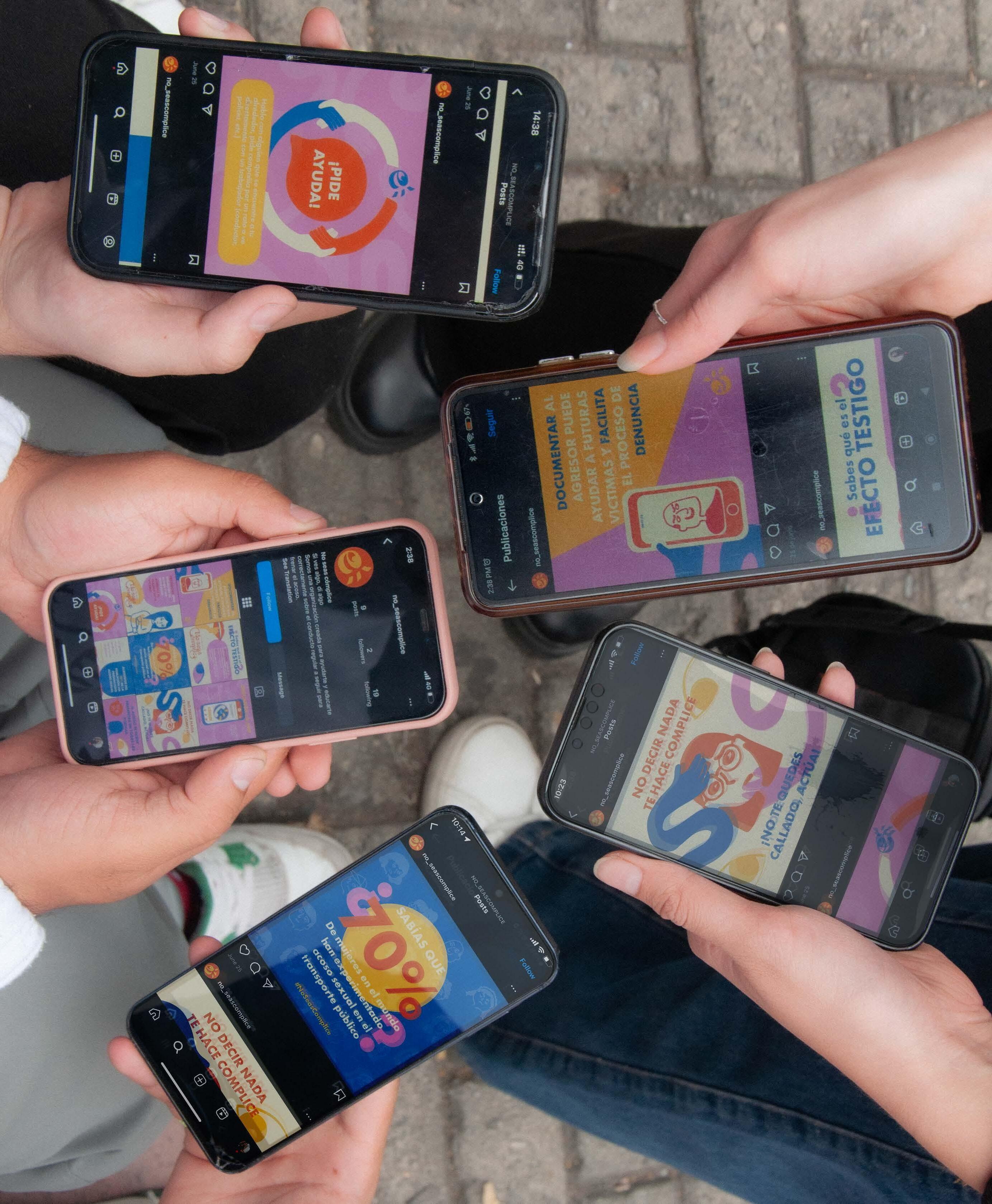
* Don’t be an accomplice
“ ”
A safe transportation system is everyone’s responsibility: If you see something, say something.

Let’s improve mobility


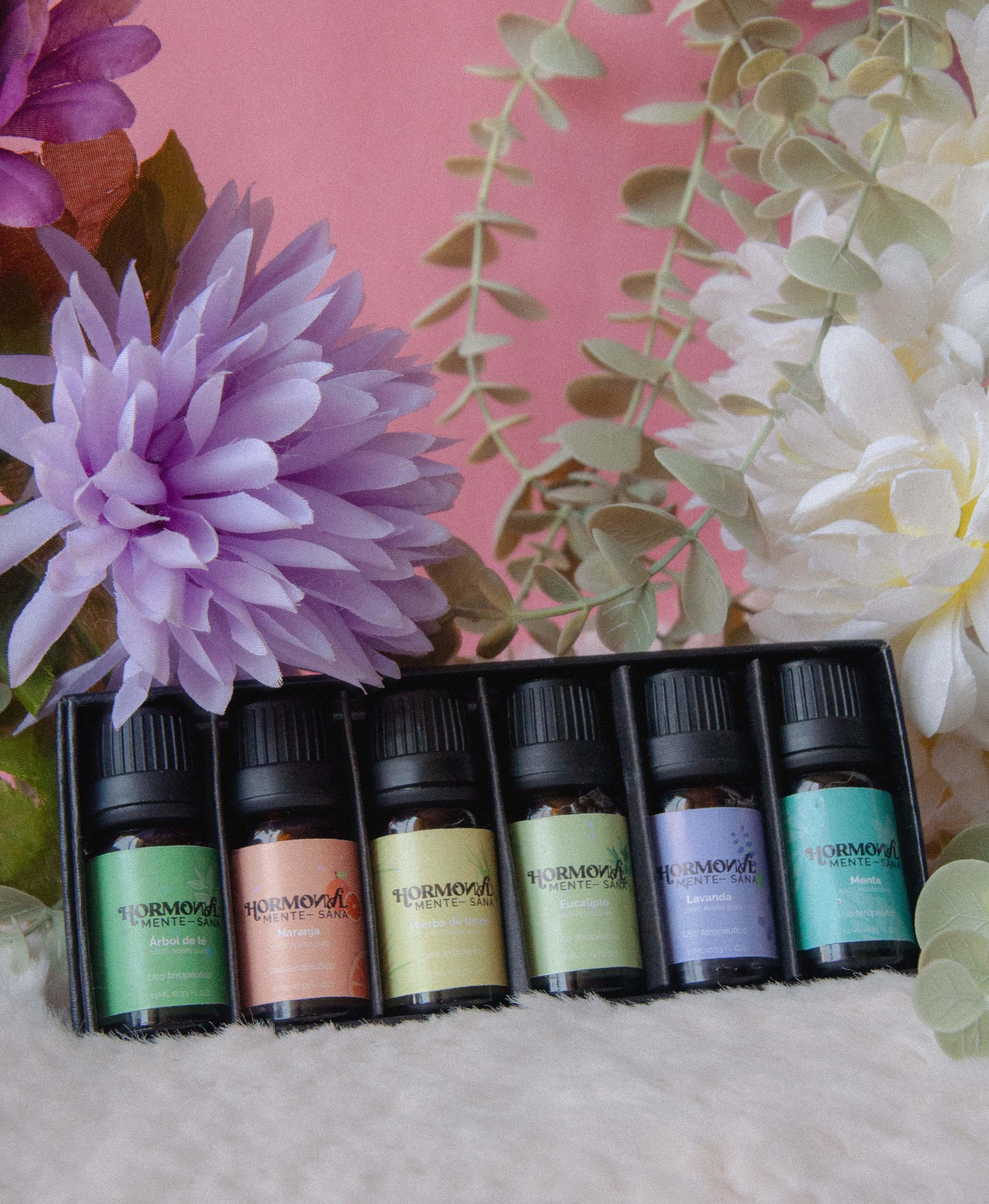
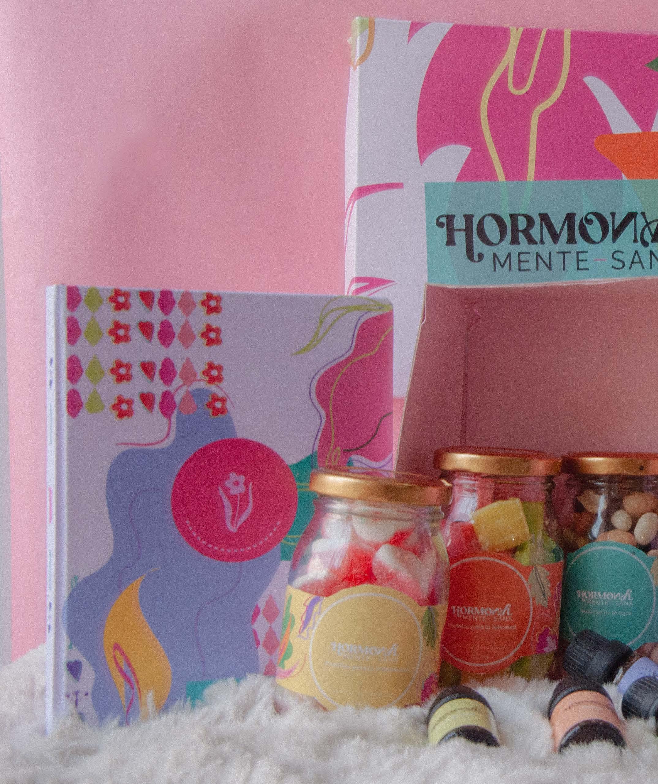
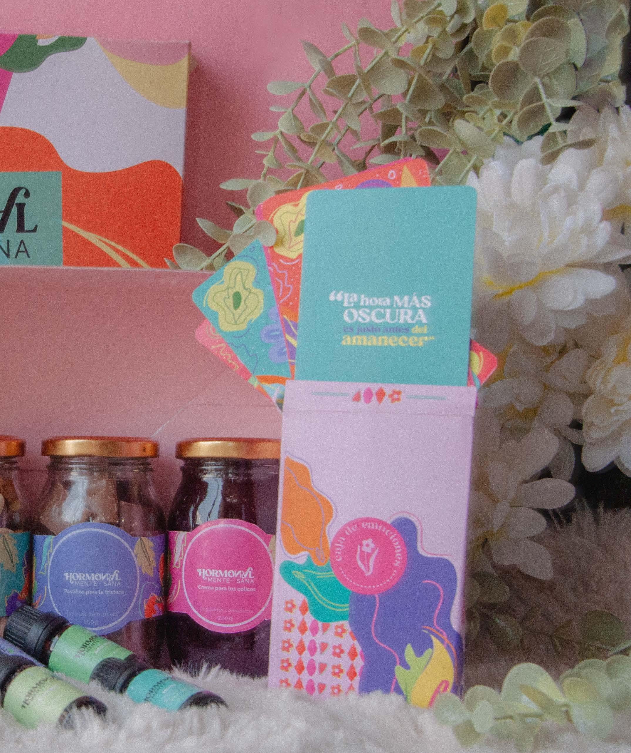
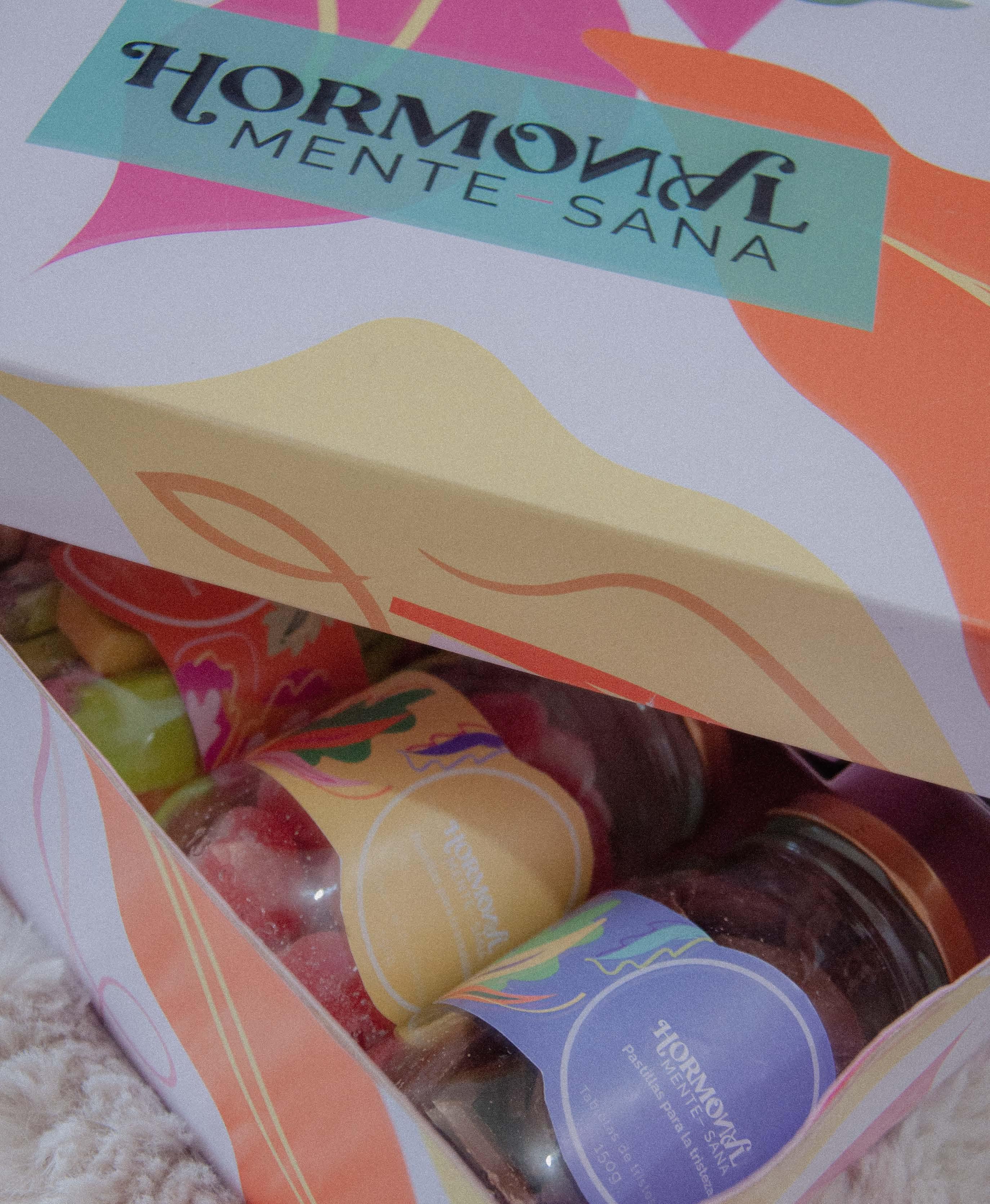
Aims to reduce the stigmatization of women by helping them understand the hormonal processes of their bodies and how to respond to these changes, recognizing them as a natural part of the human experience.


Supporting visuals

By embracing hormonal processes as a natural and intrinsic part of women’s lives, the concept seeks to dissolve stigmas and open space for a more authentic and normalized perspective.

Provide resources that support women in tracking and understanding their hormonal cycles, thereby fostering recognition of the connection between hormonal changes and mental, emotional, and physical well-being.
Development of the visual identifier through key elements
Sudden hormonal changes
Wordplay: “hormonalmente(mind)”
Showing that despite the changes, control can still be taken
Incorporating mental health into hormonal awareness by explaining the relationship between hormonal changes and their influence on mood, while providing tools that empower women to better manage their emotions.
women Designing that support challengingthrough the of the cycle
days
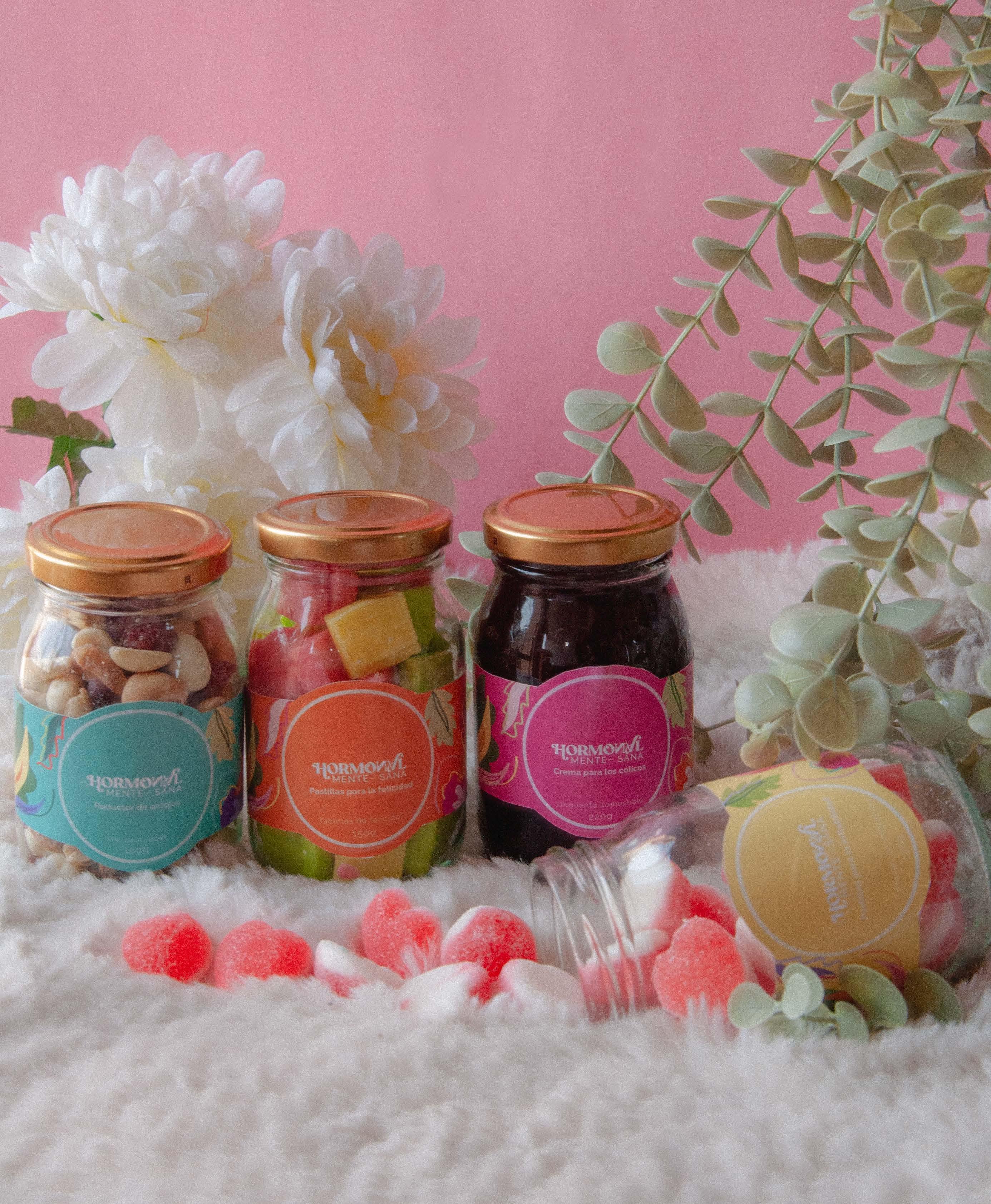
Promoting self-acceptance and self-love by offering the Kit as a tool to celebrate each phase of the cycle, helping to eliminate the discomfort that often arises with every change.
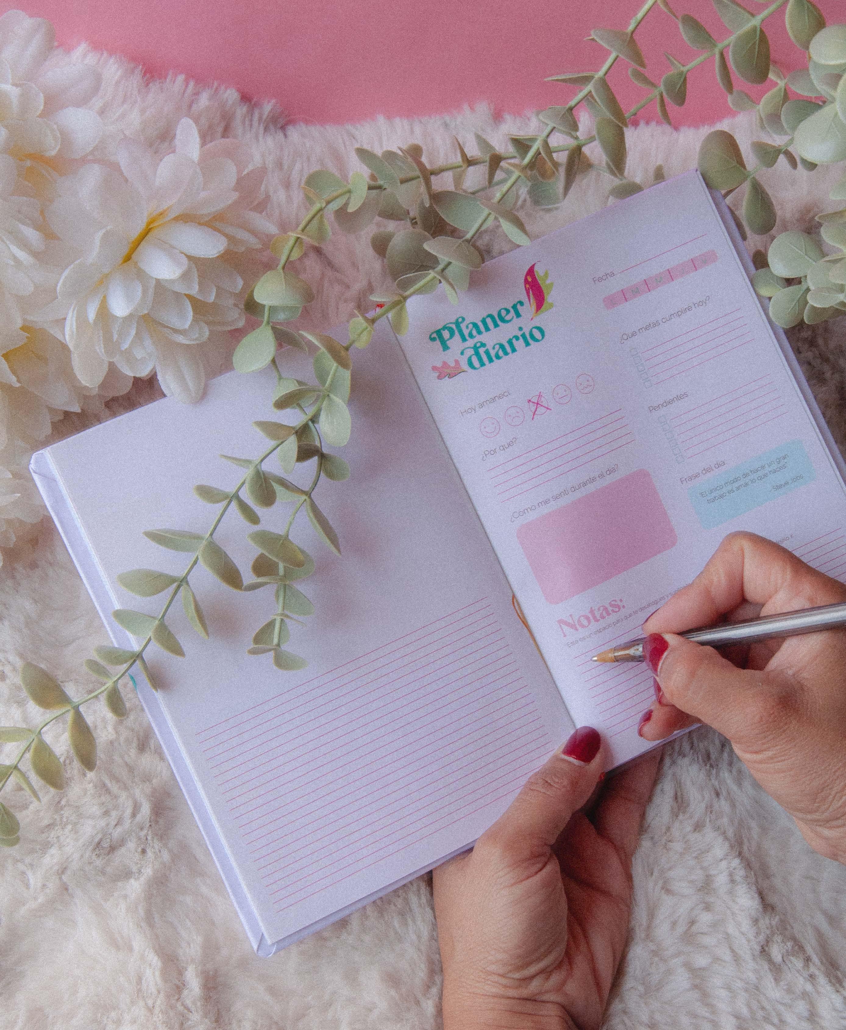
Fostering self-control through a planner that allows women to express their feelings, track their cycles, and learn how to navigate each situation.
Understanding your body is the first step toward a healthier life.
Connect with your well-being, understand your cycle. “ ”

Empowerment begins with knowledge.


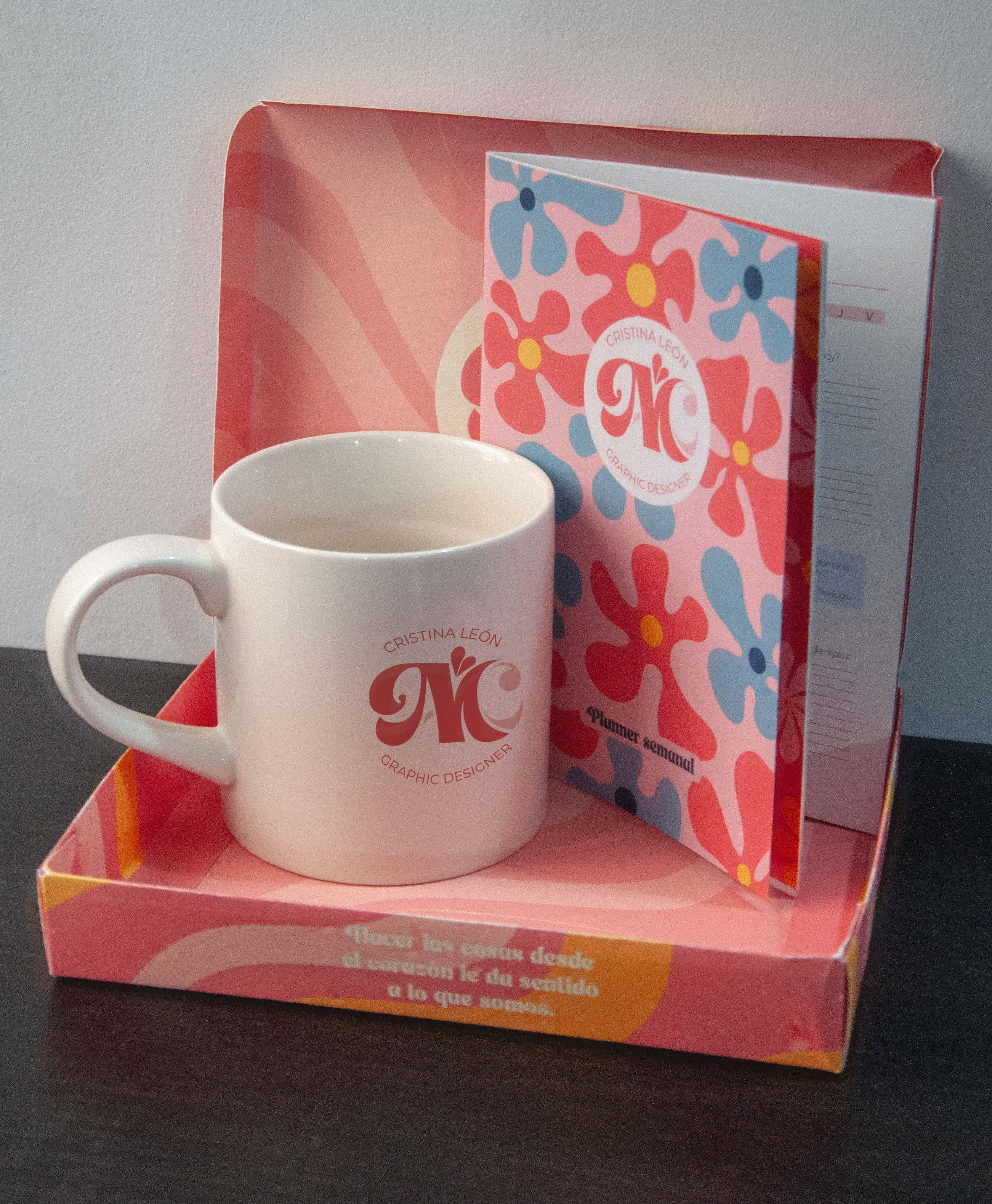
Working in the world of graphic design teaches us to understand the importance of image. It is essential to have your own identifier, as it is not only a symbol of who you are and what you represent, but also an expression of the unique creativity you possess.

Supporting visuals
Created from the word
Inspired by the Greek word that translates to “To do something with soul, creativity, or love; to put a piece of yourself into what you create”.

The initials of the name “Ana Cristina” are used, with an overlapping “M” that references the conceptual word “Meraki.”
Concept word representing the word Meraki within the initials
Be born and flow what arises from within for every creation
Initials
A and C, representing Ana Cristina
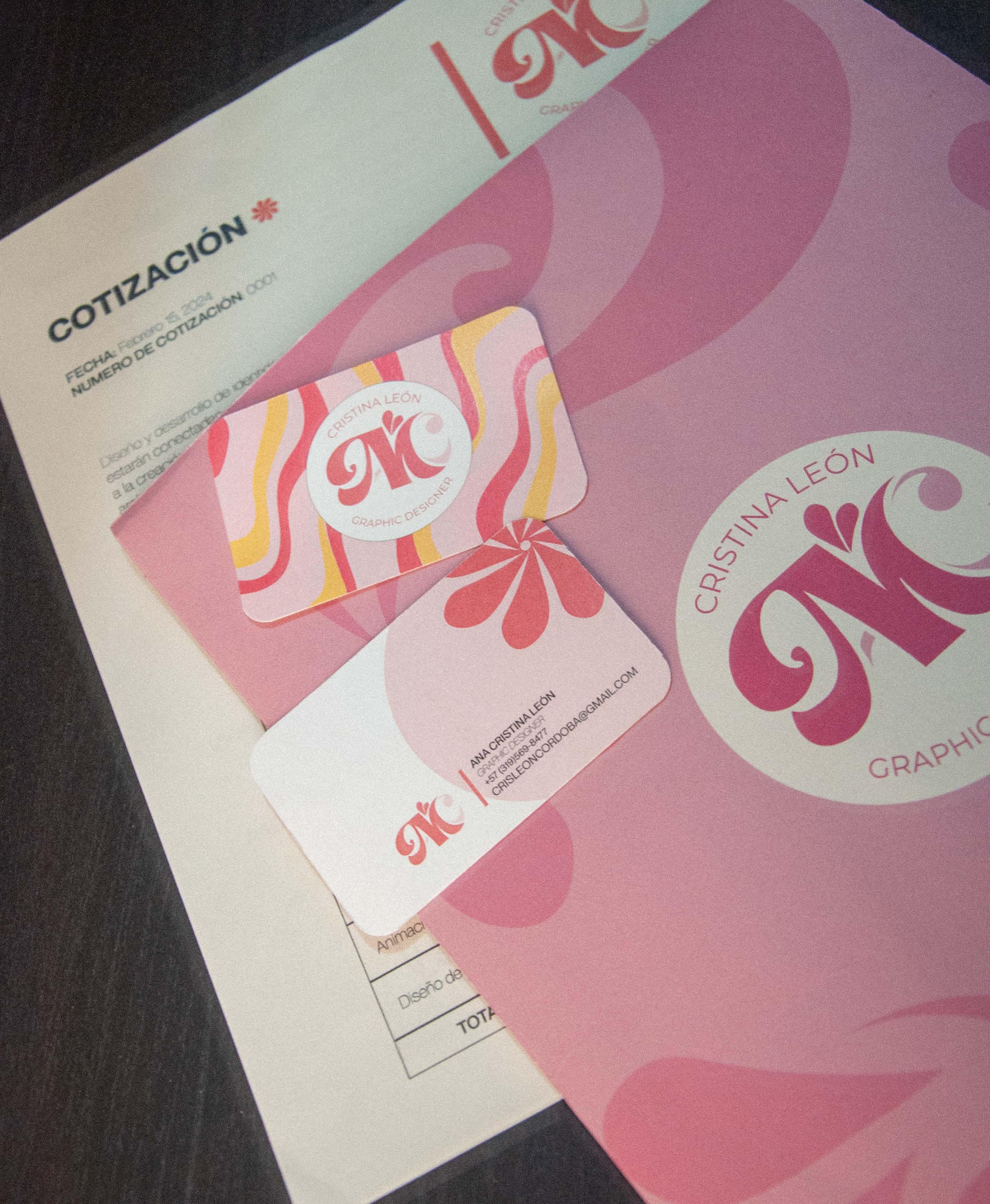
Brand identity Applied ilustration
htuA tne i c ity lies inwhat you do withpassion and d e d .noitaci
Where creativity comes to life
Focused on Time: In the office, we envision a kit that helps organize and make the most of the workday hours.
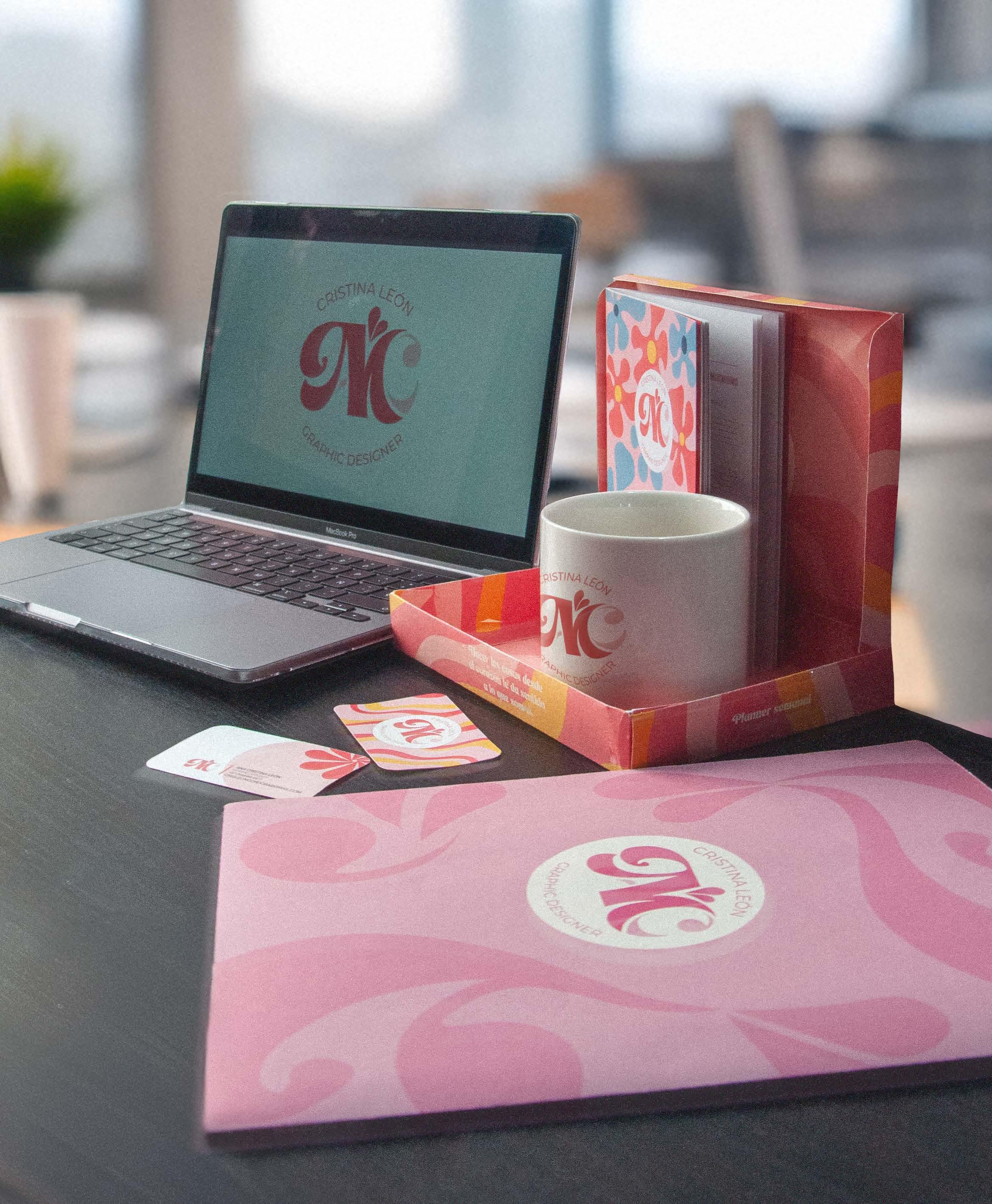
Cristina León
Design that transforms ideas into visual stories
When your soul is in what you do, the difference is felt “ ”

Creating soul-to-soul connections

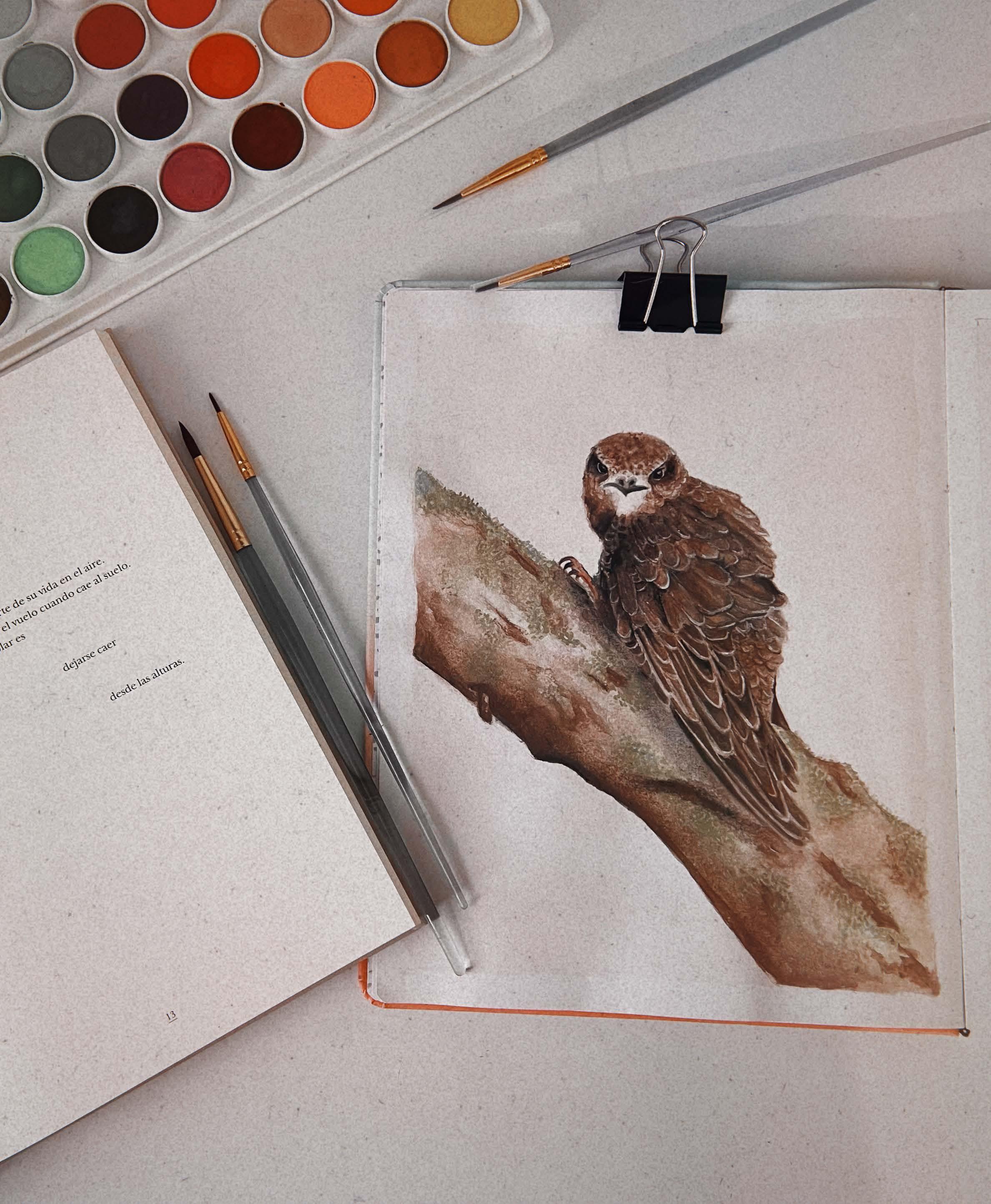
Children’s illustration| Editorial design

present a text
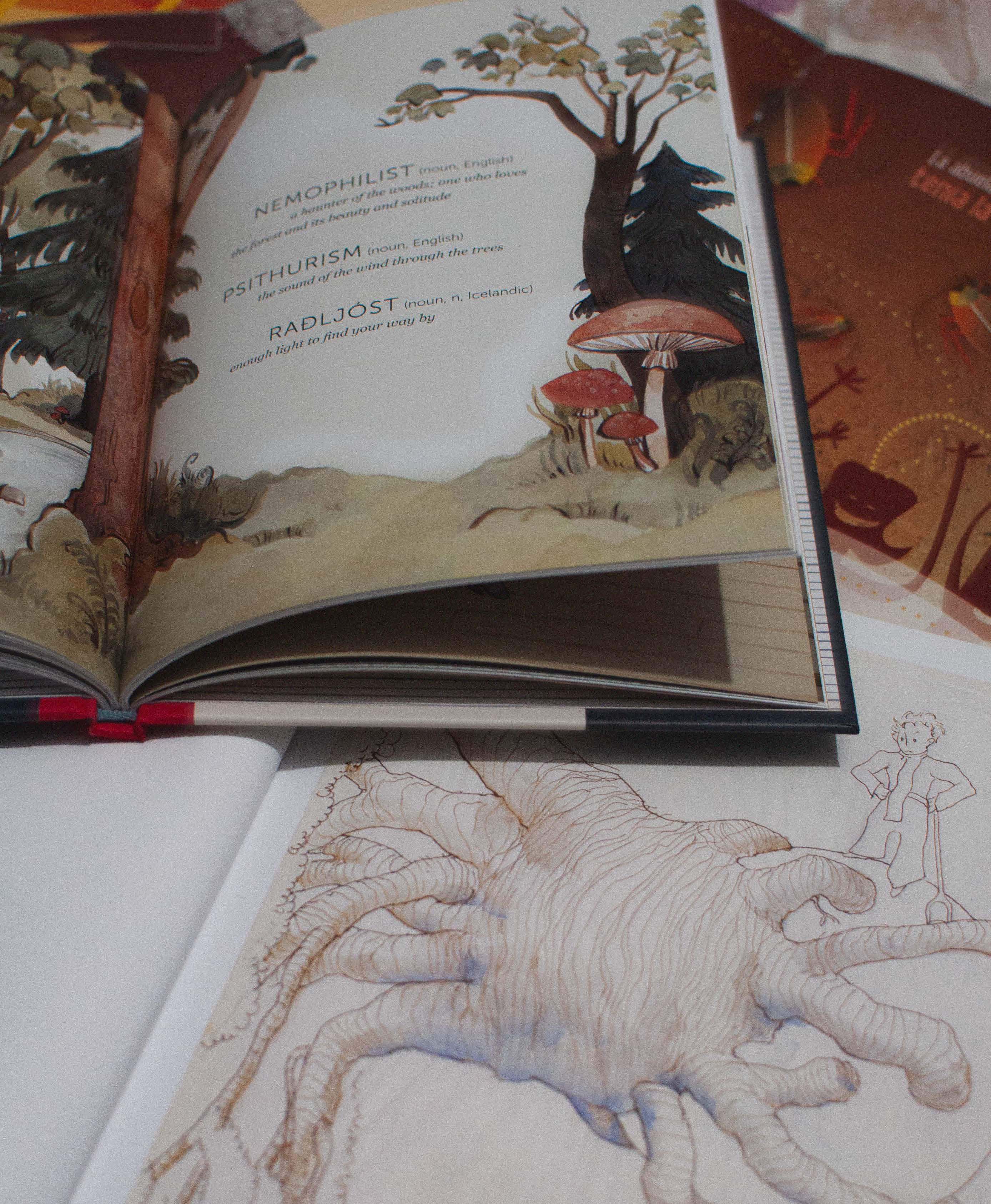
Creating a visual bridge between words and imagination, illustrations not only accompany the text but also expand, enrich, and even complement it. Sometimes, illustrations tell a part of the story that words don’t explicitly convey.
How to illustrate what has already been illustrated


Open to interpretation
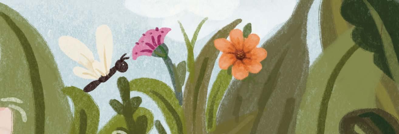

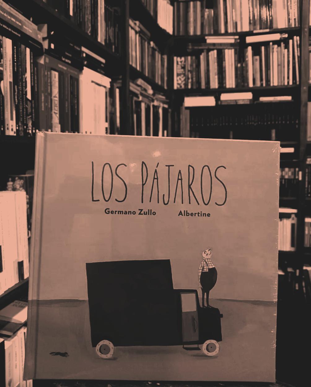
Based on the book by
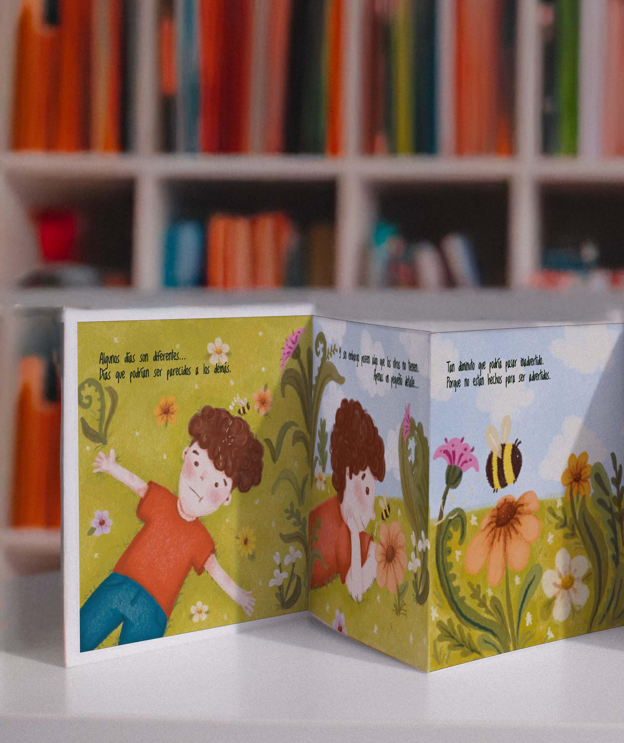
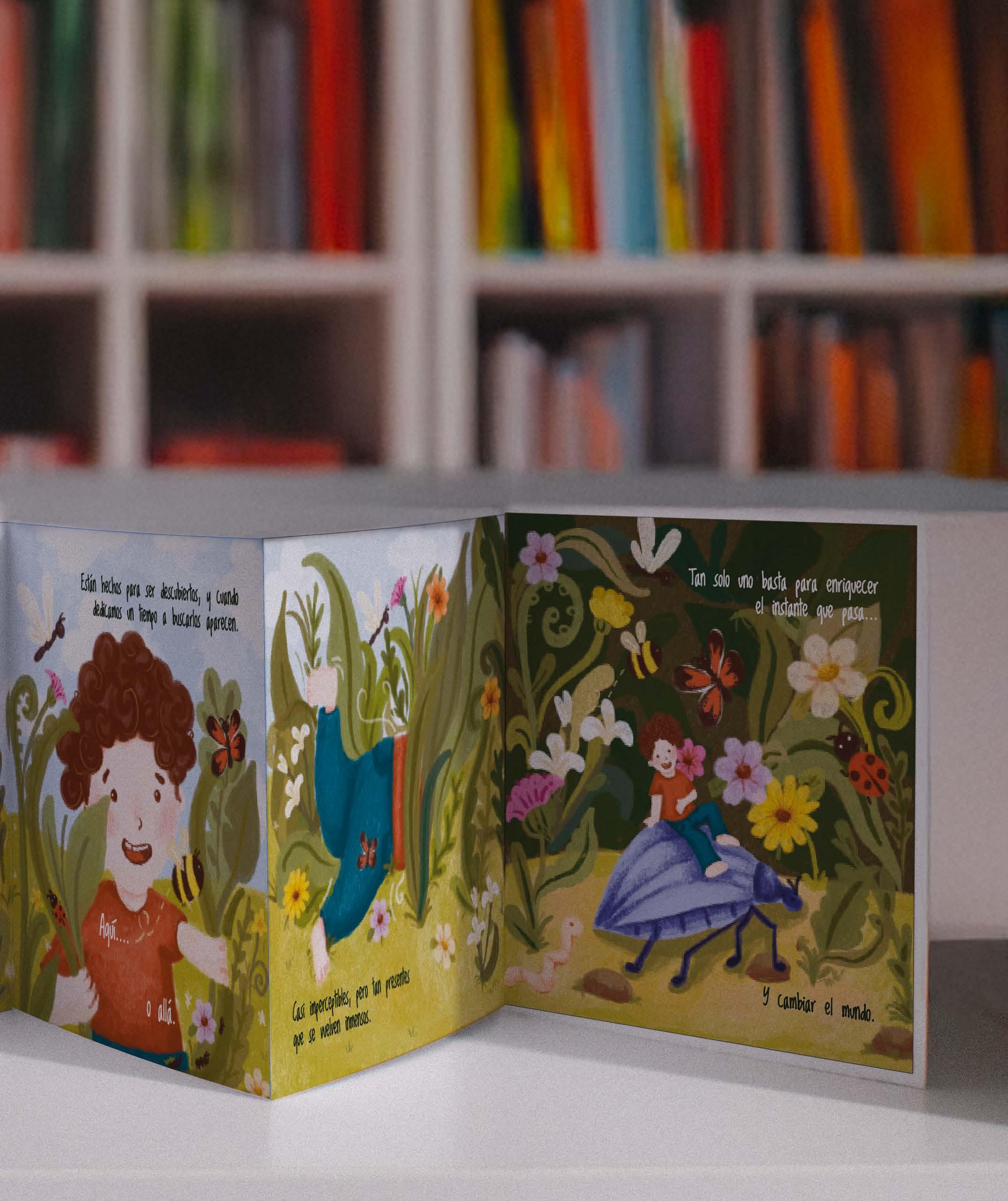
The story, simple and poetic, speaks about the importance of small gestures, trust, and freedom, reminding us that sometimes the smallest things can change the course of a life.

Thinking of an ordinary day, where we live within monotony, the aim is to highlight the beauty of the everyday and how these details can change everything.
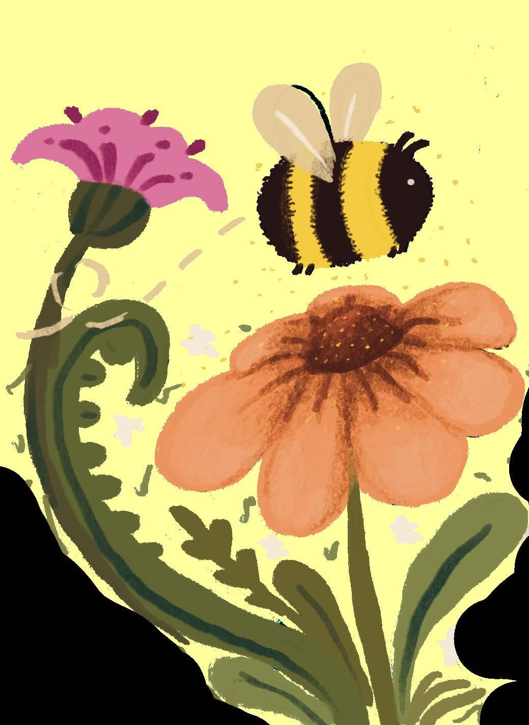
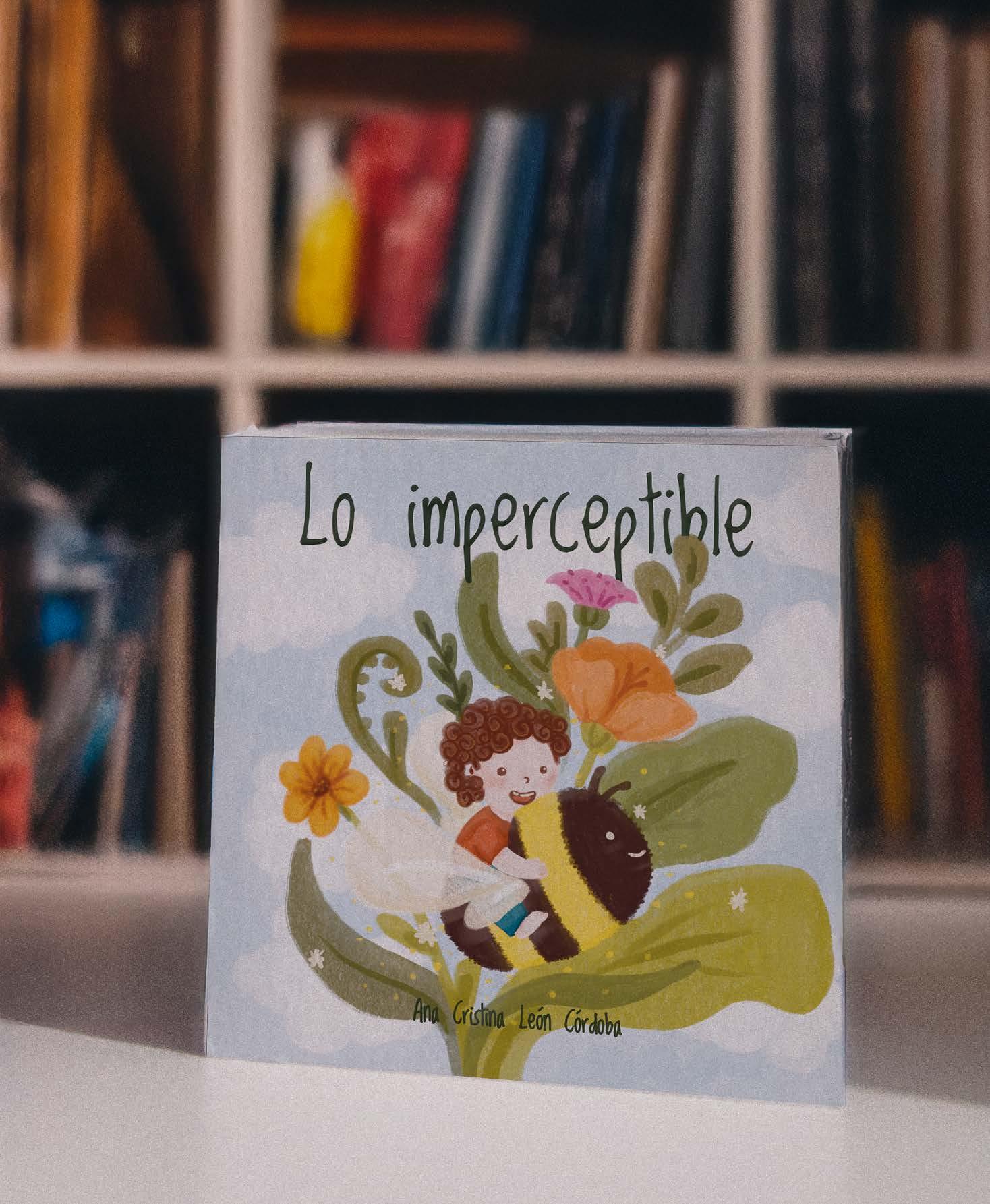
Using childlike language while also conveying a clear message to parents, thus contributing to healthy and enriching parenting.
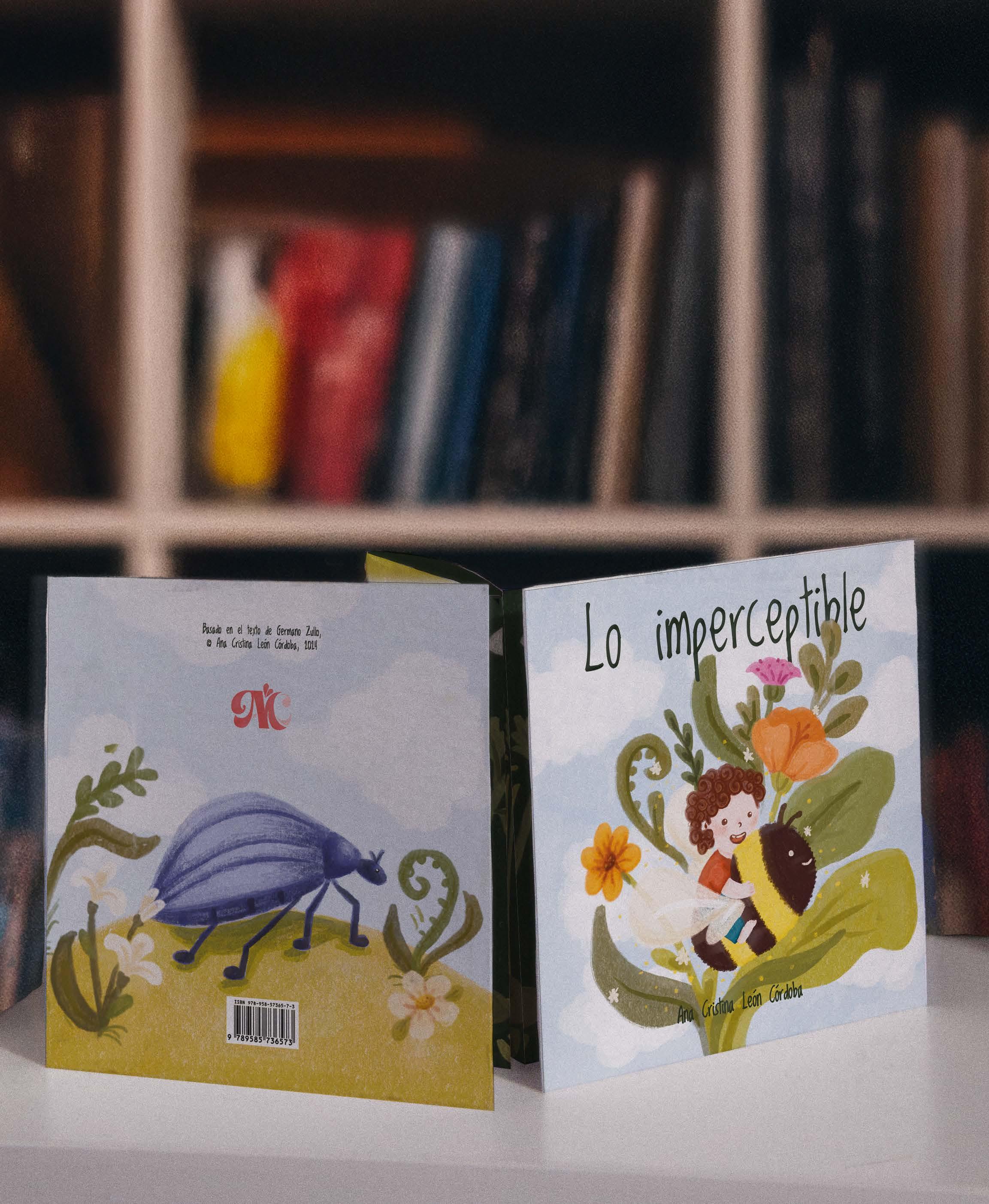
The imperceptible
Let’s value the everyday.
Let’s appreciate the details.
Some days are different, days that may seem like the others, and yet, they hold something the others don’t “ ”

Reinterpreting texts


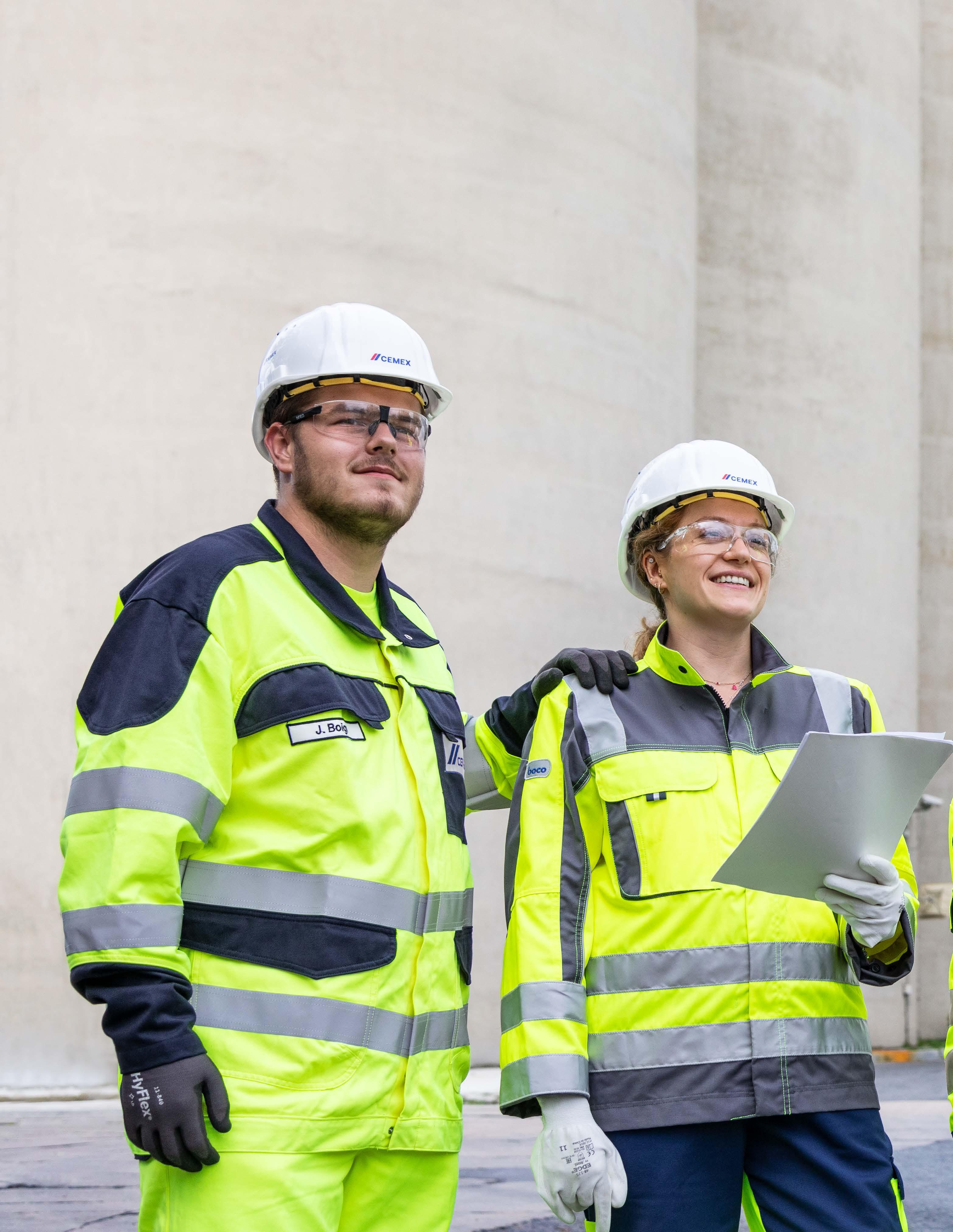
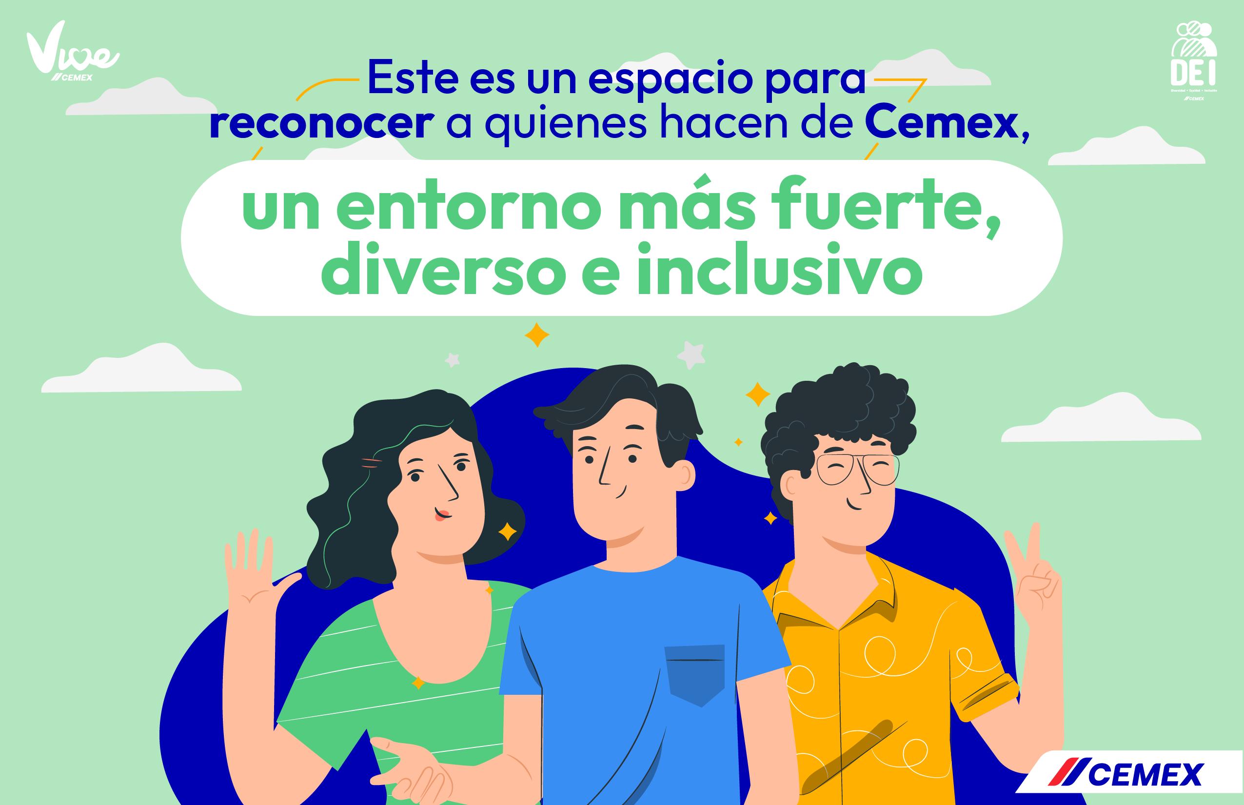
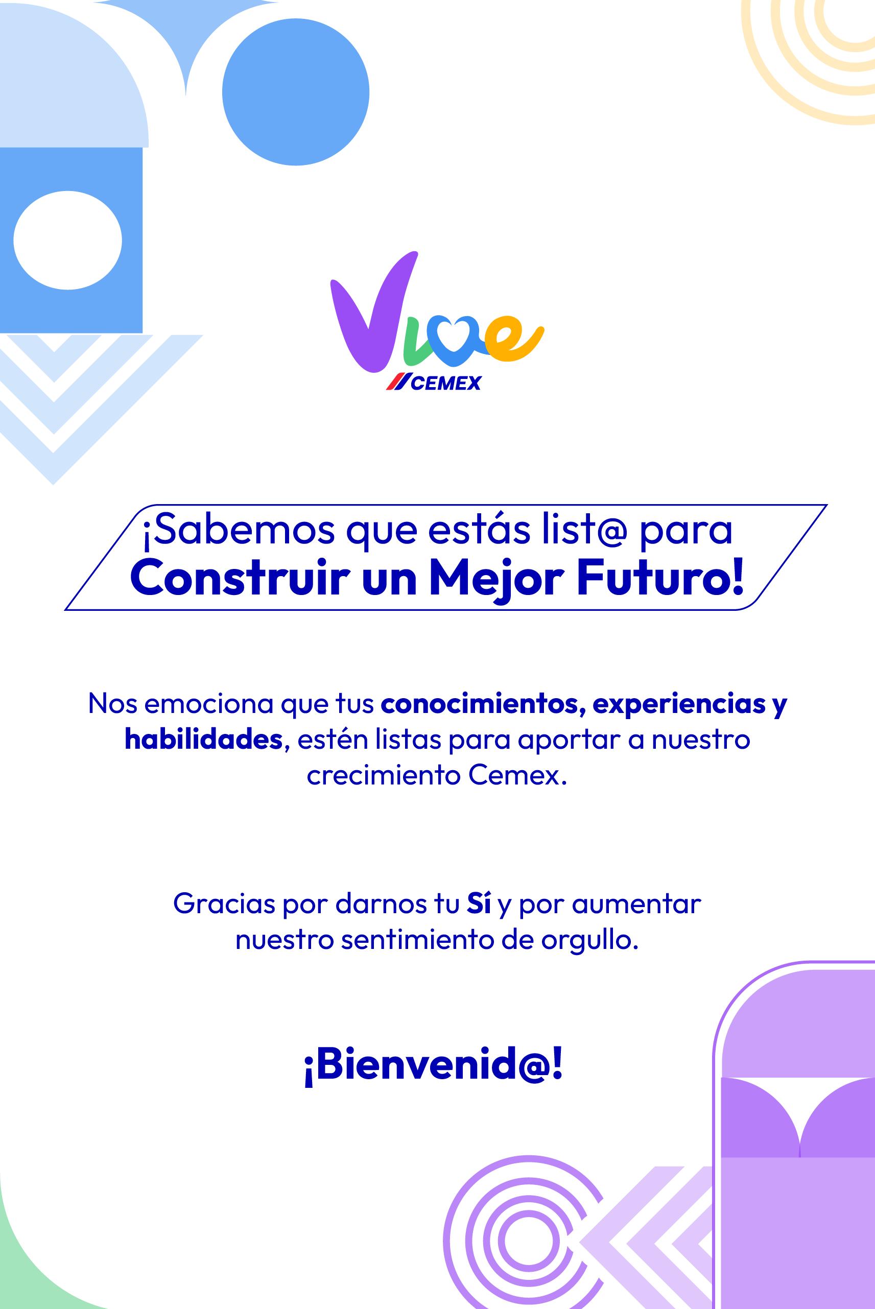
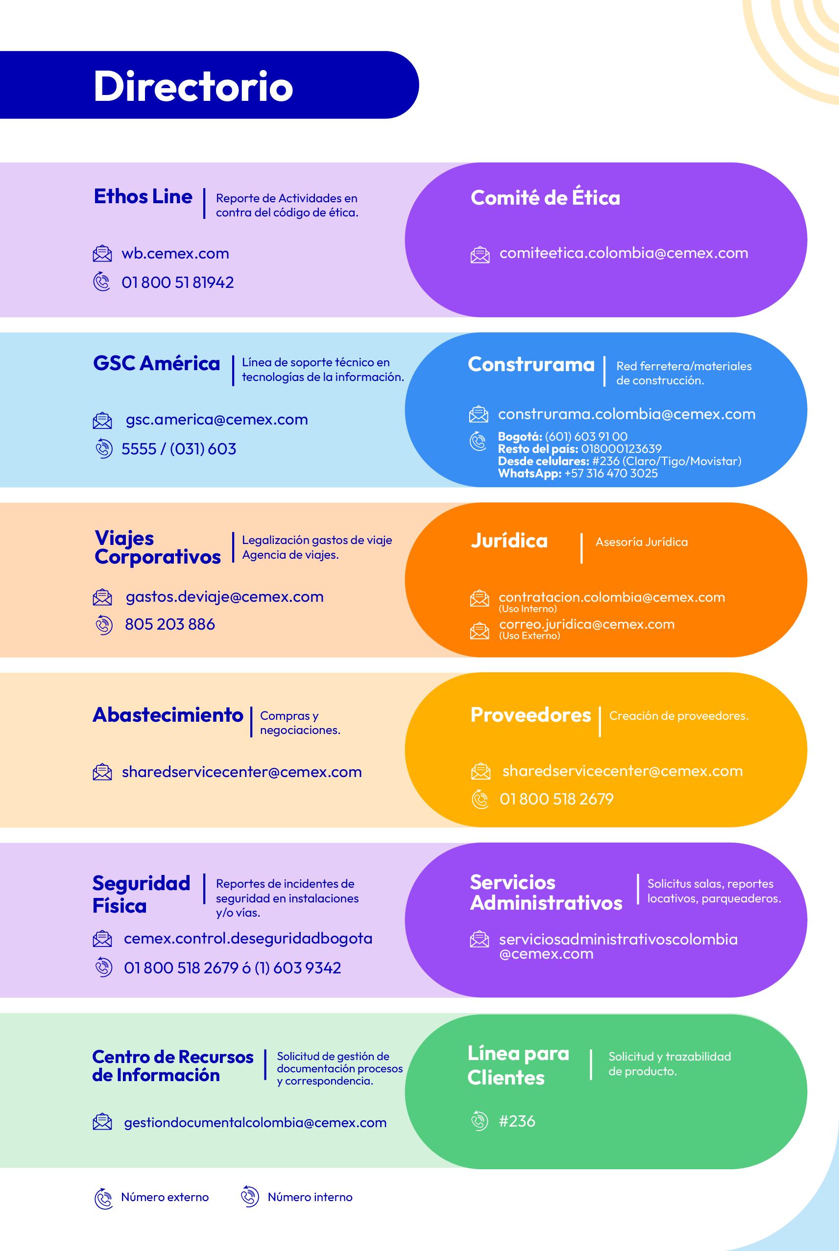
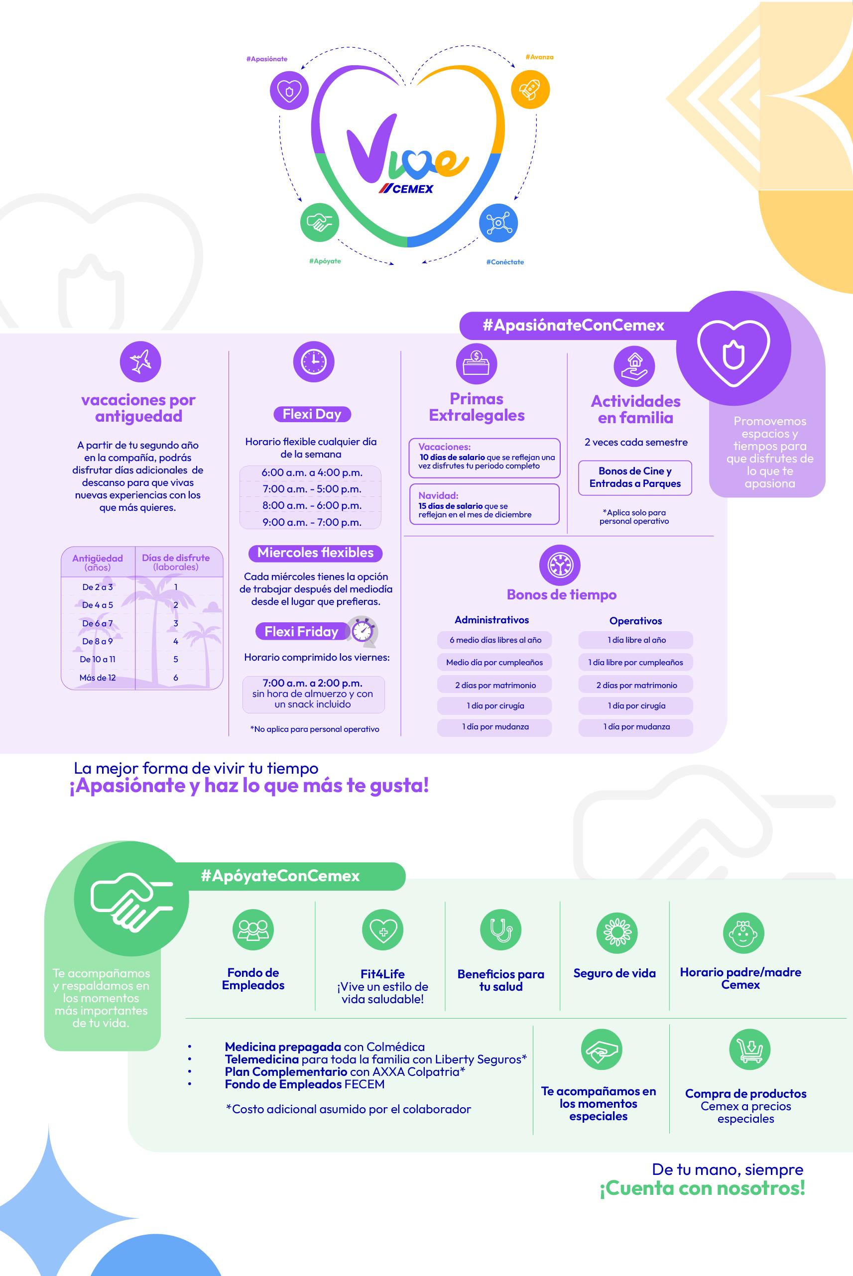
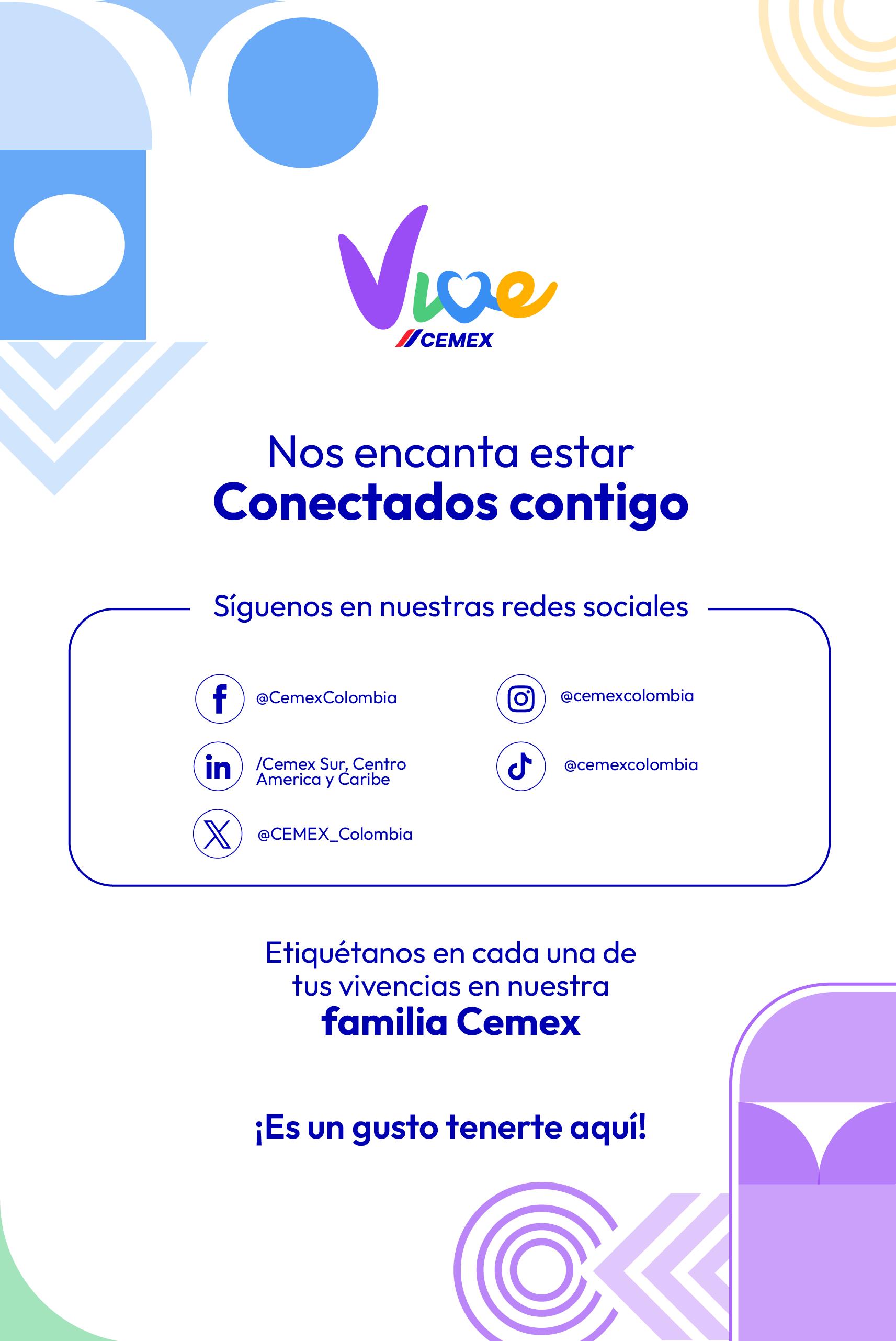
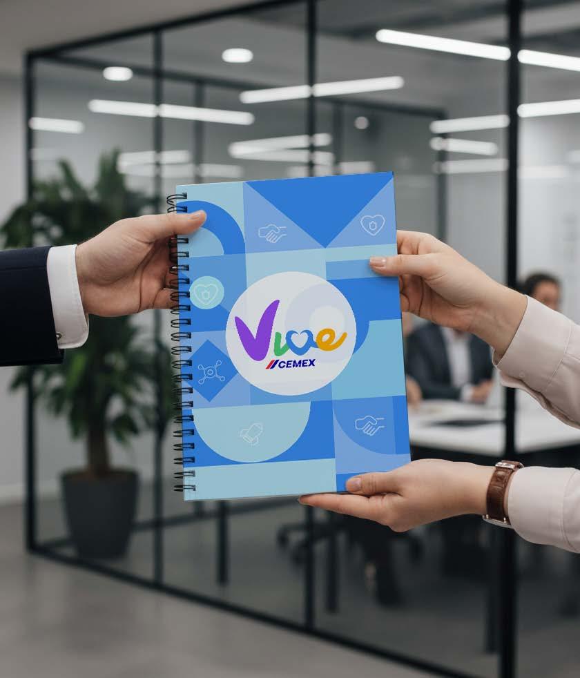
Supporting the company’s internal communications from the HR team through the “Vive Cemex” experience program, inspired by the goal of contributing to the well-being, growth, and professional development of each employee.

Proposing different graphic

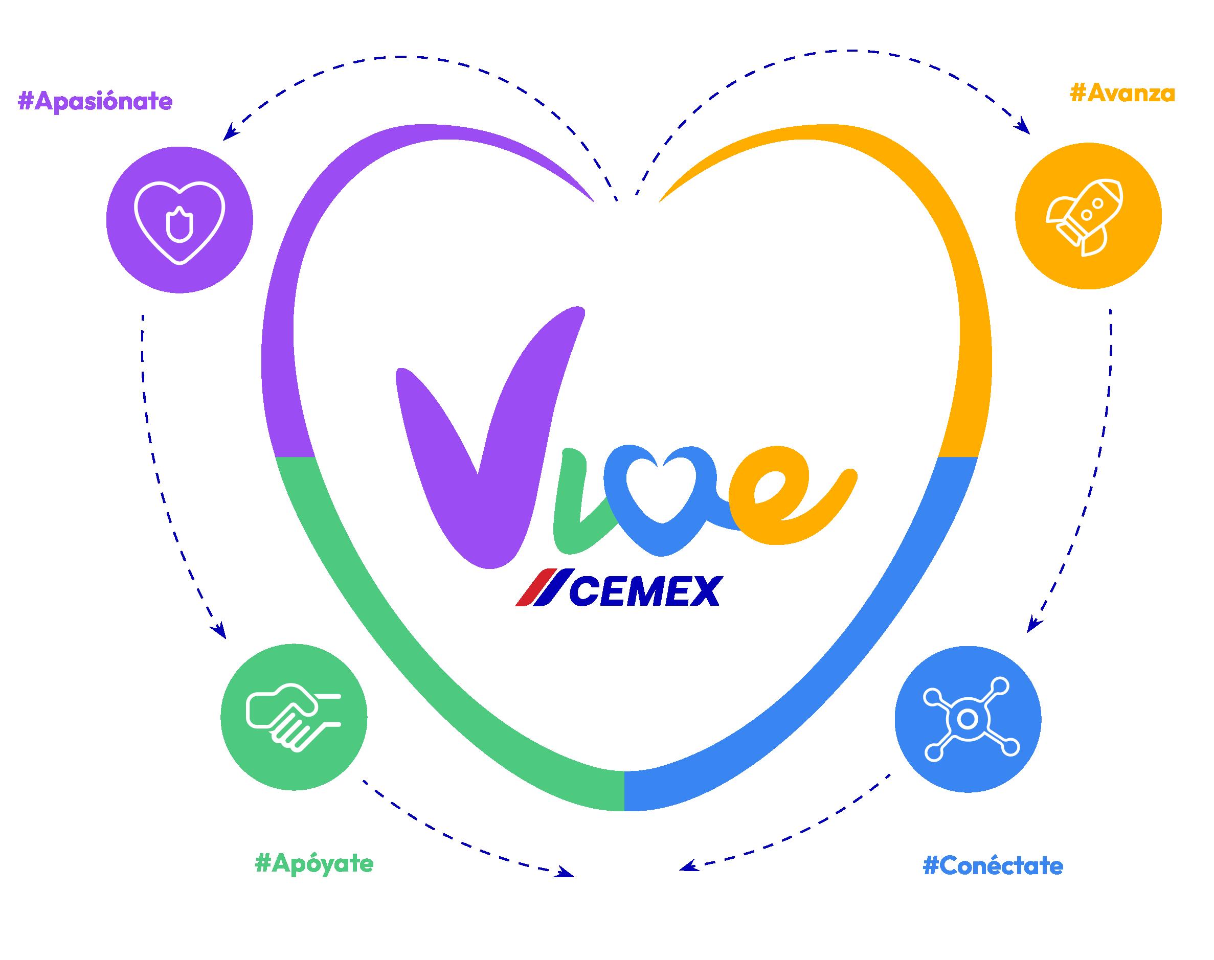
How these pillars works

Cemex is a global building materials company committed to providing innovative and sustainable solutions for the construction industry.
Customizing “Storyset” resources to align with the company’s visual identity and uniforms.

Cemex’s new visual system facilitates the production of engaging, attractive, and differentiated content for communication and marketing while remaining aligned with the correct use of our brand. It is intended to spark creativity and improve our visual communications.
Using different variations that facilitate its graphic integration in different layouts
Building a better future for all
Experience
Create a sense of belonging
Move forward
Career growth opportunities within the company
Motivating employees to take part in them.
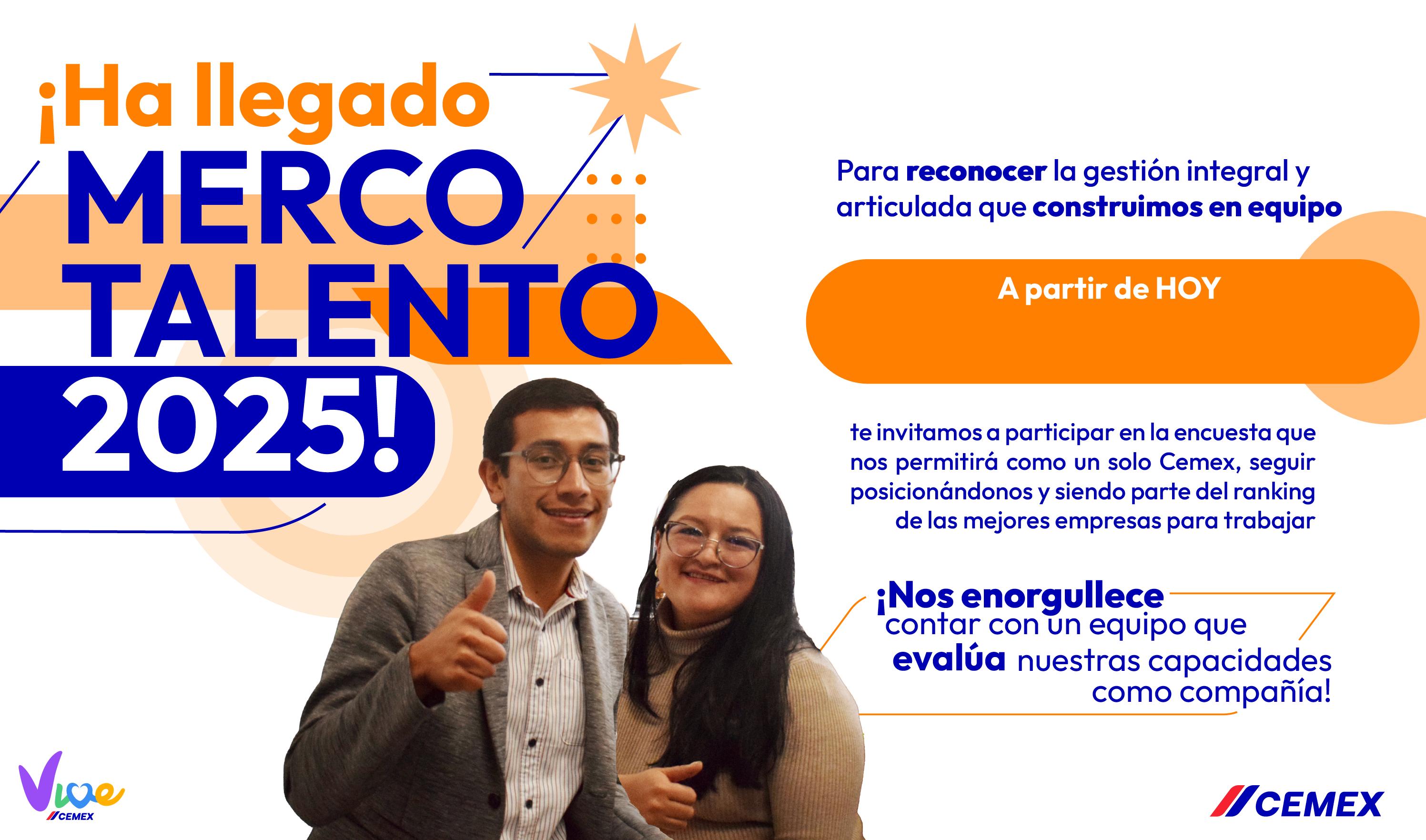
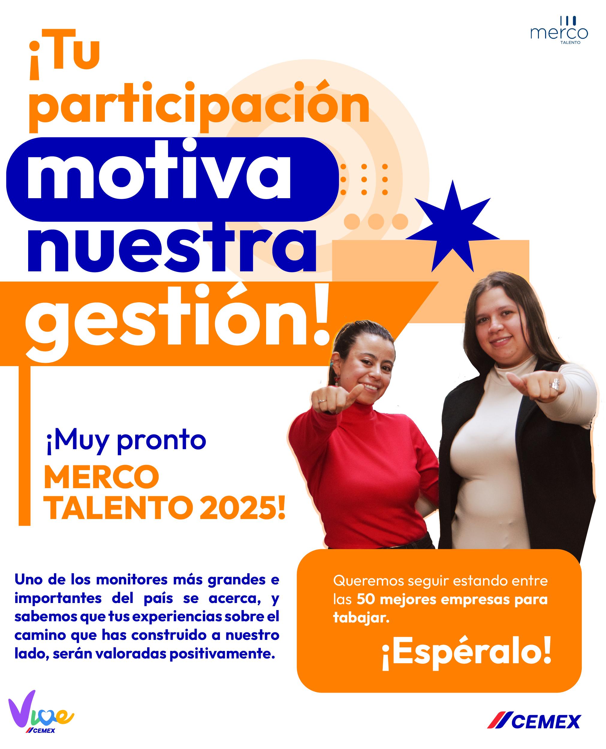
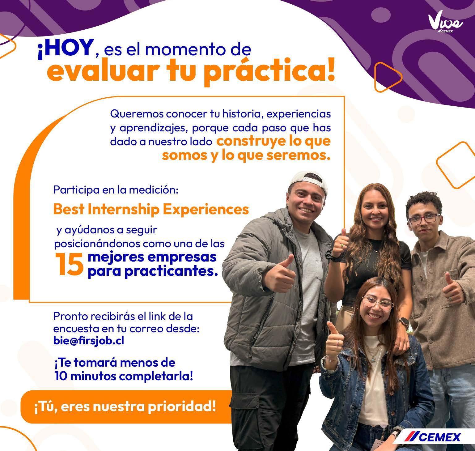
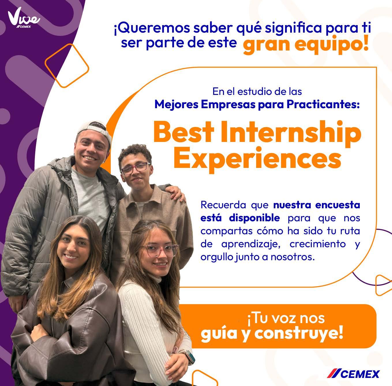

Connecting with interns and addressing their needs.
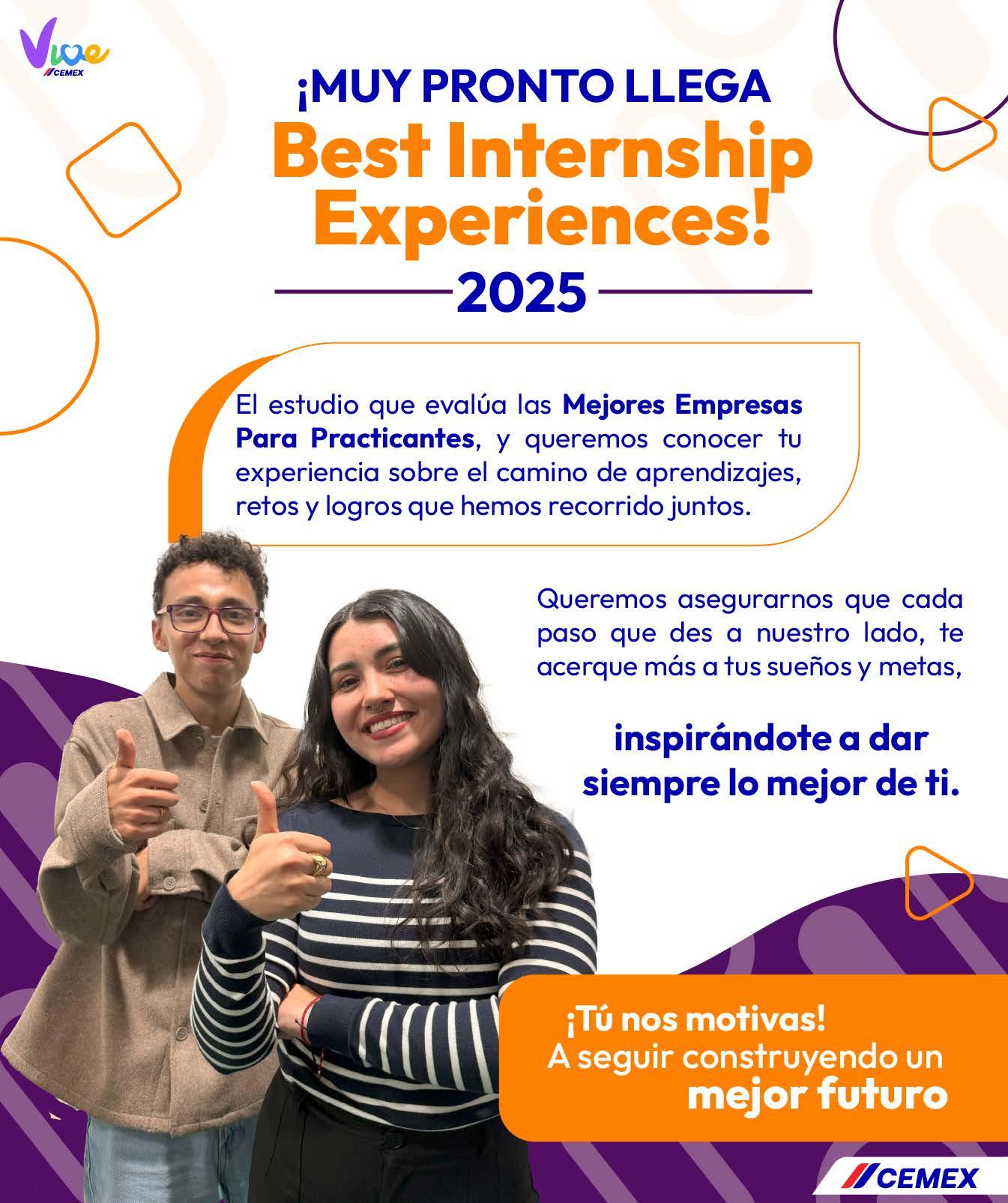

New agreements and important news aligned with the pillars of the company
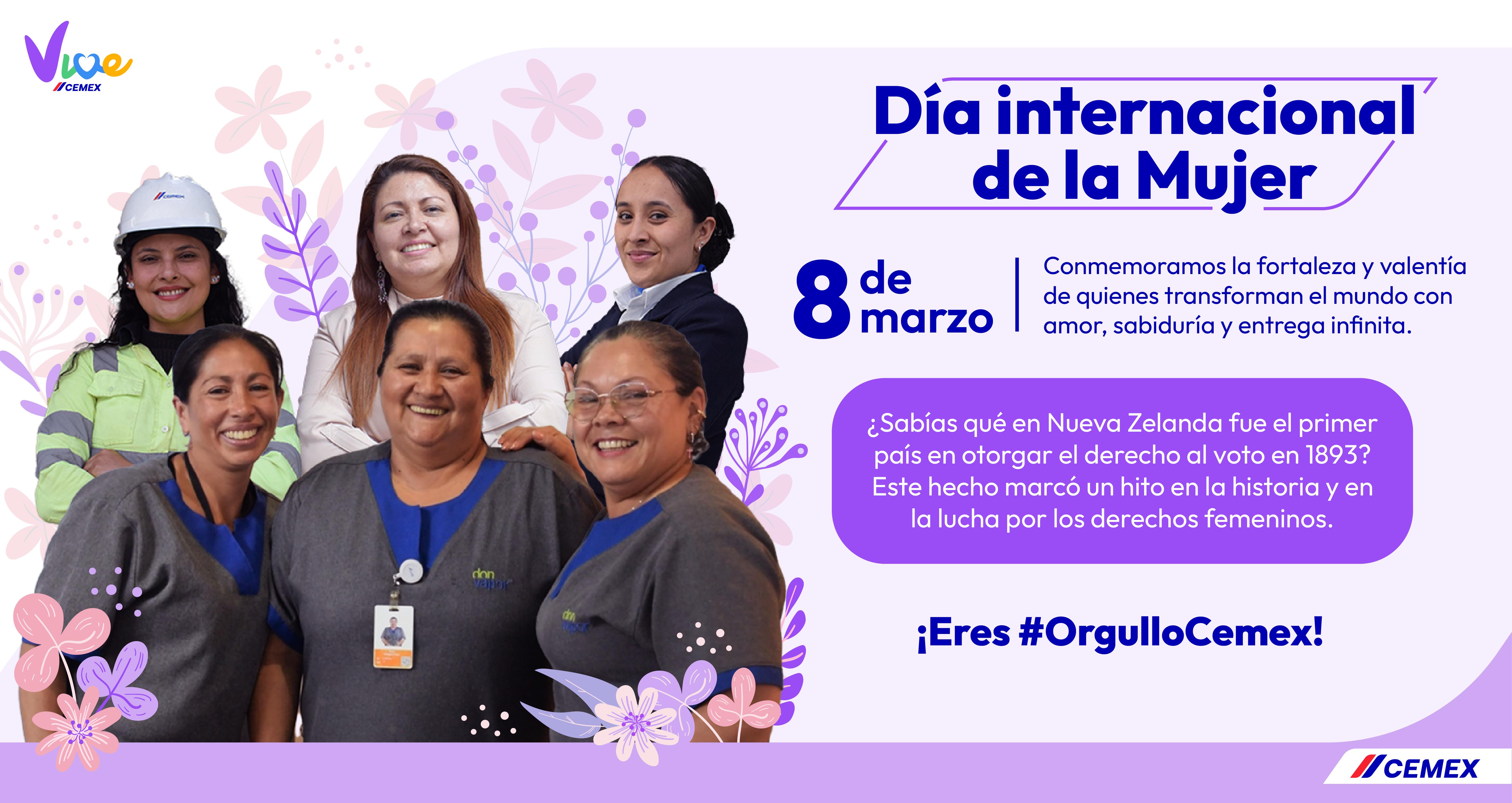
Acknowledgment at every moment
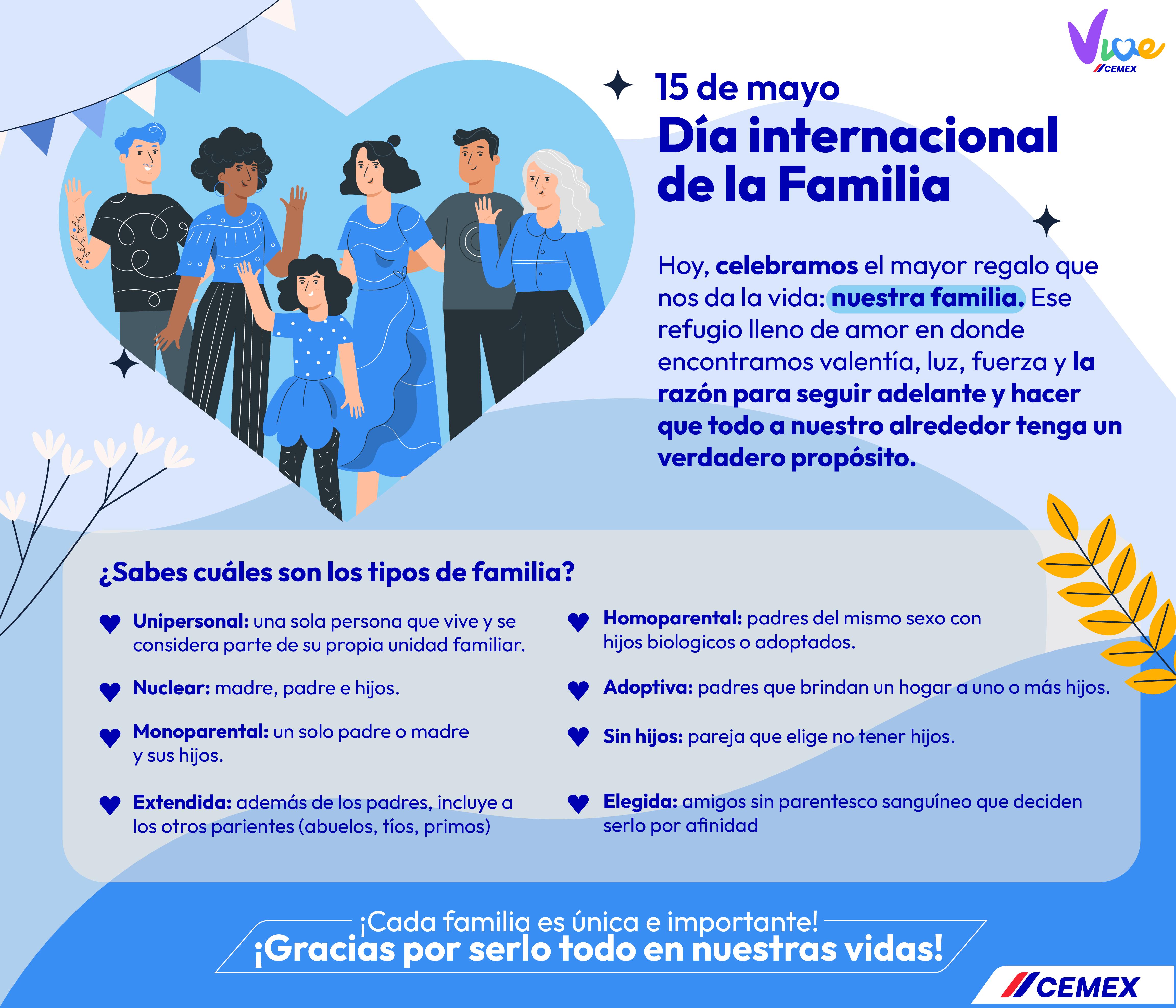
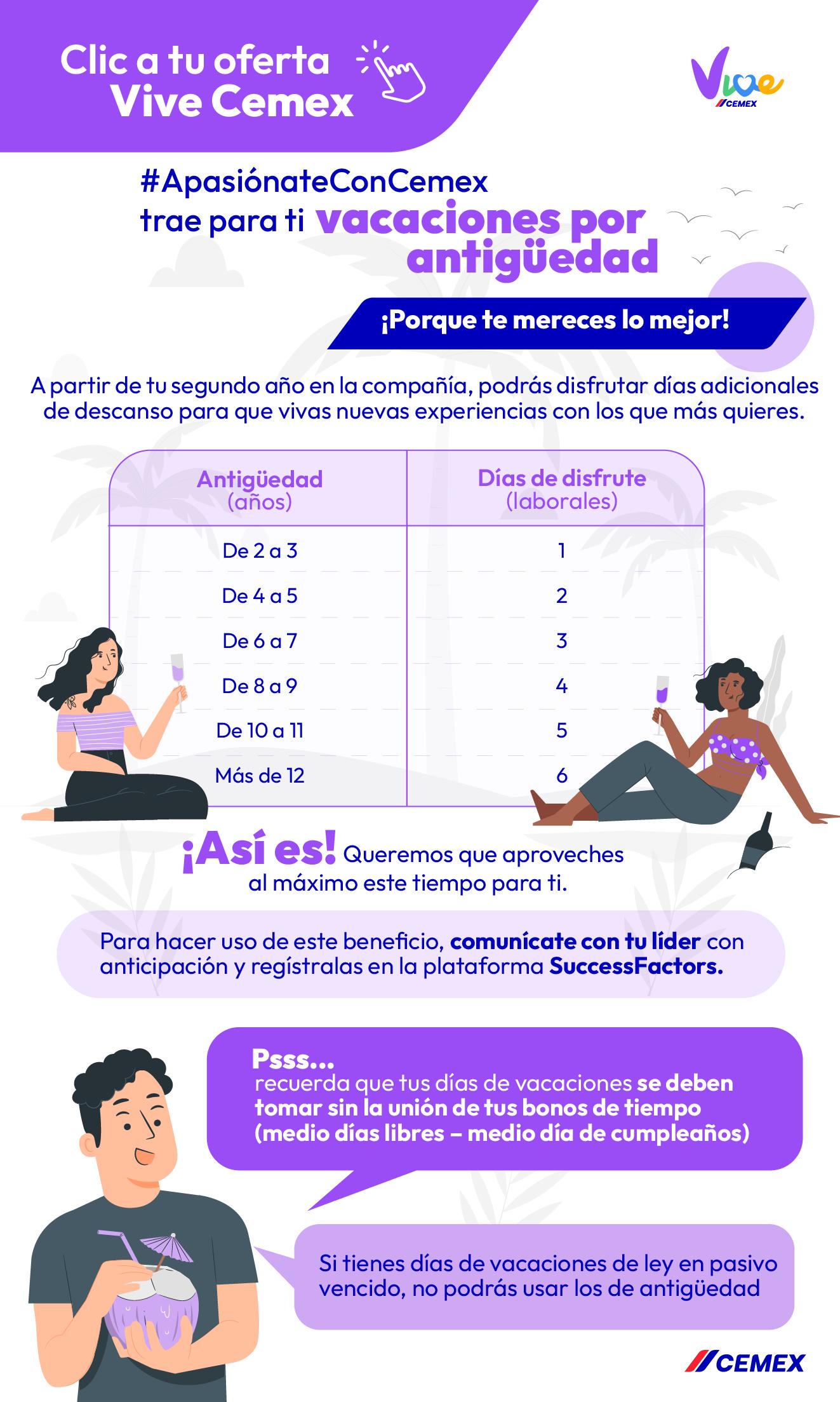
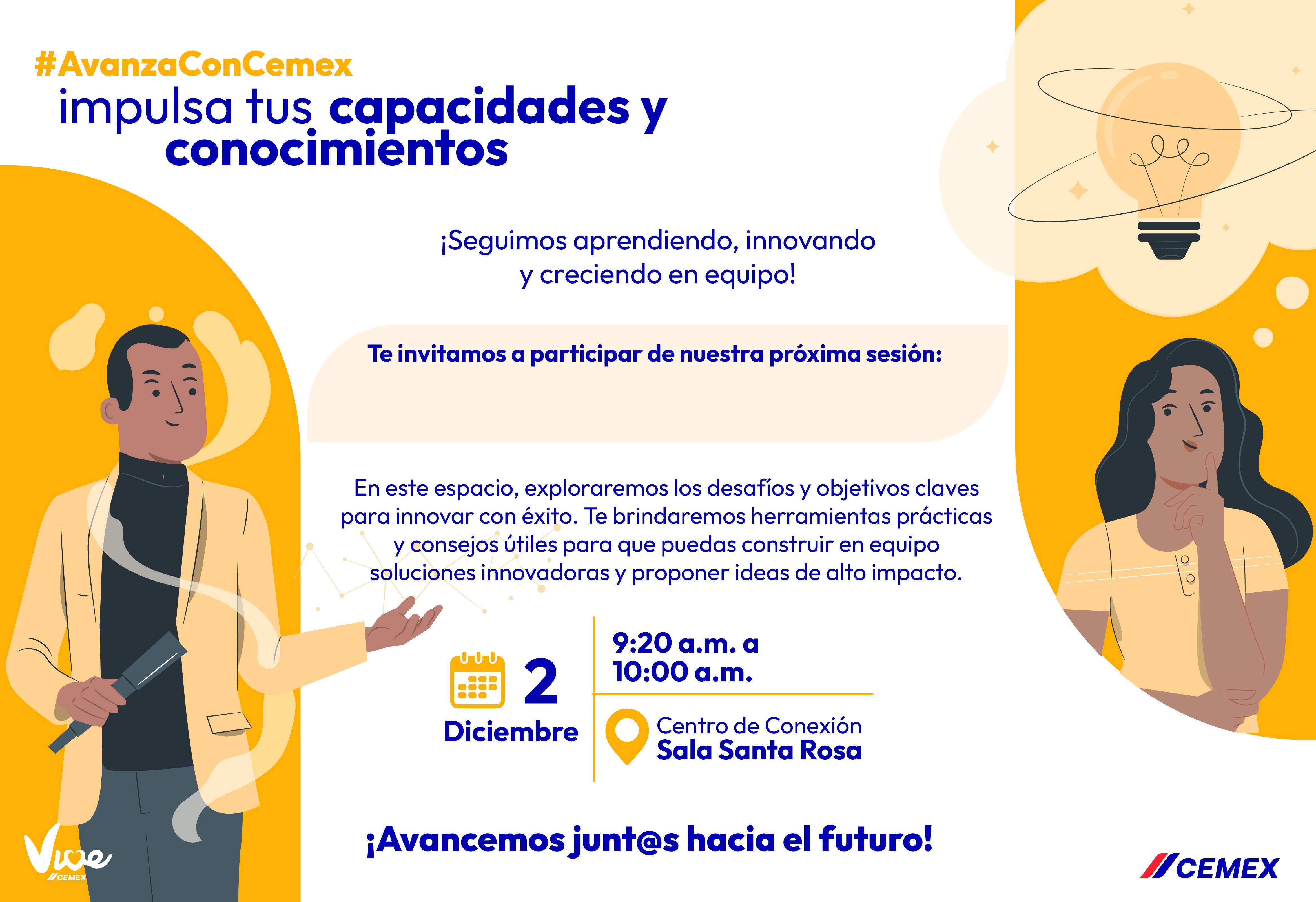
Developing internal communications distributed through email, Teams, SharePoint, or showcased across the company.
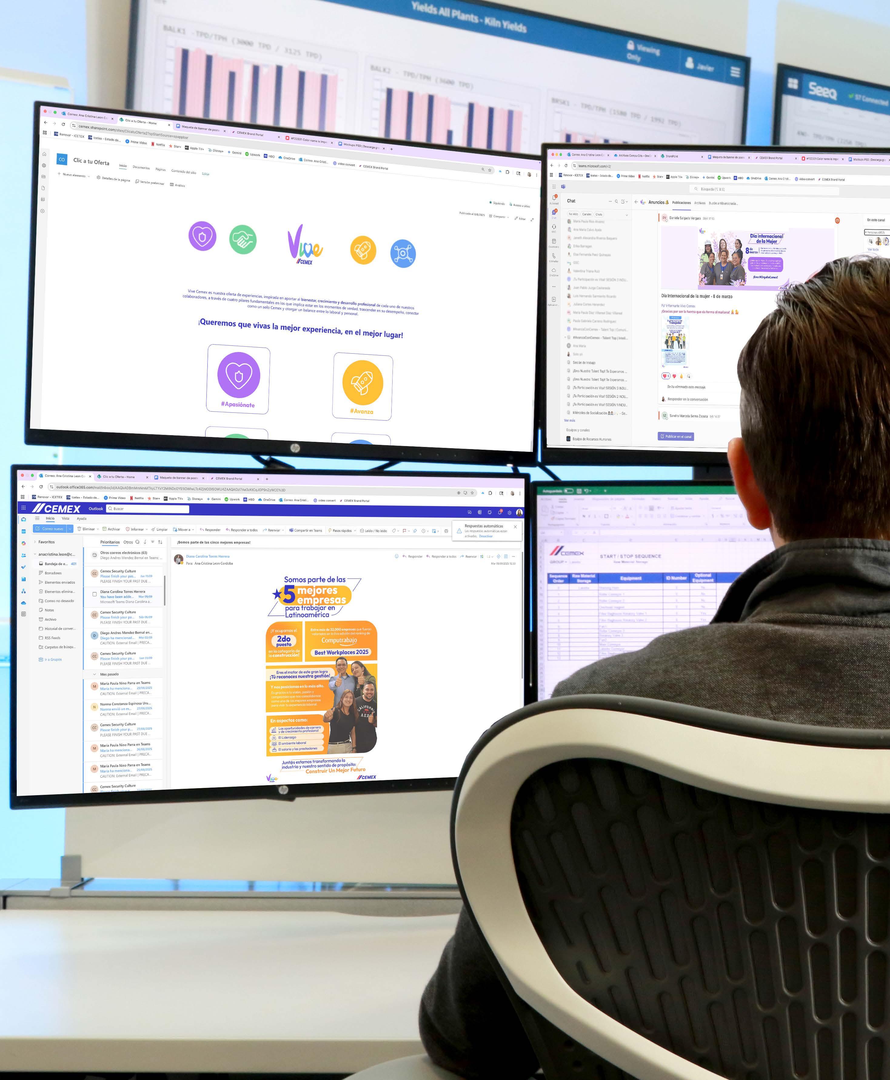
Supporting in the layout and creation of internal SharePoint pages
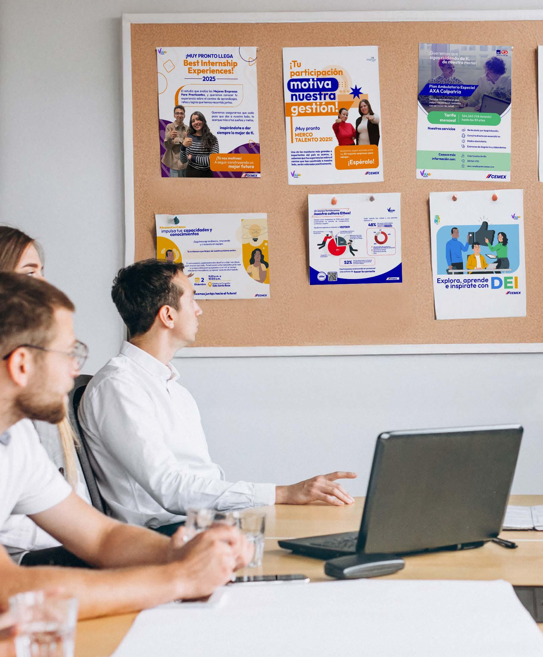
Designing new graphics for various departments, ensuring visual continuity across different stages (e.g., teaser, launch, follow-up, closing).

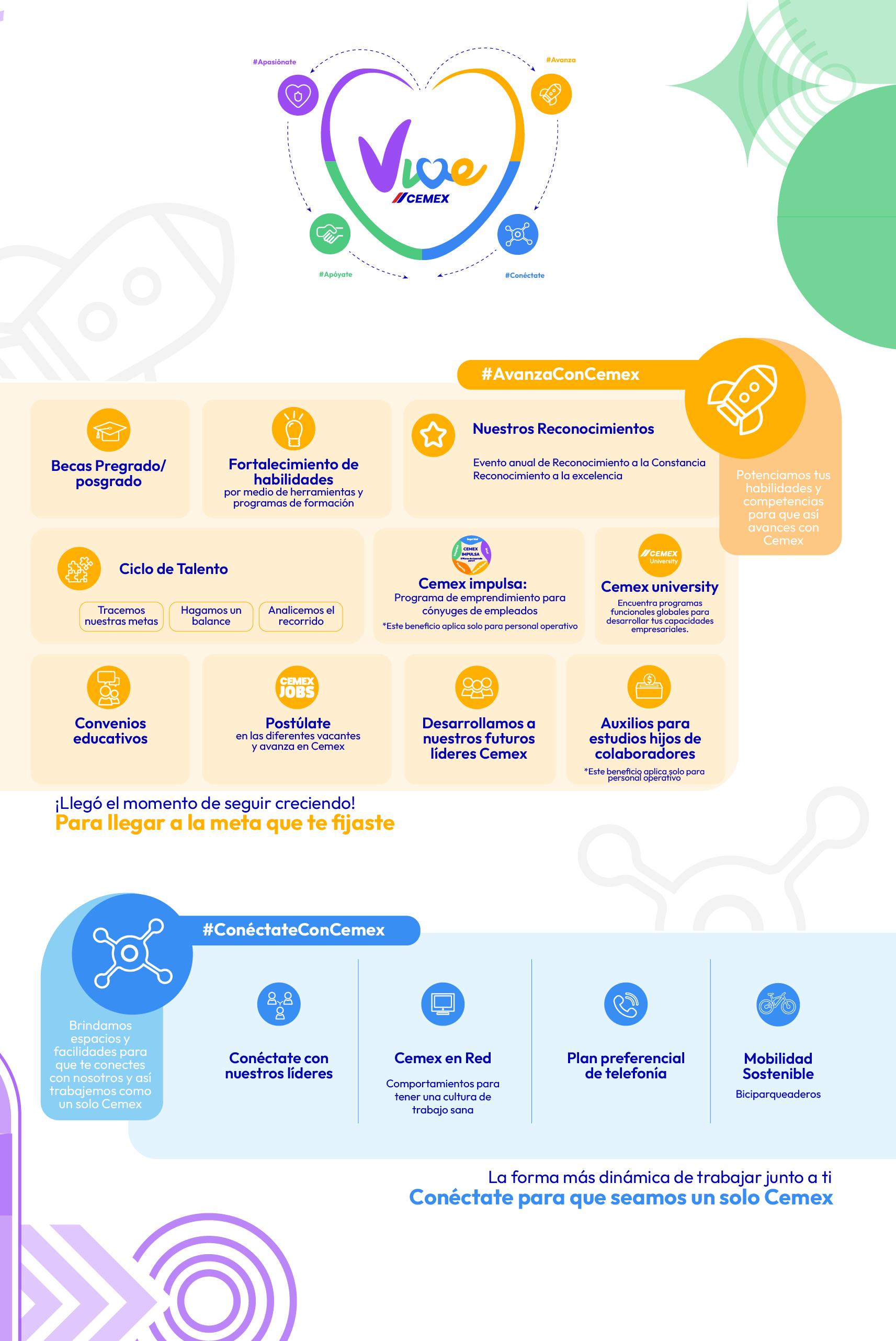
From day one, we provide welcome gifts that help new employees feel included, fostering a sense of closeness and support within the company.

Designing proposals for new initiatives
“Improving the employee experience to foster greater productivity”

Working together as One Cemex